
Today, I wrap up my report card series and compare the current market action with the previous market tops in 2000 and 2007, in relation to index levels, P/E ratios, dividend yields and finally the 10-year Treasury yield. This chart was designed by J. P. Morgan Asset Management.
To begin, I am not inferring the current market action is a market top. Important points from today’s chart – the current bull run, which began with the March 2009 bottom, is 190 percent. The previous two runs were 106 and 101 percent. After the 2000 top, there was a 49 percent drop and a 57 percent drop after the 2007 high.
The current P/E ratio is similar to the 2007 market top, but far short of the 2000 level. Next, the 10-year treasury yield is less now than the previous tops while the dividend yield is higher.
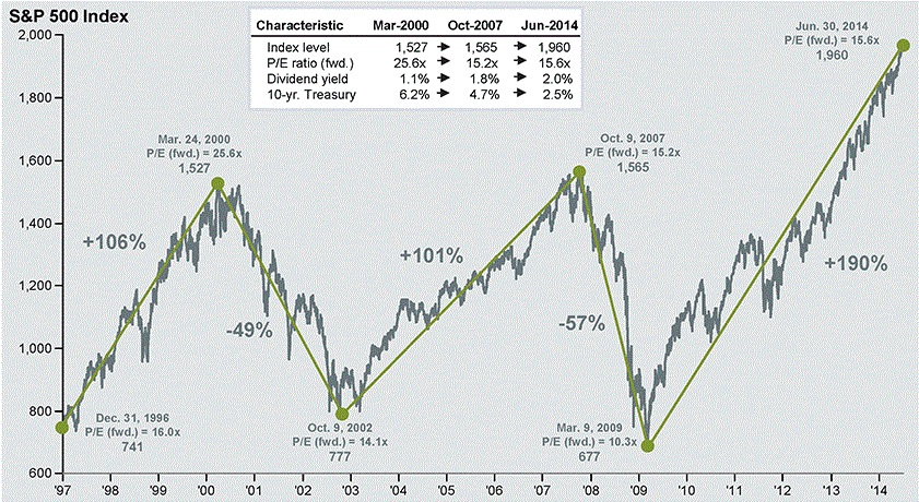
What conclusions can we take from this data? 1. I would not compare current S&P 500 P/E with previous P/E levels at market tops. 2. The more accurate index to compare would be the NASDAQ, trading at 96 times earnings in 2000. 3. The current 190 percent run far surpassed the previous runs. 4. When the markets do correct, they can devastate a portfolio value and can take years to recover.
To show the devastating effects of a massive correction, a 50 percent drop takes a 100 percent gain to recover. A 60 percent drop takes a 150 percent gain to recover. Can your portfolio balance survive a massive pullback? Do you have enough time before retiring to recover? These are very important questions to ask after and during a massive run.
If you plan to take profits, consider incremental selling in case the markets continue to run. In case of dividend paying securities, sideways markets can keep you in the green. Finally, gains do not equal profits!
Plan your work, work your plan and learn to share your harvest!
David O. England
thetraderseye@gmail.com