Hello Fellow ChartWatchers!
Today we started our Spring Special for 2013. As long-time ChartWatchers know, it is important to take advantage of our specials when we hold them in order to minimize your charting costs. That is true regardless of whether or not your account is about to expire. I hate hearing from people that miss out on our specials because they didn't think that they could participate.
The deal is simple - while the special is running, all of our long-term subscriptions include an additional month of service beyond what they normally provide: 7 months for the price of 6, 14 months for the price of 12, or 29 months for the price of 24. This reduces the "effective rate" for our subscriptions to the lowest levels we offer. Here's our complete pricing matix with all the rates.
So, should you subscribe/renew right now? To help with that question, I've prepared a little "decision tree" below that will help you regardless of your current situation. Let's get started:
Q1.) Are you a current StockCharts member?
No? Well you are in luck! Now is the perfect time to subscribe for 6 or 12 months. If you sign up for 6 months, you'll get 1 additional month for free (usually you don't get anything for a 6-month signup). If you subscribe for a year, you'll get 2 additional months of service for free (usually you only get 1). And remember that all new subscriptions come with a free 10-day trial period - cancel within the first 10 days and we won't charge you a penny. To see all the benefits of subscribing and to take advantage of our Spring Special, click here
Q2.) Do you have less than 200 days remaining on your current subscription?
(Click on the "Members" tab to see your number of remaining days.)
Yes? You should consider placing a long-term renewal order now if possible because your account will expire before our December special starts. If you renew now, we'll give you the special deal and just add the additional time you renew for to the end of your current subscription. Click here to see your renewal options
(Be sure to use your loyalty coupon when you renew too!)
Q3.) Do you have between 200 and 360 days remaining on your current subscription?
Yes? I'd still consider renewing now to lock in our special rates. That way, if you miss the December special for some reason (vacation?), your charts, scans and settings will still be protected. Click here to see your renewal options
Q4.) Do you have more that 360 days remaining?
Yes? Then you can consider skipping this special. We will probably hold at least two other specials before your account expires.
Now, how long should you signup/renew for? First, remember that in order to take advantage of our special, you need to signup for at least 6 months of service. Anything less than that doesn't qualify for the extra months.
Second, note that the longer you signup for, the more you save. For example, if you paid for 1 year of our Extra service on a month-by-month basis, it would cost you $24.95/mo x 12 months = $299.40. However, if you bought our pre-paid 1-year Extra package, you'd only pay $249.95 and you'd get 2 additional months of service for free. That works out to $99.35 less than the month-to-month cost for that same 14-month time period.
Lastly, if you have been a member already for more than one year, you have a loyalty discount coupon code waiting for you that you can use to further reduce the cost of your order. That coupon is percentage based, meaning that the larger your order, the bigger your discount.
Here are some other questions you might have about our special:
- Does it matter which service I use?
Not in terms of how the special works. Of course each service have different abilities. Click here and scroll down to see a comparison for each of our service plans.
- Can I use the special to upgrade my account?
Not exactly. The cost of upgrading an account isn't affected by our special however, after you have upgraded, you have the option of renewing your account for more time in which case our special pricing would apply.
- I forgot to use my loyalty code with my order. Can you add it?
We hate this question. Please do not be "this guy." Make sure to include your loyalty coupon in your order. Adding it later is often not possible.
- When does the special end?
Our specials usually end at the end of the month but please don't wait until the last second. All kinds of things could happen between now and then. People who play timing games with our specials are often disappointed.
Sorry to be so salesman-like this time around, but I want to eliminate the complaints that we get after our specials are over from people that didn't understand how important they are. But you are smarter than that, right? ;-)
- Chip
P.S. Because we still have a couple of spots left in our live Seattle SCU seminar on June 7th and 8th, I'm leaving our special "early-bird" pricing in effect until Monday. Save up to $100 if you register before then. And remember, three free months of service are included with each registration! If you are not getting the most out of all the tools and information on our website, come to an SCU Seminar and learn directly from the people that created the website (hey, that's me!). Click here for more details.
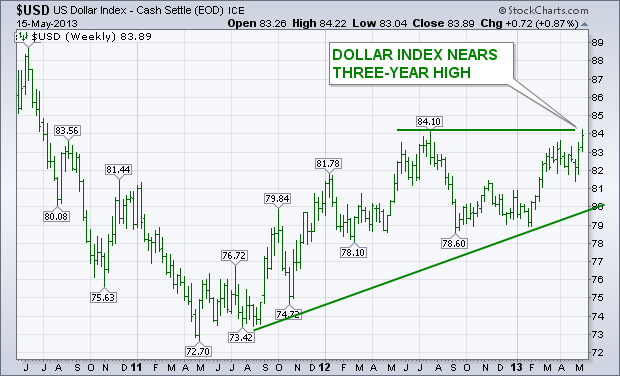
The chart below shows the U.S. Dollar Indexchallenging its mid-2012 high near 84. An upside breakout through that prior peak (which appears likely) would put the dollar at the highest level since mid-2010. The dollar has become the world's strongest currency. One of the reasons for the stronger greenback is the fact that the U.S. economy is now the strongest among developed markets. Another is chatter that the Fed is planning to cut back on bond purchases (quantitative easing) sooner rather than later. That's in contrast to other central bankers who are accelerating their easing process. Japan is the biggest example of that. But the weaker yen has forced the South Koreans to lower rates to weaken their currency (the won). [A plunging yen has pushed money into the higher yielding won which hurts South Korean exports that compete with Japan]. Europe has lowered rates to combat the longest recession in the postwar era. Australia has lowered rates to combat the deflationary impact of falling commodity prices and slowing Chinese demand. [80% of Australia's exports to China are natural resources]. The stronger greenback has a lot of intermarket implicatons for other markets, which include commodities and stocks.
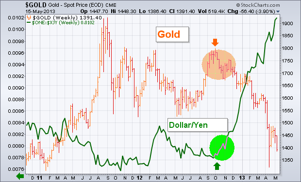
Subscribers may remember that my Market Message from last December (20) carried the headline: "A Peak in the Yen Appears to be Dragging the Price of Gold Lower". The weekly bars in the following chart show the price of gold peaking during the fourth quarter of last year and tumbling to the lowest level in two years during 2013. The green line shows the U.S. Dollar rising against the yen during that same time span. The upturn in the dollar/yen (green circle) during October coincided exactly with the peak in gold. Since the start of October, the dollar has risen 24% against the yen, while gold has lost -21%. By contrast, the Dollar Index has risen only 5% during those eight months, while the Euro has been flat. That appears to confirm my December view that the plunging yen has been the main driver of falling gold prices, and not the USD which is dominated by the Euro.
- John
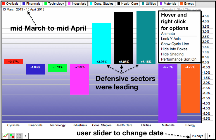
There were concerns a month ago when the defensive sectors were leading the market, but this changed as the offensive sectors took control over the past month. The defensive sectors include healthcare, consumer staples and utilities. The offensive sectors include technology, consumer discretionary, industrials and financials. Chartists can use PerfCharts with different date ranges to spot shifts in sector rotation. The first PerfChart shows the percentage change for the nine sector SPDRs from mid March to mid April. Chartists can set a past date range by right clicking on the date slider to select one month and then dragging the slider to the left. Notice that the three defensive sectors were up sharply during this period. In contrast, three of the four offensive sectors were down. The Consumer Discretionary SPDR (XLY) gained, but this gain was a paltry .47%, and the sector still showed relative weakness.

Click these images for live charts
The second PerfChart shows these same nine sectors from mid April to mid May. Notice that the four offensive sectors are up more than 8% and seriously outperforming the defensive sectors. Relative strength in these offensive sectors reflects a strong appetite for risk and this is healthy for the market. It is also positive to note that the Energy SPDR (XLE) and Materials SPDR (XLB) are also showing upside leadership. These two sectors are also considered "cyclical" because they perform best when the economy is expanding.
Good charting!
--Arthur Hill CMT
While we tend to focus more on the short and intermediate term, we notice that there is a lot going on in the long term time frame.
Most obvious is the breakout above the top of a long-term trading range. The breakout is decisive (more than three percent), so the technical assumption is that it is unlikely that prices will fall back below the line of resistance, which is now support.
After a breakout we expect prices to correct back toward the point of breakout. We can see that the index is approaching the top of a rising trend channel, and, when that is reached, it would be a logical time for a correction to begin.
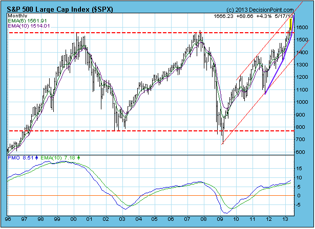
However, we noted in our blog earlier this week that a parabolic up move appears to be in progress. On the chart this has been annotated as purple trend lines with ever-increasing angles of ascent. Parabolic moves are signs of mania in the market, and this can cause prices to move higher and faster than would be considered reasonable. These moves can be fun to ride, but it is virtually impossible to know when they will end. When they do end, the reversal is usually abrupt, and the decline breathtaking. The most exaggerated parabolics occur in prices of a single stock or commodity. With an index composed of many stocks, it should be more subdued.
Conclusion: The S&P 500 is in uncharted territory, and the only resistance is the top of the rising trend channel, at which point we would expect a consolidation or correction toward the point of breakout to begin. The long-term breakout implies that prices are going to go higher, and the parabolic nature of the advance implies that it is likely to accelerate.
So much for "Go away in May"!
I've written in the past that this is VERY misleading information that's routinely provided to the investing public. For example, the month of May is one of the best months of the year to invest in small caps. The Russell 2000 has an annualized return of more than 14% during May since 1988. The NASDAQ's annualized return in May since 1971 is close to its annualized return throughout the year. Only on the S&P 500 do we see below average returns during May - and most of that weakness has generally been seen in the middle two-thirds of the month. The first and last weeks of May tend to be very bullish, even on the S&P 500. There are also very bullish parts of both June and July. The truly bearish period of the year runs from mid-July through late-September.
Financials have been leading this bull market rally on both an absolute and relative basis and that generally portends quite well for a further advance. The problem at this point is that many financial stocks are extremely stretched in the near-term and I try to avoid chasing stocks that have run too far.
Which brings me to technology.
Technology stocks have been lagging the S&P 500 on a relative basis for quite some time. I believe that technology will lead the stock market in the second half of 2013. Here are my reasons:
(1) Apple (AAPL) has bottomed in my view.
(2) Technical improvement in various areas of technology
(3) There's been a break in the relative downtrend line in technology-related stocks vs. the S&P 500.
Let's take these one at a time. First, AAPL.
Let me explain what's happened to AAPL and then show it to you visually. AAPL made a parabolic move higher that culminated with its share price reaching 700 in September 2012. The first warning sign was the emergence of a long-term negative divergence on AAPL's weekly chart. From there, a topping head & shoulders pattern formed. It then was corroborated by a high volume breakdown that measured to 390. When it reached 390, a long-term POSITIVE divergence formed and now we're in the midst of a bottoming reverse head & shoulders pattern that will confirm on a breakout above 465.
Confused? Maybe a visual will help:
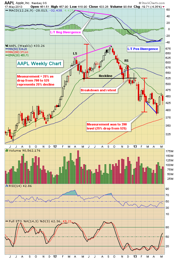
The bullish reversing head & shoulder pattern is not easy to see on a weekly chart, so take a look at this daily chart:

Keep one thing in mind here. This bullish pattern does not confirm until we see a high volume breakout above the neckline. I've drawn lines to indicate what this might look like as we move out over the next 1-2 months. But first we need to see the breakout.
Strength in technology is definitely starting to surface. I read Arthur Hill's Don't Ignore This Chart blog post from Thursday that showed how the technical rank had improved for Cisco Systems (CSCO) and Network Appliance (NTAP). If you look closer at that "improved" list, you'd also find Salesforce.com (CRM) and JDS Uniphase (JDSU) in the top 5 as well. Money is flowing towards technology and it's beginning to show on the charts.
Now let's take a look at the relative strength of technology. In order to quiet the effect that AAPL has, I've chosen to use a technology equal-weighted ETF (RYT) and compare that to the S&P 500. It's just broken a downtrend line on a relative basis. Take a look:

Many technology stocks have been consolidating recently and we're just now seeing significant breakouts. One such technology stock just broke out of a cup with handle pattern and is featured as my Chart of the Day for Monday, May 20th.
CLICK HERE for more details.
Happy trading!
Tom Bowley
Chief Market Strategist
Invested Central
The Great Rotation is in its early stages. For those initiated to this concept, it is simply that rising interest rates will cause asset allocators to sell bonds and buy stocks. And we shall posit that it shall become more pronounced in the weeks and months ahead as interest rates are on the verge of rising faster than many believe at this point.
Technically speaking, this is due to the 10-year note yield developing weekly "head & shoulders" bottom forming on the weekly chart. We'll mention that a bullish monthly key reversal to the upside is also forming, but the basis of this sharp move lies in the confirmation of the "head & shoulders" bottom on a close above 2.03%...a mere 8 basis points higher. Further, the volatile manner in which the 10-year note is trading would suggest it could happen next week, which would then target the 2.90% level...last seen in July-2011.
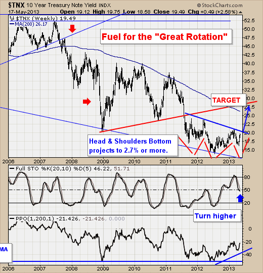
So, although the S&P 500 and other indices may be overbought in the short-term, then can remain so for quite some period of time. And we are correct in our 10-year note yield assessment, then our target of the S&P 500 is 2000...and that is not a typo.
Good luck and good trading,
Richard