Hello Fellow ChartWatchers!
October didn't live up to its fearsome repution this year. The major averages were all up somewhere between 2 and 4% for the month with the exception of the Russell 2000 (which was up only 0.7%). Will things stay in positive territory for November? See the other articles in this newsletter for some thoughts on that.
November is "Get Certified" Month!
Today I want to show you how, with a little bit of work, StockCharts members can double their membership discount - guaranteed - saving themselves money (potentially lots of it) next month. I'm talking about taking advantage of the combination of our traditional year-end holiday special combined with passing our new ChartWatchers Certification Exam.
So first off, if you are somewhat new to StockCharts, you might not know that we have always offered a special membership deal during the holiday season at the end of the year. Each year the terms of the special change slightly but, in general, if you renew your members during that time, you will get additional time for free.
In addition, members can use their Loyalty Discount on top of the holiday special to save even more. What is the Loyalty Discount? Well, members get an electronic coupon each year that they can use to save money on their next subscription. Normally, the coupon is worth 1% off the total cost for each year that you've been a member. While that doesn't sound like much, it adds up over time and can drop your per-month cost significantly. For example, a 5-year PRO subscriber who takes advantage of both the holiday special and their normal loyalty coupon could drop their per-month cost from the standard $49.95 per month to only $35.28 per month (over 14 months) saving them over $14.50 every month.
So, my first point is this: If you are a member and you like our service, always try to renew for at least a year during one of our Specials and always use your Loyalty Discount.
But now, this year, we've added a new wrinkle - the ChartWatchers Certification Exam. There are two major benefits to taking and passing this exam:
- You will definitely learn more about technical analysis and about using StockCharts.com. The exam gives you a great reason to spend some time and dive down into topics that you've probably been meaning to spend time learning anyway, right? That right there is a big benefit.
- You will DOUBLE your Loyalty Discount! After passing the exam, your discount will be worth 2% per year instead of just one. And that doubling will continue for each year you remain a member.
Going back to our example of the 5-year PRO subscriber from above, if they take some time and pass the Certification Exam before December and then renew during the special, their per-month cost would then drop to only $33.42 saving them over $16.50 every month!
My point here is that if you are a happy StockCharts member and you are at all interested in taking the ChartWatchers Certification Exam, then this month is the month to do it so that you can double your Loyalty Coupon before our traditional holiday specials kick in. Make sense?
Q: Is the exam hard? Does it take a long time?
A: Yes and yes - but hear me out...
Anything worth doing requires effort. What can be frustrating is if the reward for a lot of effort isn't worthwhile. The rewards for the effort involved in preparing for and taking the Certification Exam are clear: you will become a more knowledgeable technical investor, you will get more out of the tools on StockCharts.com, and you will double your Loyalty Discount saving you money in the long run.
After reviewing the results from the first group of people who have taken the exam, I can also give you a couple of tips that should ensure you pass on your first attempt:
- Before taking the real exam, read the Certification Study Guide that we've prepared. It's not long and it will really help you prepare effectively.
- Have the StockCharts website open in a second browser window while taking the exam. The exam is essentially "open book" - you can look up the answers on the site while taking it.
- Always, always, always use the "Search" box on our homepage to search for answers/definitions/etc. for every question on the exam. "Search" is your friend.
Finally, because you are a great ChartWatcher and have read to the end of this article, here is the answer to the #1 most missed exam question:
In order to calculate a 100% accurate 50-day Exponential Moving Average value, you need to use every daily data point going back to the day the stock first started trading. More details
So try to find some time this month to get certified. As a more knowledgeable technical investor, you'll reap the rewards forever - but especially in December!
- Chip
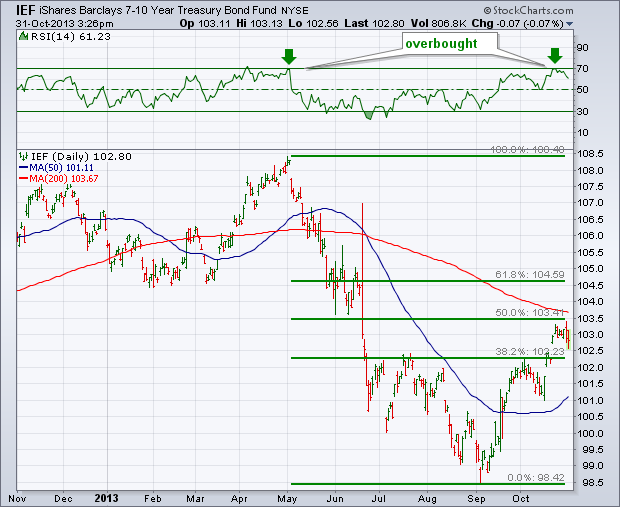
After selling off sharply between May and September, bond prices have been bouncing for the last two months. The bounce, however, has reached technical levels that may cap the rally. Chart 1 shows the 7-10 Year T Bond iShares (IEF) having retraced 50% of its previous downtrend. In addition, the IEF is up against its 200-day moving average. The green line above the chart also shows the 14-day RSI line having reached overbought territory at 70 for the first time since April. Chart 2 shows a similar trend for the iBoxx Investment Grade Corporate Bond iShares (LQD). Chart 2 shows that the LQD has reached potential chart resistance formed earlier in the year. Notice that the horizontal line drawn below the first quarter lows turned from green to red. That's because a broken "support" level becomes a new "resistance" level after it's broken. Its 14-day RSI line has also reached overbought territory at 70 (down arrows).

Basic Elliott wave teaches us that there are two types of price movements: impulse and corrective. Similarly, Dow Theory teaches us that there are primary price movements and secondary price movements. Impulse and primary moves are in the direction of the bigger trend. Corrective and secondary price moves run counter to that trend. The challenge for chartists is to distinguish between impulse-primary moves and corrective-secondary moves.
The chart below shows the 10-year Treasury Yield ($TNX) with a huge advance from early May to early August. This key benchmark advanced from the 1.6% area to the 3.0% area, which is almost a double. Something clearly changed in the bond market and this advance looks like an impulse or primary price move. If so, then the decline from 3% to 2.5% would be a corrective or secondary price move.

Click this image for a live chart
Two technical aspects suggest that this is indeed a correction. First, notice that the decline retraced 38% of the prior advance, which is the minimum Fibonacci retracement expected for a correction. Second, the decline formed a falling wedge, which is typical for a correction. The three day surge off support suggests that this correction may be ending and the long-term uptrend is resuming. Notice how the 10-year Treasury Yield found support near the July lows and surged above 2.6% on Friday. A move above the wedge trend line would provide the second signal, while a move above the mid October high would complete a medium-term trend reversal. Also, notice that Aroon Up is above 50 and a surge to 100 would turn this indictor bullish. Chartists should watch the 10-year Treasury Yield closely because a breakout could have negative implications for the utilities sector, housing stocks, REITs and other interest rate sensitive stocks.

Click this image for a live chart
Good trading and good weekend!
Arthur Hill CMT
This week had bearish overtures for my view of the markets.
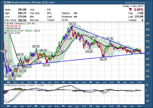
Probably the one I worry about the most is the commodities Index, the $CRB. The break below the 5 year trend line is particularly disconcerting.
One week does not make a new trend, but one week can start a trend. After breaking out to the upside, the $CRB has made 8 weeks of lower highs. Not only has it fallen below the trend line, it has now fallen below the five year support line. So, we have had 8 weeks of lower highs, which is a trend. We have had one week closing below the 5 year support, which is not a trend.
While everything else seems to be perking along, there were a lot of inter market relationships that got beat up.
The Canadian and Australian currencies are a good methodology for looking at the commodities.
Both of the charts failed at the 40 WMA which is down sloping. Live link here. When prices retest a down sloping 40 WMA, investors should respect the price action either direction.

Here is the Australia Dollar Chart. The live link is here.

All the indicators on this chart say we are in a larger bear trend. This was just a bear market rally in the commodities until proven otherwise.
For a detailed explanation of the commodity currencies and the relationship to the commodities, a long thorough posting is on The Canadian Technician Blog.
It can be found here. Currencies Ring A Pessimism Bell.
Good Trading,
Greg Schnell, CMT
Research published by Yale Hirsch in the Trader's Almanac shows that the market year is broken into two six-month seasonality periods. From May 1 through October 31 is seasonally unfavorable, and the market most often finishes lower than it was at the beginning of the period. From November 1 through April 30 is seasonally favorable, and the market most often finishes the period higher. (See Sy Harding's bookRiding the Bear for details on this subject.) While the statistical average results for these two periods are quite compelling, trying to ride the market in real-time in hopes of capturing these results is not always as easy as it sounds.
Sell in May and go away? Well, not this year. The S&P 500 was up +11.2% in the last six months, so there was obviously a positive force working that overcame negative seasonal tendencies. It was probably the Fed's money printing, but we don't really need to know. It is most important to identify the trend and try to stick with it.
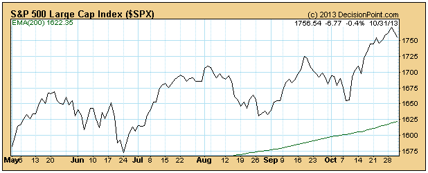
As a point of interest the Dow was up only +5.8%, and it was more in a trading range rather than an up trend. It started at the bottom of the range and ended at the top of the range.

The next six month's seasonality is supposed to be positive. We stay aware of seasonal tendencies because their effect on the market can be profound; however, we should also be aware that more powerful forces may be pushing prices in the opposite direction of seasonality. Presently, we have positive seasonality plus Fed money printing acting positively on the market. Will problems with the ObamaCare rollout provide any negative current for the market? So far this doesn't seem to be a factor, but the potential is there.
I've maintained a bullish stance throughout this bull market, but I have to admit I'm beginning to get a little nervous. As a stock market historian, it's difficult for me to think bearish thoughts as we enter November because November, December and January are BY FAR the best consecutive months to be invested in the S&P 500. In fact, check this stat out. Since 1950, the period from the October 27th close to the January 19th close has risen 53 times out of the last 62 years, including 18 years in a row from 1983 to 2000. 25 different years have seen gains of 7% or more during this bullish period. This 10-11 week period has seen the S&P 500 rise MORE THAN 10% during 12 different years. If you get bearish now, you'll have history fighting you. It doesn't mean the market can't sell off, but the odds are clearly reduced.
Now that you have that bullish historical backdrop, consider the warning signs:
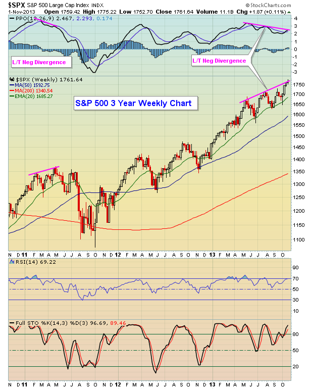
(1) We are violently overbought on weekly timeframes
(2) We have negative divergences on the weekly MACDs on 3 of our 4 major indices (NASDAQ is the exception)
(3) We are stretched on the daily charts with a reversing bearish engulfing candle printing at channel resistance
(4) The Russell 2000's relative strength has tumbled over the past two weeks
(5) Copper and crude oil prices - both of which normally correlate positively with the S&P 500 - are not supporting higher equity prices at this time
(6) Financials are now falling on an absolute and relative basis
Check out the following charts to support several of these red flags:
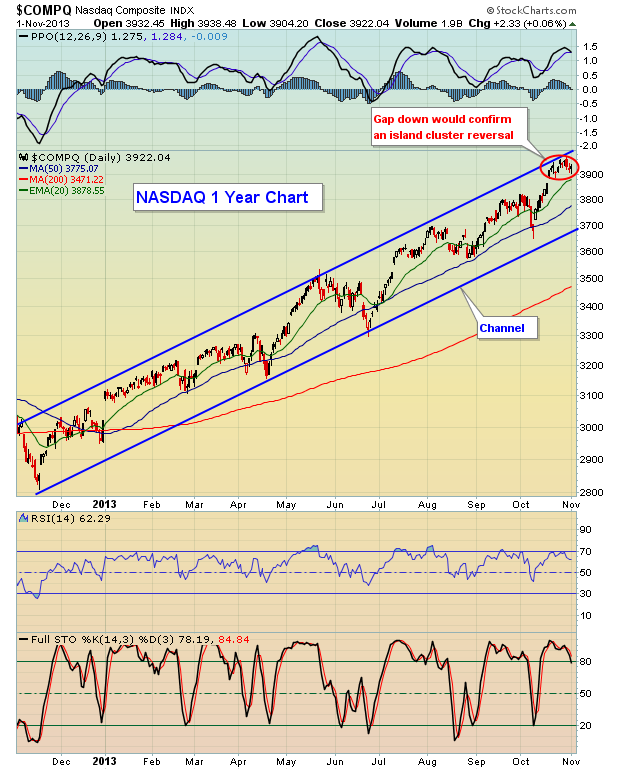
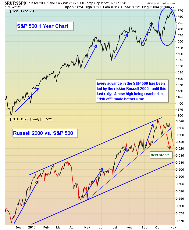
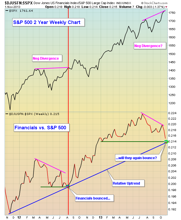
I am maintaining my bullish forecast through year end, but I am also keeping one finger on the sell button just in case. If you're long, hedging against your long positions in some fashion probably makes sense. Selling covered calls or buying put insurance are a couple of options.
On Monday, November 4th, I'm hosting the latest in our Online Traders webinar series, "Gap Trading Strategies". If interested in attending, CLICK HERE.
Happy trading!
Tom Bowley
Chief Equities Strategist
Invested Central/EarningsBeats.com
For the past 9-weeks, Crude Oil has weakened from $112/barrel to below $95/barrel. This is a rather sharp drop indeed, but the fact of the matter is that the fundamentals are bearish Crude Oil, and so is the techncial state of prices. Moreover, the technicals could very well become much worse upon further weakness in the weeks/months ahead.
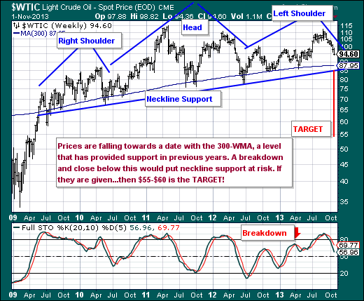
Quite simply, the 300-week moving average serves as a mean reversion target for prices, and in the past 5-years it has held more than 10-different times dependent upon what one would call a test or not. Regardless, this level is a very important support level - currently at $87.95, and it becomes more so given the proximity of the "head & shoulders" neckline crossing through the $85-to-$86 zone dependent upon the width of one's pencil. If these levels are violated, then a likely acceleration to lower levels becomes a high probability, with a low forecasted within the $55-to-$60 zone.
Therefore, at a minimum - a test of the 300-week moving average is likely given the seasonally weak period for Crude Oil is September through December, with the 20-week stochastic confirming further weakness...not to mention it is far from oversold levels. Hence, we are sellers of Crude Oil on rallies.