| |
|
|
|
|
| |
 |
ChartWatchers
the StockCharts.com Newsletter
|
|
|
|
|
|
|
|
2013 - THE YEAR IN TECHNICALS
by Chip Anderson | ChartWatchers
Hello Fellow ChartWatchers!
Well, 2013 is almost over - this is the last ChartWatchers newsletter until 2014 - and I thought now would be a good time to review some of the key technical developments during the past year.
Things got off to a good start as stocks surged higher in early January when the "Fiscal Cliff" situation in Washington appeared to be resolved. That sent small-caps into record territory where they stayed for essentially the entire rest of the year. Small-caps outperformed large-caps during much of 2013 - a situation that was under reported by many financial news outlets (but not us).
Here's an updated version of a chart John Murphy created back on January 3rd when he was pointing out the strength in small-caps.
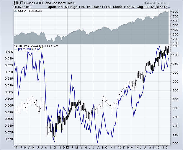
That was a great call on John's part because - as today's chart shows - $RUT continued to out-perform and move higher throughout 2013. Our Market-cap PerfChart confirms that as well.
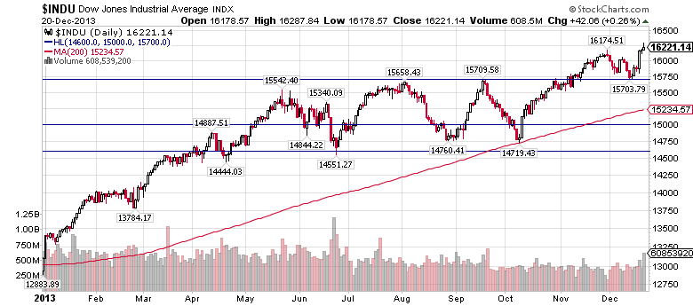
The Dow broke above 15000 in May but ran out of steam around 15500 later that same month. It then essentially moved sideways in a large trading range between roughly 14600 and 15700 testing both levels several times. After testing its 200-day MA in October it finally broke through the 15700 resistance level in mid-November. It then went back and tested 15700 as a support level just last week. Currently $INDU is setting new highs once again - a good overall sign for the market.
In many ways, 2013 was a classic "wall of worry" scenario where stocks generally moved higher despite the constant drumbeat of bearishness from the "pundits." Technicians who stuck to their charts should have profited handsomely as stocks (especially small-caps) moved higher and higher over the course of the year. Investors who ignored the charts and over-focused on the negativity in the financial press were left behind.
Again, there are still several more trading days left in 2013 but you can use these PerfCharts to see the winning sector, the winning capitalization, and the winning major index - just click the link, then right-click the "200 day" thumbnail below the chart and select "Year-to-date" from the dropdown.
As always, my New Year's resolution will be to focus on the message that the charts are telling me - not the "talking heads", not the "pundits" - but the actual trading action on Wall Street that's reflected in my charts. Here's hoping that 2014 is even more profitable for ChartWatchers everywhere!
- Chip
P.S. Don't forget to take advantage of our Holiday Special before it ends on Dec. 31st!
SITE NEWS
RECENT ADDITIONS TO STOCKCHARTS.COM
- OUR HOLIDAY SPECIAL ENDS SOON! - If you have less than 6 months remaining on your subscription (or if you just want the peace of mind of locking in this special rate), now is the time to renew your StockCharts subscription. Renew for 12 months and get 2 additional months for free. Members: Click here to get started. Non-members: Are you thinking about joining? Now's the best time for that too. Click here to learn more.
- CHARTCON 2014 LINE-UP FINALIZED - ChartCon is our yearly celebration of StockCharts and stock charting. We hold it in August in beautiful Seattle, Washington. ChartCon 2014 will be held on Friday August 8th and Saturday August 9th. We have an all-star line-up coming to present including:
- John Murphy: Chief Technical Analyst, StockCharts.com
- Alexander Elder: author of Come Into My Trading Room and Teach Me to Trade
- Martin Pring: author of Technical Analysis Explained
- Richard Arms: inventor of the Arms' Index ($TRIN) and Arms' CandleVolume
- Arthur Hill: Senior Technical Analyst, StockCharts.com
- Tom Bowley: InvestEd Central
- Greg Schnell: Senior Technical Analyst, StockCharts.com
- Gatis Roze: author of The Traders Journal blog
- Gord Greer: stock scanning expert
- Erin Heim: Technical Analyst, DecisionPoint.com
- Bruce Frazer: Wyckoff expert, Golden Gate University
- Chip Anderson: President, StockCharts.com
In addition to the big keynote presentations we're also going to be having breakout sessions and even optional "After Dark" sessions where all your questions can be answered. We'll also have a big panel discussion where our experts will share where they think the markets are headed. On the final night, we're all going on a cruise to a private island in the middle of Puget Sound for a gala dinner!
We will have more details available on the website in January but please be sure to reserve the first week of August now so you can come to Seattle and celebrate charting with us!
Wednesday's Fed announcement that it would finally begin a modest tapering of bond purchases in January gave a slight boost to bond yields during the second half of the week. The daily bars in Chart 1 show the 10-Year Treasury Note Yield (TNX) backing off Friday from its September peak near 3%. Bond yields had already risen since October in anticipation of a possible Fed move. This week's muted reaction in bond yields, however, doesn't diminish odds that bond yields will probably be heading higher during 2014. That's due partially to reduced bond purchases. But it's also due to improving economic conditions. A higher-than-expected third quarter GDP of 4.1% is the highest in nearly two years and confirms other signs of an economic rebound (like a five-year high in housing starts). What's a realistic upside target for bond yields in 2014? The weekly bars in Chart 2 show the 10-year yield having broken a six-year down trendline. Standard chart analysis suggests a possible upside target to 3.75% which is the high reached in early 2011. The pledge by the Fed to keep short-term rates down also reassured stock investors and put a limit on how high bond yields can go. My November 23 message on the yield curve relied on that pledge in arriving at an upside target for the 10-year yield: "That makes 3.75% a realistic upside target for 2014, if the Fed keeps short-term rates near zero".


Key industry group ETFs within the technology sector are leading the market. This shows a healthy appetite for risk and bodes well for the economy. The PerfChart below shows one-month performance for the S&P 500 ETF (SPY) and six tech-related ETFs. The Nasdaq 100 ETF and the Nasdaq 100 Equal-Weight ETF (QQEW) are outperforming SPY by a two to one margin. The Biotech iShares (IBB), which represents some of the riskiest stocks in the market, is outperforming the broader market by 3 to 1. The Semiconductor SPDR (XSD), which represents the cyclical semiconductor group, is also outperforming SPY by a three to one margin. Relative strength in these tech-related ETFs is positive for the market as we head into 2014.
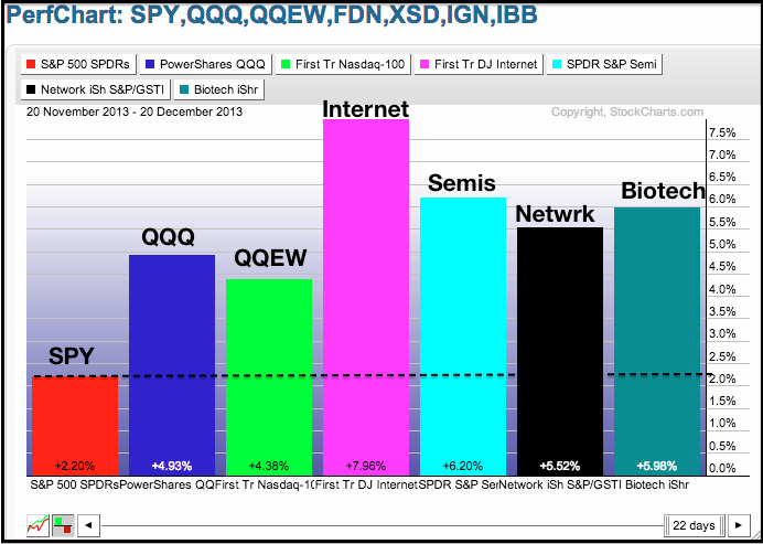
Click this image for a live PerfChart
The next chart group shows CandleGlance charts for these tech-related ETFs. Notice that the FirstTrust Internet ETF (FDN), XSD, QQQ and QQEW hit new highs last week. IBB did not hit a new high last week, but hit a new high in late November and held broken resistance with a surge above 220. The Networking iShares (IGN) was the laggard of the group, but this ETF caught fire last week and broke above the September trend line. Basically, there is broad underlying strength in the tech sector and traders should look for bullish setups within these groups as we head into 2014.

Click this image for a live CandleGlance chart
Happy Holidays! -- Arthur Hill CMT
PRICES RELATIVE TO MOVING AVERAGES
by Carl Swenlin | DecisionPoint.com
When a stock is above a moving average it is considered bullish, and the stock can be considered to be in a rising trend for that time frame. A good way to determine the market's condition (overbought/oversold) across a range of time frames is to analyze the percentage of stocks above their 20, 50, and 200 period exponential moving averages (EMAs).
The following chart shows these percentages for the stocks in the S&P 500 Index. The most obvious features are the negative divergences that persist in all time frames. In this case the divergences show that as the market moves higher, fewer stocks are participating in each new high. The divergence for Stocks Above Their 200-EMAs index is not severe, and the index is in the middle of the overbought range it has maintained all year long.
The shorter time frames (20-EMA and 50-EMA) have more severe short-term divergences. While these divergences can be eliminated if the market continues higher, they do cause concern at present.
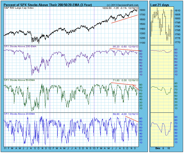
One might wonder how a market index can move higher with fewer of its component stocks participating. Well, it happens on a regular basis and is usually caused by participation narrowing to the larger-cap stocks whose high capitalizations contribute more to the value of the index.
Until the current divergences are eliminated, we have to interpret them as signs of weakness and warnings of a possible correction; however, we must also remember that price is the ultimate indicator, and in a bull market price often overrides what the indicators say.
It's quite easy to look at the S&P 500 and see if it's rallying or not. But not every rally is created equal. Many rallies carry significant warning signs that should have you running for cover. Others simply invite you to jump on the train.
Consumer stocks are telling us to jump on the train and ride this thing out. As the S&P 500 closed at yet another record high on Friday, most "under the surface" signs remain quite bullish and suggest to me that this bull market still has legs. Check out the following chart comparing the S&P 500, the XLY vs. the XLP and the 10 year treasury yield and then I'll explain it below:
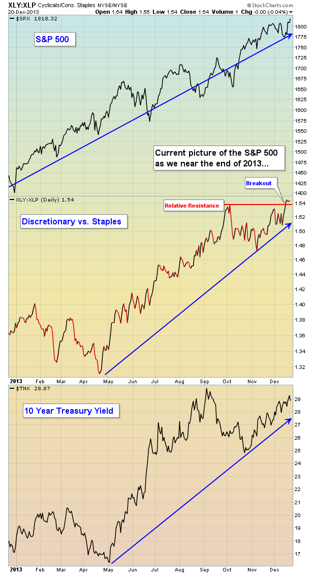
The consumer discretionary sector (XLY) is considered the more aggressive component of consumer stocks, while consumer staples (XLP) represent the safer side. Generally speaking, rallies should be accompanied by relative strength in "risk on" types of stocks such as consumer discretionary stocks. So it stands to reason that as the S&P 500 rises, we want to see the XLY vs. XLP ratio rising with it. On Friday, the S&P 500 closed at an all-time high on the heels of the XLY vs. XLP ratio breaking out to a new relative high.
Chalk one up for the bulls.
At the bottom of this chart, I've also shown the trend in treasury yields, namely the 10 year treasury yield ($TNX). When equities rise, treasuries normally fall. Falling treasuries send the yield lower as yields move inversely to treasury prices. This makes complete sense as traders have options as to which asset class they want to invest. During bull markets in equities, the proceeds from treasuries being sold generally find their way into equities. If our economy is expanding, safety is usually the last choice for traders. In a normal market environment, we should see the TNX rising to confirm the rally in equities. That's exactly what we've seen as reflected on the chart above.
Chalk another one up for the bulls.
Now I want to take you down memory lane, just prior to the last two bear markets. Let's take a look at what we DO NOT want to see. The charts below are identical to the one we just reviewed - well, with one minor exception. I think the difference in the charts below will be obvious. Have a look:
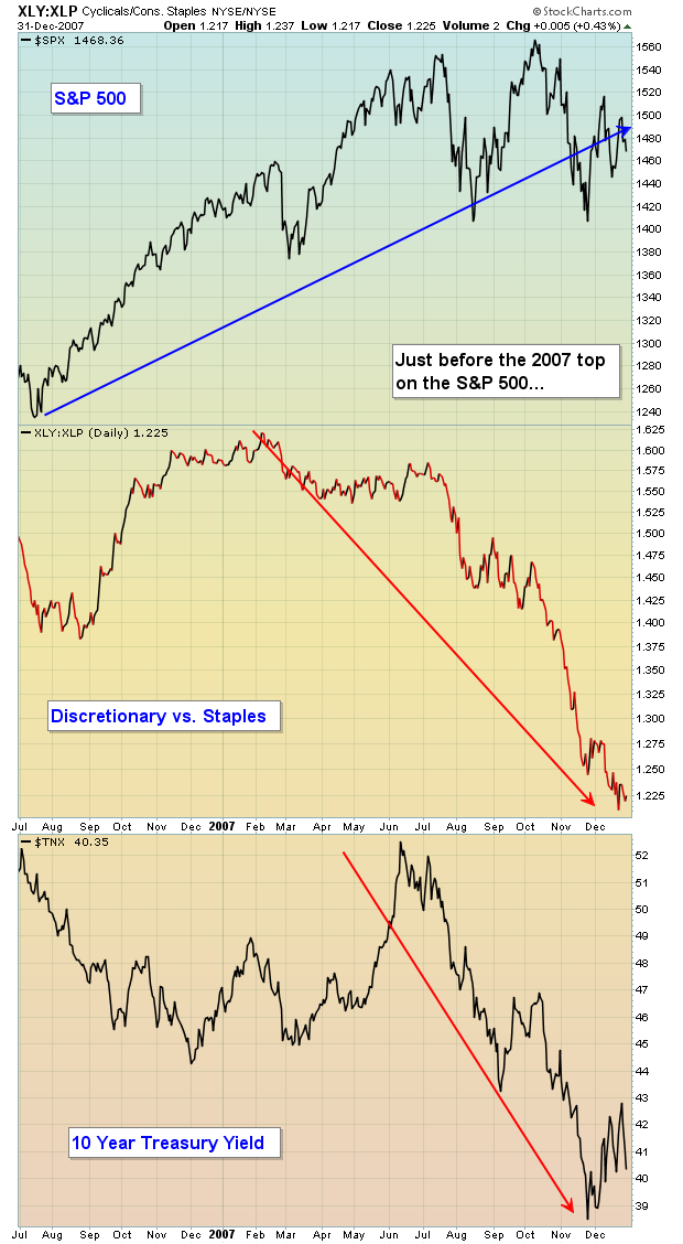
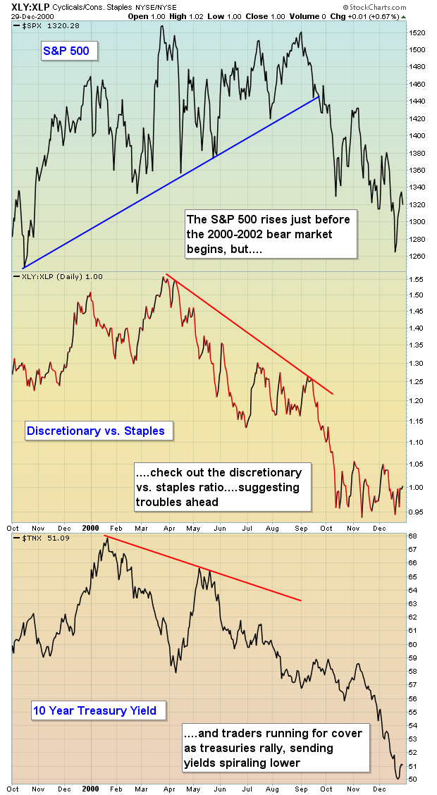
The action on these charts was VERY bearish. Yields were falling precipitously while the S&P 500 tried to push higher. In my opinion, the bond market gets it right more often than the stock market. It certainly did in these two cases. Falling yields mean rising treasuries. With the S&P 500 breaking to fresh highs, why would traders begin flocking to bonds? There's one primary reason - economic weakness ahead. The same holds true for the relationship among consumer stocks. With the S&P 500 surging, why would traders begin to take the cautious approach and move into the higher-yielding, safe consumer staples stocks?
This is when you chalk one up for the bears.
Currently, I'm just not seeing the signs of an impending top in the stock market. Believe me, I'm looking at various intermarket signs every day and every week. But you can't force a bear market, nor do I want to. Let's see where this train takes us.
I am featuring a consumer discretionary stock as my Chart of the Day for Monday, December 23rd. It's poised technically to benefit from further upside in equities. CLICK HERE for details.
It's been a great year for the stock market. Thank you for your support, have a safe and happy holiday season and HAPPY NEW YEAR!!! Let's make 2014 the best year yet!
Happy trading!
Tom Bowley
Chief Market Strategist/Chief Equity Strategist
Invested Central/EarningsBeats.com
The Rhodes Report
Richard Rhodes is on hiatus this time. Please visit The Rhodes Report for more articles by Richard Rhodes.
|
|
|
Recent StockCharts Articles You Might Have Missed
|
|
|
|
|
UPCOMING EVENTS
|
 |
StockCharts University Seminars - Live, in-person training for Technical Investors
|
|
|
|
|
|
|
|
Are you new to StockCharts.com?
|
|
Here are some activities that will help you learn more about our website:
Do you know someone else that would appreciate this newsletter? Please feel free to forward this to other people interested in stock charting. Thanks!
|
|
|
|
|
|
|
|
|
|
|
|
|
| |
|