| THIS WEEK'S ARTICLES |
| CHARTWATCHERS |
| You're One Week Away From The Two Most Transformative Days Of 2018 |
| by Grayson Roze |
|
 Hello Fellow ChartWatchers! Hello Fellow ChartWatchers!
Can you believe that we’re just ONE WEEK AWAY from ChartCon 2018? Our 5th online investing conference goes LIVE on the morning of August 1oth at 10:00am ET, and I can hardly contain my excitement. The presentations have been sent in, our bonus videos are ready to go, and the speakers start arriving in Seattle this weekend. In short, we're ready to bring you two of the most transformative, inspiring days you can imagine.
Now that we’re only a few days away from the conference, our Support Team has been receiving plenty of questions from users like you who are interested in attending ChartCon. There’s more than I can say about this incredible event in just one post, but I did want to cover a few of the most important topics that you need to know about before next Friday.
By the way, if you’ve been meaning to register for ChartCon but haven’t yet done so, CLICK HERE.
Q. “Hang on a sec, what’s a ChartCon?”
Great question. Let’s run through a quick “Who/What/When/Where/Why”, shall we?
ChartCon 2018 is our two-day investing and technical analysis conference. But it’s not like any other investing conference out there. Most other events have a bunch of folks trying to sell you on some mutual fund or get you into a new brokerage account, but ChartCon isn’t like that at all. This conference is entirely focused on helping educate and empower YOU, the modern online investor.
We’re bringing together 16 of the industry’s top technical minds – guys and gals who have invented indicators, written best-selling books, designed new technical tools and discovered game-changing ways of analyzing and trading the markets. They’re here not to sell, but to share; not to preach, but to teach. ChartCon gives you an opportunity to take a behind-the-scenes, up-close-and-personal look at the trading strategies and analysis routines of some of the financial world’s most distinguished chartists. Step into their trading rooms and join them as they reveal the secrets to their success.
The conference kicks off in just one week, and we’ll pack a TON into both days of the conference. Live presentations will run from 10:00am ET to 6:30pm ET on both August 10th and the 11th.
And the best part? ChartCon 2018 is a virtual conference, broadcast live online and streaming straight to your laptop, desktop, tablet or mobile device, anywhere in the world.
Q. “Wait, it’s a virtual conference? How is that going to work?”
Bear with me here, because I want to share a brief history of why we decided to host ChartCon online instead of in person. After hosting three ChartCons in Seattle (2011, 2012 and 2014), the idea to shift to a digital format originally came in 2015 while Chip and I were attending a physical conference in Vancouver, Canada.
We spent four days during a busy part of the year traveling up north for a two-day event. The conference was great, we learned a lot and left with some valuable action items for StockCharts. BUT…on the train ride home, both of us were swamped with emails, backlogged with work, and suddenly stressed about catching up on everything we’d missed.
Despite the mountain of work, I couldn’t stop thinking about our four days in Vancouver. I pulled out a pen and paper and quickly sketched out the costs of attending that conference. The list went something like this:
- Conference registration: $900 x 2 = $1,800
- Train tickets: $200 x 2 = $400
- Hotel: $1000 x 2 = $2,000
- Uber rides: $10
- Food: $300
It cost over $4,600 for the two of us to attend this one conference. And that doesn’t include the opportunity cost of our time or the frustrations of missing a week in the office. Sitting on the train back to Seattle, Chip and I looked at this list and said, “That’s just madness. We need to fix this.”
So with ChartCon 2016, we introduced a brand-new model. We flew all of the speakers to California, hired a professional video crew, purchased a powerful video streaming platform called Livestream and hit the “Go Live” button. 1,487 of you joined us for our first online conference in 2016, and the event was a screaming success.
By broadcasting the presentations online for you to watch on any device, in any location around the world, we were able to deliver a complete conference experience without the expense and pains of traveling to attend it.
But it’s not just the cost and convenience that really got us. Chip and I attend a lot of conferences, typically 2 to 3 per year each. They’re always full of good insights and helpful info, and we learn a lot while we’re there. But if our notes aren’t complete and we don’t follow up on everything we hear right then and there, we always find ourselves looking back at the conference a few weeks later and saying, “What was it that guy said again? He had a good point about a cool thing that…Oh man, I totally forget.”
Physical conferences are great, but they often leave you overloaded with information that you can’t take with you. What we learned from our attendees after ChartCon 2016 is that the greatest benefit of the “virtual” conference format is that the information is preserved.
Since everything is recorded and you have access to the videos forever, you get to take the entire two-day conference with you after the live video feed ends. You can go back, review, re-watch the content and follow up on the concepts and strategies you learned about. It’s this timeless nature of the online conference that makes ChartCon so powerful.
Q. “What sort of topics should I expect to hear about at ChartCon?”
When Chip and I sat down at the beginning of this year to outline our vision for ChartCon 2018, one thing was clear: the markets are heading into uncharted waters. With volatility coming back in force and interest rates on the rise, the market has made a profound shift from steady and reliable in 2017 to choppy and volatile in 2018. We decided that this year’s ChartCon needs to really focus on how to use technical analysis to protect yourself.
With that in mind, the theme of ChartCon 2018 is "Reducing Risk in Uncharted Waters". Each 1-hour presentation will relate in some fashion to the concepts of risk management, volatility, diversification, asset allocation, or general safe investing techniques. Whether you're managing your nest egg for retirement or trading actively, ChartCon will arm you with the tools and knowledge you need to prosper, even in tough market conditions like we have here today.
The great news for you as a ChartCon attendee is that today’s volatile conditions and the changes taking place in the market provide a powerful backdrop for our speakers. Each presenter will be able to frame and demonstrate the timeless concepts and strategies they share in the context of what's going on right now in the current market's rough climate. Having personally seen many of the presentation slides already, I can assure you that the content our speakers plan to share will make a lasting impact on you.
Q. “I went to a previous ChartCon. Why should I still go to this one?”
That’s an important question. After all, this is our fifth time doing this, and many of you have been to multiple ChartCons in the past. Each year, we learn valuable lessons that help us make the next conference bigger and better than ever before. With the changes we’ve lined up for this year’s event, I guarantee that you’ll get more out of ChartCon 2018 than any other year.
Also, we’ve added many new faces to the 2018 presenter list, including Tom McClellan, Dr. Alexander Elder, Tushar Chande and David Keller. The expertise they bring to the table is remarkable, and I can't wait to see each one of them up on stage.
Lastly, today's market conditions are drastically different from previous years. That means that all of our returning speakers will bring fresh content and new perspectives to ChartCon 2018. What you heard at ChartCon 2012 or watched in 2016 will be much different than the content you’ll see next weekend.
Q. “I’d love to attend, but I’m busy that weekend and can’t watch live. What should I do?”
As I mentioned above, all of the presentations and Q&A sessions at ChartCon 2018 will be recorded. As part of the ticket price (only $249 by the way), you’ll have access to those video recordings forever.
Really. Forever. They’ll be archived online and we’ll never take them away from you.
If you’re busy next weekend on August 10th and 11th, DON’T WORRY. I strongly encourage you to register now and watch later. If you end up with some free time and you can drop in to watch some of the live event, great! If not, you’ll still have the recordings to watch later on your own schedule, whenever you’re free.
There’s no penalty for not watching live and you’ll still be able to enjoy the complete ChartCon experience, even if you have to catch up on the presentations later on.
Q. “Okay, I’m intrigued, but is there anything you can show me that will give me a better idea of what ChartCon will be like?”
I’m glad you asked. While filming bonus content for the conference last month, we had a chance to sit down with a few of our featured speakers and talk to them face-to-face about ChartCon. We asked what we thought were a few simple questions like, "What are you most excited for about ChartCon?", but the totally unscripted responses we received took our breath away. In sharing their experiences and explaining why they feel this event is worth attending, these speakers truly captured the ChartCon spirit.
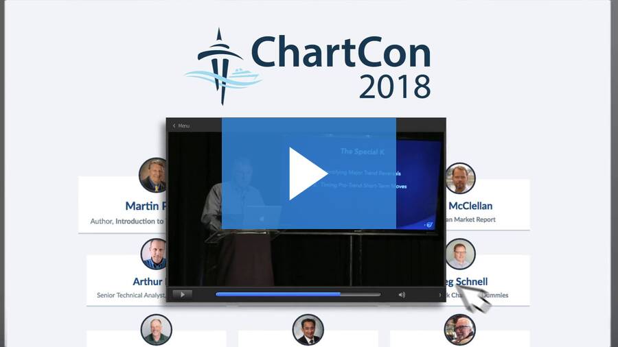
We put together the following two-minute video that you need to watch. It highlights the genuine passion our presenters bring and really illustrates their unique perspectives on ChartCon.
Q. “Remind me again, when is ChartCon and how much is it?”
ChartCon 2018 is only one week away! The conference starts on August 10th. Both days will run from 10:00am ET to 6:30pm ET, and will include live presentations and special bonus Q&A segments with each speaker. For access to the live conference, the ChartCon mobile app, and full video recordings of the entire event, the price is just $249.00.
Think about it this way: for the cost of one new tire on your car or a nice dinner out with your family, you can spend two days learning timeless investing, trading, charting and analysis strategies from some of the industry’s brightest technical minds, information that you can put to work immediately to improve your trading results. Plus, you’ll leave feeling inspired, empowered and energized.
ChartCon is really about investing in yourself, taking some time to learn and reflect and become a better investor. Our speakers are anxious to share their presentations with you, and Chip and I can’t wait to see you there.
To learn more and register, click here.
See you at ChartCon!
Grayson Roze
Business Manager, StockCharts.com
|
| READ ONLINE → |
|
|
|
| The Market Message |
| Selling in China Unsettles Global Stocks This Morning on Tariff Threats -- But US Stock Indexes Are Recovering from Early Selling |
| by John Murphy |
Editors Note: This article was originally published in John Murphy's Market Message on Thursday, August 2nd at 1:43pm ET.
TARIFF THREATS PUSH CHINESE MARKETS LOWER ... Threats of higher tariffs on Chinese imports, combined with Chinese threats of retaliation, put international markets on the defensive today. It started in Asia, spread to Europe, and caused a lower stock opening here. China took the biggest hit. The red line in Chart 1 shows the Deutsche X-Trackers CSI 300 China A-Shares ETF (ASHR) falling more than 2% today to the lowest close in more than a year. That helped pull emerging market stocks and currencies lower. The green line in Chart 1 shows the WisdomTree Chinese Yuan Fund (CYB) also falling to the lowest level for the year. The falling yuan contributed to another drop in the price of copper which is trading near a 52-week low. In Europe, export-oriented countries like Germany led the day's decline there. A modest dip in global bond yields reflected some safe haven buying as well. And as usually happens when global markets are under stress, money flowed into the U.S. dollar. That weakened stocks tied to materials, while export-oriented industrials lagged behind in morning trading. The good news is that stock indexes in the states are trying to recover from their earlier losses. Technology stocks are leading the way.
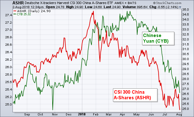 Chart 1 Chart 1
|
| READ ONLINE → |
|
|
|
| Art's Charts |
| Finding Leading Stocks in Strong Uptrends (Trend Following) |
| by Arthur Hill |

Trend following strategies are built on the premise that trends persist and we can make money by simply following the trend until it ends. There will be losers along the way, but a few strong trends will more than make up for the losses. It sounds great in theory, but putting it into practice is, of course, another matter.
The first step to trend following is finding strong uptrends. As far as stocks are concerned, we should also focus on leading stocks. Thus, we need an indicator that captures strong trends and upside leadership.
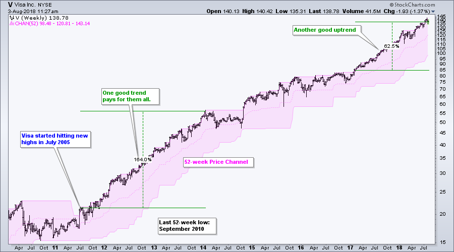
Enter the humble Price Channel, also known as the Donchian Channel, which was popularized by Richard Dennis and the Turtles. Price Channels are simple. The upper line marks the previous period's highest price over a specific period, the lower line marks the lowest price and the middle line is an average of the two. The example below shows Visa with 52-week Price Channels to identify the previous week's 52-week high. A new 52-week high occurs when price exceeds the upper line of the Price Channel.

Leadership in the stock market is important because institutions love the leaders. We can find leaders by identifying stocks that are making 52-week highs. It just so happens that stocks making new 52-week highs are also in strong uptrends. Thus, we can catch two salmon with one fly using the Price Channel.
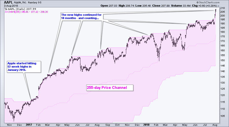
 In daily terms, we can set the Price Channel to 255 days to capture 52 week highs. The example above shows Apple starting to hit 255-day highs in January 2016. A strong uptrend extended until May 2017 and then a choppier uptrend took hold. Despite seemingly erratic price action, the stock kept hitting new highs and kept the uptrend alive. Trend followers were duly rewarded. In daily terms, we can set the Price Channel to 255 days to capture 52 week highs. The example above shows Apple starting to hit 255-day highs in January 2016. A strong uptrend extended until May 2017 and then a choppier uptrend took hold. Despite seemingly erratic price action, the stock kept hitting new highs and kept the uptrend alive. Trend followers were duly rewarded.
Want to learn more about trend following? Well.....ChartCon and trend following are coming to a screen near you. I will present some trend following strategies complete with backtest results to set expectations. I will also show proven techniques to mitigate risk, increase returns and improve your batting average. Join me and 15 other awesome speakers on August 10th and 11th for two days of empowerment.

Plan Your Trade and Trade Your Plan.
- Arthur Hill, CMT
Senior Technical Analyst, StockCharts.com
Book: Define the Trend and Trade the Trend
Twitter: Follow @ArthurHill
|
| READ ONLINE → |
|
|
|
|
|
| The Canadian Technician |
| Are Railroads Still Rolling In Profits? |
| by Greg Schnell |
Just a reminder, I am the opening speaker kicking off Chartcon 2018 on Friday morning, August 10th! DON'T BE LATE! I hope to be one of the strongest presentations to kick this off. While I love the SCTR, my presentation this year will be a totally different method of simply finding great set ups based on some of the biggest names in Technical Analysis. I am up against some fabulous speakers so I have my work cut out for me.
Seriously, when do you get to hear published authors Martin Pring, David Keller, Greg Morris, Alexander Elder, John Murphy, Arthur Hill, and Greg as just part of the roster? People have crossed the world to listen to some of these presenters. I could list the full speaking roster here but its unbelievable! Follow this link to check out the entire list. Register right away so you get all of the information regarding how to optimize the software and the Chartcon guide.
For my Chartwatchers article this week, I want to check in on American freight. The price of fuel has been accelerating, so I thought I would look in on the railroads to see if investors are bidding the stocks down as cost increases flow through to them. We know crude oil has been holding up around $70 while Gasoline and Diesel are living in the top right corner of their charts.
Railways also risk having pressure from their customers as they move a lot of stuff that has been influenced by tariffs. Railways move iron ore, which then becomes raw steel for the fabrication of the vast size range of agriculture equipment and then they move the finished products. In speaking with a local farmer, he mentioned agriculture equipment costs are jumping.
In my Final Bar video recording on Thursday, August 2nd, I noticed that CAT and BA were near the bottom of the Dow 30 list in terms of price action calculated by the SCTR. CAT closed Friday with an SCTR at 19 and BA 55. Deere and Co. (DE) which is not in the Dow, closed Friday with an SCTR at 25. Ouch!
On a personal note, I am rolling through the oil fields of Canada this weekend. With the Duvernay and Montney oilfields picking up in activity, the Canadian oil patch is starting to speed up. In the USA, the oil stocks have also been improving as the Permian and Eagleford fields are all the rage.
Railways haul the steel for the oil patch that is used in pipe, compressors stations, pump jacks, drilling rigs, valves, engines, heavy haul trucks, and skid decks for portable housing and mobile offices.
The use of steel and aluminum is also prevalent in automotive and airplane manufacturing which is well known.
So with fuel and tariffs at the heart of the manufacturing industries, how are the railways holding up? As Charles Dow noted a hundred years ago, both the manufacturing and the transportation stocks should move up together.
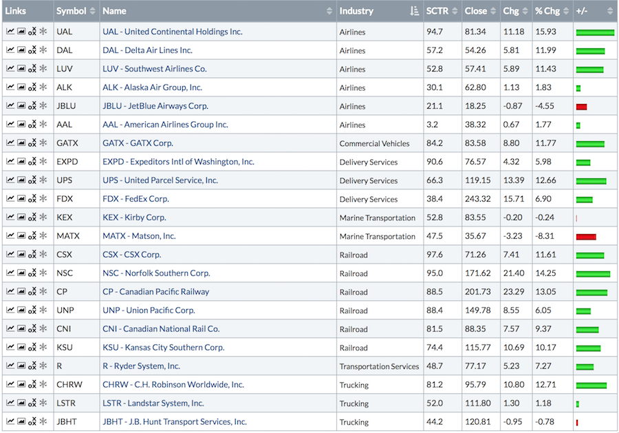
The list below shows all of the railways with an SCTR ranking holding up really well. Every railroad has an SCTR better than 70, which is excellent. The list shows the price improvement over the last month. WOW!

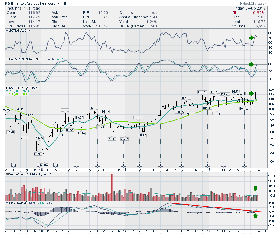
If we look at the weakest performer which is still strong, KSU suggests no need to worry yet. This is the lowest ranked railway and the price just broke out to new highs. If KSU lost support at the 40 week moving average at $108, that might indicate a whipsaw or failed breakout. That would be noteworthy but currently the rails are rolling. If the rest are better than that, thats crazy good! I'll let you check out the charts individually to decide is the SCTR is accurate! (Hint - extremely!)

Below is the recording of The Final Bar show I mentioned above. As Apple moved above the trillion dollar market cap, the $INDU chart closed down on the day. This led into a discussion about examining the underlying price action and how to quickly create index chartlists with just a few keystrokes.
Below is the recording of The Canadian Technician Video. This video shows some great examples of how breadth breaks down before the markets weaken.
Below is the Commodities Countdown video that walks through the concerns in the index set up right now.
Don't forget to register for Chartcon 2018.
If you are missing intermarket signals in the market, follow me on Twitter and check out my Vimeo Channel often. Bookmark it for easy access!
Good trading,
Greg Schnell, CMT, MFTA
Senior Technical Analyst, StockCharts.com
Author, Stock Charts for Dummies
Want to read more from Greg? Be sure to follow his two StockCharts blogs:
Commodities Countdown and The Canadian Technician
|
| READ ONLINE → |
|
|
|
| Trading Places |
| The Question Rarely Addressed - When Do I Sell? |
| by Tom Bowley |
Buying is so easy. When you pull that trigger to buy, optimism abounds. Maybe it was a recommendation from a friend. Perhaps there was water cooler talk of the next Apple (AAPL). You might even have uncovered it from a time-tested scan. The reason doesn't really matter. The bottom line is you believe the stock just purchased is going to make you money. It might. It might not. The bigger question is have you thought about when you're going to sell.
Keep in mind that I write this blog article from a short-term trader's perspective. I don't buy and hold. Ever. Heck, I won't even hold through a quarterly earnings report. I want to manage risk. How do you manage risk holding into a spin on the roulette wheel? Oops, I meant earnings report. :-)
To be fair, there are options strategies available to lower the risk of earnings shocks, but I'm assuming the majority of stock traders don't use option strategies. I don't. So to mitigate the risk of earnings, I simply get out of the way and move to cash.
If you're a short-term trader like me, let me give you two reasons that I use to sell in the short-term.
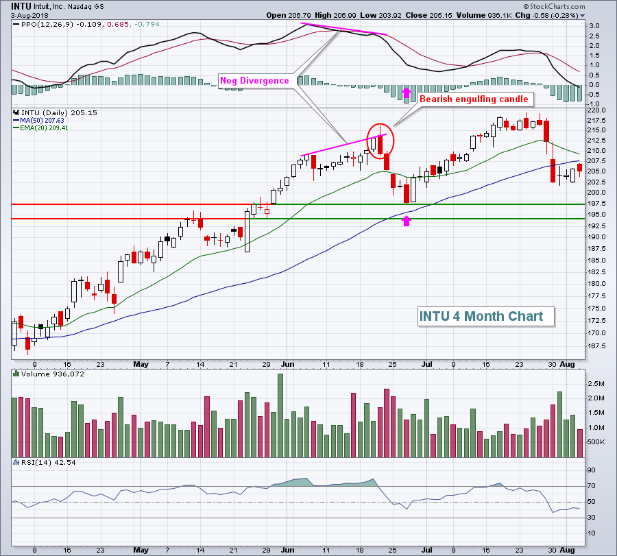
1. PPO negative divergence accompanied by a reversing candlestick
Ok, the theory here is that a negative divergence is a signal of potential slowing momentum. The reversing candlestick confirms it. Intuit (INTU) was a great recent example:
 I am not suggesting that INTU isn't a great long-term investment and that it's topping. What I am saying is that, as a short-term trader, I'm happiest if I can capture short-term profits at short-term peaks. At that point, it frees up cash to pursue other trading opportunities while I've eliminated the "risk" of a pullback in INTU. In the above example, I don't suffer through the next four days of selling. For me, the worst trade is one where I fail to capture profits, then ride a stock back down. It ties up capital, not to mention loses the money I once had earned. I am not suggesting that INTU isn't a great long-term investment and that it's topping. What I am saying is that, as a short-term trader, I'm happiest if I can capture short-term profits at short-term peaks. At that point, it frees up cash to pursue other trading opportunities while I've eliminated the "risk" of a pullback in INTU. In the above example, I don't suffer through the next four days of selling. For me, the worst trade is one where I fail to capture profits, then ride a stock back down. It ties up capital, not to mention loses the money I once had earned.
2. False breakout, especially on slowing volume
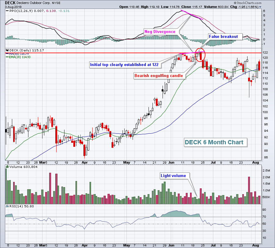
I like to buy at the bottom of an established trading range of an uptrending stock and sell at the top of that range. Yes, it might go through price resistance as an uptrend results in price resistance eventually being cleared. The key word here is eventually. I don't like holding as my trade moves up and down like a roller coaster ride at an amusement park. If I get the opportunity to take my profits, I do it. But if you do hold a bit longer and appear to be getting that breakout that you're looking for, be careful if it turns out to be nothing more than a mirage. When a stock breaks through price resistance, it should generate buying volume and the breakout should stick into the close. I have literally seen thousands of charts where these "false breakouts" occur and the stock pivots and reverses back to the downside. Obviously, it's not a guarantee of a move lower, but I want the odds on my side and usually you'll see an extended reversal. What do these false breakouts look like? Well, here's just one example:
 In addition to the false breakout on light volume, DECK gave us a bonus sell signal in the form of a negative divergence accompanied by a bearish engulfing candle. While there was no guarantee of a pullback, the odds were certainly increasing that we were going to get one. In addition to the false breakout on light volume, DECK gave us a bonus sell signal in the form of a negative divergence accompanied by a bearish engulfing candle. While there was no guarantee of a pullback, the odds were certainly increasing that we were going to get one.
In my ChartCon 2018 presentation slated for Saturday, August 11th, I will share several trading strategies that help manage risk as a short-term trader and hopefully teach you how to better capture profits. I will be joined by many of my technical analysis colleagues from around the globe, with credentials unmatched in our industry, to provide attendees our thoughts about the stock and bond markets and share our collective wisdom from years of experience, learning, teaching, trading and investing. I have attended countless webinars and conferences over my lifetime and I can assure you they are NOTHING like ChartCon. ChartCon is both educational and inspirational. Not only would I recommend that each and every one of you attend, I would also suggest that you pass ChartCon along to your children and grandchildren. I have been a part of every ChartCon and the information shared will change the financial future for our younger generation. If they're not already investing in their futures, they should begin to do so and ChartCon would be a great start!
You can register for ChartCon 2018 by CLICKING HERE. Enjoy the conference and send me feedback throughout with the ChartCon 2018 Mobile App. I'd love to hear from you!
Happy trading!
Tom
|
| READ ONLINE → |
|
|
|
|
|
| DecisionPoint |
| Fundamentals: Market Still Extremely Overvalued |
| by Carl Swenlin |
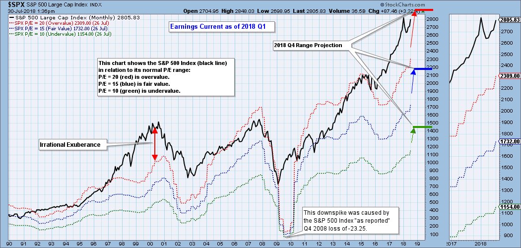
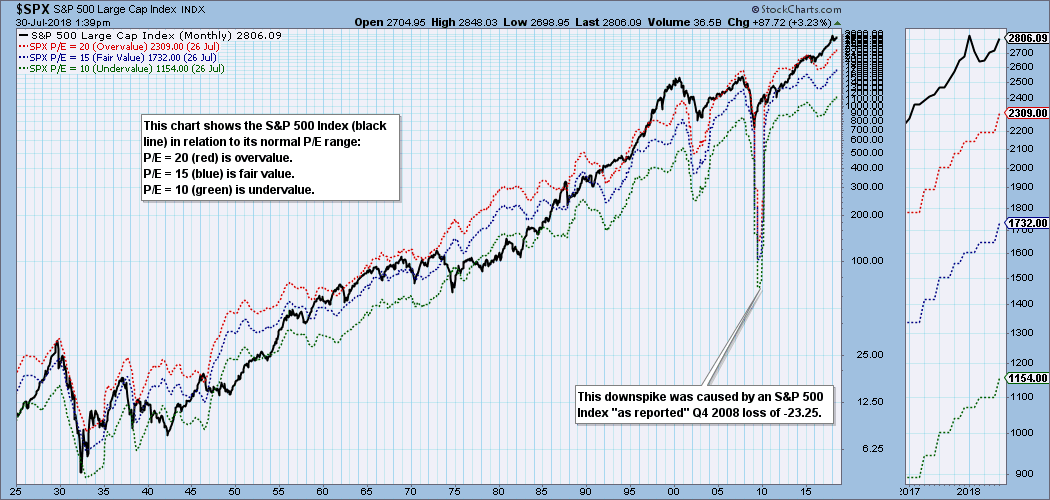
What's a technical guy doing talking about fundamentals? Well, I believe that charts of fundamental data are as useful as price charts in helping us visualize fundamental context and trends. In the case of earnings, the following chart shows us where the S&P 500 would have to be in order to have an overvalued P/E of 20 (red line); fairly valued P/E of 15 (blue line), or an undervalued P/E of 10 (green line). I have added three hash marks on the right side of the chart to show where the range will be at the end of this fiscal year based upon earnings estimates for 2018 Q4.
 For over 90 years of market history price has usually stayed below the top of the value range (red line); however, since about 1998 it is more common for price to exceed normal overvalue levels. Some call this the "new normal," but I think that Igor in the movie, Young Frankenstein, provides us with a more appropriate label: "Abby Normal." For over 90 years of market history price has usually stayed below the top of the value range (red line); however, since about 1998 it is more common for price to exceed normal overvalue levels. Some call this the "new normal," but I think that Igor in the movie, Young Frankenstein, provides us with a more appropriate label: "Abby Normal."

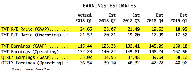
The table below shows how earnings are expected to improve going forward, but the drop in P/E shown is only possible if price doesn't change, which, of course, probably won't be the case. And in the best case shown (2019 Q1), the market will still be very overvalued.

The following table shows where the colored bands will be as earnings improve.

CONCLUSION: The S&P 500 is well above the normal value range and is extremely overvalued. Historically, overvalued conditions leave the market vulnerable for a large correction or bear market. The current conditions are not a signal for immediate action, rather, it is part of the context in which we should view the market during the process of making decisions. In short, valuations are working against us.
Technical Analysis is a windsock, not a crystal ball.
Happy Charting!
- Carl
NOTE: The signal status reported herein is based upon mechanical trading model signals, specifically, the DecisionPoint Trend Model. They define the implied bias of the price index based upon moving average relationships, but they do not necessarily call for a specific action. They are information flags that should prompt chart review. Further, they do not call for continuous buying or selling during the life of the signal. For example, a BUY signal will probably (but not necessarily) return the best results if action is taken soon after the signal is generated. Additional opportunities for buying may be found as price zigzags higher, but the trader must look for optimum entry points. Conversely, exit points to preserve gains (or minimize losses) may be evident before the model mechanically closes the signal.
Helpful DecisionPoint Links:
DecisionPoint Chart Gallery
Trend Models
Price Momentum Oscillator (PMO)
On Balance Volume
Swenlin Trading Oscillators (STO-B and STO-V)
ITBM and ITVM
SCTR Ranking
|
| READ ONLINE → |
|
|
|
| RRG Charts |
| Relative Rotation Graphs can show (much) more than just equity sectors |
| by Julius de Kempenaer |
Relative Rotation Graphs are a great tool to visualize equity sector rotation and they are probably most used for that purpose. However, there are many more areas where RRGs can be used to get a big picture view of what is going on among a group of securities or related financial instruments.
Commodities
One of these areas is commodities. Here at Stockcharts.com commodities are regularly commented on by Greg Schnell, among others, who even has the commodities countdown blog, dedicated to the commodity markets.
As there are many commodity-related indices, ETFs, and mutual funds etc. I have tried to put together a balanced set of ETFs (or ETNs as these are called) covering a wide array of commodity sub-indices.
setting up a universe
When I put together universes for use in Relative Rotation Graphs, I am always looking for securities that belong to the same "family". For the equity sectors, for example, I mostly use the SPDR sector ETFs. They are all managed by the same provider which means that there will be no overlap and consistency in the membership of stocks etc.
For commodities, it is a bit harder to find consistency as there are many providers of indices and tradeable products but not all available (sub-)indices are covered by tradeable products. I have yet have to find a resource that covers all in a consistent manner.
From a commodity indices "family" point of view, Bloomberg does a good job with its Bloomberg commodity indices family. You can find more information about this here. But it seems that they literally yesterday (3 August) have made some changes to the setup of the sub-indices.
For the time being and for this purpose I will use a set of data that comes close AND is available on Stockcharts.com
For the time being my setup for commodities is visualized in the RRG below.

As we are using ETFs/ETNs here we are depending on the availability of these products in the markets. The index provider can create (sub-)indices but if banks or asset managers do not create any tradeable products based on these indices it is still hard to trade them or create exposure.
The alternative in this case, and depending on the situation this may even be the preferred way to analyze a universe, is to use the underlying indices instead of the ETF/ETN based on that index.
Stockcharts carries a lot of these underlying indices, ticker symbols starting with $BCOM.. as well, which expands our possibilities.
Because of the recent changes, I want to examine this index family a bit better in coming weeks and see if I can come up with a pre-defined and pre-populated set of commodity universes and make them available in the selection drop-down on the RRG page.
Commodity rotation
Let's go back to the RRG and see what's going on in this universe at the moment.
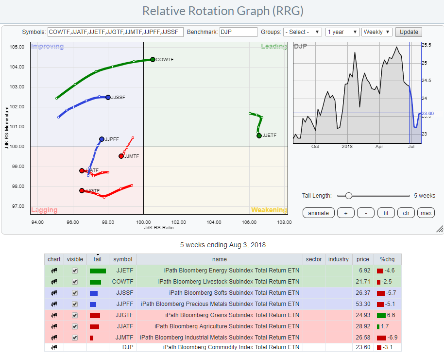
The Relative Rotation Graph below shows the relative position of almost all major sub-indices that make up the Bloomberg Commodity index total return index against the ETF/ETN that tracks this index, DJP.
Energy sub-index dominates the commodity universe
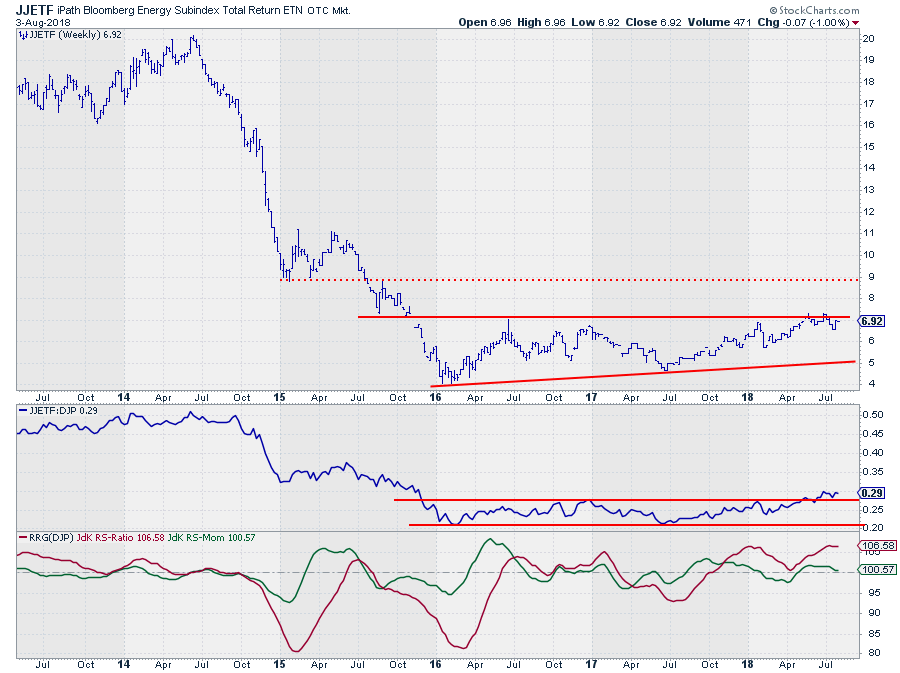
The big outlier here is clearly the energy subindex which is far away to the right at a high JdK RS-Ratio level but moving lower on the JdK RS-Momentum scale.
This sub-index has dominated the relative rotation among commodities since roughly Q4-2017 and it is still in a leading position.
 The price chart shows heavy overhead resistance around $ 7 which needs to give way for a further rise. After $ 7 the next resistance level is not showing up until $ 9. The price chart shows heavy overhead resistance around $ 7 which needs to give way for a further rise. After $ 7 the next resistance level is not showing up until $ 9.
The relative strength against DJP is a different story. during 2016 and 2017 the RS-line moved in a sideways range but managed to break out of that range a few weeks ago. The RRG-Lines picked up a relative uptrend vs DJP late last year after which RS-Ratio remained above 100.
RS-Momentum moved below 100 for a few weeks at the start of the year, rotating JJETF through the weakening quadrant and back into leading again in the second half of April. At the moment the RS-Momentum line is again about to crossover into weakening but given the high reading of RS-Ratio and the upward break out of the range on the RS-chart, the odds seem to be in favor for another rotation through weakening and then back to leading. Offering another entry opportunity, probably in coming weeks.
Let me know what you think of this usage of RRG in the comments below. If you would like to receive a notification when a new RRG blog article is published, simply "Subscribe" with your email address.
Julius de Kempenaer | RRG Research
RRG, Relative Rotation Graphs, JdK RS-Ratio, and JdK RS-Momentum are registered TradeMarks ®; of RRG Research
Follow RRG Research on social media:
If you want to discuss RRG with me on SCAN, please use my handle Julius_RRG so that I will get a notification.
|
| READ ONLINE → |
|
|
|
| MORE ARTICLES → |
|
 Chart 1
 Hello Fellow ChartWatchers!