| THIS WEEK'S ARTICLES |
| The Market Message |
| Monthly Sector Rankings Show Defensive Leadership |
| by John Murphy |
Editor's Note: This article was originally published in John Murphy's Market Message on Friday, June 14th at 1:20pm ET.
Chart 1 is taken from the Sector Summary page for the past month. And it shows that investors are still gravitating toward defensive issues. Four of the top sectors are utilities, health care, real estate, and consumer staples. All four are defensive in nature. Even the month's strongest sector has a defensive tilt. Materials were the month's strongest sector. But it was led higher by gold miners which rallied on the back of a stronger gold market. Gold has been rallying along with other traditional safe havens like Treasury bonds and bond proxies like staples, utilities, and REITs.
Chart 1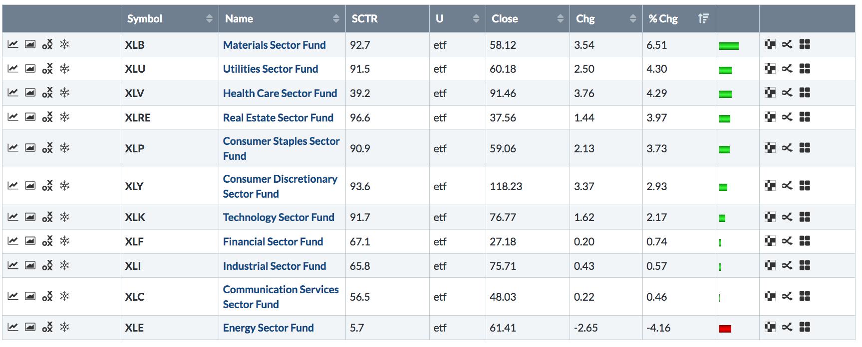
|
| READ ONLINE → |
|
|
|
| SPECIAL EVENT - WATCH LIVE |
| This weekend, The MoneyShow is in Seattle for a jam-packed two day event. Our own Gatis Roze is a featured speaker, and his presentation will be streamed LIVE online for you to watch. Click the banner below to learn more and be sure to tune in tomorrow (Sunday, June 16th) at 4:00pm PT to catch Gatis' presentation. |
 |
| LEARN MORE → |
|
| Art's Charts |
| Are Small-caps Really the Canaries in the Coal Mine? |
| by Arthur Hill |
 Many a pundit considers small-caps as the canaries in the coal mine and this implies that relative weakness in small-caps is negative for the broader market. As Missanei of Game of Thrones might say: It is known. Known, yes, but is it actually true? Many a pundit considers small-caps as the canaries in the coal mine and this implies that relative weakness in small-caps is negative for the broader market. As Missanei of Game of Thrones might say: It is known. Known, yes, but is it actually true?
In the interest of full disclosure, I bought into the argument that small-caps were the canaries in the coal mine and relative weakness was negative for the broader market. It certainly makes sense, but the markets often march to the beat of a nonsensical drummer.
We can certainly eye-ball charts and find instances when relative weakness in small-caps provided a bearish omen for the broader market. We can also find instances when relative weakness in small-caps did not matter. The only way to truly know is to quantify performance and test over an extended timeframe. Here we go....
The first chart shows the Russell 2000 relative to the S&P 500 ($RUT:$SPX ratio) in the top window. This ratio rises when the Russell 2000 outperforms, which also means the S&P 500 is underperforming. The ratio falls when the Russell 2000 underperforms, which also means the S&P 500 is outperforming. Note that the Russell 2000 underperformed the S&P 500 from 1995 to 1999, outperformed from 1999 until 2006 and performed in line with the S&P 500 over the last 14 years. Of course, there were bouts of outperformance and underperformance within this flat stretch.
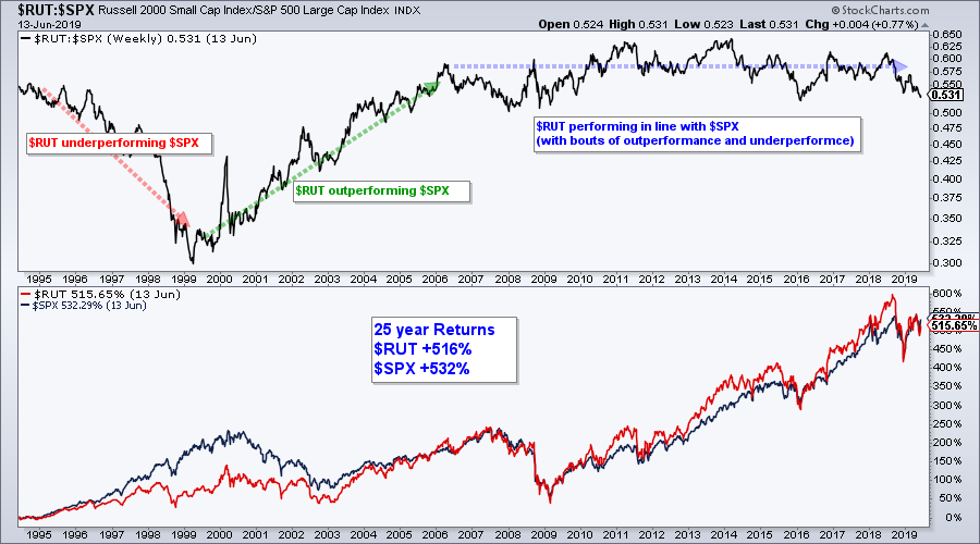
The 25-year performance in the bottom window is most telling. The Russell 2000 was up around 600% in August 2018 and outperforming the S&P 500, but gave some back and is now underperforming. As of June 13th, the Russell 2000 was up 516% over the last 25 years and the S&P 500 was up 532%. Yes, the S&P 500 has outperformed the Russell 2000. Frankly, I find it pretty amazing that the S&P 500 has more than held its own throughout this 25 year period.
We can quantify periods of relative strength and relative weakness using the Rate-of-Change (ROC) of the $RUT:$SPX ratio. In particular, the Russell 2000 is clearly outperforming when the 26-week ROC of $RUT:$SPX exceeds +5% and underperforming when the 26-week ROC of $RUT:$SPX exceeds -5%. The chart below shows this indicator in the lower window with bullish signals in green (cross above +5%) and bearish signals in red (cross below -5%).
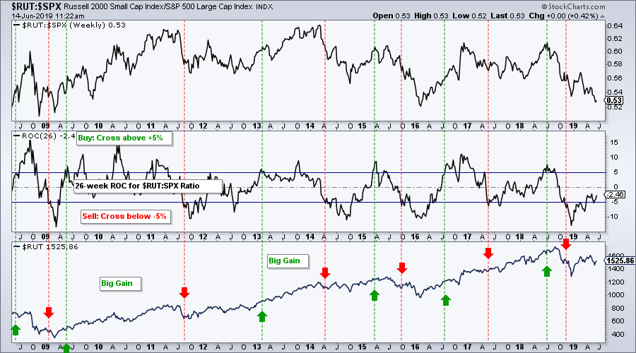
To test these signals, the strategy buys the Russell 2000 when it outperforms (ROC cross above +5%) and sells when it underperforms (ROC cross below -5%). The chart above shows 11 years and this is not enough for a backtest because there were not any extended bear markets. Instead, I decided to run this test over a 25 year period and the results are shown in the table below. The first line with gray shading shows results when buying $RUT outperformance and selling $RUT underperformance, while the second line shows the opposite (buying $RUT underperformance and selling $RUT outperformance).
 As the results show, buying the Russell 2000 when it showed strong outperformance did not work out well over the last 25 years. This is hardly surprising when we consider the first chart in this article. There were seven winning trades and five losing trades. The average gain was 20.5%, which is good, but the average loss was high too (18.91%). As the results show, buying the Russell 2000 when it showed strong outperformance did not work out well over the last 25 years. This is hardly surprising when we consider the first chart in this article. There were seven winning trades and five losing trades. The average gain was 20.5%, which is good, but the average loss was high too (18.91%).
In contrast, buying the Russell 2000 when it was underperforming worked much better. The Compound Annual Return was 6.7% with nine winners and four losers. The average gain was 22.5% and the average loss was just 4.2%. This means it is better to buy the Russell 2000 when it is underperforming the S&P 500. Put another way, buy $RUT when the S&P 500 is leading.
Note that I also tested a moving average crossover strategy and the results were similar. Buy when the 10-week SMA of the $RUT:$SPX ratio crosses above the 40-week (outperforming) and sell when the 10-week crosses below the 40-week (underperforming). Again one would have been better off buying when the 10-week SMA moved BELOW the 40-week SMA and selling when the 10-week moved above the 40-week.
Traders are better off buying the Russell 2000 when the S&P 500 is outperforming. This suggests that the S&P 500 is the main driver for stock prices, small and large. Small-caps are not the canary in the coal mine because the S&P 500 is the 800-pound gorilla in the market. If anything, chartists should become concerned when the S&P 500 starts lagging the Russell 2000. While past performance does not guarantee future performance, the last 25 years suggest that we at least need a rethink when it comes to interpreting relative weakness in small-caps.
And just to take this one step further, what if we trade $SPX instead of $RUT? The next table shows the same trades, but buying the S&P 500 when the Russell 2000 underperforms and selling when the Russell 2000 outperforms. As with the table above, the best results are to buy the S&P 500 when the Russell 2000 underpeforms and sell when $RUT outperforms (CAR 6.97%, Wins 10, Losses 3, Avg Gain 20.13%, Avg Loss (3.82%). This is basically buying when $SPX outperforms and selling when $SPX underperforms.

Clearly, the S&P 500 is the key driver for stocks and stocks perform best when large-caps lead. The Russell 2000 is just along for the ride.
On Trend on YouTube (Thursday, June 13th)
- SPY, QQQ and IWM Hold Breakouts
- Biotech ETFs Hit Reversal Zones
- Chinese ETFs Diverge as ASHR Outperforms
- "On Trend" Stocks to Watch
- Click here to Watch
Arthur Hill, CMT
Senior Technical Analyst, StockCharts.com
Author, Define the Trend and Trade the Trend
Want to stay up to date with the latest market insights from Arthur?
– Follow @ArthurHill on Twitter
– Subscribe to Art's Charts
– Watch On Trend on StockCharts TV (Tuesdays / Thursdays at 10:30am ET)
|
| READ ONLINE → |
|
|
|
| The Canadian Technician |
| Lumber Stocks Try To Bounce |
| by Greg Schnell |
Commodities have been smothered for years. I think the best way to play them is to enter near the bottom - with tight stops - and subsequently ride out the runs. When they top out, step aside as they pull back. We can use indicators to help us find setups. There is no guarantee that we'll have found the final low, but, remember, our stops can also be tight.
This week, the lumber-related stocks are trying to rally.
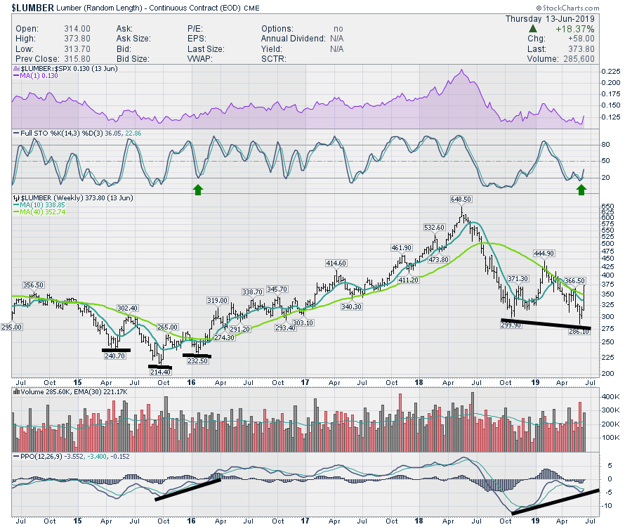
Here is the chart of Lumber. The Full Stochastic has given a buy signal this week and the PPO is close to giving a signal as well. I do like the positive divergence on the PPO compared to the price. While price made a lower low, the PPO is making a significantly higher low, which is commonly seen on final bottoms.
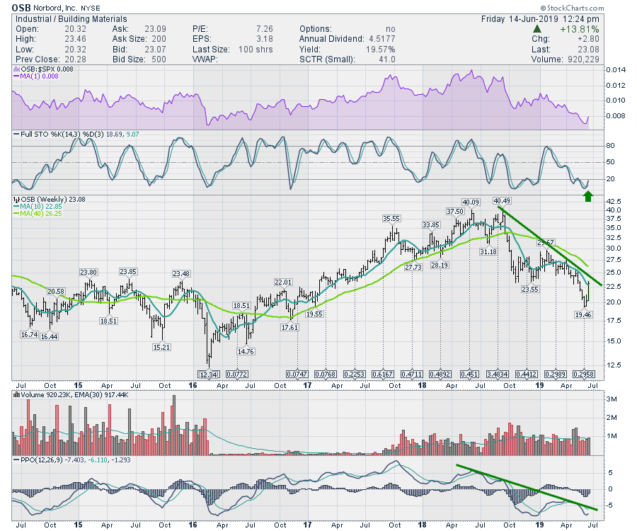
 With the underlying product as an anchor, a few of the lumber-related names have started to surge. Norbord, the maker of the Oriented Strand Board (which is the reason the ticker symbol is OSB), can be seen with huge price waves on the chart below. The Full Stochastic indicator has turned up, giving us a signal. The PPO has not turned up yet, but that would be the second signal. I would like to see the trend line on the PPO broken soon, but this current setup makes for a nice entry. We can set our stop below the last low and move it up as price responds. With the underlying product as an anchor, a few of the lumber-related names have started to surge. Norbord, the maker of the Oriented Strand Board (which is the reason the ticker symbol is OSB), can be seen with huge price waves on the chart below. The Full Stochastic indicator has turned up, giving us a signal. The PPO has not turned up yet, but that would be the second signal. I would like to see the trend line on the PPO broken soon, but this current setup makes for a nice entry. We can set our stop below the last low and move it up as price responds.
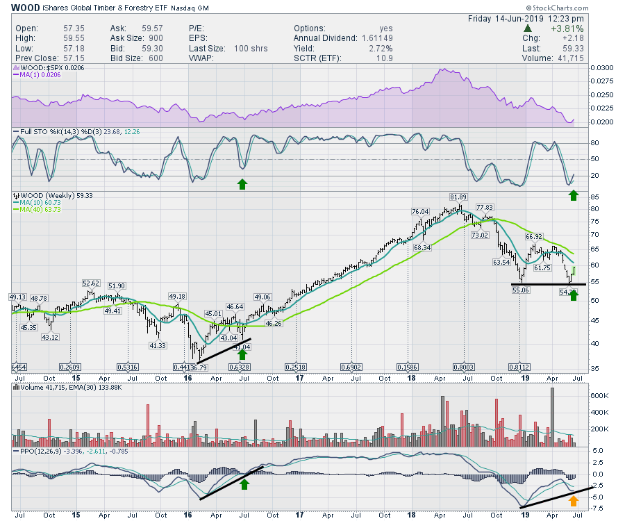
 Another way to play the group is through the WOOD ETF, where we can see similar clues of a nice place to enter. Another way to play the group is through the WOOD ETF, where we can see similar clues of a nice place to enter.
 Another week, another place to look for more improvements in the commodities. The lumber-related trade looks nice here. Another week, another place to look for more improvements in the commodities. The lumber-related trade looks nice here.
Good trading,
Greg Schnell, CMT, MFTA
Senior Technical Analyst, StockCharts.com
Author, Stock Charts For Dummies
Want to stay on top of the market's latest intermarket signals?
– Follow @SchnellInvestor on Twitter
– Connect with Greg on LinkedIn
– Subscribe to The Canadian Technician
|
| READ ONLINE → |
|
|
|
| Earnings Beats |
| I've Never Seen An Earnings Signal This Bullish |
| by John Hopkins |
At EarningsBeats.com, we track the best U.S. companies in a "Strong Earnings ChartList." In order for a company to be included in our ChartList, they must do 3 things:
(1) Beat quarterly revenue estimates
(2) Beat quarterly EPS estimates
(3) Look solid technically
If a company doesn't meet those 3 requirements, we ignore them. Plenty of energy and materials stocks have met requirements 1 and 2 over the past 90 days, but the sectors have been shunned by Wall Street due to a strengthening U.S. Dollar Index and many of these companies are in downtrends, or at least relative downtrends (vs. the S&P 500). Therefore, they do not meet requirement 3 above. We currently have 273 companies on our Strong Earnings ChartList, broken down by sector as follows:
Aggressive sectors:
Technology - 83
Industrials - 46
Consumer Discretionary - 45
Financials - 26
Communication Services - 17
Total aggressive sector stocks - 217
Defensive sectors:
Healthcare - 26
Consumer Staples - 12
Real Estate - 12
Utilities - 1
Total defensive sector stocks - 51
Other sectors:
Energy - 4
Materials - 1
Total other sectors - 5
A couple things really stand out to me. Firstly, the ratio of aggressive sector stocks to defensive sector stocks is more than 4 to 1, the highest ratio we've ever had at EarningsBeats.com. If more aggressive stocks are beating earnings estimates and looking good technically than defensive stocks, it's a signal that Wall Street believes the stock market will move higher. It's not just analysts talking bullishness - it's analysts putting their collective money where their mouths are!
We see a similar aggressive-to-defensive ratio when we compare consumer discretionary stocks (XLY) against consumer staples stocks (XLP). It's nearly 4 to 1! The following chart is how the consumer discretionary stocks (aggressive) have been performing vs. their consumer staples counterparts (defensive) on a technical basis:
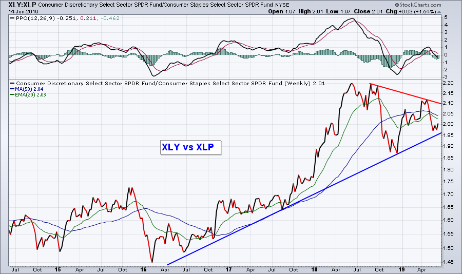 This further confirms the rotation to aggressive areas of the market vs. defensive areas, as the overall uptrend is clearly higher in spite of the consolidation over the past year or so. This further confirms the rotation to aggressive areas of the market vs. defensive areas, as the overall uptrend is clearly higher in spite of the consolidation over the past year or so.
Here's a second impressive stat from this ChartList. The software industry is represented on our ChartList by 42 companies. 42!!! That's almost as many stocks as the entire list of defensive sectors, which totaled 51. And when you look at a relative chart of software vs. the S&P 500, it's no wonder why!
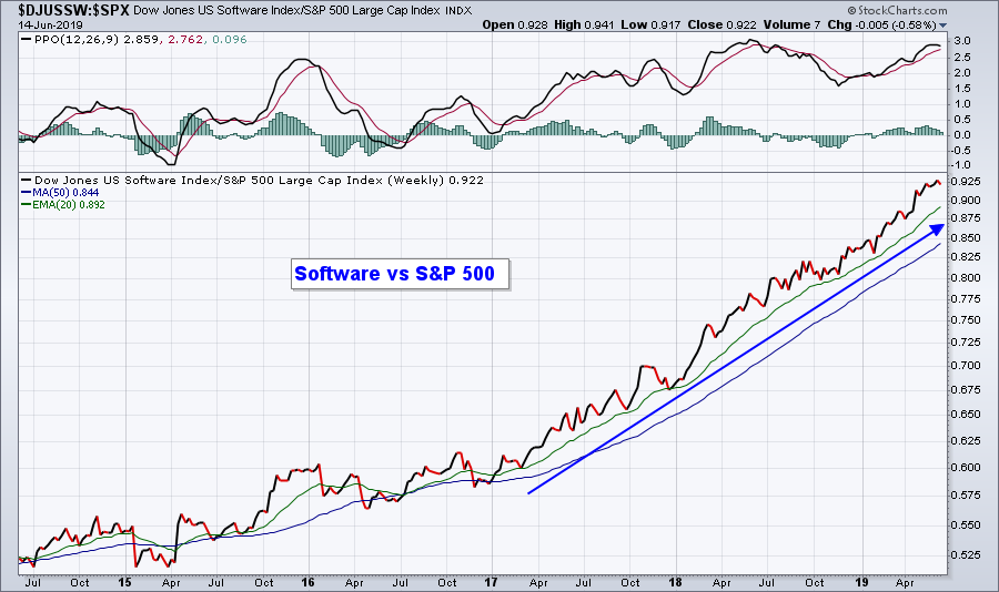 Wall Street commits to aggressive stocks in this fashion for only one reason: they believe earnings will accelerate later this year and they want to own the stocks that will benefit the most. You should want to own those stocks as well. Wall Street commits to aggressive stocks in this fashion for only one reason: they believe earnings will accelerate later this year and they want to own the stocks that will benefit the most. You should want to own those stocks as well.
Would you like to see the 273 stocks that made the cut at EarningsBeats.com? If you sign up for our free 3-times-a-week newsletter, which will feature articles highlighting earnings and relative strength, we'll also provide you a link where you can access all 273 Strong Earnings ChartList stocks, annotated with key price support levels!!! CLICK HERE to gain access and to get your FREE subscription started!
At your service,
John Hopkins
EarningsBeats.com
|
| READ ONLINE → |
|
|
|
|
|
| The Traders Journal |
| Climb a Mountain, Beat The Market: What The Mountaineers "Essential 10 Checklist" Can Teach You About Investing |
| by Gatis Roze |
 The mountaineers “Essential 10 Checklist” is seared into the memory of every serious hiker and climber. Why? Because it may literally determine life or death. Similarly, every investor's financial life or death is determined by what I am calling the “Investors Essential 10 Checklist”. The mountaineers “Essential 10 Checklist” is seared into the memory of every serious hiker and climber. Why? Because it may literally determine life or death. Similarly, every investor's financial life or death is determined by what I am calling the “Investors Essential 10 Checklist”.
Both checklists are comprehensive. Both checklists suggest that forgetting any one of the ten can kill you. So put-on your investor’s hat and your hiking boots, and let me take you through these checklists for the sake of your well-being, safety, survival and future financial prosperity.
Item #1: Navigation
- Mountaineers need a map, a compass and GPS. Don’t leave home without these.
- Similarly, investors need a written trading plan. Having an understanding and appreciation of the 10 essential stages in our book, Tensile Trading, would help. Then, having an organized assortment of ChartLists (such as the Tensile Trading ChartPack) will increase your probability of both profitability and survival.
Item #2: Sun Protection
- Mountaineers require sunscreen, sunglasses, lip balm and a hat or helmet.
- If investors are not going to get burned, they require a personalized sell strategy. Understanding their own “uncle point” or the amount of risk they can personally tolerate is necessary to address before you invest. In the midst of a market correction is a disastrous time to start trying to understand your “investor self” and begin formulating a rational sell strategy.
Item #3: Insulation
- Mountaineers must be shielded from rain. Waterproof boots, jackets, gloves and hats are non-negotiable. Gore-Tex is your friend.
- For investors, diversification is your Gore-Tex and will keep you dry. A carefully balanced portfolio will weather all storms and financial curves the market throws at you.
Item #4: Illumination
- In the great outdoors when the sun goes down, mountaineers need a dependable flashlight and/or headlamp, along with extra batteries.
- For this investor, my illumination comes from my charts. They never lie to me. When I am willing to listen objectively to what they are telling me, I am seldom in the dark with respect to my portfolio and my positions.
Item #5: First Aid Supplies
- Regular hikers know that accidents happen, scrapes, cuts and injuries are the price of admission. So they come prepared.
- Investors, too, must appreciate that money management is all about probabilities. You can shift them significantly in your favor, but never to the point of avoiding losses completely. Financial cuts and scrapes will happen. The personal trading journal that I keep provides a sort of first aid station for me. It’s where I absorb and analyze the lessons the market has taught me and from which springs my financial healing and personal growth.
Item #6: Fire
- Experienced mountaineers will always carry matches or lighters in a waterproof container to make sure that they can start a survival fire in emergencies.
- With investing, the fire metaphor works in the inverse. The emergency results when one’s personal investing fire goes out. I manage to stoke the investing fire in my belly by being an active market participant — teaching, reading and spending time with like-minded investors. Whether you are a hobbyist investor or a full-time investor like myself, if you get bored with the markets, then you should probably take up bungee jumping or heli-skiing instead.
Item #7: Repair Kit and Tools
- Every serious hiker I know has their own favorite Swiss Army knife. First invented in the 1880s, there are now probably over 100,000 variations of this all-important tool. Of course you stash it in your trusty backpack, along with duct tape and other repair essentials.
- The investors’ equivalent of their favorite Swiss Army knife is their personal methodology. In our book, I outline my “Battle V” methodology. It’s both my essential tool and my repair kit. I’d never consider investing without it. An investor who can’t explicitly describe his or her personal methodology likely doesn’t have one. And that’s dangerous. I’m happy to lend you mine.
Item #8: Nutrition
- Energy bars and snacks are standard fare in every hiker’s backpack. An extra supply of food for an unexpected extended stay is simply common sense.
- An an investor, my nutrition comes in two flavors. Since I’m a full-time trader, the obvious sustenance that I receive is in the form of financial nutrition. These past 25 years have exceeded even my wildest dreams. The second flavor, if you will, is my need for nutrition to feed my neurons. Intellectually, I feed on the market. It’s alive — always stimulating and challenging me to grow as a person and a money manager. My experience, coupled with the ongoing intrigue of constantly optimizing my portfolio, helps keep me young.
Item #9: Hydration & Sanitation
- I’ve been struck by the number of small ingenious devices now available to mountaineers that let them treat water and render it safe to drink. There’s no reason not to carry this obviously essential accoutrement. It may save your life.
- My hydration as an investor comes from fulfilling a strange personal need that I’ve had all my life. I love competition. I love fast powerful cars. I like to feel my palms get a bit sweaty. I cringe if you call me an adrenaline junkie, but I love the challenge of exciting pursuits while emotionally tempering the adrenaline. It’s a strange need I have to balance the two, but I know myself now after all these years.
Item #10: Emergency Shelter
- Every responsible mountaineer takes this seriously. A tent, a tarp or a reflective blanket are must-have gear. Most also carry a whistle, cell phone and binoculars. Some will carry a shovel.
- As an investor, I have both emotional shelters as well as financial shelters. I’ve spent many years working diligently to understand and control my investor self. Before I enter any position, I formulate both bullish and bearish scenarios so that emotionally, my sell strategy will be easier to execute. It’s much less stressful this way. With financial shelters, I have certain money management rules from which I never deviate. Never! I do not use leverage. I’ve heard all the sermons about improving my performance if only I’d use leverage, but I won’t. It’s a psychological rule with me — similar to my rule not to short the market. I don’t want to be pessimistic. My financial shelter also means that I always maintain a comfortable monetary buffer, which is a combination of cash equivalents and liquidity.
So there you have it! To ensure that you both enjoy and survive your pursuits — be they mountaineering or investing — you must embrace these ten iconic time-tested essentials. Ignore any at your peril. In both endeavors, there will be times when you’ll have to respond positively to the unexpected. Your survival checklist must be tailored to your specific adventure. Nevertheless, it will act as your insurance policy to stay safe, stay alive and have fun whether hiking or investing.
Trade well; trade with discipline!
- Gatis Roze, MBA, CMT
StockMarketMastery.com
|
| READ ONLINE → |
|
|
|
| DecisionPoint |
| Speeding Up the Price Momentum Oscillator (PMO) |
| by Erin Swenlin |
Viewers of MarketWatchers LIVE know how much I rely on my scans to find all those interesting symbols I review. In a ChartWatchers article last month, I shared my new favorite scan (Bullish EMA | Midrange SCTR), where I adjusted my time-tested "scan to rule them all" and found I could get better results by tweaking the SCTR and EMA configuration. In that mindset, I decided to try something new and use a "faster" PMO by changing the (35,20,10) parameters to (12,26,9). I run the scan using the fast PMO but analyze the results using the slower default PMO parameters.
I named this scan "Momentum Sleepers" based on the MWL segment that inspired it.
The results were quite good, but I do end up a large group (roughly 30 - 80) to sift through. (Sifting scans is another lesson; I have a video on YouTube that discusses how I sift my scans). It's interesting to see how many slower PMOs don't confirm the faster PMO results.
Here is the scan that combined a fast PMO with the slower default PMO.
[type = stock]
and [country is US]
//Not thinly traded
AND [Daily SMA(20,Daily Volume) > 100000]
//Less volatile stocks that close above $10
AND [Close > 10]
//PMO is "beat down" with a PMO that is negative (less than zero)
AND [Daily PMO Line(35,20,10,Daily Close) < 0]
//A "Fast" PMO that is on a BUY signal
AND [Daily PMO Line(12,26,9,Daily Close) >= Daily PMO Signal(12,26,9,Daily Close)]
//Fast PMO has been rising for three days
AND [Yesterday's Daily PMO Line(12,26,9,Daily Close) < Yesterday's Daily PMO Signal(12,26,9,Daily Close)]
AND [2 days ago Daily PMO Line(12,26,9,Daily Close) < 2 days ago Daily PMO Signal(12,26,9,Daily Close)]
AND [3 days ago Daily PMO Line(12,26,9,Daily Close) < 3 days ago Daily PMO Signal(12,26,9,Daily Close)]
I ran this scan and, as of publishing, got 31 results.

That's a lot to sift through, but I find that using my unique CandleGlance ChartStyle makes sifting much easier. While I use the faster PMO to get candidates, I use my slower PMO to analyze as it fits better in my intermediate-term investing style.
Here's a snapshot of the symbols that I liked out of the results above. (Remember, you can have a unique CandleGlance by saving the ChartStyle as "CandleGlance.") But why did I like them?
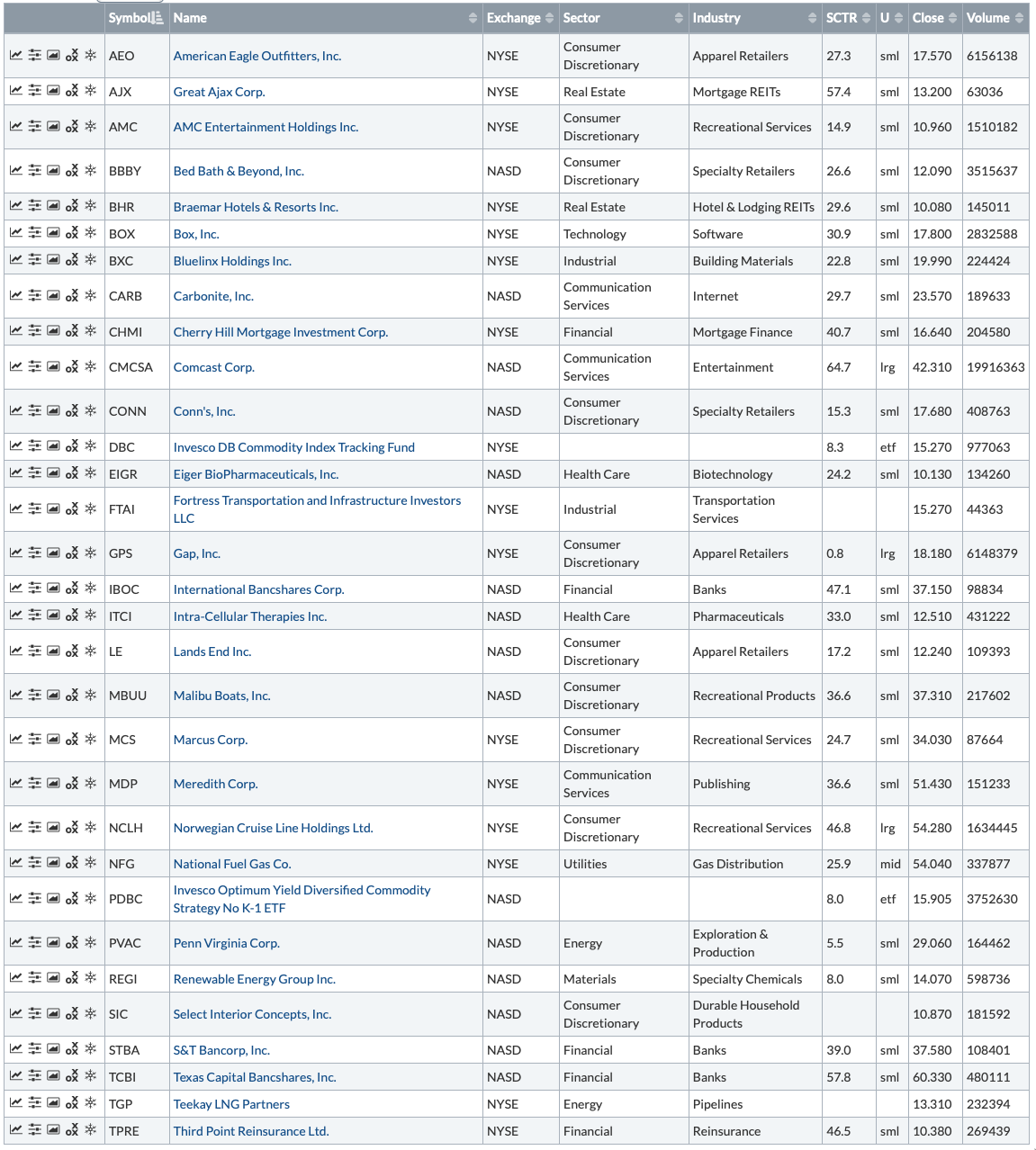
The double-bottom that is forming on NFG looks very promising. I would be interested in potentially getting on board before the move to test the confirmation line; doing so would also put me in a good position should the pattern execute. The others have consolidation zones with recent breakouts, and three (AJX, CMCSA and FTAI) have possible ascending triangles. TPRE is consolidating. It has bounced back off support and is ready to challenge resistance with a PMO that is ready to turn. If I had to pick just one, I think AJX has the most promise, closely followed by CMCSA.

Conclusion: I've found that using a faster PMO for scanning while reviewing using the slower PMO gives you new insight. We know based on the scan that the faster PMO has uncoiled and given a BUY signal. In essence, the momentum is building underneath. The slower PMO can confirm what the faster PMO is suggesting and give you better candidates overall.
Watch the latest episode of DecisionPoint with Carl & Erin Swenlin LIVE on Fridays 4:30p EST or on the StockCharts TV YouTube channel here!
Technical Analysis is a windsock, not a crystal ball.
Happy Charting!
- Erin
erinh@stockcharts.com
Helpful DecisionPoint Links:
Erin's PMO Scan
DecisionPoint Chart Gallery
Trend Models
Price Momentum Oscillator (PMO)
On Balance Volume
Swenlin Trading Oscillators (STO-B and STO-V)
ITBM and ITVM
SCTR Ranking
**Don't miss DecisionPoint Commentary! Add your email below to be notified of new updates"**
|
| READ ONLINE → |
|
|
|
| MORE ARTICLES → |
|


 Many a pundit considers small-caps as the canaries in the coal mine and this implies that relative weakness in small-caps is negative for the broader market. As Missanei of Game of Thrones might say: It is known. Known, yes, but is it actually true?

 As the results show, buying the Russell 2000 when it showed strong outperformance did not work out well over the last 25 years. This is hardly surprising when we consider the first chart in this article. There were seven winning trades and five losing trades. The average gain was 20.5%, which is good, but the average loss was high too (18.91%).


 This further confirms the rotation to aggressive areas of the market vs. defensive areas, as the overall uptrend is clearly higher in spite of the consolidation over the past year or so.
 Wall Street commits to aggressive stocks in this fashion for only one reason: they believe earnings will accelerate later this year and they want to own the stocks that will benefit the most. You should want to own those stocks as well.

 The mountaineers “Essential 10 Checklist” is seared into the memory of every serious hiker and climber. Why? Because it may literally determine life or death. Similarly, every investor's financial life or death is determined by what I am calling the “Investors Essential 10 Checklist”.