| THIS WEEK'S ARTICLES |
| CHARTWATCHERS |
| More Data, Better Charts, ChartList Actions and New Content: 5 Major Additions to Your StockCharts Dashboard |
| by Grayson Roze |
|

Hello Fellow ChartWatchers!
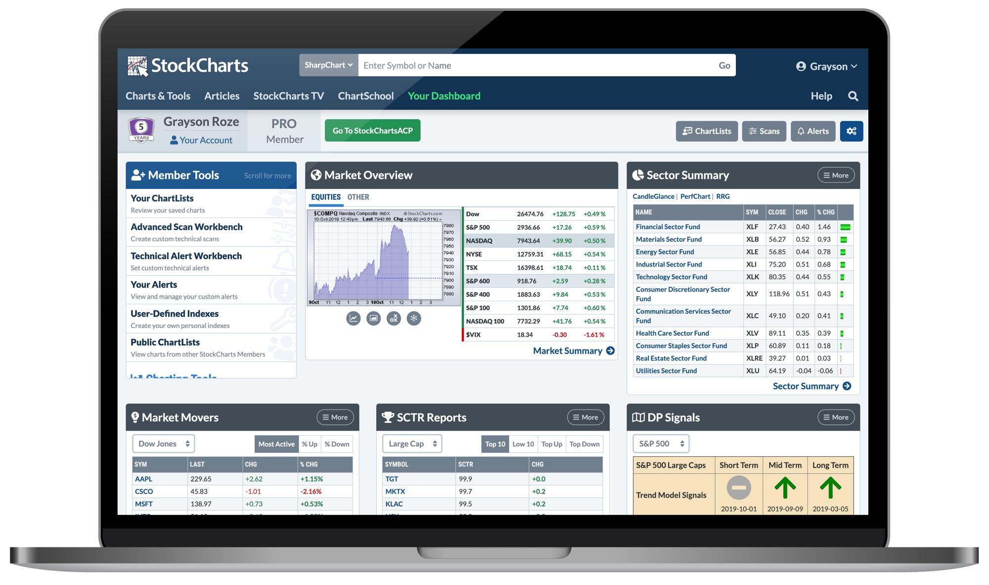
Earlier this week, we released another round of upgrades and additions to your StockCharts Dashboard. I've always referred to the Dashboard as "the heart and soul of your StockCharts account". Sure, it provides easy access to our many tools and features via the "Member Tools" panel, but that's only the beginning. There's much more to uncover on this page, and our latest additions have made it even more powerful for you.
As you'll hear more about below, the latest Dashboard updates include:
- A totally revamped Market Overview panel with more data than ever before
- A Sector Summary option for the data panels on Your Dashboard
- The ability to add new symbols to your top ChartLists right from the page
- A Latest Articles panel that includes recently-published articles on StockCharts
- A StockCharts TV panel with the live player and a quick link to new episodes
Now, one quick note before we dive in. I want to remind you that the layout of the Dashboard is actually very customizable. You can tailor Your Dashboard to fit your preferences and set it up to match the way that you want to watch the markets. With just a few clicks, the Dashboard can give you an intelligent overview of what's leading the major indexes and which stocks are making moves on the SCTR rankings. You can keep an eye on the predefined alerts or track the latest DecisionPoint signals. Plus, you get quick access to your saved ChartLists, custom scans and technical alerts – all from one page.
So, let's take a quick look at what's new on Your Dashboard and show you how to explore the latest features.
Bigger, Better, Broader Market Overview

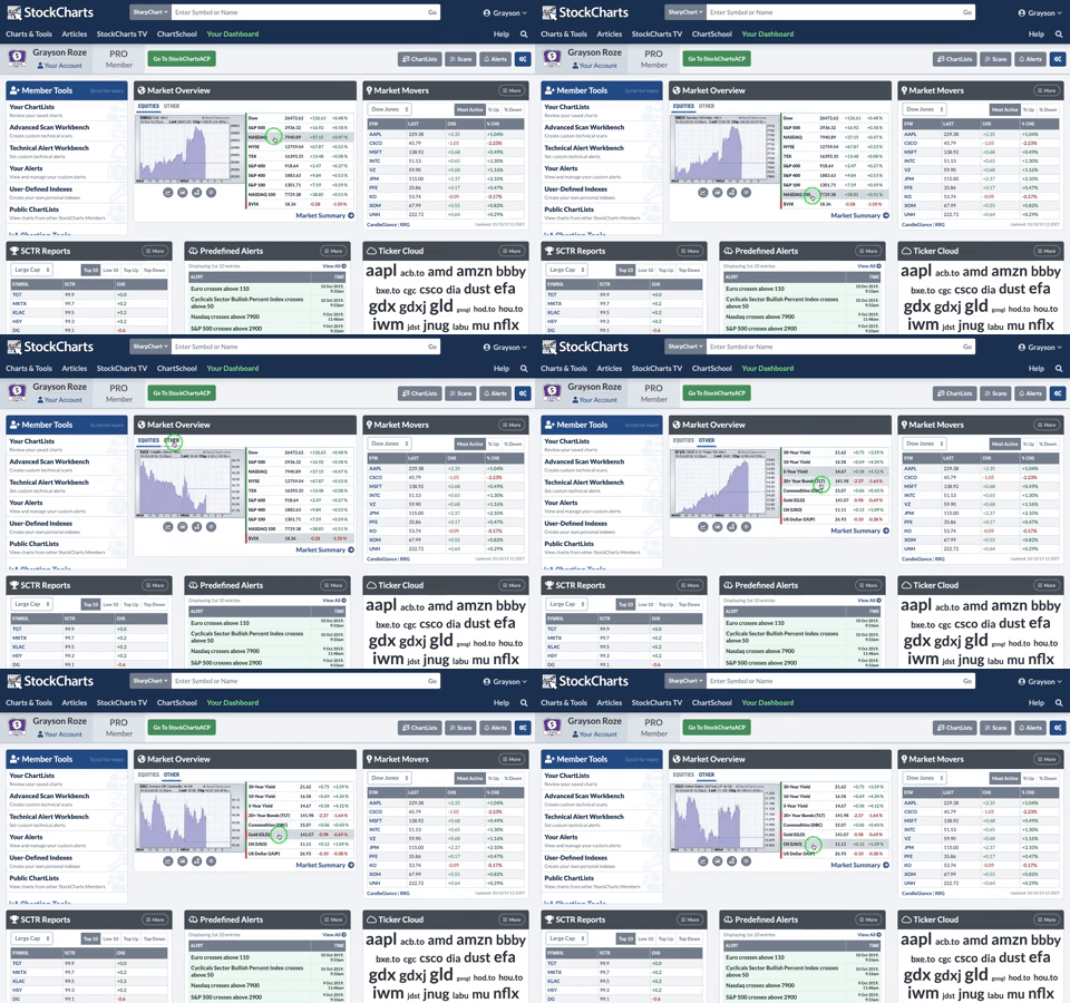
First and foremost, Your Dashboard now includes a totally revamped Market Overview panel with an improved chart and a much larger collection of summarized indexes. The tabs above the chart allow you to switch between the major equity indexes, which now includes the S&P 600, S&P 400, NASDAQ 100 and the VIX. The "Other" group includes bond yields, the TLT, gold, oil, the US dollar and more.
Click on any row in the Market Overview table to see the corresponding chart for that index or ETF. You can also use the grey buttons below the chart to launch some our other views, like SharpCharts, GalleryView or Seasonality.
Most importantly, the Market Overview panel will continue grow and improve over time as we add new groups and other indexes. For example, we'll be rolling out a new “Crypto” tab very soon!

"Sector Summary" in the Data Panels
To complement our ever-popular Sector Summary page (where you can drill down from the 11 major market sectors through the respective industry groups to the stocks within), we've added a Sector Summary view to the data panels of Your Dashboard. At a glance, you can see how all 11 sector funds are moving, following the leaders and laggards without ever leaving the Dashboard. Plus, quick links above the table take you right to the PerfChart, CandleGlance or RRG views for the full sector group.
By default, the top row of Your Dashboard shows a Market Movers panel with the most active stocks in the Dow. Click the "More" button in the top right corner of that panel and you'll see a list of other available views, like SCTR Reports, Ticker Cloud, Predefined Alerts and the new Sector Summary.
Now, here's the best part – the data panels on Your Dashboard are actually "sticky", so your most recently selected display will be waiting for you the next time you return to the page. You can set up the Dashboard with the panels that you are most interested in and we'll automatically keep those selections in place in the future. In this way, you can really make the Dashboard your own and customize it to fit your preferred market view.

Add New Symbols to Your Top ChartLists
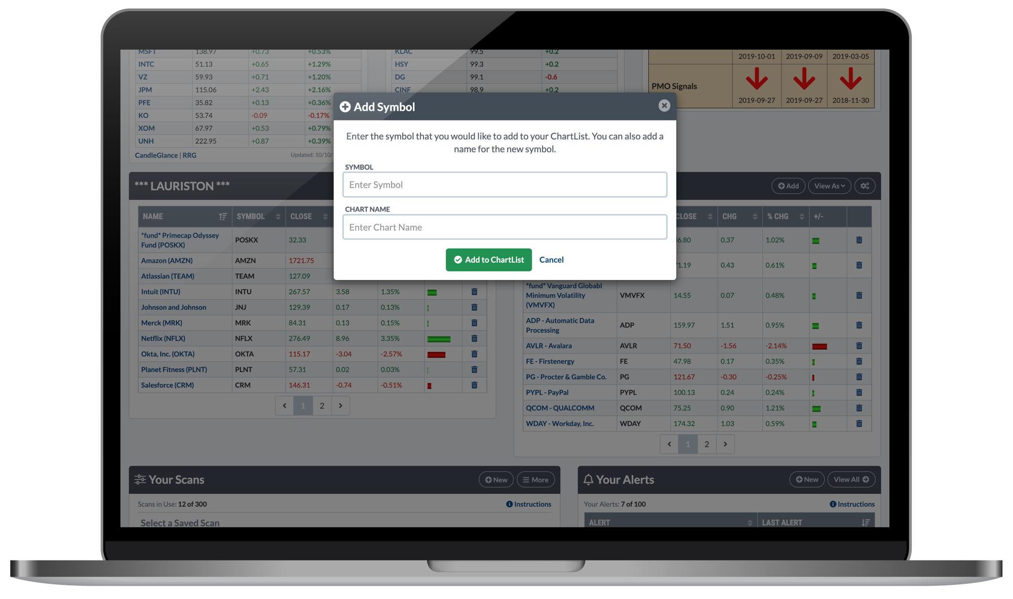
Personally, one of my favorite features of the Dashboard is the optional "ChartList Panels", which allow you to select two of your top ChartLists and see performance summaries of the stocks and funds within, right from Your Dashboard. For example, I have two of my portfolios selected in this row, so without having to click all the way into the ChartLists, I can see what my positions are doing today. As all of us do, I watch the stocks and funds that I own more closely than anything else, so the ability to track those holdings in these two ChartLists right on my Dashboard is a major benefit.
To enhance this feature even more, we've now rolled out the ability to quickly add new symbols to the top ChartLists you've selected. Look for the "Add" button at the top of the ChartList panels, give it a click, and a window will pop up where you can enter any new symbol that you'd like to add to the ChartList.
If you don't already have the optional "ChartList Panels" row switched on for Your Dashboard, I strongly recommend you give it a shot. To do so, click the blue button with the gears icon in the top right corner of Your Dashboard. In the pop up that appears, make sure the "ChartList Panels" option is checked, then hit "Save Preferences".

Latest Articles with the "Commentary" Row
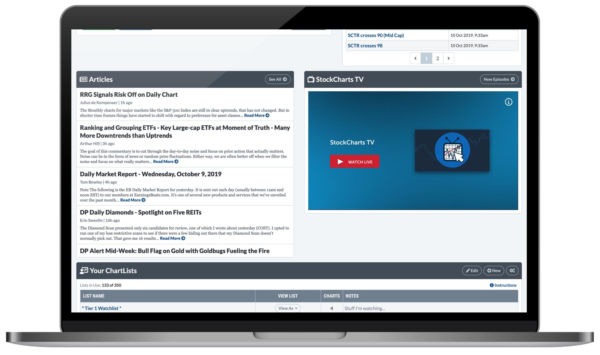
Included in a new "Commentary" row that you can select in your dashboard preferences, we've added a panel that features the latest articles published on StockCharts by our team of expert contributors. This makes it easier than ever before to stay on top of this exclusive content and see how some of the industry's best and brightest technical minds are charting the markets.
To turn on the new "Commentary" row and see the Latest Articles panel, click the blue button with the gears icon in the top right corner of Your Dashboard. In the pop up that appears, make sure the "Commentary" option is checked, then hit "Save Preferences".
AND StockCharts TV on Your Dashboard
In addition to the latest articles, the new "Commentary" row includes a panel with StockCharts TV. Right from Your Dashboard, you can tune into our 24/7 video channel dedicated to technical analysis. Watch everything that's streaming live, or click the "New Episodes" button to easily catch up on the latest content.
With the recent launch of our Fall Lineup earlier month, we have new shows from David Keller, Larry Williams, Dave Landry, Tom Bowley and Julius de Kempenaer. The StockCharts TV dashboard panel allows you to stay on top of it all and never miss a thing.
Just like the latest articles, you can see the StockCharts TV panel by turning on the new "Commentary" row in your dashboard preferences. Click the blue button with the gears icon in the top right corner of Your Dashboard, then make sure the "Commentary" option is checked in the pop up that appears.
Now, if you're not a StockCharts Member but these new features sound intriguing, I have good news for you. You can explore everything that our Members Dashboard has to offer as part of your free 1-month trial. Sign up now and in minutes, you'll be customizing dashboard panels just the way you like 'em. To get started and see what all the excitement is about, Click Here!
Until next time,
Grayson Roze
VP of Operations, StockCharts.com
|
| READ ONLINE → |
|
|
|
| Market Roundup |
| Short-Term Indicators Behave Differently in Bull and Bear Markets |
| by Martin Pring |
Editor's Note: This article was originally published in Martin Pring's Market Roundup on Tuesday, October 8th at 12:48pm ET.
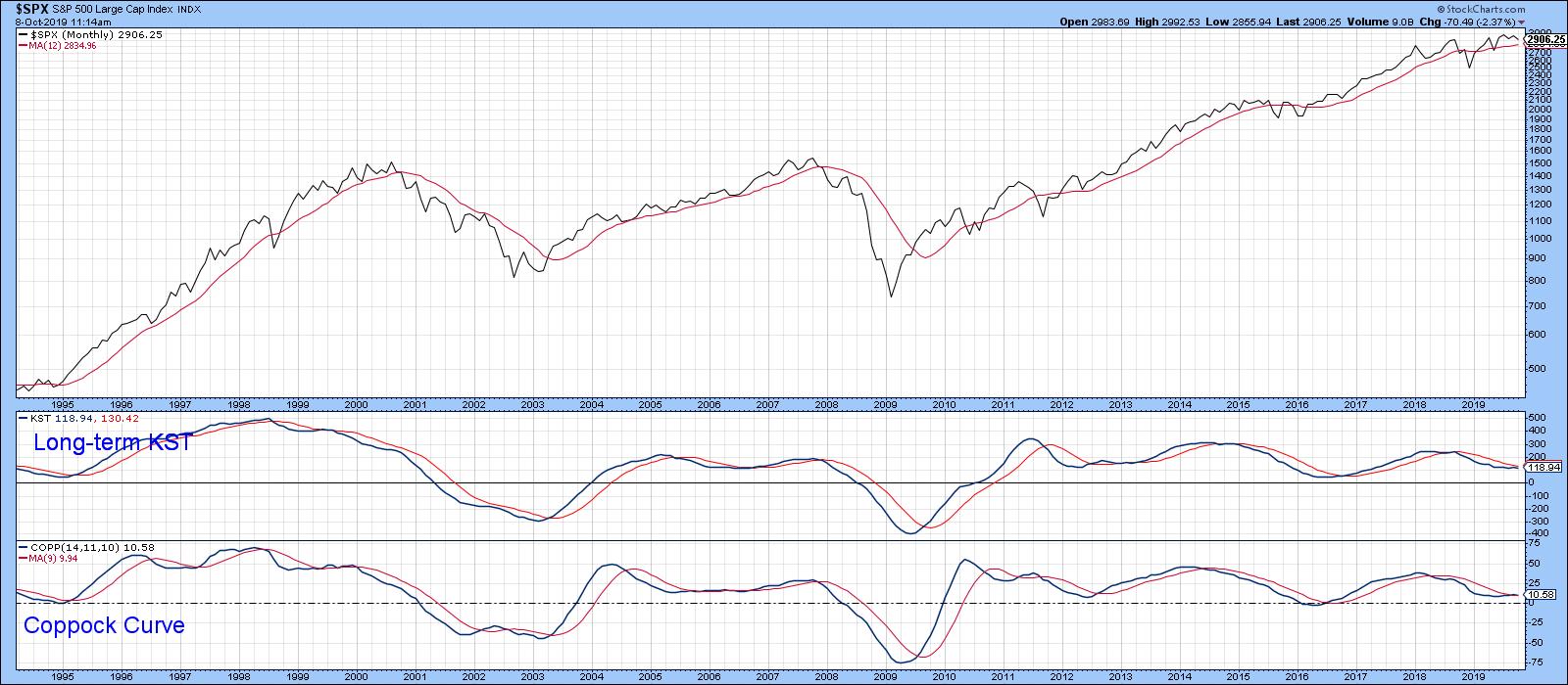
Short-term oscillators behave differently depending on the direction of the primary trend. In bull markets, prices are very sensitive to oversold conditions and quickly bounce. We see the opposite in bear markets, whereby overstretched readings on the downside do not have anywhere near the generative power they would in a bull trend. I bring this up because the majority of the long-term indicators I follow remain in the bullish camp. Take Chart 1, for instance, which shows that the S&P is above its 12-month MA and that the two momentum indicators are also in a positive trajectory. None of these series are in what we might call a decisively positive mode, so a complacently bullish stance is uncalled for, especially as the three charts I wrote about last month failed to break out on the upside. Nonetheless, the evidence, as I see it, remains bullish until proven otherwise. That means that we should expect to see the market respond to oversold short-term indicators in a positive way.

Chart 1
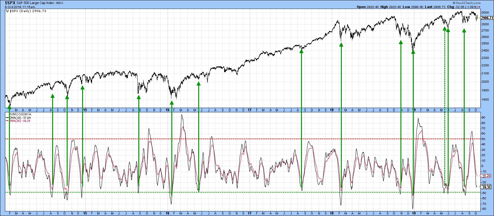
In this respect, Chart 2 features a 10-day EMA for the McClellan Volume Oscillator based on S&P components. The green arrows show when this series reverses to the upside from a position at or below the -50% level. Generally speaking, the S&P was very responsive to such conditions. One exception developed in October 2018, when all that followed was a 2-3-month trading range. Another challenged signal developed earlier this year at the dashed arrow. A reversal does not necessarily mean that prices will immediately take off on the upside, though that is often the case. What it often does, though, is signal that the market is tired of going down and probably needs a week or two to stabilize before moving higher. Currently, the oscillator is close to the oversold condition. Working on the assumption that the bull market is still alive, that probably means some range-bound activity, or even a probing of last week’s low. If a contained correction does materialize and long-term sell signals are avoided, that would be very positive. Firstly, it would indicate that the bull market is still with us. Second, once October is out of the way, the market enters the seasonally bullish November/April period, not to mention the upcoming bullish fourth quarter of the pre-election year and a bullish fourth year of the Presidential Cycle.

Chart 2
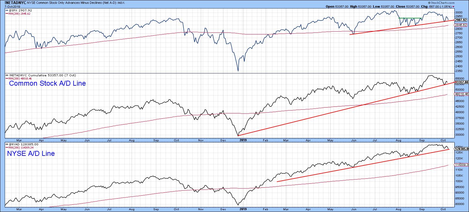
The stakes are high, as both the NYSE Common Stock A/D Line and its more broadly based counterpart in Chart 3 are very close to rupturing some important uptrend lines. The S&P is similarly positioned. Their violation would not signify a bear market, but, given the narrow margin between the S&P and its 12-month MA, it's possible that such weak action could eventually feed back to tip the primary trend balance to the bearish side.

Chart 3
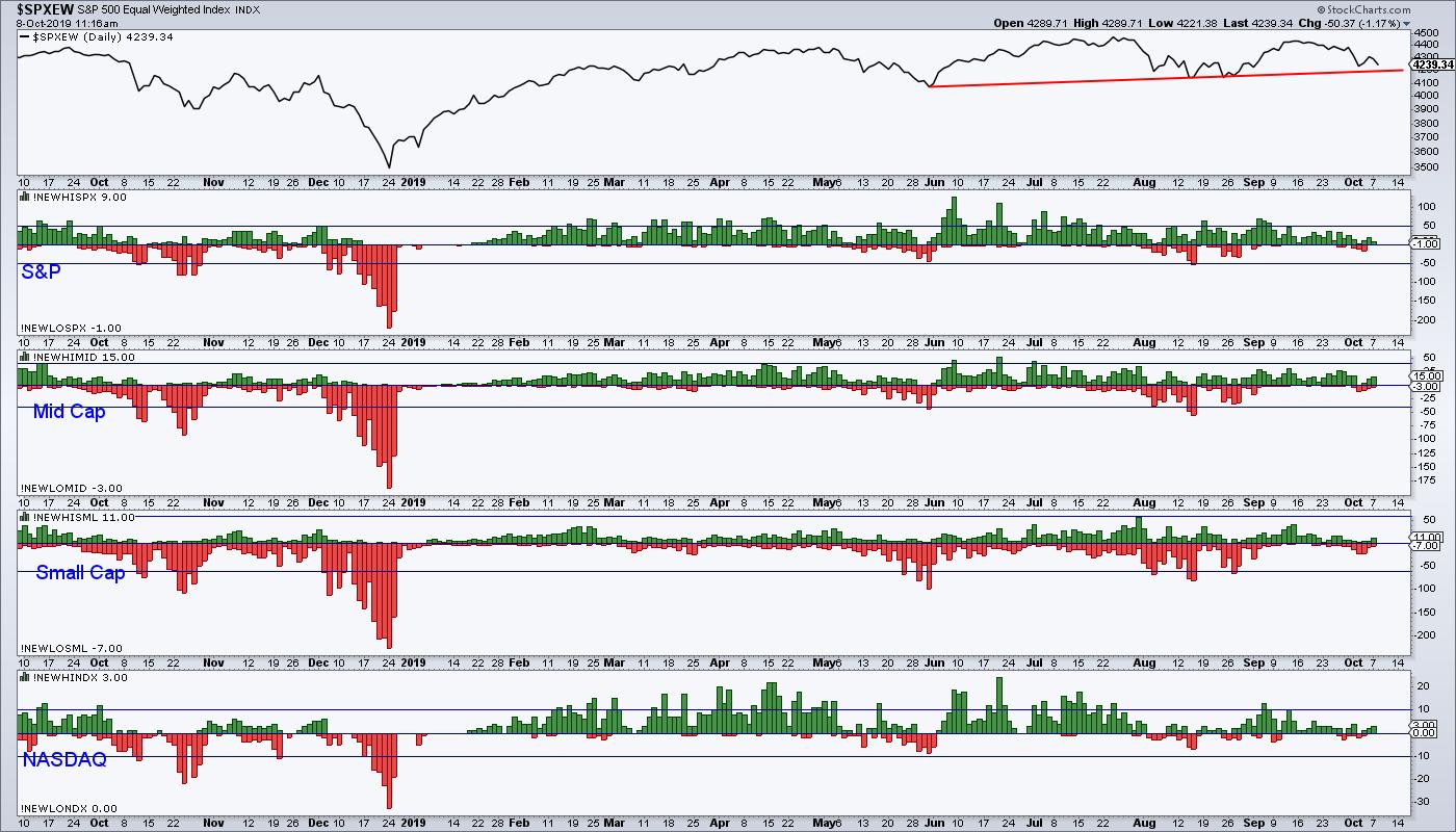
One set of indicators that often warn of subtle underlying strength or weakness are those based on net new data, featured in Chart 4 for several market sectors. Note that all series recently sported a small number of new highs and no new lows. This compares to last week, when each sector experienced a smattering of new lows, highlighted in red. This discrepancy could easily be cleared up, but, at the moment, new high data is a positive factor.

Chart 4
Good luck and good charting
Martin J. Pring
The views expressed in this article are those of the author and do not necessarily reflect the position or opinion of Pring Turner Capital Group of Walnut Creek or its affiliates.
|
| READ ONLINE → |
|
|
|
|
|
| The Mindful Investor |
| Three Ways to Think About Relative Strength |
| by David Keller |
We just completed our second week of The Final Bar, the new closing bell show on StockCharts TV. During our Friday mailbag segment, I was asked about how institutional investors think about relative strength.
To be honest, relative strength is of vital importance to institutions because, well, that is how one gets paid! The better your stocks do on a relative basis, the better you do professionally. Or, as one of my analysts liked to put it, “Price is fine, but we eat the relative line.”
But how does relative strength actually fit into the investment process? And how should individual investors think about relative strength relative to other tools in your arsenal?
Here are three ways you should be thinking about relative strength.
Relative Strength as a Scorecard
Quite simply, the relative strength line tells an institutional investor how well they are picking stocks. Are the charts of their holdings showing positive or negative relative strength? Which names are showing an inflection point in relative strength?
For individuals, the relative strength line tells you whether you’re looking at the right chart in the first place.

A rising relative strength line means your stock is outperforming the broader equity space.
If you focus only on the absolute price returns, you may conduct excellent analysis and draw a valid conclusion of whether to buy a specific stock. But if the relative strength line is flat, you’re basically doing no better than a passive investment product! Worse yet, if the relative strength is going down, then you may end up being correct on the price but underperform the broad market averages.
In general, you want to own stocks that are outperforming and not own stocks that are underperforming. Or, as Tom Bowley once put it, “You can outperform by owning stocks that are underperforming.”
Relative Strength as a Market Barometer
By tracking which stocks, industries and sectors are outperforming and which are underperforming, you can draw some valid conclusions about the overall market environment. Are traditional offensive or defensive sectors and groups outperforming? Is a long-time underperforming group starting to turn to a more positive relative strength profile? Answering these questions can help you look “under the hood” of the broad market averages to identify some of the themes that may or may not validate your analysis of the S&P 500 index.
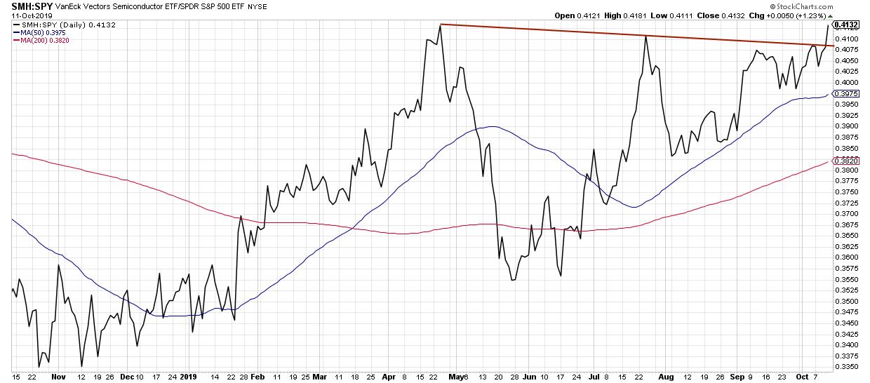
One of my favorite relative strength measures is the performance of semiconductor stocks vs. the SPX. This group tends to outperform in bullish market phases and underperform in bearish market phases.

A relative breakout for semiconductors usually means bullish market conditions.
This week, the semiconductor ETF broke to new relative highs, suggesting a more optimistic outlook for US equities. While this is just one data point among many, it certainly appears to be a check in the positive column for now.
Relative Strength as a Technical Indicator
Finally, relative strength has value as a technical indicator. I like to look for stocks making new price and relative highs, which tend to jump off the page during my weekly review of the S&P 500 members.
I also routinely run a scan for stocks making new price highs, then look for confirmation on the relative strength line. Are new highs in price supported by a break to new relative highs? This suggests that institutions are getting behind the rally and reallocating capital to those names.

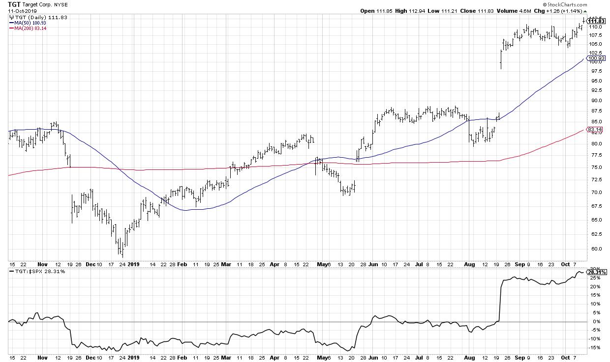
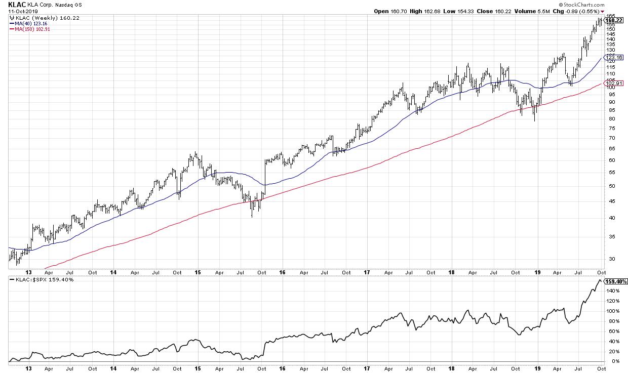
New price highs? Check. New relative highs? Check.
A friend of mine loved to compare portfolio management to managing a baseball team. Let’s say you’re setting the lineup for tonight’s game. Would you start your players that are slumping and struggling, or would you start your best players to give yourself the best chance to win?
Why would you do anything different with your portfolio?
RR#6,
Dave
David Keller, CMT
Chief Market Strategist
StockCharts.com
David Keller, CMT is Chief Market Strategist at StockCharts.com, where he helps investors minimize behavioral biases through technical analysis. He is also President and Chief Strategist at Sierra Alpha Research LLC, a boutique investment research firm focused on managing risk through market awareness. He is a Past President of the Chartered Market Technician (CMT) Association and most recently served as a Subject Matter Expert for Behavioral Finance. David was formerly a Managing Director of Research at Fidelity Investments in Boston as well as a technical analysis specialist for Bloomberg in New York. You can follow his thinking at MarketMisbehavior.com, where he explores the relationship between behavioral psychology and the financial markets.
Disclaimer: This blog is for educational purposes only and should not be construed as financial advice. The ideas and strategies should never be used without first assessing your own personal and financial situation, or without consulting a financial professional.
The author does not have a position in mentioned securities at the time of publication. Any opinions expressed herein are solely those of the author and do not in any way represent the views or opinions of any other person or entity.
|
| READ ONLINE → |
|
|
|
| Trading Places |
| Industries Most Likely To Produce Blow Out Earnings Results |
| by Tom Bowley |
Wall Street has placed its bets as we work our way into earnings season. It's very easy to see which groups are favored by big money - just look where that money has been going. Today, I'll give you my top 2 industry groups at the moment, starting with my favorite:
Computer Hardware ($DJUSCR)
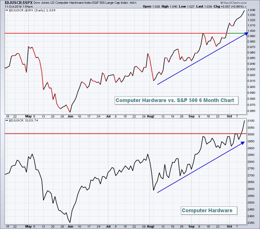
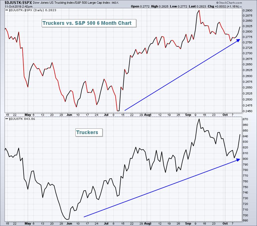
Are you ready for a big number from Apple, Inc. (AAPL)? I am. Based upon the past three months' relative performance, there's not a group I'd be more comfortable with as earnings season kicks off than computer hardware. Look at the explosion in relative strength:

Why would money rotate towards a group like computer hardware unless management teams at companies within the industry are painting a rosy picture for analysts? Not every company in the group is created equal, so you have to do your homework, but the DJUSCR is going to produce some blowout quarterly earnings.
Mark my words.
Trucking ($DJUSTK)
This is potentially a very exciting group. Why? Well, it's part of the critical transportation area ($TRAN). When transports lead the market, we usually have a very strong market on our hands. The fact that Wall Street is betting on this group really adds to the bullishness I've been discussing throughout this period of consolidation. Yes, it's been volatile and yes it's been frustrating at times, but sticking to the bullish side (and with relative leaders) is going to pay off big time. Relative strength has really turned in truckers' ($DJUSTK) favor, so I'll be looking for solid results and raised guidance from leaders in this space. Here's the chart:

The above daily chart doesn't reflect it, but the weekly relative PPO for truckers has turned positive and relative price action is above both its 20-week EMA and 50-week SMA for the first time in over a year. This is a very bullish signal for economic improvement ahead.
If relative strength interests you, I'll be hosting a FREE "Q3 Earnings Sneak Preview" webinar on Monday, not only highlighting industry group strength, but also providing individual stocks that are likely to blow away estimates based on their recent performance. In addition, I'll provide you the 3 catalysts to send the S&P 500 flying higher in Q4 and throughout 2020. It's going to get exciting! You won't want to miss this event. CLICK HERE for more information!
Happy trading!
Tom
|
| READ ONLINE → |
|
|
|
|
|
| The MEM Edge |
| Markets Uptrend May Continue - Let The Leaders Reveal Themselves To You. |
| by Mary Ellen McGonagle |
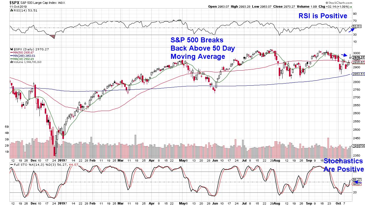
The markets closed out the week strong, with the S&P 500 jumping back above its key 50-day moving average on news of a partial US-China trade war deal. While constructive, we remain in a fragile period where the possibility of a phased trade deal may not be enough to bring buyers into the markets. With earnings season due to start next week, anxious investors will soon have even more to worry about.
DAILY CHART OF S&P 500 INDEX
That said, it’s during these uneasy times that you need to create a solid list of candidates so that, when we get the “all in” signal that a long-term confirmed uptrend in the markets is in place, you can choose from stocks poised to greatly outpace the markets.
Today, I’ll share with you the characteristics that those stocks need, which are based on historical precedent. As many of you may know, I worked with William O’Neil for 15 years. It was during this time that I was introduced to - and ingrained in - a proven system that helps investors uncover stocks poised to outperform the markets by a wide margin.
During those 15 years, there were many market types and, while the stock characteristics are the same during every cycle, these potential winners are more easily revealed to you during difficult periods, like the one we may be emerging from now.
Quite simply, in times when the markets are under pressure, you want to focus on stocks that are withstanding those downward pressures so that, when the market pressures lift, these leading stocks are the first out of the gate. The fact is that these stocks are holding up because institutions are supporting them, often for good reason.
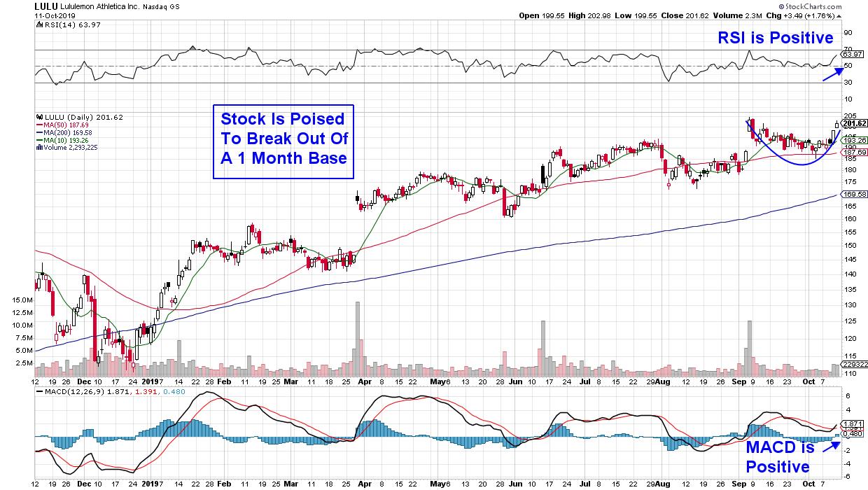
DAILY CHART OF LULULEMON ATHLETICA, INC. (LULU)
Above, Lululemon (LULU) is an example of a stock that fits the criteria for your solid watchlist. This large athletic leisurewear company has held up remarkably well during this recently difficult market. In addition, Lululemon has another key characteristic of a winning stock: a record of reporting strong earnings and sales, with average year-over-year earnings growth of 35% over the last 4 quarters and quarterly revenues of more than 24% year-over-year during the same period.
These numbers point to an impressive management team (another characteristic) and the solid growth rates are expected to continue, with analysts raising earnings estimates into 2021. (For more on top earnings producers, I'll be co-hosting an exciting Earnings Season Kickoff Webinar with Tom Bowley next week that you can read about below!)
Another trait for your watchlist stock is a company that’s continually innovating with their products to meet a changing consumer demand. Recently, LULU has expanded into skincare as well as sneakers while constantly improving the look and feel of their current apparel, all of which has helped spur growth.
While these are several of the more key traits, other items, such as an attractive chart, are also critical. When screening for similar candidates, you can quickly sort stocks by the SCTR rating, which will easily take you to the relative outperformers in any industry group. From there, a review of headline news around the company's earnings release will fill in many of the numbers.
For those of you who'd like to be alerted to these types of stocks, take a look at my bi-weekly MEM Edge Report. In addition to specific stock selection, you'll get industry and sector insights not found elsewhere. You can use this link to get a 4-week trial at a nominal fee.
As for that upcoming webinar with fellow StockCharts.com writer and show host Tom Bowley, it'll take place next Friday, October 19th at 9:00am Eastern. You'll want to register for this exciting event using this link here. Get a sideline seat to our exclusive look at stocks due to kick off this critical earnings season. And, in case you can't make it live, sign up anyway - you'll be emailed a copy.
Warmly,
Mary Ellen McGonagle,
MEM Investment Research
|
| READ ONLINE → |
|
|
|
| RRG Charts |
| Buying the Top SIX Stocks in The DJ Industrials Index (on a Monthly Basis) Can Keep You Ahead Of The Market |
| by Julius de Kempenaer |

What Is Our Track Record?
Ever since the launch of Relative Rotation Graphs on the Bloomberg professional terminal in 2011, some of the most frequently asked questions we've received have been "What's their track record", "How well do they perform?" and "What are the trading rules?".
My answer has always been and will always be: "There is no track record". I then counter the question by asking "What is the track record of a bar-chart?". Like bar charts, RRGs are a visualization tool, not a trading system with some fixed set of rules.
Now, having said that, you can of course come up with a set of rules for using RRG in a more quant- or rules-based fashion, just like you can impose a set of trading rules on a bar-chart. I stick with my opinion that I do not think RRG should be used as a stand-alone decision tool, but rather should be part of a workflow or even a systematic approach, especially as a high-level filtering or selection tool.
RRG provides you with the BIG picture in ONE picture. But...
BUT............
To satisfy all these curious minds, I have been doing some work on testing specific situations related to rotations or positioning of securities on RRGs. I presented a very basic approach to quantifying RRG last week at the IFTA conference in Cairo and reviewed that approach in last Tuesday's episode of my StockCharts TV show Sector Spotlight. As I am of the opinion that a proper back test for a set of rules can only be applied at a portfolio level, rather than at the individual security level, I did this work on both the 11 sectors as well as on the 30 Dow stocks.
My conclusions are:
- Creating a portfolio based on ranking securities on the JdK RS-Ratio scale generally adds value.
- The approach seems to work better in a sideways or declining market than in a rising market environment, a common characteristic of relative strength based systems
- Working with a relatively large universe seems to offer better returns, i.e. 11 sectors vs. 30 Dow stocks.
(You can replay my discussion on these findings in the most recent episode of Sector Spotlight. The part on the tested portfolios starts at 9:50.)
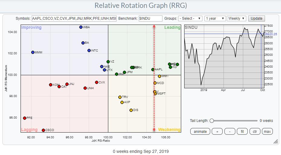
The last test presented in that show is to hold a portfolio of the top-six stocks (16.667% each) in the Dow Jones Industrials Index, based on ranking the JdK RS-Ratio (using the weekly scale) and rebalancing that portfolio at the end of each month.
Current Portfolio
On StockCharts.com, we can find those stocks easily from the RRG page.
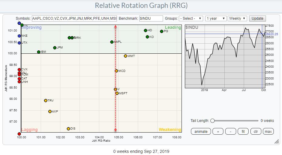
The RRG at the top of this article shows the overview for all Dow stocks at the last weekly close of September. The dotted red line separates the top-six names from the rest of the universe. As the red line runs through a cluster of stocks inside the weakening quadrant, I have printed a zoomed-in version of that chart below.

To find the current holdings of such a portfolio, simply start counting at the far right until you have reached six positions.
The current positions are:
- PG @ $ 124.57
- KO @ $ 54.31
- HD @ 229.86
- WMT @ 118.45
- MSFT @ 137.73
- MCD @ 213.16
Let's monitor this approach in coming months and see if it still holds value.
-Julius
My regular blog is the RRG Charts blog. If you would like to receive a notification when a new article is published there, simply "Subscribe" with your email address.
Julius de Kempenaer
Senior Technical Analyst, StockCharts.com
Creator, Relative Rotation Graphs
Founder, RRG Research
Want to stay up to date with the latest market insights from Julius?
– Follow @RRGResearch on Twitter
– Like RRG Research on Facebook
– Follow RRG Research on LinkedIn
– Subscribe to the RRG Charts blog on StockCharts
Feedback, comments or questions are welcome at Juliusdk@stockcharts.com. I cannot promise to respond to each and every message, but I will certainly read them and, where reasonably possible, use the feedback and comments or answer questions.
To discuss RRG with me on S.C.A.N., tag me using the handle Julius_RRG.
RRG, Relative Rotation Graphs, JdK RS-Ratio, and JdK RS-Momentum are registered trademarks of RRG Research.
|
| READ ONLINE → |
|
|
|
| MORE ARTICLES → |
|
