| THIS WEEK'S ARTICLES |
| CHARTWATCHERS |
| Introducing "Symbol Summary" - A New Full Quote View with Technicals, Fundamentals, Earnings, Dividends, Corporate Info and More, All In One Place |
| by Grayson Roze |
|
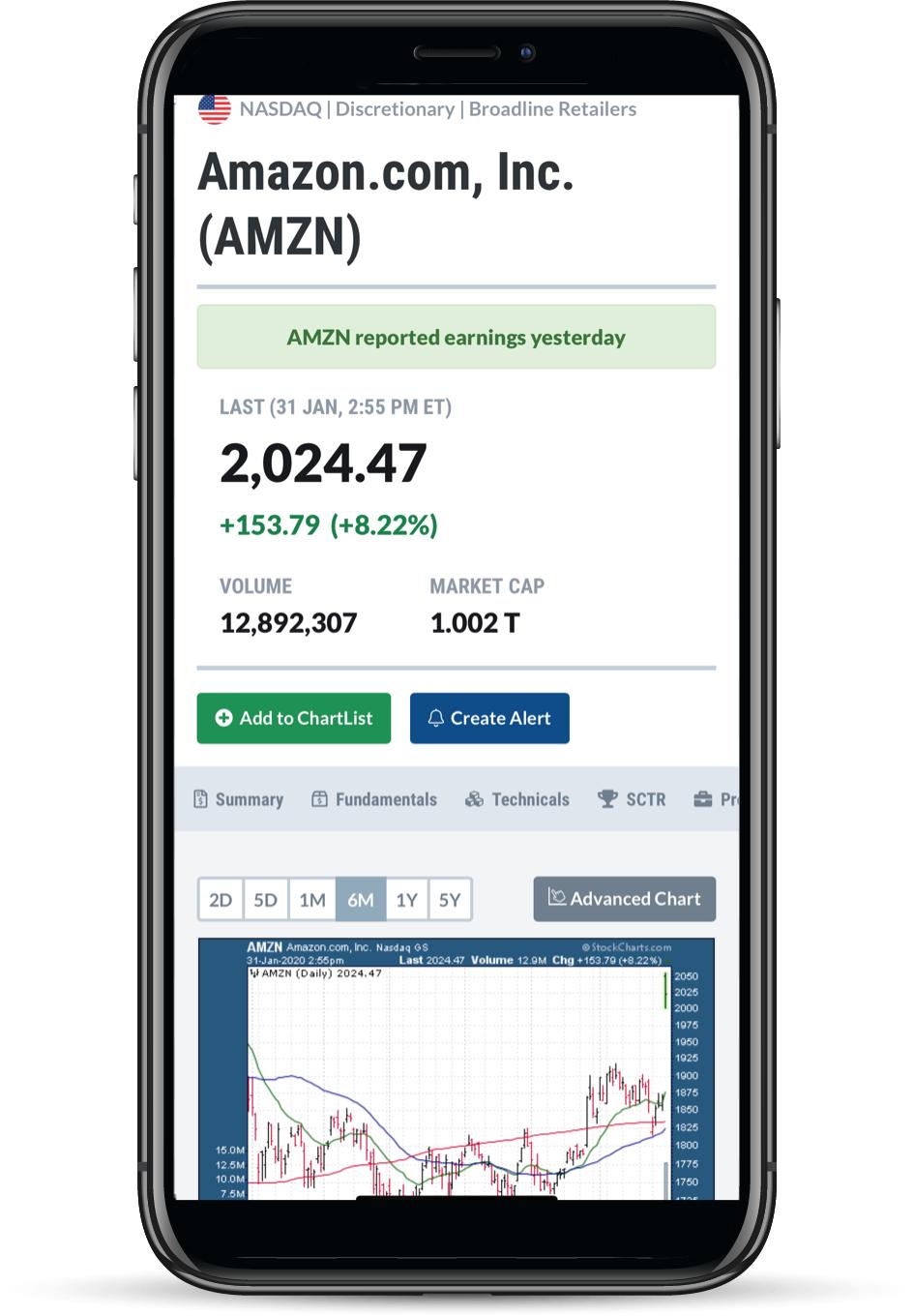
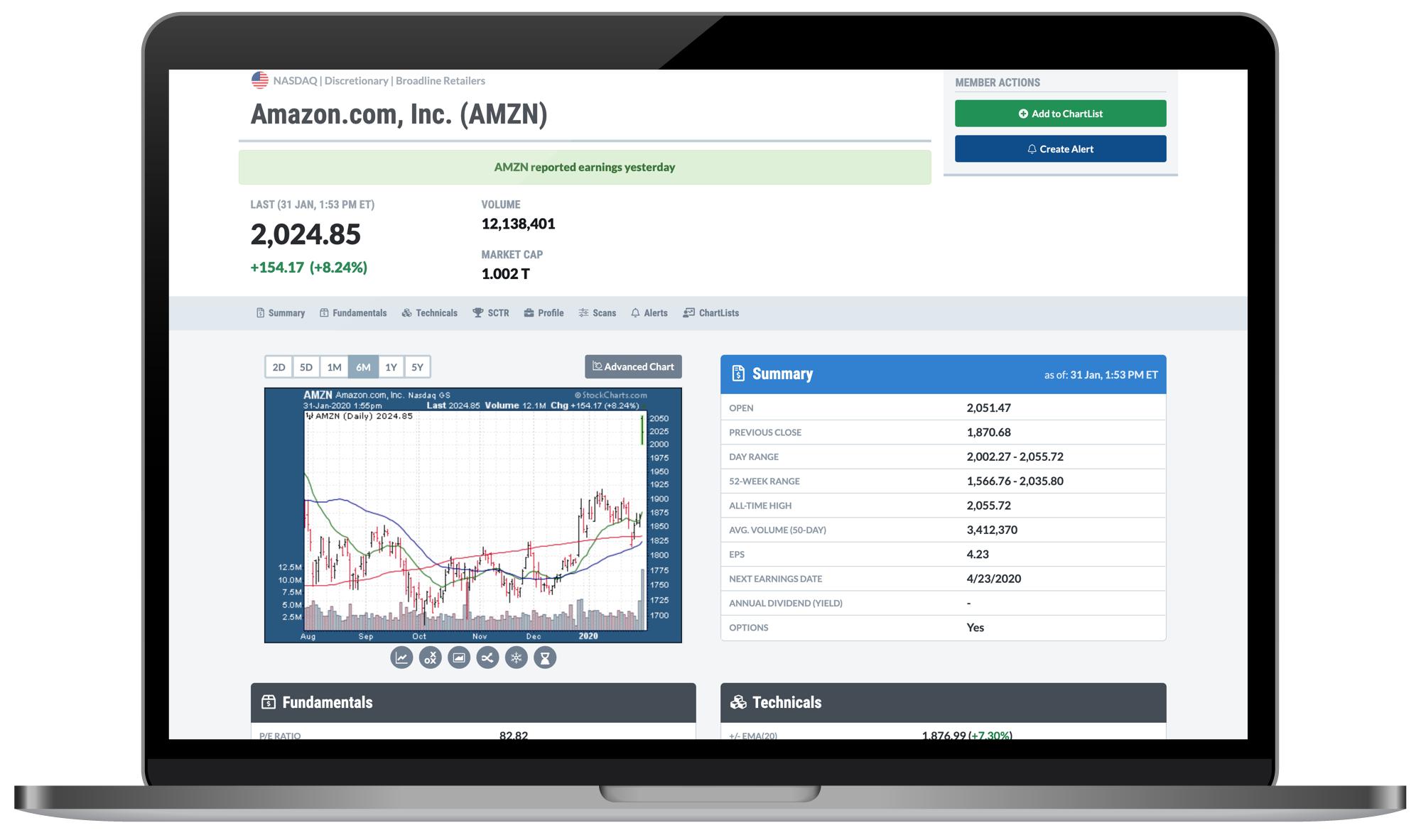 AMZN reported earnings yesterday. AMZN reported earnings yesterday.
Wondering how I know that? You probably think it's because my Twitter feed was blowing up or some notification came across my screen after the close. But here's the real answer...
I know that AMZN reported earnings yesterday because I saw it on StockCharts!
That's right - earnings. On StockCharts. Now live on our brand-new "Symbol Summary" page!
This week, it is my great pleasure to announce our Symbol Summary page. Expanding upon the success of our "Full Quote" option in SharpCharts, this new resource is designed to bring you an even more extensive and complete way to analyze stocks, funds, indexes and more.
From a single page, you can now see the latest price info, view a chart in multiple timeframes, browse high-level summary stats, fundamentals and popular technicals, get earnings dates and dividend info, visualize a symbol's recent SCTR performance, read full company and ETF descriptions, and much more. With tons to explore in this dynamic resource, this just might become your new favorite StockCharts tool.
And It's Just The Beginning...
What's perhaps most exciting about this new feature is the waterfall effect that it will have. We're standing at the top of the waterfall right now, launching ourselves off the edge by introducing the first version of our Symbol Summary. Having taken the plunge, we have no choice now but to fall further down the waterfall.
That means bringing you even more fundamental data, after-hours prices, complete earnings history, analyst ratings, and more. Very soon, you'll have the ability to run scans for this data and set automatic alerts based on earnings events. You'll be able to chart key statistics like P/E, EPS, market cap and much more. You'll see full earnings history including reported vs. estimated values for previous quarters. Major additions like these are already in the works, so I'm delighted to admit that this really is only the beginning. It's the start of a significant data expansion here at StockCharts, and we're only at the "top of the waterfall" with this new Symbol Summary page. I can't wait show you what else is in store in the coming weeks and months!
So, first thing's first - here's how to access the new Symbol Summary page.
From The Navigation Bar

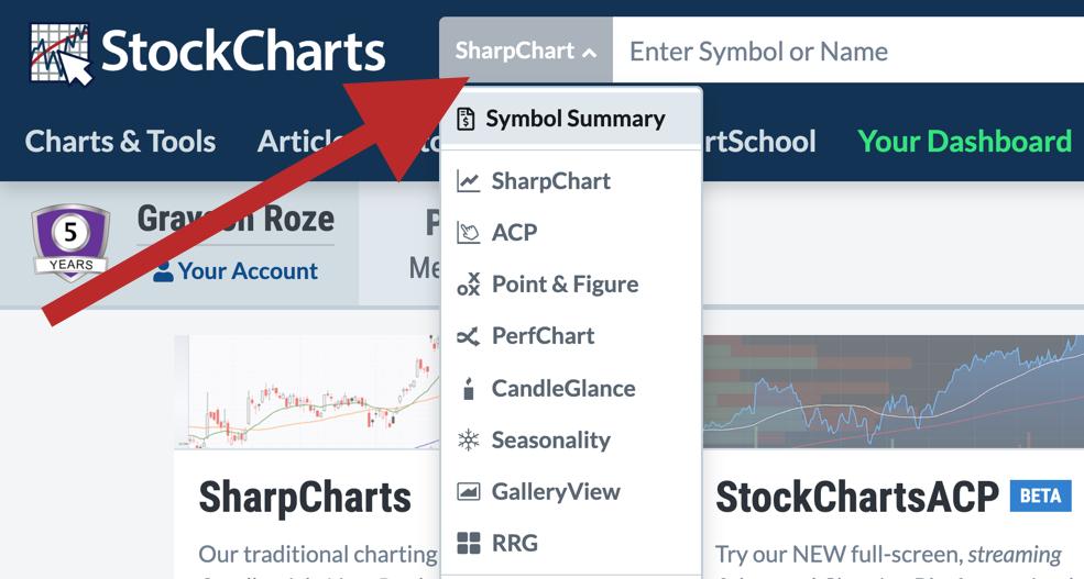
At the top of every StockCharts page, the dropdown menu to the left of the search bar will now include a "Symbol Summary" option. Click where it says "SharpChart" (the default) and then select "Symbol Summary" from the menu that appears. Enter a symbol, hit go, and you're off to the races.
As we continue to roll out support for this new tool, the navigation bar should become your go-to for accessing the new Symbol Summary page.
On Your Dashboard
From Your Dashboard, you now have a link to the Symbol Summary page in the "Member Tools" panel at the top left. Scroll down to Summary Pages and you'll see an entry for it in the list.
From The Charts & Tools Page
On the Charts & Tools page, you'll also find a card for the Symbol Summary page under "Summary Pages". Scroll down to that card and use the input box to pull up any ticker you'd like.
Now that you've found your way over to the new tool, let's jump in and take a closer look at the most important aspects of our Symbol Summary page.
Fundamentals And Technicals, Side By Side

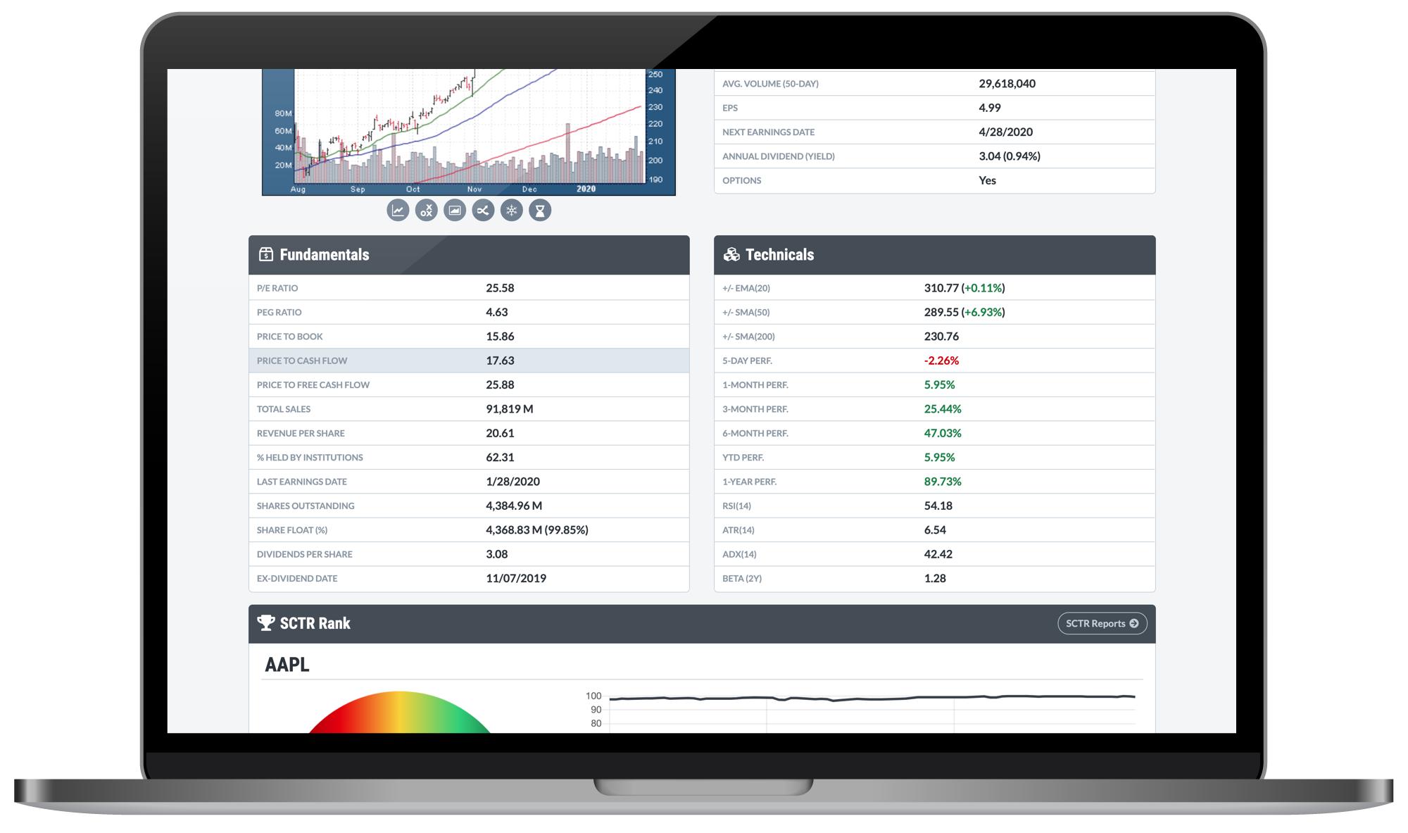
Below the price chart and Summary panel (where you'll find important price numbers, dividends, earnings dates and other key values like EPS), we have our expanded Fundamentals panel. With a ton of new data points we've never covered before on StockCharts, this is a major addition to the site that we believe will greatly enhance your analysis capabilities. You'll find crucial figures like P/E ratio, PEG ratio, Price to Book, Total Sales, Revenue per Share, Percent Held by Institutions (a favorite of mine!), Shares Outstanding, Share Float and many more.
Right next to the Fundamentals, you'll also see a Technicals panel that includes some of the crucial figures our users follow. We've added a variety of price performance numbers, helpful points like position relative to key Moving Averages, and common indicator values like RSI, ATR and ADX.
My personal favorite here – the 2-year Beta value at the bottom of the panel. Thrilled to bring that to this tool!
Unique SCTR Views

The SCTR rankings have become a beloved indicator on StockCharts, used by many thousands of investors every day. With that in mind, the Symbol Summary page lets you you can now view SCTRs like never before.
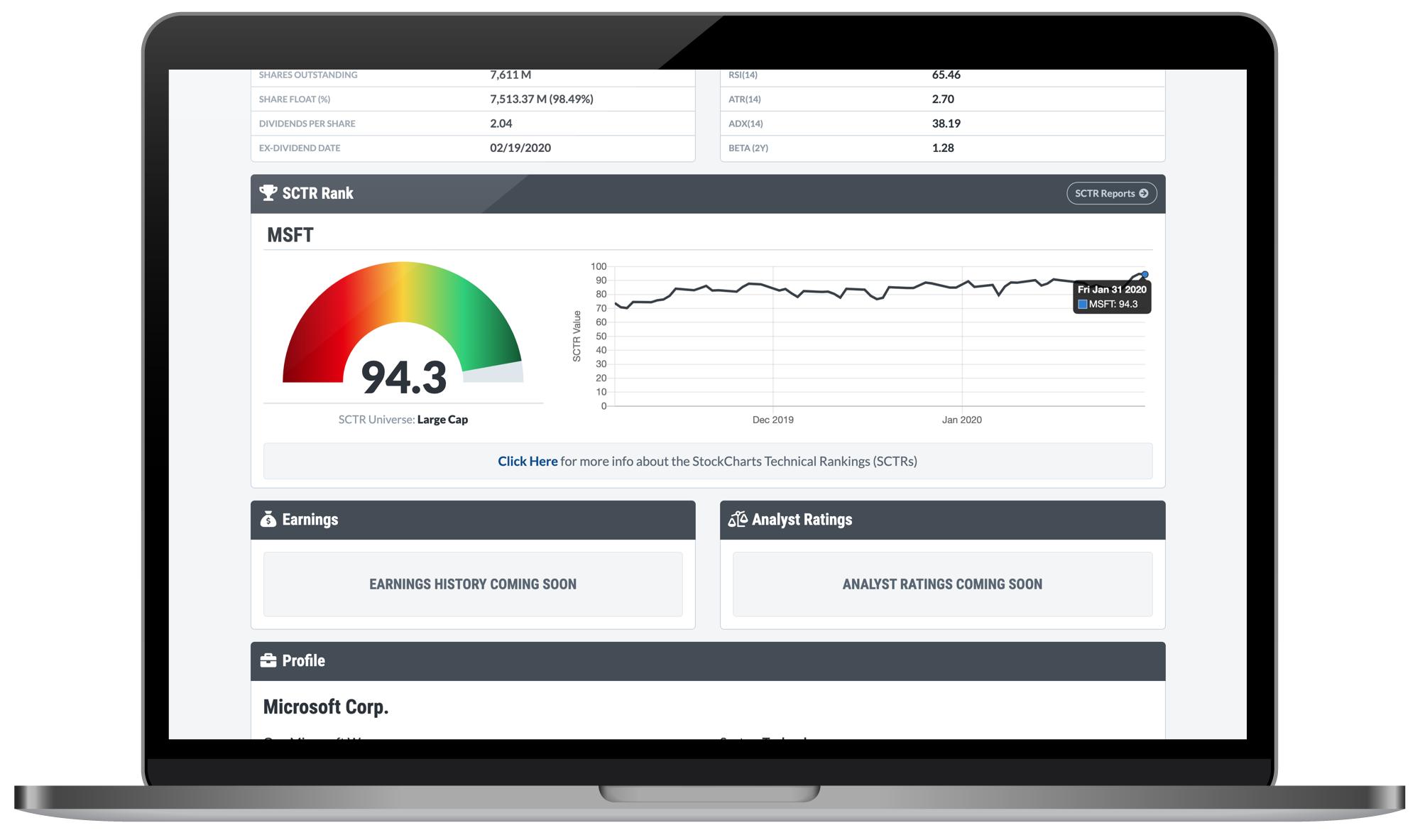
Pull up a stock or ETF and you'll see the latest value displayed in a colorful, easy-to-read, meter-like format. This quick speedometer view for the SCTR is then complemented by 3-months of history, charted in the graph on the right. You can hover over each point on the chart to see an exact value pop up in a "tooltip".
We continue to hear from more and more people who are discovering the StockCharts Technical Rankings (SCTRs) and incorporating it into their analysis system, so I'm thrilled to help display this powerful indicator even more prominently with our new Symbol Summary page.
Corporate Info And ETF Descriptions

Below the SCTR panel, you'll find a Profile section that includes a variety of corporate info and other descriptive details for many stocks and ETFs. If you're looking at a stock, you can see the company's address and a link to their website, along with sector and industry classifications off to the right. Most importantly, we use this panel to show you a company description that helps provide a general overview of the business, their products or services, their history, etc.
If you're looking at an ETF, this panel won't include an address, but it will still have a link to the external website associated with the fund, plus a description of the ETF's scope, strategy, purpose and more.
The Profile panel provides a great way to learn more about the symbols you're researching, something that goes beyond the charts, technical stats and fundamentals and looks more broadly at what the company is and what they do, or what the fund aims to achieve.
ChartLists, Alerts And Predefined Scans

Towards the bottom of the page are three unique features that you'll absolutely love as a StockCharts Member. When you pull up a symbol, we'll automatically show you any of the ChartLists in your account under which you've saved a specific ticker. You can click the name of the ChartList to quickly jump over and see what's there, or click the name of the saved chart to navigate over to that specific SharpChart or P&F chart.
In the Alerts panel, you'll see a list of all custom alerts you've created for that ticker symbol. This a unique way to see – and remember – what you've set up in your account. Links above the table will also allow you to create a new alert or view all of your saved alerts from the "Alert Center".
Finally, in the Predefined Scans panel, we'll display any and all predefined scans that the symbol you're looking at has triggered. For example, if you've got a stock on the Symbol Summary that's making new highs and triggering our "New 52-Week Highs" scan, you'll see that right there in this panel. Click the name of the scan and we'll show you all of the results for it, including other stocks and funds that meet the associated criteria.
Member Actions

Back up at the top of the Symbol Summary page, you'll find some buttons under the "Member Actions" label. Once you've logged in, you'll be able to save any symbol from this page directly into one of your ChartLists. You can select a list, set a name, and choose the ChartStyle you want to use when saving the new symbol. If you're browsing through different tickers and come across something that you want to dive deeper on, this is a great function to keep mind.
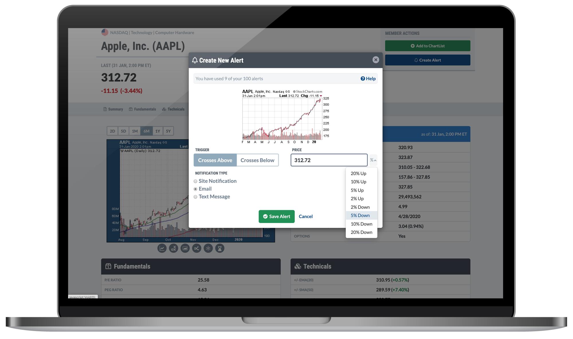
The other button under Member Actions allows you to create a new price alert for any symbol, right from this page. Just like saving to a ChartList, if you find something that you want to keep a closer eye on, the Create Alert function is a powerful feature of the new Symbol Summary. Plus, you'll then be able to see all of your custom alerts for any particular symbol in the Alerts panel further down the page.
Fully Responsive - Optimized For Every Device

Another great aspect of the Symbol Summary page: it scales to fit any and every screen size, so you can keep the analysis going from anywhere, even while you're out on the go. Whether you're on a desktop, laptop, tablet or smartphone, the Symbol Summary will automatically size to fit your device and give you a great view of the symbol you're interested in.
I've been using this new tool on my phone, for example, while I'm away from the office or even just relaxing on the couch flipping through stocks. It's a wonderful way to take a quick look at any symbol and still get a very complete picture of that stock, fund or index.
So with that, I think it's time for me to let you go explore the new tool for yourself. But as with any new feature, we'd love to hear your thoughts! As you start to play around with all that's there on our new Symbol Summary page and begin to incorporate this into your trading/investing/analysis workflow, drop us a line and let us know what you think. We welcome your thoughts and feedback and are excited to help make this an even more valuable resource for you on StockCharts.
Chart On, My Friends.
Grayson Roze
VP of Operations, StockCharts.com
Author, Trading For Dummies
|
| READ ONLINE → |
|
|
|
| Market Roundup |
| The Stock Market May Be Rattled by the Coronavirus, But Bond Yields Have a Battle of Their Own |
| by Martin Pring |
The stock market was roughed up by the coronavirus earlier in the week, but, under the surface, another battle has been going on -- the one between inflation and deflation, that is, as both yields and commodity prices have run up against key support levels. That's a dispute that should concern most investors. It certainly concerns us at Pring Turner Capital and in my monthly newsletter, the Intermarket Review, as decisions are evolved as to whether to position accounts in an inflationary or deflationary direction.
Take the 5-year yield, for instance. Chart 1 shows that the trend is still negative, because it is below its 12-month MA and the long-term KST in the lower window is bearish. However, it is also resting on a 6-year up trend line, where it's possible that a reversal could take place.
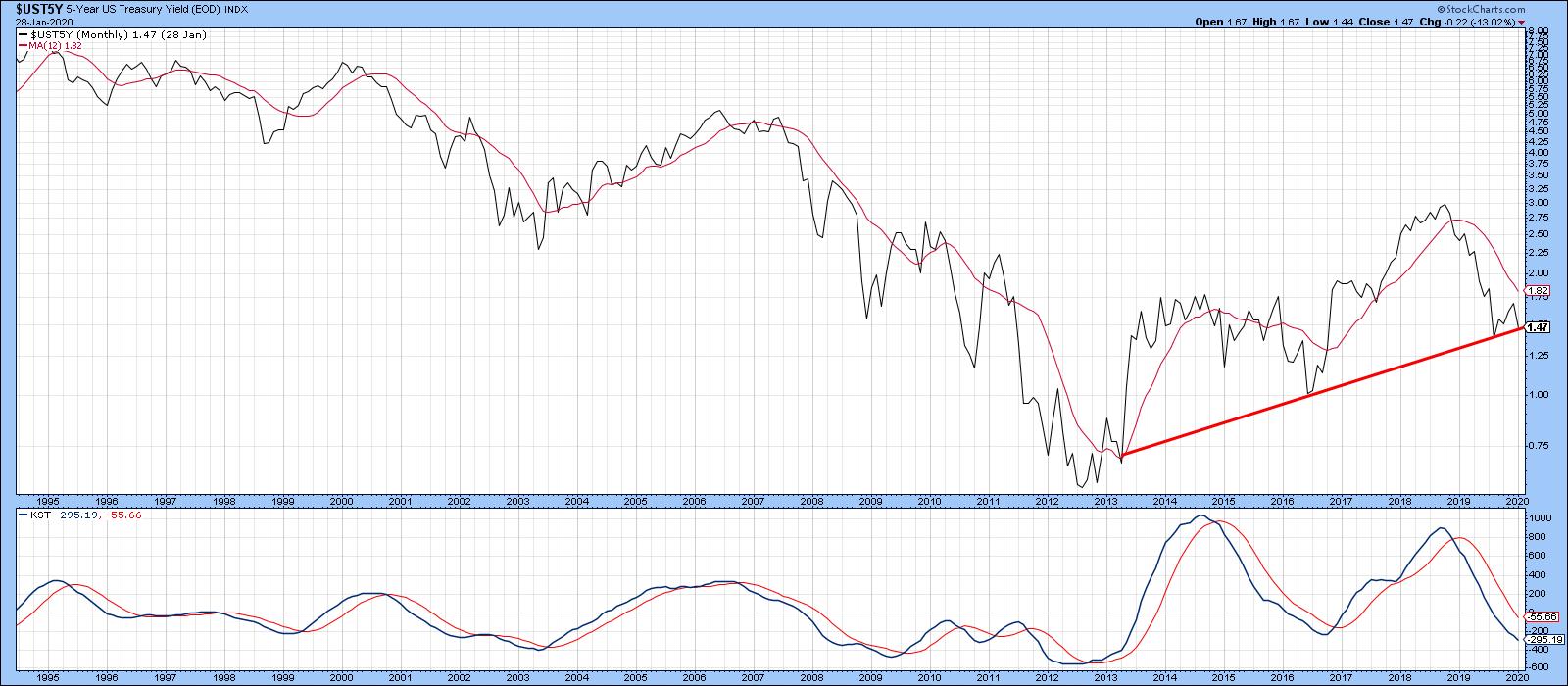
Chart 1
Chart 2 shows how critical the near-term situation is, as the yield is also resting right on its 2018-2020 up trend line. Since the 9-day RSI is oversold at a time when the yield has reached support, this should trigger some form of a bounce. If it does not, that will be a definite technical negative.
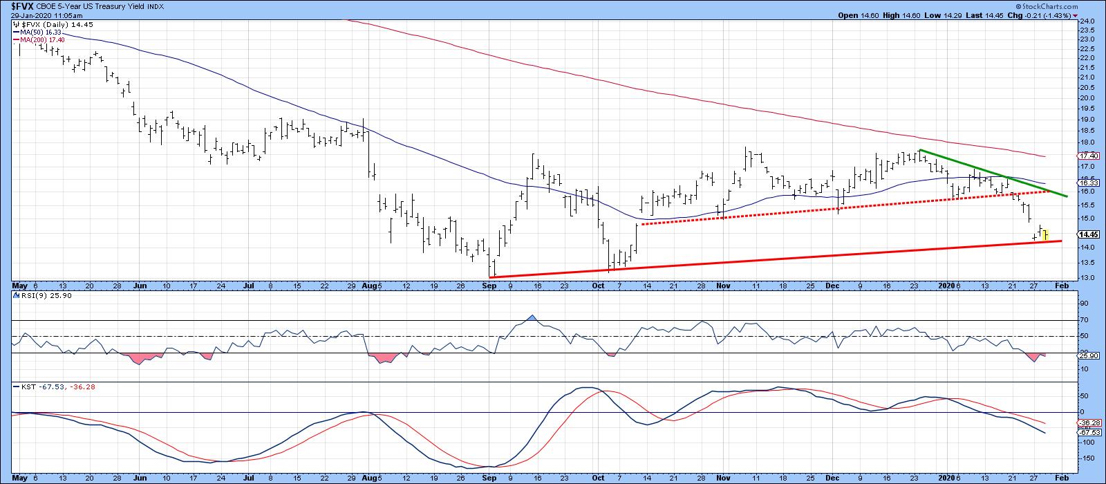
Chart 2
Further down the yield curve, the 30-year series is close to its 2009-2020 support trend line. Long-term indicators remain very oversold, hinting that a primary trend reversal may be in the cards. However, the short-term series in this chart is in a bearish mode, which suggests that a challenge of that line is a distinct possibility.
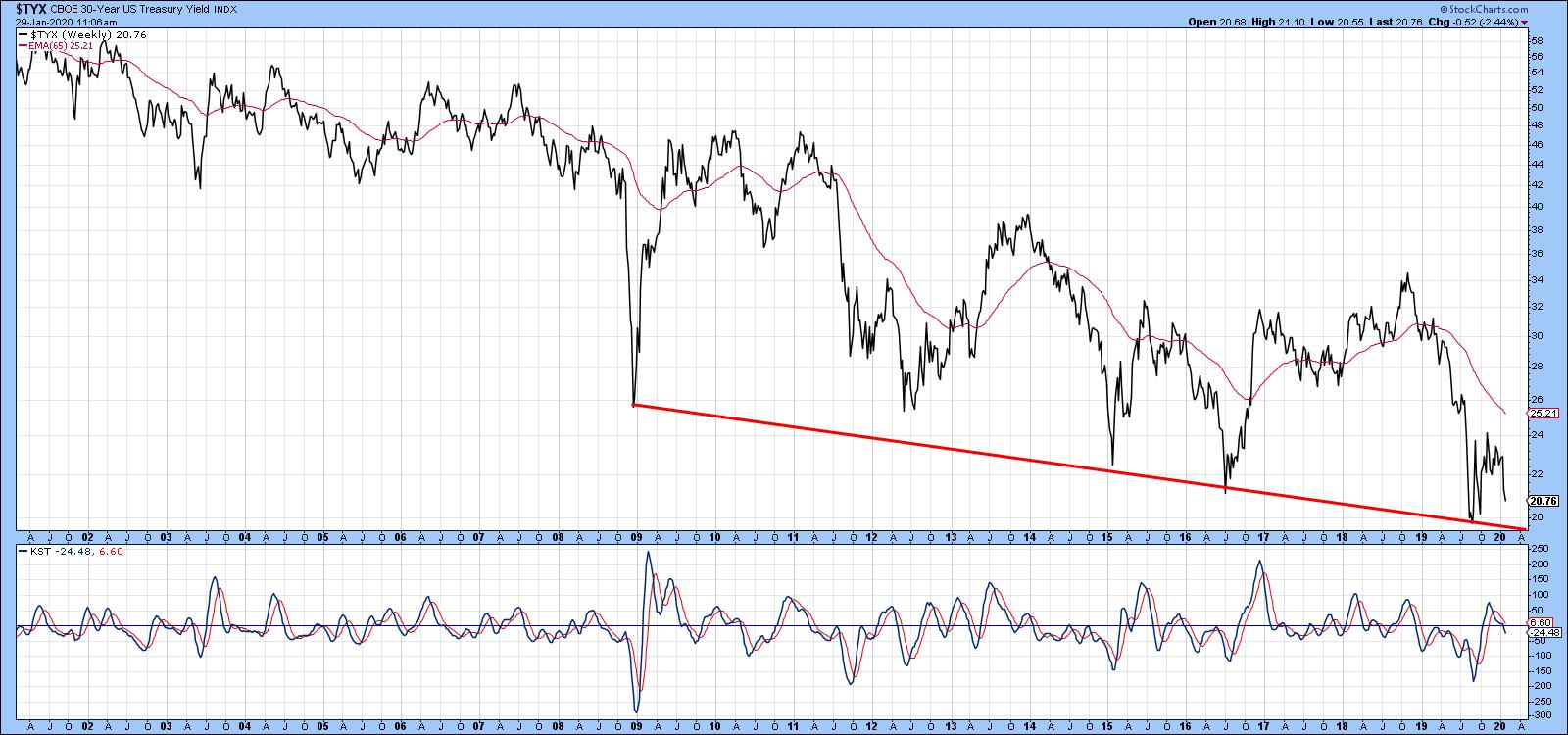
Chart 3
Editor's Note: This is an excerpt of an article that was originally published in Martin Pring's Market Roundup on Wednesday, January 29th at 1:29pm ET. Click here to read the full article, which includes Charts 4-8 and a discussion of commodities.
Good luck and good charting,
Martin J. Pring
The views expressed in this article are those of the author and do not necessarily reflect the position or opinion of Pring Turner Capital Group of Walnut Creek or its affiliates.
|
| READ ONLINE → |
|
|
|
| The Mindful Investor |
| The Shiny (and Bullish) Yellow Metal |
| by David Keller |

With stock markets in rapid decline this week, mindful investors should be looking around for opportunities. What asset classes are thriving while others are struggling?
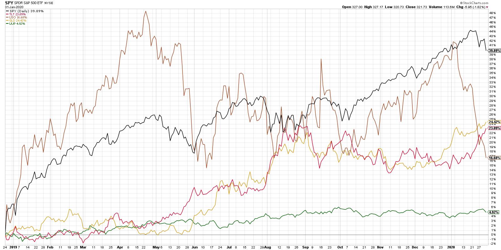
A quick survey of the asset allocation will indicate that, while oil has been in freefall and stocks are now testing and failing at support, gold and bonds have rallied nicely.

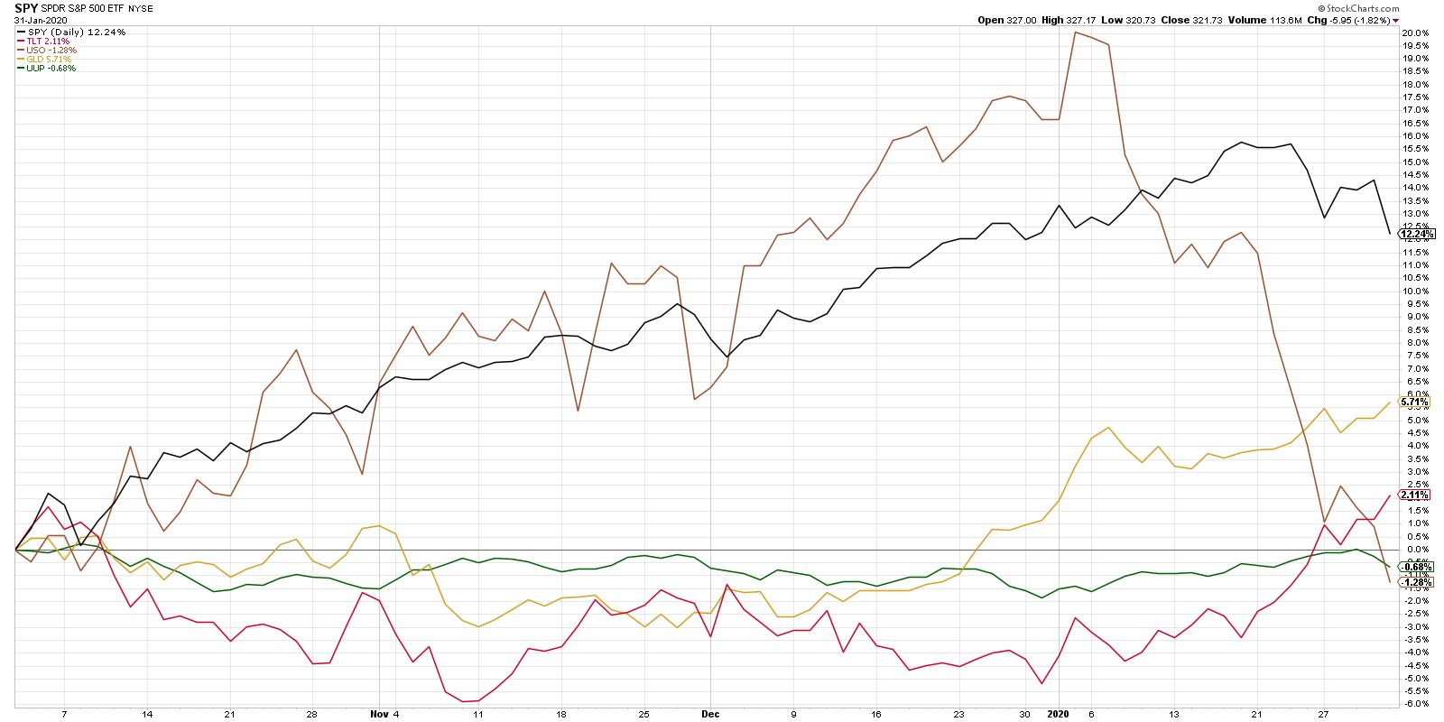
Now, if you start the clock at the December 2018 market low, stocks still appear to be the long-term winners, which is absolutely correct. A shorter-term view, however, shows how the movements of the last month relate to the previous year.

With this view, we can see the last month in much better detail, including the topping pattern of stocks and the break to new swing lows this week. We also can see both the GLD and the TLT breaking to new closing highs at the same time.
When you dig deeper into the gold story from a technical perspective, one of the first things you should recognize is the difference in return profiles between equities and gold. To put it another way, equities and gold just tend to move in very different ways.
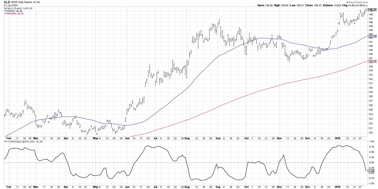
One way to visualize these relative movements is through a correlation chart:

Here, we're showing the gold ETF along with a rolling 20-day correlation to the S&P 500. Many investors think that stocks and gold are inversely correlated, meaning that, when stocks do well, then gold starts to suffer, and vice versa.
The data actually shows that this is not a consistent phenomenon. There are periods (such as mid-January) where they have moved together. In this case, both gold and stocks were in steady uptrends. However, there are other periods, such as August 2019, where they moved inversely to one another. In that instance, gold rallied while stocks were in mid-summer correction mode.
Long story short, gold and stocks have diversified return streams. This means that, for investors looking to diversify their exposure to price trends, a position in gold could provide some of that.
What are the charts saying about the overall trend in gold here?

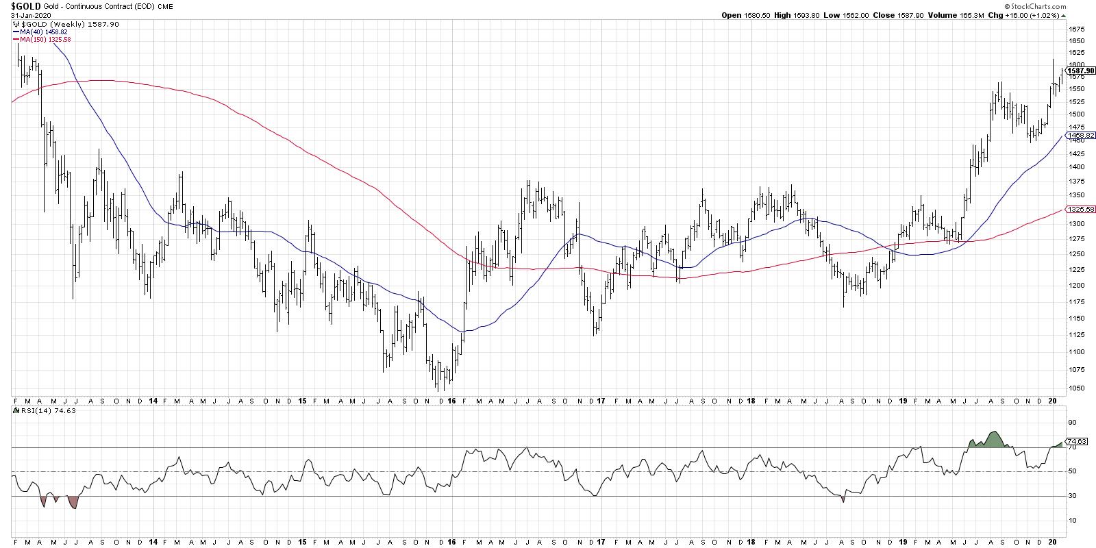
The weekly chart of the gold future illustrates the long-term rotation from downtrend to sideways trend to uptrend. In mid-2019, gold broke above a significant resistance level. "The bigger the base, the higher in space!" as my mentor Ralph Acampora would tell me. This suggests much further upside for gold based on the amount of time spent in consolidation mode.
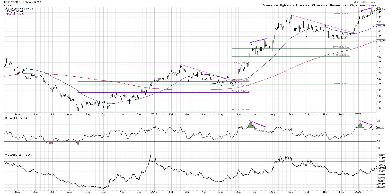
The daily chart of the GLD shows how the current chart relates to the first half of 2019.

In the first quarter of 2019, gold topped out, then retraced just over 38.2% of the previous uptrend. The GLD then broke back above resistance and continued on to a bearish divergence, with higher price peaks and lower RSI. This bearish divergence actually resolved higher, with the GLD closing above the 137 level in August when stocks were pulling back.
We saw a very similar pattern, with a bullish run followed by a 38.2% pullback, last November. Now we have the same bullish divergence that we saw in 2019. A confirmed close above the 150 level would complete this pattern that we saw last year, with a bearish divergence indicating more of a pause before the resumption of the long-term uptrend.
Regardless of the future trend in gold, the differentiated return profile from other asset classes suggests it is worth consideration as part of a mindful asset allocation exercise.
RR#6,
Dave
David Keller, CMT
Chief Market Strategist
StockCharts.com
Disclaimer: This blog is for educational purposes only and should not be construed as financial advice. The ideas and strategies should never be used without first assessing your own personal and financial situation or without consulting a financial professional.
The author does not have a position in mentioned securities at the time of publication. Any opinions expressed herein are solely those of the author and do not in any way represent the views or opinions of any other person or entity.
|
| READ ONLINE → |
|
|
|
|
|
| Trading Places |
| A Proven Method To Better Predict Earnings Results and Free Webinar |
| by Tom Bowley |
Relative strength.
It seems easy enough. Wall Street meets with management teams continuously throughout the year (except during quiet periods). Analysts evaluate not only business strategy, but also business integrity. It's an opportunity for executives to lay out their business plans and strategies to the people that matter most - the Morgan Stanley's and Goldman Sachs' of the world. These are the folks that will create demand for the stock of Corporate America.
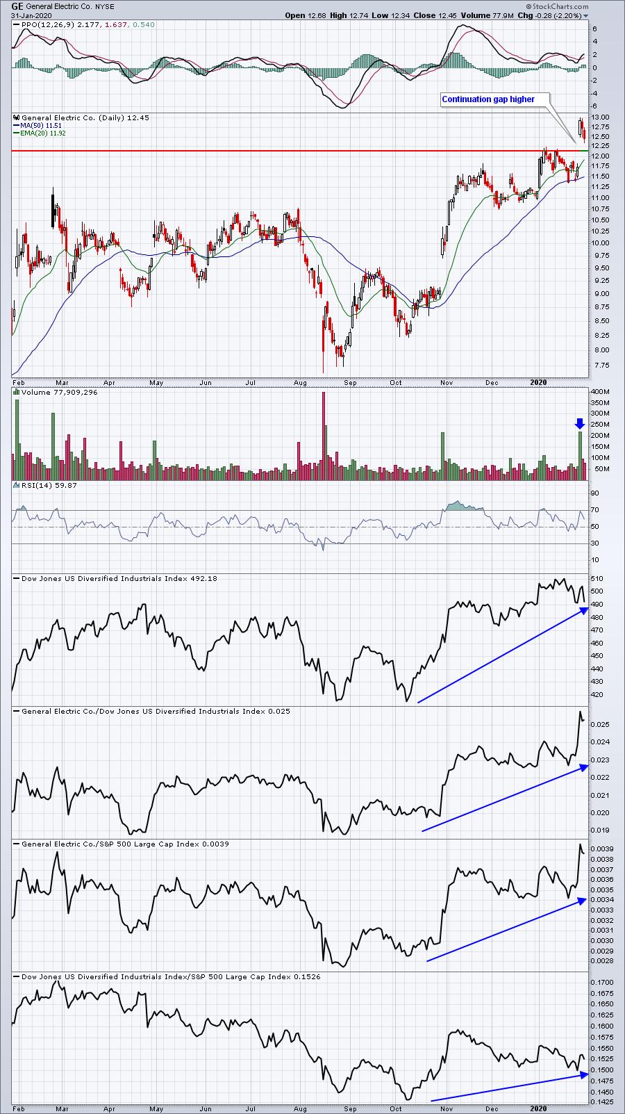
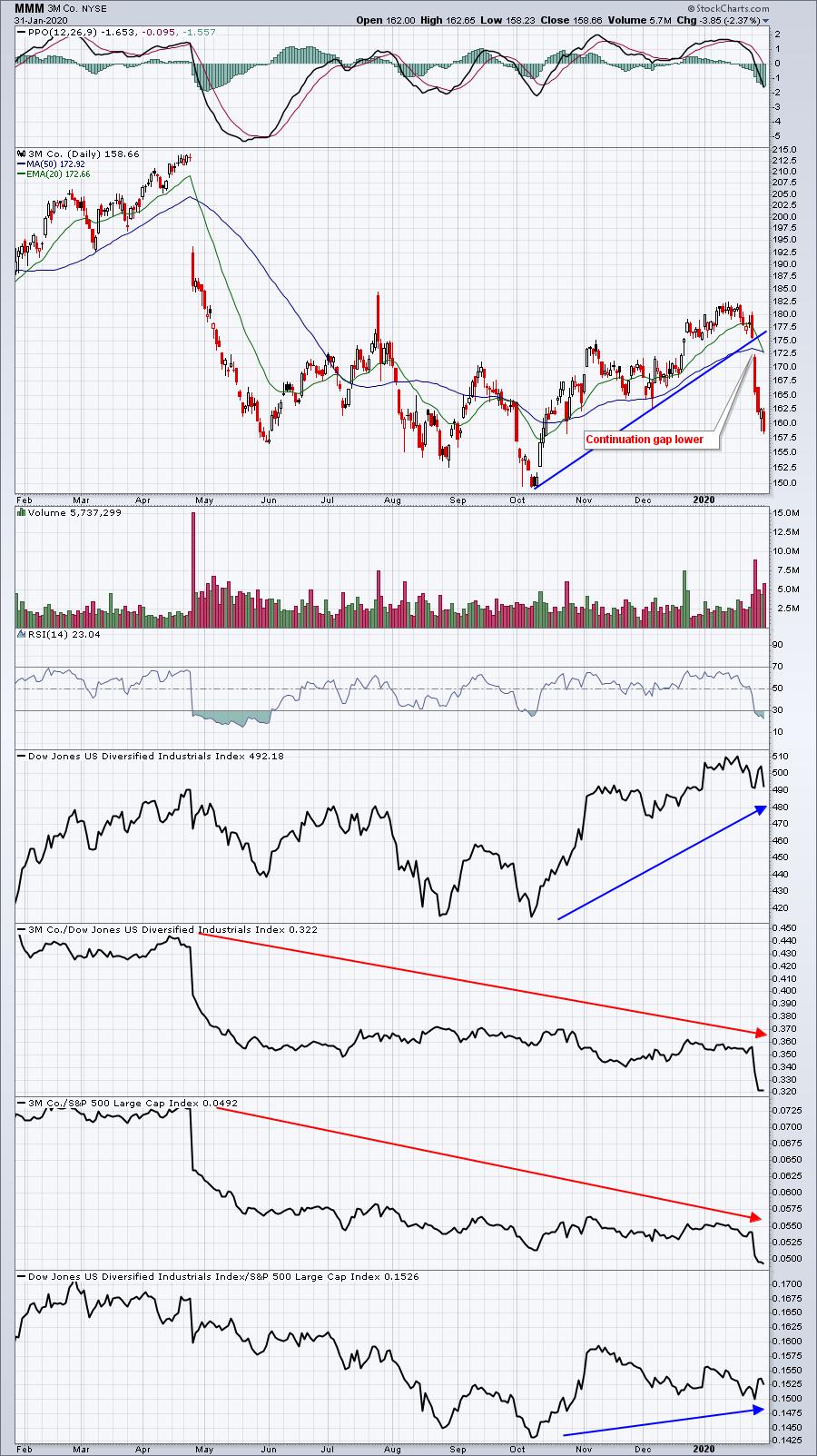
But how do you and I get to sit in on these meetings? Well, we don't. But astute technicians can look at the relative strength of companies in the same industry and get a quick feel for which companies Wall Street favors. Let me give you an example. Last week, General Electric (GE) and 3M Co (MMM), both diversified industrial companies ($DJUSID), reported quarterly results. I want you to look at these two charts and check out the key differences:
GE:

MMM:

I see huge differences in relative strength. GE has been outperforming its peers and the benchmark S&P 500, while MMM has lagged both. As they headed into earnings this past week, it was clear to me which one I'd own and which one I'd sell as the earnings announcement approached. Last week, I even wrote about MMM's likely disappointing earnings report in my Trading Places blog article, "I Will Guarantee You The Upcoming Earnings Performance Of These 2 Giants".
I pointed out that Apple (AAPL) would blow past estimates, which they did, and that MMM would deliver yet another disappointing report, which they did as well. Then last week, I provided dozens of upcoming earnings reports to EarningsBeats.com members, predicting both winners and losers before the earnings were released. The results were outstanding and can be found in another Trading Places article, written on Thursday. CLICK HERE to access that article.
The results did not include earnings reports out Thursday after the bell, nor Friday before the bell. Those reports, however, only added to the outstanding results that I'll share Saturday, February 1st at 2pm EST, in a free webinar that is open to the public!
I want you to join me at this webinar. This is what you'll get:
- A demonstration of a new Shared ChartList feature at StockCharts.com that allows me to easily provide a fully annotated ChartList with my chart styles.
- Our EB Digest newsletter (if you're not already a subscriber), which is completely free.
- A copy of my Strong Earnings ChartList, fully annotated with key price support levels.
- A demonstration of how to download this ChartList into your account. I'll show you how easy it is - it'll take me less than 10 seconds.
- The results from the earnings predictions of last week - it's quite impressive!
- My earnings predictions for next week, both bullish and bearish. I can't promise they will be as good as last week's, but I'll try my best!
I believe everyone will walk away with valuable education and, quite possibly, a few great trading ideas! Just be sure to click on the following link between 1:30pm EST and 2:00pm EST on Saturday, February 1st:
https://zoom.us/j/532677405
If you can't attend LIVE, send us an email to support@earningsbeats.com. We'll make sure you're set up in our free EB Digest and that you receive a recording of the event.
Happy trading!
Tom
|
| READ ONLINE → |
|
|
|
| RRG Charts |
| RRG Suggests Aggressive Trade Setup for XLY vs. XLV |
| by Julius de Kempenaer |
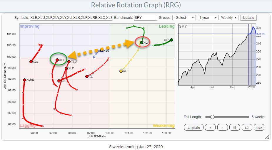
 Weekly RRG showing US sectors vs. SPY Weekly RRG showing US sectors vs. SPY
The Relative Rotation Graph above shows the weekly rotation for US sectors against SPY (S&P 500). While the S&P 500 chart is deteriorating and seems to be going into a correction, there are two tails on the RRG that suggest an interesting trade setup. (I already hinted and briefly discussed this one in last week's Sector Spotlight.)
What we are talking about are the opposite rotations currently underway for the Consumer Discretionary sector (XLY) and Health Care (XLV).
On the weekly RRG above, we see XLV inside the leading quadrant but rolling over in the past two/three weeks, after only a short period inside this quadrant (entry December 2019). On the opposite side, in the lagging quadrant, the tail for XLY started to curl upward at the start of January and has recently also started to gain on the JdK RS-Ratio axis. This means that the sector is now at a positive RRG-Heading.
The daily RRG below shows the shorter-term rotation for both sectors (isolated).
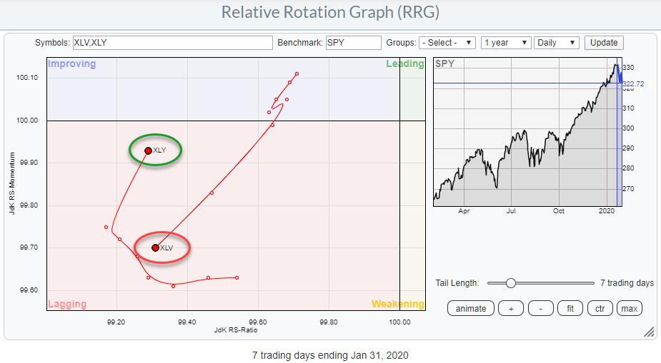
 Daily RRG showing rotations for XLY and XLV against SPY Daily RRG showing rotations for XLY and XLV against SPY
On this version of the Relative Rotation Graph, we find both sectors inside the lagging quadrant; both are also at opposite rotations. Where XLY is following a normal gradual rotation from leading through weakening into lagging (and now on its way to improving), XLV shows a quick reversal down after rotating into the improving quadrant.
Both sectors, especially XLV, are showing an acceleration of their rotations, which can be seen by the increased distance from observation to observation on the tails.
In essence, this rotation is confirming/supporting the longer-term rotation that is visible on the weekly RRG.
Time to inspect both of their price charts:
Health Care - XLV

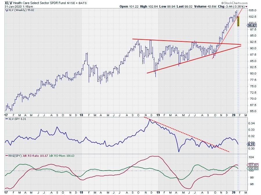
After breaking out of the consolidation/triangle in October, XLV showed a very nice and steep uptrend until it peaked last week at $ 105. The recent decline broke the steep rising support line, which ends this initial rally after the break.
The next thing to wait-and-see for is where the next low will be formed. The educated guess is somewhere between $92.50-$95.00. This is the area where the peaks in 2018 were formed and the level at which the former resistance line is; the latter is now expected to offer support.
The relative strength vs. SPY got a dent as well from the recent decline in price. The break of resistance in October was a positive, but we now need a new higher low to come in rapidly to maintain this positive element from this break. It looks questionable as to whether that will happen, IMHO. Meanwhile, the RRG-Lines are rolling over, which is causing the downward rotation of the tail inside the leading quadrant.
Going forward, we have a price chart that seems set for a further downward correction, while relative strength is weakening.
Consumer Discretionary - XLY

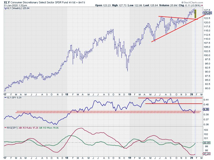
XLY also broke out of a consolidation/triangle formation in December, but the follow-through rally was not so strong, as we saw in XLV above. What we do see here is that the corrective move of this week was caught by support coming from the former resistance line, as well as the extended rising support line that marked the lower boundary of the consolidation.
The relative strength for this sector actually declined during the consolidation, only starting to level off after the break. Despite the weak price performance of this week, relative strength bounced off a support area, marked by the two dashed lines, and the RRG-Lines started to curl back up, with JdK RS-Momentum almost pushing above 100.
All in all, the opposite rotations for these sectors on both the weekly and the daily RRGs suggest that we should have a preference for Consumer Discretionary stocks over Health Care in coming weeks.
Does that make sense while the general market is deteriorating? Particularly when a rotation towards "defensive" sectors like Utilities and Staples - and, historically, Health Care - and OUT of "offensive" sectors like Discretionary would be more in line with expectations?
I don't know. Staples and Utilities seem to be respecting the historical pattern, but, as far as I can see, Health Care is not. At least, not so far. And neither does Discretionary.
It is an early call, and things can change, but, for now, I am going to follow what I see and not what I think I should see. ;)
Enjoy your weekend!!
--Julius
My regular blog is the RRG Chartsblog. If you would like to receive a notification when a new article is published there, simply "Subscribe" with your email address.
Julius de Kempenaer
Senior Technical Analyst, StockCharts.com
Creator, Relative Rotation Graphs
Founder, RRG Research
Want to stay up to date with the latest market insights from Julius?
– Follow @RRGResearch on Twitter
– Like RRG Research on Facebook
– Follow RRG Research on LinkedIn
– Subscribe to the RRG Charts blog on StockCharts
Feedback, comments or questions are welcome at Juliusdk@stockcharts.com. I cannot promise to respond to each and every message, but I will certainly read them and, where reasonably possible, use the feedback and comments or answer questions.
To discuss RRG with me on S.C.A.N., tag me using the handle Julius_RRG.
RRG, Relative Rotation Graphs, JdK RS-Ratio, and JdK RS-Momentum are registered trademarks of RRG Research.
|
| READ ONLINE → |
|
|
|
| The MEM Edge |
| Putting Your Best Players on the Field in a Rocky Market Environment - Defensive Plays With Growth & Yield |
| by Mary Ellen McGonagle |
The broader markets took it on the chin today as news of a sharp increase in the number of coronavirus cases brought fear-induced selling across most areas. Hardest hit were businesses that rely on healthy economic growth in China to buoy their bottom lines, while defensive areas held in well.
Of course, no one can predict how much harder the markets may get hit. That said, we can certainly use history as a guide to help formulate a solid game plan to buffer against the inevitable knocks that will come as the deadly virus spreads.
Below are 3 stocks in defensive areas of the market. All 3 offer above-average yields while having improving growth prospects, making them quite attractive at this time.
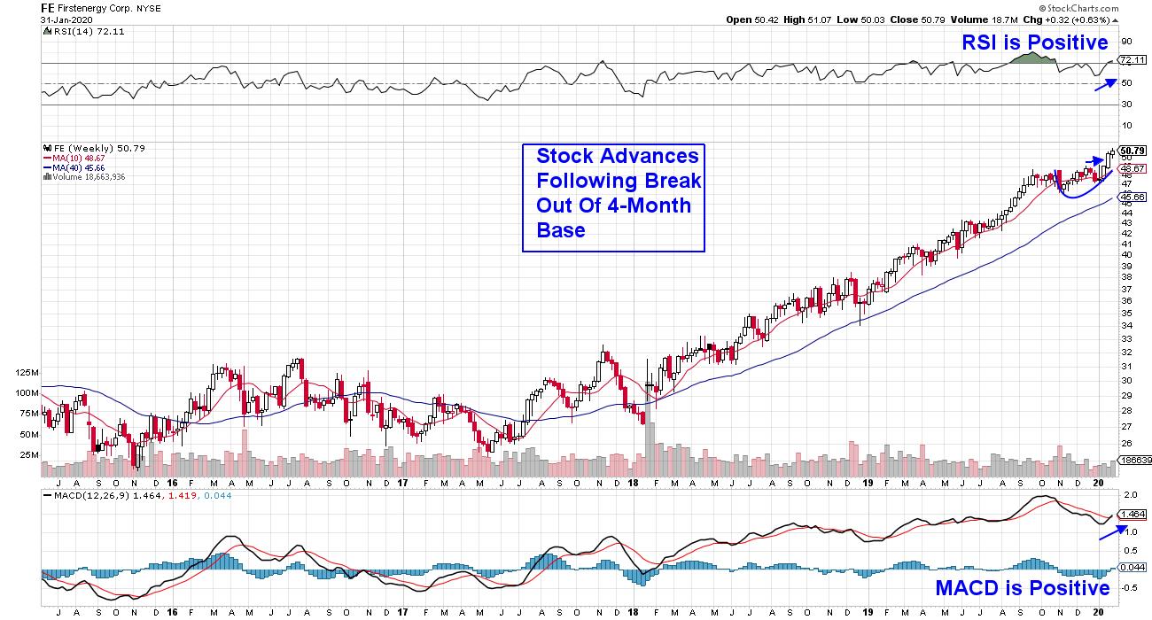
WEEKLY CHART OF FIRSTENERGY CORP. (FE)
We'll begin with a company in the Utility sector that offers a 3.1% yield, with analysts raising earnings estimates. Firstenergy Corp. (FE) generates and distributes electricity in the Northeast area of the U.S., and the recent elimination of fees by regulators has improved Wall Street's outlook.
FE was a solid winner for most of 2019 before peaking in price in late October. The outperformance came on the heels of solid year-over-year earnings growth, which was above 50% for at least 2 quarters. A recent move back into the stocks has pushed it out of a 4-month base and up to new highs on volume, pointing to further near-term upside.
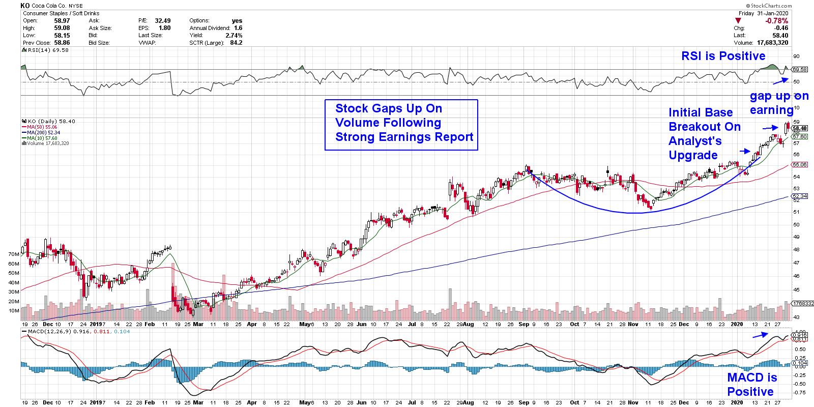
DAILY CHART OF COCA COLA CO. (KO)
Next up we have a different kind of energy provider as Consumer Staples stock Coca-Cola Co. (KO) marches to new highs. KO's uptrend started earlier this month, following a Wall Street upgrade ahead of the release of their earnings this week. The company reported solid growth following a pick-up in their energy-infused Coke-plus-coffee drink and zero-calorie sodas.
The stock gapped up in price following yesterday's bullish report of 4th quarter earnings, which, in turn, pushed the RSI into an overbought position. I'd be a buyer on any pullback as the 2.7% yielder appears poised for further upside, with an upgraded price target over 10% higher than the current price.
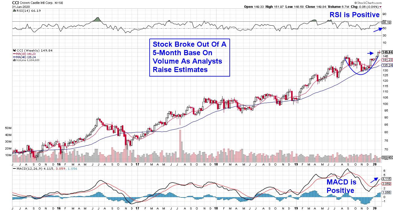
WEEKLY CHART OF CROWN CASTLE (CCI)
Last up is a REIT stock that owns and operates over 40,000 cell towers across every major U.S market. Crown Castle (CCI) continues to add to that number while also increasing their vast network of fiber optic cables. All this points to a steady income source for the company, enhanced by built-in price increases in their leases.
This stock was another big winner last year before peaking in price in September. REIT stocks fell out of favor at that time as growth stocks moved to the forefront. More recently, this 3.2%-yielder began regaining its momentum with a recent base breakout that has seen the stock hitting new highs - putting it on the path to more upside.
As the U.S. gears up for Super Bowl Sunday, smart investors will be getting their defenses ready for a potentially bumpy ride over the coming weeks. A quick look at performance during the 2002-03 SARs outbreak shows that Utility stocks outperformed, as did select beverage stocks from Consumer Staples. (REIT stocks cannot be tracked to that date period.)
For those who'd like to stay closely tuned into market sentiment as investors' fear is poised to rise, I urge you to trial my top performing MEM Edge Report for 4 weeks at a nominal fee. This bi-weekly report provides broader market insight as well as refined sector analysis, complete with stock buy and sell recommendations. CLICK HERE to get this Sunday's updated report as well as updates throughout the week, including the Wednesday Midweek Report.
In addition, fellow StockCharts contributor Bruce Fraser and I will be launching our High Growth Income report next month, which will focus on stocks such as those mentioned above. If you'd like to receive more information, just drop a line to support@thememgroup.com.
Warmly,
Mary Ellen McGonagle
MEM Investment Research
|
| READ ONLINE → |
|
|
|
| SPECIAL EVENT ANNOUNCEMENT |
| Don't miss your chance to hear David Keller, Chief Market Strategist at StockCharts.com! David will be a featured presenter at the upcoming Orlando MoneyShow conference, February 6th - 8th. The event is free to register and attend, and you'll have the chance to hear David speak alongside a long list of other industry legends and market experts. Click the banner below to learn more. |
 |
| LEARN MORE → |
|
| MORE ARTICLES → |
|


 AMZN reported earnings yesterday.