| THIS WEEK'S ARTICLES |
| Market Roundup |
| Is the State of Emergency a Sign of a Bottom? |
| by Martin Pring |
This week has seen U.S. administration fiscal proposals, as well as 1.5 trillion dollars in Fed support, aimed at limiting the economic damage from COVID-19. Friday saw a travel ban put into effect, along with a state of emergency. Unfortunately, these actions, just like the previous week's cut in short-term rates, have so far failed to spur the market in any meaningful way. That's because the market abhors uncertainty, and these actions do nothing to remove it. They will certainly help when the virus dissipates, but, until it becomes evident that it has, the uncertainty will prevail.
That big unknown comes from the expanding number of new cases outside of China, especially in Europe and the US. Last week, I referred readers to https://coronavirus.thebaselab.com/, a site that publishes the latest data on new and existing cases. My conclusion at the time was that COVID-19 appeared to be rotating around the world. Focusing on the most active countries, we showed that China and South Korea had peaked. The latest data in Charts 1 and 2 continues to point in that direction, though the total number of new cases outside of China continues to grow, as shown in Chart 3.
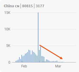
Chart 1

Chart 2 Chart 3 Chart 3
Moving westward, Iran (Chart 4) had been experiencing three down days. That was not sufficient to call a new downtrend, but it was certainly encouraging. This week has seen a bounce back to a marginal new high. No sign of a peak here, unless we see a drop below the previous low. In that case, it would likely signal that Iran had topped out.

Chart 4
So far, Europe has shown no signs of a downside reversal. Problems are concentrated in Italy (Chart 5), where new cases being reported are just shy of 3,000. That compares to Spain and Germany, both around 1,000 each. Obviously, Italy is something to watch closely.

Chart 5
Finally, the US continues to build, albeit from a relatively small number, but it is certainly not showing any signs of peaking. The market is already factoring in the bad news, so when it becomes evident that COVID-19 is in the process of maxing out in Europe or the US, equity prices may snap back pretty quickly. The "may" is in there because it could well involve a two-stage recovery, first from good news in Europe and second from the US. One thing is for sure: sharply lower interest rates and energy prices, combined with fiscal stimulus and Fed liquidity injections, could well convert a sold-out market into a booming one.

Chart 6
Speaking of sold-out markets, Chart 7 shows that the NYSE bullish percentage has almost eclipsed the record set in 2009. The solid green arrows represent previous oversold readings that bounced from the horizontal dashed line, whereas the dashed arrows flag very weak rallies. In either case, the market is buying time - time, perhaps, for those new cases in Europe and the US to peak out.

Chart 7
It seems likely to me that, if China and South Korea can take care of the situation, Europe and the US will soon follow suit. From a contrarian point of view, government action is typically a lagging indicator, as the authorities take their time to respond until the issue in question is on everyone's mind. This week's European travel ban and state of emergency should therefore be viewed as bullish developments.
Editor's Note: This is a duplicate of an article that was originally published in Martin Pring's Market Roundup on Friday, March 13th at 6:04pm ET. Click here to read the original article, which includes live charting capabilities.
Good luck and good charting,
Martin J. Pring
The views expressed in this article are those of the author and do not necessarily reflect the position or opinion of Pring Turner Capital Group of Walnut Creek or its affiliates.
|
| READ ONLINE → |
|
|
|
| The Mindful Investor |
| Bullish Divergence Suggests Short-Term Upside |
| by David Keller |
Every Friday on my show The Final Bar, we answer viewer questions from throughout the past week. One of today's questions related to the potential bullish divergence on the S&P 500 using price and RSI. In this article, I'll share how I think about divergences, why it's important to wait for validation and what this means for the short-term picture for stocks.
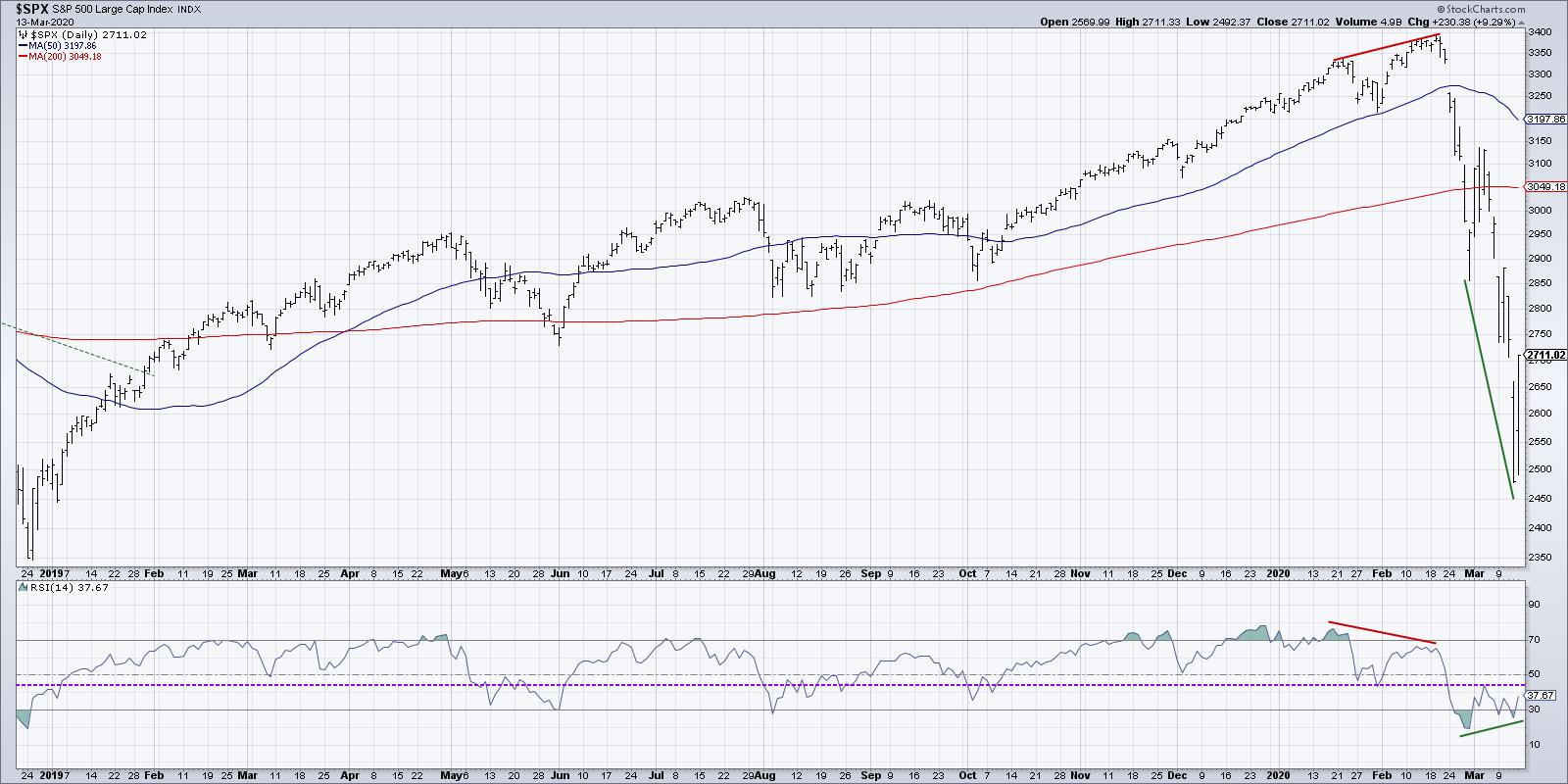
A bullish divergence, by definition, is a situation where you have price going to lower lows and an indicator experiencing higher lows. Here's the current chart of the S&P 500, which provides a fairly straightforward example:

The green lines indicate the bearish divergence, with the price making lower lows over the last six weeks while RSI has put in a higher low. This suggests a lessening of momentum on the downside and usually suggests short-term upside in price.
You'll also note the two red lines that indicate a bearish divergence, with higher highs in price and lower highs in RSI. This bearish divergence, along with weakening breadth characteristics, were a key input in our bearish thesis in mid-February.
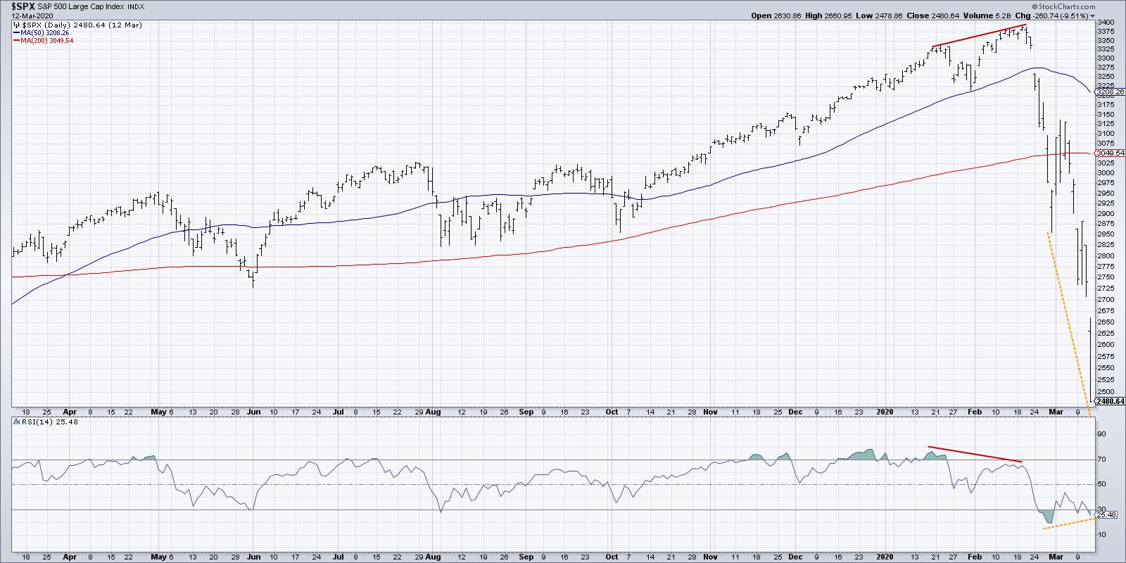
But, up until Friday's 9% rally in stocks, was this really a bullish divergence? No!
If you back up the chart one day, you'll notice that the S&P closed Thursday's session near the lows for the day, still appearing to be in a very negative trend.

It would be premature to call this a bullish divergence until you have established some short-term price bottom. Otherwise, it's a price still very much in a downtrend.
During the "falling knife" phase of a raging selloff, like we have seen in recent weeks, it's very easy fall victim to a bullish divergence that is not yet fully formed. Now that we've had Friday's rally, which established the 2470 low from Thursday as a swing low for the week, we can now say that the price has confirmed a pattern of lower lows with higher lows in the RSI.
The next step with an RSI divergence is to look for what I call "validation," which is a confirmation that the divergence is indeed playing out as expected.

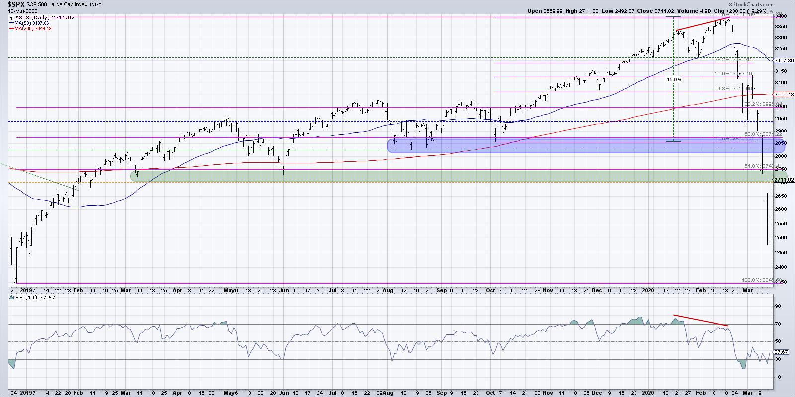
In this chart, I have indicated the RSI peak from the middle of the divergence as the resistance level. If price rallies enough to push the RSI above this midpoint, I would say the divergence has been validated and the short-term buy signal is in place.
What would invalidate the short-term buy signal? Well, if the price breaks down through the low of the divergence, which would Thursday's low of 2470, then the divergence is invalidated and lower lows would be expected.
So what does all of this mean for the S&P 500 next week and beyond?

We've now rallied back into the support area in the 2700-2750 range, which was a confluence of levels including Fibonacci support and the price lows from early 2019. I would expect this support range to become resistance, with 2750 serving as the short-term resistance level. But the most important signal will be the next move in the S&P 500 chart.
The next pullback will either a) push down through 2470, invalidating the bullish divergence and suggesting much further lows, or b) set a higher low above the 2470 level, indicating a short-term bottom is in place and we should expect more backing and filling up to 3000.
I have enjoyed many bull and bear market phases over my career. The bull markets have been great, but the bear markets are when I've really been able to grow as an investor.
Next week promises more volatility, more lines in the sand, more macroeconomic and geopolitical events and more opportunities to learn.
RR#6,
Dave
David Keller, CMT
Chief Market Strategist
StockCharts.com
Disclaimer: This blog is for educational purposes only and should not be construed as financial advice. The ideas and strategies should never be used without first assessing your own personal and financial situation or without consulting a financial professional.
The author does not have a position in mentioned securities at the time of publication. Any opinions expressed herein are solely those of the author and do not in any way represent the views or opinions of any other person or entity.
|
| READ ONLINE → |
|
|
|
| Trading Places |
| Extreme Bearish Sentiment Is Marking A Bottom |
| by Tom Bowley |
The stock market has a mind of its own, so I never like to say that it MUST do one thing or another. But I'm firmly in the camp of this being a cyclical bear market, rather than a secular bear market. Historically, cyclical bear markets within secular bull markets tend to be devastating, but very short-term in duration. Most last 3-6 months and average falling in the 20%-30% range. Q4 2018 was a perfect example of a cyclical bear market.
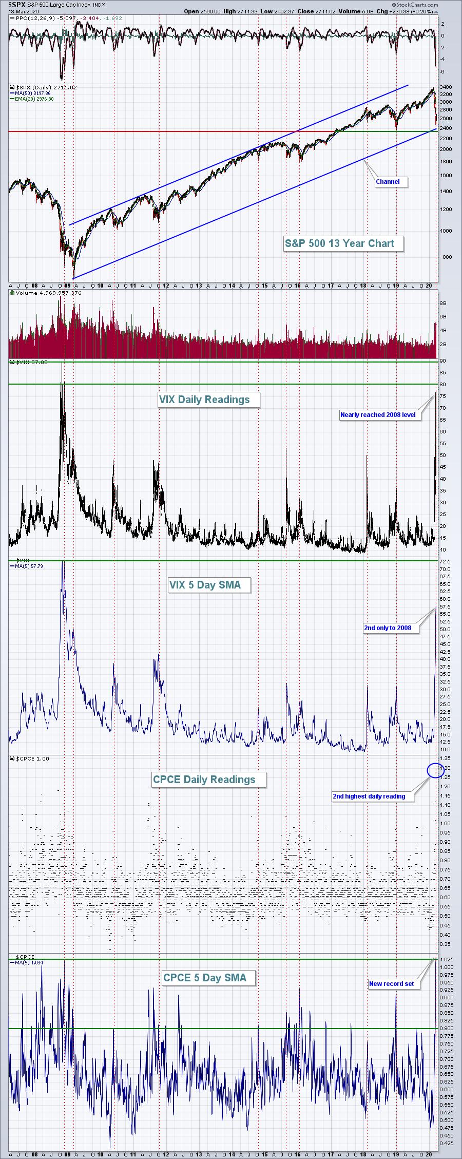
High volatility ($VIX) is always associated with bear markets of any kind. As the VIX rises, we can throw out our technical indicators. Personally, I think they're useless in a fearful environment. We have to let the fear play out in the form of high VIX readings and elevated-equity only put call ratios ($CPCE). I wrote an article in my Trading Places blog a week ago, titled "When Volatility ($VIX) Is This High, Wait For The Kitchen Sink".
Thursday was the kitchen sink.
The VIX closed at 75, the 4th highest level since the VIX began in 1990. The three higher VIX readings all came during the financial crisis in October/November 2008. The CPCE hit 1.28 at Thursday's close, showing significantly more put options traded than calls. How did that rank in history? Second, trailing only the 1.35 recorded on March 17, 2008. Here's a chart showing what happens at extremely bearish sentiment readings:

Note the light red-dotted vertical lines. Those are where we've seen extremely bearish sentiment readings, which almost always coincide with significant S&P 500 bottoms. That's when the kitchen sink gets thrown in.
In October 2008, we saw the VIX close at 80, then do so again one month later. Therefore, I wouldn't rule out the possibility that we could see one more low. But I definitely would not be shocked if Thursday's low turns out to be THE low. My strategy is to buy the SPY and QQQ when we appear to be marking a highly volatile bottom. If I'm right, the SPY and QQQ will perform extremely well and rally quickly - just as we saw on Friday.
Because of all the puts traded the past few weeks and the record CPCE level on Thursday, there could be quite an opportunity next week as monthly March options expire. We have a webinar scheduled on Tuesday to discuss "max pain," which is the point at which in-the-money call premium equals in-the-money put premium. It alerted us to a major selloff as we approached February's option expiration, and it's currently giving us the opposite signal.
We'll be sending out registration information for that timely webinar to our EarningsBeats.com community early next week. To be included, and to receive our 3x per week EB Digest newsletter - which is free and discusses earnings and relative strength - simply provide us your name and email HERE.
Happy trading!
Tom
|
| READ ONLINE → |
|
|
|
| RRG Charts |
| Technology Emerging as a Defensive Sector? Here are a Few Stocks to Watch |
| by Julius de Kempenaer |

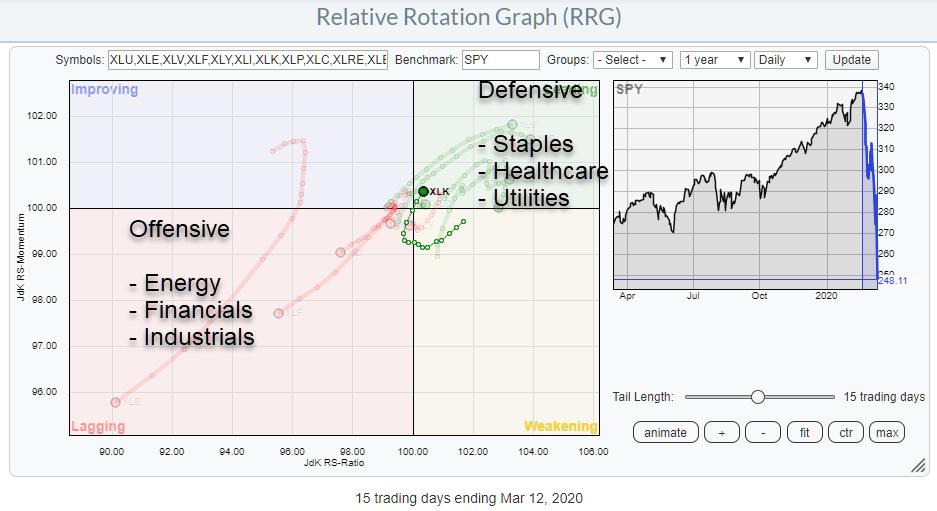
The mayhem in the markets over the past three weeks has clearly caused a rotation out of the more offensive sectors towards defensive ones. The sectors with the clearest rotations are mentioned on the chart above.
One sector that I would have expected inside the lagging quadrant, or at least at a negative RRG-Heading, is technology (BETA well above 1).
And yet.... XLK, in the last three weeks, has rotated through weakening briefly into lagging, then through the center of the chart into the leading quadrant at a strong RRG-Heading. On the weekly RRG, the tech sector is ranked highest on the JdK RS-Ratio scale and is still gaining, while showing a minimal decline on the RS-Momentum axis.
This type of behaviour/rotation makes it an interesting sector to look at for potential buying candidates. To do that, we'll bring up the RRG holding the constituents of XLK.

With over 40 stocks in this index, the RRG is quite crowded. The tickers on the outside are usually good to see, but the rotations a bit more to the center are getting harder to pick up.
My routing, or trick, is to select the first row in the table below the chart, keep the CTRL/CMD key pressed and then using the arrow keys (up/dn) to toggle through the universe, highlighting the tails of each stock. This is a quick way to identify interesting tails that may require a bit more investigation.
The RRG below holds only the stocks with an interesting (positive) tail.

From these tails, the following stocks are showing relatively strong price charts as well - that is, they have not completely broken down.
PYPL

PayPal is positioned inside the improving quadrant and at a positive RRG-Heading. On the price chart, a former resistance level has been tested this week as support and, so far, is holding up. Assuming that this level will hold in the weeks to come, this could be a broad trading range in the making, in which there is plenty of room for PYPL to rally.
From a price perspective, that $95 support level is important. On a relative basis, the RS-Line has started to curl up, making it an interesting name to watch.
ADBE

Adobe managed to hold above its rising support line that has been in play since late 2016. That $280 level should hold in order for this trend to remain intact. The RS-Line is about to break higher after a long sideways (more-or-less) pattern. Such a break is expected to give the relative performance of ADBE vs. XLK a new boost.
V

Visa is hovering above its rising support line, which is still intact so far, as well as a horizontal support area between $150-155. Breaking below the rising support line will hurt the LT uptrend, but does not necessarily turn it around in a downtrend immediately.
The $150-155 range seems to offer decent support. For now, this is pushing relative strength higher, positioning the tail for V inside the improving quadrant and heading for leading.
MSFT

Microsoft broke its rising support line but is now resting at horizontal support offered by a former resistance level. As long as this holds, the decline seems to be coming to a rest - at least for the time being.
The relative strength of MSFT vs. XLK is very strong. The RS-Line has broken to new highs, while both RRG-Lines are above 100 and rising, causing a strong RRG-Heading while inside the leading quadrant.
In contrast with the positive tails on the RRG and the individual charts above, there are also plenty of stocks with less appealing charts.
The RRG below shows the tails of the stocks that are showing weak and weakening relative trends vs. XLK.

The individual charts for these symbols are showing broken trends, broken support lines, etc., etc., including weak relative strength. Either RS is breaking below important support levels or, alternately, staying in and accelerating relative downtrends that were already in play.
Let there be no doubt. The charts of these individual stocks look awful across the board. But the relative strength of the group as a whole is surprisingly strong against the broad market (SPY).
This makes the tech sector a sector to keep an eye on, creating a potential shopping list for when things turn for the better. From a trading point of view, there are a few ways to approach these views and put them to work in positions.
I will write that up in an upcoming RRG blog and/or talk about it on Sector Spotlight (click the image below for the latest episode). The show airs every Tuesday from 10.30-11.00am ET, then becomes available on demand at our Youtube channel. Suggestions for topics, questions and suggestions are always welcome.

--Julius
My regular blog is the RRG Charts blog. If you would like to receive a notification when a new article is published there, simply "Subscribe" with your email address.
Julius de Kempenaer
Senior Technical Analyst, StockCharts.com
Creator, Relative Rotation Graphs
Founder, RRG Research
Want to stay up to date with the latest market insights from Julius?
– Follow @RRGResearch on Twitter
– Like RRG Research on Facebook
– Follow RRG Research on LinkedIn
– Subscribe to the RRG Charts blog on StockCharts
Feedback, comments or questions are welcome at Juliusdk@stockcharts.com. I cannot promise to respond to each and every message, but I will certainly read them and, where reasonably possible, use the feedback and comments or answer questions.
To discuss RRG with me on S.C.A.N., tag me using the handle Julius_RRG.
RRG, Relative Rotation Graphs, JdK RS-Ratio, and JdK RS-Momentum are registered trademarks of RRG Research.
|
| READ ONLINE → |
|
|
|
| The MEM Edge |
| One Way to Help Ride Out the Bear Market |
| by Mary Ellen McGonagle |
It was not a week for the faint of heart as the markets posted daily roller coaster type swings that had one day's action wiping out the prior day. The S&P 500 was down as much as 17% at one point before Friday's relief rally helped stem losses.
These chaotic swings are typical of the beginning stages of a bear market – particularly one that's being driven by fear due to a deadly viral outbreak that has no cure in place. While most investors may be better suited to sit out the current volatility, I've uncovered two stocks that a) have stable growth prospects, b) are in defensive areas of the market and c) have attractive charts.
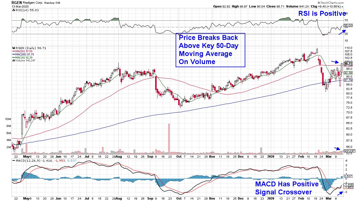
DAILY CHART OF REPLIGEN CORP. (RGEN)

This first stock is a well-known Biotech company that develops products required to manufacture certain drugs, including monoclonal antibodies, which are currently used to fight cancer. Given their properties, these antibodies are now being explored as a possible defense against the COVID-19 virus as well.
The company is Repligen (REGN) and they posted strong Q1 earnings last month while also providing guidance for continued growth into 2020 and beyond. REGN has made several strategic acquisitions over the past several years that have set them up for success even absent any virus-related income possibilities.
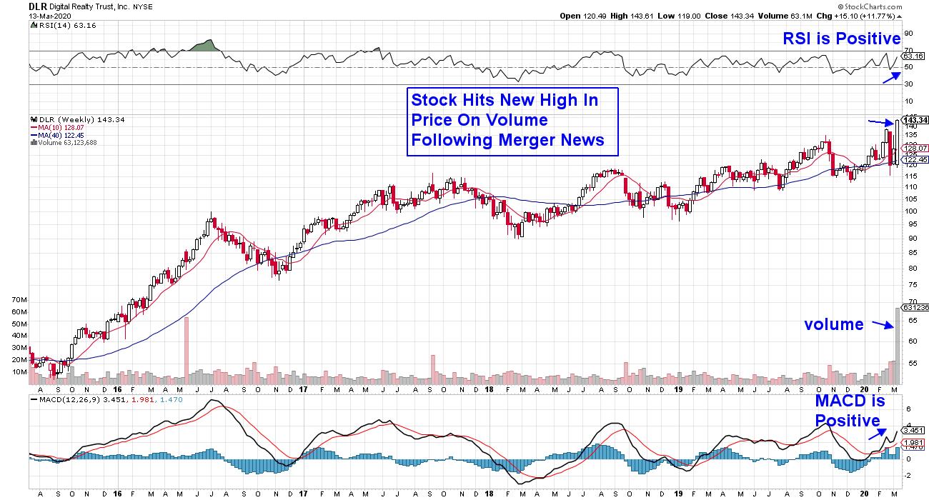
WEEKLY CHART OF DIGITAL REALTY TRUST, INC. (DLR)
The continued spread of the COVID-19 virus over the past several weeks has many businesses rushing to cloud computing, particularly as more companies are shuttering their offices and having workers remain at home while continuing to work remotely. This shift of more companies adapting to cloud computing has increased the demand for digital centers that house data in climate-controlled buildings, with servers that help keep them safe.
Most of these facilities are part of Data Center REITS, such as Digital Realty Trust, Inc. (DLR), which operates 210 data centers globally. This 3.1% yielder spiked to a new high last week following a pre-announced merger with cloud data center InterXion. The move will help DLR grow beyond their portfolio of 210 data centers and expand their footprint in Europe.
The currently difficult market environment has been tough for many investors, as each new headline pulls the market in a different direction. While there are bright spots, such as the stocks highlighted above, the price action of the past 3 weeks points to a highly unsettled market that will require time to stabilize before resuming its recent uptrend.
The good news is the period after a bear market reversal is one of the most profitable cycles, and you'll want to cultivate a watch list of stocks in preparation. For those who'd like to be alerted to when this shift takes place and what the best candidates are, I urge you to trial my bi-weekly MEM Edge Report for 4 weeks at a nominal fee.
My work uses a proven system that's I've shared with professional fund managers for years, as it has successfully identified every bear market reversal. In addition to sharing that system with you, the MEM Edge Report provides insights into what phase of the market's recovery period we're currently in by using historical precedent models.
I hope you'll take advantage of my special offer and join the hundreds of other subscribers who've been receiving regular alerts during this unsettling period for the markets. Click Here to trial the MEM Edge Report!
Warmly,
Mary Ellen McGonagle
MEM Investment Research
|
| READ ONLINE → |
|
|
|
|
|
| MORE ARTICLES → |
|


 Chart 3


