| Hello Fellow ChartWatchers |
I've got two important things to highlight for you this weekend, so let's dive in.
First up, our StockCharts TV team launched another brand new show this past week, but one unlike anything else we've had on the channel up until now. In "Your Daily Five", we're bringing you a concise, action-packed daily rundown of the five most important charts that you need to be watching. But here's the twist: the show features a new host every single day of the week. That means five top charts and key insights from a new seasoned technician every day, Monday through Friday.
I gotta say, we sure are flexing the connections muscle with this one, but the result for you is a diverse array of top chartists with a wide variety of perspectives on what's most crucial for you to be watching in the current market. In fact, the list of hosts is so deep that when one of our producers messaged me to schedule my day to host "Your Daily Five" she said, "well actually, we're scheduling into the end of May now, so will that work for you?"
I couldn't believe it... end of MAY! A whole month of experts already on the books!
Anyways, you can click here to catch up on the new episodes of "Your Daily Five", which featured Bruce Fraser, Doug Busch, Erin Swenlin, John Kosar and Joe Duarte.
Last thing before I let you go – I want to remind you to check out our newest research tool, the "Symbol Summary". Pull up a ticker on Symbol Summary and from a single page, you can see the latest price info (including after hours!), view a chart in multiple timeframes, browse high-level summary stats, fundamentals and important technicals, get earnings dates and dividend info, visualize the symbol's latest SCTR info, read full company or fund descriptions – this list just keeps going, believe me.
With earnings season heating up, you'll find report dates for the stocks you're following on this page, plus after hours data to see how stocks are responding to the results both before the open and after the close. Personally, I'm also loving the "Profile" panel, which includes business descriptions and links directly to a company's website. As you're researching new trading or investment opportunities, this can be a huge boost to your workflow.
Remember, you can access "Symbol Summary" from any page on StockCharts with the big white search bar that you normally use to pull up a SharpChart (the one at the top of every StockCharts page). Click where it says "SharpChart" (the default) and then select "Symbol Summary" from the menu that appears. Enter a symbol, hit go, and you're off to the races. |
| Chart on, my friends. |
|
|
|
| THIS WEEK'S ARTICLES |
| Market Roundup |
| Trendline Violations Suggest The Rally Is Losing Momentum |
| by Martin Pring |
Editor's Note: This is an updated version of an article originally posted on Martin Pring's Market Roundup on April 21, 2020.
In recent articles, I have pointed out that quite a few of the short-term indicators reached well beyond their normal oversold readings at the March lows. Historically, this is has been a very bullish characteristic, often signaling the end of a bear market. The difference between now and most of the previous instances is that the 2020 decline came straight after the February all-time peak. As a consequence, the long-term indicators have not had sufficient time to correct their overbought condition.There have only been two previous occasions when the Dow had experienced a 25% drop so soon after registering a new all-time high: 1929 and 1987. The former was followed by a major bear market as the economy and equity prices both dropped sharply. In 1987, by contrast, the economy remained strong and the stock market recovered without falling lower. There is a third possibility that I overlooked, which Greg Schnell reminded me of earlier this week, that being the initial decline from the 2000 top in the NASDAQ Composite.
The point I am trying to make is that those initial 1929 and 2000 lows held for 8 months to a year. The 1987 bottom has never been violated. While we may well be into a bear market, it's important to understand that the low of last March will likely, for all intents and purposes, hold for a long time. "All intents and purposes" means that the lows could be penetrated but not on a sustainable basis, and that's what should be borne in mind as we move forward.
Time for a Test of the Low
I am not a great fan of Fibonacci retracements, in the sense that I rarely use them to signal where a move might end. After all, there are several choices, including 61.8, 38.2% and 23.6%. Instead, I prefer to observe when a retracement has taken place, subsequently looking around to see whether other technical evidence fits in with a reversal scenario.
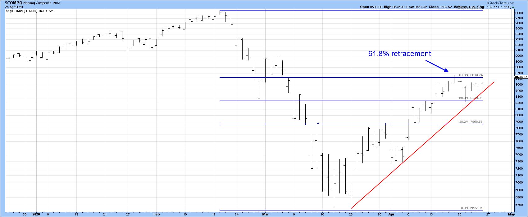
In that respect, Chart 1 shows that the NASDAQ composite is right at resistance in the form of a 61.8% retracement of its COVID-19 collapse. That compares almost identically with the early fall recovery following the initial NASDAQ drop in the tech bubble in 2000. In 1930, the retracement after the 1929 crash low for the Dow was 50%.

Chart 1
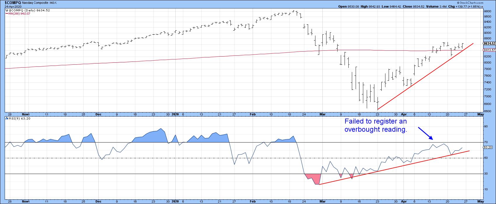
Looking around for corroborating evidence of a possible reversal, we see in Chart 2 that the NASDAQ was unable to hold below its 200-day MA last week. That's a positive sign as long as it holds. However, the RSI has so far failed to register an overbought reading. This kind of action is more akin to a bear market characteristic than an initial rally in a new bull market. At the moment, both the price and the RSI remain above their respective up trendlines. However, if these support benchmarks are violated in a decisive manner, that would suggest some kind of a test of the March lows.

Chart 2
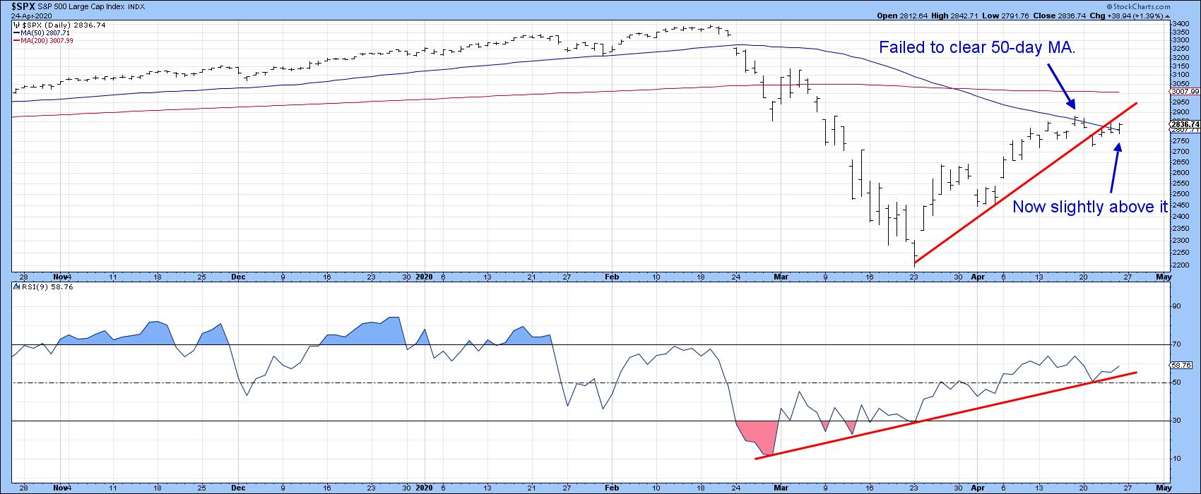
The near-term technical picture for the S&P Composite is weaker. Chart 3 shows that it remains below the extended up trendline emanating at the March lows. That line is only a month in length, so its penetration is not the end of the world. However, the failure of the RSI to again register an overbought condition is a worrying factor. Finally, it's true that the RSI has not yet violated its up trendline. However, the Index has, and even if it moves sideways, that lack of upside momentum would cause the RSI will soon follow.

Chart 3
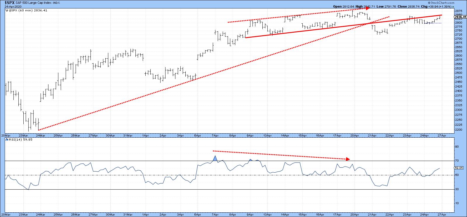
Finally for the S&P, Chart 4 shows its hourly progress since the rally began. It is fairly evident that the RSI peaked several sessions ago and has been getting weaker ever since. This action has now been confirmed by the Index, which has violated the up trendline and completed a broadening wedge.

Chart 4
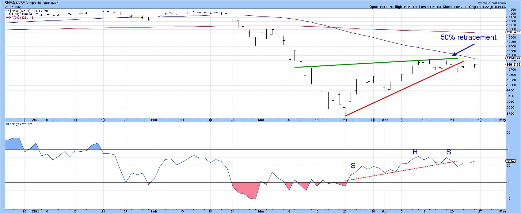
Chart 5 shows that the more broadly-based NYSE Composite has completed a bearish pennant at the same time that the RSI completed an upward-sloping head-and-shoulders top. The retracement rally for the NYA came within a whisker of 50%, which is a reasonable place to expect a pause in the advance.

Chart 5
In these volatile times, it's quite possible that a lot of these short-term discrepancies get cleared up and we move to new recovery highs. As it stands now, though, a NASDAQ 61.8% flag and an NYA 50% one have been raised, which means that next week's action is likely to be critical in either direction.
Good luck and good charting,
Martin J. Pring
The views expressed in this article are those of the author and do not necessarily reflect the position or opinion of Pring Turner Capital Group of Walnut Creek or its affiliates.
|
| READ ONLINE → |
|
|
|
|
|
| The Mindful Investor |
| Consumer Sectors Threaten Bullish Breakout |
| by David Keller |
One of the ways I like to measure offensive vs. defensive pressure in the equity market is using the ratio of Consumer Discretionary to Consumer Staples. Watching this ratio can tell you whether institutions are betting more on the "offense," like retail and travel names, or the traditional "defense," like beverages, tobacco and personal products.
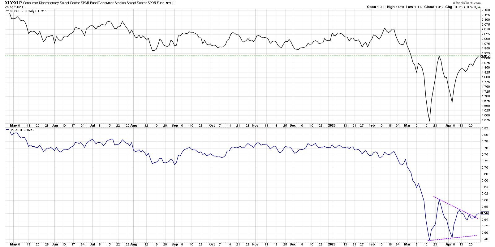
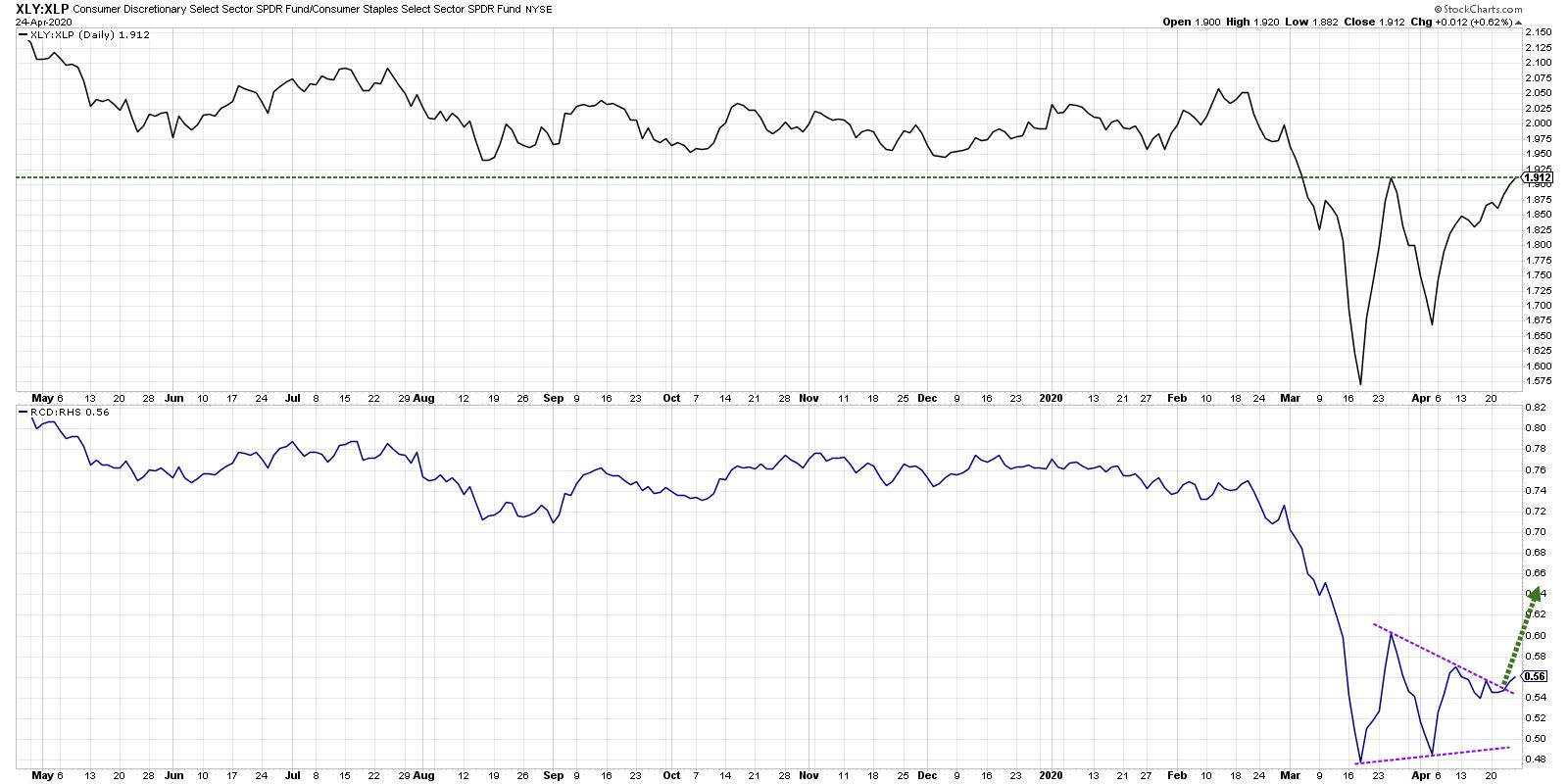
While these ratios have essentially remained in a holding pattern since the market bottom in March, both the cap-weighted and equal-weighted ratios are now threatening a breakout to the upside. A confirmed breakout would suggest more institutions betting on the offense and would further support a short-term bullish outlook.

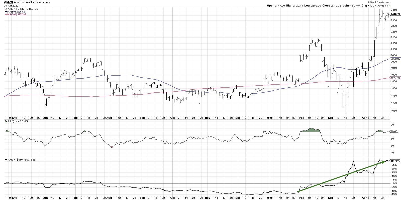
This chart includes the cap-weighted (XLY vs. XLP), along with a ratio using the equal-weighted ETFs (RCD vs. RHS). Due to AMZN's huge overweight in the XLY, the equal-weighted version will reduce the "Amazon effect" and give a better read on how the overall sectors are performing relative to one another.
Both of the ratios broke down in mid-February, although it is noteworthy that the equal-weighted ratio put in a lower high in February while the cap-weighted version went to new highs.
Since the market bottom in mid-March, the XLY spiked up relative to the XLP based on AMZN's resilience through the bear market phase. See the relative strength and how AMZN has outperformed, both during the way down as well as during the market recovery over the last four weeks.

The cap-weighted ratio is now testing the resistance level set in late March after the initial market rebound. If the XLY continues higher relative to the XLP, taking the ratio above that late March peak, it would suggest further upside for stocks.
The equal-weighted ratio gives an even clearer picture of the relative performance, as, again, it minimizes the overweight of AMZN in the calculation.

With that ratio breaking higher, this suggests that it's not just Amazon that is driving the chart. This breakout proposes that the average Consumer Discretionary stock is outperforming the average Consumer Staples name. To put another way, investors are betting more on offense than defense.
To be clear, both of these ratios can go higher while the broad market goes lower. There have been times when the overall market has rallied and defensive sectors like Consumer Staples or Utilities have been top performers. There have also been market downtrends where traditional offense like Technology has done very well.
I remain bearish on the broader equity market and have to assume that we're in the later stages of a bear market rally here. Sector ratios can help illustrate how investors are positioning around this overall market bias, as well as how that relates to the overall picture using breadth, momentum and sentiment readings.
I'm looking for any indications on what institutions are doing with their sector allocations. And, if these ratios continue higher, it means investors are betting on further upside.
RR#6,
Dave
David Keller, CMT
Chief Market Strategist
StockCharts.com
Disclaimer: This blog is for educational purposes only and should not be construed as financial advice. The ideas and strategies should never be used without first assessing your own personal and financial situation or without consulting a financial professional.
The author does not have a position in mentioned securities at the time of publication. Any opinions expressed herein are solely those of the author and do not in any way represent the views or opinions of any other person or entity.
|
| READ ONLINE → |
|
|
|
|
|
| Trading Places |
| Zooming In On A GREAT Investment....or 5....or 20! |
| by Tom Bowley |
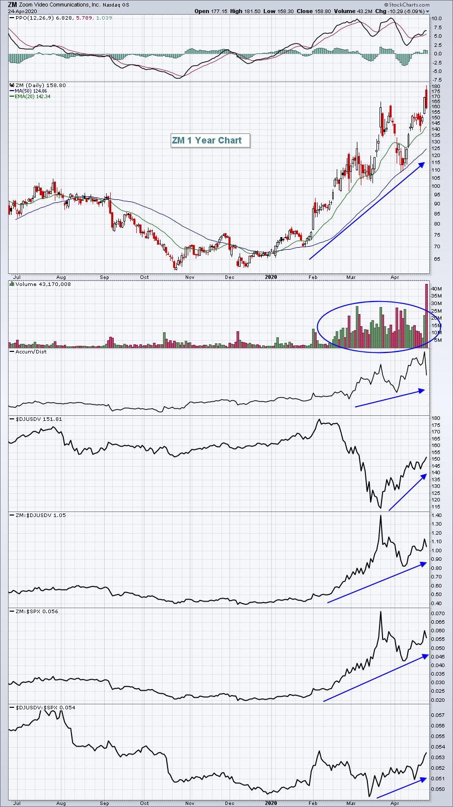
Zoom Video Communications, Inc. (ZM) broke out technically just before the start of the NFL Draft and continued its stealth move higher on Friday - that is, until Facebook (FB) announced that they wanted to join the video meeting party. ZM traded as high as 181.50 intraday on Friday, an all-time high, before it saw a rapid afternoon decline after Facebook's announcement close to 2pm EST. It ultimately closed at 158.75. The COVID-19 pandemic has caused a tremendous economic toll across the globe, but ZM has been a major beneficiary of this new "stay-at-home" and "social distancing" era. Since December 2019, ZM has seen its users increase from 10 million to 300 million. The company has so far weathered security concerns, but now they have yet another major competitor to contend with in Facebook. There are two sides to this Facebook announcement, however. Certainly, increased competition from a major technology company could be viewed as a negative. But the other side of that conversation is that Facebook, Microsoft, Google, etc. are all confirming the validity of the business model and future by offering products in ZM's space. And if any of these technology giants truly want to grow their business rapidly in this area, why not just buy the leader - ZM?
The power of ZM's technology was on display for the world to see as the 2020 NFL Draft got underway on Thursday evening. Zoom connected NFL headquarters, teams from around the NFL, its fans and the media while broadcasting it to viewers around the world. Can you imagine a better marketing strategy than showing every sports-starved fan around the globe how well ZM's technology can bring everyone together simultaneously while remaining in the comfort of your own home? Masterful.
It was announced yesterday that ZM would be added to the NASDAQ 100 index on April 30th, but I'm not so sure that the marketing leading up to and during Thursday night's NFL Draft isn't the culprit for the latest surge in its price. After all, the majority of the recent gains occurred prior to index announcement.
Earlier this month, I appeared on StockCharts TV's "The Pitch", joining host and StockCharts.com's Chief Market Strategist David Keller along with two of my fellow StockCharts.com contributors, Grayson Roze and Mary Ellen McGonagle. We each shared 5 strategic stock picks given COVID-19 and the likely paradigm shift to follow. One of the 5 companies that I featured was ZM.
ZM is changing the world as we know it. Despite competition, they are the leader in an exciting area.
Even if the pandemic were to end tomorrow, which we know it won't, a brand new collaboration technology has been unleashed on global businesses. We can now see just how easy it is to collaborate online, whether it be with friends and family or, more importantly, for business. And Wall Street has taken notice by sending ZM shares soaring:

I've circled the massive volume that we've seen over the past couple months. I know many technicians do not use volume in their analysis, but I'd love to hear any negative thoughts anyone might have about ZM after seeing a two-month doubling of its share price on historic volume levels - all during a pandemic which has seen many stocks move to lows not seen in more than a decade. Let's face it, timing is very important in life, and ZM's online collaboration is special - and Wall Street knows it.
There were four other companies that I discussed on "The Pitch" a few weeks ago that I believe will benefit from a social distancing paradigm shift. You can check those out by CLICKING HERE. I also plan to release an expanded list of 20 stocks poised to benefit from this paradigm shift. You can learn more about this event using the above link.
Happy trading!
Tom
|
| READ ONLINE → |
|
|
|
| RRG Charts |
| Asset Class Rotation on RRGs Sends Clear RISK-OFF Message |
| by Julius de Kempenaer |

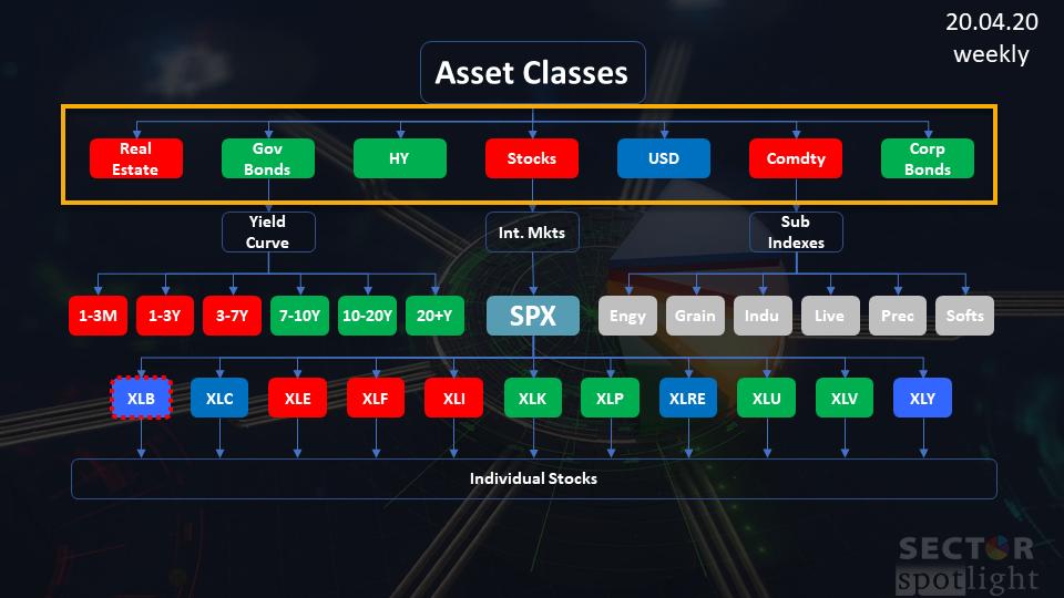
In the latest episode of my StockCharts TV series Sector Spotlight, I took an in-depth look at the relative rotation of asset classes vs. VBINX, the Vanguard Balanced Index fund, which represents a 60/40 stocks/bond portfolio. The image above shows the investment pyramid that I use to show a top-down approach from asset classes down to individual stocks.
In this article, I will share the most important charts from that episode.
Weekly Asset Class Rotation on RRG

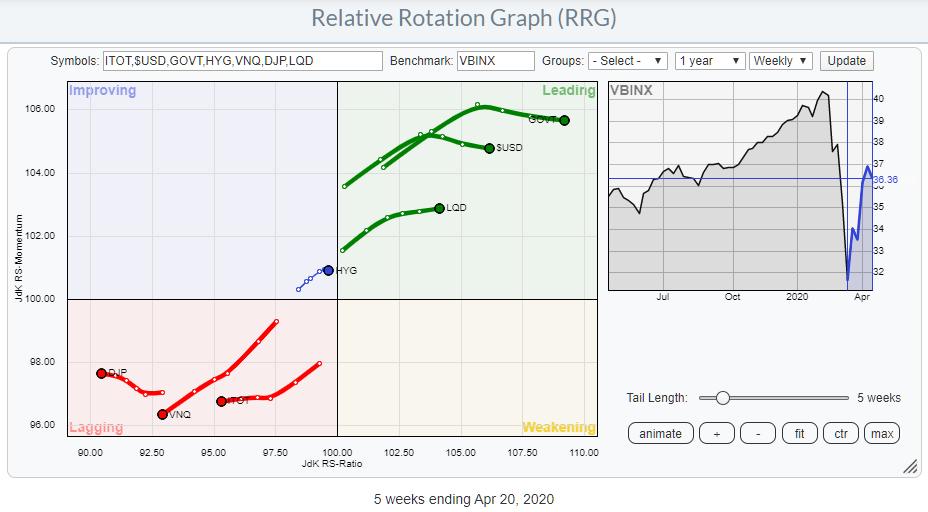
The starting point for this pyramid is the Relative Rotation Graph above, showing the rotation of all asset classes. The benchmark that I use for this setup is the Vanguard Balanced Index Fund (VBINX), which represents a typical balanced portfolio mad up of 60% stocks and 40% bonds.
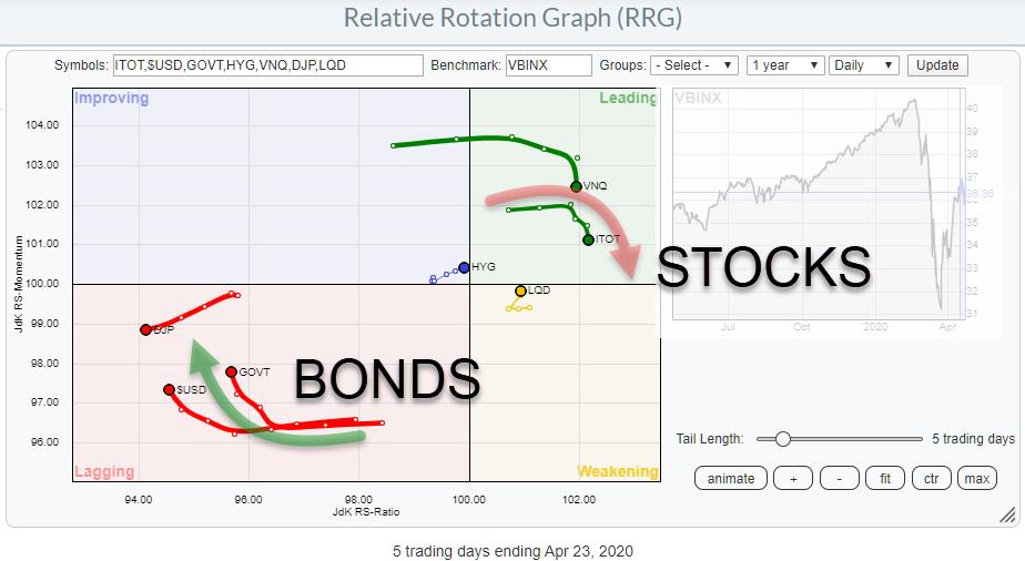
This RRG shows GOVT, USD and LQD are well inside the leading quadrant while HYG is inside improving, very close to the leading quadrant and also close to the benchmark. DJP, VNQ and ITOT are all well inside the lagging quadrant and traveling further into it.
The immediate takeaway from this RRG is the "RISK-OFF" message that it is sending. In this respect, the two most important charts are those of ITOT and GOVT.
iShares Core S&P Total US Stock Market

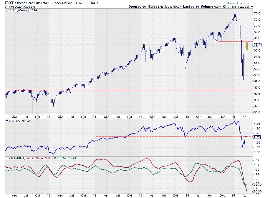
After the steep drop ITOT, started recovering very rapidly, but this rally stalled against the level of lows that were put into place in mid-2019.
The Relative Strength of ITOT against VBINX also rallied after dipping to three-year lows, but is now stalling against a horizontal barrier that lines up with highs from 2017 and the important low of late 2018.
For both graphs, this is a pretty crucial level. If the market is able to break above these resistance levels, we may see a bit more upside in coming weeks. When we are putting a high into place, it will be the first lower high after the February peak for both price and RS.
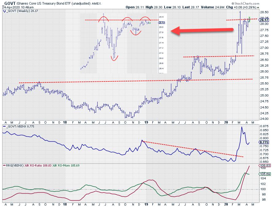
iShares Core US Treasury Bond

GOVT has been trading almost exactly opposite of ITOT, which is what you would expect in a flight to safety. So no real surprise there.
However, just like ITOT, GOVT has now reached an important price level and it seems as if the market is trying to move higher. On the inset daily chart, it can be seen that the area just above $28 is now being tested as resistance. A break higher will most likely lead to a further acceleration of bond prices, pushing US yields lower.
The rapid improvement in relative strength when stocks started to fall came off after the initial rally, but a new, higher, low seems to be in the making.
To assess the most likely move in the coming weeks, we need to look at the daily rotation for asset classes.
Daily Asset Class Rotation on RRG

On this graph, we find ITOT inside the leading quadrant tracing out the recovery of the market after putting in its low. Meanwhile, on the opposite side, we find GOVT inside the lagging quadrant as a result of the stalling rally.
BUT!!
Both tails have started to roll over during the last two to three days. And, with the tails of these two asset classes where they are (on the RRG) at the moment, this daily rotation suggests that the recovery for stocks, as well as the pause for bonds, is coming to an end - and that the main trend could be resuming any time soon.
The final trigger to confirm this will be a break higher in bonds and a failure to do so in stocks. The move that will follow, especially in the stock market after putting in a lower high, will be crucial in determining the direction of the market in coming months. Will the March low hold - or will it be broken?
#StaySafe,
--Julius
My regular blog is the RRG Charts blog. If you would like to receive a notification when a new article is published there, simply "Subscribe" with your email address.
|
| READ ONLINE → |
|
|
|
| The MEM Edge |
| The Stock Market's Great Divide: Are You Positioned On The Right Side? |
| by Mary Ellen McGonagle |
The broader markets continue to climb a wall of worry with an impressive bear market rally that's been able to shrug off a barrage of negative news. A close look at this rally reveals a divide in the markets where select areas of outperformance are leaving the rest of the markets behind.
These thriving areas have companies that fit one of two profiles – 1) the company has a healthy enough balance sheet that it can ride out this pandemic or 2) the company has dynamics in place that were set up prior to the pandemic that's allowing them to benefit greatly from a mandated lockdown that's pushed many industries to a standstill.
Below are two companies that have both positive profiles listed above, as well as a third positive - a chart that points to further upside potential.
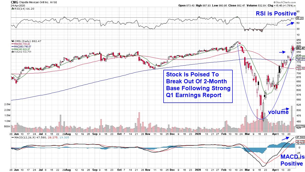
DAILY CHART OF CHIPOTLE MEXICAN GRILL INC.
The first stock is Chipotle Mexican Grill (CMG) which reported earnings this week that were ahead of estimates. Chipotle has invested in systems over the past 3 years that's put them in the forefront of digital sales among restaurants. And to their benefit, the current lockdown condition has seen online sales soaring 81% over the first quarter for this fast-food Mexican restaurant.
The company's strong balance sheet and no debt has them allocating millions more into their digital business despite the uncertainties surrounding COVID-19 as behavior prior to the pandemic has them convinced that it will be capital well spent.
The stock is poised to break out of a 2-month base following this week's gap up on heavy volume. With the RSI and MACD in positive positions, this leading Restaurant stock is poised to trade higher as their highly developed digital sales platform is hitting the right notes among a quarantined population looking for quality takeout food.
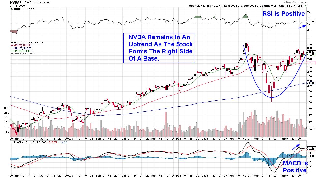
DAILY CHART OF NVIDIA CORP. (NVDA)
The next stock is in the Technology sector where advances in cloud computing and remote data processing are seeing an unprecedented surge in demand. These companies are now the backbone of global virtual learning among home-schooled students as well as the collaborative endeavors among work from home employees.
In the forefront is Semiconductor chip company Nvidia Corp. (NVDA) which began migrating their focus toward data centers over a year ago with the purchase of data center networking company Mellanox. Since then, the company has continued to invest in the development of cutting-edge products that puts them in a leadership role.
The company reported triple digit 4th quarter earnings growth in early February while maintaining full year guidance despite setting aside $100 million due to uncertainty surrounding the coronavirus pandemic. NVDA is currently in a near-term uptrend as the stock continues to bullishly form the right side of a base.
While these companies are currently seeing increased demand for their products due to historically unprecedented conditions, both stocks are poised for growth into next year as systems that were put in place previously, will continue to spur growth.
For those who'd like to be alerted to other leading companies that are experiencing high growth currently while also having strong prospects in the future, I urge you to trial my MEM Edge Report for 4 weeks at a nominal fee. In addition to individual stock recommendations, you'll receive insights into the broader markets as well as underlying sectors that you won't find anywhere else.
These are unprecedented times for the market and I look forward to helping you successfully navigate the continued volatility. Of special importance will be the ability to uncover when the current uptrend in the markets has ended. Click Here to trial my bi-weekly MEM Edge Report.
Warmly,
Mary Ellen McGonagle, MEM Investment Research
|
| READ ONLINE → |
|
|
|
| MORE ARTICLES → |
|
