| THIS WEEK'S ARTICLES |
| The Traders Journal |
| My Daily Five: Changing Tides In The S&P Groups, VTI At Key Price Levels, Breadth Improving and Offense Leading |
| by Grayson Roze |
 What a way to start the week! Yesterday afternoon, I had the pleasure of hosting "Your Daily Five", our latest series on StockCharts TV where we bring you a concise, action-packed daily rundown of the five most important charts that you need to be watching. Weekdays at 1:00pm ET, each day features a new host, which means five top charts and key insights from a different seasoned technician every single day of the week. What a way to start the week! Yesterday afternoon, I had the pleasure of hosting "Your Daily Five", our latest series on StockCharts TV where we bring you a concise, action-packed daily rundown of the five most important charts that you need to be watching. Weekdays at 1:00pm ET, each day features a new host, which means five top charts and key insights from a different seasoned technician every single day of the week.
I kicked off this week on yesterday's show with five of my top charts for the current climate. I took a look at the substantial multi-year divergence that we've seen between the S&P Large, Mid and Small Cap groups, but discussed how the tides are beginning to change with mid- and small-caps starting to lead.
I also looked at key price levels for the Vanguard Total Index (VTI), shared my take on the improving but "not-quite-there-yet" breadth picture for the NYSE, S&P 500 and NASDAQ, and dove into the XLY:XLP ratio (Discretionary vs. Staples) to show how markets are beginning to favor offense.
Be sure to catch the recording of yesterday's "Your Daily Five" episode below!
Money In, Eyes Open.
- Grayson Roze
VP of Operations, StockCharts.com
Author, Trading for Dummies (Wiley, 2017)
Author, Tensile Trading: The 10 Essential Stages of Stock Market Mastery (Wiley, 2016)
StockMarketMastery.com
|
| READ ONLINE → |
|
|
|
| The Market Message |
| Stock Indexes Stabilize |
| by John Murphy |
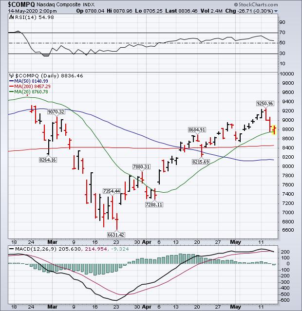
After a weak start this morning, major stock indexes are stabilizing near some short-term support levels. Chart 1 shows the Dow Industrials finding support at its 50-day moving average and its mid-April intraday low at 22900. Chart 2 shows the S&P 500 holding support at 2797. So far, those support levels have kept the selling from becoming more serious. Chart 3 shows the Nasdaq Composite Index trading slightly lower, but trying to stabilize at its 20-day average (green line). Seven sectors are in the green today with financials in the lead. Bank stocks are finding support near previous lows.
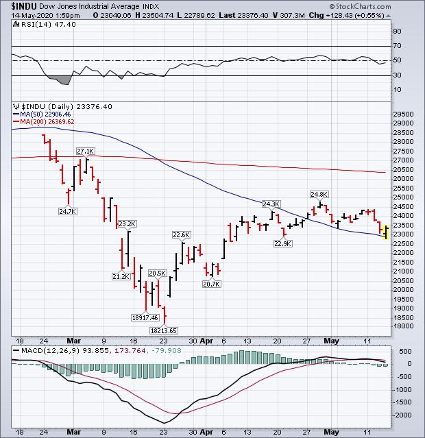 Chart 1 Chart 1
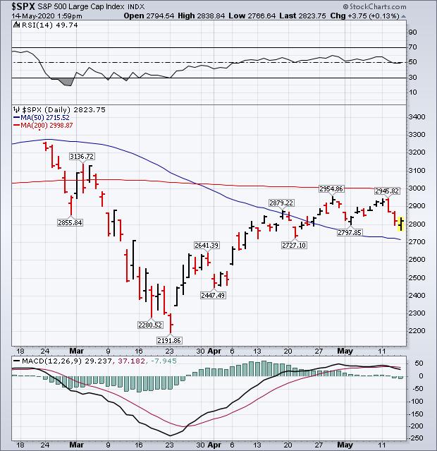 Chart 2 Chart 2
Beaten-down financial stocks are rebounding. Chart 4 shows the Financial SPDR (XLF) gaining 2% today with banks in the lead. Bank stocks are testing some pretty important support levels. Chart 5 shows the KBW Bank Index trying to stabilize above its late March low. A drop below that March low would put banks at the lowest level in four years. That's an important test for them and probably for the rest of the market.
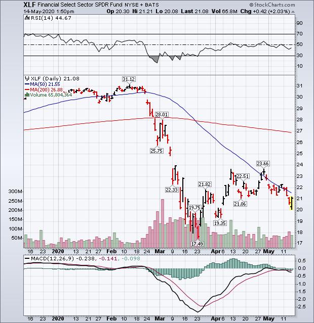 Chart 4 Chart 4
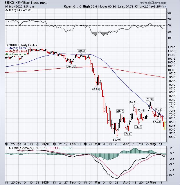 Chart 5 Chart 5
Editor's Note: This is an article that was originally published in John Murphy's Market Message on Thursday, May 14th at 2:00pm ET.
|
| READ ONLINE → |
|
|
|
| Art's Charts |
| Timing the S&P 500 Using the Bullish Percent Index |
| by Arthur Hill |
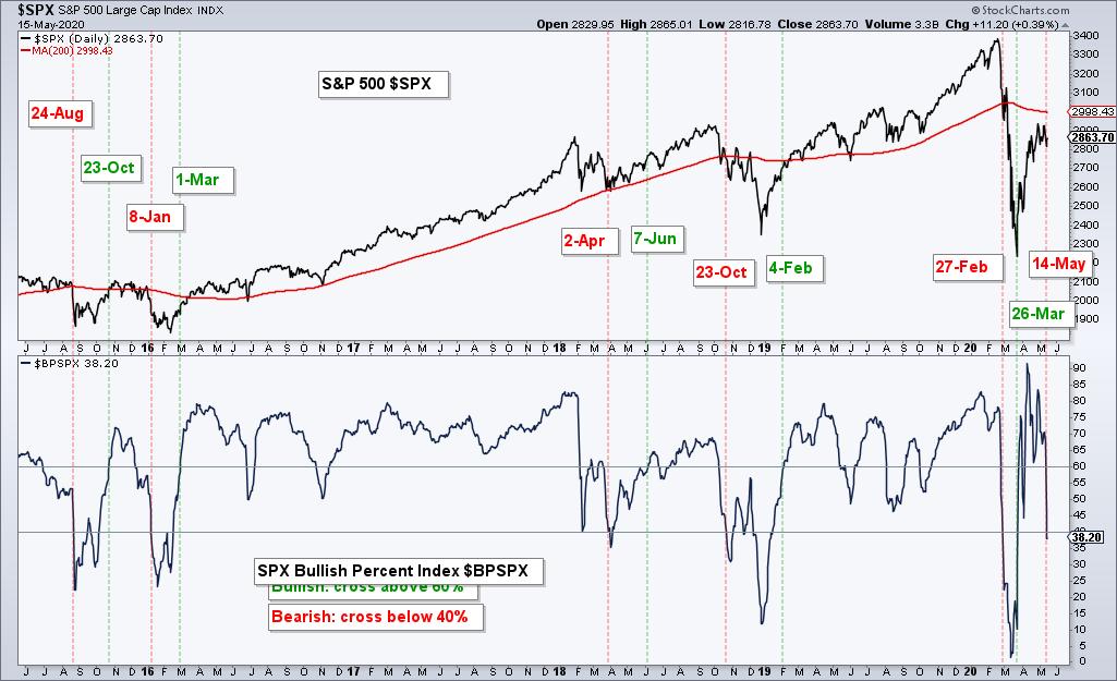
 StockCharts calculates and publishes the Bullish Percent Indexes for several major indexes and sectors. Just search for the term $BP to find them because all the symbols begin with these three characters. These indicators are not part of my breadth models for broad market timing, but I do follow them, especially the S&P 500 Bullish Percent Index ($SPXBPI). StockCharts calculates and publishes the Bullish Percent Indexes for several major indexes and sectors. Just search for the term $BP to find them because all the symbols begin with these three characters. These indicators are not part of my breadth models for broad market timing, but I do follow them, especially the S&P 500 Bullish Percent Index ($SPXBPI).
As with the %Above 200-day EMA indicators, I set the bullish and bearish thresholds at 60% and 40%, respectively. A move above 60% shows enough P&F double top breakouts to warrant a bullish environment, while a move below 40% shows enough P&F double bottom breakdowns to warrant a bearish environment. A Bullish Percent Index at 40% means 40% of stocks have double top breakouts, which implies that 60% have double bottom breakdowns.

I place my signal lines above the midpoint (50%) to reduce whipsaws and generate more convincing signals. Try as I might, whipsaws are part of life for trend indicators. Trend following indicators will not catch the exact bottom or top and they will generate some bad signals, but they should also catch some good trends to make up for these drawbacks. That's the theory, at least.

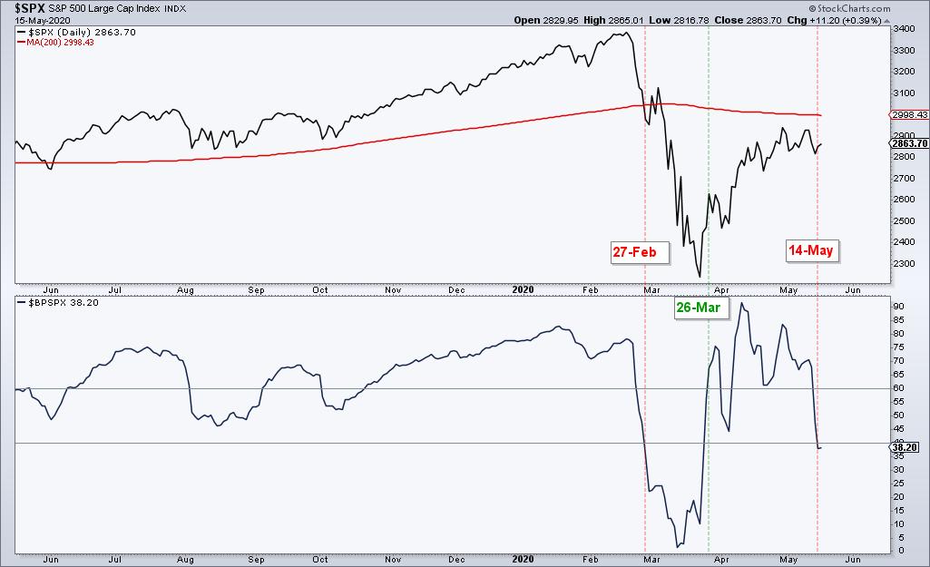
The chart above shows the most recent signals with a bearish signal triggering on Thursday's close. Notice that BPI plunged with a move from 84% on April 29th to 38% on May 14th. This means that some 62% of stocks in the S&P 500 moved below their prior reaction low. In P&F terms, this means current O column exceeded the prior O column for a double bottom breakdown. This shows a lot of weakness within the index and could mark a near-term top.
Interest in breadth indicators? Get the Essential Breadth Indicator ChartList with your subscription to TrendInvestorPro.com. This list features over two dozen breadth indicators for the major indexes and sectors. We've done the hard work for you by customizing these charts and organizing them in a logical top-down manner. This alone is worth the price of a month's subscription.
Click here to take your analysis to the next level!
---------------------------------------------
|
| READ ONLINE → |
|
|
|
| The Canadian Technician |
| The Breakout in Gold and Silver |
| by Greg Schnell |
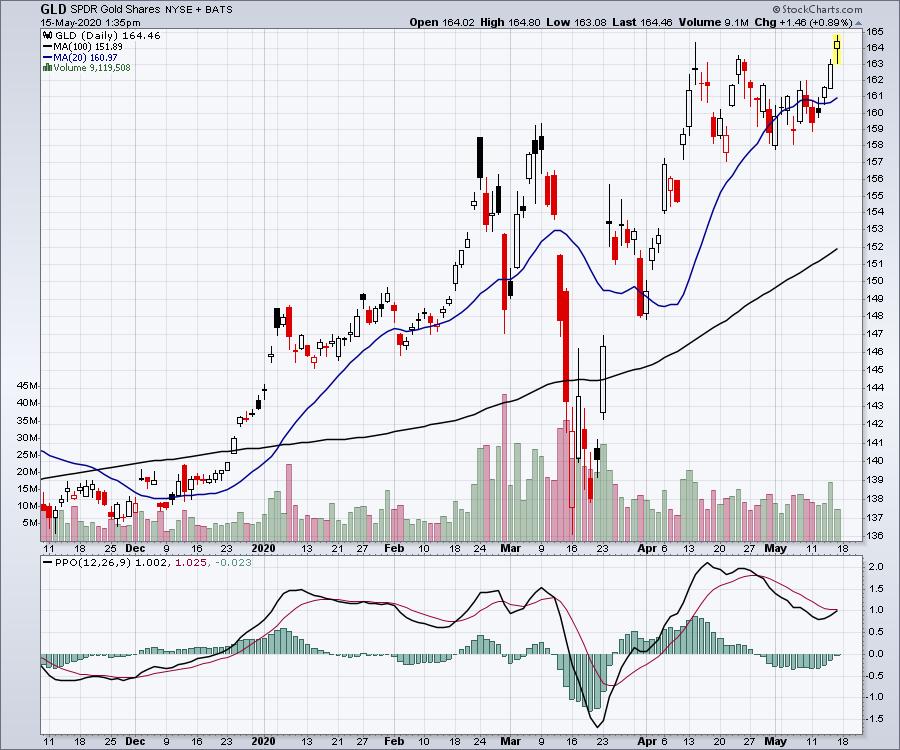
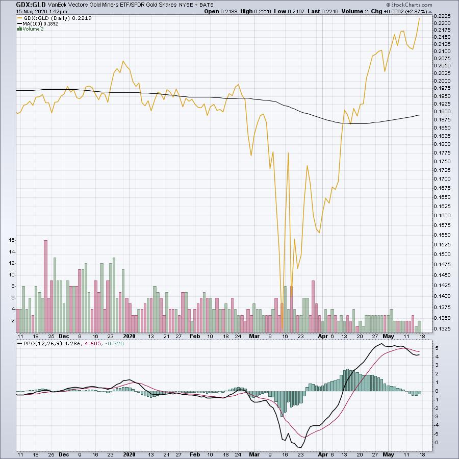
After jogging sideways for weeks, Gold (GLD) finally appears ready to start running. With the Thursday and Friday candles, it is pushing to higher highs again!

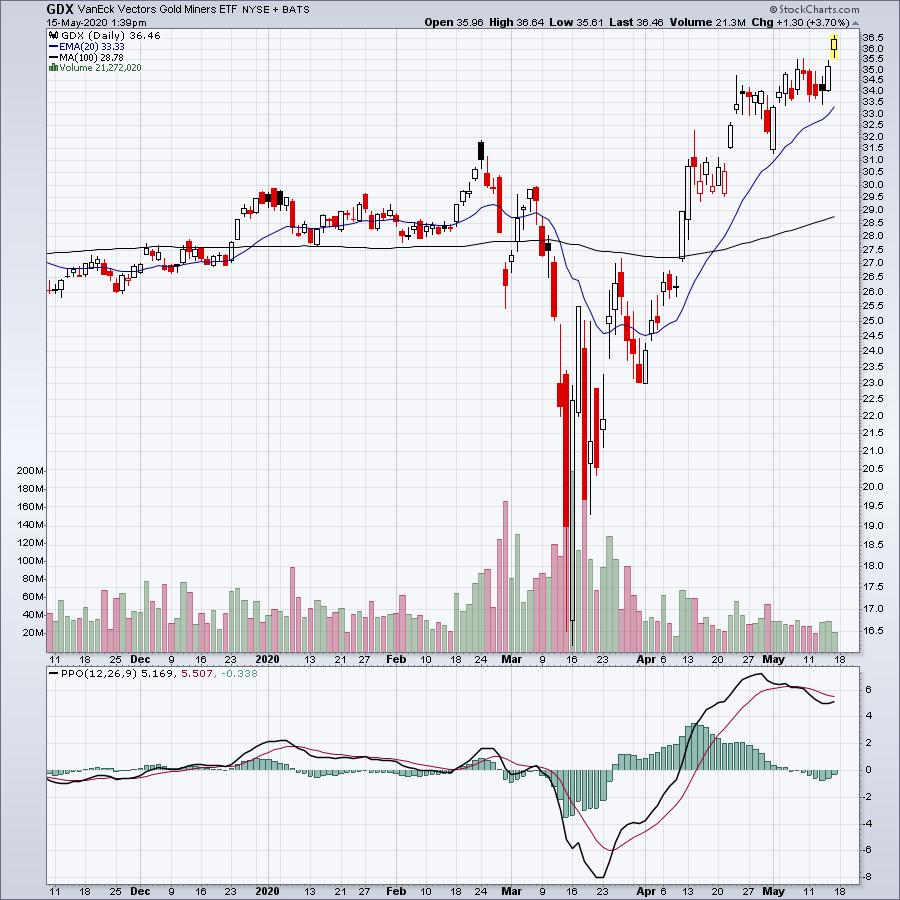
One of the things we like to see is when the gold miners (GDX) outperform the gold stocks. Gold stocks formed a tight flag recently and broke out Friday.

As I mentioned, we want the gold names to outperform the actual bullion. This is shown by using a ratio between them. When this line is rising, it is usually a great time to be invested in gold names.

For more trading ideas around Gold, Dwight Galusha, CMT is working with me on GregSchnell.com to post trade ideas! Dwight has been pointing out nice gold setups day after day, and he also posted some ideas on the Your Daily Five StockCharts TV series. Here is the link to that video:
Dwight Galusha, CMT - Your Daily Five
With the launch of the new website, the new postings by Dwight in our daily setups and the macro view by Greg Schnell, we are excited to offer a special to introduce the new offerings on GregSchnell.com. If you follow this link and select the annual membership, you can save $363. Your link to big savings!
|
| READ ONLINE → |
|
|
|
| DecisionPoint |
| How To Catch Mid-Day Market Reversals |
| by Erin Swenlin |
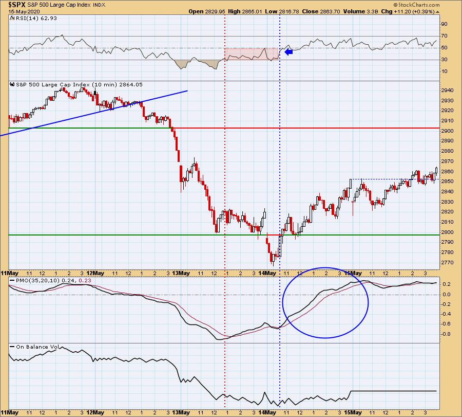
I received an email after trading on Wednesday 5/14 that included a great question about catching mid-day reversals:
"I struggle the most in days like today (5/14) where the market goes one way and then it changes direction. How do you identify when that is happening?
Your best bet is to use an intraday chart. I use a 5-min or 10-min bar chart when I am looking for an entry on a stock I already know I want (if it behaves). You will find that, on an intraday chart, the RSI and PMO are immensely helpful. For the purpose of today's article, I'm going to use a 10-min bar chart, which shows us five days. Let's look at two key points in two of these days. I want to start with yesterday (the dotted blue vertical line). This was a key reversal point for yesterday. Notice how, on the initial push higher, we got a Price Momentum Oscillator (PMO) BUY signal and, shortly after, the RSI moved above net neutral (50). This gave us two important signs that this was likely a key reversal point. As the RSI moved above net neutral, the PMO continued to move higher. There were "pauses" but, ultimately, it remained above its signal line.
Now let's look at the red vertical line from 5/13. Mid-day, a possible key reversal point appeared. However, notice the difference in the configuration of the indicators. The PMO started up, but the RSI was not above net neutral. That rally failed.


As investors, we want to accomplish two basic things: (1) Determine the trend and condition of the market and (2) select stocks that will ride that tide. The DecisionPoint Alert helps with the first step, and DecisionPoint Diamonds helps with the second. Go to DecisionPoint.com and SUBSCRIBE TODAY! (Charter Subscriber Discounts Available!)
Live Trading Room - Tuesdays/Thursdays

DecisionPoint.com Bundle Subscribers Get the
LIVE Trading Room for FREE ($49 Value)! Join Today!
Conclusion: It's important to follow a very short-term chart (5/10/15-minute) and watch the indicators to pinpoint possible key reversal points. Many people don't realize that the PMO can be used on very short-term charts and still provide the important information you need to trade. The RSI is an excellent companion to confirm price action and the PMO.
If you'd like a trial to our website newsletters, contact support@decisionpoint.com and we will hook you up!
Happy Charting! - Erin
Diamond of the Week (from Wednesday 5/13 DP Diamonds Report):
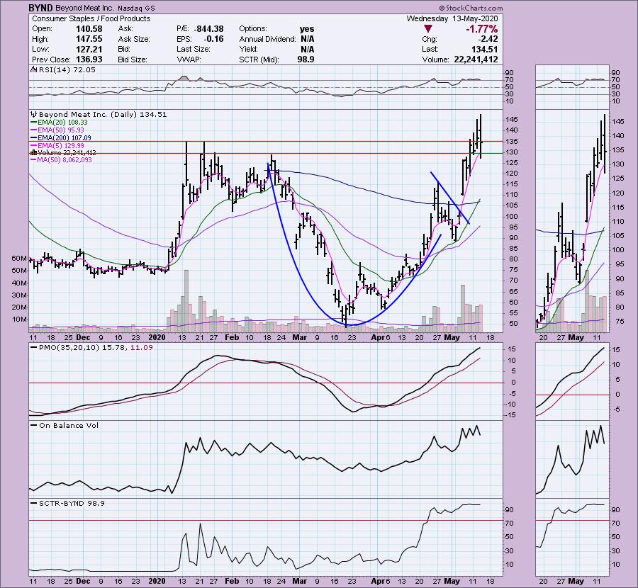
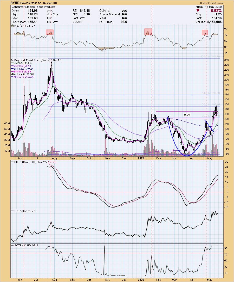
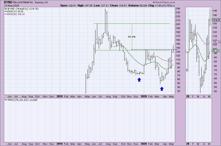
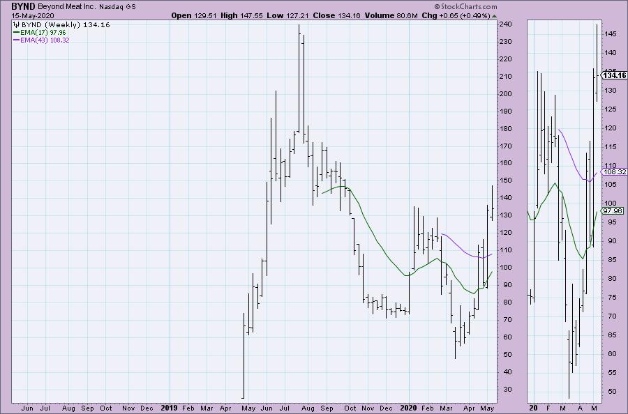
Below are the original article and charts. Underneath each chart, I've included the updated chart for today. If you watched this week's "The Pitch" on StockCharts TV, you saw my commentary on Beyond Meat, Inc (BYND).
Beyond Meat, Inc (BYND) - Earnings: 7/28/2020 (AMC)
Beyond Meat, Inc. engages in the provision of plant-based meats. Its products include ready-to-cook meat, under the brands The Beyond Burger and Beyond Sausage, and frozen meat, namely Beyond Chicken Strips and Beyond Beef Crumbles.
BYND is currently up 1.63% in after-hours trading. Today presents an excellent opportunity, given the pullback. The main negative I see on the chart is the overbought RSI, which can lead to more decline, as we've seen previously when the RSI has gotten overbought on BYND. Other than that, the chart is lovely, with a prominent cup and handle formation that has executed. PMO is rising, albeit a bit overbought.
Chart from 5/13:

Today's Chart 5/15:

The weekly chart doesn't have much information, but it has enough to show us an interesting large double-bottom pattern that is trying to execute. Even if we look at the June top as a target, that's an over 50% gain. I would probably watch what happens at the $170 level."

Today's Weekly Chart (5/15):

Technical Analysis is a windsock, not a crystal ball.
Helpful DecisionPoint Links:
DecisionPoint Alert Chart List
DecisionPoint Golden Cross/Silver Cross Index Chart List
DecisionPoint Sector Chart List
DecisionPoint Chart Gallery
Trend Models
Price Momentum Oscillator (PMO)
On Balance Volume
Swenlin Trading Oscillators (STO-B and STO-V)
ITBM and ITVM
SCTR Ranking
|
| READ ONLINE → |
|
|
|
|
|
| ChartWatchers |
| STUNNING Results in Any Market |
| by John Hopkins |
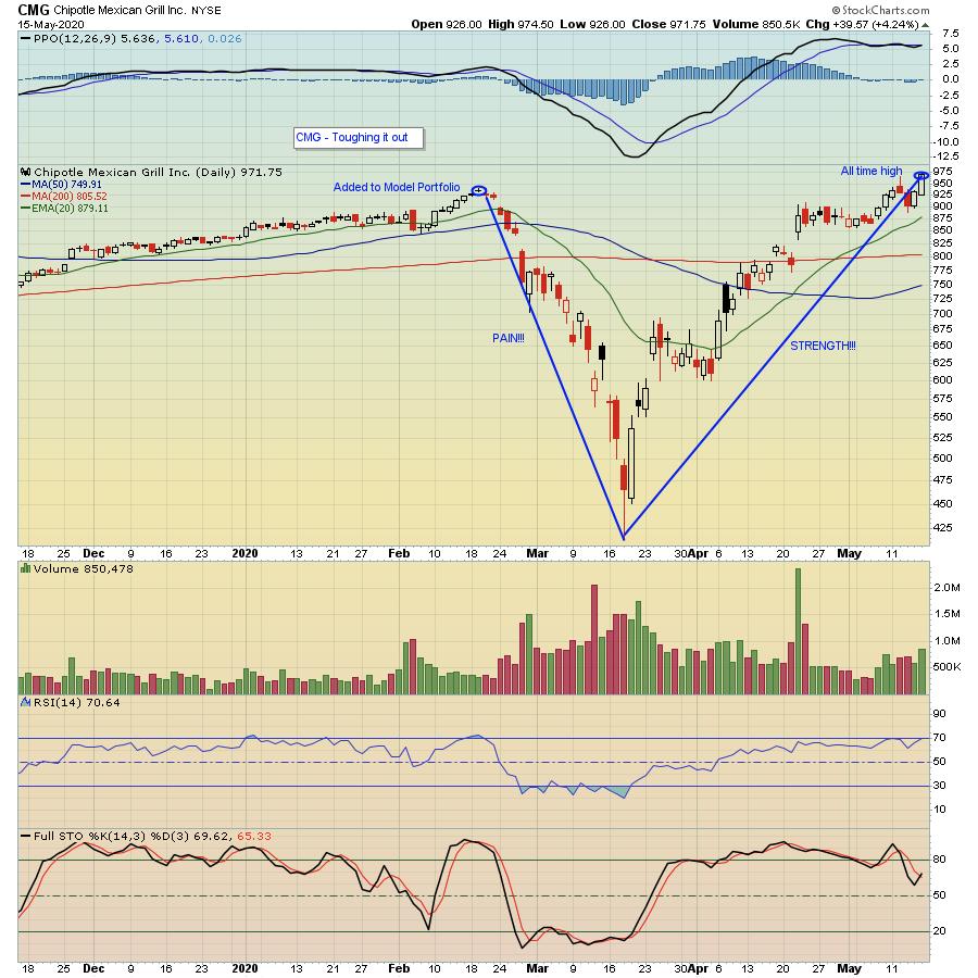
When you stop to think about the overall environment we've all been working in these past few months, it's amazing to think there are some stocks that are at their all-time highs. Of course, whenever there is a crisis, there are stocks that benefit. This is especially true for those stocks that investors see as "safe haven" trades, i.e. ones that might thrive under certain circumstances. A few stocks that come to mind include Peloton (PTON), as people look for alternative/safe ways to exercise, and Zoom (ZM), as more people look for safe ways to communicate. But one company that sticks out among the crowd is Chipotle Mexican Grill (CMG) as it hit its all-time high on Friday.
What makes the story even more amazing is the turmoil the company went through a few years back, as the equivalent of food poisoning caused many analysts to declare the stock D.O.A.. Instead, as you can see from the chart below, the stock has managed to power through all of the issues it has faced, including a world that has mostly been shut down over the past 60 days.

I'm bringing up CMG for another reason. This stock has been in the EarningsBeats.com Model Portfolio - created back in November, 2018, by our Chief Market Strategist Tom Bowley - on a number of occasions, and it serves as a perfect example of what can happen over the course of 90 days, which is the period stocks in the portfolio are meant to be held. For example, CMG was included in the Model Portfolio when Tom released his Top 10 Stock Picks on February 19 of this year, with the stock closing at $933.84 on that same day. It also happened to be 2 days before the stock started to crater as it got sawed in half, losing 50% of its value in the course of 30 days as news of the coronavirus started to break. What happened over the next 60 days? It gained back all of its losses and more. Wow!
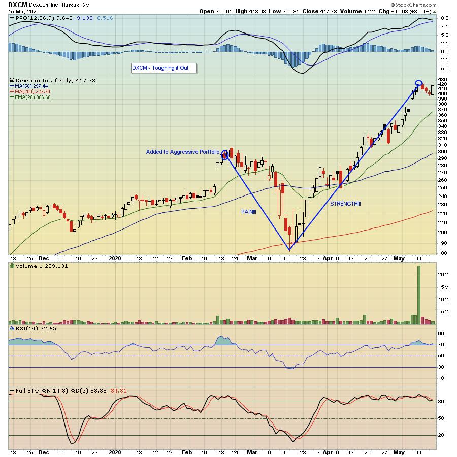
In addition to the Model portfolio Tom has created, there are three others: the Aggressive, Income and Character Change portfolios. For example, in the Aggressive portfolio, DexCom (DXCM) stands out with a chart very similar to CMG's, with the stock plunging right after it was revealed to our members, but also recently hitting its all-time high.

Of course, not every stock in the 4 portfolios Tom has created fared as well as CMG or DXCM. BUT... the two primary portfolios - the Model and Aggressive - have clobbered the S&P since their respective inceptions, with the Model portfolio up almost 67% compared to the S&P of 6.4% during the same timespan and the Aggressive portfolio up more than 22%, with the S&P flat during the same time span. And it goes to show you that when you have even a few superstars, it can go a long way to help offset the losers. Now, Tom is getting ready to release his "Top Ten Stock Picks" for all 4 portfolios - 40 stocks in all - this upcoming Tuesday, May 19. Those stocks will be revealed exclusively to EarningsBeats.com members, but prior to the unveiling, we will be having a "Sneak Preview" webinar the day before on Monday, May 18 at 4:30pm Eastern Time. And this FREE event will be open to all members of the EarningsBeats.com and StockCharts.com communities. During the event, Tom will go over some past results and discuss his methodology for picking the stocks that end up in each portfolio, so we hope you can join us. It's our most popular event, so just click on this link to register for our FREE EarningsBeats Digest newsletter and we'll make sure you receive room instructions prior to the event. You DON't want to miss this one!
Committing to a stock for 90 days - no matter the market conditions - can be a scary proposition. But, as you can see from the two examples above, if you focus on the "best of the best," you just might be able to ride out any storm.
At your service,
John Hopkins EarningsBeats.com
|
| READ ONLINE → |
|
|
|
| MORE ARTICLES → |
|
 What a way to start the week! Yesterday afternoon, I had the pleasure of hosting "Your Daily Five", our latest series on StockCharts TV where we bring you a concise, action-packed daily rundown of the five most important charts that you need to be watching. Weekdays at 1:00pm ET, each day features a new host, which means five top charts and key insights from a different seasoned technician every single day of the week.


 StockCharts calculates and publishes the Bullish Percent Indexes for several major indexes and sectors. Just