| THIS WEEK'S ARTICLES |
| The Traders Journal |
| "10 I'm Stalking" - Top Charts and Intriguing Trades (Week of May 25, 2020) |
| by Grayson Roze |
 As you may well know, I talk a lot about my weekly routine. More specifically, I talk a lot about my "Sunday Portfolio Review". I've said it before and I'll say it again – my weekend review is the most important part of my investing process. It is hands down the highest-impact, highest-leverage piece of my overall approach to the markets, and I see it as the heart and soul of my investing system. As you may well know, I talk a lot about my weekly routine. More specifically, I talk a lot about my "Sunday Portfolio Review". I've said it before and I'll say it again – my weekend review is the most important part of my investing process. It is hands down the highest-impact, highest-leverage piece of my overall approach to the markets, and I see it as the heart and soul of my investing system.
When I boil it all down, my weekend review has three fairly distinct sections:
- Market Evaluation
- Portfolio Analysis
- Discovery / "Stalking"
Now, I have to admit – the discovery piece is the fun one. This is where I sit down with all the results of the scans I've been running during the week. I sweep all of my watchlists and run through dozens of charts, sometimes even hundreds. I'm looking at what's out there that I don't own – what's working, what's trending, what's strengthening, what's making new highs and starting to set up for a high-probability trade, etc. At the end of it all, I carefully narrow my list of potential trading opportunities down to a very select group of just 10 names.
This is the list of "10 I'm Stalking".
As the new week kicks off, this list of 10 leaves me with a very focused group to consider. I'm not worrying about all of the dozens (or even hundreds...) of other possible setups out there. I've found my 10. I have my list. I know what I'm watching and where I'm looking. No muss, no fuss!
In life, focus is a beautiful thing. In investing, focus is a profitable thing.
Recently, I've been sharing out this list of "10 I'm Stalking" on Twitter before the start of each trading week. If you follow me on Twitter (@GraysonRoze), you can keep tabs on the names I'm watching each week and the charts I'm stalking as possible trade targets. For example:
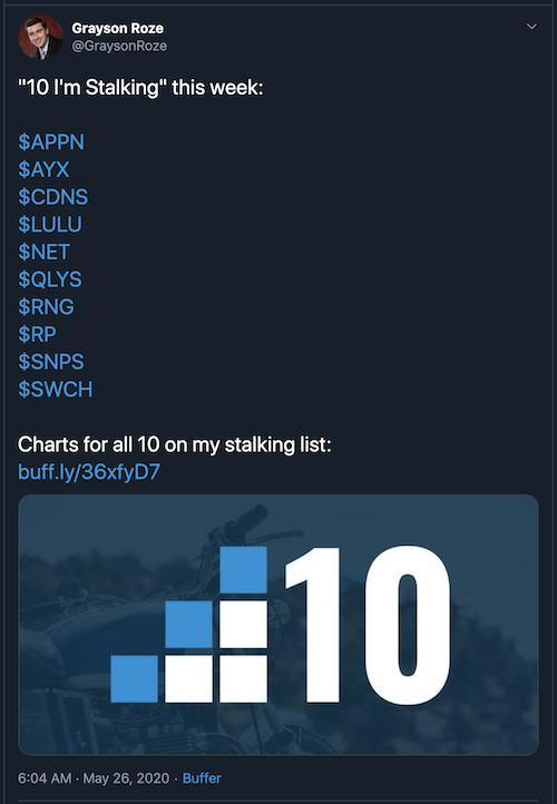
This week, in addition to the "10 I'm Stalking" tweet, I'm trying something new. Below, you'll find my charts for all 10 stocks I'm watching most closely this week. You can click on each one individually to see the live chart, or Click Here to see the full "Shared ChartList" with all 10 charts at once. You can even save the entire list into your own StockCharts account from that page, too.
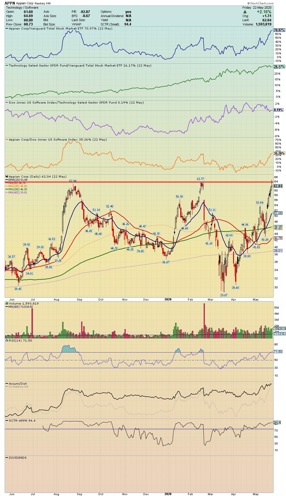
APPN - Appian Corp.
"Provides business process management (BPM) solutions. Its BPM tools automate and measures business processes."
Symbol Summary
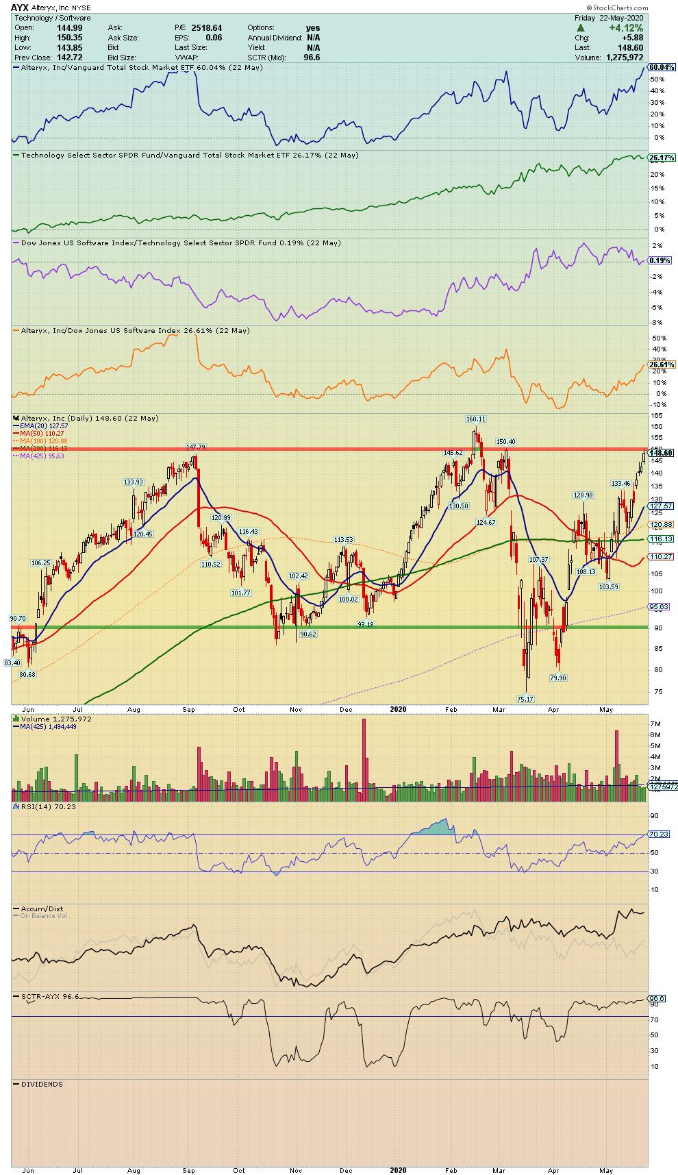
AYX - Alteryx, Inc.
"Engages in the provision of self-service data analytics software. Its subscription-based platform allows organizations to prepare, blend, and analyze data from a multitude of sources and benefit from data-driven decisions."
Symbol Summary
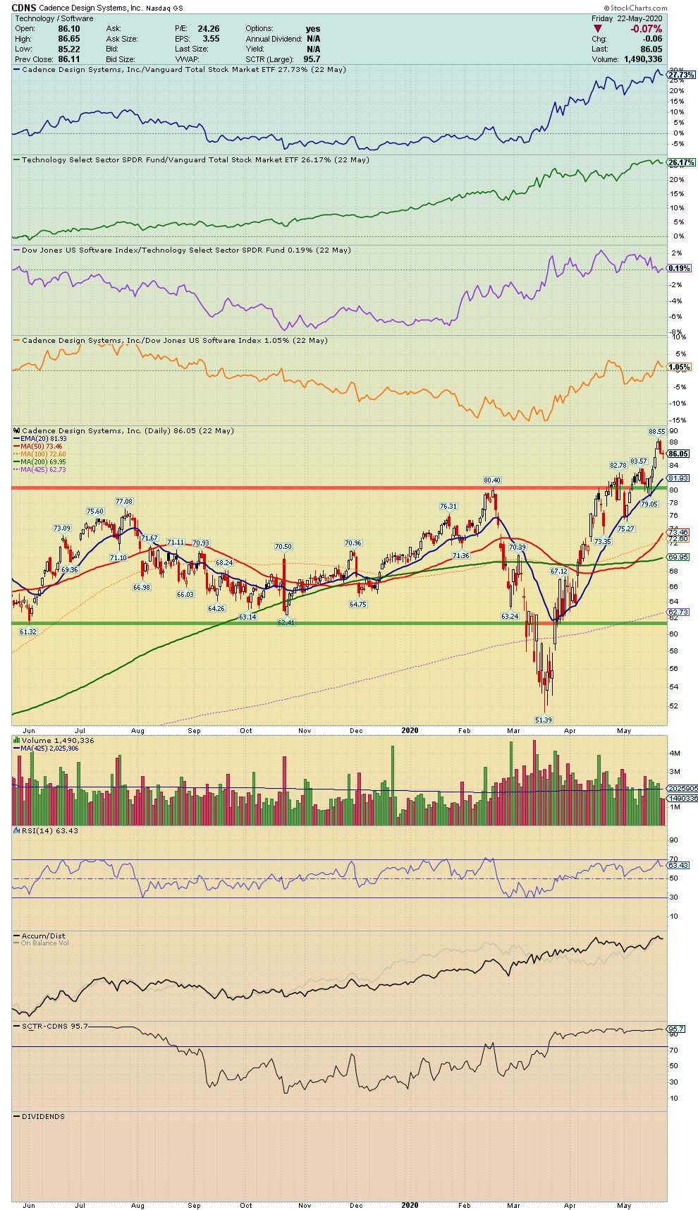
CDNS - Cadence Design Systems, Inc.
"Engages in the design and development of integrated circuits and electronic devices. Its products include electronic design automation, software, emulation hardware, and intellectual property, commonly referred to as verification IP, and design IP."
Symbol Summary
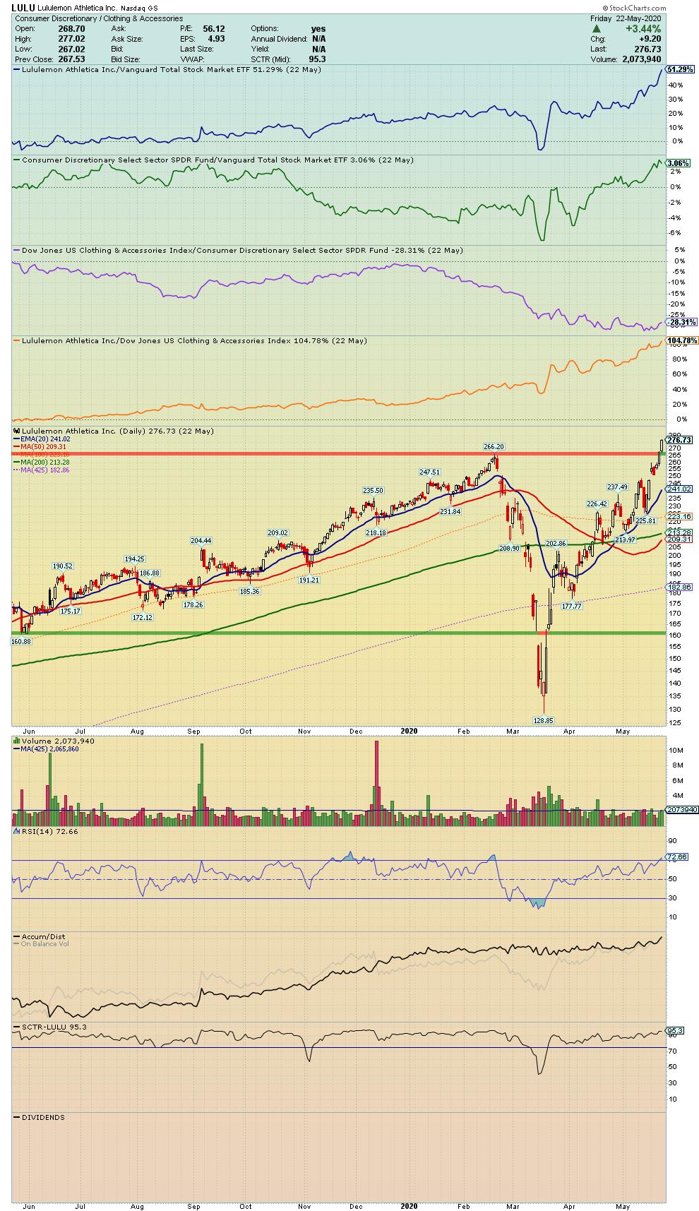
LULU - Lululemon Athletica
"Engages in the designing, distributing and retail of athletic apparel and accessories. It company operates through the following business segments: Company-Operated Stores, Direct to Consumer."
Symbol Summary
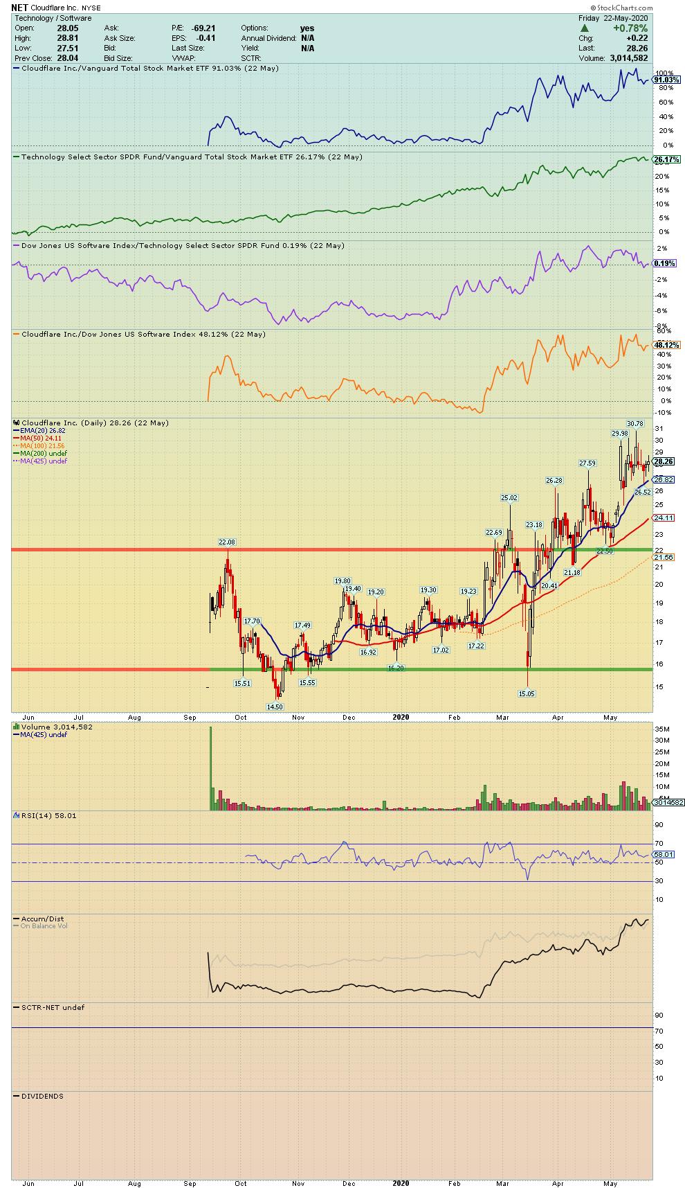
NET - Cloudflare, Inc.
"Engages in the provision of cloud-based services to secure websites. It offers various products for performance and reliability, video streaming and delivery, advanced security, insights, cloudflare for developers, domain registration and cloudflare marketplace."
Symbol Summary
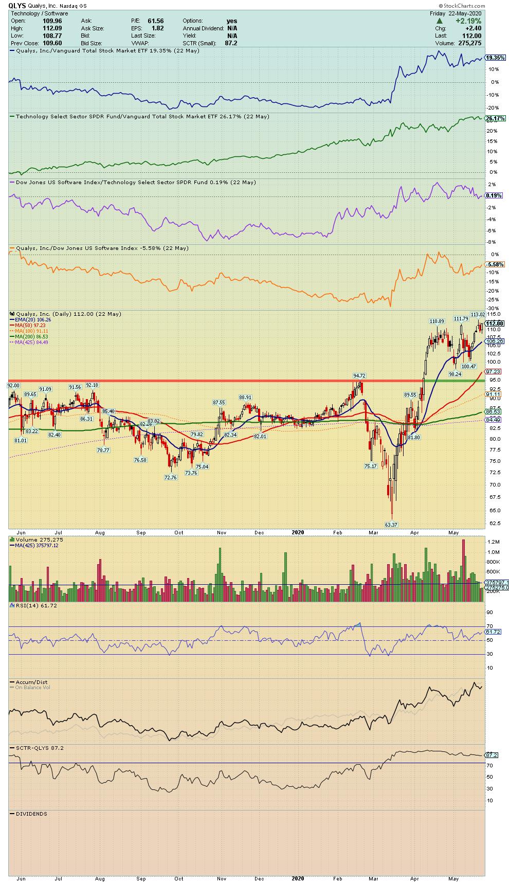
QLYS - Qualys, Inc.
"Engages in the provision of cloud security and compliance solutions. Its products enable organizations to identify security risks to information technology infrastructures; help protect information technology systems and applications from cyber attacks; and achieve compliance with internal policies and external regulations."
Symbol Summary
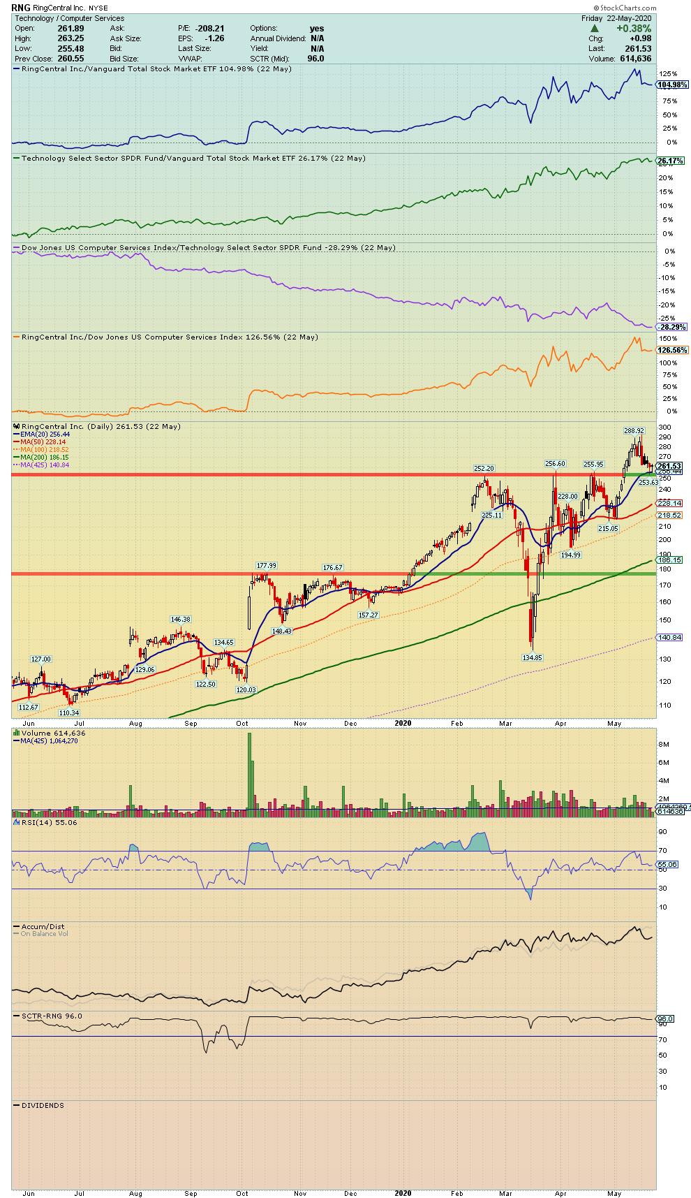
RNG - RingCentral, Inc.
"Engages in the provision of global enterprise cloud communications and collaboration solutions. The firms solutions provide a single user identity across multiple locations and devices, including smartphones, tablets, PCs and desk phones; and allow for communication across multiple modes, including high-definition voice, video, SMS, messaging and collaboration, conferencing, online meetings and fax."
Symbol Summary
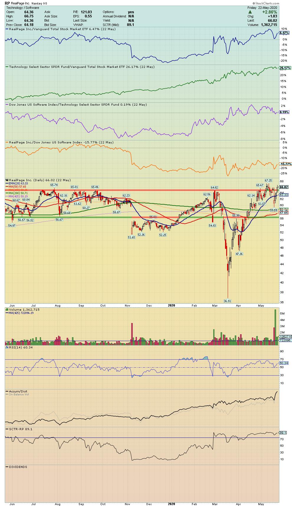
RP - RealPage, Inc.
"Engages in the provision of software and data analytics to the real estate industry. It includes marketing, leasing, living, site management, expense management, and financial solutions."
Symbol Summary
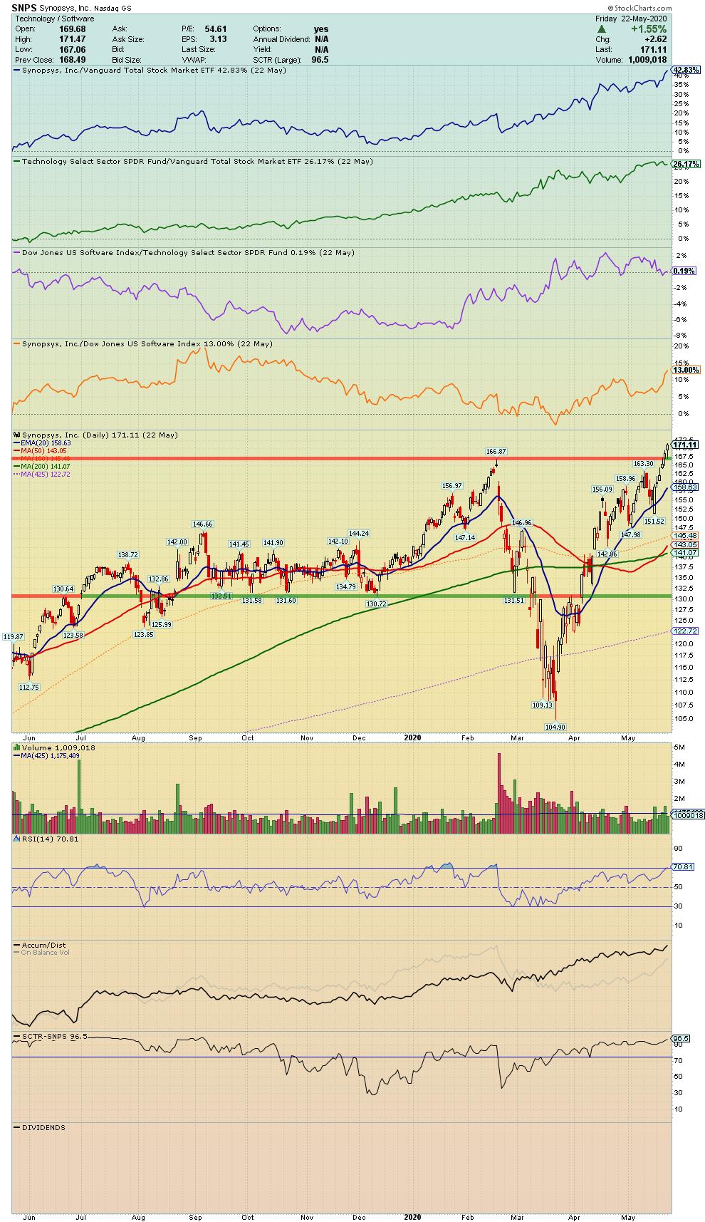
SNPS - Synopsys, Inc.
"Engages in the provision of software products and consulting services in the electronic design automation industry. The firm operates through the following segments: Semiconductor and System Design, and Software Integrity."
Symbol Summary
SWCH - Switch, Inc.
"Engages in the provision of technology infrastructure. It specializes in the development of digital platforms for digital media companies, cloud and managed service providers, financial institutions, and telecommunications providers."
Symbol Summary
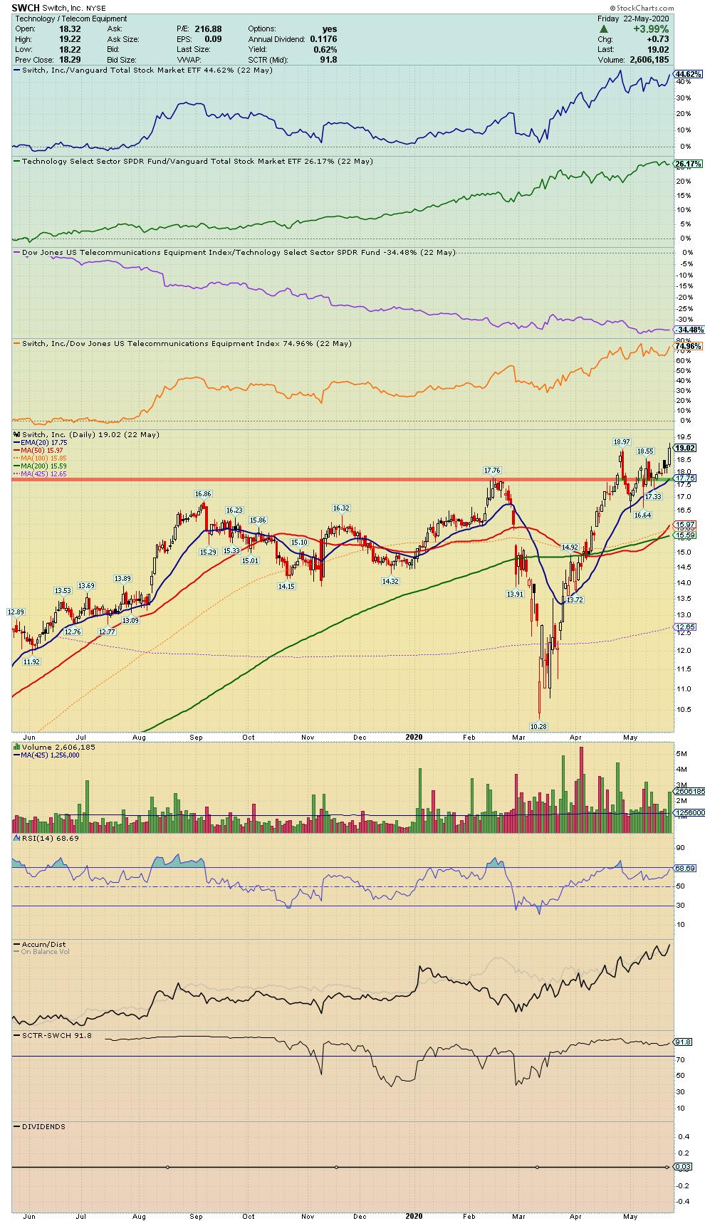
Chart on, my friends.
- Grayson Roze
VP of Operations, StockCharts.com
Author, Trading For Dummies (Wiley, 2017)
Author, Tensile Trading: The 10 Essential Stages of Stock Market Mastery (Wiley, 2016)
Co-Founder, StockMarketMastery.com
Twitter: @GraysonRoze
|
| READ ONLINE → |
|
|
|
| Market Roundup |
| Nasdaq Closes a Major Gap |
| by Martin Pring |
March Was a Really Strong Bottom
Tuesday's action looks bullish on the surface, but may signal the end of the rally. I emphasized the word "may" not because I am trying to hedge my bets, but more because the March bottom, by historical standards, was a pretty strong one, likely to hold for a considerable period of time. Indeed, there is a good probability that it will never be taken out. As a result, we have experienced a very powerful rally where short-term bearish technical indicators have been cast aside. To demonstrate what I mean about the power of the rally, take a look at Chart 1, which contains a 10-day MA of the 12-day ROC for the SPX. I have shown this indicator in previous articles. However, I keep going back to it to remind me of the importance of that March bottom. The indicator reached a really deep oversold condition, only seen twice before since the Great Depression. Those examples occurred in 1987 and 2008, indicated in the chart by the two blue arrows. The second point is that this smoothed ROC reached an extreme overbought reading only previously seen at the August 1982, October 2002 and April 2009 bottoms. All instances were followed by very powerful bull markets. The post-1987 advance was not so impressive, but that low has not been seen since.
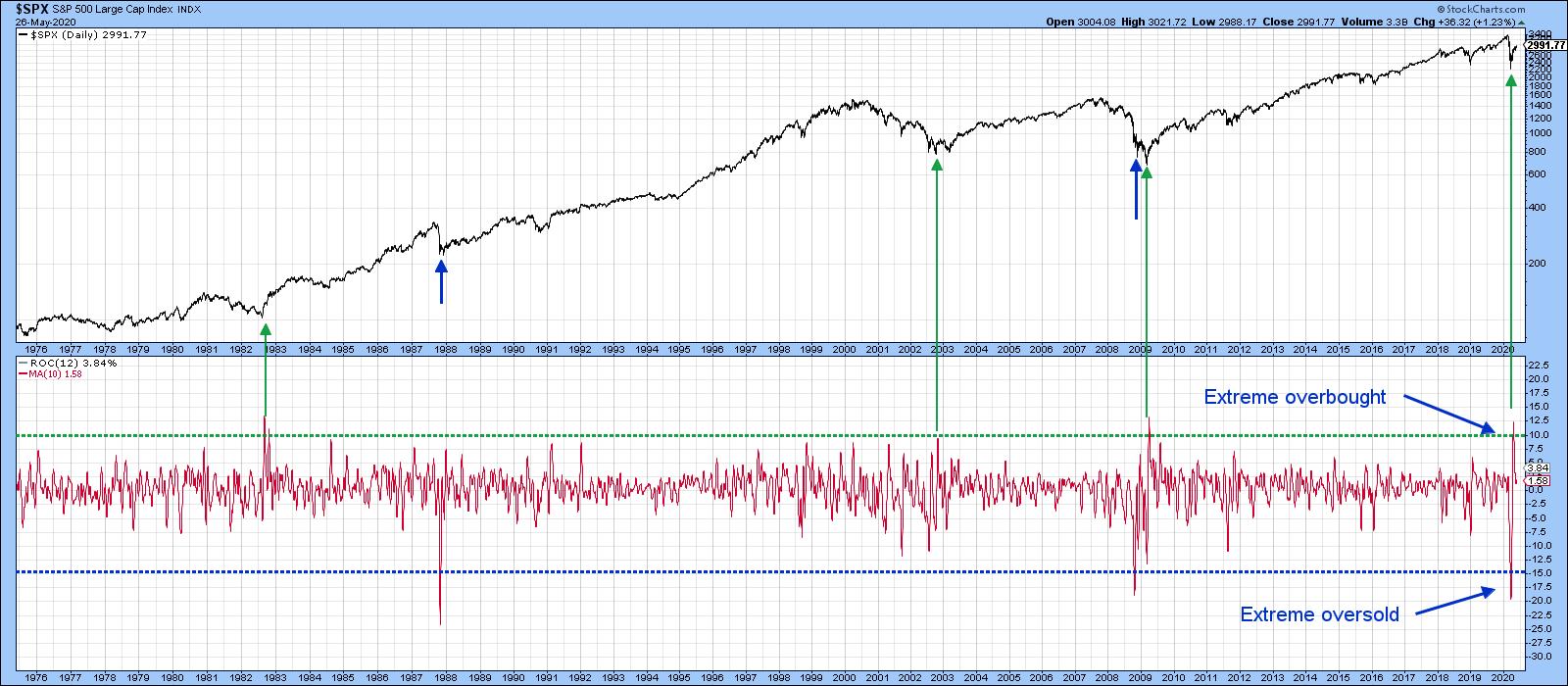 Chart 1 Chart 1
NASDAQ Closes a Gap
Fast-forward to the present and we see that Tuesday's action leaves a lot to be desired. Let's take the NASDAQ first. Chart 2 shows that it opened on its high, just at the upper area of its March downside gap. That gap was bullish in the sense that gaps are almost always filled, as investors and traders typically come back and revisit their emotions. Since that chart vacuum has now been closed, market participants have fulfilled those obligations. Second, Tuesday's Index action represented a key reversal day. That refers to a day in which buyers come into the session with great enthusiasm as the price opens up with a gap, but, by the end of the day, prices reverse to the downside and end it pretty well where the previous session closed. As a general rule, the longer and sharper the preceding advance, the stronger the pattern. Note the three gaps that were formed lower down. There is no guarantee that any of them will be filled, but that's still a worry going forward.
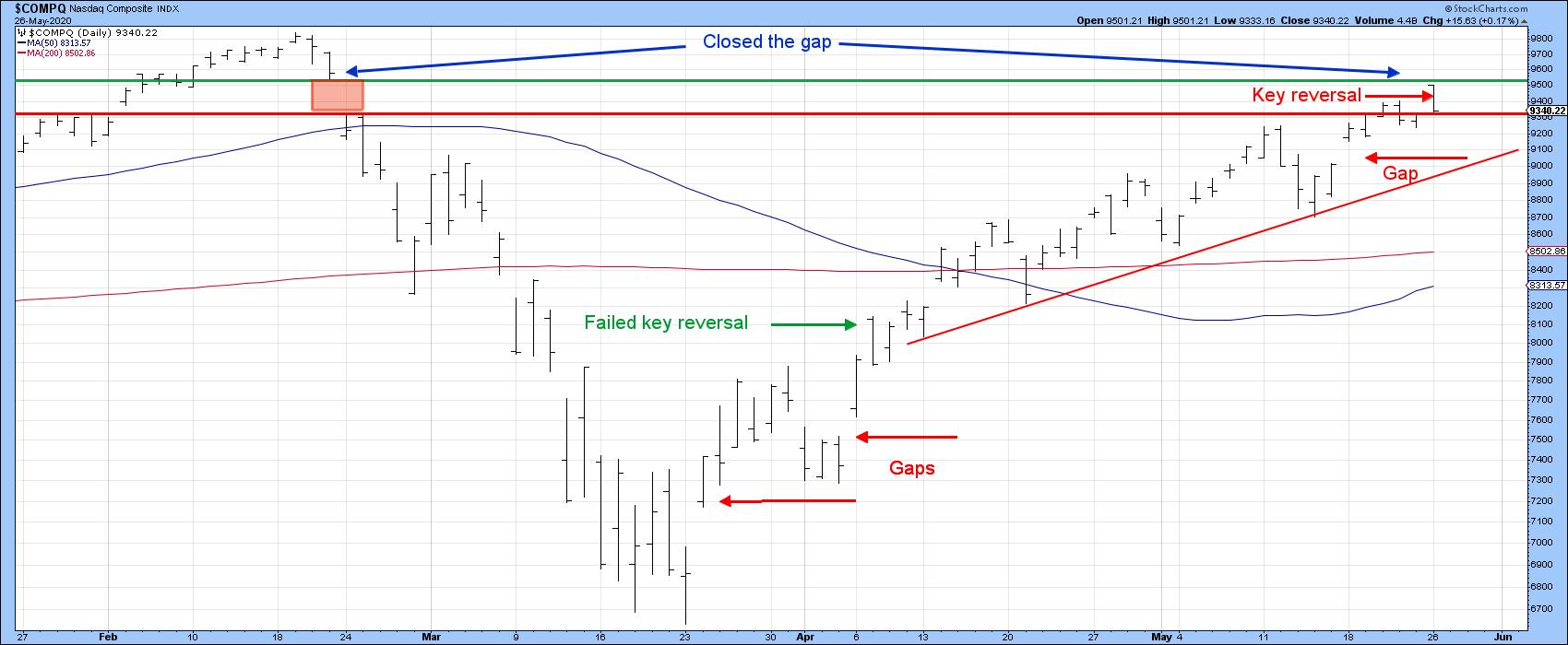 Chart 2 Chart 2
That said, a bearish pattern in a bull market often fails to fulfill its negative promise, as you can see from the early April key reversal flagged by the green arrow. I cited that one as a bearish factor at the time and got my head handed to me on a platter, as it was quickly followed by new highs. The same could happen in the current situation, but I think it's less likely, as the NASDAQ bullish percent (Chart 3) has been noticeably weak in recent weeks, having twice failed to confirm new highs in the Index itself. There is nothing to preclude a third or even fourth negative divergence from developing, but the history of the four previous ones shows that, when the up trendline in the NASDAQ is violated, bad things can happen.
The line I would use in the current situation is shown in Chart 3. It is currently around 8,900 and rising pretty rapidly.
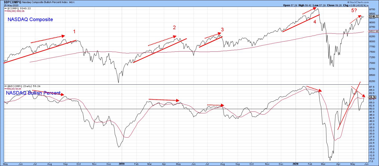 Chart 3 Chart 3
Finally on the NASDAQ, Chart 4 shows that its RS line against the S&P experienced a trendline break on Tuesday. Since the KST has also started to roll over, this may indicate that Wall Street's favorite stocks are in for a bumpy ride. The KST for the absolute price has already gone negative, which places that up trendline in Chart 4 in danger of being ruptured.
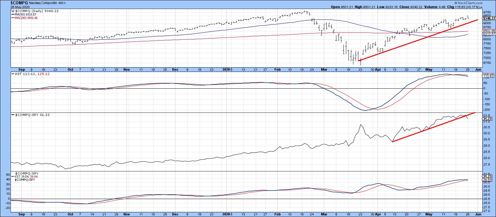 Chart 4 Chart 4
To sum up, a very strong technical bottom was registered during the end of March/early April period. Its positive effects are likely to be felt for a long time. However, there are several indicators that suggest that, if a correction is going to take place, now might be as good a time as any to expect it.
Editor's Note: This is an excerpt of an article that was originally published in Martin Pring's Market Roundup on Tuesday, May 26th at 7:18pm ET. Click here to read the full article, which includes Charts 5-6 and a discussion of the S&P.
Good luck and good charting,
Martin J. Pring
The views expressed in this article are those of the author and do not necessarily reflect the position or opinion of Pring Turner Capital Group of Walnut Creek or its affiliates.
|
| READ ONLINE → |
|
|
|
|
|
| Art's Charts |
| A Bullish Continuation Pattern for a Sector with Strong Breadth |
| by Arthur Hill |
Chartists can separate the leading sectors from the lagging sectors by sorting with various breadth indicators. The 200-day EMA is a long-term trend indicator that can also be used as a breadth indicator. A stock is in an uptrend when above the 200-day EMA and in a downtrend below. The chart below shows two examples from the Healthcare sector.
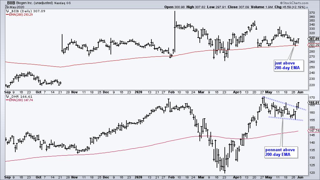
Chartists can turn this trend indicator into a breadth indicator by counting the number of stocks in a sector that are trading above or below this EMA. Don't worry. You do not have to run a scan or count the charts by hand. StockCharts has done the work for you with an array of sector breadth indicators. The percentage of stocks above the 200-day EMA is one of my favorites because it immediately tells me how many stocks within the sector are in long-term uptrends.
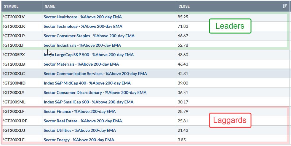
The table above shows the percentage of stocks above the 200-day EMA for the 11 sectors and three major indexes. Healthcare and Technology stand head and shoulders above the rest with readings above 70%. Consumer Staples is second with over 60% and the Industrials sector is in fourth place with a move above 50% this week. Note that these numbers are based on Thursday's close.
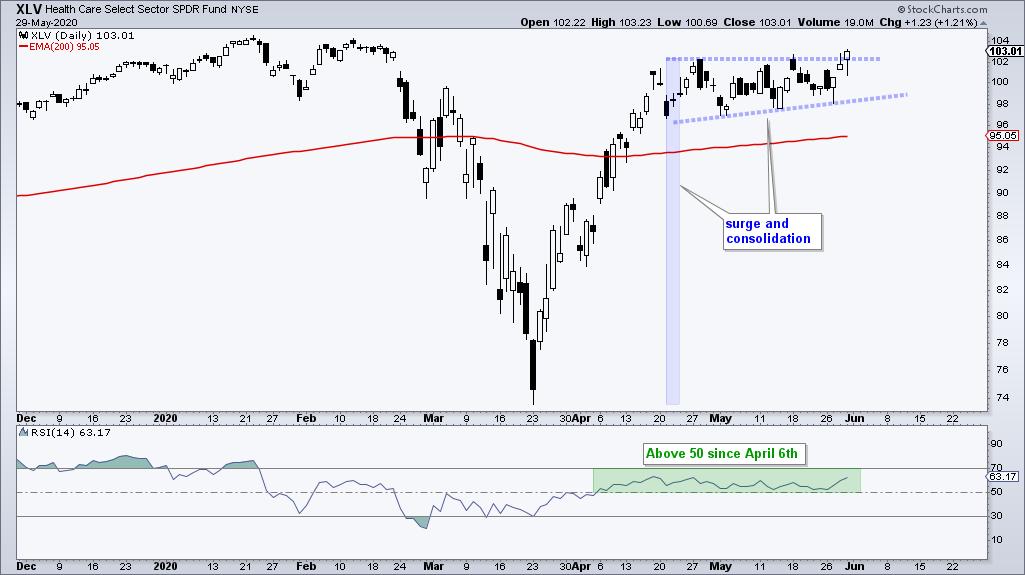
The Healthcare sector shows bullish breadth overall and the Healthcare SPDR (XLV) is above its 200-day EMA. This bullish combination means Healthcare should be on our watchlist for bullish patterns and setups. In fact, the ETF is forming one right now as a small consolidation takes place after a strong advance. This is a bullish continuation pattern and this week's upside breakout signals a continuation higher.
I maintain a breadth model using the 11 sector SPDRs and three indicators for each sector at TrendInvestorPro.com. Healthcare is the only sector with all three indicators on bullish signals. In fact, only three sectors are net bullish and eight are still bearish. Subscribe today for immediate access to this model, ETF rankings and the weekend video.
Click here to take your analysis to the next level!
------------------
|
| READ ONLINE → |
|
|
|
| The Canadian Technician |
| When Debt Doesn't Matter |
| by Greg Schnell |
One of the major risks of the global slowdown is the number of companies that are forced to close due to lack of cash flow or credit risk. Jerome Powell jumped on the credit risk issue early on to avoid contagion in the USA. The Fed flooded banks with liquidity, bought ETFs, bought junk bond ETFs, promised to help in commercial real estate and talked about the use of unlimited tools. Recently, members of the Fed discussed controlling both ends of the yield curve so inflation could not arrive to create a problem.
With the currencies muted through currency swap windows between countries, there are no clues there. The Fed has taken huge precautions in front a global GDP implosion and flattened currency fluctuations to a mere blip.
Early on Friday, Jerome Powell talked up a situation where they are unlimited in their efforts. That becomes one of the reasons this market keeps going higher. There is no downside risk. While companies earnings may be 1/2 or 1/3 of what they were in 2019, the stock market continues to believe earnings don't matter.
But this week there was even more actual action on debt. Japan announced the 2nd round of a "trillion dollar stimulus." As Abe and Kuroda started seeing the public dissatisfaction rise with only $1T in stimulus, they doubled down with their largest ever for the second time in a month. With GDP expected to be down 20%, the Asian nation added $2.1 trillion US in government/Central Bank stimulus in May. It is not the time to be focused on a budget, the leadership said. The stock index closed up 7% on the week with such good news.
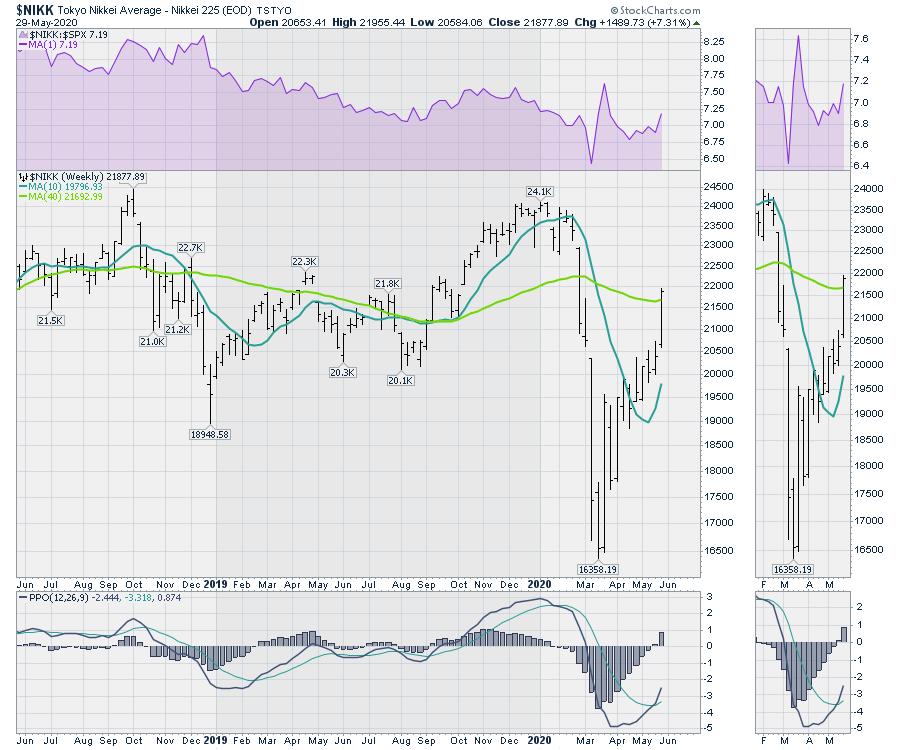
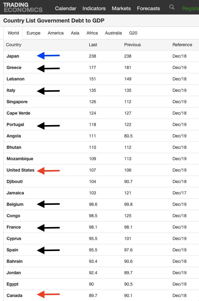
While credit rarely plays out immediately, I am reminded that Japan also has the largest debt-to-GDP. What amazes me is that this good news borrowing is on top of a Debt-to-GDP ratio over 235%. Many countries have been forced to deal with their debt at much lower levels. With plummeting GDP and the massive addition to debt, this happened overnight on Tuesday. Japan's Nikkei rallied 1000 points following the announcement through the rest of the week to retake the 40 week-moving average. Besides owning the majority of bond and stock ETFs, there is still more they can do.
 Source: TradingEconomics.com Source: TradingEconomics.com
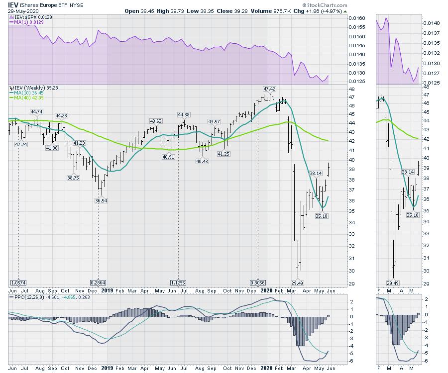
On the same evening, Europe proposed a rollout for a series of grants and loans. It was an additional $800 billion on top of previously announced funding. 6 of the top 18 nations with heavy debt are in Europe, including ones with large populations like France, Spain and Italy. It was more good news for everyone, and the European ETF ran up 5%.
Canada's Prime Minister has been holding a press briefing almost every day announcing new programs to help some part of society on the front step of the official residence. This week, he also suspended parliament in a democracy until September. The stock market was not outraged, up 1.87%. Canada is also on the debt list above.
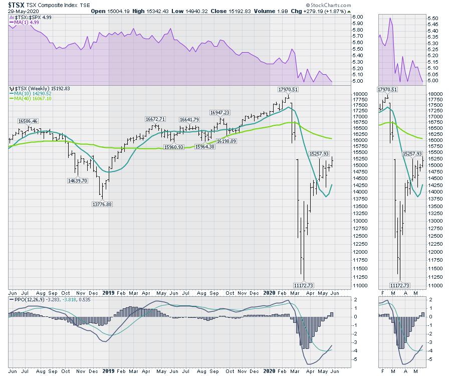
As long as there are no increased taxes, and central banks and governments worldwide continue to use debt to solve the current problems, the market is optimistic. Some of you reading this might even be surprised that all those things happened and you had not heard about them. It didn't make the news relative to China moving troops into India, Russia moving more war planes into Syria and the threat of the removal of democratic rights from Hong Kong. Add the rising tensions of US-Sino trade and it was a week to be invested optimistically.
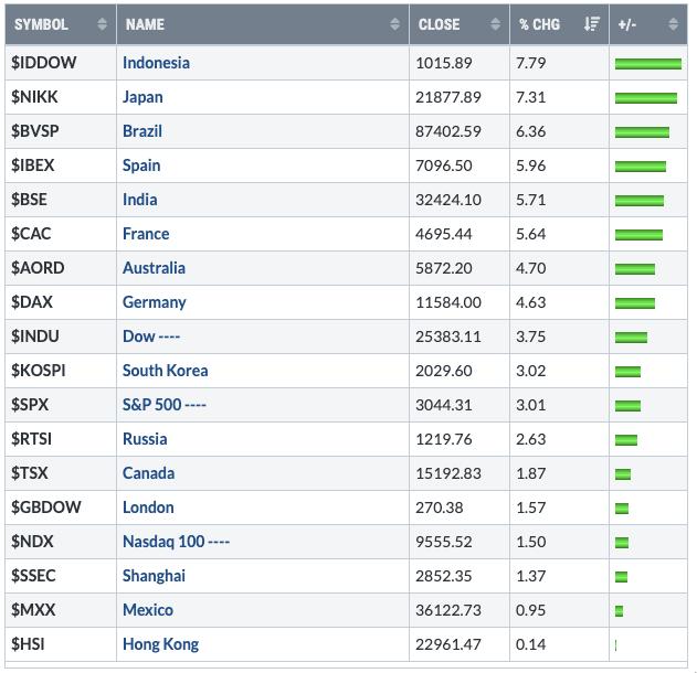
I think it is fair to say the market is not trying to reflect the economy. It is measuring risk-on vs risk-off and, right now, governments and central banks will use all the money they have to minimize civil unrest and remain in a positive light with their electorate. So the market is rising on low downside risks to owning shares due to the support being provided.
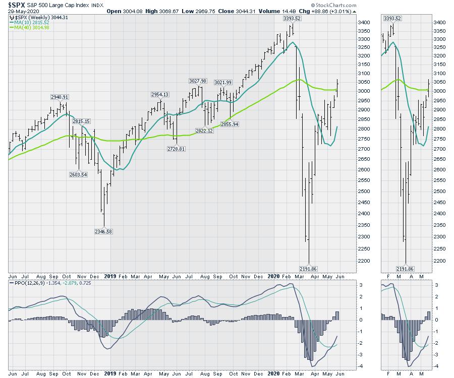
Will Japan's debt matter at 300% or 400% or 500%? I actually thought it would, but apparently it's all good. I don't want to be jaded here, but debt doesn't matter until it does. And currently it is being viewed as a party supply, not a problem. Be bullish as the charts are pointed up.
|
| READ ONLINE → |
|
|
|
| The Traders Journal |
| This Technician's Confession: There's One Essential Fundamental Indicator I've Embraced For Decades |
| by Gatis Roze |
 I've acknowledged in numerous previous blogs and in our book that I'm not exclusively a 100% pure chartist. I know... blasphemy! I've acknowledged in numerous previous blogs and in our book that I'm not exclusively a 100% pure chartist. I know... blasphemy!
Yes, I use fundamentals. I need fundamentals, I won't trade without fundamentals. But the key is that I'm neither a fundamentalist nor a technician. I label myself as a "rational investor". I keep one foot in each camp.
In the fundamentalist camp, I'm an earnings junkie. I follow earnings and earnings dates. I track the trend of analysts earnings projections. Earnings growth rates matter to me as do PEG ratios.
Having said that, earnings is not my one essential fundamental indicator. Instead, it's sales and revenues. Why, you shout — earnings are more important than sales and revenues.
Well, because when I own an equity, protecting my profits is Mission #1.
Too many times over the years, I've seen earnings continue to expand magically since companies can afford the best number crunchers and utilize "Hollywood accounting" tools while sales and revenues are falling. Earnings that are based on smoke, mirrors and cost-cutting strategies with declining revenues can only support an attractive chart for so long. Sometimes longer than you'd guess. The stories at the time always seem so plausible, and the talking heads so persuasive, but inevitably the plunge happens when revenues trend lower.
Protecting my profits dictates that I follow two maxims. To paraphrase Jesse Livermore, "when the market tells you that you are wrong, you must sell and cease being wrong", Jeff Bezos added to the sentiment, saying, "Being wrong might hurt you a bit, but being slow will kill you".
My personal interpretation and the recipe I use is this: "Pull the trigger and don't procrastinate!"
Therein lies the reason that sales and revenue trends are more important to me than the reported earnings. It's a lot harder to manipulate or fabricate sales and revenue data. Witness the Chinese company Luckin Coffee (LK) which just fired both its CEO and COO for sales fraud. It happens, but much less seldom than creative earnings.
I'll present five examples. First, a shout-out to the Value Line service. I'm a subscriber, and they make it very easy to track ten years of sales and revenue. I like easy!
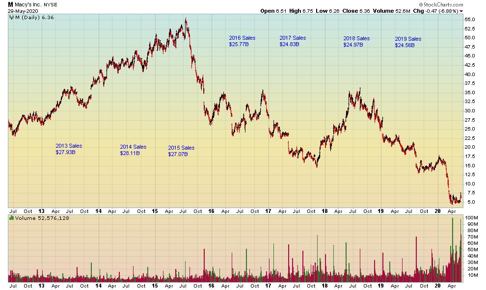
My first example is actually a cluster of retailers. Macy's (M) sales began trending down in 2015 and the chart followed.

Both The Gap (GPS) and Kohl's (KSS) had diminishing sales starting in 2019. Look at those charts, if you dare. General Electric (GE) had sales begin to trend down in 2015 and 2016, but the charts kept hoping and praying for a turnaround. The big decline came in 2016, and it was ugly. Kraft Heinz (KHC) sales turned down beginning in 2016, and the chart levitated for a short time at $84 before soon crashing to $20. For Mylan (MYL), sales began trending down in 2018 while Mosaic (MOS) sales began trending down in 2019. Both are off their highs by two-thirds. You get the point. Back to my mantra: "Pull the trigger and don't procrastinate!"
I'm going to push this even further in hopes of truly convincing my readers that this approach is one you should embrace. Over the longer term, it's difficult for a business to produce attractive returns for investors if it isn't growing its sales and revenues. An example from my own portfolio is Visa (V). Its revenues have grown from $8,065 million in 2010 to $22.8 billion over 10 years. Correspondingly, its stock price has appreciated from $15 to $190. Contrast this with Macy's (M). Its sales in 2010 were $25 billion and have drifted lower over 10 years down to $21.71 billion. Its stock price likewise has moved steadily down from $13 in 2010 to just $5 today.
Lastly, I'll layer in a recent study done by the AAII based on stock data from 1972 - 2019. Dividend Grower stocks outperformed the market and achieved this with less volatility (i.e. higher returns with lower risk). A company can't raise dividends for very long if its sales and revenues are decreasing. I would wager that there are many academic studies that show the specific correlations of stock price appreciation to sales and revenue growth, and vice versa.
There's a new book out called "Flash Crash" by Liam Vaughan. It describes how Navinder Singh Sarao thrived in his job as a trader because he displayed a rare combination of intelligence — and here's the kicker — emotional control. In our book, Tensile Trading, we show how necessary it is to blend both Stage 3: The Investor Self (all about emotional and behavioral control) with Stage 9: Selling.
Add these to your tool kit. Learn the skill of monitoring your equities sales and revenue growth while having the self-discipline to pull the trigger to lock in profits when sales begin to fade. Doing this and moving on is a behavior that will serve you well in managing your portfolio. It has served me nicely for many decades indeed.
A closing caveat. This methodology I've used for years is based on the pre-Covid period. Some adjustments and allowances are no doubt needed now to reflect the current market and post-Covid results. Nevertheless, I submit that if corporations are unable to grow their revenues, then their earnings and stock prices will soon reflect this fact. I maintain that any disconnect between fundamentals and technicals is a temporary situation, and reversion to the mean is to be expected.
Trade well; trade with discipline!
- Gatis Roze, MBA, CMT
StockMarketMastery.com
|
| READ ONLINE → |
|
|
|
| DecisionPoint |
| Reader Question: "Why Look at Weekly Charts?" |
| by Erin Swenlin |
I love getting email from my readers, and this particular email was great. He felt like he was asking a ridiculous question, but it's actually a common one that I don't think is asked out loud. This reader asked the question in the context of my DP Diamonds Report, wherein I include both the daily and weekly charts for each of my stock picks.
"You show two charts per equity, one daily and one weekly so what is the significance of a daily chart over the weekly?"
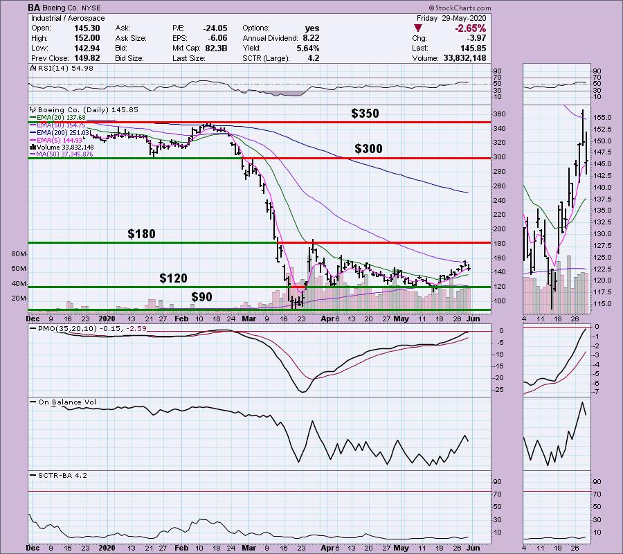
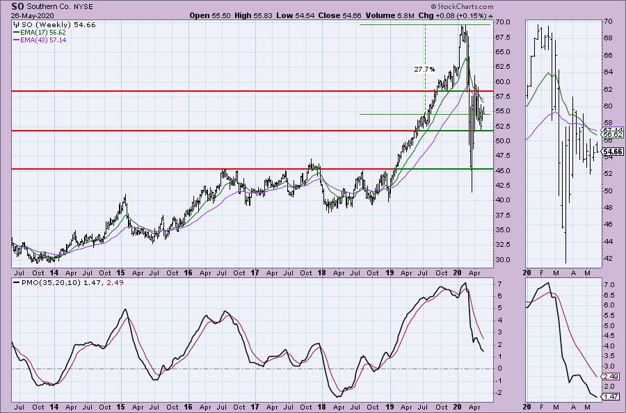
When I research a stock or ETF for possible purchase, there are few things that I find critical. The first is looking at price charts, from monthly to daily to minute/hour. Why should I care about a monthly or weekly chart if I'm in it for a short-term trade? Well, I believe it is important to glance at those longer-term charts to find any possible support or resistance areas that go waaaay back in time. If they coincide with near-term support/resistance on a daily chart, it can be considered more "touches" to those support or resistance lines, which increases the "strength" of that price level. Let's look at an example.
Below is Boeing (BA). I've annotated five levels of support and resistance and labeled the price. We can see on the daily chart that these are important areas of support/resistance. However, we can only see one year...

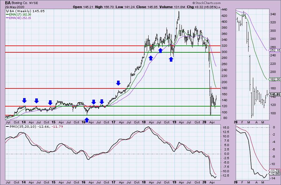
Look at these same price levels on the weekly chart. Notice we can add more "touches" to some of those levels.

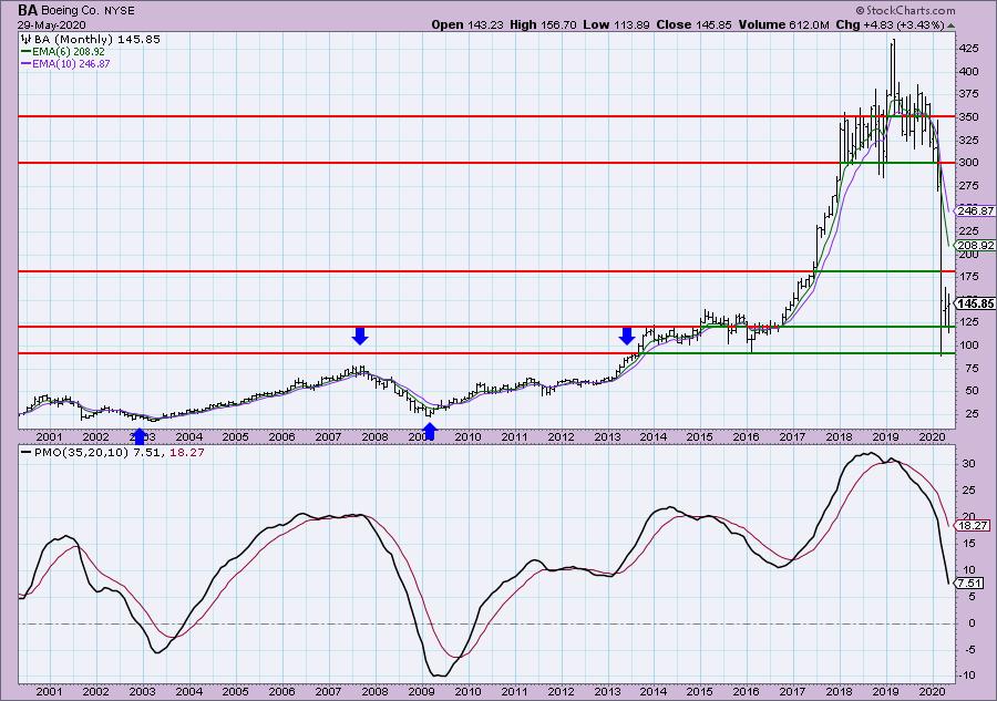
Can we add any more on a monthly chart? A little bit. Mainly, we can see that the basing area for BA is $25 - $80.

Conclusion: Many stocks have what appears to be "memory." Well, the investors have memory; they remember the key levels they purchased and sold at. I find it important to know whether a particular support or resistance level has "history." If it does, I know that there is a good chance those support or resistance levels will hold more tightly - and could be areas to look for key reversals.

As investors, we want to accomplish two basic things: (1) Determine the trend and condition of the market and (2) select stocks that will ride that tide. The DecisionPoint Alert helps with the first step, and DecisionPoint Diamonds helps with the second. Go to DecisionPoint.com and SUBSCRIBE TODAY! (Charter Subscriber Discounts Available!
Conclusion: It's important to follow a very short-term chart (5/10/15-minute) and watch the indicators to pinpoint possible key reversal points. Many people don't realize that the PMO can be used on very short-term charts and still provide the important information you need to trade. The RSI is an excellent companion to confirm price action and the PMO.
If you'd like a trial to our website newsletters, contact support@decisionpoint.com and we will hook you up!
Happy Charting! - Erin
Diamond of the Week (from Wednesday 5/27 DP Diamonds Report):
Below is the original article, but the charts have been updated through today.
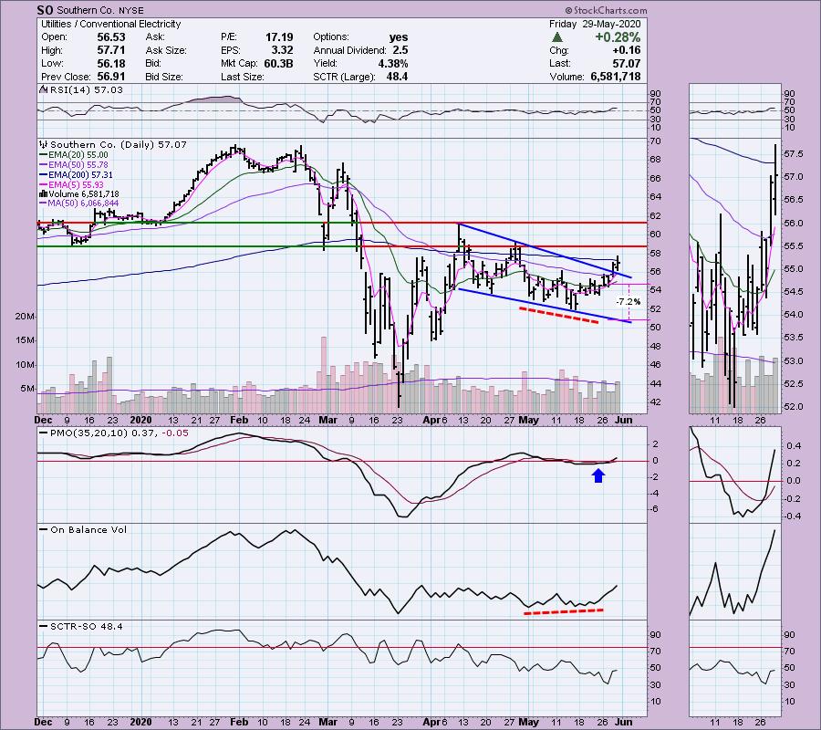
Southern Co (SO) - Earnings: 7/29/2020 (BMO)
The Southern Co. is a holding company. The firm engages in the sale of electricity. It operates through the following segments: Traditional Electric Operating Companies, Southern Power and Southern Company Gas. The Traditional Electric Operating Companies segment refers to vertically integrated utilities that own generation, transmission and distribution facilities, and supplies electric services in the states of Alabama, Georgia, Florida and Mississippi. The Southern Power segment constructs, acquires, owns and manages generation assets such as renewable energy projects and sells electricity in the wholesale market. The Southern Company Gas segment distributes natural gas through natural gas distribution facilities in the states of Illinois, Georgia, Virginia, New Jersey, Florida, Tennessee and Maryland.
(Note: The breakout from the falling wedge had not happened as of 5/26.)
I used to own this stock and I'm considering reentering. There is a bullish falling wedge, but it hasn't executed yet. I might consider getting in before that breakout, given price traded completely above the 20-EMA. This has a great dividend and yield as well. The SCTR is a bit of a problem given that it is declining. The OBV has a lovely positive divergence that I don't think has completely played out on this rally.

The PMO seems to be decelerating. Of course, I did look and this was a Diamond on April 9th. The weekly PMO was rising at the time and it didn't do much at all. I prefer a better weekly chart, but for a short-term trade it could be good.

Technical Analysis is a windsock, not a crystal ball.
Helpful DecisionPoint Links:
DecisionPoint Alert Chart List
DecisionPoint Golden Cross/Silver Cross Index Chart List
DecisionPoint Sector Chart List
DecisionPoint Chart Gallery
Trend Models
Price Momentum Oscillator (PMO)
On Balance Volume
Swenlin Trading Oscillators (STO-B and STO-V)
ITBM and ITVM
SCTR Ranking
|
| READ ONLINE → |
|
|
|
|
|
| ChartWatchers |
| Identifying Stocks with High Short Interest Can Put $'s in Your Pocket! |
| by John Hopkins |
When looking for solid long trading candidates, one of the things astute traders look for are those stocks with high short interest. In other words, those stocks that traders are heavily betting against. Why, you might ask? Because if you can identify companies with a high percentage of short interest that also have solid-looking charts, there's a decent chance you can bag some nice profits.
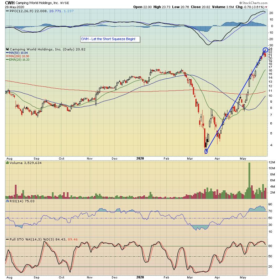
As an example, take a look at the chart below on Camping World Holdings (CWH), a stock on our "Short Squeeze ChartList" that contains over 140 stocks with high short interest.

For this particular stock, 36% of the shares available to be traded are short, meaning 36% of shares available to be traded in this company are held by those betting AGAINST the company. Why does this matter? It matters because when a stock gets hot, like this one did when it bottomed alongside the overall market and started rising, it puts pressure on those who are short; it's heading in the opposite direction of what they bargained for.
Think of it this way. When you buy a stock on the long side, you are looking for it to move higher to profit. And when you buy that stock, you know exactly how much you can lose if the trade goes against you. For example, if I buy a stock with a price of $10, I know the most I can lose is $10 times the number of shares I purchase. When you sell a stock short, you are looking for it to move lower to profit. But there's no theoretical "ceiling;" a stock could go to infinity, which becomes a very scary proposition when you are holding it short! So, quite often when a stock marches higher, those who have short positions feel "squeezed" and often have to bail to help limit losses. That works to the benefit to those on the long side.
It might seem like a complicated concept, but it's not. In fact, EarningsBeats.com Chief Market Strategist Tom Bowley has created the "Short Squeeze ChartList", which currently has over 140 heavily-shorted stocks, and he will be discussing this list - including how it is created and some key results - during a webinar scheduled for this Monday, June 1 at 4:30pm ET. This is a FREE webinar open to our subscribing members, as well as those who receive our Free EarningsBeats Digest newsletter. So if you want to join Tom on Monday and are NOT currently an EarningsBeats.com subscriber or an EarningsBeats Digest subscriber, just click on this link to sign up for the EarningsBeats Digest and save a seat for Monday's event.
Making money when trading is a tough proposition on its own. Why not find new ways to increase your chances of succeeding?
At your service,
John Hopkins EarningsBeats.com
|
| READ ONLINE → |
|
|
|
| MORE ARTICLES → |
|
 As you may well know, I talk a lot about my weekly routine. More specifically, I talk a lot about my "Sunday Portfolio Review". I've said it before and I'll say it again – my weekend review is the most important part of my investing process. It is hands down the highest-impact, highest-leverage piece of my overall approach to the markets, and I see it as the heart and soul of my investing system.


 I've acknowledged in numerous previous blogs and