| THIS WEEK'S ARTICLES |
| The Traders Journal |
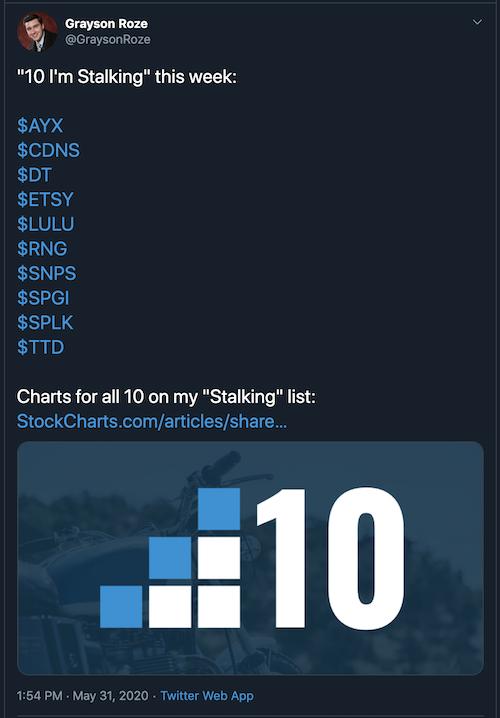
| "10 I'm Stalking" - Top Charts and Intriguing Trades (Week of June 1st, 2020) |
| by Grayson Roze |
 Every weekend, my "Sunday Portfolio Review" ends with the same rigorous search process. With my market evaluation and portfolio analysis routines complete, I turn my attention to the discovery phase. Every weekend, my "Sunday Portfolio Review" ends with the same rigorous search process. With my market evaluation and portfolio analysis routines complete, I turn my attention to the discovery phase.
This is the fun part. I sit down with all the results of the scans I've been running during the week. I sweep all of my watchlists and run through dozens of charts, sometimes even hundreds. I'm looking at what's out there that I don't own – what's working, what's trending, what's strengthening, what's making new highs and starting to set up for a high-probability trade. At the end of it all, I carefully narrow my list of potential trading opportunities down to a very select group of just 10 names.
This is the list of "10 I'm Stalking".
If you follow me on Twitter (@GraysonRoze), I share out the list of "10 I'm Stalking" before the start of each trading week. You can keep tabs on the names I'm watching each week and the charts I'm stalking as possible trade targets. I'm also posting my charts from that list of 10 here in The Traders Journal, as you'll see below. You can click on each chart individually to see the live version, or Click Here to see the full "Shared ChartList" with all 10 charts at once. If you're a StockCharts Member, you can even save the entire list into your own account.
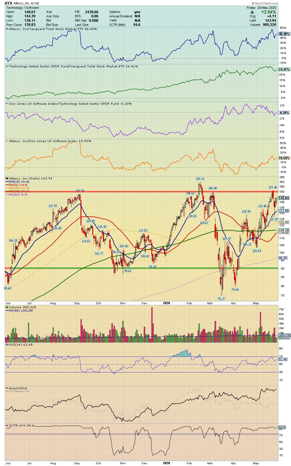
AYX - Alteryx, Inc.
"Engages in the provision of self-service data analytics software. Its subscription-based platform allows organizations to prepare, blend, and analyze data from a multitude of sources and benefit from data-driven decisions."
Symbol Summary
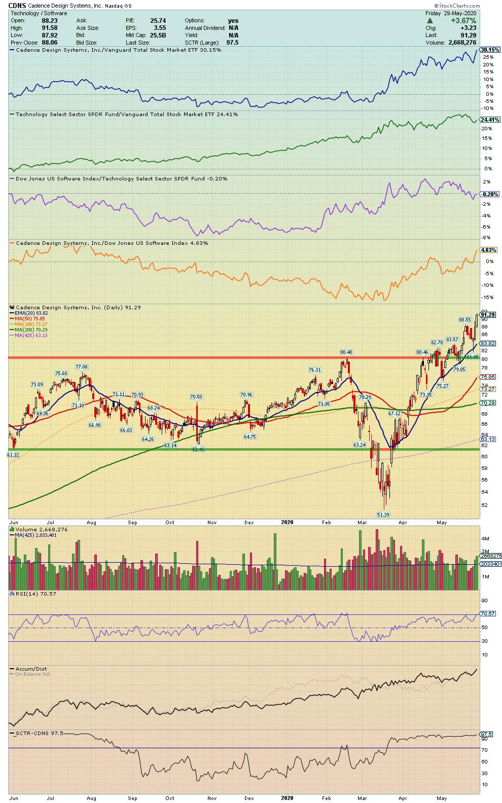
CDNS - Cadence Design Systems, Inc.
"Engages in the design and development of integrated circuits and electronic devices. Its products include electronic design automation, software, emulation hardware, and intellectual property, commonly referred to as verification IP, and design IP."
Symbol Summary
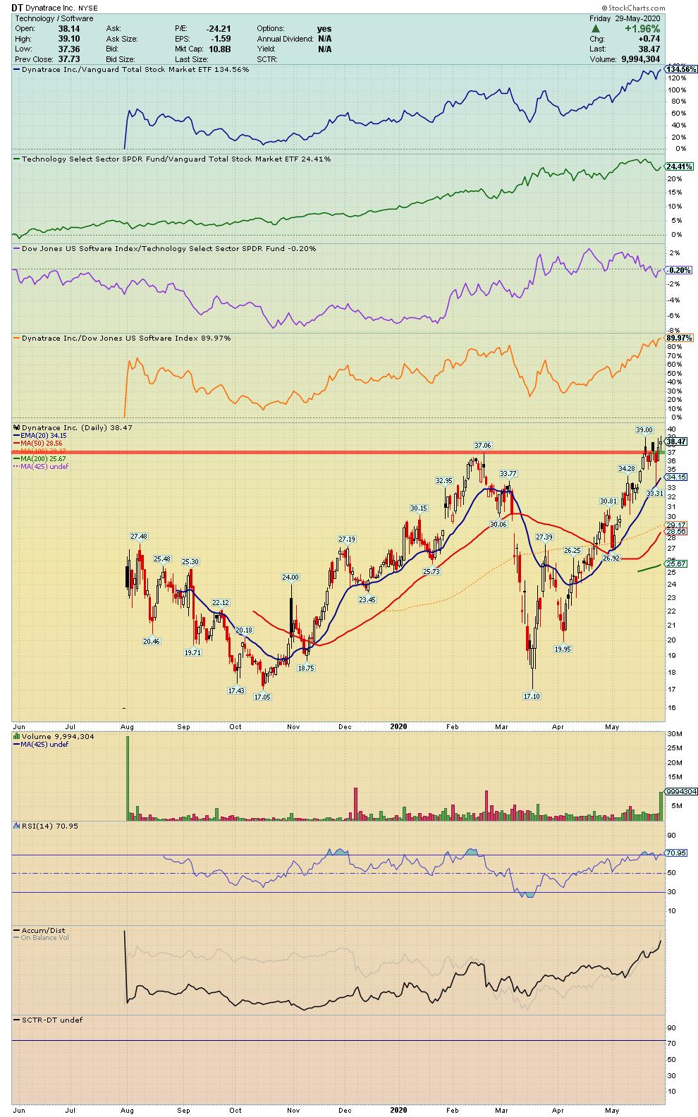
DT - Dynatrace Inc.
"Offers software intelligence platform, purpose-built for the enterprise cloud. The firm's platform utilizes artificial intelligence at its core and advanced automation to provide answers, not just data, about the performance of applications, the underlying hybrid cloud infrastructure, and the experience of the customers' users."
Symbol Summary
ETSY - Etsy Inc.
"Engages in the management of an online marketplace. Its technology platform allows sellers to manage and scale their business. The firm offers handmade products such as shoes, clothing, bags, and accessories."
Symbol Summary
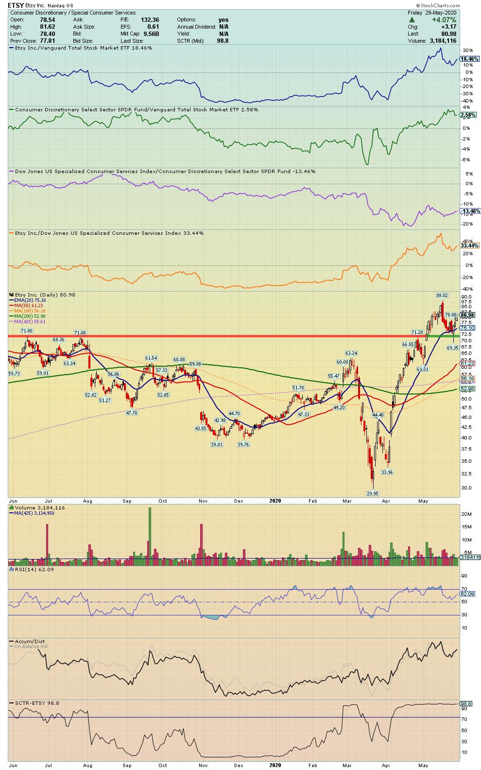
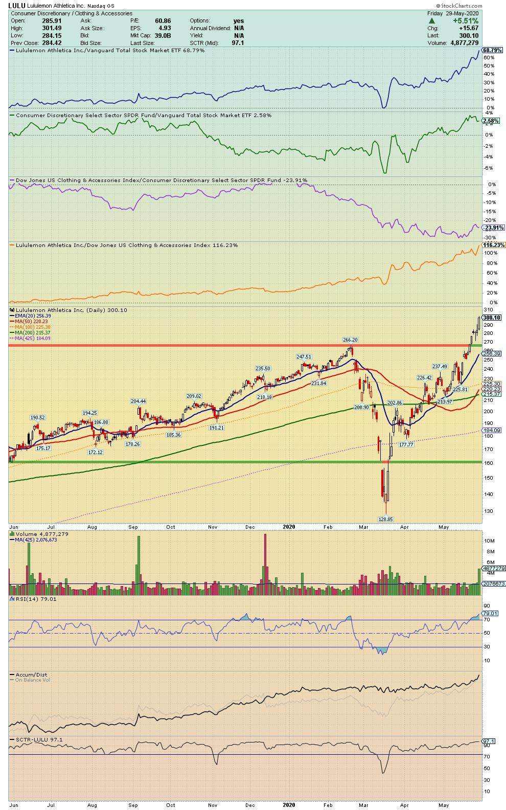
LULU - Lululemon Athletica Inc.
"Engages in the designing, distributing and retail of athletic apparel and accessories. It company operates through the following business segments: Company-Operated Stores, Direct to Consumer."
Symbol Summary
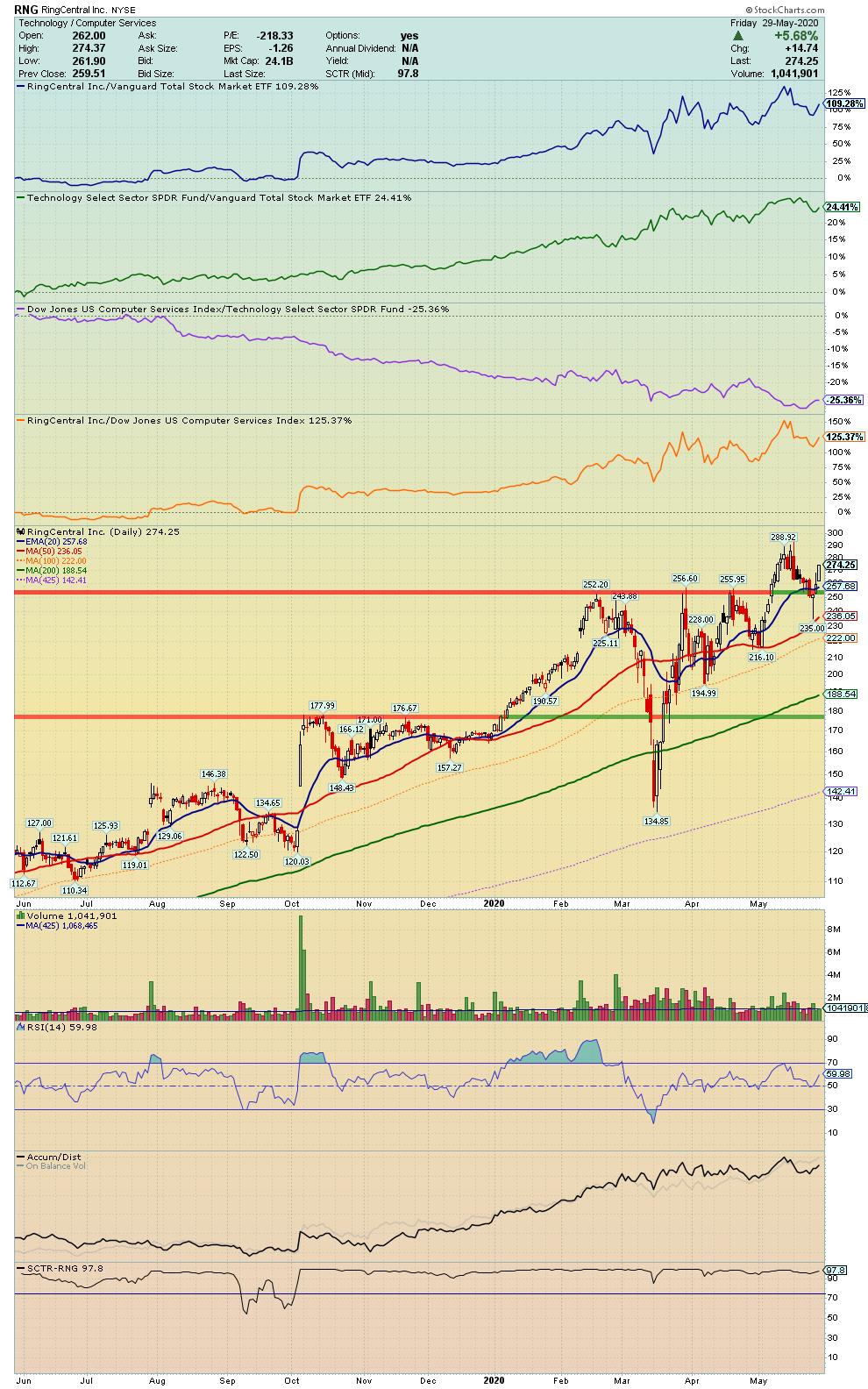
RNG - RingCentral Inc.
"Engages in the provision of global enterprise cloud communications and collaboration solutions. The firms solutions provide a single user identity across multiple locations and devices, including smartphones, tablets, PCs and desk phones; and allow for communication across multiple modes, including high-definition voice, video, SMS, messaging and collaboration, conferencing, online meetings and fax."
Symbol Summary
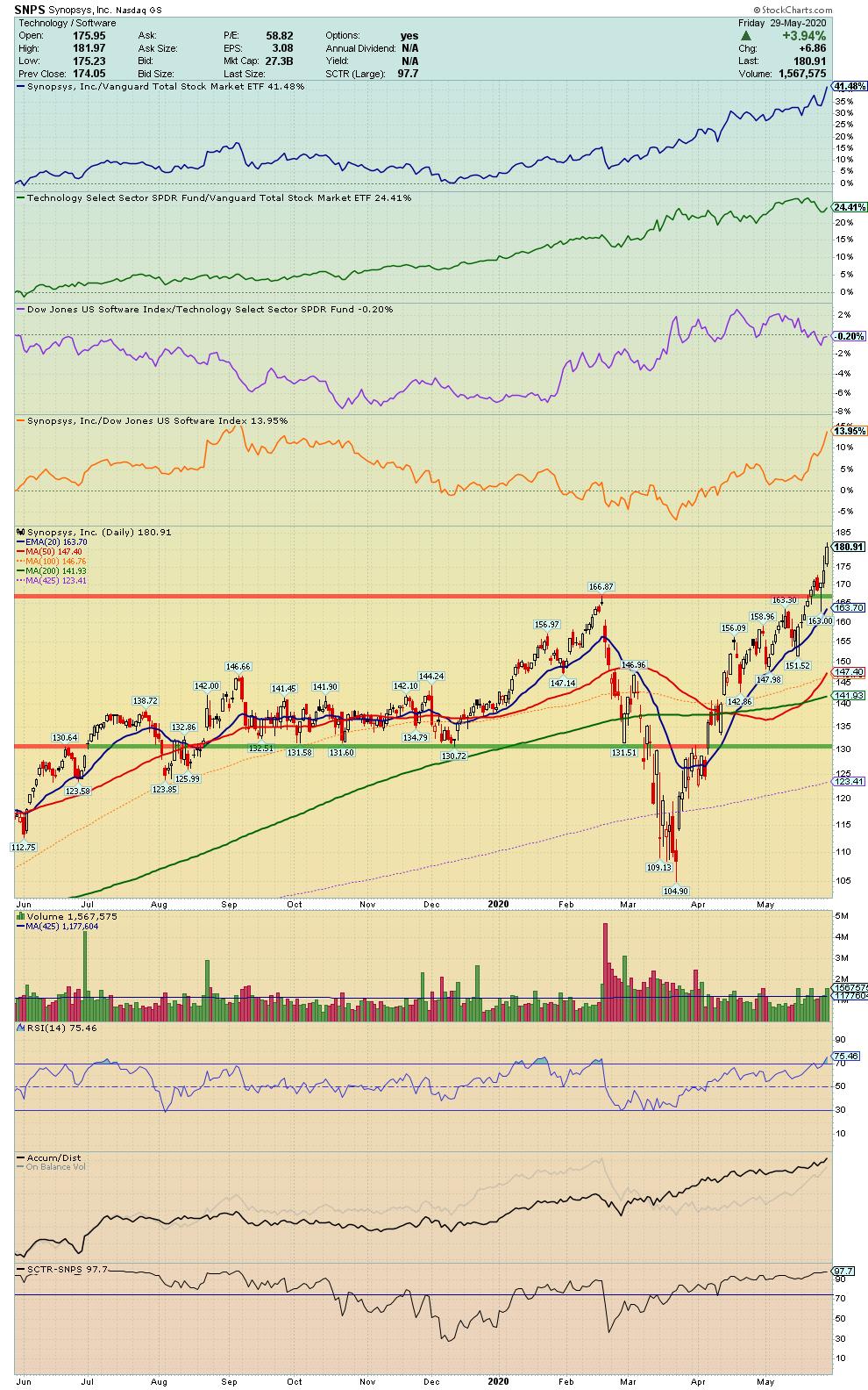
SNPS - Synopsys, Inc.
"Engages in the provision of software products and consulting services in the electronic design automation industry. The firm operates through the following segments: Semiconductor and System Design, and Software Integrity."
Symbol Summary
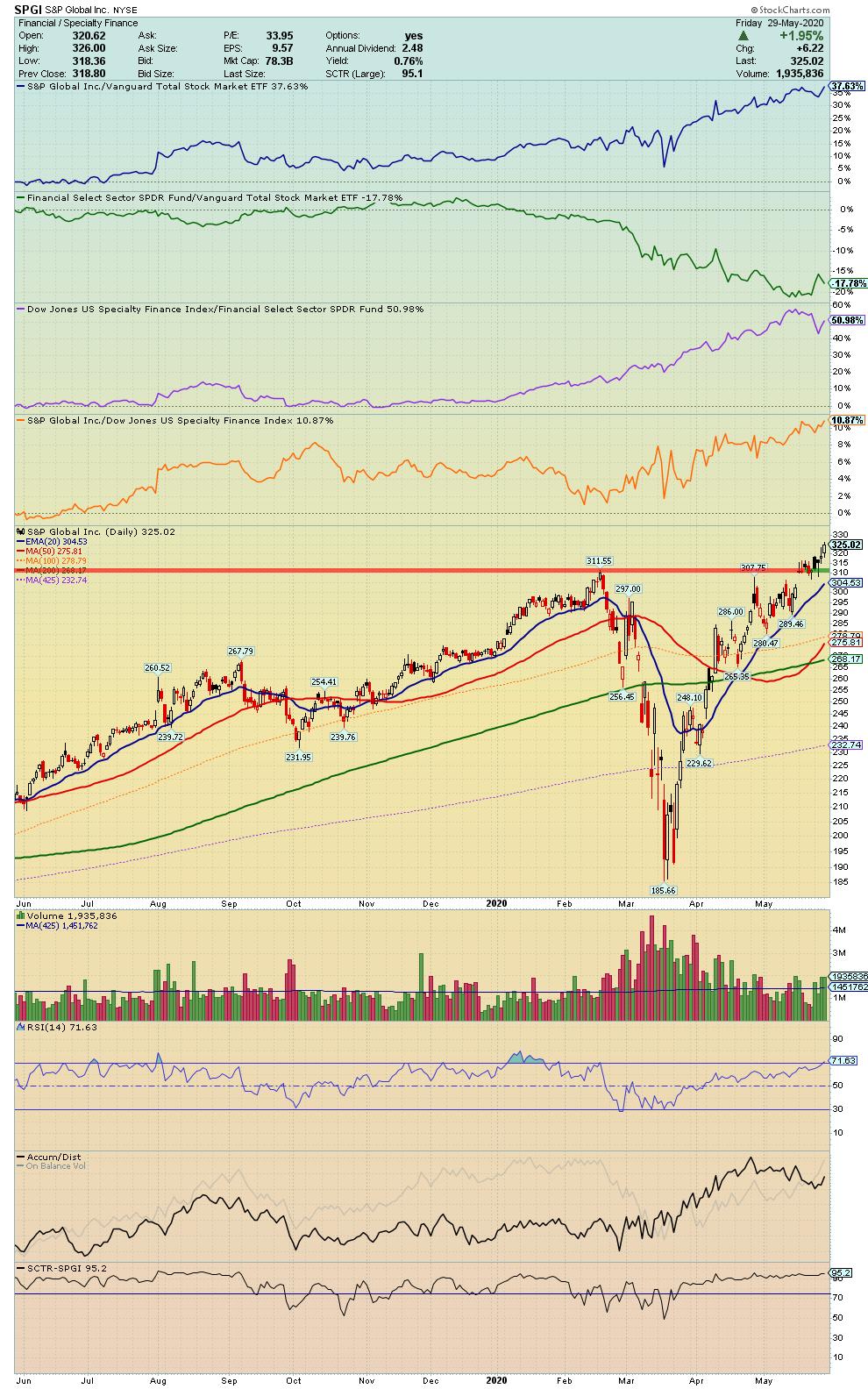
SPGI - S&P Global Inc.
"Engages in the provision of transparent and independent ratings, benchmarks, analytics and data to the capital and commodity markets worldwide. It operates through the following segments: Ratings, Market Intelligence, Platts and Indices."
Symbol Summary
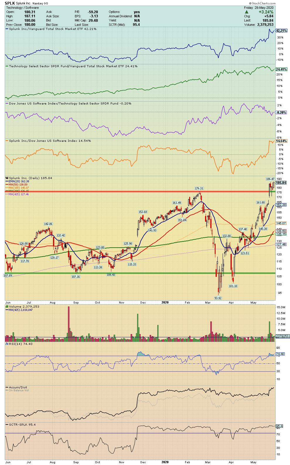
SPLK - Splunk Inc.
"Engages in the development and marketing of software solutions. Its products include Splunk cloud, Splunk light and Splunk enterprise. It also offers solutions for information technology operations, security, internet-of-things, application analytics, business analytics and industries."
Symbol Summary
TTD - Trade Desk Inc.
"Offers a technology platform for advertising buyers. It operates through United States and International geographical segments. The firm's products include audio advertising, mobile advertising, native advertising, data management platform, cross-device targeting, and inventory and marketplaces."
Symbol Summary
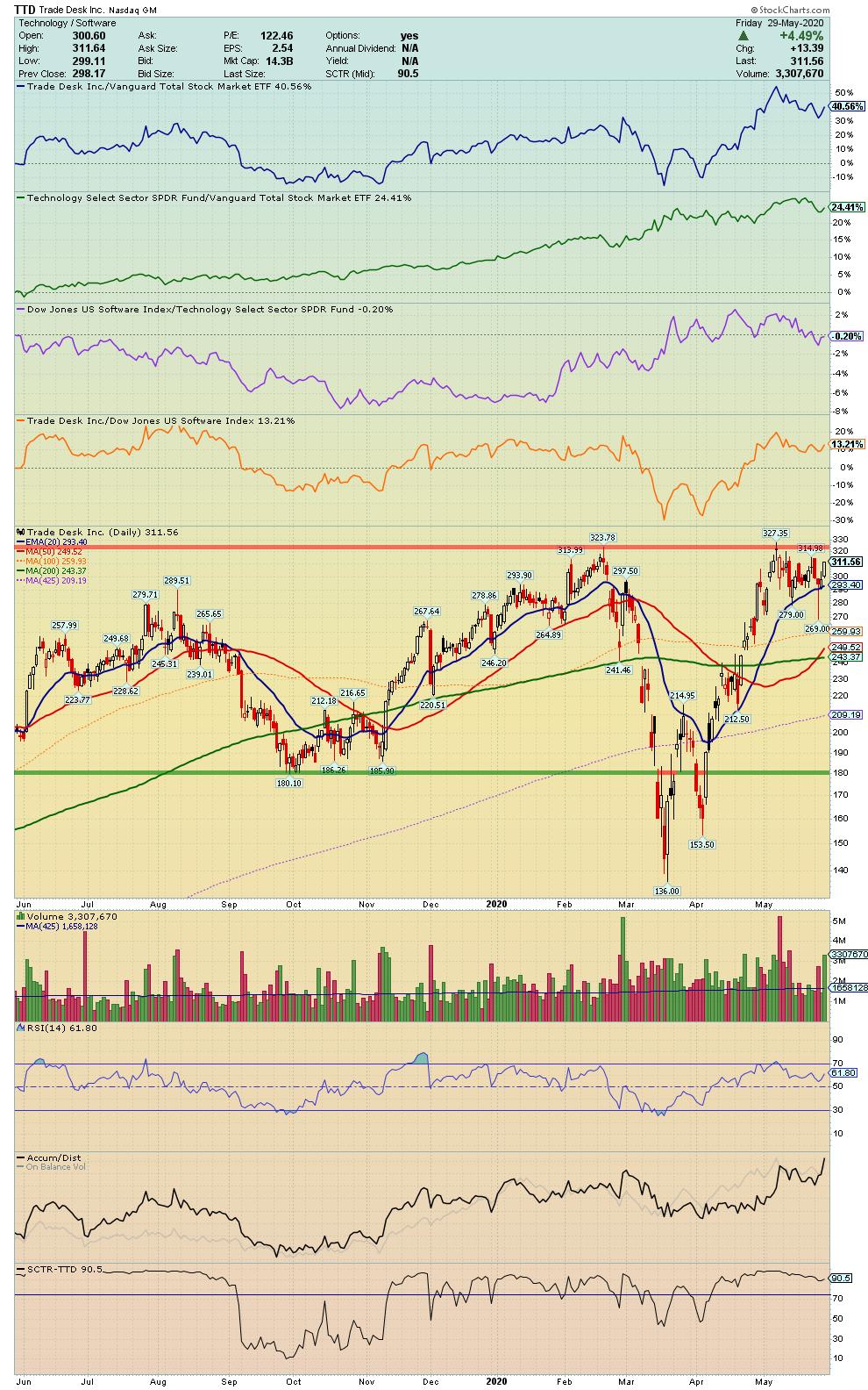
Chart on, my friends.
- Grayson Roze
VP of Operations, StockCharts.com
Author, Trading For Dummies (Wiley, 2017)
Author, Tensile Trading: The 10 Essential Stages of Stock Market Mastery (Wiley, 2016)
Co-Founder, StockMarketMastery.com
Twitter: @GraysonRoze
|
| READ ONLINE → |
|
|
|
| Market Roundup |
| Did the May Employment Report Signal an End to the Recession? |
| by Martin Pring |
Part-Time Employees for Economic Reasons is a leading indicator of the labor market. That's because employers are more inclined to hire and fire temporary workers than permanent ones, where labor laws, contracts, pensions and other impediments get in the way. This indicator has been consistently useful in identifying the start and ending of recessions. Like most economic indicators, it offered a recessionary signal earlier this year, but only after the horse had left the barn. Black swan events like COVID-19 are not very helpful in the forecasting business!
Pretty well most economists have agreed that the (not yet officially declared) 2020 recession will be a short one, based on the idea that it was artificially induced and could be artificially re-started again. However, the May jobs report caught everyone off-guard by its fortitude, strongly suggesting that the recession is over.
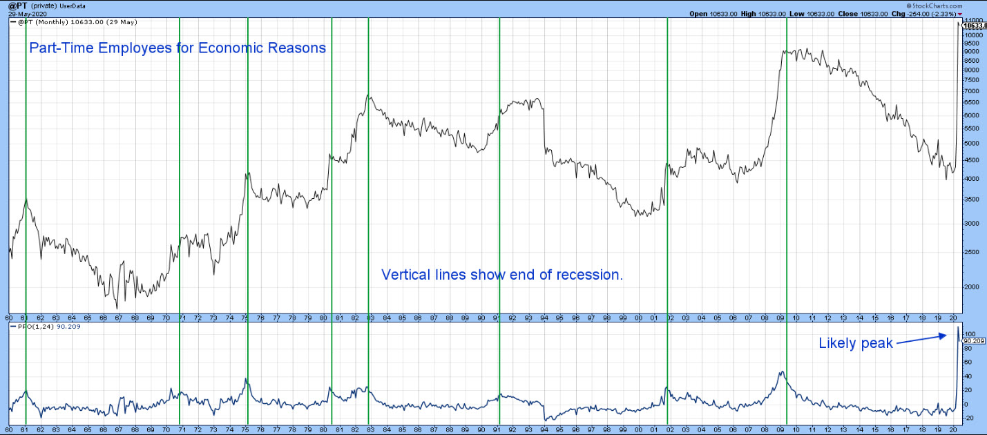
The green lines in the chart represent the end of previous recessions; you can see that they consistently correspond with peaks in the PPO. Recent economic activity caused the oscillator to rally to a record reading, but May data resulted in a down tick. It's not yet a decisive reversal, but logic suggests that it will be. After all, we have seen record amounts of monetary and fiscal stimulus thrown at the economy. In addition, the re-opening process from the artificial shutdown has only just begun. Finally, the forward-looking stock market, having crossed its 12-month MA, offers further testimony in favor of the good times to come.
Good luck and good charting,
Martin J. Pring
The views expressed in this article are those of the author and do not necessarily reflect the position or opinion of Pring Turner Capital Group of Walnut Creek or its affiliates.
|
| READ ONLINE → |
|
|
|
|
|
| Art's Charts |
| A Bullish Continuation Pattern for a Sector with Strong Breadth |
| by Arthur Hill |
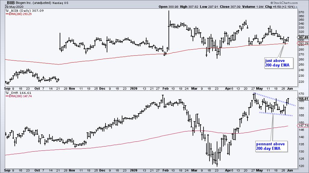
Chartists can separate the leading sectors from the lagging sectors by sorting with various breadth indicators. The 200-day EMA is a long-term trend indicator that can also be used as a breadth indicator. A stock is in an uptrend when above the 200-day EMA and in a downtrend below. The chart below shows two examples from the Healthcare sector.
Chartists can turn this trend indicator into a breadth indicator by counting the number of stocks in a sector that are trading above or below this EMA. Don't worry. You do not have to run a scan or count the charts by hand. StockCharts has done the work for you with an array of sector breadth indicators. The percentage of stocks above the 200-day EMA is one of my favorites because it immediately tells me how many stocks within the sector are in long-term uptrends.
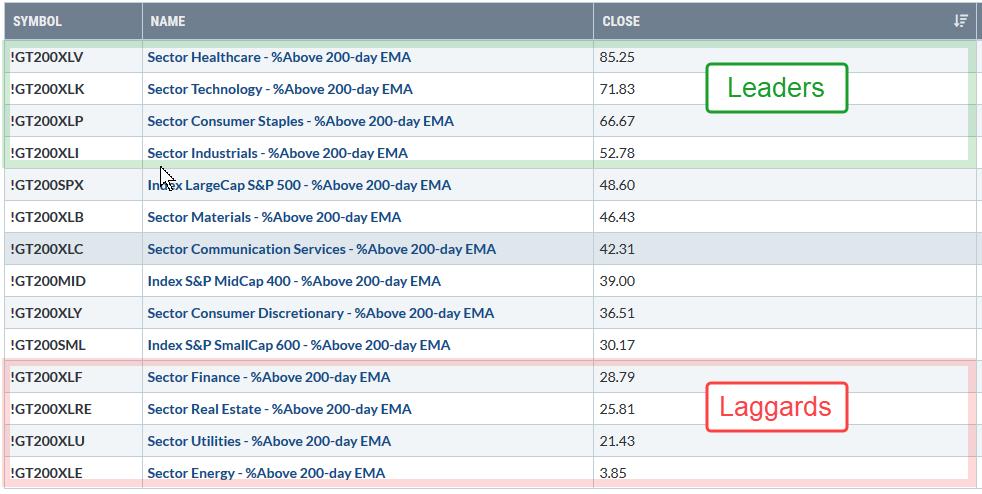
The table above shows the percentage of stocks above the 200-day EMA for the 11 sectors and three major indexes. Healthcare and Technology stand head and shoulders above the rest with readings above 70%. Consumer Staples is second with over 60% and the Industrials sector is in fourth place with a move above 50% this week. Note that these numbers are based on Thursday's close.
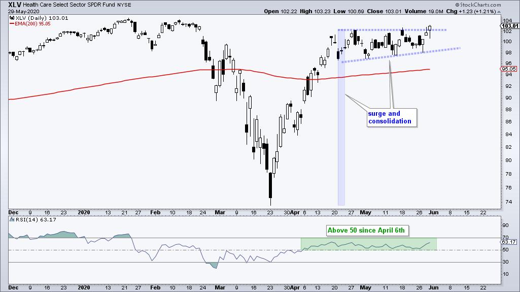
The Healthcare sector shows bullish breadth overall and the Healthcare SPDR (XLV) is above its 200-day EMA. This bullish combination means Healthcare should be on our watchlist for bullish patterns and setups. In fact, the ETF is forming one right now as a small consolidation takes place after a strong advance. This is a bullish continuation pattern and this week's upside breakout signals a continuation higher.
I maintain a breadth model using the 11 sector SPDRs and three indicators for each sector at TrendInvestorPro.com. Healthcare is the only sector with all three indicators on bullish signals. In fact, only three sectors are net bullish and eight are still bearish. Subscribe today for immediate access to this model, ETF rankings and the weekend video.
Click here to take your analysis to the next level!
------------------
|
| READ ONLINE → |
|
|
|
| The Mindful Investor |
| Stocks Overbought, Bonds Oversold (Almost) |
| by David Keller |
Every Friday on The Final Bar, I conduct a weekly chart routine called "Wrap the Week" where we review macro charts and how they've evolved over the previous seven days. This week was focused on the unrelenting uptrend in stocks, but a deeper analysis after the close shows that the bond markets are nearing a potential inflection point.
As the S&P 500 index has continued to press on to higher highs and draw ever closer to the February high around 3400, I noted how the daily RSI breaking above the 60 level confirmed that the market was in a bullish phase as opposed to a bearish phase.
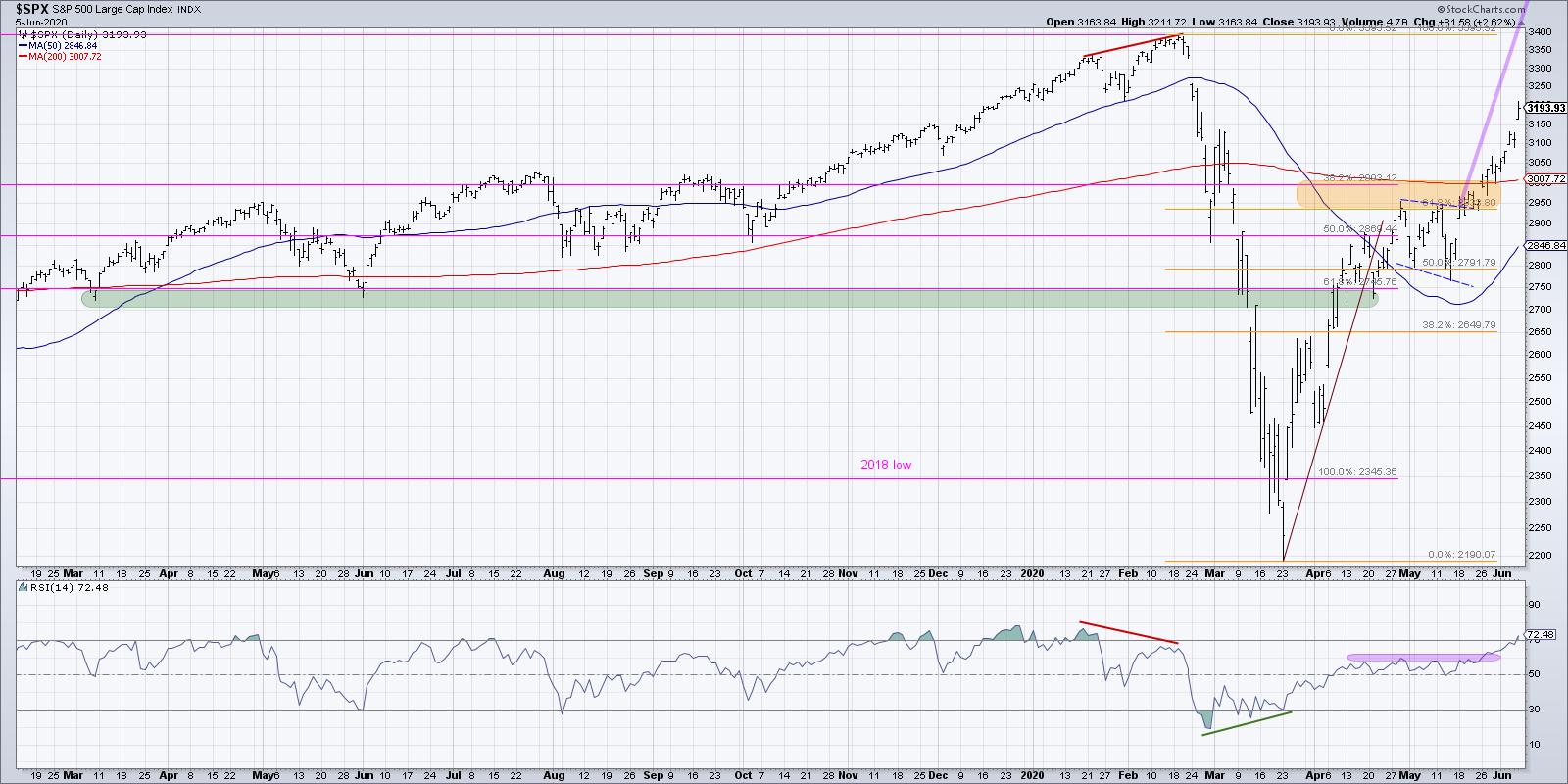
This week has seen the RSI increase to close Friday's session above 72, putting the indicator squarely in the overbought condition. I've written before about the RSI and overbought conditions, particularly about how being overbought is not necessarily a bad thing!
The overbought reading basically indicates that the price has gone up significantly. To put it quite simply, "Overbought means up a lot." In extended bull phases, a chart will often become overbought and remain overbought for way longer than you might expect. The real challenge is when the price comes out of the overbought region and/or completes a bearish divergence, both of which may indicate potential weakness going forward. Neither of these things have happened yet with the S&P 500, which tells me that the trend remains positive and that I should be on the lookout for potential reversal signals.
Even though the bond markets have held up well overall, this strong performance from stocks has driven the stock to bond ratio (using the SPY and TLT) to accelerate to the upside.
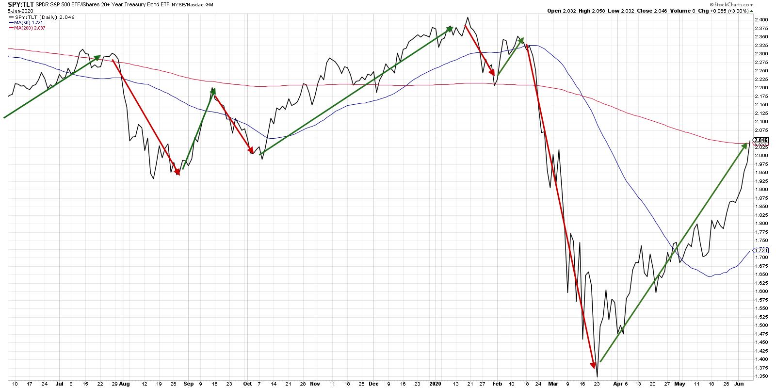
You can see on this chart the dramatic underperformance of stocks in February to March, as bonds rallied during the selloff in the equity markets. From the moment the S&P bottomed out on March 23rd, however, this ratio has pounded out a consistent pattern of higher highs and higher lows.
The chart of the Treasury Bond ETF shows a clear transition from accumulation (Jan-Mar) to consolidation (Mar-May) to distribution (the last two weeks).
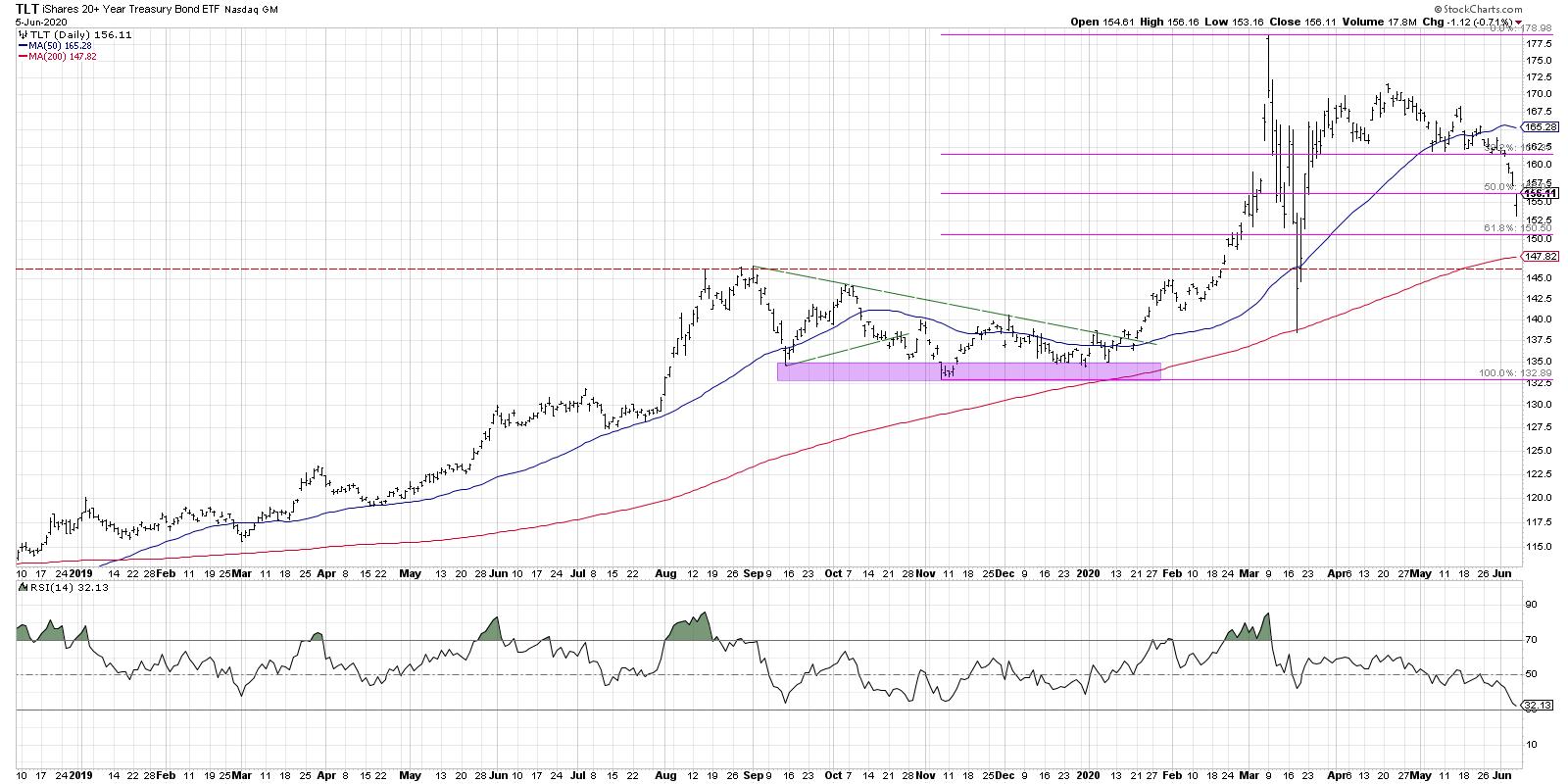
You can see on the TLT chart how the month of March was very much a dislocation, where volatility spiked and there was no clear trend in play. The overall uptrend from the first quarter of 2020 appeared to resume in late March to early April, only to see the TLT settle back to a consistent support level around $162.
This week, we saw stocks rally higher while bonds sold off, driving interest rates higher. Now, we're at a very interesting decision point.
With the S&P 500 now overbought, and the TLT very close to an oversold condition, we are near the point where a mean reversion of some sort is likely. The question, if that would come next week, is whether it is a short-term digestion of equity gains before the resumption of the uptrend OR an early signal of a deeper rotation away from stocks and back into bonds.
Based on the improving breadth characteristics in the equity markets, as well as the pace of the recent selloff in bonds, I would expect any mean reversion to be relatively short-lived. The good news about trend-following is that you don't need to try and predict the future... simply follow the trends!
RR#6,
Dave
David Keller, CMT
Chief Market Strategist
StockCharts.com
Disclaimer: This blog is for educational purposes only and should not be construed as financial advice. The ideas and strategies should never be used without first assessing your own personal and financial situation or without consulting a financial professional.
The author does not have a position in mentioned securities at the time of publication. Any opinions expressed herein are solely those of the author and do not in any way represent the views or opinions of any other person or entity.
|
| READ ONLINE → |
|
|
|
| The Canadian Technician |
| When Debt Doesn't Matter |
| by Greg Schnell |
One of the major risks of the global slowdown is the number of companies that are forced to close due to lack of cash flow or credit risk. Jerome Powell jumped on the credit risk issue early on to avoid contagion in the USA. The Fed flooded banks with liquidity, bought ETFs, bought junk bond ETFs, promised to help in commercial real estate and talked about the use of unlimited tools. Recently, members of the Fed discussed controlling both ends of the yield curve so inflation could not arrive to create a problem.
With the currencies muted through currency swap windows between countries, there are no clues there. The Fed has taken huge precautions in front a global GDP implosion and flattened currency fluctuations to a mere blip.
Early on Friday, Jerome Powell talked up a situation where they are unlimited in their efforts. That becomes one of the reasons this market keeps going higher. There is no downside risk. While companies earnings may be 1/2 or 1/3 of what they were in 2019, the stock market continues to believe earnings don't matter.
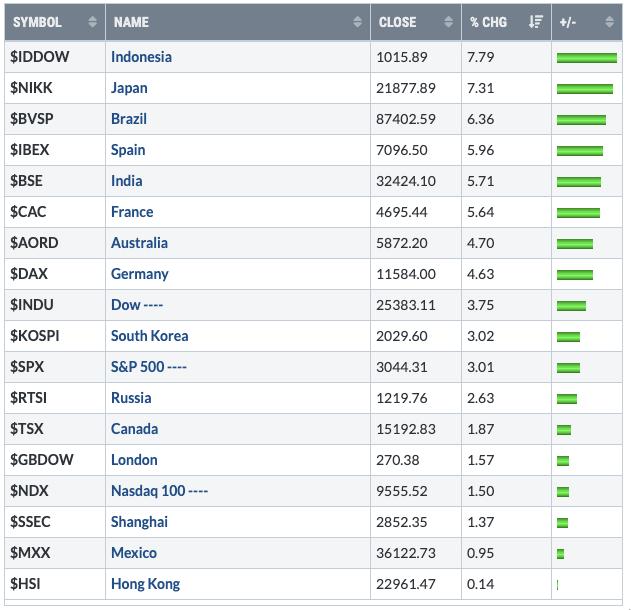
But this week there was even more actual action on debt. Japan announced the 2nd round of a "trillion dollar stimulus." As Abe and Kuroda started seeing the public dissatisfaction rise with only $1T in stimulus, they doubled down with their largest ever for the second time in a month. With GDP expected to be down 20%, the Asian nation added $2.1 trillion US in government/Central Bank stimulus in May. It is not the time to be focused on a budget, the leadership said. The stock index closed up 7% on the week with such good news.
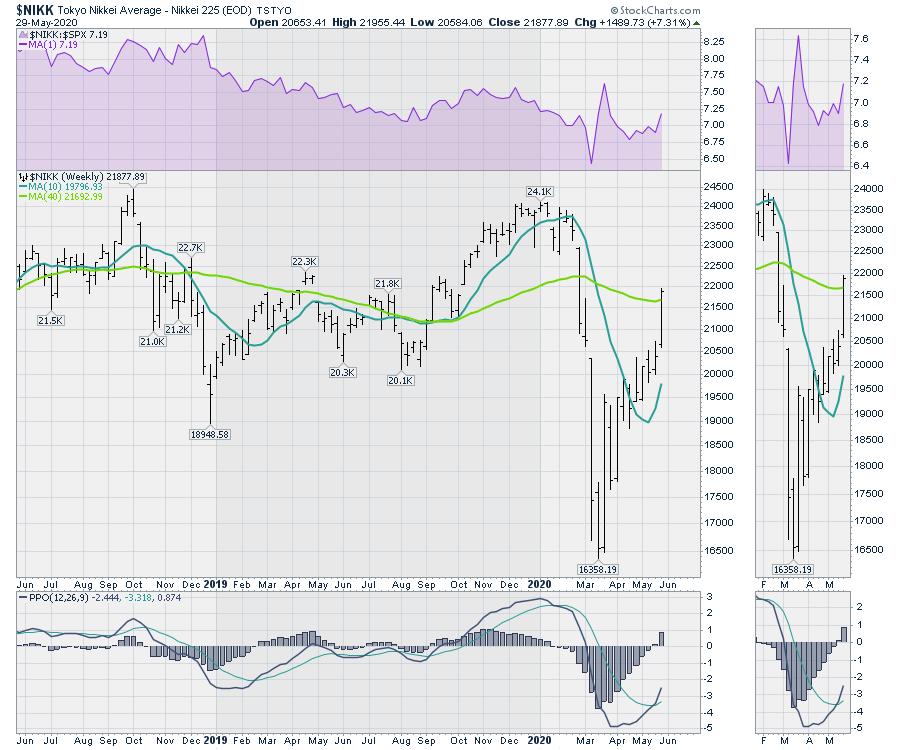
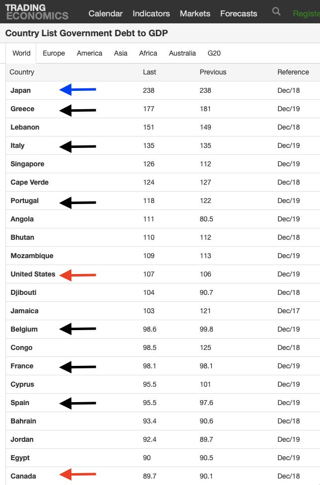
While credit rarely plays out immediately, I am reminded that Japan also has the largest debt-to-GDP. What amazes me is that this good news borrowing is on top of a Debt-to-GDP ratio over 235%. Many countries have been forced to deal with their debt at much lower levels. With plummeting GDP and the massive addition to debt, this happened overnight on Tuesday. Japan's Nikkei rallied 1000 points following the announcement through the rest of the week to retake the 40 week-moving average. Besides owning the majority of bond and stock ETFs, there is still more they can do.
 Source: TradingEconomics.com Source: TradingEconomics.com
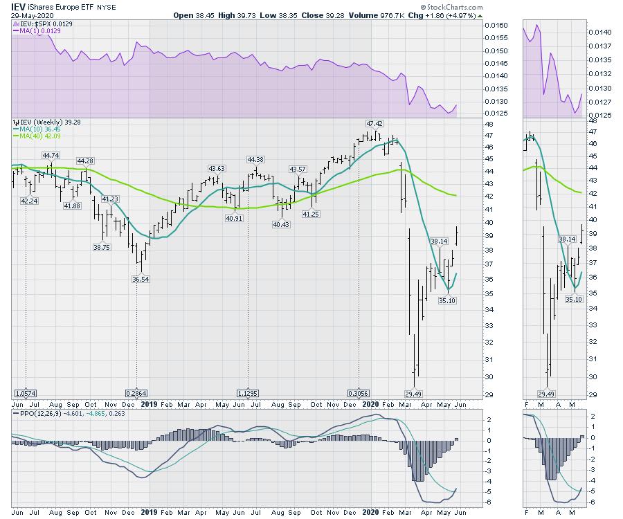
On the same evening, Europe proposed a rollout for a series of grants and loans. It was an additional $800 billion on top of previously announced funding. 6 of the top 18 nations with heavy debt are in Europe, including ones with large populations like France, Spain and Italy. It was more good news for everyone, and the European ETF ran up 5%.
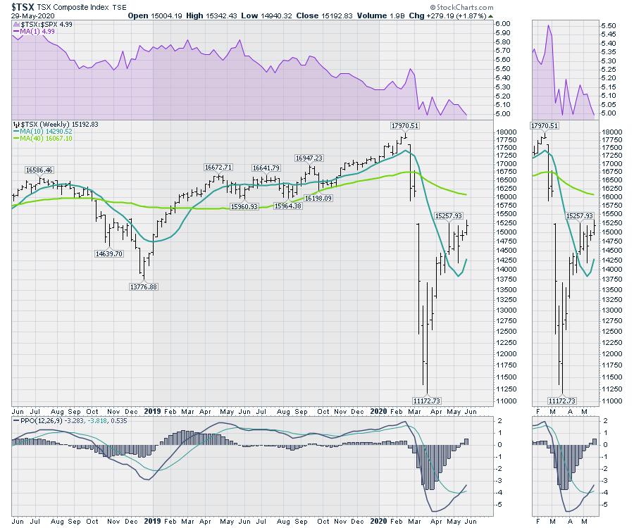
Canada's Prime Minister has been holding a press briefing almost every day announcing new programs to help some part of society on the front step of the official residence. This week, he also suspended parliament in a democracy until September. The stock market was not outraged, up 1.87%. Canada is also on the debt list above.
As long as there are no increased taxes, and central banks and governments worldwide continue to use debt to solve the current problems, the market is optimistic. Some of you reading this might even be surprised that all those things happened and you had not heard about them. It didn't make the news relative to China moving troops into India, Russia moving more war planes into Syria and the threat of the removal of democratic rights from Hong Kong. Add the rising tensions of US-Sino trade and it was a week to be invested optimistically.
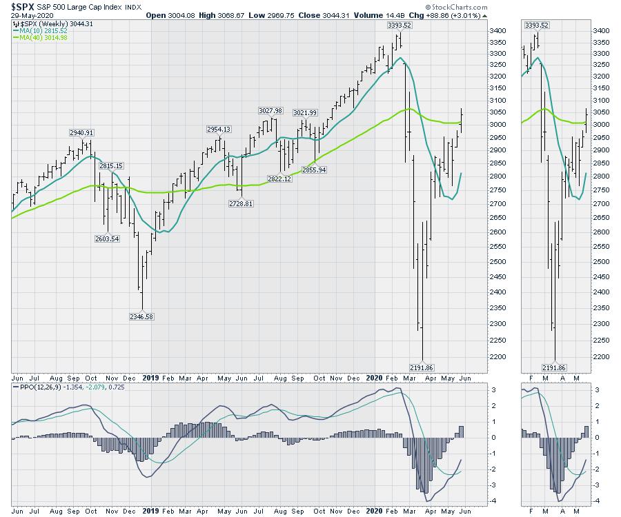
I think it is fair to say the market is not trying to reflect the economy. It is measuring risk-on vs risk-off and, right now, governments and central banks will use all the money they have to minimize civil unrest and remain in a positive light with their electorate. So the market is rising on low downside risks to owning shares due to the support being provided.
Will Japan's debt matter at 300% or 400% or 500%? I actually thought it would, but apparently it's all good. I don't want to be jaded here, but debt doesn't matter until it does. And currently it is being viewed as a party supply, not a problem. Be bullish as the charts are pointed up.
|
| READ ONLINE → |
|
|
|
| Trading Places |
| The U.S. Stock Market Is Becoming One Giant Short Squeeze |
| by Tom Bowley |
I've never understood the attraction to short selling, especially in a secular bull market. I get it - March and April didn't really feel like a big time bull market. But it was still part of one. March represented a cyclical bear market in a massive secular bull market. I've shown this chart many times, but if you're new to my articles and my work, then check this out:
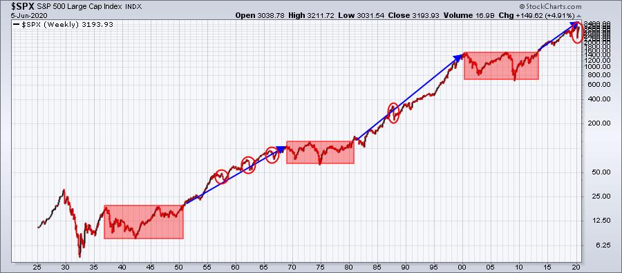
The blue directional arrows represent secular, or long-term, bull markets. The red-shaded areas, on the other hand, are secular bear markets. There's no doubt in my mind that we are currently in a secular bull market. Throw what you want at this stock market, but it likely won't stick. In the past 2-3 years alone, a trade war with China, an incompetent Fed and now a 100-year pandemic have done nothing to deter this bull market. On Friday, the NASDAQ 100 ($NDX) closed at an all-time high:
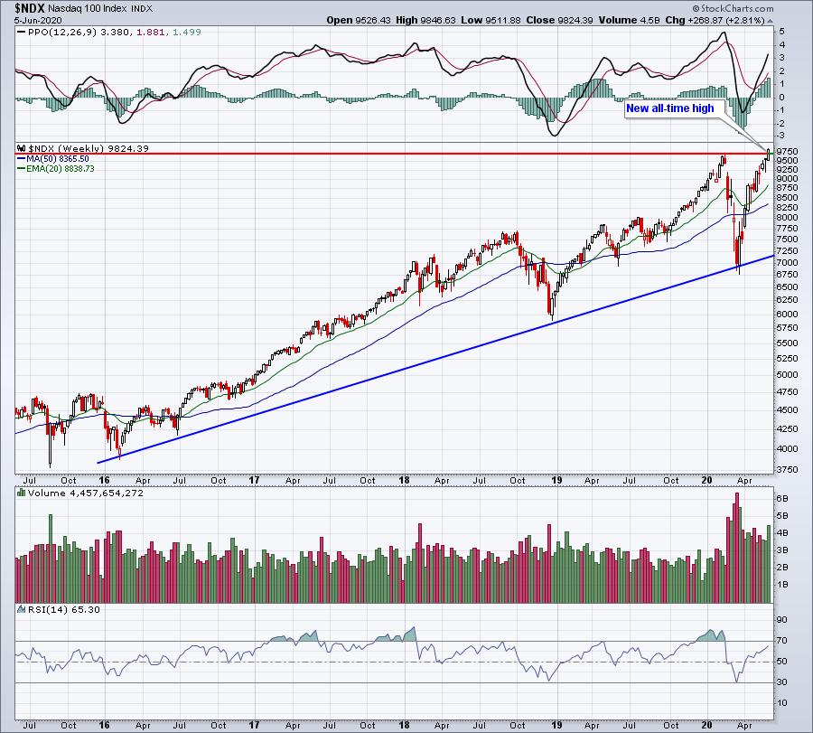
Let this chart sink in for a moment.
All-time highs likely seemed preposterous just three months ago, but here we are. The Dow Jones lagged behind the NDX rather badly throughout March and April, but this index of conglomerates has turned the corner and is picking up steam. Over the past eight trading sessions, the Dow Jones has negotiated key psychological levels at 25,000, 26,000 and 27,000. I don't think 28,000 will be far behind.
So what's been driving the Dow Jones and the stock market in general? Well, a number of different companies have led the charge. Boeing (BA) gained over 40% last week, boosting the Dow Jones, but perhaps the biggest surprise of the week were the airlines ($DJUSAR). As a group, the DJUSAR rallied 35% last week alone. American Airlines (AAL) surged 77%. One reason for these crazy gains is the fact that short sellers had to begin covering their bets that prices would continue to slide. AAL, for instance, had a short percentage of float totaling 37% as of May 15th. Short sellers sell borrowed shares in hopes for a further slide so they can buy back those borrowed shares cheaper... and return them. The problem, however, is that when prices rise, those on the short side begin to feel the emotional pain of holding short positions with unlimited upside risk. The only way to end that pain is to cover their position (buy), sending shares even higher.
I've developed a "Short Squeeze ChartList" comprised of 144 stocks with very high short interest. Last week's gains among stocks on this list were astronomical. One energy stock, Valaris (VAL), rose 162% on Friday alone. Another beaten-down energy stock, Whiting Petroleum (WLL), jumped 62% on Friday. Roughly half of the stocks on this ChartList gained at least 10% last week, which underscores the role that short sellers are now playing in the stock market's continuing rally.
If you're at least an Extra member at StockCharts.com and an EarningsBeats.com member, including a fully refundable $7 30-day trial member, you can download this ChartList into your StockCharts.com account from our website in literally 5-10 seconds and be armed with a powerful resource for next week.
I am so looking forward to the balance of 2020 and beyond as we continue our secular bull market journey!
Happy trading!
Tom
|
| READ ONLINE → |
|
|
|
| The Traders Journal |
| This Technician's Confession: There's One Essential Fundamental Indicator I've Embraced For Decades |
| by Gatis Roze |
 I've acknowledged in numerous previous blogs and in our book that I'm not exclusively a 100% pure chartist. I know... blasphemy! I've acknowledged in numerous previous blogs and in our book that I'm not exclusively a 100% pure chartist. I know... blasphemy!
Yes, I use fundamentals. I need fundamentals, I won't trade without fundamentals. But the key is that I'm neither a fundamentalist nor a technician. I label myself as a "rational investor". I keep one foot in each camp.
In the fundamentalist camp, I'm an earnings junkie. I follow earnings and earnings dates. I track the trend of analysts earnings projections. Earnings growth rates matter to me as do PEG ratios.
Having said that, earnings is not my one essential fundamental indicator. Instead, it's sales and revenues. Why, you shout — earnings are more important than sales and revenues.
Well, because when I own an equity, protecting my profits is Mission #1.
Too many times over the years, I've seen earnings continue to expand magically since companies can afford the best number crunchers and utilize "Hollywood accounting" tools while sales and revenues are falling. Earnings that are based on smoke, mirrors and cost-cutting strategies with declining revenues can only support an attractive chart for so long. Sometimes longer than you'd guess. The stories at the time always seem so plausible, and the talking heads so persuasive, but inevitably the plunge happens when revenues trend lower.
Protecting my profits dictates that I follow two maxims. To paraphrase Jesse Livermore, "when the market tells you that you are wrong, you must sell and cease being wrong", Jeff Bezos added to the sentiment, saying, "Being wrong might hurt you a bit, but being slow will kill you".
My personal interpretation and the recipe I use is this: "Pull the trigger and don't procrastinate!"
Therein lies the reason that sales and revenue trends are more important to me than the reported earnings. It's a lot harder to manipulate or fabricate sales and revenue data. Witness the Chinese company Luckin Coffee (LK) which just fired both its CEO and COO for sales fraud. It happens, but much less seldom than creative earnings.
I'll present five examples. First, a shout-out to the Value Line service. I'm a subscriber, and they make it very easy to track ten years of sales and revenue. I like easy!
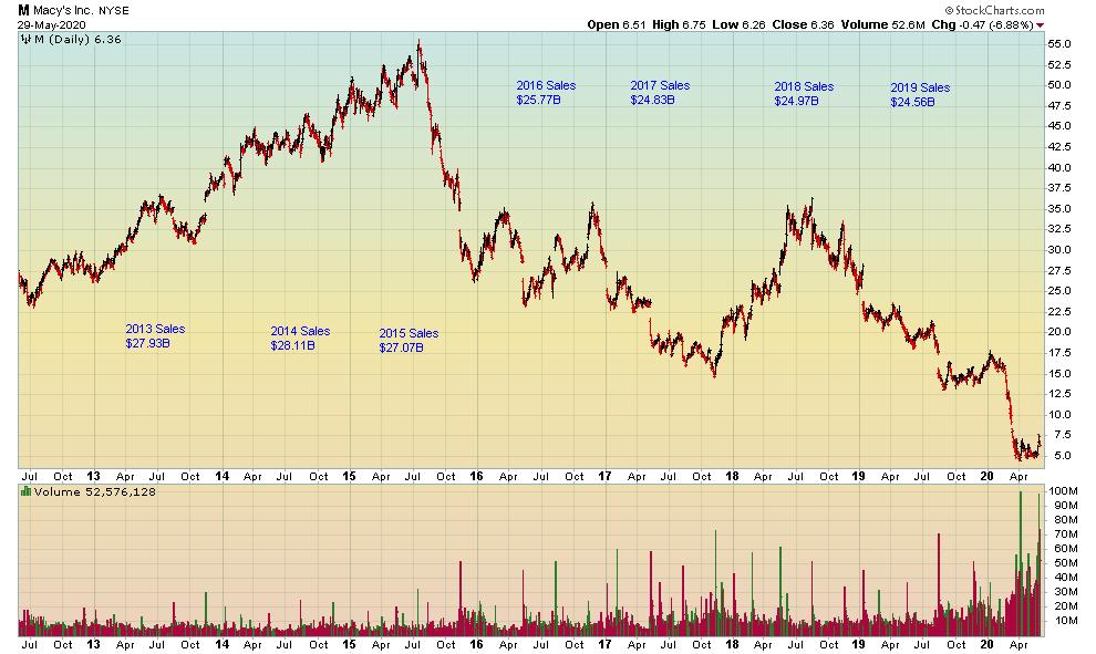
My first example is actually a cluster of retailers. Macy's (M) sales began trending down in 2015 and the chart followed.

Both The Gap (GPS) and Kohl's (KSS) had diminishing sales starting in 2019. Look at those charts, if you dare. General Electric (GE) had sales begin to trend down in 2015 and 2016, but the charts kept hoping and praying for a turnaround. The big decline came in 2016, and it was ugly. Kraft Heinz (KHC) sales turned down beginning in 2016, and the chart levitated for a short time at $84 before soon crashing to $20. For Mylan (MYL), sales began trending down in 2018 while Mosaic (MOS) sales began trending down in 2019. Both are off their highs by two-thirds. You get the point. Back to my mantra: "Pull the trigger and don't procrastinate!"
I'm going to push this even further in hopes of truly convincing my readers that this approach is one you should embrace. Over the longer term, it's difficult for a business to produce attractive returns for investors if it isn't growing its sales and revenues. An example from my own portfolio is Visa (V). Its revenues have grown from $8,065 million in 2010 to $22.8 billion over 10 years. Correspondingly, its stock price has appreciated from $15 to $190. Contrast this with Macy's (M). Its sales in 2010 were $25 billion and have drifted lower over 10 years down to $21.71 billion. Its stock price likewise has moved steadily down from $13 in 2010 to just $5 today.
Lastly, I'll layer in a recent study done by the AAII based on stock data from 1972 - 2019. Dividend Grower stocks outperformed the market and achieved this with less volatility (i.e. higher returns with lower risk). A company can't raise dividends for very long if its sales and revenues are decreasing. I would wager that there are many academic studies that show the specific correlations of stock price appreciation to sales and revenue growth, and vice versa.
There's a new book out called "Flash Crash" by Liam Vaughan. It describes how Navinder Singh Sarao thrived in his job as a trader because he displayed a rare combination of intelligence — and here's the kicker — emotional control. In our book, Tensile Trading, we show how necessary it is to blend both Stage 3: The Investor Self (all about emotional and behavioral control) with Stage 9: Selling.
Add these to your tool kit. Learn the skill of monitoring your equities sales and revenue growth while having the self-discipline to pull the trigger to lock in profits when sales begin to fade. Doing this and moving on is a behavior that will serve you well in managing your portfolio. It has served me nicely for many decades indeed.
A closing caveat. This methodology I've used for years is based on the pre-Covid period. Some adjustments and allowances are no doubt needed now to reflect the current market and post-Covid results. Nevertheless, I submit that if corporations are unable to grow their revenues, then their earnings and stock prices will soon reflect this fact. I maintain that any disconnect between fundamentals and technicals is a temporary situation, and reversion to the mean is to be expected.
Trade well; trade with discipline!
- Gatis Roze, MBA, CMT
StockMarketMastery.com
|
| READ ONLINE → |
|
|
|
| RRG Charts |
| Smaller Stocks Lead at Bottoms. - JJM |
| by Julius de Kempenaer |

The title for this article is a quote from John Murphy's book Trading with Intermarket Analysis. And I couldn't help but think of it when I was watching the Relative Rotation Graph that shows the rotation for different segments of market capitalization.
The most well-known RRG is the one that shows the rotation for US (large-cap) sectors using the SPDR ETFs. But there are many more ways in which RRG can help you get a view on market rotations that take place in specific areas of the market.
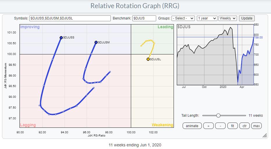
The chart below shows the rotation for Large-, Mid- and Small-cap indexes against a broad market index that includes all segments. This is a pre-defined RRG universe that you can access from the Groups drop-down.

This RRG uses the Dow Jones family of indexes.
- $DJUSS - Dow Jones US Small-Cap Index
- $DJUSM - Dow Jones US Mid-Cap Index
- $DJUSL - Dow Jones US Large-Cap Index
- $DJUS - Dow Jones US Index (benchmark)
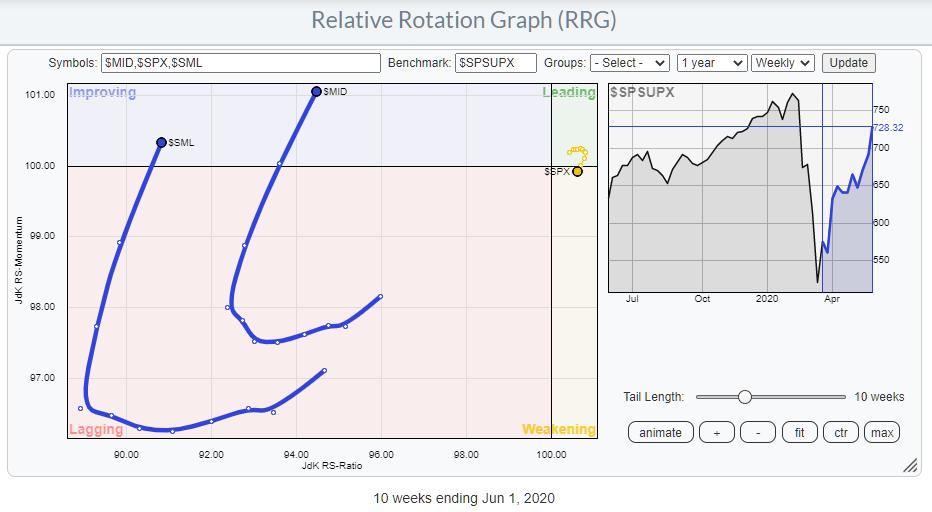
An alternative setup would be to use the S&P index family:

As you can see, there is no meaningful difference between the two RRGs and the positions of the tails on them. So the conclusions on either universe would be the same.
A family of tradable instruments that could be used to play these rotations are SPY, MDY and SLY, in combination with the benchmark SPTM.
From an RRG point of view, the rotations for Small- and Mid-Cap are very clearly improving over the last weeks. In particular, the increased RRG-Velocity indicates that there is (relative) power behind these rotations.
Going Back in History
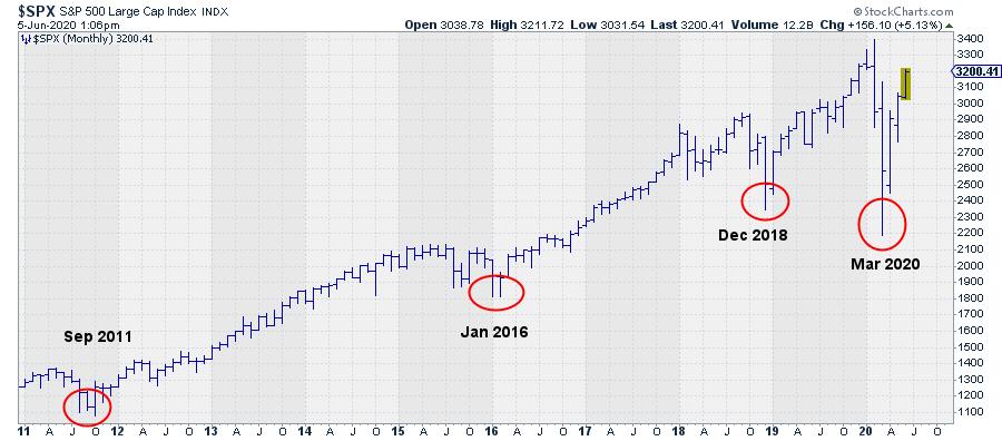
The RRG tool on StockCharts.com allows us to scroll back 10 years in history. In this period, there were, imho, three (major) lows, plus the low that we set in March and out of which we are still rallying.

These lows (visible) were set in September/October 2011, January/February 2016 and in December 2018.
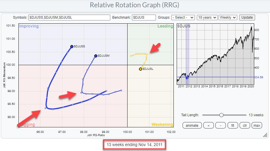
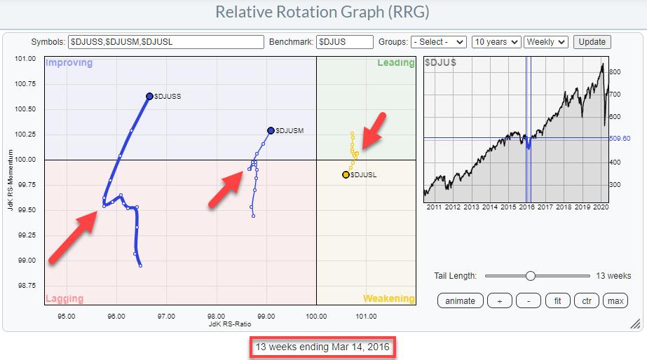
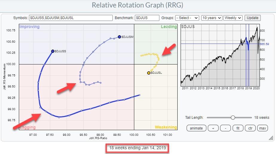
What I wanted to do is go back in time and look at the positioning of the tails for the three size segments and see if we can find similarities that, maybe, we can project on the rotational pattern that we see at the moment.
September / October 2011

The first occurrence is in 2011, when the low in the S&P 500 was set in September/October of that year. The RRG above shows the tails for the three segments around that period and I have tried to put the end date of the tail at a position that more or less mimics what we are seeing now.
The red arrows that indicate where the tails "turned" are at 3 October. Obviously, that was not THE day that you could make a call for improvement of small- (and mid-)caps, but it provides guidance with respect to the time table. Depending on how aggressive one would read the RRG somewhere between the start of October and mid-November, where the tail ends, one could pick up the idea that small- and mid-cap stocks were starting to pick up over large caps.
January / February 2016

The second occurrence was in January / February of 2016. Again, the RRG shows the tails around that period. The endpoint is the week starting 14 March. The arrows at the hooks on the tails are pointing to 8 February.
December 2018

The third occurrence was the Christmas dip in December 2018.
The tails end in the week starting 14 January. The arrows point to late November. On this occasion, mid-caps actually started to turn significantly earlier than small-caps and large-caps.
The Low is In?
On all three occasions, the tails for mid- and small-caps started to rotate oppositely to large-cap. Also, in all three occasions, the mid- and small-cap tails were positioned inside the improving quadrant and had started heading towards the leading quadrant, while large-caps already crossed over into weakening and started heading towards lagging.
When we look at the current constellation for this universe of US stock market size-segments, we see a situation that is very similar to the three historical situations that we saw above. All three of these occurrences were the prelude to a further rally and the confirmation that the low was in. That pretty much negates the possibility of a bear market rally.
Of course, the sample size is very low, maybe too low. But, getting back to John's observation that Smaller Stocks Lead at Bottoms, and combining that with the observations of large-, mid-, and small-cap rotations around these lows, it's another argument for a further bullish scenario and the assumption that the low is in place.
#StaySafe,
--Julius
My regular blog is the RRG Charts blog. If you would like to receive a notification when a new article is published there, simply "Subscribe" with your email address.
|
| READ ONLINE → |
|
|
|
| DecisionPoint |
| Reader Question: "Why Look at Weekly Charts?" |
| by Erin Swenlin |
I love getting email from my readers and this particular email was great. He felt like he was asking a ridiculous question, but it is a common one that I don't think is asked out loud. This reader asked the question in the context of my DP Diamonds Report wherein I include both the daily and weekly charts for each of my stock picks.
"You show two charts per equity, one daily and one weekly so what is the significance of a daily chart over the weekly?"
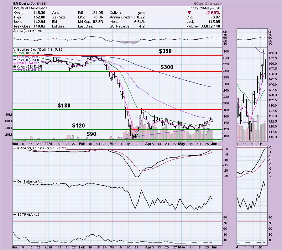
When I research a stock or ETF for possible purchase there are few things that I find critical. First is looking at price charts from monthly to daily to minute/hour. Why should I care about a monthly or weekly chart if I'm in it for a short-term trade? I believe it is important to glance at those longer-term charts to find any possible support or resistance areas that go waaaay back in time. If they coincide with near-term support/resistance on a daily chart, it can be considered more "touches" to those support or resistance lines which increases the 'strength' of that price level. Let's look at an example.
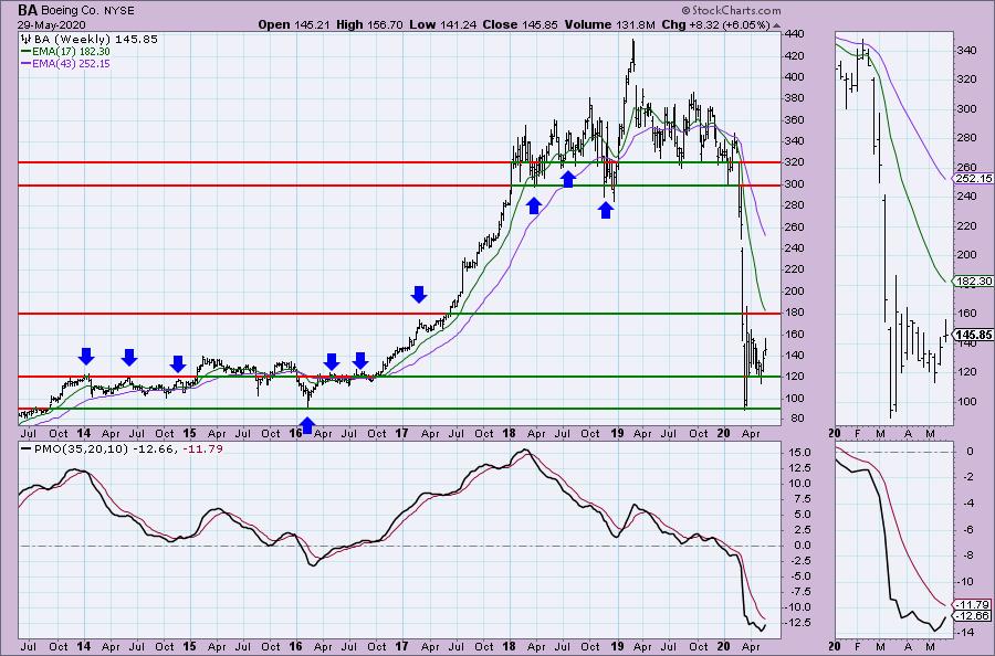
Below is Boeing (BA). I've annotated five levels of support and resistance and labeled the price. We can see on the daily chart these are important areas of support/resistance. However, we can only see one year...

Look at these same price levels on the weekly chart. Notice we can add more "touches" to some of those levels.

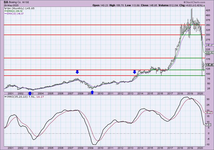
Can we add any more on a monthly chart? A little bit. Mainly we can see that the basing area for BA is $25 - $80.

Conclusion: Many stocks have what appears to be "memory". Well, the investors have memory. They remember the key levels they purchased and sold at. I find it important to know whether a particular support or resistance level has 'history'. If it does, I know that there is a good chance those support or resistance levels will hold more tightly and could be areas to look for key reversals.

As investors, we want to accomplish two basic things: (1) Determine the trend and condition of the market and (2) select stocks that will ride that tide. The DecisionPoint Alert helps with the first step, and DecisionPoint Diamonds helps with the second. Go to DecisionPoint.com and SUBSCRIBE TODAY! (Charter Subscriber Discounts Available!
Conclusion: It's important to follow a very short-term chart (5/10/15-minute) and watch the indicators to pinpoint possible key reversal points. Many people don't realize that the PMO can be used on very short-term charts and still provide the important information you need to trade. The RSI is an excellent companion to confirm price action and the PMO.
If you'd like a trial to our website newsletters, contact support@decisionpoint.com and we will hook you up!
Happy Charting! - Erin
Diamond of the Week (from Wednesday 5/27 DP Diamonds Report):
Below is the original article but the charts have been updated through today.
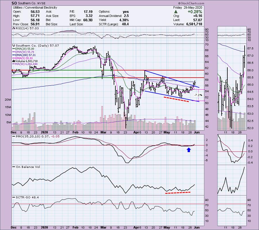
Southern Co (SO) - Earnings: 7/29/2020 (BMO)
The Southern Co. is a holding company. The firm engages in the sale of electricity. It operates through the following segments: Traditional Electric Operating Companies, Southern Power and Southern Company Gas. The Traditional Electric Operating Companies segment refers to vertically integrated utilities that own generation, transmission and distribution facilities, and supplies electric services in the states of Alabama, Georgia, Florida, and Mississippi. The Southern Power segment constructs, acquires, owns, and manages generation assets such as renewable energy projects and sells electricity in the wholesale market. The Southern Company Gas segment distributes natural gas through natural gas distribution facilities in the states of Illinois, Georgia, Virginia, New Jersey, Florida, Tennessee, and Maryland.
(Note: The breakout from the falling wedge had not happened as of 5/26.)
I used to own this stock and I'm considering reentering. There is a bullish falling wedge, but it hasn't executed yet. I might consider getting in before that breakout given price traded completely above the 20-EMA. This has a great dividend and yield as well. The SCTR is a bit of a problem given it is declining. The OBV has a lovely positive divergence that I don't think has completely played out on this rally.

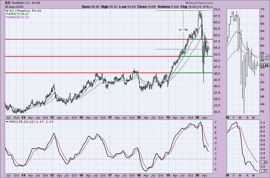
The PMO seems to be decelerating. Of course, I did look and this was a Diamond on April 9th. The weekly PMO was rising at the time and it didn't do much at all. I prefer a better weekly chart, but for a short-term trade it could be good.

Technical Analysis is a windsock, not a crystal ball.
Helpful DecisionPoint Links:
DecisionPoint Alert Chart List
DecisionPoint Golden Cross/Silver Cross Index Chart List
DecisionPoint Sector Chart List
DecisionPoint Chart Gallery
Trend Models
Price Momentum Oscillator (PMO)
On Balance Volume
Swenlin Trading Oscillators (STO-B and STO-V)
ITBM and ITVM
SCTR Ranking
|
| READ ONLINE → |
|
|
|
| The MEM Edge |
| The Outlook is Brightening for These Companies - and Their Stocks are On Sale |
| by Mary Ellen McGonagle |
Extreme uncertainty can really push stocks around, and this historically unprecedented pandemic has certainly proven that.
Take the steep selloff in normally defensive Utility and Real Estate stocks. With the country in a mandated lockdown that initially had no end in sight, these stocks got clobbered, as the need for office space and hotels evaporated while corporate utility usage plunged.
A murky outlook has kept investors on the sidelines with these hard-hit areas, and Utility and REIT stocks have been much slower in their recovery. However, a reopening of the economy is brightening the outlook for these higher-yielders, and below are several companies that show promise as they attempt to reverse their downtrends.
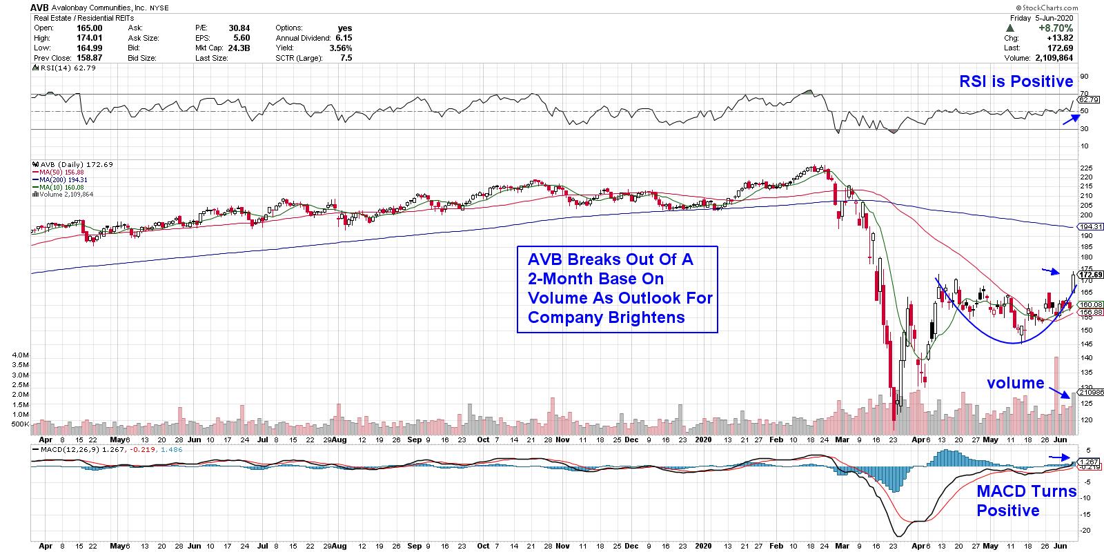
DAILY CHART OF AVALONBAY COMMUNITIES, INC. (AVB):

AvalonBay Communities (AVB) is one of the largest residential landlords in the United States, with apartment communities focused on high-end properties. The company has boosted their dividend payout annually for nine years now and AVB is considered one of the best-managed REITs of its kind.
Earlier this week, management revealed a 95% rent recovery rate through May 31st which had analysts raising reduced estimates for this year. The news helped push the stock out of a 2-month base on volume, with the RSI and MACD in positive territory. This 3.6% yielder may run into resistance at its 200-day moving average, but, for now, it can be bought on any pullback.
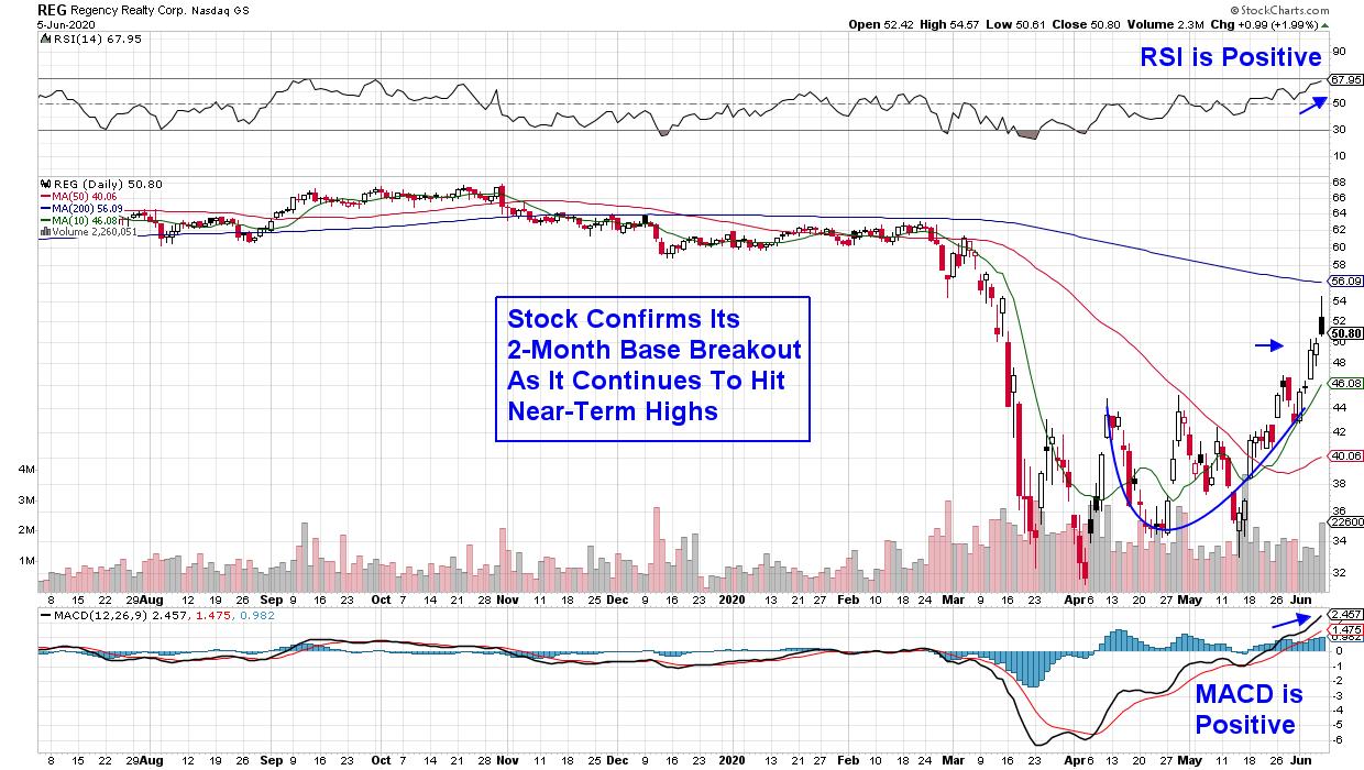
DAILY CHART OF REGENCY REALTY CORP. (REG)

Next up is Regency Centers (REG), which operates shopping centers located in affluent and densely populated areas. As of May 31st, the company reported that 75% of their tenants were open, which reflects their focus on essential businesses such as high-quality grocers and restaurants.
The reopening of retail centers has investors excited about the prospects for a faster recovery than initially anticipated for Regency Centers. The stock is near-term extended following this week's rally, and a pullback to REG's 10-day moving average would be an ideal buy point for this 4.6% yielder.
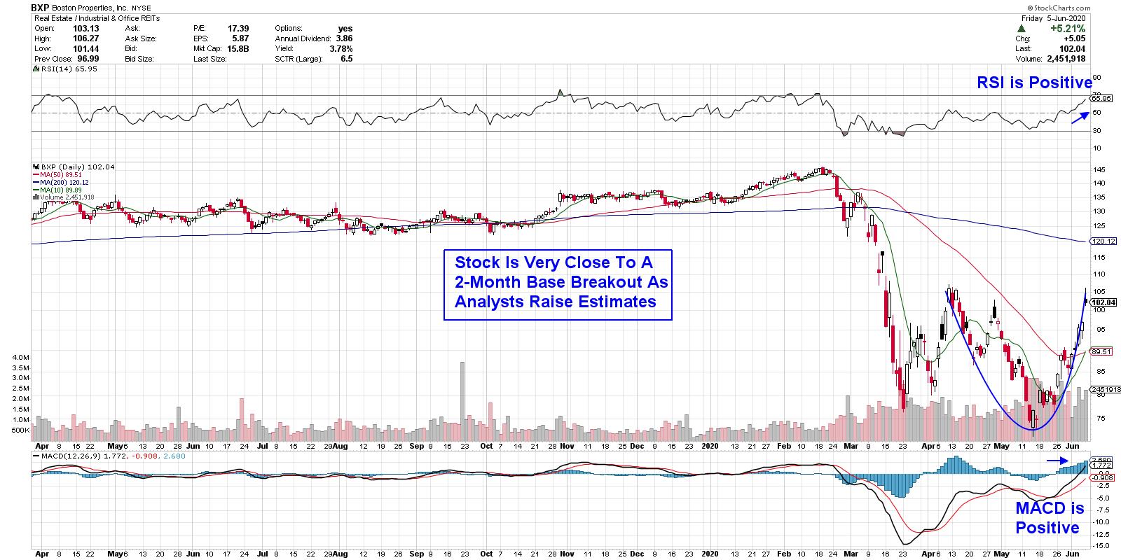
DAILY CHART OF BOSTON PROPERTIES, INC. (BXP)

Last up is Boston Properties (BXP), which is the largest owner of office properties in the United States. In late May, the company announced a 97% rent collection rate for the month while also signing new leases totaling almost a million square feet. Their high collection rate signals the quality of their tenants, who are expected to weather the current pandemic.
BXP is on the cusp of a 2-month base breakout following today's gap up in price on volume. The stock had fallen 52% from its February peak in price, in a move that analysts feel was overdone given the high quality of the company. With the RSI and MACD in positive territory, this 3.8%-yielder is poised for further upside particularly.
REIT stocks aren't the only ones that have recently joined the market's recovery rally, as lagging Bank and Industrial stocks have also been doing well of late. Not all stocks in these areas are in bullish positions, however, and if you tune in to my MEM Edge show from today, you'll uncover 2 simple screens to help uncover potential candidates.
Even better, take a 4-week trial of my top performing MEM Edge Report for a nominal fee and you'll be alerted to select stocks poised to take advantage of this sharp rotation in the markets. This bi-weekly report also provides insights into the markets and various sectors, which will give you the confidence to take advantage of this bull market.
I'm also excited to announce that my team and I will be introducing our Dividend Edge Report later this month! If you'd like more information about lower risk ways to increase your returns, please provide your contact to support@thememgroup.com.
Warmly,
Mary Ellen McGonagle,
MEM Investment Research
|
| READ ONLINE → |
|
|
|
|
|
| ChartWatchers |
| Identifying Stocks with High Short Interest Can Put $'s in Your Pocket! |
| by John Hopkins |
When looking for solid long trading candidates, one of the things astute traders look for are those stocks with high short interest. In other words, those stocks that traders are heavily betting against. Why, you might ask? Because if you can identify companies with a high percentage of short interest that also have solid-looking charts, there's a decent chance you can bag some nice profits.
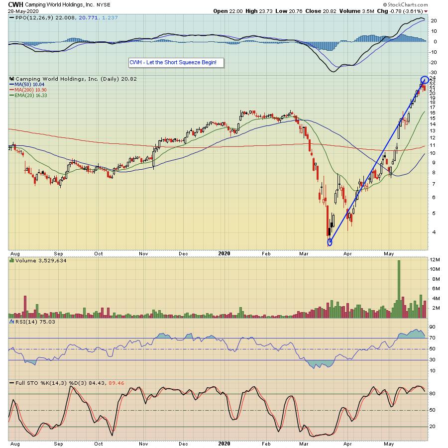
As an example, take a look at the chart below on Camping World Holdings (CWH), a stock on our "Short Squeeze ChartList" that contains over 140 stocks with high short interest.

For this particular stock, 36% of the shares available to be traded are short, meaning 36% of shares available to be traded in this company are held by those betting AGAINST the company. Why does this matter? It matters because when a stock gets hot, like this one did when it bottomed alongside the overall market and started rising, it puts pressure on those who are short; it's heading in the opposite direction of what they bargained for.
Think of it this way. When you buy a stock on the long side, you are looking for it to move higher to profit. And when you buy that stock, you know exactly how much you can lose if the trade goes against you. For example, if I buy a stock with a price of $10, I know the most I can lose is $10 times the number of shares I purchase. When you sell a stock short, you are looking for it to move lower to profit. But there's no theoretical "ceiling;" a stock could go to infinity, which becomes a very scary proposition when you are holding it short! So, quite often when a stock marches higher, those who have short positions feel "squeezed" and often have to bail to help limit losses. That works to the benefit to those on the long side.
It might seem like a complicated concept, but it's not. In fact, EarningsBeats.com Chief Market Strategist Tom Bowley has created the "Short Squeeze ChartList", which currently has over 140 heavily-shorted stocks, and he will be discussing this list - including how it is created and some key results - during a webinar scheduled for this Monday, June 1 at 4:30pm ET. This is a FREE webinar open to our subscribing members, as well as those who receive our Free EarningsBeats Digest newsletter. So if you want to join Tom on Monday and are NOT currently an EarningsBeats.com subscriber or an EarningsBeats Digest subscriber, just click on this link to sign up for the EarningsBeats Digest and save a seat for Monday's event.
Making money when trading is a tough proposition on its own. Why not find new ways to increase your chances of succeeding?
At your service,
John Hopkins EarningsBeats.com
|
| READ ONLINE → |
|
|
|
| MORE ARTICLES → |
|
 Every weekend, my "Sunday Portfolio Review" ends with the same rigorous search process. With my market evaluation and portfolio analysis routines complete, I turn my attention to the discovery phase.


 I've acknowledged in numerous previous blogs and