| THIS WEEK'S ARTICLES |
| Market Roundup |
| Gold Moves to a New High; Will the Breakout Hold? |
| by Martin Pring |
Long-Term Gold Charts Give Perspective
Gold broke out to a new recovery high on Tuesday and looks set to gain more ground, all with a favorable background from the long-term trend.
Chart 1 compares the quarterly gold price to a Coppock indicator and its 9-quarter moving average. This is not a chart for short-term traders, but it does offer the perspective of ten previous signals, nine of which were accurate. These were generated by a reversal in direction of the Coppock indicator itself. The only failure since 1975 was triggered in 2008. The latest 2016 upside reversal is still in force.
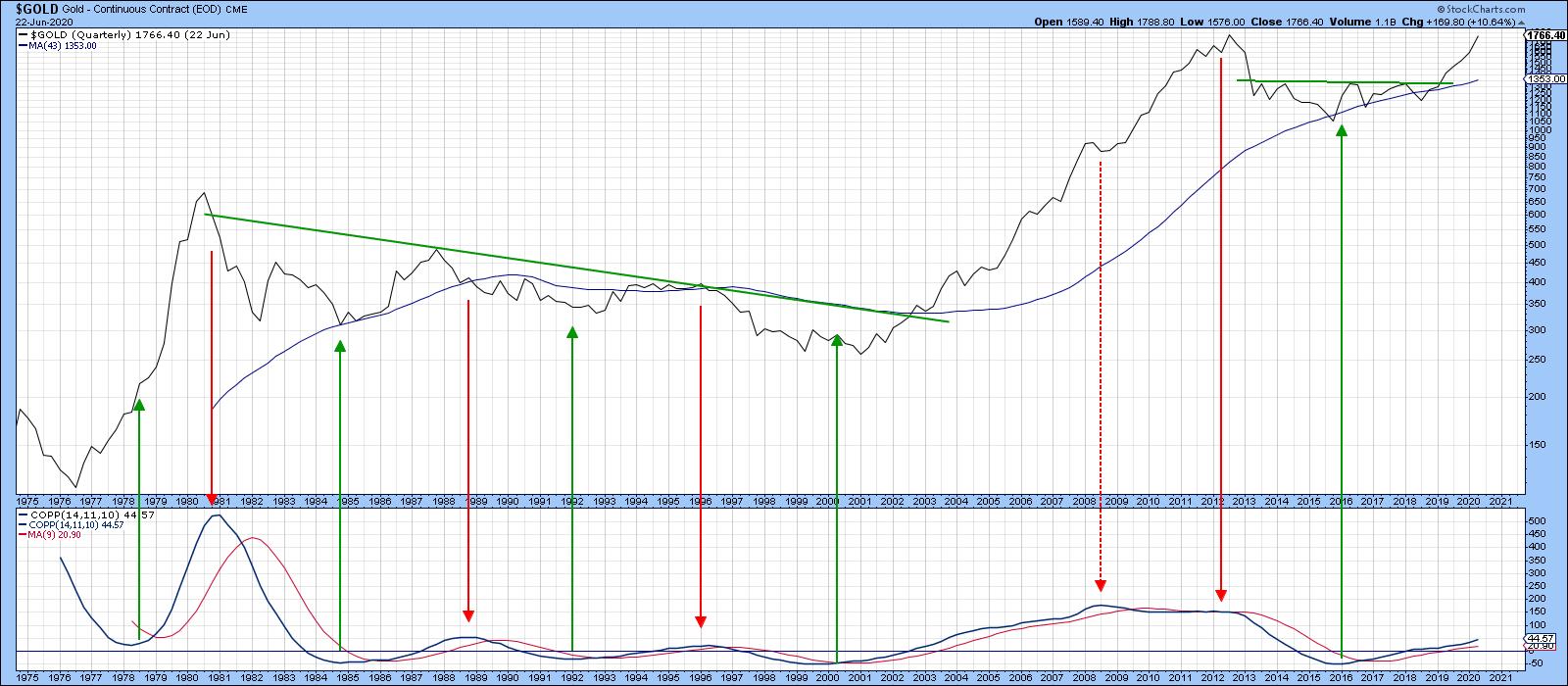 Chart 1 Chart 1
Chart 2 features my Gold PPO model. Using the 6- and 15- month EMAs as parameters, it signals buy and sell signals as it crosses through zero; in other words, as the 6-month EMA crosses its 15-month counterpart. The green-shaded areas reflect bullish periods, while white areas reflect negative ones. The three arrows, two red and one green, highlight the fact that only three whipsaws have taken place in the 45-or-so years covered by the chart. At the moment, the indicator is rallying and is therefore moving away from a sell signal. It won't come at the very top, of course; nevertheless, if past is prologue, it will likely come fairly close to it.
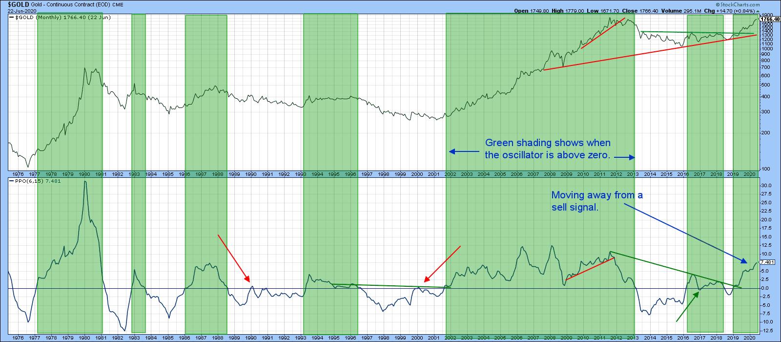 Chart 2 Chart 2
Gold vs. the Dollar
Most of the time gold moves inversely with the dollar, though the last few months have seen them rise in tandem. Chart 3 suggests that the price of the yellow metal will probably get a shot in the arm from this source, as the inversely plotted PPO for the Dollar Index has crossed above the equilibrium level, meaning that the Dollar Index itself is below its 12-month EMA. The green-shaded areas indicate that, when this condition has been in force for an extended period, the price of gold has typically risen. One of the problems of the current situation is that the June crossover has been preceded by a couple of recent false signals.
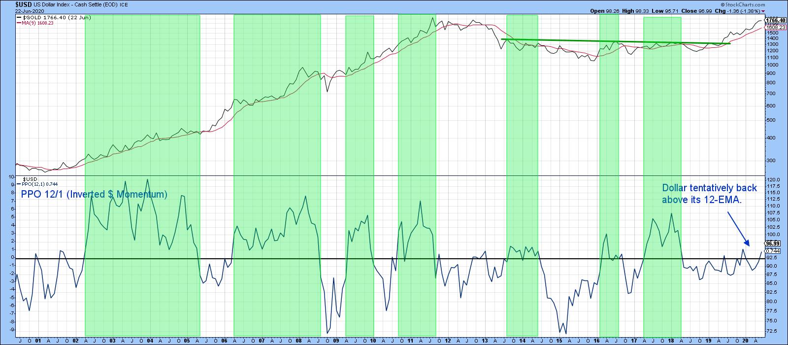 Chart 3 Chart 3
I would feel a lot more confident if the 24-month EMA version (See Chart 4), which is less prone to whipsaws, went bullish for gold. That would require a decisive month-end close in the Index below 97.
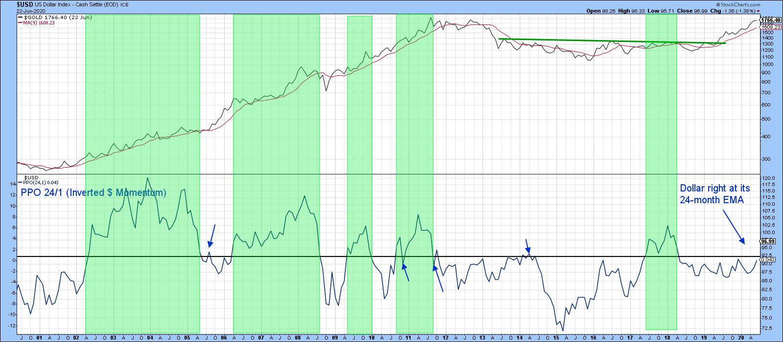 Chart 4 Chart 4
Gold vs. Gold Shares
Gold shares are probably more correlated with the price of the yellow metal than any other resource sector, so, in any technical situation it's nice to see them in gear. The Gold Bugs Index ($HUI) is characterized by the fact that its components do not generally hedge the price of gold in the futures market. Consequently, they represent a "purer" play than gold mining companies that have already sold most of their immediate future production. Just as the stock market discounts the economy, so too does the Gold Bugs Index have a strong tendency to lead the price of the metal. Chart 5 features the ratio between the $HUI and gold in the center window. The red and green arrows indicate that it leads the metal most (but certainly not all) of the time. The ratio recently broke above the green trendline, but has not followed through on the upside. This failure to confirm or lead the gold price itself is a bit of a worry, but certainly does not negate the bullish case for gold. It just clouds it a bit. One bullish note lies in the fact that the KST for the ratio is above its MA. The green shading shows that this kind of positive momentum on the ratio's part is typically a bullish omen for the gold price.
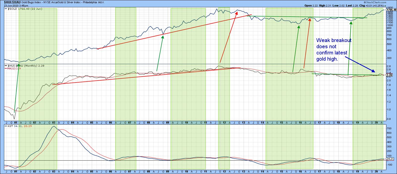 Chart 5 Chart 5
Chart 6 shows the critical nature of the ratio's current technical position, as it is trying to nudge through the green breakout trendline. A breakout is important because the short-term KST is on the threshold of a buy signal and could well join its intermediate counterpart in the bullish camp.
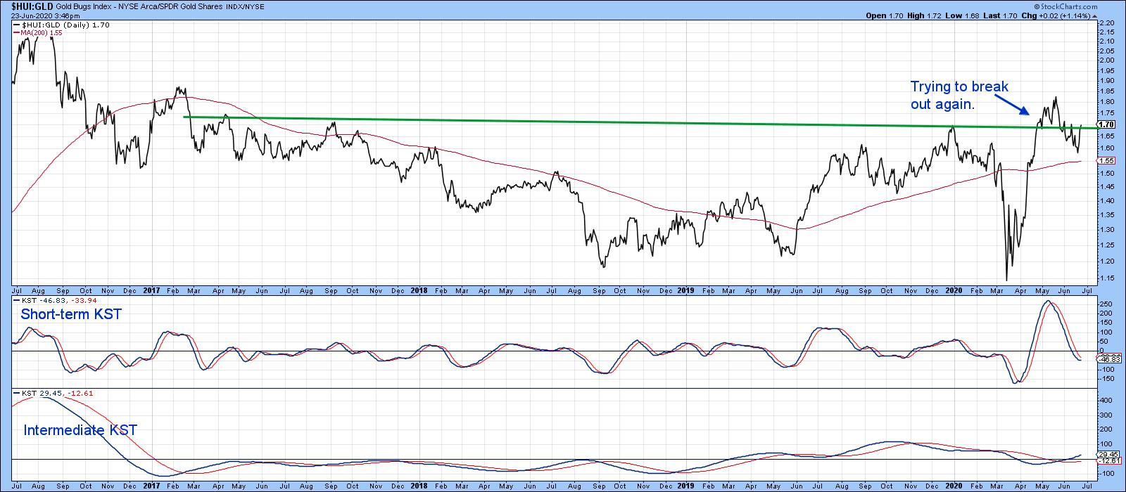 Chart 6 Chart 6
Chart 7 focuses on the Gold Miners ETF, the GDX. It recently broke out from a large base and looks headed higher. One of the things I like about the chart is that the gold shares bullish percentage, in the lower window, has been able to maintain a high reading as it has advanced. This is a clear-cut bull market characteristic. Compare that to the two bear markets, where the indicator was unable to move and hold above the 60% level. Note how the white areas flagging primary bull markets did not experience much in the way of corrections following overbought readings. In a similar but opposite vein, pink bear market areas were not able to generate much in the way of a rally from the oversold readings.
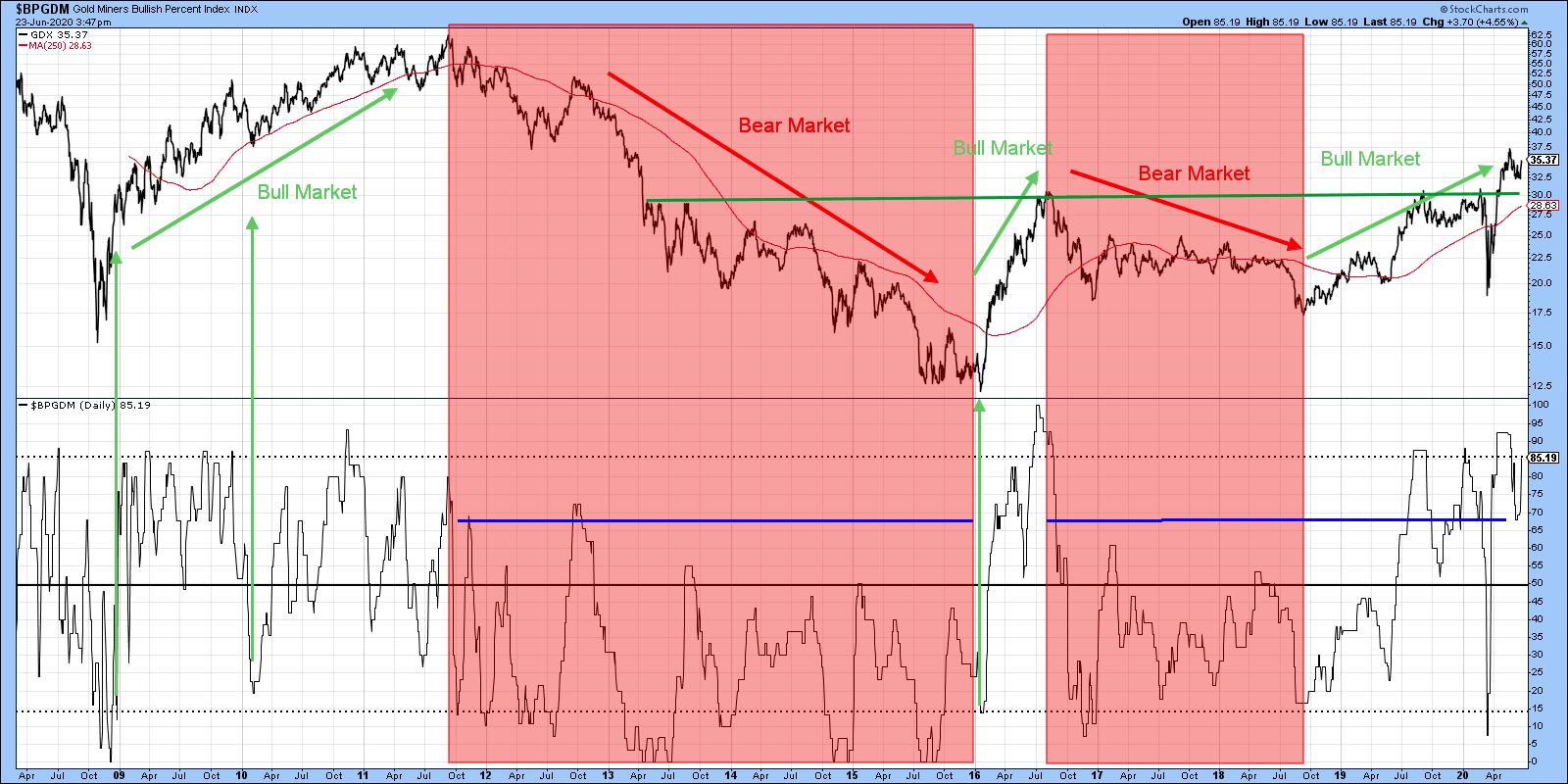 Chart 7 Chart 7
Editor's Note: This is an excerpt of an article that was originally published in Martin Pring's Market Roundup on Tuesday, June 23rd at 4:32pm ET. Click here to read the full article, which includes Chart 8 and a discussion of the short-term Gold position.
Good luck and good charting,
Martin J. Pring
The views expressed in this article are those of the author and do not necessarily reflect the position or opinion of Pring Turner Capital Group of Walnut Creek or its affiliates.
|
| READ ONLINE → |
|
|
|
| Art's Charts |
| Measuring the Balance of Power in the Equal-weight Sectors |
| by Arthur Hill |
 The 200-day SMA is a long-term trend indicator that chartists can use across the equal-weight sectors to measure the balance of power in the broader market. The more sectors trading above their 200-day SMAs, the more bullish the market. The more sectors trading below their 200-day SMAs, the more bearish the market. The 200-day SMA is a long-term trend indicator that chartists can use across the equal-weight sectors to measure the balance of power in the broader market. The more sectors trading above their 200-day SMAs, the more bullish the market. The more sectors trading below their 200-day SMAs, the more bearish the market.
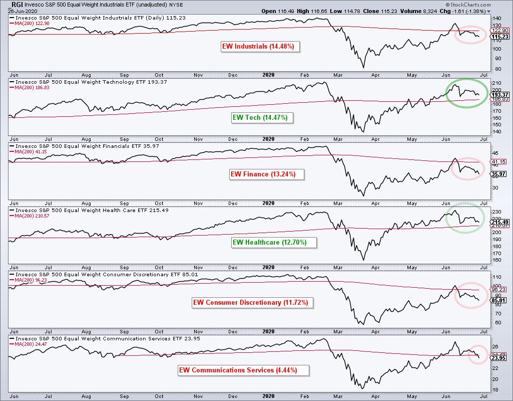
Today I am going to use the eleven equal-weight sector ETFs and put them into two groups. The first group (6) contains the five biggest sectors and the five offensive sectors. Healthcare is the fourth biggest sector, but it is not part of the offensive group. Communication Services is part of the offensive group, but is actually the smallest sector in the equal-weight S&P 500. Industrials, Technology, Finance and Consumer Discretionary are the other offensive sectors. They are "offensive" because these are the sectors we want to see leading during a broad market advance.

The chart above shows each of these sectors with their 200-day SMAs and the sector weighting. The sector name is red if below the 200-day and green if above. Currently, four of the five offensive sectors are below their 200-day SMAs and four of the five largest sectors are below their 200-day SMAs. This is not what we would expect to see in a bull market. Also notice that not one of these sectors recorded a new high in June. All fell short of their February highs.
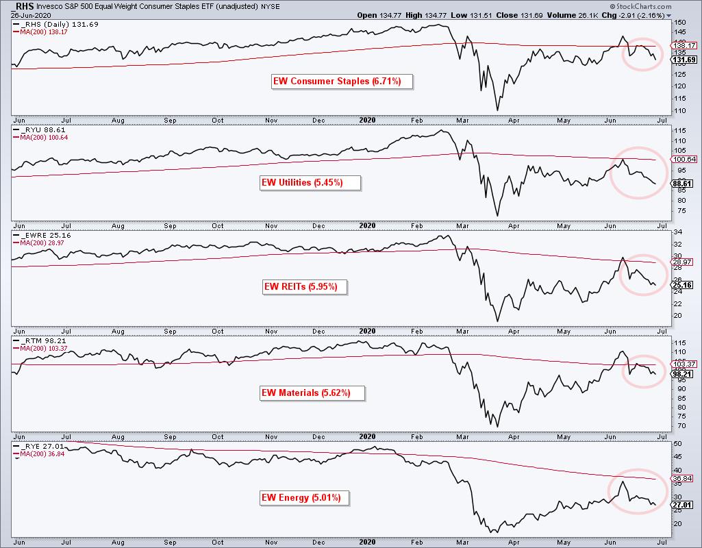
The picture deteriorates even further when we look at the defensive sectors, Materials and Energy. All five are below their 200-day SMAs. Utilities and Energy did not even get back above their 200-day SMAs in June.

Looking at the eleven sectors overall, the picture is clearly not bullish. Nine of eleven are below their 200-day SMAs. The Technology and Healthcare sectors are the only two above their 200-day SMAs and they are the leaders. Even though tech is an important sector, I do not see how we can call this a bull market when nine sectors are below their 200-day SMAs and not one hit a new high in June.
This week on TrendInvestorPro I examined the dud bottle rocket candlestick in SPY, the bearish failure swing in QQQ and the bearish wedge in IWM. In addition, I updated breadth models for the $NDX, $SPX, $MID and $SML. Subscribers who are StockCharts members also receive the core and master ETF chartlist and the essential breadth indicator chartlist. Note that I am on vacation the second week of July (5-11) and there will not be any reports that week.
Click here to take your analysis to the next level!
------------------------------------
|
| READ ONLINE → |
|
|
|
| The Canadian Technician |
| Banks, Fed and The Almighty 200 |
| by Greg Schnell |
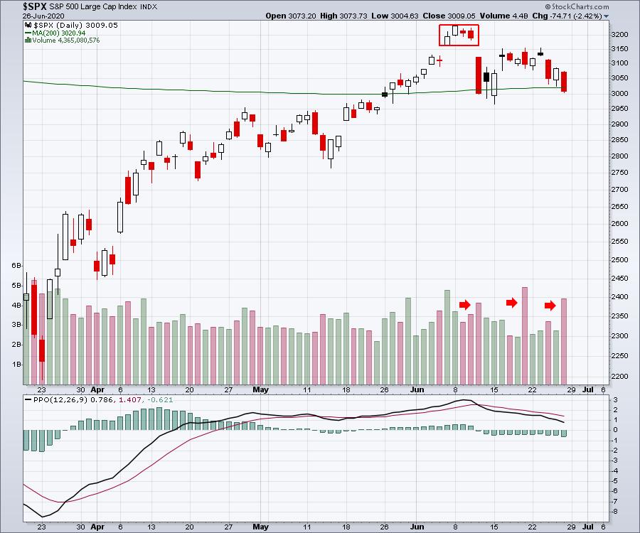
On June 10th, the Federal Reserve held their meeting and the stock market struggled on the Thursday after that, down 5% on the day. My last ChartWatchers article, titled "The End Of The Trend?", suggested that the size of the selling that day might be marking an important trend change.
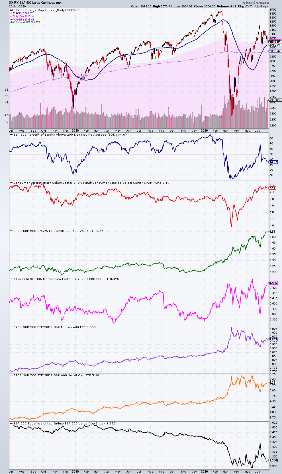
Looking back this week, we have the benefit of hindsight. We have not been able to get back into the range of what is technically termed an island high. The island was created by a gap up, a loss of momentum, and then a big gap down, trapping all buyers on the island in a losing position. After the Fed meeting, the market dropped lower (big red bar) on big volume. The following Friday was the Quadruple witching Friday, which also has high volume. That volume is common to see on Quad options Friday, but that also marked the high of the rebound. The additional selling on multiple days this week is looking very heavy, as the down volume is outpacing the up volume. When we add the 200-day moving average, we can see the $SPX closed back below it again this week.

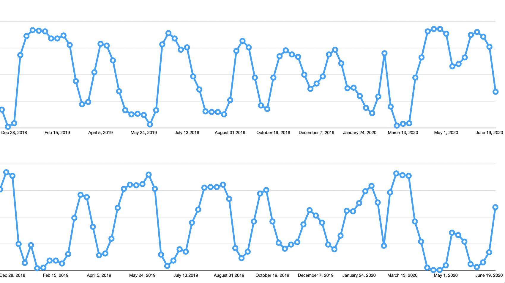
Some of my other analysis is marking some caution, as we start to see a bearish bias moving into the majority of industries for swing traders. The top panel shows industry groups in uptrends for short-term trading. The chart clearly shows the weakness, and the graph below shows the bearish momentum picking up. Again, this is for swing traders positioning.

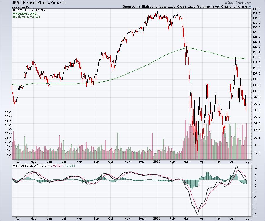
One of the industry groups that saw resistance at the 200-day moving average on the way up were the banks. Notice how JPM found support at the 200-DMA in 2019; it has now become resistance. The PPO is just moving below zero, so this is an important level for JPM to get some strength. Unfortunately, with the weak backdrop of the index shown above, it looks more likely that the banks are going to struggle here.

If you would like more information about some of my private indicators, you can check out a monthly subscription at GregSchnell.com for $79. As this market starts to grind, you might find some of the unique indicators more helpful.
|
| READ ONLINE → |
|
|
|
| DecisionPoint |
| FAANG Stocks: Darlings and Duds |
| by Erin Swenlin |
I decided to take a look at the FAANG stocks to see which ones are experiencing damage (duds) and which ones are continuing to show internal strength despite the S&P 500 stalling before reaching all-time highs. There are definitely some winners and losers. I must say that, overall, there are bearish chart patterns and deterioration showing up even on some of the darlings. Since most of us carry all or some of these stocks (Full Disclosure - I own AMZN & NFLX), caution is warranted on all of these right now.
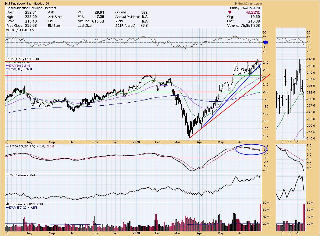
Facebook (FB) = Dud
Facebook took a huge hit today and moved from what could've been "darling" to a definitely "dud". The short-term rising trend (blue) was broken decisively today. On the bright side, the longer-term rising trend is still intact... barely. FB closed below both its 20/50-EMAs. The PMO has been on a SELL signal since the most recent trading channel began. The RSI fell out of bed yesterday. While this could be a possible entry point for a big-name stock, I would want to wait until price gets back into the trading range. The next level of strong support is at $200.


As investors, we want to accomplish two basic things: (1) Determine the trend and condition of the market and (2) select stocks that will ride that tide. The DecisionPoint Alert helps with the first step, and DecisionPoint Diamonds helps with the second. Go to DecisionPoint.com and SUBSCRIBE TODAY! (Charter Subscriber Discounts Available!)

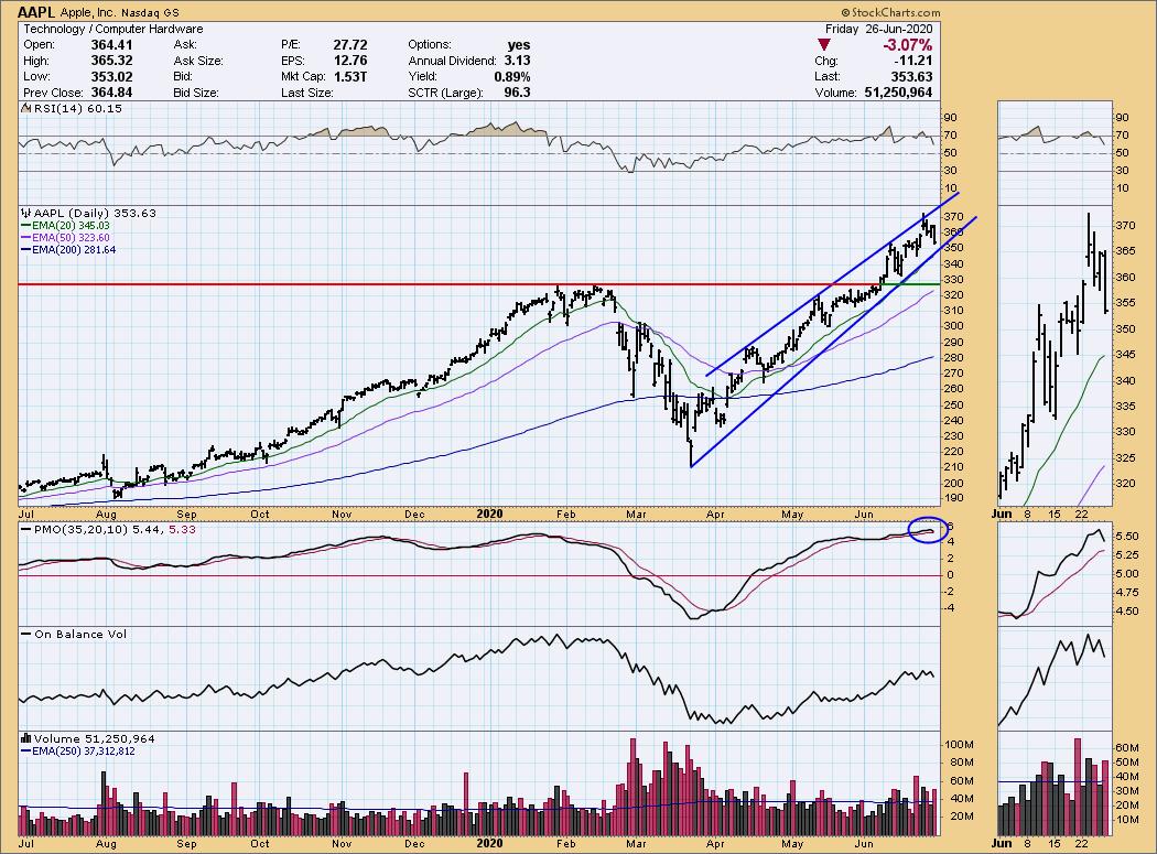
Apple (AAPL) = Darling:
Despite a rising wedge, Apple has continued to outperform. Its rising trend is intact and it has a little bit of room to fall lower without compromising that trend. The PMO has been stuttering on its way into extremely overbought territory. We have another "stutter" with today's tick down on the PMO. At this point, AAPL looks okay, as the RSI is still above 50 and OBV rising bottoms confirm the current uptrend. The next level of support is at the February high around $330.

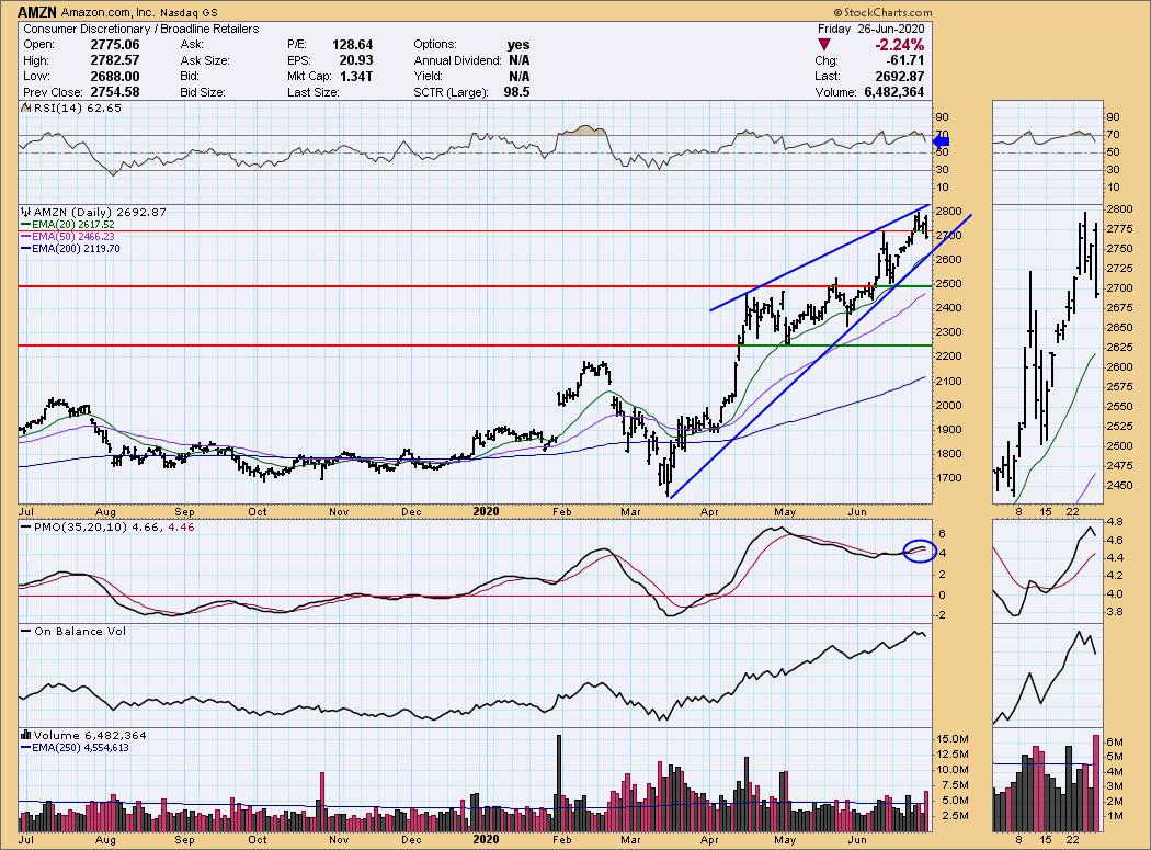
Amazon (AMZN) = Darling
I did an interview with MarketViews.TV this morning (It will be published tomorrow and sent to our free email list. Sign up from our homepage to get on the free list) where Ike Iossif discussed how Amazon can't continue to make money if 20% of the population is unemployed. This completely consumer-driven company needs customers with an income to keep it going. Of course, many of us have been waiting for the economy to intervene in this market rally for some time. In the meantime, it is still a darling. The rising trend is in place and, like Apple, there is room for it to move lower and hold that trend. As with many, there is a bearish rising wedge in play and the PMO has turned lower. The RSI is still healthy and, as long as it can hold the 20-EMA, I think you can stick with it.

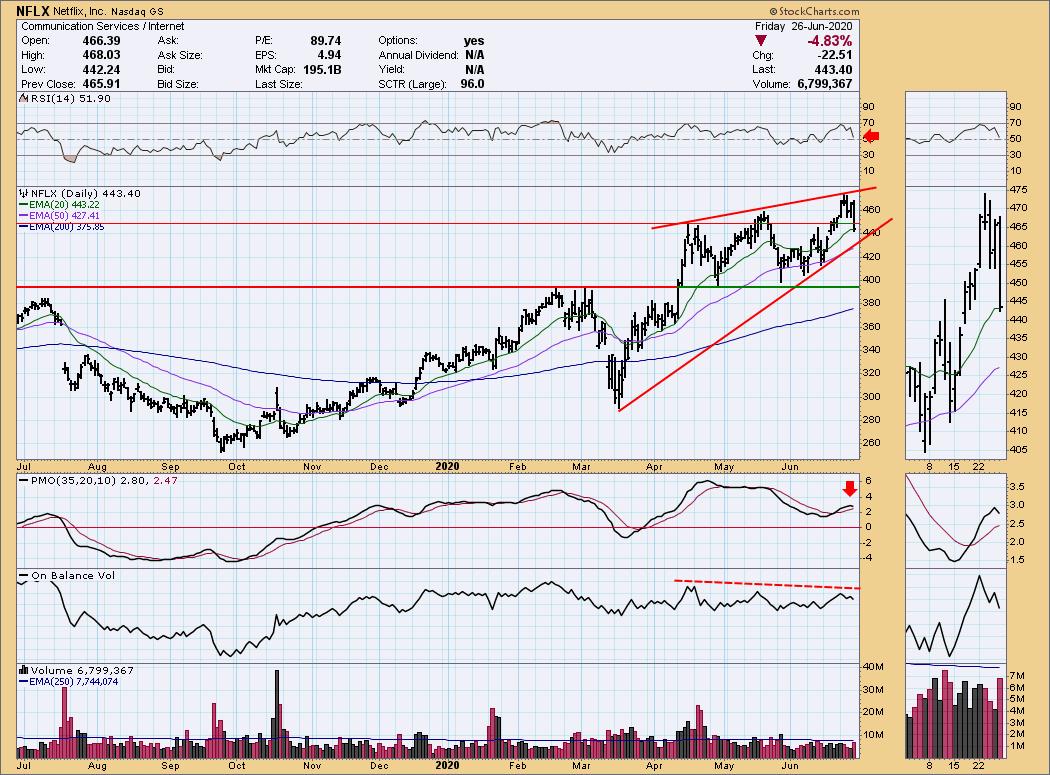
Netflix (NFLX) = Darling
Today's drop wasn't pleasant for my portfolio, but at this point I'm holding it. My line in the sand will be the 50-EMA. If it doesn't hold that, I'd prefer to exit and reenter when it reaches strong support at $400. The RSI is failing but is still positive. The PMO topped, but that isn't surprising given the deep decline. I also highlighted a negative divergence with the OBV. There is weakness here, so I'm keeping on my toes.

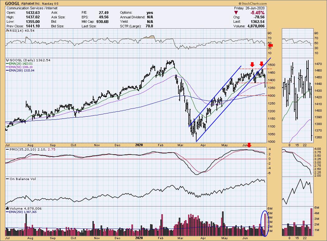
Google (GOOGL) = Dud:
I think like FB, it's pretty easy to look at this chart and call it a "dud." Like FB, Google had been consolidating sideways, but lost its rising trend earlier this month. In the meantime, it has formed a bearish double-top which has executed to the downside. Based on the chart pattern, the minimum downside target is around $1300, where there is 200-EMA support. GOOGL has now got an RSI below net neutral (50) and a PMO that is accelerating lower. Notice the very high volume that came in today. If there is a bright side, it would be the giant decline on lots of volume - it could turn out to be a selling exhaustion. However, I'm of the mind that it will test support at $1300 before it turns back up.

Conclusion: The FAANG stocks obviously drive the market, so it is important to keep an eye on these market movers. Weakness here means weakness for the market as a whole. Right now, the FAANG picture is mixed, with some holding up better than others. What I did note is that there are bearish characteristics to ALL of these charts, so consider this a caution flag. I put a coupon code in today's article that I'd love to see you redeem, especially if you're not familiar with DecisionPoint.com! I give out 60 stock picks a month in DP Diamonds for only $25/mo (price will be going up significantly soon, so lock it in!) and the DP Alert market newsletter is there for you everyday with Carl writing the "Weekly Wrap." Carl also has THREE annotated ChartLists that he keeps up to date DAILY! At the very least, you should get on our free email list here.
Happy Charting! - Erin
Technical Analysis is a windsock, not a crystal ball.
Helpful DecisionPoint Links:
DecisionPoint Alert Chart List (subscribers only)
DecisionPoint Golden Cross/Silver Cross Index Chart List (subscribers only)
DecisionPoint Sector Chart List (subscribers only)
DecisionPoint Chart Gallery
Trend Models
Price Momentum Oscillator (PMO)
On Balance Volume
Swenlin Trading Oscillators (STO-B and STO-V)
ITBM and ITVM
SCTR Ranking
|
| READ ONLINE → |
|
|
|
|
|
| ChartWatchers |
| Would You Be Happy to Beat the S&P by a Mile? |
| by John Hopkins |
On Friday, April 3, I submitted my article for the ChartWatchers newsletter with the following headline: "Get Ready to be Shocked - To the Upside". As someone who has been involved in the market for many years and who has made his fair share of bad calls, this was one headline I had confidence in and, of course, watched in great delight as the S&P rose from that day from 2460 to its peak of 3233, a nifty gain of 31%.
The confidence I had in that call came from an event held by our Chief Market Strategist, Tom Bowley, where he laid out all of the reasons he felt the market had bottomed and, after studying everything he presented, I too felt the next major move in the market would be to the upside. But even before the current pandemic came to light, something else equally amazing happened, so allow me to share it with you.
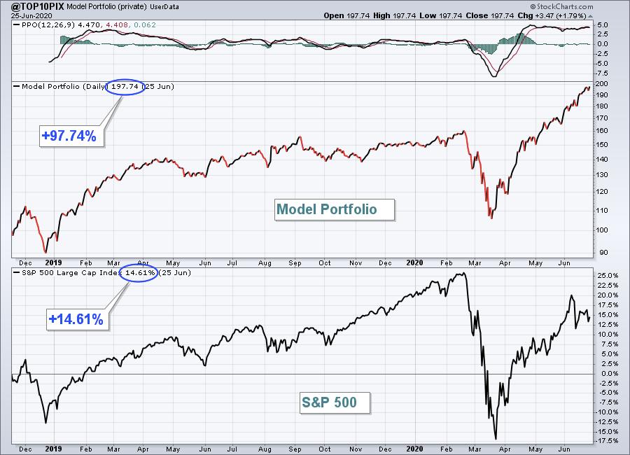
Some of you may know that Tom releases his "Top 10 Stock Picks" every quarter. This started with his Model Portfolio in November, 2018, and since then every 90 days he reveals a fresh batch of top 10 stock picks meant to be held for the upcoming 90-day period. In fact, since its inception, the Model portfolio has gone up over 97%, compared to the S&P being higher by 14.61% during the same period of time. But equally impressive was the period between February 19 and May 19, when the stocks in the portfolio rose by 4.6% compared to a loss of 13.68% for the S&P. And - get this - February 19 was literally the day before the market began its historic plunge!

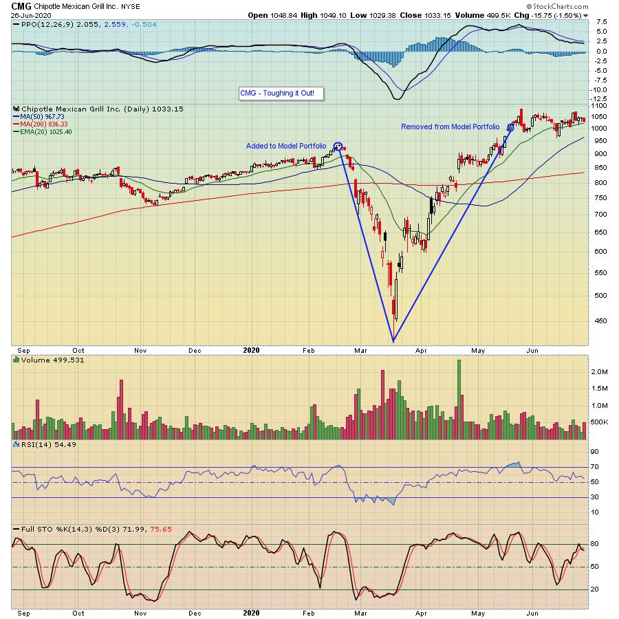
Of course, it's natural to ask why the Model portfolio performed so well in spite all of the chaos and worry surrounding the market. And the primary reason is this - the stocks in the portfolio had all beaten earnings expectations and were showing signs of strength prior to the onset of the pandemic. In other words, the charts were showing that there was a good chance they would move higher. And, to illustrate one great example that would have tested the nerves of anyone holding individual stocks during the deep dive, take a look at the chart below on Chipotle Mexican Grill (CMG).

Notice that the day CMG was added to the Model Portfolio on February 19 it had closed at $933. And where was it 30 days later? $415! That's a haircut by any measure. But then - look what happened from that bottom on March 18 to the close on May 19 - the end of the 90 day period for the Model portfolio. Not only did the stock recover all of the losses - 518 points in all - it tacked on another 87 points - rising 605 points - off of that treacherous March 18 low.
I'm pointing all of this out as a way of showing that even in the throes of the pandemic, quality stocks like CMG - and others in the Model portfolio - held up well. Why? Because they were strong stocks when they were revealed - the kind of stocks traders are attracted to - and proved their worthiness in spite of everything gone wrong.
Tom's next batch of Top 10 Stock Picks will be unveiled on August 19. But, prior to that time, we have 3 important webinars coming up over the next several weeks - including Tom's "Mid Year Market Update" - for members of EarningsBeats.com. To learn how you can save a seat for these 3 timely events, just click here. In the meantime, stay focused on quality names while we all work our way through these challenging times.
At your service,
John Hopkins
EarningsBeats.com
|
| READ ONLINE → |
|
|
|
|
|
| MORE ARTICLES → |
|
 Chart 1
 Chart 2
 Chart 3
 Chart 4
 Chart 5
 Chart 6
 Chart 7
 The 200-day SMA is a long-term trend indicator that chartists can use across the equal-weight sectors to measure the balance of power in the broader market. The more sectors trading above their 200-day SMAs, the more bullish the market. The more sectors trading below their 200-day SMAs, the more bearish the market.