| THIS WEEK'S ARTICLES |
| Market Roundup |
| Copper Could Hold the Key for the Next Leg Up in the Stock Market Rally |
| by Martin Pring |
Swings in commodity prices are both a market and an economic indicator. There are certainly exceptions, but when the economy is in a recovery phase, commodity prices generally rise. During the early phase of the business cycle, rising commodities are beneficial for stocks, not only for commodity-sensitive sectors such as energy and mining, but for the overall market. It is later on in the cycle, when capacity constraints start to emerge, that prices rise too rapidly. It is at that point that the recovery is threatened and stock prices suffer accordingly.
Rising Commodity Momentum is Bullish for Stocks and the Economy
Chart 1 compares the S&P to an 18-month ROC of the CRB Composite. Most of the time, a bottoming in momentum is followed by an equity rally, as market participants are anticipating that rising commodity prices will lead to a broader recovery. Note that there were also three notable failures, as indicated by the red dashed arrows.
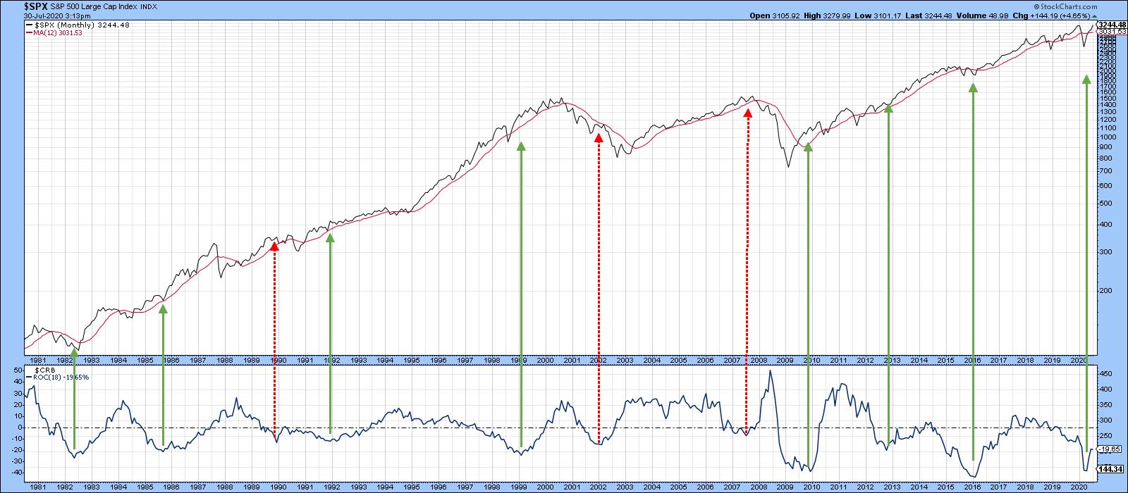 Chart 1A stronger relationship between equities and commodity prices is revealed when the copper price is substituted for the CRB Composite. Chart 2 shows that the number of valid signals is enhanced and the invalid ones reduced. That's because the CRB Composite includes numerous components whose prices are weather-driven and therefore relatively unrelated to the economy. For its part, though, copper is used in many different industries worldwide and is in a better position to identify swings in the level of economic activity. Consequently, if a bullish technical case can be made for higher copper prices, it follows that equities and the economy will be stronger as well - provided, of course, that the economy does not overheat, and there is clearly no chance of that happening any time soon. Chart 1A stronger relationship between equities and commodity prices is revealed when the copper price is substituted for the CRB Composite. Chart 2 shows that the number of valid signals is enhanced and the invalid ones reduced. That's because the CRB Composite includes numerous components whose prices are weather-driven and therefore relatively unrelated to the economy. For its part, though, copper is used in many different industries worldwide and is in a better position to identify swings in the level of economic activity. Consequently, if a bullish technical case can be made for higher copper prices, it follows that equities and the economy will be stronger as well - provided, of course, that the economy does not overheat, and there is clearly no chance of that happening any time soon.
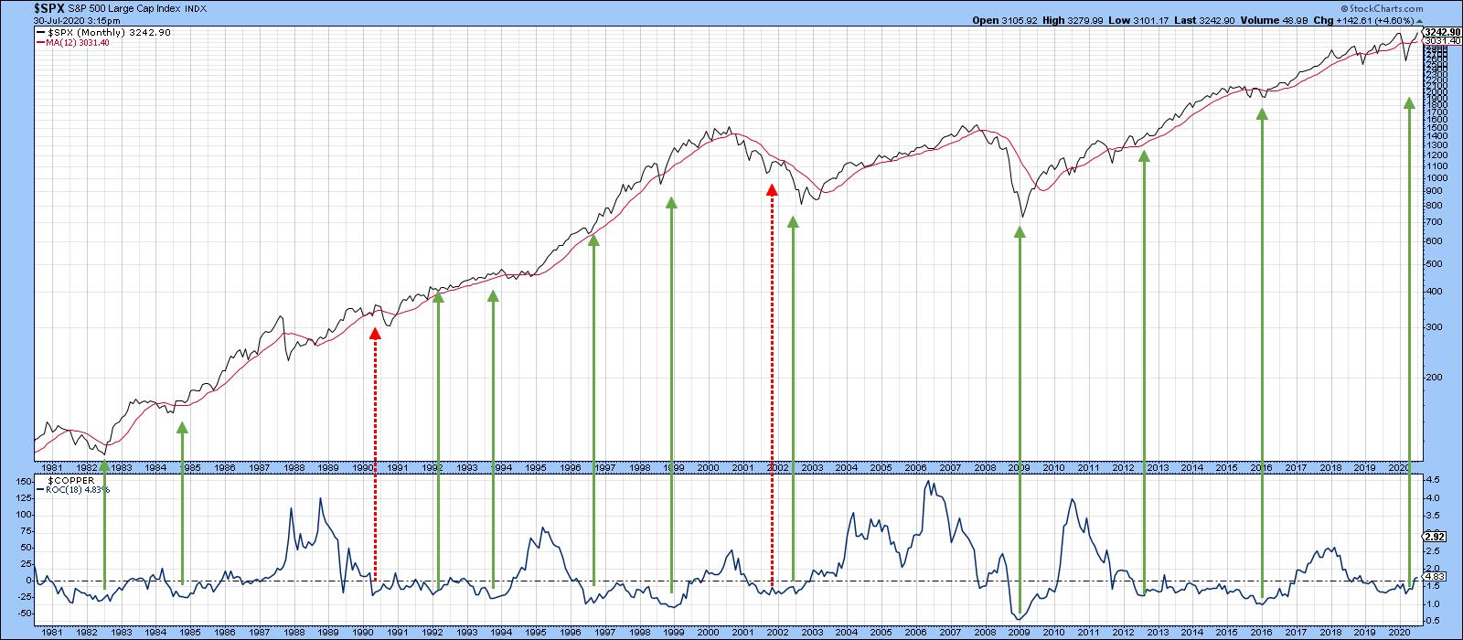 Chart 2 Chart 2
Long-Term Technicals Look Promising for Copper
Chart 3 shows the long-term technical picture for the red metal using my PPO model. In that respect, the green-shaded areas flag periods when the PPO is above zero - in other words, when the 6-month EMA is above its 15-month counterpart. One of the reasons I like this approach is that, in 25 years of history, I can only find one whipsaw, in mid-2002. Right now, this oscillator is bumping up against that zero line. It's actually fractionally above it, but not enough to credibly call it a bull market signal. It's true that the price itself is above the 12- and 48-month MAs, as well as the dashed down trendline. However, it has yet to successfully challenge the all-important 2011-2020 secular resistance line. Once again, it just requires a little more strength to get across that PPO finish line.
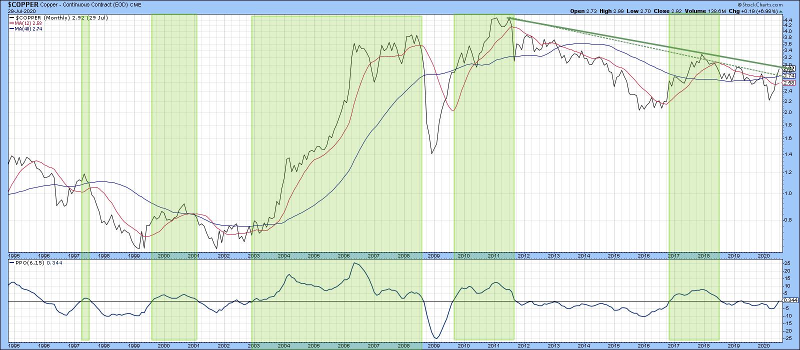 Chart 3 Chart 3
Chart 4 suggests that such a breakout will take place. That's because the price has already broken above the green 2018-2020 resistance trendline using daily data. Its Special K, which you can read about here, has achieved a similar feat. About 70% of the time, this indicator's primary trend peaks and troughs develop more-or-less simultaneously with the price series it is monitoring. That's because it combines short-, intermediate- and long-term momentum into one series. Trendline violations and decisive crossovers of the red signal line help signal basic trend reversals. In that respect, previous signal line crossovers have been flagged by the small dashed arrows against the price, while joint Special K /price trendlines are flagged using the longer ones. Right now, that analysis points to a bull market.
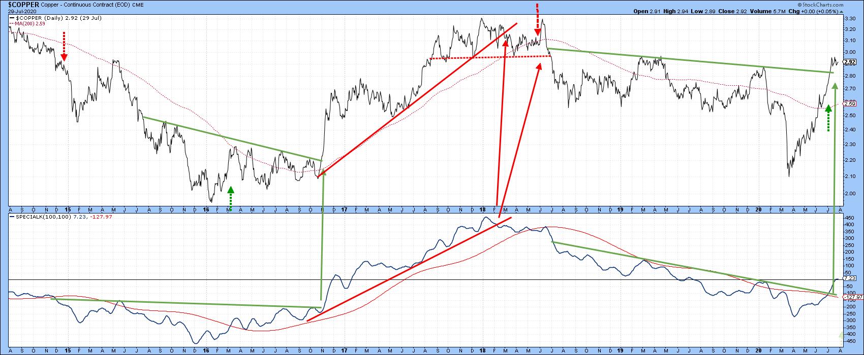 Chart 4 Chart 4
The one problem lies in the fact that several sentiment indicators are currently registering very optimistic readings, which, from a contrarian point of view, is negative. Also, as you can see from the bottom window in Chart 5, the short-term KST for the US Copper Fund (CPER) is both negative and overextended. If this is still a bear market, that could be consequential. On the other hand, if (as seems more likely) a new bull market began in the spring, the sell signal may not amount to much, as counter-cyclical short-term sell signals are generally limited in their effects.
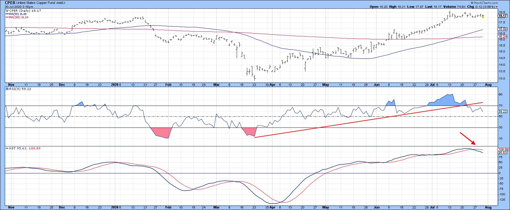 Chart 5Finally, Chart 6 shows how high the stakes are. That's because the price is bumping against the secular bear market trendline based on weekly closes. Note that the long-term KST in the second window has already gone bullish. We have established that a rising copper price is likely to be positive for the market. However, the lower two windows suggest that it will be even more bullish for copper itself, provided we get the signal of course. That's because the copper/S&P ratio has just started to edge above its secular down trendline and 65-week EMA. In addition, the long-term KST for relative action has just gone bullish by crossing above its 26-week EMA. That combination suggests that the RS line may have bottomed, which would mean copper had begun an extended period of out-performance against equities. Chart 5Finally, Chart 6 shows how high the stakes are. That's because the price is bumping against the secular bear market trendline based on weekly closes. Note that the long-term KST in the second window has already gone bullish. We have established that a rising copper price is likely to be positive for the market. However, the lower two windows suggest that it will be even more bullish for copper itself, provided we get the signal of course. That's because the copper/S&P ratio has just started to edge above its secular down trendline and 65-week EMA. In addition, the long-term KST for relative action has just gone bullish by crossing above its 26-week EMA. That combination suggests that the RS line may have bottomed, which would mean copper had begun an extended period of out-performance against equities.
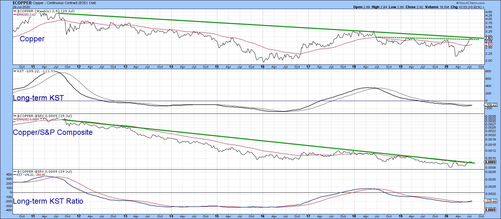 Chart 6 Chart 6
Editor's Note: This is an article that was originally published in Martin Pring's Market Roundup on Thursday, July 30th at 5:40pm ET.
Good luck and good charting,
Martin J. Pring
The views expressed in this article are those of the author and do not necessarily reflect the position or opinion of Pring Turner Capital Group of Walnut Creek or its affiliates.
|
| READ ONLINE → |
|
|
|
| The Mindful Investor |
| Too Far, Too Fast for Amazon |
| by David Keller |
This week on The Final Bar, one of our Mailbag questions related to Amazon.com (AMZN) and how far it has reached above its 200-day moving average. This phenomenon speaks to the long-term strength of AMZN's price movements, the short-term overreaching of the price since the March market low and the high likelihood of further upside for the stock.
I always tell people that there are three trends to concern yourself with: the trend you're trading, the longer-term trend one level above your time frame and the shorter-term trend one level below your time frame.
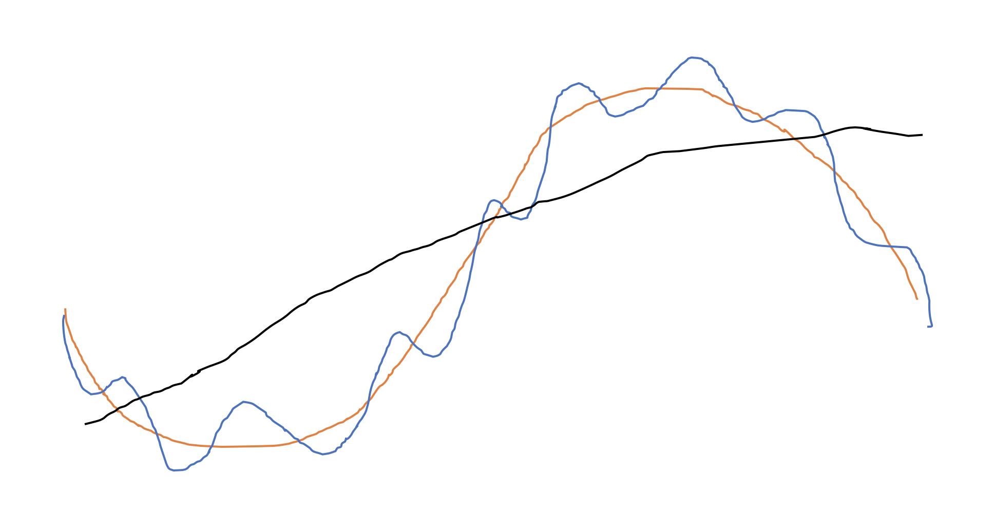
I developed this crude PowerPoint image to illustrate these three cycles.

In this illustration, assume the orange line represents your investment horizon. The cycle on which you're operating is also part of a larger cycle (the black line). So, depending on where you are at within the larger cycle, that may impact how you approach your own time horizon.
Your investment horizon is also affected by the shorter-term upswings and downswings, represented by the blue line. An awareness of this shorter-term time frame should help you approach your trades more tactically as you understand the best times to add positions.
Now let's get back to the chart of Amazon.

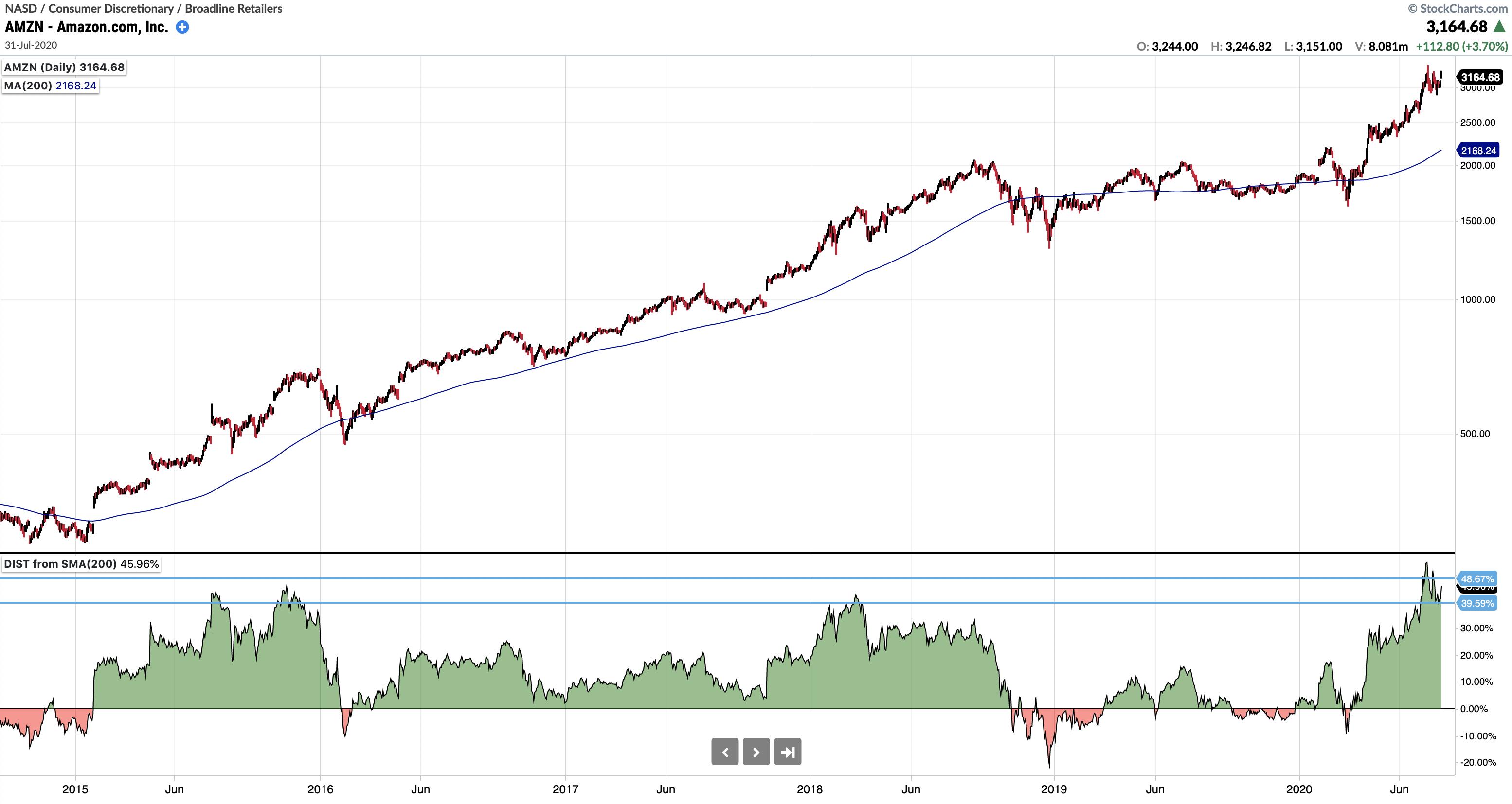
When you look at the last four years of data, you can see that AMZN was in a consistent uptrend through about the third quarter of 2018. That peak from September 2018 served as resistance again in mid-2019, and it happened to be right at the key psychological price level of 2000.
The break to new all-time highs in February 2020 was short-lived, as Amazon soon sold off along with most other stocks. The move back above 2000 in April signaled the "all clear" as the price continued to now over 3000.
This long-term trajectory from bottom left to upper right on the chart illustrates the long-term trend of Amazon. We can use the new StockChartsACP Advanced Indicator Pack to identify short-term tops within that uptrend, which gave valuable signals of potential pullbacks within the larger uptrend.
The bottom panel on this chart represents the distance of the price from its 200-day simple moving average, a common long-term price gauge favored by institutional investors.
You'll note that three times over the last four years, when the price reached at least 40% above its 200-day moving average, the price soon corrected back down. Although the long-term trend was still intact, each of these points identified an excessive upswing that needed to be "digested" first before the long-term uptrend could continue.
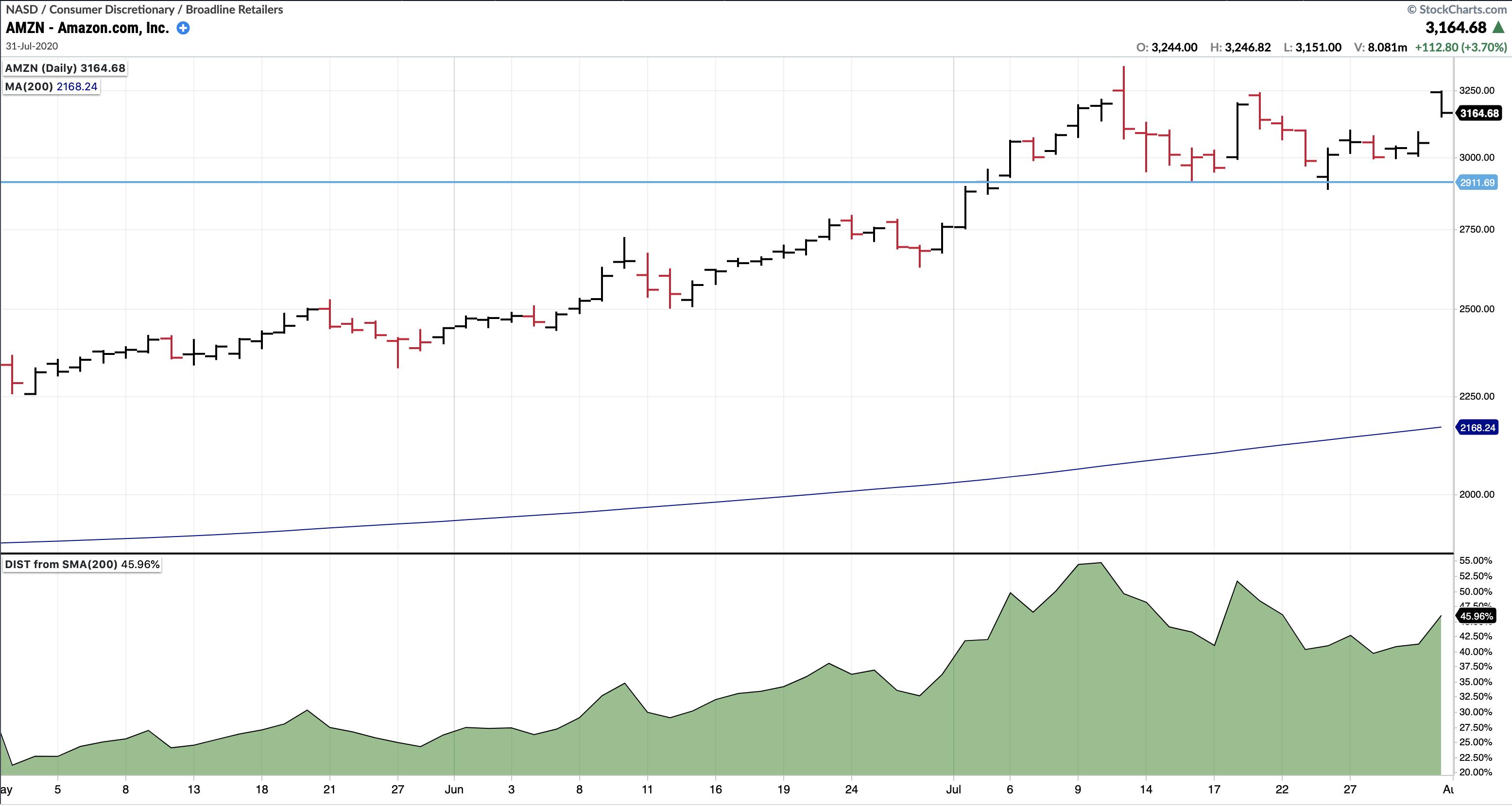
The last couple weeks have seen AMZN's price reach over 50% above its 200-day moving average. Based on the traditional application of this technical indicator, the base case would include a short-term pullback to digest recent gains before a resumption of the long-term uptrend.

As with any leading indicator such as this, I would always look for confirmation of a pullback to confirm the short-term bearish thesis. In this case, a break to a new swing low (below 2911) would suggest further weakness until the excessive upside momentum has been alleviated.
RR#6,
Dave
David Keller, CMT
Chief Market Strategist
StockCharts.com
Disclaimer: This blog is for educational purposes only and should not be construed as financial advice. The ideas and strategies should never be used without first assessing your own personal and financial situation, or without consulting a financial professional.
The author does not have a position in mentioned securities at the time of publication. Any opinions expressed herein are solely those of the author and do not in any way represent the views or opinions of any other person or entity.
|
| READ ONLINE → |
|
|
|
| Trading Places |
| Our Model Portfolio Is +118% In 21 Months; Here Are The 10 Equal-Weighted Stocks That Comprise It |
| by Tom Bowley |
Every three months, we fill out our four portfolios with 10 equal-weighted and leading stocks, mostly in leading industries. We combine fundamental research and technical analysis to make our money work harder, which is the whole idea. We know there's a strong correlation between earnings growth rates and stock performance, and we also know that institutions favor leading companies in leading industries. We simply try to construct our portfolios, as best we can, to outperform the benchmark S&P 500. That's our goal and we've been successful at doing that so far. Our quarters aren't calendar quarters. Instead, they run as follows:
- February 19th - May 19th
- May 19th - August 19th
- August 19th - November 19th
- November 19th - February 19th
It's hard to believe, but August 19th is now less than three weeks away. We will be replacing our portfolio stocks very, very shortly. But, in the meantime, we're going to continue to enjoy our quarter-to-date outperformance for another 3 weeks - hopefully! Since May 19th and through the close on Friday, July 31st (quarter-to-date), this is how our portfolios have stacked up against the S&P 500:
- Model Portfolio: +30.11%
- Strong AD Portfolio: +17.93%
- Aggressive Portfolio: +16.64%
- Income Portfolio: +8.55%
- S&P 500: +11.91%
Our flagship Model Portfolio is now +118.47% since November 19, 2018, while the S&P 500 has risen 21.57% during that same period. The results have truly been outstanding. The secret sauce is the combination of earnings growth and relative strength. Here are the 10 stocks (ticker symbols) that are currently included in our Model Portfolio:
AAPL, ZM, CDNS, ZYXI, ATVI, CMG, REGN, SHOP, MTSI, TSLA
Those have been great stocks to hold this quarter. In less than three weeks, a new list of 10 stocks will comprise each of our portfolios. We'll no doubt have several of these stocks returning as many of the stocks listed above remain leaders and have blown past Wall Street consensus estimates. Unless something drastic occurs between now and August 19th, these two almost certainly will remain:
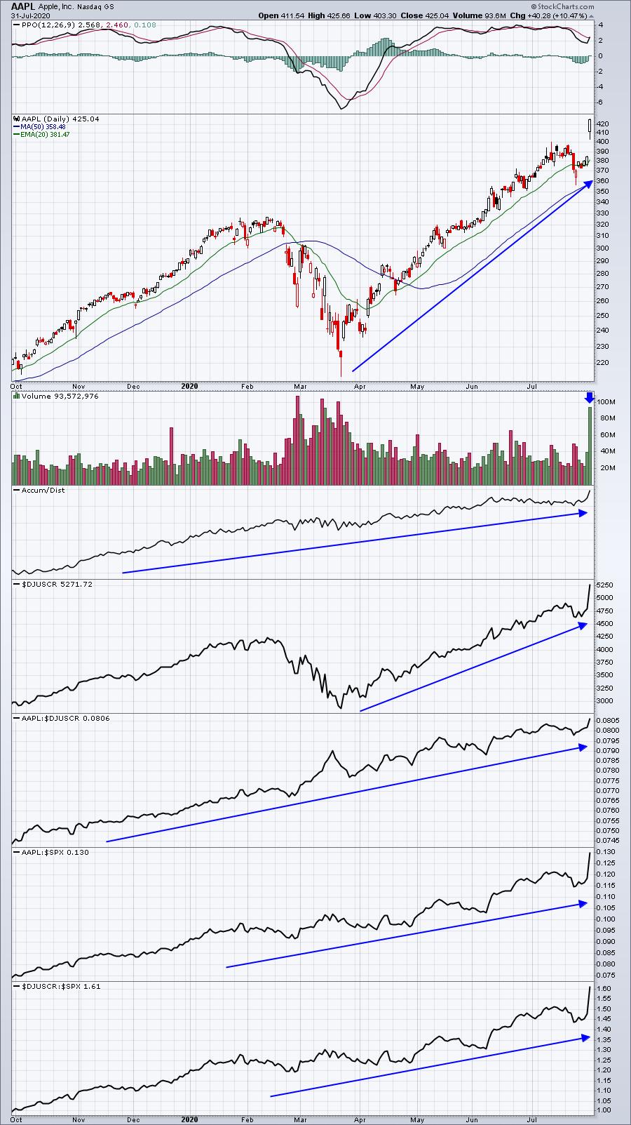
AAPL:

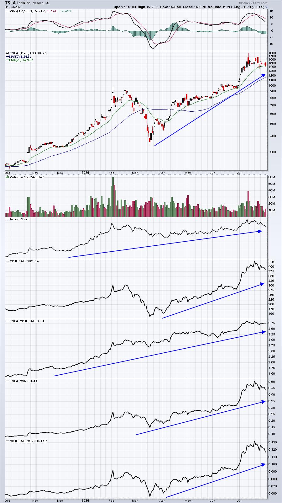
TSLA:

Technically, these relative strength panels say it all. Both companies are outperforming their industry peers by a very wide margin. Owning stocks like these is exactly how the Model Portfolio outperforms the benchmark S&P 500. While everyone tries to time bottoms in airlines, whose bottom looks more like a colander to me, at EarningsBeats.com we want to own the best-performing stocks, the leaders. At some point, they won't lead any longer and we'll find others that are.
As humans, we tend to make investing so much harder than it actually is.... or should be. Break everything down into very simple terms. Stronger-than-expected earnings and relative strength is a powerful combination and I believe we're demonstrating that in real time to our EarningsBeats.com members.
In just a few short weeks, we'll be announcing our next list of portfolio stocks for the next three months. We also have a FREE Sneak Preview event coming up on August 10th. Please don't miss out. For more information and to make sure you're included, CLICK HERE for more details.
Happy trading!
Tom
|
| READ ONLINE → |
|
|
|
|
|
| RRG Charts |
| Will The Next Big Move in Bonds Be? |
| by Julius de Kempenaer |

(Financial) Markets rotate, that's a given. When we look at the stock market, we call it sector rotation, which is probably the most widely-used term. But there is definitely also rotational action going on in other markets or cross assets. Think in terms of country or regional stock market rotation, or currency rotation. Alternately, as I would like to address today in this article, think of Asset (class) rotation.
People who watch my weekly Sector Spotlight show will know that I look at the rotation of asset classes on a regular basis using Relative Rotation Graphs. It's a great visual aid to get a handle on how money is rotating in and out of various asset classes.
What is an Asset Class?
With regard to the definition of asset classes, mine is pretty pure. There simply are not too many different asset classes. In the pre-defined RRG for asset classes, I use Stocks, Government Bonds, Corporate Bonds, High Yield Bonds, Real Estate and Commodities. The chart also holds $USD for reference purposes.
Some people will argue that Small-Cap stocks is an asset class, or Gold is an asset class, or Emerging market stocks, etc. For me, Small-Cap stocks and Emerging market stocks are part of the asset class "stocks." That asset class can be subdivided into various broken-down groups, like regional for emerging markets or based on market capitalization like small caps.
The same is true with Gold. Gold is a precious metal, and precious metals are a subgroup of the asset class Commodities. Saying that Gold is an asset class would be the same as saying that Apple (AAPL) or Amazon (AMZN) is an asset class..
Anyway... my 2 cts ;)
Stocks vs. Bonds
In this article, I want to take a closer look at the rotation of stocks vs. bonds.

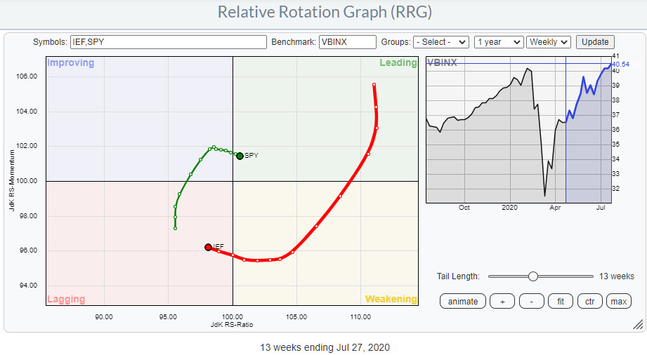
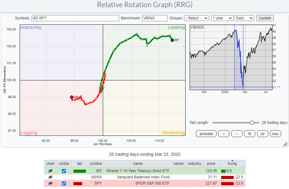
The Relative Rotation Graph above shows the tails of SPY and IEF vs. VBINX as the benchmark. As you can see, they rotate pretty much opposite to each other, which is normal. The downward, South-Western direction of IEF indicates weakness versus the positive tail, North-Eastern direction, for SPY.
With the tails now crossing over on the JdK RS-Ratio scale, that usually means a confirmation of the trend that is underway, but the fact that the tail for SPY rolled over already a few weeks ago while in improving, along with IEF curling up while inside lagging, causes some doubt about the sustainability of this trend (favoring stocks over bonds). That's especially true when you combine the rotation above with the rotation for the same assets on a daily basis.

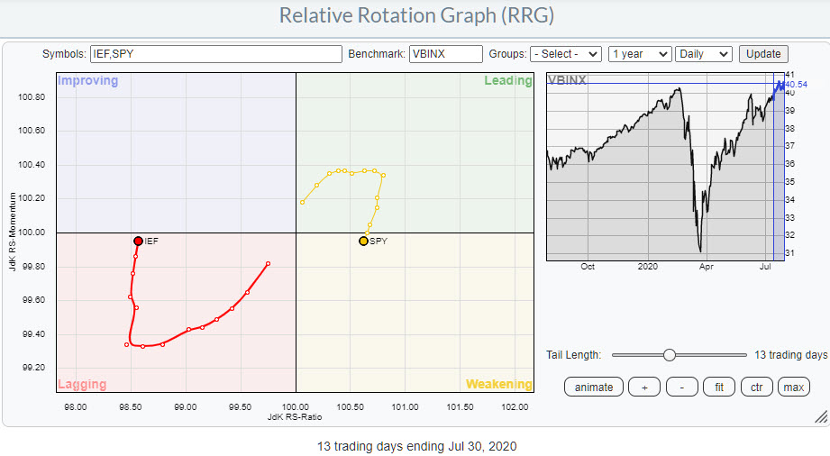
Here we see SPY crossing into the weakening quadrant after having rolled over inside leading 4-5 days ago. There's also the opposite rotation for IEF, which is inside lagging and is almost crossing into improving after curling up 4-5 days ago.
If you look at the performances for SPY and IEF during these rotations, SPY has been leading most of the time. That makes it hard to "believe" negative rotations of SPY vs. IEF. However they can make a big difference when things go South.


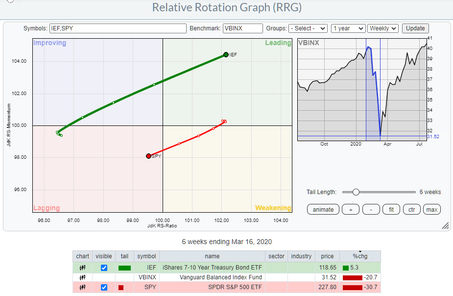
The two RRGs above show the rotations and the tails for SPY and IEF during the market decline in the "Corona Crash" and the outperformance of IEF over SPY during the opposite rotations. So I am not going to ignore such rotations.
Where does that leave us right now?
Weekly: SPY is still traveling West, but has started to fall, albeit slowly, on the JdK RS-Momentum scale, while IEF is doing the opposite. The fact that SPY is inside leading at the right hand side of the graph means that the long-term trend for this relation is still in favor of SPY.
Daily: SPY is at a negative RRG-Heading; it has crossed over into weakening and is now falling on both axes. Again, IEF is doing the opposite.
This combination of rotations on the daily and weekly RRGS suggests that, at least for the coming days/weeks, SPY will have trouble outpacing IEF. Eventually, the market will tell us if this was indeed a temporary rotation towards bonds and stocks will subsequently take over continuing the long-term trend outperforming bonds - or if a bigger rotation is starting.
It is simply too early to tell, but for now I prefer bonds over stocks.
Another observation that feeds this thought comes from the bond chart, which needs a bit of clarification.
There are many bond charts. Let's say we want to analyze 10-year US bonds. We can analyze the yield ($UST10Y), we can look at individual bond prices with maturities between 7-10 years, we can look at an ETF that tracks those bond prices with maturity 7-10 years (IEF) or we can look at the 10-Year Treasury note futures.
At first they all look "similar;" of course yields inverse to bond prices and, for the "big picture," it does not really matter what instrument you look at. But, when you want to take a closer look, you need to look at the instrument that really is the benchmark for all these tickers, and that is the T-note future. The futures market is pretty much where prices are "made" - everything else is based on those prices.
Every bond market maker will price individual bonds off the price of the future. These prices will result in the price for IEF, because it is a basket of bonds, and the generic yield is calculated off the future.
I had to think of this when I watched the price chart for IEF (and other bond ETFs) and was wondering whether what I saw was a break to new highs or not...

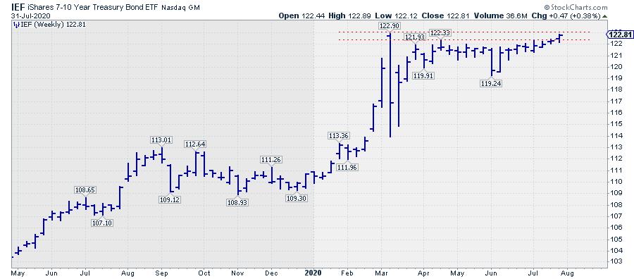
Here is the weekly chart for IEF showing a resistance area with a peak at 122.90. Should we include that or not? Is that the ultimate resistance level?

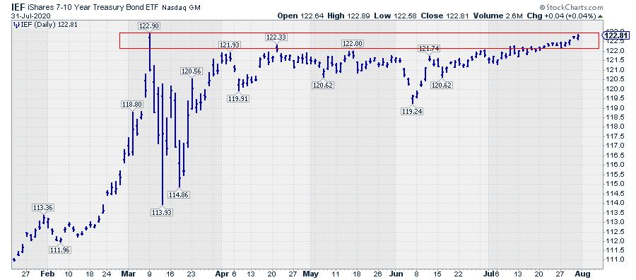
Here is the daily chart for IEF, showing the resistance area in more detail.
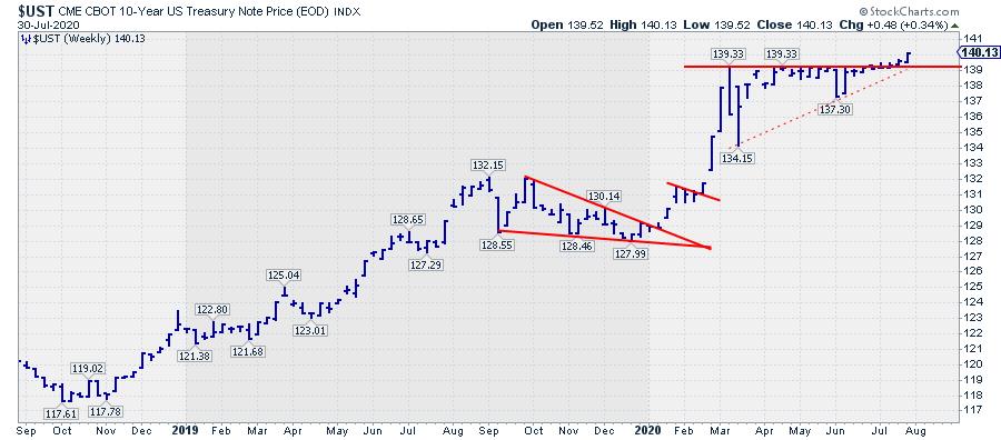
And here is the chart for the futures...

I would say that this is a pretty clear break of resistance. So the futures chart is confirming what I thought I was seeing on the ETF chart, which adds to the belief that Bonds are setting up for a new rally.
I am going to track this relationship closely in coming weeks, as I think it is crucial to the long-term positioning of stocks vs. bonds in portfolios.
#StaySafe, --Julius
My regular blog is the RRG Charts blog. If you would like to receive a notification when a new article is published there, simply "Subscribe" with your email address.
|
| READ ONLINE → |
|
|
|
|
|
| The MEM Edge |
| FAANG Stocks Exploding Higher? – Here's The Real Story This Earnings Season |
| by Mary Ellen McGonagle |
It's been quite a week for the markets and while market news is likely to focus on the explosive gains in select FAANG stocks, I believe there's an even bigger story that's come to light during this surprisingly robust earnings season.
You see, Facebook (FB), Apple (AAPL) and Amazon (AMZN) had already revealed themselves as leaders well before last week's bullish earnings reports propelled them even higher.
More interesting to me, are earnings reports over the past 2 weeks that point to a bullish tipping point in 5-G related stocks that indicates the super cycle in this new wireless standard is finally positioned to take off.
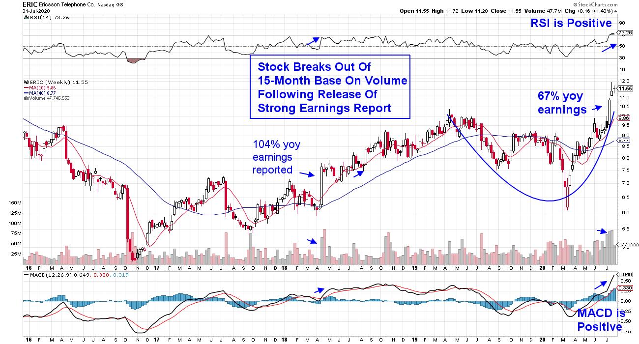
WEEKLY CHART OF ERICSSON TELEPHONE CO. (ERIC)

Swedish based Ericsson (ERIC) is a prime example as the stock soared more than 13% on strong 2nd quarter earnings boosted by a rise in 5G network sales. The company strengthened its position in this area with the signing of almost 100 5G commercial contracts since April.
Since then, ERIC posted more bullish news after signing deals with Deutsche Telekom and U.S. Cellular to assist in the deployment of their 5G traffic. And just this week, they delivered their first U.S. manufactured 5G station to Verizon.
As you can see in the weekly chart above, Ericsson broke out of a 15-month base on heavy volume following the bullish news. And while I anticipate a pullback to its 21-day moving average which is the top of its recent base breakout, a confirmed uptrend is now in place.
Two other companies that reported strong 2nd quarter results have also attributed increased demand of their 5-G products as a major driver.
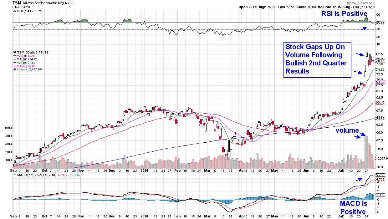
DAILY CHART OF TAIWAN SEMICONDUCTOR MFG. (TSM)

Taiwan Semiconductor (TSM) reported 93% growth in earnings for the 2nd quarter driven primarily by acceleration in 5G deployment. In addition, management is expecting increased demand in this area through the 2nd half of the year.
Taiwan Semi is positioned to benefit the most from this new era of fast-speed data delivery as they're the largest chip manufacturer who services most of the biggest semiconductor chip companies instrumental in the 5G race.
TSM gapped up bullishly on their earnings news and the heavy volume indicates Institutional buying that may well continue. Additional news that Intel (INTC) is delaying production of chips critical to this space also boosted the prospects for Taiwan Semiconductor. TSM can be bought on a pullback to its 10-day simple moving average.
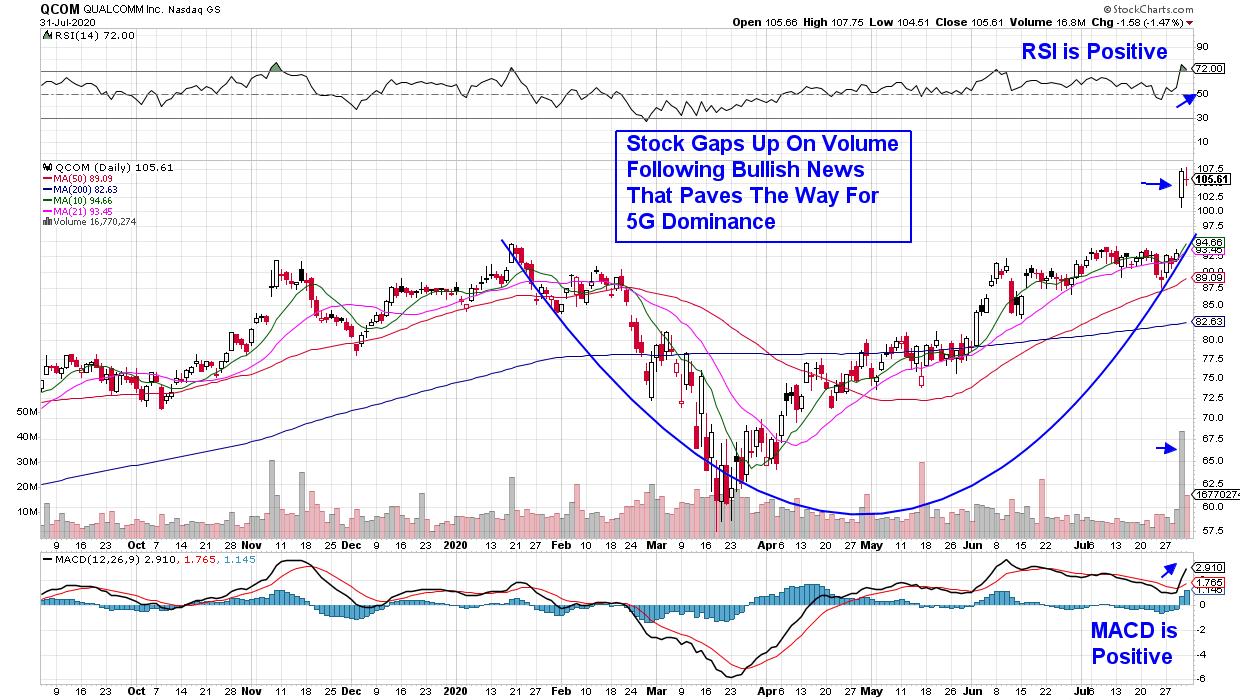
DAILY CHART OF QUALCOMM, INC. (QCOM)

Last up is Qualcomm (QCOM) whose report of a modest improvement in 2nd quarter results was super-charged by news of a settlement with the world's largest smartphone maker, Huawei. The stock broke out of a 6-month base on volume as the bullish news clears the way for QCOM to see big growth as the new 5G standard is rolled out.
Of note is the fact that historically, the longer the base that a stock breaks out of, the longer its advance out of that base; provided the company continues to report solid growth. With each of these highlighted stocks emerging from long bases while having sound growth prospects, their outlook is very promising.
There are select additional 5G related stocks that I've identified and they haven't reported their quarterly results yet. You can access them with my MEM Edge Report.
In addition to alerting subscribers to this week's winning FAANG stocks months ago, my bi-weekly MEM Edge report highlighted Qualcomm and Taiwan Semiconductor as being poised to trade higher. If you'd like to be alerted to similar stocks that are poised to greatly outperform the markets, trial my MEM Edge Report for 4-weeks for a modest fee.
This top-performing newsletter not only provides precise entry and exit points for its selected stocks, you'll receive insights into sector rotation and the broader markets that will give you the confidence to take advantage of this bullish phase in the markets. Take a look at our track record here!
Warmly,
Mary Ellen McGonagle
Founder, MEM Investment Research
|
| READ ONLINE → |
|
|
|
| MORE ARTICLES → |
|
 Chart 1A stronger relationship between equities and commodity prices is revealed when the copper price is substituted for the CRB Composite. Chart 2 shows that the number of valid signals is enhanced and the invalid ones reduced. That's because the CRB Composite includes numerous components whose prices are weather-driven and therefore relatively unrelated to the economy. For its part, though, copper is used in many different industries worldwide and is in a better position to identify swings in the level of economic activity. Consequently, if a bullish technical case can be made for higher copper prices, it follows that equities and the economy will be stronger as well - provided, of course, that the economy does not overheat, and there is clearly no chance of that happening any time soon.
 Chart 2
 Chart 3
 Chart 4
 Chart 5Finally, Chart 6 shows how high the stakes are. That's because the price is bumping against the secular bear market trendline based on weekly closes. Note that the long-term KST in the second window has already gone bullish. We have established that a rising copper price is likely to be positive for the market. However, the lower two windows suggest that it will be even more bullish for copper itself, provided we get the signal of course. That's because the copper/S&P ratio has just started to edge above its secular down trendline and 65-week EMA. In addition, the long-term KST for relative action has just gone bullish by crossing above its 26-week EMA. That combination suggests that the RS line may have bottomed, which would mean copper had begun an extended period of out-performance against equities.
 Chart 6
