Swings in commodity prices are both a market and an economic indicator. There are certainly exceptions, but when the economy is in a recovery phase, commodity prices generally rise. During the early phase of the business cycle, rising commodities are beneficial for stocks, not only for commodity-sensitive sectors such as energy and mining, but for the overall market. It is later on in the cycle, when capacity constraints start to emerge, that prices rise too rapidly. It is at that point that the recovery is threatened and stock prices suffer accordingly.
Rising Commodity Momentum is Bullish for Stocks and the Economy
Chart 1 compares the S&P to an 18-month ROC of the CRB Composite. Most of the time, a bottoming in momentum is followed by an equity rally, as market participants are anticipating that rising commodity prices will lead to a broader recovery. Note that there were also three notable failures, as indicated by the red dashed arrows.
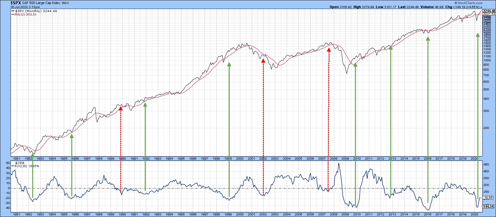 Chart 1A stronger relationship between equities and commodity prices is revealed when the copper price is substituted for the CRB Composite. Chart 2 shows that the number of valid signals is enhanced and the invalid ones reduced. That's because the CRB Composite includes numerous components whose prices are weather-driven and therefore relatively unrelated to the economy. For its part, though, copper is used in many different industries worldwide and is in a better position to identify swings in the level of economic activity. Consequently, if a bullish technical case can be made for higher copper prices, it follows that equities and the economy will be stronger as well - provided, of course, that the economy does not overheat, and there is clearly no chance of that happening any time soon.
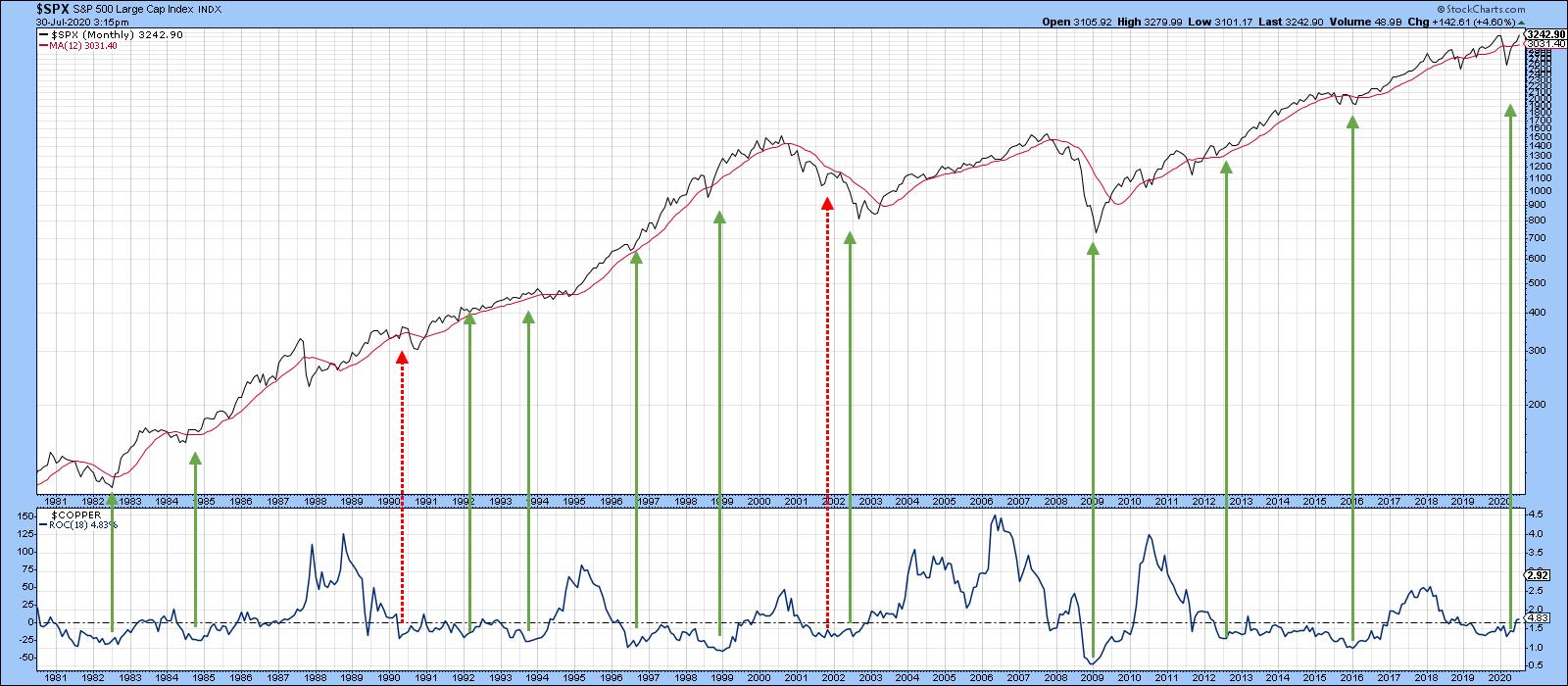 Chart 2
Long-Term Technicals Look Promising for Copper
Chart 3 shows the long-term technical picture for the red metal using my PPO model. In that respect, the green-shaded areas flag periods when the PPO is above zero - in other words, when the 6-month EMA is above its 15-month counterpart. One of the reasons I like this approach is that, in 25 years of history, I can only find one whipsaw, in mid-2002. Right now, this oscillator is bumping up against that zero line. It's actually fractionally above it, but not enough to credibly call it a bull market signal. It's true that the price itself is above the 12- and 48-month MAs, as well as the dashed down trendline. However, it has yet to successfully challenge the all-important 2011-2020 secular resistance line. Once again, it just requires a little more strength to get across that PPO finish line.
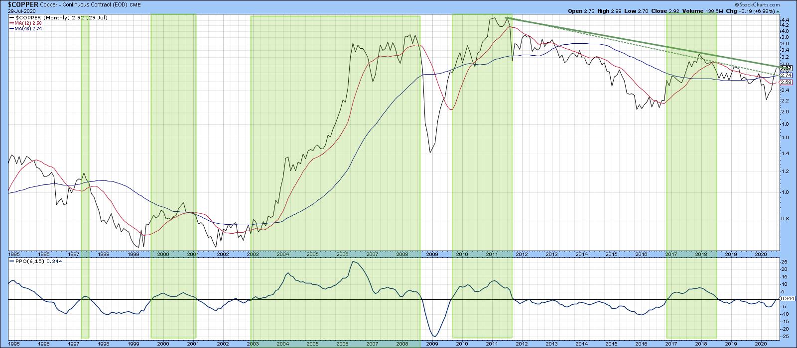 Chart 3
Chart 4 suggests that such a breakout will take place. That's because the price has already broken above the green 2018-2020 resistance trendline using daily data. Its Special K, which you can read about here, has achieved a similar feat. About 70% of the time, this indicator's primary trend peaks and troughs develop more-or-less simultaneously with the price series it is monitoring. That's because it combines short-, intermediate- and long-term momentum into one series. Trendline violations and decisive crossovers of the red signal line help signal basic trend reversals. In that respect, previous signal line crossovers have been flagged by the small dashed arrows against the price, while joint Special K /price trendlines are flagged using the longer ones. Right now, that analysis points to a bull market.
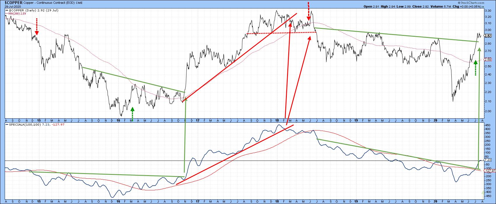 Chart 4
The one problem lies in the fact that several sentiment indicators are currently registering very optimistic readings, which, from a contrarian point of view, is negative. Also, as you can see from the bottom window in Chart 5, the short-term KST for the US Copper Fund (CPER) is both negative and overextended. If this is still a bear market, that could be consequential. On the other hand, if (as seems more likely) a new bull market began in the spring, the sell signal may not amount to much, as counter-cyclical short-term sell signals are generally limited in their effects.
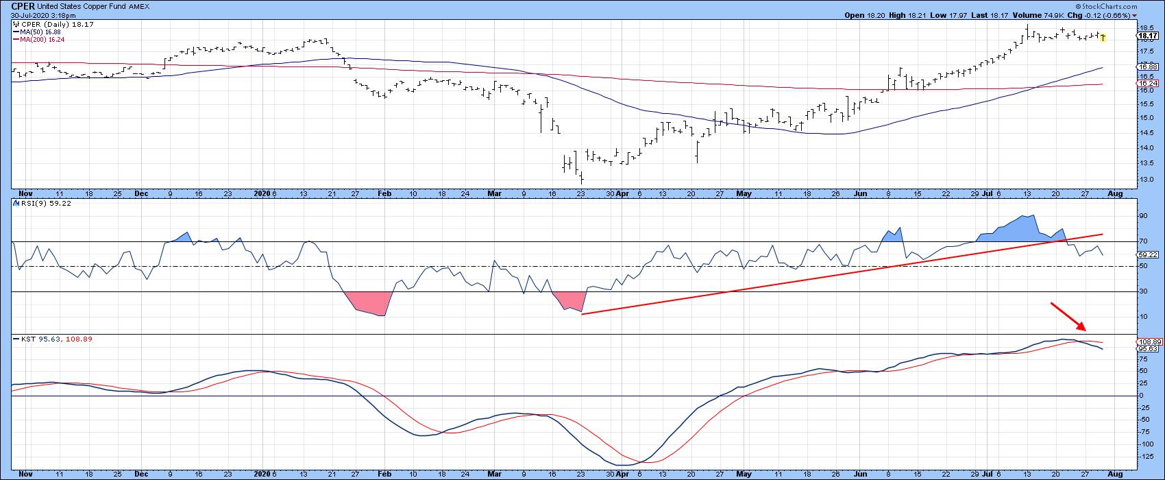 Chart 5Finally, Chart 6 shows how high the stakes are. That's because the price is bumping against the secular bear market trendline based on weekly closes. Note that the long-term KST in the second window has already gone bullish. We have established that a rising copper price is likely to be positive for the market. However, the lower two windows suggest that it will be even more bullish for copper itself, provided we get the signal of course. That's because the copper/S&P ratio has just started to edge above its secular down trendline and 65-week EMA. In addition, the long-term KST for relative action has just gone bullish by crossing above its 26-week EMA. That combination suggests that the RS line may have bottomed, which would mean copper had begun an extended period of out-performance against equities.
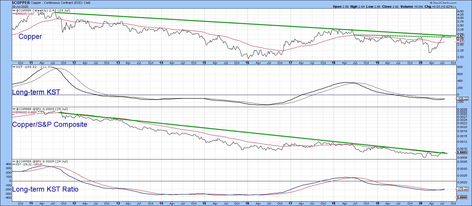 Chart 6
Editor's Note: This is an article that was originally published in Martin Pring's Market Roundup on Thursday, July 30th at 5:40pm ET.
Good luck and good charting,
Martin J. Pring
The views expressed in this article are those of the author and do not necessarily reflect the position or opinion of Pring Turner Capital Group of Walnut Creek or its affiliates.