| THIS WEEK'S ARTICLES |
| Market Roundup |
| Upside Break by Copper also Has Implications for the CRB Composite and the Economy |
| by Martin Pring |
They say Copper is reputed to have a Ph.D. in economics because of its ability to predict turning points in the global economy. That arises because of copper's widespread applications in most sectors of the economy, from homes and factories to electronics and power generation. The implication from rising copper prices is, therefore, positive for the global economy. This week, the price broke out from a recent trading range, as did a couple of copper-related ETFs. The breakouts in and of themselves are not that big of a deal. When considered under the context of longer trends, though, they take on greater significance, since they add support to the view that the price of the red metal is in a primary bull market. That fits in very nicely with the current Stage III phase of Pring Turner's Six Stage business cycle analysis cycle, which you can about here.
Chart 1 sets the scene with this week's breakout above the July/October resistance trendline. This move is also being supported by the short-term KST in the lower window, which suggests that it has further to run.
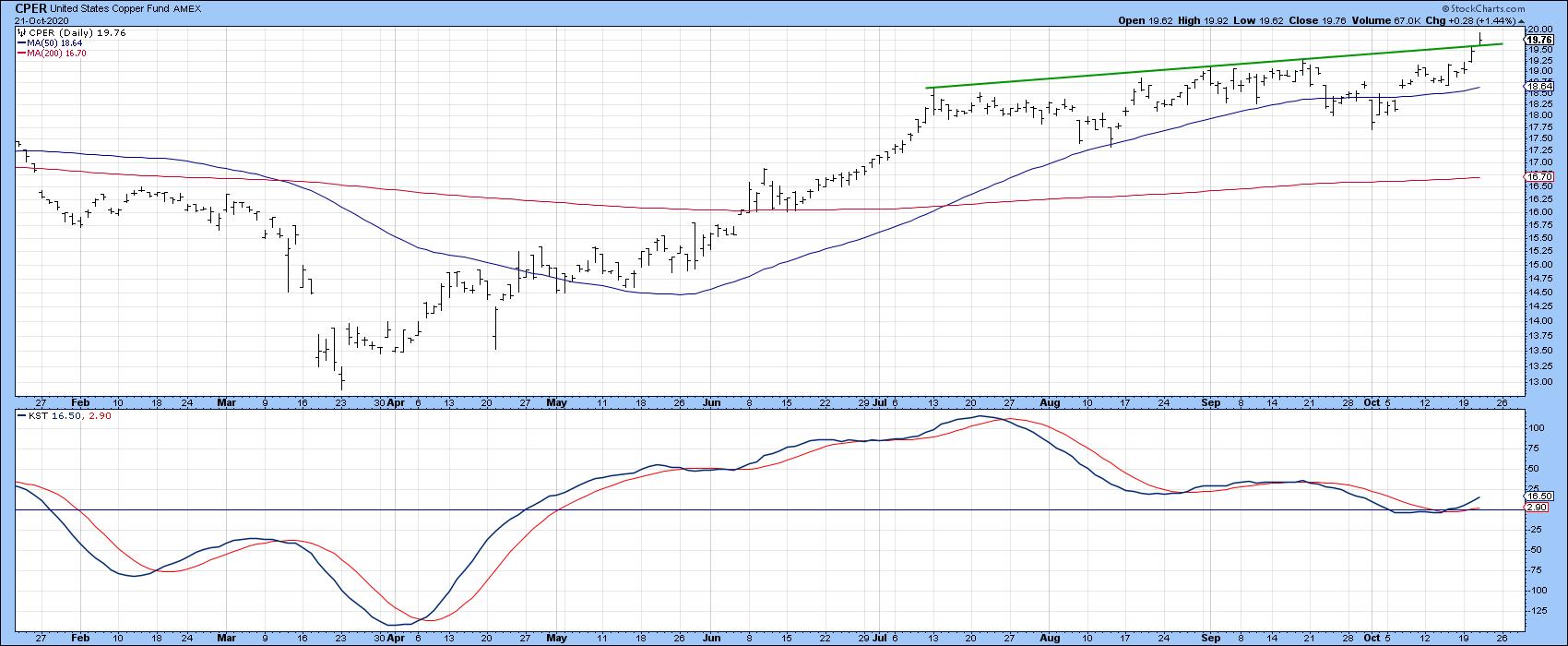 Chart 1 Chart 1
Chart 2 shows where this move fits into the big picture, as it reinforces the previous breakout above the 2011-2020 down trendline for both the price and its 9-month ROC. Note that the price is also comfortably above its 12- and 24-month MAs. The 12-month ROC is right at a major long-term resistance trendline. If this week's breakout on the daily chart is valid, it will also result in a 12-month ROC trendline violation, thereby transitioning Chart 2 into a fully bullish mode.
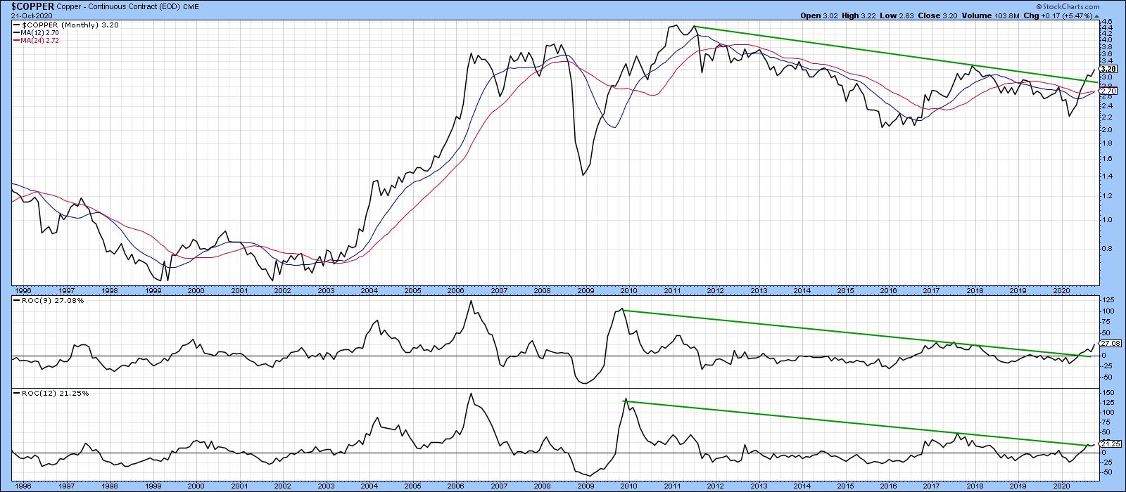 Chart 2 Chart 2
Evidence supporting the idea of a valid break is being given by Charts 3 and 4. Chart 3 features the Global X Copper Miners ETF (COPX), where we can see the price clearing its 50-day MA and small green resistance trendline at a time when the KST has just gone bullish. It's true that the 9-day RSI is overbought, but, as you can see from the June-August period, the bull market protected the price from suffering that much from an overstretched reading. In effect, this failure to trigger a more serious decline is a characteristic of a bull market.
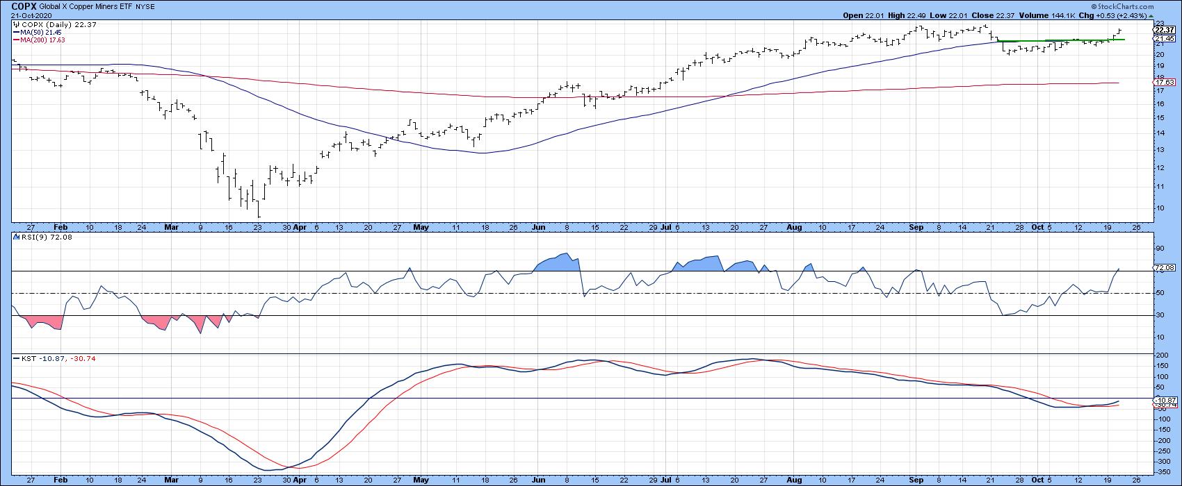 Chart 3 Chart 3
Chart 4 offers some longer-term perspective, with the absolute price and long-term KST in the upper two windows. The relative action of COPX is featured in the lower two windows. You can see that both KSTs have gone bullish and the absolute and relative lines have penetrated down trendlines, clearing their respective 65-week EMAs.
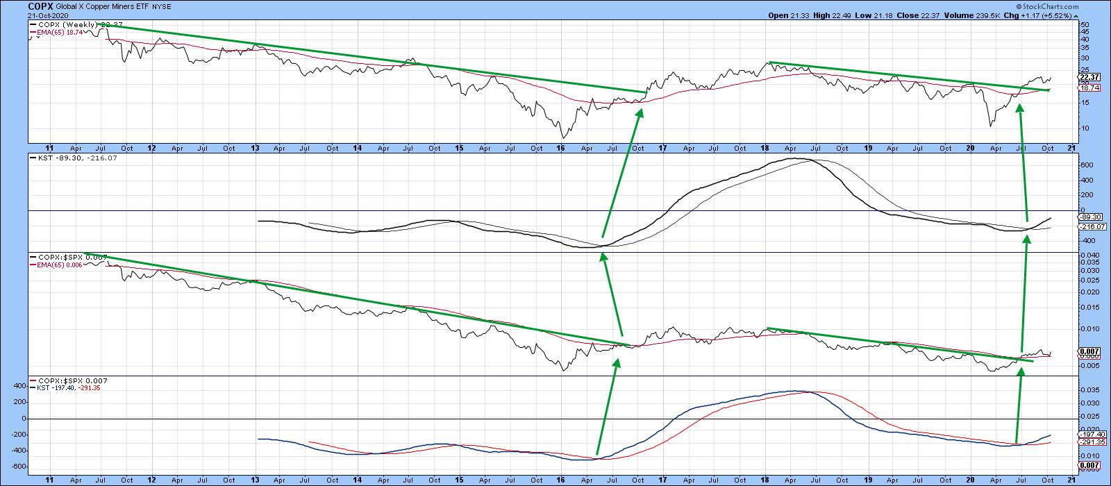 Chart 4 Chart 4
Given the close connection between the shares and copper price, as featured in Chart 5, it seems likely that copper will continue to work its way higher.
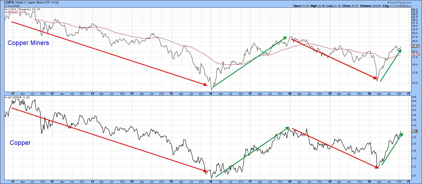 Chart 5 Chart 5
Copper may be one commodity, but Chart 8 indicates that swings in its price closely reflect those for the CRB Composite, a broad measure for the whole commodity market. Remember, commodity price trends are also a market-to-market economic indicator. The green-shaded areas tell us that, when the copper long-term KST is above its 9-month, it's typically bullish for the CRB. Two gray-shaded instances, in 1997 and 2006, warn us that this is not an infallible relationship. Even here, though, the CRB did not experience much of a drawdown.
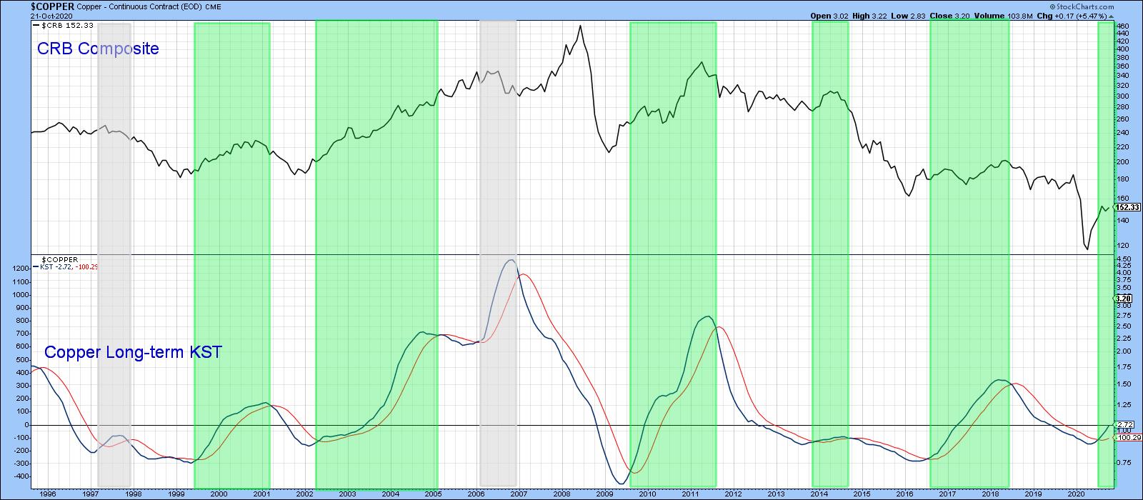 Chart 8 Chart 8
Editor's Note: This is an excerpt of an article originally published in Martin Pring's Market Roundup on Wednesday, October 23rd at 5:35pm ET. Click here to read the full article, which includes charts 6-7 and a discussion of the Chile Capped ETF (ECH) and its relation to copper.
Good luck and good charting
Martin J. Pring
The views expressed in this article are those of the author and do not necessarily reflect the position or opinion of Pring Turner Capital Group of Walnut Creek or its affiliates.
|
| READ ONLINE → |
|
|
|
|
|
| The Mindful Investor |
| Three Takes on the Presidential Cycle |
| by David Keller |
 This past Monday, I asked three experts on the Presidential Cycle - Bruce Fraser, Jeff Hirsch, and Tom McClellan - to share their take on market trends around the election season. They delivered in a big way, and the result was a masterclass in how to learn from market history. This past Monday, I asked three experts on the Presidential Cycle - Bruce Fraser, Jeff Hirsch, and Tom McClellan - to share their take on market trends around the election season. They delivered in a big way, and the result was a masterclass in how to learn from market history.
In the end, I learned that the four-year Presidential Cycle is just one of many cycles, from the ten-year cycle to the traditional 12-month seasonal cycle. I learned that a key data point is whether an incumbent party wins a second term or if the White House changes hands. I learned year-end tends to be strong regardless of who wins in November.
Here are my three main takeaways from this week's panel, The Presidential Cycle: A Technical Perspective.
First, election years overall tend to be pretty bullish.
Tom McClellan shared this chart, which shows the average price pattern for the US equity markets over the four-year election cycle.
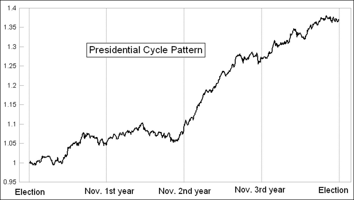
The first two years after the Presidential elections tend to be choppy, while years three and four tend to be more constructive, with the third year the strongest of them all.
The election year strength makes sense anecdotally, as the expectation is the current President would do everything they can to buoy the markets going into the elections. The year after an election is when a new President is most likely to pass new legislation unfavorable to the markets.
Second, November and December tend to be strong no matter what.
Jeff Hirsch's chart of the election year pattern showed that whether or not the incumbent party wins, the period from election day to year-end tends to be strong.
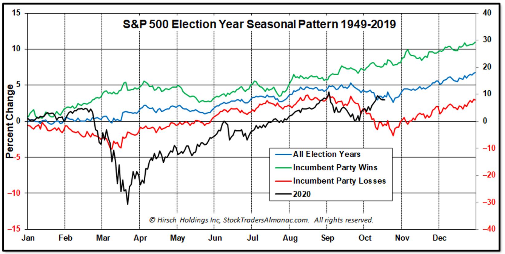
This means that the normal seasonal tendencies of strength starting in November are more at play here than some sort of reaction to the elections. A new President wouldn't put anything in motion until the new year, and this leaves the markets to trend higher overall.
Finally, there are many cycles at play here, from the seasonal cycle all the way to the 10+ year cycles.
Bruce Fraser walked through the decennial cycle and what tends to happen in years that end in zero. How does that relate to the four-year cycle?
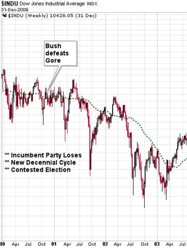
As we walked through the elections in 2000, 1980 and 1960, I was struck at how few observations we have of some of these overlapped cycles. Does that mean the information is less relevant? Not necessarily. Some of my favorite conversations with successful investors have been about how the current market relates to historical precedents. How does this particular top relate to other tops? How does this correction compare with other corrections in history?
While this allows for a more anecdotal review of the data, I think these discussions are helpful in examining how conditions are similar or different from previous events. This election may be uncharted territory (pun intended) for many reasons. But we can always see how the markets have fared around other elections, and that, in my opinion, is time well spent.
Our three panelists shared additional charts on how the year after a Presidential election tends to go, particularly if the incumbent party wins or loses. Also, I asked each for their investment ideas given all of the data we reviewed.
You can see all the additional charts as well as their best ideas on the replay video.
The Presidential Cycle: A Technical Perspective
RR#6,
Dave
David Keller, CMT
Chief Market Strategist
StockCharts.com
Disclaimer: This blog is for educational purposes only and should not be construed as financial advice. The ideas and strategies should never be used without first assessing your own personal and financial situation, or without consulting a financial professional.
The author does not have a position in mentioned securities at the time of publication. Any opinions expressed herein are solely those of the author, and do not in any way represent the views or opinions of any other person or entity.
|
| READ ONLINE → |
|
|
|
|
|
| Trading Places |
| 4 Earnings Reports You Need To Be Watching |
| by Tom Bowley |
Earnings is what we do at EarningsBeats.com. While a lot of traders are hoping, perhaps gambling, that companies they own come through with great results, we're doing our homework to prepare for our next Top 10 Stocks webinar on November 19th. That's when we'll select 10 equal-weighted stocks for each of our four portfolios. Earnings reports play a huge role in that selection process. After a company reports better-than-expected results, I watch to see Wall Street's reaction. Gaps to the upside and downside are common, but usually, after an earnings gap, we'll see a quick reversal to "fill that gap," or return to the previous closing price. The companies that produce great results and gap higher, subsequently NOT filling their gaps, typically do so because the demand is so great that market makers cannot provide enough of their capital to slow the advance. Those stocks tend to be leaders and great performers over the next several weeks. Let's start today's article with 2 such companies that already appear to be in huge demand. Then, I'll give you 2 that I believe will report stellar upcoming results.
Snap, Inc. (SNAP)
I believe internet stocks are going to produce big winners this earnings season, and SNAP certainly became one of those winners this week. After blowing away its revenue and earnings estimates, SNAP has surged 50% in three trading sessions. That's a fairly clear-cut signal that the market needs to revalue this company and is in the process of doing so. Personally, I will no longer be expecting to see a gap fill on SNAP. The major support will now be the TOP of gap support at 34.97:
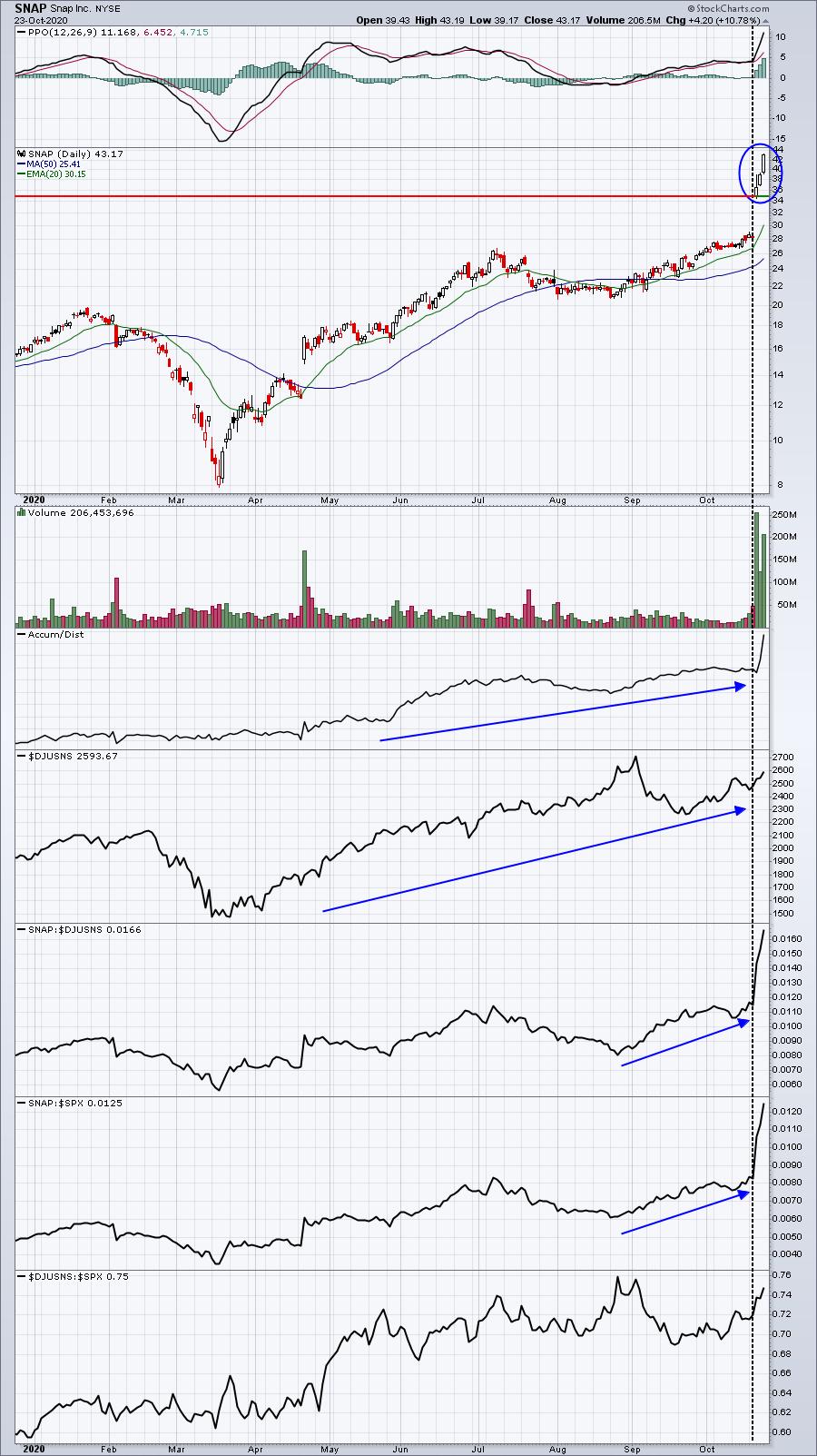
The black-dotted vertical line shows that SNAP was already a leading stock in a leading industry group before reporting blowout results. This latest earnings report just cements its leadership position.
Align Technology, Inc. (ALGN)
Medical supplies ($DJUSMS) had been consolidating just beneath major resistance - that is, until ALGN posted what might turn out to be the most unbelievable beat of earnings season. ALGN was a leader in the medical supplies space before posting EPS of $2.25 per share. Wall Street's consensus estimate was pegged at $.59! ALGN is going higher. My only question is how long it takes to get there:
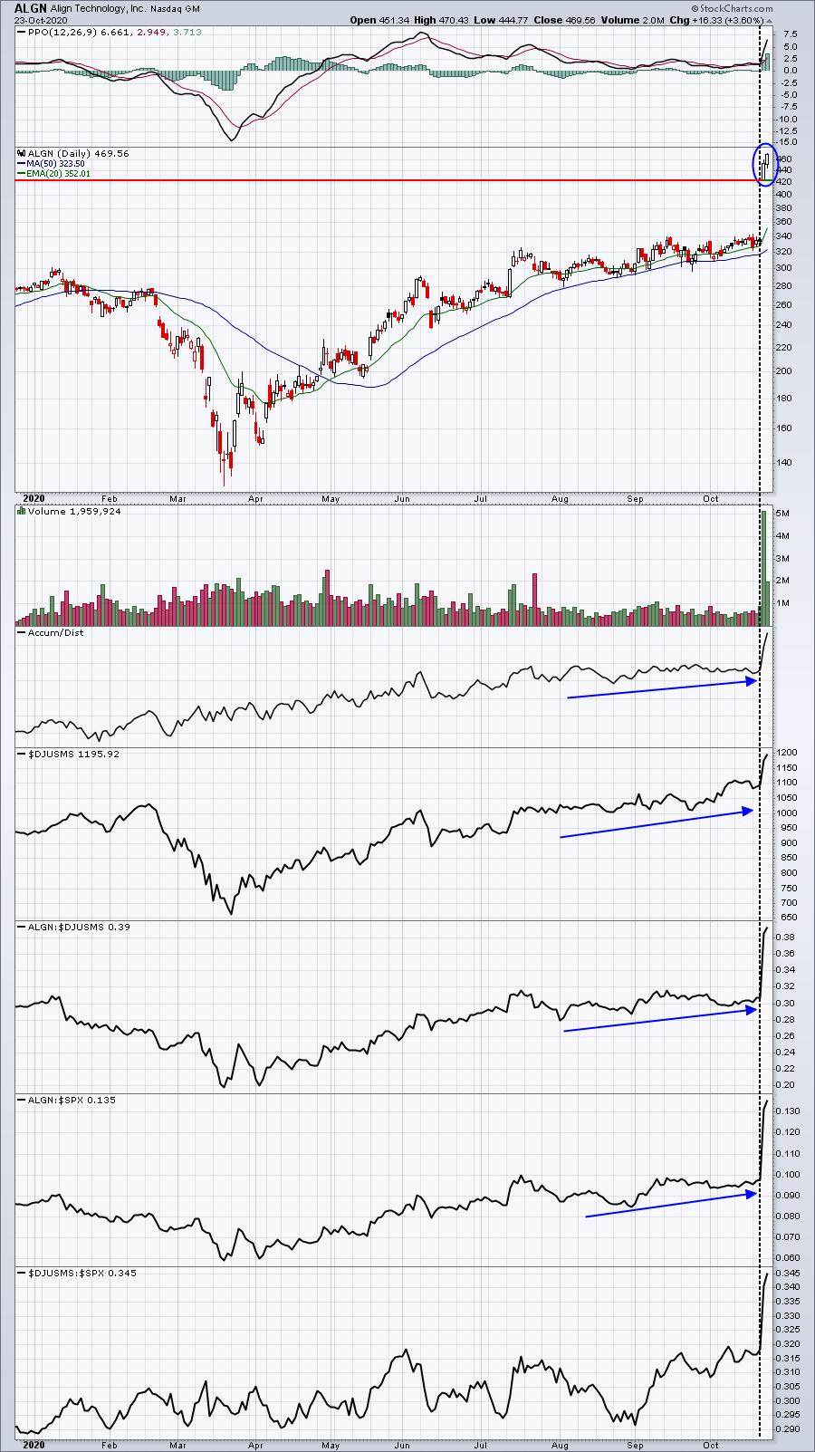
Like SNAP, ALGN was clearly a leader in its space before earnings. But now that these new numbers have been released, there's a major revaluing of the company taking place. The volume that has accompanied both stocks perfectly illustrates the demand for these companies.
As we look ahead, however, who might the next SNAP or ALGN be? What leaders should we be watching? I'm going to give you two names in the software space ($DJUSSW) that report this week. First up is a company reporting after the close on Monday:
Twilio, Inc. (TWLO)
TWLO is a $45 billion software company that provides a cloud communications platform that enables developers to build, scale and operate communications within software applications around the globe. There is no doubt what Wall Street believes: TWLO is a leader in its field. We've been seeing accumulation of the company in recent weeks as its accumulation/distribution line hit a fresh 52-week high within the past week:
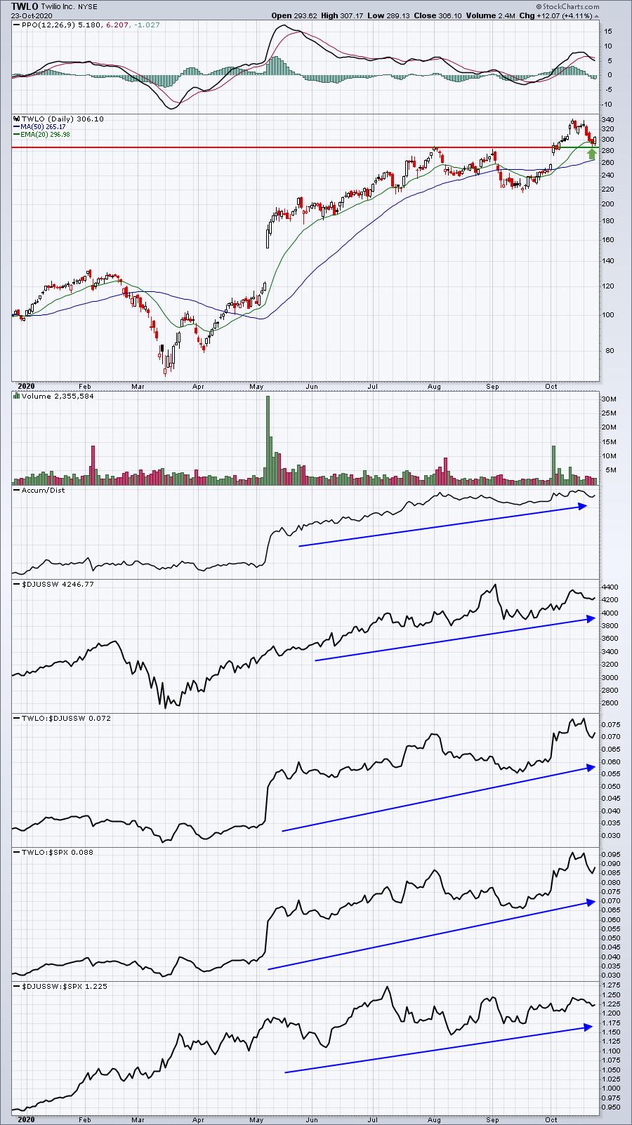
TWLO pre-announced in early October that its revenues would be reported above expectations. I believe we're going to see a solid report, along with raised guidance when TWLO announces its results after the bell on Monday.
Tenable Holdings, Inc. (TENB)
TENB is a much smaller software company with a market cap of $3.8 billion. The company provides cybersecurity solutions across the globe and handily beat expectations when it last reported quarterly results in July. The recent selling has left TENB close to key price support ahead of its Q3 earnings, which will be released on Tuesday after the market closes. I wouldn't be surprised to see a test of recent highs at that time:
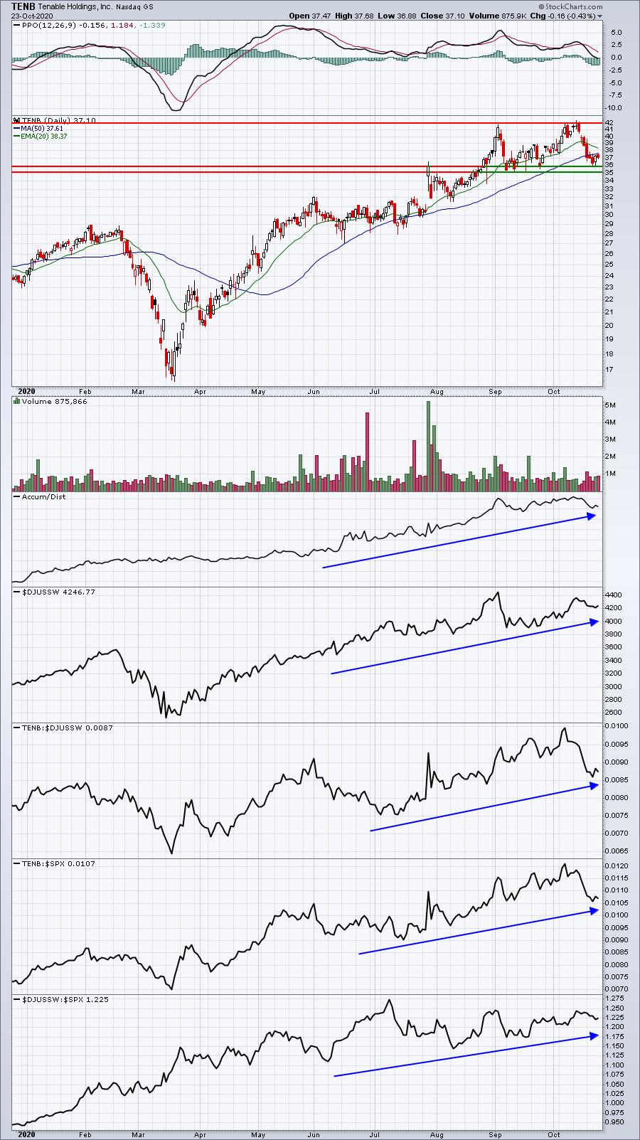
The growth story has taken a back seat of late, but I don't think it's over - not with interest rates still near all-time record lows. Companies that can prove that they're capable of growing revenues and earnings rapidly will command much higher valuations. We've seen that recently with SNAP and ALGN. There will be plenty more to command the same, and TWLO and TENB might be two software companies that fit that mold as well.
As earnings are reported fast and furious, there's no better place to get your earnings-related winners than EarningsBeats.com. Our free newsletter, EB Digest, is dedicated to providing timely information that's educational in nature. Many of our articles provide great trading opportunities as well, focusing on relative strength in addition to great earnings. To start your free EB Digest newsletter subscription, CLICK HERE and simply enter your name and email address. There is no credit card required and you may unsubscribe at any time.
Happy trading!
Tom
|
| READ ONLINE → |
|
|
|
|
|
| RRG Charts |
| Presidential Rotation |
| by Julius de Kempenaer |
 Those of you who follow my blogs and watch Sector Spotlight on StockCharts TV will know that I regularly look at rotations among various asset classes. I talked about that subject in last week's show, focusing on the relationship between stocks and bonds, and I wanted to highlight that ratio in this article as well. Those of you who follow my blogs and watch Sector Spotlight on StockCharts TV will know that I regularly look at rotations among various asset classes. I talked about that subject in last week's show, focusing on the relationship between stocks and bonds, and I wanted to highlight that ratio in this article as well.
Monitoring the Stock/Bond Ratio is Important.
First of all, monitoring the stock/bond ratio is critical because, I think, it is one of the most important high-level decisions that investors need to take. Also, I believe that a lot of (private) investors are not aware of the importance of this relationship or, if they are aware, are not paying enough attention to it. Finally, I think that this relationship has arrived at an important junction at this moment.
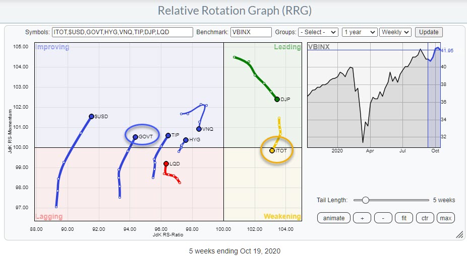
Here is the weekly RRG showing the rotation for all asset classes currently.

Stocks (ITOT) are in the weakening quadrant after rotating through leading for 15 weeks and at a slightly negative RRG-Heading. Government Bonds are on the opposite side, inside improving at a slightly positive RRG-Heading.

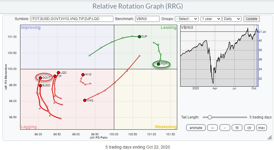
The daily RRG shows ITOT positioned inside the leading quadrant and GOVT inside lagging, at similar headings as they are on the weekly.
These rotations suggest that stocks are taking a breather at the moment, while Bonds are recovering from a period of underperformance.
Comparing Rotations Going into the Elections
However, on both the weekly and the daily versions of the RRG, stocks are at the far right (positive) side and bonds are on the far left (negative) side, with plenty of space to rotate at their respective sides of the graph.
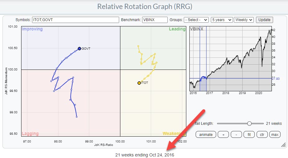
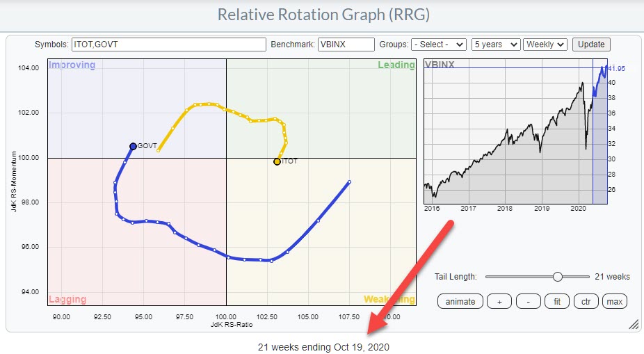
As we are in the final stretch to the US elections, I thought it was interesting to look at the positioning of both asset classes on the RRG at the same time four years ago. To better compare that rotation with the current positioning, I have snapped two images showing only ITOT and GOVT on the RRG, both with a 21-week tail.


As you can see, the positioning and the headings of the tails is largely similar. In 2016, the tails were a bit more irregular on both sides; they were also at their respective sides for a bit longer already.
More differences can be found in the distance from the benchmark on the JdK RS-Ratio axis. In 2016, both asset classes were in much closer proximity than they are at the moment. This gives the tails even more room to rotate now than they had in 2016.
If you click one of the RRGs above (opening the live version of the chart) and press the animate button, you can see how ITOT curled back up from weakening back into leading, and GOVT rotated in opposite direction, after the elections. The current setup certainly allows for enough room to see a similar rotation in coming weeks.
Will the Stock/Bond Ratio Break Higher Like it Did in 2016?
Another thing I wanted to share with you is the similarity that is showing up on the 1-1 comparisons for stocks and bonds at the same time periods.
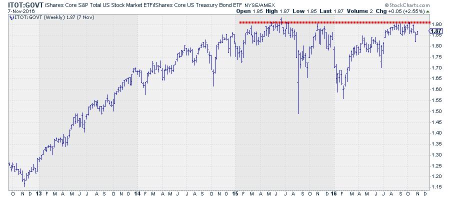
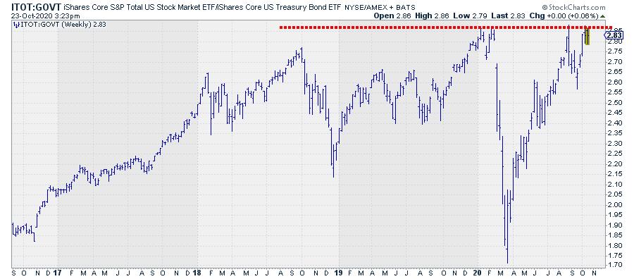
The top chart shows the ITOT:GOVT relationships over four years, ending in November 2016. The bottom chart show the same relationship over the last four years up to today.


What caught my attention is the fact that this ratio was moving more or less sideways, definitely not UP, in 2015 and 2016 (till November). And we seem to have similar situation right now. ITOT:GOVT managed to get only marginally above its 2018 peak at the start of this year, and we are now pushing against that resistance level as we speak.
If we strip away all our knowledge of what exactly we are looking at here and imagine to see just this chart without knowing what it was representing -- just imagine it is some stock in the S&P 500 that did not move much over the past 2-3 years and is now pushing to break to new all-time highs.... -- what would be our call?
For me, that would be eyeing a break of that horizontal 2+ year barrier as the start of a serious move higher.
The fact that we are dealing with a major relationship in financial markets, with potentially a big impact on markets for months to come, should not blur the judgement..
Coming back to reality and knowing what it is we are looking at, I think the markets could be in for another big move in favor of stocks over bonds when this ratio breaks above its early 2020 peaks. The RRG certainly leaves enough room between ITOT and GOVT to allow for such a rotation.
Please #Staysafe and have a great weekend,
--Julius
My regular blog is the RRG Charts blog. If you would like to receive a notification when a new article is published there, simply "Subscribe" with your email address.
|
| READ ONLINE → |
|
|
|
| SPECIAL EVENT ANNOUNCEMENT |
| Don't miss your chance to hear our own David Keller at the upcoming MoneyShow Virtual Event, streaming LIVE October 27th - 29th. Click the banner below to learn more and register for the event. |
 |
| LEARN MORE → |
|
| The MEM Edge |
| These Leading Stocks Are In Bullish Positions After Reporting Strong Earnings |
| by Mary Ellen McGonagle |
While only a quarter of S&P 500 companies have reported 3rd quarter earnings so far, the number of companies beating EPS estimates is near record highs. And, for the most part, investors are rewarding these companies – particularly if they are signaling earnings growth into next year.
My many years working with William O'Neil has ingrained in me the fact that earnings are the primary driver of a stock's upward move. And, when you combine strong earnings with an attractive chart, you're well on your way to choosing a winning stock.
Today, I'm going to share with you 2 stocks that have reported strong earnings, are poised for continued growth into next year and have attractive charts.
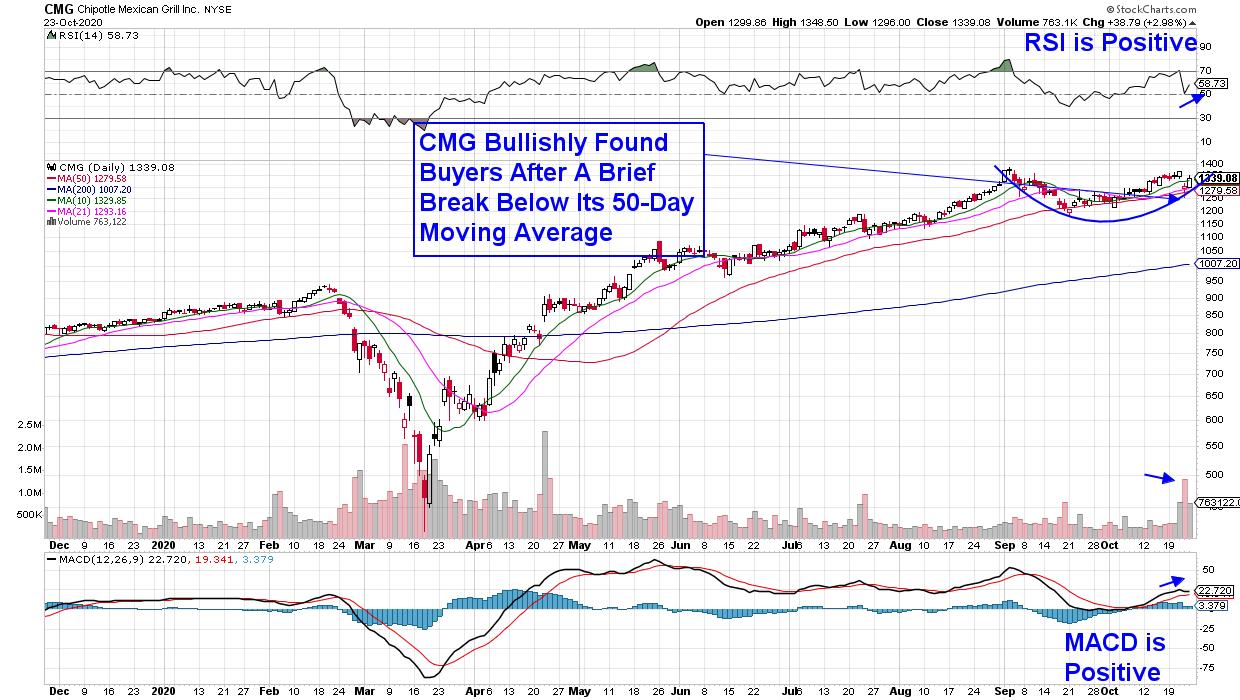
Chipotle Mexican Grill (CMG) reported 3rd quarter results that were above estimates, and it was the company's 202% increase in digital sales that really wowed Wall Street. This ability to shift to online sales, while also increasing menu prices to offset delivery costs, is one of many initiatives CMG has made over the last 2 quarters to help improve growth.
With analysts calling for 94% earnings growth for 2021, the company is one of the few that's on track to emerge from the pandemic stronger than before it.
DAILY CHART OF CHIPOTLE MEXICAN GRILL, INC. (CMG)

CMG stock dropped immediately after its 3rd quarter report as same-store sales were a bit lower than elevated expectations; however, a brief break of the stock below its 50-day moving average bought a slew of buying, and the stock bullishly closed the day back above this key moving average.
CMG also bullishly closed the week back above its shorter-term 10-day moving average on volume. A base breakout above $1,385 would be even more positive for Chipotle.
DAILY CHART OF QUEST DIAGNOSTICS INC. (DGX)

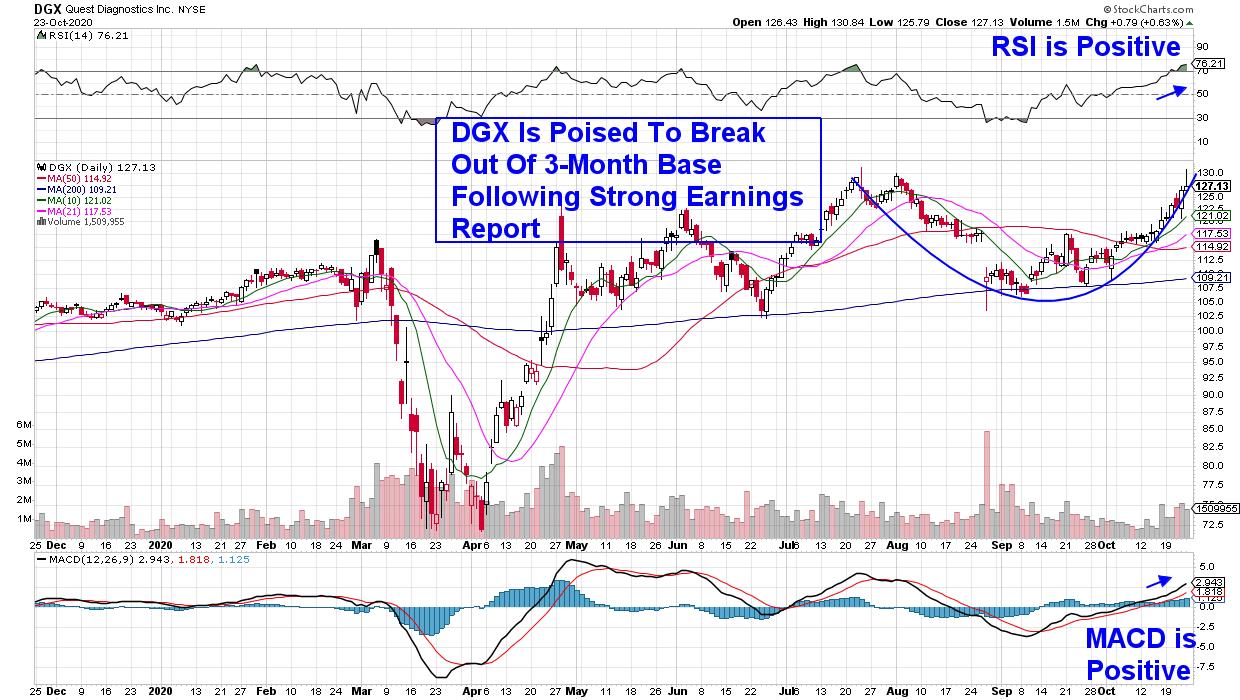
Quest Diagnostics (DGX) posted record earnings and sales for their 3rd quarter, as the maker of COVID-19 tests has performed the most tests of any provider. The good news is that the company raised guidance for the remainder of this year, primarily because of the recovery in their non-COVID-related businesses.
Last month, the company announced a partnership with Walmart (WMT) to test drone delivery of COVID-19 tests, which is in addition to innovations in their testing methods that have allowed students to return to the classroom and workers to return to work. The stock is poised to break out of a 3-month base, and a break above $132 would be quite bullish for DGX.
Next week, earnings season really heats up, with most of the major FAANMG stocks due to report their 3rd quarter results. The earnings releases of these heavyweight stocks can have quite an impact on the markets and you'll want to be closely watching results.
Two of these mega-cap FAANMG stocks look very bullish going into next week and I anticipate adding them to my MEM Edge Report Suggested Holdings List should their results be positive. If you'd like to be alerted to these stocks, as well as received detailed insights into the market's current position, take a 4-week trial of my bi-weekly report for a nominal fee.
This report has been helping investors navigate the recent volatility by providing sector and market insights not found elsewhere. Use this link to see a sample report!
Warmly,
Mary Ellen McGonagle - MEM Investment Research
|
| READ ONLINE → |
|
|
|
| MORE ARTICLES → |
|
 Chart 1
 Chart 2
 Chart 3
 Chart 4
 Chart 5
 Chart 8

 This past Monday, I asked three experts on the Presidential Cycle - Bruce Fraser, Jeff Hirsch, and Tom McClellan - to share their take on


 Those of you who follow my