| THIS WEEK'S ARTICLES |
| John Murphy's Market Message |
| SPIKE IN BOND YIELDS PUSHES STOCKS LOWER |
| by John Murphy |
10-YEAR YIELD REACHES 1.50%... The 10-Year Treasury yield is spiking above 1.50% today for the first time in a year. The size and speed of the yield advance is putting downside pressure on stocks, and technology stocks in particular. Chart 1 shows the Invesco QQQ Trust trading below its 50-day average. A close below that support line could signal a deeper market pullback. While all stock indexes are trading sharply lower, the tech-dominated Nasdaq market is leading the retreat. All eleven market sectors are down with the biggest losses in consumer cyclicals and technology. Chart 2 shows the S&P 500 heading for a possible test of its 50-day average. Value stocks that have been benefiting from a rotation out of technology shares are also losing ground today.
 Chart 1 Chart 1
 Chart 2 Chart 2
|
| READ ONLINE → |
|
|
|
| ChartWatchers |
| This Time-Tested Theory is Screaming To Buy NOW |
| by Tom Bowley |
I know it was a rough week last week; I only need to take one look at my own portfolio to figure that out. But the stock market doesn't go up in a straight line. There will ALWAYS be pullbacks. But be careful which "stories" you listen to.
The Reddit folks, as powerful as they may seem to be, won't take this market down. The stock market is much too big for a large number of smaller retail investors. Higher-than-normal PE ratios won't take this market down either. Rapidly-accelerating earnings growth in a very high GDP year with historically-low interest rates will keep a floor under stock prices. A short-term rise in treasury yields won't take this market down. There is a very strong positive correlation between the direction of treasury yields and the direction of the S&P 500. Rising yields mean that bonds are being SOLD, the proceeds of which are then available to drive equity prices higher. You need to ask yourself this question: Why would bonds be sold?
While that could depend on a number of factors, the common answer is the expectation of economic strength ahead. If the economy is expected to strengthen, the LAST thing you want to do is sell stocks. Yet we just saw the NASDAQ 100 ($NDX) tumble 4.94% last week, its second worst week since the bottom formed in March 2020.
There was one common denominator when looking at both weeks, however. They both occurred the week after options expired and during the historically-bearish calendar week of the 19th to 25th. Here are the S&P 500's historical daily returns by calendar day of the month:
- 19th: -33.69%
- 20th: -8.52%
- 21st: +3.23%
- 22nd: -11.07%
- 23rd: -5.14%
- 24th: -0.30%
- 25th: -6.58%
Considering that the S&P 500 has returned roughly 9% per year since 1950, the annualized returns above ALL fall below this average return. That's 7 consecutive calendar days of underperformance.
Given this information, now let's look back at those two bad weeks since the March low.
The NASDAQ 100 lost 4.94% from February 22nd through February 26th. The only worse week was October 22nd through October 26th. Those same calendar days did it again. One thing we have to at least consider is that much of this selling very well could be attributable to options expiration. Throw in profit-taking and fear-mongering by the media (rising yields) and the result was a 5% drop.
Instead of running scared after a much overdue pullback, how about we consider one of the biggest long-term truths relating to stock market performance?
The Dow Theory
Charles Dow developed a very basic and fairly easy-to-follow approach to trading: the Dow Theory. It centered upon the theory that the stock market, as a whole, was a reliable measure of overall business conditions within the economy and that, by analyzing the overall market, one could accurately gauge those conditions and identify the direction of major market trends and the likely direction of individual stocks. A major part of the Dow Theory discusses the significance of indices confirming one another. Dow used the Dow Jones Industrial Average ($DJI) and Dow Jones Transportation Average ($TRAN) as two key indices to follow. Industrials would be a great way to assess economic activity and transports like railroads should profit from moving the freight. It's a very simple, yet brilliant approach to determining the sustainability of an uptrend, in my view.
Let's take a current look at these two indices:
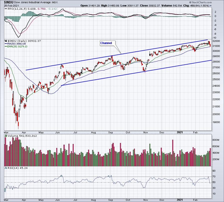
Dow Jones Industrial Average ($DJI):

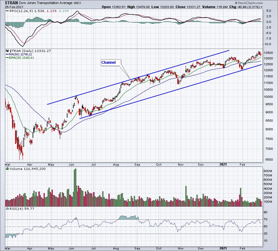
Dow Jones Transportation Average ($TRAN):

Both are channeling higher and both set all-time highs on Wednesday of this week. I believe they both reflect the likelihood that our economy will expand rapidly in the second half of 2021. Therefore, buying U.S. equities during pullbacks makes very good sense to me.
I'll be focusing on companies poised to take advantage of a strengthening economy in our 3x per week EB Digest newsletter. It's completely free with no credit card required. If you'd like to join our growing community of knowledgeable traders, simply CLICK HERE to provide your name and email address.
Happy trading!
Tom
|
| READ ONLINE → |
|
|
|
| ChartWatchers |
| When the Tails are Diverging, Opportunities Arise |
| by Julius de Kempenaer |

Last week, Friday 2/19, Tom Bowley invited me to be his guest in a webinar he did with EarningsBeats.com.
Of course, I talked about RRG in general and we applied it to international markets, crypto-currencies and US sectors. All good fun. After I presented my bit on sectors using the usual RRG for US sectors (SPDRs sectors family), Tom focused on small caps and he showed an RRG for small-cap sectors...
Wow!!! Call me ignorant, but I was not aware that that series of small cap sector ETFs existed. But when I saw it, it immediately set my creative mind off racing for ideas on how to use this setup and add it to the analytical mix.
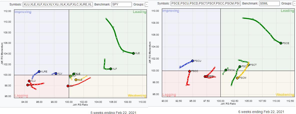
The image at the top of the article shows the RRG for the S&P 500 large-cap sectors at the left and small-cap sectors at the right. The only difference at a universe level is the fact that the small cap sectors do not have Communication Services in there; they are included in Technology. And Real-Estate is part of Financials. So the count for small-caps comes to 9 and large caps to 11, as we know.
This setup gives us a great opportunity to watch the rotations for the various sectors, large vs. small, side by side and see if their tails are following a similar path or if they are on a different track. The ones where the tails for the large cap and the small cap sectors are following a similar trajectory are less interesting. When these trajectories are diverging, that's when opportunities arise.
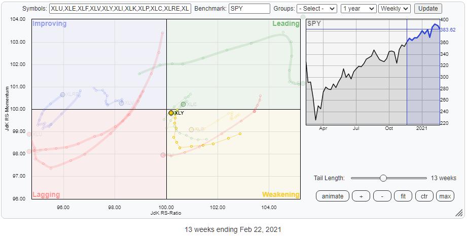
A good example of such an occurrence can be found for the Consumer Discretionary sector.

The tail for XLY is rotating through the weakening quadrant. Until a week ago, the sector was on its way back up to the leading quadrant, but last week the tail made a nasty move to the left towards the lagging quadrant. When TSLA and AMZN both have a bad week, the sector has a bad week.

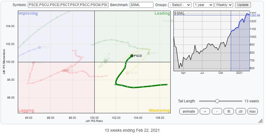
How different does the tail look on the RRG for small caps? The rotation through weakening has ended and PSCD is back inside the leading quadrant and moving higher on bot axes, pushing the sector further upward into positive territory. The different trajectories of these rotations indicate a clear preference for PSCD over XLY at the moment.
When you add this set of ETFs to your trading universe, it allows you to make the sector allocations in your portfolio even more precise by differentiating between large caps and small caps in the same sector.
There are more things to say about this combination of universes and I am planning to discuss that in next week's episode of Sector Spotlight. So make sure you tune in at 10:30am ET Tuesdays on StockCharts TV, or catch up with it on demand or on YouTube.
Y'all have a great weekend and #StaySafe, --Julius
My regular blog is the RRG Charts blog. If you would like to receive a notification when a new article is published there, simply "Subscribe" with your email address.
|
| READ ONLINE → |
|
|
|
|
|
| ChartWatchers |
| Nasdaq Rotates Toward Bearish Phase |
| by David Keller |
I recently tweeted the three steps for the S&P to signal a rotation from bullish phase to bearish phase, especially on the tactical time frame. After taking some time to digest this week's distribution, I wanted to update that thesis with a four step "bull market top" signal for the Nasdaq.
While the news flow this week was all about rising interest rates, inflation concerns, Fed policy and stimulus debates, my focus as a technical analyst is trend. As a matter of fact, I am confident that investors should strive to have three goals at all times:
- Identify trends
- Follow those trends
- Anticipate when those trends may be exhausted
The fundamental, economic and geopolitical reasons as to why trends emerge usually appear very clear in the rearview mirror. Or, as a former colleague of mine always used to say, "The technical lead the fundamentals."
When I look at the last year, it's hard to find a better example of consistent outperformance than the Nasdaq Composite Index. This represents the types of "new economy" names that investors have been flocking to and sticking with during the recent bull market phase.
How do we anticipate when this long uptrend is exhausted? Well, the technical toolkit can really be separated into three buckets. Leading indicators, like RSI, are meant to signal before an inflection point and indicate an exhaustion of the previous trend. Concurrent indicators, like Fibonacci retracements and cycle analysis, attempt to identify specific price and time combinations of a turn. Lagging indicators, like moving averages, confirm once the trend has already reversed.
Let's look at the chart of the Nasdaq Composite using a leading indicator like RSI.

A healthy uptrend will show higher highs in price as well as higher highs in momentum. As the price moves ever higher, the RSI should continue to push higher as well. But toward the end of a bullish trend, you'll often see a bearish divergence, with higher prices and lower RSI.
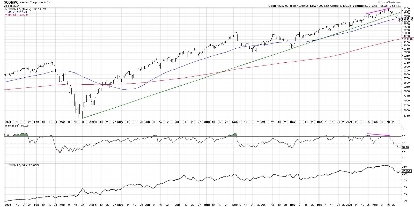
The pink lines show the recent phenomenon where the January and February highs have increased, while the RSI is sloping downwards over the same period.
You may ask, "Did we get a bearish divergence like this in January and February 2020?" and the answer is, "Absolutely we did."
Disclaimer: As with all technical indicators, this is not 100% effective. Look at June 2020 and you'll find another example of higher prices and lower RSI. This is why a divergence is not a signal on its own in my process, but rather puts the chart on a watchlist for potential breakdown. Then it's all about price itself and whether you see a downside follow through.
If we draw a trendline starting with the March low and connect it to the next major low in October, that connects beautifully with the late January low. Monday's selloff pushed the Nasdaq below this trendline, which is the first of three price confirmations.
Next, we go to the 50-day moving average, which is a classic pullback opportunity. To put it another way, stocks in long-term uptrends often revert back to this smoothing mechanism in periods of short-term weakness. Many institutional investors use the 50-day moving average as a quick line-in-the-sand to determine whether a long-term uptrend will hold. Two of the five closes this week were indeed below the 50-day.
Finally, we have recent price support. As long as a chart is making higher highs and higher lows, the trend is positive by definition. A break to a new swing low indicates the uptrend is exhausted and confirms a new downtrend. This is the last step in the four steps, and the Nasdaq spent two days this week bouncing off this key support level.
So here's the recap of the four steps in a classic bear market top, adapted to the current chart of the Nasdaq Composite.
- Bearish divergence with RSI (pink lines)? DONE.
- Price breaks through trendline support (green line)? DONE.
- Price breaks through 50-day moving average (blue line)? DONE.
- Price breaks through recent swing low (purple line)? Not yet.
The Nasdaq has triggered three of the four steps, with the last remaining step looming large as the markets reopen on Monday. I will certainly be watching to see if this final step is achieved, signaling a strong potential for further price weakness and rotation away from the long-term outperformance of the Nasdaq Composite.
RR#6,
Dave
David Keller, CMT
Chief Market Strategist
StockCharts.com
Disclaimer: This blog is for educational purposes only and should not be construed as financial advice. The ideas and strategies should never be used without first assessing your own personal and financial situation, or without consulting a financial professional.
The author does not have a position in mentioned securities at the time of publication. Any opinions expressed herein are solely those of the author and do not in any way represent the views or opinions of any other person or entity.
|
| READ ONLINE → |
|
|
|
|
|
| ChartWatchers |
| One Key Signal That It's Time to Sell Your Stock |
| by Mary Ellen McGonagle |
Every bull market cycle has its set of big, winning stocks – companies with strong fundamentals and increasing mutual fund sponsorship which helps propel these select stocks higher for huge gains. These leading names don't go up forever however, and it's important to know when to sell your stock – either to take profits or to keep your losses to a minimum.
Let's review why a stock's run might end. To begin, there may be a rotation away from the industry group or sector that your stock is a part of. Currently, we're seeing a sharp rotation away from Technology and into "recovery" stocks that would benefit from increased vaccinations and a more mobile population.
Rotation alone doesn't mean you should sell, however. Last week, Semiconductor stocks fell over 5%, yet there are select stocks in this group with very constructive charts. Subscribers to my MEM Edge Report are aware of these names as they remain on our Suggested Holdings List.
Broader market bias will also have a hand in whether you should ditch your stock and wait for better times, and it's important to have a strong idea of where the market's area of support is and whether it's been broken.
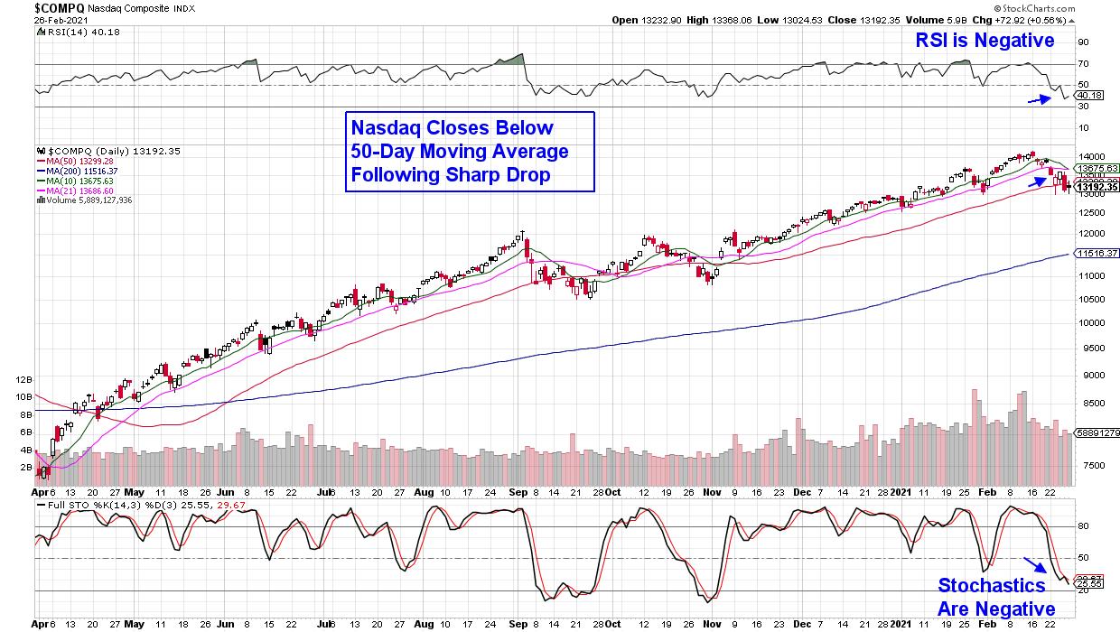
DAILY CHART OF NASDAQ COMPOSITE INDEX ($COMPQ)

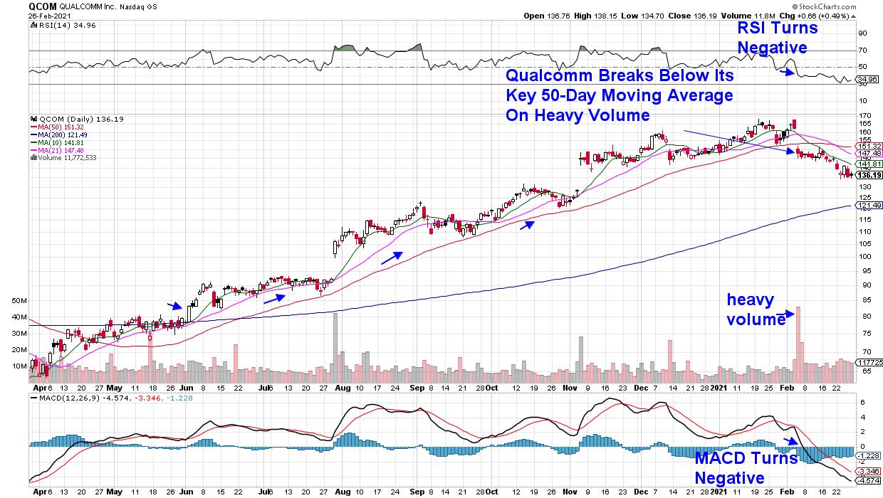
But when reviewing your individual holdings, you'll want to be on the lookout for signs of heavy institutional selling which will be signaled by above average volume. Volume alone won't tell the story, however. If the stock breaks below its 50-day moving average in heavy volume and can't rally back above it by week's end, it's a signal that buying demand is drying up and the stock's run may be ending.
These institutions can take weeks to unload their position, and it's a good idea to sell your stock if it breaks below this key level as, historically speaking, more downside is likely ahead.
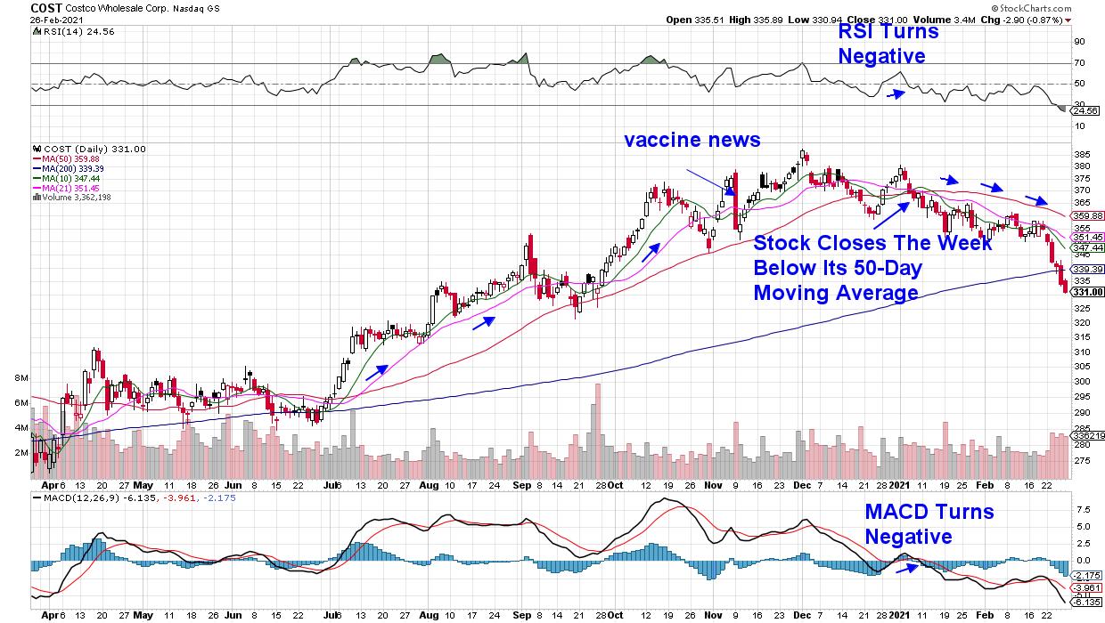
DAILY CHART OF COSTCO WHOLESALE CORP. (COST)

Above is a daily price chart of Costco (COST) and the stock was a big winner during mandated lockdowns that had people doing massive buying at one store both online and at Costco locations.
The first sign that investor's may have shifted their high-growth outlook for the company came with a sharp drop on November 9th, when Pfizer announced their vaccine. The confirming signal that Costco's run ended was its early January break below its key 50-day moving average (red line). Once the stock closes below this 50-day moving average, this moving average becomes upside resistance at lower and lower levels as the stock declines.
DAILY CHART OF QUALCOMM INC. (QCOM)
A more recent example is Qualcomm's break below its key 50-day moving average on very heavy volume earlier this month. The move was following the company's quarterly earnings results, which were positive; however, Wall Street had a mixed view of QCOM's outlook going forward. Since that time, analysts have been revising their earnings estimates lower for both this year and next as capacity constraints may limit their revenue growth.
Both Costco (COST) and Qualcomm (QCOM) were big winners for subscribers to my MEM Edge Report before we removed them from our Suggested Holdings List after a break below their key 50-day moving average. Not all the news is negative out there, however, as many recovery stocks are currently in strong uptrends. Unlike Costco, most of these stocks rallied on the positive vaccine news in November, and they're now breaking out of 14-week bases.
If you'd like to be kept up to date on whether it's safe to buy new positions or whether the markets are headed lower, take a 4-week trial of my bi-weekly MEM Edge Report for a nominal fee. Last week, subscribers received Alert reports throughout the week advising them on the broader markets as well as select stocks.
Warmly,
Mary Ellen McGonagle
MEM Investment Research
|
| READ ONLINE → |
|
|
|
| The Canadian Technician |
| Large Cap Tech Drifts Lower |
| by Greg Schnell |
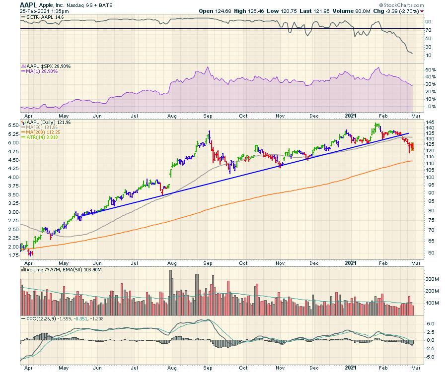
Based on how strong the stock market has been, you'd think large-cap tech was still controlling the pace of play.
It seems almost remarkable that Apple (AAPL), with its massive buyback program, can be approaching the 200-DMA. More importantly, it has round-tripped the last three months while the indexes have been making higher highs. And this is on the back of the various good news; becoming the top phone again, the car manufacturing discussions, some massive app store Pizzo fees, and the growth of the Apple Watch. How is this possible? Perhaps the price of the stock was pricing in all this good news while the economy was getting back on track? Now that the economy looks ready to resume with successful COVID vaccines, paying extremely high historical multiples for Apple doesn't seem that good anymore? It really is a unique question to ask. Why is Apple leading the market lower?

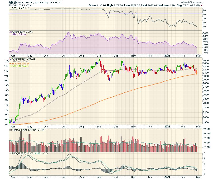
Then we have Amazon (AMZN). SCTR rank of 10! The world's biggest online retailer, hitting the 200-DMA today.

That AMZN chart seems remarkable, yet price action is real. It has wiped out the gains from November!
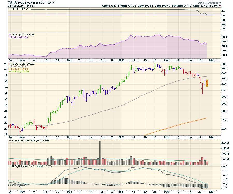
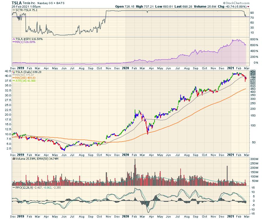
We've all seen the $100 downdraft on Tesla (TSLA), with ARK Investments hitting the buy button hard in the $600's. Today it is trying to hold the $700 level again. The 200-DMA is a long way away at $450. The SCTR ranking is also showing the first signs of weakness.

Is it time to take the Tesla weakness seriously? Check out the SCTR since 2019.

While GOOGL and MSFT look better, these three newsy names look damaged. Caution out there.
|
| READ ONLINE → |
|
|
|
| MORE ARTICLES → |
|
 Chart 1
 Chart 2

