| THIS WEEK'S ARTICLES |
| John Murphy's Market Message |
| 10-YEAR YIELD IS SPIKING OVER 1.60% AND MAY BE HEADING TOWARD 2.00% |
| by John Murphy |
10-YEAR YIELD EXCEEDS 1.60%...After a modest consolidation, bond yields are spiking again. The daily bars in Chart 1 show the 10-Year Treasury yield climbing 10 basis points to 1.63% which puts it at the highest level in more than a year. The weekly bars in Chart 2 put that upside breakout in better perspective and shows the TNX heading toward the top of a previous consolidation pattern formed during the second half of 2019. The top of that previous pattern ranges from 1.95% to 1.97%. That suggests that the TNX could approach 2% before running into some potential chart resistance. Today's spike is having a mixed effect on stock prices.
STOCKS ARE MIXED...The Dow is trading in record territory while the tech-dominated Nasdaq market is under pressure. Large tech growth stocks are especially vulnerable to rising yields. At the same time, value stocks continue to gain ground. Two groups in the black today are industrials and financials. Financials, and banks in particular, which are big beneficiaries of rising bond yields and a steepening yield curve are in record territory. Industrials, which are also hitting a new record, are being led higher by airlines and aerospace. The Dow Transports are also hitting a new record as are small cap stocks. Rate-sensitive tech stocks are the day's weakest sector. Six sectors are in the black with five losing ground. The day's three weakest sectors are technology, communication services, and consumer discretionary.
 Chart 1 Chart 1
 Chart 2 Chart 2
|
| READ ONLINE → |
|
|
|
| ChartWatchers |
| Rising Inflation: It's Coming, But What Impact Will It Have on US Equities? |
| by Tom Bowley |
At the time of my last ChartWatchers article two weeks ago, the 10-year treasury yield ($TNX) had just closed at 1.46% after reaching an intra-week high at 1.61%. Well, we didn't stop there. The TNX had a big day on Friday, gaining nearly 11 basis points and closing at 1.64%, our highest since we closed at 1.65% on February 5, 2020, which was just a couple weeks before the pandemic-induced U.S. equity selloff began 13 months ago. Personally, I'm of the opinion that bonds are selling and yields are rising because of a tremendous surge in economic activity later this year and simply due to normalization. Yields were artificially low due to the pandemic, and a return to the 2.00%-3.00% level is likely over the course of 2021. However, there's also a large number of stock market participants that believe inflation is on our doorstep and we need to brace for its bearish impact, especially on growth stocks.
So let's take a look at the Core Consumer Price Index ($$CCPI) and then I'll provide you my bearish and bullish interpretations of the chart.
$$CCPI:

Note that the annual rate of inflation has teetered back and forth from 0.6% to 2.9% this century. The Fed's target rate of 2.0% is marked with a horizontal line in the appropriate panel above.
Bearish Case
The 2004 to 2006 period (red-shaded area) was marked by a falling Dollar, rising commodity prices and an inflation scare that sent the Core CPI from 1.1% to 2.9%, well above the Fed's target level of 2.0%. That period of rising prices coincided with:
- a rising S&P 500
- a rising 10-year treasury yield
- a rapidly-deteriorating picture between growth and value stocks (IWF:IWD)
- underperformance by technology (XLK:$SPX)
- underperformance by consumer discretionary (XLY:$SPX)
If we look at the past month or so on the above chart, we are seeing the exact same scenario beginning to play out. The bearish argument says to get out of growth stocks, particularly technology.
Bullish Case
The Federal Reserve has a few primary functions, but the one I'll focus on right now is their responsibility to maintain price stability. They review current inflation and future inflationary pressures to help set monetary policy. Recently, Fed Chief Jay Powell has suggested that any short-term hike in inflation will be transitory (temporary) and he doesn't anticipate the need to raise rates at this time.
If you look at the above chart, particularly the area on the chart with the red circle, it shows Core CPI falling for a few months, which was the direct result of falling prices during the initial stages of the pandemic. I've included the monthly Core CPI numbers for each of the last 12 months. The numbers for March, April and May of 2020 are all negative, highlighted in red, and will be replaced in upcoming months by positive numbers. This will absolutely result in the spike of Core CPI year-over-year, which will give the bears PLENTY of ammunition to spread inflationary fears. But Fed Chief Powell's argument is that June, July and August were unusually high because of the low readings of the March through May period. By the time we get to May, the annual rate of inflation will be well above the Fed's 2% threshold, but the Fed will be expecting it to come back down when the June through August readings are replaced with much lower numbers. That's why the Fed Chief is saying that inflationary pressures will be transitory and that the Fed is willing to allow the year-over-year rate to exceed 2% without pulling the trigger on interest rates.
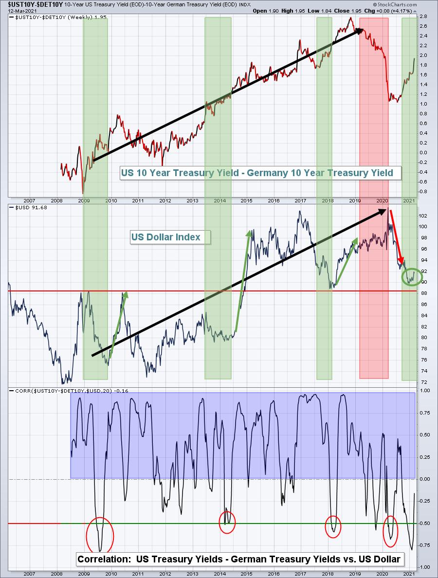
The other consideration here is that the U.S. Dollar ($USD) is just beginning to turn higher, following the much more rapid increase in treasury yields in the U.S. vs. Germany. I've found the difference between these two countries' yields to be a very solid indicator of future Dollar strength or weakness. If the USD continues rising, that will help to restrain inflationary pressures. Here's that $US10Y-$DET10Y chart:

The green-shaded areas show the U.S. treasury yield rising faster than Germany's, while the Dollar fell (inverse correlation). In each instance, the Dollar came roaring back (green directional lines). In the one red-shaded area, the U.S. treasury yield was falling vs. Germany's, while the Dollar kept rising. In that instance, the Dollar then suffered a steep decline (red directional line). Well, it appears to me that the Dollar is just beginning to turn higher after a green-shaded area developed as U.S. treasury yields rise more rapidly than Germany's. Should the Dollar continue strengthening in 2021, as I believe it will, that will act as a headwind for commodity prices.
My Conclusion
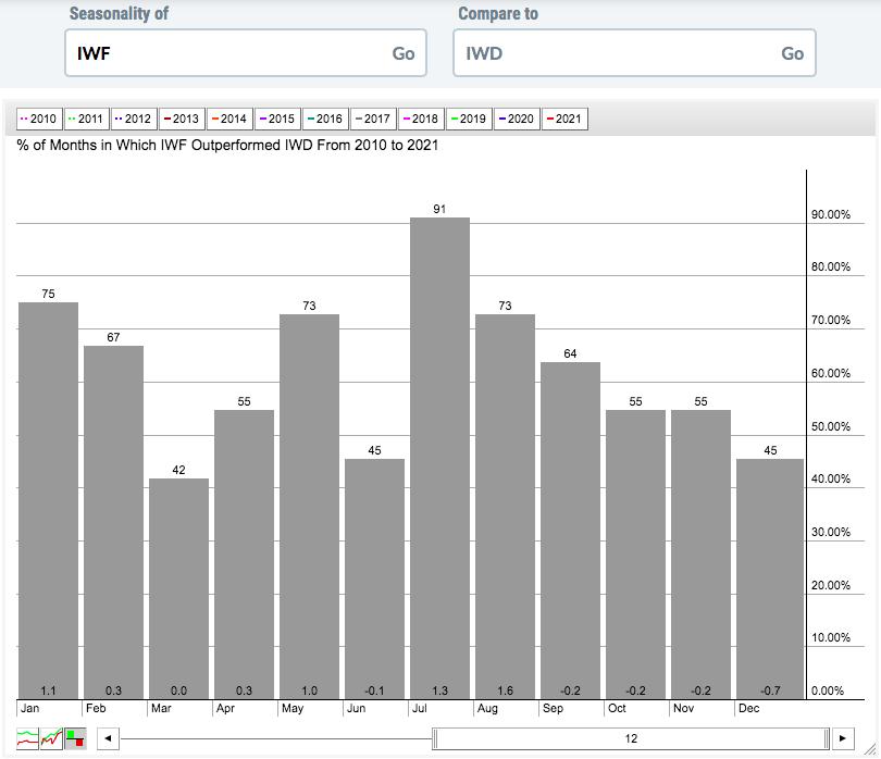
I am of the opinion that annual inflation will increase rapidly, just as it did back in 2011. This time, however, it will only take about 3 months for the annual inflation rate to hit or approach 3%. That will trigger all kinds of hyper-inflation headlines and talk, none of which will materialize. But the fears alone will result in tremendous volatility in growth stocks. I expect those stocks to do well leading up to and just beyond earnings, but in the third month of each calendar quarter, we'll need to be extremely nimble - especially if you have a short-term trading mindset. That is the history of the stock market. Here's a seasonality chart to illustrate how growth stocks perform relative to value stocks during strong stock market years (2010 through 2021):

Here's a breakdown of the average relative performance of growth vs. value by month of the calendar quarter:
- Month 1 of calendar quarter (Jan, Apr, Jul, Oct): +2.5% (7.5% outperformance annualized)
- Month 2 of calendar quarter (Feb, May, Aug, Nov): +2.7% (8.1% outperformance annualized)
- Month 3 of calendar quarter (Mar, Jun, Sep, Dec): -1.0% (4.0% underperformance annualized)
It's important to understand that growth stocks historically struggle relative to value stocks during March, June, September and December. So March 2021 is nothing new really.
I remain very bullish and fully expect that this current secular bull market will carry most equities higher throughout 2020. I can see a scenario later this year where earnings are rising rapidly among ALL areas of the market, inflation is tame, interest rates remain quite low and stock prices soar. Navigating the market for the next several months, though, will be extremely difficult due to volatility and inflation talk. It'll take a strong stomach to stick with the leading stocks in the leading industry groups. But that's exactly what we're planning to do at EarningsBeats.com.
Please CLICK HERE to subscribe to my FREE EB Digest newsletter, published 3x per week. There's no credit card required and you may unsubscribe at any time.
Happy trading!
Tom
|
| READ ONLINE → |
|
|
|
|
|
| ChartWatchers |
| The Chart You Need to Stay Bullish |
| by David Keller |
I have learned over my career to be skeptical. I have learned to question my investment thesis and actively argue the other side of any position to challenge my own analysis. I have learned to actively search out people that disagree with me and try to see what they are seeing. Most importantly, I have learned to focus not on what "should" happen, but rather what is happening.
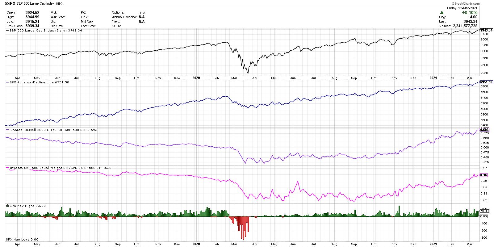
Based on a number of conversations I've had this week with industry peers, including guests on The Final Bar, I put together the chart below. Each of the five series on this chart are bullish, by any measure. As long as these five factors remain bullish, I find it challenging to assume that the path of least resistance is anything but higher.
Are semiconductors in a short-term downtrend? Yes. Have many charts besides just the SMH recently showed glaring bearish momentum divergences? Yes. Have previously high-flying names like ZM and PTON give the distinct impression that their best days are behind them? Absolutely.
But does the market as a whole keep going higher? Yes. And that's the most important thing to watch.

Here are the five components, in order from top to bottom.
1) S&P 500 Index
As legendary technical analysis Paul Montgomery put it, "The most bullish thing the market can do is go up." The top series provides the most important tell of all. Higher highs and higher lows are an uptrend, and the SPX has managed to do just that even without the support of mega-cap technology names.
2) S&P 500 Cumulative Advance-Decline Line
This is an equal-weighted series calculated as a running total of daily advance-decline values for the SPX. This is taken directly from my main breadth chart that I look at every single day. This line trending higher means that the components of the S&P 500 index are going higher - simple as that.
3) Small Caps vs. Large Caps
The ratio of the Russell 2000 ETF (IWM) versus the S&P 500 has been in a steady uptrend really since early October. Now it's worth noting that most measures of small versus large also have a sector bias of sorts, as small-cap indexes tend to have a heavier weight in sectors like financials and industrials and less in technology. But still, this is a classic measure of risk-on versus risk-off, and it is definitely signaling risk-on.
4) Equal-Weighted SPX vs. Cap-Weighted SPX
This is similar to small cap versus large cap, but as the smallest S&P 500 names are in the $7 billion market cap range, this is more mid cap versus large cap. As with the previous ratio, it also signals that the smaller companies are outperforming the larger and is another bullish tell.
5) S&P 500 New Highs and New Lows
Finally, we are looking at how many S&P 500 members are making a new 52-week high or low every day. You may not know that the 52-week lows are on the chart, because there really have not been any since March of last year! We're seeing a consistent number of new highs each week, including about 15% of the S&P 500 members making a new 52-week high on Thursday and Friday. Bullish.
From top to bottom, this chart provides five separate reads on the S&P 500 index. All five are making new highs or confirming the bullish trend.
So what would need to change for the outlook to be less bullish? Quite simply, these four ratios would need to turn lower and the new highs would need to evaporate. That would indicate an exhaustion of buyers, an increase in profit taking, and a pullback in price. Until that happens, these indicators suggest that the path of least resistance is higher.
RR#6,
Dave
P.S. Ready to upgrade your investment process? Check out my free course on behavioral investing!
David Keller, CMT
Chief Market Strategist
StockCharts.com
Disclaimer: This blog is for educational purposes only and should not be construed as financial advice. The ideas and strategies should never be used without first assessing your own personal and financial situation, or without consulting a financial professional.
The author does not have a position in mentioned securities at the time of publication. Any opinions expressed herein are solely those of the author and do not in any way represent the views or opinions of any other person or entity.
|
| READ ONLINE → |
|
|
|
|
|
| ChartWatchers |
| The Name is Value, Growth to Value.... |
| by Julius de Kempenaer |

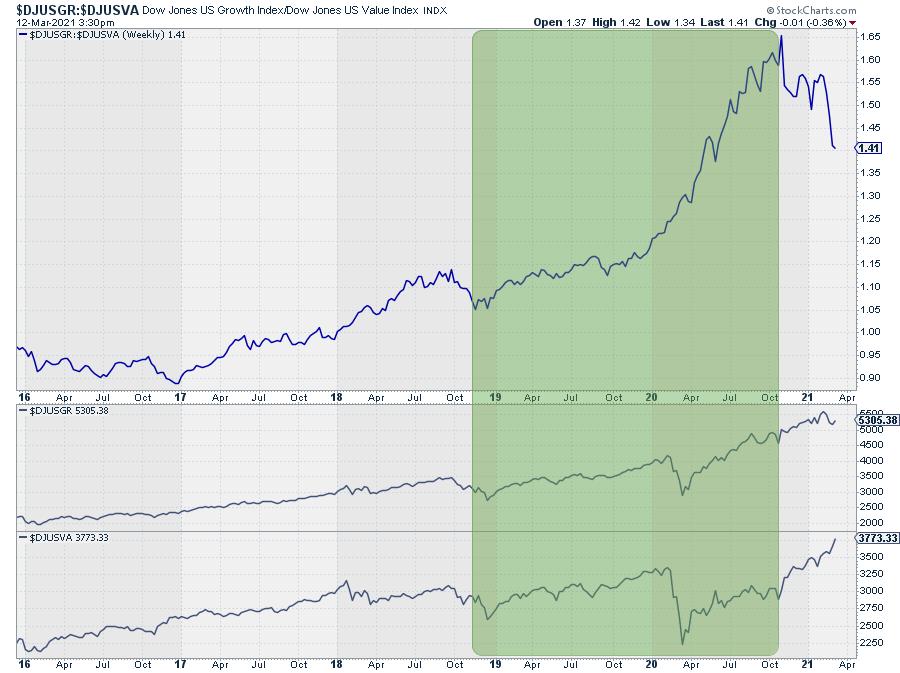
The Growth/Value relationship is always interesting to keep an eye on -- but even more so recently.
For a long period of time, roughly from late 2018 until Q3 2020, Growth stocks were beating Value hands down.

The chart above shows the Growth/Value relationship in the big pane and the individual indexes, DJ-Growth and DJ-Value respectively, in the lower two panes. The dominance of Growth over that period is easily spotted. $DJUSGR is trading well above its early 2020 high at the end of the green-shaded period, whereas $DJUSVA was not even close to that level. As a matter of fact, it was only marginally above the level it was at the end of 2018.
That started to change at the start of September 2020, while the first signs of a turn in the making already started to show up in July: see my article What About Growth vs Value Going Into the Second Half?, which describes the early signs of a rotation underway from Growth to Value while Growth was inside the leading quadrant and rolling over and Value was curling upwards inside the lagging quadrant.
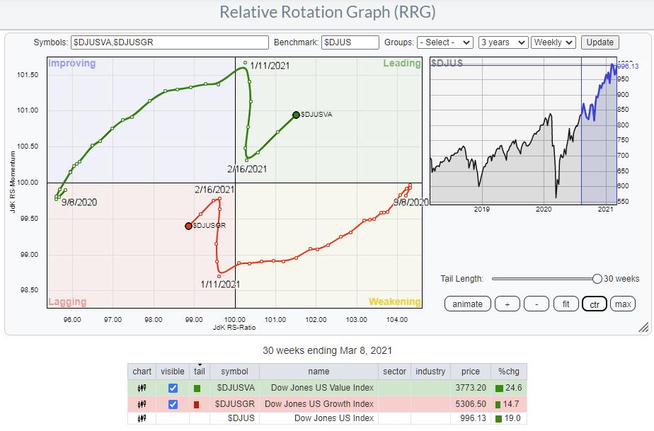
The RRG below shows the Growth/Value rotation over a 30-week period starting 8 Sept.

In the table below, you can see the massive difference in performance between these two indexes, +24.8% for Value and "only" +14.7% for Growth. This results in a +19% for the general market, the DJ US index.
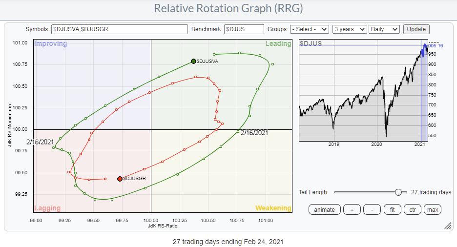
The rotation moves smoothly in favor for Value from 9/8/20 to 1/11/21, and the the tails turn swiftly, moving higher/lower on the vertical (JdK RS-Momentum) scale but remaining stable on the horizontal (JdK RS-Ratio) axis. Then, around 2/16/21 the tails get back to their opposite rotations, NE for Value and SW for Growth.
On this weekly RRG, that looks like a counterclockwise rotation, but, as you may know, that is not the case. That rotation is just too fast for that weekly timeframe. When we switch the RRG to the daily timeframe, we can see that the rotation that played out in the expected rotational fashion around that date.

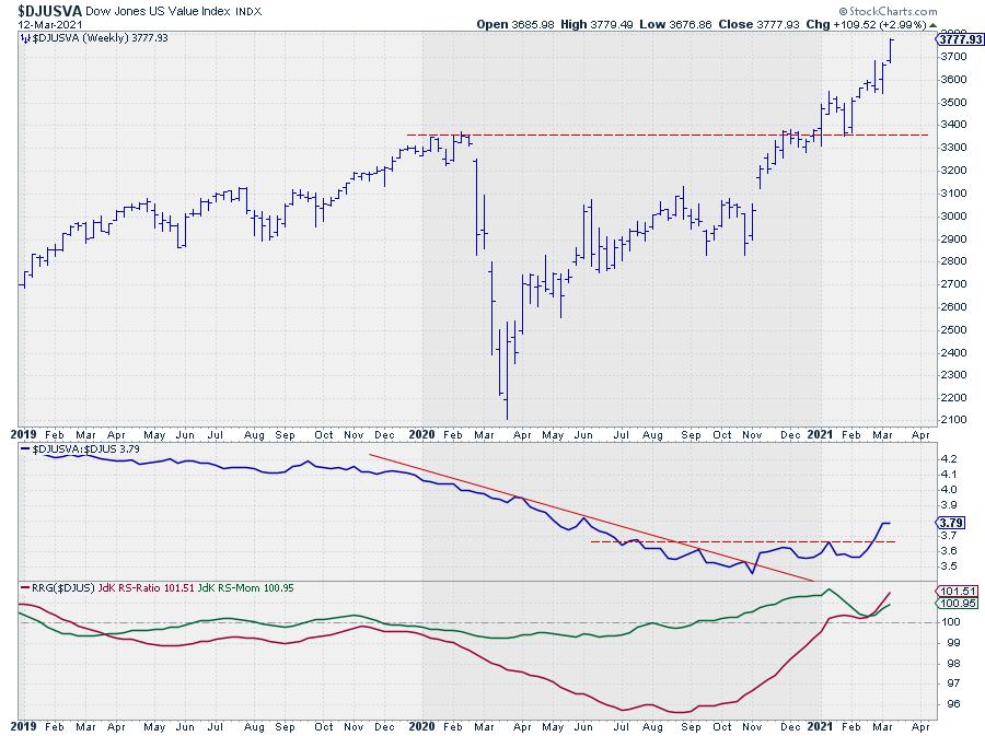
The "hook" on the weekly RRG signals a resumption of the (up)trend in value that already started when the tail crossed over into leading. Very often, such resumptions trace out from leading through weakening and then back into leading.

In this case, the rotation was so swift that the tail on the weekly RRG did not even make it into the weakening quadrant, but resumed its rotation further into the leading quadrant without leaving it.
On the chart above this shows as both RRG-Lines putting in a low above 100 and then starting to move higher. The bottoming out of the relative strength line is clearly visible, as it first broke the falling resistance line and then took out the newly build horizontal resistance. The series of higher highs and higher lows continuing higher after breaking to new all-time-highs earlier in the year confirms this strength.
Most of the time, these hooks or rotations on the right side of the graph are reliable signs for a continuation of the prior trend, i.e. Value over Growth.

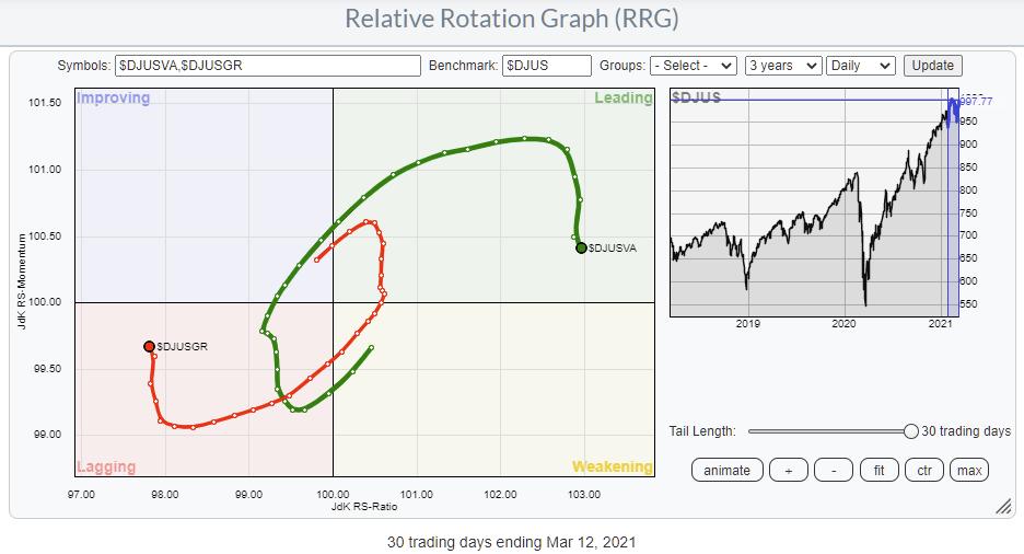
The daily RRG is updated to today and shows that the daily tails have started to roll over again. The loss of relative strength is minimal so far, which suggests that this is, again, a minor setback and just a pause in the prevailing longer trend.
If we bring that back to the current price chart, then this counter-trend rotation on the daily RRG could lead to a corrective move in the Value index -- and offer a new buying opportunity to jump on this train that is currently slowing down a bit, but still traveling in the right direction.
How To Play
Below are some suggestions to play this relationship.
- Long only: Buy IVE
- Long/Short pair trade: Buy IVE and Sell IVW
- Buy IVE Call Options and/or Buy IVW Put Options
- Buy IVE Call Options and Sell IVW Call Options
Of course, you can substitute IVE and IVW for ETFs of other suppliers that are tracking growth and value stocks.
#StaySafe and have a great weekend, --Julius
My regular blog is the RRG Charts blog. If you would like to receive a notification when a new article is published there, simply "Subscribe" with your email address.
|
| READ ONLINE → |
|
|
|
| ChartWatchers |
| Here's the Top Stock in This Red Hot Index! |
| by Mary Ellen McGonagle |
The Dow Jones Industrial Average powered to its fifth consecutive record high today as investors bought shares of companies that'll benefit from a strong reopening of the U.S. economy. Rising yields have also triggered the recent rotation away from growth-oriented stocks, including large-cap tech-related shares, into more cyclically sensitive and often value-oriented stocks and sectors.
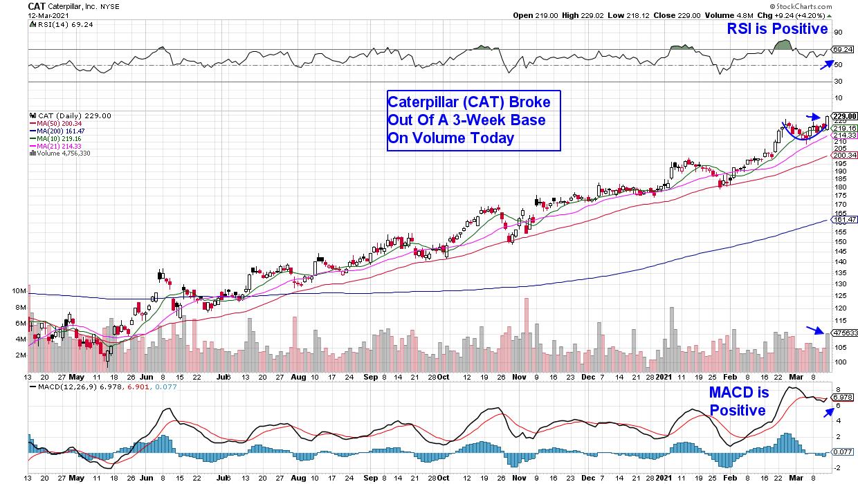
Today, I'm going to share with you the top stock in this red-hot Dow Jones Industrial Index. Considered the bellwether for the global economy, this company is poised to benefit from higher sales in each of its 3 major segments due to positive macro developments.
DAILY CHART OF CATERPILLAR (CAT)

The company is blue chip stock Caterpillar (CAT), which is the world's largest construction-equipment manufacturer. This distinction sets CAT up to be one of the biggest beneficiaries of Biden's $2 trillion infrastructure plan, which is expected to be rolled out later this year.
Another positive for CAT is the fact that we're in a period of rising commodity prices, which will benefit the company. Copper prices hit a 10-year high last month amid expectations that surging demand from power and construction industries will overwhelm supply. The sharp uptick in copper is expected to spur higher spending from mining companies, which will benefit CAT's resource industries segment.
Likewise, oil prices have soared recently and are now close to $70 per barrel, which bodes well for Caterpillar's energy and transportation (E&T) segment. Caterpillar also completed its acquisition of the Weir group's oil and gas business in February, which will boost revenues in this area further.
As you can see in the chart above, Caterpillar (CAT) bullishly broke out of a 3-week base on volume today, with both its RSI and MACD in positive territory. Subscribers to my MEM Edge Report have already been alerted to CAT, as well as other cyclical stocks that we identified as buy candidates as early as last Fall.
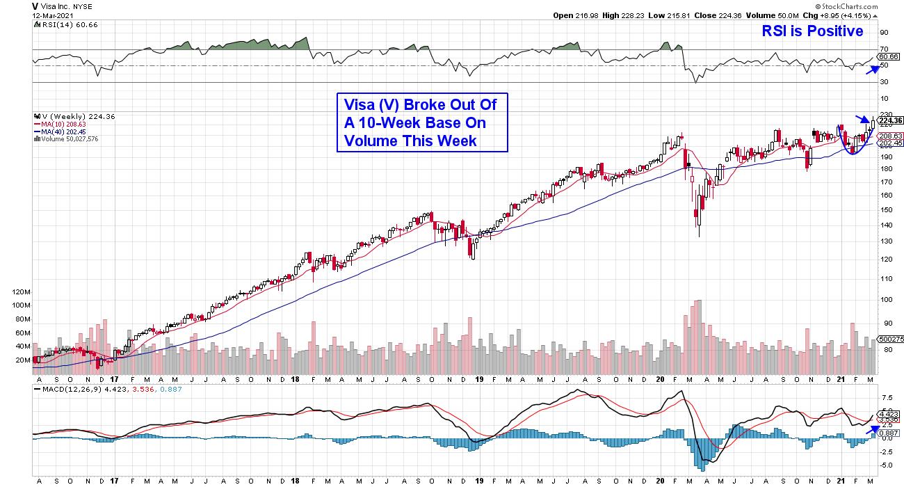
WEEKLY CHART OF VISA INC. (V)

Another recovery related stock to consider from the Dow is payment processing company Visa (V). A pick-up in cross-border travel is expected to increase Visa's revenues as profit margins on international card transactions are much higher than domestic ones.
The stock hit a new high last week amid analyst's upgrades, which pushed Visa out of a 10-week base on volume. The RSI and MACD for the stock are in a bullish position as well, which bodes well for further upside.
Last week's record high for the Dow occurred while the recently leading Nasdaq Composite remains in correction territory after falling 10% from its February high in price. This unusual occurrence is something we're monitoring very closely monitoring at MEM Investment Research, as we're on the lookout for a move back into select growth areas that will continue to flourish as the economy rebounds.
If you'd like to be alerted to when these fast-moving growth stocks come back into favor, as well as newer cyclical names, take a 4-week trial of my bi-weekly MEM Edge Report for a nominal fee. Subscribers have received additional alert reports throughout the past 2 weeks alerting them to shifts taking place in the markets.
Warmly,
Mary Ellen McGonagle, MEM Investment Research
|
| READ ONLINE → |
|
|
|
| Mish's Market Minute |
| Which Megatrends Have the Hottest Trending Stocks? |
| by Mish Schneider |

When looking for stocks that will continue to perform in 2021, we can look at the megatrends that will continue to grow considering the pandemic will be in the rear-view mirror.
On top of the list of trends is blockchain technology-and alternative currency. With Bitcoin above 52k and stocks like Riot Blockchain (RIOT), Canaan (CAN), MicroStrategy (MSTR), PayPal (PYPL), Microsoft (MSFT) and others jumping on the blockchain bandwagon, this trend will continue to change the landscape.
In almost every industry, having a system that is transparent and as a decentralized database where all transactions are stored, many industries could benefit from blockchain. Not controlled by a central authority, its popularity and usefulness will grow.
Data collection also continues to grow. Although it overlaps with blockchain technology, real-time processing using the cloud and digital channels make data collecting much more insightful and useful. The hybrid cloud combines a private and public cloud which makes companies feel more secure. Amazon and Microsoft are 2 that offer these types of services.
Large organizations will be buying and selling more data as time goes on. This is already a huge trend in China. Other notable companies in this space include Datadog (DDOG), Zendesk (ZEN), PayPal and Cloudflare (NET). However, while these companies are in megatrend territory, technical analysis is critical, as all these stocks have dropped 20-40% from their highs. If the rates hold steady as the cost of capital rises with yields, then these could start moving up again. It would also behoove investors to look at the 200-day moving averages on most of these names, as the risk point though a break below could get costly.
Another megatrend is alternative energy and EVs. Because of this, I am watching electricity distribution very carefully. With predictions of demand expected to double at least, finding companies that are working on distributing electricity is another big area to watch.
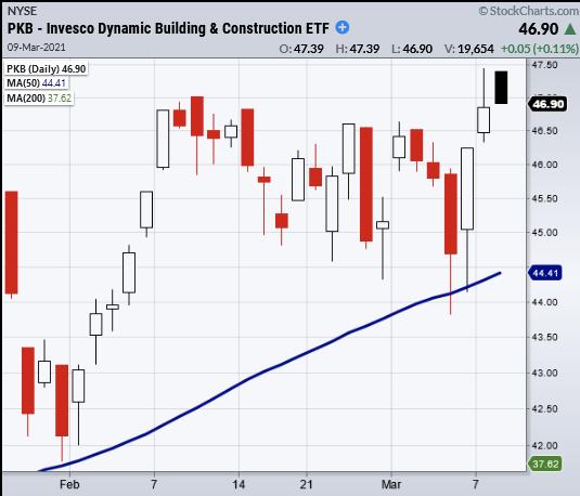
To make it simple, there are ETFs you can trade. One, for example, is Dynamic Building and Construction (PKB), sitting at new all-time highs. First Trust Nasdaq Clean Edge (GRID) is another ETF which is consolidating, looking ready to go higher. A stock called Emcor (EME) is also rocketing to new highs. These are outperforming and should continue to do so.
With the rotation into value and domestic US sectors like transportation, small caps and retail, fundamentally, there has been a shift from growth to value. What is interesting is that, before the pandemic, the economy was holding steady at around 3.5% GDP but not really growing. This is a big reason tech did so much better than the small caps or transportation sector. Also, value stocks were well under pressure.
Now, post-pandemic, with this recent move up in value, the economy must continue to grow beyond pre-pandemic levels. What could help are 2 major reforms, an Infrastructure package and Cannabis legalization. That is why looking at stocks in both spaces - like Tilray or the MJ ETF and the Transportation ETF (IYT) and some names in that basket - are also areas we expect to outperform.
- S&P 500 (SPY): 392-394 resistance area
- Russell 2000 (IWM): Lots of resistance from 224-230
- Dow (DIA): Needs to clear and stay over 320
- Nasdaq (QQQ): 312.67 the 10-DMA
- KRE (Regional Banks): Held over the10-DMA 66.64
- SMH (Semiconductors): 216 support. 235 resistance
- IYT (Transportation): 240 new support
- IBB (Biotechnology): Main support the 200-DMA at 143.31
- XRT (Retail): 93.48 next resistance to clear
Mish Schneider
MarketGauge.com
Director of Trading Research and Education
|
| READ ONLINE → |
|
|
|
| 4th Dimension |
| Connecting Sectors, Relative Value of a Stock Within the Sector and the Technical Picture |
| by Shaun Downey |
Finding Value in an expensive market is problematic unless there is a method for identifying areas of the market that are being neglected. If you're running a Fund, there is the additional problem of what Sectors or Stocks to be short in order to have some sort of balanced portfolio. Many years ago, when running an American Equity Fund, one of my other tasks was to find a either a Fundamental-based system or Technical one to identify what Sectors were just about to take off and become the leaders of the market, in what is an endless process of rotation.
A thankless task, especially on a Fundamental basis, and one that I doubted I could solve. Technical was easier, but usually involved Breakouts, which often increased risk. It is also extremely time-consuming, as even a Technical System needs to be cross-referenced against news events and company Results. Eighteen months down the road on a fundamental basis, there were more questions than answers as to what made a stock or sector become fashionable and lead the market. It appeared to be completely random, even within the same sector.
However, the relentless process of connecting Fundamentals to Technicals and Sector Rotation, looking at thousands of charts, eventually led to my Eureka moment. I had been attacking the problem the wrong way around. Instead of trying to predict, why don't I just let the market tell me?
Think of it as fashion. Things come into fashion and go out of fashion, and it is no different with stocks and sectors. Amongst the best-performing and highest-ranked sectors this year are Media/TV/Radio, Retail Wholesale Jewelry and Department Stores. The last two in particular seem nonsensical. Six months ago, those 3 sectors were languishing in the Bottom 5% of the market.
In contrast, Energy/Solar was the darling of the market in the last quarter of 2020, sitting proudly at the top of the tree. In this quarter, it is the third-worst performing sector. Therefore, when looking for value, I concentrate my efforts in the stocks in the bottom 5% of Sectors and, if they reach the top 5%, I am looking to withdraw from that market if positioned or look for signals to get short.
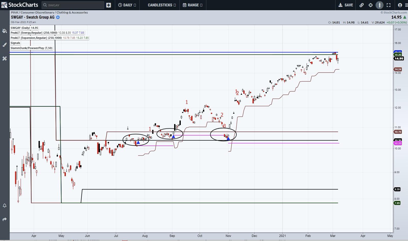
Swatch (SWGAY) is now in the Number 1 Sector, having been in the bottom 5% six months ago. Its P/E is a whopping 748 against a range of 9 to 770. The stock has risen 50% since November which begs a simple question: Are they selling 50% more watches?
The chart shows that, whilst it was unloved, there were 3 separate 4th Dimension signals (blue triangles). All three were in the band of weekly and monthly support. Looking at where we are now, the stock has reached a major upside target in that tight zone of resistance that has stopped the rally. The trailing stop is in place (brown line) and it will take a breakout above that resistance to restart the trend.

When looking at unloved sectors and picks within them, there are a couple of quick basic fundamental checks I make. Beyond the obvious, like what do they do, I am interested in its current P/E in relationship to its range of the last 5 years. This gives me an instant, if crude, recognition of where it is now in relationship to itself. Ideally, I want it to have a positive EPS Growth Rate and, as a bonus, a Yield. Additionally, in the current environment, a Large Short interest is also a positive.
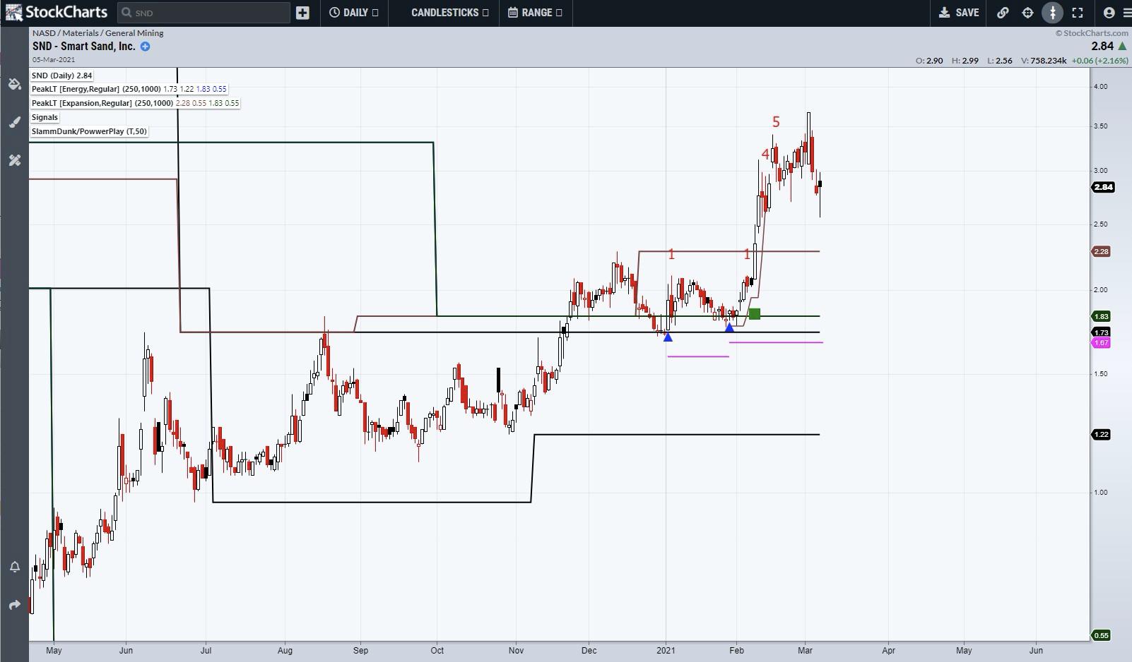
Sand Inc. (SND) is a recent classic example. Involved in Fracking (could it be any worse), its P/E languished at 3 with a 5-year range of 2 to 65. 10% of the Float was Short and, more importantly to me, based on the average daily volume, it would take 8 trading days to flush out all those shorts.
The chart shows two 4th Dimension signals within the sideways pattern that were above key weekly support. The Pink Line is the automatically-generated stop out and was therefore low risk. One resistance lay above, which was broken with a Powwerplay Buy Signal (green square). Two exits have been generated since the entry, but there has been no news at all that would justify the 100% jump.

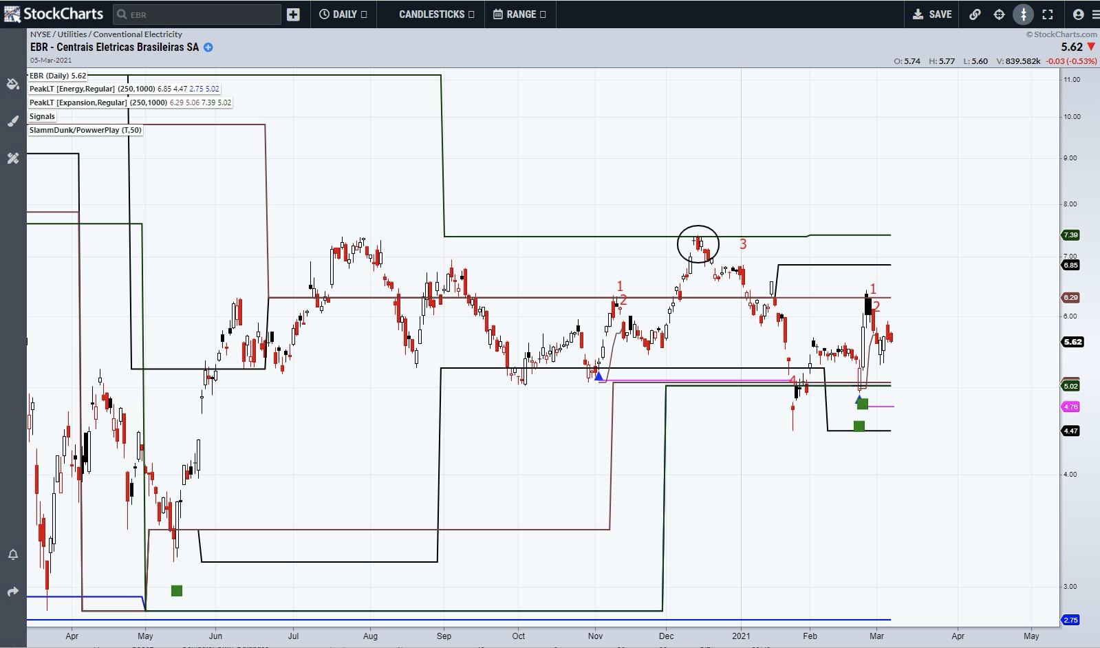
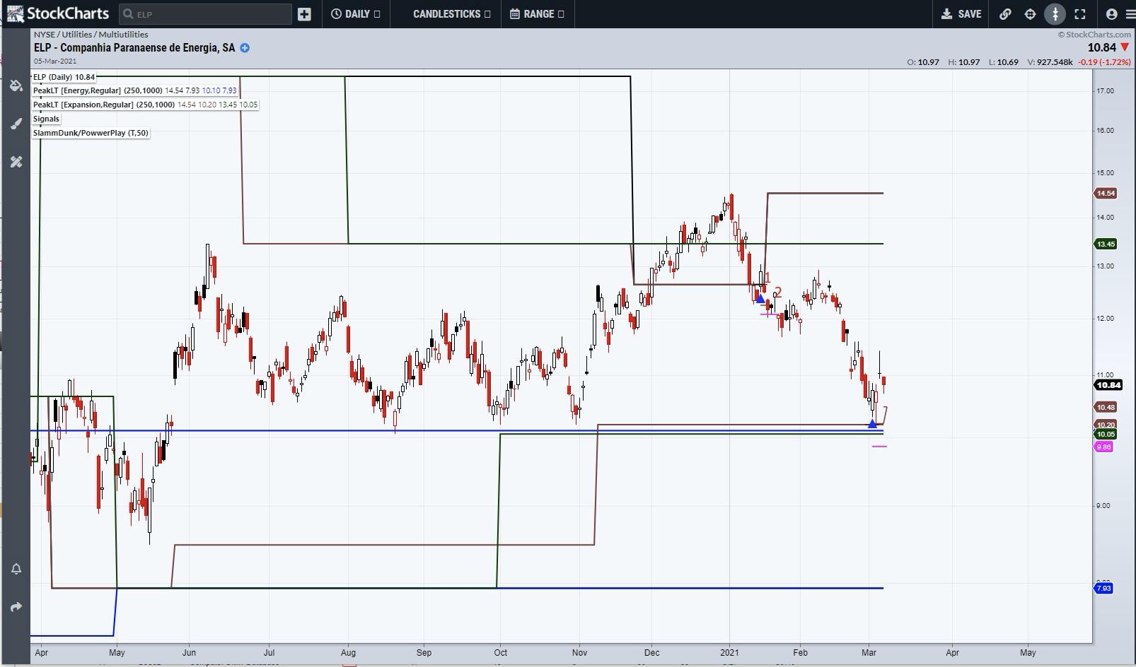
Utilities are particularly boring at present, with most sectors sitting in the bottom 5% where they have been for some time. However, in an expensive market, it makes sense to monitor these sectors and watch for signals or sudden movement. It is desirable to have some defensive stocks in a portfolio as well. In the Electricity space, there are two Brazilian companies. EBR has a P/E of 3 against a range of 1 to 9 and EPL lies at 5 against a range of 4 to 37. Both have a healthy yield.
A look at the charts shows that EBR is trapped in a large sideways pattern, which is typical of unloved stocks and sectors. There have been two 4th Dimension triggers in the past 6 months, the first one failing and topping out at the final resistance in December. ELP had a Signal in January that was at a poor location as the stock was near the top of its sideways pattern and resistance was adjacent. Last week saw a fresh signal at the bottom of the range and in close proximity to a zone of support. The reality is that both stocks are currently doing little as the gentle ebb and flow and downward drift this year is largely a product of the Dollar Real exchange rate. Both companies announce results later this week and are on my radar to see if they can generate any independent movement.


I can be contacted at shaun.downey@aol.com to answer any questions.
Shaun Downey
|
| READ ONLINE → |
|
|
|
| MORE ARTICLES → |
|
 Chart 1
 Chart 2


