| THIS WEEK'S ARTICLES |
| John Murphy's Market Message |
| DOW BREAKS SHORT-TERM SUPPORT |
| by John Murphy |
DOW UNDERCUTS ITS MAY LOW... Some hawkish comments on interest rates by a member of the Fed this morning is taking a negative toll on stocks. The Dow is under the most pressure. Chart 1 shows the Dow Industrials trading below its May low to the lowest level in nearly three months. The other stock indexes are holding up better. Chart 2 shows the S&P 500 threatening its 50-day moving average. Its daily MACD lines in the middle box, however, have turned negative which is another cautionary sign. The Nasdaq is holding up much better than the other two indexes. Chart 3 shows the Nasdaq Composite Index pulling back from potential resistance along its February/April highs.
 Chart 1 Chart 1
 Chart 2 Chart 2
 Chart 3 Chart 3
FINANCIALS SELLOFF ON FLATTER YIELD CURVE... Although all eleven market sectors are in the red, financials are the day's weakest sector. Chart 4 shows the Financial Sector SPDR (XLF) falling below its 50-day average to the lowest level in two months. That may seem surprising considering that the more hawkish stance by the Fed could eventually result in higher interest rates. Over the short run, however, longer bond maturities continue to weaken. At the same time, short-term yields have jumped sharply this week. That combination has caused the yield curve to flatten. That's the green line plotted in Chart 5 (through Thursday) which plots the spread between the 10-year and 2-year maturities. A flatter yield curve is usually negative for financials, and banks in particular.
 Chart 4 Chart 4
 Chart 5 Chart 5
|
| READ ONLINE → |
|
|
|
| The Mindful Investor |
| Four Lessons From Four Charts in My Office |
| by David Keller |
I have four paper charts hanging in my office. I use these as the background for most of my videos, and you can usually see one in the background when we shoot The Final Bar every afternoon.
I was recently asked why these four charts were worthy of display -- and why I would bother hanging paper charts in my office in the first place! As I began to answer this question, I reflected on times in the legendary Fidelity Chart Room, on conversations with Ralph Acampora and meeting him in his old chart room at Prudential, on discussions with Louise Yamada and Bruce Kamich and Steve Suttmeier and others, where I was just taken aback at the beauty of seeing long-term charts on big pieces of paper.
In a time when we can bring up pretty much anything electronically, on all sorts of screens and mobile devices, charts that stand the test of time, on paper, are the ones that deserve our attention. It's like reading timeless works of literature and human wisdom, as opposed to reading blog posts. Sure, blogs can help inform you and nudge your thinking, but if you really want to upgrade your thinking I would lean more on timeless writings.
I recorded a brief video with a "behind the scenes" look at my office and a discussion of key lessons from each of the four charts hanging in my office. Here's a quick preview of the four charts, including charts from the StockCharts Historical Chart Gallery, which provides an excellent resource if you don't happen to have beautiful paper charts on your own office walls!
This first chart shows the major US equity market indexes, from the secular bear market of the 1970s to the current bullish phase.
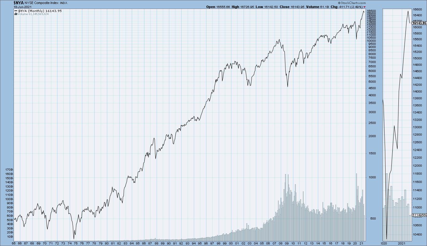
This one reminds me to think about the bull and bear phases in the markets. The 1970s were a painful stretch where it took the Dow 16 years from first reaching 1000 to actually breaking above 1000 in 1983. But even that bear phase had short-term bull cycles within the longer-term consolidation pattern. It's all about understanding the bias of the broader market.
The second chart illustrates the long-term trend in interest rates, plotting the 30-year Treasury yield back to the early 20th century.
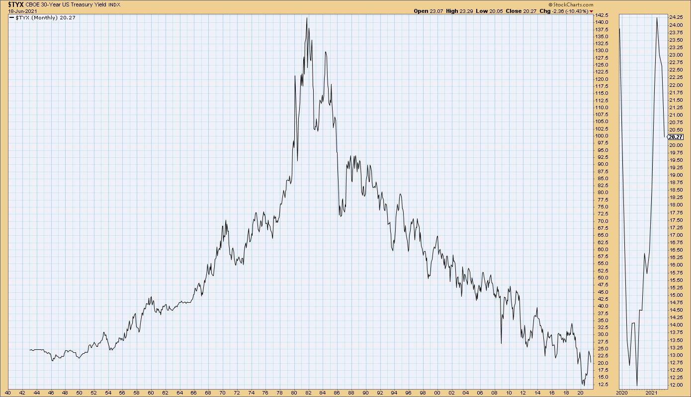
Here, I'm reminded that, for anyone who started investing after the year 1980 (which is most of us at this point), we've known nothing but a falling rate environment. A rising rate environment is a very different experience, and it may be worth studying the 1950s and 1960s to see what sectors and themes emerged during this period.
Next, we have the 100-year chart of economic growth. This chart tells the story of price versus earnings.
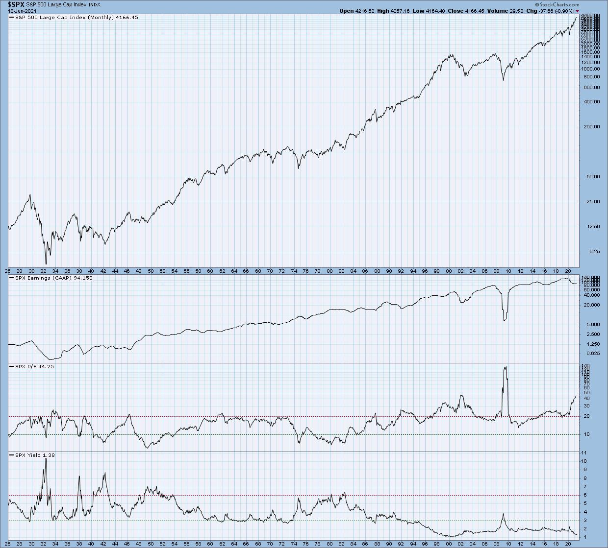
Most of the portfolio managers I worked with over the years were fundamentally-oriented, and their goal was to focus on company earnings. If you can get the earnings right, then price will surely follow.
The long-term chart of these factors shows that price and earnings have both increased over the long-term. But here's the thing: if you focus on a shorter time frame within that trend, you'll find plenty of times where price goes higher but earnings are falling. You'll also see times where price goes down even though earnings are rising.
The lesson here is that, in the short-term, the markets are a voting machine, but in the long-term they are a weighing machine (to paraphrase market behaviorist Benjamin Graham). Charts and technical analysis can be incredibly helpful on managing the short-term trends.
Finally, we have the deepest history represented in the form of the major equity indexes back to 1906. This chart shows the long-term uptrend in pretty much everything.
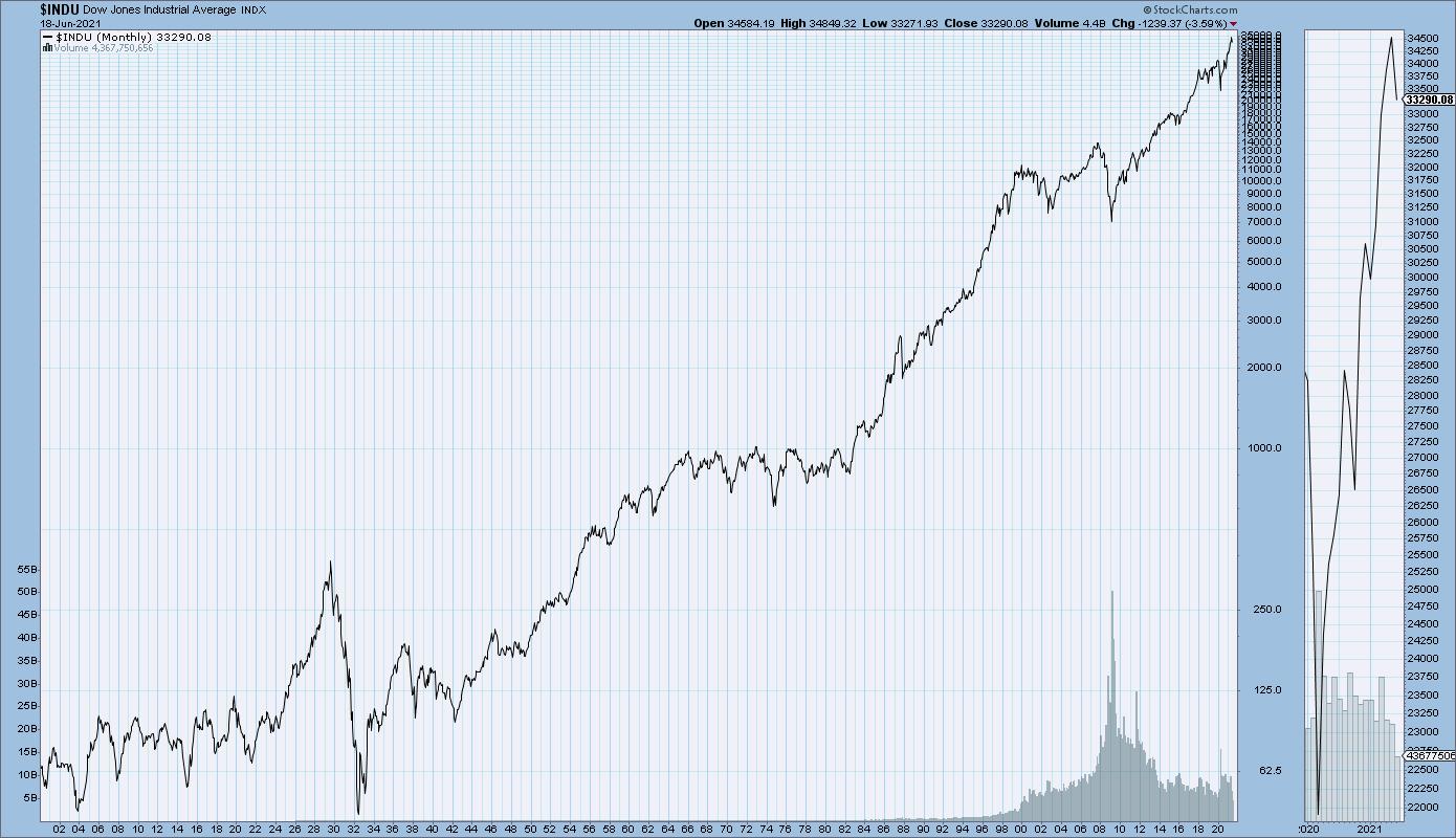
This chart reminds me that it's okay to be bearish when the evidence suggests doing so. It's even okay to short stocks when you feel that the charts are supportive of that action. But, more importantly, it reminds me that, in doing so, I am fighting against over a century of bull market behavior. The markets can and do go down in the short-term, but, for the entirety of the financial markets, equities have been a story of long-term growth and capital appreciation.
I hope you found this virtual walk through my office to be interesting and illuminating, and that you now see why I remind myself of these four lessons every time I come into my home office!
To see the actual charts and experience my home office in all its imperfect and disorganized but illuminating form, check out the video below.
For deeper dives into market awareness, investor psychology and routines, check out my YouTube channel!
RR#6,
Dave
P.S. Ready to upgrade your investment process? Check out my free course on behavioral investing!
David Keller, CMT
Chief Market Strategist
StockCharts.com
Disclaimer: This blog is for educational purposes only and should not be construed as financial advice. The ideas and strategies should never be used without first assessing your own personal and financial situation, or without consulting a financial professional.
The author does not have a position in mentioned securities at the time of publication. Any opinions expressed herein are solely those of the author, and do not in any way represent the views or opinions of any other person or entity.
|
| READ ONLINE → |
|
|
|
| ChartWatchers |
| Can Positive Short & Intermediate Indicators for the Dollar Tip Long-Term Balance to the Bullish Side? |
| by Martin Pring |
Chart 1 shows that, since 2015, the Dollar Index has been in a narrowing trading range bounded by two converging trendlines. That period has also embraced the end part of the 2011-2016 bull market, a mini-bear and bull market and the current bear. I use the term "bear" to include the period since early 2020, as the Index and its long-term KST have been trading decisively below their respective moving averages. That's not the only combination that brings me to a negative conclusion, but it is a simple test that works reasonably well in most market situations. Remember, nothing is perfect in this game!
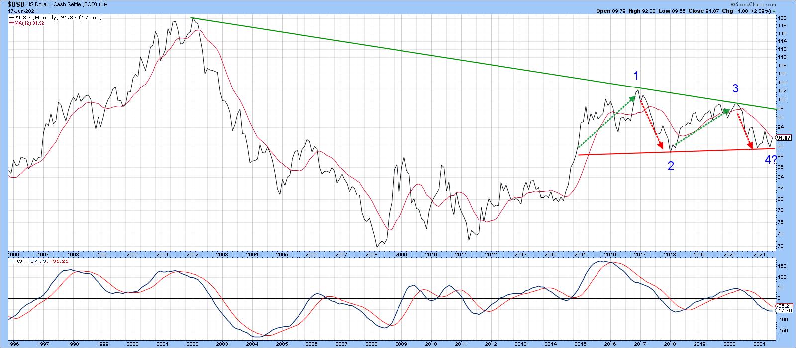 Chart 1 Chart 1
The pink-shaded areas in Chart 2, for instance, show that this negative combination has caught the majority of the declines since the mid-1990s.
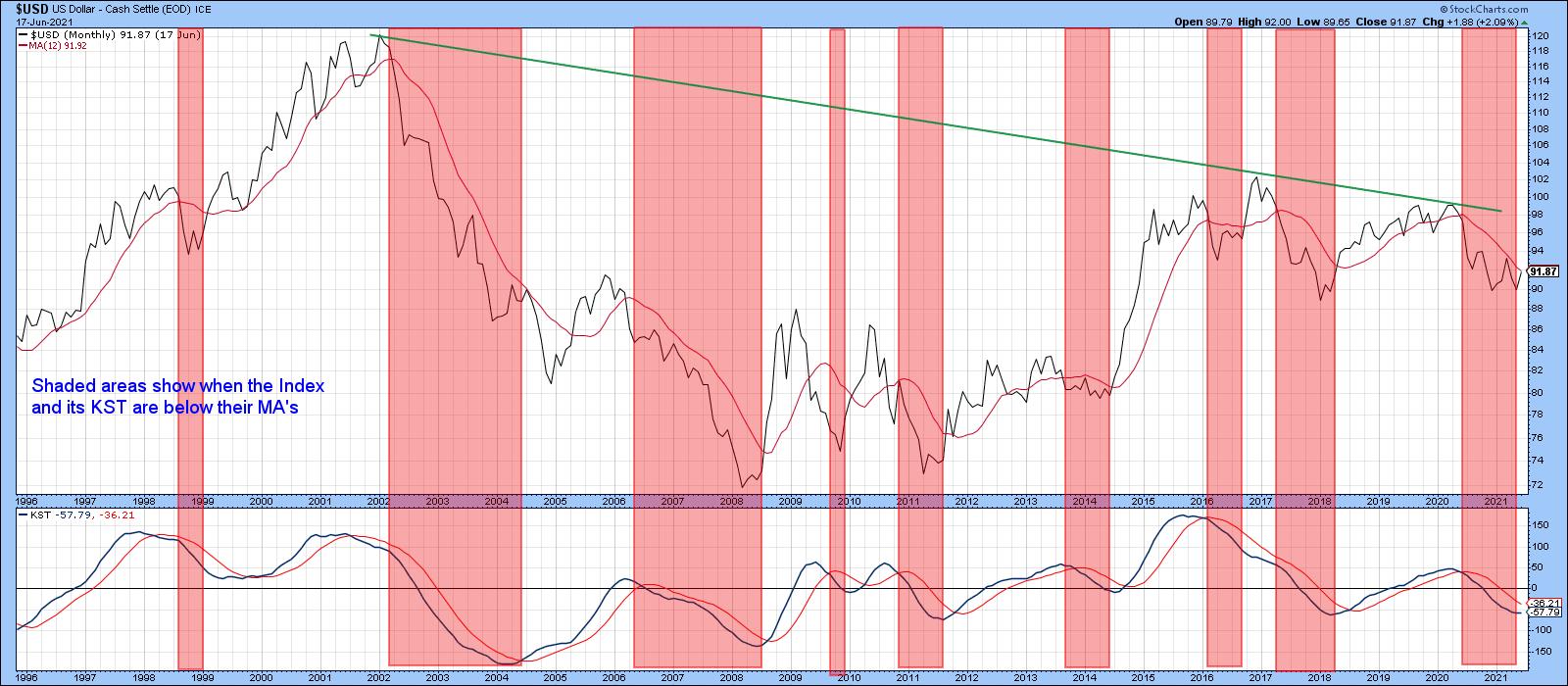 Chart 2 Chart 2
A Tightly Balanced Long-term Technical Position
Chart 3 underpins this idea of a bearish but tightly balanced long-term technical picture. The top window contains a quarterly plot of the Index, along with a 36-quarter MA. The lower one displays the quarterly Coppock Curve (or Indicator) and a 9-quarter MA. The classic method used by Mr. Coppock to trigger buy signals is to observe when the monthly version falls below zero and wait for its slope to reverse to the upside. My approach in this chart is to apply MA crossovers as a triggering mechanism in either direction. The green and red arrows approximate those points.
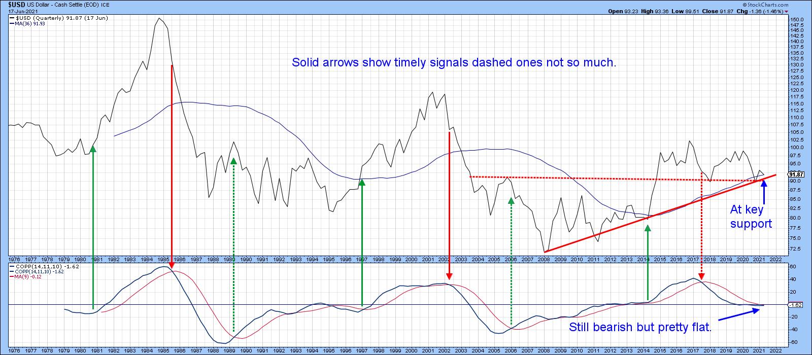 Chart 3 Chart 3
Note that most of those signals develop in sympathy with the position of the Index relative to its 36-quarter MA. The three failed dashed arrows did not. Fast forward to the current situation and we see that both the Index and momentum indicator might be below their respective MAs, but they are also extremely close. It would not take much in the form of upside action to turn this long-term situation into a bullish one. One final point to note is that the Index is currently resting on highly significant support in the form of the 2008-2021 up trendline and the dashed red breakout trendline. This is a quarterly chart, though, and that requires the end-of-quarter plot in two weeks to determine what the actual closing price will be.
Chart 4 compares the Dollar Index to the Special K indicator (SPK), which you can read about here. The pink shadings flag periods when the Index is above its 200-day MA and the SPK is above its red signal line. The two dashed blue arrows tell us that, occasionally, this approach results in whipsaw signals. By and large, though, the shaded periods catch the majority of the declines and the unshaded ones catch the rallies. Since I originally wrote this article at the beginning of the week, the Index has managed to cross above its 200-day MA and the SPK is right at its average. It looks very much as if the current short-term rally will tip the balance to the bullish side. Remember, these signal line crossovers do not happen that often, so they are usually a big deal. By way of example, we have only seen one positive crossover in the seven years since 2014.
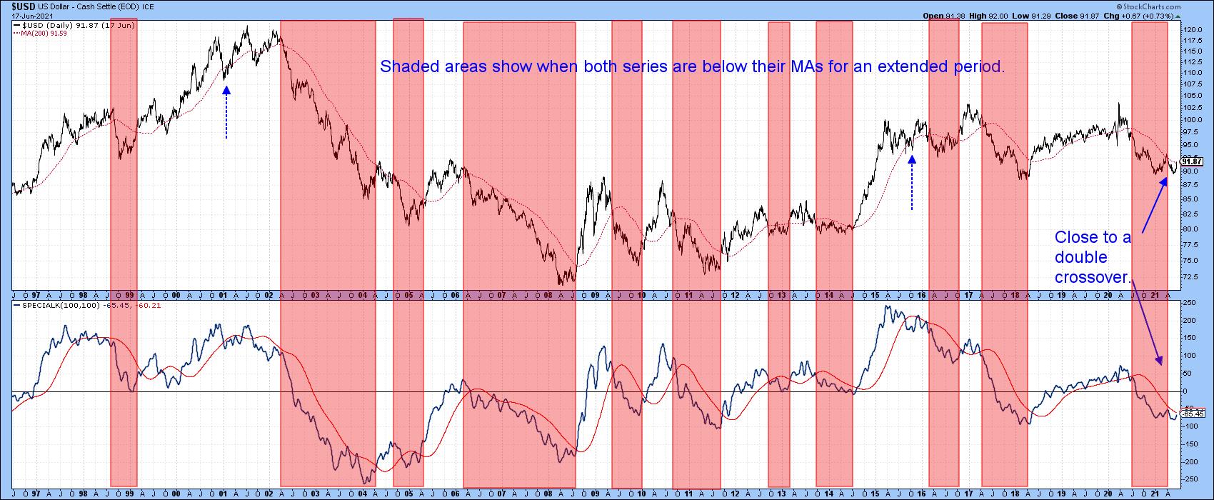 Chart 4 Chart 4
Short- and Intermediate-Term Indicators Starting to Look Positive
The Dollar Index contains a 57% weighting to the euro, which obviously has a huge influence on its behavior. Chart 5 tries to get around that by monitoring a broad universe of cross-dollar relationships in a positive trend. The solid green arrows identify upside reversals that take place from at or below the green dashed oversold level. The vast majority are followed by an advance of some kind.
The pink-shaded areas use the benefit of hindsight to identify major declines. Oversold reversals that develop in this kind of environment tend to be followed by sub-par advances, which is why they have been flagged with a dashed arrow.
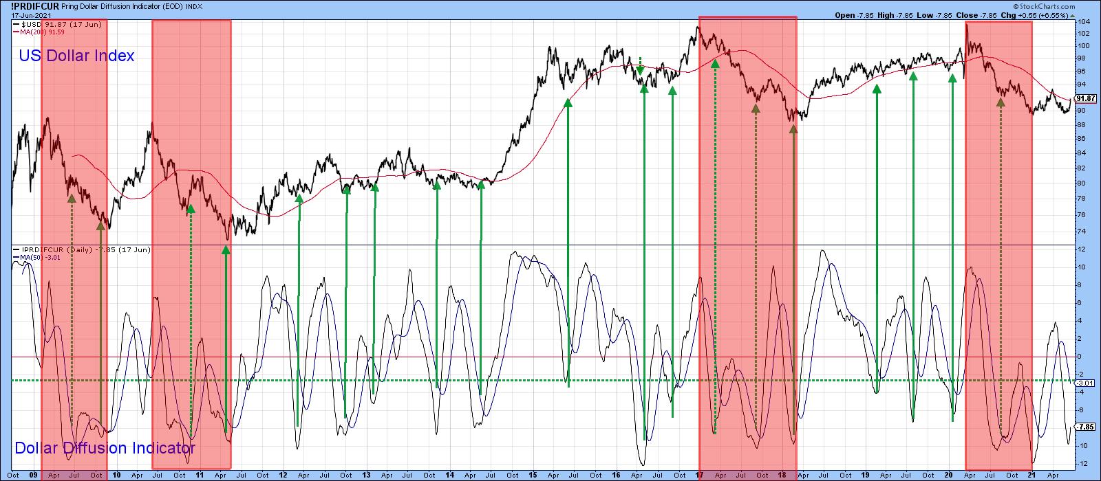 Chart 5 Chart 5
Chart 6 shows recent price action in greater detail. The indicator has managed to cross over its MA for another buy signal and is now right at its MA. A failed rally at this point would re-confirm that the bear market is alive and well, since it would not only be followed by the penetration of key support but would be perfectly consistent with bear market activity. On the other hand, a successful one would be more in character with a primary uptrend, as we saw in Chart 5.
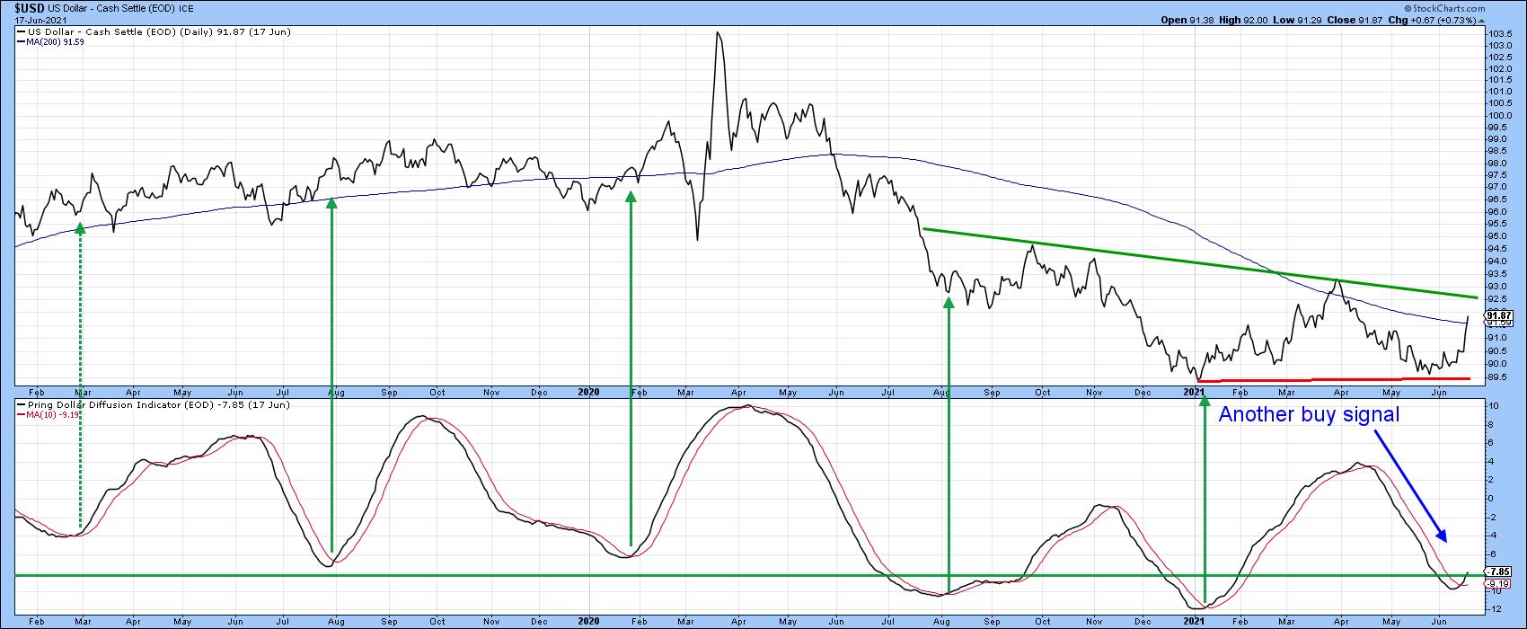 Chart 6 Chart 6
At the moment, it looks as though the rally is on track, since the Index has broken out from a small downward-sloping head-and-shoulders bottom, which is also being supported by a 12-day ROC breakout.
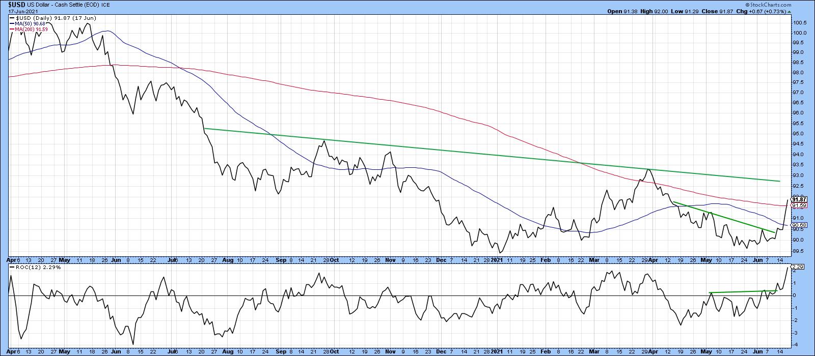 Chart 7 Chart 7
The real challenge lies at the 93.50 area, since that is where the previous short-term rally high exists. A move above that level would violate the neckline of a potential reverse head-and-shoulders pattern, as shown in Chart 8. If the Index does manage to get that high, it is evident from the longer-term charts that this would most likely be sufficient to tip the long-term balance to the bullish side.
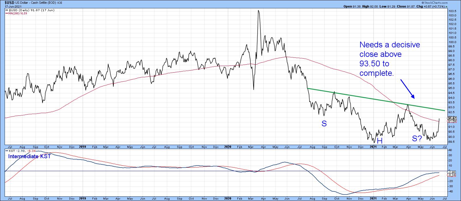 Chart 8 Chart 8
Remember, you can update any of these charts by simply clicking on them.
Good luck and good charting,
Martin J. Pring
This article was previously published on Tuesday, June 15th at 3:43pm ET in the member-exclusive blog Martin Pring's Market Roundup.
The views expressed in this article are those of the author and do not necessarily reflect the position or opinion of Pring Turner Capital Group of Walnut Creek or its affiliates.
|
| READ ONLINE → |
|
|
|
|
|
| The Traders Journal |
| How To Rank, Rate And Grade The Stocks In Your Watchlist |
| by Gatis Roze |
 We chartists are a dedicated lot, but at the risk of alienating my fellow technicians, we are sometimes too myopically focused just on charts at the expense of profits and have been known to succumb to something I'll label "The Shiny Chart Syndrome". This blog is called The Traders Journal for a reason. For ten years now, I've tried to be brutally honest and candid, so please hold your aggressive rebuttals. Here are my conclusions from trading the markets for over thirty years as a "rational investor" or my updated label "technomodernist", one who combines technicals and charts with fundamentals and modern media. We chartists are a dedicated lot, but at the risk of alienating my fellow technicians, we are sometimes too myopically focused just on charts at the expense of profits and have been known to succumb to something I'll label "The Shiny Chart Syndrome". This blog is called The Traders Journal for a reason. For ten years now, I've tried to be brutally honest and candid, so please hold your aggressive rebuttals. Here are my conclusions from trading the markets for over thirty years as a "rational investor" or my updated label "technomodernist", one who combines technicals and charts with fundamentals and modern media.
William O'Neil was spot on when he developed the CAN SLIM investment strategy for growth stocks and made "Institutional Sponsorship" one of the seven essential legs of his acronym. His pioneering work is based on studies of winning stocks dating back to 1953. It's clearly stood up to the test of time, as well as testing by the American Association of Individual Investors (AAII) which has rigorously monitored over 60 different investing strategies for decades now. O'Neil's methodology has been consistently at the "top of the charts" to use a music analogy. Grayson and I freely admit that our methodology which goes by the name of "BATTLE V" – detailed in our book, Tensile Trading — is an enhanced derivation of O'Neil's methodology.
Too often we technicians place stocks on our watchlists based on complex scans we've written — breakouts to new price highs, increasing momentum, increasing relative strength versus the market, the sector, the industry group — so on and so forth. As Jesse Livermore often said, it was his sitting that made him the most money — not his trading. If we want to find stocks with staying power to invest in and sit on as Livermore says, we best have Institutional Sponsorship. If we are to put investment probabilities at our backs, the big money guys better have discovered the equity and already started to accumulate their positions.
If you think you've uncovered the next Amazon and its institutional sponsorship is minimal, I've found it's often akin to a bait-and-switch game where the emotionally driven price run-up is not sustainable. My experience has been that stocks with significant institutional endorsement allows me to sit and profit from a positive trend.
Therein lies the key difference between an investment versus a trade. Cardinal Rule: don't ever get the two confused. If it's a stock you decide to trade, stay true. Keep the stops tight and the sell finger on the trigger. Once you've allowed a stock trade to be relabeled as one that's now an ‘investment', your positive probabilities cease working for you. You've lost your edge.
In a recent interview with Kiplinger Magazine, Jack Brennan, the former CEO of the Vanguard Group said, "The idea that trading is the way you invest your serious money is misguided".
Back to the need for institutions to show some love for a stock. O'Neil's paradigm emphasized technicals such as relative strength and market direction, but equal emphasis was also placed on supply and demand as well as Institutional Sponsorship. Money flow indicators, such as On Balance Volume, do gauge these latter two but I'd like to suggest you dig deeper.
For example, in our ChartPack we monitor a list of six exceptional stock pickers (i.e. mutual funds) that have clobbered and out-performed the S&P 500 over many different time periods (for example, 10 years S&P 500 = 15.1% per year versus Mutual Fund = 24.0% per year). You get the idea. Using the X-Ray function in Morningstar, it's easy to unbundle their holdings and review the stocks they are buying. There are other tools available with your brokerage houses which yield the same insights. This is precisely how I got into Amazon, Visa and Mastercard over a decade ago, and I've been "sitting" ever since.
There's a list of other stocks (too painful to list) that I jumped into prematurely before accumulation and institutional sponsorship was evident, based on my "unique insights" while invisiblizing essential fundamentals which led to trading that resulted in little or no profits. Amazon is a good example, Twelve years ago there wasn't the wide institutional sponsorship even though there was some sponsorship building at the time. That expanding sponsorship was the foundation of its price appreciation and increased the probabilities of a profitable investment. Note that I didn't say "trade". But "sitting" does work.
Back to the watchlists. Say we have ten stocks in our watchlist, all generated by attractive technicals. How do we rank these options? I've already outlined the sponsorship requirements. Let's touch on earnings and earnings growth. The "C" and the "A" in O'Neil's acronym.
I prefer graphs that plot a stock's quarterly revenues and earnings so I can see trends. I also like charts that show actual earnings versus analysts' consensus EPS to see those trends and also determine if the company historically beats (exceeds) expectations or whether it misses projected earnings.
In addition, I acknowledge that analysts do impact the behavior of institutional buying. Therefore, I track their ratings, their price targets for the stock and whether they're upgrading or downgrading their assessments. All your brokerages online have variations of this information. Yahoo Finance also colorfully charts this data and is available for no cost.
Finally, another tool you might consider in ranking your watchlist stocks is using one of the available "Graders". Louis Navellier has his "Portfolio Grader", and Zack's has its "Ranking" rating. Fidelity will give you a cumulative 'Equity Summary Score' based on the top 10 analysts following each equity. There are many more, but make sure that their methodology aligns with yours. Navellier's orientation is growth stocks which does mesh with my own. Personally, I'm not interested in other ‘graders' (which will go unnamed) that are oriented around value stocks. So there you have it!
Generate your watchlist as a chartist / technical analyst, but then caveated by the use of these fundamentals to rank your options. The challenge is to limit the number of options in your watchlist to match your personal bandwidth — whatever that might be. I suggest that you review these three spheres:
- Institutional Sponsorship and Money Flow
- Earnings, Revenues and Analysts Projections
- Stock Graders
Remember that your role in this quest is that of "Reality Czar" and that's best achieved by combining your charts with fundamentals.
With this review, the cream in your watchlist will magically rise to the top and your probabilities for profits will rise as well.
Trade well; trade with discipline!
- Gatis Roze, MBA, CMT
StockMarketMastery.com
|
| READ ONLINE → |
|
|
|
| ChartWatchers |
| Is The Bond Market Sending Us Warning Signals? |
| by Julius de Kempenaer |

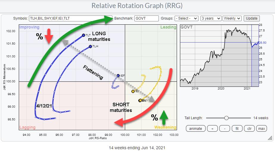
There's been a lot of talk and articles on rates, rising yields, and rate hikes lately. That seems like a good moment for a reminder of the fact that Relative Rotation Graphs can also be very well used to visualize the (relative) movement of yields for various maturities.
In the drop-down box for pre-defined groups, there are two entries related to US bonds/yields. The first one is labeled "US Bond Maturities" and, when loaded, will show you the RRG at the top of the article. In this group are all ETFs that represent bond "prices" corresponding with various maturities of the US Government bond market.
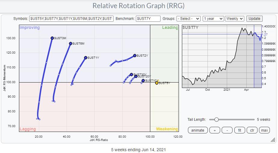
The second entry printed below is labeled "US Yield Curve".

This RRG shows the rotation for the Yields on various maturity bonds. In essence, this is the same picture as the first one holding the ETFs, but reversed. As you know, bond prices and bond yields move inversely vs. each other. That's the only thing you need to keep in mind when analyzing these RRGs.
Personally, I prefer the bond version, showing the rotation of the ETFs, I think it rotates more clearly and paints a better picture of what's going on in that area of the market. Also, it resonates better with me, as the leading quadrant means good/strength. Prices are going up and yields are going down, which generally is perceived as being a good thing. And the lagging quadrant represents falling prices and rising yields.
I have spoken to people who prefer the yield-based version, so we added it as an option to the list of pre-defined groups. As long as you realize what you are looking at, it is all good.
One way I like to use the yield-based version sometimes is by changing the benchmark to $ONE. That allows me to see whether yields in general are moving up or down. Especially when you load this RRG with 10 years of historical data, set the scaling to max, and then hit the animate button.
Most of the time, all tails will move in tandem and remain close together. When you see tails moving away from the cluster or you see one cluster moving in one direction and one cluster in the other, something odd is going on that may require a bit more of our attention.
Flattening and Steepening
The RRG at the top of the article is a great way to keep a handle on the steepening and flattening of the curve. If you need to read up on what that is or refresh your memory, there is a great article in ChartSchool that will help you get up to speed.
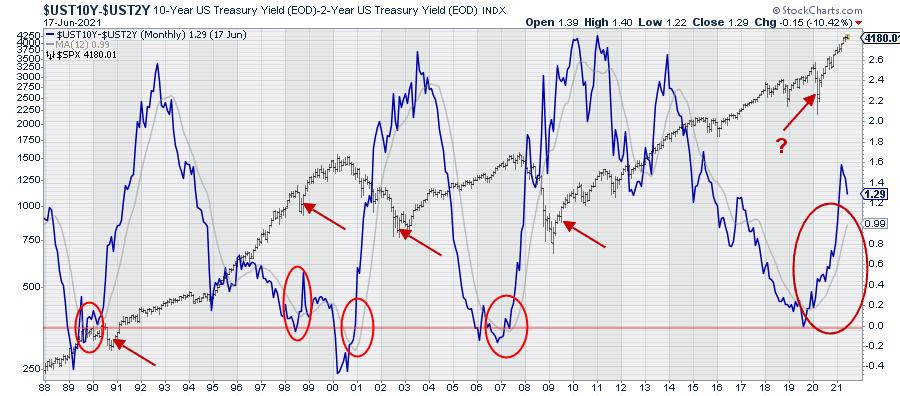
Since late 2019, after a short inversion, the 10-2 yield curve has been steepening rapidly.

The chart above shows that 10-2 yield curve relationship in combination with the S&P 500. Very recently, the yield curve started to flatten again, albeit slowly. And that rotation was picked up, in the week of 4/12, by the RRG at the top of the article shortly after the peak on 3/15.
Looking back in history on the graph above, all previous prolonged periods of yield curve steepening moved up towards the 2.5% region (10-year yields 2.5% above 2-year yields). Be careful, as that says nothing about the absolute level of yields and whether that is higher or lower than current levels.
Yields Moving Higher?

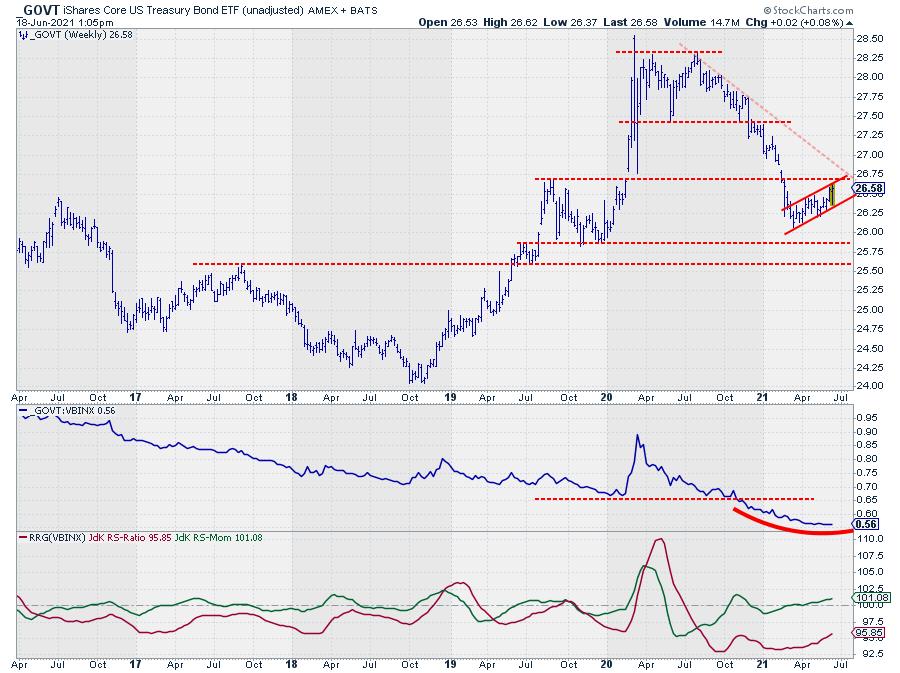
GOVT is an ETF that provides exposure to US Treasuries from 1-30 year maturities. So the direction of GOVT identifies the general direction of the broader US Government bond market.
Looking at the chart above, we can identify a large double top formation that was completed when GOVT broke below $27.50, which is the low that was set in June 2020. Following that break, the decline in price (rise in yields) started to accelerate and only managed to come to a rest and set a low in March of this year.
Since that low, GOVT is crawling upward, showing a short series of higher highs and higher lows in what looks like a bearish flag formation. Based on the duration of that counter-trend move, it does not qualify as a flag (anymore), but I am still judging it as a counter-trend move. It is the first meaningful rise after the peak in August 2020 at $28.30, and I expect this move to run into trouble (=resistance) very soon.
In the area around $27.75, there is horizontal resistance from the August 2019 peak, which clusters with the rising resistance line marking the upper boundary of the counter-trend rally. Breaking down from that recovery move will very likely cause a renewed acceleration of the decline in GOVT and push yields higher across the board.
Given the slope of the steepening of the curve and the observation that it has plenty of upside room to move further, I am going to watch for a rotation of longer maturity ETFs into a weak RRG-Heading and for shorter maturities to turn into a strong RRG-Heading. This will signal a continuation of the steepening, which is the prevailing long-term trend.
Historically, the stock market has always gone through a serious decline somewhere during a period of steepening of the curve. The question mark on the chart indicates that it is unclear for me whether or not the dip in 2020 was THE decline that was to be expected during the steepening phase. Will we see another, more serious, one?
The developments in the bond market, combined with current sector rotation and the price developments on the S&P chart, are pointing to weakness ahead. We will have to wait and see how far, how deep and how long this will go, but caution is warranted, IMHO.
#StaySafe and have a great weekend, --Julius
My regular blog is the RRG Charts blog. If you would like to receive a notification when a new article is published there, simply "Subscribe" with your email address.
|
| READ ONLINE → |
|
|
|
| ChartWatchers |
| These Two Growth Stocks Are Likely Pausing Before A Big Run Ahead |
| by Tom Bowley |
One of our key ChartLists at EarningsBeats.com is our Raised Guidance ChartList. As the name implies, it tracks companies that raised their revenue and/or EPS expectations at some point over the last 90 days. Many times, a stock will raise guidance and then profit taking kicks in, traders grow impatient and sell, and then a real bargain and opportunity presents itself. Or we'll see a solid response to raised guidance, but a bullish continuation pattern will take time to develop. We have plenty of these candidates on our RGCL, but here are two that I believe are worth watching, or possibly owning:
MANH:
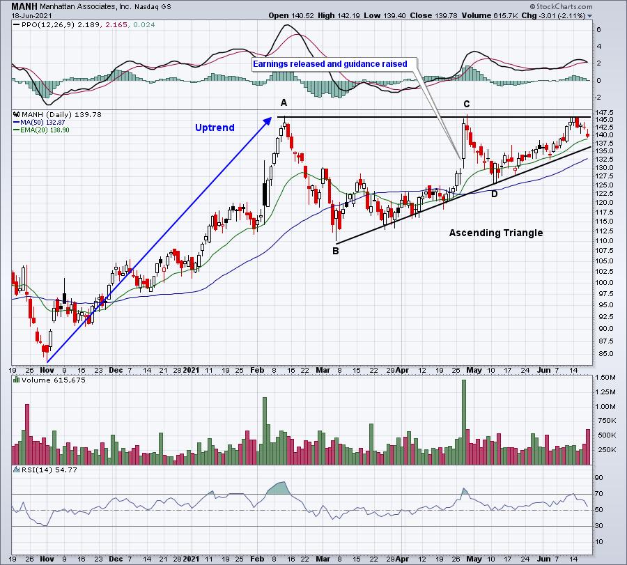
MANH is an $8.9 billion software company. Software ($DJUSSW) moved above 5000 on Friday for the first time ever after closing at its all-time high on Thursday. So we know the industry has bullish tailwinds. When MANH reported its stronger-than-expected quarterly results in April, it also raised guidance and the stock exploded higher, challenging its prior high from February. But two weeks later, MANH was back below where it was trading when its earnings were released and guidance raised. Now, it's on the move again, but pausing at what would be an extremely bullish ascending triangle breakout:

The measurement of this pattern (Point A to Point B) is more than 35 bucks. If you add that to the breakout level near 146, that provides us an initial target price of 181. That's definitely worth keeping an eye on.
MCFT:
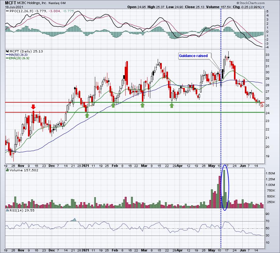
MCFT is a $476 million recreational vehicles company. Recreational products ($DJUSRP) has not performed as well as software of late, but it does appear to be attempting a bottom near key price and trendline support. MCFT got a huge lift in mid-May when it raised guidance, jumping nearly 15% in a week on the news. But it's been drifting lower for a month and is now touching a key area of price resistance. Don't be shocked to see a rebound soon:

Note the heavy volume that accompanied that 15% spike. It certainly appears as if the stock was accumulate and is just being ignored for now. As we approach key price support, however, I won't be at all surprised to see buyers return. There is more risk on a stock like MCFT, in my opinion, as it's a small cap and the average daily volume is typically in the 150,000-250,000 range - much less than I typically trade.
I'll be providing a 3rd stock from our RGCL in our EB Digest newsletter on Monday morning that I believe could be poised for a big advance ahead. If you're not currently a subscriber, it's 100% free (no credit card required) and you may unsubscribe at any time. Simply CLICK HERE to enter your name and email address in the boxes provided and begin receiving your newsletter articles on Monday!
Happy trading!
Tom
|
| READ ONLINE → |
|
|
|
| ChartWatchers |
| The Rotation is Real - Here's One Area That Stands to Shine |
| by Mary Ellen McGonagle |
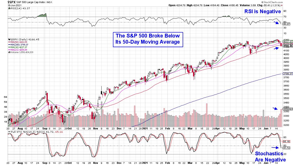
The U.S. markets ended the week in the red, with the S&P 500 breaking below its key area of support today on heavy volume. Already under pressure following Wednesday's hawkish comments from the Federal Reserve, the markets took a tumble today after Fed official James Bullard remarked that rate increases may come sooner than anticipated. The result was a sharp rotation away from the reflation trade as value stocks and commodities took a hit amid a rising dollar.
DAILY CHART OF S&P 500 INDEX

With last week's action pointing to further volatility over the near-term, investors may want to take profits to reduce exposure among more vulnerable areas that have broken down, such as Financials, Industrials and Materials.
Not all areas of the market took a hit last week, as select areas of Technology and Healthcare were on the rise. Both areas are in a highly transformative period, as developments that took place due to the pandemic are paving the way for long-lasting shifts in many areas of our lives.
Within Technology, many analysts have been citing a digital transformation that is only in its beginning innings. Digital transformation reached healthcare through telehealth and in retail through e-commerce, while banking has morphed due to fintech.
Whether you put the stocks I'm about to discuss on your Watch List or your Buy List, you'll definitely want them on your radar.
DAILY CHART OF DOCUSIGN, INC. (DOCU)

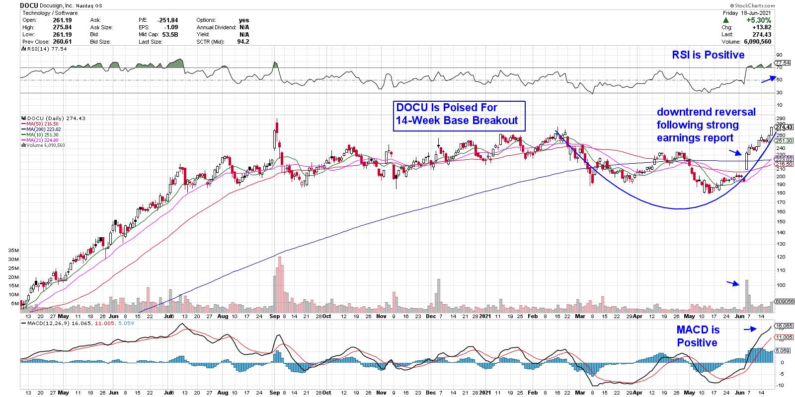
First up is Docusign Inc. (DOCU), which enables businesses to digitally prepare, execute and act on agreements. The stock reversed its downtrend earlier this month after reporting 1st quarter earnings that were 267% greater than last year. The results were 60% above estimates, which spurred a spike in price on heavy volume.
DOCU has since been in an uptrend, receiving another boost today following a Wall Street upgrade that sparked a 5% rally. The stock is now overbought and, while a base breakout at $275 may spark more near term upside, I'd wait for a pullback before entering.
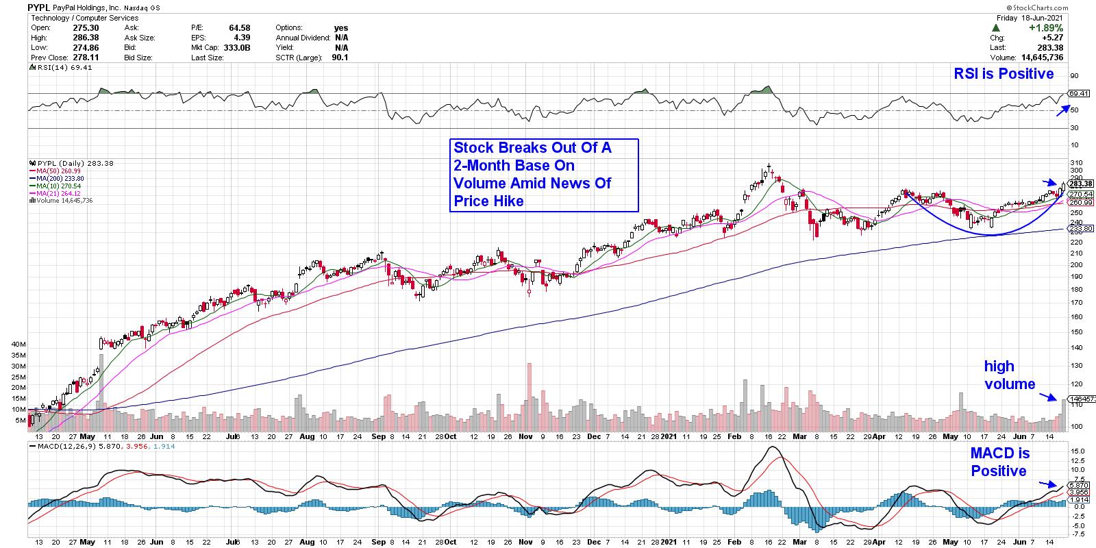
DAILY CHART OF PAYPAL (PYPL)

Next up is Payment Processor company PayPal (PYPL), which operates as a technology platform and digital payments company. The company experienced a surge in usage as locked-down consumers used their mobile payments service to purchase goods online. The company also experienced growth by facilitating the government's pandemic-related assistance program, which provided loans to businesses. More recently, PYPL has expanded their cryptocurrency app by allowing customers to buy, sell, hold or pay at checkout using 4 different currencies.
The stock broke out of a 2-month base this week amid news of a service fee price hike for certain services. The move has analysts raising earnings estimates for the company.
Subscribers to my bi-weekly MEM Edge Report were alerted to PayPal (PYPL) a while ago when it reversed its recent downtrend in early May following strong quarterly earnings results. I've been highlighting specific buy points for this upward-trending stock since then.
In this Sunday's MEM Edge Report, I'll be sharing insights into the broader markets, as well as what to be on the lookout for in the coming weeks. I'll also go over stocks on the Watch List that are ripe to take off. Use this link here for a 4-week trial for $7.00.
Warmly,
Mary Ellen McGonagle, MEM Investment Research
|
| READ ONLINE → |
|
|
|
| MORE ARTICLES → |
|
 Chart 1
 Chart 2
 Chart 3
 Chart 4
 Chart 5


 We chartists are a dedicated lot, but at the risk of alienating my fellow technicians, we are sometimes too myopically focused just on charts at the expense of profits and have been known to succumb to something I'll label "The Shiny Chart Syndrome". This blog is called The Traders Journal for a reason. For ten years now, I've tried to be brutally honest and candid, so please hold your aggressive rebuttals. Here are my conclusions from trading the markets for over thirty years as a "rational investor" or my updated label "technomodernist", one who combines technicals and charts with fundamentals and modern media.