Chart 1 shows that, since 2015, the Dollar Index has been in a narrowing trading range bounded by two converging trendlines. That period has also embraced the end part of the 2011-2016 bull market, a mini-bear and bull market and the current bear. I use the term "bear" to include the period since early 2020, as the Index and its long-term KST have been trading decisively below their respective moving averages. That's not the only combination that brings me to a negative conclusion, but it is a simple test that works reasonably well in most market situations. Remember, nothing is perfect in this game!
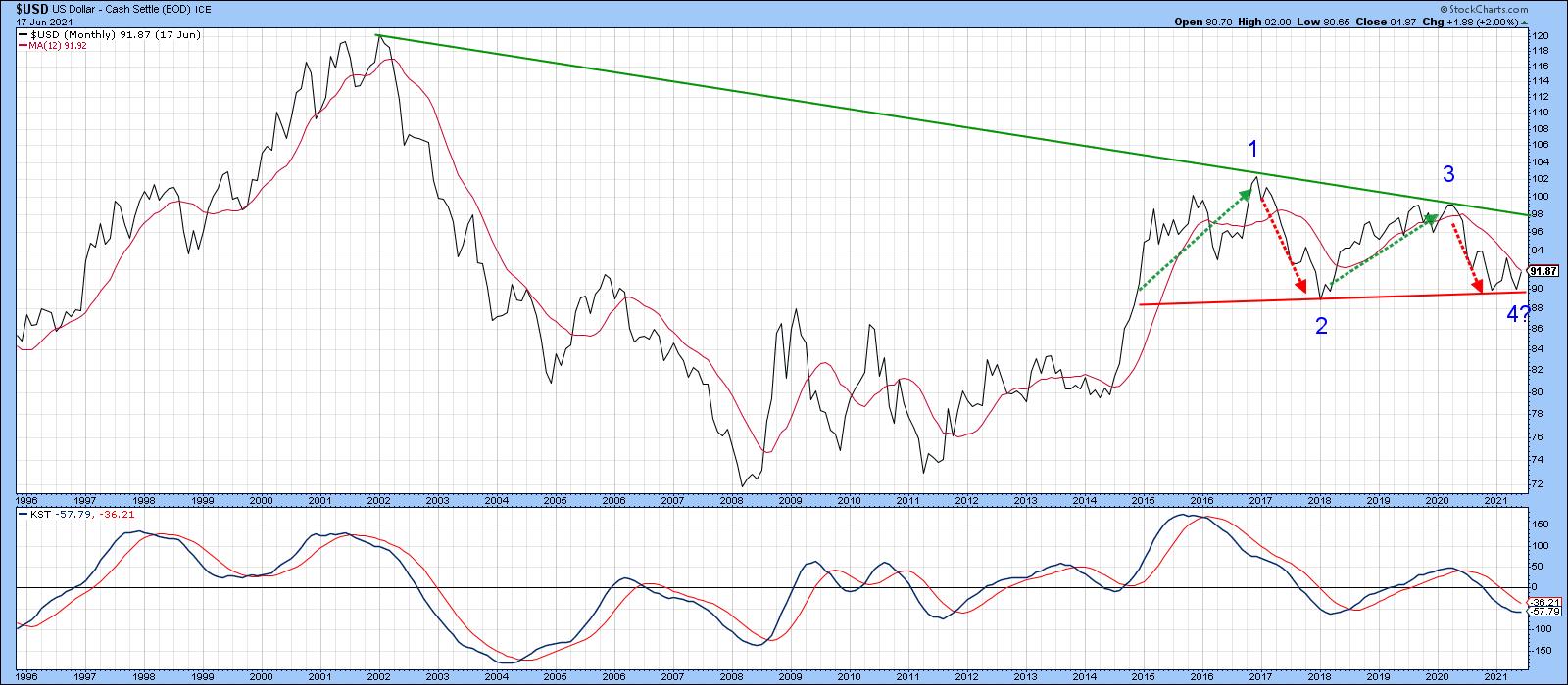 Chart 1
The pink-shaded areas in Chart 2, for instance, show that this negative combination has caught the majority of the declines since the mid-1990s.
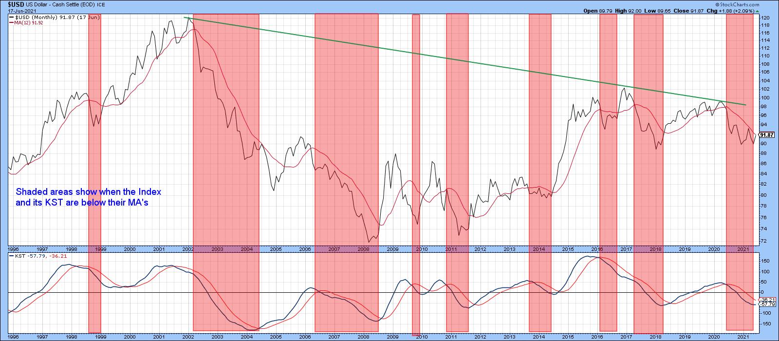 Chart 2
A Tightly Balanced Long-term Technical Position
Chart 3 underpins this idea of a bearish but tightly balanced long-term technical picture. The top window contains a quarterly plot of the Index, along with a 36-quarter MA. The lower one displays the quarterly Coppock Curve (or Indicator) and a 9-quarter MA. The classic method used by Mr. Coppock to trigger buy signals is to observe when the monthly version falls below zero and wait for its slope to reverse to the upside. My approach in this chart is to apply MA crossovers as a triggering mechanism in either direction. The green and red arrows approximate those points.
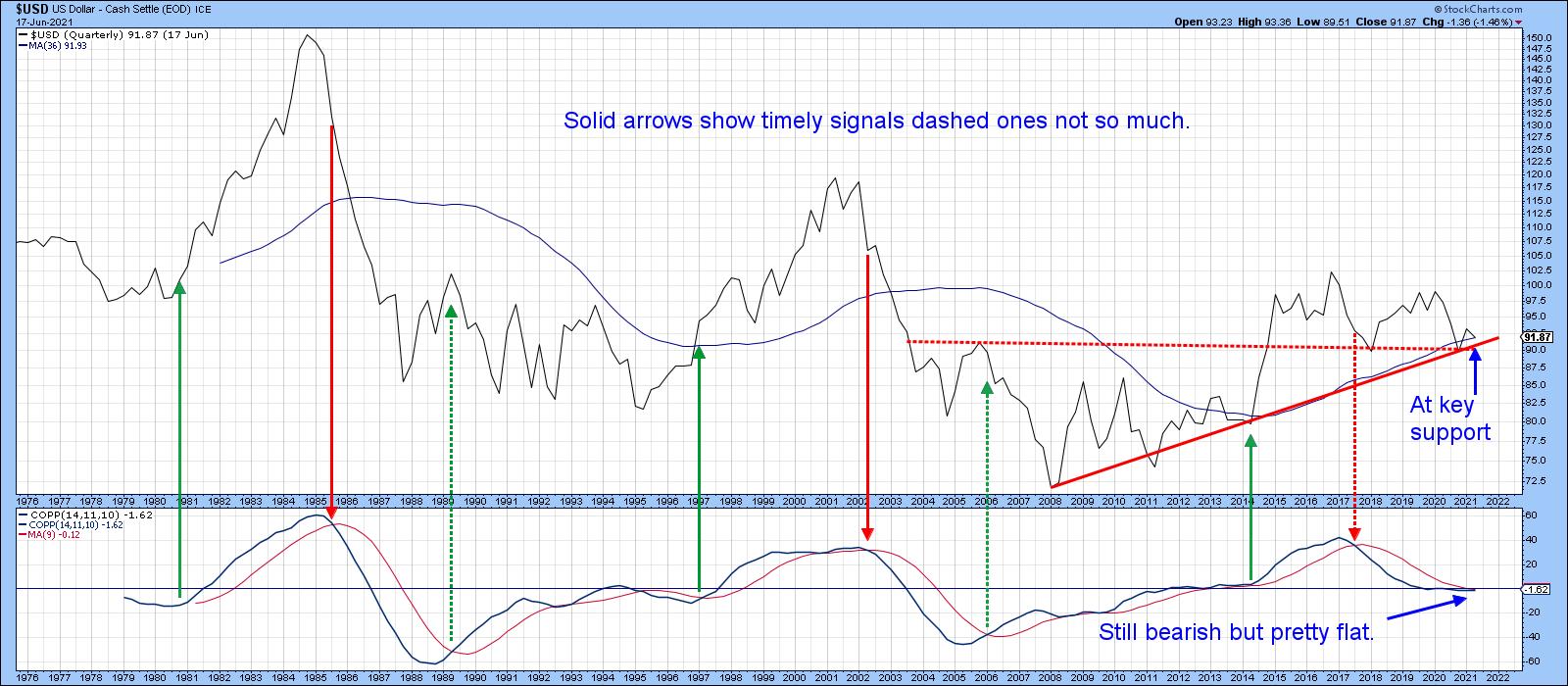 Chart 3
Note that most of those signals develop in sympathy with the position of the Index relative to its 36-quarter MA. The three failed dashed arrows did not. Fast forward to the current situation and we see that both the Index and momentum indicator might be below their respective MAs, but they are also extremely close. It would not take much in the form of upside action to turn this long-term situation into a bullish one. One final point to note is that the Index is currently resting on highly significant support in the form of the 2008-2021 up trendline and the dashed red breakout trendline. This is a quarterly chart, though, and that requires the end-of-quarter plot in two weeks to determine what the actual closing price will be.
Chart 4 compares the Dollar Index to the Special K indicator (SPK), which you can read about here. The pink shadings flag periods when the Index is above its 200-day MA and the SPK is above its red signal line. The two dashed blue arrows tell us that, occasionally, this approach results in whipsaw signals. By and large, though, the shaded periods catch the majority of the declines and the unshaded ones catch the rallies. Since I originally wrote this article at the beginning of the week, the Index has managed to cross above its 200-day MA and the SPK is right at its average. It looks very much as if the current short-term rally will tip the balance to the bullish side. Remember, these signal line crossovers do not happen that often, so they are usually a big deal. By way of example, we have only seen one positive crossover in the seven years since 2014.
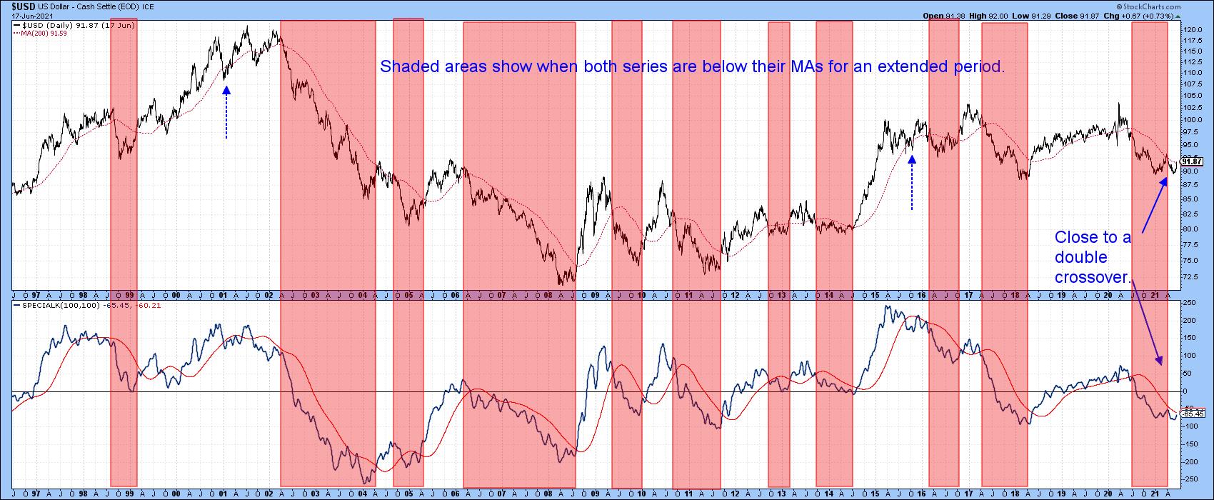 Chart 4
Short- and Intermediate-Term Indicators Starting to Look Positive
The Dollar Index contains a 57% weighting to the euro, which obviously has a huge influence on its behavior. Chart 5 tries to get around that by monitoring a broad universe of cross-dollar relationships in a positive trend. The solid green arrows identify upside reversals that take place from at or below the green dashed oversold level. The vast majority are followed by an advance of some kind.
The pink-shaded areas use the benefit of hindsight to identify major declines. Oversold reversals that develop in this kind of environment tend to be followed by sub-par advances, which is why they have been flagged with a dashed arrow.
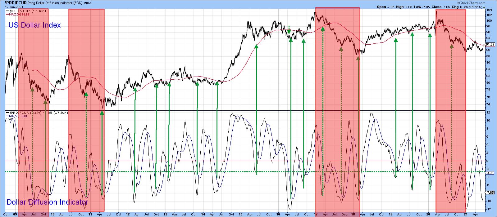 Chart 5
Chart 6 shows recent price action in greater detail. The indicator has managed to cross over its MA for another buy signal and is now right at its MA. A failed rally at this point would re-confirm that the bear market is alive and well, since it would not only be followed by the penetration of key support but would be perfectly consistent with bear market activity. On the other hand, a successful one would be more in character with a primary uptrend, as we saw in Chart 5.
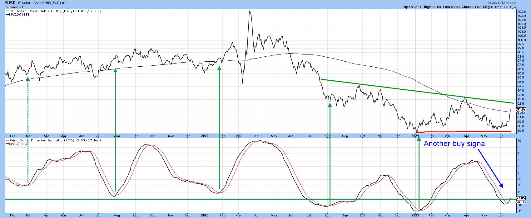 Chart 6
At the moment, it looks as though the rally is on track, since the Index has broken out from a small downward-sloping head-and-shoulders bottom, which is also being supported by a 12-day ROC breakout.
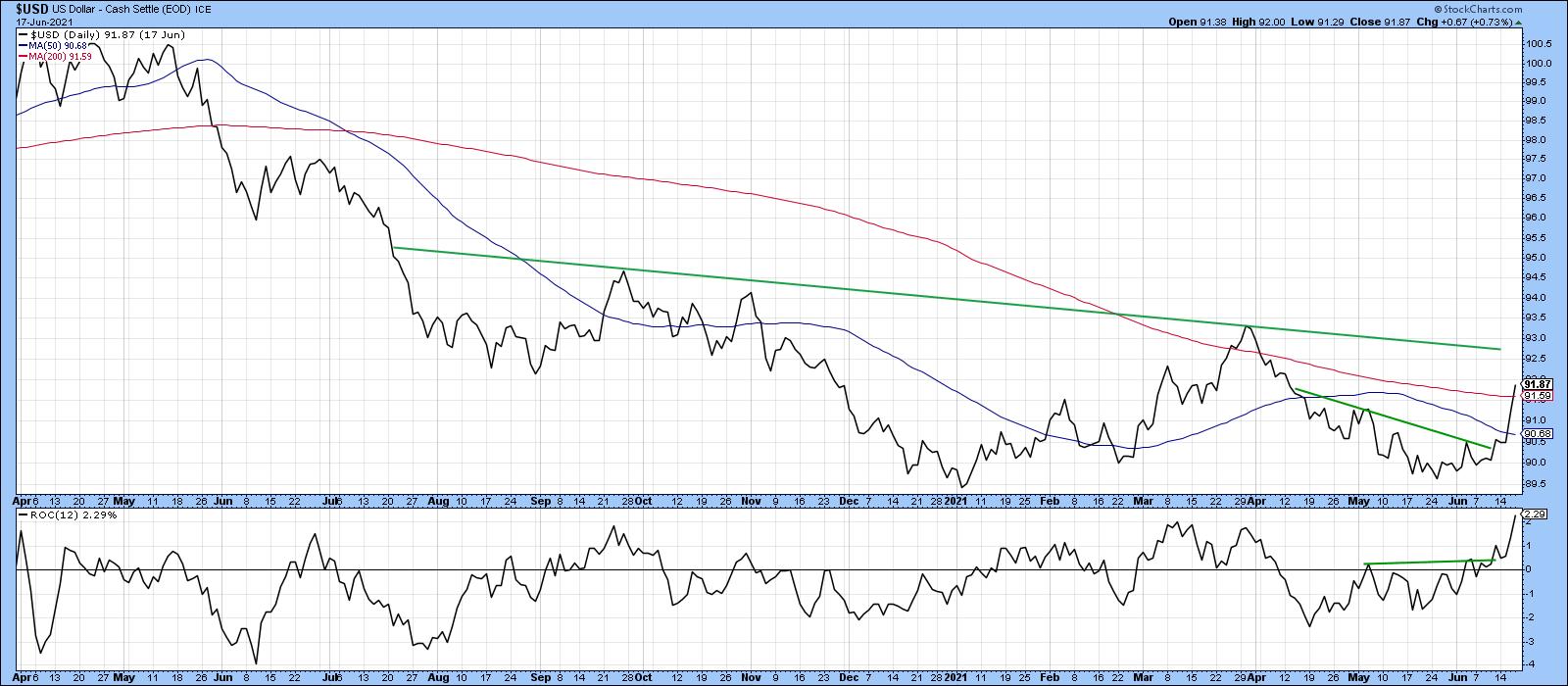 Chart 7
The real challenge lies at the 93.50 area, since that is where the previous short-term rally high exists. A move above that level would violate the neckline of a potential reverse head-and-shoulders pattern, as shown in Chart 8. If the Index does manage to get that high, it is evident from the longer-term charts that this would most likely be sufficient to tip the long-term balance to the bullish side.
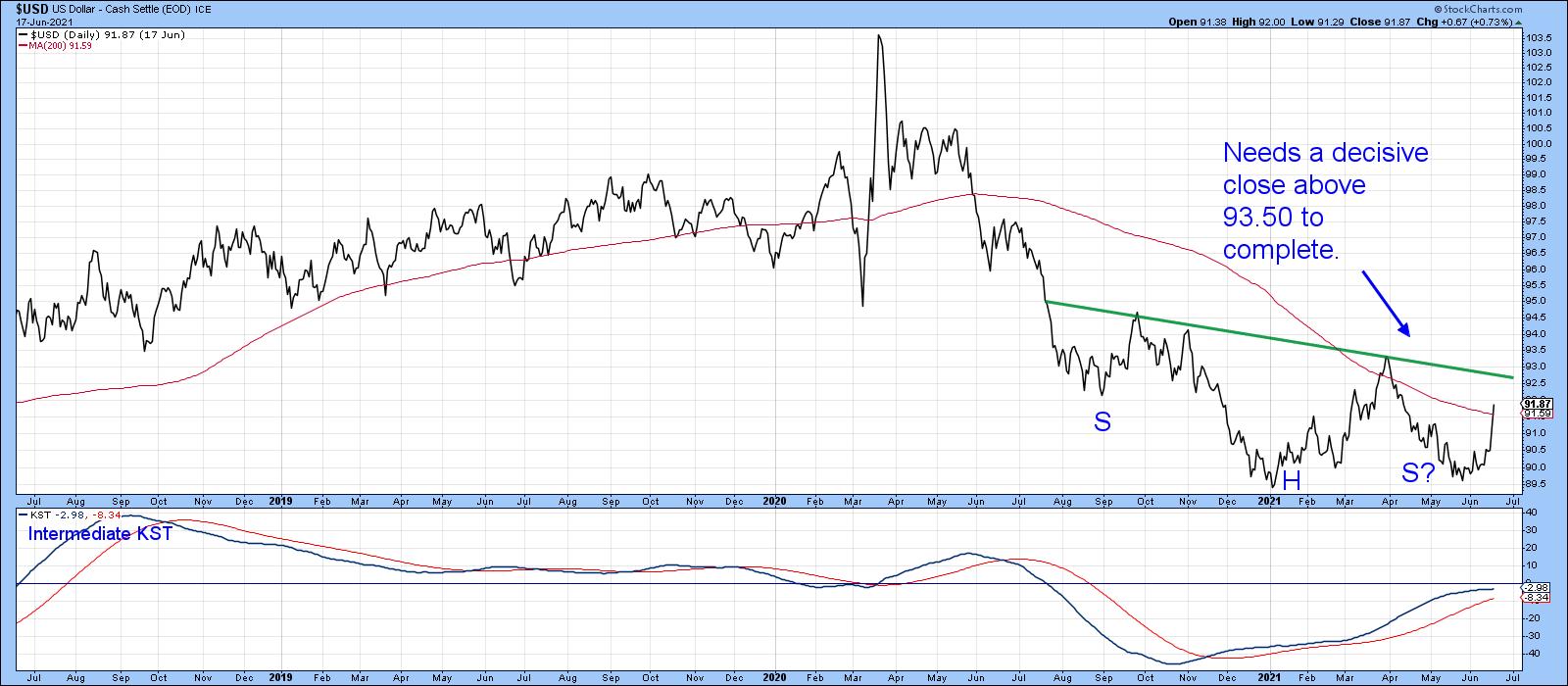 Chart 8
Remember, you can update any of these charts by simply clicking on them.
Good luck and good charting,
Martin J. Pring
This article was previously published on Tuesday, June 15th at 3:43pm ET in the member-exclusive blog Martin Pring's Market Roundup.
The views expressed in this article are those of the author and do not necessarily reflect the position or opinion of Pring Turner Capital Group of Walnut Creek or its affiliates.