| THIS WEEK'S ARTICLES |
| ChartWatchers |
| What the Impending Correction May Look Like |
| by David Keller |
As the S&P 500 and Nasdaq 100 indexes have pounded away at new all-time highs basically every month in 2021, investors are left to wonder when a correction may actually be coming. We were taught that markets don't just go straight up, but instead they move in a series of impulse moves and corrective reactions as the overall trend continues. But 2021 has very much been the exception to that rule of market trends!
Underneath the hood, however, the picture has indeed been evolving. As the S&P pushed up to new highs in late June into July, the advance-decline lines for the NYSE, as well as the small cap index, did not confirm those new highs.
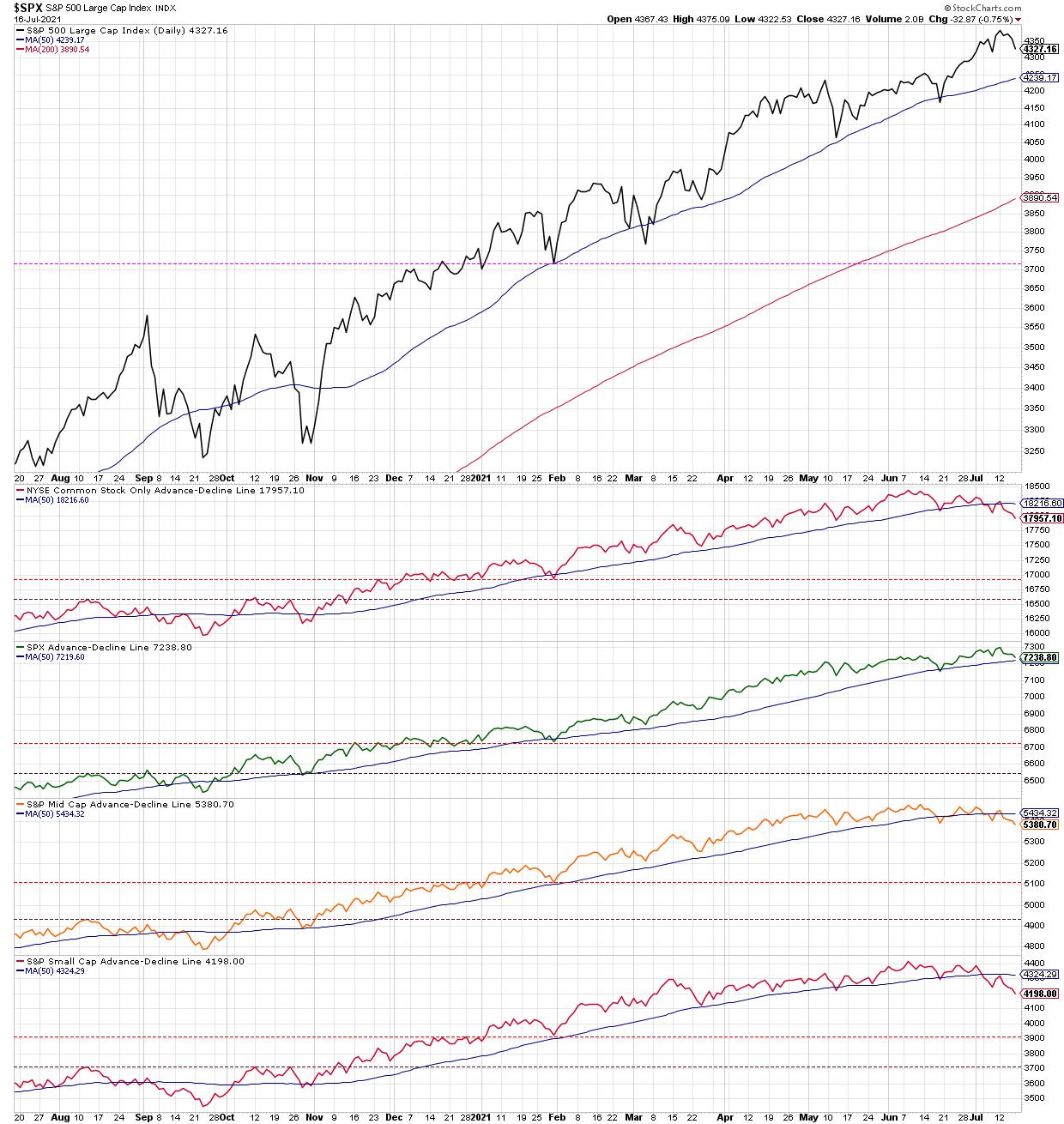
This week, we saw further downside confirmation when both of those A-D lines broke below their 50-day moving averages and made new swing lows. This suggests a sort of "stealth correction" where the major averages are moving higher but the conditions underlying that uptrend are much more corrective.
Join me on Tuesday July 11th at 1:00pm ET for a FREE webinar entitled "The Bear Market Top Checklist"! We'll review previous bull market tops and discuss the conditions to watch for given the current market uncertainty. Sign up HERE for this free virtual event!
So now that we have bearish breadth divergences, what happens next?
Markets can actually correct in three ways: a price correction, a time correction and a stealth correction. Let's briefly review each of these corrective patterns using the chart of the S&P 500 index.
I should note that, while many media outlets like to use specific percentage moves to define a pullback vs. correction vs. bear market, I tend to feel the trend, momentum and support/resistance levels are much more important than the label. So I tend to classify a smaller downturn as a pullback, a deeper downturn as a correction and a complete rotation to risk-off as a bear market!
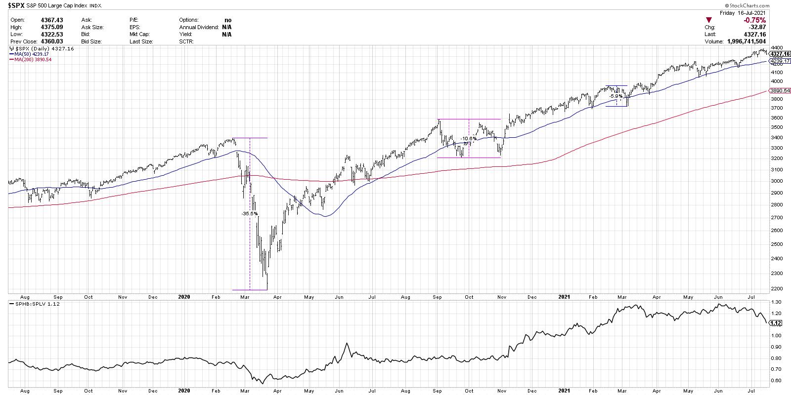
February-March 2020 provides a good example of a price correction. The S&P lost about 35% of its value in just over one month. Remember how quickly the bottom reverted back to the upside, giving the chart its classic V shape? That's what a price correction often looks like.
By mid-April, the S&P was back in uptrend mode, making higher highs and higher lows. The April low was a key indication that the price correction was over and the bull phase had resumed.
For a time correction, check out September-October 2020. You can see that the market only pulled back above 10%, but it was a shallower and wider correction than in February-March. A time correction involves less pain price-wise, but tends to be longer and more drawn out. Time corrections are when the market essentially goes sideways, trading around an equilibrium price.
Finally, we have a stealth correction, which I would argue we've been in for a while now. While the indexes move higher, many stocks and groups are already breaking down. Stocks that break out often fail, indicating a lack of willing buyers to push prices onward and ever upward. Stealth corrections are tricky because many stocks are still going higher, which can create a sense of overconfidence for investors who believe the market can go only one direction: up.
I added one series to the bottom of the S&P 500 chart, which is the ratio of high beta to low volatility stocks (using the SPHB and SPLV ETFs). Note that, since mid-February, this ratio has essentially been rangebound. This illustrates how the markets have truly been in leadership rotation mode, with offense and defense-oriented sectors taking turns in the driver's seat.
So now that we have defined the three types of corrections, what could we expect now, given the weakened breadth conditions and clear indications of risk-off this week? That is to say, if we do see a downside follow through next week and beyond, what might a correction look like?
Scenario 1: Down 8% to May lows
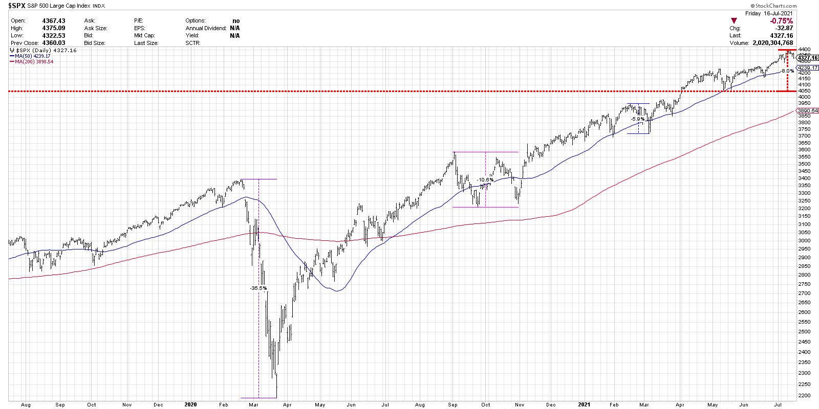
In this first scenario, the S&P comes down about 8% off the highs (another 6.5% below current levels) to retest the price lows from May. Many of my guests on The Final Bar recently have pointed to this key level of support. As long as the S&P remains above this level, one could argue that the long-term bull phase is still intact. This would mean the deepest correction thus far in 2021, although, compared to previous bull markets, it's not that out of the question. Think about how cyclicals, which have already pulled back from recent highs, would likely continue their drop in this scenario.
Scenario 2: Down 11% to 200-day moving average
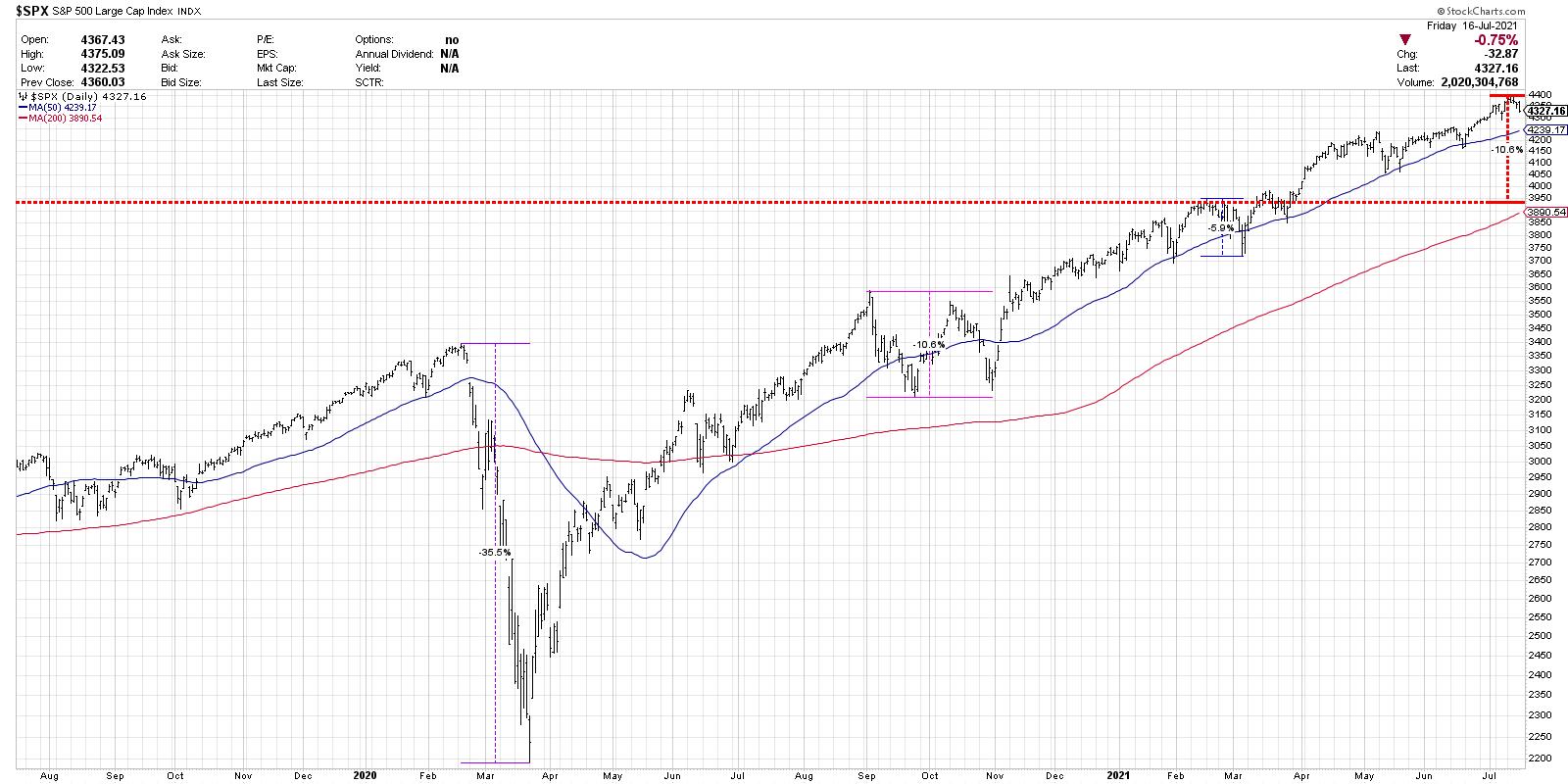
But perhaps the S&P fails to hold support at the May low? In breaking below 4050, many strategists (including most likely yours truly) call for a much more drawn-out bear phase. But, instead of going full bear market, the S&P simply goes down another 3-4 percent, reaching the 200-day moving average for the first time since June 2020.
Investors start to think defensively and consider the possibility of a retest of the March lows, but the S&P instead finds support at the 200-day and provides enough buying power to establish a new base, propelling the equity markets to finish even higher by year end.
Scenario 3: Down 35% as 2020 selloff repeats
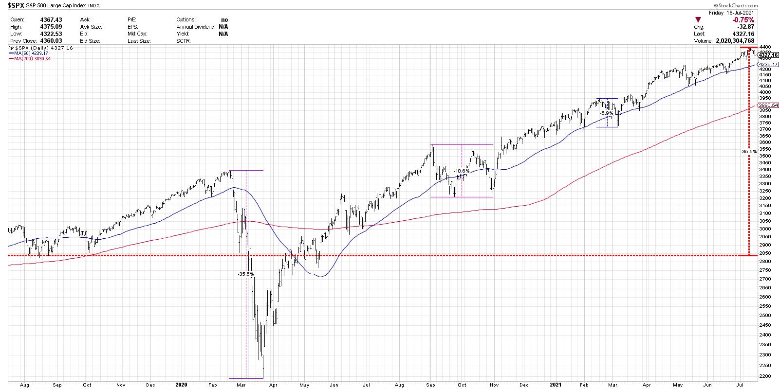
This is definitely a worse-case scenario, with the argument being that, if the S&P can't hold the May lows and then fails at the 200-day moving average, enough damage will be done that investors become despondent.
I would consider this a highly unlikely scenario, given economic conditions and the strength of the bull market in the first half of 2021. There would need to be some new catalyst that would create the conditions to propel the S&P that far down.
However, I learned over my career to always consider the alternative scenarios. What would happen in a 35% drop? How would the FAANG stocks, who have led the most recent up move in stocks, react to that sort of negativity? What would happen to gold? Could cryptocurrencies emerge as a "safe haven" of sorts, or would investors flock to fixed income and create a new bull market in bonds?
So there are three potential outcomes given an S&P correcting further next week. Given the internal weakness and breadth divergences, a pullback seems likely. The question is how far, how long.
The most important question is, how will you manage risk in that environment?
RR#6,
Dave
P.S. Ready to upgrade your investment process? Check out my free course on behavioral investing!
David Keller, CMT
Chief Market Strategist
StockCharts.com
Disclaimer: This blog is for educational purposes only and should not be construed as financial advice. The ideas and strategies should never be used without first assessing your own personal and financial situation or without consulting a financial professional.
The author does not have a position in mentioned securities at the time of publication. Any opinions expressed herein are solely those of the author, and do not in any way represent the views or opinions of any other person or entity.
|
| READ ONLINE → |
|
|
|
| Martin Pring's Market Roundup |
| US Breaks Out Against the World as Bonds Fail at 200-day Moving Average |
| by Martin Pring |
The US Breakout
The S&P has been in a secular or very long-term uptrend against the Dow Jones World Stock Index since the financial crisis. That trend is still intact, as the ratio remains above its 2011-2021 up trendline. The primary trend picture is a bit mixed as this relationship has moved back above its 12-month MA, but its KST, though flattening, has yet to re-cross its 9-month MA. In reality, the ratio has been in a trading range for the last couple of years, as demonstrated by the two blue dashed lines. That rangebound activity could turn out to be a consolidation of previous gains or a top. In technical folklore, it is wiser to assume that the prevailing trend is intact until proven otherwise. Consequently, we should assume that the secular uptrend is intact, which means that any breakout from the recent trading range will be resolved on the upside.
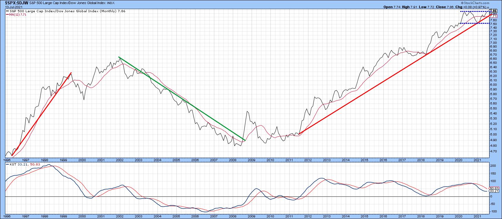 Chart 1 Chart 1
That's also the impression we get from Chart 2, which compares the ratio to its Special K indicator (SPK), explained here. First, it is evident that it has completed a reverse head-and-shoulders. Second, this is being supported by the SPK trading above its red signal line and the small solid green trendline, not unlike its bullish 2018 action. In the current situation, though, the SPK itself has also begun to trace out a series of rising peaks and troughs. What has not yet happened is a break above the green dashed-down trendline, as that would complete the positive momentum picture.
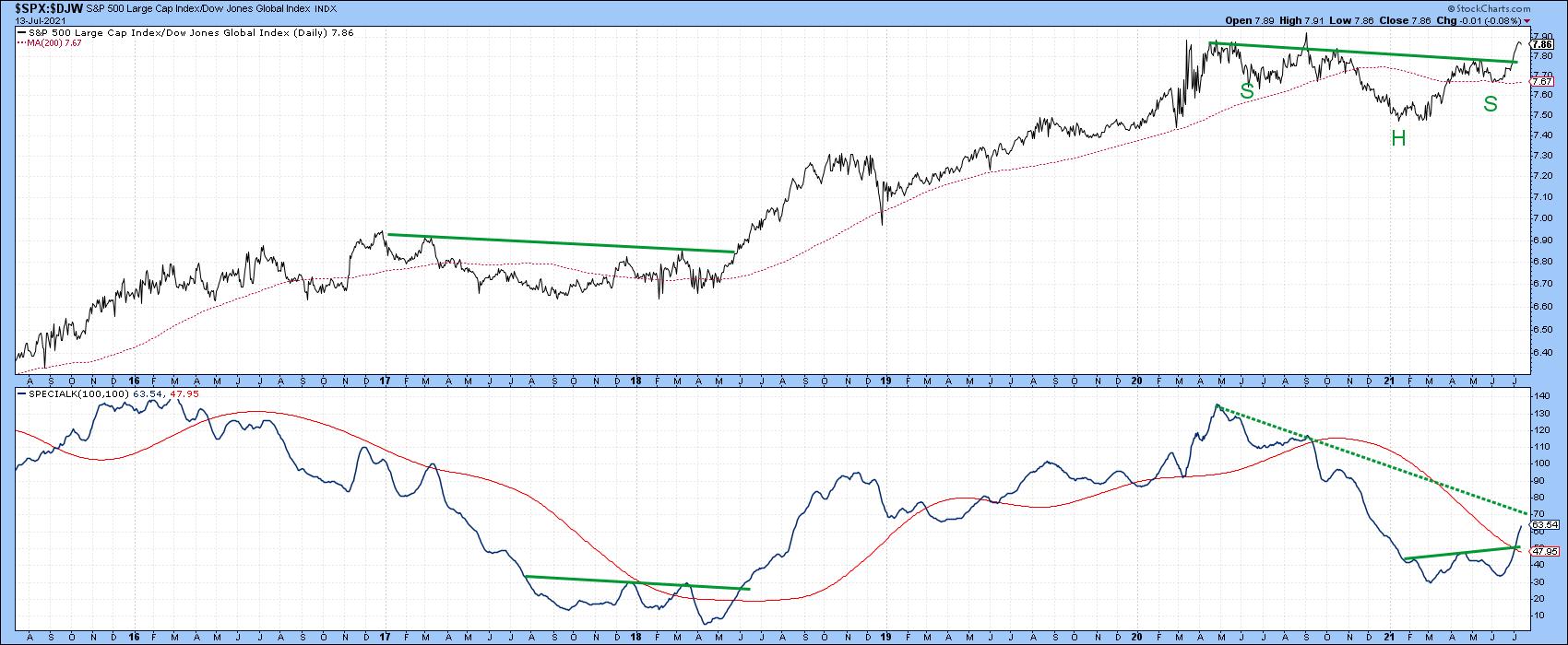 Chart 2 Chart 2
Chart 3 says that it is likely to happen, as both the short- and intermediate-term KSTs are in a bullish mode. This weekly chart enhances the reverse head-and-shoulders seen on the previous daily one. That's because the neckline has been touched or approached on six different occasions. Remember, the more touches or approaches, the more formidable the resistance and the greater the significance of any penetration.
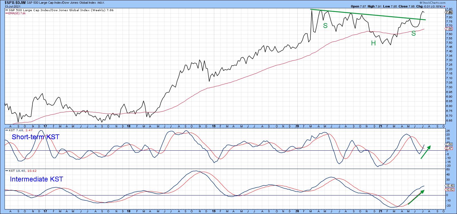 Chart 3 Chart 3
If the US is to Gain, Who Loses?
If the US breakout is valid, nobody has to lose on an absolute trend basis provided the world equity market, as I expect, continues in its long-term bullish phase. However, in a relative sense, there are always winners and losers. In this instance, we are using the S&P Composite as our relative benchmark. On that basis, Asia and some emerging markets look the most vulnerable. Chart 4 shows that the iShares Japan ETF (EWJ), as featured in the top window, continues to trade above its 65-week EMA. It is also being supported by a positive long-term KST. No problem there, apart from an overextended KST. However, relative action recently broke below significant support in the form of the red trendline. The relative KST is also dropping.
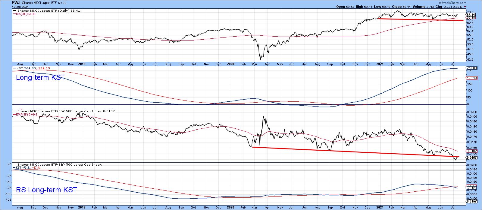 Chart 4 Chart 4
China is also positive on an absolute basis, but only just. That's because the iShares China ETF (MCHI) is only slightly above its 65-week EMA. Adding to the stress level is the fact that the price is also right at the neckline of a potential head-and-shoulders top. Moreover, the absolute long-term KST has begun to roll over. Not much doubt as to the bearish direction of relative action, as the RS line has just broken to a post-2016 low. In addition, the relative KST has recently crossed below its 26-week EMA.
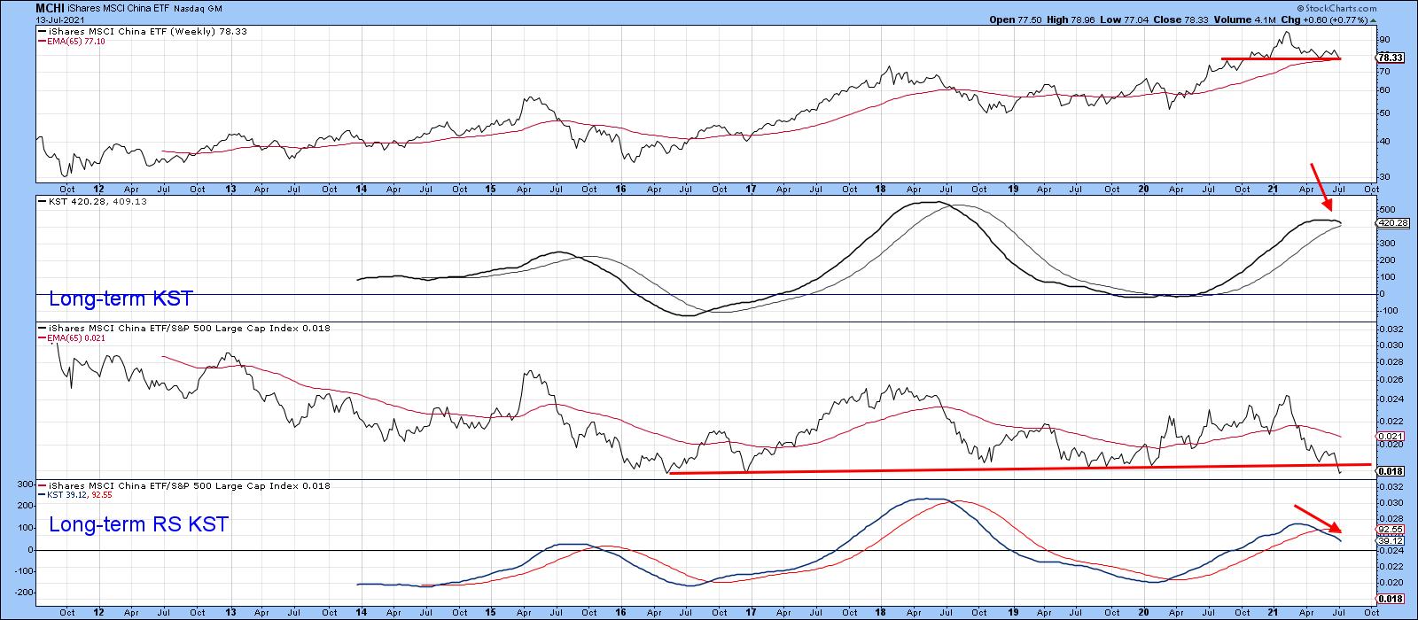 Chart 5 Chart 5
Chart 6 indicates that the SPDR Emerging Asia Pacific ETF (GMF) is comfortably above its 65-week EMA. However, the RS line is right at 5-year support trendline and therefore faces a critical relative strength test. One problem lies in the fact that the RS long-term KST has just triggered a sell signal by crossing below its EMA. Finally, we should note that emerging markets prefer a falling dollar and it's quite possible that the Dollar Index is in the process of signaling an end to its bear market.
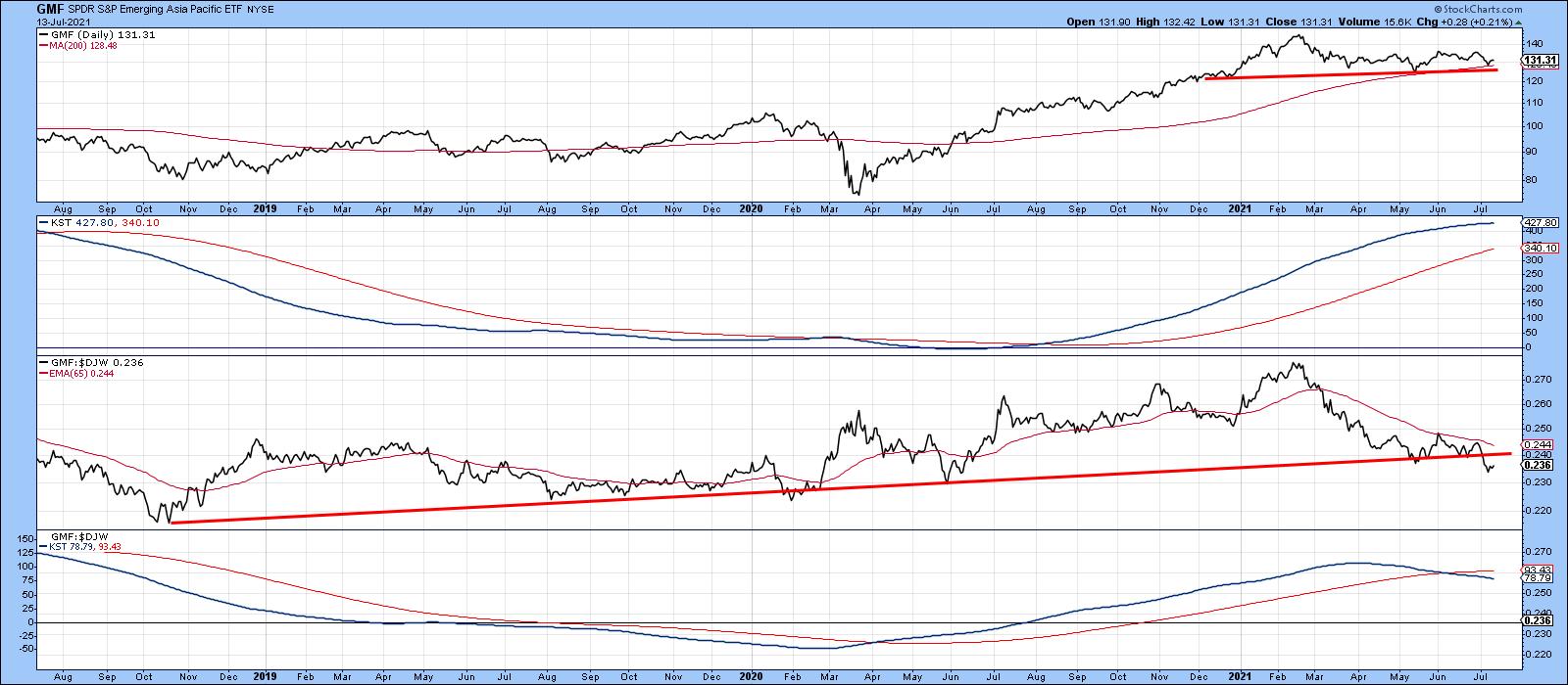 Chart 6 Chart 6
iShares 20-year + Treasury Bond ETF (TLT) fails to hold above its 200-day MA
A key test of any bear market bull market transition is for the price to cross and then hold above its 200-day MA. The crossover is the easy part, but the ability to hold above the average is far more difficult to achieve, as it represents an important piece of evidence that the tide has turned.
Chart 7 shows that the TLT was recently showing some promise, with two overbought readings (see the blue arrows) failing to trigger a decline, which is a bull market characteristic. Since that positive action was capped by a 200-day MA cross, evidence in favor of a primary trend reversal or trading range environment was beginning to mount.
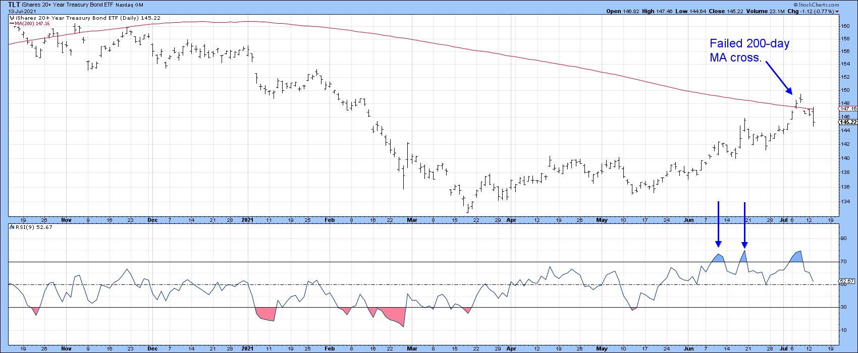 Chart 7 Chart 7
However, Tuesday's action confirmed Friday's drop below the average, thereby indicating that the breakout was a whipsaw. Bear market rallies are notably deceptive, where false breaks above the 200-day MA are a typical characteristic.
The failure of the price to hold that breakout now throws open the possibility that a test of the neckline of the potential head and shoulders top (Chart 8) is now underway.
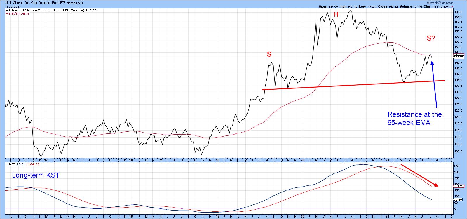 Chart 8 Chart 8
Good luck and good charting,
Martin J. Pring
The views expressed in this article are those of the author and do not necessarily reflect the position or opinion of Pring Turner Capital Group of Walnut Creek or its affiliates.
|
| READ ONLINE → |
|
|
|
| ChartWatchers |
| Thinking Outside the US Box |
| by Julius de Kempenaer |
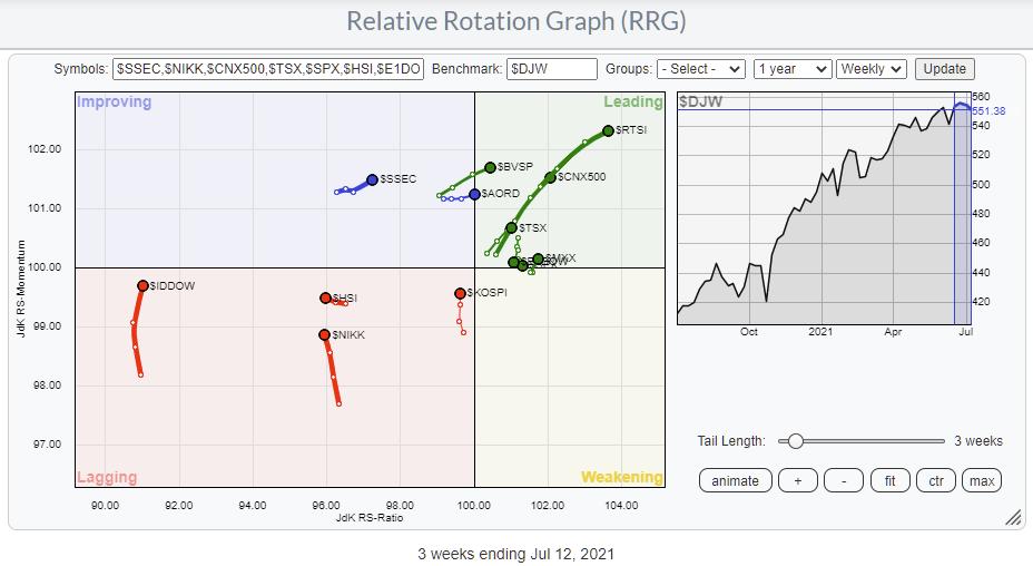
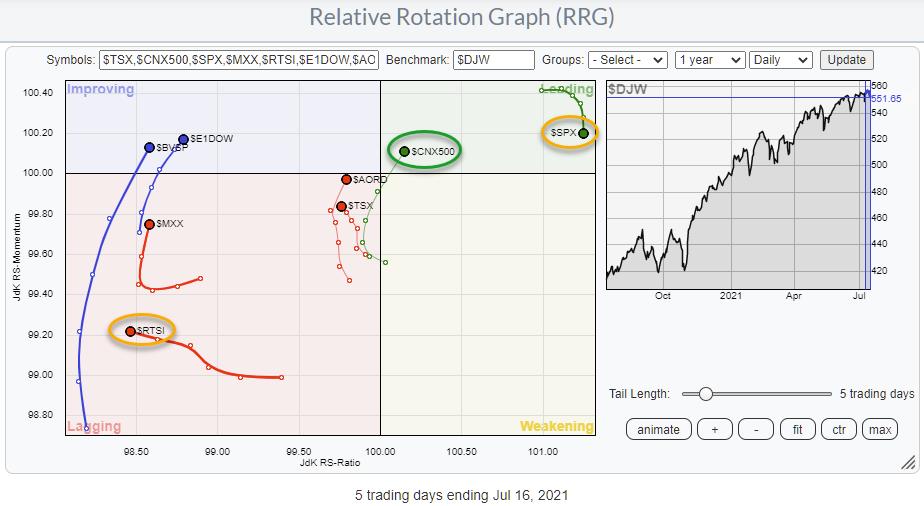
The Relative Rotation Graph above shows the rotation for major stock market indexes against the Dow Jones Global Index.
First of all, this is a so-called "open universe" which means that not all constituents of the benchmark are plotted on the graph. As a result, the universe is not necessarily more or less evenly spread out over the canvas as it usually is with a closed universe.
The more interesting rotations in this universe are found inside the leading quadrant.
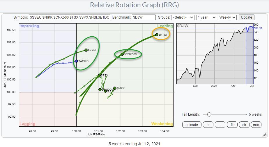
The tail furthest into the leading quadrant is for $RTSI (Russia Trading System Index). On the same trajectory, but not as far in, is the Indian $CNX500, while even lower on that trajectory we find the Canadian $TSX. Brazil ($BVSP) and Australia ($AORD) are entering the leading quadrant this week at good momentum values.
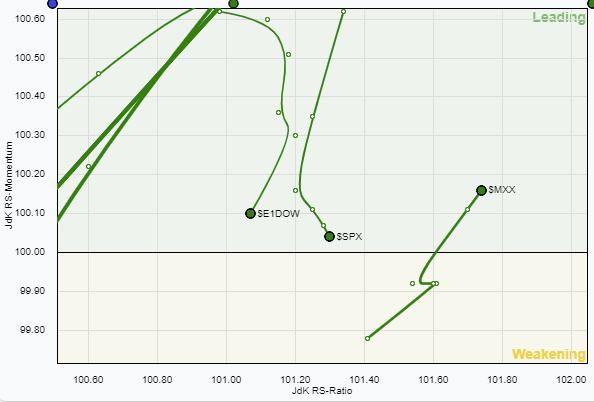 In the cluster close to 100 on the JdK RS-Momentum line inside the orange oval, we have the US ($SPX), Europe ($E1DOW) and Mexico ($MXX). The small RRG magnifies this area. Mexico just returned to the leading quadrant after a rotation through weakening, but both $SPX and $E1DOW are heading South. The $SPX picked up a bit of relative strength last week while $E1DOW continued to lose on both scales. In the cluster close to 100 on the JdK RS-Momentum line inside the orange oval, we have the US ($SPX), Europe ($E1DOW) and Mexico ($MXX). The small RRG magnifies this area. Mexico just returned to the leading quadrant after a rotation through weakening, but both $SPX and $E1DOW are heading South. The $SPX picked up a bit of relative strength last week while $E1DOW continued to lose on both scales.
Inside this universe and inside the leading quadrant in this RRG, both tails are weakening, signaling that other markets are picking up steam vs Europe and the US. Bringing the tails from the leading quadrant on the weekly RRG to a daily RRG gives the picture below.

The position of the $RTSI tail inside lagging and pushing lower on the JdK RS-Ratio scale suggests that the weekly tail is about to roll over. That is to say, the period of relative outperformance for Russia is coming to an end.
On the daily RRG above, the $SPX is rolling over inside the leading quadrant and getting back to the same RRG-Heading as the weekly tail for $SPX. This suggests that more underperformance vs. the world in underway in coming weeks.
Europe and Brazil are moving into the improving quadrant on the daily RRG. The long daily tail for Brazil supports a further push into the leading quadrant on the weekly RRG. The weekly tail for Europe moving opposite to the daily makes it difficult to get a clear handle. However, the shorter tail for Europe on the daily RRG and the weekly tail at a negative RRG-Heading tips the balance more to weakness/underperformance, IMHO.
Closer to the benchmark are the Australian $AORD and the Canadian $TSX. The $AORD picked up nicely the last day of the week and is now back at a positive heading in line with the weekly tail, suggesting that more strength lies ahead. $TSX needs to pick up relative strength, move higher on the RS-Ratio scale to get back in line with the weekly tail for Canada.
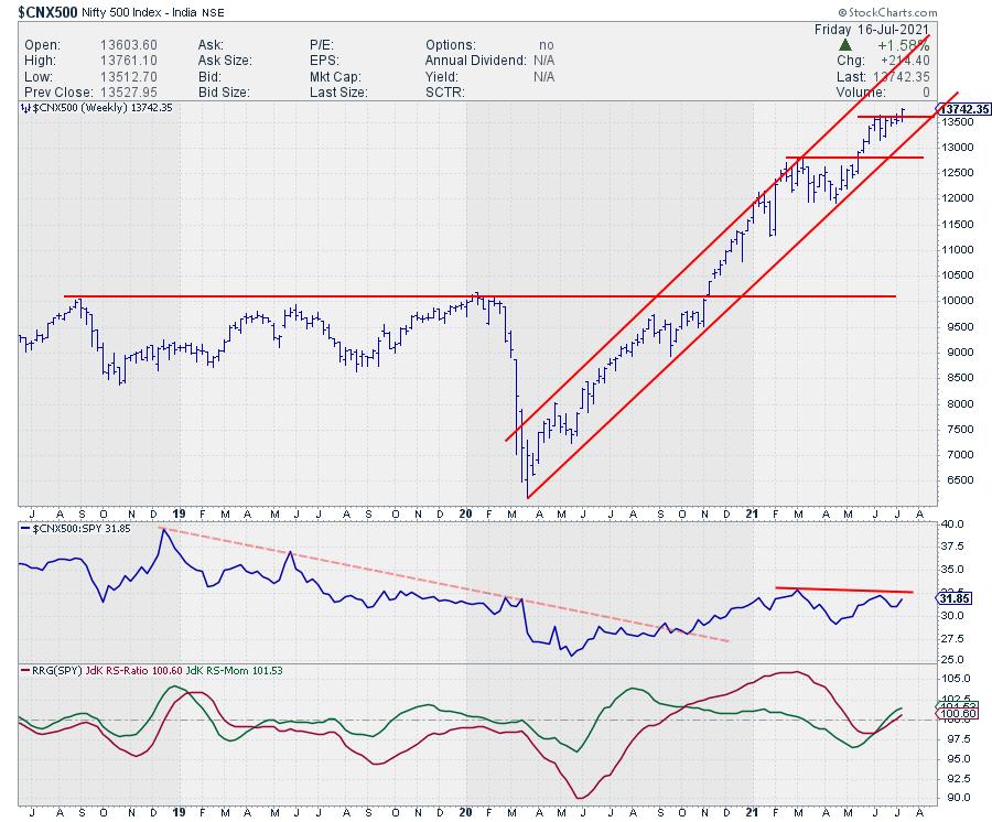
The most promising index in this universe for the moment seems to be the India Nifty 500. Well inside the leading quadrant and moving at a strong RRG-Heading on the weekly RRG, it is just returning into the leading quadrant at a strong heading on the daily RRG.

This week's upward break on the weekly price chart will very likely cause an acceleration in the ongoing uptrend. With the bigger components of the global index (Europe and US) under pressure, India seems to be a very reasonable alternative for some alternative equity exposure.
Some of the ETFs that you could use and which are available to chart on StockCharts.com are FLIN, PIN, and INDA.
#StaySafe and have a great weekend, --Julius
My regular blog is the RRG Charts blog. If you would like to receive a notification when a new article is published there, "Subscribe" with your email address.
|
| READ ONLINE → |
|
|
|
|
|
| ChartWatchers |
| Broader Markets are Looking Weary. Here's How to Build Your Watch List |
| by Mary Ellen McGonagle |
If you want to uncover the next big winning stock, now is the ideal time to be screening the markets. Why? Because proven studies have shown that the #1 driver of a stock that goes on to far outpace the markets is big, accelerating earning-per-share (EPS) growth.* This growth in earnings is what attracts the attention of the big institutional investors, who go on to bid the stock much higher.
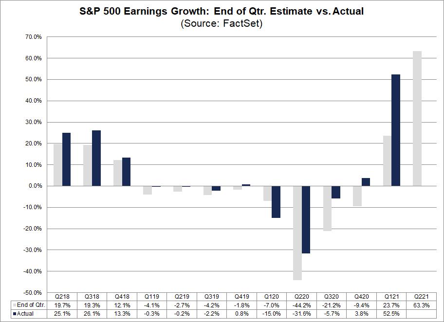
Second quarter earnings reporting just started and, according to research firm FactSet, the S&P 500 is expected to report the highest earnings growth in more than 10 years.

In addition, during the past four quarters (Q2 2020 through Q1 2021), actual earnings reported by S&P 500 companies have exceeded estimated earnings (see chart above). On average, 83% of companies reported EPS above their estimates. This should be great news for investors looking to uncover the next big winner.
Unfortunately, strong earnings alone will not always lead to higher stock prices. You also need a bullish backdrop; not only in the broader markets, but the industry group that stock is a part of.
Studies show that 37% of a stock's price movement is directly tied to the performance of its industry group.*
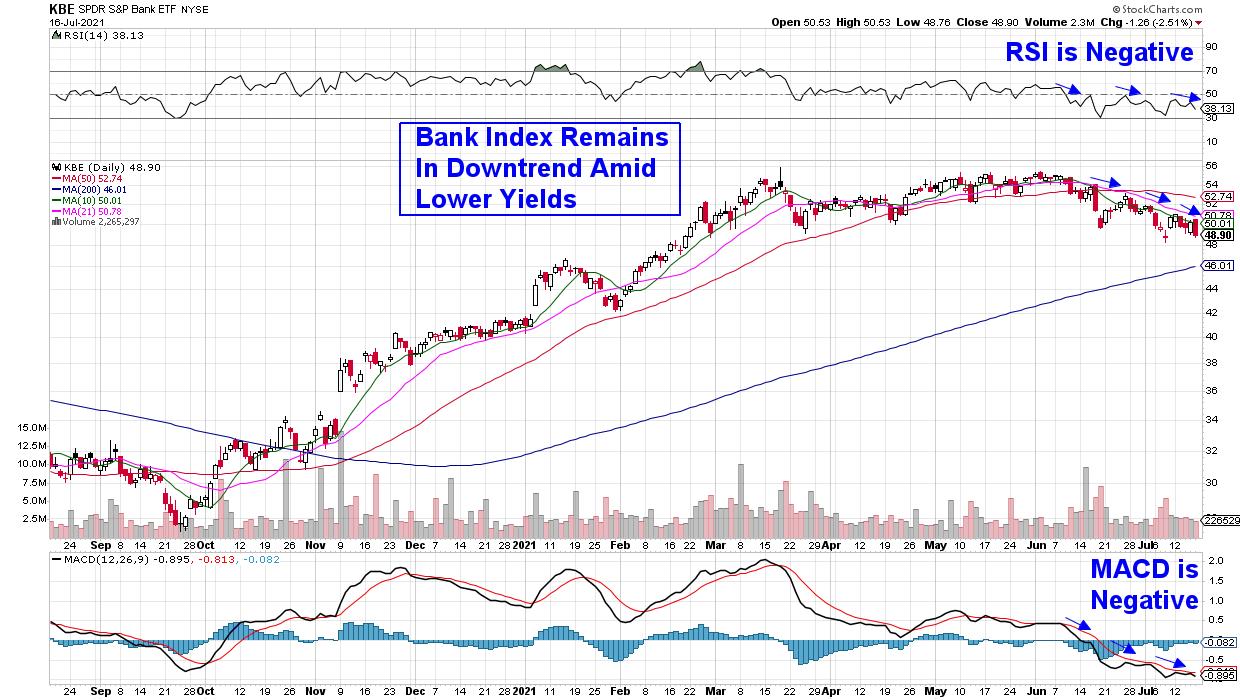
Take JP Morgan (JPM) and Goldman Sachs (GS), who both reported excellent earnings last Tuesday but have since traded lower. This is because the Banking industry group they're a part of is in a downtrend as yields continue to decline.
DAILY CHART OF S&P BANK ETF

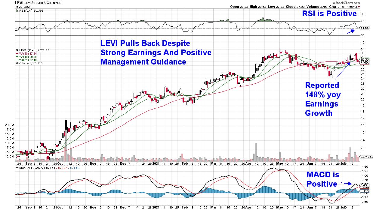
Other big growers are selling off for different reasons, including clothing manufacturer Levi's (LEVI), who reported triple digits earnings growth that was 160% above estimates. The stock pulled back from a post-earnings advance and is now below its pre-earnings price. The poor performance in LEVI is in line with a sharp decline in many Retail stocks that are being hurt by lowered Consumer Confidence in the face of inflation fears.
DAILY CHART OF LEVI STRAUSS & CO. (LEVI)

That doesn't mean that each of these stocks shouldn't have a place on your watchlist. Once market and industry group pressures are lifted, these stocks may very well go on to far outpace the markets.
Historical precedence of winning stocks shows that a minimum quarterly EPS growth rate is 25%. However, the best-performing stocks will have EPS gains of 50% to 100% or more, so it's important to focus on companies with those higher earnings.
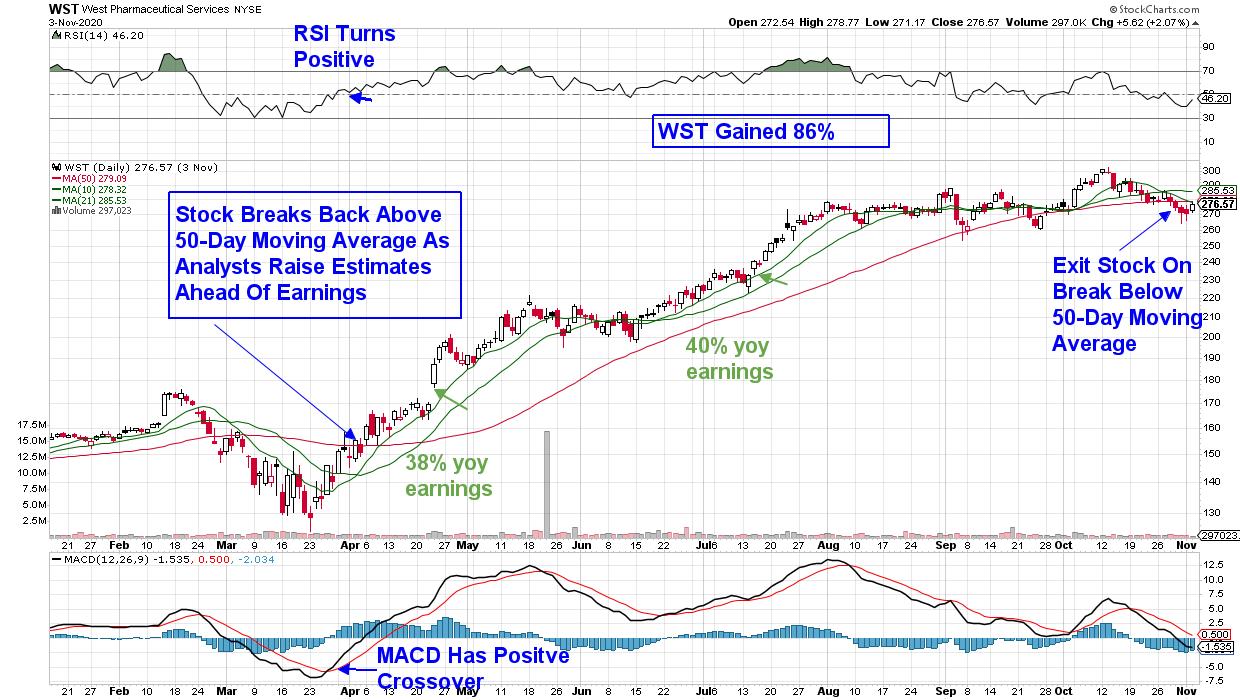
Take winning stock West Pharmaceutical (WST), which went on to gain 86% following 2 consecutive quarters of earnings that were above 35% (see chart below). This stock was a big winner for subscribers to my MEM Edge Report, as we identified the stock as a buy 3 weeks prior to their first strong quarter in April of last year.
DAILY CHART OF WEST PHARMACEUTICAL SERVICES (WST)

As was alluded to earlier, the broader markets are struggling despite remaining very close to record highs. The continued rally in heavyweight FANMG stocks is masking distribution elsewhere, as recently leading areas of the market are fading.
My MEM Edge Report for this Sunday will provide further insights into the broader markets, and I'll reveal what to be on the lookout for so you can create a plan of action. I'll also share where pockets of strength are, as well as select stocks that can help buffer against volatility.
Use this link here for a 4-week trial of this bi-weekly report as well as immediate access to my most recent reports!
Warmly,
Mary Ellen McGonagle
On this week's edition of StockCharts TV's The MEM Edge, Mary Ellen reviews weak areas of the market that appear poised to head lower. She also discusses important takeaways from companies that have reported 2nd quarter results, as well as stocks trending upward on Delta variant news.
MEM Investment Research powered by Simpler Trading
*Source: How to Make Money in Stocks by William J. O'Neil
|
| READ ONLINE → |
|
|
|
| ChartWatchers |
| The IYW Shines -- See Why |
| by John Hopkins |
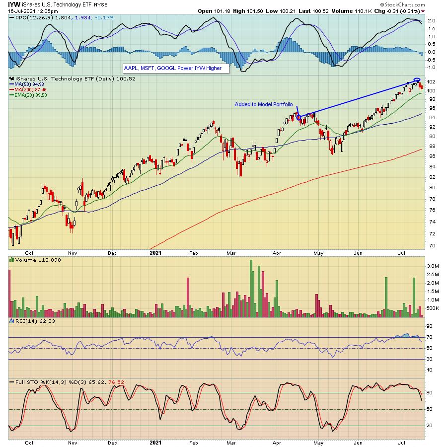
The IYW is a US Technology ETF. Its three largest holdings are AAPL, MSFT and GOOGL. At its peak this past Wednesday, it was higher by 9.4% from the date it was added to our ETF Model portfolio on April 19, compared to the S&P of 5.5% during the same period of time. Why am I bringing this up? Because we are getting ready to unveil our next batch of ETF's this upcoming Monday that are meant to be held for the next 90-day period, and our theme when selecting ETF's for our members is "Know What You Own". In other words, what stocks make up a specific ETF, as that is a very important question.

Let me put this another way. Would you want to buy an ETF that consisted of technically broken stocks? Or stocks that had weak accumulation/distribution lines? Or stocks in an industry that was out of favor? Probably not. This is why it pays to study which companies are represented in a specific ETF, especially if you are looking to beat the performance of one of the biggest ETFs of all: the SPY.
In looking at performance, all 8 of the ETFs we unveiled to members on April 19 rose higher at some point from the time they were added to our Model Portfolio, though it was the IYW that outperformed the S&P substantially during the same 90-day period. And it represented the highest percentage of the portfolio, weighing in at 25%. Since its inception in October of last year, our Model ETF portfolio has clocked a very impressive gain of over 21%.
When our Chief Market Strategist Tom Bowley unveils his next batch of ETFs this Monday, July 19, at 5:00 pm Eastern Time, he will discuss his strategy in selecting and weighting the various ETFs to maximize their cumulative return. This will include demonstrating how he arrives at his picks - the "behind the scenes" mechanics. In addition, on Tuesday at 4:30 pm Eastern, Tom will be holding a webinar for members, "Q2 Earnings Season", as he points out the best quarterly earnings reports to date and then uses both absolute and relative strength indications to uncover those companies most likely to report blowout results throughout the balance of earnings season. In other words, which companies to zero in on that could provide the highest returns.
Both the ETF and Q2 Earnings Season webinars are very popular events that you don't want to miss -- and you can sign up for a FREE 30-day trial that will get you access to both events as well as all of the features of the EarningsBeats service. Just click here.
When you trade individual stocks ,you should be looking at all of the tools at your disposal to make smart trading decisions. The same goes for ETFs; dig deep beneath the surface and know what you are about to own!
|
| READ ONLINE → |
|
|
|
| Mish's Market Minute |
| Market Reckoning -- Will Support Levels Hold? |
| by Mish Schneider |
Over the last week, we heard the chair of the Federal Reserve, Jerome Powell, address worries over the recent 5.4% year over year inflation increase. While the Fed continues to hold an accommodative stance with its bond-buying program, some are doubting whether the Fed is taking inflation seriously.
So far, the Fed continues to look at inflation from a transitory side and expects it to run hot for a while as bottlenecks and supply-chain issues get resolved. However, prices change in consumer staples and in general tend to be sticky. This could be causing the market stress, as this week's price action has been unpredictable, with new highs in the S&P 500 and the Nasdaq 100 followed by 2 down days.
With that said, we are watching specific sectors in the market to hold recent lows, as they could be showing pivotal areas the market needs to hold if Monday's market continues to lower.

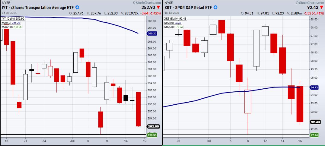
To jump right in, the Transportation (IYT), Retail (XRT) and Regional Banking sectors (KRE) all have roughly the same chart pattern, with a recent low created on 7/08. Come Monday, this low will need to hold if they are going to stand their ground. Both the transportation and retail sectors are important, for they show sentiment in the demand and supply side of the market.
Additionally, regional and big banks kicked off this quarter's earnings. Although the expectations for robust earnings were met, the banks, for the most part, could not hold onto gains. This could very well be the theme for the earnings in big tech, coming up very soon.
The market is forward -thinking. Big expectations are most likely already priced in. The 3rd quarter may disappoint as labor is still a concern, along with slower economic growth following the surge post-COVID. And COVID has not exactly gone back into the closet either, with surges in cases all over the globe.
The small-cap index Russell 2000 (IWM) is another focus at MarketGauge. IWM has been rangebound since the beginning of the year and is now close to the lower edge of its range around $208-$211.50. This is the main support to hold, besides the 200-day moving average coming in at $206.46.
The market is heading into a week of reckoning. Either these support levels hold up or we could be looking at a bigger correction. Certainly, the long treasury bonds are flashing caution as well, with yields continuing to fall.
Follow Mish on Twitter @marketminute for stock picks and more. Follow Mish on Instagram (mishschneider) for daily morning videos. To see updated media clips, click here.
On this week's edition of StockCharts TV's Mish's Market Minute, Mish covers an important sector that is often a way to diversify your portfolio into safer plays during tougher times.
Watch Mish on Cavuto: Coast to Coast as she gives insights on inflation and commodities.
ETF Summary
- S&P 500 (SPY): 427 support area.
- Russell 2000 (IWM): 211.50 next support.
- Dow (DIA): 341.53 next support.
- Nasdaq (QQQ): 354.42 next support area.
- KRE (Regional Banks): 61.24 support recent low.
- SMH (Semiconductors): Watching for to confirm caution phase with second close under the 50-DMA at 247.95.
- IYT (Transportation): 251.78 support.
- IBB (Biotechnology): 156.50 support area from 50-DMA Like to see 158.60 level hold.
- XRT (Retail): 99.24 main resistance. 91.71 main support.
Mish Schneider
MarketGauge.com
Director of Trading Research and Education
Forrest Crist-Ruiz
MarketGauge.com
Assistant Director of Trading Research and Education
|
| READ ONLINE → |
|
|
|
| DecisionPoint |
| Participation Keeps Getting Worse |
| by Carl Swenlin |
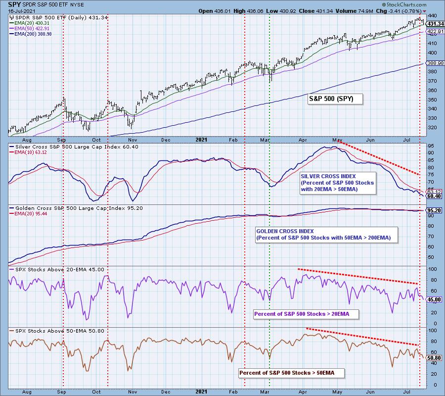
In spite of the market making new, all-time highs this week, participation continued to deteriorate. Our focus is usually on the S&P 500 Large-Cap Index, so we'll begin with that, but mid- and small-cap stocks are really looking bad as well. The Silver Cross Index for the S&P 500 has dropped to 60%, meaning that 60% of SPX stocks have the 20EMA above the 50EMA. Obviously, the largest component stocks are holding the index aloft. This is entirely possible because there are some giant stocks in the index; however, 60% is really starting to push the envelope. To make matters worse, only 50% of SPX stocks are above their 50EMA, meaning that there is the potential for an additional 10% of stocks to lose their Silver Cross status, which would leave only 50% of stocks supporting the index.

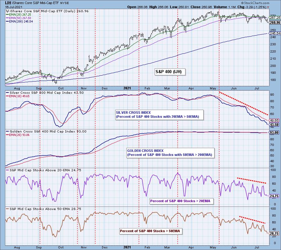
S&P 400 Mid-Cap stocks are much worse than the large-caps. Only 43% of them have the 20/50EMA Silver Cross, and only 29% are above their 50EMAs. That leaves an additional 16% of mid-cap stocks with the potential for 20/50EMA negative crossovers. We will assert that there is no way for this index to avoid a bear market under those circumstances.


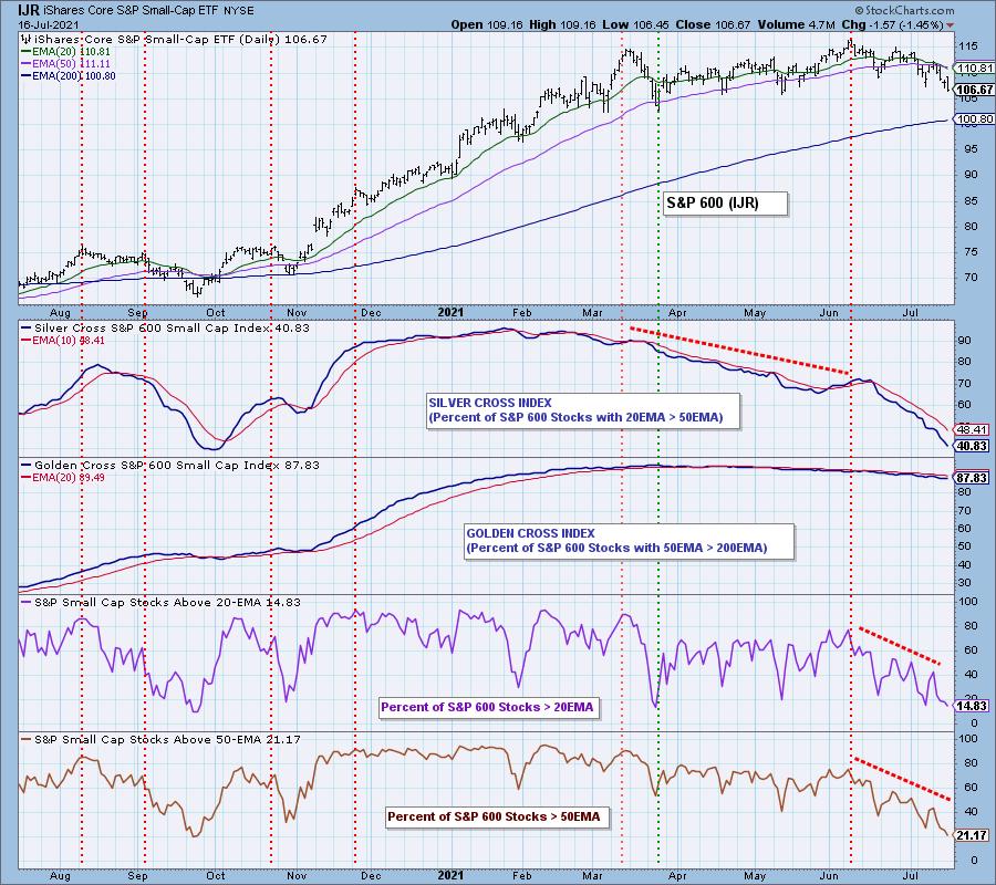
As could be expected, the S&P 600 Small-Cap Index is in the worst shape of the three indexes. Only 41% have a Silver Cross, and only 21% are above their 50EMA, meaning that the Silver Cross percentage could drop to 21% or lower. We think it is safe to say that this index may already be in a bear market, it just doesn't know it yet.

CONCLUSION: As the market has relentlessly moved to record highs, we can clearly see that the foundation has been steadily crumbling beneath it. This condition could be turned around with renewed buying interest, but at present the internals are very weak and getting worse. Extreme caution is indicated.

Click here to register in advance for the recurring free DecisionPoint Trading Room! Recordings are available.
Technical Analysis is a windsock, not a crystal ball.
--Carl Swenlin
(c) Copyright 2021 DecisionPoint.com
Helpful DecisionPoint Links:
DecisionPoint Alert Chart List
DecisionPoint Golden Cross/Silver Cross Index Chart List
DecisionPoint Sector Chart List
DecisionPoint Chart Gallery
Trend Models
Price Momentum Oscillator (PMO)
On Balance Volume
Swenlin Trading Oscillators (STO-B and STO-V)
ITBM and ITVM
SCTR Ranking
DecisionPoint is not a registered investment advisor. Investment and trading decisions are solely your responsibility. DecisionPoint newsletters, blogs or website materials should NOT be interpreted as a recommendation or solicitation to buy or sell any security or to take any specific action.
|
| READ ONLINE → |
|
|
|
| MORE ARTICLES → |
|





 In the cluster close to 100 on the JdK RS-Momentum line inside the orange oval, we have the US ($SPX), Europe ($E1DOW) and Mexico ($MXX). The small RRG magnifies this area. Mexico just returned to the leading quadrant after a rotation through weakening, but both $SPX and $E1DOW are heading South. The $SPX picked up a bit of relative strength last week while $E1DOW continued to lose on both scales.