| THIS WEEK'S ARTICLES |
| John Murphy's Market Message |
| ENERGY AND FINANCIALS CONTINUE TO LEAD |
| by John Murphy |
ENERGY ETFS ACHIEVE BULLISH BREAKOUTS... Rising energy prices continue to fuel a rally in energy shares which are the day's strongest sector. Crude oil and natural gas are trading at the highest level in several years and show no signs of slowing down. That's contributing to upside breakouts in a couple of energy ETFs. Chart 1 shows the Energy Sector SPDR (XLE) rising above its June high to reach the highest level in two years. Chart 2 shows the S&P Oil & Gas Exploration & Production SPDR (XOP) doing the same. The inflationary impact of rising energy prices is also helping push bond yields higher which is making financial stocks another market leader.
 Chart 1 Chart 1
 Chart 2 Chart 2
FINANCIAL SECTOR IS SETTING A NEW RECORD...Financials are today's second strongest sector thanks largely to rising bond yields. Chart 3 shows the Financial Sector SPDR (XLF) in the process of setting a new record high. Stronger bank stocks are one of the main reasons why. Chart 4 shows the S&P Bank SPDR (KBE) nearing a record as well. Bank stocks are one of the main beneficiaries of rising bond yields and a steeper yield curve. And that's partially the result of rising energy inflation. And helps explain why both sectors are market leaders.
 Chart 3 Chart 3
 Chart 4 Chart 4
S&P 500 REGAINS ITS 100-DAY AVERAGE... Wednesday's message showed the S&P trying to. climb back over its 100-day moving average. Chart 5 shows the SPX gapping above its green line on Thursday. That's an encouraging sign. That leaves it between potential resistance at its blue 50-day line and potential support at its green 100-day line.
 Chart 5 Chart 5
|
| READ ONLINE → |
|
|
|
| ChartWatchers |
| The Secret to Selecting the ETFs that are Right For You |
| by Tom Bowley |
I have two reasons for writing this article. First, I'm hosting a FREE webinar relating to ETF selection on Saturday morning that I'll discuss later. Second, I was having a market-related discussion with a good friend a few nights ago and he was explaining his investment strategy. He said he didn't like investing in individual stocks because they were "too risky", then proceeded to tell me he only owns ETFs and told me which ETFs he owns. I thought to myself, "do I tell him that his ETFs are 100% comprised of individual stocks?" I did tell him and he didn't really understand the entire concept.
Hence, the writing of this article.
ETFs come in so many shapes and sizes. If you don't understand the stock market and all the nuances, selecting the right ETFs for your own personal strategy and objectives can be daunting, to say the least. While I personally focus on trading individual stocks, because that fits my strategy and style, I realize many of you are much more comfortable spreading your risk around various ETFs. Accordingly, we started offering an ETF portfolio that we select every quarter. The next release date will be Tuesday, October 19th. Our flagship ETF product, however, is our ETF Analyzer, which is an Excel spreadsheet listing ETFs meeting our momentum and liquidity objectives, each ETF's representation by sector and its Top 10 Holdings. This information is critical in establishing a truly planned portfolio of ETFs; by using it, you can quickly determine your overall percentage allocation to all 11 sectors, while comparing your percentages by sector to the S&P 500's.
This way, if you're a fan of the financial sector, for instance, because treasury yields are on the rise, you can ensure that your money is being put to work in the way you intended. By checking out the Top 10 Holdings, you can quickly determine if your ETF(s) are concentrated in few individual stocks, which is much riskier, or evenly concentrated in a large number of individual stocks - a much more diversified approach.
Let me provide you an example.
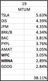
On the last ETF Analyzer spreadsheet that I provided to EarningsBeats.com members, there was an ETF listed MTUM, the iShares MSCI USA Momentum Factor ETF. Without doing any research, would you have any idea what this ETF invested in? Do you think it's diversified? Which sectors does it invest in? Here's a snippet of our ETF Analyzer spreadsheet that you might find surprising:

MTUM's Top 10 Holdings represent 38.11% of the entire ETF. That might be appealing to you, and maybe not. But it could be a great ETF holding if you're looking for balance with a heavy dose of financial stocks. 34.32% of MTUM is invested in financials. We have another spreadsheet that lists the Top 10 Holdings for each ETF listed. Here are MTUM's:

You may not be a fan of TSLA's, and knowing that it's the top-weighted stock at 5.63%, maybe that's a deal breaker. Or, on the flip side, maybe you like the fact that these are all very well-known companies with large market caps. It could be a staple in your portfolio, or possibly a secondary ETF, or, again, maybe you don't like it all. But the key here is that you actually know what you own!
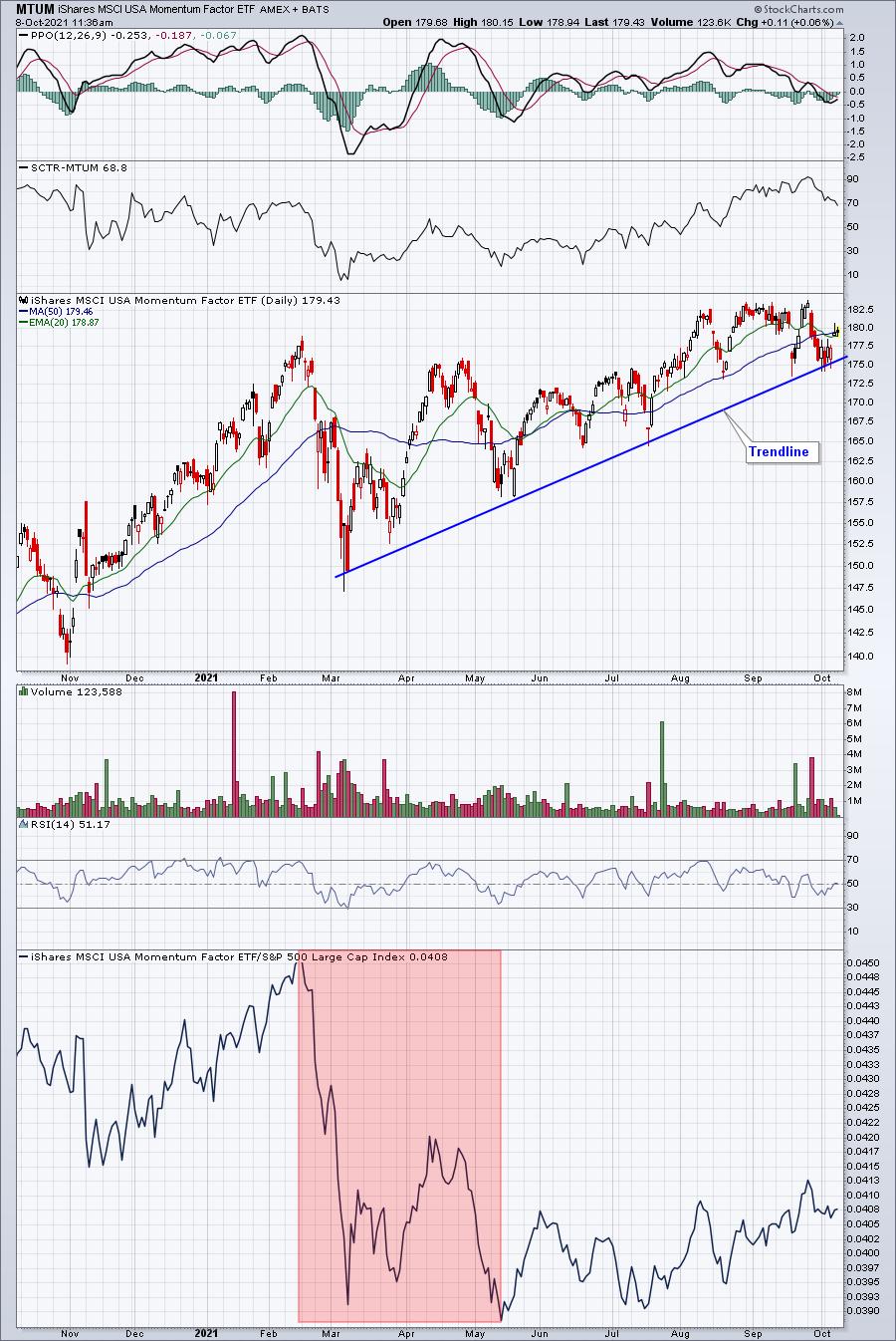
One other piece of this ETF puzzle is the technical piece. How well has this ETF performed vs. the benchmark S&P 500? We provide a ChartList of ALL of our ETFs listed so that you can also view the technical performance as well, in order to make a completely informed decision. Here's the current look at MTUM:

MTUM has been holding its recent trendline, a bullish signal. However, the red-shaded area at the bottom shows significant relative weakness, which was likely the result of growth stocks underperforming from February to May while inflation numbers were surging.
The point here is that putting thousands and thousands of dollars to work in ETFs that you don't understand is a strategy designed to fail. Be sure to invest in leading ETFs and understand what your ETFs own. By doing so, you'll be in a much better position to build a winning investment strategy.
On Saturday, October 9th, at 11:00am ET, I'll be hosting our "Sneak Preview: Model ETF Portfolio" event, where I'll describe our process in building a sound and profitable ETF investing strategy. All of our EarningsBeats.com community is invited, including our FREE EB Digest newsletter subscribers (no credit card required). You can register for this event in one of two ways - either by CLICKING HERE to enter your name and email address to join our EB Digest newsletter OR you can join directly by using the room link below. If you use this link to enter and you're not already a free EB Digest subscriber, we'll make sure to add you. Also, keep in mind that the room will not open until Saturday 10:30am ET and the event won't begin until 11:00am ET. Here's the room link: https://earningsbeats.zoom.us/j/83299713065.
It will be a very educational event, so I hope you can join me! By the way, if you can't make the event LIVE, we'll send out the recording to all EB Digest subscribers, so be sure to sign up!
Happy trading!
Tom
|
| READ ONLINE → |
|
|
|
| ChartWatchers |
| A Run on Banks |
| by Julius de Kempenaer |

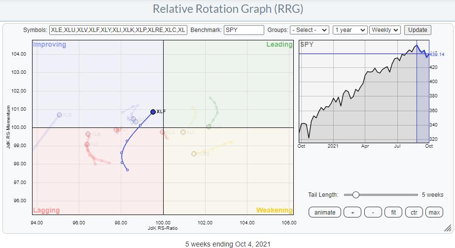
On the Relative Rotation Graph for sectors, the tail on XLF is showing one of the most promising rotations, being inside the improving sector and traveling at a strong RRG-Heading towards leading. Relative and price-technical arguments aside, I think there are two charts that support a further rotation towards and into the leading quadrant for the Financials sector.
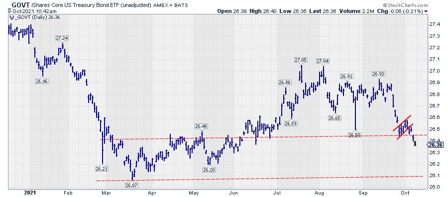
Government Bonds

Government bonds, ETF GOVT, have just broken lower from a small consolidation pattern after the first thrust lower. The next support level to watch, imho, is around 26.10. Lower bond prices mean higher yields and higher yields are a positive thing for financials, especially banks.
Yield Curve

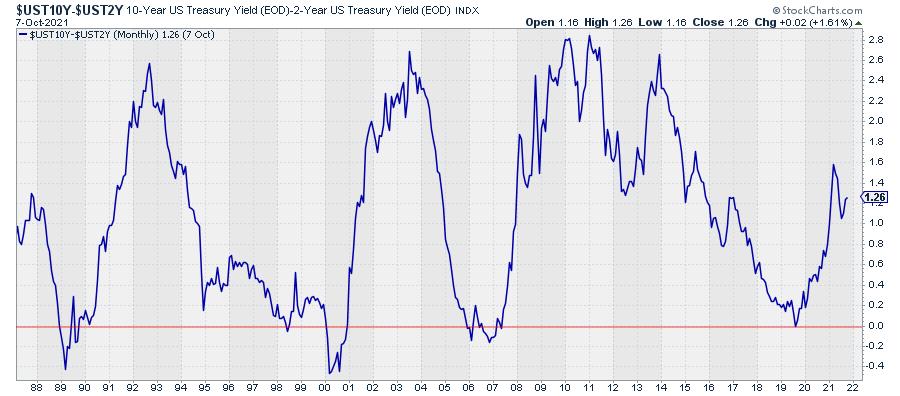
The second chart I am watching is the yield curve, essentially the difference between 10-year and 2-year yields. On the chart above, you can see how that difference "inverted" (i.e. dropped below 0) shortly in the middle of 2019. After that low, the difference started to rise sharply, which means a steepening curve. The long-dated yields are rising faster than the shorter-dated yields. This, in general, is also a positive for financials/banks.
Groups

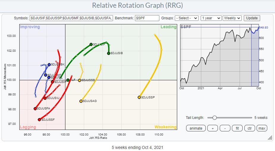
The RRG that shows the rotations for the various groups in the financials sector highlights a few interesting tails.
From a positive point of view, the eye-catchers are Full-Line Insurance, Banks and, to a lesser extent, Life Insurance. These groups are all at a strong RRG-Heading and either inside or moving towards the leading quadrant. The groups in the yellow weakening quadrant are all still fairly good from a relative point of view, but they seem to be going through a corrective phase. All groups inside the lagging quadrant are also at a negative heading and are therefore better avoided.

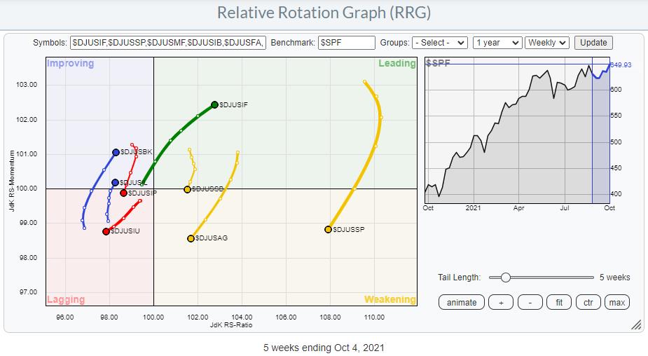
On the same RRG above, only the most meaningful tails are displayed. It's interesting to see how different the rotations for the various insurance groups are playing out.
$DJUSIF (Full Line insurance) is clearly in a strong relative uptrend, but $DJUSIP (Property and Casualty Insurance) and $DJUSIU (Reinsurance) are on an opposite trajectory. Banks, $DJUSBK, is found inside the improving quadrant, at a strong RRG-Heading and on its way to leading.
Banks

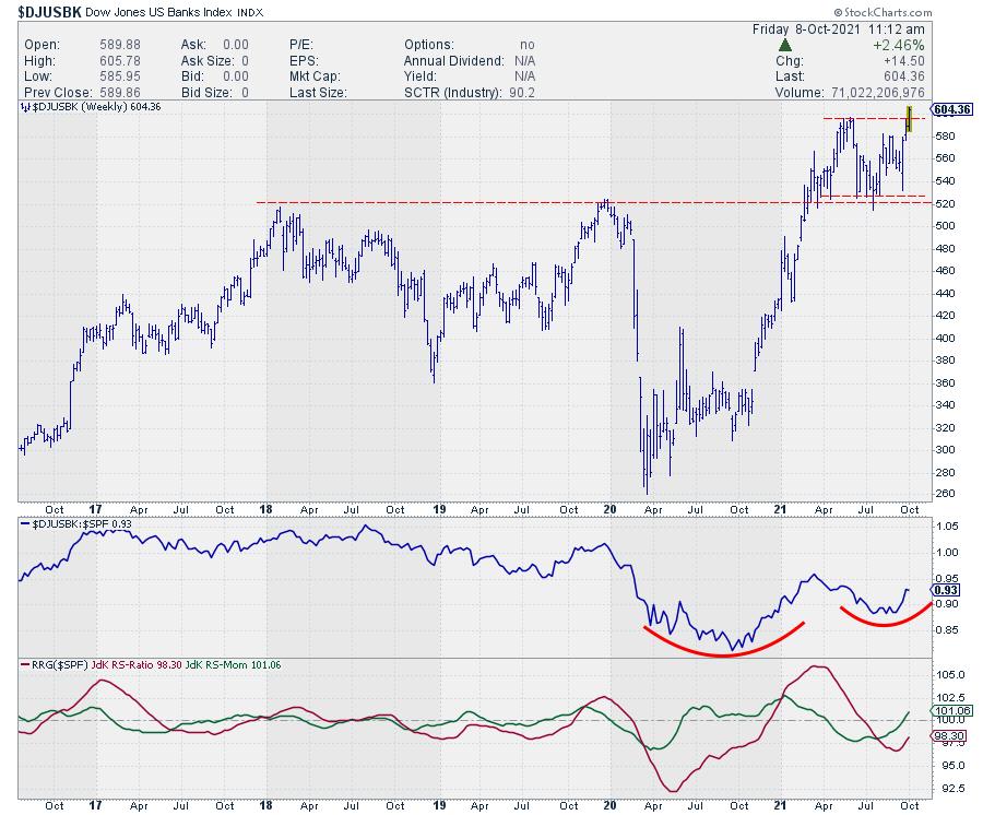
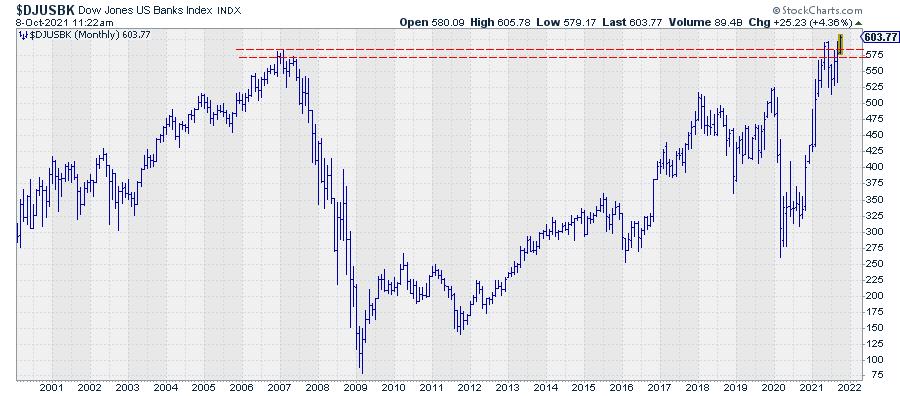
This week, the Banks index is breaking out from a consolidation phase that started after breaking above multi-year resistance earlier this year. So this is fully aligning with a strong relative rotation. As the consolidation is clearly marked by an upper and lower boundary and the upward break is looking pretty strong (half a day trading left when I am writing this article), we can peg a price target by projecting the height of the range on top of the breakout. Roughly, this comes out with $670 as the target ($600-$530=$70, $70+$600=$670).
A quick check on the monthly chart learns that this break actually also means the clearing of the 2007, pre-financial crisis, top.

The added benefit of such a break is that the upward potential is, in essence, unlimited, with no overhead resistance insight, while downside risk is well protected at the breakout level ($600).
Fifth Third Bancorp

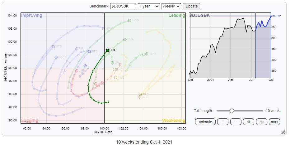
Running a Relative Rotation Graph for the banks in this index against the Group index as the benchmark shows a few interesting tails that are worth further investigation. For this occasion, I picked FITB.

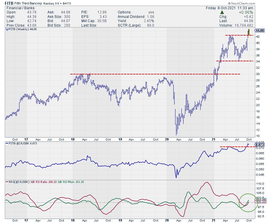
Both RS and Price are breaking to new highs, which causes both RRG lines to curl back up above the 100-level and push FITB further into the leading quadrant of an already leading group in a sector that is getting stronger!
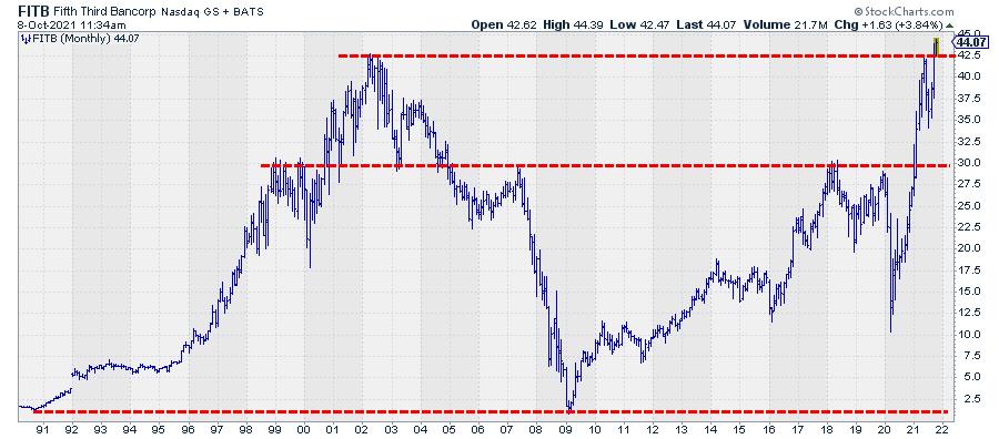
However!!! The real message is, once again, coming from the monthly chart!

The close of the monthly bar for September was at 42.44, which was right on the overhead resistance level coming off the monthly highs from March-June 2002(!!!.... 2002, that is almost 20 years ago!!) and May 2021.
Breaking 20-year resistance.... Wow .....
One word of caution. The month of October is still young. BUT, when FITB can hold and close above roughly 42.50, all ingredients for a massive rally are lining up.
Wishing you a very good and healthy weekend. --Julius
My regular blog is the RRG Charts blog. If you would like to receive a notification when a new article is published there, "Subscribe" with your email address.
|
| READ ONLINE → |
|
|
|
|
|
| Martin Pring's Market Roundup |
| This Sector is Likely to Outperform the NASDAQ in a Major Way |
| by Martin Pring |
Back in April and May, I wrote about the possibility that the tech-dominated NASDAQ had begun to lose its mojo. The argument was based more on relative action than the absolute price, as I was, and still am, bullish on the primary trend.
Recent NASDAQ Underperformance is Likely to Extend
Chart 1 sets the scene with the NASDAQ relative strength line, which completed a large complex head-and-shoulders top in May. Immediately after, it looked very much as if that break would turn out to be false, since the RS line subsequently worked its way back above the neckline. However, it never managed to re-cross its red 200-day MA.
 Chart 1 Chart 1
Chart 2 focuses on the post-breakdown period, where you can see that the RS line looked as if the breakdown formed part of an inverse head-and-shoulders pattern. Had it been completed, the previous top formation displayed in Chart 1 would have been canceled. That did not happen, as the ratio was unable to surpass the 200-day MA and the potential neckline, both of which were in the same vicinity. Whenever you can spot a reliable moving average and a good trendline overlaying each other, it reinforces that area as a resistance zone. In this instance, that resistance proved to be overwhelming. As a consequence, the RS line has now dropped below the dashed red up trendline, joining the head with the potential right shoulder. In most cases, that kind of action is sufficient to indicate that the pattern in question has failed. It also represents a warning that new lows are likely. Finally, the 25-day ROC, in the bottom window, has violated an up trendline in sympathy with the RS line itself. Chart 1 also shows the KST to be in a negative mode.
 Chart 2 Chart 2
It's important to remember that this is an analysis of relative action. Whilst that suggests that the NASDAQ will continue to underperform the S&P Composite, it by no means precludes the Index itself from registering new bull market highs.
NASDAQ versus Energy
Sectors flow in and out of fashion and the NASDAQ will not prove to be an exception. In that respect, one of the key relationships I discussed in May was the long-term cyclic one between the tech-dominated NASDAQ and the energy sector. At the time, there was insufficient evidence to conclude that the 2008-2020 trend favoring the NASDAQ had terminated, though that looked to be a likely proposition. Now more data is available, leading me to believe that the odds more strongly favor a reversal in that trend.
 Chart 3 Chart 3
Chart 3 plots the ratio between the NASDAQ and the NYSE Oil Index. In 2000, it reversed trend to the downside by penetrating a head-and-shoulders neckline and its 24-month MA. Fast-forwarding to the current situation, we see the exact same combination with one proviso, which is that the chart is plotted on a month-end basis. We are currently in the first full trading week for October; consequently, the break is not yet an official one.
A powerful reason why it is likely to happen comes from the 18-month ROC in the lower window. It has clearly reversed from an exceptionally high reading, as was the case at the 2000 peak. Achieving a reading of 200% is a pretty big deal because it means that prices have doubled in an 18-month time span. By way of comparison, the all-time S&P peak in 1929 was less than 100%. When the ROC reverses from such a level, it usually indicates that buyers have exhausted themselves. Research over numerous stock markets, commodities and currencies, going back multiple decades in most cases, reveals that a reading in excess of 200% is definitely in nose-bleed territory. The research shows that, when the ROC peaks from such a reading, that level is not surpassed for an average of 15 years.
 Chart 4Chart 4 tells us that the moment of truth is upon us. In this instance, the ratio has been plotted using the SPDR Energy ETF, the XLE. Once again, it looks like it may be in the terminal phase of completing a head-and-shoulders top, as this relationship is currently resting on a potential neckline. Since the short- and long-term KSTs are in a bearish mode, a downside penetration is a more likely outcome. Chart 4Chart 4 tells us that the moment of truth is upon us. In this instance, the ratio has been plotted using the SPDR Energy ETF, the XLE. Once again, it looks like it may be in the terminal phase of completing a head-and-shoulders top, as this relationship is currently resting on a potential neckline. Since the short- and long-term KSTs are in a bearish mode, a downside penetration is a more likely outcome.
If you really want to roll the dice and compare the NASDAQ to more leveraged energy plays, Charts 5 and 6 show that two such relationships have already completed a downward-sloping head-and-shoulders. In Chart 5, we see the iShares US Oil and Gas ETF (IEO), whereas Chart 6 features the VanEck Vectors Unconventional Oil and Gas ETF (FRAK).
 Chart 5 Chart 5
 Chart 6 Chart 6
Please remember it's possible to update these charts simply by clicking on them.
Good luck and good charting,
Martin J. Pring
The views expressed in this article are those of the author and do not necessarily reflect the position or opinion of Pring Turner Capital Group of Walnut Creek or its affiliates.
|
| READ ONLINE → |
|
|
|
| ChartWatchers |
| A Stealth Area of the Markets is Heating Up - Here Are Three Stocks That'll Benefit |
| by Mary Ellen McGonagle |
The broader markets have been struggling amid inflation and interest rate fears that have collided with a global energy crisis. After peaking in price in early September, the S&P 500 has been in a downtrend that it's been struggling to reverse. Not all areas are seeing selling, however, as Oil and Bank stocks have seen substantial gains over the past 4 weeks. In fact, subscribers to my MEM Edge Report have seen gains as high as 30% among the eight stocks in these 2 groups that we've highlighted as strong buys.
Other areas are also bucking the general downtrend, such as companies that benefit from spending on defense-related projects that will take place despite a possible uptick in interest rates or inflation. In particular, the Space Development Agency (SDA) has been building a system of surveillance satellites that act as a tracking layer to detect missile launches while also performing battle management plans for warfighters on the ground. At full strength, this transport layer is expected to provide coverage to 99% of the Earth's surface.
The result is a need for 144 satellites -- with the SDA looking to hire multiple vendors who would need to begin deployment within three years. Bidding from defense contractors was due today with the awards being announced in January. Below are three companies expected to bid on these lucrative contracts and, judging from their charts, investors are anticipating a positive outcome.
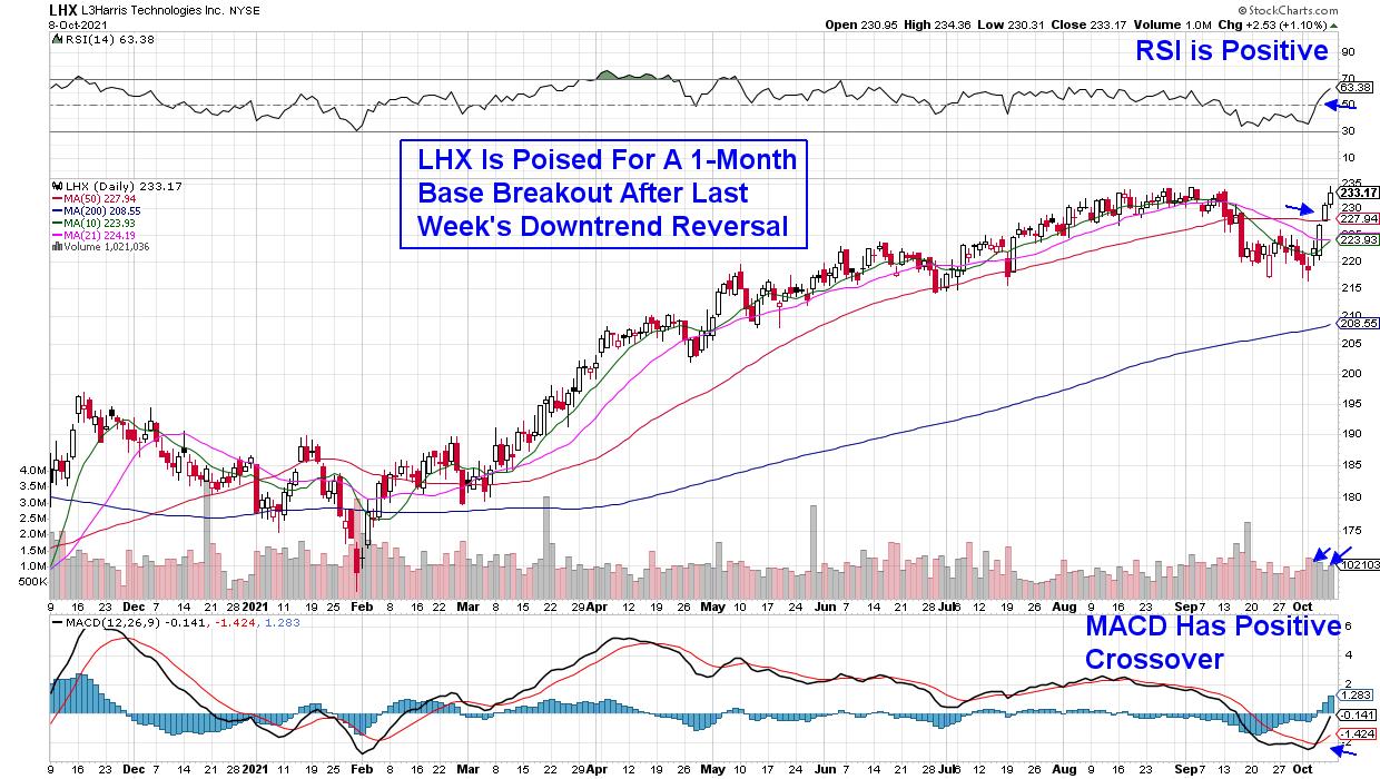
DAILY CHART OF L3HARRIS TECHNOLOGIES (LHX)
Frontrunner L3Harris Technologies (LHX) has a leg up as the company received SDA approval of their satellite design plans late last month. The company has been involved in other cutting-edge areas of technology, with their robots being selected to protect Air Force bases around the world.
Last week, LHX reversed a recent downtrend following a move back above its 50-day moving average on volume. The gains put the stock on track for a 1-month base breakout at $235. With a positive RSI and a bullish MACD crossover, the stock is poised for further upside.
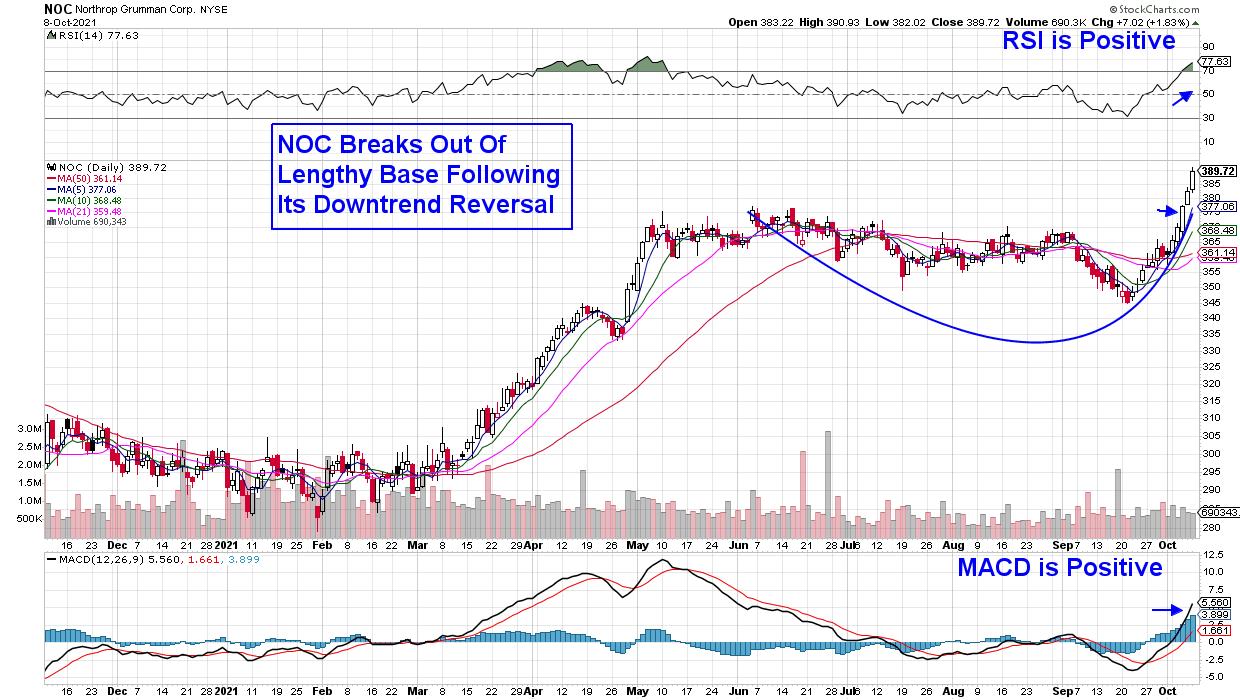
DAILY CHART OF NORTHROP GRUMMAN CORP. (NOC)
Northrop Grumman (NOC) increased its lead as a space stock after it purchased rocket maker Orbital ATK in 2018. The company makes satellites as well as the deep-space telescope for NASA.
NOC broke out of a 4-month base on volume last week as analysts raised earnings estimates for both this year and next. Last week's explosive move puts the stock in an extended position and, with the RSI and Stochastics in positive territory, it can be bought on a pullback to its 5-day moving average.
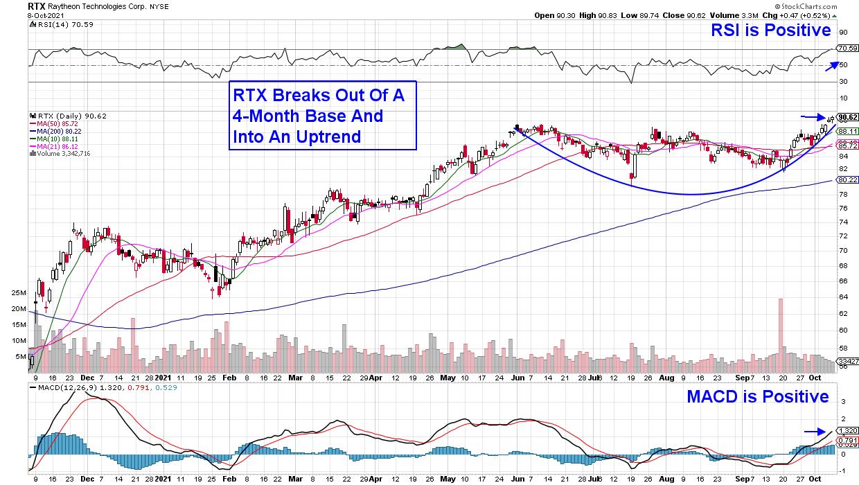
DAILY CHART OF RAYTHEON TECHNOLOGIES (RTX)
Raytheon (RTX) is also building out its space division with an announcement last month that they've purchased a second company that's a leader in satellite technologies. These companies add to RTX's already established Intelligence & Space division.
Raytheon broke out of a 4-month base and into an uptrend last week as the 2.3%-yielder saw estimates revised higher for this year's earnings. RTX is poised for further upside with its RSI and MACD in positive territory.
Several other well-known Defense-related companies are in the running to be selected for the SDA's satellite project; however, their stocks are not in confirmed uptrends at this time. This would include both Boeing (BA) and Lockheed Martin (LMT), which are trading below their key 50-day moving averages and nowhere near a bullish base breakout.
According to the proven methodology I use in my work, most leading stocks begin their outperformance as they're emerging from a base breakout that's coupled with a strong fundamental driver. That's what pointed me toward leading Technology stocks from June until September, and many of these same stocks appear poised to regain their uptrends this month.
If you'd like to be alerted to these stocks as well as know precisely when the broader markets have turned bullish, take a 4-week trial of my bi-weekly MEM Edge Report for a nominal fee now.
On this week's edition of StockCharts TV's The MEM Edge, I review areas of the market that are in confirmed uptrends, with further upside ahead and what areas to stay away from. She also highlights what to be on the lookout for to confirm that the broader markets are safe.
Warmly,
Mary Ellen McGonagle
President, MEM Investment Research
|
| READ ONLINE → |
|
|
|
| The Canadian Technician |
| Power in Potash? |
| by Greg Schnell |
I recently rode on the Rocky Mountaineer train through the Canadian Rockies. This article is another in the series from the railway track point of view. The potash business is one of those businesses that relies on the railway.

I want to focus on the potash companies this week. First of all, it is important to realize how big a train full of potash is. The legal limit is 12000 feet, or over two miles.
Potash Train
Potash is one of those products that the general public doesn't know. However, it is a product widely used in agriculture to help enhance the soil. Looking through the potash companies, the charts are starting to break out.
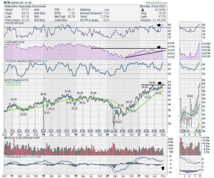
Let's start with Nutrein (NTR, NTR.TO). Nutrein is breaking out to new highs as crops around the world are struggling. I couldn't get a better buy signal. The relative strength in purple is breaking out to the upside as price breaks out to all time highs. The PPO is turning up with a buy signal this week. The chart looks great.

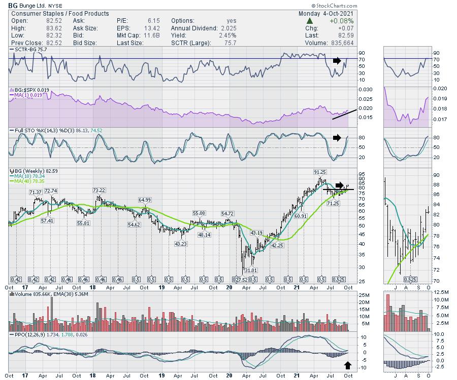
Bunge (BG) is also turning up but has not moved to new highs yet. The relative strength is starting to turn up. The stock SCTR comparing it to peers is moving into the top quartile. That is bullish when the stock resumes outperforming. We would like to see it continue to outperform. This stock is also giving us a buy signal on the PPO this week.

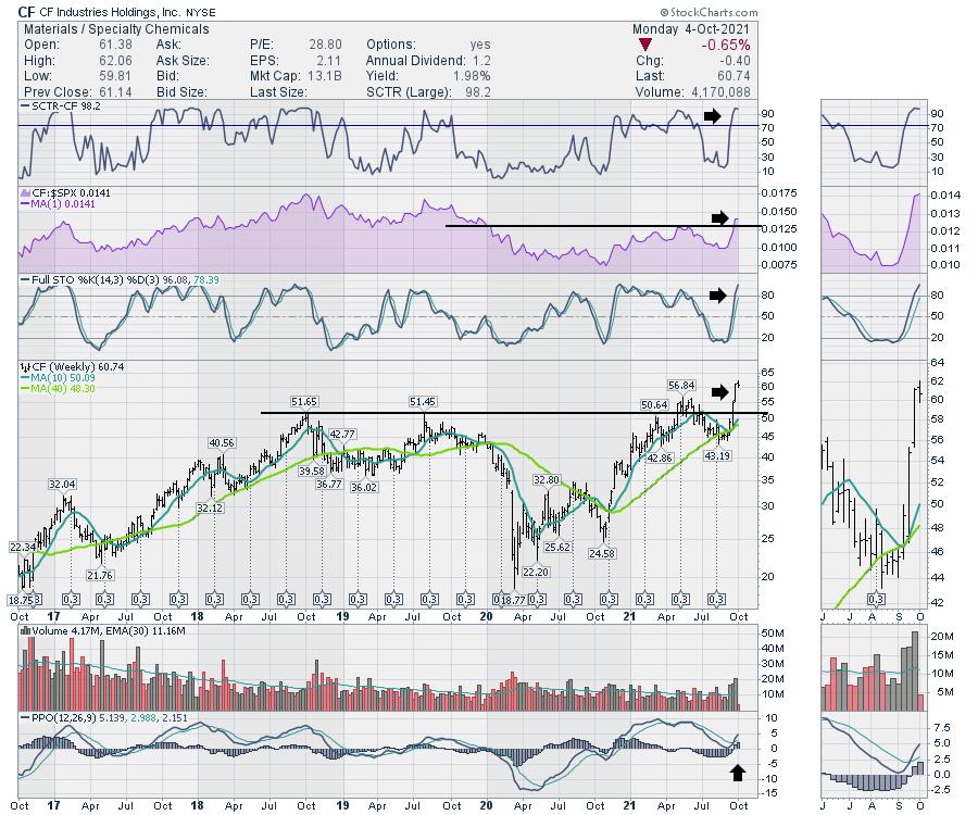
Another Potash stock is breaking out on a buy signal as well, as CF is blowing through to new all-time highs. The volume is soaring on the break out. The relative strength is breaking out to new 2-year highs. But this stock also has a PPO turning up, giving us a buy signal.

So another commodity rolls down the rails, and it is obviously in demand. Three of the players in the commodity are breaking out on buy signals. I like it when the industry turns up as a group. This one looks like it has a lot more room to run, in my opinion.
|
| READ ONLINE → |
|
|
|
| Mish's Market Minute |
| Are Investors Worried Over the Latest Jobs Report? |
| by Mish Schneider |

The recent jobs report came in less than expected, with analysts' estimates running anywhere from 250,000 to 500,000 new jobs created. Disappointingly, employers added only 194,000 jobs in September.
Although the numbers mean slower progress towards the 2-3% unemployment goal, will investors take a cautious note? Possibly, but only if the market loses support from its biggest fan, the Fed.
With the market heavily supported from the Fed's bond-buying program, investors continue to look for upward movement, even though the economy faces slower-than-expected economic growth from supply-chain and labor bottlenecks. This leaves the market at a pivotal point, as the Fed looks to scale back its bond-buying program while supply chain and weak jobs growth point to increasing inflation.
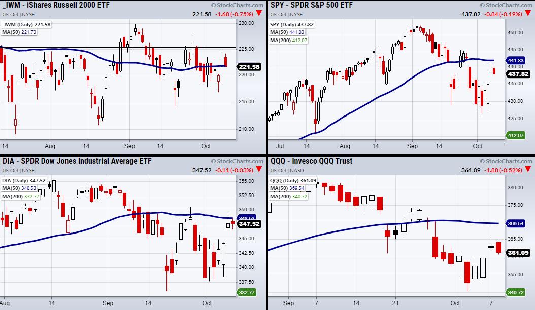
This also aligns with the current market technicals. As seen in the above charts, the Dow Jones (DIA), S&P 500 (SPY) and Nasdaq 100 (QQQ) all have overhead resistance from the 50-day moving average, while the Russell 2000 (IWM) continues to have trouble staying over $225. Therefore, if the market is going to push higher from its recent bounce, it will take more than delaying the debt ceiling to keep the market happy.
On a higher note, even with current issues, U.S demand for goods looks to be growing if the transportation sector (IYT) holds over its 200 and 50-day moving average. Along with a continued growth in U.S manufacturing, if the market becomes rangebound or more volatile, at least core economic fundamentals are heading in the right direction.
Follow Mish on Twitter @marketminute for stock picks and more. Follow Mish on Instagram (mishschneider) for daily morning videos. To see updated media clips, click here.
On this week's edition of StockCharts TV's Mish's Market Minute, following a big correction in the market, Mish covers the intermarket relationships that you can look at to find oversold stocks for potential buys with minimal risk.
On the Friday, October 8 edition of StockCharts TV's Your Daily Five, Mish explains how she likes to have a group of stocks from all asset classes to pick from so that, regardless of what the market does, she has a choice. For example, if it decides to react to inflationary pressures, she has picks that can do well in that. Or, in the case of some easy policy by the Fed, we have some good picks for that as well.
ETF Summary
- S&P 500 (SPY): Resistance 442 area.
- Russell 2000 (IWM): Resistance 225.
- Dow (DIA): 350 resistance.
- Nasdaq (QQQ): 366 level to clear.
- KRE (Regional Banks): Needs to hold over 70.
- SMH (Semiconductors): 248.745 support area.
- IYT (Transportation): Needs to stay over 251.
- IBB (Biotechnology): 153.38 support.
- XRT (Retail): 89.15 support the 200-DMA.
Forrest Crist-Ruiz
MarketGauge.com
Assistant Director of Trading Research and Education
|
| READ ONLINE → |
|
|
|
| MORE ARTICLES → |
|
 Chart 1
 Chart 2
 Chart 3
 Chart 4
 Chart 5


