| THIS WEEK'S ARTICLES |
| John Murphy's Market Message |
| BREADTH FIGURES WEAKEN |
| by John Murphy |
S&P 500 SHOWS SOME NEGATIVE DIVERGENCE... Stocks are ending the week in a mixed fashion. The Dow Jones Industrials are weakening, while the Nasdaq 100 is hitting a new record. That being the case, this message will focus on the S&P 500 which is in the process of testing its early November high. One area of possible concern on a short-term basis is its 14-day RSI line in the upper box which is starting to weaken at its overbought reading of 70. In addition, its daily MACD lines in the lower box have also turned negative. Neither carries major significance. But may be hinting that the SPX is due for short-term pullback. Breadth measures are also starting to weaken.
 Chart 1AD LINES WEAKEN...Two different versions of advance-decline figures are shown below. And both show short-term weakness. Chart 2 shows the NYSE Advance-Decline line falling to the lowest level in a month. That means that losing stocks outnumber the number of winning stocks during November. Chart 1AD LINES WEAKEN...Two different versions of advance-decline figures are shown below. And both show short-term weakness. Chart 2 shows the NYSE Advance-Decline line falling to the lowest level in a month. That means that losing stocks outnumber the number of winning stocks during November.
Chart 3 shows the NYSE Common Stock Only Advance-Decline Line pulling back as well. Neither AD line has fallen enough to signal that market uptrend is in serious trouble. But they have slipped enough to suggest that the market's short-term uptrend is starting to weaken. Sector performance has also weakened.
 Chart 2 Chart 2
 Chart 3 Chart 3
SECTOR BREADTH IS ALSO WEAKENING...A study of sector performance over the past week also shows short-term weakness. Eight sectors are declining during Friday trading, while only three are gaining. The winners include technology, utilities, and consumer discretionary stocks. Everything else is losing ground. For the week, seven sectors have lost ground, while only four are gaining. There again, no serious warnings are being given. The fact that most sectors are losing ground this week, however, is another sign that the market's short-term trend may be weakening.
|
| READ ONLINE → |
|
|
|
| The Mindful Investor |
| Five Stocks I'm Watching Next Week |
| by David Keller |
My Market Trend Model remains positive on all three time frames, which means I focus on three main goals: identify breakout opportunities with upside potential, lean into positive trends that continue to work and, lastly, look for signs of weakness that may indicate the bull market phase is exhausted.
On Friday's episode of The Final Bar, we talked about three stocks in the Communication Services sector that demonstrate where opportunities may lie in a sector that is struggling on a relative basis. I'll also share with you two other charts that I'll be following closely in the weeks to come!
Communication Services is one of the newest S&P sectors, formed a number of years ago from the old Telecom sector, along with internet names from Technology and media/entertainment stocks from Consumer Discretionary. As a result, this sector represents many different business models and, because of that, many different technical patterns.
We'll start with Alphabet (GOOG), with one of the most consistent uptrends around.
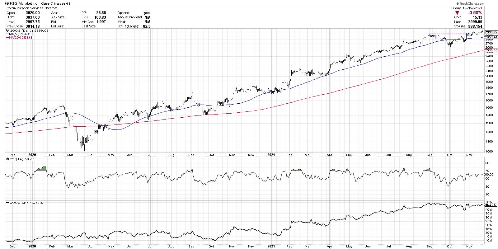
GOOG recently broke above the "big round number" of $3000, which took the stock above its early September price peak. If you look at the relative strength, you'll see the stock has essentially been in line with the market returns since that point.
This week saw interest rates pull back and the growth trade pushed higher, including names like Alphabet. I would expect a bullish trend like this one to remain in place until proven otherwise, but a break back below $3000 is what I'm watching using the StockCharts Price Alerts function.
Second, we have Meta Platforms (FB), which just rotated back above its 50-day moving average.

When FB started to pull back in early September, I keyed in on the $290-300 range based on previous support/resistance levels, as well as the Fibonacci retracement levels. While FB did violate its 200-day moving average, it remained above $300 and now has rotated back to a short-term uptrend. I'll remain focused on this important area of support because, assuming the price remains above $300, the uptrend appears to be intact.
Next, we have Walt Disney (DIS) and an example of a stock breaking price support.

While FB has remained above price and Fibonacci support in recent weeks, DIS has done exactly the opposite. Now the chart of Disney has been less than ideal for quite some time; note how the stock topped out back March and has yet to regain those levels, compared to the consistent higher highs in our first two charts.
In the last two weeks, DIS has gapped down out of a six-month trading range, and this week followed through with a break of the 38.2% retracement level using the March 2020 low and March 2021 high. The stock has now reached the oversold region on the RSI for the first time since May. Back in May, the stock bounced off support, and I will be looking to see if there any signs of life for DIS going forward. For now, the overall technical picture appears negative with further downside potential.
Now we go outside of Communication Services for two stocks where Fibonacci retracements also are very much in play. Wynn Resorts (WYNN) is one of a number of gambling stocks that have shown signs of life in recent weeks.

WYNN topped out in March, similar to DIS, but has seen a more consistent downtrend from that point on. After bottoming out near the 61.8% retracement level in mid-September, the stock has pushed higher over the past two months. Now the stock has moved back above its 50-day moving average, but appears to have stalled just below the 38.2% Fibonacci level. This is now a range-bound chart with clear resistance in the $100-105 level, and clear support around $77-80.
Which way will the price break? Given the fact that the RSI remains in the bearish range below 60, I'd give the benefit of the doubt to the bear case. But I'll be watching those key levels to see where the next breakout occurs.
Finally, let's look at Visa (V).

All of the payment processors, names like V, PYPL and GPN, have been struggling recently, while the broad markets have been moving higher. While charts like FB have found support before reaching their first Fibonacci objective, Visa has broken down through this key support level. V bounced briefly off the 38.2% level earlier this month, but this week's gap lower pushed the stock below $206 to the end the week right at "big round number" support at $200.
What's really compelling about the Visa chart is how well the Fibonacci levels line up with previous price support levels. The 38.2% level was hit a number of times earlier in 2021, the 50% level lines up with the Jan 2021 low, and the 38.2% is right at the October 2020 low.
Any time Fibonacci levels line up with traditional support and resistance levels, I've found these to be more meaningful and more important to track. For now, the path of least resistance appears lower, with next support around $192 and $178.
In a bull market phase, it's all about identifying opportunities for further upside. I've found that, by regularly reviewing key charts for important levels of interest, you can use price alerts to better anticipate inflection points and identify entries and exits.
If you want to get further information on applying Fibonacci Retracements on that last example, Visa, check out the video below!
RR#6,
Dave
P.S. Ready to upgrade your investment process? Check out my free course on behavioral investing!
David Keller, CMT
Chief Market Strategist
StockCharts.com
Disclaimer: This blog is for educational purposes only and should not be construed as financial advice. The ideas and strategies should never be used without first assessing your own personal and financial situation, or without consulting a financial professional.
The author does not have a position in mentioned securities at the time of publication. Any opinions expressed herein are solely those of the author, and do not in any way represent the views or opinions of any other person or entity.
|
| READ ONLINE → |
|
|
|
| ChartWatchers |
| Top Stock Picks Revealed |
| by John Hopkins |
This past Thursday evening, our Chief Market Strategist Tom Bowley unveiled his "Top 10 Stock Picks" for our 4 portfolios, 40 stocks in all. These stocks are meant to be held for the subsequent 90 days, when a new batch of stocks will be unveiled and the process is repeated each quarter. The portfolios are meant for those members who are less inclined to be active traders, but are not necessarily long term buy-and-hold investors. But we also have plenty of members who like to trade individual stocks that make up the portfolios. How have the portfolios performed this past quarter and since inception? You can see for yourself in the chart below.

While our most conservative portfolio, the Income Portfolio, lagged the S&P over the same period of time, you can see that the Aggressive portfolio has crushed the S&P (a 4-bagger) and the Strong AD has outperformed the S&P by more than double. Combined, the 4 portfolios averaged over 13% for the quarter compared to the S&P of 6.78%, almost a double. How did this happen?
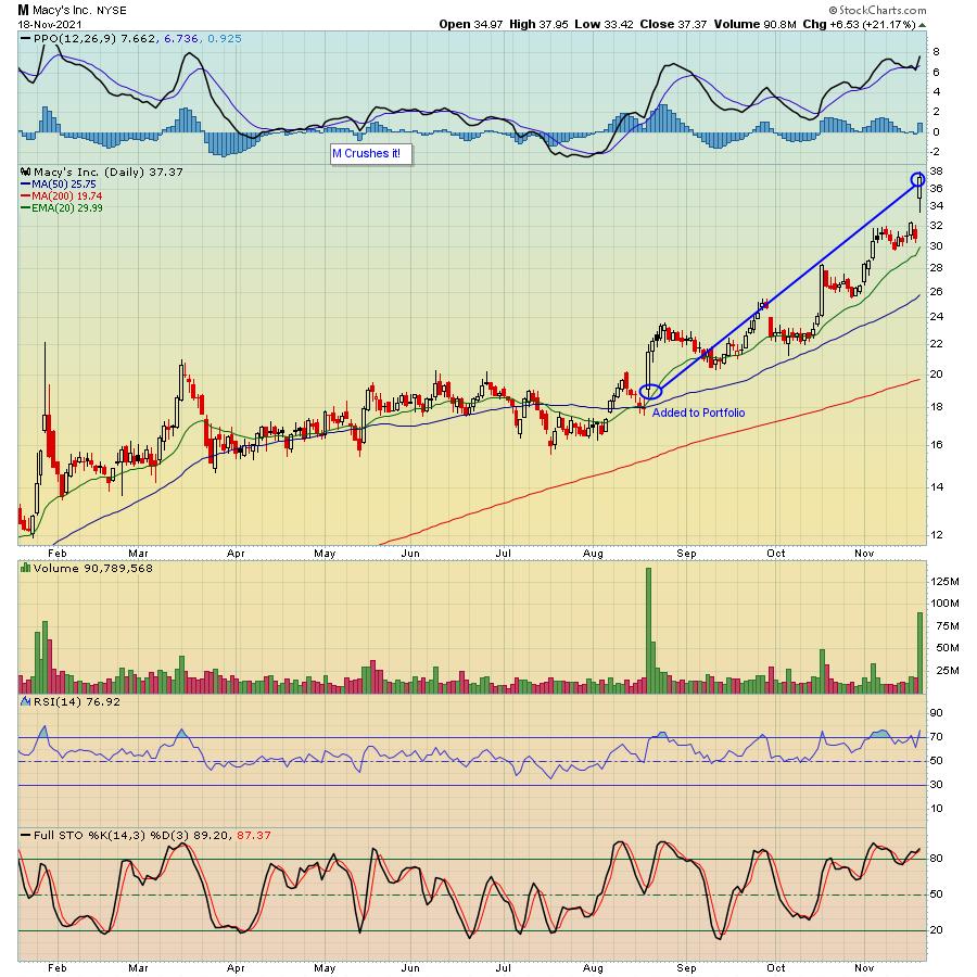
First, it helped that both Macy's (M) and NVIDIA (NVDA) were included in the Aggressive portfolio. For example, in the case of M, as you can see below, when the stock was added to the portfolio on August 19, it was trading at a price of $21.61. As of Thursday's close, the stock was at $37.37, resulting in a 73% gain.
In the case of NVDA, as you can see below, when the stock was added to the portfolio on August 19, it was trading at $197.98. As of Thursday's close, the stock was at $316.75, a gain of 60%.
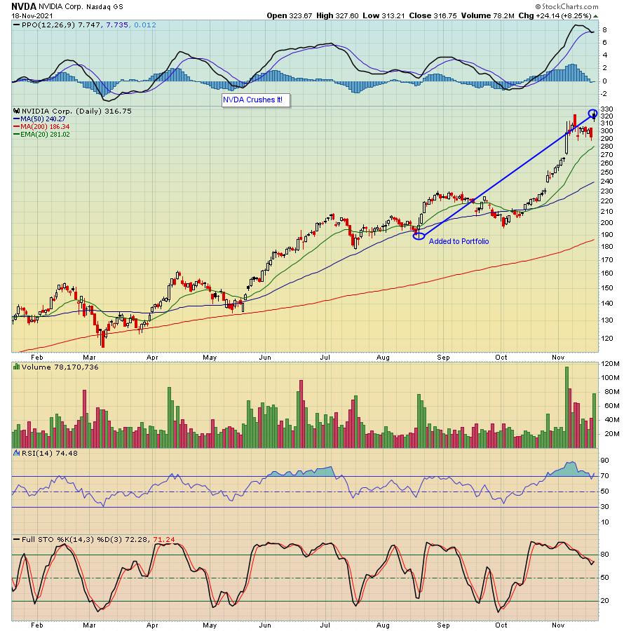
What we have found consistently since the Model portfolio was first introduced on 11-19-18 is that, if you have even a few strong winners, it helps to offset the laggards. For example, this past quarter, Moderna (MRNA) was one of the stocks in the Aggressive portfolio, and it lost 33% through Thursday's close. But the other stocks in the portfolio more than made up for MRNA's loss.
There are some commonalities in each of the portfolios. For example, we look for companies that are showing relative strength. With the exception of the Strong A/D portfolio, every stock has beaten Wall Street consensus estimates as to both revenues and EPS in its latest quarterly report and comes from our Strong Earnings ChartList. Next, every stock is technically sound. And every stock is held for the entire quarter; no price targets or stops. Every stock is selected the 19th of February, May, August and November. So, in the case of those stocks Tom unveiled this past Thursday, they will replace the current crop of stocks as of the close on Friday, the 19th.
In fact, if you would like to see all of the stocks that Tom just revealed, click here to sign up for a NO COST trial which will get you access to all 40 stocks. Also, feel free to sign up for our FREE newsletter, the EarningsBeats Digest by clicking here.
The primary goal of money managers is to beat the S&P. Many don't. If you can develop a formula that outpaces the S&P by a wide margin, you will be miles ahead of the pack!
At your service,
John Hopkins
EarningsBeats.com
|
| READ ONLINE → |
|
|
|
| ChartWatchers |
| 2 Wall Street Upgrades and 1 Activist-Led Shakeup - These 3 Stocks are on the Move! |
| by Mary Ellen McGonagle |
Last week, the S&P 500 traded mostly sideways despite outsized gains in several heavyweight FAANMG stocks. In fact, most of the underlying sectors in this Index were down over 1% for the week while investors sorted through news, such as a potential shift in the Federal Reserve's tapering timeline due to high inflation.
There were pockets of outperformance, however, led by analysts' upgrades and management shakeups that pushed select stocks into compelling positions.
WEEKLY CHART OF PLUG POWER, INC. (PLUG)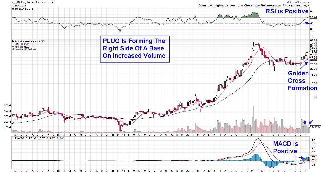
First up is hydrogen fuel-cell tech company Plug Power (PLUG), which popped today after Morgan Stanley boosted their price target for the company by 51%. Earlier in the week, Citigroup had a similarly large price target upgrade for the company.
Plug Power plans to make hydrogen-powered heavy-duty trucks while also manufacturing and distributing the hydrogen gas required. This, in turn, is expected to drive sales into 2030. PLUG was a big winner for me following its post-election rally from November 2020 rally into February 2021, and the stock has been on my Watch List.
The weekly chart above looks particularly interesting, with the MACD just entering positive territory. The RSI is also in a positive position, with a Golden Cross formation taking place last week. Weekly charts provide insight into the potential for longer-term moves; a concerted move into other alternative energy stocks would give me additional confidence in PLUG.
DAILY CHART OF MICRON TECHNOLOGY (MU)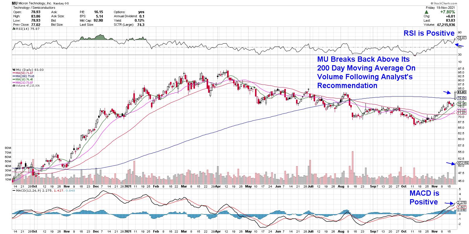
Lagging Technology company Micron (MU) reversed its downtrend on Friday after being added to Wall Street firm Evercore's top stock pick list. The company lost share value after DRAM pricing flattened out in May of this year, which, in turn, reduced the revenue outlook for the company.
While MU is not expected to turn profitable until the 2nd quarter of next year, the market's predisposition to look out two quarters when evaluating a stock has this analyst thinking a run up in MU's price is in the works. MU broke back above its 200-day moving average on volume and, while constructive, I'd need to see a more sustained move above this key area of resistance to confirm that an uptrend is in place.
DAILY CHART OF DOLLAR TREE, INC (DLTR)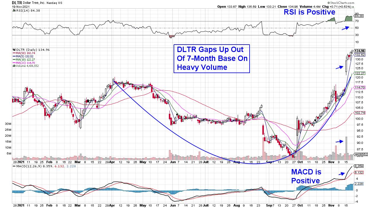
Last up is Dollar Tree (DLTR), which soared to a new high this week after activist firm Mantle Ridge unveiled a $1.8 billion stake in the discount retailer. Excitement over the news stems from the fact that Mantle Ridge has a good track record and is known as a long term investor who focuses on a few investments at a time.
As you can see, DLTR gapped up on heavy volume into a multi-month base breakout and has since trended higher. A pullback to its 5-day moving average on its daily chart would be an ideal entry point as the stock continues to trend higher.
There were other strong areas of the market last week as well, which I'll be reviewing in detail in my MEM Edge Report on Sunday. This twice-weekly report provides alerts to high-growth stocks that are poised to outperform the broader markets. It also provides insights into sector and industry group rotation not seen elsewhere.
You can use this link here for a 4-week trial that includes immediate access to existing reports.
On this week's edition of StockCharts TV's The MEM Edge, I share how to trade stocks after they have big gaps up. I also review signals that a downtrend reversal has further upside potential, as well as small-cap stocks in bullish positions.
Warmly,
Mary Ellen McGonagle
President, MEM Investment Research
|
| READ ONLINE → |
|
|
|
|
|
| DecisionPoint |
| Broad Market Participation is Drying Up |
| by Erin Swenlin |
Here is part of the opening paragraph from yesterday's subscriber-only DP Diamonds Report:
"I am still not in favor of expanding exposure. Big reason would be the diminishing participation within the major indexes. It's going to get harder and harder to find solid winners as there are fewer and fewer to pick from."
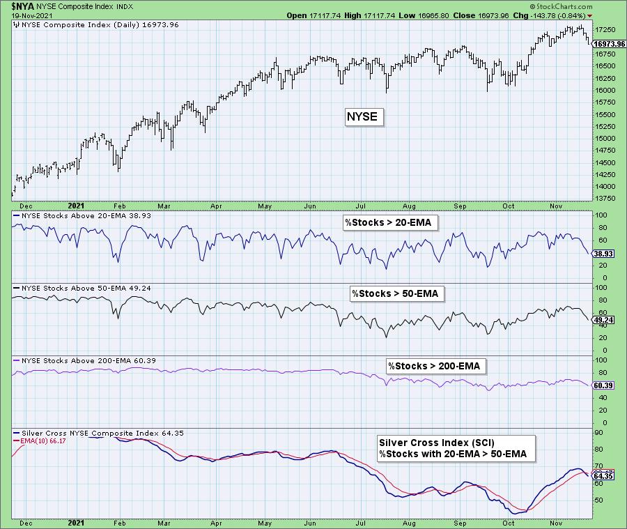
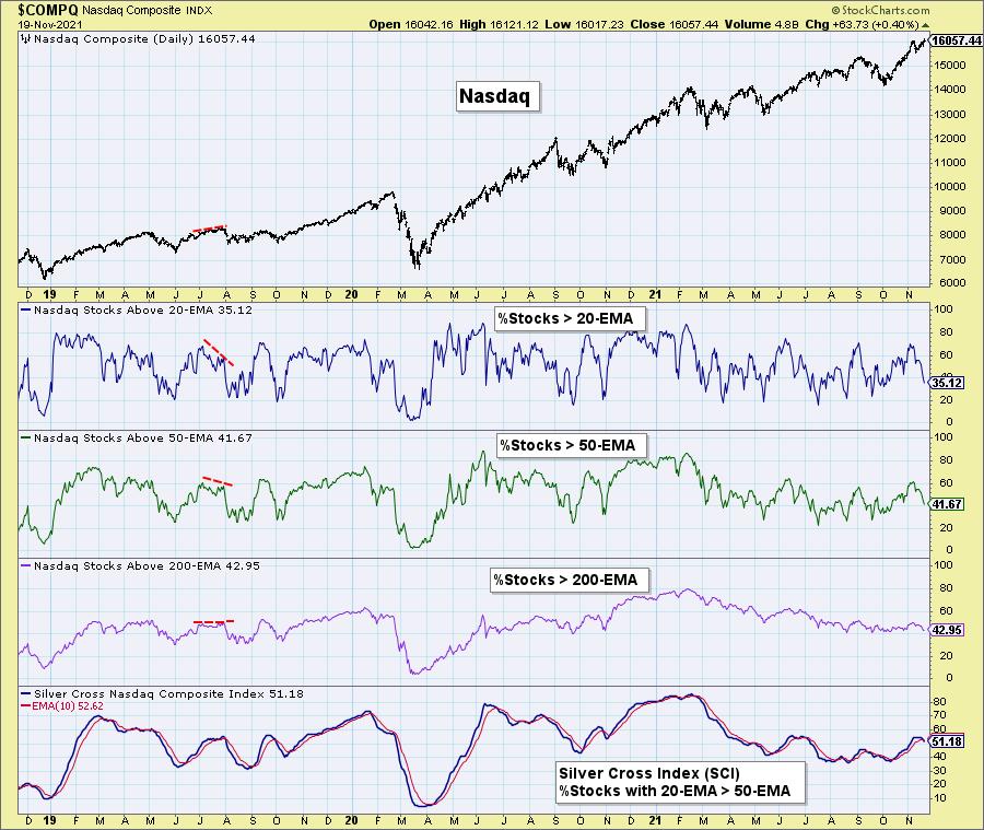
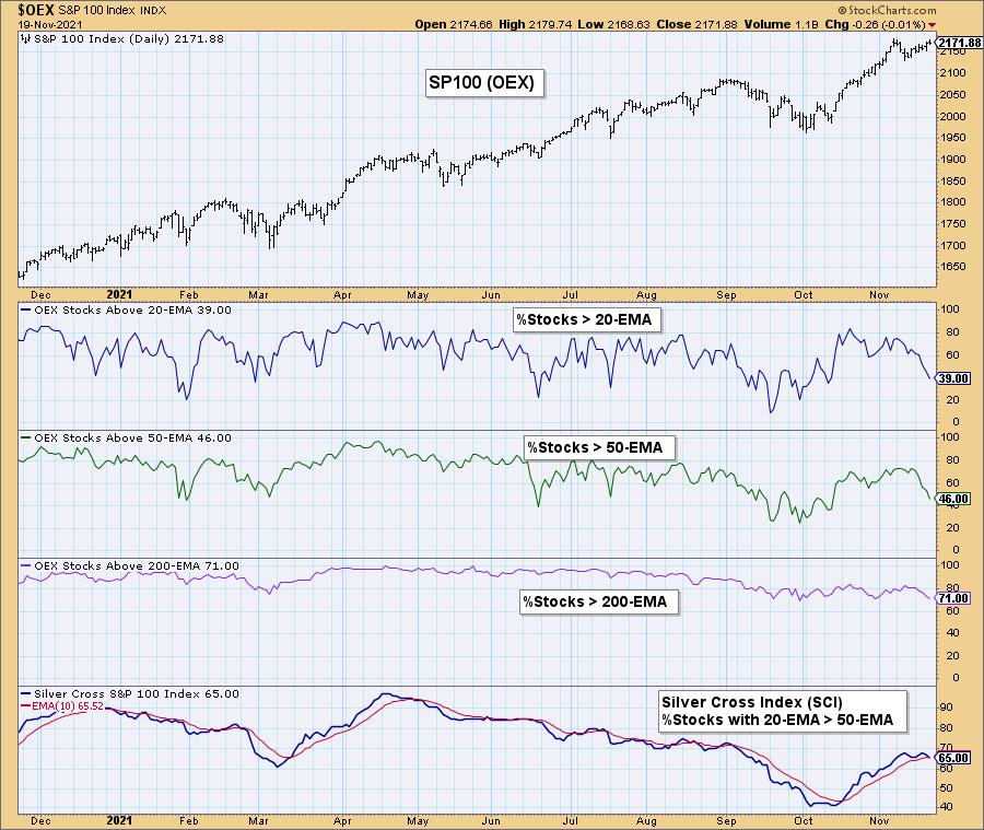
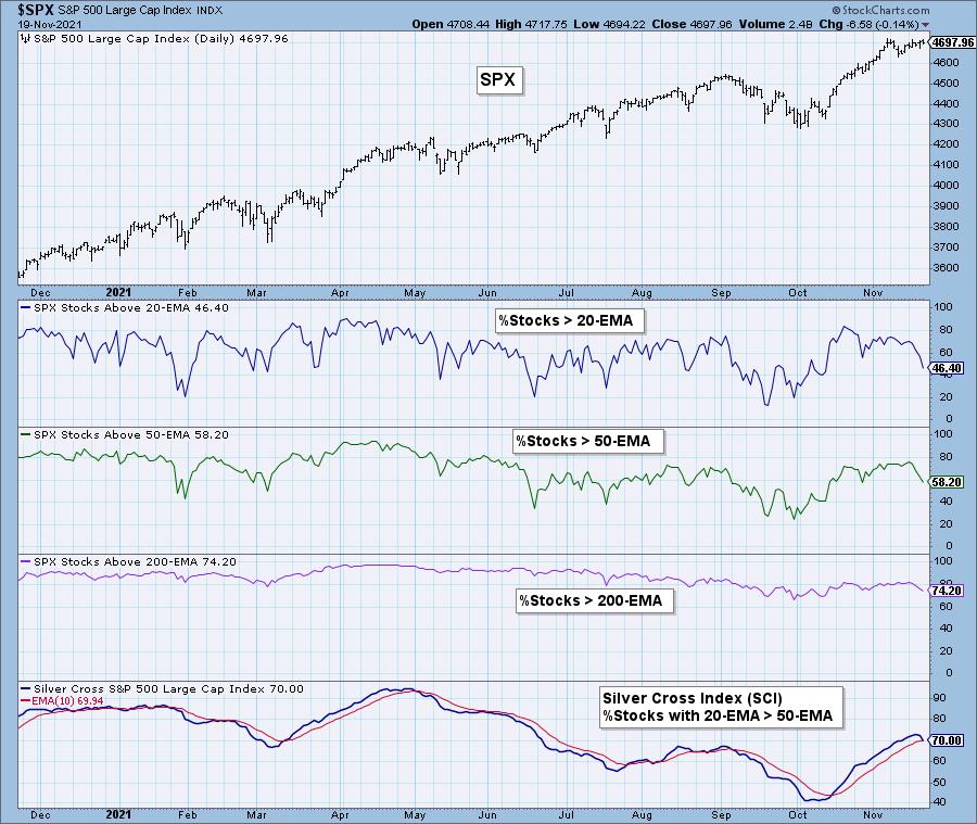
Below are the visuals behind that statement. I've included the participation charts for the NYSE, Nasdaq, OEX and SPX below. It shows you the %Stocks > 20/50/200-EMAs. I've also included the Silver Cross Index (SCI). The SCI is a breadth indicator that measures the percentage of stocks that have their 20-EMA > 50-EMA.
When the %Stocks > 20/50-EMAs is less than the SCI percentage, there is a bearish short-term bias. You'll note all of these indexes have short-term bearish biases moving into next week.
The NYSE, Nasdaq and OEX have less than 40% of their stocks with price > 20-EMA and these numbers are getting worse each day. The SCIs on all four of these indexes had negative crossovers their signal lines this week.
The NYSE has a differential between %Stocks > 50-EMA and the SCI of 29%. The SCI will likely accelerate its decline next week. Remember that EMAs move toward price. If price is above, they move higher. If price is below, they move lower. You cannot get an improved reading on the SCI when fewer stocks are above their 20/50-EMAs.


Click here to register in advance for the recurring free DecisionPoint Trading Room! Recordings are available!
The Nasdaq has the weakest participation of the bunch with %Stocks > 20-EMA at a mere 35%.
The OEX shows participation free falling lower.
The SPX is the only index with %Stocks > 20-EMA sitting above 40% and that is still very weak.
Conclusion: I had been looking for sideways consolidation and then a resumption of the rally this past week. The first part played out with consolidation and a trickle up this week. However, given the speedy contraction of participation among the major market indexes, I expect next week will not see new all-time highs, but a pullback on prices instead.
Technical Analysis is a windsock, not a crystal ball.
--Erin Swenlin
(c) Copyright 2021 DecisionPoint.com
Helpful DecisionPoint Links:
DecisionPoint Alert Chart List
DecisionPoint Golden Cross/Silver Cross Index Chart List
DecisionPoint Sector Chart List
DecisionPoint Chart Gallery
Trend Models
Price Momentum Oscillator (PMO)
On Balance Volume
Swenlin Trading Oscillators (STO-B and STO-V)
ITBM and ITVM
SCTR Ranking
DecisionPoint is not a registered investment advisor. Investment and trading decisions are solely your responsibility. DecisionPoint newsletters, blogs or website materials should NOT be interpreted as a recommendation or solicitation to buy or sell any security or to take any specific action.
|
| READ ONLINE → |
|
|
|
| Martin Pring's Market Roundup |
| After Seven Months of Consolidation Food Prices are Starting to Resume their Advance |
| by Martin Pring |
The Invesco DB Agricultural Fund (DBA) consists of grains (37%), softs (sugar, coffee and cocoa; 35%) and livestock (24%). A small allocation is also given to cotton. Chart 1 shows that this ETF began a bull market back in the spring of last year. Late 2020 also saw it break above the green down trendline; that line represented the upper part of a broadening wedge. These formations, when completed, are particularly bullish, as they are often followed by a powerful advance.
The reason probably lies in the fact that short sellers become more and more emboldened as the price works its way progressively lower. That process has been flagged by the lower trendline of the formation. By the same token, each new low takes out more and more discouraged longs. The transfer of the security in question to more resilient hands and the build up in short positions results in a strong technical position. As prices start to rally, more and more participants begin realize that they are on the wrong side of the market. That realization is a key factor in fueling the advance. Following a strong rally off the March 2020 bottom, the price began to consolidate in May. Now the consolidation, in the form of an upward-sloping inverse head-and-shoulders, is giving way to an upside breakout. This is shown in greater detail in Chart 2.
 Chart 1 Chart 1
 Chart 2 Chart 2
The breakout looks genuine because the Goldman Sachs Agricultural Index (Chart 3), which is weighted slightly differently, is also experiencing one. Further examination of several agricultural sub indexes and their components suggests that this recent strength is broadly-based.
 Chart 3 Chart 3
Grains
Chart 4 features the three principal grains: corn, soybeans and wheat. The latter has broken out decisively whilst corn and soybeans have experienced a tentative break. The soybean price is of particular interest since it is also edging above its 10-week MA, which also adds to the significance of the resistance when decisively surpassed.
 Chart 4 Chart 4
Softs
Chart 5 indicates that the Bloomberg Soft Commodity Sub Index (JJS) is in a firm uptrend. However, coffee, one of its principal components, is likely to give it an additional boost, as it has just broken out from a consolidation right-angled triangle formation (Chart 7).
 Chart 6 Chart 6
 Chart 7 Chart 7
Livestock
The Bloomberg Livestock ETN (COW) is trying to edge through its 2019-2021 down trendline. It's a pretty significant one, not only due to its length but aslso from the number of times it has been touched or approached. The line is also in the area of its 65-week EMA, which adds to the importance of this resistance. If the price is able to more decisively push through this resistance, it is very likely to move much higher. The two KSTs are also supporting the probability of a stronger breakout materializing, as both are above their respective EMAs and are by no means overextended.
 Chart 8 Chart 8
Conclusion
After several months of consolidation, the DBA has broken to the upside. Not all of its components have followed with breakouts of their own. However, there are enough to suggest that the next leg of the agricultural commodity bull market is already underway. Soybeans and the livestock area are two worth watching in that regard, as are the prices in your local supermarket!
Good luck and good charting,
Martin J. Pring
The views expressed in this article are those of the author and do not necessarily reflect the position or opinion of Pring Turner Capital Group of Walnut Creek or its affiliates.
|
| READ ONLINE → |
|
|
|
| RRG Charts |
| Railroads are On Track |
| by Julius de Kempenaer |
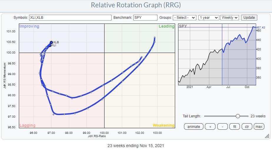
Two sectors that have my attention at the moment are Industrials (XLI) and Materials (XLB).
Looking at the Relative Rotation Graph above, we can see how similar the rotation for both sectors has been over the last 23 weeks, and still is. A few weeks ago, both tails rotated back into the improving quadrant at a strong RRG-Heading.
Materials

The Materials sector broke above overhead resistance on the price chart last week and is holding up well so far this week. This break occurs after a sideways period of roughly six months and, very likely, signals the continuation of the prior uptrend out of the March 2021 low. Based on the height of the range, roughly 10 points, we can estimate a target for the coming move around 97 for XLB.
The relative strength line, which started to drop from the high in March, has stabilized and seems to be putting in a low at the moment. This bottoming process is causing the RRG-Lines to improve and move higher. For the time being, only the Green JdK RS-Momentum line has managed to get back above the 100-level, but the Red JdK RS-Ratio line is starting to come along.
A further improvement is very likely when the raw RS-Line manages to take out the red-dashed overhead resistance. This looks to be in line with the continuing improvement of Cyclical sectors to which Materials belong.
Industrials

The chart of the Industrials sector has a lot of similarities with the Materials sector. A nice uptrend emerged out of the March low, followed by a break of trendline support, then a sideways move of around six months and then an upward break two weeks ago, which is still holding up so far. The accompanying rotation on the RRG is very similar, and at the moment, both tails are more or less on top of each other.
The Industrials sector is part of the "sensitives" group. Particularly on the daily RRG for this group, we can see the improvement that is currently taking shape.

On the weekly RRG, only the Communication Services sector continues to head lower on both axes and deeper into the lagging quadrant. Energy is still pushing further into the leading quadrant and continuing its positive relative trend. Technology is about to turn back up towards leading while only just inside the weakening quadrant.
The weekly tail on the Industrials sector looks very similar to the tail on the daily RRG, which means that both time frames are getting in sync, underscoring the current (relative) strength.
Which Groups?
From the sector level, we can zoom in to the groups level of these sectors.
Materials

In the materials sector, there are three groups worth taking a closer look at: Specialty Chemicals ($DJUSCX), Commodity Chemicals ($DJUSCC) and Nonferrous Metals ($DJUSNF). Of these three groups, specialty and commodity chemicals are breaking to new highs while their relative strength is bottoming out. This makes them very interesting. The Nonferrous group, meanwhile, is still inside the improving quadrant on the RRG and below its highs on the chart; it is slightly lagging behind the first two.
Industrials

In the Industrials sector, two tails are standing out. These are Industrial Suppliers ($DJUSDS) and Railroads ($DJUSRR). Both are moving further, into the leading quadrant on the RRG and at a strong RRG-heading.
After inspecting the charts for both groups, I prefer the Railroads. The Industrial suppliers have already gone through a steep rise, creating a more significant than desired downside risk.

Railroads have just broken above their previous high and holding up while hovering above that breakout level, which creates a good risk/reward ratio.
Railroads

This RRG shows the four Railroad stocks which are in the S&P composite 1500. The direction vs. XLI as the benchmark is pretty straightforward.
CSX and UNP have already broken to new highs, while KSU and NSC are pushing against their previous highs. Assuming further relative improvements, that means that CSX and UNP probably have better risk/reward, as their previous highs can be expected to act as support. KSU and NSC are the more aggressive options, betting on a break above resistance followed by acceleration.
#StaySafe, --Julius
|
| READ ONLINE → |
|
|
|
| The Traders Journal |
| The Biggest Update In A Decade - Introducing The Totally New, Totally Revamped "Stock Market Mastery" ChartPack! |
| by Grayson Roze |
 It's not often you get to say something is the biggest moment in a decade – the biggest change, the biggest update, the biggest overhaul. But here we are, introducing the most monumental evolution of our "Tensile Trading" ChartPack since the launch of the original version. In fact, this update is so huge that we've even changed the name... It's not often you get to say something is the biggest moment in a decade – the biggest change, the biggest update, the biggest overhaul. But here we are, introducing the most monumental evolution of our "Tensile Trading" ChartPack since the launch of the original version. In fact, this update is so huge that we've even changed the name...
My friends, it's a thrill to finally introduce the new-and-improved, totally redesigned "Stock Market Mastery" ChartPack!
To be honest, I'm not even sure it's fair to call this an update. This is a complete overhaul. It's a massive redesign from the ground up. We've gone through every chart, every list, every little corner of the ChartPack to restructure, re-organize, and rebuild a dramatically enhanced version of this supremely popular tool. As a result, we've created the latest and greatest StockCharts account enhancer out there.
How We Got Here
Now, it's no secret that Gatis and I are active traders and investors. We're true market geeks who have devoted our lives to technical analysis and the financial markets. As all good traders and investors do, both of us have continued to learn, grow and evolve as technicians over the past 10 years since the first iteration of the ChartPack came out. Throughout the years, the ChartPack has followed along, growing and evolving over time as our processes and routines have shifted. And thanks to the thousands of ChartPack users out there in our StockCharts community, some good ol' fashioned feedback from the people has also helped the ChartPack move forward each quarter.
That said, it's been a long time since Gatis and I have stepped back and really asked ourselves, "Is the ChartPack everything that it could truly be? Does is fully reflect our approach to the current markets? Are there elements from our process, our routines, our strategies and our unique ChartList organization that haven't been incorporated into the ChartPack?"
So a few months back, Gatis and I sat down to answer those exact questions. We decided to launch into a wholesale redesign. We've spent countless hours pouring over every little detail in the ChartPack, carefully reviewing, updating, changing, modifying and expanding along the way. We've taken that decade worth of process evolution and blended our StockCharts accounts together to create a new-and-improved ChartPack design that more completely and accurately reflects our shared approach to trading and investing. After all, the ChartPack is our way of sharing our very own charts, lists, styles and routines with all of you!
Two Valuable Ways To Utilize The ChartPack
The way I see it, there are two very real ways to use the "Stock Market Mastery" ChartPack. The first is to take it for exactly what it is, as delivered and as installed. If you've read our book, "Tensile Trading", you've bought into the 10-stage investing roadmap, and you want to use the very same charts and ChartLists that Gatis and I follow exactly as they come, well that is a totally real and totally valid use of the ChartPack. And the good news is, since it's a complete copy of our actual accounts - one that you can plop right over into your own StockCharts account with one click - you'll find it delightfully easy to install the ChartPack and start using these tools to follow the markets in exactly the same way that we do.
But there's a second totally valid way to use this ChartPack. You can embrace it as a source of data and inspiration. Use it as a source of symbols. Use it as a source of lists. Use it as a source of organized market analysis groups and pre-populated ChartLists that you can build from. If you're looking for a simple way to fill out your StockCharts account with a complete collection of every list you could ever want to have, well, our "Stock Market Mastery" ChartPack is the easiest, most exhaustive starting place you're going to find.
When you install the ChartPack, you'll instantly gain a vast collection of organized ChartLists pre-filled with charts, symbols and up-to-date market groups. For example, instead of manually building out lists for all of the major index components, install the "Stock Market Mastery" ChartPack and you'll get lists with all of the individual stocks in the S&P 100, S&P 500, S&P 400, S&P 600, NASDAQ 100, Dow Industrials, Dow Transports and Dow Utilities. From these lists, you can start to customize, modify and re-organize as you please.
In this way, the "Stock Market Mastery" ChartPack can be used as a starting place to build out a full-featured StockCharts account of your own. Bring in your own indicators, your own chart settings, your own names and symbols and ultimately create a collection of ChartLists that reflects your specific routines. All of that is possible, and all of that is made far easier without having to start from scratch and build everything yourself.
Take A Tour Of All That's New
So enough talk. Time to see the ChartPack in action! On today's edition of "StockCharts In Focus", we took a tour through all of the lists that are included in the totally new, totally revamped "Stock Market Mastery" ChartPack. You'll see exactly what comes with this extensive collection of carefully crafted, expertly designed ChartLists, and you'll hear more about how the ChartPack can help enhance and streamline your StockCharts experience.
More Special Content Coming Soon!
One last note! Gatis and I will be sitting down with David Keller in early December to talk more about the latest version of the ChartPack and share our thoughts on why it's such a valuable resource for all StockCharts users. We'll be sure to keep you posted here in The Traders Journal, so stay tuned for that special presentation coming in just a few weeks!
BONUS – The ChartPack Is ACP Ready
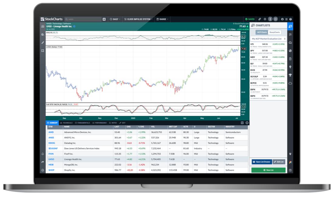 As you've surely heard, StockCharts has recently launched a new interactive, full-screen Advanced Charting Platform - StockChartsACP. This powerful all-in-one charting and analysis package brings you true dynamic charting with the ability to scroll back and forth through time, drag indicators and overlays up, down and around your charts, manipulate the y-axis with your cursor and much more. In short, the future of Technical Analysis and the next generation of StockCharts technology. As you've surely heard, StockCharts has recently launched a new interactive, full-screen Advanced Charting Platform - StockChartsACP. This powerful all-in-one charting and analysis package brings you true dynamic charting with the ability to scroll back and forth through time, drag indicators and overlays up, down and around your charts, manipulate the y-axis with your cursor and much more. In short, the future of Technical Analysis and the next generation of StockCharts technology.
Now, one important feature of the new platform is the ability to view ACP versions of your existing saved SharpCharts. You can open the ChartLists sidebar (on the right) and click the "SharpCharts" tab to see your current ChartLists. You can then click on each symbol in the list to see an ACP chart that will very closely match the saved SharpChart. The ChartLists drawer at the bottom of the screen also allows you to access your existing SharpCharts ChartLists, including all those in the ChartPack. These features provide a great way to explore the new world of ACP, or quickly get set up with some of your favorite indicators and other chart settings.
What this means for all you ChartPack users is that you can easily explore the ChartPack in ACP, right out of the box. When you install the latest version of our ChartPack, all of the ChartLists and associated SharpCharts will be installed into your StockCharts account. You'll then be able to head over to ACP and browse through dynamic versions of all the charts included in the ChartPack.
Already have the ChartPack? Here's how to upgrade:
- Log in to your account, then visit the "Manage ChartPacks" page (accessible from the bottom of the Members Dashboard or from the "Your Account" page).
- In the table that appears, find the entry for the "Stock Market Mastery ChartPack" (if you don't see the Stock Market Mastery ChartPack listed, that means that you haven't purchased it. Click Here to do so now).
- Click the "Re-Install" button next to the Stock Market Mastery ChartPack to start the update process
The download should take about 10 seconds, after which you can explore the new ChartLists and other updates!
New to the ChartPack? Here's how to install it:
If you'd like to add the Stock Market Mastery ChartPack to your StockCharts account, Click Here.
Chart on, my friends.
Grayson Roze
VP of Operations, StockCharts.com
Author, Trading For Dummies (Wiley, 2017)
Author, Tensile Trading: The 10 Essential Stages of Stock Market Mastery (Wiley, 2016)
Co-Founder, StockMarketMastery.com
Twitter: @GraysonRoze
|
| READ ONLINE → |
|
|
|
| Mish's Market Minute |
| Mish: The Key Market Relationships -- Love or Rancor? |
| by Mish Schneider |
 
This past week, the market found both love and irreconcilable differences.
The love came from the big cap tech stocks. Nvidia, Apple, Google, Microsoft all gave investors hearts and flowers. On the flip side, small caps, energy, industrial metals, and transportation stocks gave investors indigestion, inconveniently ahead of Thanksgiving.
It's rare and disconcerting to see the market so divided. Nonetheless, investors do have some reliable barometers to gauge what might be next. I have posted four charts that depict the market breadth and risk on/off. I also threw in one chart to see how inflation is faring, or at least what the Federal Reserve might be looking at to support their "transitory" theme.
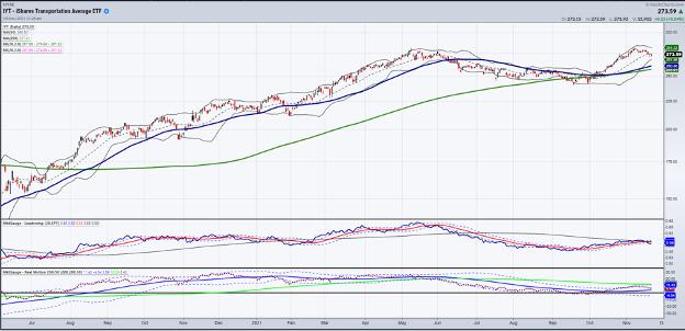
One chart shows the relationships between the transportation sector through IYT versus the S&P 500 through SPY. This is the most disconcerting of the four charts. The health of the economy and the ultimate health of the stock market are undeniably interlocked, even with the NASDAQ going up and making new all-time highs.
Transportation (except for the rails, which are doing way better) reflects the supply chain issues, consumer demand and the appetite for travel. Plus, with the infrastructure package as the growth economy's holy grail, it is underperforming SPY. We see that as risk-off.
The price chart of IYT remains intact, however, so this sends up a caution flag but not necessarily the end of days. Nonetheless, it is something to watch, as what we know about the markets is that, regardless of tech strength, a crash in the inside sectors of the economy weighs heavily on everything at some point.
 
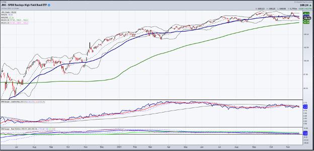
The next chart is the relationship between the high-yield junk bonds and the long bonds.
Again, independently, junk bonds (JNK) are holding technical support. But what we like to see is junk bonds outperforming the long bonds. TLTs are often used as a flight to safety, while junk bonds are bought during good times. Right now, junk is underperforming long bonds. That, too, is a typical risk-off scenario. If IYT holds and begins to show muscle over the S&P 500, then that relationship can change. For now though, the lovefest for both bond traders and "inside" sectors is questionable.
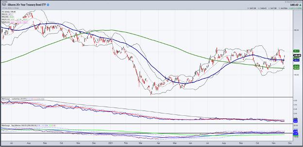
Next, we see the chart of the relationship between the long bonds (TLT) and SPY. Again, we want to see SPY outperform the long bonds, as we want to see JNK outperform long bonds.
Friday's price action put the TLTs ahead of the SPY and also put the TLTs above the 50-DMA. Even with certain members of the Fed talking more hawkishly about interest rate raises and a faster tapering pace, bonds are up and yields are down. If one follows price, the bonds are telling us that the economic picture is not quite so roseate as the big tech stocks are showing Besides, big tech may be sexy, but they are not good economic barometers. Ideally, we want to see SPY outperform the bonds. So for now, we consider this more risk-neutral.
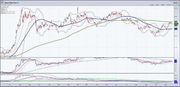
Which leads me to a good inflation indicator chart. Typically, when inflation is going parabolic, silver will outperform gold. This was the case in 1979 and during other inflationary times throughout history. In this chart, we see that silver outperformed gold from the middle of October until this past week. Although not underperforming to any large degree, silver most likely emboldens the Fed to believe that inflation is transitory.
Even with food prices up a lot, until the precious metals take off, despite a firmer US dollar -- that is when the Fed will have to pay attention and take some more aggressive action on rate hikes.
For us traders, keeping eyes on this chart, especially if silver takes out the 200-DMA (green), will not only give you a great long trade, but keep you one step ahead of the pack on a potentially parabolic move in commodities, whilst impacting a lot of equities.
Put this all together and these four charts are saying:
- Risk is neutral to slightly off in equities, although big tech is in love with itself.
- Long bonds are key; not so much in yields or even in yield curve, but in relation to the performance of the SPY.
- Transportation is the most important gauge for the future growth (or not) of the economy.
- Inflation, although a hot topic, has done nothing compared to what it can do if silver takes off.
Follow Mish on Twitter @marketminute for stock picks and more. Follow Mish on Instagram (mishschneider) for daily morning videos. To see updated media clips, click here.
On this week's edition of StockCharts TV's Mish's Market Minute, Mish gives actionable information on current trades that are unfolding in the small-cap space. She also highlights how she is positioning herself from now and into 2022.
ETF Summary
- S&P 500 (SPY): 464 support.
- Russell 2000 (IWM): 232 support.
- Dow (DIA): 352 support area.
- Nasdaq (QQQ): Breakaway gap which could lead the rest of the market -- or turn out as a top if the others fail to rise.
- KRE (Regional Banks): If 73.50 breaks next is 70.00.
- SMH (Semiconductors): Breakaway gap this week-320 target.
- IYT (Transportation): 270-272 support.
- IBB (Biotechnology): 153.38 support.
- XRT (Retail): 98.50 support.
Mish Schneider
MarketGauge.com
Director of Trading Research and Education
|
| READ ONLINE → |
|
|
|
| MORE ARTICLES → |
|
 Chart 1AD LINES WEAKEN...Two different versions of advance-decline figures are shown below. And both show short-term weakness. Chart 2 shows the NYSE Advance-Decline line falling to the lowest level in a month. That means that losing stocks outnumber the number of winning stocks during November.
 Chart 2
 Chart 3


 It's not often you get to say something is the biggest moment in a decade – the biggest change, the biggest update, the biggest overhaul. But here we are, introducing the most monumental evolution of our
  As you've surely heard, StockCharts has recently launched a new interactive, full-screen Advanced Charting Platform -