| THIS WEEK'S ARTICLES |
| John Murphy's Market Message |
| STOCKS PLUNGE ON NEW COVID VARIANT |
| by John Murphy |
STOCK INDEXES PLUNGE... Reports of a new covid variant in South Africa pushed stocks sharply lower the day after Thanksgiving. As a result, all three major U.S. stock indexes suffered short-term technical damage. Chart 1 shows the Dow Industrials falling -904 points (-2.5%) and ending the day well below its 50-day moving average. The Dow is now in danger of dropping further toward its 200-day moving average. Chart 2 shows the S&P 500 falling below its 20-day line. Next potential support may lie at its 50-day moving average and/or its early September peak near 4545. Chart 3 shows the Nasdaq 100 ending the day below its first line of support at its 20-day moving average.
ALL SECTORS LOSE GROUND... All eleven stock sectors lost ground. Some defensive sectors like healthcare, consumer staples, and utilities held up a bit better than some of the others. More cyclical sectors like energy, financials, industrials, and consumer cyclicals suffered the biggest losses. A big drop in crude oil contributed to energy weakness; while financials may have been hurt by a plunge in bond yields.
 Chart 1 Chart 1
 Chart 2 Chart 2
 Chart 3 Chart 3
BOND YIELDS PLUNGE... A flight to the relative safety of Treasury bonds pushed bond yields sharply lower today. Chart 4 shows the 10-Year Treasury yield falling 14 basis points to 1.49% as bond prices rallied. Gold also benefited from some defensive buying. Volatility spiked as well. Chart 5 shows the CBOE Volatility (VIX) Index surging 47% to reach the highest level since mid-September. Last Friday's message suggested that weaker market breadth increased the technical odds for a market pullback. Fears of a new covid variant made that pullback a lot worse.
 Chart 4 Chart 4
 Chart 5 Chart 5
|
| READ ONLINE → |
|
|
|
| ChartWatchers |
| SPY Hits the Trend Monitoring Phase: Take a Seat |
| by Arthur Hill |
Stock futures are pointing to a sharply lower open as I write (Black Friday, before the market open). Overall, small-caps are dragging their feet again and stocks with nose-bleed valuations are getting buzz cuts. The S&P 500 SPDR (SPY) and the Nasdaq 100 ETF (QQQ), however, remain in clear uptrends and recently hit new highs. It is important to maintain perspective and charts can help with that. A pullback after a new high is not abnormal and I am not going to rush to judgement on Black Friday, regardless of what happens while I am out shopping, eating, drinking and supporting the economy. Let's get some perspective and discuss the trend-monitoring phase.
First and foremost, the long-term trend for SPY is up. The chart below shows a simple line chart with weekly closing prices and the 40-week SMA. SPY is near a new high and well above the rising 40-week SMA. The indicator window shows the percentage difference between the 5-day SMA and the 40-week SMA. This indicator has been green since early June and the 5-day is over 8% higher than the 40-week. The long-term trend is clearly up.
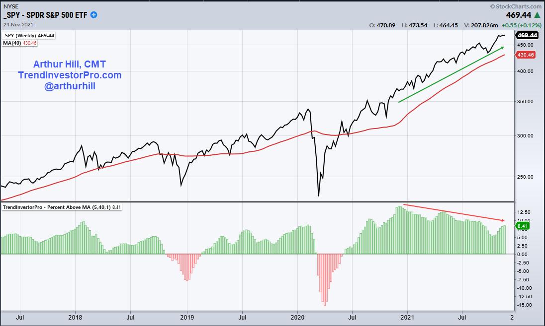
Worried about the negative divergence? I am not because these are not part of my strategy. First and foremost, the lower highs in the indicator indicate that the advance is slowing, not reversing. Momentum is still positive, just less positive. Second, negative divergences form when price records a higher high. Are higher highs bearish? I think the higher high is more important here. Third, I am only measuring the trend and the trend is up as long as the 5-week SMA is above the 40-week SMA. Note that this indicator is part of the TrendInvestorPro indicator edge plugin for StockCharts ACP.
There is a clear uptrend and my trading bias is bullish. This means I will look for bullish setups on the daily chart and ignore bearish setups. Trading setups, however, are not always present and this means we must sometimes just monitor the trend (trend-monitoring phase). For my style, a bullish setup occurs when SPY becomes short-term oversold, pulls back and/or forms a bullish continuation pattern, such as a falling flag or wedge. The chart below shows the setup that was featured in ChartWatchers on October 15th. SPY pulled back with a falling wedge and broke out with a breadth thrust as S&P 500 AD Percent ($SPXADP) surged above 80%.

Well, that is a great hindsight signal, Art, but what about now? Take a seat. The trend-monitoring phase is when traders wait for the next setup or plan their exits. For exits, traders can consider profit targets for all or part of a position, setting a trailing stop or exiting on a bigger trend reversal. Plan that trade and trade that plan. As far as a setup, I do not see a setup on the chart right now. A possible future setup could involve a pullback to the rising 50-day SMA (green line) and short-term oversold condition.
StockCharts members receive two bonuses when subscribing to TrendInvestorPro. First, you get the Master ETF ChartList with 200+ ETFs organized in a logical top-down manner. Second, you get the Essential Breadth Indicator ChartList with over 100 charts covering dozens of breadth indicators. Click here to take your charting to the next level.
------------------------------------------
|
| READ ONLINE → |
|
|
|
| The Traders Journal |
| Eight Things You Can Do To Boost The Profitability Of Your Own ChartLists |
| by Gatis Roze |
 Yes - believe it! Yes - believe it!
The organization of your ChartLists is an extremely high leverage investing activity that YOU control. It does and will determine your profitability. Hence, it's worthy of your time and effort. As I often quote the entrepreneur and investor Michael Dell, "You don't have to be a genius to be successful. You just need a framework."
So in that spirit, I'd like to share eight simple yet high-leverage things you can do to boost your organization and fuel your profitability in the process:
#1
Two weeks ago, I wrote a detailed blog about understanding the "trumping hierarchy" within ChartLists. If you use the symbol "!" and the "#" as prefixes when you name your ChartLists, the "!" will trump the "#" and be placed above it. In the blog, I describe ten of these symbols and how to use them to enhance the order of the equities in your ChartLists.
SUGGESTION:For those of you who have downloaded our ChartPack in the past and wish to keep your existing lists and comments as is, you should rename those ChartLists by simply installing a prefix of your choice as the new ChartPack only overwrites or replaces ChartLists of exactly the same name.
#2
Simplifying the complexity of the market and boiling it down to a manageable number of ChartLists which I can then review has regularly produced powerful profitable returns. As the old advertising adage goes, I never go anywhere without them. My essential ChartLists are my Permission to Buy ChartList, Market Dashboard ChartList, and Permission to Sell ChartList, to name just a few.
#3
I keep a ChartList of the 250 of the most active ETFs based on volume. By slicing and dicing and sorting this ChartList, I'm able to literally have X-ray vision into the market's present sentiment and money flows.
#4
Fact: There are software bundles in the investor universe with over 300 different charting indicators. The more the merrier is fine for Thanksgiving but it should not be the basis of your investment methodology. Your ChartLists only need ten indicators. I have my favored ten which I understand intimately and which tell me trend, volume, momentum, risk and reward. Pick your own ten but show some restraint!
#5
For twenty years, I taught my post-college classes that the stock market operates based on the "Law of Groupings." Individual ‘Bubble" stocks may levitate by themselves for short periods of time, but those are low probability trades. The most profitable stocks from an investor's standpoint are those with the highest probability of making you money with the fewest downside probabilities. Most have similar characteristics. Those stocks are usually the "Best of the Breed" within their industry group populated with sister stocks in the same industry. This specific Industry is usually one of the top Industry groups within its Sector.
For example, the Healthcare Sector (XLV) is one of the eleven Sectors that comprise the total market. That Sector (XLV) is comprised of five Industries: Medical Supplies; Pharmaceuticals; Medical Equipment; Biotech and Healthcare Providers. Year-to-date (YTD), the best Industry Group has been Healthcare Providers. Six stocks within this Industry Group are up 157% to 437% YTD. That's the "Law of Groupings" at work.
My point is this principle which is detailed in our book, "Tensile Trading", is also the basis of monitoring all my equities (including ETFs and Mutual Funds). Every position gets its own ChartList populated with the appropriate Sector ETF, appropriate Industry Group and a collection of the most appropriate Sister Stocks. So, the rule is that you monitor the entire family of stocks, not just the one you own. In the case of ETFs and mutual funds, the family composition is similar but obviously unique when you construct those ChartLists.
#6
I've often had retired professionals attend my seminars and make pronouncements such as "I'm here for the day to have you teach me exactly what you do." Okay then, let's get started and tomorrow you can teach me how to be a plastic surgeon! My point being that learning how to become a consistently profitable investor takes dedication, hard work and lots of experience. In my mind, the best tool for that is the name I gave to this blog over a decade ago: The Traders Journal. A personal journal of your experiences is the ticket. To that end, don't overlook the Comments section of each ChartList. It's an ideal place to record specific lessons and observations about your equities and past trades very much akin to the majority of the ChartLists in our new Stock Market Mastery ChartPack which are jam-packed with educational insights in the Comments section of many ChartLists.
#7
History matters. I keep a ChartList of all the market tops and bottoms going back over 40 years— with extensive notes, observations and commonalities listed in the Comments section beneath each chart. As Mark Twain once said, "History doesn't necessarily repeat itself, but it often rhymes." Use this ChartList to your advantage as Twain suggested.
#8
Before I pull the trigger to buy an equity, it has cascaded through my four ChartLists — having been investigated, analyzed, dissected and debated. In other words, it's been thoroughly vetted. These four ChartLists are labelled as follows:
- Likes
- To Watch
- To Stalk
- To Buy
For me, it's a routine and consistent system that has decreased risks and increased probabilities in executing profitable trades and minimizing my losers.
So there you have the eight insights regarding ChartLists that I feel have contributed mightily to my own success for over 30 years of investing. The bottom line is that your ChartLists are worthy of your dedicated focus and your precious time. The rewards are there. For those of you who've read our book, these eight principles will be familiar. You know of the synergy between the book and the ChartPack. Others of you might wish to save yourself hundreds of hours to organize, populate and format all the same ChartLists that Grayson and I use. To delegate all that work to us, simply download the newly revised Stock Market Mastery ChartPack.
Trade well; trade with discipline!
Gatis Roze, MBA, CMT
StockMarketMastery.com
|
| READ ONLINE → |
|
|
|
| Trading Places with Tom Bowley |
| Giving Thanks! |
| by Tom Bowley |
Thanksgiving is celebrated here in the US on the 4th Thursday of November and is a day to give thanks. Let me say that I'm very thankful for God and family. I was blessed with my first grandchild a little over a year ago and she's absolutely beautiful. I've never felt a love like the one I have for my granddaughter. If you have grandchildren, I know you can relate.
We all need to keep the stock market in perspective. It's just the stock market. Still, as it relates to the stock market, I have much to be thankful for as well.
StockCharts.com
It's actually quite funny how my relationship with StockCharts.com began. I was doing national radio with my partner John Hopkins and I kept saying things like, "let's take a look at Apple (AAPL) over at StockCharts.com." So I thought to myself, "we're giving StockCharts.com a lot of air time. Maybe, just maybe, they'd like to sponsor our show and help offset the expense?" It was a polite NO from Chip Anderson, BUT I started writing on the ChartWatchers newsletter shortly thereafter in September 2006 (crazy that it's been 15 years already - where does the time go?), and the legendary technical analyst John Murphy joined us live on our radio show. Mind you, I was and still am a HUGE John Murphy fan. I always use the analogy of being a college basketball player and being drafted by the Chicago Bulls to play alongside all-time great Michael Jordan. That's what it felt like to me interviewing John on my show and then writing with him on the ChartWatchers newsletter. What a great start to a great relationship with StockCharts.com!
This isn't just a business relationship for me, though. Many of my best friends work at StockCharts.com. The work that takes place "behind the scenes" is absolutely amazing. Teaming up with this extraordinary group of people has probably been the best business decision of my life. Thanks to everyone at StockCharts.com, I am grateful for all you!
John Murphy
I consider myself a self-taught technician. I love analyzing anything financial-related. I like to dig deep. It's the reason I started my career in public accounting as I was fascinated to see what made businesses "tick." Numbers and charts are my love languages. I'm naturally curious when it comes to the "hows and whys" of the stock market. Who else in their right mind would have an Excel spreadsheet with every day's close on the Dow Jones, S&P 500 since 1950 and the NASDAQ since 1971? But we're all inspired from time to time to be better versions of ourselves and my business inspiration, in large part, came from John Murphy. I'm not a big reader, but I read John's books and they've played a major role in my development as a technician. When I'm asked what book I'd recommend to help learn technical analysis and the stock market, I don't hesitate. Go to the online store here at StockCharts.com and pick up your copy of John's "Technical Analysis of the Financial Markets." It's well worth the read and it may change the course of your financial future or someone close to you, as it did mine. While John's teaching was invaluable to me, I'm most thankful for the inspiration it provided me. I now look under every stock market leaf trying to find the stock market's next clue. In particular, John's intermarket relationships provided the foundation for much of my stock market guidance, research, and education.
I first met John in 2011 at the very first ChartCon in Seattle. After years of admiring his work, he then became a great friend. Thank you John!
Secular Bull Market
Yes, I'm thankful for this raging bull market. It's helping millions of folks around the globe achieve their financial goals and dreams. The best news, in my opinion, is that this long-term bull market hasn't yet run its course. While the financial media tries to rip the market apart at every turn, it just keeps rolling higher and higher. Skeptics have pointed to quantitative easing (QE), the trade war, the COVID-19 pandemic, the national debt, etc. as reasons why the stock market cannot go higher. Yet we keep going higher. The latest reason is inflation that's spiraling out of control. But the growth-oriented NASDAQ 100 ($NDX) is leading the S&P 500 ($SPX) over every time frame in 2021 - year-to-date, last 6 months, last 3 months, last month, etc. Inflation KILLS growth stocks and Wall Street looks ahead 6 to 9 months. If the brilliant MBAs on Wall Street believe inflation will be problematic in the months ahead, you'd see it in the relative performance of these two key indices. However, during the stock market's crazy rise over the past month, here's your relative performance:

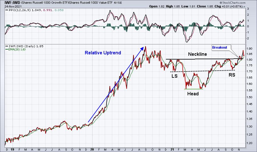
Growth stocks are leading. This isn't me making "click-bait" headlines. This is indisputable fact. You see, the charts tell us the TRUTH about stock market behavior. It doesn't get caught up in "what ifs." It's why technical analysis is so incredibly important. Here's a price-relative chart to drive home my point:

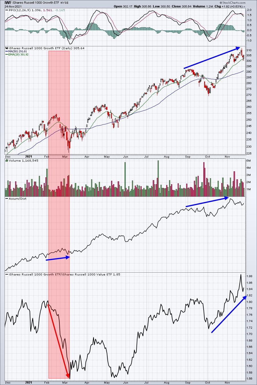
When inflationary reports began coming in much hotter than expected in February, you can see that growth stocks (IWF) tumbled vs. its value-stock (IWD) counterparts. That significant relative downtrend took place from February to May and it's undeniable. Growth stocks were crushed. But the ensuing relative inverse head & shoulders pattern was quite bullish and we just broke out above the relative neckline earlier this month. In other words, growth stocks have now outperformed value stocks since February throughout all the economic imbalances and elevated inflationary readings. What does this tell us? Well, it tells me that Wall Street used the selling in the Spring to accumulate growth stocks. Hey, you don't have to believe me. Again, let's let the charts do the talking:

The IWF's AD line rose during February as it appeared to be falling out of favor. I believe it's important to note that the AD line has been rising throughout the year, including over the past 7 weeks or so as clear rotation has taken place back to growth stocks.
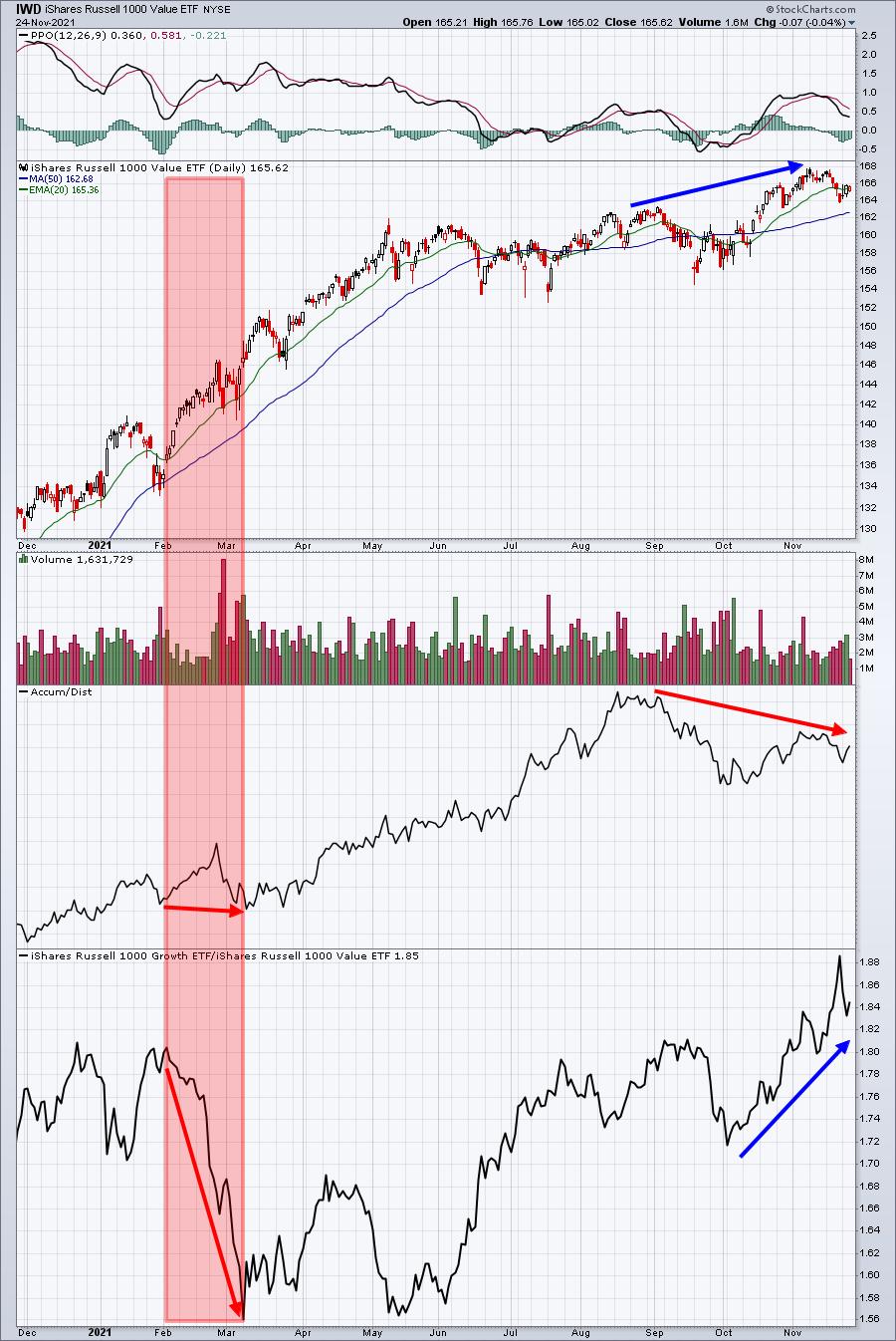
Now let's look at the IWD to see how value stocks performed on the same chart and timeline:

The IWD AD line actually declined during February when it was supposedly being accumulated vs. growth stocks. Interesting. Over the past several weeks, the IWD has broken out on an absolute basis, but it's been steadily losing ground vs. growth stocks. And its AD line? It hasn't confirmed the breakout in price.
So the media can hype up inflation all it wants, but as long as Wall Street keeps sending me signals that inflation is not a problem, I will listen to the money and ignore the "click-bait" headlines. In my humble opinion, the media is a pawn for Wall Street. It helps to create the panic and volatility from time to time in order to allow big Wall Street firms the opportunity to accumulate at our expense.
You have a choice. You can listen to the headlines that constantly scream the sky is falling or you can benefit from all the great tools and features here at StockCharts.com to be your own finance MBA.
Thank you secular bull market!
My Colleagues
It always helps to be challenged. StockCharts.com has assembled many of the finest technical analysts around. I would much rather try to objectively assess the technical merits of these blog authors, show hosts, and great friends, than to try to assess the agenda of the media. It's usually most helpful when my colleagues disagree with my technical assessment as it provides another objective opinion about what's taking place on the charts and in the market. I might disagree with their assessment as the stock market always has two sides, but it definitely provides food for thought. And, quite honestly, we all have our own biases that Dave Keller often speaks of, so stepping back to consider another opinion is invaluable.
Thank you to my colleagues for all your tireless work to enable the StockCharts.com audience to make more informed investing and trading decisions!
The Community
The StockCharts.com platform has provided me the opportunity to reach millions of folks around the globe. While I always joke that the only market guarantee I can make is that I'm going to be wrong plenty of times, the truth is that trading and investing can be a very lonely business/hobby. It's a scary thing to invest for the future, because there are so many possible directions to go and none of us have a crystal ball. My work and the work of others here would all be for naught, however, if it weren't for the entire StockCharts.com community of fellow investors/traders. We appreciate you!
When I returned to EarningsBeats.com in September 2019, I never could have imagined the level of support I'd receive. It was a no-brainer decision for me to return to my "roots" as EB's Chief Market Strategist, while also providing me the opportunity to work with my daughter Erin Webber, a fellow CPA. This community support has enabled me to reach dreams that I didn't even know were possible. Whether you've listened to my Trading Places shows, read my blog articles in ChartWatchers, Trading Places, and Don't Ignore This Chart, subscribed to our EB Digest free newsletter, or become a paid member at EarningsBeats.com, you've played a part in my success and the success of EarningsBeats.com. For that, I'd like to say thank you!
Looking Ahead
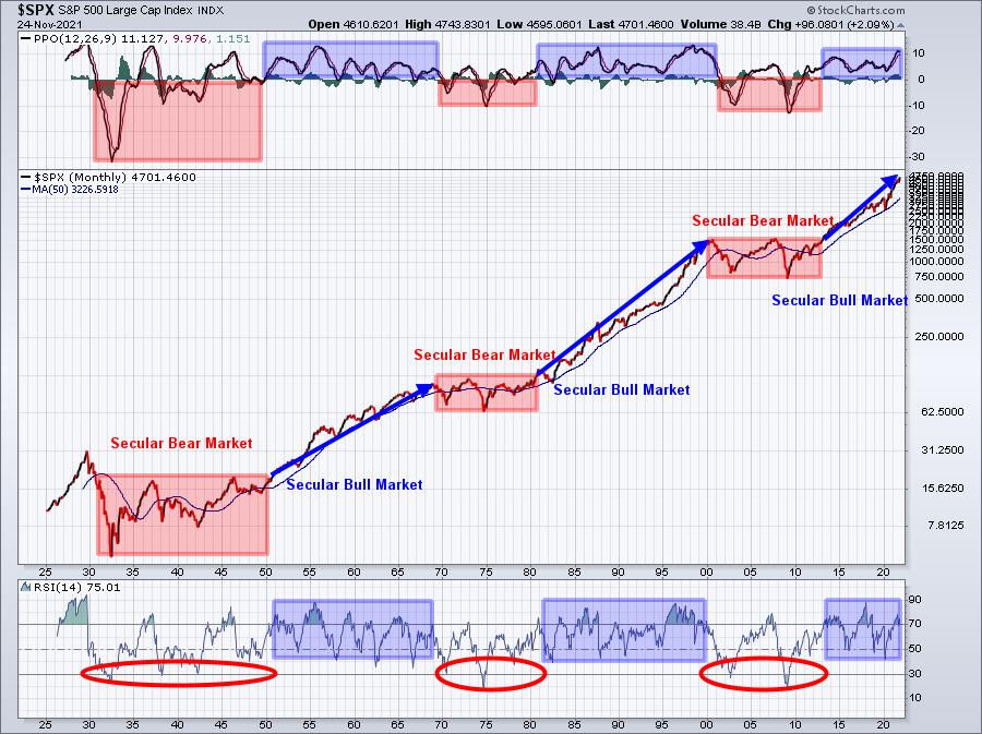
The past is the past and we can't change any of it - whether we'd like to or not. But the future is not certain or settled. We will play a starring role in our financial future. I'm certainly an optimist when it comes to the stock market as history tells us that stock prices rise much more often than they decline. Also, history suggests that we're still in the early to middle stages of a bullish super cycle. The big picture says that we're in a multi-decade period that favors the equity market. Check this out as pictures do literally say a thousand words:

While many incorrectly try to call major long-term market tops using daily charts, media headlines, and/or preconceived biases, these types of major market reversals are best seen and confirmed on long-term monthly charts. Secular bear markets have never occurred without 2 technical conditions present simultaneously. First, the monthly PPO MUST see a bearish centerline crossover AND the monthly RSI must pierce 40 support. While these signals will not occur at a market top, they do alert us to the fact that we'll be in for YEARS of frustration. These signals absolutely should be viewed as bearish technical confirmation and investing/trading strategies should be adjusted accordingly. Fortunately, we're potentially in Year 8 of this secular bull market. I consider the start of a secular bull market to be the time that we clear previous tops. In the case of the current secular bull market, it occurred on April 10, 2013. Previous secular bull markets have spanned up to two decades, which would take us to 2033. That means we could very well be in Year 8 of 20 of a major market advance. Before you think I'm totally nuts, you need to realize that cyclical bear markets can occur during secular bull markets. We've already had two - one during Q4 2018 (trade war) and Q1 2020 (COVID-19 pandemic) - during the current secular bull market. I'm not at all suggesting that we'll go straight up for the next 12 years. I believe the secular bull market in the 1950s and 1960s saw multiple recessions and cyclical bear markets.
Based on history, however, I believe the next dozen years will be incredibly important in building wealth through equities as the subsequent secular bear market will most likely produce a shift into other asset classes and be much, much more challenging.
Our Commitment
As always, I'll try to objectively review the charts and continue to provide you with the latest technical information. History provides us many lessons, but history also continues to evolve. We have to evolve with it as best we can. Changing market conditions require us to change strategies as well from time to time.
While stock market guidance, research, and education are the three "pillars" of our service at EarningsBeats.com, I've always been most consumed by the educational aspect. I spent a lot of "stock market tuition" over the past 35-40 years. We all want to make a difference, hopefully positive, in helping others. I do my best to pass on everything I've learned over the years (and continue to learn) to help others avoid many of the mistakes I've made. I sincerely hope that something I've written or said has had a positive impact on you somewhere along the way.
I want to thank you for your support over the years. Many of our members have been with us since 2004, the year we started our business. It's really unbelievable to think that members have been with us through all of our business iterations. If you'd like to become part of our EarningsBeats.com community, here are two ways to do so:
Free EB Digest newsletter, published 3x per week (M-W-F, no credit card required)
Register with your name and email address HERE.
30-day FREE trial to our paid service (credit card required)
CLICK HERE to learn more and get your free trial started!
Our best deal ever - our Fall Special - is running through this Saturday, so this is a GREAT time to try us initially for FREE!
Whatever support you've given us in the past, I want to sincerely thank you! We're looking forward to a bright future ahead!
Happy Thanksgiving and Happy Trading!
Tom
|
| READ ONLINE → |
|
|
|
|
|
| Mish's Market Minute |
| What Is Going On With the Oil Market? |
| by Mish Schneider |

The oil market has the media spotlight, with projected prices continuing to rise. Shortages, inflation and economic growth have all been major factors in oil trending higher throughout this year. With gas at a 7-year high, pressure has been mounting on the Biden administration to ease the consistent price climb.
However, this leads to the current disagreement between the U.S. and OPEC (Organization of the Petroleum Exporting Countries). While the U.S and other countries have entertained the idea of releasing personal oil reserves to calm prices, OPEC has responded with a warning that if the U.S, India, China and South Korea all release oil, they will not ramp up their oil productions. They believe that the oil market will swing into a surplus cautioning haste on releasing too much oil.
From the inflation side, JP Morgan created a study on oil prices compared to equities adjusted through inflation, showing that, going back 20 years, if oil had followed equities percentage increase (excluding the Nasdaq index), oil would be priced near $115 per barrel. Currently, the price is $78 per barrel. From this standpoint, oil is still much cheaper compared to $115. However, with so many moving parts and potential manipulation from OPEC, it's tough to gauge where price should be based on growing demand.
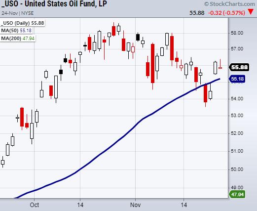
Pulling away from fundamentals, charting can add more perspective to oil's short-term future. Above is a chart of United States Oil Fund ETF (USO). Currently, USO has made a second close over its 50-day moving average (DMA) confirming a bullish phase. Though it is within a recent downward trend, if USO can hold over its 50-DMA at $55.18 or its 10-DMA at $55.53, we could see it run back to highs near $59. On the other hand, if USO breaks down, watch the support area from $53.50 – 54.50 to hold.
Either way, consumers are looking for cheaper prices, which OPEC is hesitant to meet through adding supply. Therefore, it will be interesting to watch the oil market going forward if demand continues to outpace supply, thus putting pressure not only on travel and movement of goods but the current U.S administration.
Safe travels and have a Happy Thanksgiving!
Follow Mish on Twitter @marketminute for stock picks and more. Follow Mish on Instagram (mishschneider) for daily morning videos. To see updated media clips, click here.
Watch Mish on Making Money with Charles Payne below!
ETF Summary
- S&P 500 (SPY): 464.45 new support to hold.
- Russell 2000 (IWM): 228.26 support the 50-DMA.
- Dow (DIA): Watching 355.34 to hold.
- Nasdaq (QQQ): Watching to stay over the 10-DMA at 397.62.
- KRE (Regional Banks): 75.75 resistance area.
- SMH (Semiconductors): like this to stay over 300.
- IYT (Transportation): 270.89 support.
- IBB (Biotechnology): 150.21 new support.
- XRT (Retail): Sitting in support from prior trading range.
Forrest Crist-Ruiz
MarketGauge.com
Assistant Director of Trading Research and Education
|
| READ ONLINE → |
|
|
|
| Martin Pring's Market Roundup |
| Key Index Experiences a Bearish Outside Day: Could There Be More Downside to Come? |
| by Martin Pring |
One piece of Monday's market action that really stood out to me was a bearish outside day in the NASDAQ, as shown in Chart 1. A classic outside day develops after a persistent short-term rally and signals a short-term reversal in sentiment. The outside part refers to the fact that its price range exceeds that of its predecessor. From an analytical point of view, the wider the bar, the better, since a wide bar reflects a bigger battle between buyers and sellers than a narrow one. Also, it's important to have the closing price develop near the low of the day. Remember, during the period preceding the bar, buyers were in control. If the price can close near the low, it is a signal that sellers now have the upper hand.
With these yardsticks, Monday's NASDAQ action represents a very powerful signal since it reflects buyer exhaustion. This negative action was augmented by the fact that the RSI experienced a failure swing and violated the up trendline.
 Chart 1 Chart 1
It's important to stress that these one-day formations are only expected to have a short-term effect, say for 5-10 sessions. Moreover, no long-term indicators, such as the 200-day MA, have come anywhere close to triggering a bear signal. That said, a deeper dive into some of the NASDAQ breadth indicators leaves a lot to be desired, which could mean that the outside bar represents an opening salvo.
NASDAQ Breadth Indicators
Chart 2, for instance, features the NASDAQ Bullish Percentage Index. It peaked back in February and has been working its way progressively lower, as the NASDAQ itself has been steadily rising. That kind of discrepancy developed on a smaller scale in the summer and fall of 2020, but was resolved in a positive way. It's possible that the current one will experience a similar outcome. For that, we will have to wait for an upward penetration of that March/November down trendline. On the other hand, a break below the red support trendline at 45% would suggest a negative outcome.
 Chart 2 Chart 2
Breadth can also be measured by monitoring the number of issues reaching net new highs over a 52-week lookback period. Chart 3 indicates three instances of a small negative divergence where the Index registered a new high but the number of individual issues touching net new highs did not. A fourth such divergence appears to have formed in the last week, as the mid-November all-time high was barely accompanied by any of its components; the indicator could barely make it above zero. Equally as important, this week the net number of new lows fell to its lowest level since last March.
 Chart 3 Chart 3
Between March 2020 and February of this year, the percentage of NASDAQ stocks trading above their 200-day MA's moved more or less in gear with the Index itself. Since then, that number has been steadily declining in the face of an even stronger Index. At the recent high, barely 35% of NYSE issues were above that key average. The technical position of this indicator could change, given a break above the green 2021 down trendline. Such action would be very positive, since it would indicate a rising trend of stocks trading above their 200-day MA. However, the indicator, which does not reflect weak Tuesday action, is right at the August/November support trendline and its KST has just gone negative. Based on current action, I therefore interpret this relationship as bearish. Please remember, this chart can be updated simply by clicking on it.
 Chart 4 Chart 4
The NASDAQ Composite Has a Relative Problem
Chart 5 shows that, like the indicator in Chart 4, relative action was moving in gear with the Index until February of this year. The first set of dashed red arrows demonstrates that, at the marginal new high in April, the RS line was well off its February peak. It even broke down from a head-and-shoulders top. However, that break has so far turned out to be false. The second set of arrows shows that the price/relative strength divergence continued to extend.
 Chart 5 Chart 5
Chart 6 holds out the possibility that the RS line is in the process of tracing out an inverse head-and-shoulders pattern. Completion would require a decisive break that can hold above the green resistance trendline. Such action, should it take place, would merely indicate the likelihood of the NASDAQ outperforming the S&P. Most of the time, though, it is true to say that a rising RS line does reflect improving confidence and tends to lift all boats.
 Chart 6 Chart 6
That said, a more likely outcome is that the RS line, having falsely broken above the green trendline and its 200-day MA, is now testing support in the form of the 2021 red dashed up trendline. If such a break develops, we would expect to see the RS line move significantly lower, as that would confirm the late November upside break as being truly false. Whipsaw moves are often followed by above-average moves in the opposite direction to the whipsaw.
Good luck and good charting,
Martin J. Pring
The views expressed in this article are those of the author and do not necessarily reflect the position or opinion of Pring Turner Capital Group of Walnut Creek or its affiliates.
|
| READ ONLINE → |
|
|
|
| Top Advisors Corner |
| Going Alone |
| by Mike Zaccardi |
Making the rounds on the financial blogosphere earlier this month was a Wall Street Journal article that detailed millennials' DIY approach to investing. Some advisors might be disappointed to read stories of young money venturing into financial planning decisions with no traditional guidance. Other planners might see this as an opportunity.
I'm reminded of all the ink spilled a decade ago about how millennials would not own houses like their parents did. Funny how that narrative died. I believe millennials will also come around and seek help with their finances as they age. There are a few factors at play.
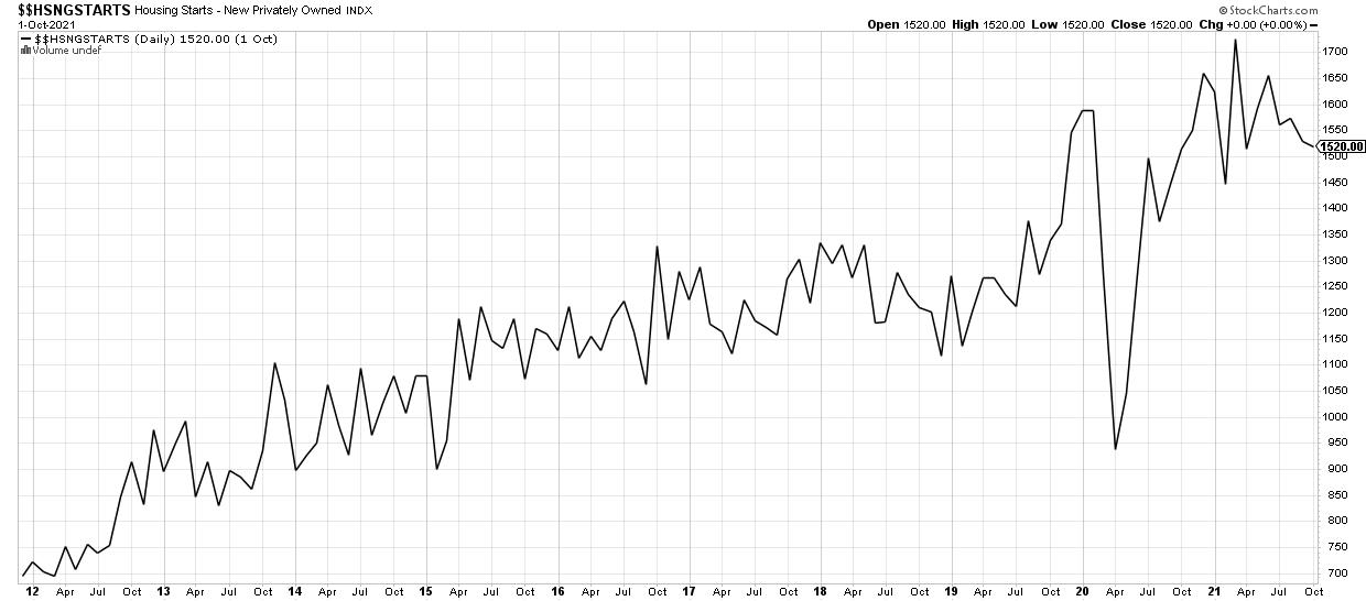
 Chart 1: Housing Starts Chart 1: Housing Starts
For starters, millennials and Gen Z might have just recently seen a boost in wealth via a booming stock market, surging cryptocurrencies and exciting "to the moon" meme stocks. Moreover, a homebuyer from before the pandemic is already sitting on considerable equity. Some may have even scored significant gains from being a part of a startup which have seen valuations soar. As time wears on, their portfolios might become more of a burden than a source of thrill.
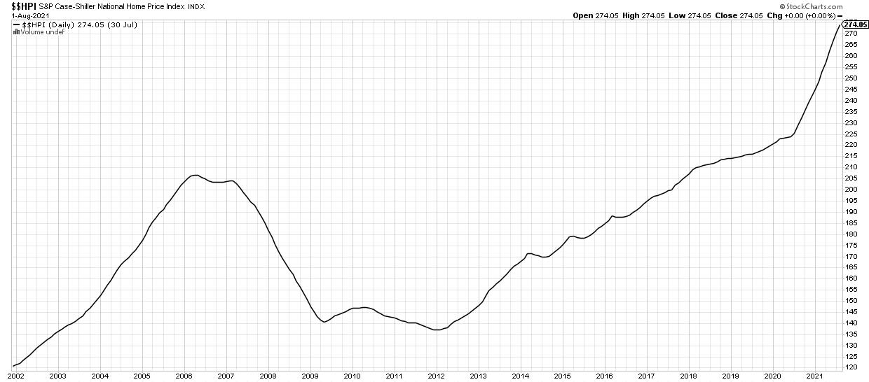
 Chart 2: Case Shiller Home Price Index Chart 2: Case Shiller Home Price Index
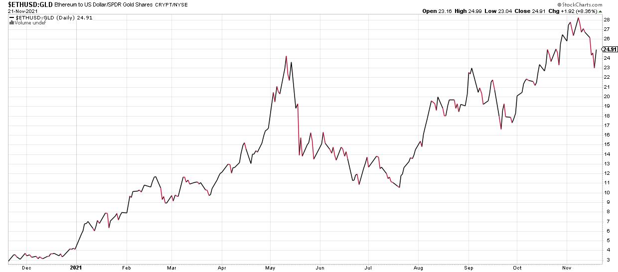
 Chart 3: Ethereum/USD Relative to SPDR Gold Shares ETF Chart 3: Ethereum/USD Relative to SPDR Gold Shares ETF
Another thing to consider is that life becomes more complicated as you get older. There is not a whole lot of planning required for a young buck in good health with a significant financial portfolio. Circumstances change quickly when a spouse enters the picture, then comes a house, children and caring for aging parents. That is where an experienced financial advisor can bring huge value.
Finally, time becomes a scarce resource by the time someone hits their late 30s and 40s. Unloading financial planning tasks to a professional opens up more time to spend with loved ones rather than in front of screens and spreadsheets.
Financial advisors should focus on the value they can bring to young money. Tax-saving strategies, risk management and simply freeing up an individual's time offers quite the value proposition. Helping those in their 20s and 30s with student loans is another opportunity for RIAs.
Recent college grads have student debt upwards of $30,000, on average, according to the latest data. Financial planners must be knowledgeable in this key area if they want to attract the next gen.
How advisors are paid is changing, too. An "assets under management" fee arrangement is slowly shifting to an hourly or even flat-fee structure. This trend can be helpful for young investors who need basic help. It can also be beneficial for those with more wealth who do not want to pay 1% per year for essentially the same service (and hours) as a client with much less wealth.
Advisors must be able to talk the talk. At least knowing the basics of crypto, understanding the appeal of sexy (unprofitable) stocks, and letting clients spend within reason should be the new normal if advisors want to reach the next generation of wealth.
Mike Zaccardi, CFA, CMT
Investment Writer, Zaccardi LLC
|
| READ ONLINE → |
|
|
|
| MORE ARTICLES → |
|
 Chart 1
 Chart 2
 Chart 3
 Chart 4
 Chart 5


 Yes - believe it!
