| THIS WEEK'S ARTICLES |
| John Murphy's Market Message |
| STOCKS ENDING TRADING WEEK ON A STRONG NOTE |
| by John Murphy |
STOCK INDEXES GAIN GROUND... Stocks are ending the trading week on a strong note as shown in the three charts below. The most notable one belongs to the S&P 500 in Chart 2 which is nearing a test of its old high. Ten of eleven stock sectors are also gaining ground led by consumer discretionary, industrials, and materials. Defensive sectors like real estate, utilities, and consumer staples are lagging behind.
SANTA CLAUSE RALLY IN PLAY...The traditional Santa Clause rally usually gives a boost to the market during the last couple of weeks of the old year; and may be one of the factors driving stocks higher. That doesn't, however, mean the stock rally is on solid technical footing. Various measures of market breadth are lagging behind,
 Chart 1 Chart 1
 Chart 2 Chart 2
 Chart 3 Chart 3
MARKET BREADTH LAGS BEHIND... Chart 4 shows the S&P 500 percent of stocks above 50-day averages (through yesterday) at 57% and well off its highs. The percent of S&P stocks above 200-day averages through yesterday stands at 68%. Both measures of market breadth have a lot of catching up to do. So does the advance decline line. Chart 5 shows the NYSE Common Stock Only Advance-Decline Line (through yesterday) also well off its highs and remaining below both of its moving average lines. It too has a lot of catching up to do to support the holiday rally.
 Chart 4 Chart 4
 Chart 5 Chart 5
|
| READ ONLINE → |
|
|
|
|
|
| ChartWatchers |
| Two Intermarket Relationships Worth Monitoring for Early 2022 |
| by Martin Pring |
Last week, I pointed out three charts that had triggered bullish signals and suggested that these characteristics were strong enough to power the market higher. Prices immediately sold off, but have subsequently rebounded. Since those charts are still positive, I am sticking to the higher market over the next 2-4 weeks scenario.
For example, Chart 1 features the daily KST for the CBOE Total Put/Call ratio. Last week, it had started to go flat. Now, it has experienced a decisive peak, which indicates that traders have started to become more optimistic. The arrows show that such action has consistently been followed by a 2-to-4-week rally or more.
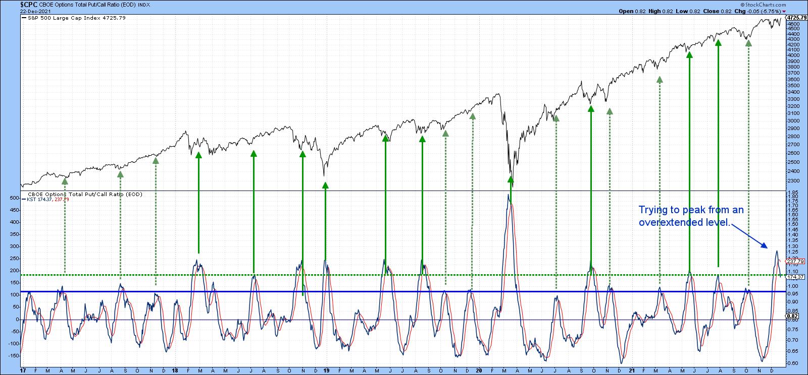 Chart 1 Chart 1
Three Intermarket Relationships to Monitor
Further out, things get a bit murky, as some of the intermarket relationships I follow are deteriorating and need to change course if 2022 is to avoid an early stumble. Chart 2 compares the ratio between the S&P High Beta and its high-quality counterpart (SPHB/SPHQ). Using the benefit of hindsight, the green-shaded areas show instances when the ratio has been in a rising mode for an extended period. That reflects growing confidence, because it means that traders are bidding up risky high-beta stocks over the more conservative high-quality issues. When that happens, that improving confidence spills over into the overall market. A falling relationship does not necessarily mean that the S&P will drop; however, we see two examples of a negative divergence, as flagged by the dashed red arrows. Both were associated with a confirming S&P trendline break and were followed by a temporary setback. A third divergence has been building since the ratio topped out in June; it clearly needs monitoring for possible confirmation from the S&P with another trendline break.
You can also see that this relationship completed a base as it broke above the thick solid green trendline earlier this year. The breakout looked very promising at the time, but now the ratio is back below the breakout point. A rally above the dashed green down trendline up to, say, 1.60, would help put things right. However, a drop below the red neckline of that potential head-and-shoulders top would not be a good sign.
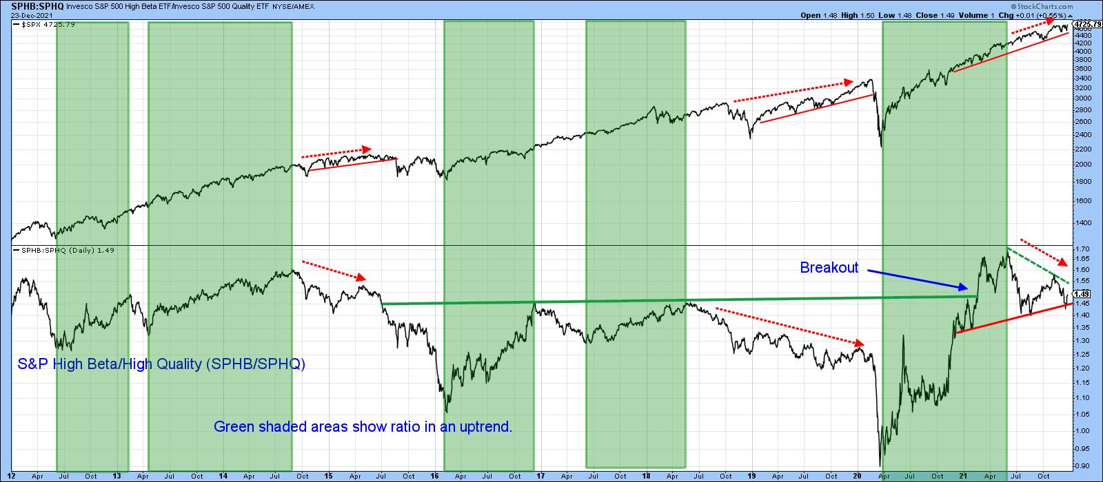 Chart 2 Chart 2
Something like that appears likely because Chart 3 shows that the Special K Indicator has crossed below its signal line, slipping below its 2021 trading range. The chart shows four instances since 2012 when joint ratio/Special K trendline breaks have confirmed major trend changes in the ratio. I have to stress a break for the ratio has not yet occurred, so we should assume that the recent trading range is intact.
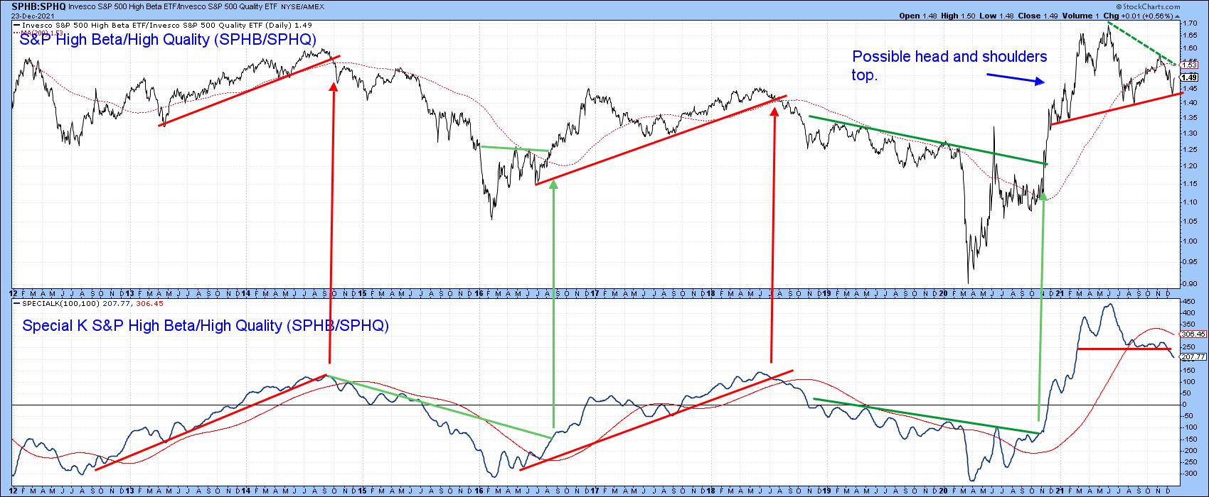 Chart 3 Chart 3
Chart 4 features another confidence relationship. This time, it's the Fidelity Capital and Income versus the Vanguard Treasury fund (FAGIX/VUSTX). The former is heavily weighted in high-yielding (riskier) bonds, while the latter has lower-yielding but relatively safe treasuries. A rising relationship, as represented by the green shading, indicates growing confidence, because it reflects the fact that market participants are favoring the higher-yielding fund and ignoring the possibility of default. Not surprisingly, such an environment is also positive for the S&P itself. In early 2021, the ratio broke out from a multi-year base, but has since been unable to maintain that breakout, which has given way to a declining peak and trough. A falling ratio is not necessarily bearish for the S&P, as we have seen for most of this year. However, it is also clear that all the major declines since 2009 have occurred when this approach has been in a negative mode.
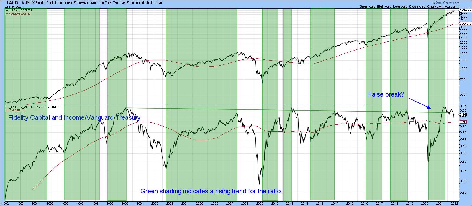 Chart 4 Chart 4
That's why Chart 5 is one of those worth monitoring, firstly to see whether the green or red trendline is violated, and secondly, if it turns out to be the red one, to make sure that the S&P confirms with a break below the red up trendline -- say, with a daily close that can hold under 4,400.
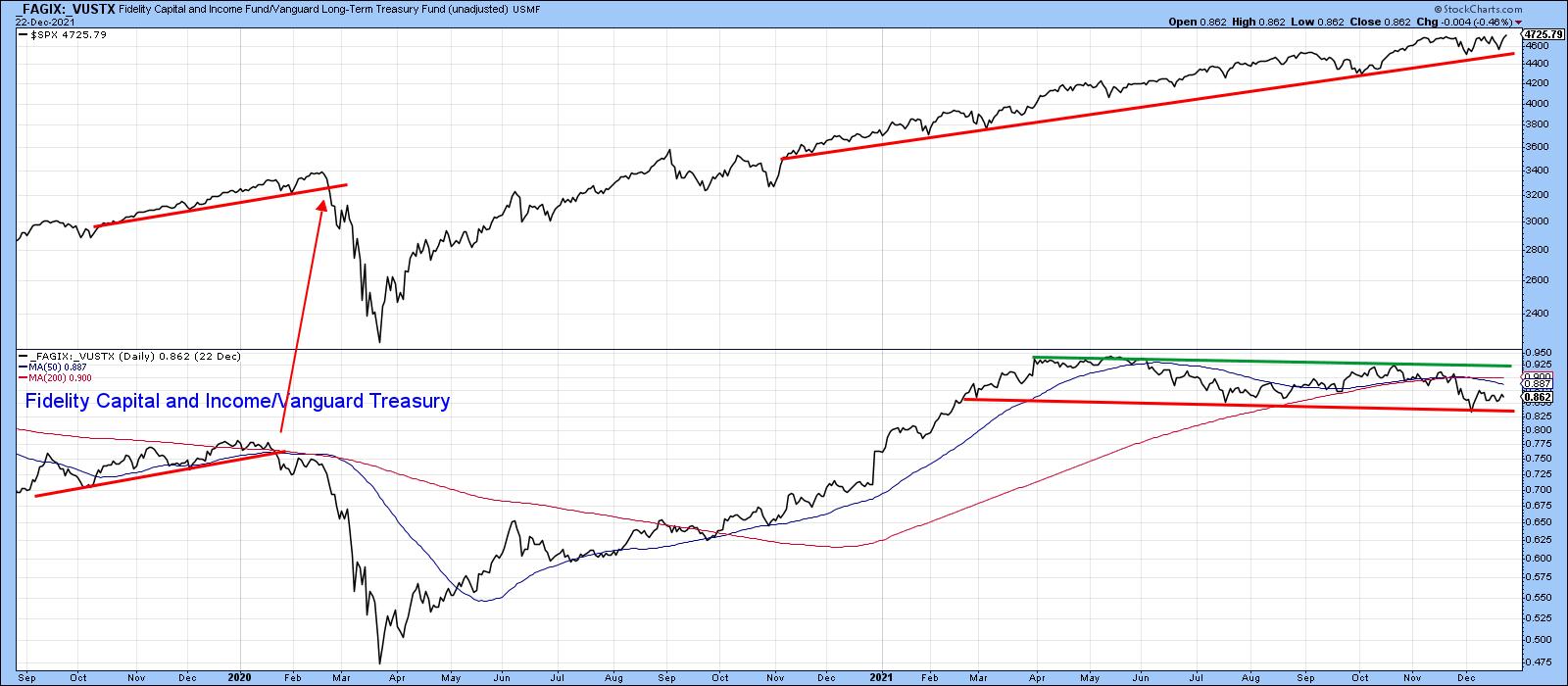 Chart 5 Chart 5
What Will Small-Caps Do?
Finally, the Russell 2000 ETF (IWM) is not an intermarket relationship for sure. However, its recent price action fascinates me and, I think, is worth watching going forward. Chart 6 shows that it recently broke to the upside above the green trendline. I wrote about it at the time and was pretty sure that it was a valid break and, therefore, the precursor to higher prices. Unfortunately, I began to see on the internet that many others had spotted the same chart as we all jumped on the bandwagon. When an investment theme becomes widely popular, it tends not to pan out, which was certainly the case in this instance.
Now, the price has dropped back to the lower region of the trading range. If it penetrates the red trendline, that will confirm the breakout was false and would likely be followed by a really nasty decline. It's already under its 200-day MA and the long-term KST is tentatively bearish. That said, the red trendline has held and the intermediate KST has just crossed above its MA. This offers the opportunity to re-group and re-assert the previous upside breakout. Let's wait and see what happens, because whichever direction the breakout ultimately takes, it is likely to be followed by a big move.
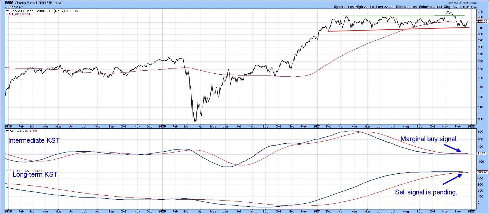 Chart 6 Chart 6
Conclusion
It seems likely that the U.S. stock market will continue to firm up over the next 2-4 weeks. If that proves to be the case, some of the discrepancies that have been developing in the last few weeks and months could be cleared up. However, if they are not, that could set the scene for a challenging 2022.
This article is an updated version of an article previously published on Wednesday, December 22nd at 4:29pm ET in the member-exclusive blog Martin Pring's Market Roundup.
Good luck, good charting and Merry Christmas!
Martin J. Pring
The views expressed in this article are those of the author and do not necessarily reflect the position or opinion of Pring Turner Capital Group of Walnut Creek or its affiliates.
|
| READ ONLINE → |
|
|
|
| ChartWatchers |
| Networking Leads and this Stock Could be Next |
| by Arthur Hill |
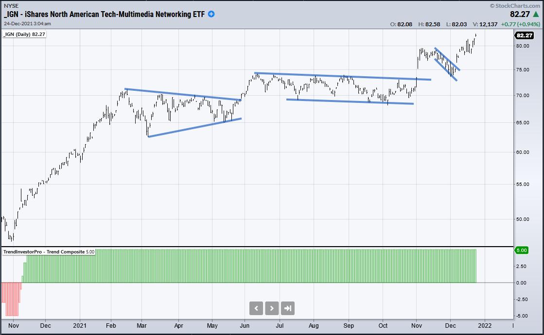
 The Networking ETF (IGN) is leading the market with a solid uptrend and a new high this week. Diving into the group, I found a stock that recently broke out and formed a short-term bullish continuation pattern. The stock is also in an uptrend and I expect a breakout to new highs in the coming weeks. The Networking ETF (IGN) is leading the market with a solid uptrend and a new high this week. Diving into the group, I found a stock that recently broke out and formed a short-term bullish continuation pattern. The stock is also in an uptrend and I expect a breakout to new highs in the coming weeks.
The first chart shows IGN with the Trend Composite Indicator in the lower window. This indicator aggregates trend signals from five different trend-following indicators. The Trend Composite turned bullish in mid November 2020 and all five indicators currently signal uptrend. On the price chart, IGN broke out in early November 2020, fell back to the breakout zone and broke out of a falling flag in early December.

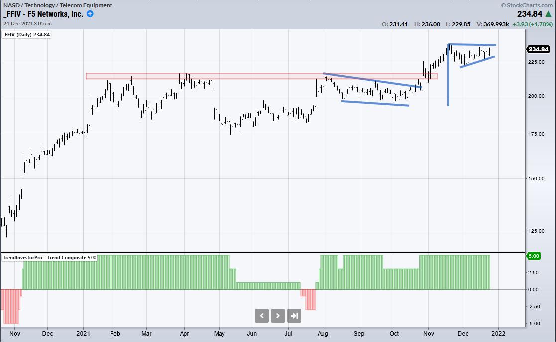
F5 Networks (FFIV) also sports an uptrend and a recent breakout. The Trend Composite got a whipsaw in July and has been bullish since late July. On the price chart, the stock broke out of a long consolidation in early November (red zone) and then stalled with a pennant (small triangle). This is a short-term bullish continuation pattern and a breakout would signal a continuation of the bigger uptrend.

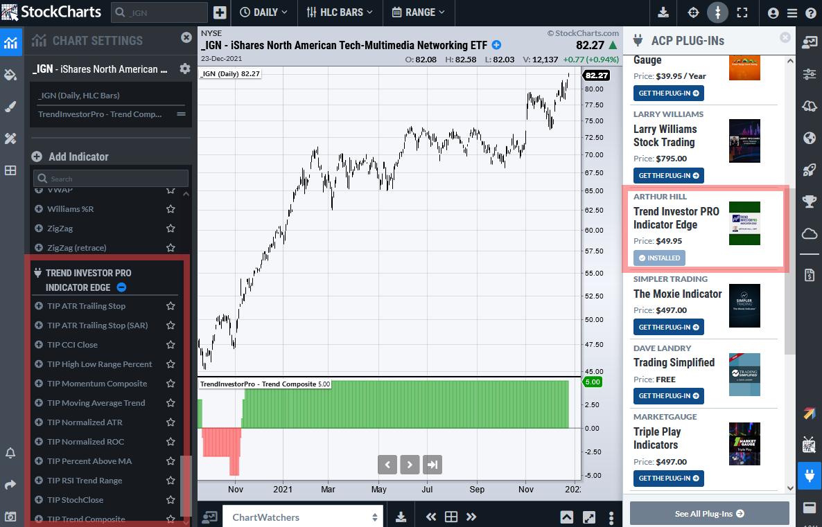
Interested in the Trend Composite? This is one of 11 indicators available as part of the TrendInvestorPro indicator edge plugin for StockCharts ACP. The screen shot below shows these indicators on the left and the plugin details on the right.

---------------------------------
Thanks for tuning in and best wishes for the holiday season!
---------------------------------
|
| READ ONLINE → |
|
|
|
| The Mindful Investor |
| Top Five Charts of 2021 |
| by David Keller |
Try to summarize 2021 in one word.
"Rotational."
"Uncertain."
"Volatile."
Perhaps all of the above?
This year has been all about leadership rotation, with growth names, value stocks and even defensive sectors all spending some time as the strongest performers in a given month. This has been a year of uncertain times and competing narratives, from the Fed's attempts to address elevated inflation levels, to the projected economic boost of increased infrastructure spending, to the chronic unknowns of the COVID-19 pandemic. And, after 2019 and a relatively low volatility environment, followed by 2020 with its all-time high levels for the VIX, 2021 was somewhere in the middle.
So how do we make sense of this year from a technical perspective?
Here are my top five charts of 2021, which I believe tell the story of this year. And I feel that they tell of a challenging year, given all the uncertainties, but also provide plenty of lessons on how to manage a portfolio when the future is truly unknown.
First, we have what I call the Market Trend Model.

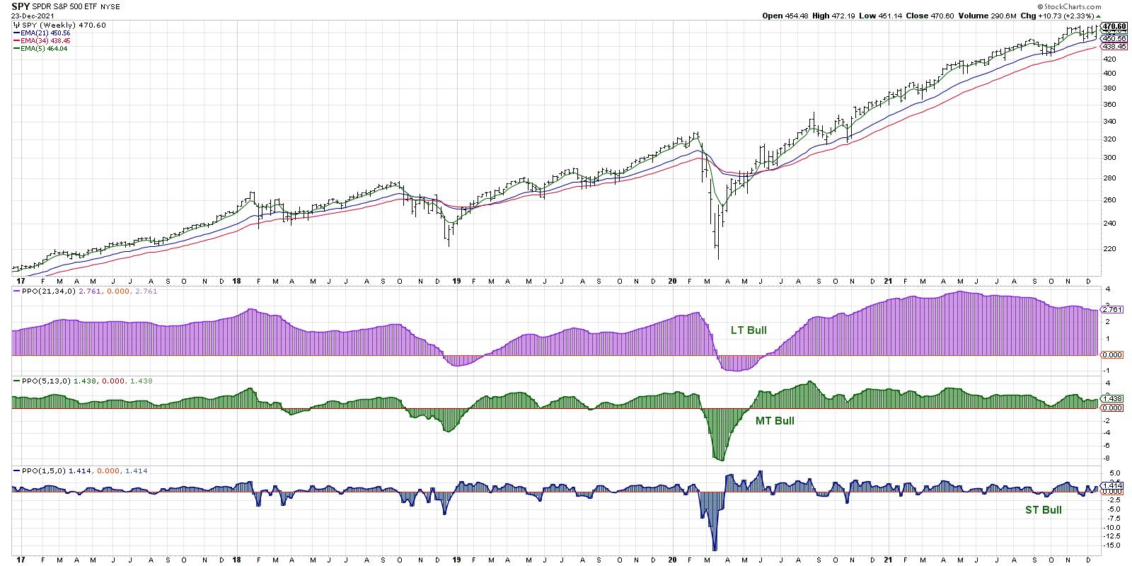
Years ago, I tried to create a systematic trend-following model that would mirror how I was viewing the overall market trend on three time frames: short-term (a couple days to a couple weeks), medium-term (a couple months to a couple years) and long-term (many years). My Market Trend Model uses exponential moving averages to determine the trend on each of these time frames, and I have found that a regular review of this chart during my Morning Coffee Routine allows me to keep a proper focus on the overall trend in the equity markets.
The long-term model turned bullish in June 2020 and remained bullish through all of 2021. Given the persistent strength in stocks and repeated new all-time highs for the S&P 500 and Nasdaq 100, this makes good sense.
On the medium-term time frame, the model turned positive in May 2020 and also remained bullish through the course of 2021. I actually tweaked the medium-term portion of the model earlier this year, as my previous version turned negative in May 2021 and remained bearish as the S&P pressed on to new highs into the fall.
This was a fantastic lesson on developing a process and staying consistent during your day-to-day to use of the approach -- but don't be afraid to adjust your inputs if you find that market conditions have changed!
The medium-term model is what I use as a basic risk-on/off gauge for equities. Should I be thinking more about potential reward or potential risk in my portfolio? The consistent bullish reading here tells me the remain constructive and to keep looking for long opportunities given the overall strength in the market trend.
Lesson #1: Don't fight the trend!
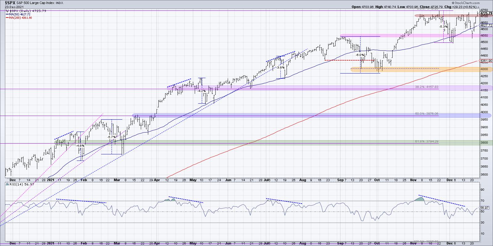
My second chart for 2021 is the daily S&P 500 chart, using daily price bars along with RSI and support/resistance levels.

The daily S&P chart demonstrated the limited pullbacks that we experienced in 2021. During an average year in the equity markets, it's reasonable to expect at least one good corrective move of over 10% down. We just didn't see that in 2021!
While the consistent uptrend from the weekly chart was certainly one key theme for equities, this chart shows how that upside was paired with limited downside as well. A basic approach of buying every time the S&P touched its 50-day moving average would have proven to be a fairly successful strategy!
It's also worth noting here that we saw four bearish momentum divergences in 2021. The deepest drawdown after a bearish signal was only 5-6%. So, while the bearish divergence in November and December appears quite negative on the surface, the reality has been much less negative through the course of the year.
Lesson #2: New highs and higher lows are the sign of a healthy bull market phase.
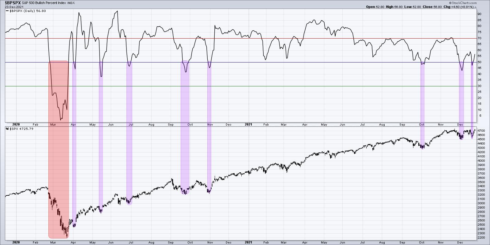
Next, let's review one of my favorite market breadth indicators, the Bullish Percent Index.

The Bullish Percent Index is derived by reviewing the point and figure charts of all 500 members of the S&P 500 index. Was the most recent signal on each chart a buy signal or a sell signal?
This index gives the percentage of the 500 charts which are currently on a buy signal, and is another way of measuring overall market participation. The index has dipped below the 50% level nine times since the beginning of 2020. In eight of those instances, the indicator turned back above 50% within a week or so of first dipping below 50%. In each of those cases, the S&P 500 rallied soon after and usually pushed to new highs. The ninth occurrence was in Feb 2020, where the index moved well below 50% and remained below this level for almost six weeks.
Years down the road, when I think about the year 2021, I may call this "The Year of Buyable Dips". Pretty much every pullback was an opportunity to jump in and ride the next leg higher. In 2022 and beyond, I will be keeping a close eye on this chart and comparing subsequent signals to this year's "buy on the dips" mentality.
Lesson #3: A strong uptrend will often provide plenty of opportunities to buy in on short-term weakness. Use a breadth indicator to identify these potential entry points.
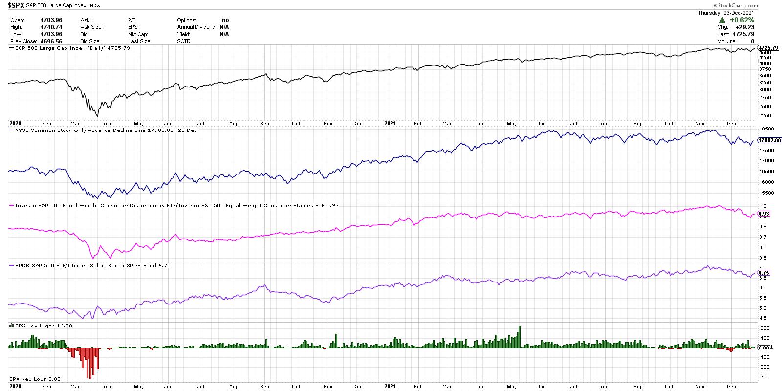
Now let's review a series of risk-on vs. risk-off measures using market breadth and sector rotation. This chart has become so important to me over the years that I often just refer to it as "The Chart".

From the top, we have the S&P 500 on a closing basis, the cumulative advance-decline line of the New York Stock Exchange, the ratio of Consumer Discretionary to Consumer Staples, the relative performance of the SPY versus the Utilities sector, and the new 52-week high and lows for the S&P 500 members.
The advance-decline line is all about participation. If the S&P 500 index is moving higher, what about all the stocks that make up these indexes? Toward the end of a bullish phase, you will often see the major indices move higher, but measures of breadth like this one will start to slope lower. This suggests a weakening of market internals and less upside momentum behind the price movements.
You'll notice on the chart that this breadth indicator peaked in June and, from there, it's been more sideways than bullish. This shows how many individual stocks, particularly in cyclical sectors, have not been participating in the most recent moves higher.
Next we have what I call the "offense vs. defense ratio" which compares the equal-weighted Consumer Discretionary and Consumer Staples ETFs. I'm using the equal-weighted ETFs instead of the more common cap-weighted versions to limit the impact of the mega-cap Consumer Discretionary stocks: AMZN, TSLA and HD.
This ratio made a new into December, which was one of the main inputs that encouraged me to remain overall constructive on stocks through the November high. Over the last six weeks, however, this ratio has turned lower as stocks like PG, KO, PEP and others have made new all-time highs. This suggests a move to more defensive positioning going into the new year.
The next line (purple) shows the relative performance of the S&P 500 ETF vs. the Utilities sector (XLU). I have found that investors usually only own Utilities if they are looking to ride out market uncertainty by owning something with low volatility and high income. Overall, this ratio has moved higher through the course of 2021, which illustrates the underperformance of a key defensive sector. Similar to the consumer ratio above, this has also taken a negative turn in December and could be a key chart to watch going into January.
Finally, we're looking at the new highs and lows for the S&P 500. A healthy bull market phase is marked by an expansion in new highs. The market is doing well if it's not just the major indexes making new highs, but a broad group of stocks showing strength as well. While this indicator was fairly strong in October and November, I've seen less and less stocks making new 52-week highs in December. A bullish trend in early 2022 would really need to be confirmed by an increase in new 52-week highs.
Overall, The Chart shows the overall strength of breadth measures through much of 2021, but also shows the strength of the FAANG trade over the summer. As sectors like Energy and Financials topped out in May, the market moved higher despite the lack of participation.
Lesson #4: Investors have not broadly rotated to defensive positioning yet, but they will!
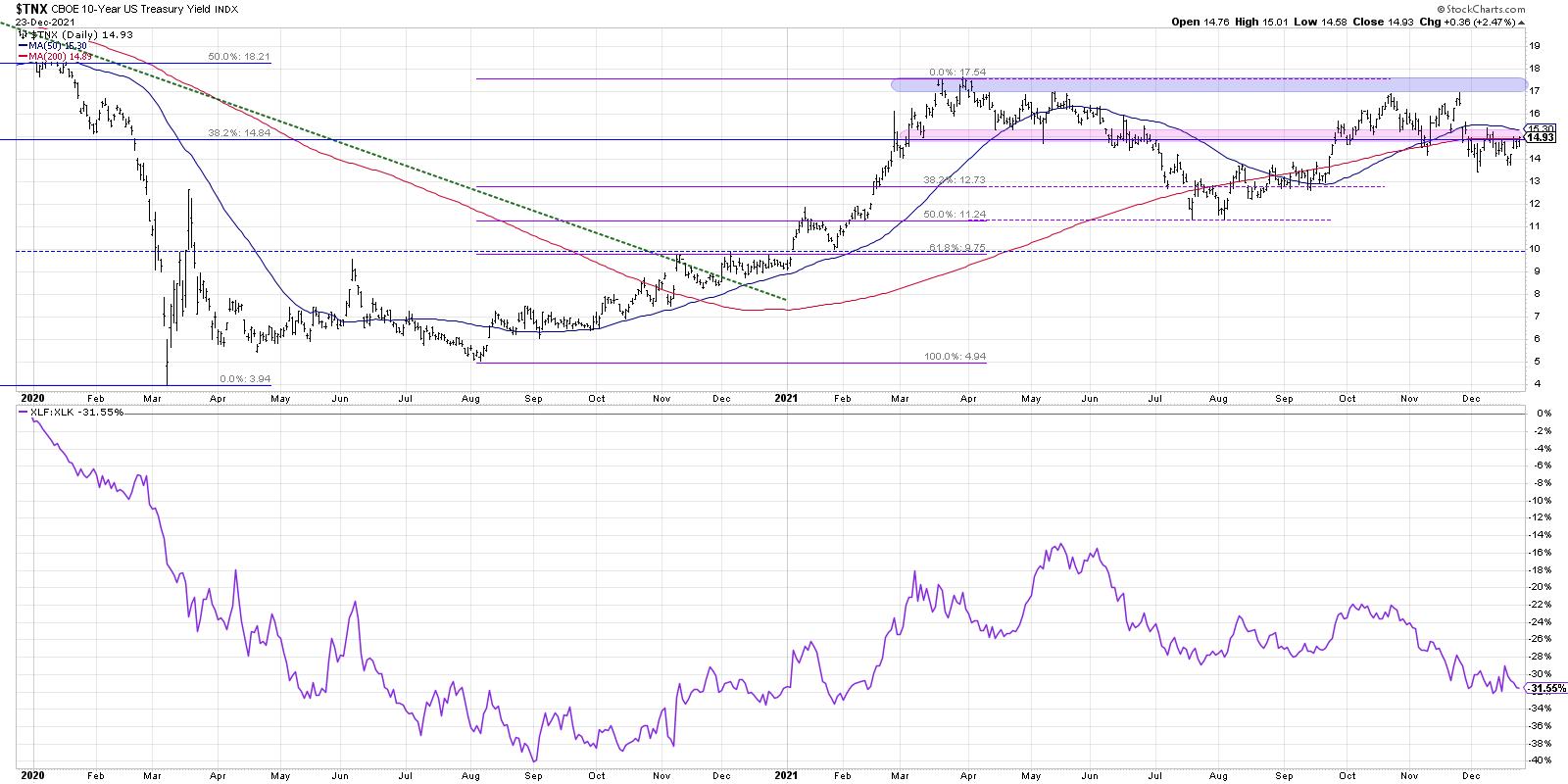
For our fifth and final chart, we have the Ten-Year Treasury Yield, along with the relative performance of Financials vs. Technology.

What strikes me on this chart is that the Ten-Year yield is almost exactly where it was in February! Now, it has not been a sideways trend over the last ten months, as this key interest rate has fluctuated up to 1.75%, down to 1.15% and back again. But the key to this chart is what it tells us about market leadership.
From January to May, it was all about the cyclical sectors driving the markets higher. Sectors like Energy and Financials emerged in Q4 2020 and pounded higher in the first quarter. May to August saw interest rates move lower, which means a headwind to those value-oriented sectors and more of a tailwind to growth sectors like Technology. The ratio moved higher into October as rates moved back higher and value sectors shined. The last eight weeks have been marked by lower interest rates and stronger charts in Technology. Growth sectors have once again regained the leadership role.
I was asked recently the question I posed at the beginning of this article. I answered "rotational" and I feel this fifth chart tells the story quite clearly.
If you want to understand the leadership theme in equities, and figure on which side of the growth/value debate you should be positioned, I would watch the chart of the Ten-Year. Given the Fed's well-documented plans to raise rates in 2022, I would expect this chart to move higher, which would mean it's much more likely we'll see a sector like Financials outperforming Technology. And this chart should help you understand the timing of that move.
Lesson #5: Interest rates matter. Big time.
How would you describe your experience as an investor in 2021? And what can you do today to help you upgrade your investment process and find success in 2022?
To help you answer those questions, check out the video version of this article, which includes a more complete illustration of the lessons from each of my Top Five Charts of 2021!
RR#6,
Dave
P.S. Ready to upgrade your investment process? Check out my free course on behavioral investing!
David Keller, CMT
Chief Market Strategist
StockCharts.com
Disclaimer: This blog is for educational purposes only and should not be construed as financial advice. The ideas and strategies should never be used without first assessing your own personal and financial situation, or without consulting a financial professional.
The author does not have a position in mentioned securities at the time of publication. Any opinions expressed herein are solely those of the author, and do not in any way represent the views or opinions of any other person or entity.
|
| READ ONLINE → |
|
|
|
| ChartWatchers |
| These Two Industry Groups Offer Excellent Opportunities |
| by Erin Swenlin |
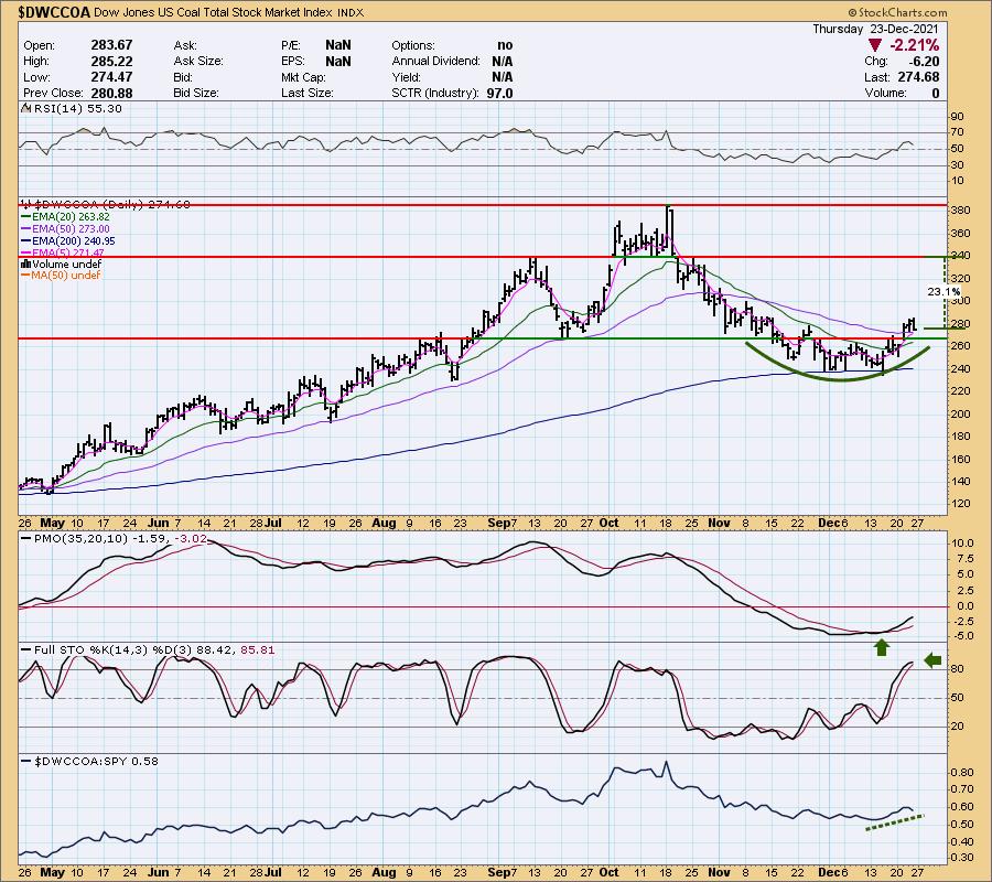
This week in the subscriber-only DecisionPoint Diamond Mine trading room Thursday morning, I found two industry groups to watch. Interestingly, one of those groups I had brought to the table last Friday for my DP Diamonds subscribers and, on Monday, I brought it to the attention of the DP Alert subscribers. That industry group is Coal. I've provided my synopsis from Monday with some added commentary for you.
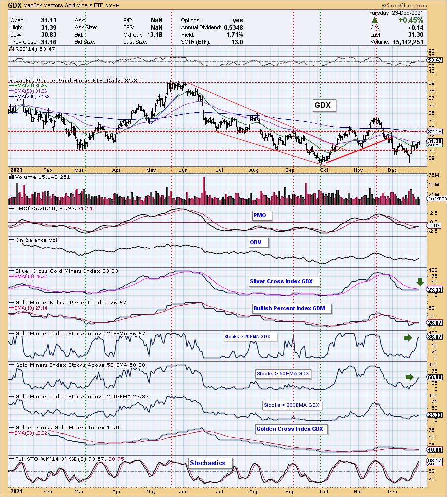
The second industry group is Gold Miners. DP Alert subscribers already knew about Gold Miners (GDX) heating up. I cover them in every DP Alert report every market day. This is the only industry group that we have "under the hood" indicators for, so, with that expanded knowledge, I knew that this group was improving quickly.
Let's start with Coal.
Last Friday, I noticed that Coal was beginning to bottom on the 200-EMA. The PMO is now rising on a crossover BUY signal. Stochastics are rising and have hit bullish territory above 80. The RSI is positive; you can see that the relative strength line is beginning to rise. It didn't have a great day, but the indicators are still very positive and price, though it pulled back, is still above the 50-EMA.
There are three coal stocks that I have on my watch list: Arch Coal (ARCH), Alpha Metallurgical Resources (AMR) and Warrior Met Coal (HCC). They all have very similar formations to the Dow Jones US Coal Total Stock Market Index ($DWCCOA).

ChartWatchers Save More on Our Holiday Special!
Save 50% off your FIRST month AND get a 2nd month FREE!
Currently, we are running our holiday special of "BUY ONE MONTH, get ONE MONTH FREE" on our website. However, as a ChartWatchers reader, we are offering you an even better deal!
Use Coupon Code: SAVE50CW and you will get 50% off your first month AND get your second month FREE! Once you've subscribed, we will move your renewal date out to February!
This is our best deal of the year! Subscribe Now!

Next up is Gold Miners (GDX):
Today, price closed above the 50-EMA. The PMO triggered a crossover BUY signal today as well. What has impressed me most is the upward thrust in participation of stocks > 20/50-EMAs. Those readings are well above the Silver Cross Index (SCI) reading, which gives Gold Miners a very bullish bias going into next week. The RSI is now in positive territory. Stochastics are now above 80 and still rising strongly.
Gold Miners that are on my watch list: IAMGOLD (IAG), SSR Mining (SSRM), Newmont Corp (NEM) and Yamana Gold (AUY). Please note that IAG and AUY are priced very low, so position size wisely.


Click here to register in advance for the recurring free DecisionPoint Trading Room! Recordings are available!
Check out the recording from Monday 12/20:
Topic: DecisionPoint Trading Room
Start Time: Dec 20, 2021 09:00 AM
Meeting Recording Link.
Access Passcode: December@20
Technical Analysis is a windsock, not a crystal ball.
--Erin Swenlin
(c) Copyright 2021 DecisionPoint.com
Helpful DecisionPoint Links:
DecisionPoint Alert Chart List
DecisionPoint Golden Cross/Silver Cross Index Chart List
DecisionPoint Sector Chart List
DecisionPoint Chart Gallery
Trend Models
Price Momentum Oscillator (PMO)
On Balance Volume
Swenlin Trading Oscillators (STO-B and STO-V)
ITBM and ITVM
SCTR Ranking
DecisionPoint is not a registered investment advisor. Investment and trading decisions are solely your responsibility. DecisionPoint newsletters, blogs or website materials should NOT be interpreted as a recommendation or solicitation to buy or sell any security or to take any specific action.
|
| READ ONLINE → |
|
|
|
| ChartWatchers |
| Sorry, But I Don't Believe in This Santa Claus Rally |
| by Tom Bowley |
It might take more than Old Saint Nick to sustain this current stock market rally. I'm not a believer this year. It reminds me of that catchy holiday tune:
"StockCharts is making a chart and I've checked it twice, gonna find out that Wall Street's naughty, not nice."
The S&P 500 closed on Friday at 4725, its highest close EVER. That's bullish, right? On the surface, it's very bullish, but the stock market truth doesn't always lie on the surface. As technicians, we need to learn to dig deeper. as that's where the problems can reside. And, in my opinion, we have an issue that needs to be resolved quickly.
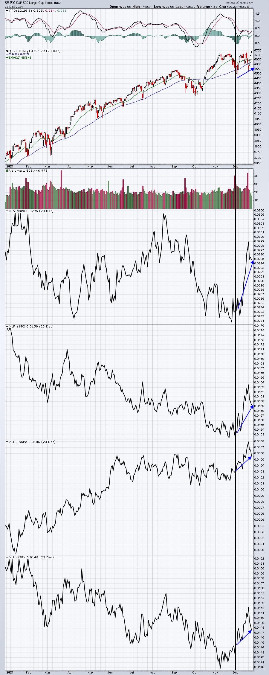
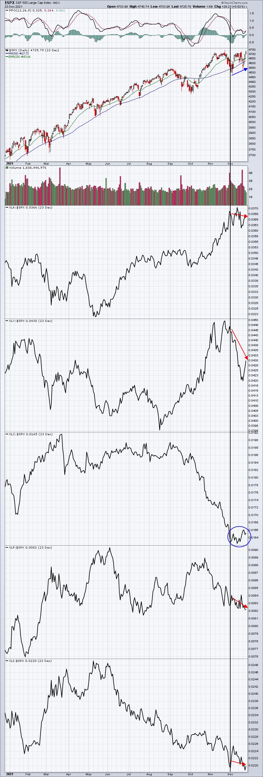
Many times, a final rally occurs as Wall Street rotates from offense to defense. That seems to be the case currently. The following charts of the S&P 500 show the rally back to new highs, but make sure you check out the relative strength of the various sectors -- first the defensive, then the offensive:
S&P 500 vs. Defensive Sectors:

The latest market rally has been spurred by defensive groups. This chart shows us definitively that Wall Street is favoring defensive groups as the market sets a new high. That's a warning signal and one that I take very seriously. Should the S&P 500 continue to perform well next week, I'd refer to these charts. To sustain the rally, we need to see aggressive groups take the lead on a relative basis. Here's the latest relative chart on those aggressive groups:
S&P 500 vs. Aggressive Sectors:

Technology (XLK) and consumer discretionary (XLY) held this rally together for much of 2021, but that black vertical line marks the most recent market low. The rally off of that low is to the right of the line. The blue circle shows that communication services (XLC) has seen a bit of a dead cat relative bounce, but the other 4 aggressive groups saw relative weakness during this latest surge in equities. That's not what we want to see. Wall Street doesn't move into defensive areas on a relative basis for no reason whatsoever. Many times, it will precede a volatile period ahead. Higher volatility typically results in lower equity prices.
It's time to question the sustainability of this rally.
Let me be very clear that I remain EXTREMELY bullish in the longer-term. I view this current rotation as a short-term, or possibly a medium-term, warning sign. I see much, much higher prices ahead and so, from a long-term buy and hold perspective, I'd keep my long positions intact. But as a short-term trader, I grow more conservative when I see those short-term storm clouds rolling in.
Is omicron the problem? I say absolutely not. When I want to know the severity of COVID and all of its variants, the last place I go is to a media website. They'll scare the heck out of us in order to gain more CLICKS. That's how they make money (larger audience draws in more advertising, so reading their headlines and stories is generally a great big waste of time). Would you like to know where I go for my news? StockCharts.com. Every chart tells me a story. And while you cannot always trust what someone says, especially when it comes to Wall Street firms, I do trust decisions relating to the allocation of resources.
Do you recall the groups that were absolutely crushed during the initial stages of the pandemic? Recreational services ($DJUSRQ) and travel & tourism ($DJUSTT) were two of the hardest hit industry groups during 2020. I initially tracked a Pandemic Index that I created using the User-Defined Indexes here at StockCharts.com. These two industries were included as part of my Pandemic Index. It was very clear to me that COVID-19 was going to present considerable headwinds for both of these industries, and it did.
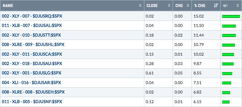
I'm not getting the same message right now. The omicron variant has begun to surge over the past month. That part is a fact, not really open to interpretation. Much of the current rally occurred this past week. Do you know the groups that led last week's rally? There are 104 industry groups and here were last week's top 10 relative performers:

Look at where Wall Street is allocating its resources! Recreational services (think cruise lines) was the #1 performing industry group last week during this rally. The REAL headlines should read something like this:
"Omicron Variant Surges, But It Won't Affect Travel"
But that is not what we'll see. We'll count hospitalizations and deaths, because that's the part that attracts CLICKS. Listen, I'm not downplaying the virus. COVID is a very serious illness and is a major health care concern. But as history has now proven, it was not a financial concern. And it's even less of a financial concern with omicron, as the resource allocation above tells us. That's the REAL story and the charts tell us the truth.
In addition to the strength in recreational services, check out those other Top 10 industry groups. Travel & tourism ($DJUSTT) was the 3rd best group. Hotel & Lodging REITs ($DJUSHL) and gambling ($DJUSCA) were also in the Top 5. Airlines were 8th. Wall Street is sending us breaking news in the form of resource allocation. On the flip side, it's worth mentioning that 7 of the 9 WORST industry groups last week were in the 5 aggressive sectors, which is extremely unusual during a rally. Can we trust this rally?
The Year Ahead
It's always a challenge to predict what might happen over the course of the coming year, but I've had a pretty good track record in our two previous MarketVision events, which are always held in the first week of the new year. In January 2020, two months before COVID changed our lives, I predicted that the S&P 500 would rise from 3235 to 4040 by December 31, 2020. Of course, there was no way to predict the COVID devastation that sent the S&P 500 plunging to a low of 2191 on March 23, 2020, but, even despite this collapse, we saw the S&P 500 close out 2020 at 3756 - not all that far from my 4040 prediction. I still believe we'd have hit 4000 in 2020 if it weren't for COVID. But we'll never know.
Heading into 2021, I predicted we'd see another huge surge in the S&P 500 to 4750, but that rotation would be the biggest challenge because of the virus. As of Friday's close, the S&P 500 now stands at 4725, just 25 points shy of my earlier prediction. Our high was 4744, so I'll take credit for a solid prediction.
So now comes the prediction for 2022 and our upcoming MarketVision 2022 event. I'll be joined by the following speakers:
- David Keller, Chief Market Strategist, StockCharts.com, and host of The Final Bar
- Grayson Roze, Vice President of Operations, StockCharts.com, and host of StockCharts in Focus
- Bill Shelby, Lead Software Engineer, StockCharts.com, and Scan Engine Extraordinaire
It is going to be another very educational event that everyone should attend. It's an EarningsBeats.com Members-Only event, but here's the good news. You only need to be a FREE 30-day trial member to attend. So, in order to claim your seat, CLICK HERE to get your free 30-day trial membership started! The event will be held on Saturday, January 8th, starting at 8:45am ET. We're working out final details, but it's likely to last just over 4 hours through 1:00pm ET. Those who cannot attend the event live need not worry. We record all of our events and we'll send the recording to all of our members to view at their leisure.
2022 will be an extremely challenging year. I'm not going to spill the beans, but I can say without a doubt that I'm not as bullish heading into 2022 as I was in 2020 or 2021. I hope to see you there!
Happy trading!
Tom Bowley, Chief Market Strategist, EarningsBeats.com
|
| READ ONLINE → |
|
|
|
| ChartWatchers |
| Does the Sun Shine in December? |
| by Greg Schnell |
While charting is always an interesting look back, it looks like the solar charts have had a bit of shade, with two real peaks and valley's in 2021. As the world energy crisis adds continent after continent to its grasp, I would expect these charts to gather some power for another rally in 2022. As I roll through the list of companies, the charts still look weak, but shopping is part of the process, watching for the change in investor sentiment.
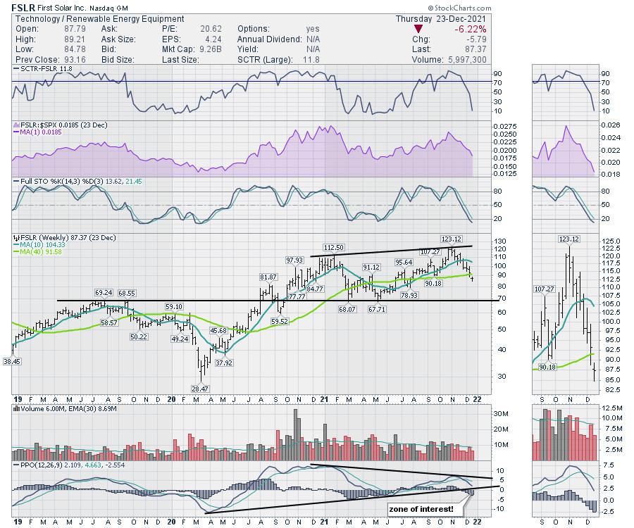
I noticed First Solar (FSLR)'s offices in Phoenix a few weeks ago. Let's start there. First Solar had a massive run in 2020, topping out in early 2021. After a big pullback, it soared to a new high in late October, made a higher high the next week and then dropped 30% in under 2 months. You'd think the sun stopped shining in December! There is a low at $80 that might provide support, but the big horizontal area is $70. For the PPO momentum indicator, the trend line and the zero level are both in play here. The full stochastic is already under 20%, so we have numerous reasons to keep watching this name for an upside ride.

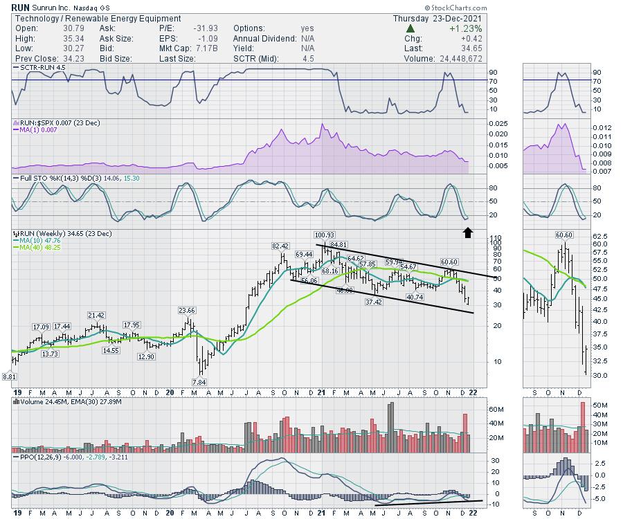
Sun Run (RUN) is a big one. The problem with the chart below is the developing downward channel since the beginning of the year. While there is hope for a bounce off the lower trend line, all the major support areas are broken until you get to $22. The huge volume last week occurred almost every day, so it was not just an Options Expiration Day.

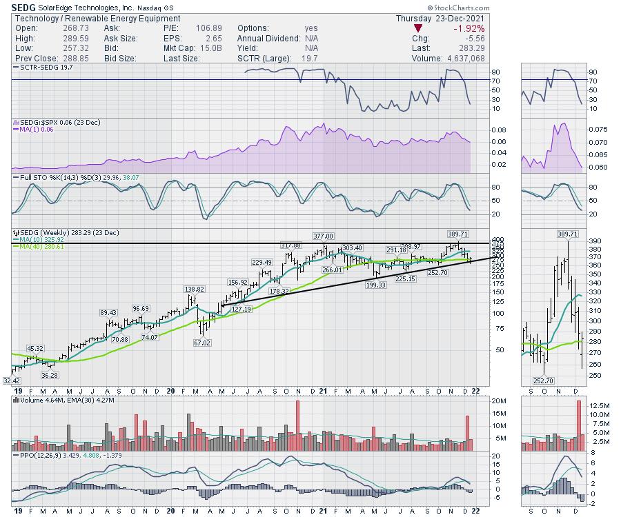
SolarEdge (SEDG) has been a strong name in the industry, but it is moving lower right now. There is a small reason for optimism as it comes to rest on the up-sloping trend line. If the stock can push higher after making a big push off the lows this week, this is not a bad area to expect a bounce. But this stock also failed to hold a breakout, much like FirstSolar. Perhaps we need to see some stocks improving over multiple weeks before getting interested.

I think the larger question here is "Why are all the stocks in the industry group so weak, and what would have to change to get them to start improving?" I will look for the charts to change shape rather than examine the macro factors facing the industry. When the more astute investors start supporting the stocks and build some momentum higher, then I'll be interested. Until then, it looks more like watching a sunset is in order.
Wishing you all the best for the holiday season and may 2022 be the best year yet!
|
| READ ONLINE → |
|
|
|
| ChartWatchers |
| Theme of 2021? Market Resilience. Theme for 2022? TBD |
| by John Hopkins |
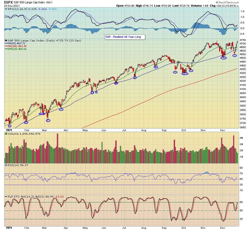
When the S&P hit a record high on November 22, then proceeded to fall over 5% in just over a week, a lot of pundits declared the market was dead. The S&P had simply risen too much for the year and fallen below key technical levels, and many felt it had seen its last high for the year. Yet here we are as the year comes to an end with the S&P closing at an all-time this past Friday.

As you can see in the chart above, every time the S&P pulled back throughout the year, traders were waiting to jump back in. And, in fact, at no point during the year was the S&P in danger of hitting its critical 200-day moving average, as traders gobbled up stocks in fear of missing out on any subsequent rallies.
With just a shortened trading week remaining in 2021, the S&P is up just over 25%. That compares to 16% for 2020. Any way you cut it, a tremendous year.
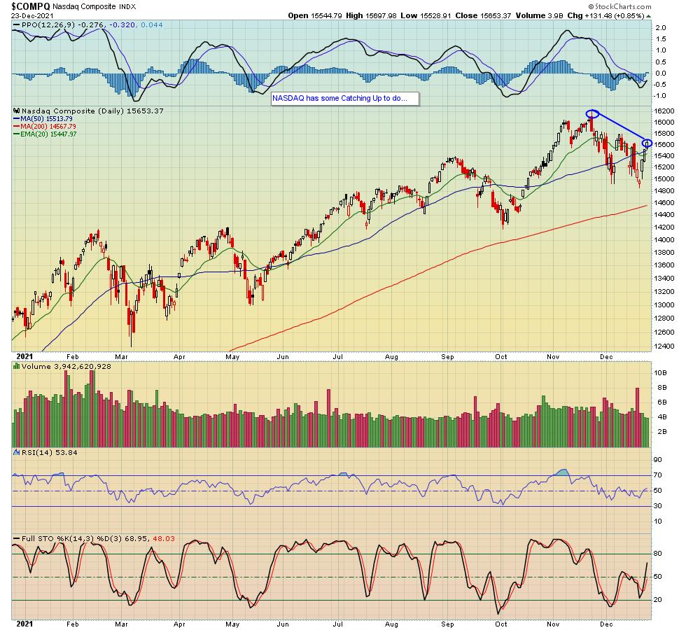
While the S&P is sitting at an all-time high, both the Dow and NASDAQ have been lagging. In fact, as you can see in the chart below, the NASDAQ is currently almost 3.5% below its November 22 high of 16,212, so there's some catching up to do over the next week.

Of course, traders are no longer interested in what happened during 2021; that's already old news. Instead, they are ready to turn their collective attention to 2022 and what might lie ahead. And this is something we will be addressing in great detail during our upcoming "MarketVision 2022" event on Saturday, January 8, when EarningsBeats Chief Market Strategist Tom Bowley and I will be joined by StockCharts.com's Bill Shelby, Grayson Roze and David Keller as they discuss what they see developing during 2022 and how to be positioned to take advantage of whatever takes place. Topics and timetables are being finalized, so if you would like to be kept up to date on this important event, just click here to sign up for our FREE EarningsBeats Digest and we will keep you posted.
I want to wish everyone the very best of the holiday season and look forward to a happy, healthy, and prosperous 2022!
At your service,
John Hopkins
EarningsBeats.com
|
| READ ONLINE → |
|
|
|
| RRG Charts |
| Providers and Pharmaceuticals Looking Strong Inside Healthcare |
| by Julius de Kempenaer |
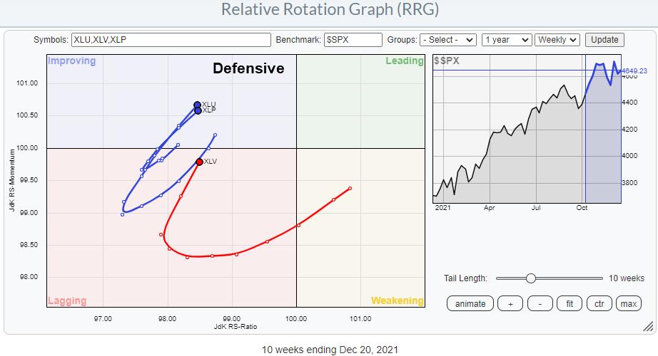
My longer-term outlook for the general market is still based on a continuing uptrend. However, over the last few weeks, defensive sectors picked up on the Relative Rotation Graph against the S&P 500.

Of these three sectors, Healthcare (XLV) is the biggest in terms of market capitalization at 12.7% and bigger than Utilities (2.4%) and Consumer Staples (5.6%) together. The turn into the 0-90 degree RRG-Heading as it occurred in all three defensive sectors recently makes it worthwhile to investigate a bit deeper. In order to do so, I looked at the breakdown of the Healthcare sector into its industries, as plotted on the RRG below.

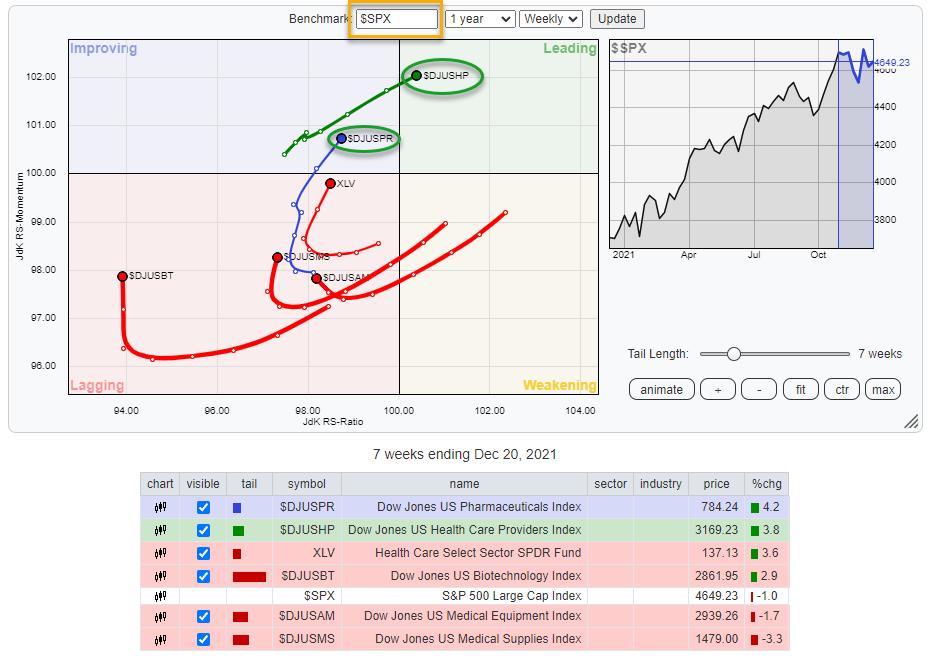
This RRG shows the industries inside the Healthcare sector against $SPX as the benchmark. The current strength for $DJUSHP, Health Care Providers (21%), and $DJUSPR, Pharmaceuticals (28%), clearly stands out. These are the two groups that are currently driving the (out-)performance for the sector.

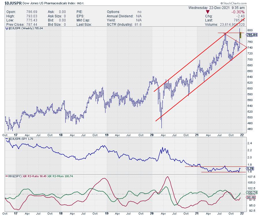
$DJUSPR is pushing against resistance coming off its previous high; a break higher will definitely add to the further outperformance for this group.
The RS-line vs. SPY has bottomed against lows that were formed earlier this year. A break out of the range will push the tail on the RRG further into the leading quadrant at an accelerating speed. The RRG-Lines are already picking up a potential new uptrend, as they are both rising with RS-Momentum>100 and RS-Ratio approaching that 100-level.
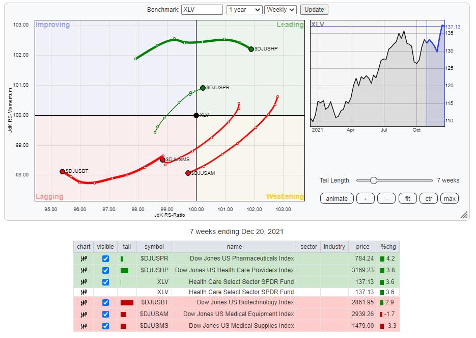
Taking the same RRG but changing the benchmark from $SPX to XLV gives us a more granular insight. The tail on Healthcare providers is flat and has started to head slightly lower in terms of JdK RS-Momentum recently. The tail on pharmaceuticals is also showing a strong RRG-Heading against its sector index.

This does not make the Healthcare providers a weak group, but it looks as if they are taking a break after having led the sector higher (on a relative basis) recently. Pharmaceuticals seem to be taking over now. Following these rotations, it seems wise to have allocations to the Healthcare sector positioned in the Pharmaceuticals group.

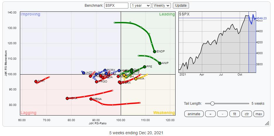
This RRG shows the stocks in the group Pharmaceuticals, which are in the S&P composite index (S&P 1500, $SPSUPX).
As you can see, there are a few tails going wide on the outside of the plot. These are ENDP, ANIP, MRNA, HSKA, and SPPI. In the next RRG, I have switched off these tails to zoom in and get a better view of what is going on inside this industry.

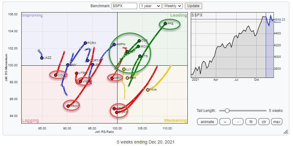
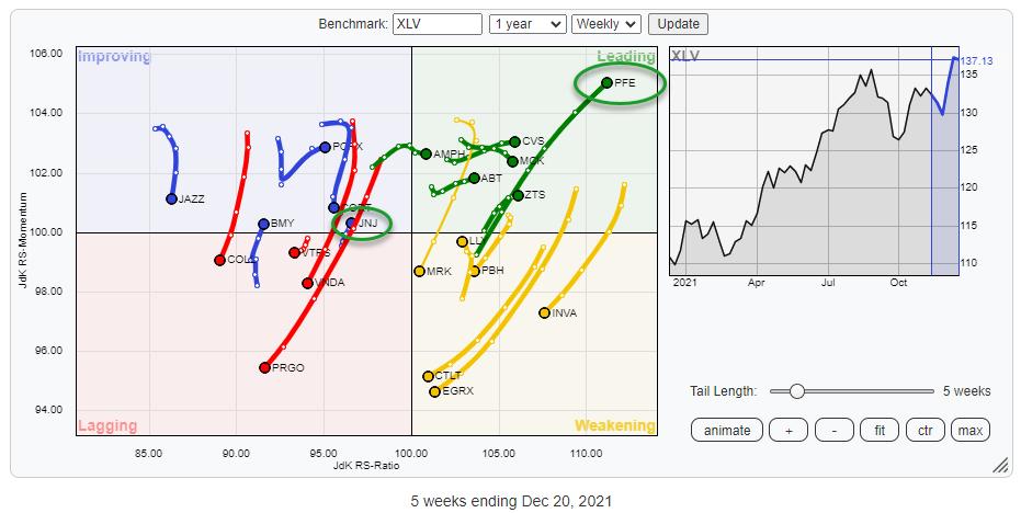
The resulting picture gives a much better view of what's going on in terms of rotation for the members of this group. The tails that are standing out in a negative way are COLL, VNDA, PRGO, MRK, CTLT, and EGRX. So, even though the group is doing well and the sector is picking up strength recently, these stocks are not able to follow. The strong names in the group/sectors are PFE, CVS, MCK, ZTS and ABT inside leading, AMPH in improving and LLY inside weakening.
Switching the benchmark to XLV gives this picture:

PFE is here the real outsider and one of the larger stocks in the group, with a very strong tail at a strong RRG-Heading pushing further into the leading quadrant. Given the strong move that is already underway for a while, I would probably pass on new entries in PFE (hold for sure), but check out opportunities in the other stocks inside the leading quadrant and potentially LLY inside weakening, which is traveling back up.
A more risky opportunity may be arising in JNJ, an even bigger name in terms of the market cap than PFE. At the moment, it's still at the left side of the RRG on a very short tail, but it has recently starting to travel at a positive RRG-Heading and enter the improving quadrant.
|
| READ ONLINE → |
|
|
|
| MORE ARTICLES → |
|
 Chart 1
 Chart 2
 Chart 3
 Chart 4
 Chart 5


 The Networking ETF (IGN) is leading the market with a solid uptrend and a new high this week. Diving into the group, I found a stock that recently broke out and formed a short-term bullish continuation pattern. The stock is also in an uptrend and I expect a breakout to new highs in the coming weeks.