| THIS WEEK'S ARTICLES |
| John Murphy's Market Message |
| NEGATIVE DIVERGENCES WEIGH ON STOCKS |
| by John Murphy |
NEGATIVE DIVERGENCES ON SPX... A number of negative divergences have shown up on the major stock indexes which have weakened the market's technical condition. Those divergences are showing up mainly in daily momentum oscillators. Chart 1 shows the S&P 500 rallying to a new record at the end of December and the start of January. The line in the upper box, however, shows its 14-day RSI line failing to do so (see red arrow). The red arrow in the middle box shows the same failure taking place in its daily MACD lines. Those divergences are usually warning signs that the uptrend is weakening. The same negative divergences are showing up in the Dow Industrials. Chart 1 also shows the SPX falling below its 50-day moving average which confirms that the price trend is weakening. Other warning signs are coming from underperformance of the Nasdaq and small cap indexes.
 Chart 1 Chart 1
NASDAQ COMPOSITE IS TESTING ITS 200-DAY LINE... The daily bars in Chart 2 show the late December rally in the Nasdaq Composite Index falling well short of its November high. That created a negative divergence between that index and the Dow and S&P 500. And warned of relative weakness in the technology sector which dominates the Nasdaq market. The chart also shows the Nasdaq index in the process of testing its 200-day moving average. The COMPQ hasn't closed below that long term support line since the spring of 2020. It bounced off that red line on Monday but is retesting it again today. That's an important test for it and possibly for the rest of the market. If prices close below the 200-day line, the next potential support level would be at its October low.
 Chart 2 Chart 2
SMALL CAP WEAKNESS IS ANOTHER WARNING... Small caps have become one of the weakest parts of the market. Chart 3 shows the Russell 2000 iShares (IWM) trading well below its 200-day moving average. In addition, it's nearing a test of previous support formed over the last year (see red line). That's an important test that also bears watching. Relative weakness in smaller stocks is usually a sign that market breadth is deteriorating.
 Chart 3 Chart 3
ENERGY LEADS WHILE TECHNOLOGY LAGS... Chart 4 compares the eleven sectors in the S&P 500 over the last month. And it shows energy and financials in a leadership role; with technology in last place. My previous message explained that energy and financials are linked in the sense that both are benefiting from rising inflation and impending rate increases by the Fed to combat that inflation. Energy shares are benefiting from rising energy prices; while financials have been helped by rising bond yields. Rising yields, however, are also putting downside pressure on technology stocks.
 Chart 4 Chart 4
COMPARISON OF BOND YIELDS AND XLK... Technology shares are sensitive to the direction of bond yields. They usually do better when yields are dropping and worse when yields are rising. Chart 1 compares the 10-Year Treasury yield (green line) to a ratio of the Technology SPDR (XLK) to the S&P 500 (black line) over the last year. And it shows them generally moving in opposite directions. The rising XLK:SPX ratio last spring shows Technology shares starting to outperform at the same time that bond yields were starting to drop (see arrows). Rising bond yields starting last August caused the XLK:SPX ratio to flatten. The upside spike in bond yields starting in December coincided with a drop in technology relative performance. That helps explain why the Nasdaq has been underperforming the Dow and S&P 500. The big question is what happens from here. Bond yields are expected to climb this year as part of Fed tightening. That could act as a drag on the tech-dominated Nasdaq market, and may have a negative impact on the rest of the market.
 Chart 5 Chart 5
|
| READ ONLINE → |
|
|
|
| The Mindful Investor |
| Hindenburg Omen Signals Downside Potential |
| by David Keller |
The Hindenburg Omen is a bit of a controversial indicator. I often get asked about it from financial media outlets, as the name itself is enough to stir up investor fear. What is this indicator, and what can it tell us about current market conditions?
The Hindenburg Omen was developed by Jim Miekka and basically is designed to look for conditions that are consistent with major market tops. One word of caution: it is not 100% accurate (as much as we often wish technical indicators would be!). As one mentor of mine once put it, the Hindenburg Omen has called ten of the last three market corrections!
This is essentially a breadth indicator combining three separate inputs along with a time factor. Let's review these three inputs and what they really represent.

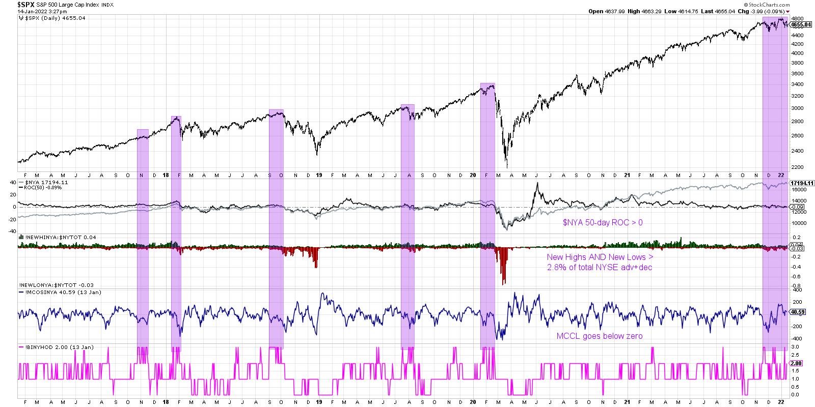
First, we need the overall market to be in an established uptrend. Now, there are a number of ways to make this determination, including the slope of the 50-day moving average, or perhaps just making sure the Dow is above a long-term moving average. But I tend to use the 50-day rate of change on the NYSE Composite Index ($NYA). As long as this value is above zero, then the $NYA is higher than it was ten weeks ago.
Once we've established the overall market uptrend, we need to review the new 52-week highs and lows for the NYSE. This is where it gets a bit interesting. Miekka identified that major market tops often experience an expansion in new highs AND new lows. That is, some stocks are breaking out to the upside while others are breaking down to new swing lows. It turns out that there is often indecision at the end of the bull market run. When the new highs and new lows are both at least 2.8% of NYSE listings (actually, I believe Miekka used the advancers + decliners instead of total NYSE listings) then we have achieved this second condition.
The third piece to the Hindenburg picture involves the McClellan Oscillator, a common measure of market breadth based on exponential moving averages of the advance-decline line. When the McClellan Oscillator breaks below zero, it basically indicates that the momentum of net advancers is turning negative. This suggests breadth deterioration and further downside for major indexes.
So far, we have shown how the Hindenburg Omen basically looks for a market in an established uptrend, a state of indecision with a significant number of both new highs and new lows, followed by breadth conditions turning negative.
Now we get to the final aspect to this popular indicator, the time factor. A valid Hindenburg Omen signal needs to have multiple signals within a 30-day window to actually register a valid bearish indication. That is, we need to see the combination of those three pieces of the indicator on two separate occasions within a 30-day window. StockCharts makes this analysis fairly easy, as we have developed an indicator that aggregates the three components of the Hindenburg Omen.
The bottom panel on the chart above is an indicator (!BINYHOD) that tracks the three components. If all three have triggered, the indicator shows a value of 3. If none of them are currently triggered, the indicator shows a value of zero.
I have shaded in purple the times where the Hindenburg Omen was triggered in multiple signals within a 30-day period. In three of those instances (Feb 2020, Sep 2018 and Jan 2018), the market sold off soon after this cluster of signals. Two others were somewhat less successful. In August 2019, the market had already pulled back by the time the indicators was triggered and there was limited downside in the weeks to come. November 2017 saw another cluster of signals, but the market did not even pause en route to the eventual high in January 2018.
You'll notice on the far right side of this chart that we have now registered a valid Hindenburg Omen over the last two months. So how should investors proceed? Very cautiously.
Given the fact that the indicator tends to give false positives, taking significant action based purely on this signal may not be warranted. But it does tell me to focus in on key risk levels to identify if and when a selloff begins. For the S&P 500 index, the 4550 level remains the most important one to watch. If we do see a break of S&P 4550 after the Hindenburg Omen has been registered, the coming weeks and months may be bring elevated risk of market downside!
Want to digest this article in video format? Check out my YouTube channel!
RR#6,
Dave
P.S. Ready to upgrade your investment process? Check out my free course on behavioral investing!
David Keller, CMT
Chief Market Strategist
StockCharts.com
Disclaimer: This blog is for educational purposes only and should not be construed as financial advice. The ideas and strategies should never be used without first assessing your own personal and financial situation, or without consulting a financial professional.
The author does not have a position in mentioned securities at the time of publication. Any opinions expressed herein are solely those of the author, and do not in any way represent the views or opinions of any other person or entity.
|
| READ ONLINE → |
|
|
|
| ChartWatchers |
| What Do Staples, Energy and Financials Have in Common? |
| by Martin Pring |
Technology outperformed throughout the second decade of this century, but the times they are a-changin', as it is obvious that this sector has lost enough mojo in the last year to indicate that a basic transformation in market leadership is underway. Just to be clear, I am not saying that this new emerging leadership will last as long as tech leadership has, nor will it be as dominant. What I am suggesting is that tech is unlikely to regain its relative leadership for many years to come and that energy, staples and financials are likely to be some of the initial relative beneficiaries.
Major Top for NASDAQ Relative Action
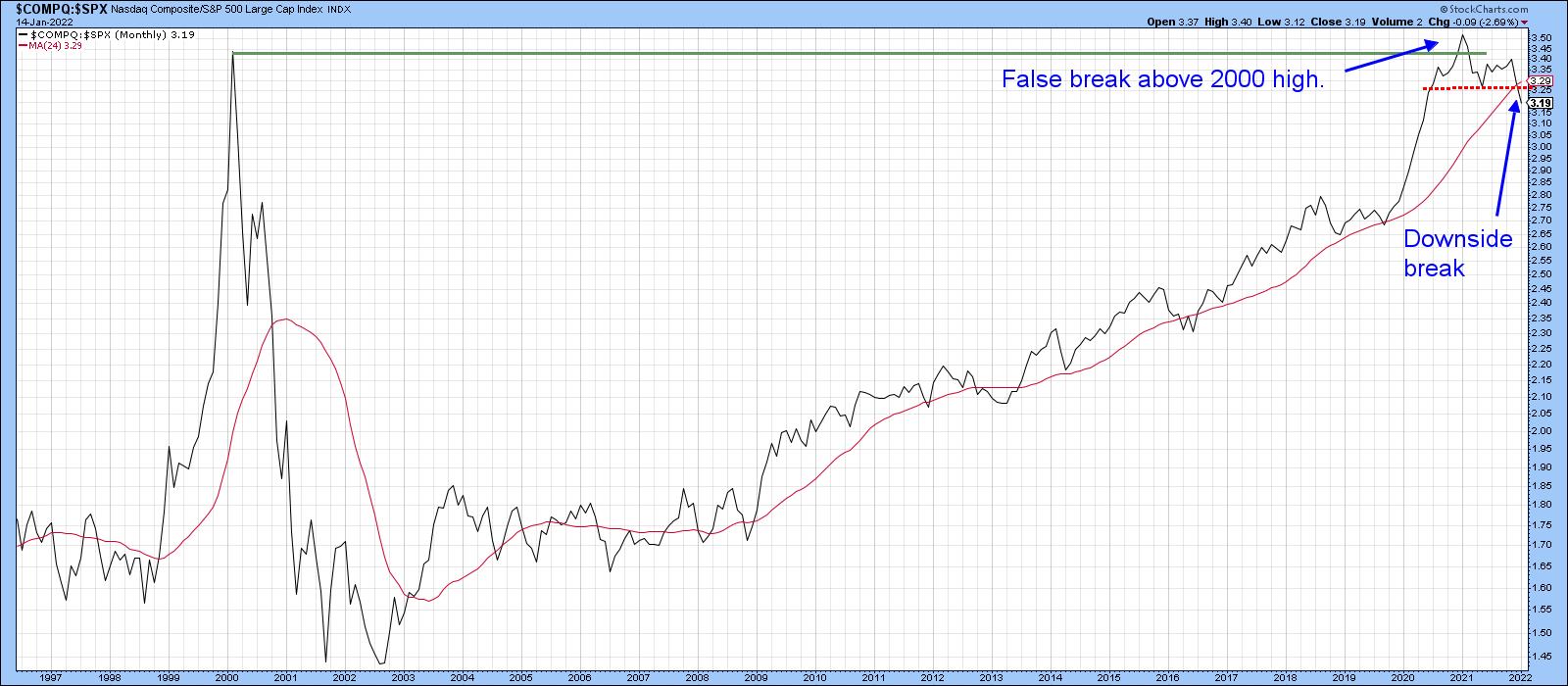
In that respect, Chart 1 shows the relative strength of the tech-dominated NASDAQ against the S&P Composite from 2000. It peaked at the beginning of 2021 and has since been tracing out a series of declining peaks and troughs, which has also involved the completion of a major top and the downside penetration of its 24-month MA. That action follows a run-up from the 2002 bottom in the relationship, which suggests that the recent downside reversal will be of historic proportions. One note of caution lies in the fact that the monthly charts featured in this article are plotted with early January data. The real January plot will not be known until the month-end closing.
 Chart 1 Chart 1
Energy, Staples and Financials are Taking Over
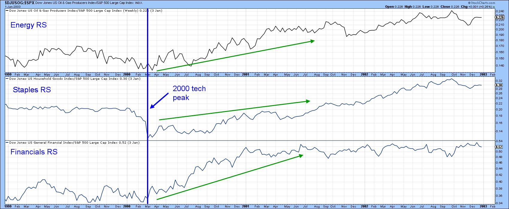
There is precedent for some of this, as financials, staples and, to a lesser extent, energy all outperformed following the bursting of the tech bubble in 2000. This is shown in Chart 2, where their relative action, based on Dow Jones data, has been plotted. Now let's take a closer look at the current situation.
 Chart 2 Chart 2
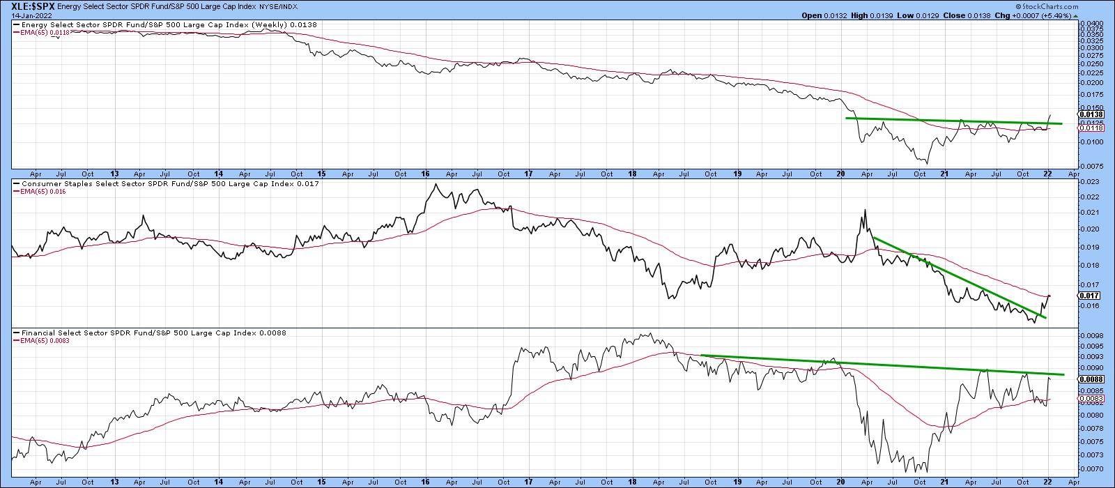
In that respect, Chart 3 shows that the SPDR Energy (XLE) and Consumer Staples (XLP) ETFs have already experienced a relative breakout both above resistance trendlines and their 65-week EMAs. For its part, the financial index is above its EMA. However, it has not yet been able to clear the neckline of a potential inverse head-and-shoulders.
 Chart 3 Chart 3
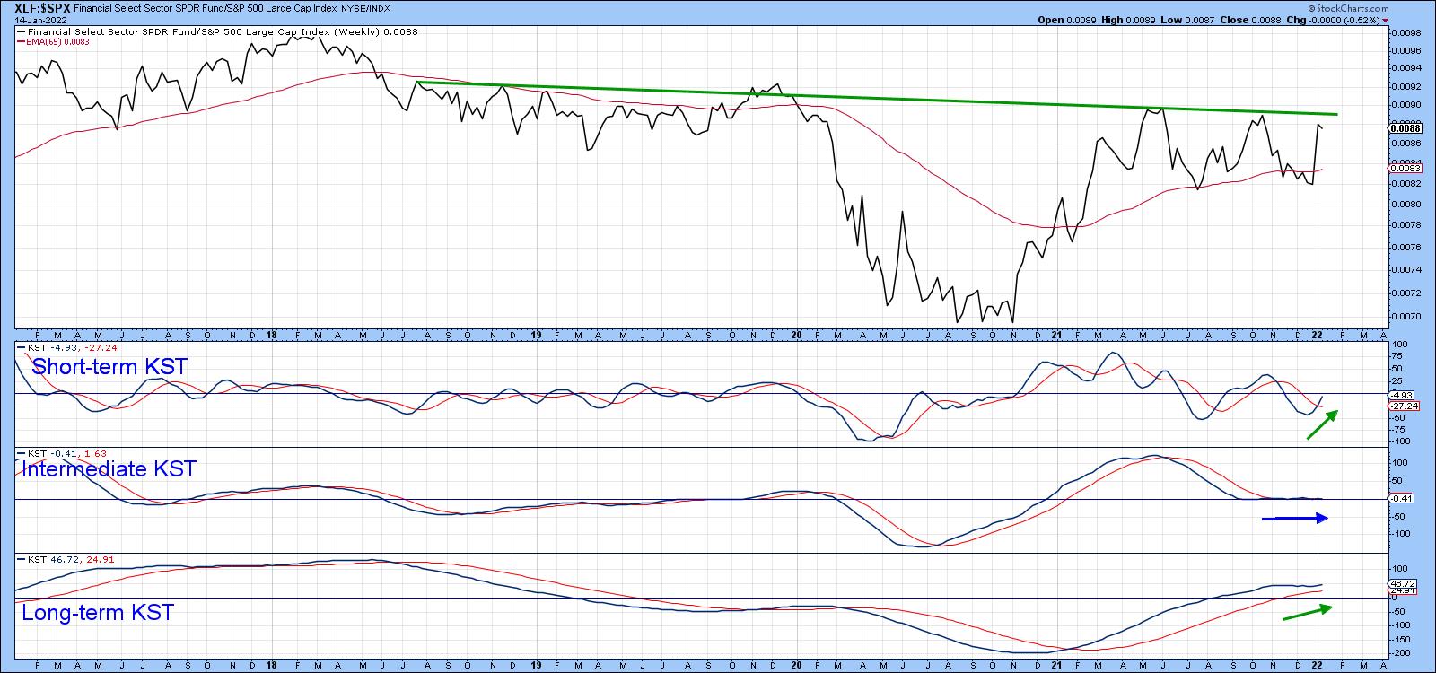
Chart 4 again features financial relative action, this time in conjunction with three momentum indicators. Since the short- and long-term KSTs are in a bullish mode, an upside break in the ratio seems likely.
 Chart 4 Chart 4
Three Weaker Sectors
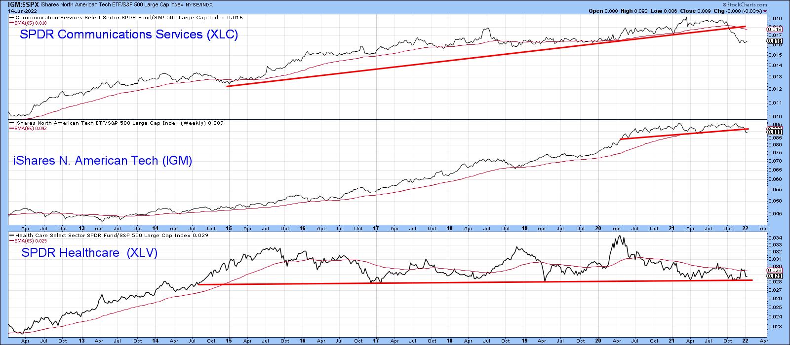
Superior relative action by some sectors implies a weaker performance by others. Chart 5 displays three possible candidates: communications services, technology (of course) and a range-bound healthcare. Even though all three are below their 65-week EMAs, I hedge my bets by applying the word "potentially" to healthcare, since it has yet to drop below that 2014-2022 support trendline. It's a very long line and has been touched or approached on numerous occasions, which makes it a very significant one. If it gives way, that would be a very serious long-term negative development for the sector.
 Chart 5 Chart 5
Cross-Sector Relationships Also Provide Clues
We usually think of relative action being determined by a specific sector relative to the market (S&P Composite) but plotting the data using cross-sector relationships often provides valuable supporting evidence. For example, Charts 6, 7 and 8 compare the iShares Consumer Staples (IYK) ETF, the iShares US Energy (IYE) and the iShares Financial ETF (IYF) to the IYH iShares Health Care (IYH).
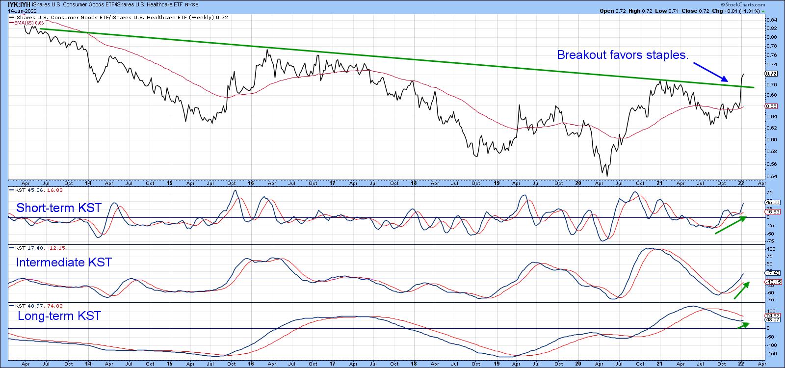
Chart 6 shows that the Consumer Goods or Staples ETF has broken above a 7-year resistance trendline favoring staples. Since the short- and intermediate-term KSTs are in a bullish mode and the long-term series has started to turn up, a more decisive breakout seems likely.
 Chart 6 Chart 6
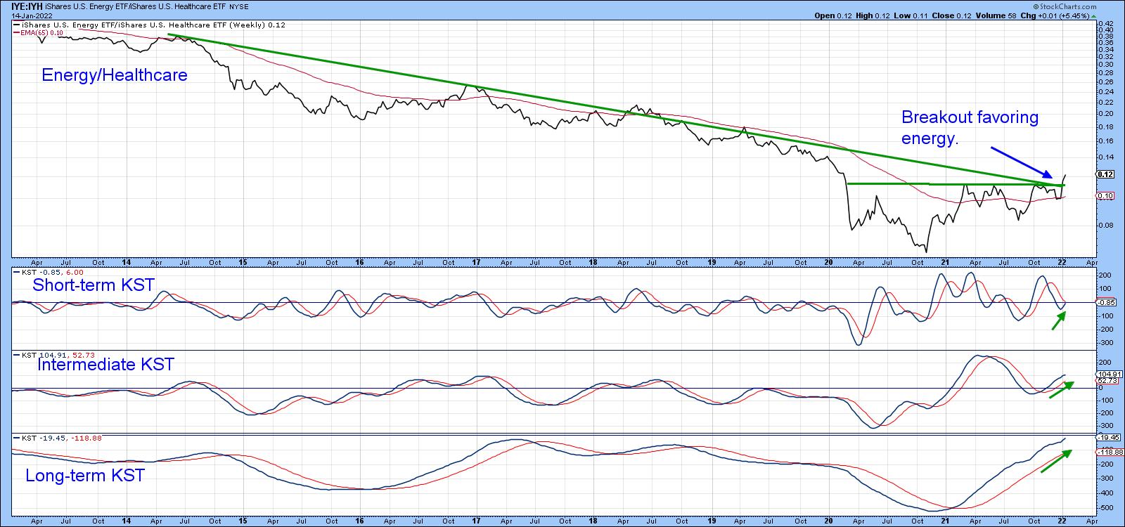
Energy also appears to be breaking against the iShares Healthcare, as the ratio is above its 65-week EMA and marginally above the 2014-2022 down trendline and the 2020-2022 resistance trendline. Since all three momentum indicators are rising, a more decisive and believable breakout seems a likely proposition in the period directly ahead.
 Chart 7 Chart 7
Finally, Chart 8 tells us that the ratio between the iShares Financial ETF (IYF) and the iShares Healthcare (IYH) has tentatively cleared a 13-year resistance trendline. All three KSTs are in a rising mode, so, once again, the probabilities favor that a more decisive breakout will transpire as the month progresses.
 Chart 8 Chart 8
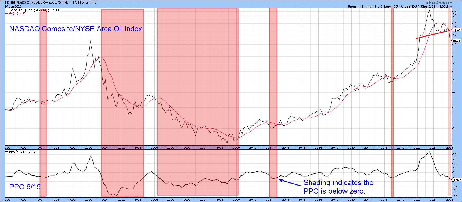
NASDAQ vs. Energy
I wrote about the NASDAQ/Energy relationship a couple of times last year regarding a possible long-term reversal favoring energy. The latest 2022 data now confirm that the 13-year period of technology dominance, epitomized by the NASDAQ, has finally culminated with the completion of a 2-year head-and-shoulders top. Note also that the ratio has traced out a series of declining peaks and troughs and is decisively under its 12-month MA. Finally, the PPO has dropped below zero, thereby indicating that its 6-month EMA is trading below its 15-month counterpart.
The pink shading indicates that this condition has not been kind to the NASDAQ, to say the least. That suggests this index is likely to underperform energy for many years to come. The rationale is not difficult to see, as both tech and energy face government regulation. The difference is that tech margins are likely to be trimmed as a result of regulation, whereas energy producers will benefit from the higher prices induced by government-inspired restrictions and shortages.
 Chart 9 Chart 9
This article is an updated version of an article previously published on Tuesday, January 11 at 5:19pm ET in the member-exclusive blog Martin Pring's Market Roundup.
Good luck and good charting,
Martin J. Pring
The views expressed in this article are those of the author and do not necessarily reflect the position or opinion of Pring Turner Capital Group of Walnut Creek or its affiliates.
|
| READ ONLINE → |
|
|
|
| ChartWatchers |
| Using RRG for Visual Inspection of Market and Sector Breadth |
| by Julius de Kempenaer |

Relative Rotation Graphs are mostly used to show exactly that -- the RELATIVE Rotation of securities against a benchmark and against each other. However, they offer many more possibilities.
One of the options is to change the benchmark to $ONE. That is essentially a straight line at value 1. This takes out the relative comparison to the benchmark, making the graph absolute price-based.
When you do this, you will notice that the nice even spread of the securities in a universe around the benchmark is now gone and, given the direction of the original benchmark, the majority of the securities will move in one direction, aligned with the move of the original benchmark.
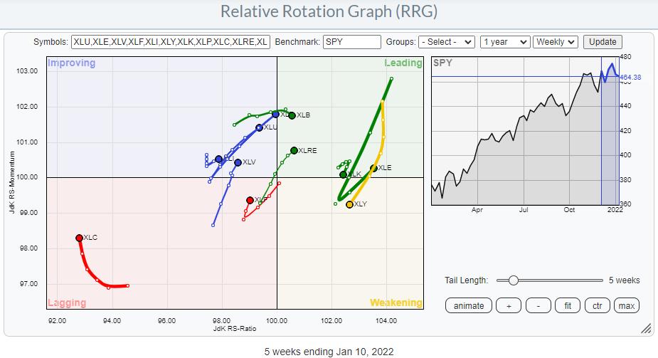
Let's start with the S&P sectors. The RRG below is the RRG as we use it most of the time, using weekly data.

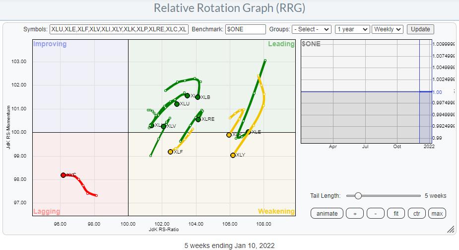
The next RRG shows the same universe, but now using $ONE as the benchmark.

At first sight, the majority of the tails "just" seem shifted to the right. But when you look a bit closer, you will find that many tails have different shapes. XLC, for example, is pointing upward on the Relative RRG but heading due West on the $one version. The defensive sectors XLV, XLP, XLU are all at strong rotations on the relative graph, but they have started to roll over on the $one version.
The main takeaway, IMHO, from this comparison is that all sectors but XLC are still in uptrends, as they are positioned at the right-hand side of the plot. However, all of them are going through a correction, given the drop in (relative) momentum. Only XLE has sharply hooked back up.
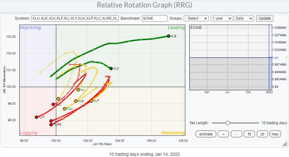
Switching the time frame to daily makes this rotation much more pronounced, as seen in the RRG below.

This approach clearly shows the weakness in all sectors, with the exception of XLE and XLF, over the last two weeks. Thinking in terms of market breadth this means that the majority of sectors are moving down and, thus, dragging the market lower on broad participation.
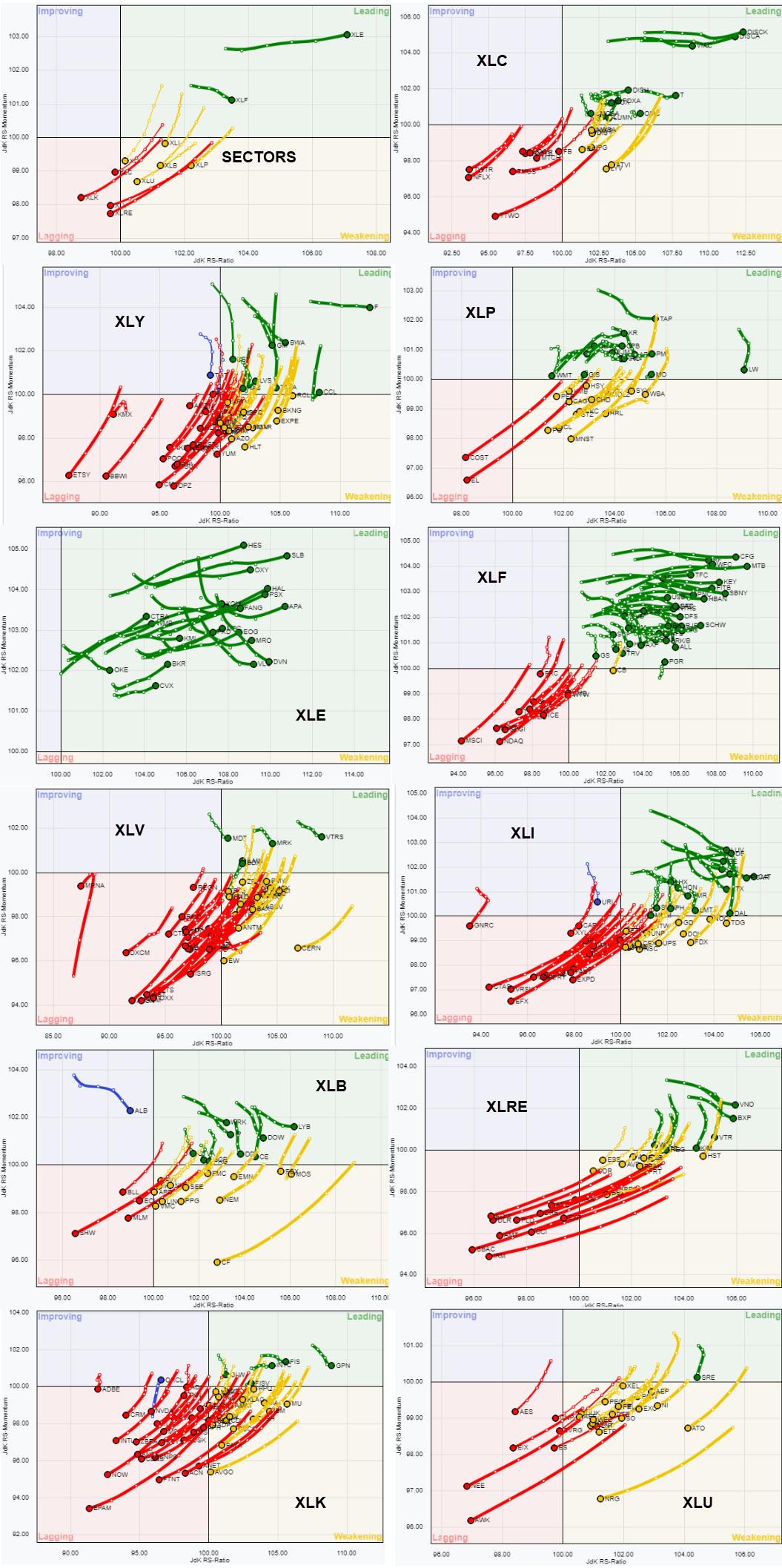
In the next step, I am going to do the same for the stocks in each sector and show all these RRGs side by side. Click on the image to enlarge it.

When you look at each sector, you can very quickly judge how broadly-based the rally or, in most cases now, the decline is.
A few that stand out are Energy (XLE), with all tails inside the leading quadrant and moving higher on the RS-Ratio scale. Financials (XLF) has the majority inside leading, but there is a clear distinction between the stocks inside leading and a cluster that is inside lagging and moving opposite the ones in leading. A few good pair-trading ideas can probably be found in that sector.
Clear negative rotations are seen in XLU, XLK, XLRE, XLV, XLI, XLY. But a more mixed pattern is visible on XLC, XLP, XLB.
I hope this gives you a bit of insight into what you can do with RRGs beyond the basics and maybe experiment for yourself.
Have a great weekend and #StaySafe, --Julius
My regular blog is the RRG Charts blog. If you would like to receive a notification when a new article is published there, "Subscribe" with your email address.
|
| READ ONLINE → |
|
|
|
| ChartWatchers |
| This Investment Vehicle Has Plenty of Stocks to Hedge Against Inflation - Here are 2 Top Holdings |
| by Mary Ellen McGonagle |
Inflation has hit a 40-year high due to strong customer demand amid ongoing labor and supply shortages. While economists are mixed regarding how close we may be to a peak in inflation readings, it's generally agreed that the main drivers of this currently high cost of living will remain with us for the foreseeable future.
During that similarly high inflationary period 40 years ago, legendary investor Warren Buffet highlighted two characteristics that help companies thrive amid high inflation in his annual letter to shareholders. The first is an ability to increase prices easily; the second is an ability to take on more business without having to spend too much.
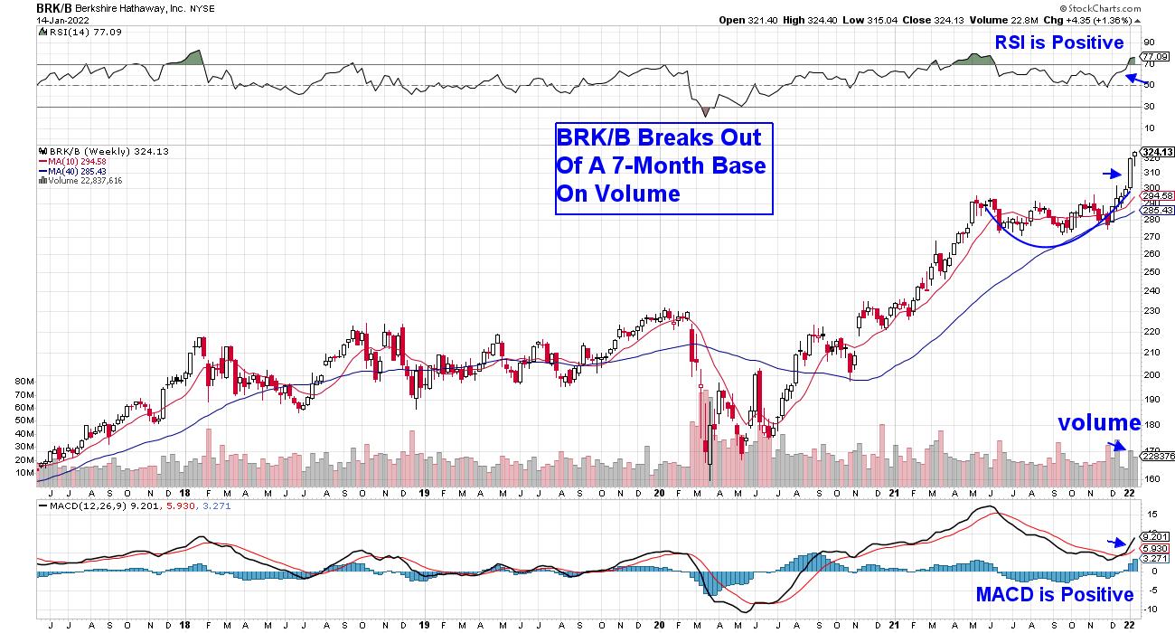
Many of the top holdings in Buffett's Berkshire Hathaway (BRKB) fit this profile today, which has BRKB in a confirmed uptrend while hitting a new high in price.
WEEKLY CHART OF BERKSHIRE HATHAWAY, INC. (BRK/B)

By most accounts, BRKB is extended and due for a period of consolidation; however, the MACD crossover on the weekly chart above points to much further upside. The lengthy base prior to last week's breakout is also a positive as, the longer the base, the longer the potential advance out of that base.
Berkshire Hathaway invests in many well-known companies; below are two from Buffett's portfolio that have an ability to increase prices without having to spend much. They also have additional positive characteristics.
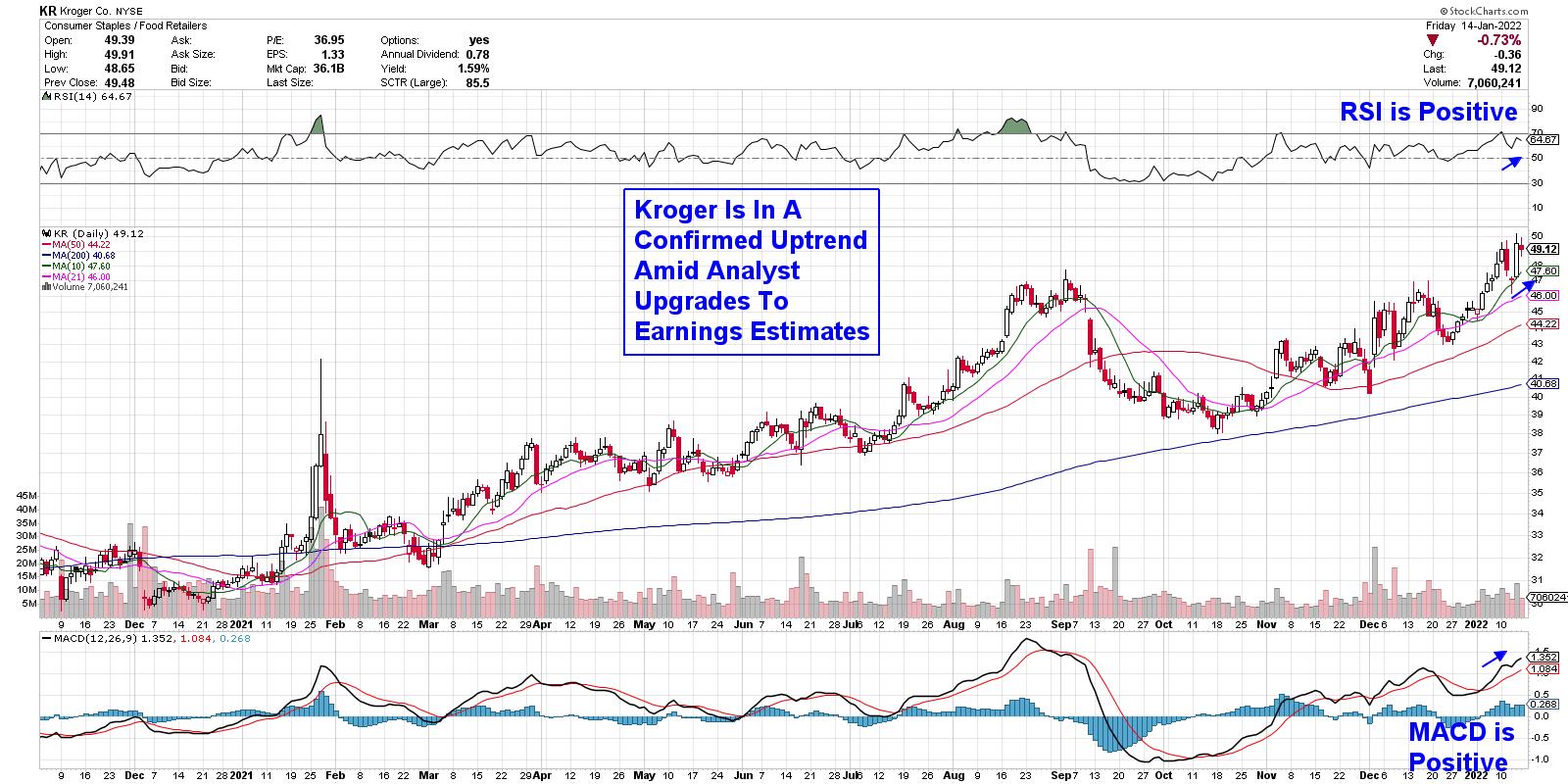
DAILY CHART OF KROGER CO. (KR)
First up is Kroger Co. (KR), which is a retail supermarket chain that operates over 2500 stores nationwide. In late December, the company authorized a $1 billion stock repurchase program, which has investors excited. In addition, Kroger has been accelerating the growth of their digital grocery operations, which have grown by 103% over the last 2 years.
Their proprietary data from these digital operations has helped them be strategic about passing increased costs onto their customers, which has helped KR see improved profits. The stock broke out of a 4-month base on volume this week, with its momentum indicators in positive territory.
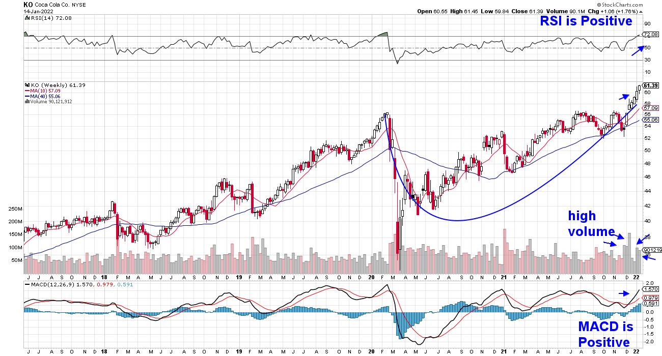
WEEKLY CHART OF COCA COLA CO. (KO):

Coca-Cola (KO) is a long-time holding of Buffet's as he'd held the company since the late 80's. The company has an entrenched market position, which gives it pricing power relative to newcomers. KO first began raising prices last July, which improved their profit margins substantially.
Coca-Cola also has one of the longest dividend growth streaks in the market, with almost 60 consecutive years of increasing their dividend. The 2.8%-yielder has been on a run over the past couple of months, with today's gain pushing the stock out of a 1-week base on volume. The weekly chart above points to a stock with further near-term upside.
High inflation is just one of the many powerful forces that's driving price action in the markets right now. Higher interest rates, as well as the beginning of a new earnings season, is also pushing volatility higher. If you'd like to be kept alerted to what's important in the markets and stocks poised to benefit from the current dynamics, trial my twice weekly MEM Edge Report by using this link here.
You'll gain immediate access to the top Energy and Bank stocks that were recently added to the Suggested Holdings List, as well as be alerted to when it's safe to dive into the markets further. Our watchlist is loaded with high-quality names and, once they reverse their downtrends, the upside will be huge.
I hope you'll join the hundreds of satisfied subscribers who regularly share their investing success stories with me!
On this week's edition of StockCharts TV's The MEM Edge, I review the broader markets, as well as the underlying sectors, to reveal where the markets stand. I also share select ETFs that are benefiting from a focused group of stocks that are on the move higher.
Warmly,
Mary Ellen McGonagle, MEM Investment Research
|
| READ ONLINE → |
|
|
|
| ChartWatchers |
| As Earnings Season Begins, Opportunities Abound |
| by John Hopkins |
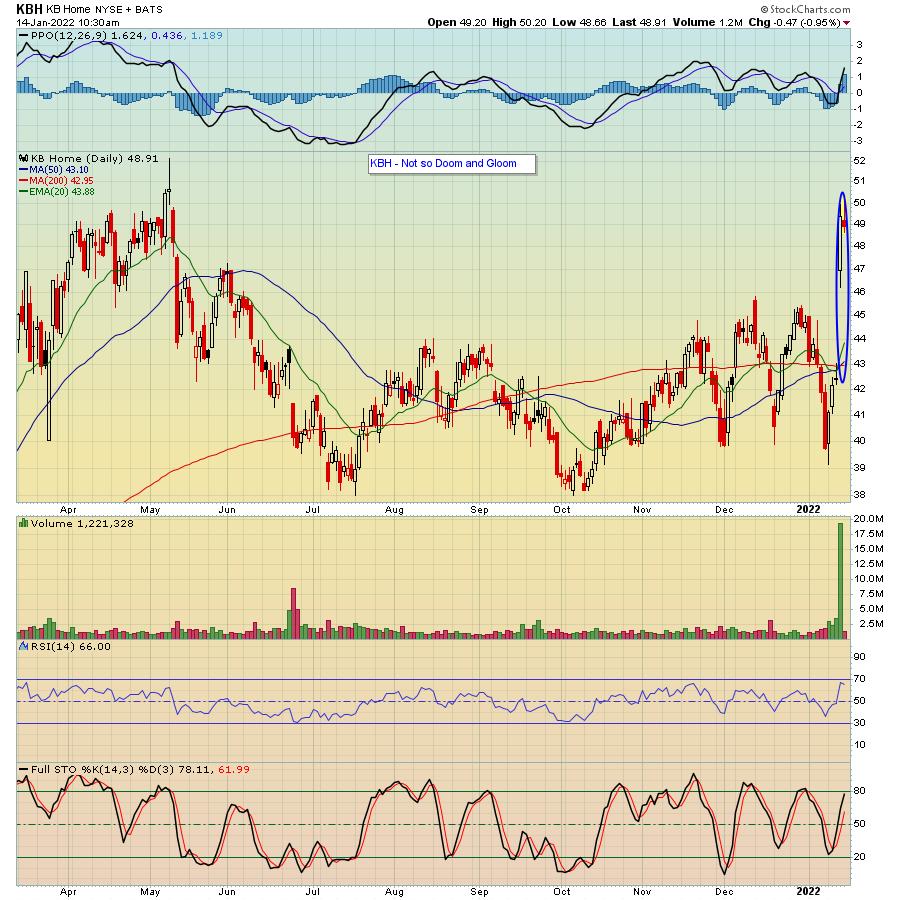
All we've been hearing about lately are Fed rate increases and inflation. This has, in turn, cast a cloud over the market as many traders head to the sidelines. But, from my perspective, the recent pullback in the market has created some unbelievable opportunities in beaten-down stocks. Case in point: KB Home (KBH), which reported its earnings last week.

As you can see, KBH has struggled to gain any traction since its May 10, 2021 high. And this makes sense, right? A homebuilder faced with spiraling material costs, with fear of rising rates, doesn't seem like a good bet. But lo and behold, when the company reported its earnings last Wednesday, the stock rose 16% as it painted a very rosy picture for the future. And it points out that, when everything is said and done, nothing matters more than earnings. At the moment, the market is betting that earnings will be weak when in fact we might see -- as we did with KBH -- that this is not always the case.
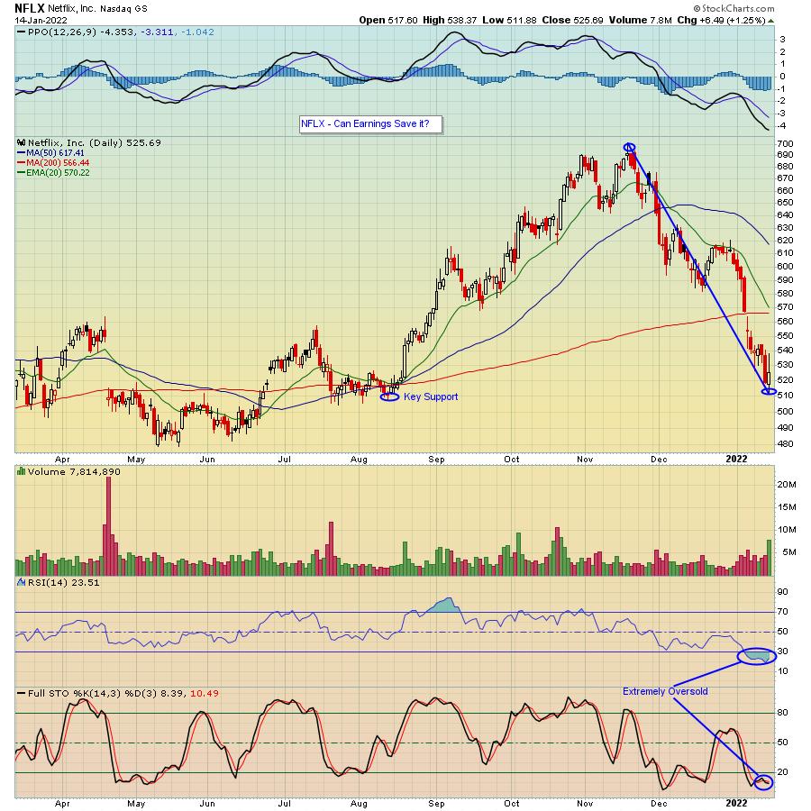
One stock I am keeping an eye on is Netflix (NFLX), which reports its numbers this Thursday. (Full disclosure: I picked up some shares on the pullback at the end of the week.) The stock has pulled back over 25% since its most recent high and, as you can see in the chart below, is technically oversold, with an RSI that was in in the teens at the start of the day and stochastics in single digits.

I bring up NFLX since, as one of the FANG stocks, it will be one of the first highly-visible companies to report its earnings, and the reaction to its numbers could help set the stage for what is about to come. And while an earning's miss and or weak forecast could hit the stock further, just the opposite could occur if they surprise to the upside. So, from my perspective, at this beaten-down level, it's a decent reward-to-risk trade.
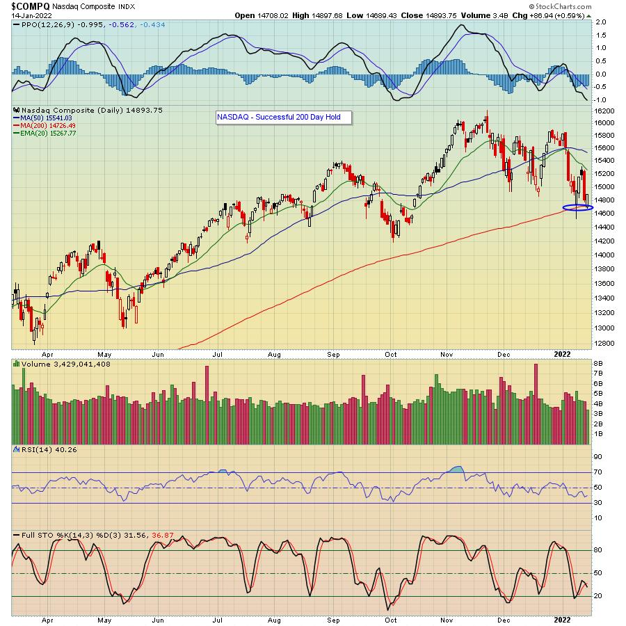
The list of stocks that have been hammered is endless, from Zoom (ZM), which is down 70% from its all-time-high, to SNAP, down over 50%, to Shopify (SHOP), which has lost 40% of its value in just two months. Trade Desk (TTD) is almost 40% off of its high. I bring these companies up since traders could not get enough of them at one point -- at much higher prices -- but now just won't touch them. I should also point out that the weakness in tech stocks just ahead of earnings includes the NASDAQ testing its 200-day moving average for the second time in a week. As you can see in the chart below, it held the first time around and, if it holds again, might give traders a reason to put some money to work.

We might find that current worries are justified. For example, if interest rates rise and it costs more for companies to borrow, it's likely to have an impact on earnings. Ditto on inflationary costs. But, as KB Homes pointed out in its conference call, the demand for housing is so strong that they are able to pass on supply cost increases to home buyers while increasing their margins. The same thing applies to automobiles; demand is so strong that the auto companies can't keep up with demand.
We won't have to wait much longer to see how earnings season plays out. And, given the market reaction of late, there seems to be a lot of doom and gloom. To that end, our Chief Market Strategist Tom Bowley will be conducting a FREE webinar this Monday, "Q4 Earnings Sneak Preview", where he will look ahead to upcoming earnings to identify companies that might report blowout or weaker-than-expected numbers. A great way to prepare for what might be about to come. Just click on this link to learn more about this event as well as a few other key webinars that will take place over the next week. Very timely!
At your service,
John Hopkins
EarningsBeats.com
|
| READ ONLINE → |
|
|
|
| Dancing with the Trend |
| 2021 Review |
| by Grant Morris, Greg Morris |
Trend Plus
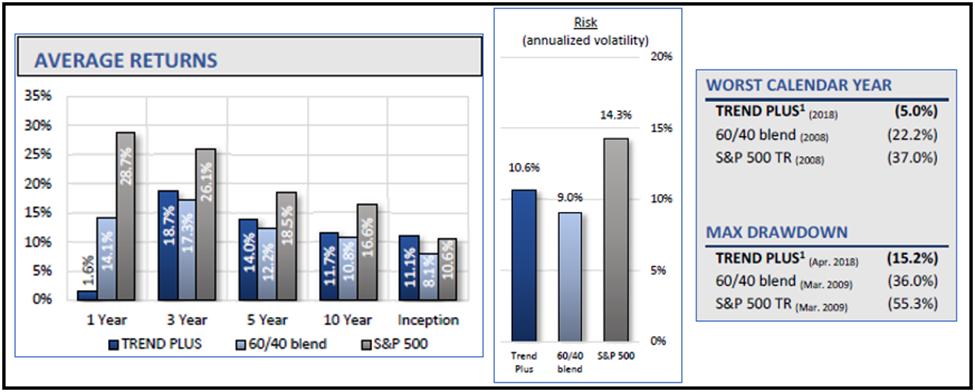
Our Trend Plus strategy delivered a net return after fees of 1.6% during 2021, while a 60/40 portfolio was up about 14% and the S&P 500 was up 26.9%. Underperforming the broad market or benchmark portfolios can be very frustrating to investors, but as we've said many times in this blog, it is better to deal with frustration then devastation. Devastation comes from watching your capital evaporate during a bear market, panic selling after the damage has been done, and then not being able to participate in the eventual recovery out of fear that more losses could occur. The Buy & Hold approach is truly devastating at times to investor's confidence and their retirement plans.
The frustration of our chosen investment approach can somewhat be mitigated by examining the goals of the strategy and whether those goals continue to be met. We are never focused on outperforming the broad market or other benchmarks in a specific time period like months, quarters, or calendar years. The primary goal (#1) of our strategy is to deliver good returns over time, especially over full market cycles, while avoiding the large losses that are seen in bear markets.
Our other goals are to (#2) deliver higher risk-adjusted returns than the S&P or reasonable benchmarks and to (#3) beat the S&P500 over full market cycles. A full market cycle includes a bull market and a bear market. You have to include a bear market in the comparison to the S&P or it is not a reasonable comparison, since most tactical strategies like ours deliver a significant amount of outperformance when they avoid the damage of bear markets. That cannot be overlooked. Of course, if you think we won't have any more bear markets in the U.S. you might as well stop reading now, and good luck to you!
Related to goal #1 is that we want to invest in a way that never causes a client to panic sell for suffering large losses. Advisors that use the Buy & Hold approach to investing will put their clients in that situation multiple times throughout their careers. We avoid that scenario by focusing on risk management and downside protection.
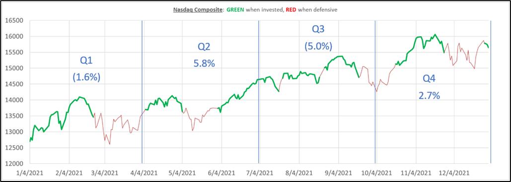
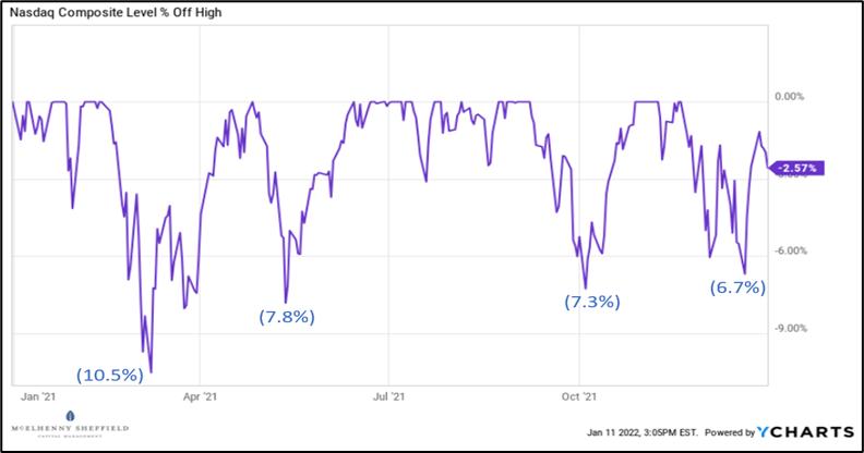
Below is a chart of the Nasdaq Composite index for the year, shaded green when Trend Plus was invested and red when Trend Plus was defensive. The Nasdaq was up 21.4% during the year. The blue lines break the year into quarters and the net return of Trend Plus is shown for each period. From this chart you can see our model getting invested after an uptrend begins, only to be stopped out (sometimes quickly) when the market pulled back. Losing money in defensive positions during Q1 and multiple whipsaw trades in Q3 attributed to most of the underperformance.

Many will look at the year-end number of the major index returns and conclude that the market moved straight up all year. This was definitely not the case. The Nasdaq had several pullbacks between 6-8% and was in a full correction, down more than 10%, in March (shown below).

Trend following works best when the market trends, and during 2021 the market never had a sustained uptrend (or downtrend, for that matter). Thankfully, we know from our research that the U.S. equity markets do exhibit many periods of trend and our belief is that our strategy will be able to capitalize on those periods, all while avoiding major drawdowns.
Looking beyond just the one year allows us to see if we are still achieving our goals in terms of returns. Over the three-year period, Trend Plus has had average annual returns of 18.7%, versus the 60/40 portfolio of 17.3%, and over the five-year period of 14% versus the 60/40 portfolio of 12.2%. Keep in mind that the three-year and five-year periods take into account the underperformance of 2021. The 60/40 is a more appropriate benchmark based on the risk of our strategy.
Trend Plus Metrics:

Sometimes a single strategy is hard to stick with even if it is meeting the stated goals, because it is hard for investors to not compare it to the S&P and they often get frustrated if the relative performance to the S&P lags by a lot. Investors often chase returns and may go elsewhere when they see a strategy underperform. No strategy or investing approach can beat the S&P500 over every timeframe...that seems to be what people expect, but it doesn't exist. That is why at MSCM, we typically incorporate at least two distinct tactical investment strategies in client accounts to help offset the periods where any given strategy may underperform. This is just another form of diversification – diversifying by strategy type as opposed to just by asset class and geography.
Sector Rotation
The second main tactical strategy that we run is called Sector Rotation and it is a momentum strategy that invests in the top three ETFs from our investment universe, based on our proprietary momentum ranking criteria. Our universe of ETFs covers the main S&P sectors, plus some ETFs to provide sub-sector/industry exposure in market segments that may behave differently than their sectors, and a few broad market ETFs. The strategy allocates 40% to the top ranked ETF and 30% each to the second and third ranked ETFs. Positions always have stop loss protection and we use a longer timeframe signal to move the whole strategy defensive when the chance of a bear market is high.
The strategy is 100% rules-based and fully tactical, meaning that we don't continue to use momentum to score ETFs when it looks like the market is in a downtrend. Using momentum when the stock market is going down just means you are buying what is going down the least...likely the more defensive sectors (utilities, consumer staples, etc.). We don't want to own what is going down and would rather move to defensive non-equity positions (gold, treasuries, U.S. dollar) that have a chance of appreciating during a market selloff.
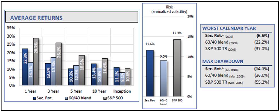
Sector Rotation was built independently of Trend Plus; it is trying to take advantage of a different market factor and uses entirely different indicators and rules. The strategy has positive expected returns and delivers very similar risk and return metrics as Trend Plus.
Sector Rotation Metrics:

The good thing about having both of these models available to run in a single account is they have a low correlation to each other, so investors receive a huge diversification benefit by allocating to both. When one strategy is underperforming the other strategy is usually doing just fine, and vice versa. We think the combination of both strategies can handle just about any market environment and work to deliver a smoother investment path for clients.
TPSR
In fact, we have a strategy called TPSR that is a 50% allocation to Trend Plus and a 50% allocation to Sector Rotation. The TPSR approach delivers an even better risk adjusted return than either strategy on its own (this is the diversification benefit). The TPSR strategy also has a low correlation to traditional/non-tactical portfolios such as those built with strategic asset allocations. During bear markets, TPSR often has a negative correlation to those traditional portfolios, providing true uncorrelated returns and diversification to the investors.
TPSR Metrics:

We even recently launched an ETF based on this blended strategy. One of the biggest benefits of having the strategy in an ETF wrapper is that investors can buy the ETF and own it long term and it should be more tax efficient than allocating to the strategies in separately managed accounts, since the ETF can avoid passing through most capital gains. An investor owning the ETF might only realize gains when they sell a share of the ETF. If they own the ETF for more than 12 months, those gains are likely taxed at the more favorable rate as long-term capital gains. An investor not needing liquidity might defer most taxable gains indefinitely. We think the ETF will be a great way for investors and advisors with traditional portfolios to add additional diversification into tactical strategies and improve their investment outcomes.
If you want to learn more about our tactical strategies or the new ETF, please go to www.mscm.net.
Dance with the Trend,
Greg Morris
Grant Morris
|
| READ ONLINE → |
|
|
|
| The Canadian Technician |
| Commodity Sunshine |
| by Greg Schnell |
Commodities have being doing well to start off 2021. I have been hammering the drum on energy and copper throughout December and into January; this trend is just breaking out from some consolidation.
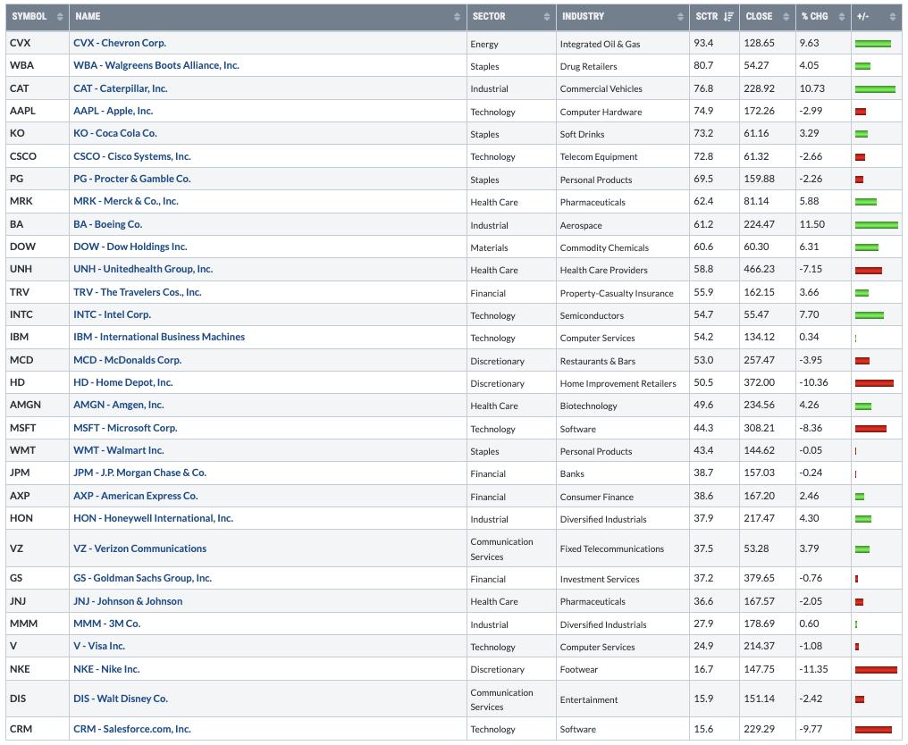
Today, I did a screenshot of the Dow components because it was down so hard relative to the other indexes. I was trying to figure out what was changing so quickly. What I was more impressed with is where the leadership has been for the first two weeks of 2022.
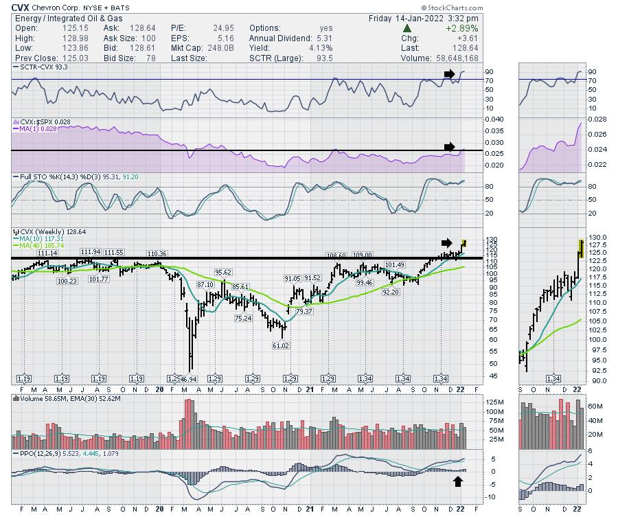
It's worth doing some analysis here. Oil names have been reduced to just one oil name in the Dow, which is Chevron (CVX). CVX also has the highest SCTR ranking in the group of stocks. The list sort is based on SCTR; the % Change is year-to-date for 2022.

Chevron looks really solid. The SCTR is at the highest level in three years. The chart is just breaking out and it is still unloved. The relative strength is breaking out to new 18-month highs. The chart looks really solid.

The Caterpillar chart is also strong as miners look ready to break out topside. Copper keeps flirting with $4.58, which was the previous high in 2012. Big mining companies look great. RIO, VALE, TECK, BHP and FCX have great charts, which supports the strong look of CAT.

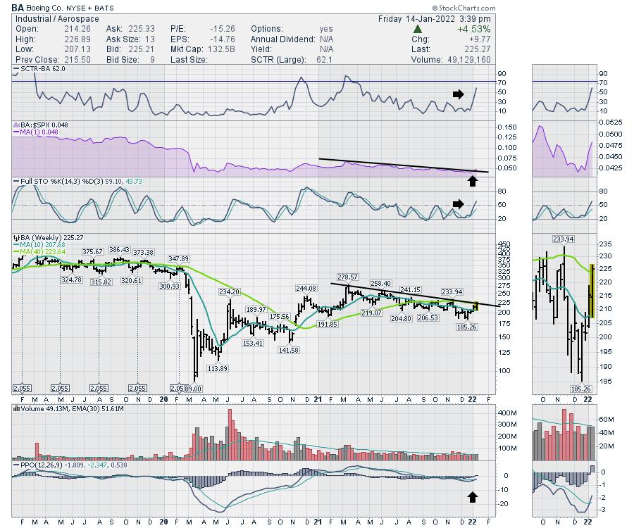
The third best performer on the list year-to-date is Boeing (BA). This chart looks well set up to follow the breakout leads of CVX and CAT.

As the world rotates out of tech, they seem to be moving money towards solid, tangible businesses like the three listed above.
A friend of mine on Twitter listed off his chart review for the evening, which included 18 tech names and zero of the stocks breaking out. If you are staying in your lane for trading tech stocks, you are probably in cash, as the sector compresses a bit here. For the industrials and energy investors, it's been a wonderful start to the year.
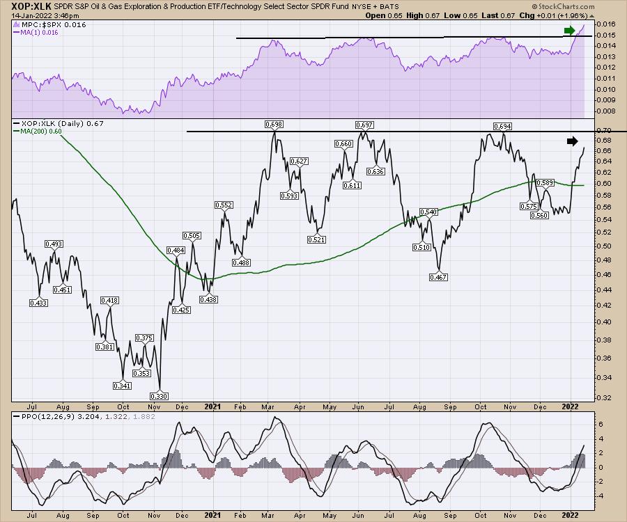
Investing is fast-paced and tech investors are watching for the rotation back into tech for the next ride. Looking at the chart below, I am comparing oil and gas exploration with the XLK. It has been a wild swinging ride over the last year. As we approach the level where tech starts to take control again, it is a good time to be prepared for both outcomes. Can oil keep going? The relative strength of this ratio compared to the $SPX suggests yes. The actual ratio in the main panel has not broken above yet.

If the ratio breaks out to new highs because oil names are improving faster than tech, that will probably ignite a further capital flow to energy stocks. If we stall here, it will be a great time to be getting back on the tech trade. Keep an eye out to see what happens.
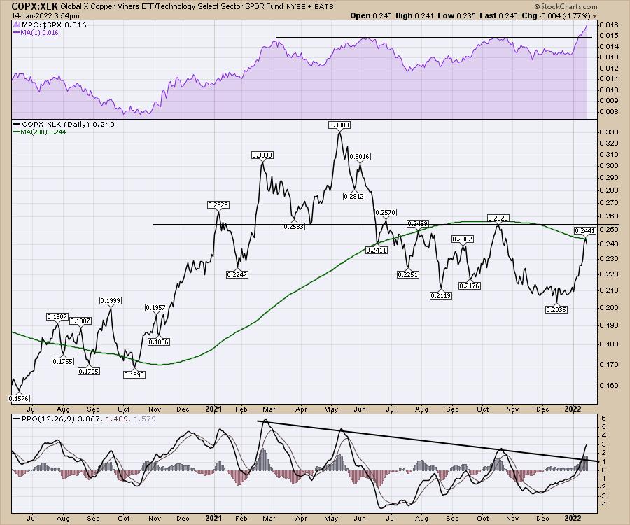
We can do the same for copper-related miners compared to tech. We are at a pivotal resistance point once again. Both the indicators suggest the main panel will break higher. We'll have to watch and see if it can.

These rotations are quite vicious, so try not to overstay your welcome. As the market is so split right now, be prepared to take gains off the table, because the reversals are painful as tech investors suffered the first two weeks of the month.
To stay on top of these rotations, consider investing in a membership to gregschnell.com. It's been an awesome year for our members already.
|
| READ ONLINE → |
|
|
|
| MORE ARTICLES → |
|
 Chart 1
 Chart 2
 Chart 3
 Chart 4
 Chart 5

