| THIS WEEK'S ARTICLES |
| John Murphy's Market Message |
| RISING UKRAINE TENSIONS ARE PUSHING GOLD TO THE HIGHEST LEVEL IN EIGHT MONTHS |
| by John Murphy |
RISING TENSIONS BOOST GOLD... With increased warnings that a Russian invasion of Ukraine is likely, investors are selling stocks around the world. And they're buying gold which is usually viewed as a traditional safe haven in times of heightened global tensions. Chart 1 shows the Gold Shares SPDR (GLD) rising above its November high to achieve a bullish breakout in the yellow metal. The weekly bars in Chart 2 show GLD rising to the highest level in eight months and heading toward a test of the highs reached last spring. Today's upside breakout strongly suggests that the price of gold is heading higher. The same is true of gold miners.
 Chart 1 Chart 1
 Chart 2 Chart 2
GOLD MINERS ARE ALSO RALLYING... Investors are also buying gold miners today. Chart 3 shows the VanEck Vectors Gold Miners ETF (GDX) surging to a three-month high and nearing a test of its November peak. A close above that previous resistance level would be a bullish sign for gold miners. The weekly bars in Chart 4 show that a price rise above that November peak would constitute an upside breakout for the GDX. An upside breakout would also push prices above the falling trendline extending back to the middle of 2020.
 Chart 3 Chart 3
 Chart 4 Chart 4
|
| READ ONLINE → |
|
|
|
| ChartWatchers |
| A Winner is Emerging in the Battle for the Large-cap Trend |
| by Arthur Hill |
 Buyers and sellers are slugging it out for control of the long-term trend for the S&P 500. This battle is raging near the 200-day SMA, which is perhaps the most widely followed long-term moving average. The S&P 500 is also the most widely followed benchmark for US stocks. Buyers and sellers are slugging it out for control of the long-term trend for the S&P 500. This battle is raging near the 200-day SMA, which is perhaps the most widely followed long-term moving average. The S&P 500 is also the most widely followed benchmark for US stocks.
This is a powerful combination and market participants should take notice. Good things are more likely to happen when above the 200-day SMA (uptrends) and bad things are more likely to happen when below the 200-day (downtrends). It is all about odds and the odds are shifting further in favor of the bears.
Instead of using the closing price and the 200-day (red line), I prefer to smooth closing prices with a 5-day SMA (green line). This reduces whipsaws and keeps the signal timely. The 5-day dipped below the 200-day in late January, popped back above in February and moved back below this week. Whipsaws are unavoidable. The current signal is the most important and this signal is bearish until proven otherwise.
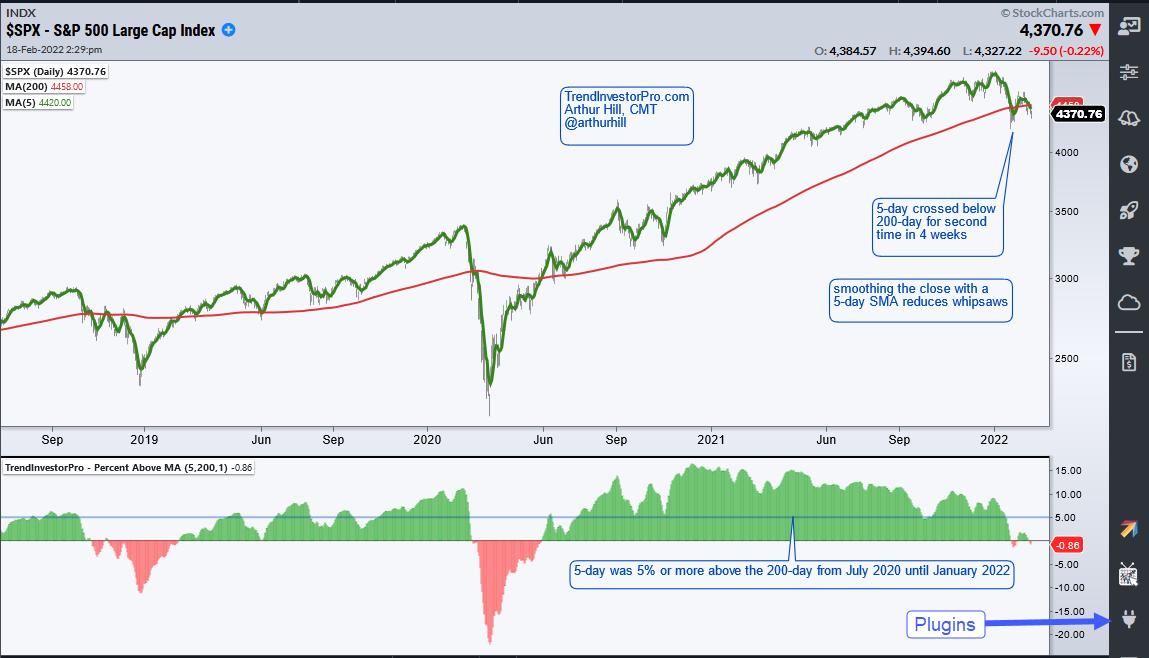
The indicator window shows an oscillator that measures the percentage difference between the 5-day SMA and the 200-day SMA. It is green when the 5-day is above the 200-day and red when the 5-day is below. This makes it easy to see crosses and the percentage distance between the two SMAs. The 5-day SMA was 5% or more above the 200-day from July 2020 until January 2022. These two dips below zero in the last four weeks show that weakness is spreading to large caps.
The Composite Breadth Model at TrendInvestorPro triggered this week as well and risk is rising within the stock market. Moreover, correlations tend to rise when the S&P 500 turns down and this means there could be few places to hide. Commodities and commodity-related ETFs are still at the top of our ranking table right now. Click here to learn more
The Percent Above MA is one of 11 indicators in the TrendInvestorPro Indicator Edge Plugin for StockCharts ACP. Other indicators include the Trend Composite, Momentum Composite and ATR Trailing Stop. Click here to learn more
-------------------------------------------------
|
| READ ONLINE → |
|
|
|
| Martin Pring's Market Roundup |
| Gold Breaks Out for the Fourth Time in the Past Year -- But is it for Real this Time? |
| by Martin Pring |
Since its August 2020 high, gold has been a very tricky market to call. Let me put it another way; it has been easy to call, but exasperatingly difficult to call correctly because of the numerous false breakouts that have taken place in the last 18 months-or-so. Monday's action resulted in another, so the real question is whether this, too, will end in tears for the bulls? It's an important question, since a successful resolution of the recent trading range would likely have huge technical implications, not only for the gold market but, through intermarket relationships, other markets as well.
I'll start with the current breakout and its predecessors, then point out the longer-term implications for gold, stocks and commodities.
Two Charts with Multiple False Breakouts
Chart 1 features the gold price since the correction/mini-bear market began in August of 2020. The numbers 1-3 refer to three legitimate trendline breaks that have taken place since then. All turned out to be false bullish flags. Now we can draw another and wait to see whether it will be the first legitimate break since the correction began.
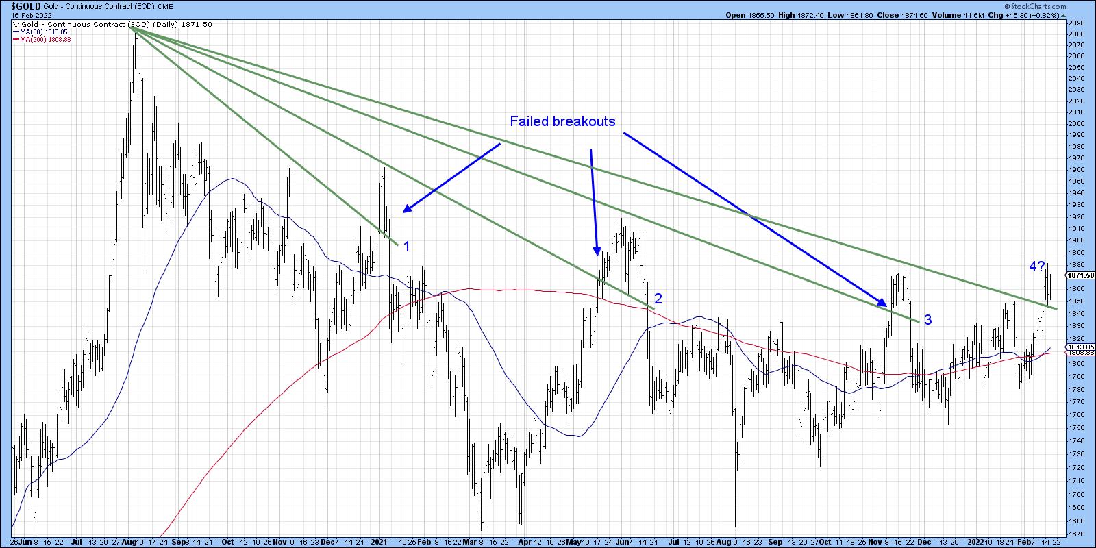 Chart 1 Chart 1
Chart 2 looks at the same period, this time from the aspect of price pattern completions. All three previous breakouts failed. Interestingly, the current breakout has been preceded by a slow exponential-type build up, which is suggestive of a possible large pending up move.
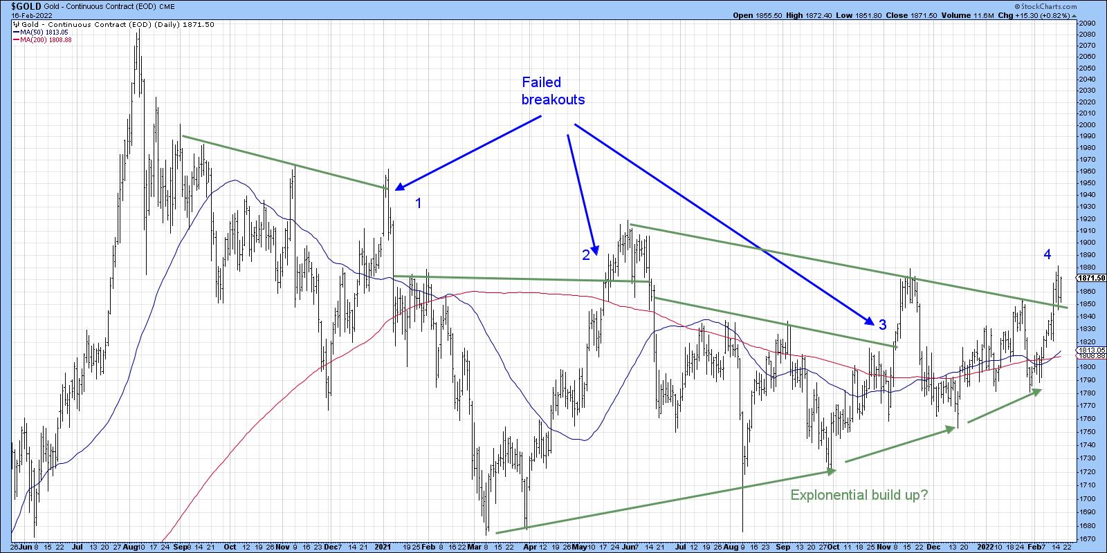 Chart 2 Chart 2
Chart 3 shows the latest breakout using a daily close together with three KSTs. It's true that the long-term series is below its MA, which is not a positive. However, the short- and intermediate-term series are both rising and could certainly provide some momentum for a successful breakout.
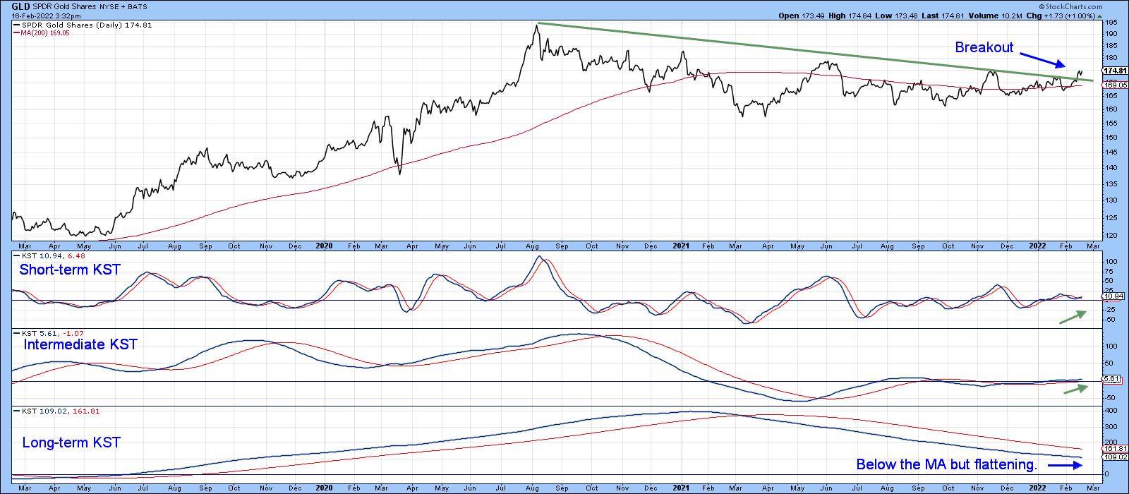 Chart 3 Chart 3
Gold Shares
I also like to look at gold shares, as they closely correlate with movements in the metal. Chart 4 is encouraging on that front because the VanEck Vectors Gold Mining ETF (GDX) has also broken out on both an absolute and relative basis. The short-term KST and the KST for relative action show promise as well.
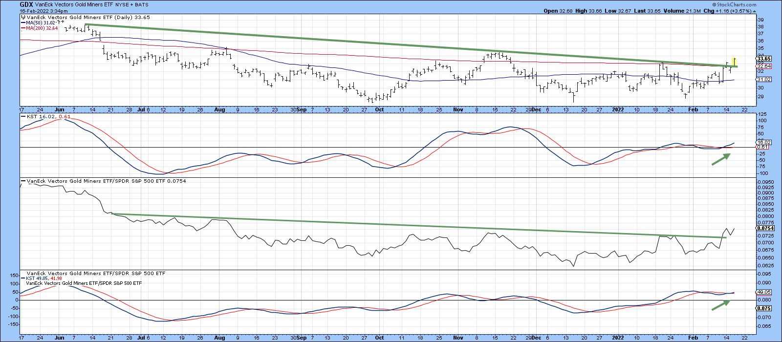 Chart 4 Chart 4
The Gold Bugs Gold Share Index ($HUI) consists of companies that do not hedge their gold production. It is therefore a more leveraged way to play the gold market than either the hedged share indexes or gold itself. Chart 5 shows that, when the ratio between the $HUI and the GLD is in a rising mode, this indicates growing confidence in gold-related assets. It is also associated with a rising gold price in its own right. We can't yet say that the ratio has broken out because it is right at its resistance trendline. However, the Special K has violated its down trendline, which is often a precursor to the ratio itself moving higher. You can read about the Special K here.
One way to obtain exposure with slightly reduced risk is through gold streaming companies, which you can read about here. In full disclosure, Pring Turner clients have positions in these equities.
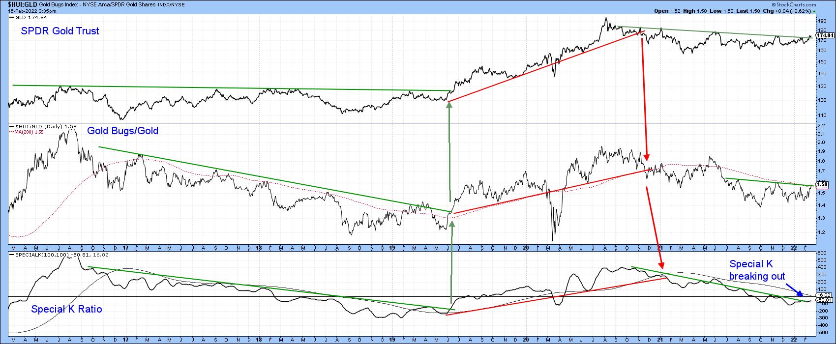 Chart 5 Chart 5
Long-Term Implications of a Valid Breakout
If this week's breakout is successful, Chart 6 tells us that gold has the potential to trigger a major bull market signal. That's because the CPI-adjusted price is within striking distance of crossing its 1980-2022 resistance trendline. Currently, it is above its 12-quarter MA. The Coppock Curve in the lower window is also trading above its MA, all of which suggests that any move higher will be supported by a positive secular up trend.
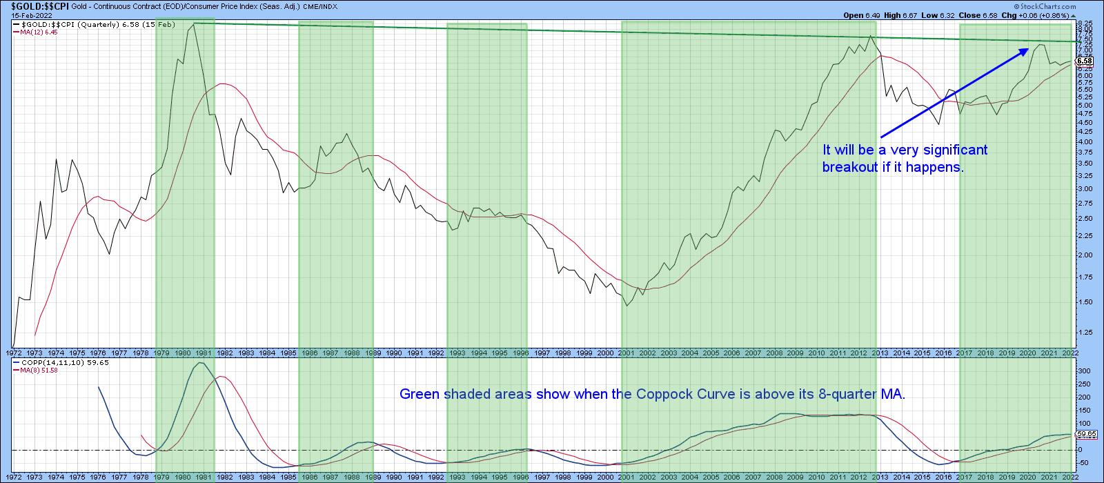 Chart 6 Chart 6
One of my favorite primary trend models is also bullish. It is simply a monthly PPO using the 6/15 parameters. The green shading in Chart 7 shows periods when the 6-month EMA traded above its 15-month counterpart. The red and green arrows reflect the fact that very few whipsaws have been triggered since 1978. In other words, its signals are usually pretty accurate in both directions.
Late last year, it looked as though the violation of the 2014-2021 red up trendline would result in a negative zero crossover. That did not happen, though, as the indicator has been slowly advancing since. That said, the indicator is still dangerously close to its equilibrium line; all the more reason why this week's gold breakout needs to hold.
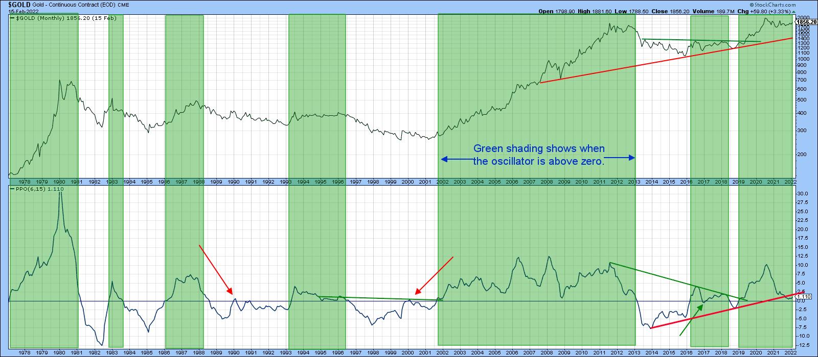 Chart 7 Chart 7
Good luck and good charting,
Martin J. Pring
The views expressed in this article are those of the author and do not necessarily reflect the position or opinion of Pring Turner Capital Group of Walnut Creek or its affiliates.
|
| READ ONLINE → |
|
|
|
| ChartWatchers |
| How Will We Know the Coast is Clear? |
| by Erin Swenlin |
A common question I am receiving via email and the Monday free DecisionPoint Trading Rooms (register here to be a part and/or receive the recordings): "How will we know it is safe to expand exposure or when seas aren't so stormy?" In this week's DecisionPoint show, Carl and I discussed the signs we are going to be looking for. The title of the video was "This Indicator Called the 2020 Bear Market Low". In this article, I will show you that indicator!

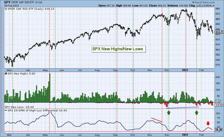
What is this magical indicator? It's the New Highs/New Lows indicator.
Below is the latest NH/NL chart. Notice the positive divergence we had with New Lows contracting over time and price lows going lower. We were very encouraged by this chart in the short term. But (there's always a "but")...
The NYSE New Highs/New Lows chart did not confirm with its own positive divergence. In fact, it was clearly confirming that this isn't over yet.
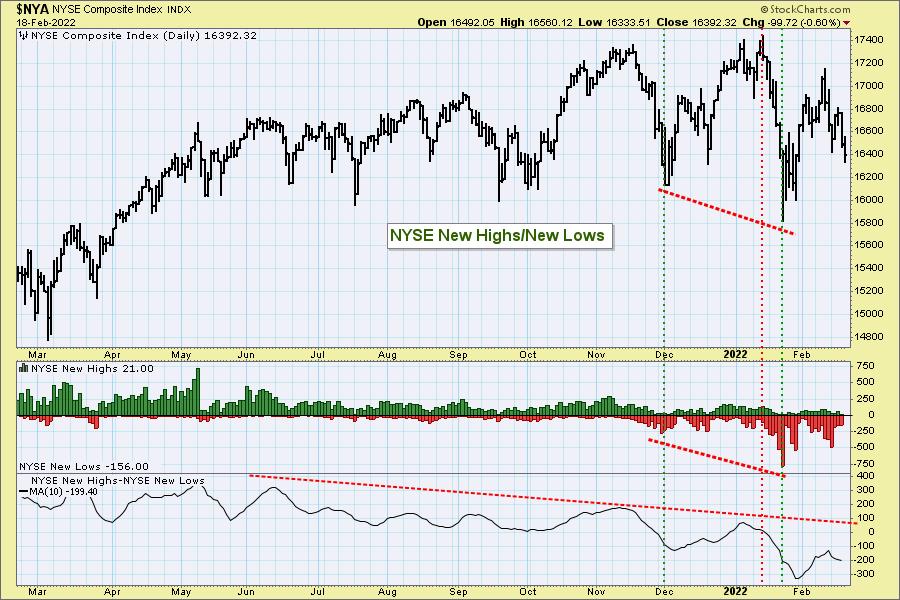
But wait! There's more!

Click here to register in advance for the recurring free DecisionPoint Trading Room! Recordings are available!
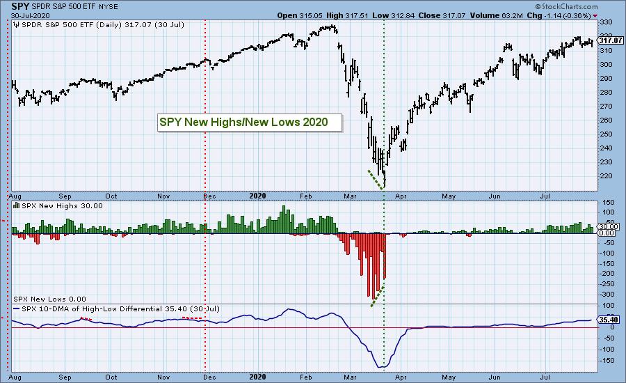
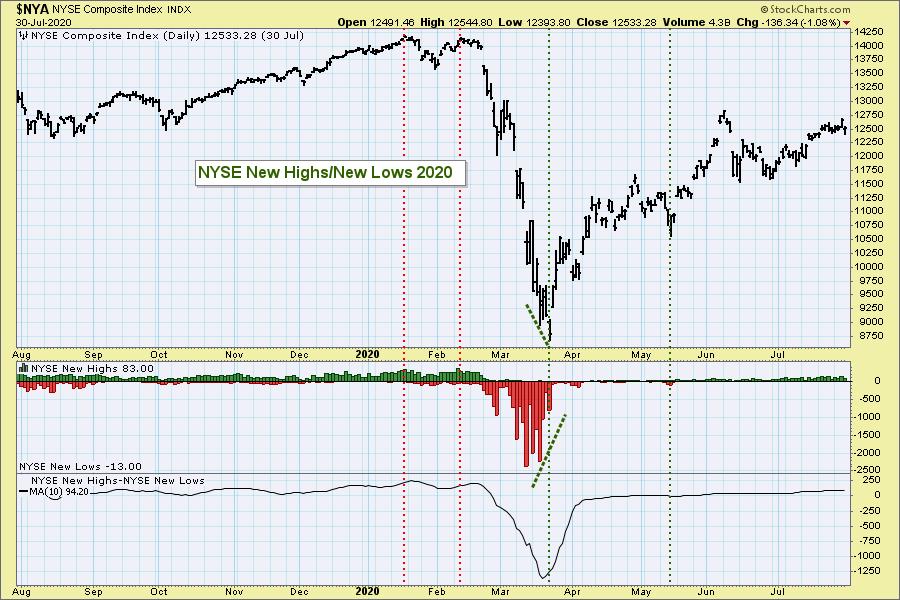
Look at these same charts at the end of the 2020 Bear Market. We steeply lower price bottoms, yet New Lows were contracting anyway. Boom! It was the end of the bear market.
We're not done yet. Below, I have our primary short-term and intermediate-term indicators, the Swenlin Trading Oscillators (STOs) and ITBM/ITVM. The shorter-term STOs started confirming a possible bottom arriving, but it was actually confirmed by the retreat of the ITBM/ITVM.
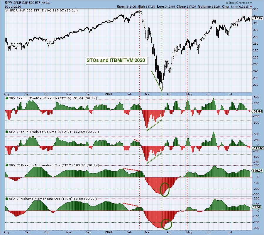
Carl and I are of the opinion we are in a bear market. It may not be "official" with a 20% decline, but why wait to play defense? These indicators called the end of bear market conditions last time. There is no guarantee they will this time, but at least we know what we are looking for. DP Alert subscribers will be the FIRST to know when the conditions are ripening and it is safe to dip our toes back in.
Good Luck & Good Trading!
Erin Swenlin
Technical Analysis is a windsock, not a crystal ball. --Carl Swenlin
(c) Copyright 2022 DecisionPoint.com
Helpful DecisionPoint Links:
DecisionPoint Alert Chart List
DecisionPoint Golden Cross/Silver Cross Index Chart List
DecisionPoint Sector Chart List
DecisionPoint Chart Gallery
Trend Models
Price Momentum Oscillator (PMO)
On Balance Volume
Swenlin Trading Oscillators (STO-B and STO-V)
ITBM and ITVM
SCTR Ranking
DecisionPoint is not a registered investment advisor. Investment and trading decisions are solely your responsibility. DecisionPoint newsletters, blogs or website materials should NOT be interpreted as a recommendation or solicitation to buy or sell any security or to take any specific action.
|
| READ ONLINE → |
|
|
|
| ChartWatchers |
| Three Big Names at Risk of Losing Their Leadership |
| by Greg Schnell |
The chip leaders of 2021 are at risk of losing their throne to another group. And when we measure up the double AA battery versus a fossil fuel giant, it's surprising to see who is winning in the performance race. Who could have imagined?
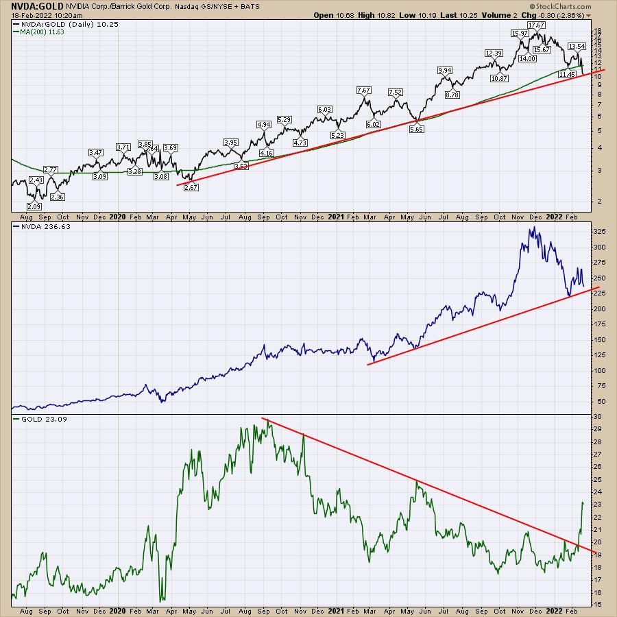
The first chart compares the big gun, Nvidia (NVDA), to Barrick Gold (GOLD). After the earnings for both on February 15th, the two charts are diverging meaningfully. The ratio chart on the top panel is on the two-year trend line. Who would have thought this would be even close? It is still an uptrend in favour of NVDA, but, as we'll see below, that can change.
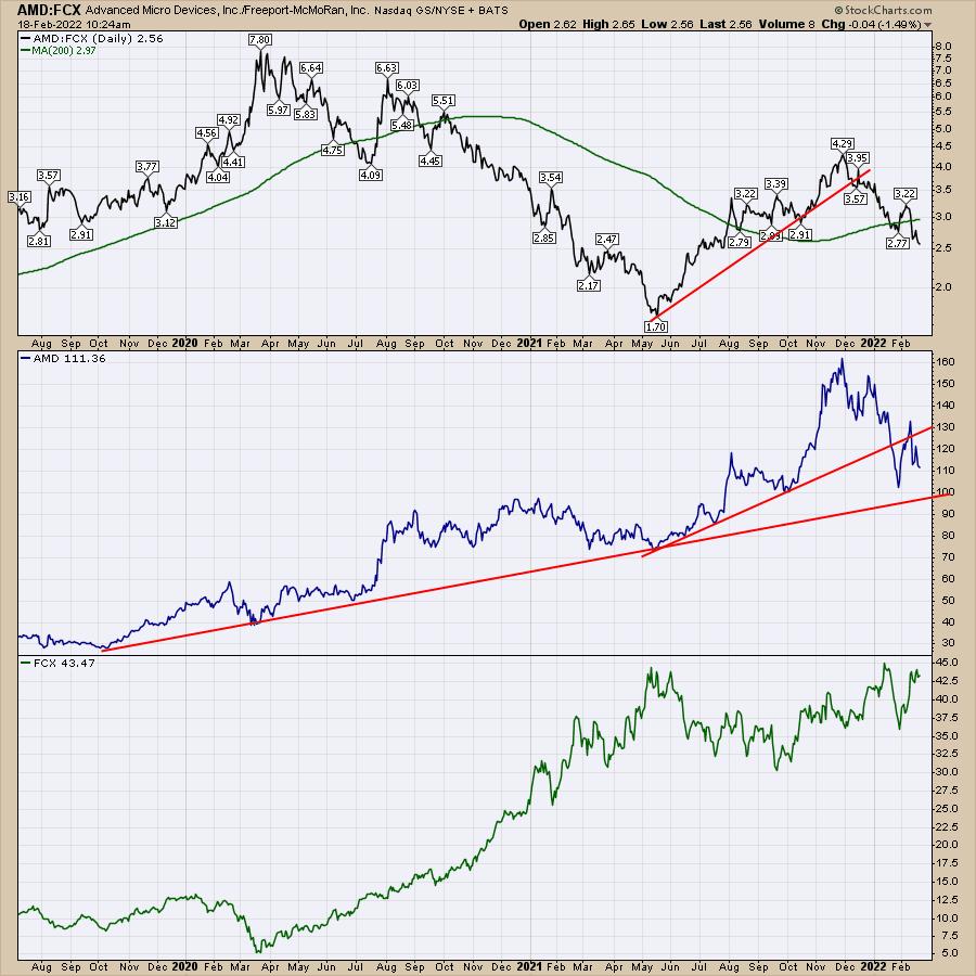
The second chip leader is Advanced Micro Devices (AMD) and I have paired it up with a copper stock -- Freeport McMoRan (FCX). Working through the panels, the ratio is clearly showing AMD underperforming Freeport for almost two years. The ratio high was in 2020 at the COVID lows. AMD recently topped in December, but Freeport continues to power higher. Freeport looks ready to break out to new highs, where AMD broke the 10-month uptrend and now looks like it will test the three year uptrend.
Lastly, we have the golden child, Tesla (TSLA), against the fossil fuel relic, ConocoPhillips (COP). As the ratio shows, they have been somewhat similar for almost two years, but the ratio is starting to break lower. The ratio has a lower high on it like the AMD/FCX ratio, but you could have done equally well since Sept. 2020.

While technology lovers will always love technology, these ratio charts are pointing out some significant changes in the heartbeat of the market. For more information, you can head over to our new website at OspreyStrategic.org to monitor these changes more closely. With the launch of the website, I have a new trial offering at $7 for the first month. Each weekly video and the accompanying newsletter discusses where the opportunities are in the market and when to protect capital. I hope you find it very interesting.
|
| READ ONLINE → |
|
|
|
| ChartWatchers |
| Are You Ready for a Market Meltdown? It's Coming |
| by Tom Bowley |
I am rarely dramatic, but 2022 is an exception. I believe we are in the type of bear market that we haven't seen in a long, long time.
The pandemic-driven cyclical bear market in 2020 was a health care crisis, not a financial crisis. I wrote about it throughout the pandemic and boldly predicted in the middle of it that we remained in a secular (long-term) bull market. The 2020 bear market lasted 23 trading days. It was brutal, but it was swift.
The good news is that I very much believe that we remain in a secular bull market and we'll once again recover from this current cyclical bear market (yes, I believe it started in early January), though it likely won't be as quick as 2020. Our EarningsBeats.com members have been reminded over and over again for the past several weeks to expect exactly what we're seeing -- high volatility and cyclical bear market conditions. The whipsaws have been difficult, but we're just getting started. Many of you probably think, "well, how much lower can these stocks go?" The answer? A lot.
Holding at neckline support at 4300 on the S&P 500 and forming the right shoulder has been the "eye of the storm." It's given many a false sense of calm. When the next shoe drops, it won't be so calm. Volume will soar and retail traders will panic. Why? Because they always do.
The bad news is that this cyclical bear market won't be as quick as the 2020 version. 2020 was pure financial manipulation and no one will ever convince me otherwise. Gap downs and intraday buying on so many growth stocks. That provided great opportunities to make significant profits if you read what was happening timely and accurately. Those growth stock profit-taking days ended in 2021, with rotation away from growth stocks as inflation surged. I see inflation peaking over the next 2-3 months. The problem right now, though, isn't inflation; it's the Federal Reserve ready to ramp up interest rates to fight the ghost of inflation. By the time the Fed realizes they don't need to hike rates any further, the damage will be done and all the talk will shift to the "R" word -- recession.
Growth stocks will flourish. Just after the stock market has been pummeled and the shift towards a more accommodative Fed takes place, the next recession will be talked about over and over and over. But with inflation dropping and the potential of interest rate decreases on the horizon, growth stocks will suddenly surge. I hope you're ready. I know I will be.
We have to endure more pain first, however. This pain will help to reset sentiment, which has been ridiculously bullish the past two years. During our Market Vision 2022 event on January 8, 2022, I provided a sentiment chart that needed to be corrected. It was the CBOE equity-only put call ratio ($CPCE). The 253-day moving average, while it would seem to be a lagging indicator, actually is an extremely solid predictor of investor behavior and market performance ahead. Before we look at the 253-day moving average, let's start with a reprint of a CPCE chart that I provided here in ChartWatchers a month or so ago:
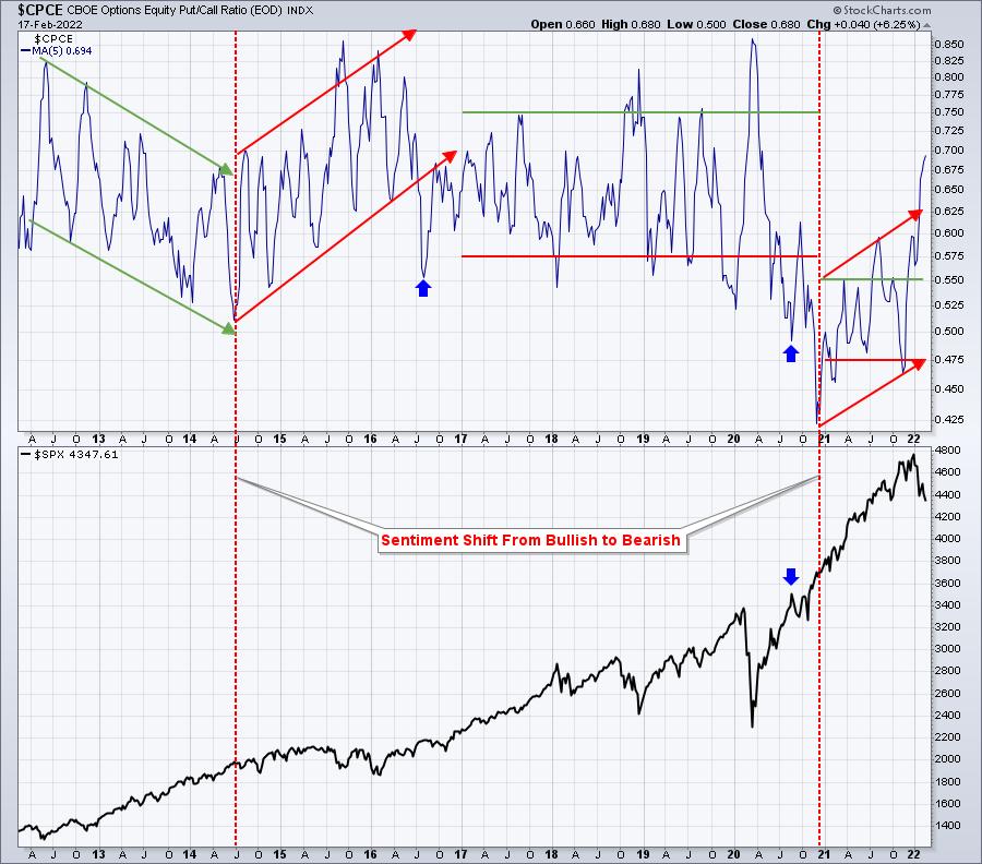
This is a "short-term" reset of the CPCE ratio. After the huge rally in the S&P 500 throughout 2013 and much of 2014, bullish sentiment reached a level that was simply too low. The market struggled for over a year and a half during the balance of 2014 and throughout 2015, while sentiment shifted. Once we reached a much higher 5-day moving average of the CPCE, the S&P 500 launched again. We've seen the market recently growing much more nervous as U.S. equities sell off. The rising 5-day moving average above clearly depicts the change in sentiment -- but only on a very short-term basis. This needs to continue for awhile....and it will.
We need that bearish sentiment to increase and to last awhile to carve out a meaningful bottom on the S&P 500, one where we can launch once again in this secular bull market. This is where the 253-day moving average comes into play:
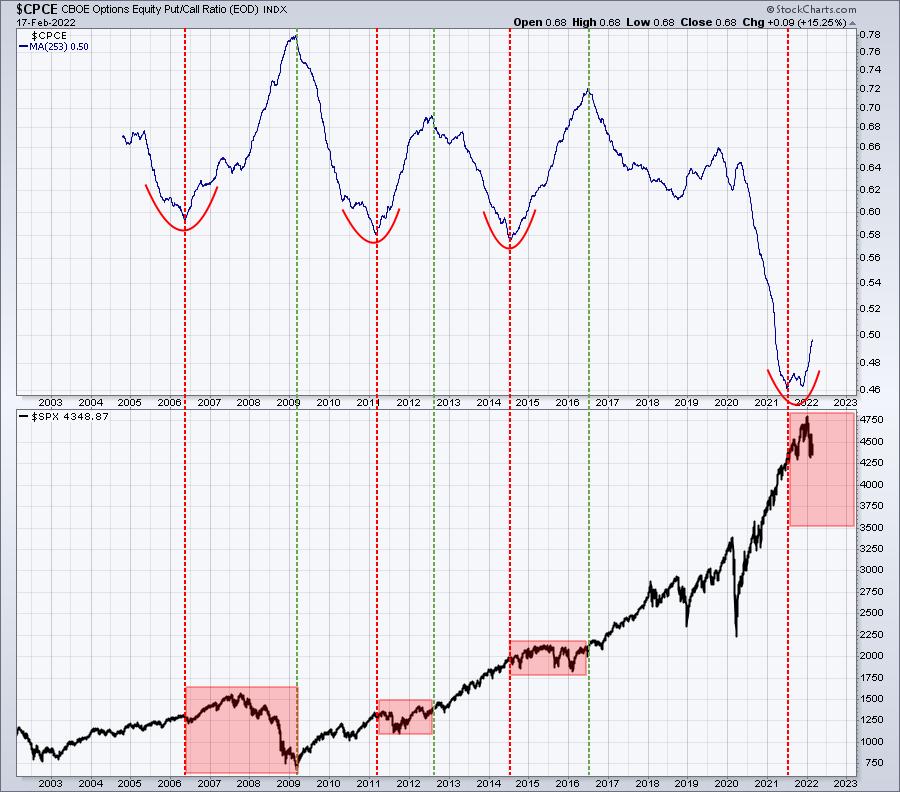
The red-dotted vertical lines mark warning signs where the CPCE reaches an extreme low (very bullish sentiment) and turns higher. Note that the S&P 500 struggled mightily after that. The green-dotted vertical lines essentially gives us that "all clear" signal when the CPCE has reached an extreme high (very bearish sentiment). Once everyone believes the stock market can go nowhere but lower, that's when we'll see another big advance. You have to get rid of the sellers.
I believe this 253-day moving average has a very solid track record. I see a minimum downside target of 3800 on the S&P 500, but would not be at all surprised to see 3500 and maybe even lower. And I'm convinced the breakdown of one chart will trigger it all. On Friday, this index finished 0.20% from a breakdown. If this index breaks down with the VIX nearing 30 (Friday's intraday high was 29.71), a subsequent surge in the VIX into the 30s or even the 40s could result in an absolute meltdown in our major indices.
Are you protected?
In Monday's EB Digest article (our free newsletter), I will share the chart and the bearish pattern that is on the verge of triggering. When its support is lost, I see another 500 points being shaved off the S&P 500 quickly. If you'd like to see this chart, you can CLICK HERE to subscribe to our newsletter. Again, it's free with no credit card required and you may unsubscribe at any time.
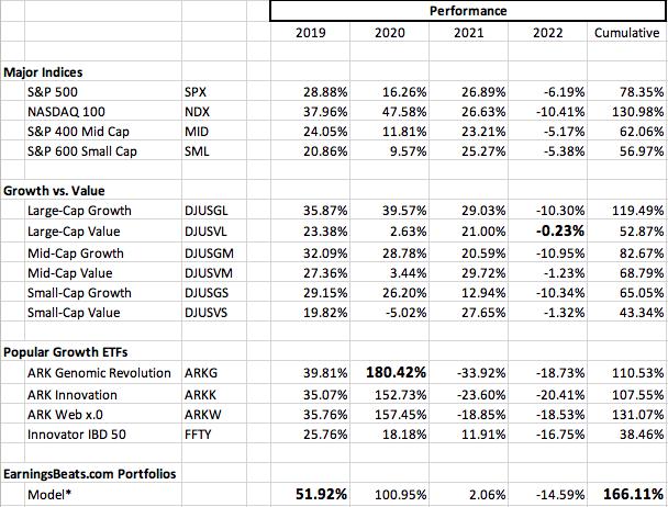
On Monday, February 21st (Presidents Day - Market Closed), I will announce the 10-equal weighted stocks that will be included in each of our portfolios. Below is a performance summary of several benchmarks, key growth and value indices, popular growth ETFs and our flagship Model Portfolio:
For more information on the event and how to reserve your seat, follow this LINK.
Have a great holiday weekend and happy trading!
Tom
|
| READ ONLINE → |
|
|
|
| Dancing with the Trend |
| Misunderstanding Average |
| by Greg Morris |
 Did you hear about the six-foot tall Texan that drowned while wading across a stream that averaged only 3 feet deep? The "World of Finance" is fraught with misleading information. The use of average is one that needs a discussion. Did you hear about the six-foot tall Texan that drowned while wading across a stream that averaged only 3 feet deep? The "World of Finance" is fraught with misleading information. The use of average is one that needs a discussion.
Figure A shows how easily it is to be confused over what is average. And of course, this time it is intentional. This example should put it in perspective. You cannot relate rates of change linearly. In Figure A, point A is 20 miles from point B. If you drive 60 mph going from point A to point B, but returning from point B to point A, you drive 30 mph. What is his average speed for the time you were on the road?
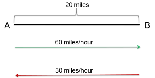 Figure A Figure A
What is the average speed for the round trip?
- 35 mph
- 40 mph
- 45 mph
- 50 mph
Many will answer that it is 45 mph ((60mph + 30mph) / 2). However, you cannot average rates of change like you can constants and linear relationships. Distance is rate multiplied by time (d=rt). So, time (t) is distance (d) / rate (r). The first leg from A to B was 20 miles divided by 60 mph or 1/3 of an hour. The second leg from B to A was 20 miles divided by 30 mph or 2/3 of an hour. Adding the two times (1/3 + 2/3 = 1 hour) will mean you traveled for one hour and covered a total distance of 40 miles, which must mean the average speed was 40 mph. Look up harmonic mean if you want more information on this, as it is the correct method to determine central tendency of data when it is in the form of a ratio or rate.
Everything on four legs is a pig. While this is unrelated to investments and finance, it is a story about averages which offers additional support to this topic. Doctors use growth charts (height and weight tables) for a guide on the growth of a child. What folks do not realize is that they were created by actuaries for insurance companies and not doctors. As doctors began to use them the terms overweight, underweight, obese, etc. were created based upon average. So, if your doctor says you are overweight and you need to lose weight, he is also saying you need to lose weight to be average. And from a Wall Street Journal article by Melinda Beck on July 24, 2012... "The wide variations are due in part to rising obesity rates, an increase in premature infants who survive, and a population that is growing more diverse. Yet the official growth charts from the Centers for Disease Control and Prevention still reflect the size distribution of U.S. children in the 1960s, '70s and '80s. The CDC says it doesn't plan to adjust its charts because it doesn't want the ever-more-obese population to become the new norm." And now you know.
During my last physical examination, I told my doctor about how these charts on height and weight were just large averages created by actuaries for insurance companies and that I did not mind being above average.
Trade Above Average,
Greg Morris
|
| READ ONLINE → |
|
|
|
| RRG Charts |
| Discretionary and Tech Are Crucial For The Direction of The Market |
| by Julius de Kempenaer |

Correlation is a useful metric to use when trying to gauge the direction of the market.
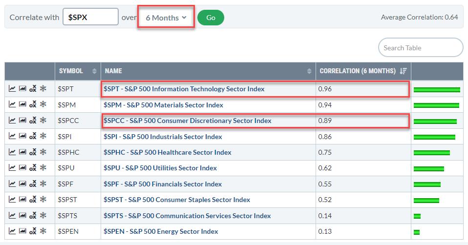
The table above shows the correlations for the 12 sectors against the S&P 500. In this version, I used a 6month period to calculate the correlation, the drop-down selection allows users to look at correlations over different time periods.
When you do that you will notice that the Technology Sector and the Consumer Discretionary sector are always at the top of the list. Some sectors, like Energy, Communication Services, Consumer Staples, will show up at different positions as their correlations show more change over time.
Technology and Discretionary are always very close to 1 (which is "the market"). This can largely be explained by the large weight of both sectors within the S&P 500.
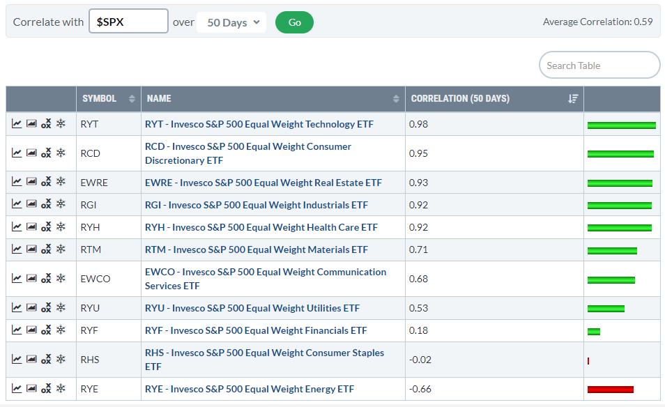
When you run this same table for the Equal Weight Sectors you will see similar levels of correlation against the S&P 500.

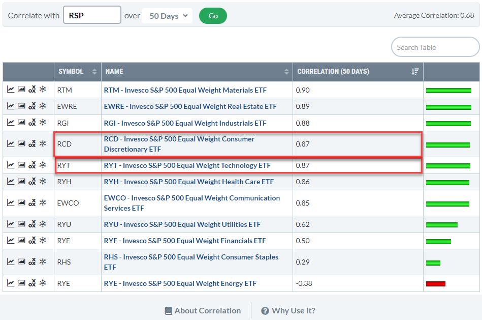
However, when you run the EW sectors against, their own, Equal-weight S&P 500 the ranking changes.

Now Tech and Discretionary are no longer at the top of the list. They are still high but much more in line with other sectors.
Here you can see that the difference in correlation between the first seven sectors is about 5 basis points. Only from Utilities downward the correlation really drops and Energy is even significantly below 0.
As a result of the high correlation, the direction of the two biggest sectors Technology and Discretionary is crucial for the direction of the S&P 500. Or the other way around; as a result of their heavy weight inside the S&P 500, the correlation of Tech and Discretionary with the S&P is very high.
Either way, keeping a close eye on the charts for these two sectors will help us to determine what might be in store for the market as a whole ($SPX).

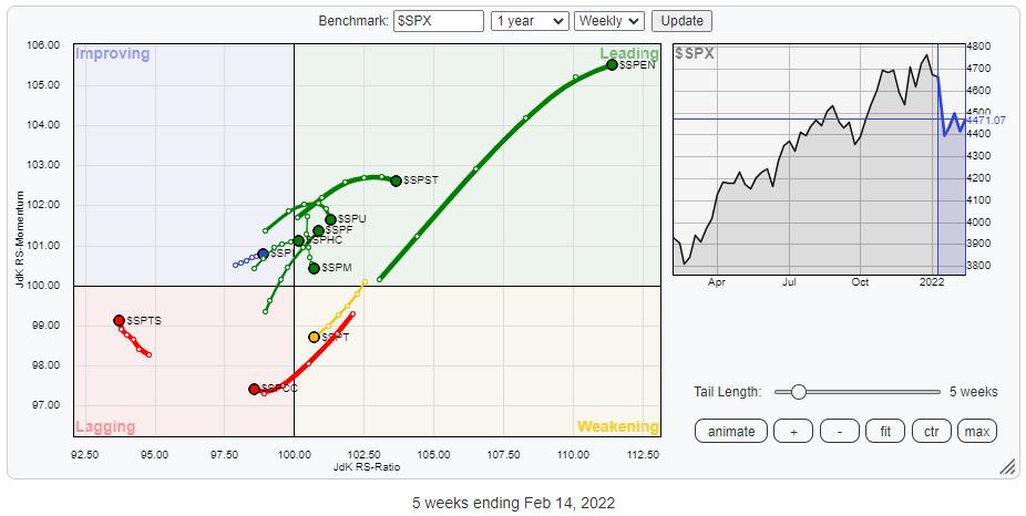
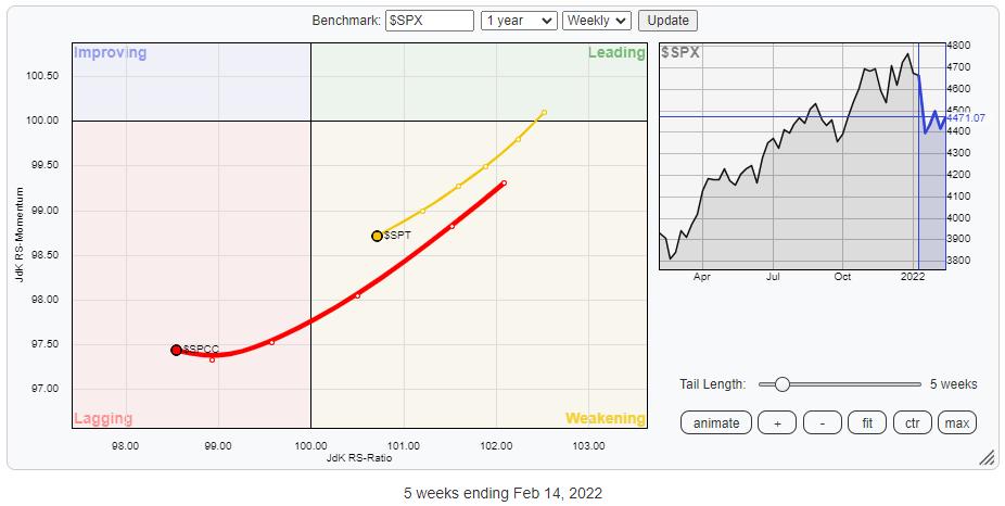
The RRG shows the rotations for the sectors vs $SPX. This RRG uses the actual underlying indexes instead of the SPDR ETFs which we usually use. Not surprisingly the rotational patterns are exactly the same.
The weak rotations for Technology and Discretionary are clearly visible.
Technology is still inside the weakening quadrant and heading lower on both axes towards lagging. Consumer Discretionary already inside lagging and since last week, leveling off a bit on the RS-Momentum scale.

Technology (27%) and Discretionary (13%) together make up 40% of the total market capitalization of the S&P500. So when these two sectors are pulling negatively on the S&P 500, a lot of sectors (market cap) need to pull the other way to offset these forces.
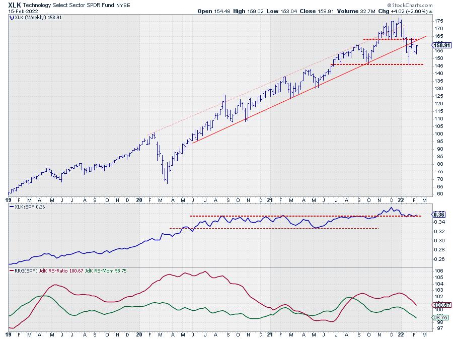
Technology (XLK)

XLK (Technology) left its rising channel five weeks ago to find support at 145. Out of this support level, XLK bounced back towards a double resistance level near 164.
This resistance level is coming off the former support level offered by the low in December. The break below that low completed a top formation, as always old support levels tend to come back as resistance later on. This happened in the weeks starting 1/31 and 2/7 when XLK touched 164 from below.
A similar situation is in play with the former lower boundary of the rising channel. For a long time, this trendline acted as support. Here also, when broken, this former support line tends to come back as resistance. The big difference with a former low is the act that we are dealing with a dynamic level that moves higher over time.
At the moment that former support line is now moving around the same level as the aforementioned December low, creating a double resistance level.
All in all, the upside potential for XLK looks very limited vs a downside risk that stretches at least down to the recent low at 145 but much lower when that gets broken.
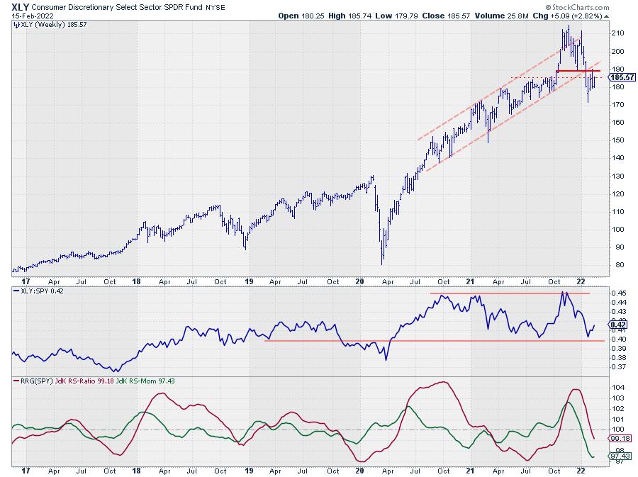
Consumer Discretionary (XLY)

The chart of XLY (Consumer Discretionary) is showing a very similar picture. A break below a former low which completed a topping formation, followed by a break out of a long-standing rising channel, a move to a new low, and a bounce back to former support which is now acting as resistance.
For XLY, the area around 190 is the area where the former trendline intersects the level of the previous low and therefore an important level to watch as resistance now.
Here also upside potential is very limited for the time being while downside risk is quite significant.
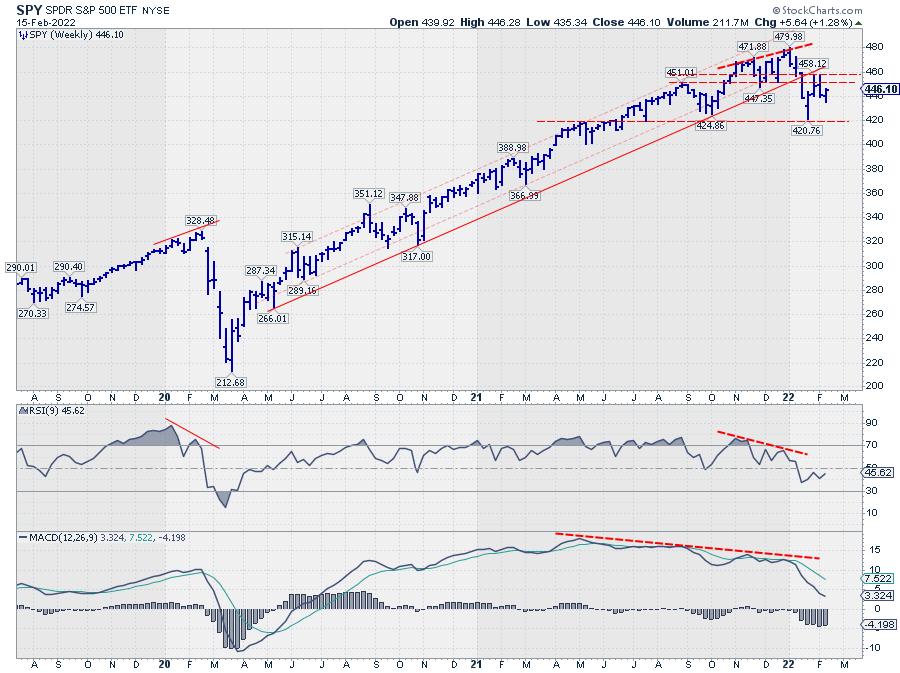
S&P 500 (SPY)

Translating all of that back to the chart of SPY shows a very similar picture. The levels are not as clear as for the individual sectors but the bigger picture is remarkably similar.
The levels I am watching for the SPY are 460 (or better the area between 450-460) to the upside and 420 on the downside.
Bringing in the RSI (9) and the MACD on the weekly S&P chart reveals an ongoing negative divergence between price and both indicators. The initial result of this divergence already surfaced with the drop out of the channel and completing the top formation. As long as this condition remains the market is likely to remain under pressure.
#StaySafe, --Julius
|
| READ ONLINE → |
|
|
|
| MORE ARTICLES → |
|
 Chart 1
 Chart 2
 Chart 3
 Chart 4

 Buyers and sellers are slugging it out for control of the long-term trend for the S&P 500. This battle is raging near the 200-day SMA, which is perhaps the most widely followed long-term moving average. The S&P 500 is also the most widely followed benchmark for US stocks.


 Did you hear about the six-foot tall Texan that drowned while wading across a stream that averaged only 3 feet deep? The "World of Finance" is fraught with misleading information. The use of average is one that needs a discussion.
 Figure A