| THIS WEEK'S ARTICLES |
| ChartWatchers |
| SPY Gets its Biggest Surge since November 2020. Is it Enough? |
| by Arthur Hill |
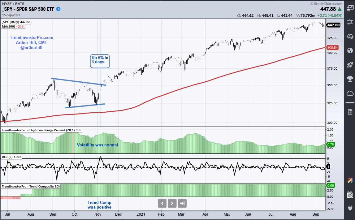
 The S&P 500 SPDR (SPY) surged 5.77% from Tuesday to Thursday and this was the biggest 3-day surge since the 6.07% advance on November 5th, 2020. This early November surge led to a breakout and the advance extended until January 2022. The current surge also shows some serious short-term strength, but there are some key differences between now and November 2020. Let's investigate. The S&P 500 SPDR (SPY) surged 5.77% from Tuesday to Thursday and this was the biggest 3-day surge since the 6.07% advance on November 5th, 2020. This early November surge led to a breakout and the advance extended until January 2022. The current surge also shows some serious short-term strength, but there are some key differences between now and November 2020. Let's investigate.
The chart below shows SPY above its 200-day as it consolidated in September-October 2020. The Trend Composite (bottom) window was also positive. Thus, the long-term trend was up. The middle indicator window shows the 3-day Rate-of-Change for reference. The top indicator window shows 20-day average of the High-Low Range percent, which is the high-low range as a percentage of the average price. This measures volatility and the indicator was below 2% at the time of the November surge (normal volatility). Thus, SPY was in an uptrend and volatility was normal as the ETF broke out of a triangle.
Now let's look at March 2022. First, SPY is below its 200-day SMA and the Trend Composite is negative. Thus, the long-term trend is still down. Second, the High-Low Range percent indicator has been above 2% for nine days (red) and this shows above average volatility (risk). This week's surge is impressive short-term, but SPY is still in a downtrend and volatility is above average. I would like to see a meaningful breakout and follow through before considering it as more than a bear market bounce.

This week at TrendInvestorPro I continued the Trend Composite trading strategy series with part five. This part tested a trend-momentum strategy using the 50 ETFs in the All Weather List. Click here for immediate access to this series and more.
On this week's Next Level Charting (video here), I used the High-Low Range percent indicator to quantify volatility in the S&P 500 SPDR (SPY), DB Energy ETF (DBE) and Gold SPDR (GLD). The latter two are in uptrends and experienced short-term parabolic moves.
The Trend Composite and High-Low Range Percent are part of the TIP Indicator Edge Plugin for StockCharts ACP. This plugin includes nine other indicators that help traders define the trend, identify tradable pullbacks and set stops. Click here to learn more.
---------------------------------------------------
|
| READ ONLINE → |
|
|
|
| ChartWatchers |
| Sector Watch? Healthcare Triggers an IT Trend Model "Silver Cross" BUY Signal |
| by Erin Swenlin |
The Health Care sector (XLV) broke out from a strong resistance zone today. Better yet, we saw an IT Trend Model "Silver Cross" BUY signal as the 20-day EMA crossed above the 50-day EMA. There is a lot going for this sector right now; the RSI is positive and not overbought, while the PMO is on a BUY signal and has now moved above the zero line.
Participation within this sector is getting stronger. First, we look at the Silver Cross Index (SCI), which is rising after a recent crossover. It is still below our 70% bullish threshold, but it is rising. It will likely pick up speed given we have 89% of stocks above their 20-day EMA and 78% of stocks above their 50-day EMA. That gives us a bullish bias in the short term.
The Golden Cross Index (GCI), which measures how many stocks within XLV have a 50-day EMA above the 200-day EMA (or stocks that have had golden crosses and are keeping them), is flat and stands at 55%, which is also below our 70% bullish threshold. This gives XLV a long-term bearish bias. However, given that 78% are above their 50-day EMA and 66% are above their 200-day EMA, it should improve soon.
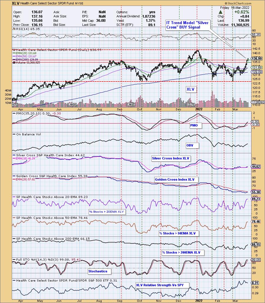
PARTICIPATION and BIAS Assessment: The above chart objectively shows the depth and trend of participation in two time frames.
- Intermediate-Term - the Silver Cross Index (SCI) shows the percentage of SPX stocks on IT Trend Model BUY signals (20-EMA > 50-EMA). The opposite of the Silver Cross is a "Dark Cross" -- those stocks are, at the very least, in a correction.
- Long-Term - the Golden Cross Index (GCI) shows the percentage of SPX stocks on LT Trend Model BUY signals (50-EMA > 200-EMA). The opposite of a Golden Cross is the "Death Cross" -- those stocks are in a bear market.

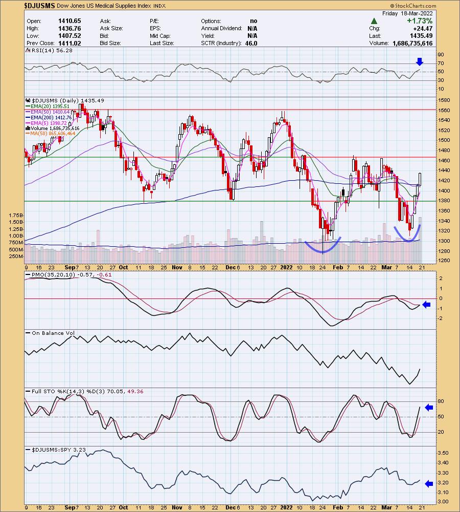
If you review the industry group charts within Healthcare, you'll find that all have bullish configurations. I particularly like Medical Supplies. Note on the chart below that the RSI has just moved positive and the PMO has just generated a new PMO crossover BUY signal. We have a large double-bottom pattern that will be confirmed when price overcomes resistance at 1470. Volume is coming in and relative strength is improving. Stochastics are also rising in positive territory, implying internal strength.
Conclusion: We are likely in the midst of a new bear market rally in the overall market that could turn into the end of the bear market. We won't go that far yet, but we are alert. In the meantime, the Healthcare sector looks like it will profit from a healthy overall market (pun not intended) and could weather through a downturn given the strong participation within.
Good Luck & Good Trading!
Erin Swenlin

Click here to register for the recurring free DecisionPoint Trading Room! Check out her latest recording:
- Topic: DecisionPoint Trading Room
- Start Time: Mar 14, 2022 09:01 AM
- Meeting Recording Link.
- Access Passcode: March@14
Technical Analysis is a windsock, not a crystal ball. --Carl Swenlin
(c) Copyright 2022 DecisionPoint.com
Helpful DecisionPoint Links:
DecisionPoint Alert Chart List
DecisionPoint Golden Cross/Silver Cross Index Chart List
DecisionPoint Sector Chart List
DecisionPoint Chart Gallery
Trend Models
Price Momentum Oscillator (PMO)
On Balance Volume
Swenlin Trading Oscillators (STO-B and STO-V)
ITBM and ITVM
SCTR Ranking
Bear Market Rules
DecisionPoint is not a registered investment advisor. Investment and trading decisions are solely your responsibility. DecisionPoint newsletters, blogs or website materials should NOT be interpreted as a recommendation or solicitation to buy or sell any security or to take any specific action.
|
| READ ONLINE → |
|
|
|
| ChartWatchers |
| The Rally Ahead |
| by Greg Schnell |
I think, if I had to pick something in the market that I see often which is misleading, I'd pick the previous historical models proudly rolled out. Examples include how "Saint Patrick's Day is one of the best trading days of the year", "the Santa Claus rally was up, so the next year should be good", "January was down, but from the end of January onward is up", "if the first quarter is down, it's an excellent time to buy because the 12-month forward returns are almost always positive, except for", etc., etc.
The Fed has been frothing markets higher for 13 years. Nothing negative about that, but it's going to skew every historical model with the liquidity that was offered. It was only two years ago that the Fed wanted inflation. We had a massive number of government bonds with a negative interest rate globally. The downward spiral was scaring the world. Commodity prices were plummeting. If all that is changing, are these historical models at all relevant?
With the COVID response, almost every central bank and government in the world offered fuel to keep the economy going. It was the single biggest money print ever. Of course it would be, as the total GDP of the global economy is larger than ever before and this was a response that was also global.
I think what I find more difficult is the forgetfulness of fighting the negative interest rate spiral in the historical model discussion. We are now fighting something new, and it's called inflation. Again, it was only two years ago that the Fed/central banks worldwide wanted to create inflation. We got what we asked for. These are not light switches that turn on and off easily.
Commodity markets were under duress before the Russia/Ukraine situation. In the last month, we have shocked the world's commodity markets. Without proper functioning of the commodity markets, we are in a world of trouble. As countries start to hoard grain and raw materials, we enter a door to a different kind of inflation.
The removal of trade barriers had lowered prices on goods around the world. With the size of Russia and Ukraine commodity exports being affected, this is setting up for some rough seas ahead. If Russia loses 3 million barrels a day of production/exports, that is a billion barrels/year not reaching the world markets. As floating storage swells, eventually this pressure will force Russia to stop producing oil as the tank farms fill up. The impacts from reduced grain shipments is also huge, so oil is one example, but it moves across the spectrum of commodities.
Amazingly, commodities are only marginally higher from the sanction date of February 24th. Notice crude oil trading for three days trading within the price bar of February 24th, shown by the black arrow. When people talk about the oil price reflecting the war with Russia, I would suggest it has barely started. Both the 8-day and 20-day moving averages are pointed down. Has the shortage stopped?
The price volatility is definitely changing, as oil has traded in a 26% range for the prior two weeks. The current week of March 14th has oil trading in a 17% range. Oil is currently a $100 Billion/day market, and it is swinging wildly trying to adapt to the changes.
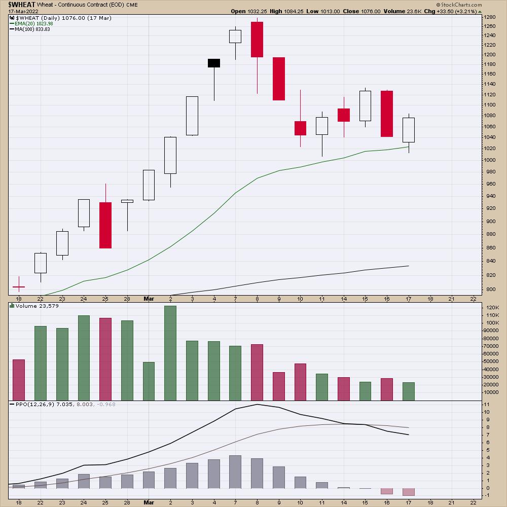
Wheat is also trying to stabilize after rocketing higher.
Germany is closing car plants to deal with supply chain problems. Again, oil is just one example. As the hoarding of materials goes global, this can affect the economic resilience of our industries.
While the focus is on the Fed to control inflation, it's not realistic to think they can control commodity inflation, especially during trade sanctions. The slowing of the economy might help them do that, but it is a difficult type of inflation we are staring at. Investing will be very tricky as the Fed removes liquidity and raises rates into a commodity shortage. It's not the quarter-point change that matters in my opinion, it is the shortage of energy globally that is going to make the economy slow. We were in an energy crisis before this Fed meeting. We are definitely in one after the sanctions.
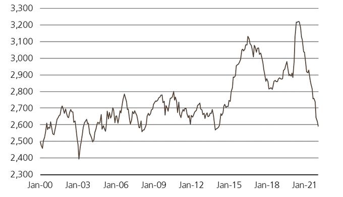
I found this chart on my Twitter feed, but this shows the global crude inventory levels back in January from the IEA, before any war started.
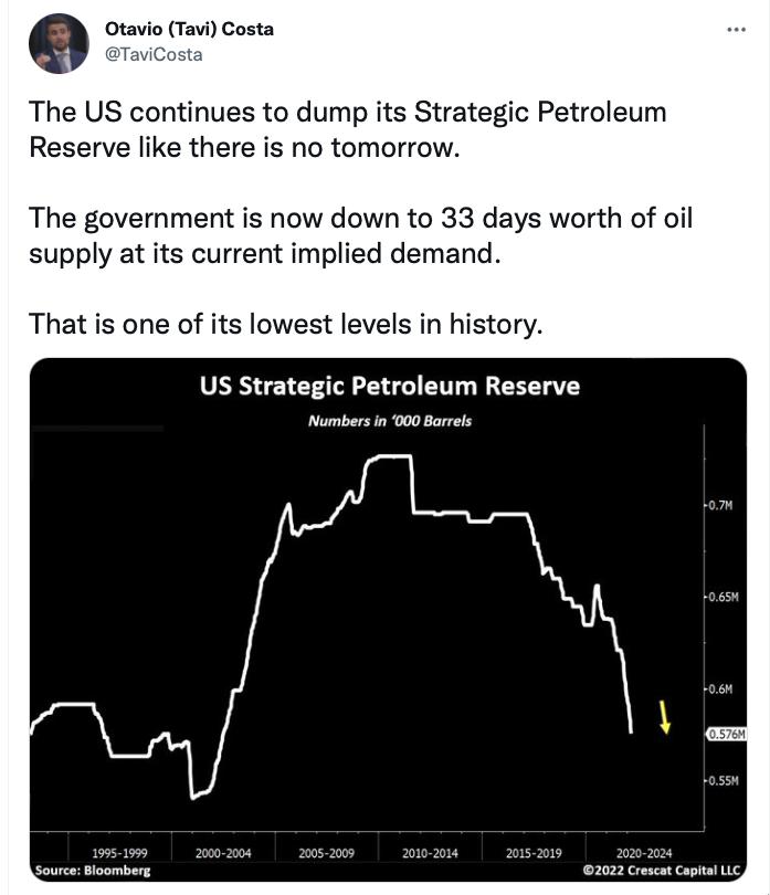
For those believing the SPR is the source of solace, notice the dates on this chart.
The charts are telling us a different story than the current political spin globally. The inflation we wanted 2 years ago is now unrelenting. The problem didn't start in February, and it won't being going away anytime soon.
Using historical models of good days and seasonal tendencies is literally pub talk. The backdrop of what we are facing is dramatically different than anything we have faced in the golden years since the 2009 financial crisis. Fed support and commodity weakness made it a one-way environment. Now it's a Fed that is removing liquidity and extreme commodity shortages, making it the opposite environment.
I think minimizing the use of historical data within the last ten years is probably a much better way to think about the markets going forward. The shortages are just beginning, unless something remarkable happens beyond the Russian situation.
|
| READ ONLINE → |
|
|
|
| Martin Pring's Market Roundup |
| Don't Be Surprised if the NASDAQ Jumps from Here |
| by Martin Pring |
I've been bearish on the NASDAQ -- or, more specifically, on its relative action against the S&P Composite -- for about a year. Now that the financial press has announced that the Index, by virtue of passing the somehow magic -20% level, has "entered bear market territory", it might, from a contrarian point of view, be time to take a second look at the technical position to see what gives.
To start with, Chart 1 compares the NASDAQ to its RS line against the S&P Composite. It shows the large negative divergence between the RS and absolute price action between early and late 2021. A sharp and persistent drop followed. Now things are looking a bit more constructive, since the 45-day ROC has begun to diverge positively with the RS line, not unlike previous instances featured in the chart. They have been flagged by the green dashed arrows. Positive divergences in and of themselves do not tell us that the bear market is over, but do suggest that some form of counter-cyclical rally for both the Index and its RS line may not be far off. However, until the two down trendlines at 13,200 for the Index and 31.5 for the RS line are bettered, I am assuming that the short-term trend is down.
 Chart 1 Chart 1
By way of indicating that some form of bounce is likely, Chart 2 tells us that, by any measure, the loss in NASDAQ relative action has been swift. Since the ratio is just a tad above its multi-year support trendline, this might be as good a place as any for a temporary respite. The chart also reveals a classic example of a false upside move being followed by an above-average drop, as participants scramble to get back to the right side of the market.
 Chart 2 Chart 2
Chart 3 compares the NASDAQ to the NASDAQ Bullish Percent. Note that the indicator peaked in early 2021, but the Index kept rising until November of that year. This told us that the Index itself was in a bull market, but participation, in the form of the average stock, was gradually shrinking. That's never a good sign and prices have responded by dropping all year. One ray of hope now comes from the fact that this process looks as though it may be in the process of reversing. That's because the indicator saw its low in late January whilst the NASDAQ continued to edge lower. Note that a positive divergence preceded the March 2020 bottom.
 Chart 3 Chart 3
Chart 4 features another NASDAQ breadth indicator. This time, it's new highs minus new lows. Notice how this indicator reached its low point in late January, yet the NASDAQ has continued to work its way lower. We are now at the point where a small reduction in new lows or a small increase in new highs could revert to positive territory where new highs exceed new lows. If so, that would be a very bullish short-term development considering how far the Index has sunk this year.
 Chart 4 Chart 4
Early 2021 until the end of that year saw a very striking negative divergence between the high in the percentage of NASDAQ stock trading above their 200-day moving averages and the NASDAQ itself. I think there is a lot more downside to come as a result of this discrepancy. However, this indicator, like the previous two, is now experiencing a positive divergence, thereby adding additional evidence favoring a possible near-term counter-cyclical rally. The triggering mechanism, in this case, would be a break above the dashed green trendline marking the top of a small base and the 2021-2022 down trendline. To be decisive, that would require a rally to around the 26 level.
 Chart 5 Chart 5
Conclusion
Back in late 2021, things looked bleak for the NASDAQ, since large negative divergences had taken place between the Index and several breadth measures. Now that a part of the implied downside potential has been realized and some positive divergences have appeared, it may be time to look north again. None of this matters, though, until that daily close down trend line for the NASDAQ can break and hold above the 13,200 level. That said, a lot of long-term technical damage has been done, so any rally is likely to be counter-cyclical in nature or, at best, part of a larger trading range. Unfortunately, those are also the most tricky and deceptive to play.
Good luck and good charting,
Martin J. Pring
The views expressed in this article are those of the author and do not necessarily reflect the position or opinion of Pring Turner Capital Group of Walnut Creek or its affiliates.
|
| READ ONLINE → |
|
|
|
| GoNoGo Charts |
| Going, Going, Gone: End of Week Themes with GoNoGo Charts |
| by Alex Cole, Tyler Wood |
As the week ends, let's look at some of the thematic charts from a GoNoGo perspective.
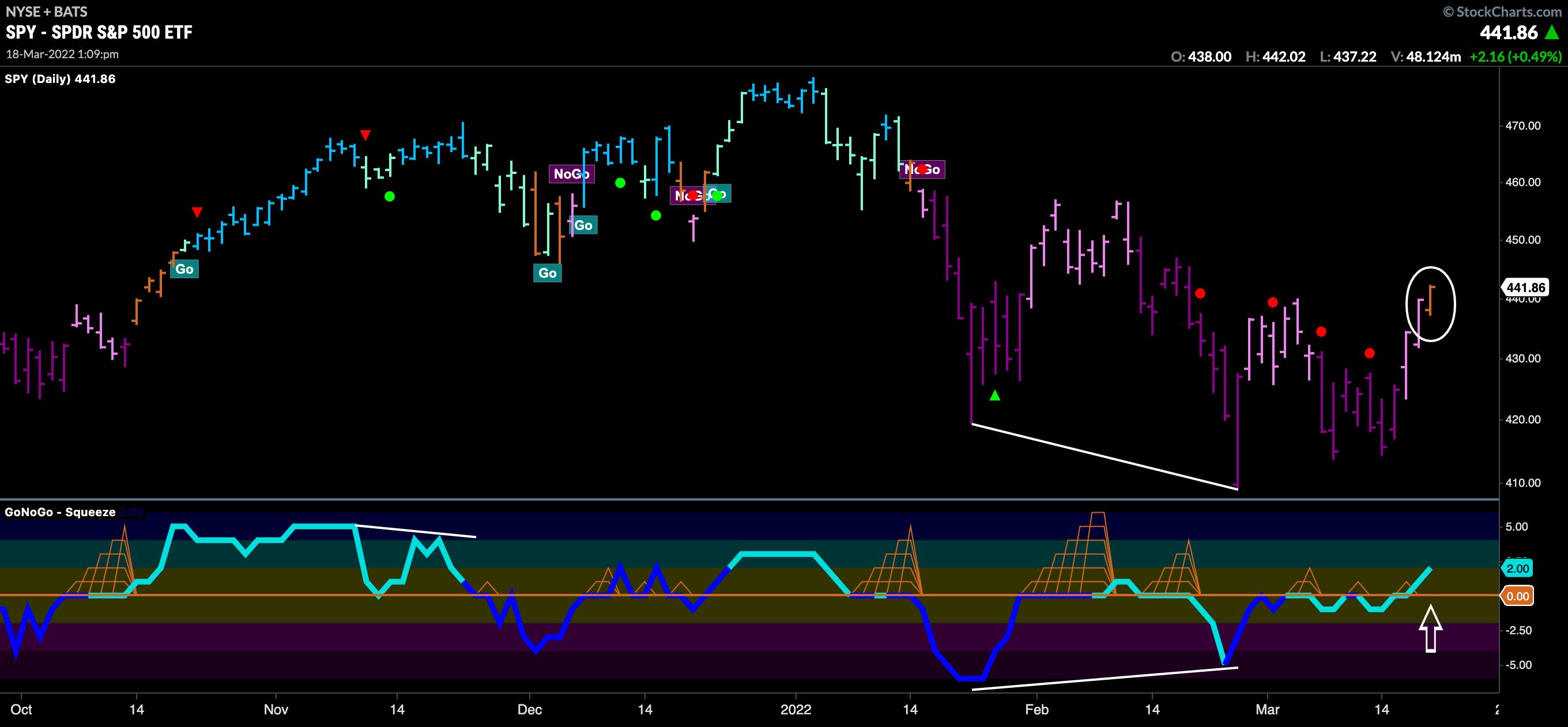
Below is the GoNoGo Chart of $SPY. We have seen a strong rally that started on Wednesday as prices have climbed higher. We were watching the zero line on the oscillator closely to see whether it would act as resistance. When a trend is strong, the zero line acts as an objective level of support/resistance. We see that (at the time of writing, just after 1pm ET 3/18/22) that GoNoGo Oscillator has crossed into positive territory; we are noticing an amber "Go Fish" bar, suggesting that not enough trend conditions have been met to continue to paint "NoGo" bars. We want to see the oscillator remain above zero to show that momentum is positive in order to expect a new "Go" trend to emerge in price.
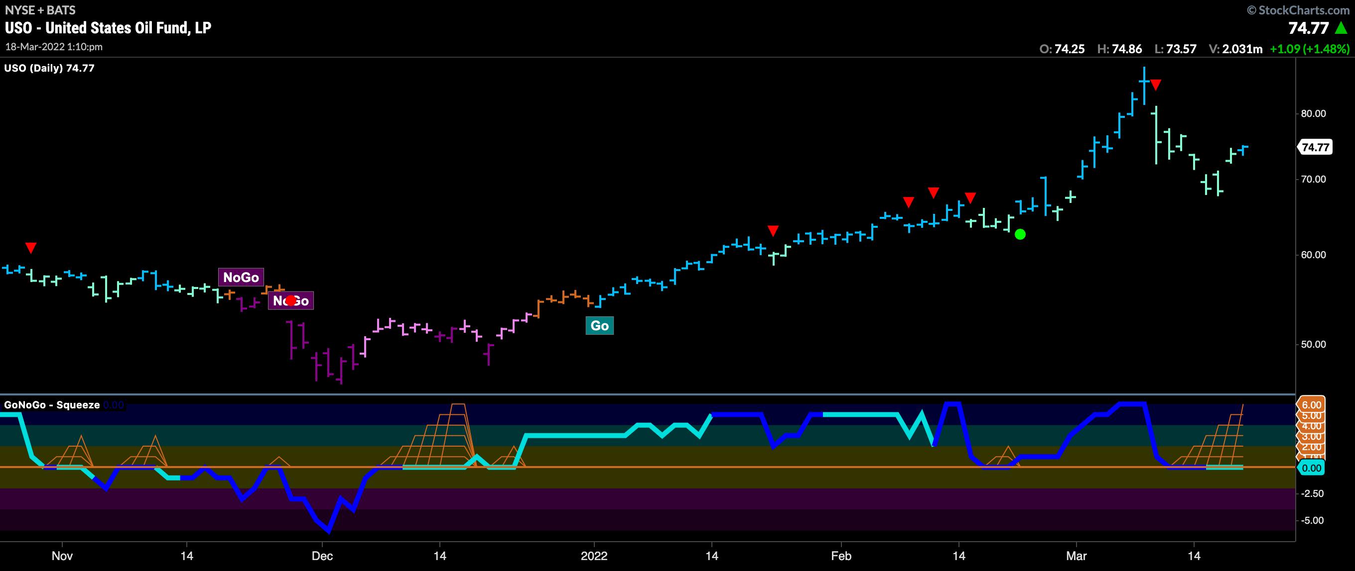
Oil has been champion of the markets since the start of the year, but we saw a significant pullback over the last two weeks. The chart below shows the GoNoGo Chart of $USO, the United States Oil Fund. The correction has caused the GoNoGo Oscillator to fall to the zero line, where it has remained. The GoNoGo Squeeze sees its grid climbing to a max as the oscillator is unable find directional momentum. If the GoNoGo Oscillator can continue to find support at zero and rally into positive territory, then we will see a Go Trend Continuation green circle appear under price, indicating that the "Go" trend is likely to persist and potentially attack the prior high.
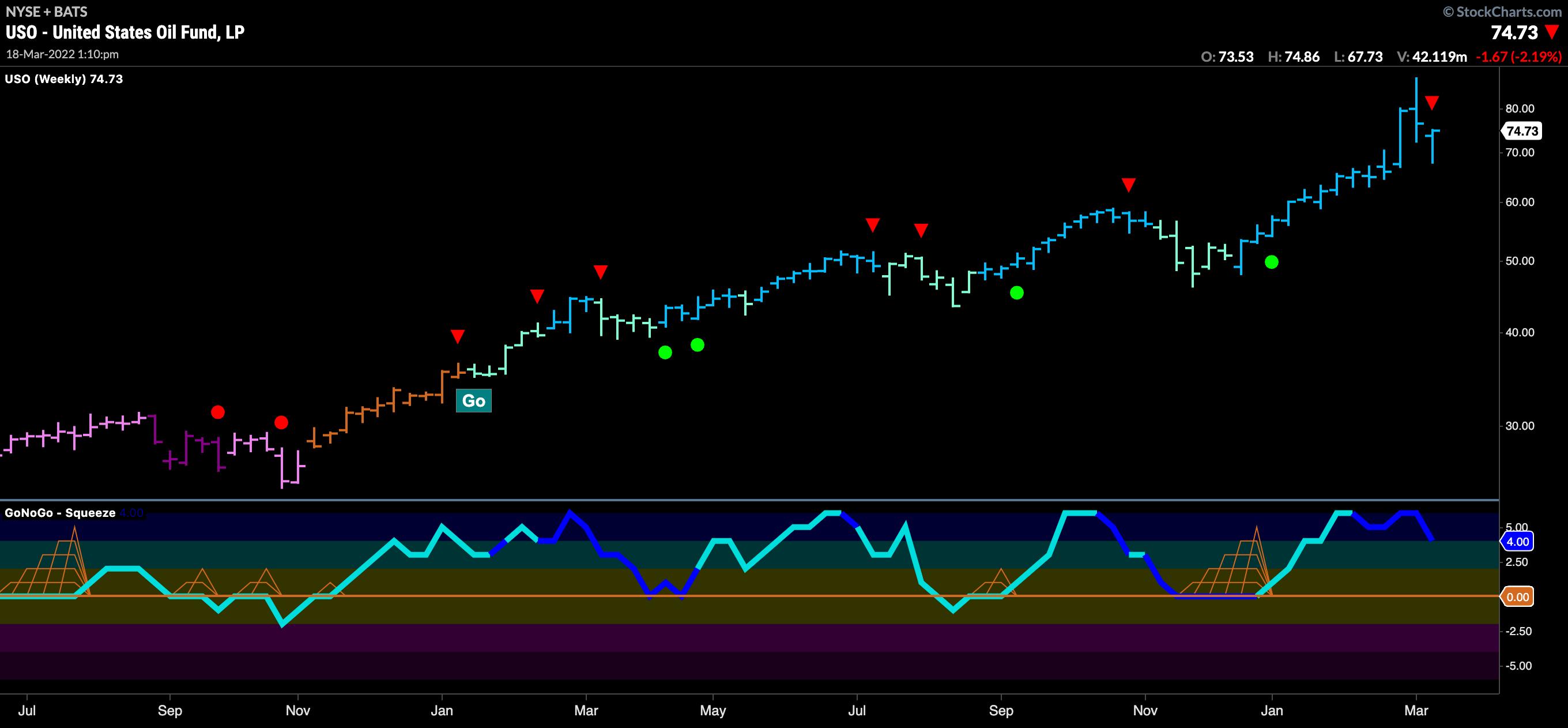
Looking at a GoNoGo Chart of $USO with weekly bars, we can see that there hasn't been much to threaten the larger "Go" trend. The GoNoGo Trend shows uninterrupted "Go" bars since January of 2021 and the GoNoGo Oscillator has consistently found support at the zero line each time momentum has returned in the direction of the "Go" trend. Given the trend is in place, perhaps we can look at the daily above as a "buy the dip" opportunity should the green trend continuation icon appear.
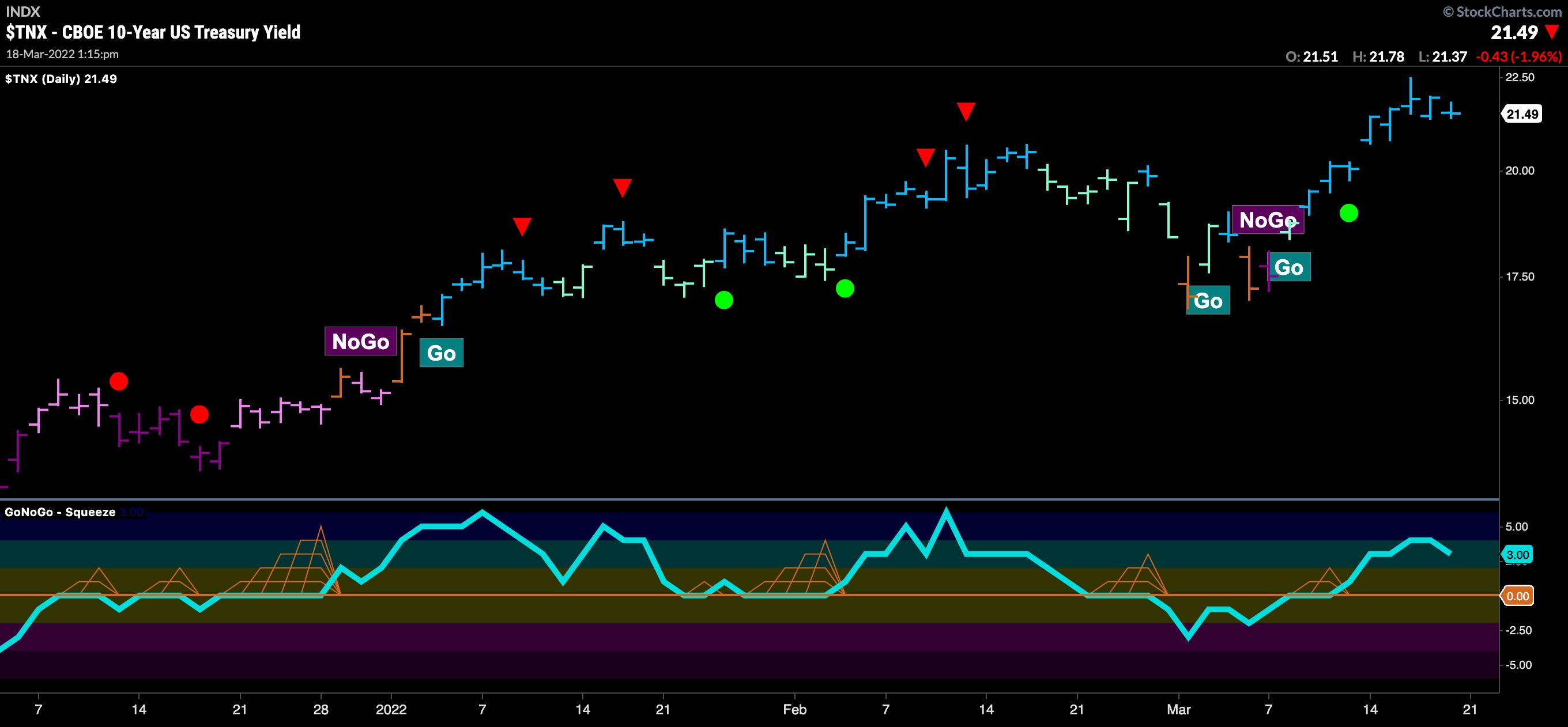
We have also seen a strong move in rates continue this week, with a string of uninterrupted bright blue "Go" bars as prices crept up over 2.2% on Wednesday to set a new higher high. The GoNoGo Oscillator shows that momentum is positive; prices reflect the expected behavior of the Fed as investors look toward consecutive rate hikes in 2022.
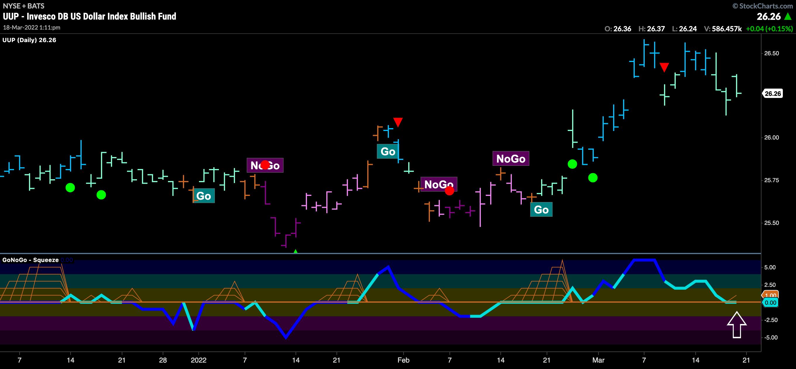
Interestingly, the Go trend in the dollar persists so far, even in the face of a rising rate environment. Below, we can see the GoNoGo Chart of $UUP, the Invesco Dollar Index Bullish fund. The GoNoGo Trend shows weaker aqua "Go" bars in the latter part of the week; this price activity has pushed GoNoGo Oscillator to fall to the zero line. This is now an important inflection point, as we know that, for the "Go" trend to remain in place and move higher, the GoNoGo Oscillator should not break support at zero and fall into negative territory. If the GoNoGo Oscillator fails to hold the zero line, we could see the greenback struggle to hold onto its "Go" trend.
Watch the latest edition of StockCharts TV's GoNoGo Charts show with Alex and Tyler!
Better Charts. Better Decisions.
Alex Cole & Tyler Wood
|
| READ ONLINE → |
|
|
|
|
|
| Top Advisors Corner |
| How to Analyze Bond Yields |
| by Mike Zaccardi |
The Fed hiked its policy rate by a quarter-point this week. The May FOMC meeting will be more interesting — odds suggest it could be either another 25 bps or a half-point increase. The market has already moved.
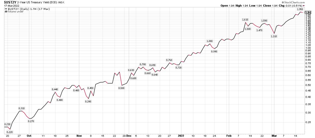
The U.S. 2-Year Treasury rate was barely above 0.2% in the third quarter last year; now, it is near 2%. With such a quickly-changing interest rate situation, clients and even advisors can be confused about what yield measurements to use when gauging bond funds.
U.S. 2-Year Treasury Yield
Look at the YTM
The effective yield to maturity (YTM) is the preferred indicator. It basically takes a bond's current price and assumes all future coupon payments are made along with the final return of principal. It's not so helpful to look at the trailing twelve months' total distribution, since you can never be quite sure of the timing of those cash flows. Moreover, the SEC yield — which is used to standardize yields on money market funds net of fund expenses — only uses the last 30 days of distributions, so that is not ideal. Finally, just using a bond indenture's stated yield as a gauge of a market-based interest rate is no good either.
A Relative Opportunity in Near-Dated Treasuries?
What can advisors do right now? You might consider parking client cash in a short-term Treasury fund, yielding near 2% given the shape of the Treasury yield curve. While very short-term rates inched up thanks to the Fed, many argue that money market funds and savings & checking accounts will be slow to see annual percentage yield inch higher.
Duration Risk
What's interesting about the yield curve right now is that you are not compensated for extending duration. For example, the 2-year and 30-year are not that far apart on their respective interest rates. In fact, the 2-year rate is above the 30-year rate. So, why take so much more duration risk? The answer to that is, if there is a dramatic drop in market rates, the long-dated bonds will move sharply higher.
But, right now, short-term Treasury bond ETFs have effective durations (as you might expect) of roughly two years. A 30-year Treasury STRIP might have an effective duration of 10 or 15 times that amount. You cannot park your cash way out there on the timeframe spectrum due to the extreme interest rate risk.
Conclusion
I do assert, though, that taking a tiny bit of interest rate risk with a 1-3 year Treasury fund is probably fine. Of course, you can still see your principal drop should near-dated rates rise dramatically. Also, money market yields will eventually turn higher once the Fed reaches their terminal policy rate — which market participants see near 2.6% by the third quarter next year.
Mike Zaccardi, CFA, CMT
Investment Writer, Zaccardi LLC
|
| READ ONLINE → |
|
|
|
| Mish's Market Minute |
| The 50-Day Moving Average Must Hold in the Major Indices |
| by Mish Schneider |
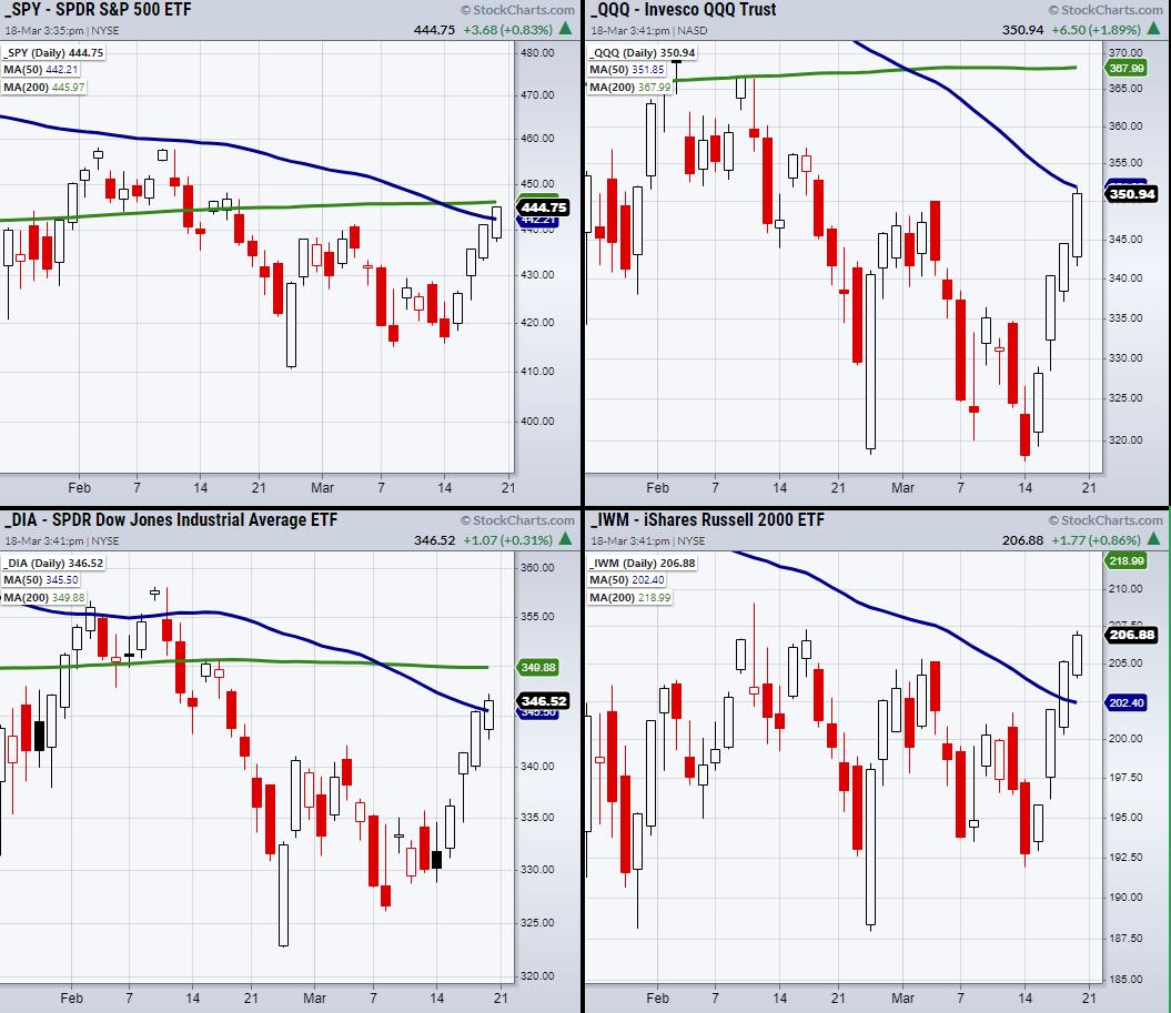
After the quarter-percent rate increase, the market continues to rally off recent lows. Now, all the major indices besides the Nasdaq 100 (QQQ) have cleared resistance from their 50-day moving average as seen in the above chart. So far, the Russell 2000 (IWM) is leading the way with a second close over its 50-DMA. Now we can watch for the rest of the indices to follow in IWM's footsteps.
Given the recent downward trend in the market, many investors have taken a defensive investing approach, buying more commodities and precious metals. But with the current rally, ETFs such as Silver (SLV), Sugar (CANE), and Oil (USO) have taken a breather. However, they still have upside momentum and have consolidated, showing that investors are still looking for their safety.
This gives us two potential trading opportunities. While the macro-economic situation has not changed with increasing rates and inflation, we can continue to watch for trading opportunities within commodities. On the other hand, equities are also showing more potential, with many companies trending upwards on a short-term basis.
Having said that, our trading approach continues to be from a rangebound/stagflation perspective. We continue to see potential in commodities, since we expect inflation to increase along with supply chain disruptions. However, we are also looking for trades in equities as we see the short-term potential to the upside. While the market may not make new highs, we can still watch for entries based on our recent lows holding and a breakout over key resistance levels, such as the 50-DMA, in the indices.
Follow Mish on Twitter @marketminute for stock picks and more. Follow Mish on Instagram (mishschneider) for daily morning videos. To see updated media clips, click here.
The question on everybody's mind right now is "Was that the bottom?" A lot of the doubt has to due to with the economy and the recent interest rate rise; however, the economy and the markets can be two very different things. On this week's edition of StockCharts TV's Mish's Market Minute, Mish examines the entire macro, looking for signs of strength or weakness. As always, Mish provides some actionable trading advice.
Mish also hosted the Friday, March 18 edition of StockCharts TV's Your Daily Five. The market has been extremely volatile, and investors are looking for bargains. Mish takes a look at a variety of sectors, and gives you an actionable trading plan on the stocks she finds interesting.
You can also watch Mish's latest appearance on Fox Business here.
ETF Summary
- S&P 500 (SPY): 446 200-DMA to clear next.
- Russell 2000 (IWM): Needs to hold over 207.
- Dow (DIA): 350 the 200-DMA.
- Nasdaq (QQQ): 352.52 the 50-DMA.
- KRE (Regional Banks): 73.17 the 50-DMA to clear.
- SMH (Semiconductors): 271.76 50-DMA to clear.
- IYT (Transportation): Needs to hold over 260.
- IBB (Biotechnology): 130 to hold.
- XRT (Retail): 79.18 to hold.
Forrest Crist-Ruiz
MarketGauge.com
Assistant Director of Trading Research and Education
|
| READ ONLINE → |
|
|
|
| ChartWatchers |
| Preserving Capital in a Challenging Environment |
| by John Hopkins |
Back on December 31, 2021, our Chief Market Strategist Tom Bowley penned a ChartWatchers article titled "It Could be a Very Rough Start to 2022". Boy, was he right! In fact, look at the two charts below, showing the performance of both the S&P and NASDAQ since Tom's prescient call and as they hit their respective bottoms.
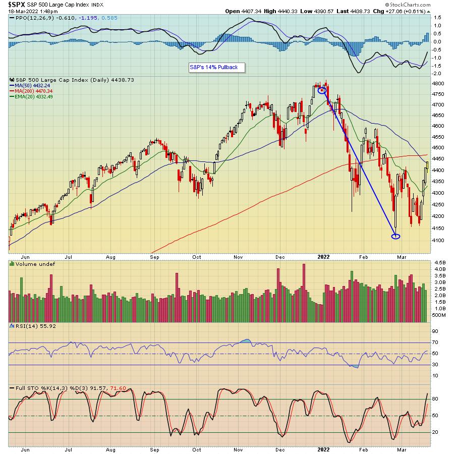
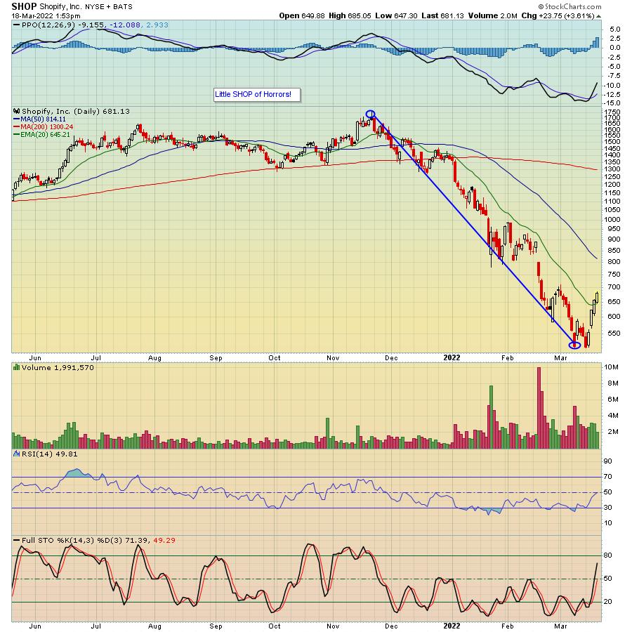
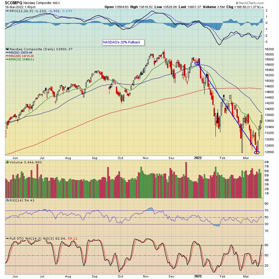 As you can see, from December 31, 2021 to their respective lows, the S&P gave up almost 14% and the NASDAQ gave up 20%. But that doesn't tell the whole story. Instead, as we've seen, some stocks like Shopify (SHOP) gave up a whopping 70% over just a few months. As you can see, from December 31, 2021 to their respective lows, the S&P gave up almost 14% and the NASDAQ gave up 20%. But that doesn't tell the whole story. Instead, as we've seen, some stocks like Shopify (SHOP) gave up a whopping 70% over just a few months.

SHOP wasn't alone, There have been a TON of growth tech stocks that suffered huge losses; SHOP simply shows what many charts have looked like during the vicious market rotation.
Finally, last week, traders realized that the selling in stocks like SHOP had gone too far. As a result, those that have been hit the hardest were scooped up last week, though still remaining well below their respective highs before the carnage began.
So now what? Well, since Tom has done a masterful job of guiding our members through these tumultuous times -- including correctly predicting a major bounce into Friday's options expiration -- he's decided to conduct a "Market Update" webinar this Wednesday, March 23 at 4:30 PM EST. This timely event is FREE for all members of the EarningsBeats and StockCharts communities and you can learn more by clicking here. You really don't want to miss this one, as Tom will be discussing how Cyclical Bear Markets unfold, how to spot Potential Bottoming Signals and more.
Every trader wants to make money, no matter the market environment. The key is having the knowledge to know when to get aggressively long or short or simply sitting on the sidelines. Sitting on the sidelines can get mighty boring, but if it has the intended effect of preserving precious capital, it should most definitely be considered as an option.
At your service,
John Hopkins
EarningsBeats.com
|
| READ ONLINE → |
|
|
|
| MORE ARTICLES → |
|
 The S&P 500 SPDR (SPY) surged 5.77% from Tuesday to Thursday and this was the biggest 3-day surge since the 6.07% advance on November 5th, 2020. This early November surge led to a breakout and the advance extended until January 2022. The current surge also shows some serious short-term strength, but there are some key differences between now and November 2020. Let's investigate.





 As you can see, from December 31, 2021 to their respective lows, the S&P gave up almost 14% and the NASDAQ gave up 20%. But that doesn't tell the whole story. Instead, as we've seen, some stocks like Shopify (SHOP) gave up a whopping 70% over just a few months.