| THIS WEEK'S ARTICLES |
| John Murphy's Market Message |
| DEFENSIVE SECTORS LEAD THIS WEEK |
| by John Murphy |
STOCKS HAVE WORST QUARTER IN TWO YEARS...The month of March has seen a rebound in stocks. Even with that rebound, however, the first quarter of this year has been the weakest in two years. Which raises the bigger question of whether or not the recent rebound is the start of another upleg in the market, or part of a major topping process. All things considered, I lean toward the more negative view. Which suggests that stocks could be forming a major top. Energy stocks have been the strongest part of the market so far this year. Other leaders include utilities, financials, consumer staples, and materials. Communications, consumer discretionary, and technology have been the biggest losers.
DEFENSIVE SECTORS LEAD... Chart 1 shows sector performance over the last week which may be telling us something about the strength of the current rally as we end the first quarter. What's most concerning is that the top four sectors are defensive in nature. They include real estate, utilities, consumer staples, and health care. Their leadership suggests more caution over the shorter run. While financials, materials, energy, and industrials have slipped in the weekly ranking. A pullback in the price of crude oil has slowed the advance in energy shares which has been a positive for stocks in general. By contrast, financials were the weakest sector this week, with banks leading them lower. That may be the result of a flattening yield curve which is also raising larger concerns about the health of the economy and stock market.
 Chart 1 Chart 1
BANK STOCKS WEAKEN ON FLATTER YIELD CURVE... Chart 2 shows the S&P Bank SPDR (KBE) having a weak quarter and falling below its 200-day moving average. Banks were the weakest part of the weakest sector over the past week. That may be due to a flattening yield curve. The green line plots the spread between 10-Year and 2-Year Treasury yield and has fallen to the lowest level in two years. While rising bond yields are normally good for banks, rising short-term yields can hurt their earnings. During the first quarter, short-term yields have risen faster than longer-term yields which has caused the spread between them to flatten. That explains why the version of the yield curve shown in Chart 2 has been falling. While that's a negative factor for bank stocks, the flattening yield curve is also raising broader concerns about the state of the economy. That's because that version of the yield is close to inverting.
 Chart 2 Chart 2
YIELD CURVE NEARS INVERSION... The green line in Chart 3 shows how far the spread between the 10 year and 2 year Treasury yield has fallen this year. The spread between the longer and shorter yield has fallen to the lowest level since 2019 which was the last time this version of the yield curve inverted (see green circle). That takes place when the green line dips below the zero line into negative territory (see flat green line). That means that the shorter yield has risen above the longer yield. The main reason for the falling yield curve is the steep jump in the 2-year yield (red line) on expectations that the Fed is embarking on a more hawkish policy of raising short-term rates to combat rising inflation. Long term yields have also risen but at a slower pace than shorter yields. An inverted yield curve would be a warning of a possible recession. That would a warning for stocks which usually peak months before the start of an economic recession.
 Chart 3 Chart 3
|
| READ ONLINE → |
|
|
|
| ChartWatchers |
| Wild Swings and a Classic Setup for Palladium |
| by Arthur Hill |
 Volatility is through the roof for many commodities and commodity-related ETFs, but this does not mean we have to abandon technical analysis and classic setups. High volatility does, however, imply higher risk and we probably need to give setups a little more wiggle room. Volatility is through the roof for many commodities and commodity-related ETFs, but this does not mean we have to abandon technical analysis and classic setups. High volatility does, however, imply higher risk and we probably need to give setups a little more wiggle room.
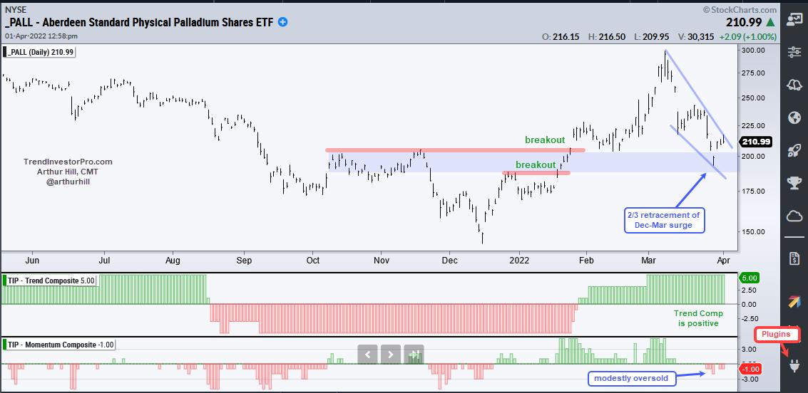
The Palladium ETF (PALL) surged over 100% from mid December to early March and then fell around 33% by the end of March. Despite huge moves, the long-term trend remains up and the ETF has a classical bullish setup working.
First, notice that price broke above the October-November highs in late January and the Trend Composite also turned positive (bullish) at this time. PALL extended higher and then fell back to the blue support zone. "Broken resistance turns support" is a classical tenant of technical analysis. These two broken resistance levels combine to mark a support zone and price returned to the breakout zone.
The pattern and the retracement amount are also typical for corrections within bigger uptrends. Notice that the decline formed a falling wedge and retraced around 2/3 of the prior advance. This is like three steps forward and two steps backward.

PALL forged a short-term reversal this week and could be poised for a wedge breakout, which would signal an end to this correction and a resumption of the bigger uptrend. Note that volatility is WAY above average and this makes it a risky proposition.
This week at TrendInvestorPro.com I continued the Trend Composite strategy series with part eight. This series quantifies a trend-momentum strategy based on trend signals, performance rankings and bull/bear regimes. This week's segment added a percentage-based profit target. Click here for immediate access to this series and more.
On this week's Next Level Charting (video here), I covered the fourth price thrust in as many years for the S&P 500 SPDR. The current thrust, however, could follow the 2011 pattern. I also covered the Palladium ETF as it hit a potential reversal zone.
The Trend Composite, ATR Trailing Stop and nine other indicators are part of the TIP Indicator Edge Plugin for StockCharts ACP. Click here to take your analysis process to the next level.
---------------------------------------
|
| READ ONLINE → |
|
|
|
| The Mindful Investor |
| Utilities vs. Technology - Which Sector Wins? |
| by David Keller |
In a fantastic sign of the times, I find myself writing an article with a legitimate discussion as to which of these two sectors has a more attractive technical setup - Utilities or Technology.
For younger investors, the idea that anything other than Technology would be leading the market is a bit of a head-scratcher. How should a boring utility company be outperforming a leading-edge technology firm?
I've learned that "should" is indeed a four-letter word for investors. Down the road, people will debate why gold outperformed the S&P 500, or why banks underperformed during a rising rate environment, or whatever particular reality actually plays out. Technical analysis is not about what should happen, but about what is happening. The reasons for why this is the case often appear crystal clear in the rear-view mirror!
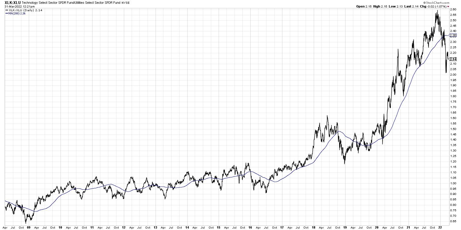
That brings up to today's comparison between Utilities and Technology. If we look at the long-term chart, going back to the 2009 market bottom, you can see that indeed the Technology sector has been a fairly consistent outperformer. In fact, there are only brief periods where Utilities have been able to outperform (i.e. where this ratio turns lower).

In 2015-2016, 2018 and late 2020, there were stretches of over three months where Utilities outperformed. So why is this such a rare occurrence? Well, for starters, the equity markets tend to appreciate over time. One of the big paper charts in my office shows the US equity markets back to 1921. I can assure you that the long-term trends in stocks in higher. What is more likely to outperform in a rising equity market - companies designed to grow earnings in the coming years, or those relatively low-volatility defensive plays with a healthy income component?
So... is this time different?
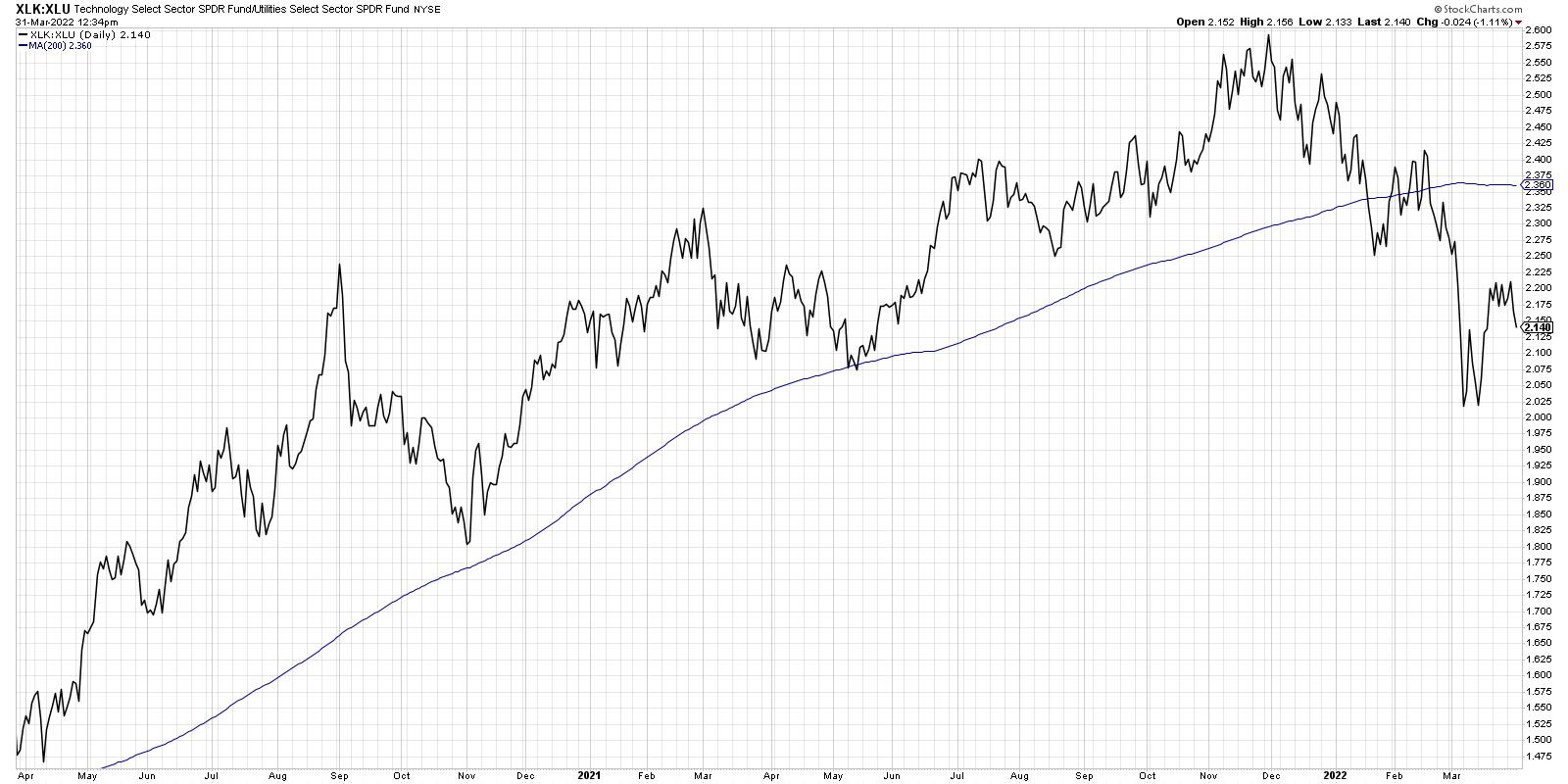
Notice the far right end of the above chart, and you'll see how the ratio has taken its steepest downturn since 2009. Let's zoom into the last two years to see that in more detail.

On my closing bell show, The Final Bar, we've been discussing how the equity markets actually topped out in November of last year. While the S&P 500 made a higher high at year-end, the Nasdaq actually topped out in November. On top of that, common measures of market breadth and price momentum all topped out in November as well. So it's not surprising to see that the ratio of Technology vs. Utilities topped out in November as well!
What's next for this ratio, and what does that mean for your portfolio? As interest rates move higher through the course of 2022 and 2023, that should provide a major-league headwind for growth stocks. Does that mean Technology will underperform for the next two years? Not necessarily. But it does make it much more likely that there will be periods where defensive sectors do well, particularly during periods of market uncertainty.
The problem with Utilities here is that, as interest rates rise, the income component embedded in dividend-paying stocks becomes less attractive. If bonds are paying a decent yield, why would you take on the additional risk owning stocks?
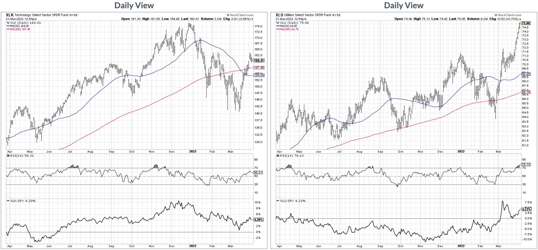
At the end of the day, to be honest, none of that really matters. What matters is price. And price is saying that the Utilities sector is breaking to new all-time highs this week, while Technology is still struggling to eclipse its February high. This story is perhaps best told using the Comparative GalleryView feature on StockCharts, where you enter two tickers separated by a comma.

Here, we can see the XLU breaking to new all-time highs this week, as well as the XLK lagging behind in terms of price momentum. When in doubt, follow the price!
Want to learn more about Comparative GalleryView? I just posted a YouTube video including two other hidden features of StockCharts. You can find it over at my YouTube channel!
RR#6,
Dave
David Keller, CMT
Chief Market Strategist
StockCharts.com
Disclaimer: This blog is for educational purposes only and should not be construed as financial advice. The ideas and strategies should never be used without first assessing your own personal and financial situation, or without consulting a financial professional.
The author does not have a position in mentioned securities at the time of publication. Any opinions expressed herein are solely those of the author, and do not in any way represent the views or opinions of any other person or entity.
|
| READ ONLINE → |
|
|
|
| ChartWatchers |
| Revisiting the Vertical Rise in Mortgage Rates |
| by Carl Swenlin, Erin Swenlin |
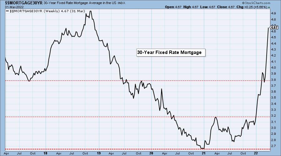
The following is an excerpt from this week's subscriber-only DecisionPoint ALERT Weekly Wrap.
We have been commenting on mortgage rates for several months, and this week we finally saw a report on Fox Business that reported on the problem of rising mortgage rates. Also, for a couple of weeks, we have been hearing a local radio commercial that says, after months of frantic real estate sales, we now have some homes that are not selling. This could put pressure on buyers to lower prices.
Won't this bring prices back into the range for average buyers? Maybe, but people whose buying enthusiasm bids home prices up will become less enthusiastic about buying when prices are coming down. Falling real estate prices are not what they have been conditioned to expect from the HGTV House Hunter shows.
We keep hearing about a shortage of inventory. Where are people going to live? Well, they are living somewhere now. Maybe they want to move up, but if they can't, they won't.
MORTGAGE INTEREST RATES (30-Yr)**
**We watch the 30-Year Fixed Mortgage Interest Rate, because, for the most part, people buy homes based upon the maximum monthly payment they can afford. As rates rise, a fixed monthly payment will carry a smaller mortgage amount. As buying power shrinks, home prices will come under pressure.
This week, the 30-year fixed mortgage rate rose from 4.42% to 4.67%, which is over two percentage points above the low of 2.65% just 15 months ago. Assuming a fixed monthly payment of $2,015, the mortgage that a buyer can afford is 20% lower than it was in January 2021. All the while, home prices have been soaring (up +19% per https://realestatedecoded.com/case-shiller/), putting a double squeeze on buyers. But there are signs that this is about to change.


Conclusion: Cheap money has created another real estate bubble (thank you Federal Reserve), and conditions are ripe for that bubble to be popped.
Good Luck & Good Trading!
Carl & Erin Swenlin


Click here to register in advance for the recurring free DecisionPoint Trading Room! Recordings are available!
Technical Analysis is a windsock, not a crystal ball. --Carl Swenlin
(c) Copyright 2022 DecisionPoint.com
Helpful DecisionPoint Links:
DecisionPoint Alert Chart List
DecisionPoint Golden Cross/Silver Cross Index Chart List
DecisionPoint Sector Chart List
DecisionPoint Chart Gallery
Trend Models
Price Momentum Oscillator (PMO)
On Balance Volume
Swenlin Trading Oscillators (STO-B and STO-V)
ITBM and ITVM
SCTR Ranking
Bear Market Rules
DecisionPoint is not a registered investment advisor. Investment and trading decisions are solely your responsibility. DecisionPoint newsletters, blogs or website materials should NOT be interpreted as a recommendation or solicitation to buy or sell any security or to take any specific action.
|
| READ ONLINE → |
|
|
|
| ChartWatchers |
| Financial Charts are Crumbling |
| by Greg Schnell |
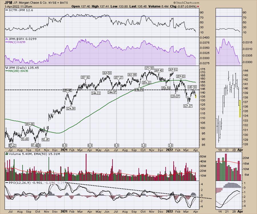
With the bank stocks moving lower, well below the 2021 range, it is an odd "rebound" in the indexes. The difference between the bank price action and the indexes is starting to become meaningful. I went through a few of the bank stocks in the financial sector to see what is going on.
JP Morgan (JPM)
JPM - the Just Print Money stock is actually below the range of the last three quarters in 2021. The real issue is the technical backtest at the neckline and now the accelerating breakdown below that. For technicians, this is textbook down-trending price action.
- The stock falls below the 200-DMA (daily moving average) in green.
- It bounces back up, but fails to regain the prior highs and stalls at the 200-DMA (mid February). Then the stock pushes lower to the next level of support (2021 lows and the year-end 2020 price level) and bounces March 14.
- The stock rallies again, but fails at the neckline this time, not getting anywhere near the 200-DMA.
- The stock is making a series of lower highs and lower lows; for technicians, the definition of a downtrend. But there were other clues on the chart. On the ultimate high, the SCTR rallied briefly but failed to hold above the 75 level. The stock price made a marginal new high, but rolled down quickly. It rallied again into early January, participating in the Santa Claus rally. But bigger pain was just around the bend.
- The stock gapped lower -- presumably from earnings -- and the downtrend was under way. It all looks so easy in hindsight. The relative strength in purple made new 12-month lows in December, prior to the stock gapping down. That can be a great clue to underperformance, but long-term buy-and-hold investors don't use those clues.

The PPO momentum indicator continues to make a series of lower highs. For me, the stock is an avoid.
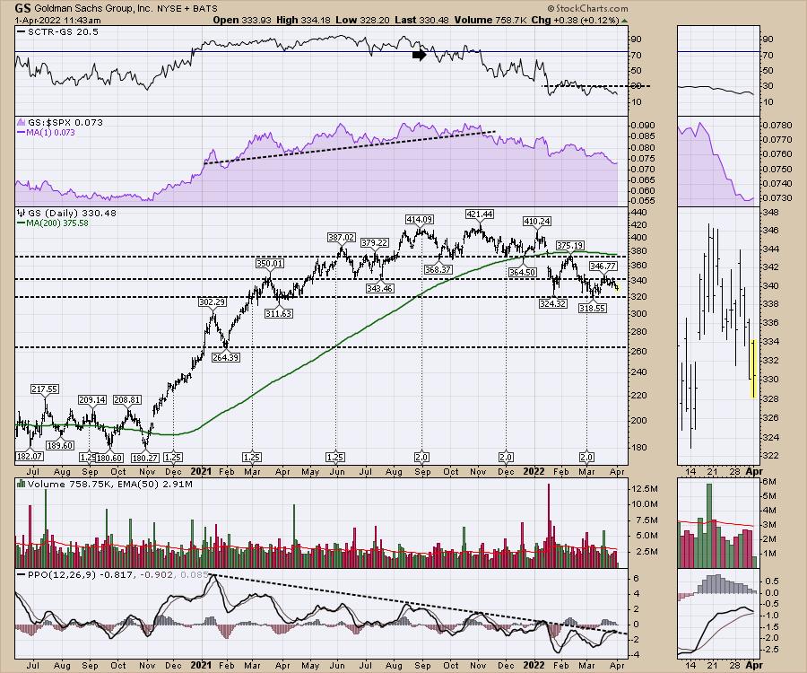
Goldman Sachs (GS)
Looking at Goldman Sachs, the chart is just as wobbly. All the same conditions are in place. The SCTR says 80% of the stocks have better price action. There is no reason to buy the stock here.

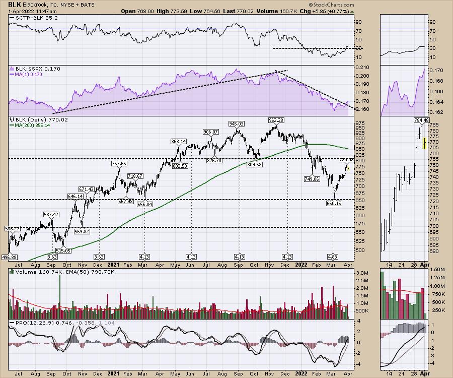
BlackRock (BLK)
Before we get too bearish, the chart of BLK should be examined. It has been in a downtrend, but the relative strength compared to the $SPX has broken the downtrend. It's at least trying to bounce, unlike the other two.

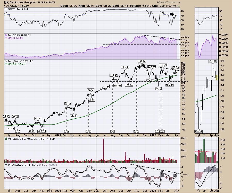
Blackstone (BX)
So that takes us to BlackStone, where the CEO is the king of big pay cheques, making $1.1 billion last year.
The chart is in much better shape than all three of the above, but the stock peaked in November. It has been moving in a tight range, with support around the $110 level. Can it hold here and start to work higher, or will it turn out to be just one phase shift behind the others and begin to move lower in earnest?

As the financial charts show duress, it's no wonder the average portfolio is having trouble making money. If these money-printing organizations are being sold off, what does that say about the rest of the market? Well, I have something to say about that!
I recently recorded a Market Buzz that you might find interesting, titled "20-Year Trends are Breaking".

Cover Graphic for Market Buzz Video
I also recorded the monthly conference call for clients at OspreyStrategic.org on March 31st. You can try a subscription to the site for just $7 for the first month by following the link above. After signing up for the offer, click on the tab Gold Members. If you are wondering why portfolio managers, hedge funds and high-net worth individuals are clients, this is a great opportunity to check out the unique indicators and insights Greg provides.

Best wishes for a great second quarter. Based on the charts above, it should be eventful.
|
| READ ONLINE → |
|
|
|
| Martin Pring's Market Roundup |
| The Fed Raises Rates; What If it's Already Priced into the Market? |
| by Martin Pring |
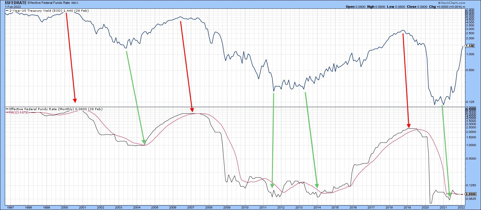
Markets discount the future, so if the Fed tells the market it's going to raise rates, it goes ahead and raises them anyway. Why wait on the railroad tracks when you know a train is coming? Ironically, the widely-telegraphed rate rise has arrived at a time when bond yields across the board have begun to run into mega resistance. Perhaps it's time for some corrective activity on the part of yields?
Market Leads the Fed
Chart 1 compares the Fed-controlled Federal Funds rate to the yield on the 2-year treasury. Please note that because the funds rate is only updated monthly on the StockCharts database, the latest hike does not yet show up in the chart. Regardless, the green and red arrows point up that, most of the time, the bond market, in the form of the 2-year yield, leads the "lagging" Fed at both peaks and troughs.
 Chart 1 Chart 1
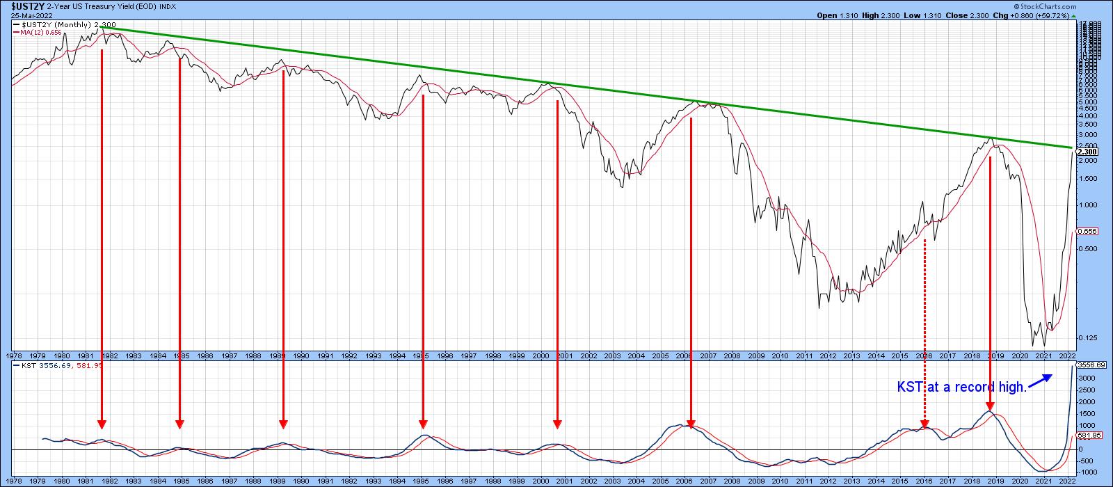
There is no sign at the moment that the 2-year is peaking, but it is evident that the yield in Chart 2 has run into mega-resistance in the form of its 1981-202? trendline. The KST is also at a record, which suggests incredible upside momentum consistent with a very long-term or secular reversal. That said, momentum doesn't rise forever. Going forward, more of the parameters used in the calculation of the KST will be compared to periods when the rate not only stopped going down, but was involved with the early stages of the post-2020 rally. In short, the KST is likely to peak at any time.
The red arrows show that previous KST downside reversals were generally followed by a primary trend decline. This leaves us with the likelihood that a new secular bull market, characterized by the record-breaking KST, is running into its first technical challenge, in the form of that the overhead resistance combined with the potential for a near-term KST peak. In other words, down now, up later?
 Chart 2 Chart 2
Secular Reversals Usually Take the Form of a Giant Trading Range
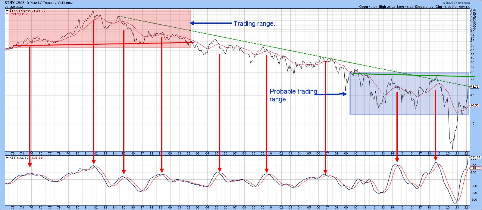
This idea of renewed accumulation is consistent with previous secular reversals going back to the nineteenth century. Chart 3 looks at that aspect with the 10-year yield. The pink shading identifies the head-and-shoulders top that developed at the top of the post-World War II secular bull market. The blue shading offers a possible base-forming scenario for the termination of the 1981-20?? secular bear. Note that the 10-year, like its 2-year counterpart, is bumping up against its secular resistance trendline. The KST is once again at a record level, suggesting that the secular trend may have hit bottom in 2020. However, resistance at the line again weighs in, with the possibility of a correction coming first.
 Chart 3 Chart 3
Yields of Most Maturities Challenge their Secular Down Trendlines
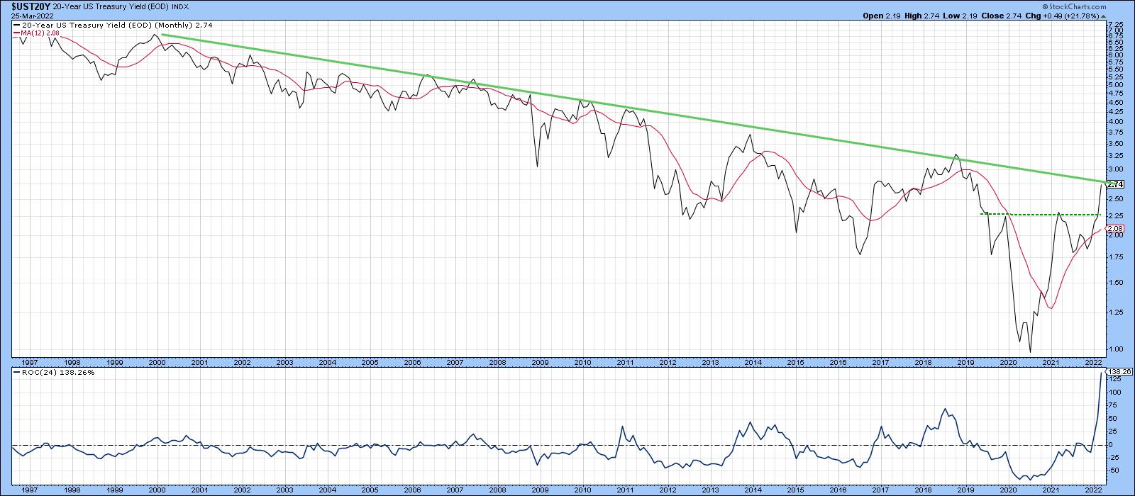
The 20-year yield is featured in Chart 4. Most impressive is the record-smashing 24-month ROC which, coming off a major bottom, again represents a characteristic of a secular reversal. The yield has completed a reverse head-and-shoulders formation and has the potential to ultimately move higher. For the moment, though, it is also running into resistance at its secular down trendline. If a correction does develop, it is likely to be contained at support in the form of the extended neckline.
 Chart 4 Chart 4
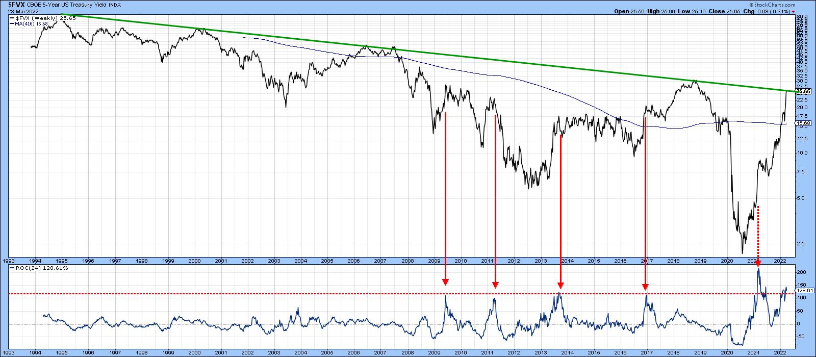
The 5-year maturity offers a link between shorter- and long-term maturities. Chart 5 shows that it has also just rallied to its secular down trendline. In this instance, the history only goes back to the mid-1990s, but the message of massive resistance is the same. After all, the line has been touched or approached on numerous occasions and is lengthy enough to be regarded as a significant barrier. The 24-week ROC is once again overextended and could therefore be close to peaking again.
 Chart 5 Chart 5
International Bonds at Resistance
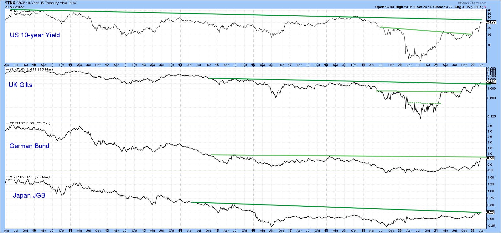
Bond markets are not only at resistance in the US, but around the world as well. In that respect, Chart 6 shows that British, German and Japanese 10-year bonds have all reached multi-year trendlines, with a slight breakout by the British Gilts.
 Chart 6 Chart 6
Arithmetic vs. Log Scaling
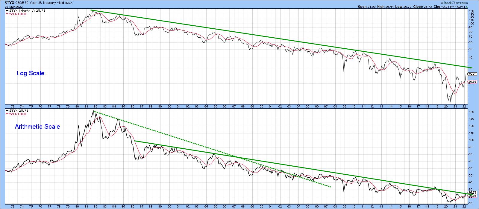
Chart 7 features the 30-year yield. It is evident that this ultra-long-term maturity has not yet reached its secular down trendline. That said, if we plot the same series using arithmetic scale, the yield is very slightly above the solid secondary secular down trendline. That's because arithmetic down trendlines are penetrated more quickly than those drawn on a log scale. The opposite is true for up trendlines. The true (dashed) secular down trendline joining the 1981 top to the 1984 was penetrated many years ago, well ahead of the final low and thereby offering a premature signal. It's an example of why log scale is the preferred technique in almost all long-term situations.
 Chart 7 Chart 7
Good luck and good charting,
Martin J. Pring
The views expressed in this article are those of the author and do not necessarily reflect the position or opinion of Pring Turner Capital Group of Walnut Creek or its affiliates.
|
| READ ONLINE → |
|
|
|
| Trading Places with Tom Bowley |
| Do Not Make This Critical Mistake - Nearly Everyone Does |
| by Tom Bowley |
The stock market never works the way we think it should. When the news stories are bleak, we tend to think the stock market must react negatively. But that's not the way things work. Most times, the stock market bottoms LONG BEFORE we see any positive developments in the fundamentals. Let me give you a perfect example and one that reminds me a LOT of today's market action:
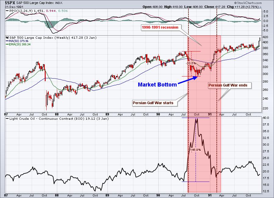
1990-1991 Persian Gulf War
The Persian Gulf War was just one of a number of problems during that time period. Similar to today, crude oil prices ($WTIC) soared 147% from $17 per barrel to $42 per barrel in a very short period of time - from July through September 1990. There was also a recession that lasted from July 1990 through March 1991, mostly as the result of restrictive Federal Reserve policy in 1989 and 1990 to fight inflation. Oh, and we had just recovered over the prior 2-3 years from a dramatic market drop - the 1987 market crash.
Does this all sound familiar?
During the 3rd quarter of 1990, the S&P 500 fell just over 20%, resulting in a cyclical bear market. But while the war and the recession lasted well into 1991, the stock market bottomed long before in early-October 1990:

The red-shaded area represents the timing of 1990-1991 recession. The dotted vertical lines mark the beginning and end of the Persian Gulf War. Note when the market bottom occurred - well before either of the other two ended. So if you ever wonder, "how can the stock market move higher with so much bad news out there?", just remember that the stock market looks ahead. Wall Street sees things that we can't see. It looks beyond the current troubles, many of which will go away over time.
Currently, we see crude oil soaring, a major conflict in Eastern Europe, and a determined Fed that's begun its fight against inflation and plans to continue hiking interest rates throughout 2022 and into 2023. It's all occurring within 2 years of a major market decline that resulted from the 2020 pandemic. It sounds a lot like 1990, doesn't it? So how could the stock market possibly have bottomed with its February low? While I'm not convinced it has, I certainly realize that it's quite possible, because that's how the stock market works. Bottoms do not occur when media outlets start reporting good news. First of all, they don't report good news as their viewers/readers will drop by a half to two-thirds. Bad news sells, so we'll continue seeing terribly negative headlines. If you want to see or anticipate the bottom, stick with the charts.
In tomorrow morning's EB Digest, our FREE newsletter, I'm providing an S&P 500 chart to help illustrate what I believe is going to happen in the coming days and weeks based on key technical price levels. If you'd like to join our growing EB community and receive this S&P 500 chart tomorrow, simply provide your name and email address HERE. There's no credit card required and you may unsubscribe at any time. We'll keep your information private as well, never providing your information to third parties.
Happy trading!
Tom
|
| READ ONLINE → |
|
|
|
| Mish's Market Minute |
| If the Market Holds, Watch Bitcoin and the Biotech Space |
| by Mish Schneider |

The past week was a chop fest in the major indices, with large intraday price swings. While the 3 major indices closed roughly flat on Friday, the Russell 2000 (IWM) made a late-day turnaround, ending up over 0.8% on the day. Although IWM closed under its pivotal $209 level, it looks to be attempting to hold the $206 area. With that said, on Monday, we should watch for IWM to again clear and hold over $209.
Moving on to Mish's Economic Modern Family, two of the seven members show strength as they held important areas in both price and momentum. In the above chart, you can see Bitcoin on the left and the biotech ETF (IBB) on the right. Underneath both charts are our Real Motion and Leadership indicators.
Currently, Bitcoin has been battling to hold its new support level at 45K. If it can hold, it will look to clear resistance from its 200-day moving average at 48k. When it comes to momentum, the dotted red line is holding near its upper band, showing both momentum and price agree. If BTC continues higher, we can watch for both momentum and price to clear the 200-DMA. It should also be noted that BTC is outperforming the S&P 500 (SPY) based on the leadership indicator.
Pivoting away from the crypto space, of all the ETFs in Mish's Economic Modern Family, the biotech space (IBB) closed the strongest on Friday. Again, both momentum and price are moving together while the leadership indicator shows that IBB is outperforming SPY.
With that said, on Monday we should watch for a continuation of the biotech space and, when it comes to Bitcoin, keep an eye out for 45k to hold and 48k to clear.
Follow Mish on Twitter @marketminute for stock picks and more. Follow Mish on Instagram (mishschneider) for daily morning videos. To see updated media clips, click here.
With volatile and choppy markets traders and investors need to know when to put your money to work, and when to sit on the sidelines. On this week's edition of StockCharts TV's Mish's Market Minute, Mish takes a look at hot meme stocks and gives actionable information.
ETF Summary
- S&P 500 (SPY) 447 support.
- Russell 2000 (IWM): 209 pivotal.
- Dow (DIA): 343 the 50-DMA.
- Nasdaq (QQQ): 348 next main support. 369 to clear.
- KRE (Regional Banks): Confirmed caution phase with second close under the 200-DMA at 69.
- SMH (Semiconductors): Watch for second close under the 50-DMA at 266.
- IYT (Transportation): Large selloff does not look good. Watching for a breakdown into the 250 area.
- IBB (Biotechnology): 127 main support the 50-DMA.
- XRT (Retail): Back into a bearish phase with second close under the 50-DMA at 77.
Forrest Crist-Ruiz
MarketGauge.com
Assistant Director of Trading Research and Education
|
| READ ONLINE → |
|
|
|
| ChartWatchers |
| A Winning Strategy During Earnings Season |
| by John Hopkins |
In this extremely volatile market, it pays to develop a trading strategy that can work in any market environment. And with Q1 Earnings getting ready to heat up in just a week or two, this, in turn, should provide traders with a ton of opportunities to make money through focusing on those companies that not only beat expectations, but guide higher as well.
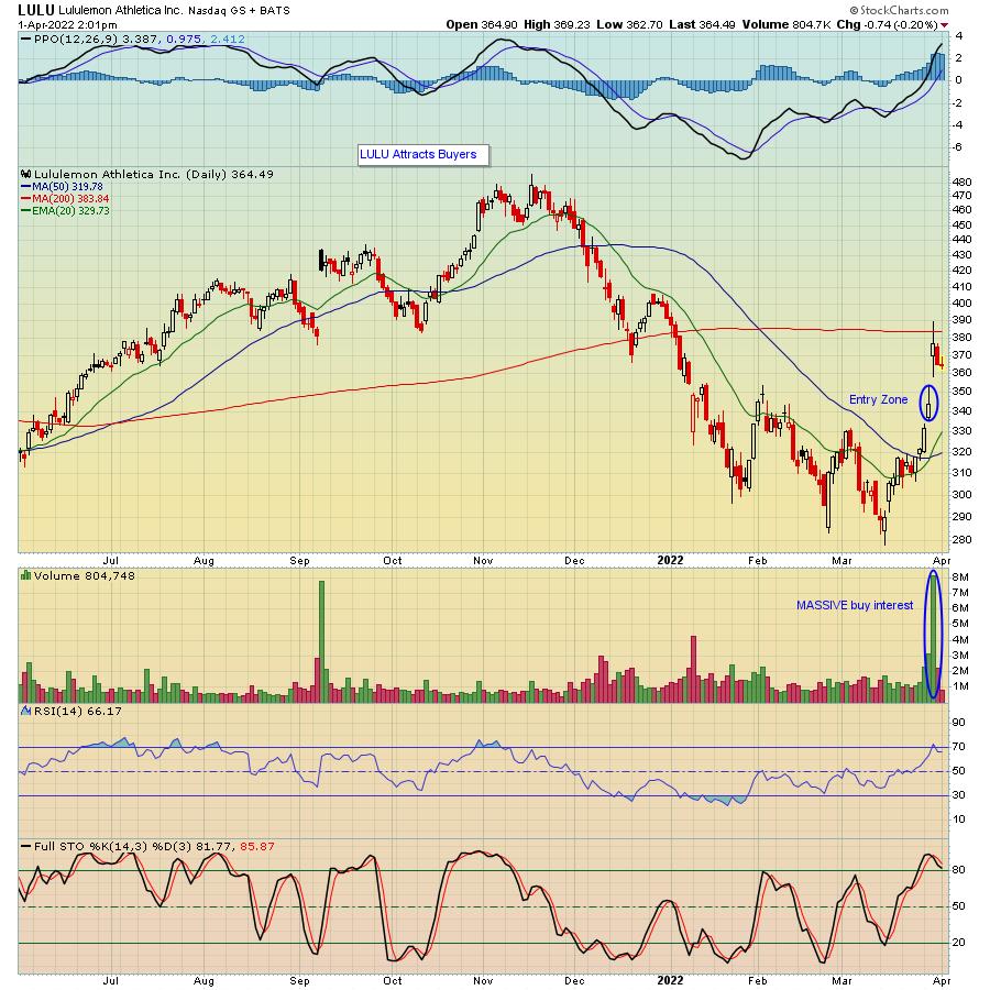
A perfect example of this strategy is Lululemon (LULU), which reported its earnings last week, beat expectations and guided higher as well. As a result, the stock rose over 13% when its numbers were revealed.

I point to LULU as, after the initial pop to the upside, it pulled back 25 points, providing an opportunity to get involved in a trade for those who did not own the stock when earnings were reported. And I've shown another possible entry level in case the stock pulls back even more, providing an even better reward-to-risk trade.
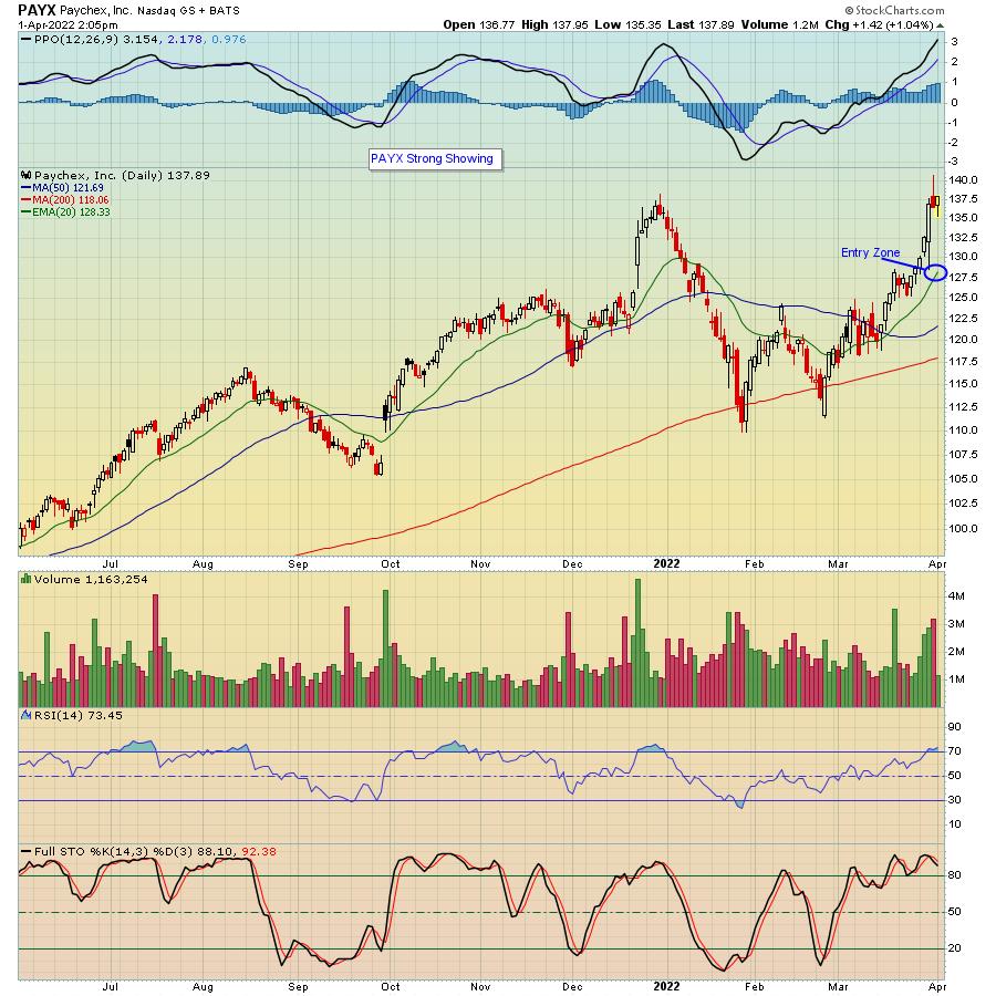
Another company that reported this past week was Paychex (PAYX), which both beat expectations and guided higher. As a result, the stock moved higher, hitting an all-time high.

What I like about this strategy is it focuses on the "best of the best" -- that is, companies that show the one-two punch of both beating earnings expectations and guiding higher as traders tend to gravitate to winners. It then becomes a matter of letting any initial euphoria wear off while looking for levels to enter on any pullbacks.
In order to put this strategy to work, you need to be able to identify those companies that both beat earnings expectations and guide higher. At EarningsBeats, we've developed our "Strong Earnings ChartList". Our current list, available exclusively to our subscribing members, contains 489 companies (and accompanying charts) that have beaten Wall Street consensus estimates as to both revenues and earnings, are liquid and have solid technical charts. In other words, those companies you want to examine as possible trading candidates. If you would like to get access to all of the companies on the list, just click here to sign up for our FREE, widely read EarningsBeats Digest (EBD) and we will include a link in Monday's EBD free of charge.
At your service,
John Hopkins
EarningsBeats.com
|
| READ ONLINE → |
|
|
|
| MORE ARTICLES → |
|
 Chart 1
 Chart 2
 Chart 3

 Volatility is through the roof for many commodities and commodity-related ETFs, but this does not mean we have to abandon technical analysis and classic setups. High volatility does, however, imply higher risk and we probably need to give setups a little more wiggle room.