| THIS WEEK'S ARTICLES |
| John Murphy's Market Message |
| SECTOR RANKINGS REMAIN DEFENSIVE |
| by John Murphy |
WEEKLY SECTOR RANKING... A rebound on Friday leaves the major stock indexes either flat or with minor losses for the week. The weekly sector rankings in Chart 1, however, show a lot of movement beneath the surface. One factor that stands out is that defensive stock groups continue to show leadership. That includes healthcare, consumer staples, utilities, and real estate all of which gained ground on the week. So did energy. Some of the more economically-sensitive sectors lagged behind. They include consumer discretionary stocks and industrials. Industrials were weighed down by weak transportation stocks (more on that shortly). A three-year high in Treasury bond yields weighed on technology stocks and the Nasdaq market. Technology ended in last place for the week with most of the selling in semiconductors.
SEMICONDUCTORS FALL... Chart 2 shows the VanEck Vectors Semiconductor ETF falling sharply during the week and ending well below its moving average lines. The price drop also saw rising volume which is a negative combination. The SMH also ended the week closer to its March low than its March high. As is normally the case, technology stocks were negatively effected by another sharp rise in bond yields. While technology stocks and some economically-sensitive sectors were being sold, a couple of defensive sectors hit new records. They include healthcare and utilities.
 Chart 1 Chart 1
 Chart 2 Chart 2
HEALTHCARE SPDR HITS NEW RECORD... Healthcare stocks were the week's top sector and scored a bullish breakout. Chart 3 shows the Health Care Sector SPDR rising above its December high and moving into record territory. Its two leading groups were pharmaceuticals and health care providers. Utility stocks also saw another record high. By contrast, transportation stocks fell sharply. That's not a good combination.
 Chart 3 Chart 3
BAD DOW SIGNALS...While the Dow Industrials saw little change during the week, the two other Dow averages saw relatively big changes. And the message they're sending isn't very encouraging. Chart 4 shows the Dow Utilities having a strong week and achieving another new record in the process. Utilities are considered to be defensive in nature. By contrast, more economically-sensitive transportation stocks fell sharply. Chart 5 shows the Dow Transports falling sharply and ending the week near their February low. The $TRAN was led lower rails, truckers, and delivery services. Rising energy prices may be contributing. Rising interest rates may also be playing a role. Recent yield curve inversions have added to concerns about a slowing economy. Which may explain recent rotations into defensive stock groups like utilities (and healthcare) and out of transportation stocks which are more closely tied to the direction of the economy.
 Chart 4 Chart 4
 Chart 5 Chart 5
|
| READ ONLINE → |
|
|
|
| ChartWatchers |
| Please Do NOT Ignore These 3 Warning Signs |
| by Tom Bowley |
We've rallied a TON off the February low, which is certainly encouraging. While I believe it's still possible that we print a new low sometime over the next 3-6 months, the significant rally over the past few weeks should not be ignored and increases the odds that our 2022 low has been set. In this article, I want to spell out the reasons why I'm not totally convinced of that bottom. I'll start off with one of my favorite technical friends -- relative strength.
Defensive Sectors Continue to Lead in 2022
A picture is worth a thousand words, right? So let me save some ink here and simply show you the weekly RRG chart for 9 of our 11 sectors. I'm ignoring energy (XLE) and materials (XLB) to focus on the relationship between the offensive sectors -- technology (XLK), consumer discretionary (XLY), communication services (XLC), industrials (XLI), financials (XLF) -- and the defensive sectors -- health care (XLV), consumer staples (XLP), real estate (XLRE) and utilities (XLU). All 9 of these sectors are reflected on this RRG chart vs. the benchmark S&P 500:
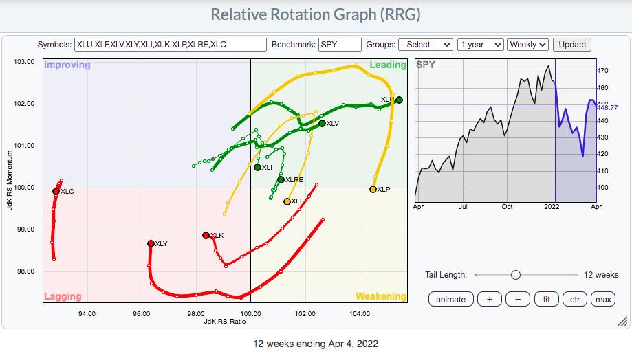
2022 has been the year of rotation from aggressive areas of the market to defensive areas of the market. Looking at the above RRG, how can you come to any other conclusion? While we do see the momentum improving for the three most important sectors - XLK, XLY, and XLC - they all are well left of the vertical axis, which is the axis that represents relative strength. We've seen very little turn back to the right, and the XLK looks like it's put on its left turn signal. So, yes the rally has been nice, but Wall Street has yet to seriously begin to move into technology and consumer discretionary, which is worrisome.
Inflation: The Worst Number Yet Arrives on Tuesday
At 8:30am ET on Tuesday, April 12th, prepare yourself. The annual core rate of inflation at the consumer level (Core CPI) is going to jump. The math is really easy to forecast; you look at the last 12 readings on the Core CPI and add them up. That's your annual rate. When a new monthly Core CPI number is released, you add it to the last annual reading, then subtract the one from a year earlier. Here are the last 18 Core CPI readings, plus an estimate for March 2022:
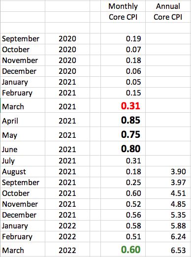
The big RED ".31" reading for March 2021 will likely be replaced by a higher March 2022 reading, which will raise the annual rate of core inflation to the 6.5% area. I've used the big GREEN ".60" reading as an estimate. The actual number will obviously change both the March 2022 monthly and annual numbers.
Next, I want you to focus on the upcoming April, May and June numbers. They will be replacing the monthly numbers from 2021 that I've included in big BLACK numbers. Those are extremely high readings that we haven't seen since. Every reading since June 2021 has been lower than those 3, meaning that the annual inflation rate will move notably lower over the next 3 months. That's why I've been saying that Tuesday's reading very well could be the peak of this pandemic-related inflation surge. It's also why I believe the Fed will back off of its rate-raising campaign. They've announced to the world that they're on "inflation watch", which helped calm the hyper-inflation worries of the 1970s. As the economy naturally slows, possibly tipping into a recession, I see the post-pandemic demand slowing, while supply chain issues lessen, effectively squashing inflation worries. As this takes place over the summer months, expect the Fed to hit the brakes on their "12 rate hikes ahead" rhetoric. That, in turn, will have investors pouring back into treasuries, sending the yields back down. As this transpires, expect growth stocks to SOAR later this year as the secular bull market regains strength like a hurricane over warm waters.
But patience will be required for this scenario to unfold.
Homebuilders, Truckers and Banks.....Oh My!
If you don't believe the stock market is prepping for a possible recession, then you haven't been watching these three groups. Higher treasury yields and mortgage rates are significantly lowering the expectations of home construction companies ($DJUSHB). Take one look at this chart and let me know if you see something different than me:
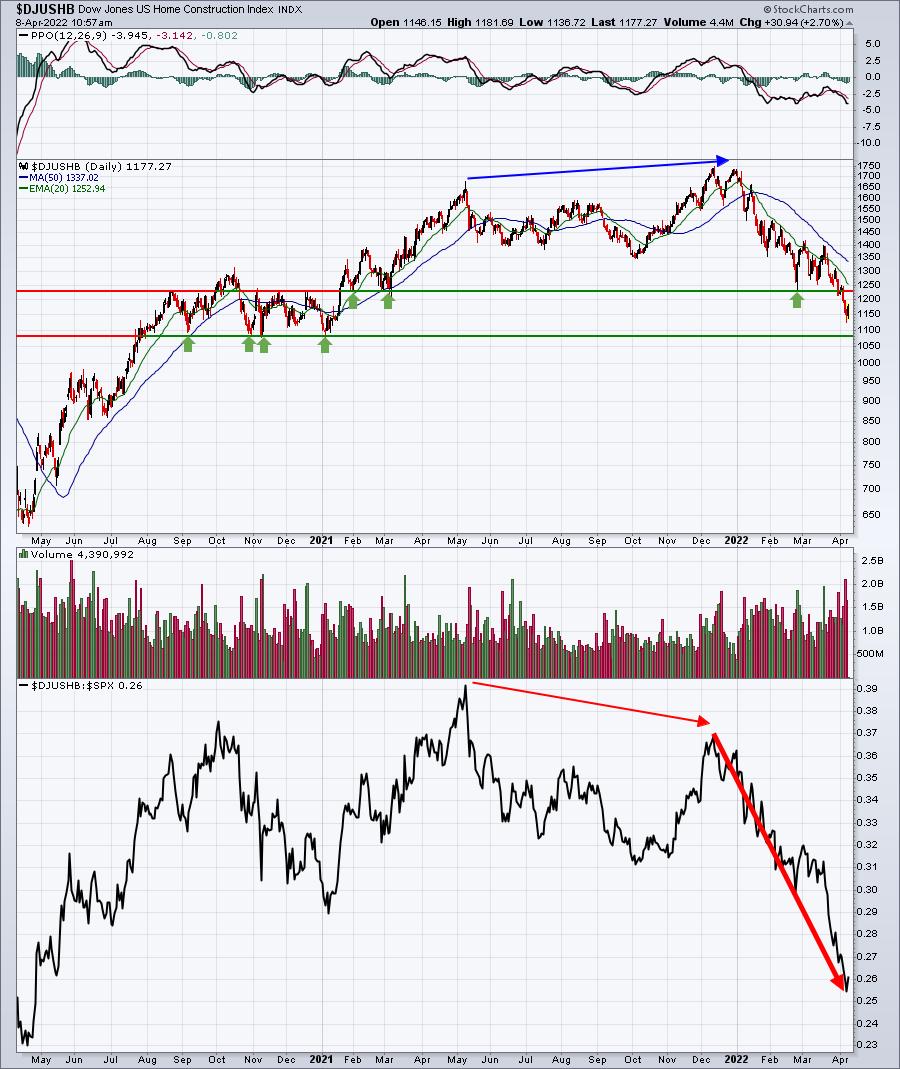
Notice how, even at the absolute price high in December 2022, the DJUSHB was losing relative strength? And 2022 has been downright horrific for home construction, free falling in terms of relative strength.
Are you expecting our economy to strengthen in 2022? Or at least be stable? Well, tell that to the truckers ($DJUSTK). Their business model is really easy to understand: they ship goods. When the economy strengthens or is expected to strengthen, they ship MORE goods. When the opposite is in play, they ship LESS goods. Check their chart out:
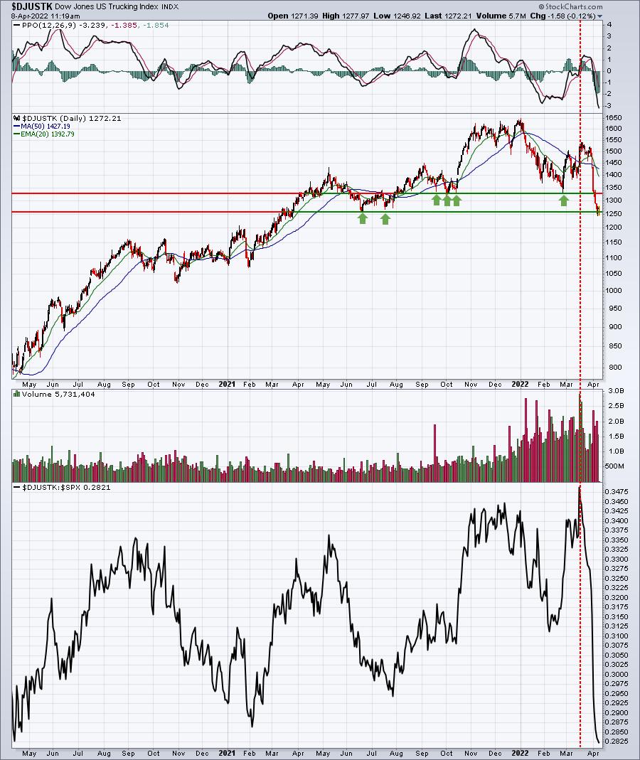
What the heck happened in mid-March? Just as the stock market bottomed and rallied strongly, the truckers' wheels fell off. In three weeks, the DJUSTK moved from a 3-year relative high to 3-year relative low. Clearly, Wall Street has undergone a complete makeover and truckers aren't a part of their current plan. Shouldn't we take notice?
Finally, we have the banks ($DJUSBK). There is plenty of talk about an inverted yield curve as the 2-year treasury yield ($UST2Y) has moved above the 10-year treasury yield ($UST10Y). Having audited banks in my prior career as a CPA, I'd rather follow the 3-month treasury ($UST3M) vs. the 10-year treasury, which appears to be much stronger. But no matter how we slice it, banks are performing very poorly, and that's a major concern:
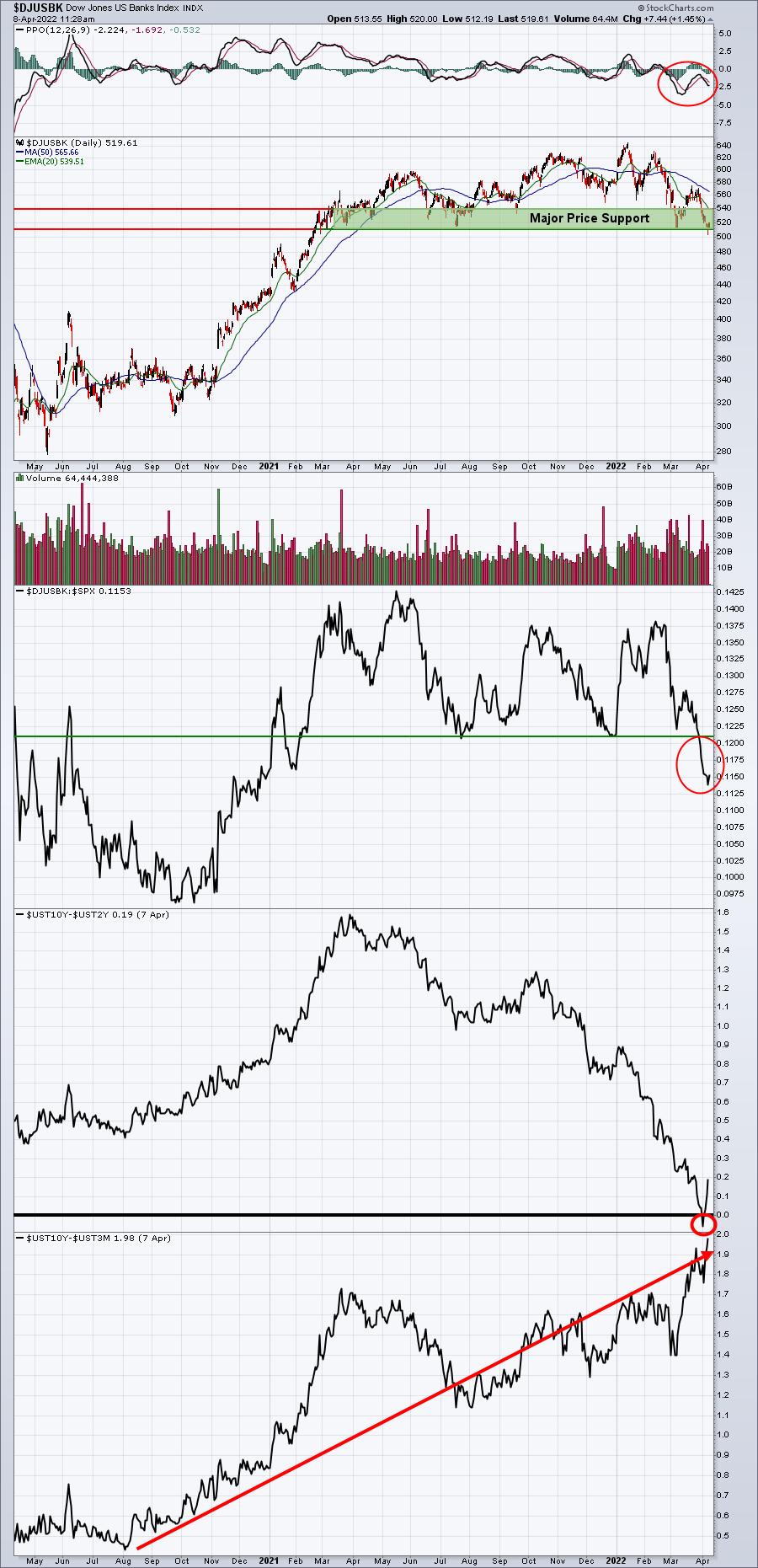
The two "inverted yield curve" calculations are much different. The former, using the 2-year treasury yield as the comparison, shows that yields did invert (small red circle), while the latter shows the yield spread at its highest level in the past two years. Which one is correct? I believe the bottom one is suggesting that, when the dust settles, banks will be an excellent choice during the next phase of this secular bull market. But in the very near-term, watch the key price support zone from 510-540. That's where selling has been contained many times over the past year. A breakdown beneath this support area could lead to much further selling and, ultimately, a much better buying opportunity.
It's Not All Bearish
I absolutely do NOT want to paint a super bearish picture. I said we'd get off to a poor start in 2022 and, indeed, quarter one was not pretty. Maybe the worst is behind us. Long-term investors should stay the course, in my opinion, as any further weakness in 2022 is likely to be followed up by a very strong rally later this year and into 2023. Of course, that's just my opinion. We all know anything can happen. But based on my work, research, and study of history, I'm convinced the odds point to a very strong rebound once this current mess clears.
On Monday, I plan to write an EB Digest article about one area of the market that I expect to flourish in the second quarter. Wall Street has endorsed the group as a leader, so don't be surprised to see further strength in the weeks ahead. If you're not currently an EB Digest subscriber, CLICK HERE to start your FREE subscription with only a name and email address. There's no credit card required and you may unsubscribe at any time.
Happy trading!
Tom
|
| READ ONLINE → |
|
|
|
| The Mindful Investor |
| Flailing Financials Finally Finished? |
| by David Keller |
This week's release of the Fed's March meeting minutes painted the picture of a hawkish Fed committed to raising rates to curb inflation. These latest comments from the Fed helped to push the Ten-Year Treasury Yield ($TNX) higher, finishing the week just above 2.7%.
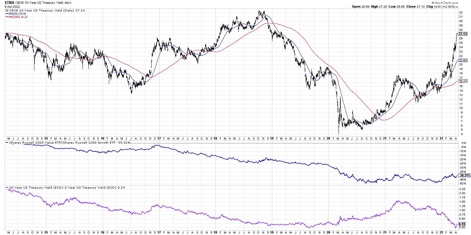
This chart shows the 10-Year Yield for the last seven years, along with the ratio of growth vs. value as well as the spread between the 10-Year and 2-Year points on the Treasury curve. So if interest rates are going higher, why aren't Financial stocks performing better?
While value stocks overall are outperforming growth stocks in 2022, the performance of banks is usually tied less to the level of rates and more to the shape of the yield curve. As our Dynamic Yield Curve function so beautifully demonstrates, the yield curve became briefly inverted over the last week when the two-year point pushed just above the ten-year point. As a number of strategists have pointed out, using the three-month point instead of the two-year point shows a more normal steepness to the yield curve. But the 2s-10s spread remains the most widely followed indication of the shape of the yield curve.
As a technical analyst, I've learned that while narratives such as the one delineated above are interesting, at the end of the day, it's all about price. What can the charts tell us about the Financial sector?
Let's start with the weekly RRG chart.
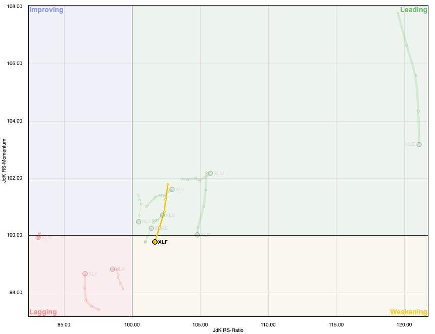
This week, the Financial sector moved from the Leading quadrant to the Weakening quadrant, indicating a decrease in momentum as the XLF has shown deteriorating relative strength. Which sectors are most improving on the RRG? Utilities and Health Care! But we digress.
While the XLF has essentially been rangebound for months, many of the banks have rotated from an accumulation phase to a distribution phase. Let's review Goldman Sachs (GS).
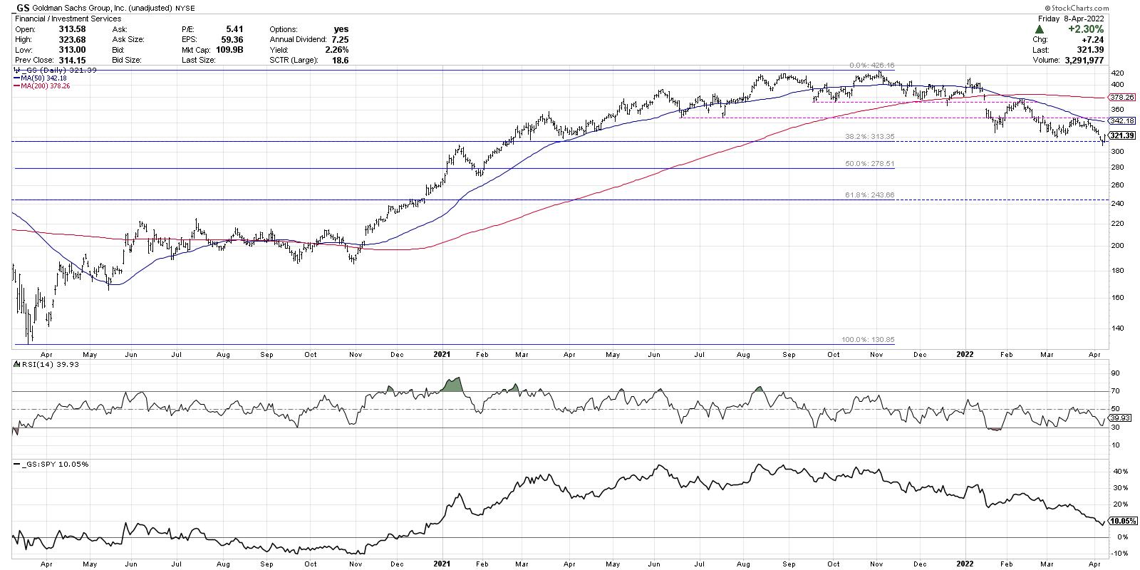
Goldman first reached the $420 level in August 2021 and retested that level most recently in November of last year. A new support level was established around $375, which held until January. We then saw GS gap below this support level, as well as the 200-day moving average. The most negative evidence on the chart was when the price retested that $375 level from below and failed in February. This confirmed a lower high and a new downtrend phase for the stocks.
Now we see a consistent pattern of lower highs and lower lows as Goldman Sachs has now reached a low around $310 this week.
So now the good news. When GS reached $310 this week, it brought the price down to the 38.2% Fibonacci retracement level. You may also note the RSI has been steadily sloping higher as the price has been trending lower over the last three months.
I would always be more optimistic if I saw further signs of accumulation, but this improving momentum as GS hits a key Fibonacci level may be a sign that the stock has upside potential here. While the major banks have been struggling recently, there are some bright spots in the Financial sector, particularly the insurance stocks.
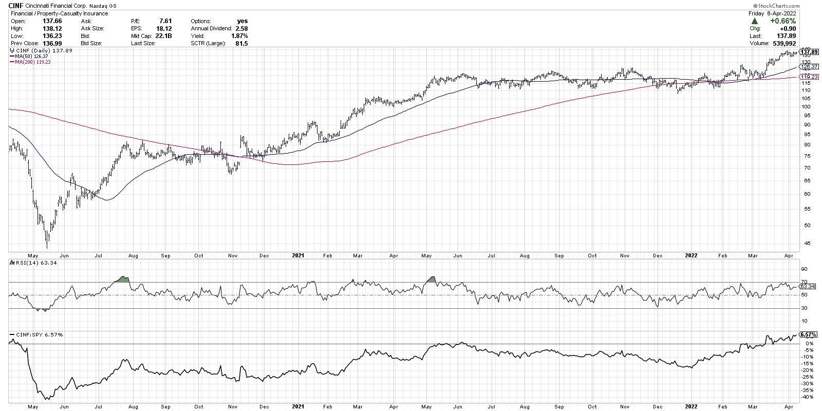
Cincinnati Financial (CINF) is a great example of the strong charts in the insurance space. These names were more rangebound for the second half of 2021, but resumed the previous uptrend in 2022. CINF has now broken to new all-time highs again this week and is currently above two upward-sloping moving averages. Most impressively, the relative strength line has been aiming steadily upwards since December of last year.
When in doubt, look for stocks with strong price and strong relative strength!
RR#6,
Dave
David Keller, CMT
Chief Market Strategist
StockCharts.com
Disclaimer: This blog is for educational purposes only and should not be construed as financial advice. The ideas and strategies should never be used without first assessing your own personal and financial situation, or without consulting a financial professional.
The author does not have a position in mentioned securities at the time of publication. Any opinions expressed herein are solely those of the author, and do not in any way represent the views or opinions of any other person or entity.
|
| READ ONLINE → |
|
|
|
| ChartWatchers |
| Who Is Swimming Against The Tide? |
| by Julius de Kempenaer |
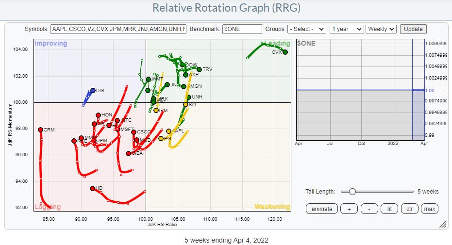
The Relative Rotation Graph above shows the members of the DJ Industrials index against $ONE as the benchmark. This way of looking at RRG helps us to gauge the price trends within the universe. You can see quite clearly that the majority of the tails are inside the lagging quadrant, with a few inside weakening and heading towards lagging.
Of the tails that are inside leading, only a few are moving at a positive RRG-Heading. Of the tails inside lagging, quite a few are picking up on the vertical JdK RS-Momentum axis but not (yet) on the RS-Ratio axis. This suggests that these moves are more recoveries within the existing downtrends than reversals of those trends.
This reading gets support from the daily RRG
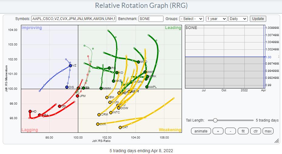
Here we see a whole cluster of tails inside leading and weakening, pretty much all at a negative RRG-Heading. It's the positive rotation that this group went through over the past 2-3 weeks which pushed the weekly tails up on the RS-Momentum scale. The weakness that is now setting in on the daily RRG suggests that this recent rally is now ending.
The fact that the general tendency of tails on both RRGs is weak makes it hard to call a bull market for the DJ industrials index itself.
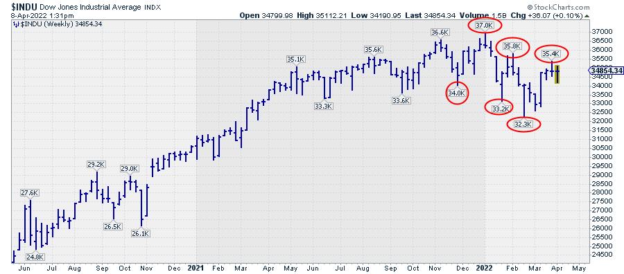
A quick look at the weekly chart of $INDU above reveals that, since the start of this year, the lows are coming in at lower levels while the highs are also coming in at lower levels. This defines a down-trend.
I am writing this on Friday before the close, so things have still a few hours to change, but I'd be quite surprised if the market would manage to take out the 35.4k high that was set last week. When the market closes at or around current levels, that 35.4k peak will become a confirmed lower high.
But also simply comparing the behavior on this chart since the start of 2022 with the behavior since mid-2020, it's pretty safe to conclude that this is not a very strong chart anymore. There's enough technical evidence that one should at least be using a careful approach to putting on new long positions.
Not All Pigs Are Equal..
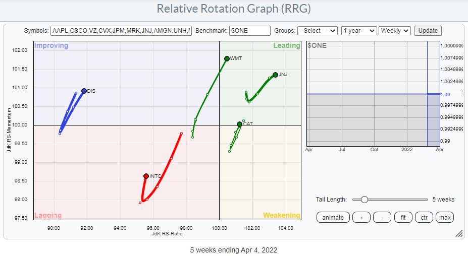
Browsing through the tails on the weekly RRG., I identified only five stocks that are on a positive RRG-Heading (0-90 degrees). These are shown in the plot above. The two that really stand out in a positive way are WMT and JNJ.
JNJ - Johnson & Johnson
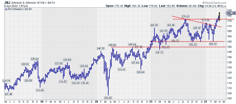
After a consolidation that took about a year, JNJ is now breaking away from that trading range, which opens up a lot of new upside potential for this stock. Within the Dow Jones Industrials index, this could be one of the few fish that is trying to swim against the tide.
WMT - Walmart
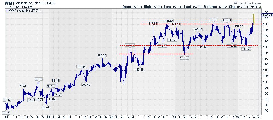
For WMT, the picture is quite similar. The consolidation took even longer, but the upward break of this week takes WMT convincingly out of its trading range which, just like JNJ, opens up a lot of fresh upward potential for the stock.
For both names, the downside is well protected by the upper boundary of the former trading range, which should start to act as support in case of a setback offering a good risk/reward ratio.
Have a great weekend and #StaySafe, --Julius
My regular blog is the RRG Charts blog. If you would like to receive a notification when a new article is published there, "Subscribe" with your email address.
|
| READ ONLINE → |
|
|
|
| ChartWatchers |
| Rally Interrupted - Three Charts That Define Last Week and One That's a Killer Hedge |
| by Mary Ellen McGonagle |
The Federal Reserve's confirmation that they'll be taking an aggressive stance with their monetary policy to fight inflation halted an emerging downtrend reversal in the markets. Prior to comments from Fed Governor Brainard on Tuesday, the S&P 500 and Nasdaq were both trending higher, with the Tech-heavy Nasdaq eyeing a break back above its last area of possible upside resistance -- its 200-day moving average.
DAILY CHART OF NASDAQ COMPOSITE
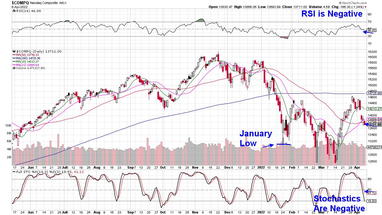
As you can see in the chart above, the Nasdaq is now in search of possible downside support following its break below each of its moving averages. I've highlighted this Index's February low as the next area of possible support and, at this time, it's 4.5% away.
Last week's sharp drop in the Nasdaq was amid a decline in each of the heavyweight FANMG stocks, which lost an average of 4%. Semiconductor stocks suffered even more, with a 7.7% decline that also put downward pressure on the Nasdaq.
DAILY CHART OF SEMICONDUCTOR INDUSTRY (SOXX)
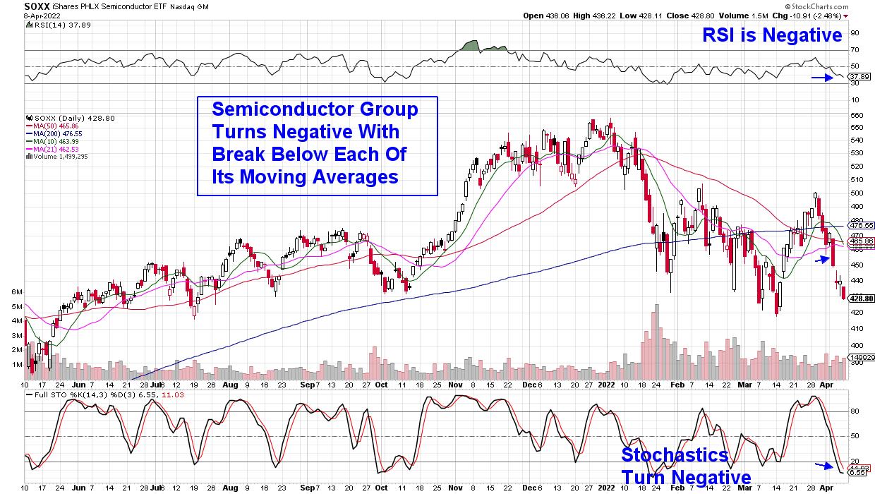
This was the 2nd week of sharp declines in Semiconductor stocks, which began the prior week amid Wall Street downgrades to the group. Analysts were citing a possible downturn in chip demand next year as their corporate customers face slowing earnings and sales. In other words, fears of an economic slowdown next year are hitting this historically cyclical industry now.
The increased conflict in Ukraine is also weighing on the group, as this country produces over 50% of the world's Neon supply. This gas is a key component in the production of Semiconductor chips.
DAILY CHART OF REAL ESTATE SECTOR (XLY)
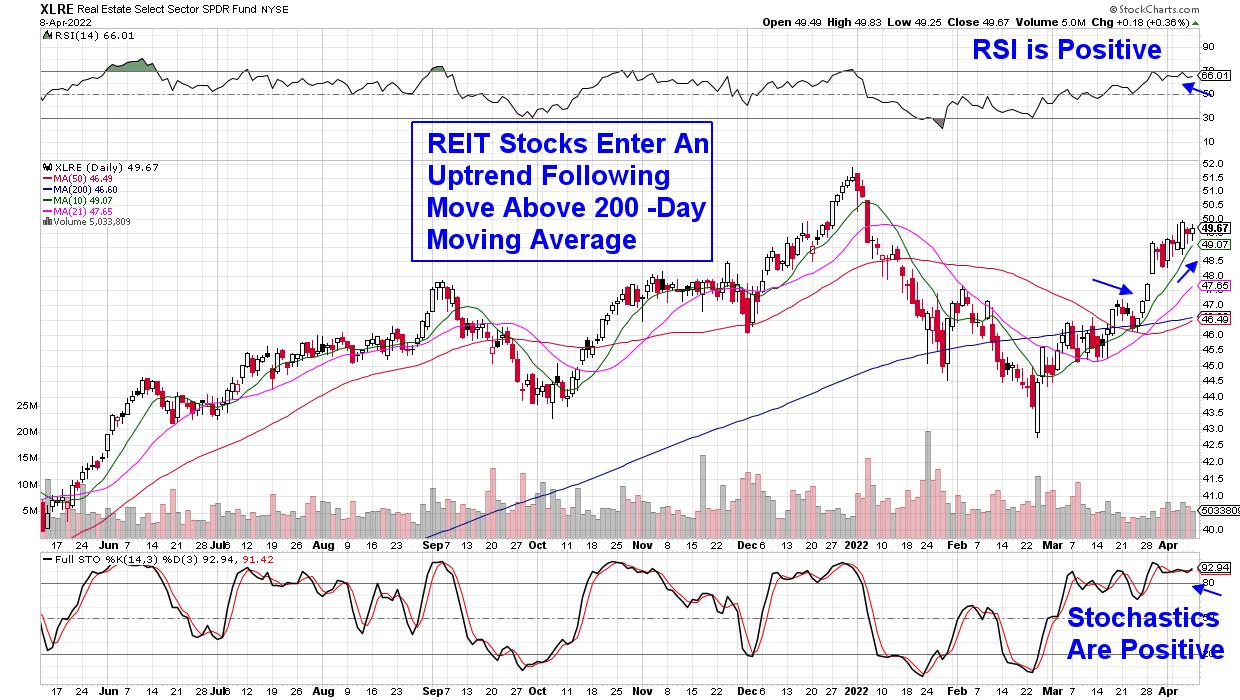
Not all stocks suffered last week, however, as REIT stocks posted a gain after the sector reversed its downtrend the prior week. REITs are companies that own or finance income-producing real estate, and their lease structures allow frequent rent hikes that are linked to the consumer price index (CPI).
With high gas and food prices expected to keep CPI elevated, this makes REITs a great way to hedge against high inflation. Their requirement to pay out at least 90% of their taxable profits as dividends is another, as many of these stocks offer attractive yields.
Subscribers to my MEM Edge Report were alerted to a top-performing REIT in last week's report, and the stock has since far outpaced its peers. This stock is poised to trade much higher, and if you'd like immediate access to it, use this link here.
You'll find other suggested stocks in my MEM Edge Report that are trending higher while acting as a wonderful hedge to the currently weak markets. This twice-weekly report also highlights sector rotation as it's taking shape. Last week, we discussed the move away from Semiconductor stocks while also reviewing the bullish move into REIT stocks.
In fact, paying attention to sector rotation was how I was able to have a 75% win rate among the 140 stocks I suggested as buys last year. If you'd like to hear more about ways to outperform the markets during periods of heightened volatility, I urge you to attend my live webinar next Wednesday evening. You can use this link here to sign up! In case you're unable to attend, if you sign up now, you'll have access to the recording.
On this week's edition of StockCharts TV's The MEM Edge, I review the break in the Nasdaq and what areas are driving this Index down. I also spoke with special guest Danielle Shay from Simpler Trading about what to be on the lookout for with stocks due to report earnings this month.
You can also watch my special presentation "Understanding Sector Rotation", where I help you get a clear grasp on sector rotation! I demonstrate how to spot moves in and out of sectors, key drivers for rotation, why it's important to be in the correct sector and different ways to capitalize on rotation.
Warmly,
Mary Ellen McGonagle, MEM Investment Researchh
|
| READ ONLINE → |
|
|
|
|
|
| Wyckoff Power Charting |
| Wyckoff Principles within Principles |
| by Bruce Fraser |
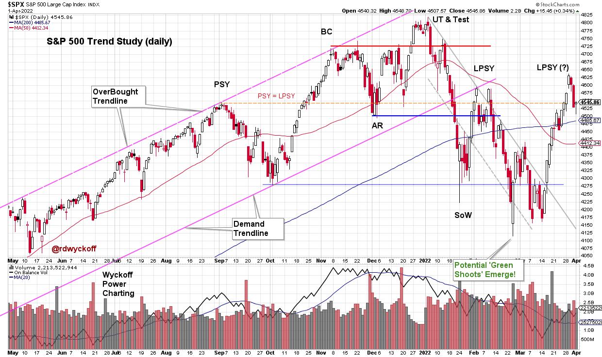
 Trouble for the S&P 500 Index became apparent last September when an outsized decline arrived. Downward volatility with volume expansion (presence of Supply) characterized the decline into October, touching the demand trendline. Bulls were relieved by the near vertical rise into November which included a new high in the index. Two attributes of that rally had clues and warnings regarding exhaustion of the larger advance in force since the March 2020 lows. There was the sharp and persistent advance of the index which could be viewed as a Buying Climax (BC). Second was the acceleration of that rally as it culminated on high volume. Once a Climax (BC or SC) and Automatic Reaction (AR) occur, a range-bound condition is expected, and that is what came next. Roman Bogomazov and I evaluated this structure as it was unfolding in our weekly ‘Wyckoff Market Discussion' (see below for a complimentary invitation to attend the upcoming WMD on April 6th). Trouble for the S&P 500 Index became apparent last September when an outsized decline arrived. Downward volatility with volume expansion (presence of Supply) characterized the decline into October, touching the demand trendline. Bulls were relieved by the near vertical rise into November which included a new high in the index. Two attributes of that rally had clues and warnings regarding exhaustion of the larger advance in force since the March 2020 lows. There was the sharp and persistent advance of the index which could be viewed as a Buying Climax (BC). Second was the acceleration of that rally as it culminated on high volume. Once a Climax (BC or SC) and Automatic Reaction (AR) occur, a range-bound condition is expected, and that is what came next. Roman Bogomazov and I evaluated this structure as it was unfolding in our weekly ‘Wyckoff Market Discussion' (see below for a complimentary invitation to attend the upcoming WMD on April 6th).

S&P 500 Index Daily Chart
Dr. Hank Pruden often discussed the concept of ‘Principles within Principles' in our Wyckoff Method classes. This concept is at work throughout the recent stock market structure. Let's profile one of those here. Green Shoots emerged in February / March during the test of the ‘Sign of Weakness'. This could be seen in internal breadth characteristics, sentiment studies and the throw under of the downward trend channel (as an oversold condition). Also Point and Figure (PnF) count objectives were being fulfilled (more on this below).

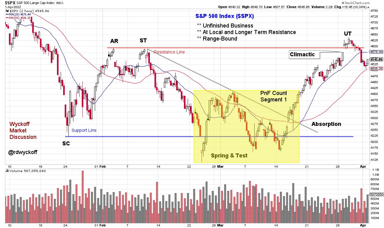
S&P 500 2-Hour Intraday Chart Study
A significant principle in Wyckoff analysis is the concept of building a cause. Here an Accumulation structure is identified on the Intraday (2-hour) vertical chart above. The Selling Climax (SC) in late January stopped the decline, followed by an Automatic Rally (AR), and this established a range-bound condition going forward. Range-bound conditions (trading ranges) are where Causes are built. Within the larger structure reaching back to January is a smaller trading range (yellow shaded box). Each of the lows within tested the January Selling Climax (SC) successfully. The subsequent March rally has been the best swing trading advance of the year. This rally returned to the Resistance area, as defined by the Automatic Rally (AR). A Point and Figure count of this smaller structure has been fulfilled (PnF chart below). The final phase of this rally had acceleration and a gap upon the throw over of the AR (labeled an Upthrust), which suggests a local Buying Climax (BC) of the March advance. We would then expect volatility back into the trading range, which appears to be unfolding now.
Capacity of the index to remain in the vicinity of the resistance area of this trading range would suggest that Accumulation is unfolding and that it is nearing completion. A return to the SC area would mean more work is needed in this potential Accumulation structure, or worse that Re-Distribution is forming for another bear leg downward.

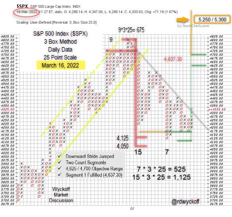
S&P 500 Index Point & Figure Case Study
Point and Figure Notes (chart originally profiled during weekly WMD webinar):
- Distribution count formed after BC surge (red line)
- Minimum downward count objective was touched at 4,125
- A 7-column Swing trading count began forming at that point
- Each decline thereafter had less force demonstrating local absorption
- Both counts were taken when the downtrend line was exceeded (gray line)
- The subsequent rally (not shown on this PnF chart) was partially fulfilled at 4,625
- The larger count (15 columns) is still active and has potential objectives at new price highs
- This very large trading range structure reaches back to August 2021 and could be Distribution
An excellent low risk trading juncture was presented on the three tests of the Selling Climax lows. In the cluster of those tests ‘Green Shoots' emerged along with a local PnF swing trading count. Now fulfilled, we will tighten our risk management and study the action of the stock indexes around this resistance area and any emerging weakness back into the trading range.
All the Best,
Bruce
@rdwyckoff
Disclaimer: This blog is for educational purposes only and should not be construed as financial advice. The ideas and strategies should never be used without first assessing your own personal and financial situation, or without consulting a financial professional.
Announcement:
Join Roman Bogomazov and me for a complimentary ‘Wyckoff Market Discussion' this coming Wednesday, April 6th at 3pm PT. Each week we cover the important financial markets with a Wyckoffian orientation while also reviewing other relevant indicators effecting the present position and likely future trends of these markets. See you there!
Registration Link (completely free and we never share your registration info): Click Here to Register
To learn more about WMD click here.
Video Links
Trading Survival and Success Strategies | Bruce Fraser & Andrew Cardwell | Power Charting (04.01.22)
Wyckoff Power Charting Blog Links of Interest
Distribution or Re-Accumulation? | March 01, 2022 at 06:36 PM
|
| READ ONLINE → |
|
|
|
| Martin Pring's Market Roundup |
| Watch this Market for a Huge Potential Upside Breakout |
| by Martin Pring |
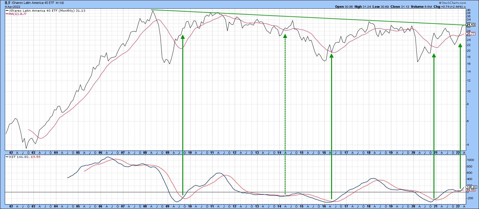
At the turn of the century, this ETF achieved a ten-timer, rallying from $4 in 2002 to $40 in 2008. It's been consolidating for the last 12 years and looks set to embark on a move to new all-time highs. It's not a tech stock, nor is it a cryptocurrency. It's a region of the world that has been out of favor for a long time and now looks set to break to the upside, taking many of its component countries with it. That ETF is the iShares Latin America 40 ETF, the ILF.
Latin America in General
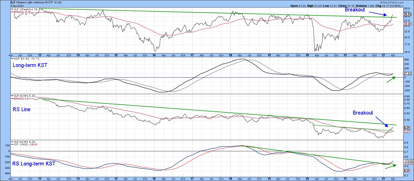
Chart 1 shows its meteoric rise at the turn of the century, together with the rangebound action that has since followed. The price has found resistance at the 2008-2022 trendline on numerous occasions. Now it's trying to edge its way through. Until it does, we have to be careful about calling a breakout, as current action could easily turn into disappointment, as it has in the past. That said, there are some grounds for suspecting that it will be successful this time. For starters, the long-term KST, which you can read about here, has just gone bullish. It's not a perfect indicator, as you can see from the dashed arrow flagging the 2014 signal. However, it usually puts the odds on your side. Second, relative action against the world indexes and S&P has started to rupture some very long-term down trends. Finally, as we shall see later, many individual Latin American country ETFs have already begun to break to the upside. Those that have not look poised to do so.
 Chart 1 Chart 1
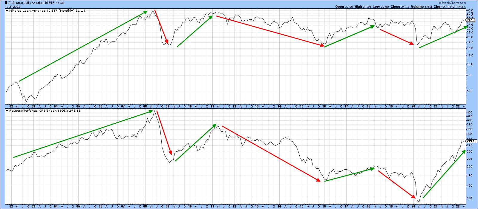
Chart 2 shows that Latin America, taken as a whole, is very much a resource play. The arrows highlight the principal price movements that have taken place this century. The basic difference between the two series is that the ILF has moved sideways, whereas the CRB Composite, up until early 2020, had been zig-zagging on the downside.
 Chart 2 Chart 2
Chart 3 contains one of my favorite templates, comparing the absolute price and its long-term KST to its RS line and a long-term KST calculated for relative action. In this case, the price is compared to the MSCI World Stock ETF (ACWI). I call this the "nirvana" template because it gives me a substantial amount of information on the price, relative action and their long-term momentum in just one chart. It's a great starting point for an analysis, even for short-term traders, as the character of short-term price movements is determined by the direction of the main trend.
 Chart 3 Chart 3
The best long-term signals are triggered when the two KSTs start to reverse to the upside from a relatively low level and this is confirmed by the price and relative action crossing above both their 65-week EMAs and a significant trendline. The chart shows that the ILF has just broken above its 2012-2022 resistance trendline at a time when the absolute KST has started to re-accelerate on the upside. It's true that the RS line has yet to surpass its secular down trendline. However, that is likely to happen because it has already cleared the dashed green 2020-2022 resistance trendline and its EMA. This action is also supported by the long-term KST for relative action, which has not only begun to rise but has recently moved above its 2018-22 down trendline.
If you like this nirvana arrangement and want to replicate it, click on the chart and save it as a template. In the StockCharts workbench, you can also change the base security by substituting the $SPX or another Index for the ACWI, should you want to accomplish some sector analysis.
Latin American Country ETFs
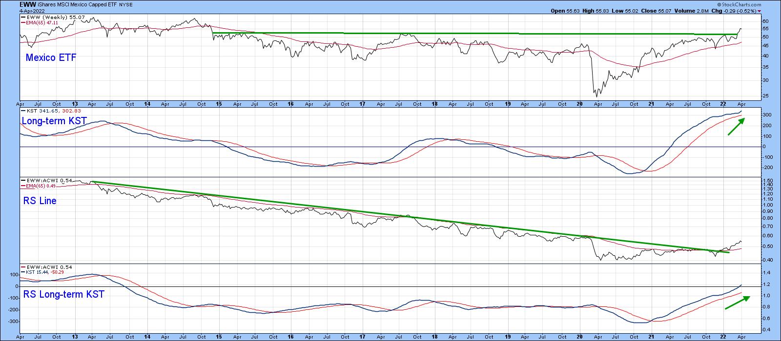
The following country ETFs are arranged in an approximate order of relative technical attractiveness. First on deck is the Mexican ETF (EWW), featured in Chart 4. Here we can see a major upside breakout by the price and a secular down trendline violation by its RS line. Both KSTs are supporting this action as the EWW leads the ILF higher.
 Chart 4 Chart 4
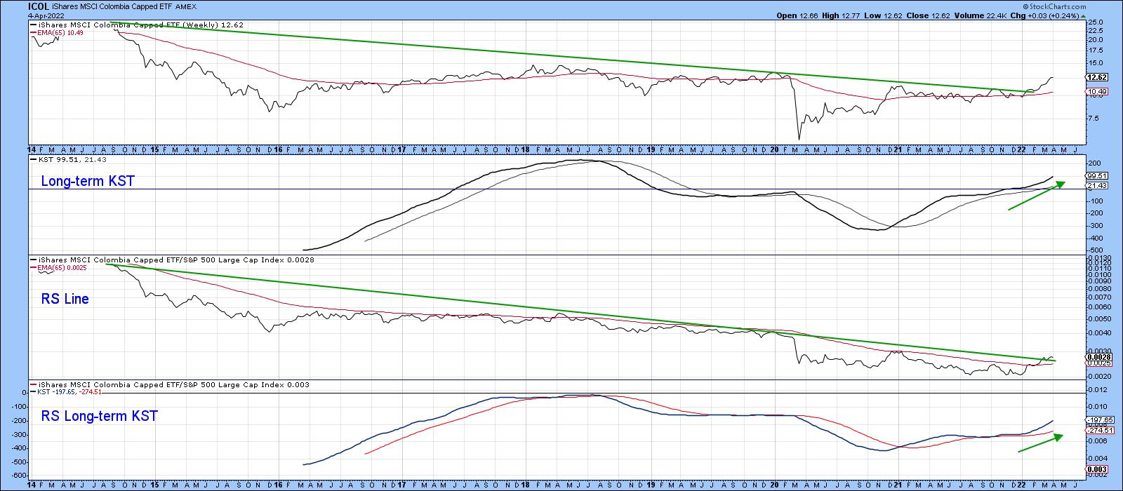
Chart 5 shows another double price and RS breakout, this time for the iShares MSCI Columbia (ICOL). Since this action is being supported by two decisively bullish KSTs, higher prices are expected.
 Chart 5 Chart 5
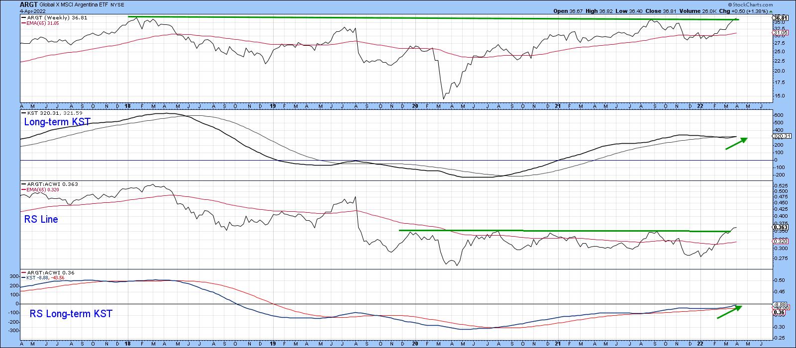
The Global X MSCI Argentina ETF (ARGT) in Chart 6 has broken out from a nice base for relative action, which suggests that the tentative upside break in the price may soon be able to be upgraded to a decisive one.
 Chart 6 Chart 6
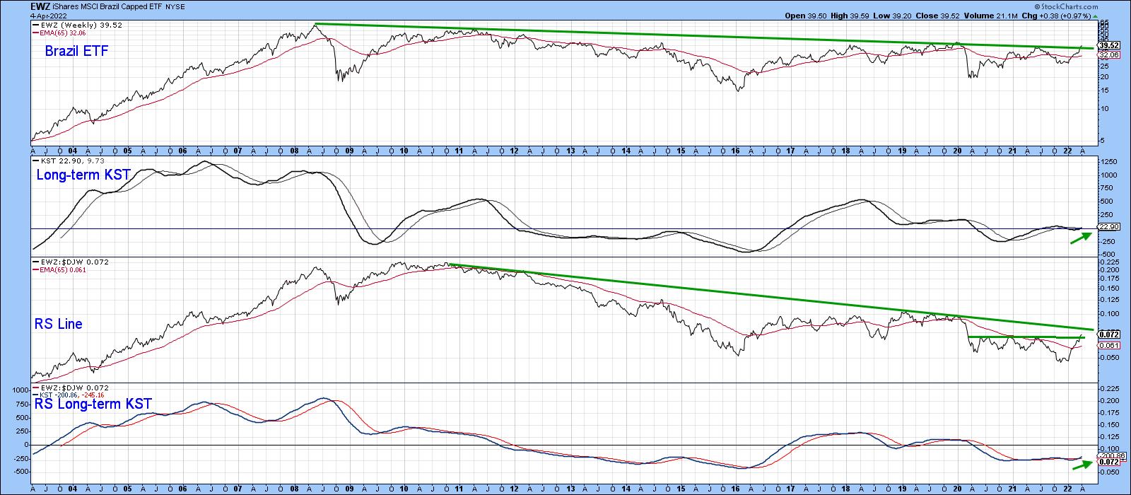
Brazil, in the form of the EWZ in Chart 7, is edging through its 2008-2022 resistance trendline, which is being supported by a recently minted long-term KST buy signal. The relative action has tentatively completed a small base but has not yet cleared its secular down trendline. A rising KST says it soon will.
 Chart 7 Chart 7
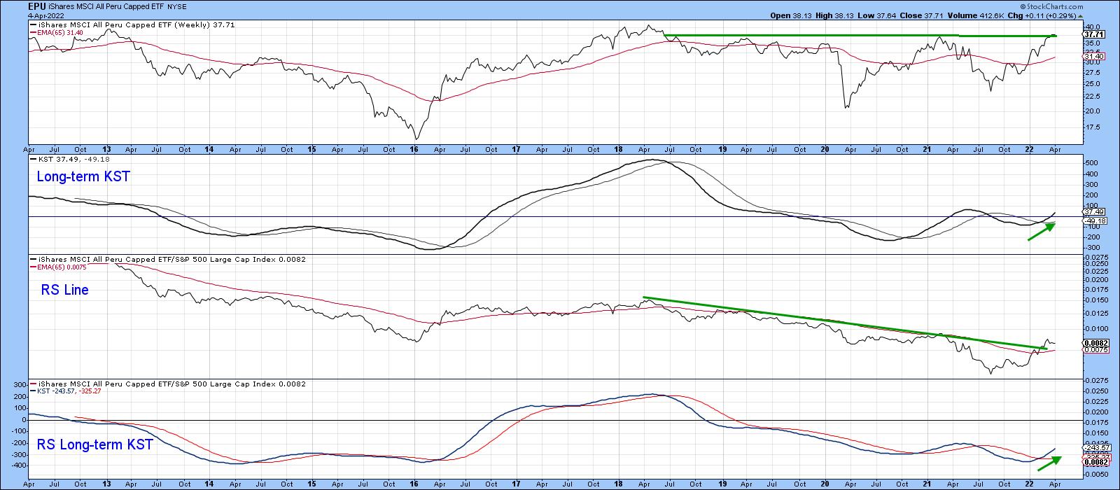
Peru (EPU) in Chart 8, is very close to a price breakout, having already established one in the relative strength department. Both KSTs have begun to edge higher, which is another positive factor.
 Chart 8 Chart 8
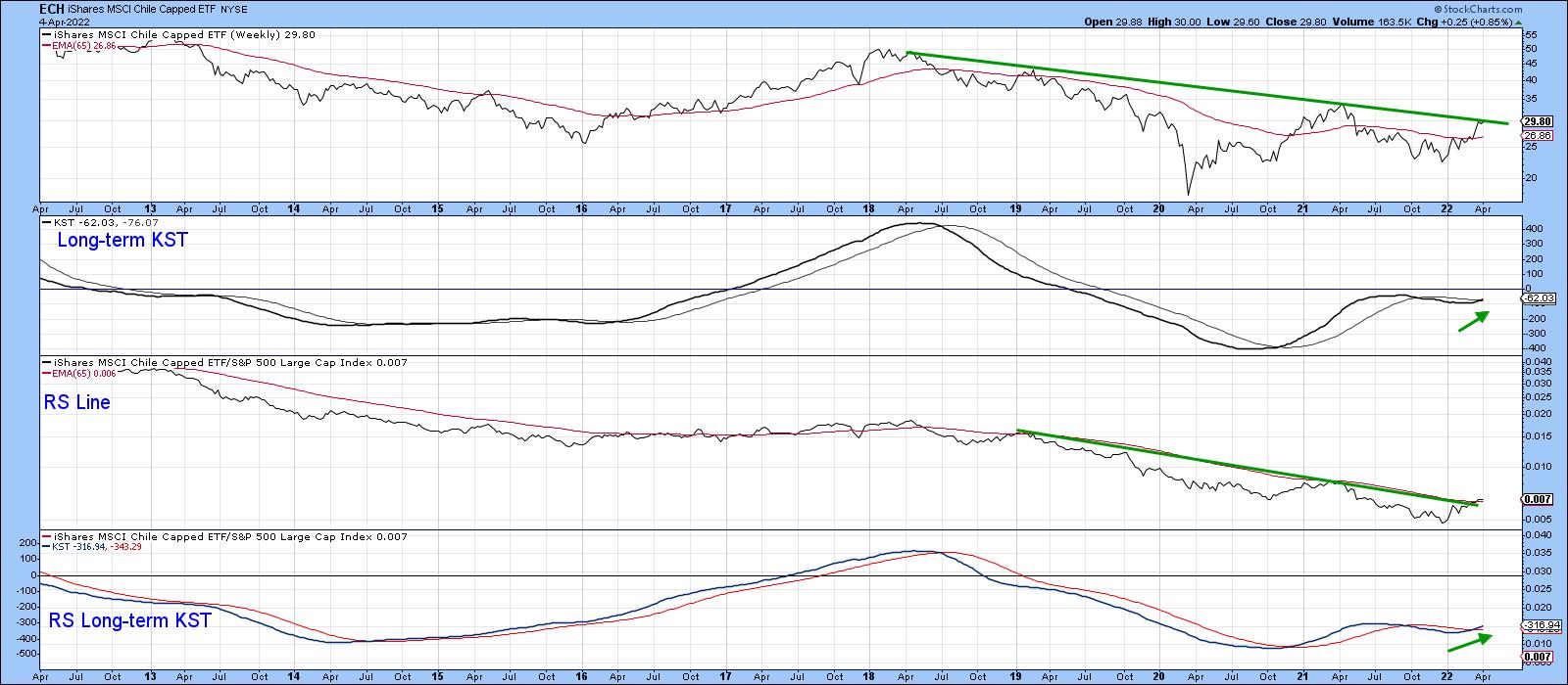
Finally, Chile (ECH) is right at its 2018-2022 down trendline, seen in Chart 9. A break above it would be positive. However, it would not likely be as significant as the one for some of the other ETFs, such as Mexico, for example. Its resistance trendline is much longer and has been touched or approached on more numerous occasions.
 Chart 9 Chart 9
Conclusion
The Latin American ETFs are either breaking to the upside or are very close to doing so. Given their long-term sensitivity to swings in the commodity markets, a valid and decisive upside break by the ILF would be a strong signal for substantial commodity gains over the course of the next few years.
Good luck and good charting,
Martin J. Pring
The views expressed in this article are those of the author and do not necessarily reflect the position or opinion of Pring Turner Capital Group of Walnut Creek or its affiliates.
|
| READ ONLINE → |
|
|
|
| The Canadian Technician |
| Are You Feeling Vulnerable? |
| by Greg Schnell |
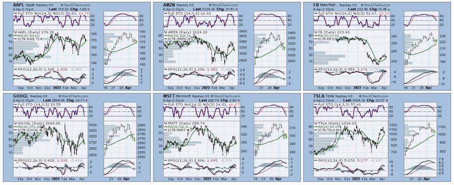
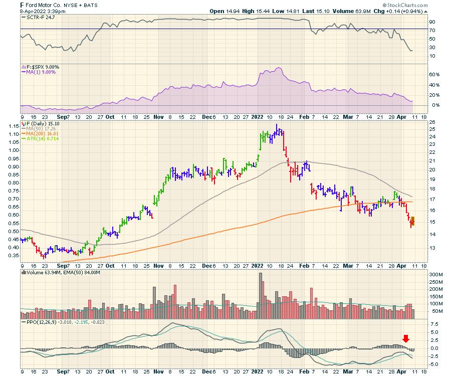
The chart work I do leads me to believe this is a potential "turn the plane around" moment of decision. As the market works to discover if it can go back to the prior highs, so many pieces are uncomfortably weak. Can we get the momentum to go higher, or does this market make a quick leg lower here? I've listed a few areas showing stress below.
I looked through a couple thousand charts this week to try to get a feel for the underlying conditions. As I flipped through, I was amazed the market could hold up here. But, as we have come to know, when I look at the big six, they are holding in firmly, even though they have started rolling down a little. I do notice the PPO momentum indicator rolling over on all of them.
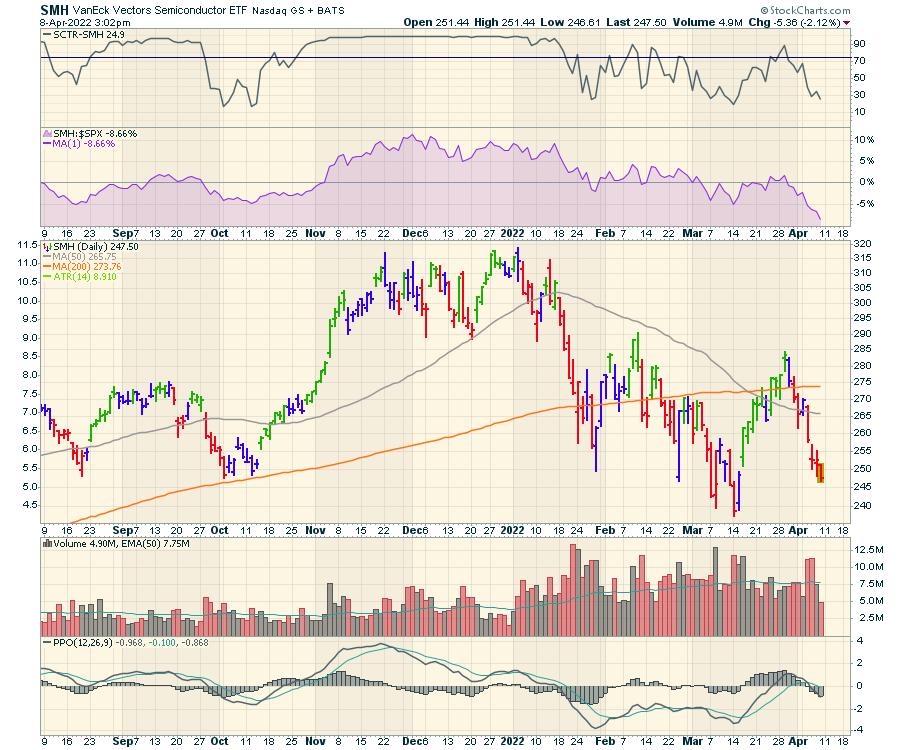
Semiconductors
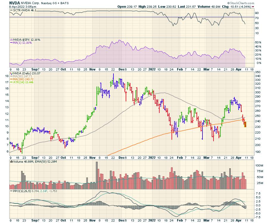
When I look at the weakness in semiconductors, it's hard to believe the market is as high as it is.

Nvidia (NVDA) is a golden name, but the chart is dropping hard. It is closing below the 200-day moving average again, down about 20% from the highs of last week.

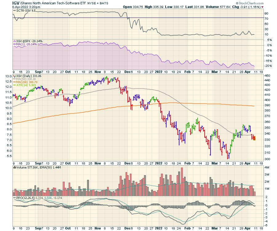
Software
Software isn't as weak as the semiconductors, but, so far, the higher high above early March didn't hold.

Automobiles
Any new vehicle purchases are at full price and the lease rates are soaring. With the underlying car price and the interest rate calculation for lease/car payments at multi-year highs, this makes new car affordability difficult. This is a new hurdle for the extremely expensive electric car category. The used vehicle markets are still frothy, with higher selling prices for previous owners and the interest rates climbing quickly as well. It's hard for me to imagine this is good as car buyers decide spending priorities as food and energy costs soar. These rapid changes are making some vehicle clientele struggle, as they are living close to the edge of the paycheque deciding between food, energy and rent/mortgage/car payments.

For me, the market feels very vulnerable to the downside, but, as long as the world continues to buy and hold up the big six, the main indexes aren't breaking meaningfully lower. As we come into the earnings period next week, the news will be coming fast and the markets will be very fluid, reacting to each new piece of data. Stay sharp.
Lastly, the longer the credit markets move in multiples of "standard" deviations, the more stress on the system. It's not obvious that it works out positively.
Good trading,
Greg Schnell, CMT, MFTA
|
| READ ONLINE → |
|
|
|
| Top Advisors Corner |
| T-Bond Yields Following Gold's Footsteps |
| by Tom McClellan |

Inflation worries are finally getting the attention of investors and the Fed, and that has long-term rates finally starting to climb. It is weird for anyone who lived in the 1970s and 1980s to see an inflation rate approaching 8%, and long term T-Bond yields are still at 2.6%, and think that this is normal. But at least bond yields are moving.
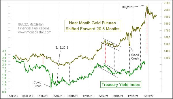
The small amount of the rise in bond yields is a curiosity, but the timing of it is not. Those who regularly read our McClellan Market Report newsletter have known for a couple of years that a big rise in bond yields was coming now, because gold has told us so. The movements of gold tend to get echoed about 20-1/2 months later in the movements of the Treasury Yield Index (TYX), which reflects 30-year T-Bond yields. And a big peak for yields is just around the corner.
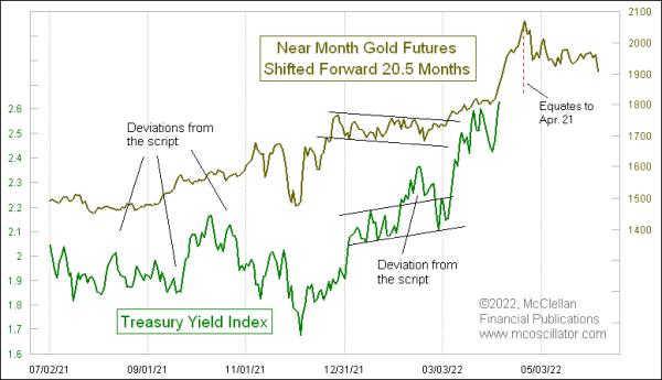
Gold prices rushed up to a blowoff top on August 6, 2020. We are now approaching the echo point of that gold price peak for bond yields. Zooming in closer on this same relationship, we can see that sometimes it is not perfect at explaining the movements of the TYX, and bond yields do not always follow the script exactly.

But in those instances when the TYX goes slightly off script, it usually works extra hard to get back on the program afterward. Zooming in this way allows us to see that the gold price top in August 2020 equates to a top for bond yields due around April 21. This model does not tell us at what level of yields this prospective blowoff will finally stop; it is much better at the timing than the magnitudes of the movements.
Gold prices in March 2022 made a valiant effort to equal that August 2020 all-time price high. That implies bond yields will be coming back up to high levels again in around November to December 2023, which is 20-1/2 months after gold's most recent top.
It is hard to imagine bond yields reaching a peak so soon, with no apparent end to inflation in sight. But that is gold's message now, and gold has been pretty good at telling us what is going to happen. The news then follows to fill in the story line.
I do not have a good answer to the question of why this leading indication relationship works. How can gold possibly know 20-1/2 months ahead of time what the movements of bond yields are going to look like? If gold is an inflation hedge, then one might reasonably think it would be more of a coincident relationship.
What we think does not govern how the markets actually behave. Our job is to figure out the actual physics of the stock market, not to prejudge how those physics ought to work. There is sufficient history to show us that this 20-1/2 month lag time between gold's movements and those of bond yields is a real phenomenon, even if we cannot explain the amount of that lag.
|
| READ ONLINE → |
|
|
|
| MORE ARTICLES → |
|
 Chart 1
 Chart 2
 Chart 3
 Chart 4
 Chart 5


 Trouble for the S&P 500 Index became apparent last September when an outsized decline arrived. Downward volatility with volume expansion (presence of Supply) characterized the decline into October, touching the demand trendline. Bulls were relieved by the near vertical rise into November which included a new high in the index. Two attributes of that rally had clues and warnings regarding exhaustion of the larger advance in force since the March 2020 lows. There was the sharp and persistent advance of the index which could be viewed as a Buying Climax (BC). Second was the acceleration of that rally as it culminated on high volume. Once a Climax (BC or SC) and Automatic Reaction (AR) occur, a range-bound condition is expected, and that is what came next. Roman Bogomazov and I evaluated this structure as it was unfolding in our weekly ‘Wyckoff Market Discussion' (see below for a complimentary invitation to attend the upcoming WMD on April 6th).