This week's release of the Fed's March meeting minutes painted the picture of a hawkish Fed committed to raising rates to curb inflation. These latest comments from the Fed helped to push the Ten-Year Treasury Yield ($TNX) higher, finishing the week just above 2.7%.
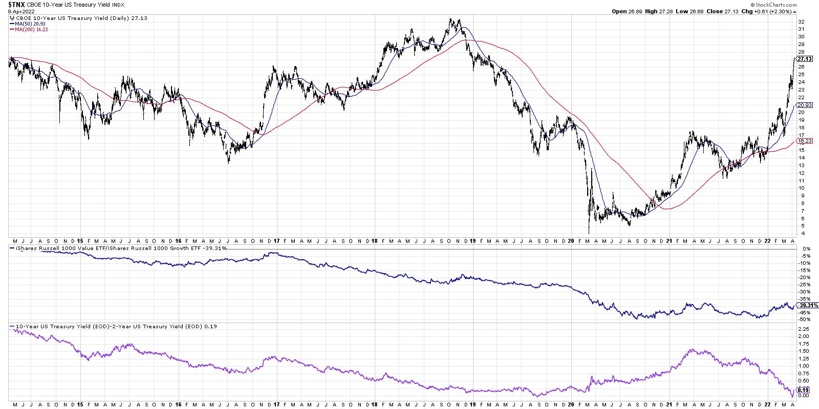
This chart shows the 10-Year Yield for the last seven years, along with the ratio of growth vs. value as well as the spread between the 10-Year and 2-Year points on the Treasury curve. So if interest rates are going higher, why aren't Financial stocks performing better?
While value stocks overall are outperforming growth stocks in 2022, the performance of banks is usually tied less to the level of rates and more to the shape of the yield curve. As our Dynamic Yield Curve function so beautifully demonstrates, the yield curve became briefly inverted over the last week when the two-year point pushed just above the ten-year point. As a number of strategists have pointed out, using the three-month point instead of the two-year point shows a more normal steepness to the yield curve. But the 2s-10s spread remains the most widely followed indication of the shape of the yield curve.
As a technical analyst, I've learned that while narratives such as the one delineated above are interesting, at the end of the day, it's all about price. What can the charts tell us about the Financial sector?
Let's start with the weekly RRG chart.
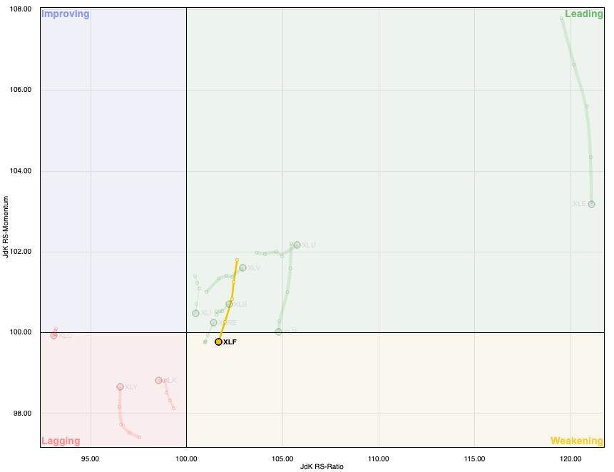
This week, the Financial sector moved from the Leading quadrant to the Weakening quadrant, indicating a decrease in momentum as the XLF has shown deteriorating relative strength. Which sectors are most improving on the RRG? Utilities and Health Care! But we digress.
While the XLF has essentially been rangebound for months, many of the banks have rotated from an accumulation phase to a distribution phase. Let's review Goldman Sachs (GS).
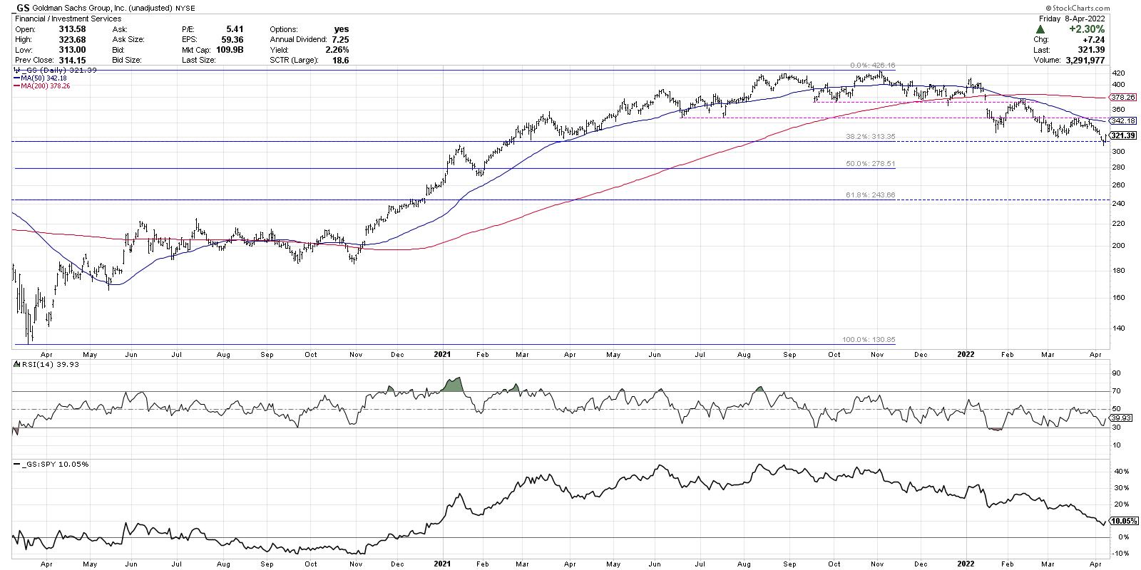
Goldman first reached the $420 level in August 2021 and retested that level most recently in November of last year. A new support level was established around $375, which held until January. We then saw GS gap below this support level, as well as the 200-day moving average. The most negative evidence on the chart was when the price retested that $375 level from below and failed in February. This confirmed a lower high and a new downtrend phase for the stocks.
Now we see a consistent pattern of lower highs and lower lows as Goldman Sachs has now reached a low around $310 this week.
So now the good news. When GS reached $310 this week, it brought the price down to the 38.2% Fibonacci retracement level. You may also note the RSI has been steadily sloping higher as the price has been trending lower over the last three months.
I would always be more optimistic if I saw further signs of accumulation, but this improving momentum as GS hits a key Fibonacci level may be a sign that the stock has upside potential here. While the major banks have been struggling recently, there are some bright spots in the Financial sector, particularly the insurance stocks.
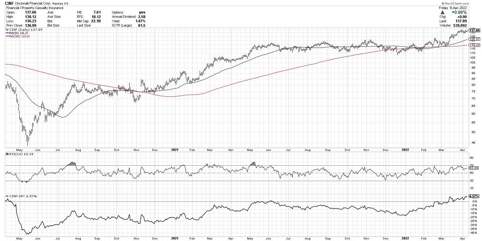
Cincinnati Financial (CINF) is a great example of the strong charts in the insurance space. These names were more rangebound for the second half of 2021, but resumed the previous uptrend in 2022. CINF has now broken to new all-time highs again this week and is currently above two upward-sloping moving averages. Most impressively, the relative strength line has been aiming steadily upwards since December of last year.
When in doubt, look for stocks with strong price and strong relative strength!
RR#6,
Dave
David Keller, CMT
Chief Market Strategist
StockCharts.com
Disclaimer: This blog is for educational purposes only and should not be construed as financial advice. The ideas and strategies should never be used without first assessing your own personal and financial situation, or without consulting a financial professional.
The author does not have a position in mentioned securities at the time of publication. Any opinions expressed herein are solely those of the author, and do not in any way represent the views or opinions of any other person or entity.


