| THIS WEEK'S ARTICLES |
| The Mindful Investor |
| Key Sentiment Indicator at Bearish Extreme |
| by David Keller |
My weekly investment routine involves a review of key sentiment indicators every Thursday. This is mainly because the survey data I review is usually updated on Wednesday and Thursday of each week, so it's a perfect time to reflect on survey data (how investors are voting with their voice) versus price performance (how investors are voting with their capital).
A number of sentiment indicators have flashed somewhat bearish readings in recent months as the major indexes have pulled back in the 10-20% range. But that's nothing compared to the essentially bombed-out sentiment readings I saw this week.
One of the most popular surveys out there is the American Association of Individual Investors (AAII) Survey. Every week, AAII members are invited to cast a ballot of bullish, neutral or bearish on stocks for the next six months. While any survey has its imperfections, I like the fact that this survey has been around for so long in a fairly consistent format. As you'll see later in the article, you can review how the numbers played out during previous bull and bear market cycles, even decades in the past!
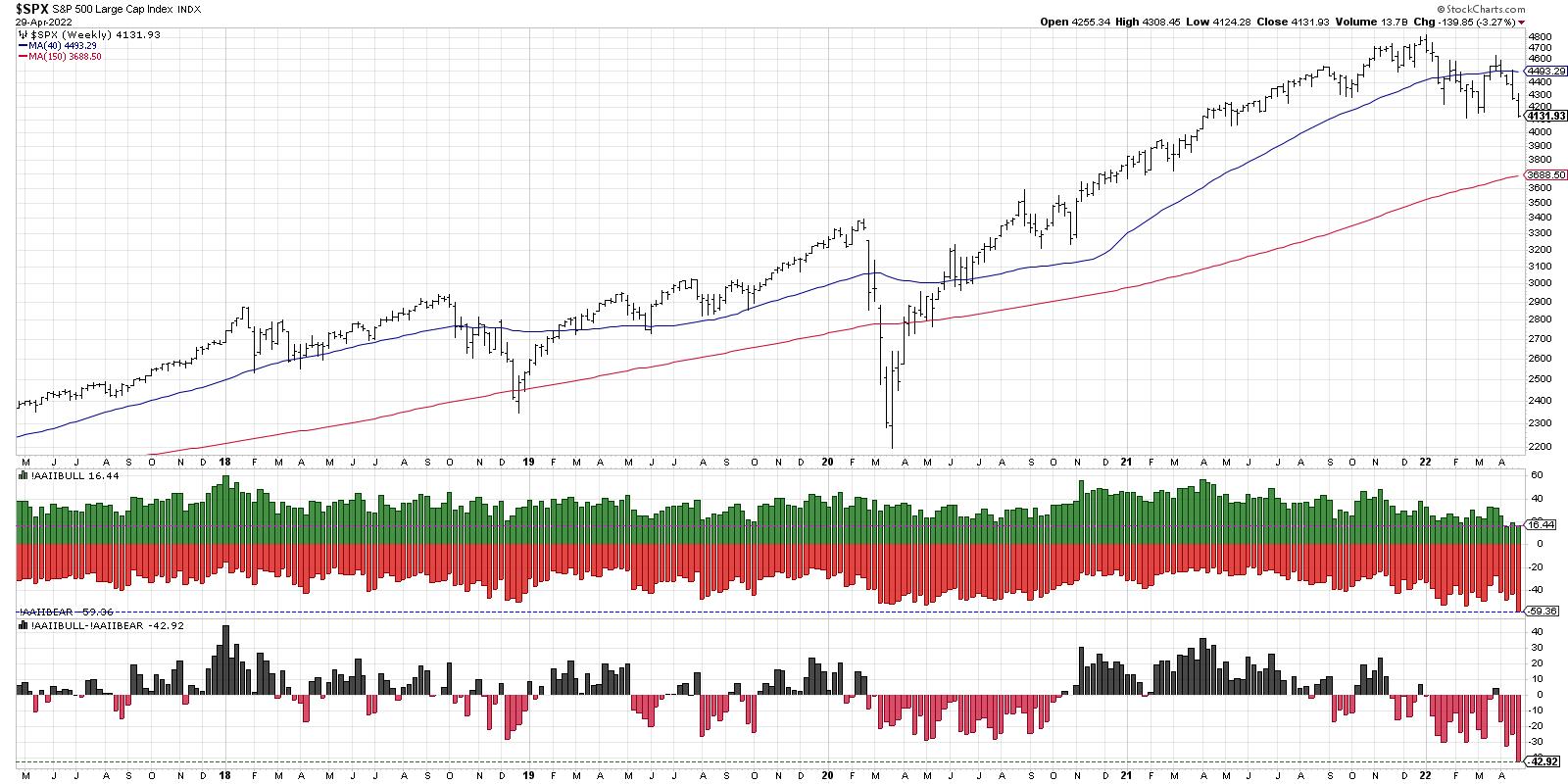
The current chart looks like this:

The green bars represent the percent of respondents who were bullish, while the red bars show the percent of bearish respondents. The bottom panel shows the spread between the two, bullish minus bearish, and the neutral responses are not included here.
My first response this morning was that, besides two weeks ago, we have not seen such a low level of bullish votes (only 16%) in over five years. I also noticed that the bearish number, at almost 60%, is the lowest we've seen in over five years. Finally, the spread between the two currently sits around -43%, with bears far outnumbering bulls. This is also well below the range of the previous five years.
So, basically, the current move has been so severe that you have no historical parallel without bringing in more data. I have found that when this happens on your chart, you are experiencing a market where a deep historical analysis is worthwhile.
Let's bring in 20 more years of data, which will take us back to the late 1990s.

This shows the current bearish readings are indeed some of the most severe we've seen even going back to the pre-2000s secular bull market. The only other time bullish sentiment has been this low was in 2016. The bearish reading of almost 60% was only seen at the 2003 market low, the 2006 pullback, and much of 2008 going into the 2009 market bottom. The spread of bulls to bears has only been this negative (-43%) one other time in the last 25 years, and that was at the 2009 market low.
Now let's dig into each of these periods in a little more detail.
It's interesting to me that the sentiment in March 2003 was more bearish than in the third quarter of 2002, which was the actual bottom of that cyclical bear market phase from 2000-2002. The 2003 low was a retest of the 2002 lows, but the prospect of moving to new lows for the cycle made investors incredibly bearish.
The 2006 observation is a compelling one, in that it occurred during a brief pullback during a cyclical bull market phase. Similar pullbacks in 2005 saw somewhat bearish sentiment, but not the extreme seen in 2006. The market quickly recovered and went on to new multi-year highs soon after.
The 2008-2009 observation is perhaps the most concerning, because the first leg down in the first quarter of 2008 saw a very similar pattern of bearish sentiment. As you can see, the sentiment remained excessively bearish for over a year, culminating in the quite negative readings in March 2009.
I was taught that investors tend to be excessively bearish at market bottoms and overly bullish at market tops. But a review of the AAII survey data over the last 25 years shows that this has indeed occurred... but only some of the time. In certain cases, like the 2008-2009 cyclical bear market, excessively bearish sentiment was just the beginning of a long and painful journey to the downside.
Want to digest this article in video format? Head over to my YouTube channel!
RR#6,
Dave
P.S. Ready to upgrade your investment process? Check out my YouTube channel!
David Keller, CMT
Chief Market Strategist
StockCharts.com
Disclaimer: This blog is for educational purposes only and should not be construed as financial advice. The ideas and strategies should never be used without first assessing your own personal and financial situation, or without consulting a financial professional.
The author does not have a position in mentioned securities at the time of publication. Any opinions expressed herein are solely those of the author, and do not in any way represent the views or opinions of any other person or entity.
|
| READ ONLINE → |
|
|
|
| Martin Pring's Market Roundup |
| Yields May Be Peaking for a While |
| by Martin Pring |
A few weeks ago, I wrote a piece entitled "The Fed Raises Rates; What if it's Already Priced into the Market?". The idea was to point out that the Fed is a lagging indicator and that multiple bond yields had already reached mega resistance in the form of their secular down trendlines. Perhaps, just as the Fed was beginning to raise money market rates, longer-term maturities, which are more subject to market forces than central bank activity, had already factored that into their yield. The bottom line being, whilst longer-term rates will ultimately rise much higher, that was as good a time as any to anticipate a correction.
Rates have not moved much since then and, in some cases, have started to show some signs of short-term weakness, though it's important to emphasize that no serious trends have yet been reversed.
The Long-Term Technical Position
First, let's look at bond yields from that long-term perspective. Previous secular turning points, going back to the nineteenth century, have been characterized by an extended trading range. The most recent one developed between the mid 1970s and 1980s, shown in Chart 1. A potential base has also been shaded in blue. Note that the yield is slightly above the secular down trendline but, nevertheless, facing resistance in the form of the top of the possible base. The bottom window shows that it is currently very stretched against its 96-month MA, almost as much as at the 1981 secular peak. Some reversion to the mean seems likely.
 Chart 1 Chart 1
Chart 2 features the 10-year yield and its 18-month ROC. It shows that the ROC is also extremely overbought. From a secular point of view, that record reading is a characteristic of an immense change in psychology. The record, by the way, goes back in my database to 1857. Some would argue that the high reading is less significant, because the comparative lookback observations for the yield were extremely low. However, that was also the case in 1934 following the 1929 equity bear market. Stocks did not do too badly following that and have never returned to the 1932 lows!!
The exceptionally high reading carries an additional message that it indicates an overbought market. Overbought conditions imply the likelihood of a correction. Such a process could well involve, let's say, a retracement of the post-2020 rally to a point somewhere above the lower area of the base at 1.5%. In that respect, the blue line has been inserted as a highly speculative possibility.
 Chart 2 Chart 2
The idea of secular resistance is also presented in Chart 3, where it is evident that the yields for the 1-, 2-, 5-, 20- and 30-year maturities are all bumping up against very long-term down trendlines.
One takeaway from the chart is that these yields move in sync most of the time. However, there have been only three times in 25 years when all five simultaneously touched their respective trendlines. Each instance was followed by a yield decline. Needless to say, if a breakout takes place in the immediate future, that would be super bullish for rates, as they will have overcome a resistance tremendous barrier confirming beyond a reasonable doubt that 2020 experienced a secular low.
 Chart 3 Chart 3
The Near-Term Picture
Chart 4 features the 10-year Yield, together with its 9-day RSI and daily KST. No trends have yet been broken, but the yield could well be in the process of tracing out a small head-and-shoulders top. If it is completed, the short-term KST is certainly in a position to pressure a decline. So too is the RSI, which has just violated an up trendline.
 Chart 4 Chart 4
Chart 5 compares the iShares 7-10-year Bond ETF (IEF) to my net new high bond indicator, which you can read about here. The ETF has just touched support at a time when the oscillator reached a record oversold reading. The green arrows show that, when it has reversed from an oversold condition, a rally has typically followed. It has not yet reversed to the upside. However, being in such an oversold state, it is unlikely to maintain its downtrend for much longer.
 Chart 5 Chart 5
The Yield Curve Inversion Has Been Greatly Exaggerated
As an aside, there has recently been an unprecedented amount of attention fixated on the yield curve. Usually, when the consensus of the financial community focuses on a specific aspect, the expected event fails to transpire. In this case, a recession. Yield curves come in many shapes and sizes, but all compare a short- to a longer-term maturity. When both yields reach the same level, this is known as an inversion. Inversions reflect the cumulation of a tighter monetary policy. All recessions since the 1970s have been preceded by an inversion.
Chart 4 features two versions of the curve the 2/10-year and the 6-month to 10-year. The 2/10 series has been rising rapidly, a process known as flattening, as the two rates come closer to each other. It almost inverted this month. However, the highly Fed sensitive 6-month/10-year version has hardly moved at all, as it reflects that the Fed has been slow to the party. The vertical lines approximate the beginning of recessions. Note that all six were preceded by both series inverting. The business cycle has repeated throughout recorded history (220-years), so a recession is all but inevitable at some point. However, the current yield curve dichotomy argues that now is not the time to be overly concerned.
 Chart 6 Chart 6
Good luck and good charting,
Martin J. Pring
The views expressed in this article are those of the author and do not necessarily reflect the position or opinion of Pring Turner Capital Group of Walnut Creek or its affiliates.
|
| READ ONLINE → |
|
|
|
| ChartWatchers |
| Long-Term Participation at One-Year Lows and Bear Market Levels |
| by Carl Swenlin, Erin Swenlin |
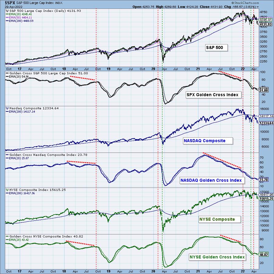
The Golden Cross Index (GCI) and Silver Cross Index (SCI) give a much better picture of market breadth than any advance-decline based indicator. And, rather than breadth, we think of them as giving an accurate measure of participation -- the percentage of stocks participating in the up or down pressures driving the market.
The GCI is a long-term indicator that tracks the percentage of stocks in a given index that have the 50-EMA above the 200-EMA, the venerable Golden Cross. Below is a chart showing the GCI for the S&P 500, Nasdaq Composite, and NYSE Composite Indexes. We consider GCI readings above 70 to be bull market conditions; between 70 and 50, correction territory; and below 50, a bear market. These levels are somewhat arbitrary and leave room for subjective interpretation. As you can see, the Nasdaq Composite and NYSE Composite are deeply into the bear market range. The S&P 500, while still above 50, is barely so and will probably join the other two soon. Note how the GCIs topped well ahead of their price indexes -- up to a year or more.


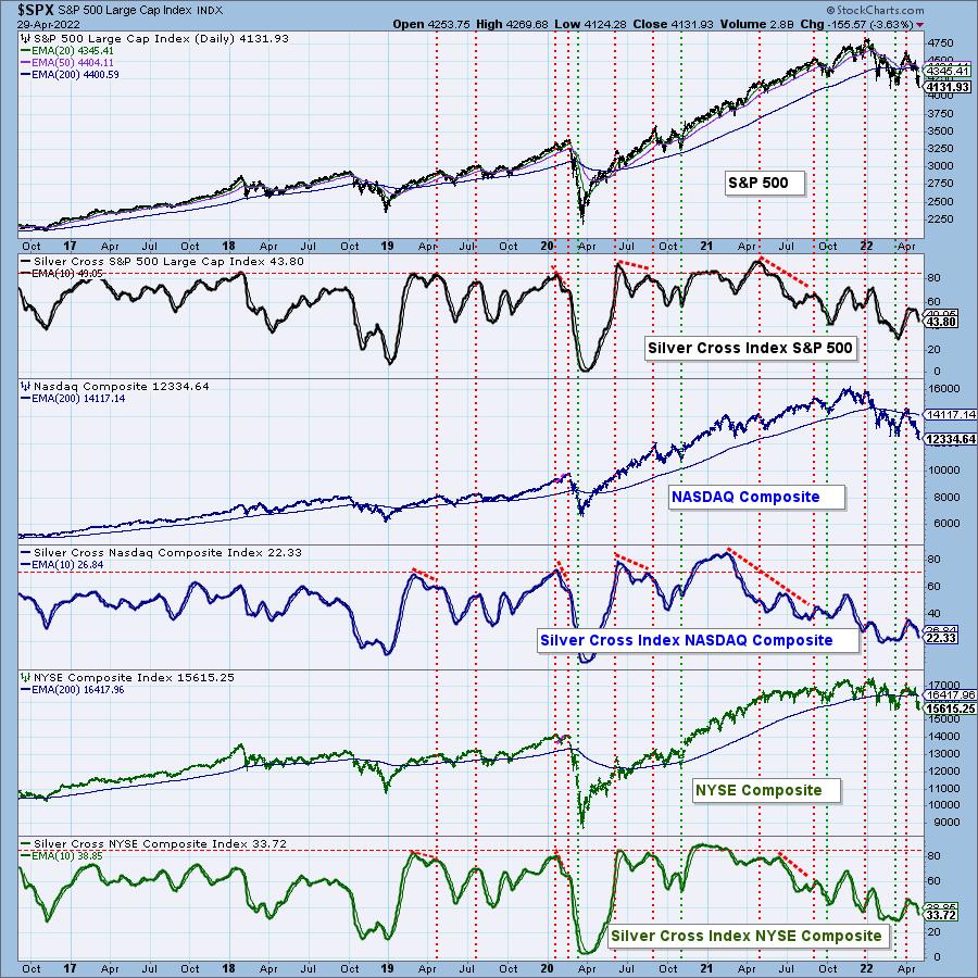
The SCI is an intermediate-term indicator that tracks the percentage of stocks in an index with the 20-EMA above the 50-EMA, which we call a Silver Cross. In the chart below, we have the same three market indexes with their SCIs. The SCI moves more quickly than the GCI, and we can see how readily it responded to the March rally. Nevertheless, the SCIs are all below 50 and falling again.

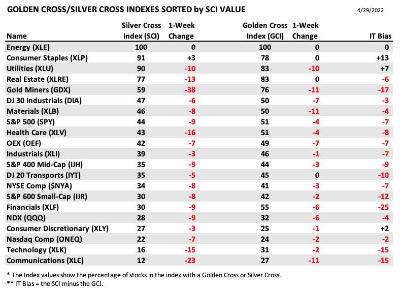
DecisionPoint has SCIs and GCIs for 21 market and sector indexes. The following table shows the SCI and GCI (sorted by SCI value) for each of them. This gives a clear picture of strongest to weakest index/sector in terms of participation. As you can see, all but four are at correction levels, while 16 are at bear market levels. Note that Technology is the SCI ranked second from the bottom.

CONCLUSION: The Silver Cross and Golden Cross Indexes are excellent indicators for assessing breadth and participation in the medium- and long-term. The broadest market indexes are showing that upside participation by their components is mighty thin. The situation is even worse for sector indexes. The S&P 500 is still slightly above 50% level, but just barely. More selling will surely send into the bear market zone.

Click here to register in advance for the recurring free DecisionPoint Trading Room! Recordings are available!
Technical Analysis is a windsock, not a crystal ball. --Carl Swenlin
(c) Copyright 2022 DecisionPoint.com
Helpful DecisionPoint Links:
DecisionPoint Alert Chart List
DecisionPoint Golden Cross/Silver Cross Index Chart List
DecisionPoint Sector Chart List
DecisionPoint Chart Gallery
Trend Models
Price Momentum Oscillator (PMO)
On Balance Volume
Swenlin Trading Oscillators (STO-B and STO-V)
ITBM and ITVM
SCTR Ranking
Bear Market Rules
DecisionPoint is not a registered investment advisor. Investment and trading decisions are solely your responsibility. DecisionPoint newsletters, blogs or website materials should NOT be interpreted as a recommendation or solicitation to buy or sell any security or to take any specific action.
|
| READ ONLINE → |
|
|
|
|
|
| ChartWatchers |
| CMT Association Hosts 49th Symposium |
| by Greg Schnell |
I need to add a new word to my trading vocabulary. I think every presentation at this year's CMT Association Symposium has used "regime change" to define the shift from one leading sector to another leading sector. This verbiage is also used in discussions for the "regime change" from growth to value. How about from tech- to commodity-centric? These are all regime changes, and this phrase does help to disrupt our historical thinking of tech or growth as the best sector.
The phrase is important because it highlights how significant the change is. This is not just a month-to-month focus. The consideration of a regime change highlights that we are at a much more significant place in history. Using this macro terminology, let's look at some of the different market areas.
Nasdaq 100
The markets have been breaking down for months and, as we roll out of April, the QQQ hangs around the neckline of the classic head/shoulders pattern.
When we place the thought pattern of a regime change, the chart below holds some technical signals that chartists talk about. First of all, the QQQ SCTR is down to 23%. That means that 77% of the ETF's have better price action than the QQQ's right now. The question has to be "Is this a bounce level?"
The relative strength in purple compares the chart to the $SPX. The Nasdaq was outperforming the $SPX for years, and now it is not. Until that 3-month down trend changes, we can look elsewhere. The simple trend line change can tell us a regime change may be happening, when we are comparing big macro environments. It was a great clue at year end.
The full stochastic is near the bottom of the range. This can stay near the bottom of the range for a while. The way a full stochastic is calculated tells us where the price is compared to the recent price action. Bad markets stay near the bottom, good markets stay near the top. There is no news that this is improving yet.
When we look at price, the chart has clearly made a lower high recently at the end of March. But it is trying to bounce off support.

The volume on this chart shows this week as one of the highest volume weeks in 2022. It was also the earnings week for the largest tech companies. The volume reflects something very important here: it was either managers selling into any earnings rally, or it was managers buying the bounce. We won't know yet, but there is a specific level of interest right here.
Lastly, the PPO is my favorite indicator, and it is still pointing down. The slotted black trend line is a real resistance line. For me, unless we can break this momentum downtrend, this chart is still heading lower. If this chart breaks lower, I would suggest a larger cycle regime change is officially here as it breaks support.
Energy
I do have a chart that is a commodity-related chart. Without going through all the indicators, it's pretty obvious this has been outperforming.

The real question for me is if the purple uptrend on the XOP chart will continue to outperform. The PPO is rolling over to end the month of April. We'll see if this chart can continue higher, but, right now, it is much better than the rest of the market.
If the idea of a regime change is worrying to you, we are about to see if the change from tech to energy is a larger cycle regime change. To me, the regime change started in January 2022, when the QQQ started to underperform the $SPX.
The CMT Symposium is using the regime change verbiage during most presentations. While the fundamental investors are thinking this is a great time to step in as a value investment, the technical view suggests the regime change is very important. For me, we stand at a critical juncture.
Stay tuned.
|
| READ ONLINE → |
|
|
|
| ChartWatchers |
| Earnings Hits and Misses Present New Opportunities |
| by John Hopkins |
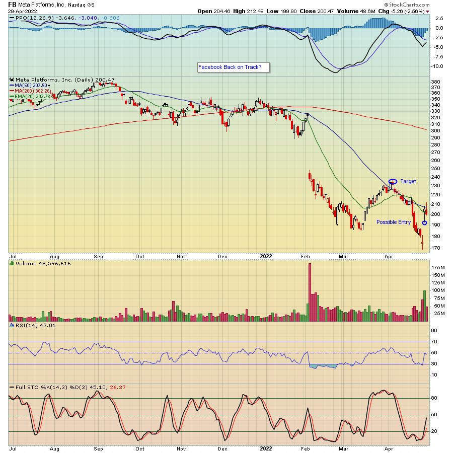
Over the past two weeks, we have heard from many of the most visible companies in the world, including the FAANG stocks, Facebook (FB), Amazon (AMZN), Apple (AAPL), Netflix (NFLX) and Google (GOOGL), who reported their Q1 earnings. The overall market reaction to the reports was mixed with traders particularly zeroing in on those companies that either guided higher or lower. In the case of FB, the reaction to their earnings was quite positive, as you can see in the chart below.

FB has gone nowhere but down since its all time high of $384, going back to September of last year, and had a lot on the line going into its report. In fact, the stock had lost 55% of its value over the past 7 months and could have gone even lower if earnings had come up short. Now, all of the sudden, buying interest in FB has picked up and, if the market steadies in any fashion, the stock could see further gains.
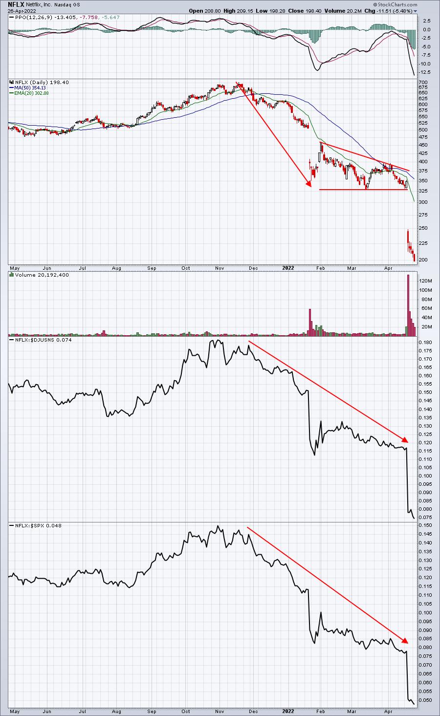
In the case of NFLX, just about everything that could go wrong this past quarter did, with the stock getting hammered as it fell by almost 47% in just over a week, and down a stunning 74% since its November high.

Unlike FB, which showed stronger than expected earnings, NFLX shocked traders when it reported a net loss in subscribers. That's never a good thing, but especially when the market is struggling and looking for anything that might go wrong as a way to justify selling a stock. But, in looking at the chart, we could be at one of those points where the stock has been oversold. One big clue for me is the RSI, which dipped into the teens as stochastics are nearing zero, almost always a sign that a bounce might be imminent. In fact, you can see a similar "Blue Cloud" form back in late January, and the stock bounced 100 points over just a few days. (Full disclosure: I took a position in NFLX at the end of last week.) Not to say the selling could not continue, but now we at least have a new price support level near $185, which could serve as a stop should the selling resume. To the upside, I'm looking for a move to the April 20 gap near $250, which would still keep the stock $450 from its all time high. It may never get there, but I do like the reward-to-risk at this level.
The FANG stocks only represent a small number of companies that have reported or are due to report their earnings over the next few weeks. At EarningsBeats, we keep our members up to date, including which companies are scheduled to report and which ones are likely to beat or miss expectations. In fact, every M, W and F, we include our "Upcoming Earnings Chartlist" in our FREE EarningsBeats Digest. If you would like to receive the EB Digest, just click here.
At your service,
John Hopkins
EarningsBeats.com
|
| READ ONLINE → |
|
|
|
| RRG Charts |
| Which Stocks Inside the DOW Are Worth Holding? |
| by Julius de Kempenaer |

With the general market going through a rough time at the moment, it makes sense to see if we can find pockets that are worth watching and potentially holding in portfolios.
For this occasion, I am using the DJ Industrials universe.
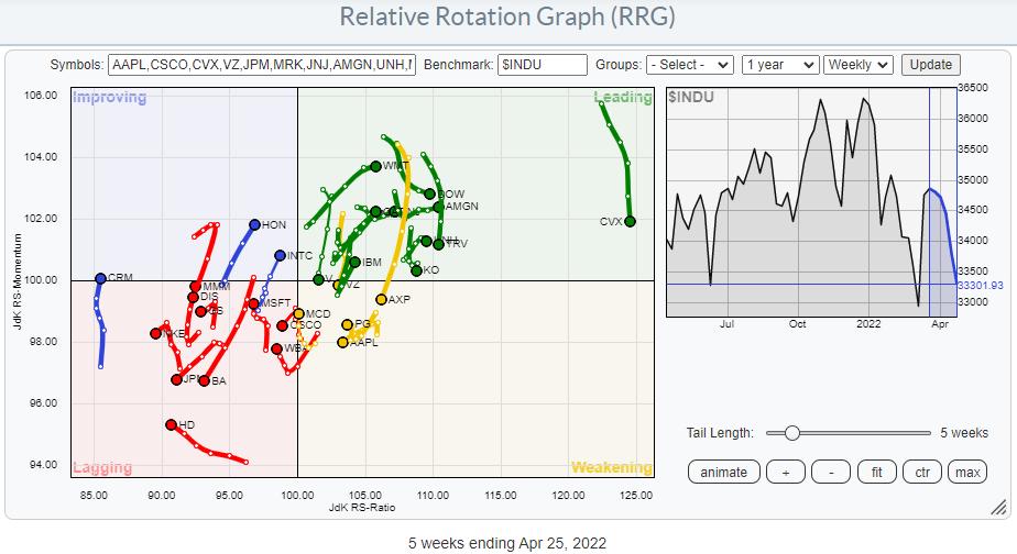
As you know Relative Rotation Graphs are based on a relative strength approach. The center of the chart is the benchmark and the trends are relative trends.
In the chart above we can see an evenly spread out universe around the center of the chart. When stocks are showing up inside the leading quadrant, it does not necessarily mean that they are moving up in price but they are in a rising relative trend.
Looking at the RRG I want to spot the tails that are traveling at a positive RRG-Heading (0-90 degrees).
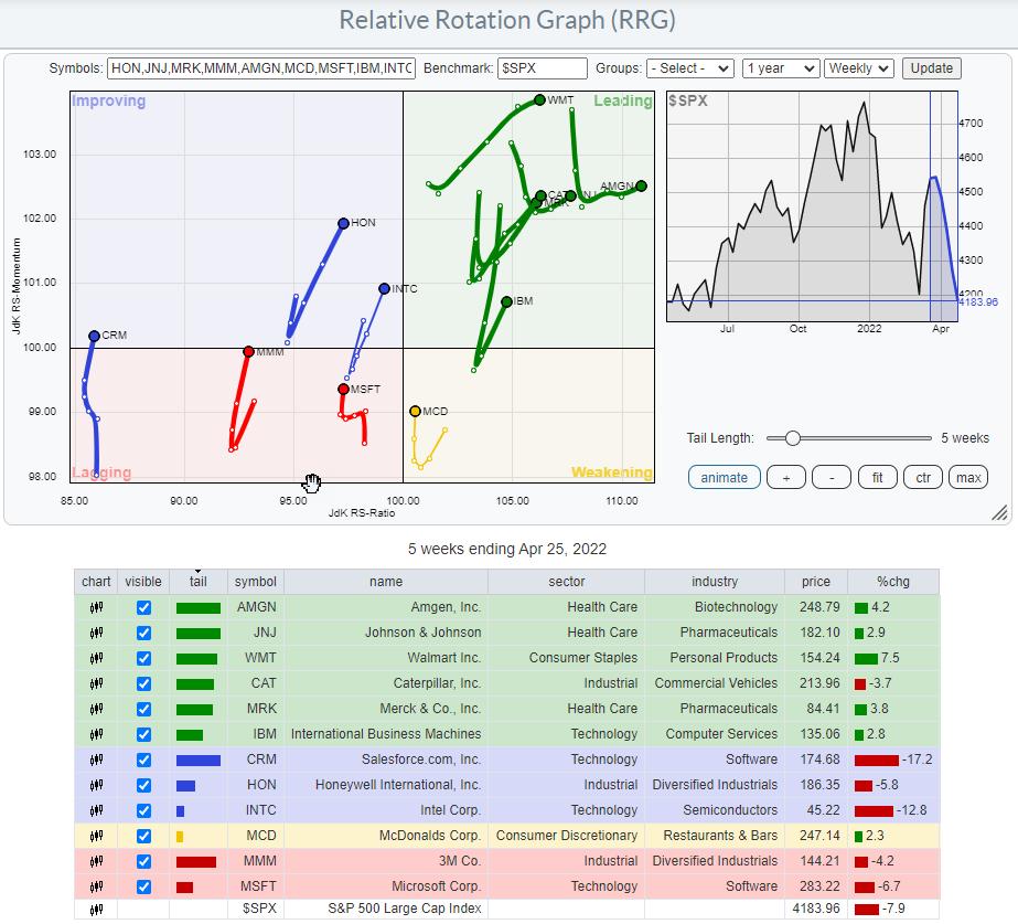
In the chart below I have deleted all others.

These are the stocks that are either already in a relative uptrend against $INDU or attempting to make their way (the ones on the left-hand side of the graph)
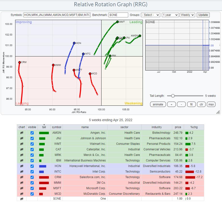
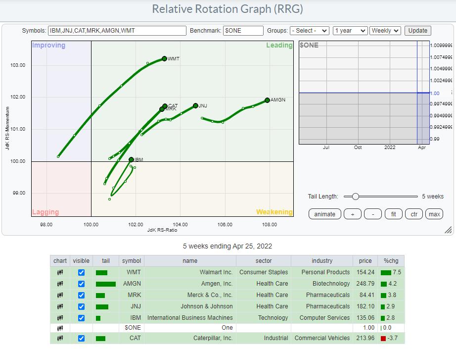
Because most retail investors traders are looking for absolute price performance it is also important to check the price trends as well. The way to do that with RRGs is to change the benchmark to $ONE. Instead of comparing the performance of the stocks on the graph with the benchmark and each other, they are now compared to a benchmark that is always equal to 1, i.e. absolute performance.

The main difference is that the image has shifted to the left. This is to be expected when the benchmark ($INDU) is going down. The other difference that we can spot on this version of the RRG, is that the tails are less "jiggly", they look cleaner which suggests that some reliable trends are underway, especially for the stocks that are inside the leading quadrant.
Browsing through the price charts for these individual stocks rapidly clarifies why the stocks inside the lagging and improving quadrants are on that side of the graph. They are all still in downtrends but going through a, most likely temporary, recovery which causes their tails to pick up a bit of relative momentum. Their trends have not changed.
That makes them not suitable for our purpose today.
The next RRG shows only the tails of the stocks inside the leading quadrant.

At the moment these names are all potential targets. Now it comes down to the individual charts.
I will show the ones that I like best below.
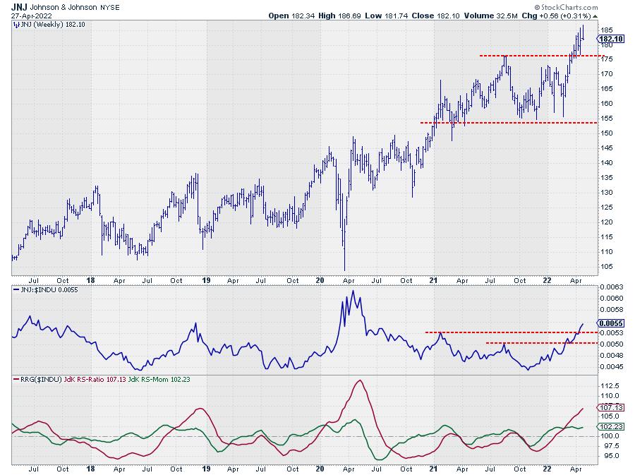
Johnson&Johnson - JNJ

JNJ is showing strong breakouts in both price and relative terms. Taking out resistance around $175 and managing to stay above that level for weeks already despite weakening market conditions is a sure sign of strength.
The upward break in relative strength marks the turnaround after a two year (almost) period of weak and/or sideways movement against $INDU.
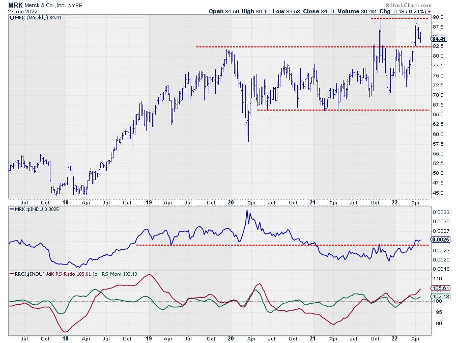
Merck - MRK

MRK is showing a picture that is quite similar to JNJ. The only difference is the big upward spike at the end of last year. The most important resistance level, IMHO, was the area around 82.50. Once broken a few weeks ago MRK rallied to the peak level of last year (89.74 vs 89.48) and seems to be underway for a test of, now, support at 82.50. Once a bottom can be put into place here MRK becomes an interesting stock for a rally back to $ 90 and possibly beyond.
Relative strength is certainly supportive.
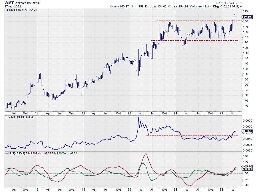
Wallmart - WMT

The third one on the list, and probably the "cleanest"chart is Wallmart.
The range in price between 130-150 is clearly visible and came into place when the downward break was reversed and WMT moved (back) into that range. Four weeks ago WMT broke above the upper boundary of that range and is still holding above that level (150) which should now start to act as support.
Here also a new low at or above support will make WMT a strong contender for inclusion in portfolios backed by strong relative strength.
#StaySafe, --Julius
|
| READ ONLINE → |
|
|
|
| Trading Places with Tom Bowley |
| Predicting Earnings Reports Is As Simple As Analyzing One Key Indicator |
| by Tom Bowley |
Let me start off by saying that nothing is a guarantee. In technical analysis, we don't work in guarantees. We work in probabilities. As I approach earnings season, I like to separate companies into 3 baskets:
- The strong
- The weak
- The I don't care
In my experience, the best earnings generally come from the best companies in the best industries in the best sectors. There's a reason why companies are outperforming heading into their earnings reports and, on their earnings dates, we find out why. The opposite is true as well. Weak stocks are typically weak for a reason. Case in point: Netflix (NFLX). Last week, in our "Sneak Preview: Q1 Earnings" event, NFLX was featured as one of the weak upcoming reports. One look at the NFLX chart should help to explain why:

NFLX showed absolutely ZERO relative strength as it approached yet another dismal earnings report. You have to keep in mind that Wall Street firms meet with NFLX management throughout the quarter (until quarter end). They are already receiving information as to competitive strength/weakness and they form their own conclusions as to the reliability of revenue and EPS estimates. These firms then return to their offices and they either buy or sell NFLX based on their discussions. We don't have that luxury. If I call the NFLX accounting folks, I don't think they're going to pick up. The only way I can make an assessment as to what might be forthcoming with regard to earnings is to look at the chart. It's important to look at absolute price action, but I believe relative price action may be even more important.
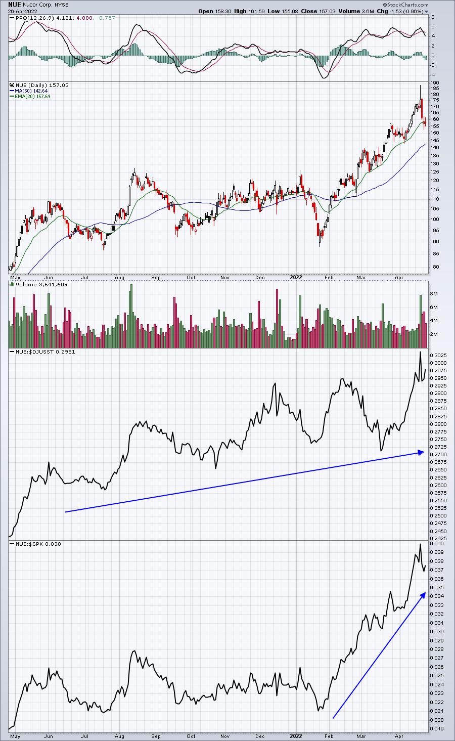
Now let's look at the relative strength of another company, Nucor Corp (NUE):

Last week, this was one of the "strong" charts that I passed along in our Sneak Preview event. I expected very solid numbers and NUE delivered. Their revenues surpassed estimates, as did their EPS. They also indicated that Q2 would likely be the most profitable quarter in the company's history! Did Wall Street just make a lucky guess? I don't think so. NUE moved higher in anticipation of strong earnings, then jumped another 10% intraday after earnings were reported. NUE has seen a bit of profit taking the past three trading sessions as the overall market has sold off hard.
As we move full throttle into earnings season, a TON of companies will be reporting. So Wednesday afternoon at 4:30pm, I'll be unveiling a new batch of "strong" and "weak" stocks as they head into their earnings. While I plan to discuss the results of last week's event (ie, how did the strong and weak stocks perform collectively?), I will share this with you. The 7 primary strong stocks provided averaged gapping higher by 4.46% after earnings were reported, while the 9 primary weak stocks provided averaged gapping lower by 3.28%. That's an 8 percentage point swing between the two groups.
If you'd like to join us at EarningsBeats.com for our Q1 Earnings webinar, I'll provide the next batch of strong and weak stocks after reviewing more than 1500 charts featuring companies with upcoming earnings reports. This is a members-only event, but a 30-day FREE trial gets you a seat to the event. CLICK HERE for more information and to start your trial! We'll send out room instructions tomorrow.
Happy trading!
Tom
|
| READ ONLINE → |
|
|
|
| Top Advisors Corner |
| Weekly $SPX Head and Shoulders Chart Pattern |
| by Leslie Jouflas |
On January 11, 2022, I presented a segment for StockCharts TV's Your Daily Five show titled "Are Market Indexes Hinting at Long-Term Weakness?".
The week of April 18, 2022 to April 22, 2022 saw prices in all indexes trending down for 2 days. It's unusual for the markets to have multiple trending days back-to-back. This generally signals a change. However, I believe this signal is only one of several that have occurred since the start of 2022.
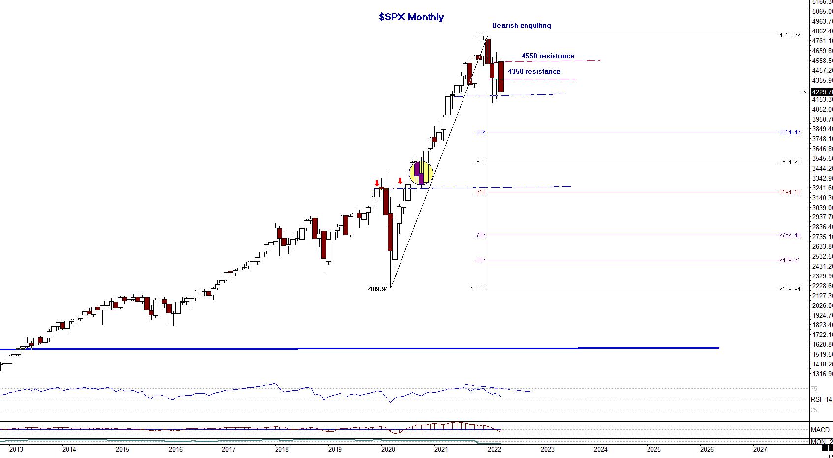
Let's start by looking at Chart 1, a monthly chart of $SPX.
 Chart 1 Chart 1
The January 2022 closing bar formed a bearish engulfing pattern. The close of this pattern erased most profits of investors from November and December 2021.
The February and March 2022 bars, interestingly, have opens and closes virtually in the same price ranges. These are illustrated on the chart with the upper red dashed line (4550 resistance) and lower blue dashed line (4350 resistance). The reason the lower blue dashed line is marked resistance is because it had previously been support. Generally, once support is broken, it will then act as a potential resistance level. Note also the pink dashed line where 4350 resistance is labeled. This is approximately a 50% retracement of the current monthly candle (April 2022), which still has a few more trading days before closing and a potential resistance level on any rally to the upside.
The lower, dashed horizontal trend line, 4200 price level, should be monitored for any potential downside breaks. We'll look in detail on a weekly (Chart 2) and daily chart (Chart 3) at this important price level.
Chart 1 of the $SPX monthly also shows Fibonacci retracement levels using March 2020 lows. The yellow circle near the .618 and red arrows are showing the price level from the upside breakout above the highs preceding the March 2020 highs.
Chart 2 of $SPX is a weekly chart showing detail of a potential Head-and-Shoulders pattern. In technical analysis, Head-and-Shoulder patterns are only validated with a break of the lower neckline for a topping pattern and a break of the upper neckline on an inverse, bottoming pattern.
 Chart 2 Chart 2
Viewing Chart 2, we can see more detail using trendlines and outlining of the Head-and-Shoulder pattern. Let's walk through some of the price levels.
The all-time highs in January 2022 completed a Butterfly sell pattern. This pattern was discussed in the video link above, and this pattern was followed on my website for subscribers. The right shoulder shows a horizontal pink line; this price level, around 4525 to 4550, shows opening and closing prices around the same price level, 4525, and the highs of those bars at 4550 level. The high of the right shoulder is a test of an upward-sloping trend line, which broke (light blue), and an evening star candlestick pattern, re-test of the trend line. That appears to have completed the right shoulder of the pattern. Using the lows of the left shoulder, a horizontal neckline is extended to the right, near the intersecting trendlines at red arrow. If this is "the" neckline, then it has been penetrated and the pattern is activated. However, there may be a neckline that is downward-sloping and the lower end is being tested today, around the 4200-price level. The market needs to close below this level to confirm the pattern.
If the 4200 level is decisively broken, then we can look for potential targets to the downside. The weekly chart shows potential areas. There are Fibonacci retracement levels using the March 2020 lows. As a note, the NASDAQ and QQQs traded to the .382 retracements in March 2022, and the $SPX and Dow Jones Industrials did not reach these retracements. The technology sector was much weaker on that sell-off.
Please see my April 12, 2022 Your Daily Five segment, titled "Tech Giants on Watch", that details current patterns in GOOGL, AMAT, AAPL, MSFT, FB, and AMZN. Most of these broke the support levels outlined in that segment.
The tech sector (NASDAQ, QQQ) will exceed the .382 retracement level reached in March 2022 and may well lead the $SPX and $INDU to lower levels. Monitoring this Head-and-Shoulder pattern should give traders a good roadmap to follow.
Finally, prior to the neckline/neckline's being decisively broken, if a rally exceeded a trend line drawn from the high through the high of the right shoulder, that would likely invalidate this pattern, and possible call for a reversal to the upside.
Best wishes for successful trading!
Leslie Jouflas, CMT
Note: None of the markets, ETFs or stocks listed in this article are recommendations to buy or sell; this article is intended for educational purposes only.
Please refer to my book Trade What You See, How to Profit from Pattern Recognition for more information. It's always important to learn entry skills, which include combining elements of intraday time frames, momentum indicators and other price patterns to control risk, and also, at times, waiting on the sideline until there is confirmation. There are trading techniques that can be learned and implemented to control risk and monitor the price behavior. We never know what price will do, and the only element we can control is the risk.
If you would like to learn more about these patterns and programs, please visit me at my website www.tradingliveonline.com. Questions? Email ljouflas@msn.com.
|
| READ ONLINE → |
|
|
|
| MORE ARTICLES → |
|
