| THIS WEEK'S ARTICLES |
| John Murphy's Market Message |
| STOCKS REMAIN UNDER PRESSURE |
| by John Murphy |
S&P 500 REMAINS IN DOWNTREND...Stock prices continue to weaken with no sign of a bottom. The daily bars in Chart 1 show the S&P 500 having fallen to the lowest level in more than a year and nearing a 20% loss which signals a bear market. In addition, its moving average lines remain in bearish alignment. The three moving average lines show the blue 50-day moving average having fallen well below its red 200-day line. And its green 20-day average remaining below its blue 50-day line which also signals an ongoing downtrend. Last week's message showed the SPX nearing a test of its 38% Fibonacci retracement line measured from its spring 2020 low which remains the market's first downside target. The green horizontal line in Chart 1 shows the SPX nearing that line. Breadth figures also remain weak.
 Chart 1 Chart 1
BREADTH MEASURES REMAIN WEAK...An article in today's Wall Street Journal points out that eight large stocks in the technology sector account for nearly half of this year's S&P 500 losses. Even so, measures of market breadth show that the current market downtrend is pretty broad based. The blue line in Chart 2 shows the percent of S&P 500 stocks above their 50-day moving average falling below 15% which is the lowest level in two years. In addition, the red line in Chart 3 shows the percent of S&P 500 stocks above their 200-day moving average falling below 30% for the first time in two years. In other words, more than 70% of SPX stocks are in major downtrends.
 Chart 2 Chart 2
 Chart 3 Chart 3
|
| READ ONLINE → |
|
|
|
| The Mindful Investor |
| How to Smile During a Bear Market |
| by David Keller |
It is super difficult to disconnect from the emotional impact of investing. I've often spoken of the dangers of endowment bias, where we tend to hold on to a losing position despite very clear evidence that we should cut our losses. As legendary technical analyst Ralph Acampora told me early on in my career, "Analyzing the chart is the easy part. Actually doing what the chart says? That's the tough part."
Being a mindful investor is about three things:
- Having a consistent set of routines
- Improving your market awareness
- Finding calmness as an investor by effectively managing risk
For my Market Misbehavior premium members, we actually devote a whole section of my behavioral investing course on how to overcome behavioral biases by injecting discipline into the investment process.
So how are you supposed to stay "cool as the other side of the pillow" when the markets are melting lower pretty much every week? It starts with a consistent weekly routine. Every Friday, I look at charts like this to assess the overall market conditions:
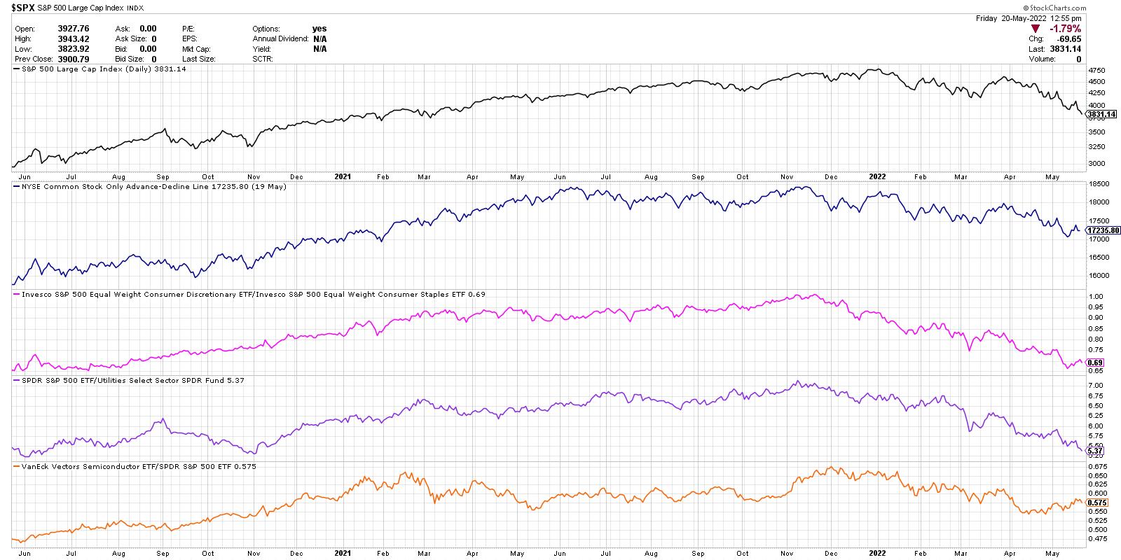
From the top, we're looking at the S&P 500 index on a daily closing basis, the NYSE advance-decline line (common stock only), the ratio of Consumer Discretionary vs. Consumer Staples (equal-weighted), the relative performance of the Utilities sector (inverted) and the relative performance of the semiconductor ETF.
So far in the month of May, four of the five indicators have made a new low for 2022. That means that the S&P 500 is in a confirmed downtrend, the breadth picture is continuing to deteriorate, offense is underperforming defense in the consumer space, and you're better off owning boring Utilities than the S&P 500.
Not a bullish picture.
The final data series at the bottom is the one that has not made a new low. And that is exactly how a market bottom could indeed emerge. One of these indicators stops confirming the bear market, then another, then another. Eventually the evidence is confirming that a bottom has indeed occurred.
This last piece of the puzzle leads me to look at stocks like AMD. Are they confirming this positive rotation for semiconductors?
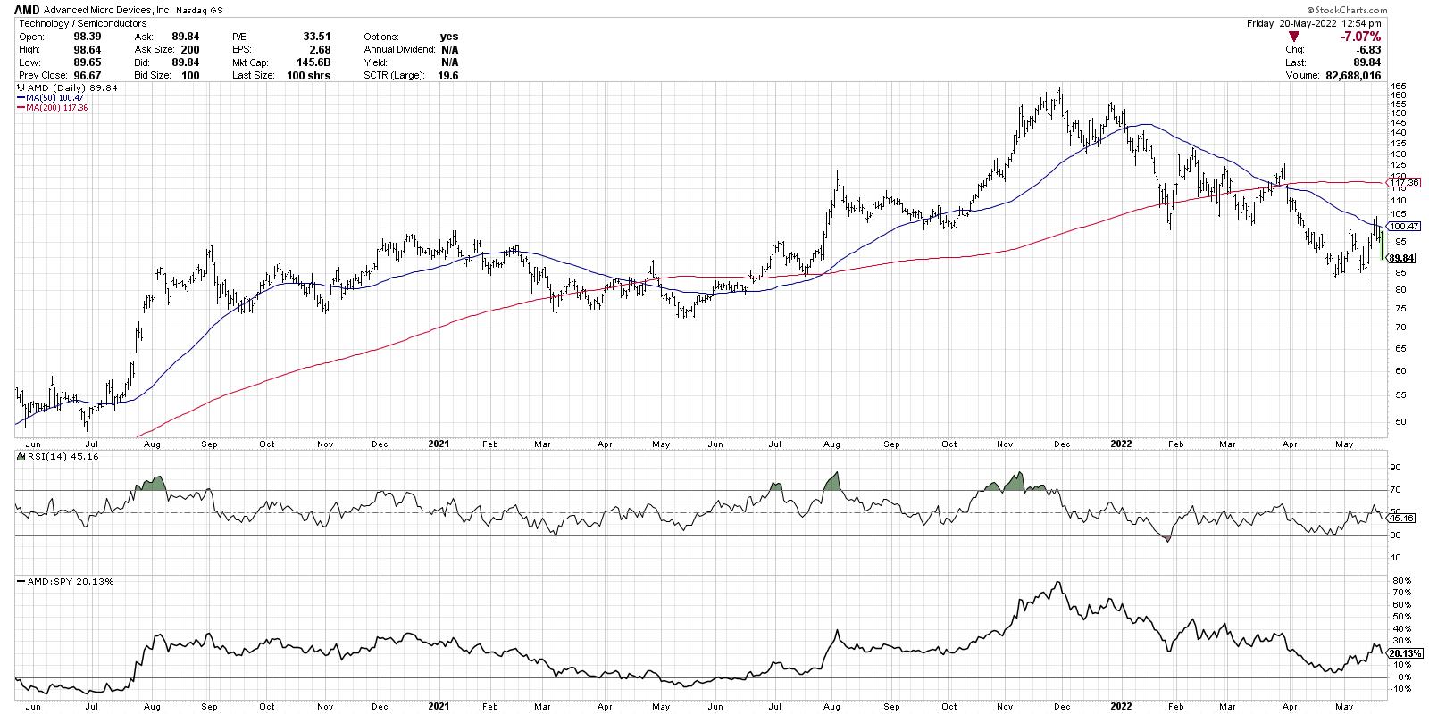
AMD did indeed jump higher this week, but has once again found resistance at the 50-day moving average. So while the relative strength is improving a bit, I'm not seeing enough on the chart of AMD to indicate a bullish rotation.
When a market bottoms, charts like AMD break back above the 50-day moving average as buying power comes in to overwhelm the selling pressure in the markets. That causes indicators like the percent of stocks above their 50-day moving average to go well above 30%.
What's the reading as of Thursday's close? Just 15% and making a new low for 2022. See the bottom panel in this chart for the new low this week for this key breadth indicator.
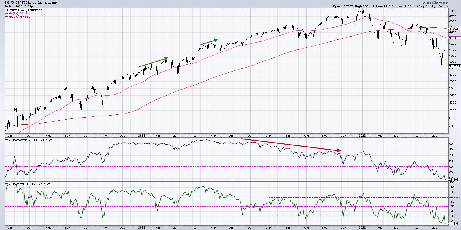
So why am I smiling in the face of a bear market? Because if there's one thing I learned in 2001, 2008 and 2020, it's that worrying about the markets does not seem to help the markets reverse course. My portfolio does better if I focus on managing risk and following trends in any environment. And I'm able to smile because I have a consistent set of routines, a healthy market awareness and a decent risk management strategy.
Want to learn to smile during a bear market phase? It starts with coming to terms with things like endowment bias. For more info, head over to my YouTube channel!
RR#6,
Dave
P.S. Ready to upgrade your investment process? Check out my YouTube channel!
David Keller, CMT
Chief Market Strategist
StockCharts.com
Disclaimer: This blog is for educational purposes only and should not be construed as financial advice. The ideas and strategies should never be used without first assessing your own personal and financial situation, or without consulting a financial professional.
The author does not have a position in mentioned securities at the time of publication. Any opinions expressed herein are solely those of the author, and do not in any way represent the views or opinions of any other person or entity.
|
| READ ONLINE → |
|
|
|
| ChartWatchers |
| The Brutal Summer Ahead Will Favor Health Care |
| by Tom Bowley |
I've been warning all year about this cyclical bear market and, unfortunately, it's not over just yet. Sentiment is turning more and more bearish, which is good, but we haven't seen the peak to mark the market bottom. That will take time and patience. In the meantime, relative strength in the health care sector (XLV) cannot be ignored. Check out this relative strength chart:
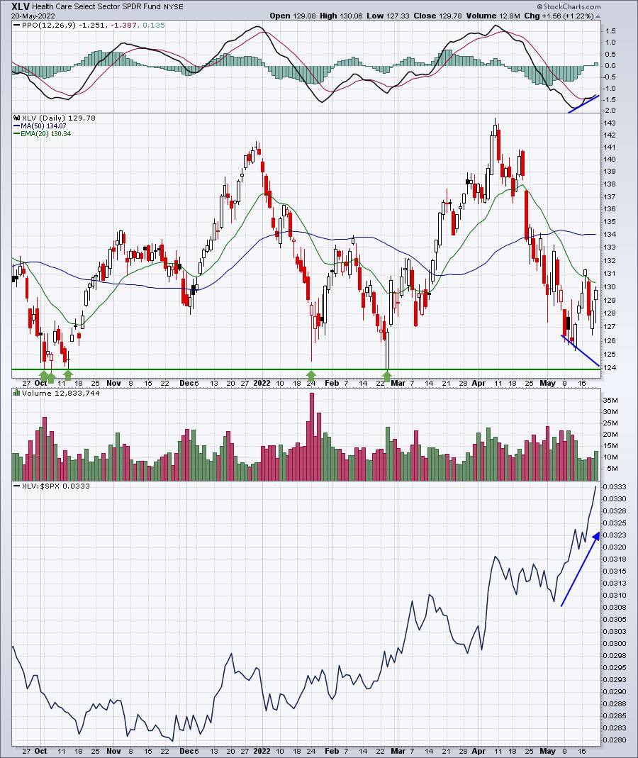
Money has been rotating into health care stocks, and the chart above clearly depicts this. Within the health care sector (XLV), medical equipment stocks ($DJUSAM) tend to perform exceptionally well from May through July and the group is nearing a relative high for 2022:
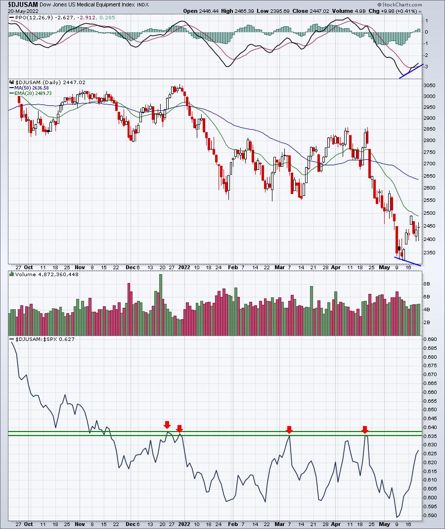
If medical equipment stocks fall back one more time in the near-term, there's an excellent chance we'll see a positive divergence form. If that's the case, you should be aware that medical equipment stocks LOVE the May through July period. Since the April 2013 breakout in the benchmark S&P 500 (above prior highs in 2000 and 2007), it's rather obvious that medical equipment stocks thrive from May to July. Check this out:
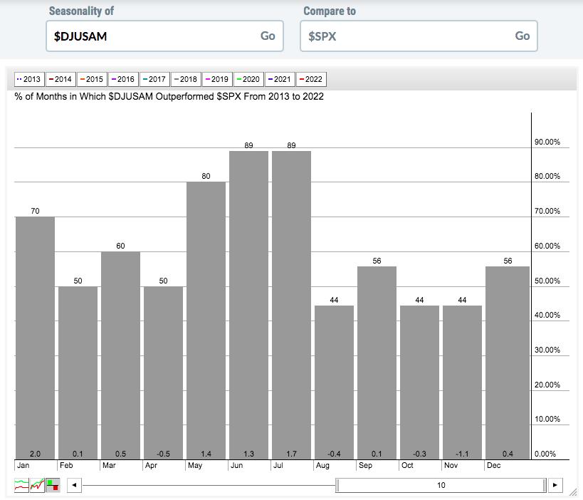
The above chart shows the relative outperformance of the DJUSAM over the next couple months. May through July are clearly the months where we see significant outperformance by medical equipment companies.
Cyclical bear markets definitely favor defensive sectors, and the DJUSAM is likely to provide great individual stock trading candidates as money rotates even further into defensive areas. On Monday, in my FREE EB Digest newsletter, I'll provide a medical equipment company that is poised to benefit from this summer rotation into defensive sectors. If you're interested, simply CLICK HERE and provide your name and email address in the area provided. I'll make sure you're set up and I'll get that chart out to you first thing Monday morning!
Happy trading!
Tom
|
| READ ONLINE → |
|
|
|
| ChartWatchers |
| The US is Dragging Stock Markets Around the World Lower |
| by Julius de Kempenaer |

For a bird's eye view of developments in international stock markets, I use a Relative Rotation Graph that shows the rotations for a group of international stock indexes.
The RRG below shows the weekly rotation for this group. You can find this under the pre-defined groups in the drop-down selection on the RRG page. I have added the Nasdaq and the DJ Industrials for this occasion, while I disabled the RTSI (Russian) index.
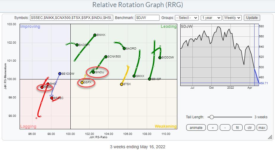
The benchmark for this chart is the Dow Jones Global Index. The US makes up a very large component of this index, which means two things:
- US market indexes will usually stay fairly close to the benchmark (center) of the chart because it is very difficult for them to deviate much
- When US markets move in one direction, by default, there has to be a group of markets that are moving in the opposite direction to offset that move. At least, that's the case when you are using a broad market index, like the DJ global index, as the benchmark.
Observations
So what do we see when we look at the RRG above?
The first thing that caught my eye was the strong rotations for Japan ($NIKK), India ($CNX500) and Europe ($E1DOW), as well as the shifted concentration of the tails to the right of the canvas. As this is an open universe, which means that not all components that are in the benchmark are plotted in the graph, this is not unusual. But, on further inspection, I noticed that all three US indexes (S&P, Nasdaq, and DJ Industrials) are heading at a negative RRG-Heading. Since they make up a large portion of the benchmark, it becomes clear(er) that the shift to the right is actually caused by the weakness in the US indexes, not necessarily from strength in those markets.
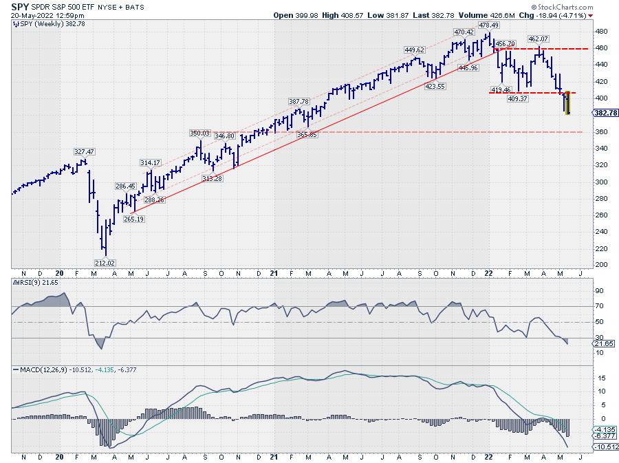
Following an intra-week rally attempt to come back to its breakout level around 410, SPY is now moving lower again. The first serious support level as I see it is now found in the 350-360 area. But, more importantly, the upside potential seems very limited and capped near 410 for the time being.
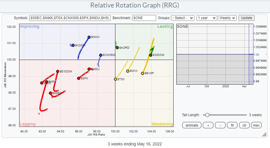
The general weakness for stocks around the world becomes even more visible when we switch to $ONE as the benchmark. All of a sudden, the concentration of tails is on the left-hand side of the graph, indicating downtrends (in this case in price), while the tails that are still on the left-hand side are at a negative heading and moving towards the lagging quadrant.
Again, also when visualized this way, the tails for Japan and India stand out, as they are pointing to the top-right. Upon inspection of their individual charts, it becomes clear that the rotation in relative terms is indeed very strong, but that the strength of the tail in absolute terms is more a recovery/pause in a trend that is predominantly moving lower.
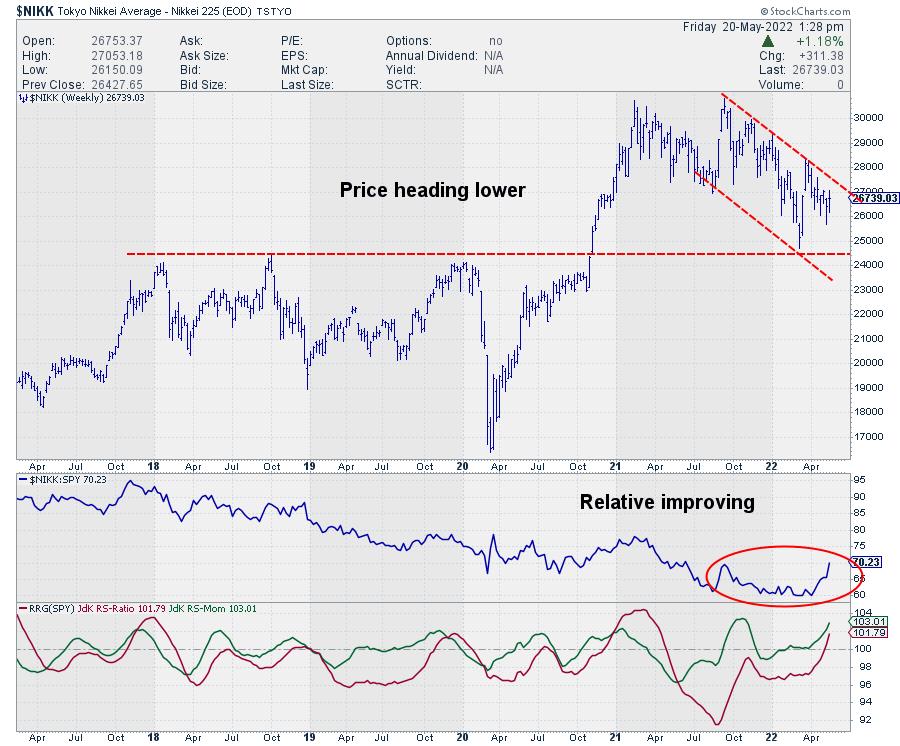
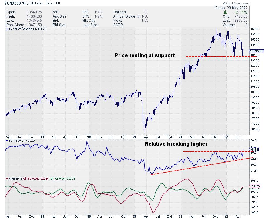
Given the strong US dollar, ETFs tracking those markets can be interesting hedges / offsets against positions in US stocks. Just be aware that here also the downside risk is clearly present, especially in India, when the current support level (where the market is resting at the moment) gives way.
#StaySafe and have a great weekend!, --Julius
My regular blog is the RRG Charts blog. If you would like to receive a notification when a new article is published there, "Subscribe" with your email address.
|
| READ ONLINE → |
|
|
|
| Martin Pring's Market Roundup |
| Commodities on the Verge of an Upside Breakout, But Participation Will Likely Narrow |
| by Martin Pring |
Chart 1 shows that the Invesco DB Commodity Tracking Fund could be on the verge of breaking out from a 3-month consolidation pattern. It also points out that the number of commodities participating in the rally has been narrowing of late. That's because the indicator monitoring a universe of commodities registering net new highs over a 50-day lookback period has been shrinking since the pattern began forming in early March. Such narrowing is typical of the internal battle typically fought at the end of most commodity bull markets, as industrial commodities in general begin to lose upside momentum ahead of energy.
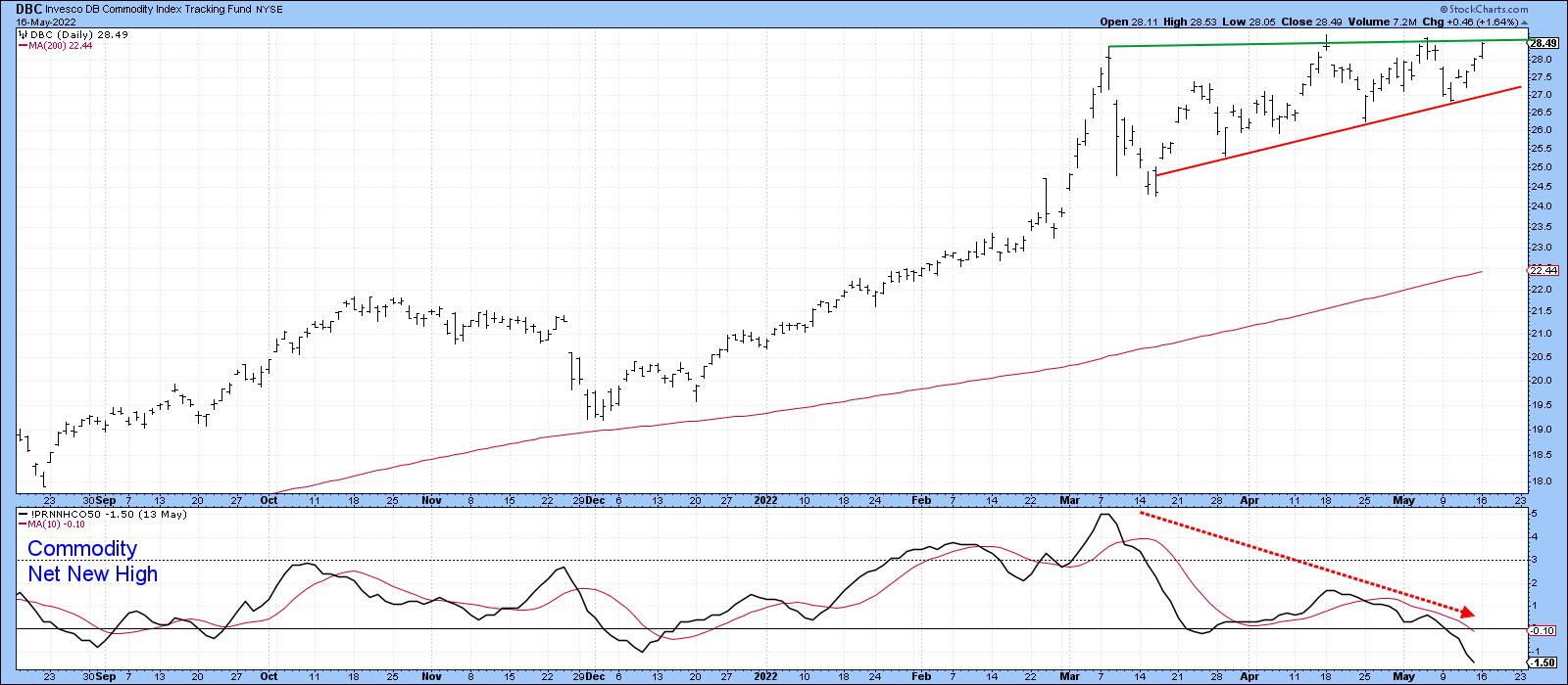 Chart 1 Chart 1
That relationship is best demonstrated by comparing a smoothed long-term momentum indicator for copper, our proxy for non-energy industrial commodities, against that for crude oil. In Chart 2, the green arrows show that the KST for the copper price leads that for oil in virtually every cycle. When copper momentum peaks, it tells us two things: first, the technical position of the red metal has begun to deteriorate, and second, that the commodity bull market is in its late stage and likely to be narrowing in participation.
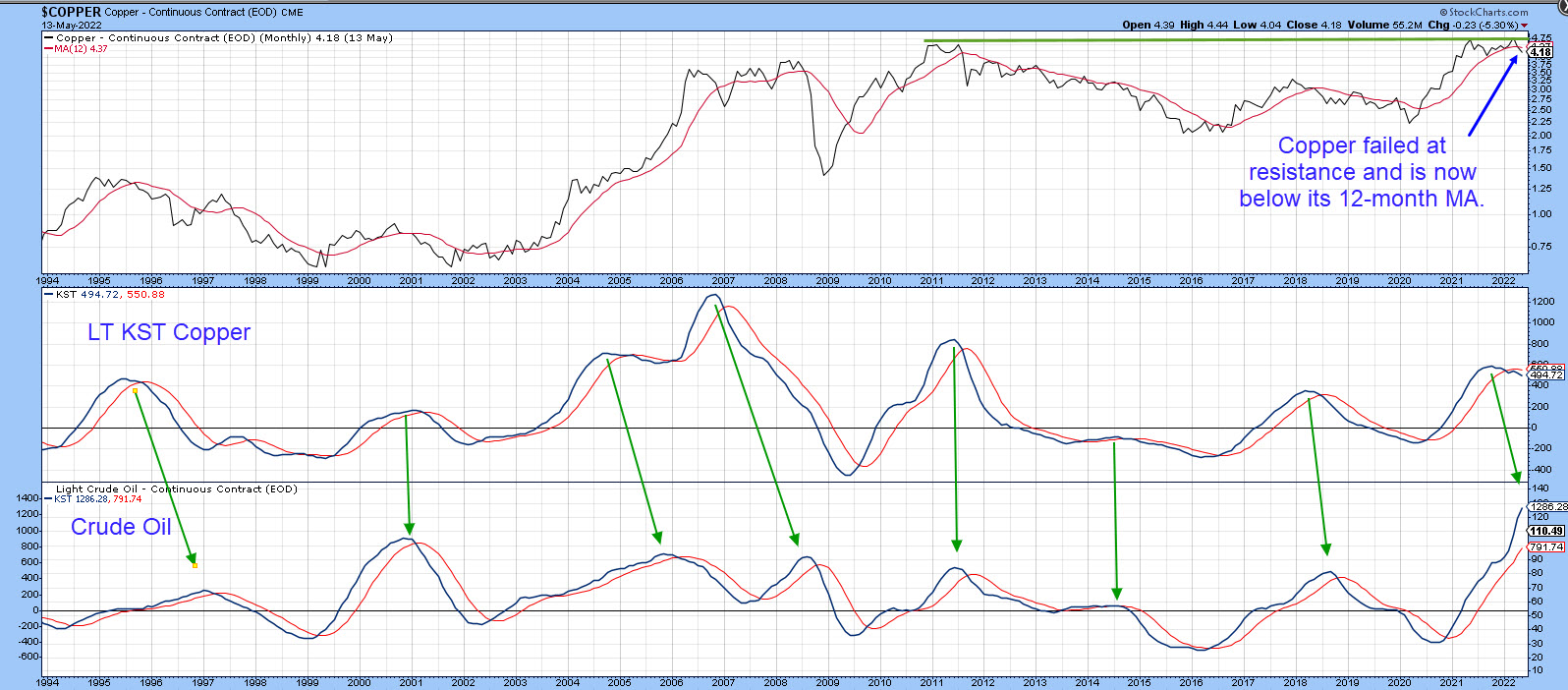 Chart 2 Chart 2
Chart 3 tells us that the ratio between oil and copper has reached a crucial chart point, just slightly above its secular down trendline and the 2018 high. Don't forget this is not an end-of-the-month plot yet. It's obviously a bit overextended on the upside, but an examination of the technical picture of its two components suggests that energy is destined to ultimately win the battle.
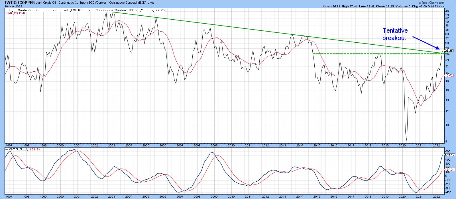 Chart 3 Chart 3
Copper Looks Weak
Note that the copper price, in the upper window of chart 2, has already failed at massive resistance in the form of the multi-year horizontal trendline. It has also dropped below its 12-month MA. In addition, Chart 4 indicates that copper has completed a top formation. Note that the Special K, which you can read about here, has also peaked for the cycle and completed a top of its own.
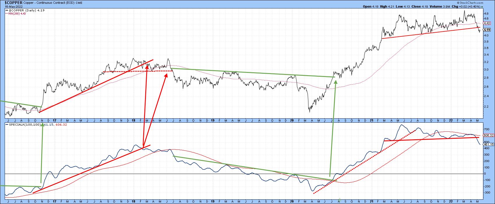 Chart 4 Chart 4
More negative proof arises from Chart 5, where the relative line between copper and the CRB Composite has violated a 17-year up trendline and experienced a long-term KST sell signal. The breaking of the up trendline is particularly egregious, since it confirms that the early 2021 high for relative performance was a false breakout. Whipsaw signals such as this are typically followed by an above-average decline. Some kind of a bounce is overdue, especially as the ratio has reached support. However, the long-term bearish overhang remains.
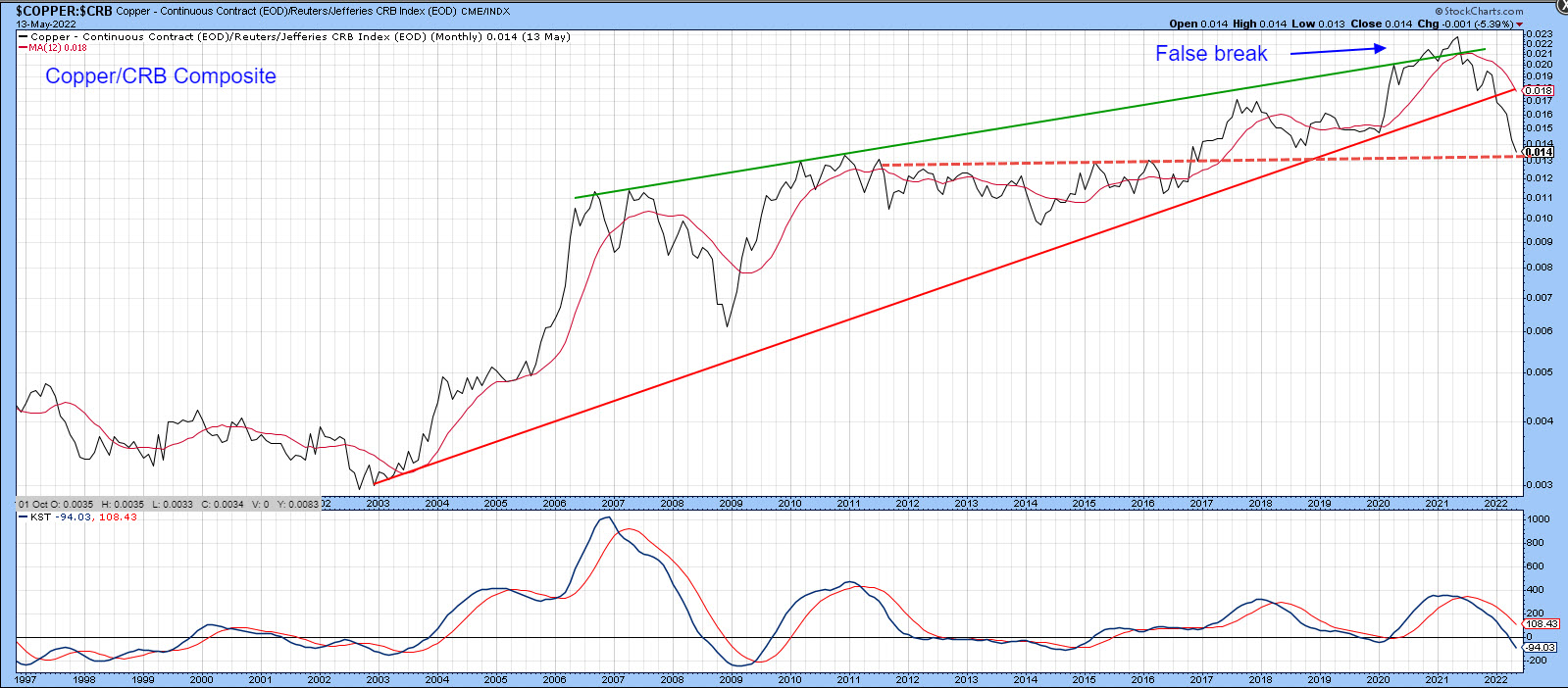 Chart 5 Chart 5
Chart 6, comparing the broader energy with base metals, confirms this continuing energy emergence.
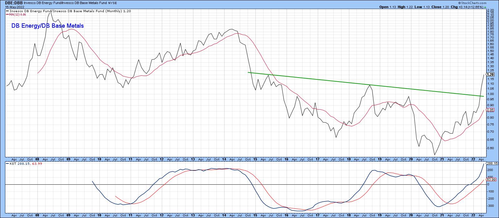 Chart 6 Chart 6
Energy Ready to Break to the Upside Again?
Crude oil broke above its secular down trendline very late last year and has now reached resistance in the form of the solid green trendline in Chart 7. Its RS line against the CRB Composite is also at resistance in the form of the 2013-2022 horizontal trendline. Both series are being supported by bullish, albeit overextended, KSTs, which brings us down to two important charts. The first is a daily one featuring the US Oil Fund (USO), which indicates that the price is edging through important resistance. Bearing in mind the critical status of the long-term technical position as indicated in the previous chart, we need to follow this one very closely to see if a decisive breakout follows.
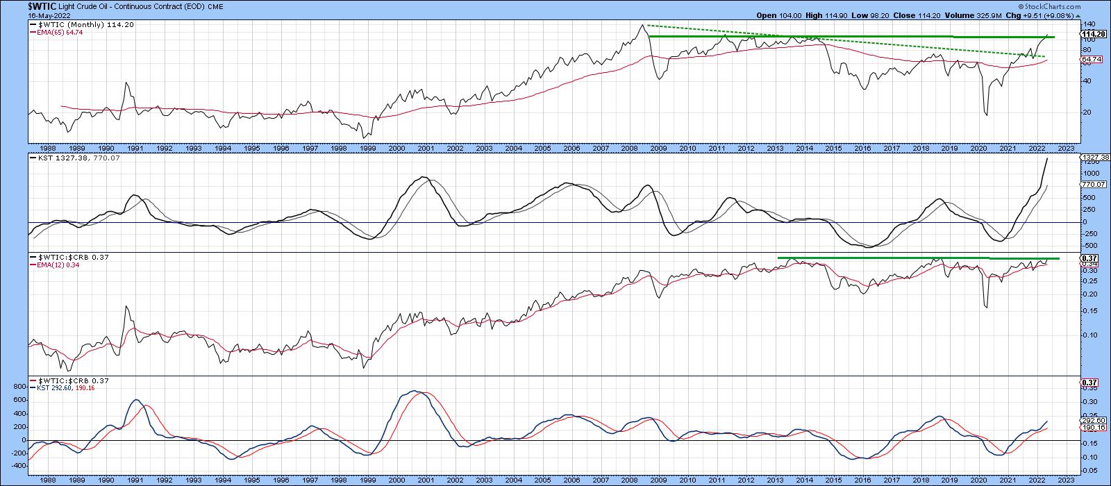 Chart 7 Chart 7
Chart 8 argues that it will, since the NYSE Oil Index has just broken out from a 14-year consolidation pattern. Oil equities and the oil price do not move on a tick-by-tick basis, but the completion of such a pattern does suggest that energy prices themselves have further to go on the upside.
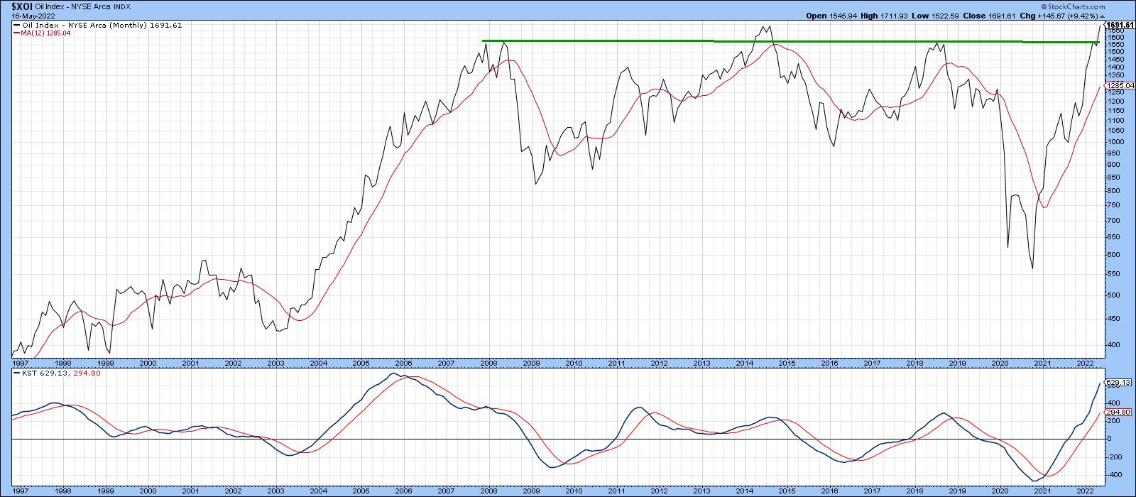 Chart 8 Chart 8
Good luck and good charting,
Martin J. Pring
The views expressed in this article are those of the author and do not necessarily reflect the position or opinion of Pring Turner Capital Group of Walnut Creek or its affiliates.
|
| READ ONLINE → |
|
|
|
|
|
| ChartWatchers |
| What Bear Market? These Stocks Have Great Looking Charts -- With Very Sound Reasons |
| by Mary Ellen McGonagle |
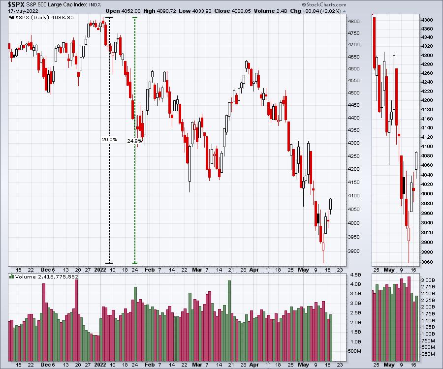
The markets have fallen for seven consecutive weeks, with the S&P 500 having its worst period in over 20 years (which was back when investors were grappling with the dot-com bubble burst). Today, this Index briefly fell into bear market territory, which is marked by a 20% decline from its high on January 4th of this year.
The continued deterioration in the broader markets this week followed news from retail giants Target (TGT) and Walmart (WMT) that growth was slowing in the face of high inflation and supply chain issues. The news was similar to Amazon (AMZN)'s market-rattling report of a slowdown in growth several weeks ago. All of which hints that consumers may have reached their limits. Consumer spending accounts for over 2/3rds of the U.S. GDP, and a slowdown in spending would point to a slowing economy.
Globally, things are looking grim as well as the war in Ukraine rages on, disrupting supplies of energy, wheat and other basic staples. The result is increased prices for these commodities which--coupled with earlier supply chain issues that remain in place--is at the root of the currently elevated level of inflation.
While high inflation is a negative for most areas of the market, there are stocks that historically fare well for a variety of reasons. Below are the charts of 3 companies that have characteristics that currently make them attractive.
DAILY CHART OF PFIZER (PFE)
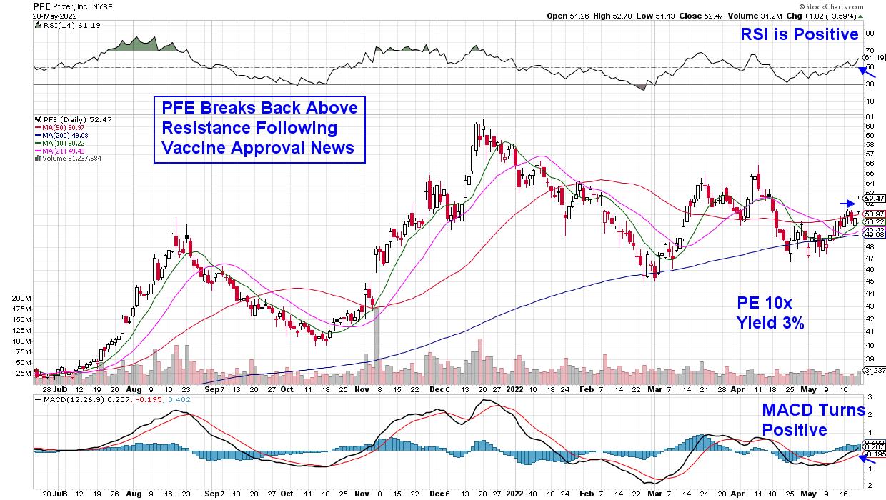
First up is Large-Cap Pharmaceutical company Pfizer (PFE), which closed the week above its key 50-day moving average on volume. Earlier this month, the company reported quarterly earnings that were 71% greater than last year, as COVID vaccine and treatment sales boosted results. Last week's break above resistance came on the heels of CDC approval for the company's booster shot for children aged 3-11. Other positive news for the company came on May 10th, when Pfizer announced their bid to buy migraine drugmaker Biohaven Pharmaceutical, which has Wall Street analysts raising earnings estimates going forward.
While all of this is good news for the fundamental backdrop of Pfizer, the company has additional characteristics which are making it attractive right now. In particular, the company is trading at 10 times the value of its last 4 quarter of earnings, while also offering a 3% dividend. Low multiple, higher-yielding stocks fare well in periods of high inflation, and the fact that it's in Healthcare--historically a defensive area of the markets that outperforms when the markets are in trouble--also adds to its appeal.
DAILY CHART OF OCCIDENTAL PETROLEUM
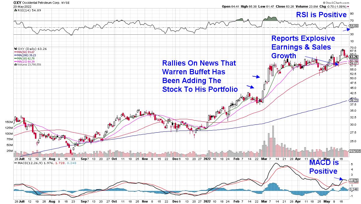
Next up is Energy stock Occidental Petroleum (OXY). Subscribers to my MEM Edge Report will be very familiar with this company, as it was first identified as a buy on January 4th when the Energy sector turned positive. While the stock has gained 90% since then, high oil prices amid reduced supply has kept the stock in an uptrend, with further near-term upside looking very possible.
Earlier this month, OXY reported earnings of $2.12 per share compared to -0.15 per share for the same quarter last year. In addition, they raised their dividend while authorizing a $3B share buyback program. Oil stocks fare well during periods of high inflation, and OXY's Price to Earnings ratio of 13 makes it attractive.
DAILY CHART OF DOW HOLDINGS INC. (DOW)
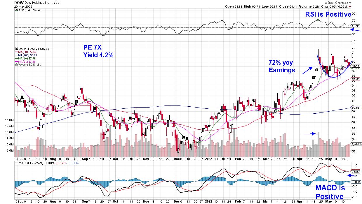
Last up is Dow Inc. (DOW), which provides chemicals for packaging and other areas. The company recently reported 72% year-over-year earnings growth, due to their ability to pass increased costs on to customers by way of higher prices. DOW is currently forming the right side of a base, with its RSI and MACD in positive territory. The stock currently has a price to earnings ratio of 7 times while offering a yield of 4.2%.
Chemical stocks are in the Commodities group, and this area has a history of faring well in bear markets that are plagued by high inflation. One of the winners in the 1974 bear market--which most closely resembles current market conditions--was chemical producer Dupont (DD), which produced a revolutionary printing system that year.
While the stocks mentioned above have attractive characteristics, it's important to remember that the overall trend of the markets is down. That is to say, similar to a bull market, when all ships rise with the tide, there may come a time when all boats sink as the tide continues to go lower.
I'm continually monitoring the broader markets and screening for stocks such as those above and, if you'd like to be alerted to a shift in market sentiment, as well as have access to my Watch List of possible winners in the next bull phase, take a 4-week trial of my MEM Edge Report for a nominal fee. You'll receive immediate access to our thoughts on the markets, with Sunday's live action report delivered directly to you.
On this week's episode of StockCharts TV's The MEM Edge, I review the status of the markets, highlighting areas and stocks that have positive charts and why. I also discuss the sector that was hardest hit this week, with further downside ahead.
Warmly,
Mary Ellen McGonagle, MEM Investment Research
|
| READ ONLINE → |
|
|
|
| Dancing with the Trend |
| "Believable" Misinformation Is a Danger to Long-Term Retirement Goals |
| by Greg Morris |
 Many investment "truths" seem to go unchallenged but are in fact, very clearly just myths. Buy and hold investing is a good long-term strategy, economists are good at predicting the markets, diversification will protect you from losses, compounding is the eighth wonder of the world, missing the best days each year can be devastating, probability and risk are the same thing, and chasing performance will work; just to mention a few. It is important to debunk these myths. Many investment "truths" seem to go unchallenged but are in fact, very clearly just myths. Buy and hold investing is a good long-term strategy, economists are good at predicting the markets, diversification will protect you from losses, compounding is the eighth wonder of the world, missing the best days each year can be devastating, probability and risk are the same thing, and chasing performance will work; just to mention a few. It is important to debunk these myths.
Buy and hold is a proven strategy for the stock market. The 1976 Ibbotson study and later updates are convincing evidence that buy and hold is a valid strategy for stock market investing. That is until you realize that you might not have a 100-year horizon to make your investment wealth. Most human beings have a good 15, maybe 20 years, to accumulate their retirement nest egg. During the 100 years of the Ibbotson study there were many 15-year periods where a buy and hold approach would have resulted in significant losses. After big losses, it takes a long time to break even. Remember, breaking even is not a successful strategy.
Economists are good at predicting the markets. It is odd that one of the components of the Index of Leading Indicators (designed by economists) is the performance of the stock market. The truth is, however, that the stock market is better at predicting the economy. In 1973, a young economist named Alan Greenspan stated, "Now may be the best time in history to buy stocks." This proclamation was made just days before the beginning of the 1973-74 bear market that took the S&P 500 Index down over 48% in a little less than 2 years' time.
Diversification protects against losses. Harry Markowitz won a Nobel Prize in 1990 for his ground-breaking research on diversification (modern portfolio theory) in 1952. The simple explanation of this theory is that by diversifying across a wide range of asset classes, one will not be devastated by a significant decline in any particular asset type. Bottom line, Markowitz advocated investing in portfolios, not individual securities. Peter Lynch, former successful manager of Fidelity's Magellan mutual fund said, "Diversification is not a guarantee against losing money, it is just a guarantee that you won't lose all your money at one time."
Compounding is the eighth wonder of the world. In the stock market, there are many years when prices go down and those down years can destroy an investor's wealth quickly. Negative compounding requires exceptional returns over the following years just to recover. Wall Street doesn't like this kind of math. If you experience a decline of 33%, you must have a gain of 50% to break even. Breaking even is not exactly the best means available to avoid the devastation of bear markets. A better and more accurate statement would be: Positive compounding is the eighth wonder of the world.
If you miss the 10 best days each year you will not perform as well as the market. This is certainly a true statement. It is commonly touted to further convince you that you must invest for the long term. Another statement that is also true is "if you miss the worst 10 days each year you will greatly outperform the market." Studies have shown that missing the worst 10 days each year will offer exceptional returns, significantly better than the market, and much better than those generated by missing the 10 best days each year. For the period 1979 through 2004 (25 years), using the S&P 500, a buy and hold strategy yielded a return of +10% per year. If you had the misfortune of missing the best 10 days for each year, your annualized return would be -10%, significantly worse than buy and hold. Convincing, isn't it? However, if you missed the 10 worst days of each year, your annualized return would be +38% per year. Of course, both of these scenarios are hypothetical, and neither are a realistic investing strategy, but the point is that missing the down days is much better than missing the up days.
Probability and risk are essentially the same thing. The dependence on statistics (probabilities) for investment forecasting is widely covered in the media and by many analysts. Usually the statistics are only used to add support to their current market hypothesis. Investor's understanding of probabilities is usually not good. There's the story about offering someone a chance to win at a game by telling him he will guarantee his winning 1 time out of 6. Most eagerly accept such odds. That is, until you tell them that the game is Russian roulette. The focus then shifts to the risk of the loss, not the probability. Most investors forget to incorporate risk into their decision-making process when the truth is, managing and accessing risk is tantamount to investment success. As Thomas Gilovich says, "odds are you don't know what the odds are."
Chasing performance will work. Performance chasing can also be devastating to investment health. A manager might outperform or under perform their benchmark, but often, the benchmark is inadequate for the manager's style. Past performance is not predictive, it is only a measure of how a manager achieved past success (or not). Success (or failure) can be attributed to style (growth, value, large cap, small cap, etc.), economic conditions, bull/bear markets, etc. Past performance is about hope, which is a comforting companion but a poor indicator of the future. One should adopt an investment philosophy that realizes the market has its good periods and its bad periods, and the philosophy adjusts to them as needed. A technical approach that follows the intermediate trends of the market with strong risk management offers a peace of mind dividend.
Each of these examples shows us where human frailty translated into investment errors and how perceived "common knowledge" is taken for granted. We cannot afford to accept investment-related information that we understand as "common knowledge" if that "common knowledge is not accurate. Look at the myths and find an investment advisor who understands them and whose investment practice debunks them on a daily basis.
Dance with the Trend,
Greg Morris
|
| READ ONLINE → |
|
|
|
| The Canadian Technician |
| I'm Watching These Areas |
| by Greg Schnell |
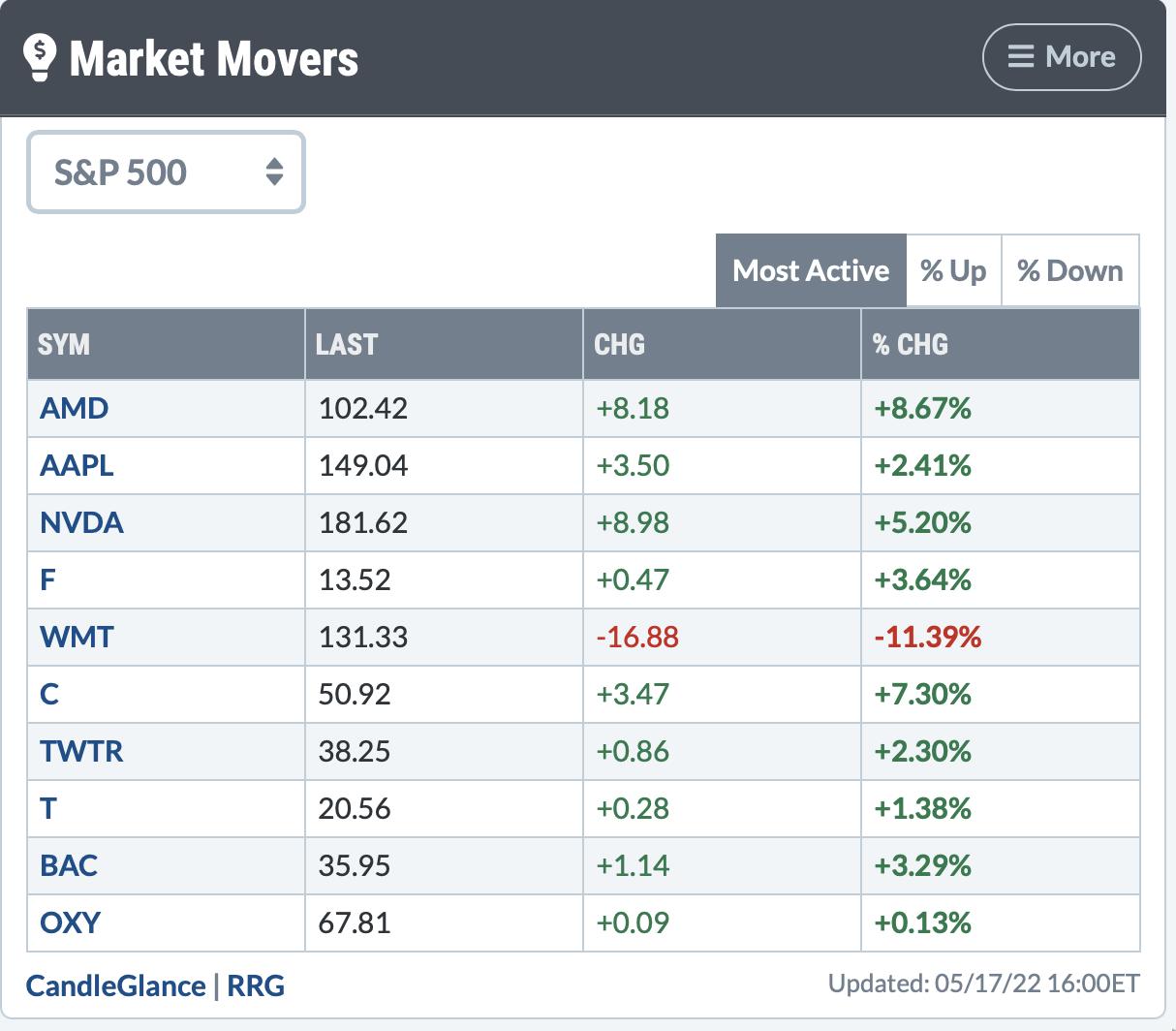
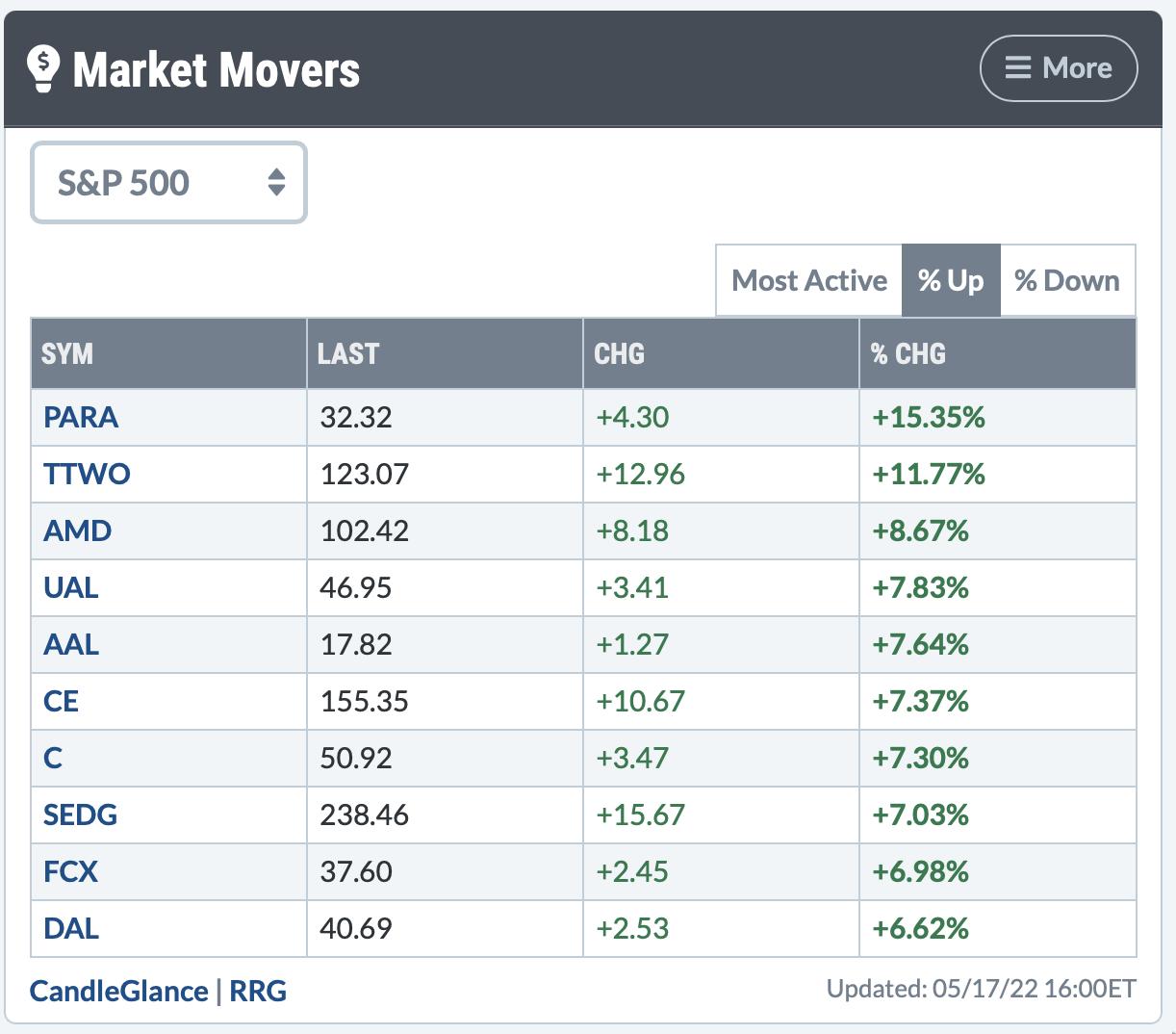
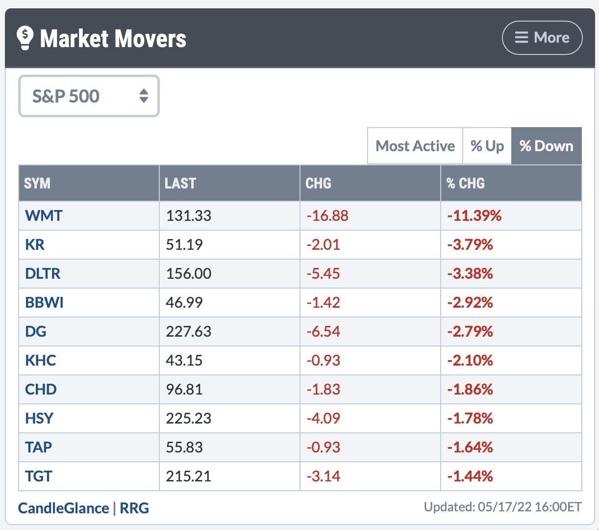
The market made its low on Thursday and has made some nice gains off the lows. Tuesday was another strong day. I continue to like the setup here for a rally.

The other areas I am looking for is a rotation from defensive to growth-oriented sectors. Semiconductors really popped on Tuesday and have done well over the last 5 days. When I look at the list that is sorting based on Tuesday's results, it has growth areas on the top and defensive sectors on the bottom. One area that is not really popping yet is the discretionary sector.

Looking at the top-performing stocks, most active names and underperforming names, it does highlight the rotation away from defensives.
In the top panel, the most active list is dominated by tech-related, but there are two banks and an oil company there.

Looking at the biggest movers, it shows a different picture. Three airlines made the list. I was surprised to see FCX and SEDG on the list actually. The copper chart has been terrible and Solar Edge was not where I would have looked. Might be more there in Clean Tech, as it has been beaten down for over a year.

One area I was not surprised to see was the defensive names as the weakest. Grocery stores, dollar stores and food companies were selling off.

To me, it looks like a rally has started. If you'd like more information on where to look for opportunities, I'd encourage you to take at look at OspreyStrategic.org and sign up for the 30-day trial for $7. That will give you access to the next 4 newsletters and videos.
|
| READ ONLINE → |
|
|
|
| Mish's Market Minute |
| Watch the 200-Week Moving Average on These 3 Symbols |
| by Mish Schneider |

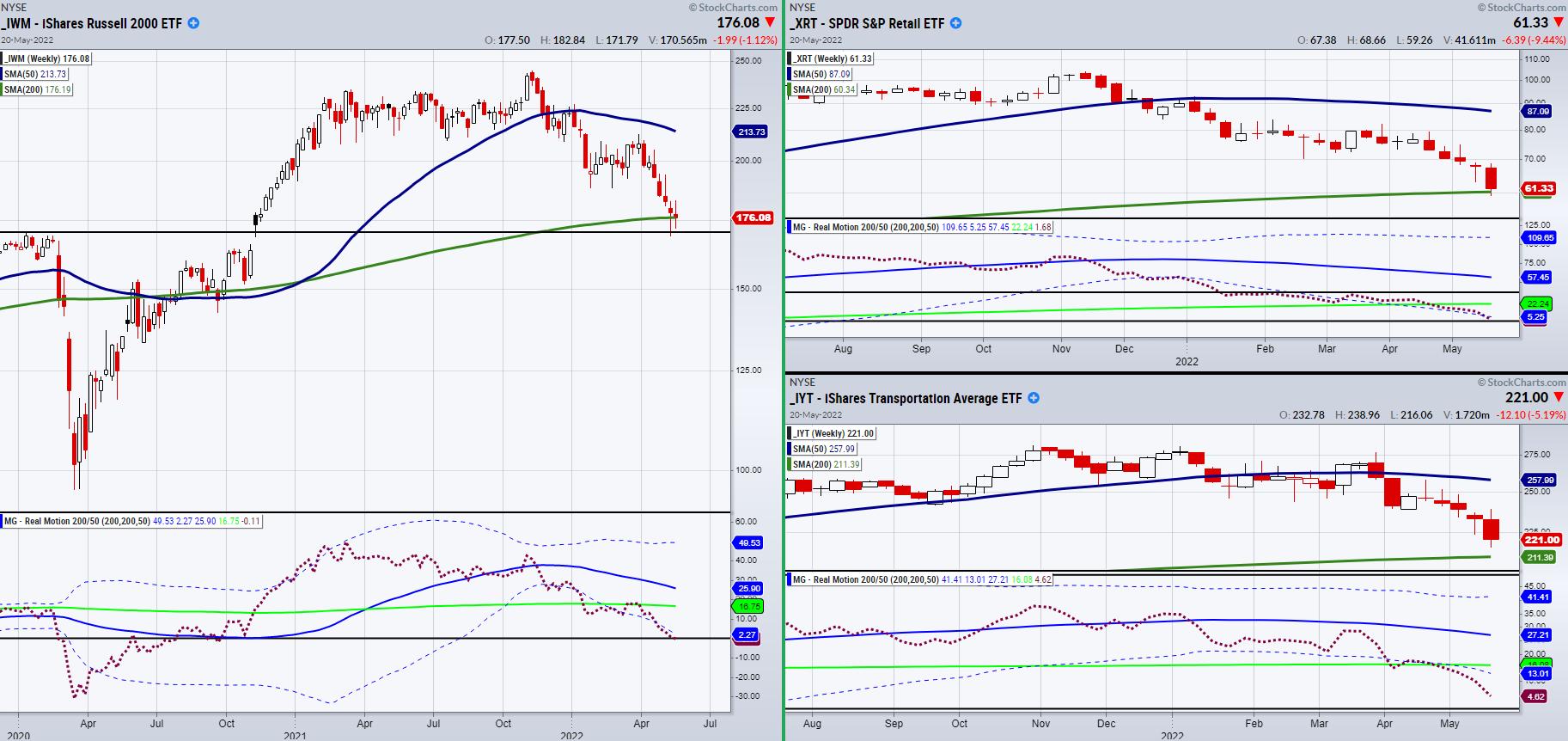
The small cap-index Russell 2000 (IWM) is hanging onto support from the 200-week moving average at $176.19. Last week, it dipped below the moving average with a low of $168.90. With that said, it looks as though IWM is trying to find temporary support in this price area between $168 and 176. If so, we should be careful of taking a full bearish stance through the coming week.
However, if we are going to look for a further breakdown, let's watch for confirmation not only from IWM, but two other important symbols. The two ETFs we are watching are the Retail (XRT) and Transportation (IYT) sectors. Together, they can give insight into investor's sentiment on basic supply and demand. This can also help us confirm a breakdown if both follow IWM lower.
Like IWM, each is currently holding over its 200-WMA. Additionally, from a momentum perspective, our RealMotion (RM) indicator found at the bottom of each chart is not showing any redeeming qualities, as each symbol is either on or has already broken the lower band. One thing to note is that, when RM is under the lower band, this shows the symbol is in oversold territory. However, a downward trending symbol can easily make quick fake out signals by briefly jumping over the dotted line. Therefore, if RM was going to show upside momentum, watch for the red dotted line to clear back over the lower band and begin to trend upwards.
Moreover, come Monday, if these symbols continue to hold over support from the 200-WMA, stay cautious of shorting the market as we could get a quick pop to the upside. While market weakness looks to continue from a fundamental standpoint, these pivotal areas in price can have a large amount of volatility which can easily shake short-term traders out of the market.
Follow Mish on Twitter @marketminute for stock picks and more. Follow Mish on Instagram (mishschneider) for daily morning videos. To see updated media clips, click here.
Read Mish's latest article on the Macro Picture on CMC Markets!
ETF Summary
- S&P 500 (SPY): 385 support area closed over.
- Russell 2000 (IWM): 168 area to watch for support. 183 resistance.
- Dow (DIA): Sitting at a pivotal price level.
- Nasdaq (QQQ): closed over support from 285.
- KRE (Regional Banks): support 58.75.
- SMH (Semiconductors): 215 support. 239 resistance.
- IYT (Transportation): Needs to find support.
- IBB (Biotechnology): 116.68. to clear.
- XRT (Retail): 60.34 the 200-WMA.
Forrest Crist-Ruiz
MarketGauge.com
Assistant Director of Trading Research and Education
|
| READ ONLINE → |
|
|
|
| MORE ARTICLES → |
|
 Chart 1
 Chart 2
 Chart 3


 Many investment "truths" seem to go unchallenged but are in fact, very clearly just myths. Buy and hold investing is a good long-term strategy, economists are good at predicting the markets, diversification will protect you from losses, compounding is the eighth wonder of the world, missing the best days each year can be devastating, probability and risk are the same thing, and chasing performance will work; just to mention a few. It is important to debunk these myths.