| THIS WEEK'S ARTICLES |
| Martin Pring's Market Roundup |
| This Sector Bucked Last Friday's Decline and Could Be Ready to Take Off |
| by Martin Pring |
A couple of weeks ago, I wrote about the fact that the technical position of gold was extremely finely balanced, and that it was "Either in a Hard Place or a Sweet Spot". My conclusion was that its short-term position was improving and that the sweet spot scenario had a better chance of working out. That assumption was based on the fact that both the SPDR Gold Trust (GLD) and the Van Eck Vectors Gold Miners ETF (GDX) had both tentatively broken to the upside. Naturally, both sold off after that, frustrating my expectations and negating the breakout . Friday's strong action though, has once again turned the tables in favor of the bulls. Before I get to that, let's quickly recap why the resolution of this battle is so important.
Chart 1 expresses gold adjusted by the CPI, so that we can easily see whether the yellow metal is acting as a hedge against inflation. The price is trading just below its 12-quarter moving average. That's not an official print, though, because the end of the quarter does not occur until the end of June. In addition, the Coppock Curve, in the bottom window, is just about to cross below its MA. The green shading shows that previous periods when it has been trading above its 8-quarter MA have generally been bullish. A double negative crossover by the price and momentum would imply a bear market, previous examples of which can be observed from the unshaded areas on the chart. Finally, if a sell signal is avoided and gold rallies above the green resistance trendline, it will have experienced a massive upside breakout, with substantial upside potential. Don't forget that's a 40-year resistance trendline. Since gold has a habit of anticipating inflation or disinflation, the eventual outcome will have significant implications for both.
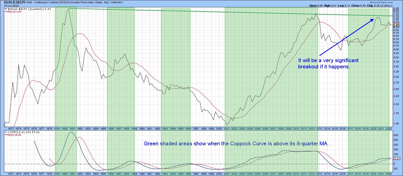 Chart 1 Chart 1
Another reason to watch gold is because it has an indirect effect on the stock market. In that respect, Chart 2 shows that when the long-term KST for the Gold/stock ratio is below its MA favoring gold, stocks are vulnerable. We can't say that it's outright bearish , because there are many periods when equities rally despite the fact that the KST is below its MA. However, it is also a fact that all the major bear moves since the 1990's have developed during periods when gold has outperformed stocks.
The chart shows that the KST has just crossed below its MA again. The implication is the ratio itself will soon confirm the possibility of a false upside breakout by dropping below its red secular up trendline.
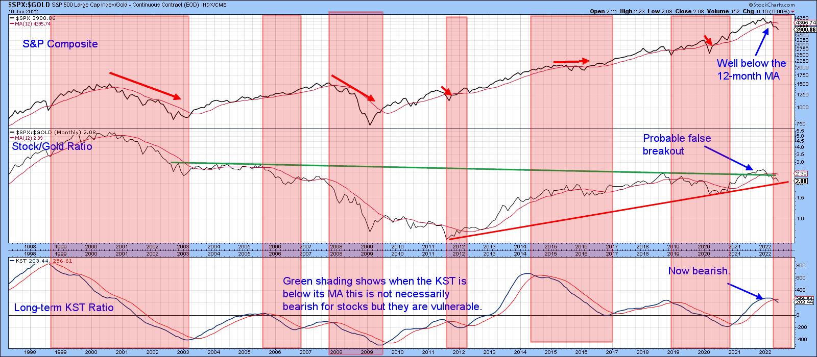 Chart 2 Chart 2
Friday's Action
Chart 3 shows that Friday's action represented a bullish outside day, since its trading range not only encompassed Thursday's, but many sessions prior to that. Since the price also closed near its high, there is little doubt that buyers ended the day clearly in control. Note that Friday's action also resulted in a trendline violation for both the price and its RS line. Finally, the price closed decisively above its 200-day MA. Volume also picked up noticeably for the first time since late March.
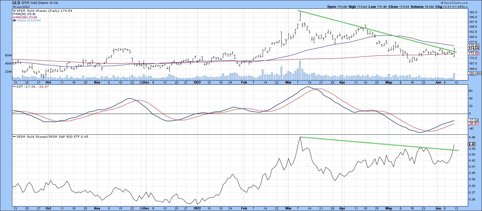 Chart 3 Chart 3
Volume also picked up for the GDX, but, so far the price remains literally right at its resistance trendline and 200-day MA. Since the RS line has broken out and the price also experienced a bullish outside day, gold shares deserve close monitoring for a possible near-term upside breakout.
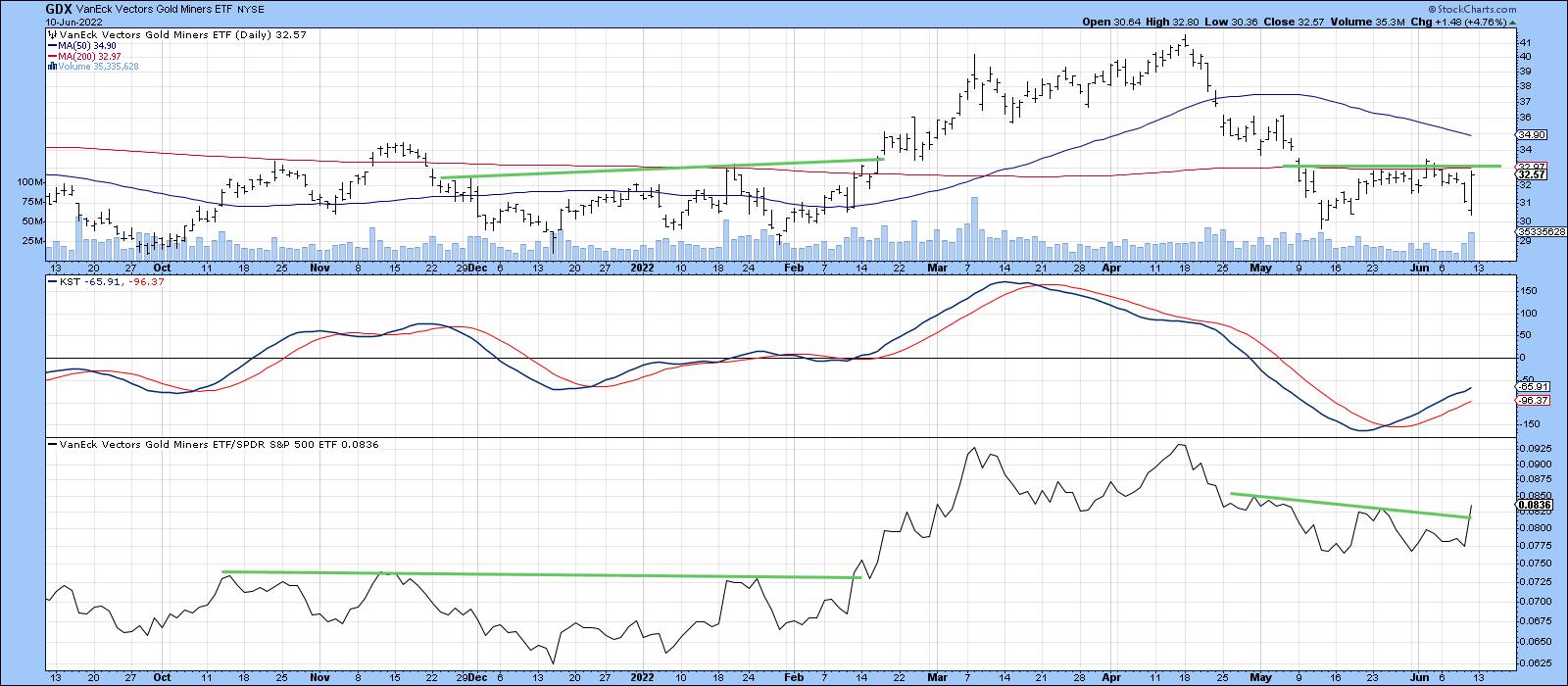 Chart 4 Chart 4
Good luck and good charting,
Martin J. Pring
The views expressed in this article are those of the author and do not necessarily reflect the position or opinion of Pring Turner Capital Group of Walnut Creek or its affiliates.
|
| READ ONLINE → |
|
|
|
| The Mindful Investor |
| One Chart to Rule Them All |
| by David Keller |
One of my early mentors, Ralph Acampora, suggested that, if you want to understand the trend in the S&P 500, you simply need to look at the chart of the S&P 500. What is the trend? Are we seeing higher highs or lower lows? Where are we at relative to important support and resistance levels? Are key moving averages sloping up or down?
That message stuck with me, to the point that the first chart I look at every day is a weekly chart of the S&P 500. The second chart is a daily chart of the S&P 500. Every day, same two charts.
Over time, I've added to these two charts with additional visuals covering other market indexes, measures of market breadth and sentiment, and the performance of key themes and groups using a series of price ratios. Most of these charts are included in my Mindful Investor Live ChartList. A couple times a year, I combine some of the most compelling data series into one chart, which I simply call "The Chart". The idea is that all I should need to get a read on the current market trajectory is to watch The Chart.
Are these indicators trending bullish or bearish?
When do we know when a market bottom has occurred? Join me for my upcoming FREE webcast, The Market Bottom Checklist, where we'll review previous bear market cycles and develop a bear market checklist to use in 2022! Sign up for this free event HERE.
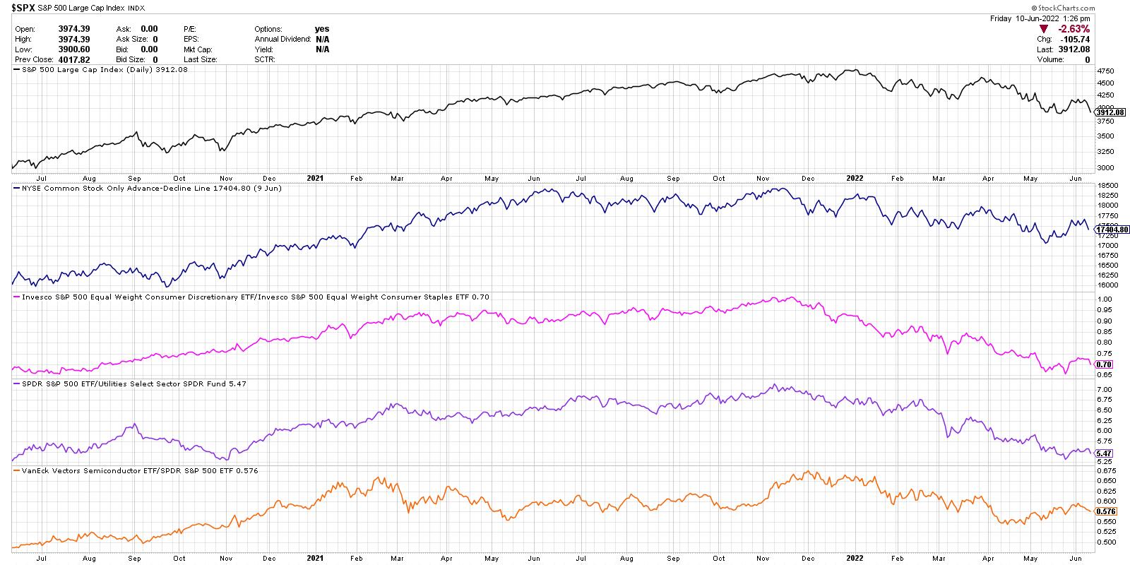
Here's my latest version of The Chart, what each data series represents and what it's telling me about the current market environment.

From the top, we're looking at the daily closing price of the S&P 500, the NYSE common-stock-only advance-decline line, the equal-weighted ratio of the Consumer Discretionary to Consumer Staples, the S&P 500 relative to the Utilities sector and the relative performance of the semiconductor group.
The daily closing price of the S&P 500 is simplicity in itself. Is the trend bullish or bearish? Now how you answer that question certainly depends on your time frame, but, using two years of daily data, I'm generally trying look forward about 1-3 months. Since the beginning of 2022, the S&P has been making a fairly consistent pattern of lower highs and lows. Downtrend.
Next, we have market breadth in the form of the NYSE advance-decline line. How many stocks are closing higher than yesterday, and how many are closing lower? We take this net difference every day and add it to a running total, thus a cumulative measure of market breadth. Similar to the S&P 500 chart, the A-D line has pounding out a fairly consistent downtrend of lower highs and lower lows. Bearish.
Third, we're looking at what I call the Offense vs. Defensive ratio. Within the consumer space, are investors rotating more to the offense of Consumer Discretionary (things you want) or the defense of Consumer Staples (things you need)? This key ratio actually topped out in November, just as the Nasdaq Composite index did. Basically, investors have been getting more defensive since the fourth quarter of 2021. Bearish.
Next, we have relative performance of the Utilities sector, but plotted inversely to match the overall trend in the markets. Utilities usually only outperform when the markets are challenging and investors are getting defensively positioned. Just as with the Offense vs. Defense ratio, this data series has been trending downward since November 2021. Bearish.
Finally, we are looking at the relative performance of semiconductors. I consider semis a bellwether group, in that these names tend to do well when economic conditions are strong and tend to struggle when consumers are buying less products fueled by their technology. This last series is the only one I could perhaps label as "neutral", in that it has not made a new low since April. Semiconductor names have bounced off their lows and in the short-term have been trending higher. Neutral.
So my current version of The Chart shows four bearish indications and one neutral. When the indicators on this chart turn from bearish to neutral, and then neutral to bullish, you will hear me take a much more constructive tone for stocks. Until then, the path of least resistance remains lower.
RR#6,
Dave
P.S. Ready to upgrade your investment process? Check out my YouTube channel!
David Keller, CMT
Chief Market Strategist
StockCharts.com
Disclaimer: This blog is for educational purposes only and should not be construed as financial advice. The ideas and strategies should never be used without first assessing your own personal and financial situation, or without consulting a financial professional.
The author does not have a position in mentioned securities at the time of publication. Any opinions expressed herein are solely those of the author, and do not in any way represent the views or opinions of any other person or entity.
|
| READ ONLINE → |
|
|
|
| The Canadian Technician |
| Is This Commodity a Larger Signal? |
| by Greg Schnell |
More experienced investors have a feel for the swings in the market. Bear markets are very difficult to trade, and there is an important reason. When an investor has a big winner, they generally don't like to sell them, as they still see the uptrend resuming. Commodities have a particular feel to them and, at Osprey Strategic, we focus on the moves in commodities and the related trades, as they can move as fast as technology or faster.
There are some very important trend changes taking place, and I have been highlighting some of them on Twitter space broadcasts, as well as the MoneyShow broadcasts I did in May. Here is a fresh new change I highlighted today to clients.
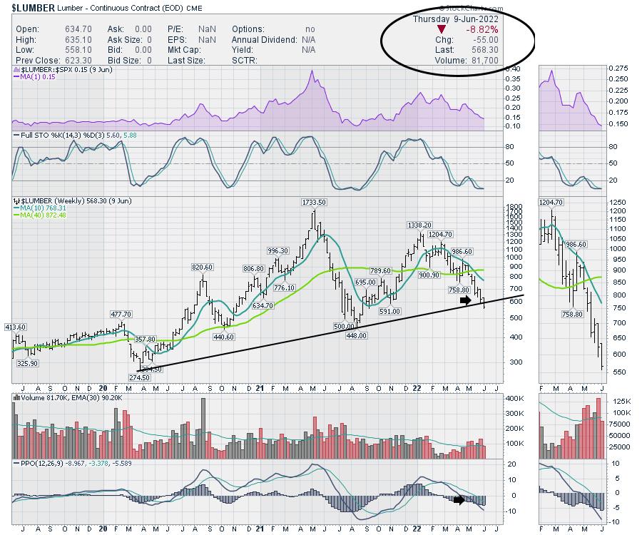
The Lumber chart and the Wood ETF are closely related, but the charts have dramatically different shapes. The lumber chart is an example of a trend that is subtly losing support. I have been following these charts each week discussing their lack of correlation. Our original 2022 loss of support was at $1100 when the uptrend in lows broke in early 2022. However, there is now a larger trend breaking.
The price bar is subtly breaking the 2-year trend, but the size of the move is huge. The move of almost 9% looks like a normal weekly price bar.

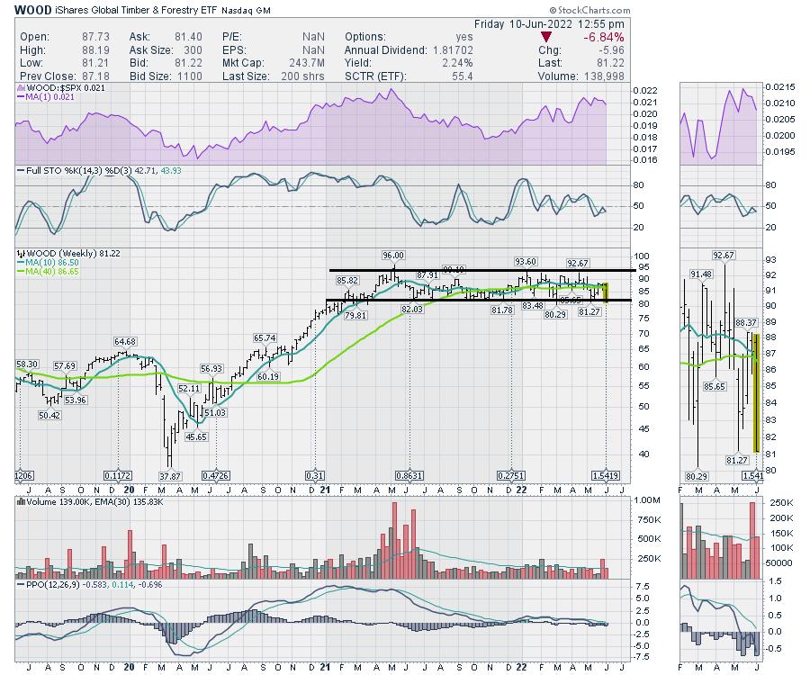
When we look at the lumber stocks, they have moved sideways, while lumber prices have been dropping since February. The charts look uncorrelated.

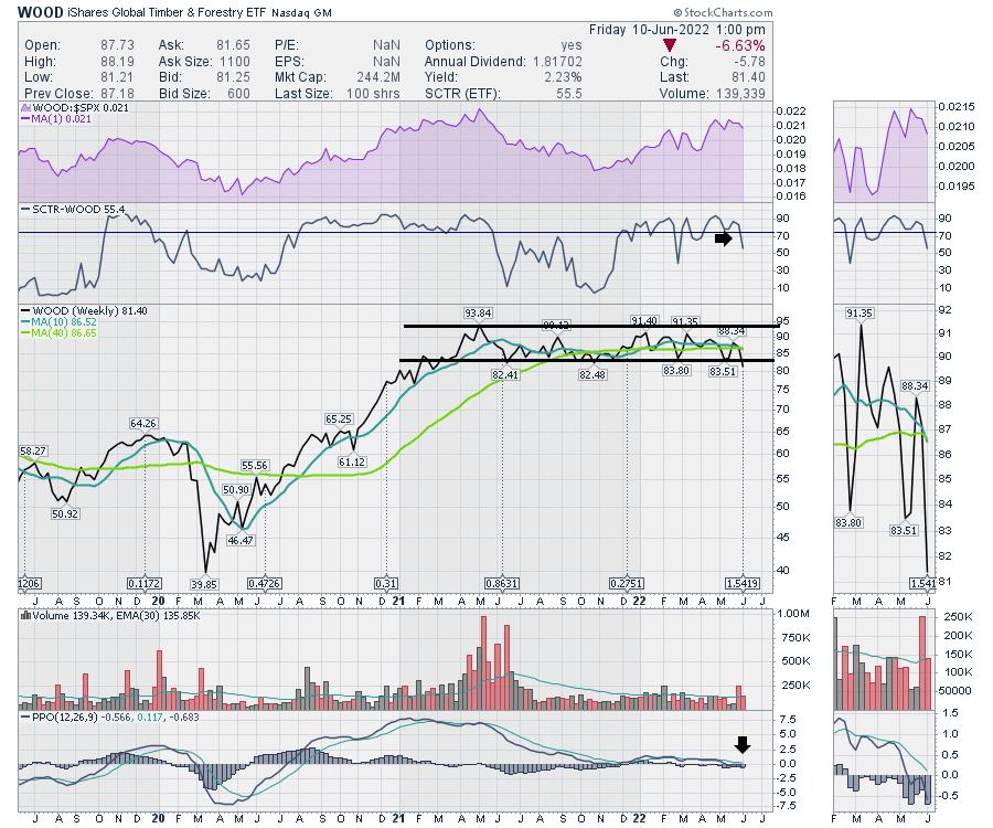
However, this chart also misses some clues that can be redeemed by looking at the chart with different settings. First of all, a line chart below shows this Friday close as a new 52-week closing low. It coincides with the trend break on the Lumber chart. It is a big deal that these charts are breaking together.
The SCTR ranking is also falling out of the top ETFs. This is a real nice confirmation signal of the broken price trend, suggesting that this chart is also starting to underperform other ETFs after a strong period of outperformance.

The weekly review I did Friday (June 10th) at noon for clients highlights many charts that are changing. Some positive, some negative, but a huge week for chartists to see the changing texture of the markets.
We offer a $7 one-month trial at OspreyStrategic.org. If you have any sizeable investment-related commodity charts, this would be a very important weekend for you to get caught up on the news for only $7. You can also go back through the previous videos to get a feel for if our newsletters and videos would help you save capital and put timely capital to work.
|
| READ ONLINE → |
|
|
|
|
|
| Top Advisors Corner |
| Hundreds of New Lows Shows Distrust of Market Continues |
| by John Hopkins |
Just before the market closed Friday, I saw there were over 400 companies that were at 52-week lows. By any measure, that's a TON of stocks that traders have given up on as the market continues its move lower.
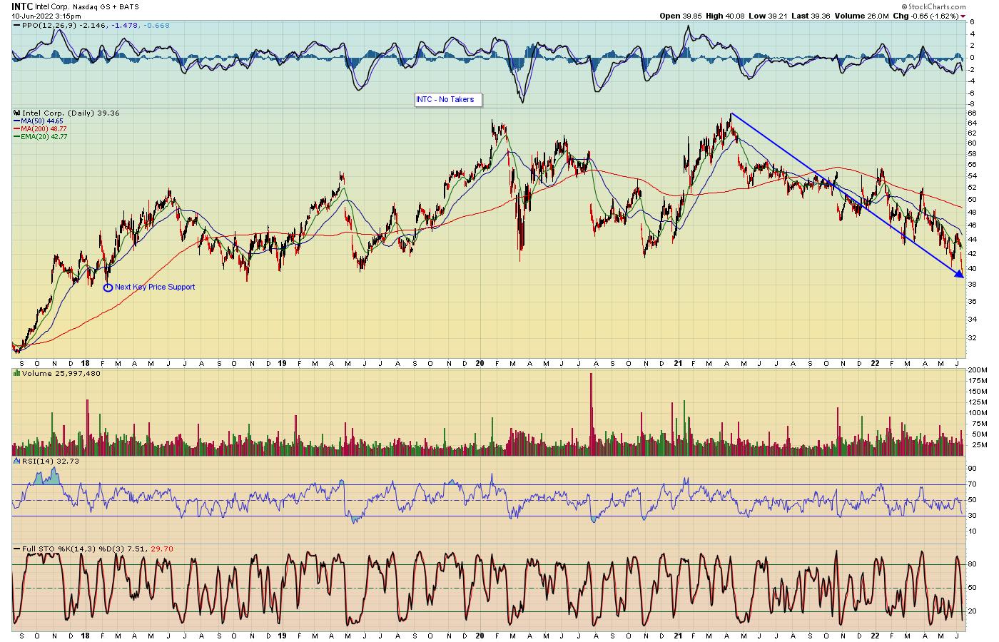
Some of the companies hitting fresh lows carry a lot of weight, both as individual stocks and in their respective sectors. For example, Intel (INTC) hit a new 52-week low on Friday, a level not seen since October 2018.

In the case of INTC, the stock has lost 41% of its value since the April 12, 2021 high. And there's no indication that a bottom has been hit, with the next price support level being $37.72, dating back to February of 2018.
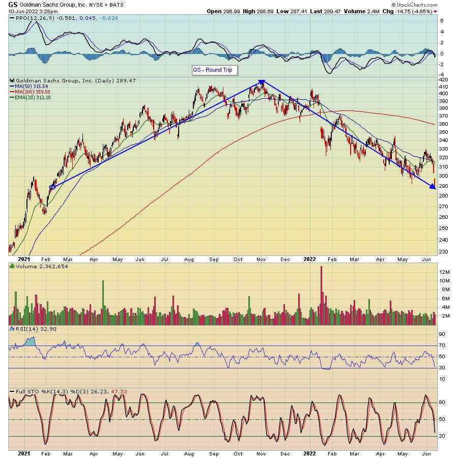
Another stock hitting a fresh 52-week low is Goldman Sachs (GS), with financials totally out of favor in spite of rising rates.

In the case of GS, you have to go back to February of 2021 to match the current price.
One would think that traders would welcome such nice discounts on stocks like INTC and GS, but that's not the case. Instead, the 400+ companies reaching new 52-week lows point out how skeptical traders are to take on any positions. So, what's it going to take to get traders off the sidelines?
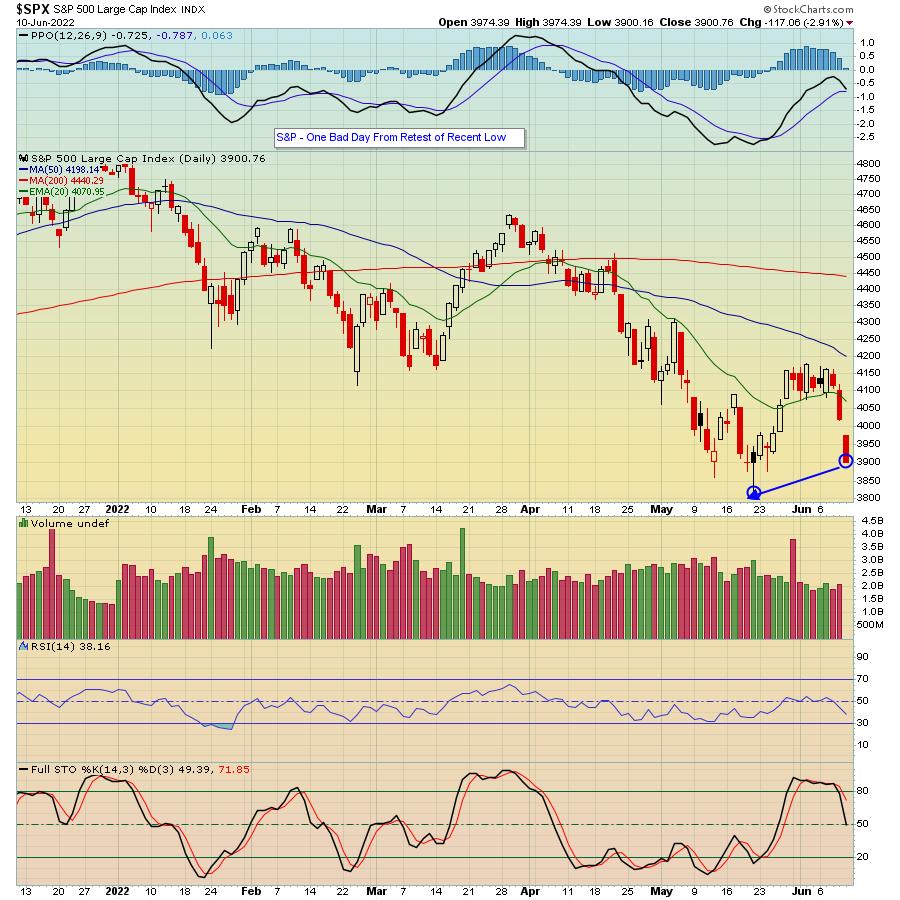
It seems, at a minimum, we're going to need to see the S&P retest May 20 low of 3810. And, as you can see in the chart below, another day like we saw on Friday, when the S&P fell 117 points at the days low, would do the trick.

The bottom line is that, in spite of big time discounts on stocks like INTC and GS, there just aren't many takers; witness over 400 companies hitting 52-week lows. And unless we see further evidence that a bottom is in, it's best to go slow and do whatever is necessary to maintain your precious capital. In the meantime, if you would like to get market insights and expert analysis in this uncertain environment from our Chief Market Strategist Tom Bowley, just click here to sign up for our FREE EarningsBeats Digest.
At your service,
John Hopkins
EarningsBeats.com
|
| READ ONLINE → |
|
|
|
| DecisionPoint |
| Are Yields Finally Ready to Top? History Suggests Not |
| by Erin Swenlin |
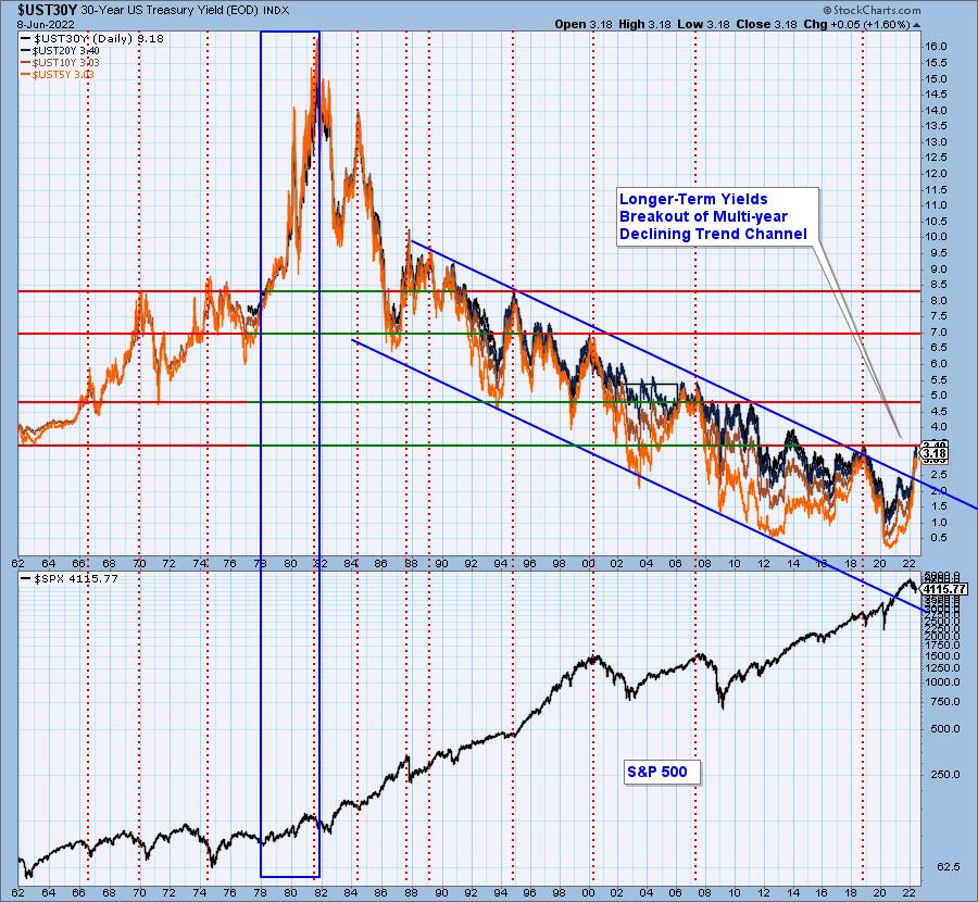
It's been trending on social media that it is time for yields to top. One of the charts in the DPA ChartList (available to subscribers of DecisionPoint.com Blogs) is a long-term yield chart. The chart in the ChartList includes 1-yr yield on up to the 30-year yield, but we've trimmed it down to the 5/10/20/30-year yields.
Looking at the chart below, it is hard to imagine we are going to see a major top in yields. Yes, they are up against overhead resistance from 2019, but this strong breakout from a declining trend channel that has been in place since the 1990's is troublesome. Most importantly, we would point you to the period between 1978 and 1981, where the economy was experiencing many of the same problems we have now -- high inflation, high oil prices, housing prices soaring higher, etc. We're not saying that we will see yields move up to 16%, but what is occurring today is not an historic precedent.

Conclusion: We don't want to be "Debbie Downers", but we have to consider that rates could move much higher, given the technical breakout and an economy that shares characteristics with the economy of 1979-1981. That period saw an unprecedented rise in yields.
Good Luck & Good Trading,
Erin Swenlin

Click here to register in advance for the recurring free DecisionPoint Trading Room! Recordings are available!
Technical Analysis is a windsock, not a crystal ball. --Carl Swenlin
(c) Copyright 2022 DecisionPoint.com
Helpful DecisionPoint Links:
DecisionPoint Alert Chart List
DecisionPoint Golden Cross/Silver Cross Index Chart List
DecisionPoint Sector Chart List
DecisionPoint Chart Gallery
Trend Models
Price Momentum Oscillator (PMO)
On Balance Volume
Swenlin Trading Oscillators (STO-B and STO-V)
ITBM and ITVM
SCTR Ranking
Bear Market Rules
DecisionPoint is not a registered investment advisor. Investment and trading decisions are solely your responsibility. DecisionPoint newsletters, blogs or website materials should NOT be interpreted as a recommendation or solicitation to buy or sell any security or to take any specific action.
|
| READ ONLINE → |
|
|
|
| Top Advisors Corner |
| Anemic High-Yield Bond A-D Line |
| by Tom McClellan |

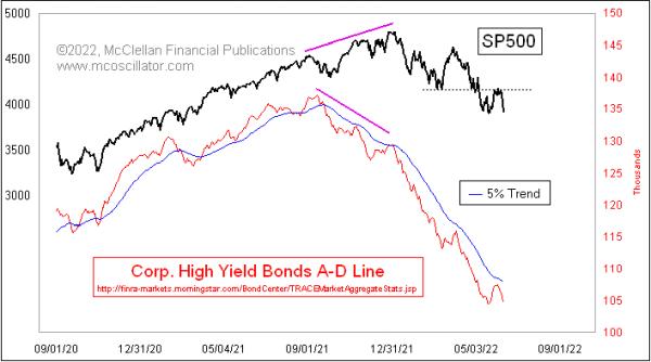
After making an oversold low on May 19, the S&P 500 had a pretty impressive rebound effort, which included 3 really strong breadth days on May 25-27, 2022. That got a lot of analysts talking about a "breadth thrust" signal of various flavors. But the S&P 500 bonked at a resistance level that had been a prior support level at the March 2022 lows and, after several days, it has now fallen back away from that test of the resistance.
Breadth might have been really good-looking for the NYSE stocks in late May, but it was pretty anemic-looking for the stock market's fellow travelers, the high-yield corporate bonds. This week's chart features a daily Advance-Decline Line for those bonds' A-D data, which is published each day by FINRA. These bonds move a lot more like the stock market than like T-Bonds. What makes them even more interesting is that they tend to be terribly sensitive to liquidity, both good and bad, so they function like the canaries in the coal mines of Newcastle a couple of centuries ago. That is to say, they tell us when the conditions are great for stocks and, more importantly, when liquidity is in short supply.
This High Yield Bond A-D Line did bounce higher along with the stock market in late May 2022, but it was a weak bounce that did not even make it to the 5% Trend line. That is an exponential moving average with a 5% smoothing constant (see this article). The message is that, while the bulls were able to mount a decent 3-day bounce, it was done without a real return of strong liquidity, which means that there was not the fuel for a real uptrend.
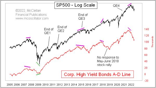
Looking at this A-D Line longer term, we can see that it has shown us divergent top indications at all of the major tops where we would want to have that message.

It also told us when things were looking iffy at the end of QE1 and QE2, that liquidity really was not a problem, and the market pretty quickly got over its troubles. The end of QE3 was a different story, however, and saw a more significant decline in the High Yield Bond A-D Line, indicating the liquidity problems that the financial system was suffering through then. And then, in early 2016, this A-D Line shot higher to say that liquidity had somehow been restored.
This A-D Line also told us about the liquidity problems in 2018, when the Fed decided it would do some "quantitative tightening" or QT, shrinking its holdings of T-Bonds and mortgage backed securities (MBS). It showed no response when stock prices rallied in the summer of 2018, setting up the big decline in Q4 of that year.
It also told us about the big liquidity problems we are now facing, when it made a divergent top versus stock prices in late 2021. We have seen in 2022 what those liquidity problems have meant for the stock market, and, thus far, this A-D Line is not showing us an "all-clear" signal. There is more work yet for the market to do to dismantle the excesses built up during QE4.
|
| READ ONLINE → |
|
|
|
| MORE ARTICLES → |
|
 Chart 1
 Chart 2
 Chart 3
 Chart 4

