| THIS WEEK'S ARTICLES |
| Martin Pring's Market Roundup |
| Credit Spreads May be the Canary in the Financial Mine |
| by Martin Pring |
Waterfall declines leading to capitulation are easy to observe and understand when we have the benefit of hindsight. However, they are almost impossible to identify ahead of time.
One characteristic often associated with such uncomfortable price moves is an unexpected weakening of economic activity, where confidence literally falls off a cliff. Very few individuals have the ability to anticipate these moves ahead of time, simply because they are so unexpected. It's certainly well above my pay grade! That said, bond investors, when taken as a group, have a great track record in nailing such liquidations. That tends to happen when they begin to lose their thirst for high yielding risky instruments, replacing it with a rush to quality in the form of lower-yielding, but far less risky, treasury paper.
The reason I bring this up is because several credit spread relationships have either begun to deteriorate or look as though they may be on the verge of doing so. Chart 1, for instance, features the ratio between the Fidelity Capital and Income and the Vanguard Treasury funds (_FAGIX/_VUSTX). The former is essentially a high-yield bond fund, the latter a purely government vehicle. Note the underscore sign before the two symbols, which excludes dividends, thereby limiting the comparison to price.
A rising ratio reflects improving confidence; a declining one reflects a growing risk of defaults emanating from a weakening economy. Normally, this relationship moves ahead of the equity market at market peaks. Consequently, its March/May rally in the face of a declining S&P Composite looked, at the time, to be a favorable factor. Now, though, it has broken to the downside and has violated its 2020-2022 up trendline. That's not a good sign.
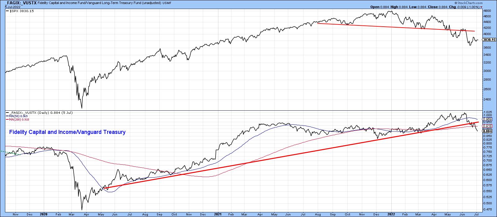 Chart 1 Chart 1
Chart 2, using the benefit of hindsight, takes this a step further by shading the periods when the ratio was in an extended rising trend. Note that equities were almost invariably positive during those periods. Unshaded ones were not always negative, but equities are certainly at their most vulnerable when confidence is in a declining trend. The chart also shows the trendline violation originally featured in Chart 1. Using the benefit of a long-term perspective though, it is also apparent that this break confirmed a false multi-year upside breakout. False breakouts are usually followed by above-average moves in the opposite direction to the breakout, as traders and investors scramble to get on the right side of an unexpectedly weak market.
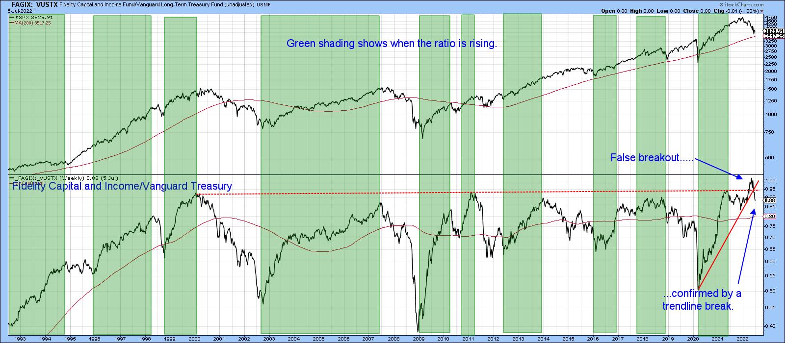 Chart 2 Chart 2
Chart 3 features another credit spread by comparing the iBoxx High Yield to the iShares 7-10-year Treasury Fund _HYG/_IEF). This relationship also experienced a whipsaw signal. In this instance, it took the form of a temporary break above its secular down trendline, dating from 2007.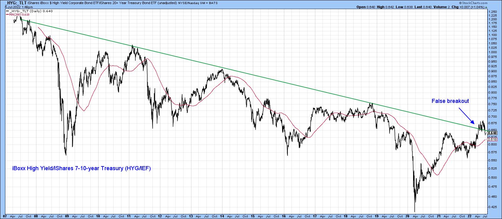 Chart 3 Chart 3
Chart 4 indicates that this false move was confirmed by the ratio completing a head-and-shoulders top. Its Special K indicator is poised to do the same thing.
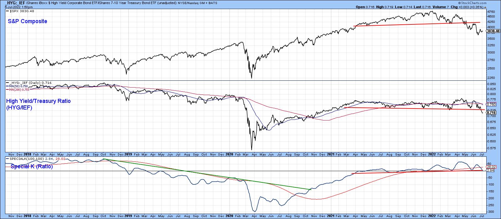 Chart 4 Chart 4
Chart 5 considers this deterioration in credit spreads as a world-wide phenomenon. It compares the price of the iShares International High Yield to the SPDR International Treasury Bond ETF (_HYXU/_BWX). This global confidence relationship has also completed a top formation and experienced a false upside breakout. The bearish nature of the short- and long-term KSTs suggest that further downside action is likely.
 Chart 5 Chart 5
Stock/Bond Ratio at a Critical Juncture
The ratio between stocks and bonds is not exactly a credit spread, but often moves in the opposite direction to stocks themselves. Chart 6 shows it to have been in a trading range for over a year. If a downward penetration of the lower part of the range takes place, the pattern would qualify as a broadening wedge, a formation whose volatility is often the precursor of an above average decline. Note that the Special K has already broken down from a top and crossed below its signal line.
One might also call the pattern an upward-sloping head-and-shoulders top. The name does not really matter, because it represents a battle between buyers and sellers. If it breaks to the downside, sellers gain the upper hand.
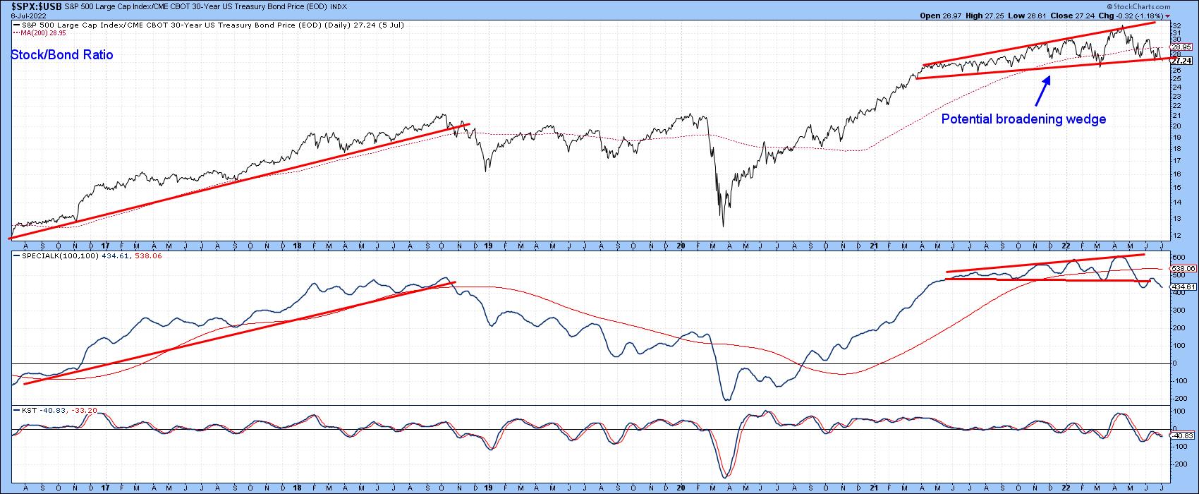 Chart 6 Chart 6
As I pointed out at the beginning of this piece, there is no consistent way in which waterfall decline can be predicted. That said, it's worth monitoring these credit spreads, because they are in the kind of technical position where further deterioration could warn of some serious trouble ahead.
Good luck and good charting,
Martin J. Pring
The views expressed in this article are those of the author and do not necessarily reflect the position or opinion of Pring Turner Capital Group of Walnut Creek or its affiliates.
|
| READ ONLINE → |
|
|
|
| The Mindful Investor |
| What Happens if FAANGs Break Out? |
| by David Keller |
Despite the long-term macro trends of higher interest rates, higher inflation and a hawkish Fed, growth stocks have managed to log some pretty decent gains in recent weeks.
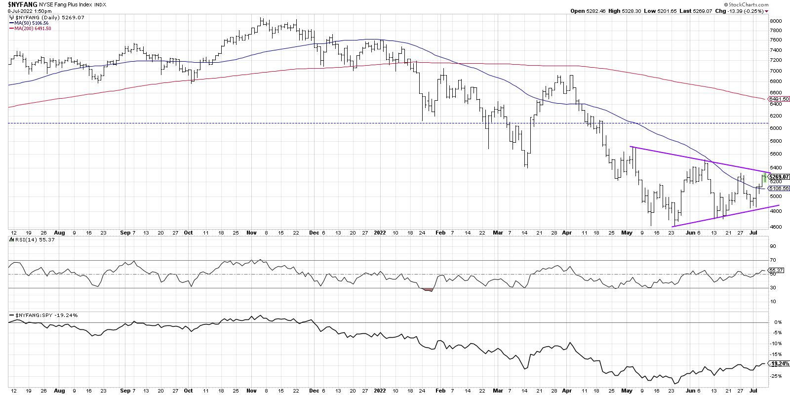
I've spoken often on the importance of the FAANG stocks due to their outsized influence on our very growth-oriented equity benchmarks. ("As go the FAANGs, so goes the market!") So I have definitely taken notice of the NYSE Fang Plus Index threatening to break out of a symmetrical triangle or "coil" pattern to the upside.

After making a new low every month in 2022 through May, the FAANG stocks made a higher low in June as part of a consolidation pattern. The $NYFANG index (which includes lots of other names like TSLA and TWTR) is now testing trendline resistance using the highs in early May and June. This pattern of lower highs and higher lows, revolving around a midpoint around 5000, mirrors the consolidation in the S&P 500 index around the 3800 level. Basically, buyers and sellers are in equilibrium, and the market is telling you were at about the right value for these indexes.
So what's next?
A coil pattern is relatively straightforward, in that it reaches a natural end or "apex" as the two trendlines eventually converge. Usually about 2/3rds to 3/4ths of the way through the pattern, the price breaks out to either the upside or downside. Whichever ways the price resolves is the stronger direction of momentum. In general, the price will tend to follow the direction of the breakout as either buyers or sellers exert control over price.
The NYSE Fang Plus index is now testing the upper boundary of this pattern. If we get a valid breakout above the pattern next week, that could indicate renewed strength in growth stocks and, most likely, further upside for bonds as interest rates fall. If and when the price would instead break down through the lower boundary of the pattern, that would indicate a likely next leg down in the ongoing bear market phase of 2022.
Either way, this next move in the FAANG stocks will absolutely be the chart to watch!
RR#6,
Dave
P.S. Ready to upgrade your investment process? Check out my YouTube channel!
David Keller, CMT
Chief Market Strategist
StockCharts.com
Disclaimer: This blog is for educational purposes only and should not be construed as financial advice. The ideas and strategies should never be used without first assessing your own personal and financial situation, or without consulting a financial professional.
The author does not have a position in mentioned securities at the time of publication. Any opinions expressed herein are solely those of the author, and do not in any way represent the views or opinions of any other person or entity.
|
| READ ONLINE → |
|
|
|
| RRG Charts |
| This Industry Group is Facing 60% Downside Risk |
| by Julius de Kempenaer |

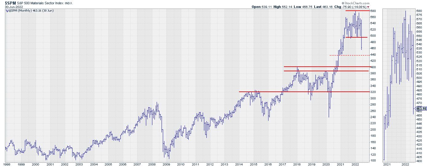
The chart above is the monthly chart for the materials sector $SPM, which I discussed in this week's episode of Sector Spotlight while going through the completed monthly charts for June.
Materials Sector Completing Big Top Formation
$SPM especially stands out, as the sector very clearly completed a large top-formation following a strong rally, which started in 2020 and started stalling in the middle of 2021. The break below the horizontal support level around 495 was the trigger for a further move lower.

The weekly chart for the materials sector above shows a more detailed picture. After breaking horizontal support, the initial decline is underway with a low, so far, at 447.50. Given the speed and the steepness of the recent decline, it is very well possible that we will see a bounce back up in the near future. But, as long as the horizontal resistance near 495 remains intact, such rallies have to be judged as recoveries within a downtrend.
All Metals Groups Showing Weak Rotation on RRG
From a relative perspective, the materials sector has tested resistance in the area of the 2021 relative peak from which it started declining. This has caused the RRG-Lines to roll over and JdK RS-Momentum has already pushed below 100, causing the tail to rotate into the weakening quadrant.
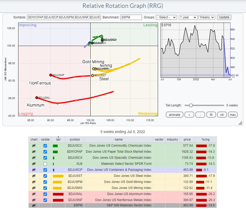
Breaking down the Materials sector into its sub-groups gives the rotational picture in the RRG below.

This Relative Rotation Graph shows the groups inside the sector, and it is providing an interesting picture. Basically, the sector is split into two groups, those being all groups related to metals and all others (Chemicals, Paper). The groups related to metals are catching the attention. All of them are inside weakening or lagging, but, more importantly, they are all heading lower on the RS-Ratio scale, suggesting more weakness lies ahead.
These metals-related groups are also far away from the benchmark (center of the chart) compared to the other groups, which are concentrated close(r) to the benchmark and all but one inside the leading quadrant. This means that the current weakness of the sector can largely be attributed to the weakness in the metals groups and less so to the others.
Aluminum
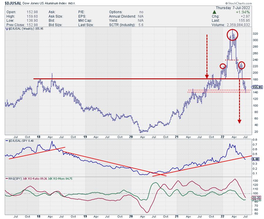
Going over the individual charts for the group, the Aluminum index attracted my attention.

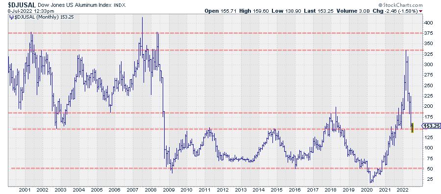
At the start of this year, Aluminum broke above resistance coming off multi-year highs near 180, then shot up to a high around 320, before coming back down to 180 and breaking below it again just a few weeks ago. The price behavior above that 180 level looks like an H&S top-formation. Applying basic TA rules, I get a target price of around 40, which is seriously lower than where we currently are.
These are the situations that make me go hmmm, and I start questioning myself. Am I missing something, does it make sense, does it fit in the context, etc., etc? I am quite reluctant to blatantly scream that Aluminum could drop $100 or ~65% from current levels... At the very least, I want to dig a little deeper.
In this case, that means pulling up a real long-term chart to figure out where we are in terms of all-time-high levels, etc.

And that chart is very interesting, IMHO. First of all, the parabolic rise from 2020-2022 (25 to 325) did NOT bring Aluminum to a new all-time high. $DJUSAL traded around 375 in 2002, 2007 (spiked) and 2008. But the projected target area, somewhere around 50, is also not strange, as it traded there numerous times since the sharp drop in 2009.
The way I read this chart is that there are two big ranges that offer support or resistance. The first is at the top between roughly 330-375. The most recent peak was formed against the bottom of that range. The second important range is between 145-185. As we speak, Aluminum is testing the lower boundary of that support range.
In the near term, this area may provide enough support for Aluminum to bounce a little, but the large H&S is expected to start weighing in sooner or later and push $DJUSAL below 145, which will open up a huge downward risk.
Based on the historical performance and technical behaviour, $50 for Aluminum is absolutely possible!
No matter what happens, at the moment, Aluminum has very limited upside and a huge downside risk, making it a very risky investment. With more metals-related groups in the Materials sector, it is very difficult to see $SPM turning around and moving significantly higher in the coming weeks.
#StaySafe and Have a Great Weekend, --Julius
|
| READ ONLINE → |
|
|
|
|
|
| The Canadian Technician |
| Rally Continues to Form |
| by Greg Schnell |
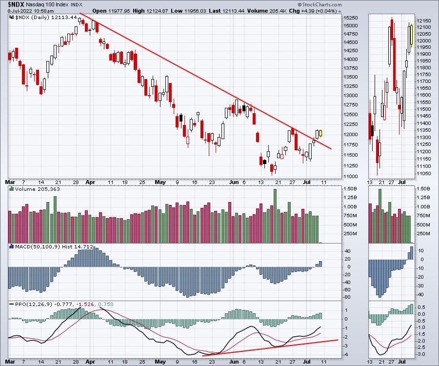
Previously, I discussed the "follow-through day" concept. The problem we had was the strong pullback on June 28th cancelled the follow-through day. However, we are working our way higher as the market continues to make progress, climbing off the lows of last week. The big challenge for next week will be to try and make higher highs and close up there. Looking at the Nasdaq, the 3-month downtrend has finally been broken.

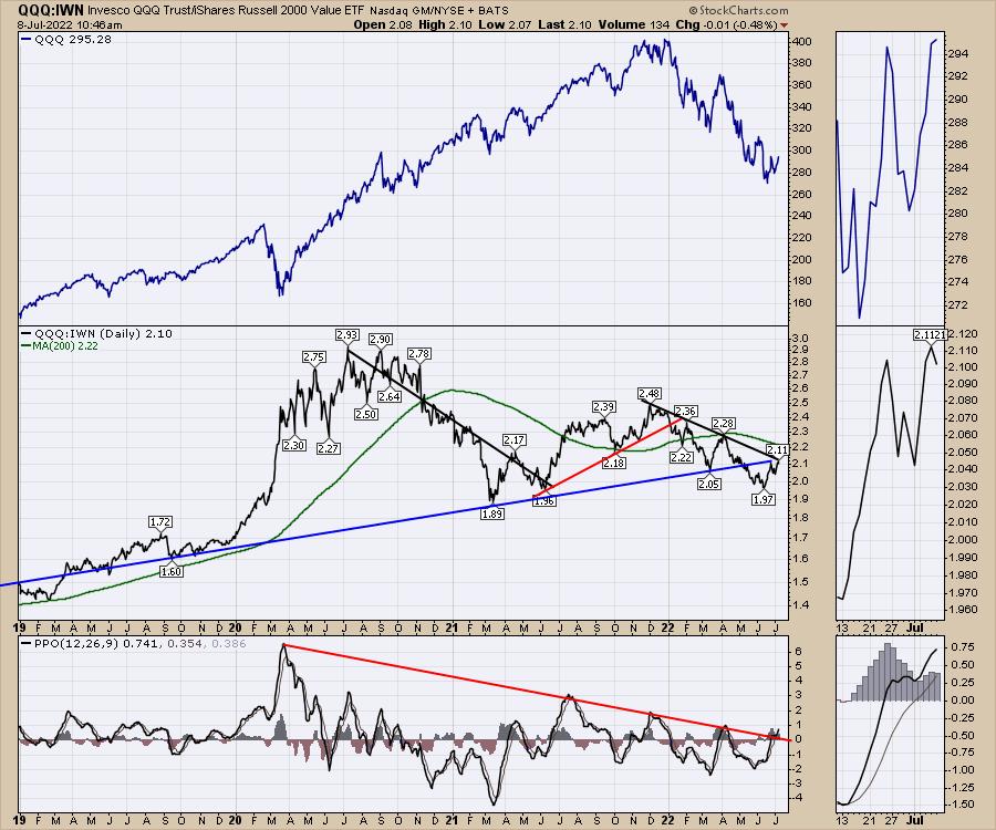
One of the charts I am focused on is a ratio chart (black centre panel). This is a ratio chart that can help define growth vs. value investing. The chart started building a downtrend in November 2021, when the current market correction started. However, price is currently at a really important junction of two trend lines.
This does not predict uptrends or downtrends. It does tell us where investors are focusing their investments, Growth or Value. A breakout above this downtrend will be an important signal to get long growth for the first time since 2021. If this ratio turns down here, it would suggest avoiding the high growth area. Recently, this has been trending higher, suggesting a potential change towards growth is in the wind.

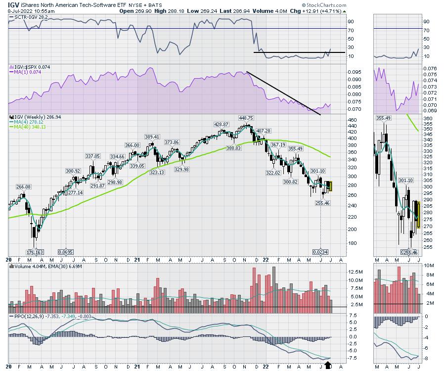
Lots of technicians are noticing a rotation back towards tech, but it has been spotty. I continue to watch software for a return to former glory. The relative strength is close to three-month highs. The SCTR ranking is changing from awful to less than awful. But it does take a lot of momentum to change this indicator, so this is very constructive. The PPO is almost firing off a buy signal this week, which is also nice to see.

The market is getting more constructive here, and I continue to look for more opportunities.
|
| READ ONLINE → |
|
|
|
| Trading Places with Tom Bowley |
| Shhhhh! Don't Tell Anyone, But Here's a Wall Street Secret! |
| by Tom Bowley |
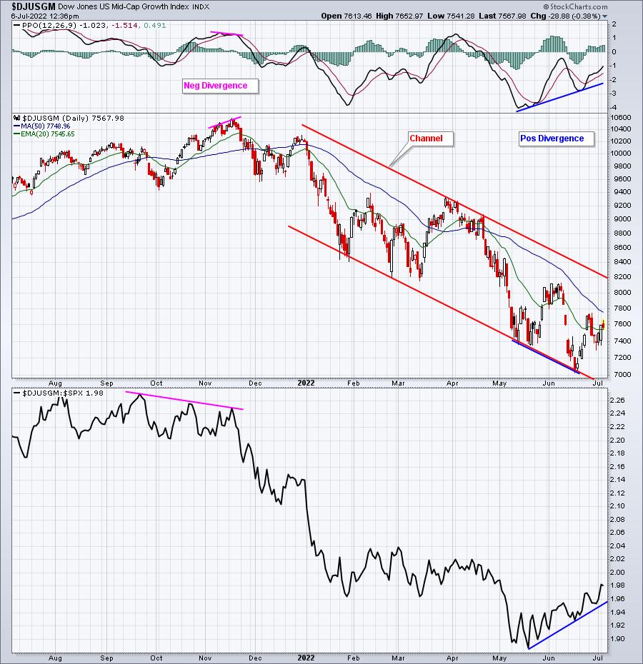
One very interesting and intriguing part of stock trading is that Wall Street disguises their buying/selling and rotation, as many times the absolute charts don't tell us the REAL story. I want you to look at the absolute price action in both mid-cap growth ($DJUSGM) and mid-cap value ($DJUSVM):
Mid-Cap Growth:

If you do not look at relative strength, doesn't the DJUSGM simply look like it's downtrending within a channel? Does it show any sign of hope? I don't think so. BUTTTTT, under the surface, these growth stocks are suddenly showing bullish rotation and relative strength vs. the benchmark S&P 500. This is why relative strength is SO critical in your evaluation of market strength/weakness. The absolute chart says SELL, but the relative chart shows bullish rotation. Note that the opposite occurred at the DJUSGM high in late 2021. Absolute price action looked solid, moving to fresh new highs, but Wall Street was rotating OUT of this asset class. Only relative strength showed this subtle reallocation.
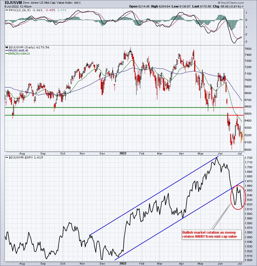
Mid-Cap Value:

The absolute chart simply shows a breakdown and further weakness in another area of the market - a bearish signal. But notice that these value stocks were "relative" leaders during the market weakness in 2022. That's typical during a bear market as traders want to eliminate the risk that are inherent with growth stocks, so they "rotate" to value stocks. It doesn't mean that value stocks go higher, but rather that value stocks OUTPERFORM. Now look again at that bottom panel. Do you see the rotation AWAY from value stocks, relative to the benchmark S&P 500?
This is insanely important in evaluating the stock market.
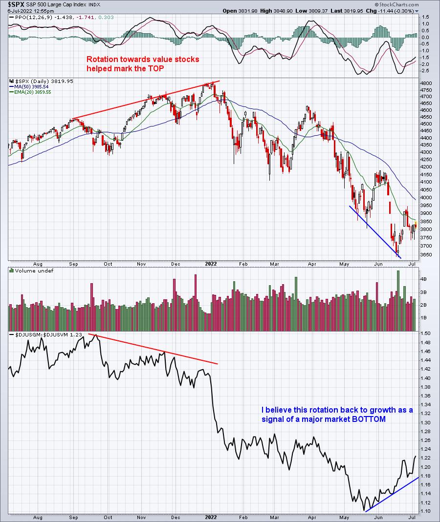
The above two charts were both looked at independently and vs. the benchmark S&P 500. I actually prefer, however, to look at an S&P 500 chart, with a panel below that compares mid-cap growth vs. mid-cap value($DJUSGM:$DJUSVM). I call it a "sustainability ratio". If the S&P 500 is going higher and this sustainability ratio is going higher, it tells us that growth remains in favor and the S&P 500 strength is likely (note I didn't say guaranteed - no such thing as a guarantee) to keep moving higher - with profit taking normal along the way. And during a correction or bear market, I'd expect to see that DJUSGM:DJUSVM ratio declining to support a further decline in the S&P 500. Having said all of this, check out how this chart currently looks:

Ask yourself a very simple question and be honest. If inflation fears and/or recession fears are likely to send U.S. equities spiraling lower in the second half of 2022, WHO IN THEIR RIGHT MIND WOULD BE ROTATING OUT OF VALUE AND INTO GROWTH? Seriously, who?
When you come up with an answer to that question, please respond in the comments below. If you'd prefer to keep your comments private, send an email to me at "support@earningsbeats.com". My approach to stock market investing/trading is one of common sense. I ignore all the brainwashing found at media outlets and follow the charts. Please tell me what I'm missing in the growth vs. value story that the charts above are telling.
Also, TONS of mid-cap growth stocks are looking so much better on their charts and I'll feature one in my next EB Digest newsletter. To subscribe for FREE (no credit card required), simply CLICK HERE and provide us your name and email address. We'll provide you that mid-cap growth stock chart and writeup with our next newsletter article on Friday.
Happy trading!
Tom
|
| READ ONLINE → |
|
|
|
| Top Advisors Corner |
| A Curious Backwardation Behavior in Oil Futures |
| by Tom McClellan |

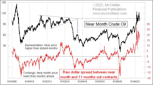
Crude oil futures prices peaked on June 8, 2022, with a closing price of $122.41/barrel for the near-month contract. Since then, prices have fallen 24 points to a closing price of 98.13 on July 6. It is not at all unusual to see such price volatility in the midst of a supply squeeze. But what is unusual is that we are seeing a similar price drop throughout the crude oil futures market.
Normally, a supply squeeze will affect just the near-month contract, meaning the one closest to expiration, and perhaps the next one or two contracts in succession. The far-out month contracts, which do not mature for several more months, typically do not manifest the high volatility of the near month contracts during a supply squeeze. And so, as the supply squeeze starts to abate itself and supply/demand forces start to get back into balance, the premium of the near month contract over those far into the future starts to dissipate.
That is the normal model for how things work. But things are not working that way right now.
The crude oil futures market has been in a pretty severe condition of "backwardation," meaning that the price of the near month contract is far above the prices of those contracts further out into the future. I show that in this week's chart, which measures the spread between the current month contract price and that of the contract 11 months out. A supply squeeze puts a premium on oil that can be delivered now, which turns into a big positive spread in the chart, showing as "backwardation" of the contract pricing.
A more normal condition is to have farther out contracts priced higher than the near month contract, which is known as "contango." A large contango condition in the crude oil futures market is a pretty good sign of an important price bottom. Similarly, a large condition of backwardation is a sign of a price top.
Sure enough, the big backwardation condition we have just been seeing recently in 2022 has now led to a big price drop, taking oil prices back below $100/barrel. But it has come with a proportionate drop throughout the maturity spectrum of oil futures, meaning that the far-out months are dropping almost as fast. That is resulting in oil maintaining a pretty large condition of backwardation.
The implication is that there is going to be even more of a decline in crude oil prices, because the near-month price will need to naturally contract back downward to meet where the far-out month contracts are priced, just to get back into equilibrium. But that equilibrium is running away as fast as the near-month contract can chase it.
There is one more interesting point in this week's chart. For several years now, I have been expecting that the $105/barrel price level would someday display some importance for oil prices. That expectation arose out of noticing that a nearly symmetrical triangle had formed in oil prices from 2011-2014. The apex of that triangle structure was at the $105/barrel level, and apices can have future importance either in terms of timing or of price. Sometimes an apex will display importance in both ways.
In this case, the moment of the apex in mid-2015 marked the peak of a countertrend rally in oil prices, which was pretty interesting. But the price level of the apex also should have mattered, and I suspect it would have mattered more precisely had the Russian invasion of Ukraine not intervened to disrupt things. As it was, the chopping around in oil prices at a high level since that invasion has been happening centered on the 105 level, a behavior which I believe is honoring the message of that triangle apex.
Sometimes there is fascinating symmetry in the price charts.
For now, the message of the continued backwardation is that there is still more room for oil prices to decline in the coming months.
For more on the topic of backwardation and contango, click here and here to read some informative articles from our web site's Learning Center.
|
| READ ONLINE → |
|
|
|
| MORE ARTICLES → |
|
 Chart 1
 Chart 2
 Chart 3
 Chart 4
 Chart 5
 Chart 6
