| THIS WEEK'S ARTICLES |
| John Murphy's Market Message |
| ONE VERSION OF YIELD CURVE INVERTS |
| by John Murphy |
TEN YEAR - TWO YEAR YIELD CURVE INVERTS... Chart 1 shows the spread between the ten year and two year Treasury yields falling below the zero line which signals an inverted yield curve. That means that the shorter two-year yield is now higher than the longer maturity ten-year yield. That normally occurs when the Fed starts raising short-term rates to combat rising inflation. And is usually an early warning sign of an impending recession. Chart 2 shows that version of the yield falling to the lowest level since 2006. A second version of the yield curve is also falling.
 Chart 1 Chart 1
 Chart 2TEN YEAR - THREE MONTH YIELD CURVE WEAKENS... A second version of the yield curve is the spread between the ten year and three month Treasury yields. Chart 3 shows that version of the yield curve falling to the lowest level in two years which means that the shorter yield is rising faster than the longer yield. It remains above its zero line which means that it hasn't inverted yet. But the fact that it's falling isn't a good sign. If it were to fall below its zero line, that would be added confirmation of an impending recession. Inverted yield curves are usually bad for the stock market. Chart 2TEN YEAR - THREE MONTH YIELD CURVE WEAKENS... A second version of the yield curve is the spread between the ten year and three month Treasury yields. Chart 3 shows that version of the yield curve falling to the lowest level in two years which means that the shorter yield is rising faster than the longer yield. It remains above its zero line which means that it hasn't inverted yet. But the fact that it's falling isn't a good sign. If it were to fall below its zero line, that would be added confirmation of an impending recession. Inverted yield curves are usually bad for the stock market.
 Chart 3 Chart 3
ANOTHER LOOK AT WEAKER ENERGY SECTOR...Energy is the only market sector in the black for the year. Over the past month, however, it's become the market's weakest sector. That's due to a pullback in energy prices. Chart 4 shows the United States Oil Fund falling 23% over the past month. That puts it near potential chart support along its spring low and 200-day moving average (red arrow). At the same time, Chart 5 shows the United Stated Gasoline Fund losing 20% of its value. That combination of falling energy prices has taken a toll on energy shares.
XLE TESTS 200-DAY LINE...Chart 6 shows the Energy Sector SPDR (XLE) peaking in early June before falling to a four month low and a test of its 200-day moving average. The XLE has lost -28% during that period making it the weakest part of the stock market over the last month. A short-term oversold condition and presence of its 200-day line may offer short-term support. But it's major uptrend may be in jeopardy. That could carry good and bad news.
IS ENERGY INFLATION PEAKING?... Two hot inflation reports this week sent stocks tumbling before recovering on Friday. But the CPI (9.1%) and PPI (11.3%) reports reflected what prices did in June. Energy prices, however, have pulled back over the last month along with other commodity markets. That could carry good and bad news. The good news is that falling energy prices might help weaken inflation figures. Selling in other commodity markets might do the same. The bad news is that a peak in energy and other commodity prices could be another sign that the economy is weakening. That's because a weaker economy usually reduces demand for energy and other economically-sensitive commodities.
 Chart 4 Chart 4
 Chart 5 Chart 5
 Chart 6 Chart 6
|
| READ ONLINE → |
|
|
|
| The Mindful Investor |
| Financials Rallied on Friday, But Is It Enough? |
| by David Keller |
The top gainer in the S&P 500 index on Friday was Citigroup (C), up over 13% on a strong earnings report. So the chart is obviously bullish, right?
Not so fast.
It is very easy to get drawn into short-term signals like one-day price movements. But the trick is to make short-term decisions using short-term data and long-term decisions using long-term data. So, while C popped 13% higher on Friday, the stock is still down about 16% for the year!
Other names in the Financial sector rallied strongly on Friday as well, including Wells Fargo (WFC), State Street (STT), Bank of America (BAC) and Bank of NY Mellon (BK). All of the above stocks were in the top ten performers of the S&P 500 index on Friday. But when we take a step back and reflect on the performance of Financials in 2022, it's difficult to see the chart as anything but bearish.
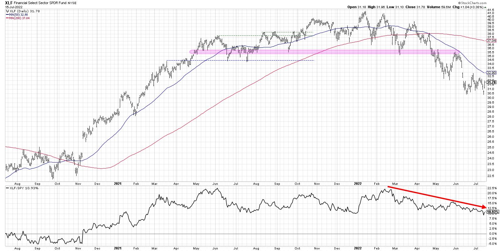
The XLF provides a brilliantly clear illustration of a chart rotating from accumulation phase (March 2020 to mid-2021) to topping phase (mid-2021 to early 2022) to a distribution phase (basically the last six months). I label something in a "distribution phase" if we see a fairly consistent pattern of lower highs and lower lows. And the XLF certainly fits the bill starting in March 2022.
Each attempt to bounce higher of a new low as stalled out before overcoming the most recent swing high. Sellers are dominating, and not enough buyers are materializing to push the price above any key resistance levels. Most negatively, the relative strength has been in a consistent downtrend since February. So not only has this sector been in a downtrend, it's even underperforming the S&P 500 as well.
Let's take one of the biggest gainers this week and break down the short-term and long-term prospects.
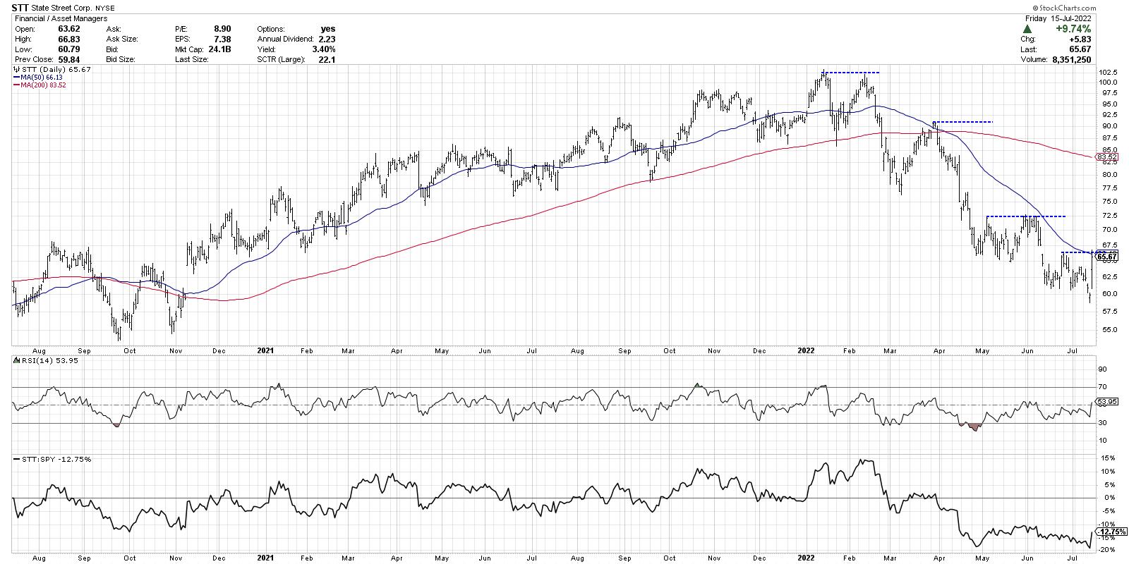
To get a sense of the long-term picture, just look at the price and the 200-day moving average. The first two-thirds of this chart show a rising price above an ascending 200-day moving average. Then, in early 2022, we see the entire trend change as the price breaks the 200-day, retests that level from below and then begins making further new lows through this week.
That's right. Before Friday's impressive 9.7% bounce, STT had just made a new 12-month price low.
On a short-term basis, State Street's Friday bounce pushed the price right up to the 50-day moving average. This level (around $66) lines up well with the most recent swing high in late June. So, while the stock did indeed rally off the lows to finish the week, the up move wasn't enough to push above clear levels of price resistance.
Bullish charts make new highs. Bullish charts stop making new lows. Bullish charts don't just test resistance, they achieve valid breakouts above resistance and follow through to the upside. Could the lows be in for these Financial stocks? Perhaps. But I've not seen enough evidence on the daily charts to convince me of the upside potential in these names.
When in doubt, follow the charts!
RR#6,
Dave
P.S. Ready to upgrade your investment process? Check out my YouTube channel!
David Keller, CMT
Chief Market Strategist
StockCharts.com
Disclaimer: This blog is for educational purposes only and should not be construed as financial advice. The ideas and strategies should never be used without first assessing your own personal and financial situation, or without consulting a financial professional.
The author does not have a position in mentioned securities at the time of publication. Any opinions expressed herein are solely those of the author, and do not in any way represent the views or opinions of any other person or entity.
|
| READ ONLINE → |
|
|
|
| DecisionPoint |
| Sectors Don't Look So Bad - "Bear Market Special" Coming to a Close! |
| by Carl Swenlin, Erin Swenlin |
While we have negative long-term expectations for the market, we notice that most of the eleven S&P sectors are looking rather bullish intermediate-term. Only two sectors -- Energy and Materials -- have been making new lows, but the rest are either showing rising bottoms from the June low or are making a double bottom against that low.
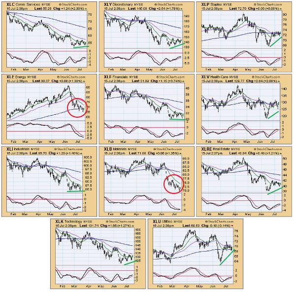
In the Diamond Mine trading room, which Erin holds for subscribers of the DP Diamonds Report on Fridays at Noon ET, she "mines" to find the "Sector to Watch" and "Industry Group to Watch". She noted that aggressive sectors were showing bullish price patterns, while defensive sectors (XLP, XLU and XLRE) were displaying fading strength. Here is an excerpt from Erin's Diamonds Report today.
Our "Bear Market Special" Has Been Extended to July 22nd!
Get your first month of the "Bundle" for only $14!
Use Coupon Code: BEARS
Our subscriptions are priced to allow all investors access to professional grade analysis! Beginners to advanced, all can learn our analysis process!
- $35/month for our cornerstone DP Alert market letter with coverage of Gold, Gold Miners, Yields, the Dollar, Crude Oil, Bitcoin and MORE!
- $40/month for DecisionPoint Diamonds, ten+ handpicked stocks or "Diamonds in the Rough" AND a weekly subscriber-only Diamond Mine trading room!
$68/month for BOTH!
Click HERE to subscribe now!
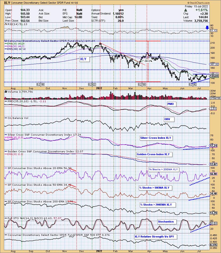
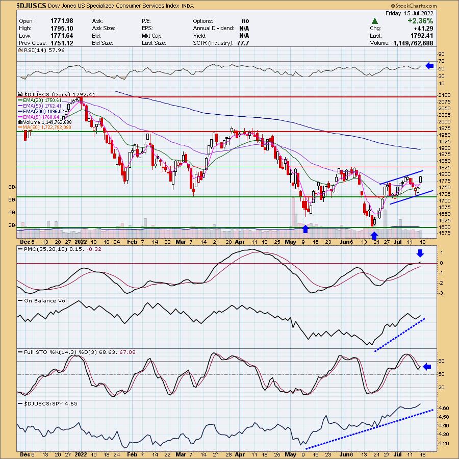
In this morning's Diamond Mine Trading Room, I liked XLY as a "Sector to Watch." After getting participation data for the day, I still believe XLY is the most bullish. As far as "Industry Group to Watch," I also haven't changed my mind. Specialized Consumer Services is outperforming in a big way, and today's rally suggests more upside ahead.
Sector to Watch: Consumer Discretionary (XLY)
I decided to go with XLY, but XLC and XLK were close seconds. My reasoning for this one over those was that we have better participation of stocks above their 50-day EMAs, and the SCI reading was higher than the others and rising steadily. We have a bullish ascending triangle, which implies a breakout above the confirmation line and 50-day EMA.
Industry Group to Watch: Specialized Consumer Services ($DJUSCS)
There were some interesting groups out there within XLY, but this chart floated to top. The RSI is positive, rising and not overbought. The PMO just accelerated above the zero line. Stochastics have tipped up. Not only is there an intermediate-term bullish double-bottom, but price is traveling in a rising trend channel.
Good Luck & Good Trading!
Erin Swenlin & Carl Swenlin
Don't miss the new DecisionPoint Trading Room show! Carl has joined the room with Erin and answers questions from attendees or from comments left on YouTube. If you'd like to attend LIVE on Mondays, click HERE to register.

Technical Analysis is a windsock, not a crystal ball. --Carl Swenlin
(c) Copyright 2022 DecisionPoint.com
Helpful DecisionPoint Links:
DecisionPoint Alert Chart List
DecisionPoint Golden Cross/Silver Cross Index Chart List
DecisionPoint Sector Chart List
DecisionPoint Chart Gallery
Trend Models
Price Momentum Oscillator (PMO)
On Balance Volume
Swenlin Trading Oscillators (STO-B and STO-V)
ITBM and ITVM
SCTR Ranking
Bear Market Rules
DecisionPoint is not a registered investment advisor. Investment and trading decisions are solely your responsibility. DecisionPoint newsletters, blogs or website materials should NOT be interpreted as a recommendation or solicitation to buy or sell any security or to take any specific action.
|
| READ ONLINE → |
|
|
|
|
|
| Top Advisors Corner |
| Earnings Season Just Might Offer Big-Time Profit Opportunities |
| by John Hopkins |
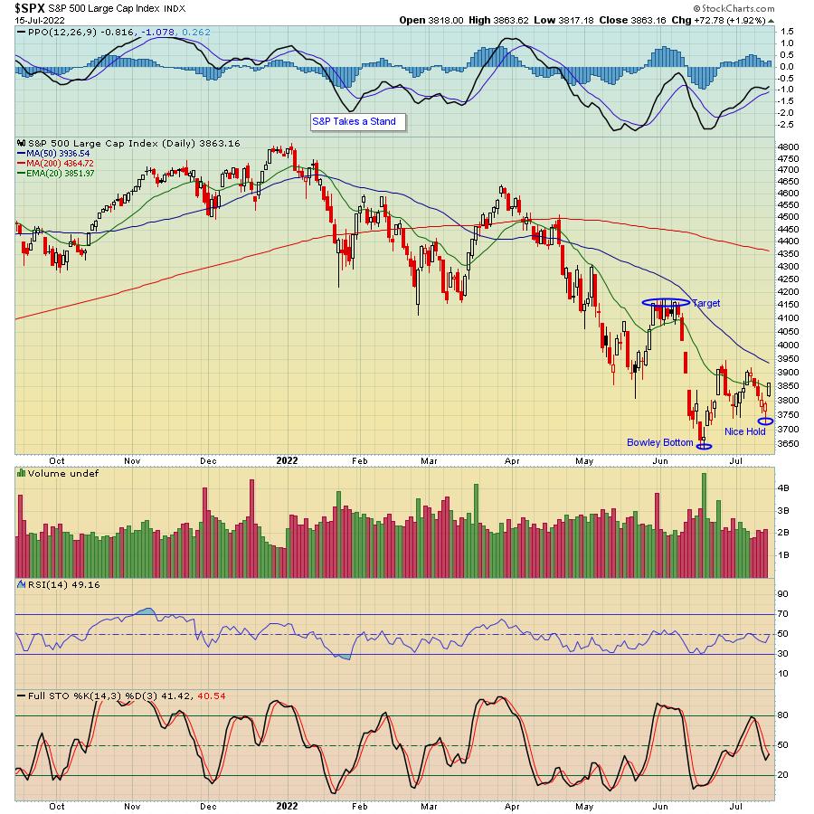
In my article last week, I made the case that the market reward-to-risk has shifted to the upside and that 3740 on the S&P looked like it had strong support on any pullback. As you can see in the chart below, that level was indeed challenged on Thursday and held like a champ.
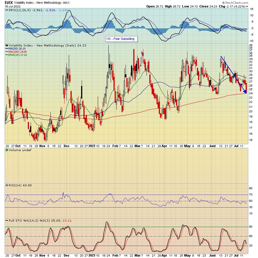
Of course, in this volatile market, things can change on a dime, and we could see stocks pull back right away. However, as you can see in the chart below, the VIX, which broadly measures fear, has fallen sharply. It could move even lower -- especially if it pierces its 200 day moving average -- if we see followthrough buying come Monday.
The strong end to the week came in spite of horrific inflation numbers that we haven't seen for many decades and with non-stop talk about the Fed's aggressive rate-raising campaign. And it comes right as earnings season kicks into high gear, with thousands of companies getting ready to report their numbers over the next several weeks.
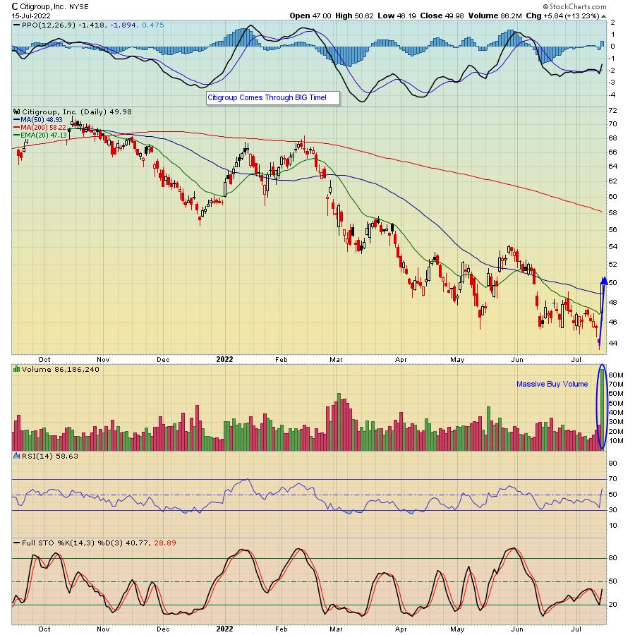
There's been a lot of talk lately that the market has not factored in higher interest rates, the possibility of a recession, anything you can think of that might be bearish. But then we got Citigroup's numbers on Friday with the stock soaring 13%, possibly saving the banking sector and perhaps the market as well.
Is it possible that the S&P hit its bottom, as our Chief Market Strategist Tom Bowley declared (The "Bowley Bottom") when it touched 3636 on June 17? It's possible. And, if collective earnings turn out to be stronger than most are anticipating, we could be in for a decent rally.
In fact, Tom will be conducting a very timely webinar this Monday, June 18, "Q2 Earnings: Sneak Preview" where he will share his thoughts on what to expect, including some specific companies that are likely to beat or miss earnings expectations. It's a FREE event and if you want to learn more and save a seat, just click here.
The one thing I can guarantee you is that this earnings season will NOT be dull! But if overall numbers do come out better than expected, especially on the forecast side, we could be in for a sustained, profitable rally.
At your service,
John Hopkins
EarningsBeats.com
|
| READ ONLINE → |
|
|
|
| Martin Pring's Market Roundup |
| Will the Bond Market Surprise Us? |
| by Martin Pring |
In late April, I wrote that bond yields had run into resistance and a pause in the on-going uptrend was likely. Yields on longer-dated maturities initially moved slightly higher, but are now at approximately the same level as that April article. However, more corrective activity appears likely, as commodities (e.g. the energy sector) have since retreated.
Commodity price inflation is usually the sworn enemy of bond prices. Part of the reason for commodity weakness lies in a slowdown in the growth rate of the economy. If that weakness morphs into a recession, you can be sure that yields on longer=dated maturities will tumble. However, with the R word on everyone's lips and a resilient labor market, a business contraction is no slam dunk for the immediate future.
The Longer-Term Picture
Chart 1 sets the scene for the longer-term picture for the 10-year yield. It opens with some pink shading, reflecting the fact that secular or very long-term reversals since the mid-nineteenth century have been characterized with an extensive trading range. If 2020 marks the low point of the secular bear that began in 1981, it would be reasonable to expect more basing action in the current situation, as flagged by the blue shading. If so, a likely candidate for the upper part of the range would be the green resistance zone, where the three previous highs reside.
The violation of the green down trendline and positive 96-month MA already argue for a secular reversal. Further evidence comes from the swing in the 18-month ROC from a record low to a record high. That kind of action, by definition, is extremely rare and indicates a change in sentiment consistent with a change in the secular trend. However, the record high still represents an overbought situation, where the odds favor some form of corrective activity. In that respect, support certainly lies at the 96-month MA, around 2%. That's not a forecast, but would not be an unreasonable expectation.
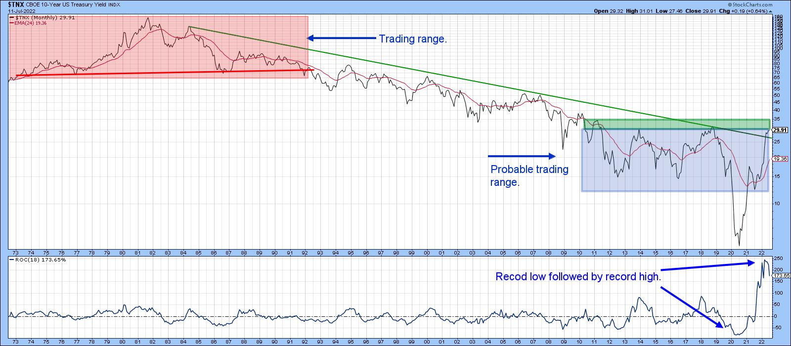 Chart 1 Chart 1
Near-Term Possibilities
My Bond Net New High Indicator (!PRNNHBND) monitors the number of Net New Highs registered over a 40-period time span. It is derived from a basket of bond ETFs, both US and international. For instance, daily charts would calculate the indicator based on a 40-day time span, hourly by hours, weekly by weeks and so forth. Since the raw series is quite jagged, it has been smoothed with a 40-period moving average. In this instance, it has been plotted using daily parameters.
The indicator has reached an oversold condition three times since 2012. Each was followed by a base building period and rally. The fact that it has fallen to a record oversold level offers two possibilities. The first is that this is a sign of weakness not seen in 10 years of trading under the context of a secular bull market. As such, it offers one piece of evidence that the secular trend has reversed. Second, some form of rally is likely to follow the indicator's upside reversal.
 Chart 2 Chart 2
Chart 3 shows that a break above the green trendline, at around $118, would complete an inverse head-and-shoulders pattern. The rising short-term KST offers support for this possibility. This momentum indicator has also completed a reverse head-and-shoulders, which is another positive.
That said, the 9-day RSI has exhibited bear market characteristics throughout the history of the chart. They include extreme sensitivity to an overbought condition, as flagged by the two red arrows. Equally important, the RSI has failed to reach that level since early December of last year. Finally, multiple oversold conditions have been unable to trigger a meaningful rally. That can all change, of course, but, as of this moment, RSI action is typical of a primary bear market.
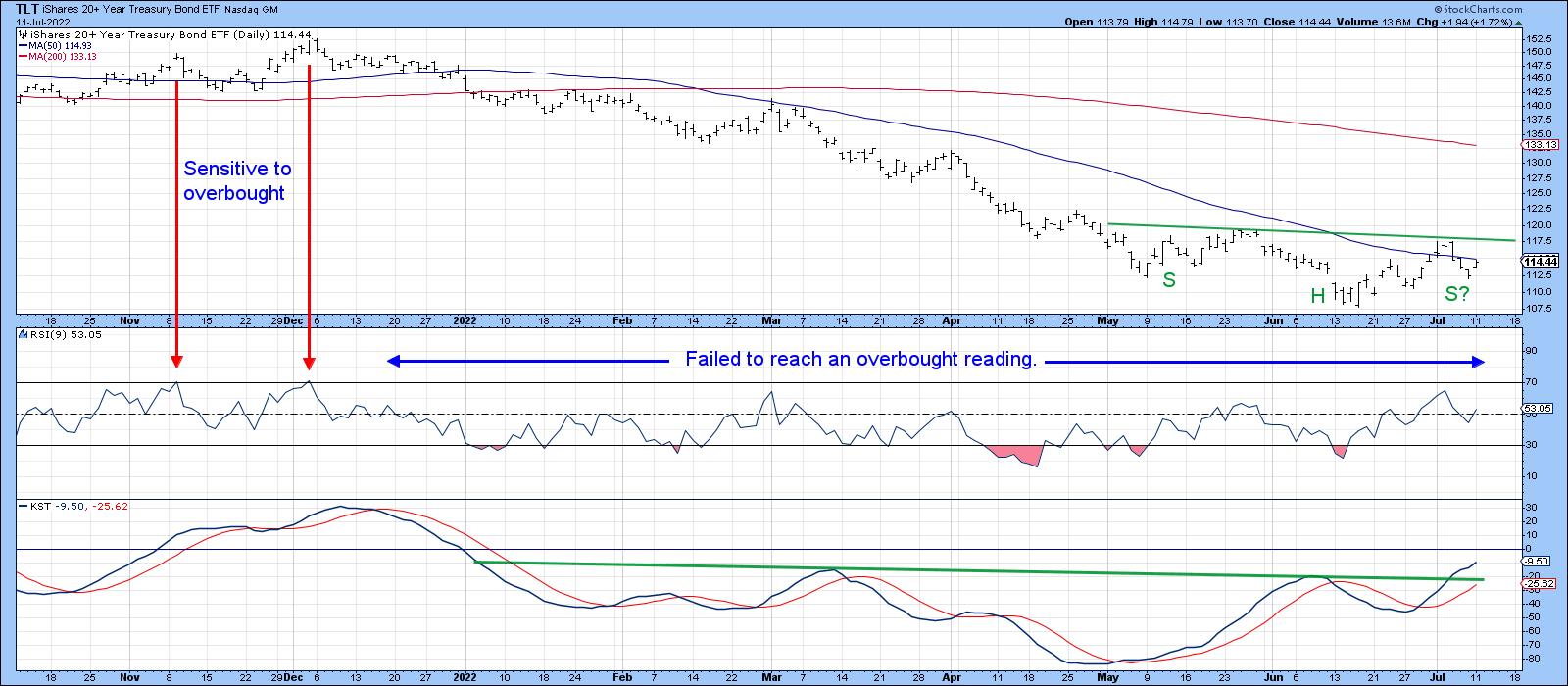 Chart 3 Chart 3
I don't get into hourly charts very often. Sometimes, though, they can be quite revealing. Our fourth offering compares the iShares 7-10-year Trust to a Special K (SPK) indicator, which you can read about here. Normally, it is calculated from daily data by combining the short-, intermediate- and long-term KSTs into one series. The resulting indicator is used to help identify primary trend reversals. The SPK in Chart 4, though, is constructed from hourly data as it tries to monitor intermediate reversals and, occasionally, very small primary trends.
The potential reverse head and shoulders also shows up in this maturity, but what is intriguing is the fact that the SPK recently violated its down trendline, moved above its signal line and started to trace out a series of rising peaks and troughs. The next challenge is to break above the 600-hour MA and potential neckline at $104.
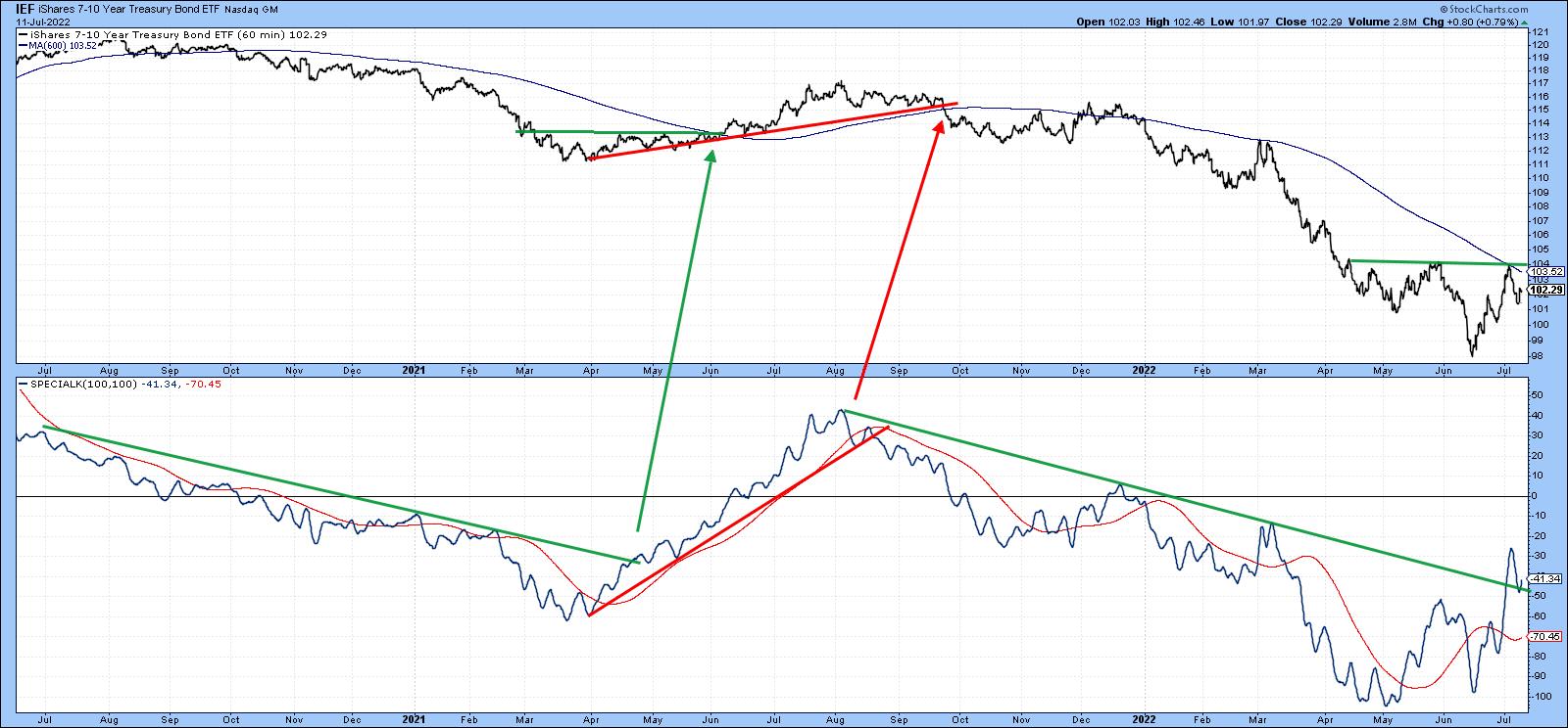 Chart 4 Chart 4
Since bonds are in a confirmed bear market, it will be of paramount importance to make sure that any break above those potential necklines for the IEF and TLT hold. That's because bear markets are notorious for their deceptive contra trend breakouts. Failed inverse head-and-shoulders are often followed by above-average moves on the downside. We will know this in the event that the breakouts materialize and prices are unable to hold above those inverse right shoulders.
Good luck and good charting,
Martin J. Pring
The views expressed in this article are those of the author and do not necessarily reflect the position or opinion of Pring Turner Capital Group of Walnut Creek or its affiliates.
|
| READ ONLINE → |
|
|
|
| The MEM Edge |
| Markets End Week on High Note -- Here's Why They Could Stay There |
| by Mary Ellen McGonagle |
It was another volatile week amid mixed economic and corporate earnings reports, as investors continue to digest news in an effort to gain long-term insights into U.S. inflation and growth prospects. While the markets traded down for most of the week, the S&P 500 gapped up in price on Friday, in a move that was marked by relatively high volume (which is positive).
Economic data was one reason for the market's nice gain today; however, the primary driver among some of the day's biggest winners was 2nd quarter earnings reports. Today, eight large-cap companies came out with results and each one traded much higher on well-above-average volume. The average gain was 6%, which is three times what the market posted.
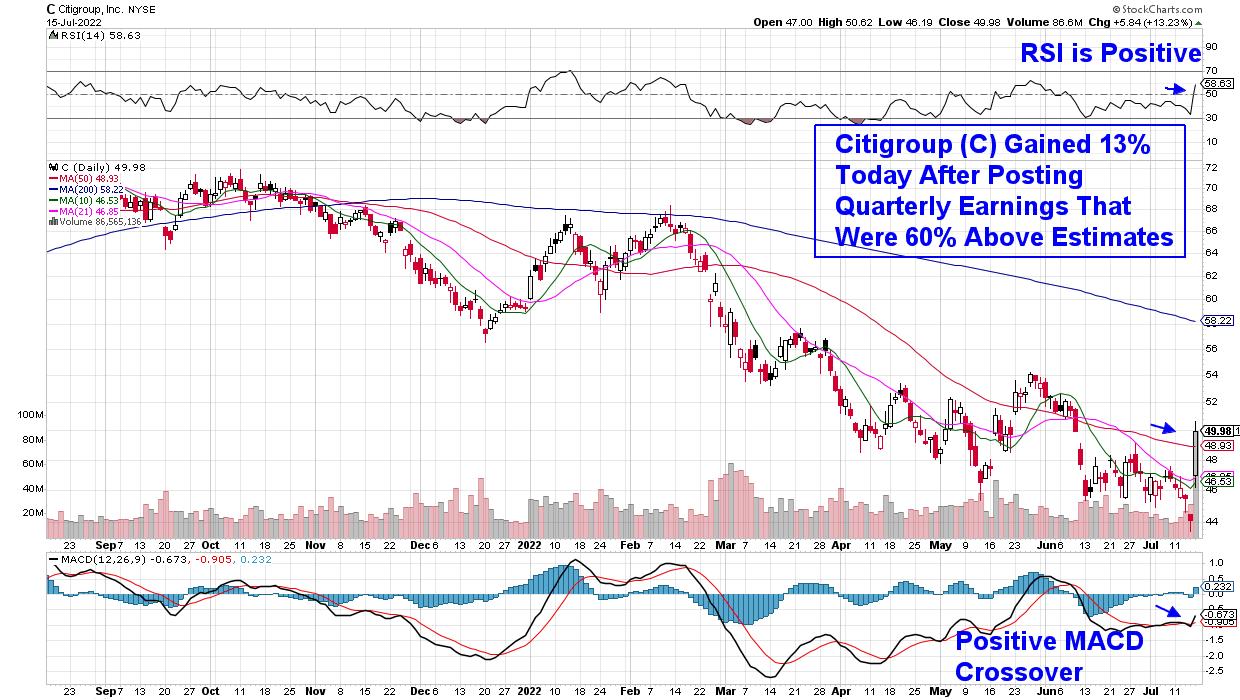
The largest gainer was Citigroup, which was up over 13% today on volume that was 250% above its average. This high volume indicates investors want in and often points to further upside as market conditions allow. The company's pop followed 2nd quarter results that were 61% above estimates.
DAILY CHART OF CITIGROUP (C)
Most of the other companies reporting today were also in the Financial sector and while none reported results as strong as Citigroup, each of the Bank stocks that shared 2nd quarter results came in above estimates. The fact that they were so handsomely rewarded is the common thread, however, and this positive response may carry through into next week and beyond.
To begin, many stocks have seen their earnings estimates revised much lower after reporting weak 1st quarter results. Many Bank stocks, in particular, experienced reduced profits as loan margins were low amid a flatter-than-usual yield curve.
Other stocks also saw their estimates knocked a lot lower on weak Q1 results, with Amazon (AMZN) being a prime example (pun intended!). Estimates at this time are calling for an 84% decline in earnings for 2022 compared to last year.
DAILY CHART OF AMAZON (AMZN)
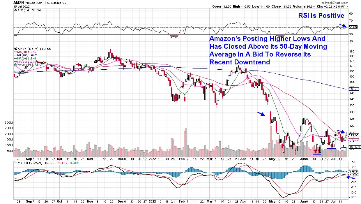
Analysts are revisiting their lowered outlook for the company, with Wall Street firm Barclays expecting Amazon to provide better-than-feared guidance for their 3rd quarter due to declining capital spending, among other factors. The Barclays analyst has a $195 price target on the stock, which is 75% above the current price.
As earnings season continues, investors will be closely watching management's outlook for the remainder of this year, and any upgrade in guidance, similar to what's anticipated for Amazon, should help push many beaten down stocks higher.
Next week, 73 companies within the S&P 500 will be reporting their 2nd quarter results, with heavyweight stock Tesla (TSLA) as well as major banking firm Goldman Sachs (GS) expected to garner the most attention. I'll be closely watching Semiconductor firm A S M L (ASML)'s results as well, after last week's rally in Semis following positive results from a major firm in this group.
Other areas of the market have firmed up as well, with the select few Suggested Holdings stocks from my MEM Edge report outpacing the markets. If you'd like immediate access to these stocks, as well as my in-depth insights into whether the broader markets have bottomed, use this link to trial my twice week report for a nominal fee for 2 weeks.
On this week's edition of StockCharts TV's The MEM Edge, I discuss the rally in QCOM and other Semiconductor stocks as select Technology stocks begin to firm up. I also share insights into top stocks due to report earnings next week.
Warmly,
Mary Ellen McGonagle, MEM Investment Research
|
| READ ONLINE → |
|
|
|
| The Canadian Technician |
| Can Oil Start To Rally? |
| by Greg Schnell |
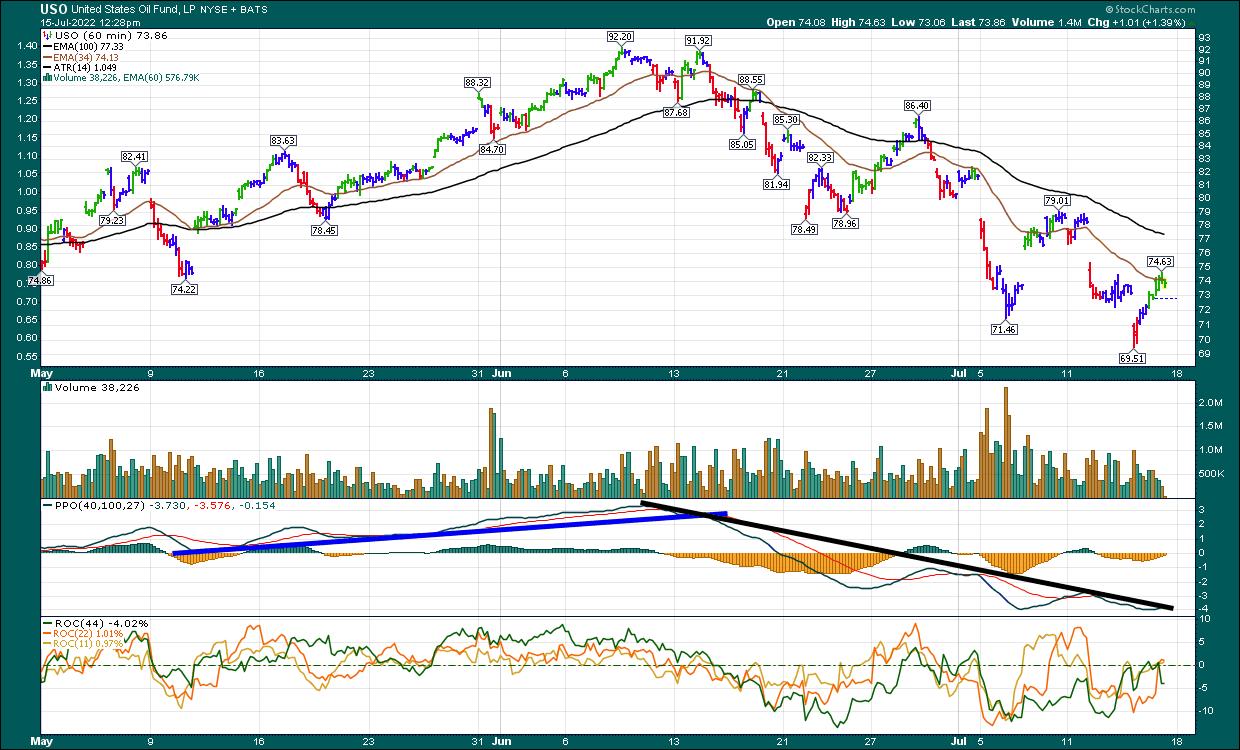
One area that has sold off extremely hard is energy, but many of the stocks are holding near their 200-DMA. If this was a long-term rally, with a deep low down at the 200-DMA, this is where we would expect a bounce.
Here's an example of the oil chart on the 60-minute time frame. Notice the PPO trend keeps going lower. On Thursday, oil price pushed down to a lower low and rallied back to Wednesday's close. The chart doesn't look like it will be in an uptrend any time soon, but if the PPO trend could break, that could at least be a clue for a bounce to start on OE once again. Notice the break of the PPO trend as the price of oil topped out. The same break the other way is often bullish.
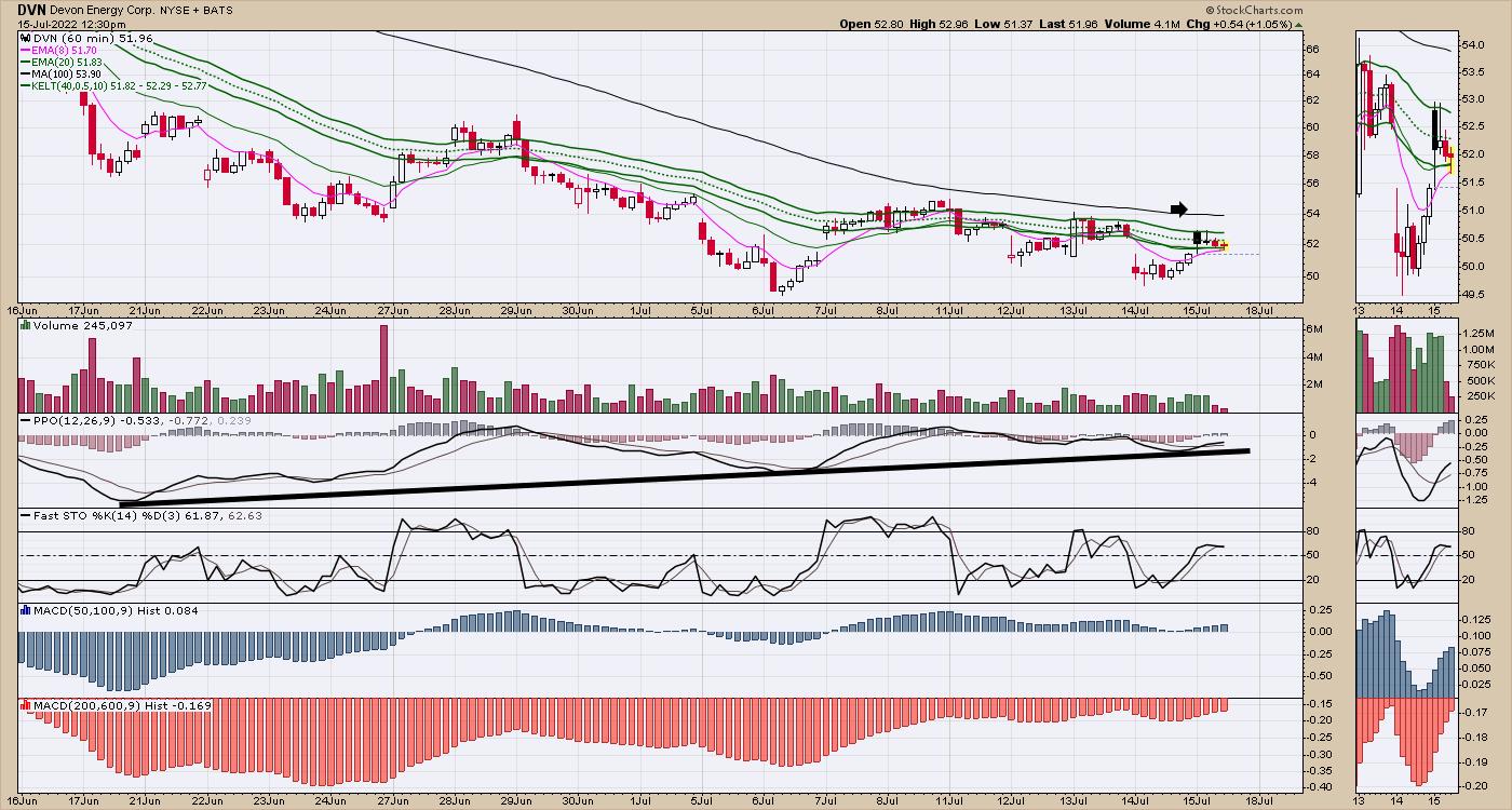
An good example of oil chart now might be the ETF for oil and gas producers. The ETF PPO is ticking higher.

Some other names like COP have broken a little further, but DVN is a nice example of holding at the 200-DMA. A bounce back to the highs would be a 50% gain. The breakdown in the oil names hasn't made a lot of sense, with oil supply tightening and Europe in trouble. Whether or not the trade works is a big question, but at least looking for a breakout back to the upside makes sense. A break above the 100-MA line on the 60-minute chart is roughly the 20-DMA on the daily. That would be near an 11-day high, which has a much better chance of holding the breakout.
Using the 200-day MA or 40-week MA, notice how the 2003-2008 rise found support, usually around the 40-week, even after steep pullbacks.
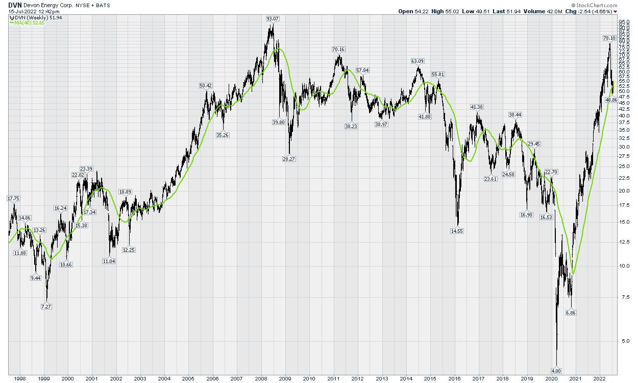
For those wishing to wait for the bigger bull market, we can wait for the indexes to take out the 50-day moving average (at the least).
Am I bearish? Absolutely. The markets moved lower all week. But it's been a week up, a week down, a week up , a week down. If things start to improve in energy after the Middle East meetings, I'd like to have a preplanned approach, and energy is at least starting to flatten out. A PPO moving into positive territory on DVN would be a start, as an example.
|
| READ ONLINE → |
|
|
|
| Mish's Market Minute |
| Mish's Daily: Strengthen Your Portfolio with Real Assets |
| by Mish Schneider |
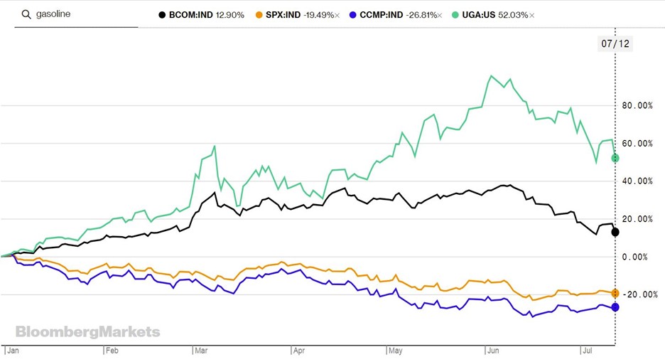
As we head into the second half of the year, it's essential to keep an eye on real assets. Real asset prices provide clues to what's happening in the global economy and can provide valuable insight. If commodity prices start to fall, it could indicate that a recession is on the horizon, or simply that we're seeing a pullback in a long bull market cycle.
Commodities are a volatile asset class, for which corrections of 20%-40% are common. The current drop in commodity prices and commodity-related stocks is one such correction.
Whenever the $USD rolls over and begins to fall, the next leg up in this significant commodities bull market will begin. We have stocks in a bear market, more Fed tightening on the way and inflation at 8%. On top of that, we have monetary policy that has caused stocks and bonds to sell off together—a development not seen since the 1990s.
What instruments are we watching right now?
Inflation may pose the biggest economic threat now. The economy is likely to test the boundaries of stagflation, although we are not discounting the potential for recession in the coming months either. We can safely say we are in a regime of lower growth and higher inflation, with CPI on tap.
June's CPI print is projected to come in at 8.8%, according to median Wall Street Journal forecasts. This would mark an uptick from May's 8.6% and is the exact opposite of what most investors and consumers are hoping to see. The only sign of cooling in the current June projections comes on the core CPI front, which will be released on Thursday and strips out energy and food costs.
Given these clues about stagflation, we think it makes sense to overweight tangible assets relative to bonds in your portfolio. Investors need to be nimble and position their portfolios accordingly to weather the inflationary storm. Commodity prices, on balance, should regain their uptrend shortly if we look at historical price volatility. Market volatility and rising inflation can erode purchasing power, and these factors should consider allocations in tangible assets. Alternative investments have become an essential part of portfolios, and if you do not have tangible assets within your asset allocation, even a tiny percentage, I would tell you that you need to buy some tangible assets now.
My daily blog has profitable ideas every week. The second-quarter earnings seasons start to coincide with the tradable range reset we follow at MarketGauge. Click here to subscribe.
 Get your copy of Plant Your Money Tree: A Guide to Growing Your Wealthand a special bonus here. Get your copy of Plant Your Money Tree: A Guide to Growing Your Wealthand a special bonus here.
Follow Mish on Twitter @marketminute for stock picks and more. Follow Mish on Instagram (mishschneider) for daily morning videos. To see updated media clips, click here.
Mish in the Media
In this appearance on Business First AM, Mish talks about the big data week and what to watch for if the market is to bottom.
Mish discusses the best investments now and what strategy traders should use on TD Ameritrade.
Mish explains how the Fed has been behind the curve and what can happen as a result on Yahoo! Finance.
Join Mish tomorrow at 9am ET as she explores the two price levels that will determine the fate of the market in 2022. This brand new special episode of Mish's Market Minute airs exclusively on StockCharts TV.
ETF Summary
- S&P 500 (SPY): 372-386 new trading range to watch
- Russell 2000 (IWM): 170 support must hold
- Dow (DIA): 307 support and needs to clear 315
- Nasdaq (QQQ): Looking heavy unless it clears 297
- KRE (Regional Banks): 56 the 200-WMA, 60 resistance
- SMH (Semiconductors): 200 now interim support, 210 resistance
- IYT (Transportation): 211.90 support with resistance at 220
- IBB (Biotechnology): 129.50 resistance, 117 support
- XRT (Retail): 60.75 the 200-WMA, 57.50 support
Mish Schneider
MarketGauge.com
Director of Trading Research and Education
|
| READ ONLINE → |
|
|
|
| MORE ARTICLES → |
|
 Chart 1
 Chart 2TEN YEAR - THREE MONTH YIELD CURVE WEAKENS... A second version of the yield curve is the spread between the ten year and three month Treasury yields. Chart 3 shows that version of the yield curve falling to the lowest level in two years which means that the shorter yield is rising faster than the longer yield. It remains above its zero line which means that it hasn't inverted yet. But the fact that it's falling isn't a good sign. If it were to fall below its zero line, that would be added confirmation of an impending recession. Inverted yield curves are usually bad for the stock market.
 Chart 3
 Chart 4
 Chart 5
 Chart 6


 Get your copy of Plant Your Money Tree: A Guide to Growing Your Wealthand a special bonus here


