| THIS WEEK'S ARTICLES |
| John Murphy's Market Message |
| STOCK INDEXES CLEAR JUNE HIGH |
| by John Murphy |
JUNE HIGHS CLEARED... Last week's message showed major stock indexes testing initial resistance at their June highs, and suggested that an upside penetration of that resistance could lead to a possible test of their 200-day moving averages. Those June highs have since been exceeded. Chart 1 shows the Dow Industrials trading at the highest level in three months and headed toward its 200-day average (red line). As shown last week, a test of that red resistance line would also coincide with a test of a falling trendline drawn over its January/April highs (see blue arrow). The Dow would have to clear both resistance lines to signal that the current rally is more than just a rebound in an ongoing downtrend.
Chart 2 shows the S&P in a similar situation. It's also worth noting that daily MACD lines in the lower box have risen to the highest level in more than year which is normally a bullish sign. Its 14-day RSI line in the upper box, however, is crossing into overbought territory over 70. That suggests that the current rally is beginning to looked stretched on the upside. Both stock indexes have also recovered more than half of their 2022 losses. As with thee Dow, the major trend of the SPX is still down. The SPX would also have to clear its red and blue resistance lines to reverse that major downtrend.
 Chart 1 Chart 1
 Chart 2 Chart 2
NASDAQ INDEX CLEARS RESISTANCE LINE... Last week's message showed the Nasdaq market testing trendline resistance extending back to January. Chart 3 shows the Nasdaq Index having cleared that barrier which suggests a further rally to its 200-day average. The flat red lines show Fibonnaci retracements of the yearlong decline which may also provide overhead resistance. Notice that the 50% retracement level (middle line) coincides closely with the red 200-day average. There again, a decisive move above its 200-day line is necessary to signal a more substantial rally.
BULL OR BEAR RALLY?... The big question right now is whether the stock rally that started in June is still part of a major downtrend or the start of a new bull market. I still lean toward the more negative view. A modest decline in this week's inflation reports supports the view that inflation may be peaking. A continuing pullback in commodity prices, and oil in particular, also supports that view. So does a pullback in bond yields. Both of those lower trends, however, could also be suggesting a slowing in the economy which isn't good for stocks. So does a continuing inverted yield curve which usually signals recessionary conditions. That's why we look at charts to help determine market trends. And the above charts suggest that the continuation of the market's 2022 downtrend is about to be tested.
 Chart 3 Chart 3
|
| READ ONLINE → |
|
|
|
| The Mindful Investor |
| Can The Final Bear Turn Out the Lights? |
| by David Keller |
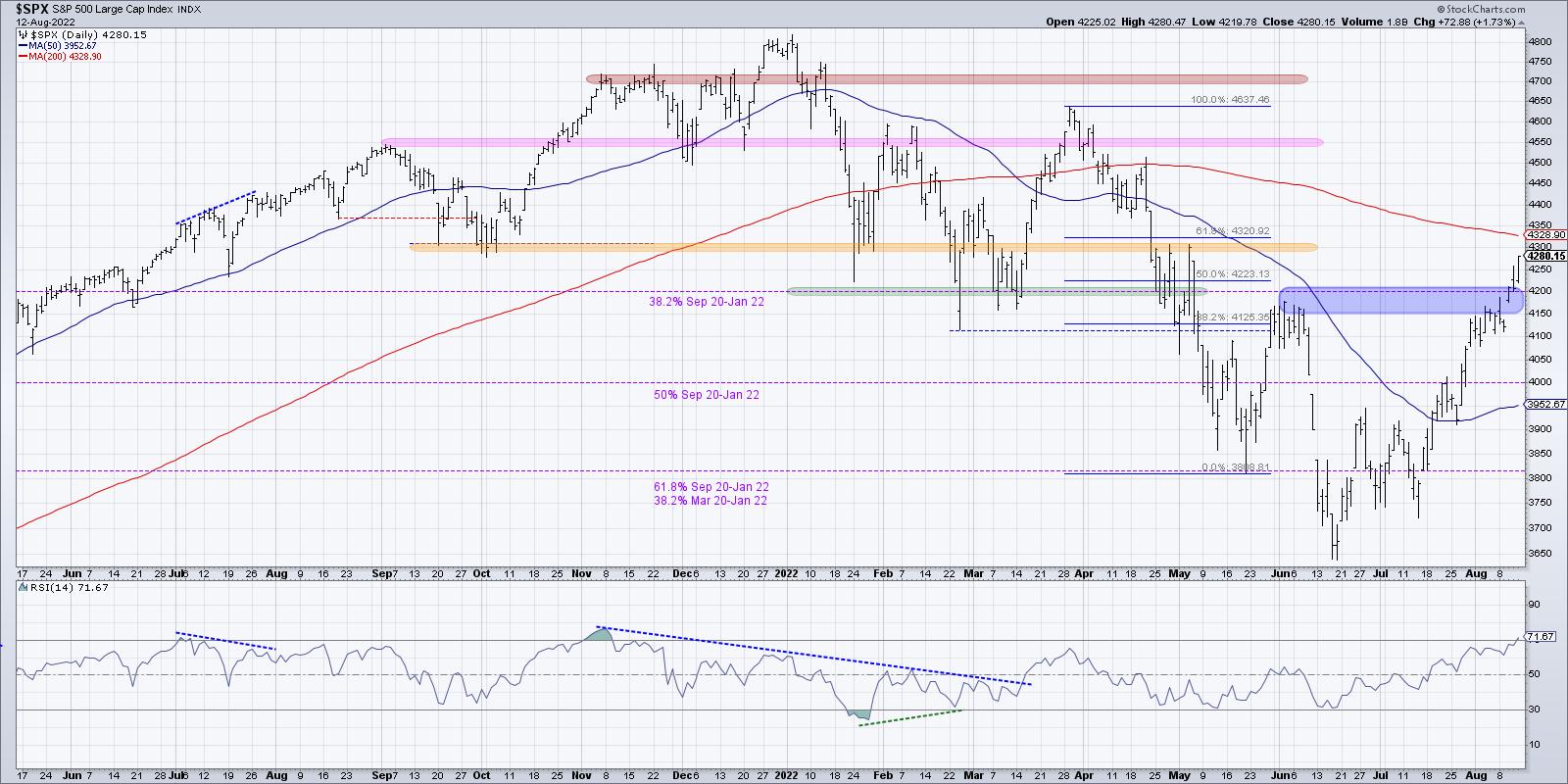
Since the initial rally off the June low, we've been reinforcing the importance of upside resistance in the 4150-4200 range. This is based on an initial Fibonacci retracement off the lows, and also happens to be the peak from early June.
On Wednesday, we finally closed above this level for the first time in two months. Thursday saw an initial follow-through which eventually closed at the lows of the day. Friday's session finally indicated a valid follow-through move after the initial upside breakout.
Now, does that mean we are now in a raging bull market with unlimited upside? Absolutely not.

I see plenty of warning signs, three of which I'll list out below. But the fact that the S&P broke above resistance, before then demonstrating even further buying power with a close around 4280, tells me to respect the trend. And given these breakouts and my Market Trend Model turning bullish last week, I would say the medium-term trend is now bullish.
What are the new upside objectives now that 4200 is in the rear-view mirror? Well, in the short-term, we still need to eclipse the 200-day moving average, which actually lines up with the 61.8% retracement level around 4320. The Russell 2000 ETF actually closed this week above its own 200-day moving average. After that, all eyes would be focused on the February/March highs around 4600. So, if we've confirmed the trend is now positive, then what's the downside risk?
What's next for the S&P 500? In this choose-your-own-adventure style discussion, we describe four potential future paths for the S&P 500 index. The $SPX is up about 15% off the June low and is now testing the 4200 level. Which of these scenarios do you feel is most likely, and why? Let us know in the comments!
First, we've talked about technology shares and other growth names becoming overbought after the acceleration higher off the March lows. Now the S&P 500 itself is overbought, for the first time since November 2021. However, while the overbought condition is in some ways a bullish indication, because stocks and ETFs usually only become overbought in bullish phases, it also tends to be negative in the short-term as it suggests that price has gone too high too quickly.
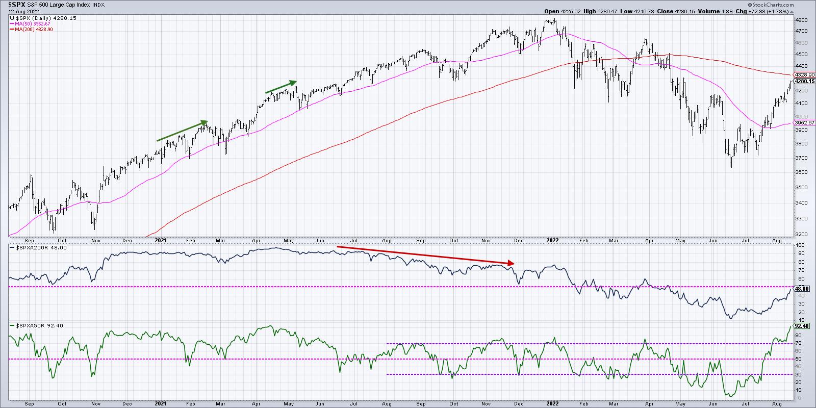
Second, breadth has gone from incredibly weak to incredibly in a very short period of time. And, in a way, that tells me the market has to pause to relieve that excess positive breadth. For example, in mid-June less than 5% of the S&P 500 members were above their 50-day moving average. The reading on Friday's close? Over 90%.

That's right. Almost the entire 500 members of the S&P 500 index rotated back above their 50-day moving average over the last eight weeks. And that's the highest reading in the indicator since April 2021.
This is not a shallow, narrow-led rally. This is a broad-based price expansion, leaving resistance levels destroyed and receding into the background. But when that many stocks make that sort of rotation, my "brief and buyable pullbacks" alarm starts to pop. It's reasonable to expect a short-term pullback to reset the bull market phase and allow a new set of buyers the opportunity to enter the game.
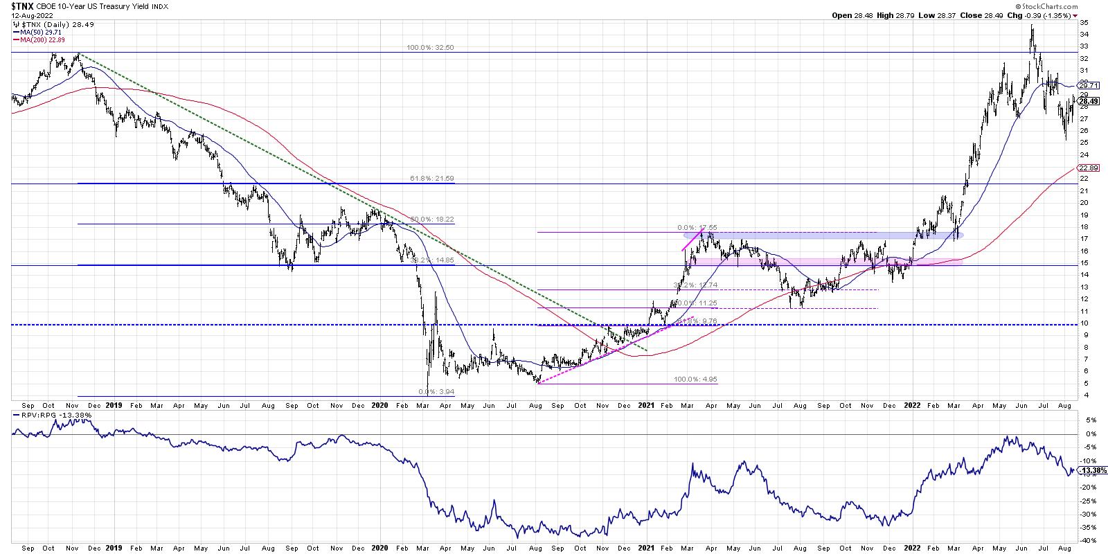
Finally, interest rates have come down a lot already. The Ten-Year Treasury Yield peaked around 3.50% in June and finished this week down at 2.85%. I had two very interesting conversations on interest rates on this week's The Final Bar shows.
Mark Newton, CMT from FundStrat Global Advisors suggested that rates could move higher, and that a higher Ten-Year Yield would be a challenging environment for current leadership sectors like Technology. On the other hand, Ari Wald, CMT of Oppenheimer, argued that we've already seen a peak in rates for 2022, and that lower rates mean plenty of upside for growth stocks.

One thing on which we all agreed was that the direction of the Ten Year has been a key macro theme in 2022, with obvious implications on leadership from value or growth names. So, while the bull run for stocks has been impressive to observe, every ounce of my being as a technical analyst tells me to expect a pullback from current levels. I have learned to respect the trend, and I will acknowledge that the trend is decidedly positive based on the last two months. But the short-term readings suggest a market absolutely ripe for a drawdown.
Here's the real problem. What happens when the last bear finally throws in the towel?
RR#6,
Dave
P.S. Ready to upgrade your investment process? Check out my YouTube channel!
David Keller, CMT
Chief Market Strategist
StockCharts.com
Disclaimer: This blog is for educational purposes only and should not be construed as financial advice. The ideas and strategies should never be used without first assessing your own personal and financial situation, or without consulting a financial professional.
The author does not have a position in mentioned securities at the time of publication. Any opinions expressed herein are solely those of the author, and do not in any way represent the views or opinions of any other person or entity.
|
| READ ONLINE → |
|
|
|
| Art's Charts |
| Overbought and Staying Overbought |
| by Arthur Hill |
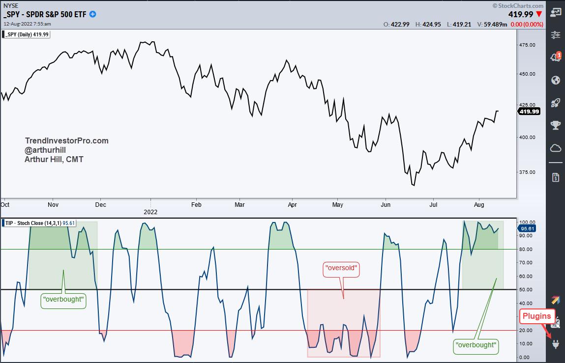
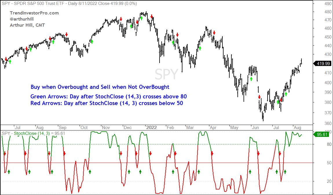
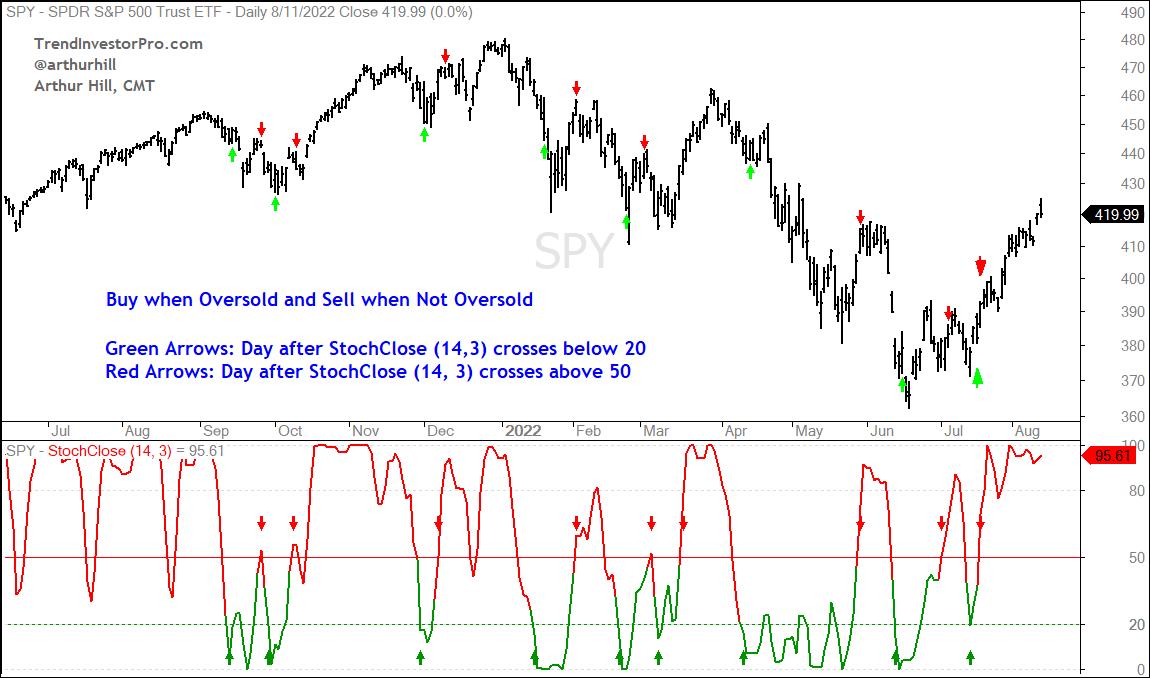
The S&P 500 SPDR (SPY) is in the midst of a strong advance since mid July as it became "overbought" on July 20th and remains overbought. Today's article will show how to measure overbought and oversold levels using StochClose, which is a version of the Stochastic Oscillator that uses closing prices. We will then backtest SPY using overbought and oversold signals.
The Stochastic Oscillator measures the level of the close or current price relative to the intraday high-low range. StochClose also measures the level of the close relative to the high-low range, but uses the "closing" prices only (as opposed to the intraday high-low range). This is why I am only showing a line chart (close only) for SPY. Readings above 80 mean price is near the top of its 14-day range and readings below 20 mean price is near the bottom of its 14-day range. As with traditional Stochastic (14,3), I also smoothed 14-day StochClose with a 3-day SMA. StochClose is part of the TrendInvestorPro indicator edge plugin for StockCharts ACP.

For testing purposes, an overbought period will start with a move above 80 and end with a move below 50. Oversold will start with a move below 20 and end with a move above 50. Signals are based on the close and the buy/sell occur the next open. For example, the strategy will buy SPY on the open the day after StochClose crosses above 80 and sell on the open the day after StochClose crosses below 50. The tests ran from January 2000 until August 11th, 2022. There are no commissions or dividends. The charts below show signal examples.


The purpose of this exercise is not to create a stand alone system. Instead, it is to underunderstand the nature of overbought and oversold for SPY over the last 20+ years. There are two key takeaways. First, overbought conditions last longer than oversold conditions. On average, the overbought trades lasted 19 days and the oversold trades lasted 11 days. The current overbought trade is 17 days so far. Second, oversold trades have a much higher chance of turning a profit than overbought trades. Buying when StochClose crosses below 20 and selling when StochClose crosses above 50 was profitable 77% of the time with an average gain of 2.27%. Buying when StochClose crossed above 80 and selling when it crossed below 50 was profitable just 44% of the time.
There were some new Trend Composite signals this week in our ETF universe and we highlighted these signals along with the ATR Trailing Stop for trend-following. We are also monitoring the advance in SPY using short-term breadth for clues on underlying strength. This analysis is included in our detailed reports and comprehensive videos. Click here for immediate access.
The StochClose, the Trend Composite, ATR Trailing Stop and eight other indicators are part of the TIP Indicator Edge Plugin for StockCharts ACP. Click here to take your analysis process to the next level.
---------------------------------------
|
| READ ONLINE → |
|
|
|
|
|
| DecisionPoint |
| Two Indicators that are Acting Like It's 2020 |
| by Erin Swenlin |
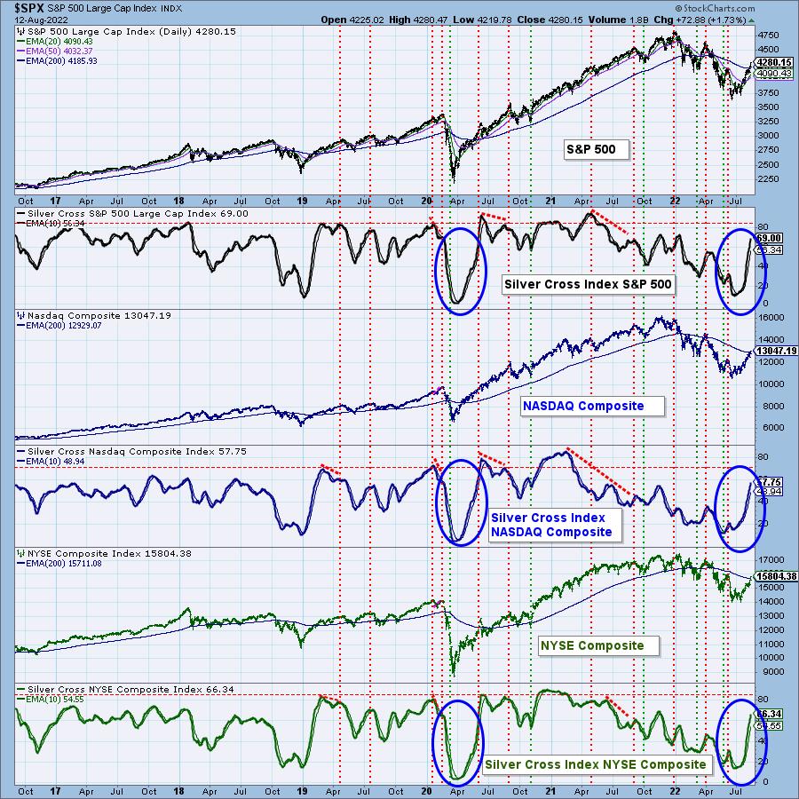
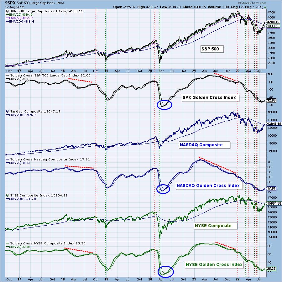
We decided to take a look at our Silver Cross Index (SCI) and Golden Cross Index (GCI) across the broad markets. They were startling, to say the least. As we all debate whether this is the end of the Bear Market of 2022, these two indicators suggest it just might be.
Our SCI measures how many stocks have a 20-day EMA above the 50-day EMA, and the GCI measures how many stocks have a 50-day EMA above the 200-day EMA. Those numbers have been steadily increasing and, in the case of the SCI, the increase has been nearly vertical. The SCI has been on a roll as more and more stocks have "silver crosses." Notice how similar behavior was occurring at the end of the 2020 Bear Market.

Additionally, on the improving GCIs, we have an oversold bottom and positive crossover on all of them. The last time the GCIs bottomed in oversold territory, it was the end of the 2020 Bear Market.

Conclusion: We can't say for sure that the bear market is over, but we are seeing compelling evidence on our DecisionPoint indicators that suggest it just might be. On the flip side, the SCIs are overbought, which could mean a market top ahead. If you haven't checked out the daily and weekly $ONE RRGs, I suggest you do. DP Alert subscribers will see them and our analysis in today's report as well as in EVERY DP Alert report.

Technical Analysis is a windsock, not a crystal ball. --Carl Swenlin
(c) Copyright 2022 DecisionPoint.com
Helpful DecisionPoint Links:
DecisionPoint Alert Chart List
DecisionPoint Golden Cross/Silver Cross Index Chart List
DecisionPoint Sector Chart List
DecisionPoint Chart Gallery
Trend Models
Price Momentum Oscillator (PMO)
On Balance Volume
Swenlin Trading Oscillators (STO-B and STO-V)
ITBM and ITVM
SCTR Ranking
Bear Market Rules
DecisionPoint is not a registered investment advisor. Investment and trading decisions are solely your responsibility. DecisionPoint newsletters, blogs or website materials should NOT be interpreted as a recommendation or solicitation to buy or sell any security or to take any specific action.
|
| READ ONLINE → |
|
|
|
| Martin Pring's Market Roundup |
| Good Inflation News is Helping Stocks Move Through Resistance -- But is It Enough? |
| by Martin Pring |
The summer rally has enabled several indexes to push through important resistance, but, since there was a lot of backing and filling at higher levels earlier this year, there are several places where even more resistance is apparent.
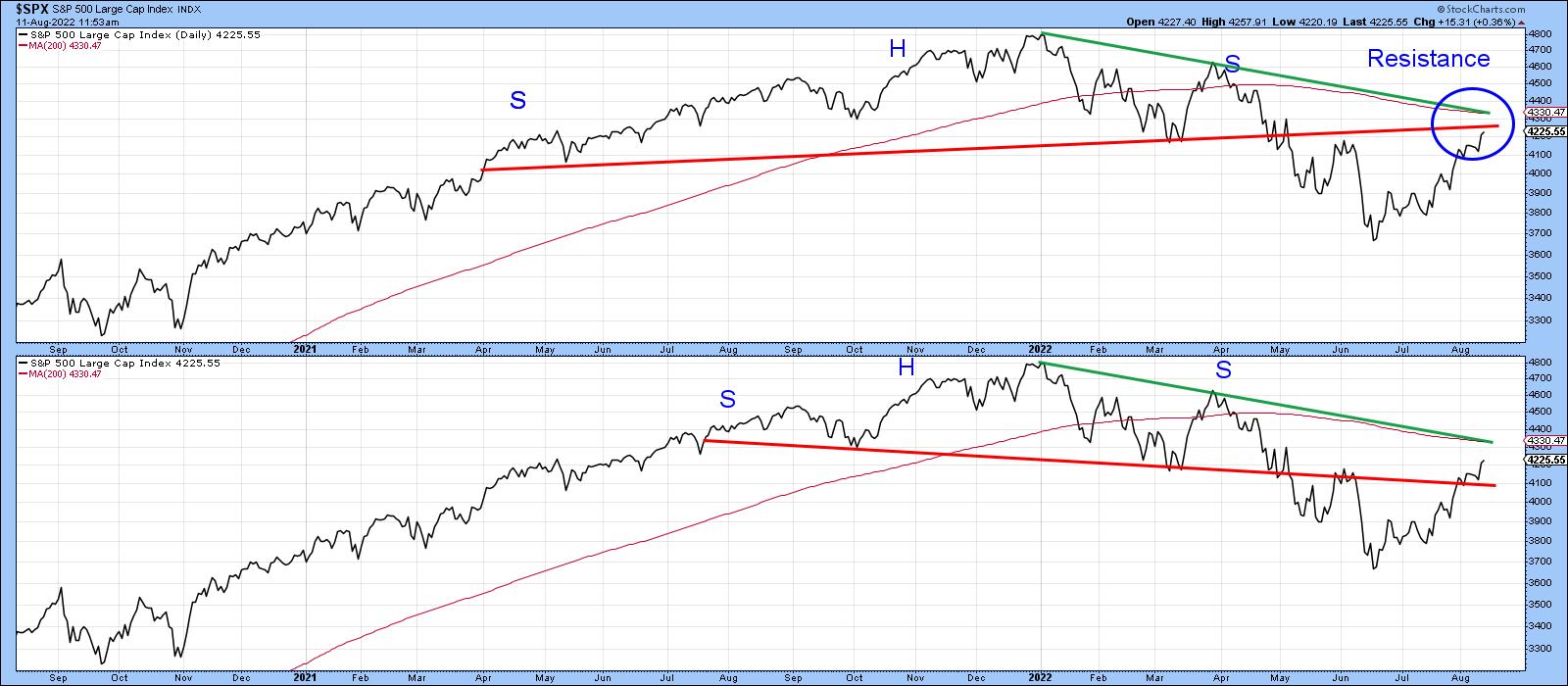
If you want to be bullish, for instance, take a look at the lower window in Chart 1. Here, we see that the S&P completed a downward-sloping head-and-shoulders top, but the Index has crossed back above the neckline, suggesting that the top has been cancelled. On the other hand, the upper window reveals that a different, but perfectly legitimate, upward-sloping head-and-shoulders top is still intact. One of the keys to spotting a head-and-shoulders failure is to watch for the price to cross back above the line joining the head with the right shoulder. In this instance, that line is currently resting at around 4,330. As luck would have it, that's also where the 200-day MA is residing. Since both represent dynamic levels of support or resistance, their appearance at the same level reinforces that zone just above 4,300 as a very significant one.
 Chart 1 Chart 1
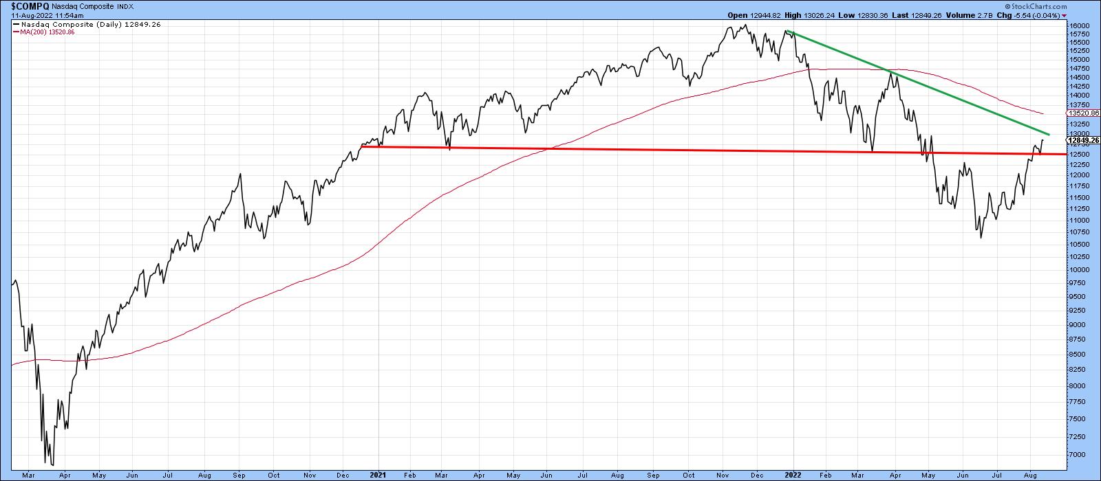
The NASDAQ Composite has also broken back above its breakdown trendline. This morning, The Wall Street Journal announced that the NASDAQ is now in a bull market, as it has risen 20% from its low. If only things were that easy! Chart 2 shows that the Index has yet to clear the trendline joining the head with the right shoulder, not to mention the 200-day MA at 13,500.
 Chart 2 Chart 2
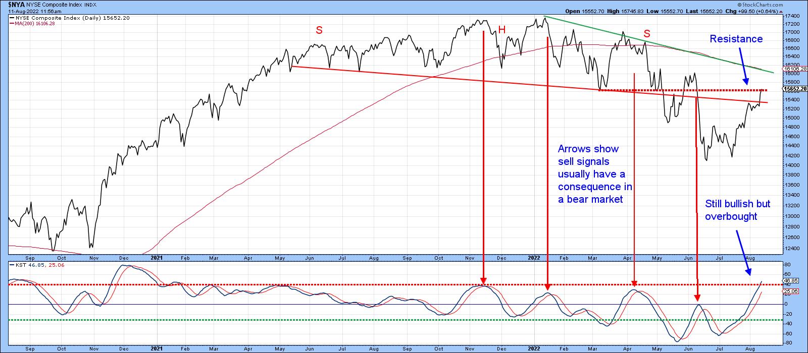
Chart 3 lays out the battle lines for the NYSE Composite, as the Index has just broken above the extended neckline of a downward-sloping head-and-shoulders top for the second time. Others may disagree with my assessment, as the various rallies and reactions open up many possibilities of identifying the top. Based on the criteria determining the significance of a trendline, this one seems to me to fit the bill. It's lengthy, has a narrow angle of descent and been touched on numerous occasions, thereby indicating its importance as a dynamic level of support. Due to its large 2022 drop, the Index is still some way from the head/right shoulder trendline and 200-day MA at around 16,100.
KST momentum is overbought, but still rising. If this is a bear market rally, it's likely to roll over and trigger a sell signal pretty soon. All the other downside reversals since the bear market began were followed by declines. Note that, on the left hand part of the chart, when the primary trend was bullish, sell signals did not have much power at all. If we really did hit bottom in June, this indicator would be expected to move substantially higher above its bear market range.
 Chart 3 Chart 3
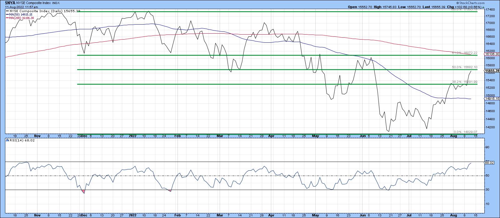
Chart 4 underscores additional resistance, this time in the form of retracements. Here, you can see that the post-June advance has retraced 50% of its bear market decline. Interestingly, the Fibonacci 61.8% retracement would take the Index back to its early June high and 200-day MA.
 Chart 4 Chart 4
The 14-day RSI last saw an overbought condition at the 70 level back in November. Its failure to get close to such a reading, since the Index peaked earlier this year, is a bear market characteristic. If the Index pushes through and holds above the 50% retracement line, the RSI could always push firmly into overbought territory. However, as it stands right now, that has not happened.
Watch Tesla
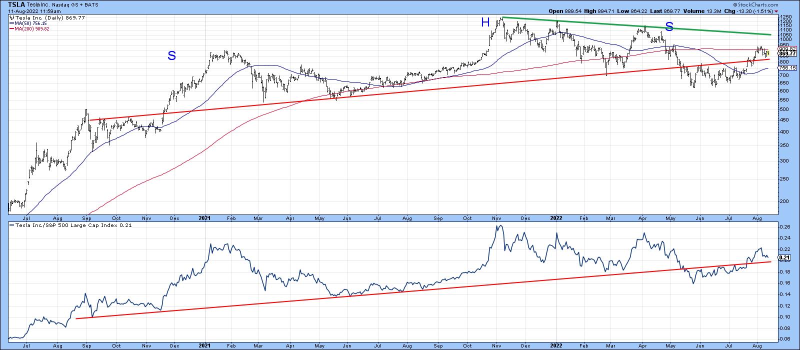
I don't usually get into individual stocks, but I do find Tesla's recent price action to be quite interesting. As one important icon of the 2020-2022 bull market, it may provide clues as to whether a new primary uptrend did begin in the early summer or if the bear is in hibernation.
Chart 5 shows that, between late 2020 and 2022. the price traced out a large head-and-shoulders top. Instead of selling off sharply, it then experienced a trading range and broke back above the extended neckline. The price recently turned back from its 200-day MA and is now challenging that breakout point again. The RS line is replicating this action.
 Chart 5 Chart 5
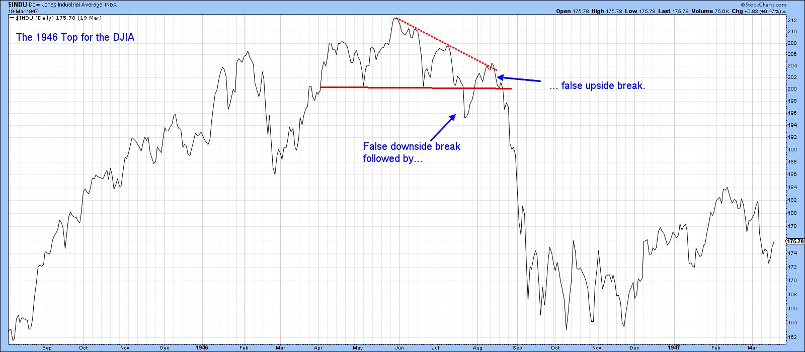
It's vitally important that the price hold above that extended neckline; otherwise, it will experience a double false breakout, the kind of action shown in Chart 6 for the 1946 top in the Dow. Remember, false breakouts when confirmed are usually followed by an above-average move in the opposite direction to the breakout.
 Chart 6In this case, we would have a double false breakout, which would have an even stronger negative connotation -- if it happens. Chart 6In this case, we would have a double false breakout, which would have an even stronger negative connotation -- if it happens.
Good luck and good charting,
Martin J. Pring
The views expressed in this article are those of the author and do not necessarily reflect the position or opinion of Pring Turner Capital Group of Walnut Creek or its affiliates.
|
| READ ONLINE → |
|
|
|
| The Canadian Technician |
| Compelling Charts Ignore Narratives |
| by Greg Schnell |
One of the hardest parts of investing is changing your mind as the charts change, rather than waiting for the news and the economy to change. Before the CPI print, the market had been stalling sideways for almost two weeks. But after the CPI, the market started to rally higher again. The big difference this week is that we can see some sectors breaking through the 200-DMA, and industries that continued to be muted have broken out positively.
One of the biggest moves this week that I wouldn't have expected is the move in the banks. Why? The narrative was terrible:
- Quantitative tightening coming up
- Inflation over 8%
- Fed tightening aggressively, with another 0.75% happening mid-September
- Yield curves inverted, with the 10-year at the lowest yield
- Supply chains a mess
- Energy shortages globally
- Food shortages for large parts of the world
- War
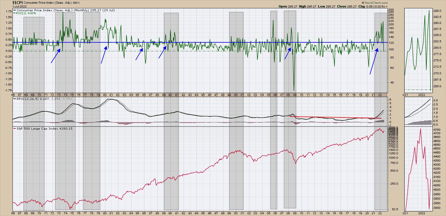
That narrative doesn't describe what is going on in the investing rally. The chart below is the rate of change for the consumer price index on the top panel. I added some blue arrows:
- Where the PPO momentum for CPI was rising
- Where ROC readings had been meaningfully higher than the blue dashed line for a while
- Where we had a sudden drop in the rate of change
We could sort the signals various ways, but it seems to be a mixed bag for $SPX returns.

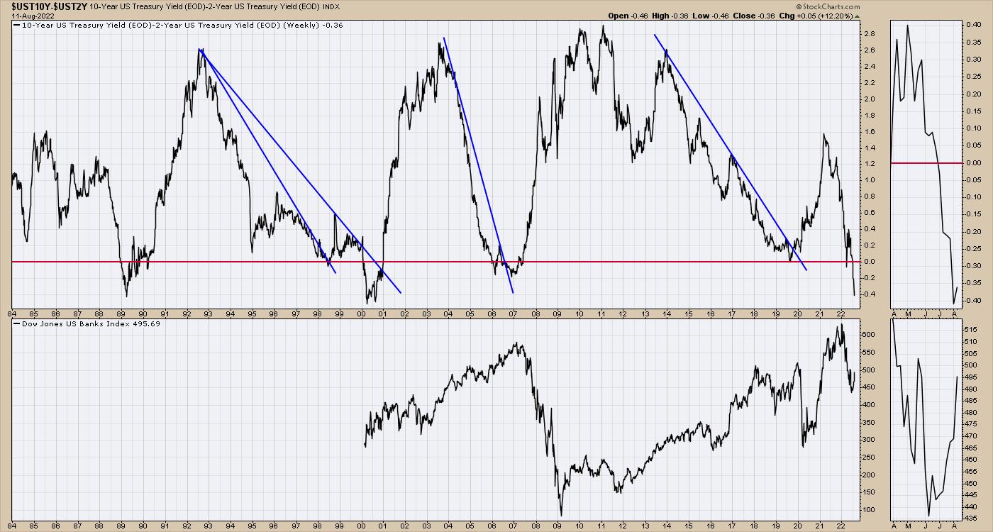
When I think about the banks, we can ponder whether or not, if the yield spread starts going from getting worse to getting better, the banks will start to rally.

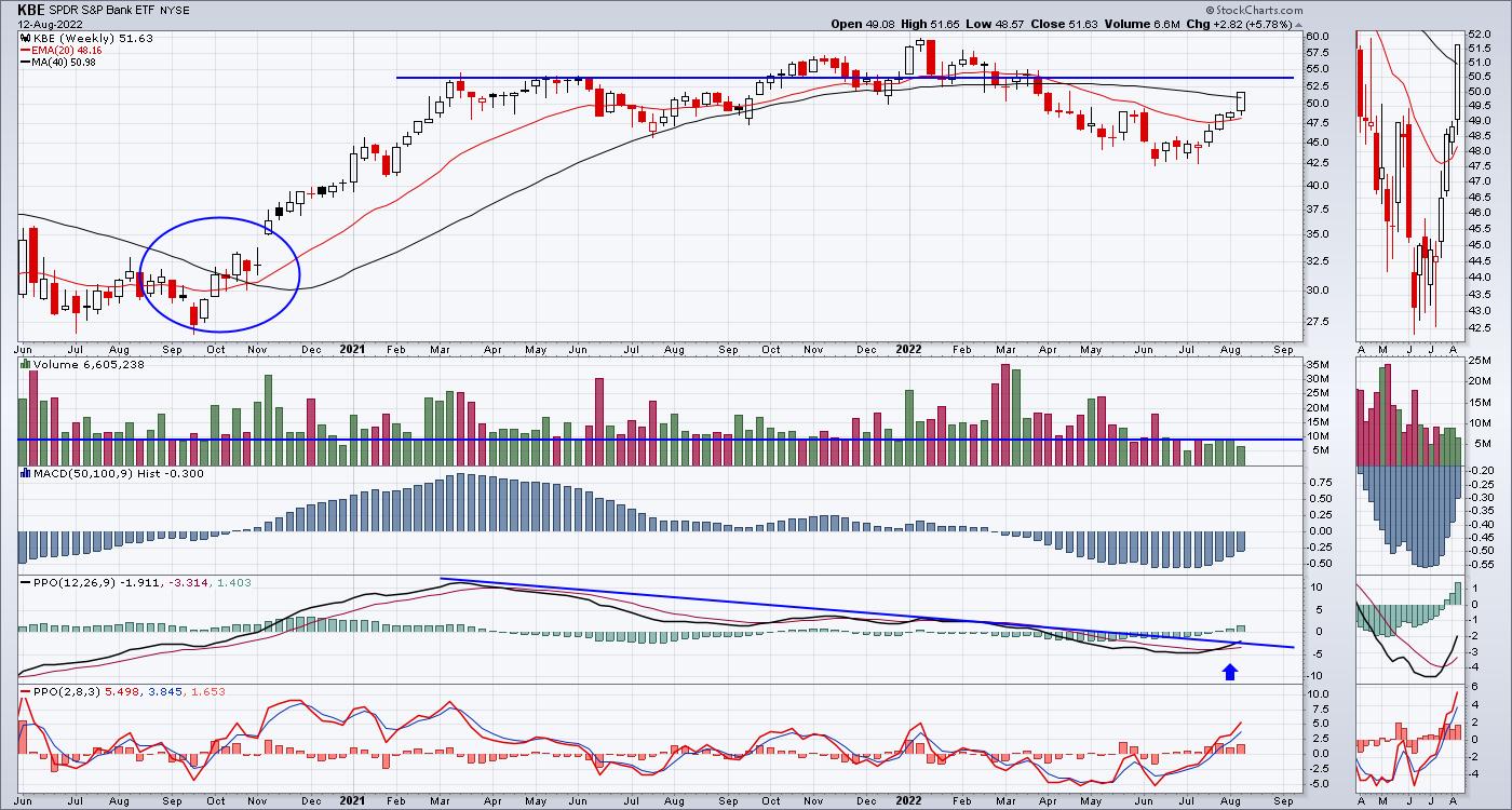
I don't know the narrative, but the KBE shot up this week. It was above the 20-Week Moving Average (WMA) last week, and this week it moved above the 40-WMA. I circled the last time that happened on the chart. It was an epic run in the bank names.

When banks and industrials are moving above the 40-WMA, something is changing. Better to ride the trend than question it.
|
| READ ONLINE → |
|
|
|
| The MEM Edge |
| Is the Bear Market Really Over? |
| by Mary Ellen McGonagle |
Last week's rally in the Nasdaq marked a 21% rise from its June 16th closing low and, according to widely-followed criteria, this signals the end of its bear market status. The gains occurred following news of a slight easing of inflation in July and, if we continue to see inflation drop, the bull market trade should gain further momentum.
This is great news for growth investors, as many Technology and Retail stocks are well-priced after lengthy declines from their November peaks in price. Not all stocks have the criteria for a continued move higher, however, and below, I'll review what's needed.
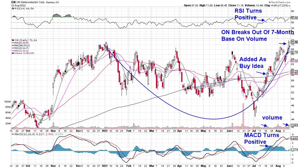
My work centers around uncovering leadership stocks that go on to far outpace the markets, and it's based on my many years working with William O'Neil, the founder of Investor's Business Daily. A recent alert for subscribers to my MEM Edge Report was to purchase ON Semiconductor (ON) on July 20th, and it‘s a prime example of exhibiting the characteristics needed to outpace the markets.
DAILY CHART OF ON SEMICONDUCTOR (ON)

Below are the criteria that put ON on my short, but select, list of buy ideas, and I'll continue to use these proven criteria to add more stocks as the markets trade higher.
First up, ON was trending higher before the Nasdaq broke above its 50-day moving average in late July. When searching for leadership names, relative outperformers during a bear market or correction will often go on to far outpace their peers.
Second, you want to make sure that your stock has solid growth prospects, as this will draw institutional investors who will bid the stock higher. ON was estimated to report 65% earnings growth for this year when we added it to our buy list.
Last, reported earnings and industry group improvement will help propel the stock higher. ON reported earnings on August 1st that were 113% greater than last year, with management guiding estimates higher due to expected growth. In addition, the Semiconductor group bullishly broke above its 50-day moving average the day we added ON.
The company's very positive earnings report helped push the stock even higher. ON provides semiconductor components that are instrumental in the electrification of automobiles, which is a huge area of growth. In addition, the stock is trading at 15 times trailing 4-quarter earnings, which is another attractive characteristic.
ON has gained 18% since we added it to the MEM Edge List's Suggested Holdings List 3 weeks ago. That's 80% better than the Nasdaq, and we think it'll trade much higher from here. As you can see in the chart above, the stock broke out of a 7-month base on volume today.
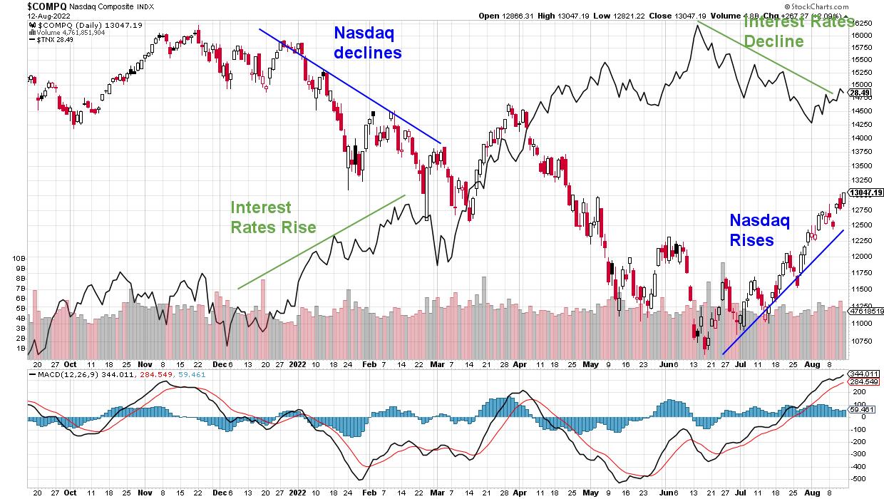
DAILY CHART OF NASDAQ COMPOSITE

As for the Nasdaq having its bear market label removed, I'm continuing to treat the current market uptrend with a touch of caution, with a break above the 200-day moving average providing further conviction. Most of the recent gains in the market have occurred due to rallies in beaten-down companies that have reported mostly tepid earnings reports. With over 90% of S&P 500 stocks having released 2nd quarter results, it will be left to economic data alone to propel the markets higher. As you can see in the chart above, any considerable rise in interest rates could easily stall the current rally in growth stocks.
Of course, continued reports of lower inflation, such as last week's PPI and CPI data, could easily push us into a new bull market phase. For now, I'll continue to put money to work as the markets climb the proverbial wall of worry -- particularly high-quality names that are in a position to greatly outperform.
You can gain access to the other Growth stocks that are my MEM Edge Report's Suggested Holdings List by using this link here. You'll also gain broader market and sector analysis not found anywhere else. Use the link above to receive a 4-week trial of my twice weekly report for a nominal fee.
On this week's edition of The MEM Edge, now available to watch on demand at StockChartsTV.com and the StockCharts YouTube channel, I review why select stocks are trading higher than the markets. I also highlight the rotation into small-caps and share ways to capitalize.
Warmly,
Mary Ellen McGonagle , MEM Investment Research
|
| READ ONLINE → |
|
|
|
| Trading Places with Tom Bowley |
| Can the Stock Market Overcome This MAJOR Issue? |
| by Tom Bowley |
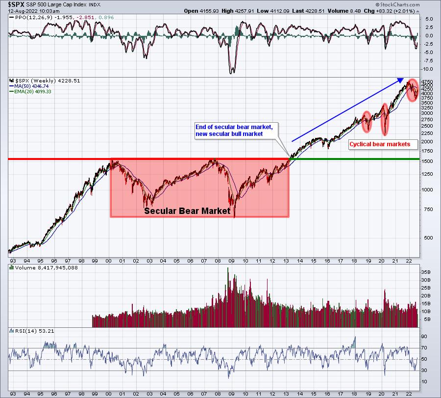
I'm a believer that Wall Street will eventually overcome all obstacles and move back to all-time highs. It's a big "wall of worry", but the bulls are up to the task. The cyclical bear market is over, and we've resumed the secular bull market that began on April 10, 2013 when the S&P 500 finally cleared highs from years 2000 and 2007:

So the big argument between bears and bulls currently is whether what I believe was a cyclical bear market morphs into something similar to the 2000s, when we traded for more than 13 years without setting a new all-time high. Everyone is free to pick their side; one group will be right and one will be wrong. I'll take my chances on the long side.
Hey, I get it. I realize that inflation hit its highest level in more than 40 years. The 1970s was a very rough decade, so no one wants to live through that again. Yes, the Fed has been very hawkish and continues to talk tough; no one wants to fight the Fed, right? We've just seen a second straight quarter of negative GDP; who wants to buy stocks in the midst of a recession? We've got the ongoing war in Ukraine; who wants to buy stocks in the face of geopolitical tensions?
My answer to all of this is.......do you think this is news that Wall Street is unaware of? Trust me, they've got Harvard Economics MBAs on staff. They likely understand all of this MUCH better than you, me and everyone else trying to figure all of this out. Rather than try to outsmart these brilliant folks on Wall Street, I simply follow their money.
That's where StockCharts.com and the charts come into play. Technical analysis isn't easy, and those who apply it use different strategies, indicators, tools and, yes, their own personal biases. I will happily tell you that I have a bullish bias, ALWAYS. I've said before that if I see warning signs and enough of them emerge, I'll try my best to objectively point them out and discuss them. I did that at the end of 2021 and continued to do that through the first 5 months of 2022. But once I see money rotate away from value and back into growth as the S&P 500 sets a new low, I begin to question all of the media rhetoric. When I see the options traders all turning bearish simultaneously, I realize that sentiment has shifted dramatically -- which is EXACTLY what we needed and what I called for at the end of 2021.
The news right now is honestly just as bad as it was last year, probably worse in several areas. But THAT is why the S&P 500 dropped 25%, the 6th worst cyclical bear market in the last 72 years! The stock market prices in bad news. Once sentiment turns bearish, market participants, collectively, cannot process how the stock market can go higher when the news is so bad. After studying bear market behavior, rotational shifts, sentiment, etc, for years and years, I realize the disconnect and accept it. I also do my best to profit from it -- just like Wall Street is doing.
Personally, I believe all the bad news we're hearing right now was fully priced in at the June low. That's when Wall Street decided it was time to buy growth stocks -- exactly when the stock market was at its most panicked level! It was that bullish rotation and increased panic that suggested I call the bottom on June 16th. For me, it's not about being right or wrong, it's about managing risk. If Wall Street, and all of its MBAs, decided it was time to start buying growth stocks hand over fist, that's good enough for me. I said at the time that the risk of remaining in cash or shorting was much too great based upon this new market development -- rotation into "risk-on" areas while selling was exhausting itself.
Now For My Bearish Thoughts
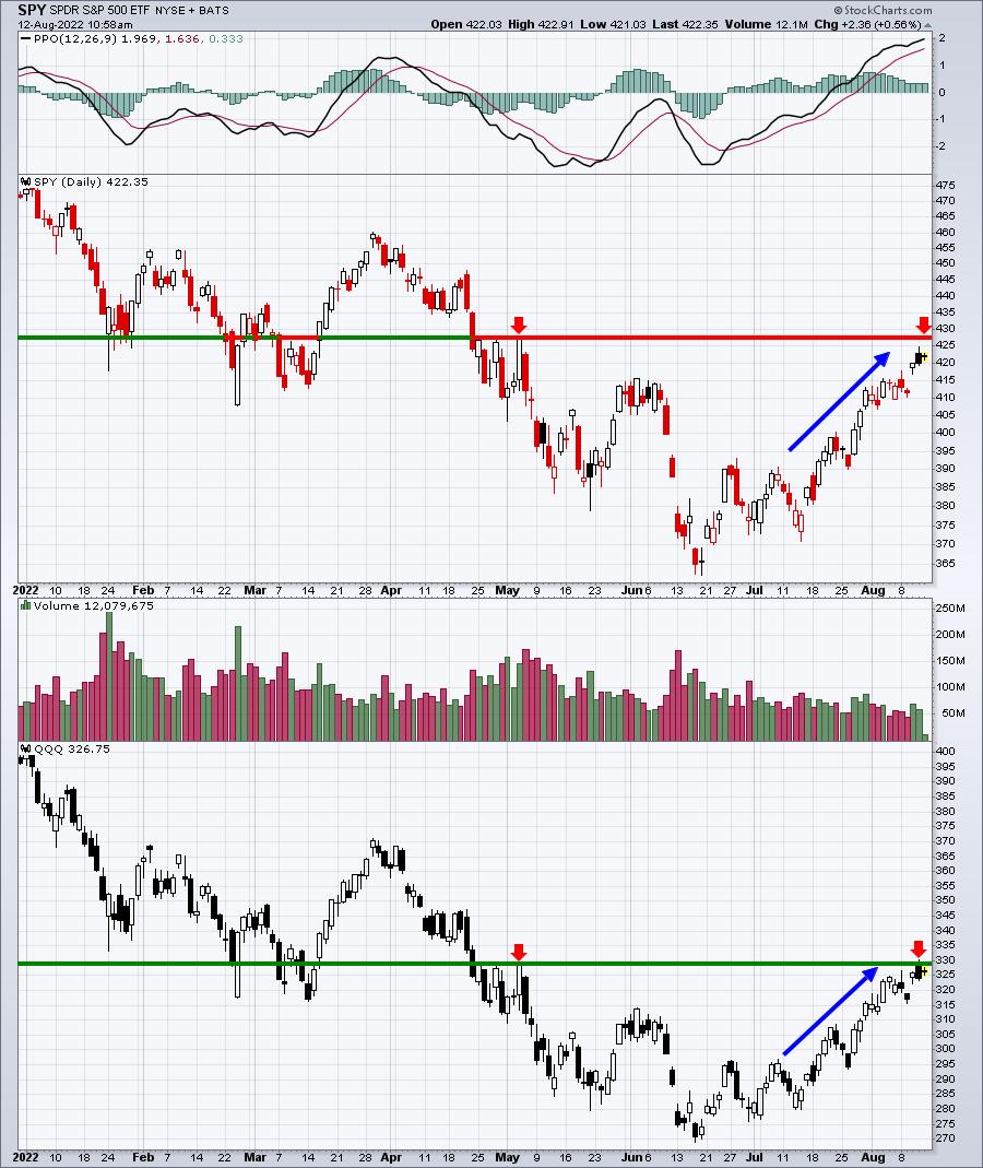
August options expire next Friday. Have you looked at the major index ETFs like the SPY and QQQ? The number of in-the-money calls are SWAMPING the number of in-the-money puts. No matter how much I believe a bottom is in, I will not overlook the financial incentive for market makers to manipulate prices next week.
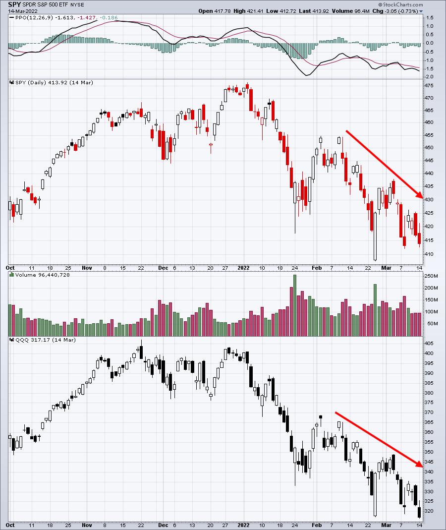
I remember when everyone was talking about the bear market rally in March. First, here's how the QQQ and SPY looked at the close on March 14th, just four days before March options expired:

The very next day, we held our March Max Pain event with members, and I showed them this Excel spreadsheet:

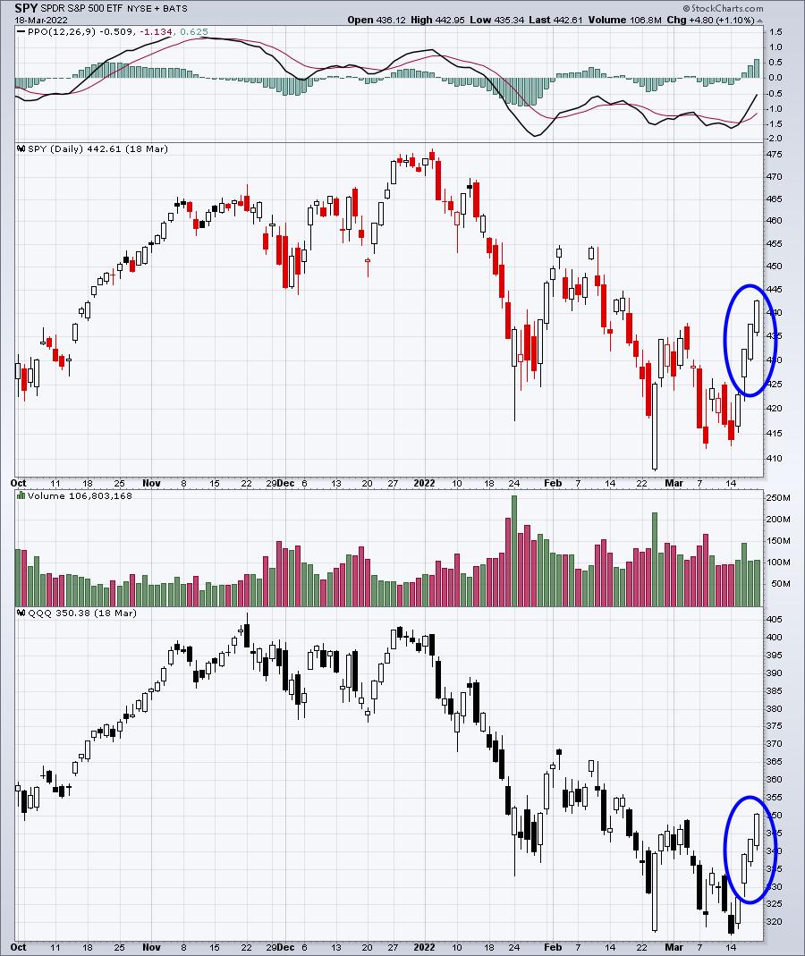
From left to right, the 423.02 was the Tuesday, March 15th close, the 443.79 was the "max pain" level for the SPY (point at which in-the-money calls equals in-the-money puts), the POTENTIAL gain if prices gravitate all the way to max pain, and the amount of NET in-the-money put premium on the SPY as of the March 15th close. So, between the SPY and QQQ, there was nearly $3.4 BILLION of net in-the-money put premium. If prices would rise from that Tuesday close through Friday, market makers would be in a position for a WINDFALL of profits. So was this rally that began on March 15th simply a bear market rally, or was the financial incentive from options the reason that we saw such a big rally? Here's what happened the balance of that week:

Wow, boy those market makers are lucky, aren't they? (Sarcasm intended.)
Max pain on the SPY, calculated on Tuesday, was at 443.79. The SPY closed the week at 442.61. The QQQ had max pain of 354.76. The QQQ closed the week at 350.38.
Call it a bear market rally if you'd like. I'll call it Wall Street ONCE AGAIN stealing (legally) from unsuspecting options traders. It's the way the market was designed....and works. Bet against it at your own risk.
So why do I bring up March, options, max pain, and that huge reversal? Well, because, as Yogi Berra would likely say, it's "deja vu all over again!" Except there's one big difference this time: instead of a massive decline heading into options expiration week, we've seen the opposite.

We've been trading straight up over the past 4-6 weeks and there is a MASSIVE imbalance between in-the-money calls and in-the-money puts. I haven't calculated the amount of net in-the-money calls, but I can tell you that it's substantial. This time, there will be financial incentive for market makers to manipulate prices LOWER between now and next Friday. It's important to understand one thing, however. Market makers likely hedge their options positions. When the market is going straight up, as traders buy calls, I would be shocked if market makers didn't take covered call positions -- selling the calls to traders, while buying the underlying stock. That protects market makers if prices keep going higher. So don't worry about them; they'll be fine, trust me. But, in this scenario, what if market makers sell their underlying stock at some point for profit, use their capital to take short-term short positions to artificially (temporarily) drive prices lower into options expiration, making money on those short positions? Oh, and by the way, by driving those prices lower temporarily by shorting, guess what happens to all that in-the-money call premium? Yep, it disintegrates into thin air while options traders are left holding the empty bag. It's a WIN-WIN-WIN for market makers. You don't think these big Wall Street firms would do this? Let me tell you something -- they'd sell a family member for a buck.
It's very possible we'll get that selloff that so many bears are looking for right now. Unfortunately for them, it won't be the start of another leg lower. It'll be temporary, encourage them to dig their heels in deeper, and then the carpet will get pulled once again.
Let's see how this plays out.
On Saturday, August 27, 2022, at 10am ET, I'll be hosting a VERY important event, "Where Does The Market Go From Here?" It's a FREE event open to everyone, but you will need to register for this event to save your seat. CLICK HERE for more information and to register with your name and email address.
Happy trading!
Tom
|
| READ ONLINE → |
|
|
|
| RRG Charts |
| Only Two Sectors are Leading the Charge |
| by Julius de Kempenaer |

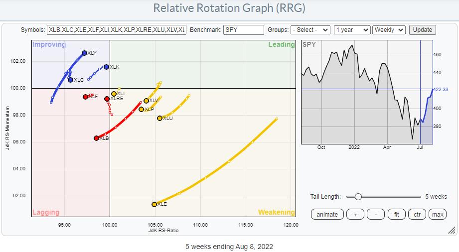
On the Relative Rotation Graph for US sectors, there are only two sectors that are leading the market higher. Not surprisingly, these are growth-related sectors, specifically XLK and XLY, which together make up 40% of the market capitalization of the S&P 500 index.
In last Tuesday's episode of Sector Spotlight, I pointed out that the other offensive sectors are still in relative downtrends and that all defensive sectors are still in relative uptrends. They (defensive) are inside the weakening quadrant, which means that their uptrends are still intact but losing traction. Given their distance from the 100-level on the JdK RS-Ratio scale, there is still a very good chance for them to curl back up and return to the leading quadrant.
But the strength in the S&P is there, which cannot be denied.

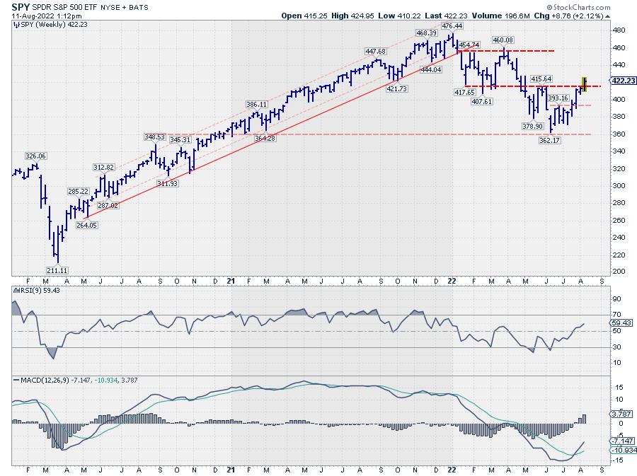
On this weekly chart, SPY is breaking above its previous high, which puts an end to the rhythm of lower highs and lower lows. It does not immediately signal a new uptrend, but merely the transition into a more sideways move.
My big question is: How sustainable is this move?
And it is based on the observations that only a handful of stocks inside the Consumer Discretionary and Technology sectors are showing relative strength vs. their respective sector indexes.
Consumer Discretionary

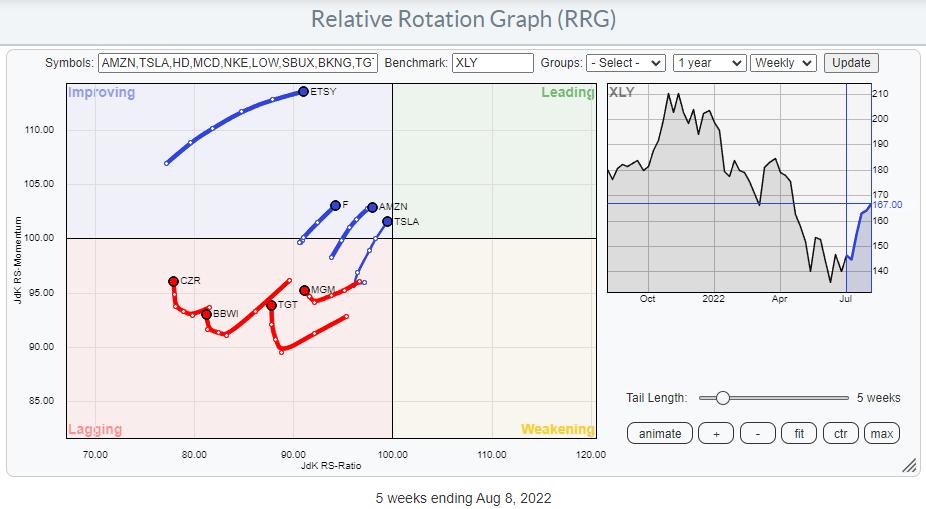
The RRG above shows the tails for stocks that are at a positive (or almost) RRG heading. Applying this filter only leaves eight out of the top 50 Consumer Discretionary stocks, including heavyweights AMZN and TSLA.
Information Technology

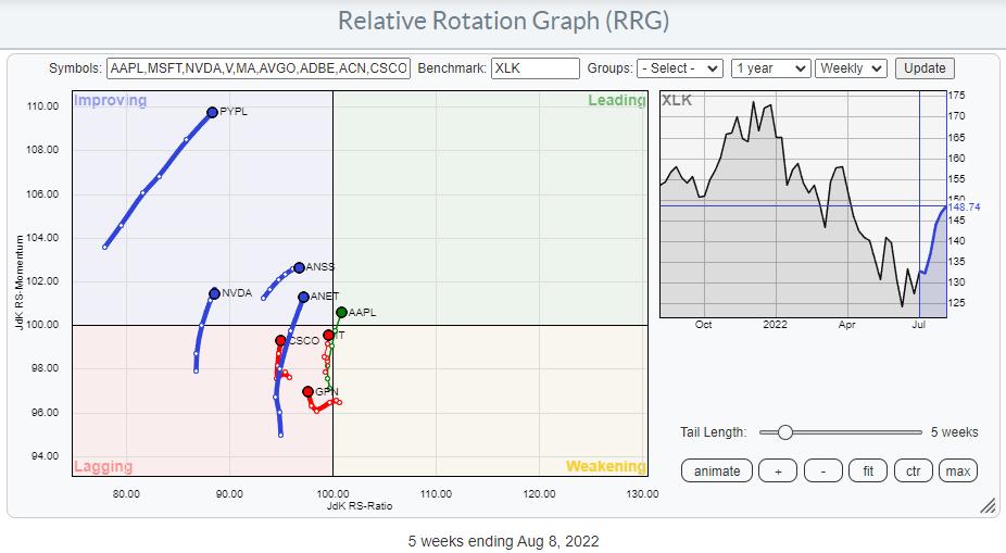
Applying the same filter on the universe of the top 50 Technology stocks also only leaves eight tails that are moving at a strong RRG-Heading, including AAPL, which by itself is already 25% of the market cap of the sector. Only eight stocks per sector are picking up more relative strength, which makes the participation base for this rally very low.
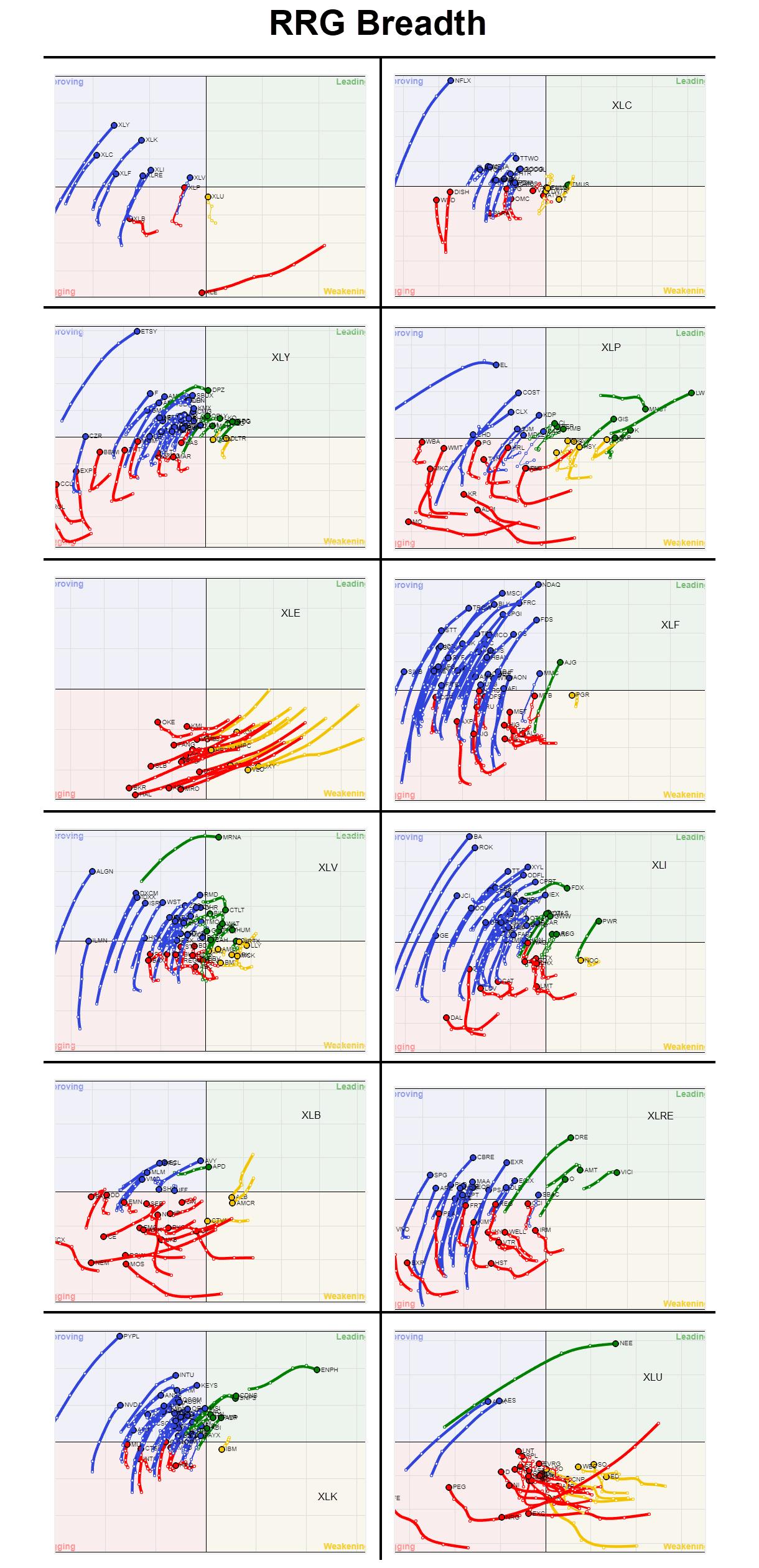
Another way of using the RRG visualization to take a look at breadth is to plot the members of each sector not against their sector index, but against $ONE. This takes the relative component out of the graph and shows absolute price trends.
The simple interpretation is:
- LEADING: Uptrend and pushing higher on strong momentum
- WEAKENING: Uptrend but momentum getting weaker
- LAGGING: Downtrend and pushing lower on weak momentum
- IMPROVING: Downtrend but momentum is picking up
Below is an updated version of the graph, which I put together about two months ago, showing these RRGs for all sectors (and at sector level against SPY).

Looking over all these RRGs, it is very clear that the market is recovering, and there are a lot of blue tails. But it is also clear, at least imho, that that is what it is; a recovery. There are still very few green tails.
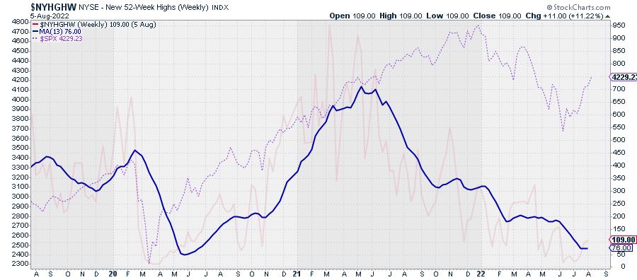
One more breadth chart that I track is the number of new 52-week highs, in combination with a 13-week (1 quarter) moving average.

The opaque red line is $NYHGHW, with its 13-week MA thick blue. As a reference, the dashed pink line is the $SPX.
The series of lower highs and lower lows in the $NYHGHW is very much intact, and the metric is at low levels from an absolute perspective. But the MA is still moving lower and not yet showing signs of a reversal. Yes, I know this is a contrarian indicator, but I also know that these types of indicators can stay low longer than you would expect.
All in all, things still keep me cautious. Only two sectors lead in terms of relative strength. Inside these sectors, only a handful of (big cap) stocks are doing the hard work. And, from a price perspective, the majority of stocks are still in a downtrend despite the recent rally in the S&P 500.
It is very well possible that the low for this move is in place, but, even if that would be the case, I expect the market to hammer out a more solid base and get broader participation to the upside. Until then, the foundation remains shaky.
|
| READ ONLINE → |
|
|
|
| MORE ARTICLES → |
|
 Chart 1
 Chart 2
 Chart 3

