| THIS WEEK'S ARTICLES |
| John Murphy's Market Message |
| S&P 500 MEETS RESISTANCE AT ITS 200-DAY MOVING AVERAGE AS BOND YIELDS REBOUND |
| by John Murphy |
S&P 500 STALLS AT 200-DAY AVERAGE...The two month rally in stocks has run into a couple of formidable resistance lines while in an overbought condition. Last week's message showed the S&P 500 nearing a test of its 200-day moving average and a falling trendline drawn over its January/March peaks. Chart 1 shows the SPX starting to pull back after touching both lines (see red and blue arrows). In addition, its 14-day RSI line in the upper box has moved into overbought territory over 70. That combination suggests that the summer rally may have run its course and may be peaking. The flat black lines also show the SPX having retraced just over 50% of its first half losses. That increases the odds that the rally has run into serious overhead resistance.
BOND YIELDS BOUNCE... Falling bond yields have been one of the factors supporting the stock rally. Chart 2, however, shows the 10-year Treasury yield rising above its 50-day moving average on Friday. An upturn in bond yields could put additional downside pressure on stocks. A couple of key sectors are also backing off from moving average resistance.
 Chart 1 Chart 1
 Chart 2 Chart 2
MORE 200-DAY LINES... Two key sectors that helped lead the summer rally are also meeting moving average resistance. Chart 3 shows the Consumer Discretionary SPDR (XLY) pulling back from its 200-day line (red arrow). Chart 4 shows the Technology SPDR (XLK) also pulling back from its 200-day line. In addition, their RSI lines in the upper boxes are starting to weaken near overbought territory. Their daily MACD lines in the lower boxes are also close to turning negative. Volume has also been lighter during the summer rally. All of which suggests that the rally is stalling.
 Chart 3 Chart 3
 Chart 4 Chart 4
ENERGY MAY BE REBOUNDING... Another factor supporting stock prices over the past two months has been a pullback in energy prices and stocks tied to them. Chart 5, however, shows the Energy SPDR (XLE) climbing to the highest level since June. Its relative strength is also improving. That can be seen by the gray area which plots a relative strength ratio of the XLE divided by the S&P 500. After rising during the first half of the year, the ratio peaked during June just as stock prices were starting to rally. The ratio has started to rise again with energy being one of the week's strongest sectors. That bears watching because energy stocks are closely tied to the trend of oil. Any hint of higher oil prices might also make investors more nervous about the trend of stocks. That may also explain why defensive sectors like consumer staples and utilities were the week's strongest sectors with energy in third place.
STOCK INDEXES IN CRITICAL TEST... What stocks do from here is very important from a technical standpoint, and should help determine if the summer rally is just a bear market bounce or something more lasting. This is precisely where the rally in stocks should fail if the major downtrend is still intact. A 50% rebound up to 200-day moving averages and a major downtrend line represents a major test of the downtrend that started earlier in the year. Any serious pullback from current levels would suggest that the summer rally has probably run its course and would also keep the market's major downtrend intact. That also warrants a more cautious view on stocks from current levels.
 Chart 5 Chart 5
|
| READ ONLINE → |
|
|
|
| The Mindful Investor |
| I'm Calling the Top in the S&P 500 |
| by David Keller |
A key breadth indicator, which has indicated every swing top thus far in 2022, generated another sell signal on Friday.
By the way, in case you're wondering, today's title is a direct reference to my friend Tom Bowley's quite well-timed show on StockCharts TV, where he made an unpopular but excellent bullish call on stocks. Take a bow, Tom. That was nice.
But in the two months since, we've now seen a dramatic reversal in many of the breadth and sentiment indicators that proved so accurate in suggesting a market bottom. For example, back in June, about 5% of the S&P 500 members were below their 50-day moving average. This week, that same indicator reached up to over 90%.
The VIX was above 30 back in mid-June, as panicked sellers were driving volatility readings near their highest levels in 2022. Going into this weekend, the VIX sits just above 20, near the lowest levels for the VIX in 2022.
August into September has been a seasonally weak time of the year for Technology. What does that mean in 2022? Join us for our next FREE webinar "Seasonal Struggles for Technology" on Tuesday, August 23rd at 1:00pm ET. We'll look at what has often happened as summer rotates into fall, how that relates to the four-year Presidential cycle, and what that means as the major averages are testing key resistance levels!
Can't make it? No problem. Just sign up HERE and we'll send you the replay as soon as it's available.
Our spectacular point & figure charting engine allows us to calculate "bullish percent" indexes for the major market averages. Basically, a point & figure chart is either bullish or bearish at any given point. So we can calculate what percent of stocks in a particular universe are in a bullish phase according to their individual point & figure charts.
So here's the Bullish Percent Index for the Nasdaq 100 Index.
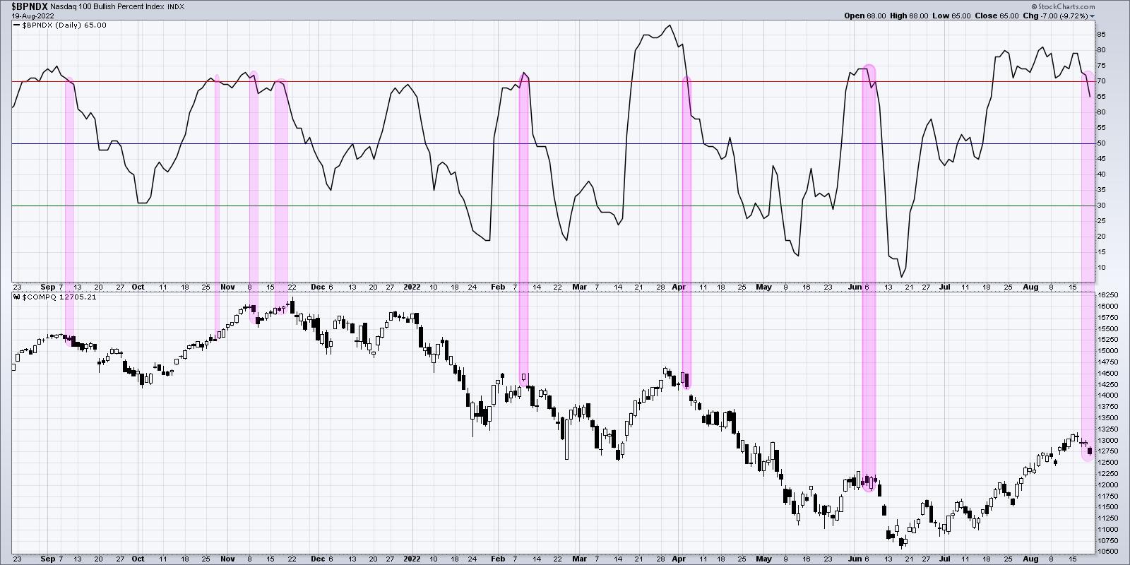
You'll see that, back in mid-June, less than 10% of the $NDX members were in a bullish phase. By late July, that number had risen all the way up to 80%. That means about 70% of the Nasdaq 100 members had a buy signal on their point & figure chart!
On Friday of this week, the indicator moved back below the 70% level for the first time in four weeks. How many times has this signal occurred in 2022? Three times, on February 10, April 6 and June 7. That's right, pretty much three best selling opportunities in 2022 after the initial selloff in January. Given the run up off the June low, the key resistance levels just above current levels, and overbought conditions demonstrated by many stocks this week, a pullback in the coming weeks certainly makes sense.
On my show this week, I interviewed one guest with an upside target of S&P 6000, then another with deep downside targets given the Elliott Wave structure. In the end, I've always found it valuable to consider all the potential outcomes, which helps me open my mind to new possibilities for making sure I manage risk appropriately.
I wouldn't be surprised if we finish 2022 in a position of strength. There is certainly plenty of buying power ready to be unleashed in risk assets, as evidenced by the last eight weeks. But this Friday may have been the signal that all is not well, that macro headwinds which propelled the market lower into the June low still very much exist, and that a hawkish Fed and rising interest rates can frustrate growth stocks for many months to come.
At the end of the day, we have to follow the evidence. And based on one breadth indicator that has tracked 2022 quite well, the evidence is quite bearish.
RR#6,
Dave
P.S. Ready to upgrade your investment process? Check out my YouTube channel!
David Keller, CMT
Chief Market Strategist
StockCharts.com
Disclaimer: This blog is for educational purposes only and should not be construed as financial advice. The ideas and strategies should never be used without first assessing your own personal and financial situation, or without consulting a financial professional.
The author does not have a position in mentioned securities at the time of publication. Any opinions expressed herein are solely those of the author, and do not in any way represent the views or opinions of any other person or entity.
|
| READ ONLINE → |
|
|
|
| Martin Pring's Market Roundup |
| Dollar Bull Market Due for an Intermediate Correction, But It's Not an Easy Call |
| by Martin Pring |
It's a Primary Bull Market for the Dollar
Chart 1 shows that the US Dollar Index is very much in a primary bull market, having violated a (dashed) secular down trendline a few months ago and, more recently, completed a 7-year rectangle formation. The green-shaded areas identify those periods when the long-term KST has been in a rising trend and the Index itself trading above its 12-month MA. This momentum indicator is moderately overbought, but leaves room for further upside before it reaches an extreme overstretched reading marking the top of the rally, as it did in 1998, 2001 and 2015.
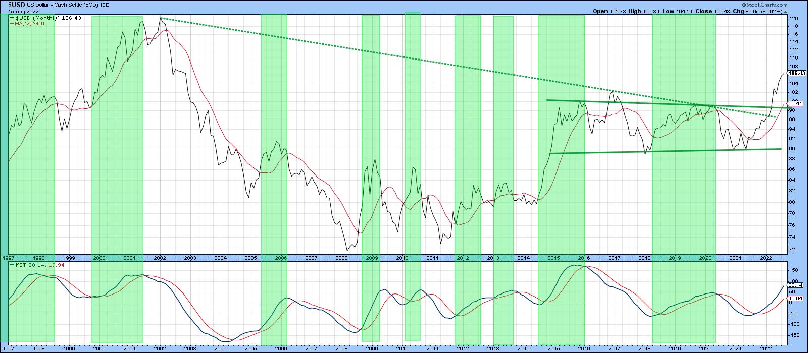 Chart 1 Chart 1
Another useful approach, which can be applied to many different markets, is to compare a 6-month EMA with its 15-month counterpart. When the 6-month crosses above the 15-month time span, it shows up as a positive zero crossover by the oscillator in the lower window. Positive readings have been highlighted once again with green shading. It's not a perfect approach, but it does capture most of the major advances, the 2004-06 rally being an exception. Right now, the oscillator is rising and a long way from triggering a sell signal. Steady as she goes.
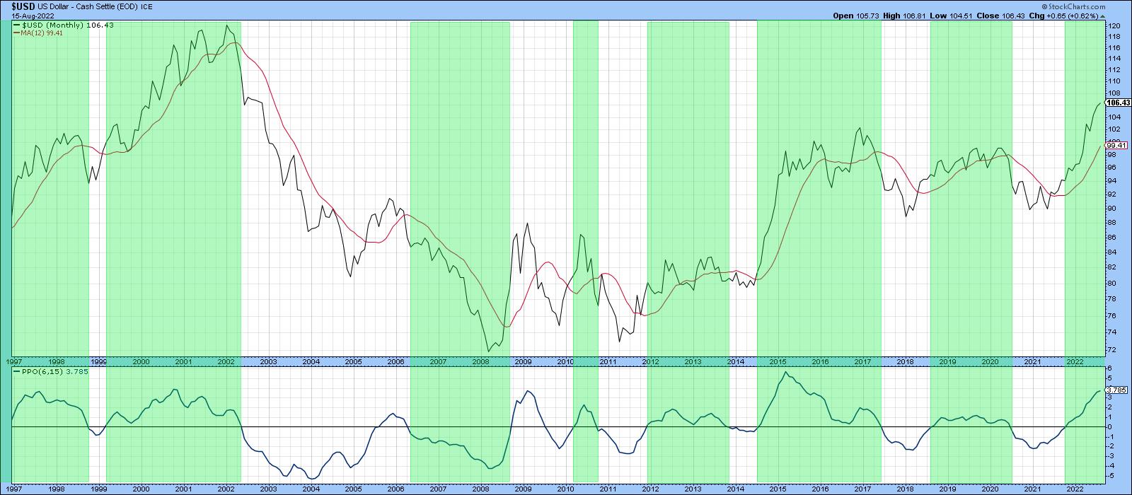 Chart 2 Chart 2
Euro and Yen
Chart 3 features a long-term chart for the euro. This currency has a 57% weighting in the Dollar Index, so it's not surprising that it is a bit of a mirror image.
The euro has experienced two major breakdowns this century. First, we see one at AB in 2014; another one happened more recently at CD, around the turn of the year. Interestingly, those patterns call for a similar downside objective of between .975 and .95, basis month-end close. That's not so far from a recent 1.01 and change, but remember, in technical folklore, it is interpreted as a minimum ultimate objective, so it could go much further.
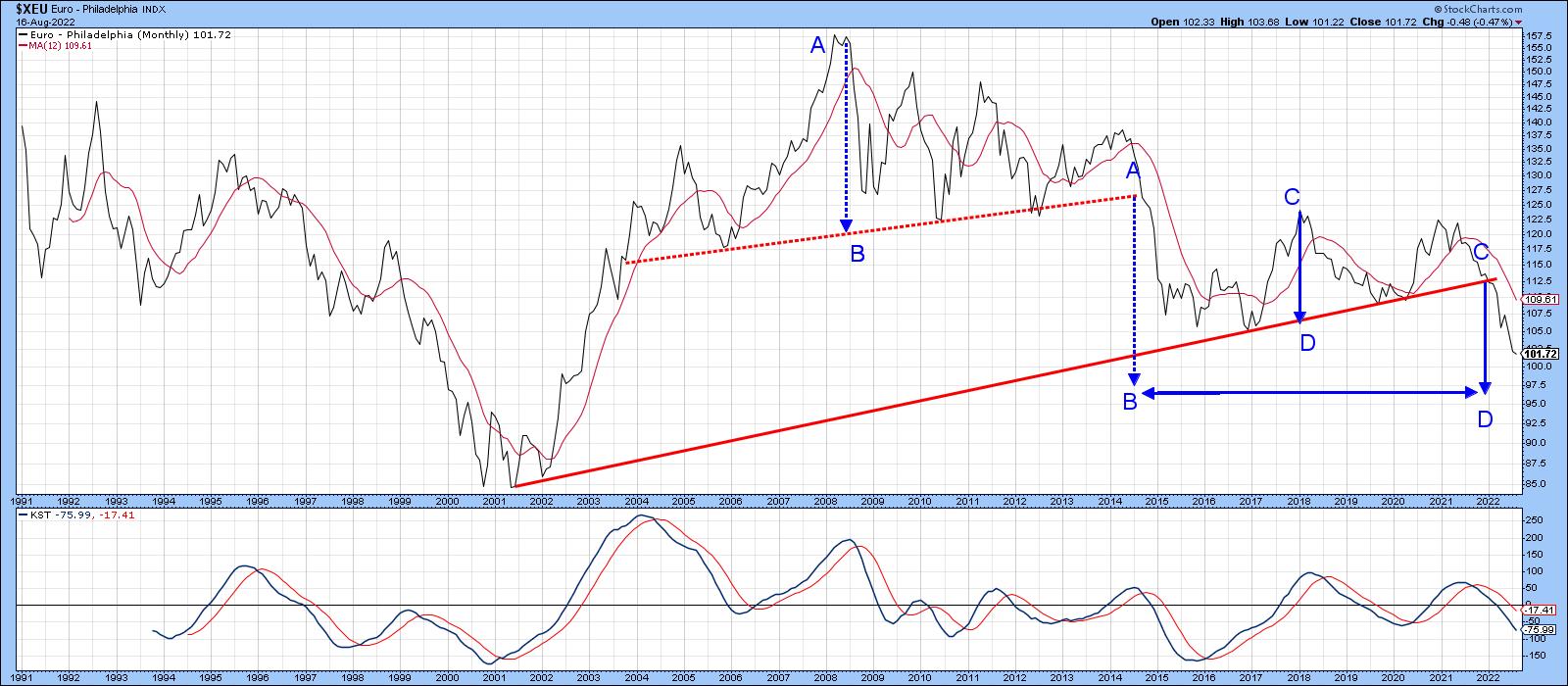 Chart 3 Chart 3
The euro is clearly oversold on an intermediate basis and, certainly, an intermediate counter-cyclical move would not be unexpected; it's been trying to achieve that goal since its widely-publicized drop to par in mid-July. However, the situation has become quite tricky, since the currency managed to break above its 2022 dashed down trendline and the top of a bullish right-angled triangle. Unfortunately, it could not hold the breakout, which is a problem.
Before concluding without a reasonable doubt that a false break has actually taken place, it's usually a good idea to wait for some confirmation. We got that on an intraday basis on Tuesday. However, by the end of the session, the price had clawed its way back to the red confirmation line, leaving some doubt. One event that tips the expectations to a downside break comes from the RSI. That's because it has violated an up trendline in a similar way to three previous similar setups indicated in Chart 4.
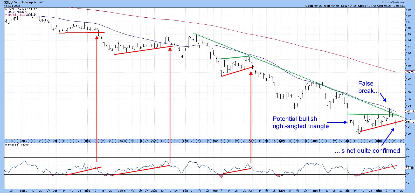 Chart 4 Chart 4
The yen, in Chart 5, looks to have an even bleaker prospect in view of its 2022 multi-decade trendline violation. The downside objective in the 50-area may look to be unrealistic, but it was trading at even lower prices in the 1990s. Moreover, if this level is touched again, it is not likely to happen soon, as the yen is likely to zigzag lower in the opposite way to its progress between 1998 and 2012.
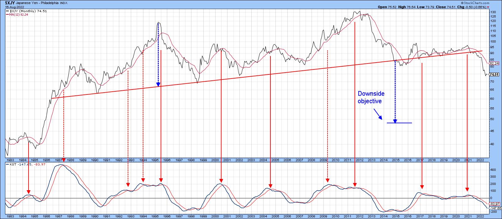 Chart 5 Chart 5
The Dollar Index Intermediate Trend
Chart 6 features my Dollar Diffusion indicator. This one monitors a universe of cross dollar rates that are in a positive trend. The pink shadings use the benefit of hindsight to identify the bearish environments. Red arrows indicate when the oscillator peaks from at or around its overbought zone. Solid arrows reflect valid signals; dashed ones, false negatives. Note that each of the failed signals developed under the context of a bull market and were counter-cyclical in nature. That's what makes the most recent reversal somewhat problematic.
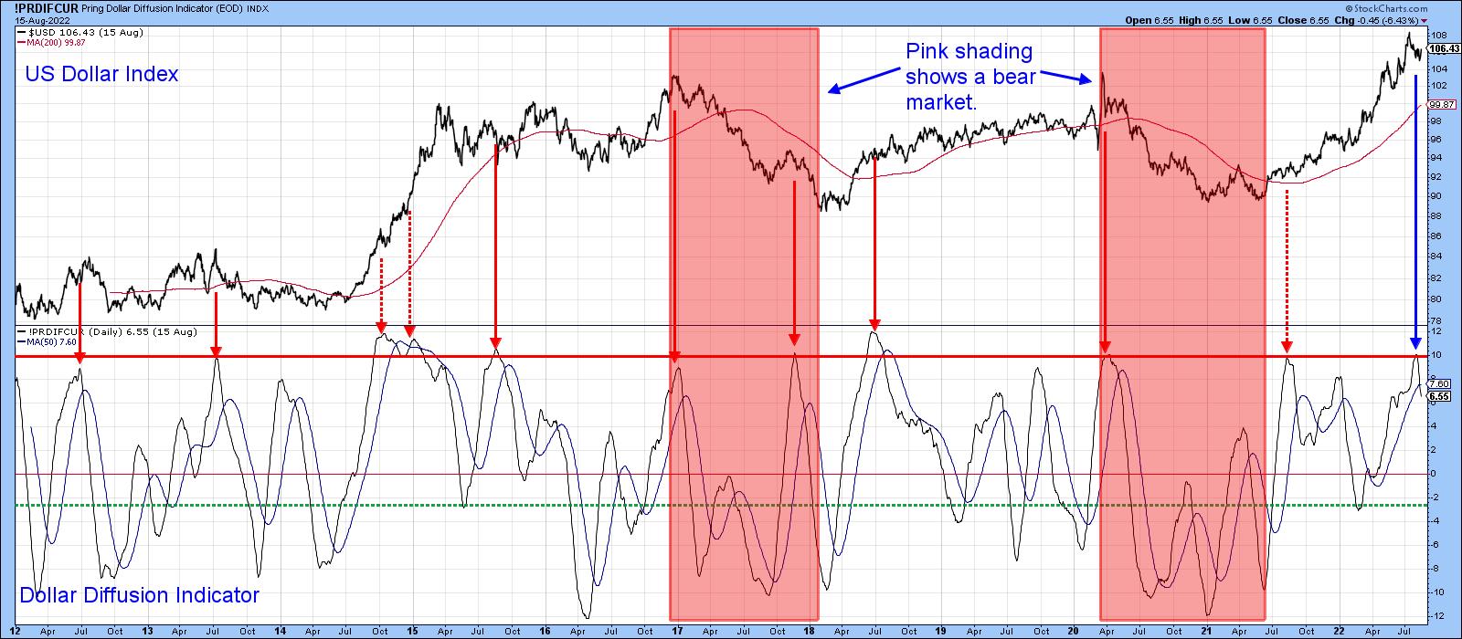 Chart 6 Chart 6
The conclusion from Chart 7 is similar, since the weekly stochastic using the 12,10 10 parameters has also peaked. If our assumption of an ongoing bull market is correct, this latest sell signal is likely to be limited in its downside magnitude.
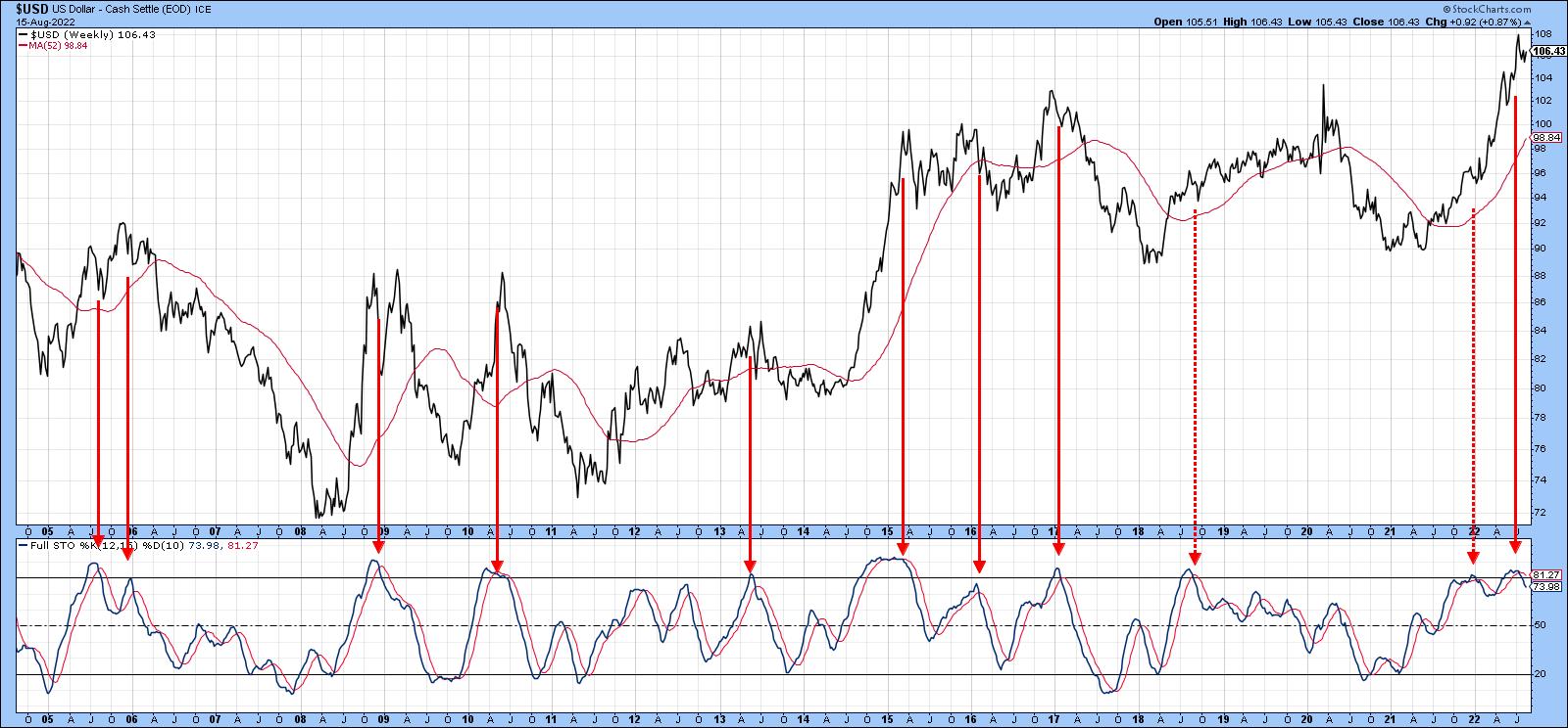 Chart 7 Chart 7
Chart 8 compares the Dollar Index to a ratio between the iShares Aggregate Bond and the SPDR International Bond ETF's (AGG/BWX). Note how closely the ratio tracks the Index. In 2017 and 2020, both series experienced a false breakout above their respective green dashed trendlines. This was followed by a dollar retreat, as flagged by the red dashed arrows. It looks as if another such false breakout began a few days ago.
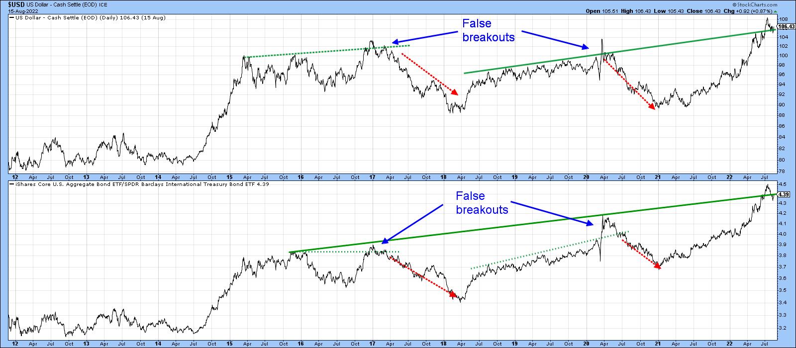 Chart 8 Chart 8
However, the action is far from decisive, so our final chart reproduces the two long-term trendlines from Chart 8, but in greater detail. The chart reveals a very finely balanced technical picture. We see a negative violation of the original solid green up trendline for the Index that did not hold, as well as one for the ratio that (so far) did. A joint break in the red 2022 up trendlines and a possible break above the two July/August dashed green corrective trendlines is also apparent.
False breaks are often followed by above-average price moves, so, if the Dollar Index closes below its recent low of 105, it seems likely that the overbought diffusion and stochastic indicators will result in a negative intermediate outcome. On the other hand, a break above the extended red trendline at 107 would signal that the Index is likely to extend its bull market. Remember, you can update any of these charts by simply clicking on them, and don't forget Chart 4 featuring the euro that's at a pivotal level as well.
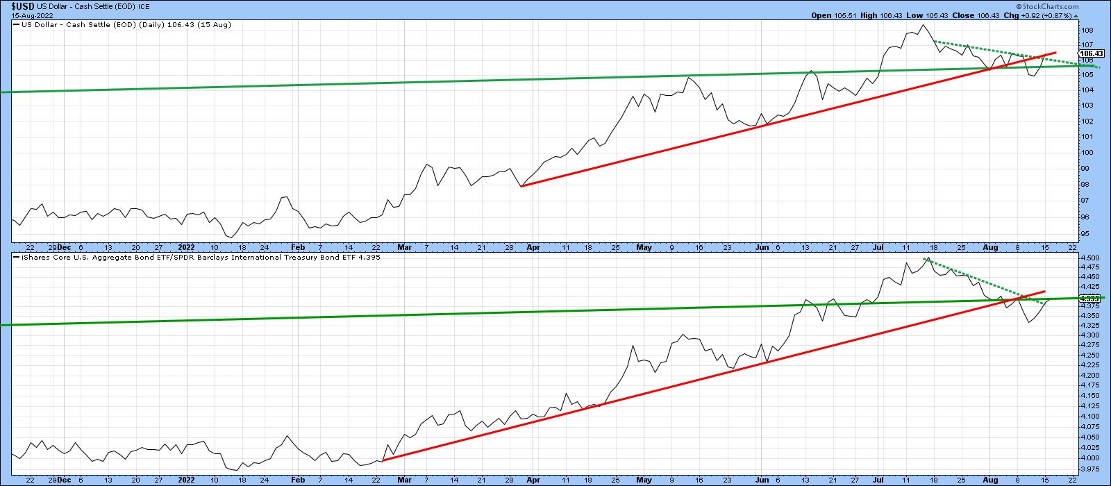 Chart 9 Chart 9
Good luck and good charting,
Martin J. Pring
The views expressed in this article are those of the author and do not necessarily reflect the position or opinion of Pring Turner Capital Group of Walnut Creek or its affiliates.
|
| READ ONLINE → |
|
|
|
|
|
| Art's Charts |
| Quantifying the Battle for the 200-day – It's Elementary |
| by Arthur Hill |
 The S&P 500 SPDR (SPY) surged to its falling 200-day SMA here in August and even edged above this key level intraday on Tuesday. Even though the ETF is close to crossing above the 200-day, chartists would be better off taking a step back to avoid a whipsaw. Note that SPY has crossed the 200-day SMA over 150 times since 2000. This may not seem like many for a 22 year period, but these crosses tend to cluster because the 200-day SMA is a real battle zone. The S&P 500 SPDR (SPY) surged to its falling 200-day SMA here in August and even edged above this key level intraday on Tuesday. Even though the ETF is close to crossing above the 200-day, chartists would be better off taking a step back to avoid a whipsaw. Note that SPY has crossed the 200-day SMA over 150 times since 2000. This may not seem like many for a 22 year period, but these crosses tend to cluster because the 200-day SMA is a real battle zone.
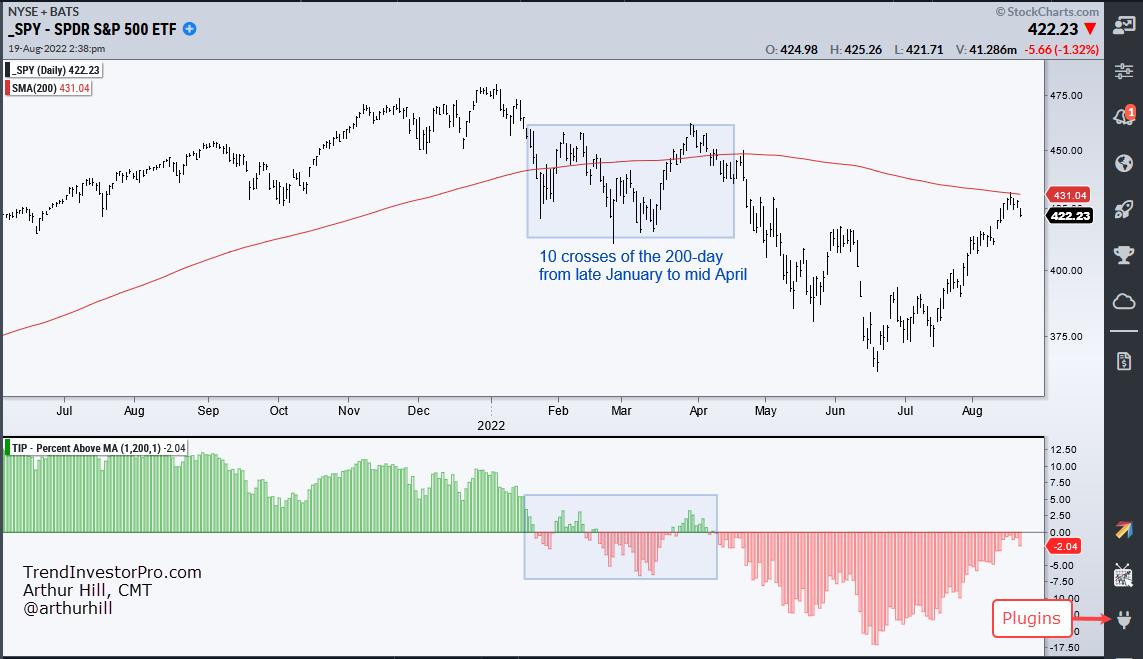
The chart above shows SPY with the 200-day SMA and Percent Above MA (1,200,1) in the indicator window. First, notice that SPY crossed the 200-day SMA ten times from late January to mid April (blue shading). Talk about whipsawing. The indicator in the lower window visualizes these crosses by turning positive (green) when the 1-day SMA (close) crosses above the 200-day SMA and red when below.
Chartists can reduce whipsaws and improve performance by smoothing closing prices with a short moving average. This could be 5, 20 or even 50 days. The 50/200 cross, also known as the golden cross, is perhaps the most popular combination. I prefer a 5-day SMA because the 20 and 50 day SMAs lag too much and generate bigger drawdowns (think March 2020). The next chart shows the 5-day crossing the 200-day just five times from late January to mid April. The indicator window shows Percent Above MA (5, 200, 1) confirming these crosses. This indicator is part of the TrendInvestorPro Indicator Edge Plugin for StockCharts ACP.
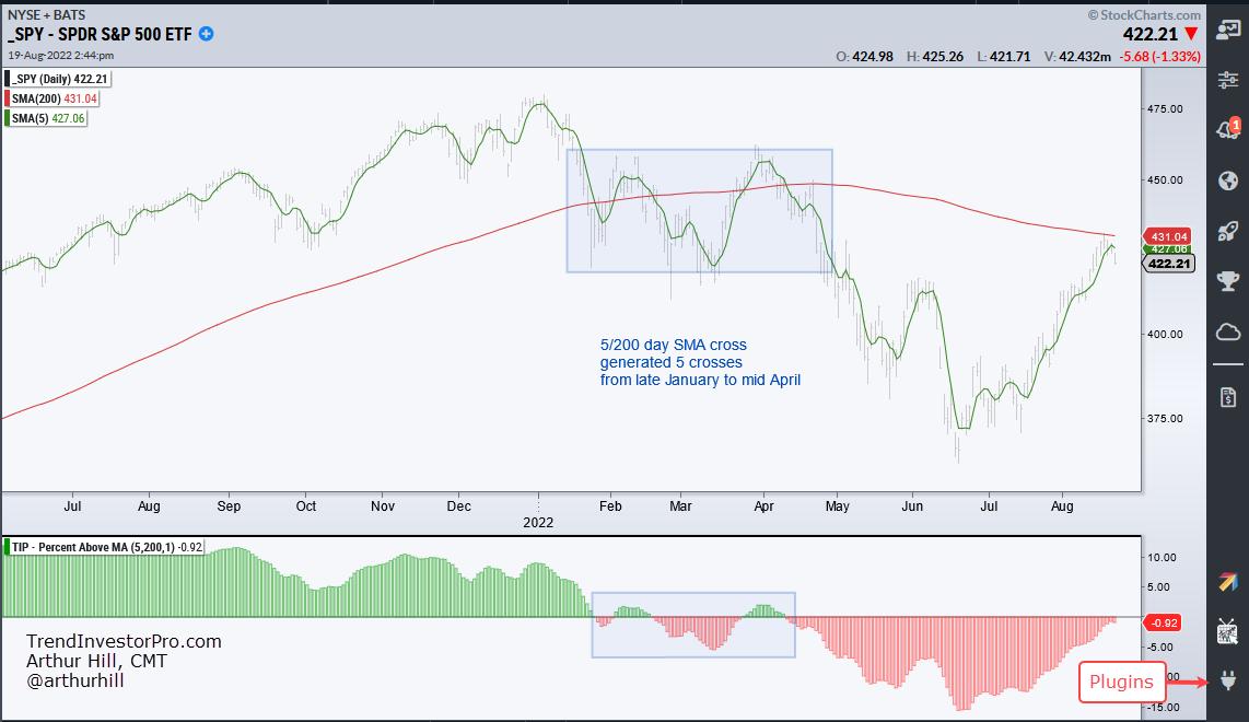
Now let's quantify performance with a backtest. Since 2000, buying and selling the close/200-day SMA cross generated 83 trades with an annual return of 4.53%, a win rate of 34% and a maximum drawdown of 14.7%. There are two crosses for every trade and dividends were not included. Buying and selling the 5/200 day SMA cross generated just 31 trades with an annual return of 5.6%, a win rate of 42% and a Maximum Drawdown of 20%. The higher annual return and better win rate make the 5/200 cross a more robust strategy. Also note that SPY remains in a long-term downtrend because it is below the falling 200-day and the 5-day is below the 200-day. It's elementary my dear Watson.
This week at TrendInvestorPro, the Composite Breadth Model hit a make of break level and two inputs turned bullish the last two weeks, but three remain bearish. Our recent focus has been on seasonality, oil, energy ETFs and agriculture ETFs. Click here for immediate access to our reports and weekly video.
The StochClose, the Trend Composite, ATR Trailing Stop and eight other indicators are part of the TIP Indicator Edge Plugin for StockCharts ACP. Click here to take your analysis process to the next level.
---------------------------------------
|
| READ ONLINE → |
|
|
|
| The Canadian Technician |
| Oil and Gas - Calling Crude Oil's Bluff? |
| by Greg Schnell |
Energy investors have been watching a crisis emerge in Europe, while the world tries to share tight supplies since the Russia/Ukraine conflict.
On the back of the war on February 24th, oil spiked. Following the immediate spike, oil and oil names have wandered sideways. Even off the June lows, oil and oil names continued meandering. I did a Market Buzz show on Wednesday describing why investing in oil is hard right here. That show can be seen here:
Why Energy Investing Is So Hard
A look at the crude oil chart shows the problem. The two-year trend line is cracking after the double top pattern emerged in June. Positives for the chart are that the PPO has just returned to zero and, if this is going to start to trend higher for the 4th quarter, it is not uncommon for a momentum indicator to cycle back to zero before starting the next rally.
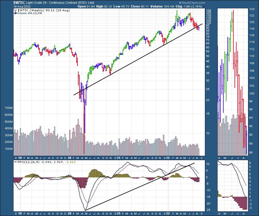
The chart for Natural Gas is really only for futures traders, as the tracking ETFs are a problem with the market open only 25% of the time. The price is swinging wildly week to week and overnight gaps are huge.
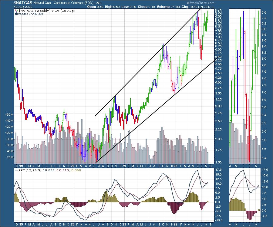
High volatility makes high rewards both ways!
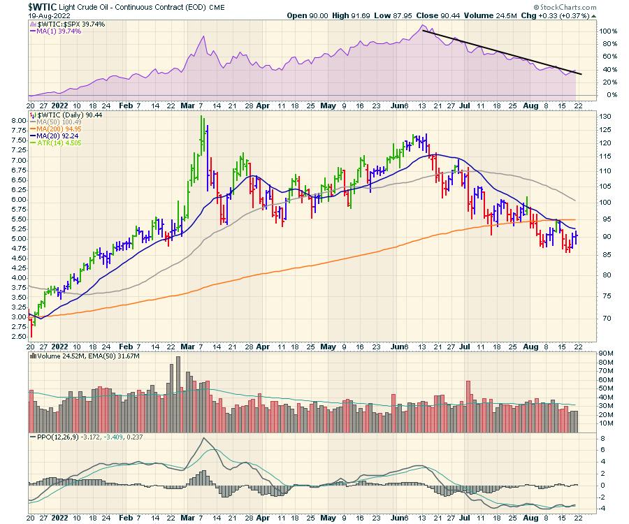
Looking at both crude oil and Natural Gas on the daily chart bring some other price action into play. First of all, we have the crude oil chart. The rate of descent has been slowing, and we can see that on the momentum indicator which is negative but flat. However, until crude oil actually starts to outperform the $SPX to the upside (purple area chart), it seems the selling of the SPR (strategic petroleum reserve) has worked to moderate price acceleration. The low volume on oil contracts also makes it a potential turning point here to watch closely.
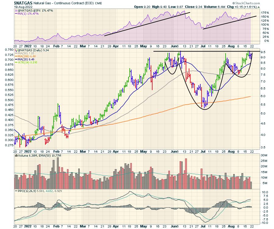
Natural Gas is another world compared to the oil chart. The commodity has been outperforming the $SPX, as seen on the purple area panel. Price is building a head/shoulders base with a $9.50 neckline, suggesting the move to the upside could be $4 or $13.50.
But I titled the article as calling crude oil's bluff. Why? Well, XOP is holding up while crude oil has been drifting lower.
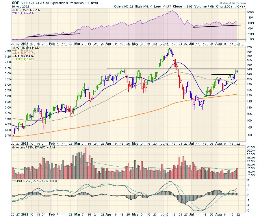
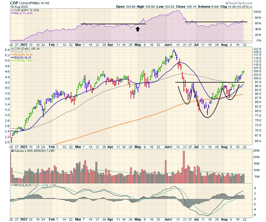
A few of the associated stocks are starting to break out of the basing funk they have been in for months. COP is a nice example.
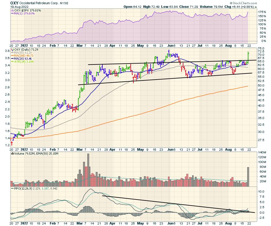
Another is OXY.
All that to say, this is a good time to be watching these trades closely.
If you are interested in trading through the worldwide energy crisis that is upon us, try a trial subscription for $7 at OspreyStrategic.org. We have been featuring ideas over the last two months, highlighting both renewable as well as Oil and Gas. Renewables have been one of the biggest gainers since the June lows.
|
| READ ONLINE → |
|
|
|
| The Traders Journal |
| Five Decades Of Personal Stock Market Passages, Tools, Lessons And Stories (Part 1) |
| by Gatis Roze |
 Successful investing calls for much the same prerequisites as those required to become a professional athlete. Fortunately, we investors have a much longer shelf life than pro athletes. Here's how I took advantage of this reality. Successful investing calls for much the same prerequisites as those required to become a professional athlete. Fortunately, we investors have a much longer shelf life than pro athletes. Here's how I took advantage of this reality.
Maturing as an investor does not automatically mean you are becoming a better investor. Experience alone does not grant that badge. Only ongoing rededication and learning will do that. Self mastery and constant attention to your skill set is central to becoming a successful consistent long-term investor. Note, these are two separate objectives.
As I've said before, profits are the product of practicing persistent and personal discipline and growth. This new series of blogs details my own journey. It's an odyssey that has provided a rich tapestry and lifestyle far beyond my wildest imagination growing up. I'll be taking an introspective inventory of those prerequisites I cultivated which made the most significant contribution to growing my net worth over the decades. At best, it's difficult — or perhaps even impossible — to weigh the importance of each "passage", but I'll give it a shot.
This journey is one I view as part and parcel of the " virtuous circle of learning" that I've tried to embrace for the duration of my investment life and which has consistently borne fruit. As the title states, it's a sort of quadraphonic symphony.
The first group will be the 12 indispensable and pivotal "passages" that occurred during my time as a full-time investor. The second group will examine my tool kit. Steve Jobs famously described the wonders of personal computers and explained that humans were not as fast runners as many other species, but a human on a bicycle beats them all. I will share my bicycle with you. Thirdly, I'll provide you with indispensable caveats, lessons and rules I've collected pertaining to trading, investing and the markets. Fourthly and finally, I'll share some stories that don't fit neatly into the previous three segments.
Please join me in the coming weeks here at the Traders Journal desk. I'll make it worth your effort!
Trade well; trade with discipline!
Gatis Roze, MBA, CMT
StockMarketMastery.com
|
| READ ONLINE → |
|
|
|
| Top Advisors Corner |
| Options "Max Pain" Right on Cue |
| by John Hopkins |
Each month, on the Tuesday before the third Friday of the month, we hold our options "Max Pain" webinar, where our Chief Market Strategist Tom Bowley shares his thoughts with our members on where the major indexes and certain stocks might be headed based on outstanding calls and puts. Generally, Tom focuses on the SPY and QQQ, along with a number of stocks that are showing a significant imbalance -- i.e., a high ratio of calls to puts or puts to calls -- as options expiration Friday nears.
The term "Max Pain" is meant to describe the greatest negative financial impact that is felt by those holding call or put positions at expiration. In other words, a manipulation of stock prices by Market Makers who stand to benefit financially by the pain inflicted on individuals who are holding options into expiration. The Max Pain webinar is really meant to serve as a directional lesson for our members, especially those who tend to be short term traders.
For example, we saw a large imbalance of calls to puts on the QQQ (many more puts than calls) set to expire this past Friday. Since we see a large imbalance as a "contrarian indicator," we alerted our members that there was a strong chance we could see a pullback by week's end, which is exactly what happened. In fact, the QQQs were trading as high as $334.42 the day of our webinar and as low as $322.08, as you can see in the chart below.
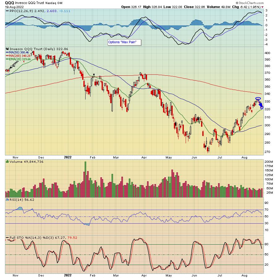
Even though the move in the QQQs wasn't huge, it does show that the large imbalance of calls to puts resulted in a directional move to the downside. And we saw this in a number of individual stocks we shared with our members. For example, Docusign (DOCU) was trading as high as $75.81 the day of our webinar, and our Vice President of Operations, Erin Webber, calculated that Max Pain on DOCU would be $67.73. It closed Friday below that level at $65.92, a drop of almost 14% in just a few days.
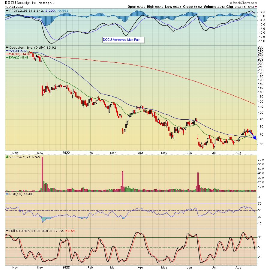
Does every Max Pain candidate work out? Of course not. Again, it's meant to alert our members that the market could be setting up to move in a certain direction. However, you might be surprised to see the results each month that show the power Market Makers have over directional price. In fact, if you would like to see the Max Pain spread sheet Erin put together for our members heading into the week. just click here to sign up for our highly educational EarningsBeats Digest (EBD) and you will get Tom's valuable market insights every M, W and F.
One final thing. We've noticed through our studies that Max Pain often bleeds into the beginning of the following week as option positions are settled. So it will be interesting to see what transpires early next week.
At your service,
John Hopkins
EarningsBeats.com
|
| READ ONLINE → |
|
|
|
| RRG Charts |
| Combining RRG with the Turtle Soup Scan is Now More Powerful |
| by Julius de Kempenaer |
 Since my introductory article on the topic, 2018's "Combining Relative Rotation Graphs and the "Turtle Soup" setup", I have mentioned and used this strategy a few times in my articles and analyses. The main goal has been to combine the power of RRG and this short-term trading strategy to find short-term trading opportunities. Since my introductory article on the topic, 2018's "Combining Relative Rotation Graphs and the "Turtle Soup" setup", I have mentioned and used this strategy a few times in my articles and analyses. The main goal has been to combine the power of RRG and this short-term trading strategy to find short-term trading opportunities.
The approach is to run the Turtle Soup scan, for which the scan code is available in the article, and plot the resulting symbols on a (daily) Relative Rotation Graph to see if there are any cases where the rotation on the RRG aligns with the Turtle Soup trigger. The only "problem" was that the Turtle Soup strategy is a short-term, often intraday, trading strategy, and the rotations on the daily RRG, which used to be the shortest time frame, were too slow. With the introduction of the intraday time frames for Relative Rotation Graphs, this issue is no longer a problem, as we can plot the results on an intraday basis as well, getting an even better and more realistic handle on the short-term rotations for the symbols which triggered a TS buy setup.
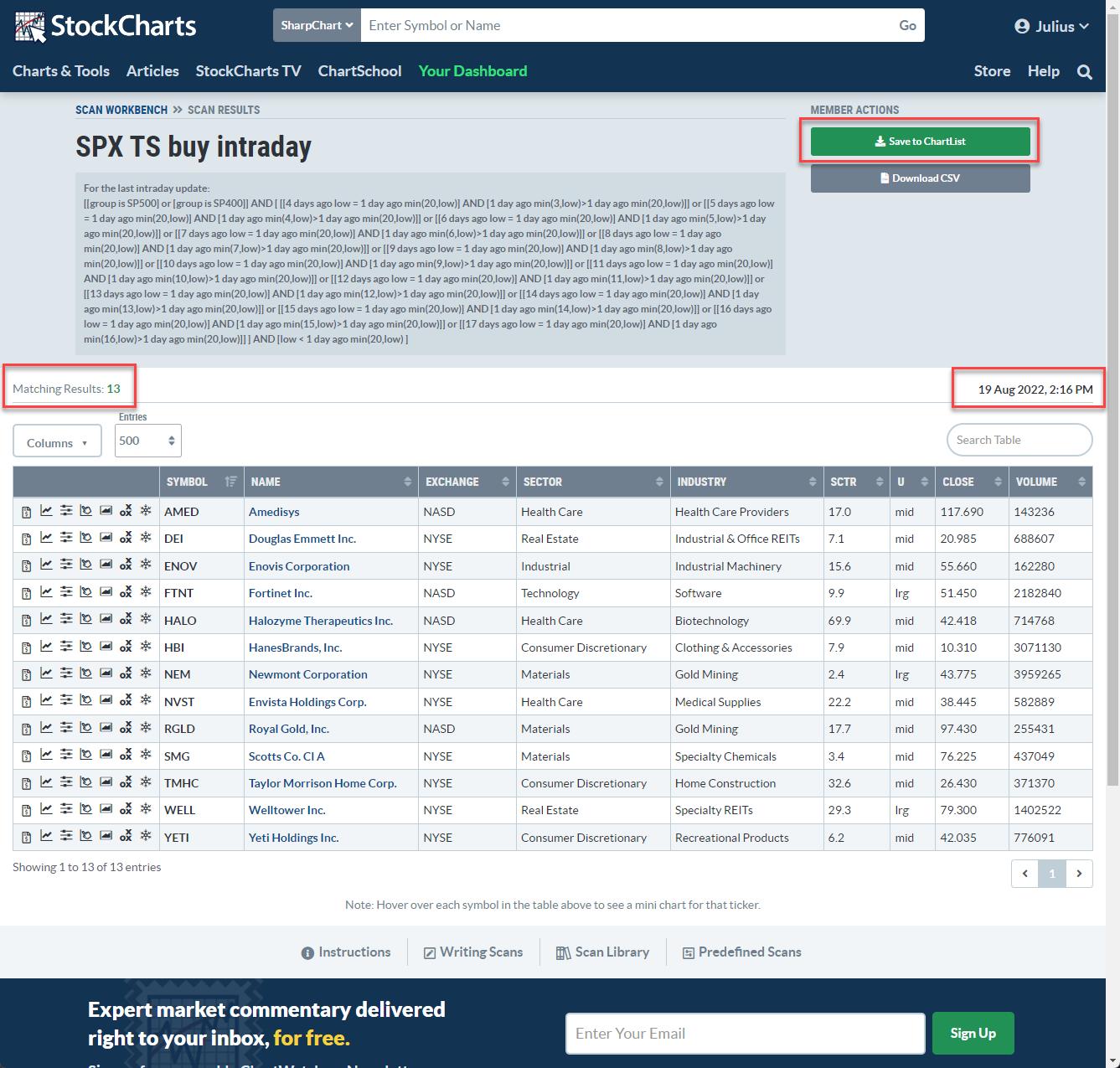
In this article, I will walk you through the steps and the results for Friday, 19 August. I have this scan running automatically, and it sends me an SMS when the conditions are met. I already received an SMS just after 10am, half an hour after the opening. At that time, it had 7 results; DEI, ENOV, FTNT, HALO, NVST, TMHC, YETI
At the time of writing this article, around 2:15 pm, 6 more symbols triggered a setup, as you can see in the image below.

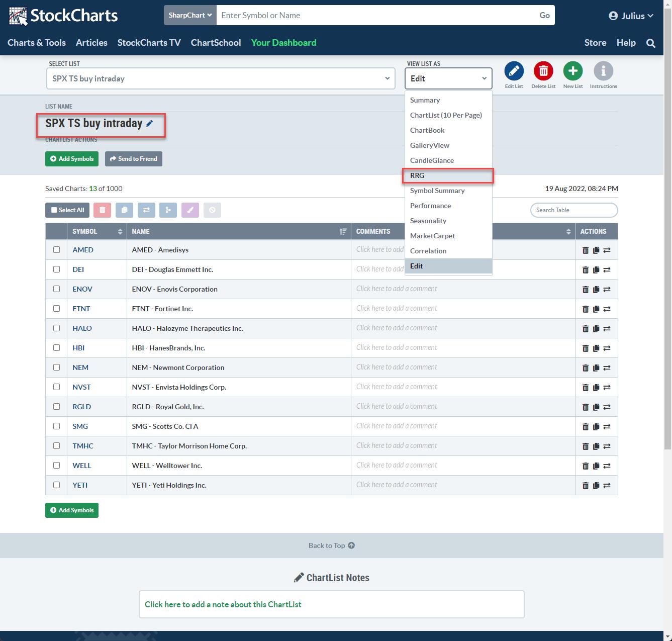
I have a ChartList called "SPX TS buy intraday", which I always replace with the latest results of this scan. From the ChartList, I can immediately open up the RRG from the "View List As" menu option.

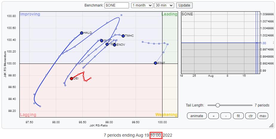
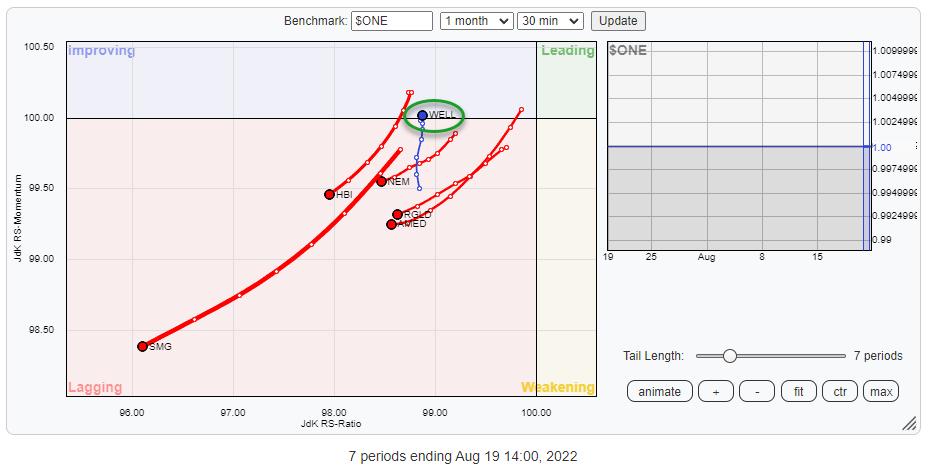
At 10am, the RRG had 7 symbols. Using a 30-minute timeframe, it looked like this:
From an RRG perspective, the only tails that looked slightly promising were HALO, NVST and TMHC. Although the latter two had already started to lose relative momentum. The triggers for these stocks, a break back above the previous 4-day low with a bit of margin, were as follows:
- HALO: 41.81 --> entry stop at 42.00
- NVST: 38.69 --> entry stop at 39.90
- TMHC: 26.93 --> entry stop at 27.10
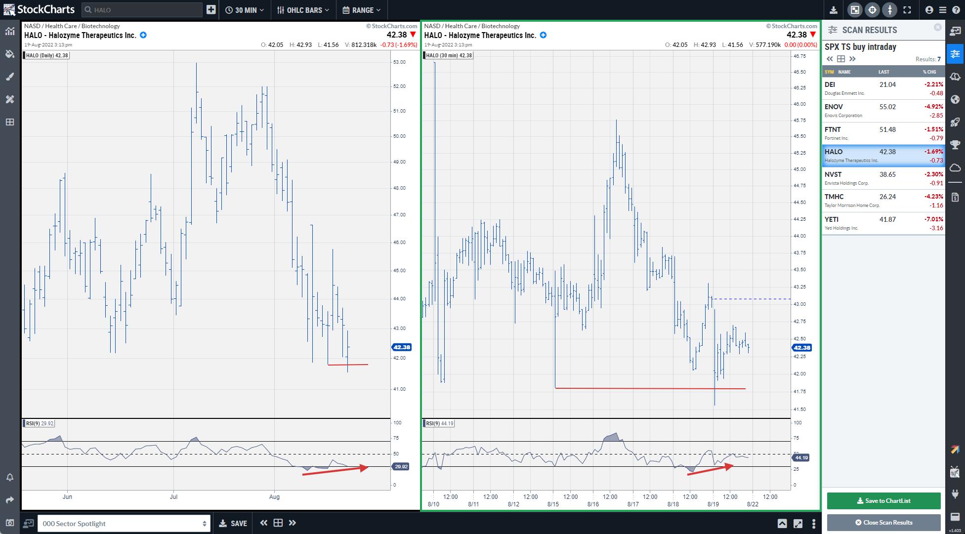
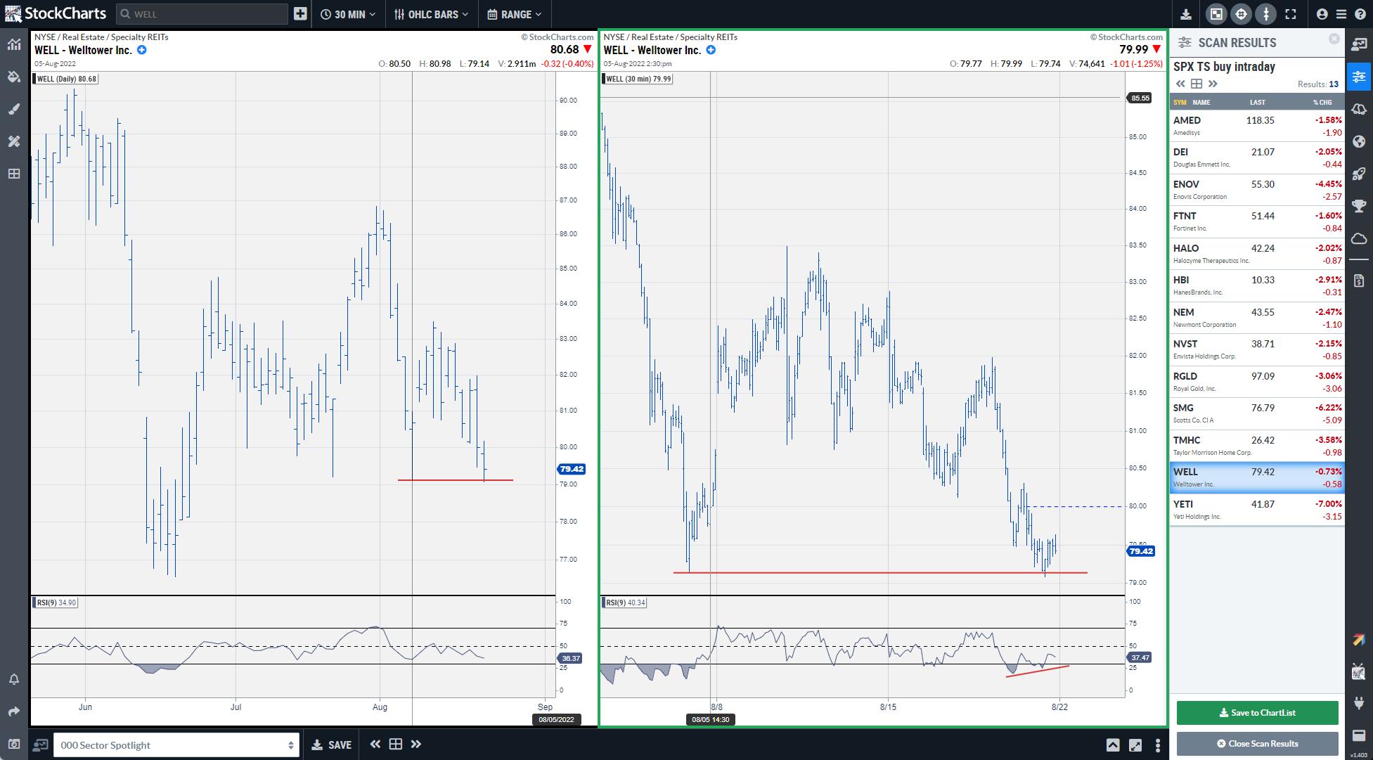
To monitor these charts and levels, I like to use ACP, as it streams data and allows me to have two charts with different timeframes open at the same time side-by-side, and the scan results in the sidebar so I can easily click the symbol to update both charts.
In my ACP setup, I have two chart widgets open, one with the daily chart to monitor the setup and one with a 30-minute chart to track during the day for execution. NVST and TMHC did not get triggered, as they never got back to their previous 4-day low level.

HALO triggered its buy signal around 10am, as it immediately bounced back up after an initially lower opening and then triggered its entry stop at 42. During the day so far, HALO has reached a high of 42.93 and is trading around 42.40/50 as I am writing this.
For some traders, this would already have been enough to close the trade (exits using this strategy are subjective) but I think it would be safe to say that the stop-loss should now be moved up to the entry-level to prevent this trade ending in a loss.
After running the scan around 2pm, 6 new symbols showed up in the results. The RRG for these symbols at that time looked like this:
There is only one stock that really stands out from a positive point of view, which is WELL. The trigger for WELL was at 79.14 (its previous 4-day low which was set on 8/5).

The chart reveals that the setup was generated on the 30-min bar at 1pm and triggered half-an-hour later at 1:30 pm around 79.20.
*Me running this scan earlier and paying more attention would have triggered it at that time ;)
At 3pm, WELL is trading around 79.40 and a stop should still be present just below today's low so around 79. Probably not the two best trades in the world for today, but I wanted to show you how you can have the new intraday RRG time frames interact with other short-term trading techniques to maybe get a little bit more of an edge.
Have a great weekend and #StaySafe, --Julius
|
| READ ONLINE → |
|
|
|
| DecisionPoint |
| This Is What Overbought Looks Like |
| by Carl Swenlin |
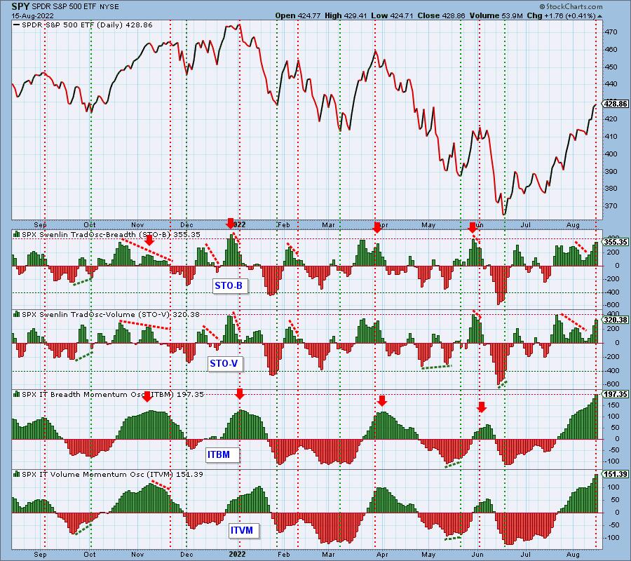
It occurred to me that some of our primary indicators have created a teachable moment. Specifically, our short-term and intermediate-term indicators are both at fairly extreme overbought levels, and now is a good time to talk about what that means.
The Swenlin Trading Oscillators for breadth and volume (STO-B and STO-V) are near the top of their normal range, and that usually coincides with short-term price tops. The IT Breadth and Volume Momentum Oscillators (ITBM and ITVM) are also near the top of their normal ranges, and that normally coincides with intermediate-term price tops. With indicators from both time frames at overbought levels, there is strong technical pressure for prices to make a noticeable decline.

Conclusion: This condition occurs about every two to three months (see the red, downward pointing arrows for previous events), and it is fairly reliable as a top warning. While all four indicators are still rising, they are quite extended, so I would expect a price top soon, probably this week. Not guaranteed, just likely.

Technical Analysis is a windsock, not a crystal ball. --Carl Swenlin
(c) Copyright 2022 DecisionPoint.com
Helpful DecisionPoint Links:
DecisionPoint Alert Chart List
DecisionPoint Golden Cross/Silver Cross Index Chart List
DecisionPoint Sector Chart List
DecisionPoint Chart Gallery
Trend Models
Price Momentum Oscillator (PMO)
On Balance Volume
Swenlin Trading Oscillators (STO-B and STO-V)
ITBM and ITVM
SCTR Ranking
Bear Market Rules
DecisionPoint is not a registered investment advisor. Investment and trading decisions are solely your responsibility. DecisionPoint newsletters, blogs or website materials should NOT be interpreted as a recommendation or solicitation to buy or sell any security or to take any specific action.
|
| READ ONLINE → |
|
|
|
| MORE ARTICLES → |
|
 Chart 1
 Chart 2
 Chart 3
 Chart 4
 Chart 5


 The S&P 500 SPDR (SPY) surged to its falling 200-day SMA here in August and even edged above this key level intraday on Tuesday. Even though the ETF is close to crossing above the 200-day, chartists would be better off taking a step back to avoid a whipsaw. Note that SPY has crossed the 200-day SMA over 150 times since 2000. This may not seem like many for a 22 year period, but these crosses tend to cluster because the 200-day SMA is a real battle zone.


 Successful investing calls for much the same prerequisites as those required to become a professional athlete. Fortunately, we investors have a much longer shelf life than pro athletes. Here's how I took advantage of this reality.

 Since my introductory article on the topic, 2018's "