| THIS WEEK'S ARTICLES |
| Martin Pring's Market Roundup |
| The Direction of the Secular Trend Will Determine Whether the June Low Holds |
| by Martin Pring |
The big daddy of all market trends is the secular or very long-term one, and it's about to have a big influence as to whether the June low will hold, meaning prices are about to reach new all-time highs, or if we are going to return to a 1970s type of environment, dominated by negativity.
Chart 1 features the S&P Composite adjusted for inflation. The ellipses reflect economic events, which either represent recessions (in pink) or economic slowdowns (in blue). The purpose is to demonstrate first and foremost that the state of the economy has a huge influence on stock prices. Slowdowns and mild recessions result in a temporary blip in an on-going uptrend -- a mini-bear market, if you like. I call these "burglars" because they do relatively little damage to portfolios. On the other hand, deep and prolonged recessions do far more damage to inflation-adjusted prices and are represented by the large ellipses. These are termed "bank robbers", because they do much more serious damage to portfolios, which take years to recover. In all cases of recession-induced bears since the 1950s, the low point for equity prices were seen after the recession in question had begun.
The second point Chart 1 illustrates is that bank robbers develop during secular bear markets. The ups and downs of the secular trend are expressed in the chart through the direction of the PPO, using the 60- and 360-month parameters. This indicator also demonstrates that burglars tend to congregate during periods when the oscillator is in a rising trend, and is regularly followed in my monthly Intermarket Review. Note the four burglars, 2011, 2015, 2018 and 2020, that have transpired since the financial crash of 2008. The $64,000 question is whether the current bear is the fifth in that series or the first bank robber in a new secular downtrend.
Right now, the PPO is in a rising trend, but has begun to roll over. It's also at a very high reading only exceeded once before, when the tech bubble was bursting. If the trend is still up, the recent selloff has created a great buying opportunity, especially as the late August decline has already retraced half the gains from the post-June low. Alternatively, if the secular direction has turned to the downside, and that dangerous-looking rolling over action turns into an actual reversal, the recent 6-month drop will be more likely to morph into a bank robber.
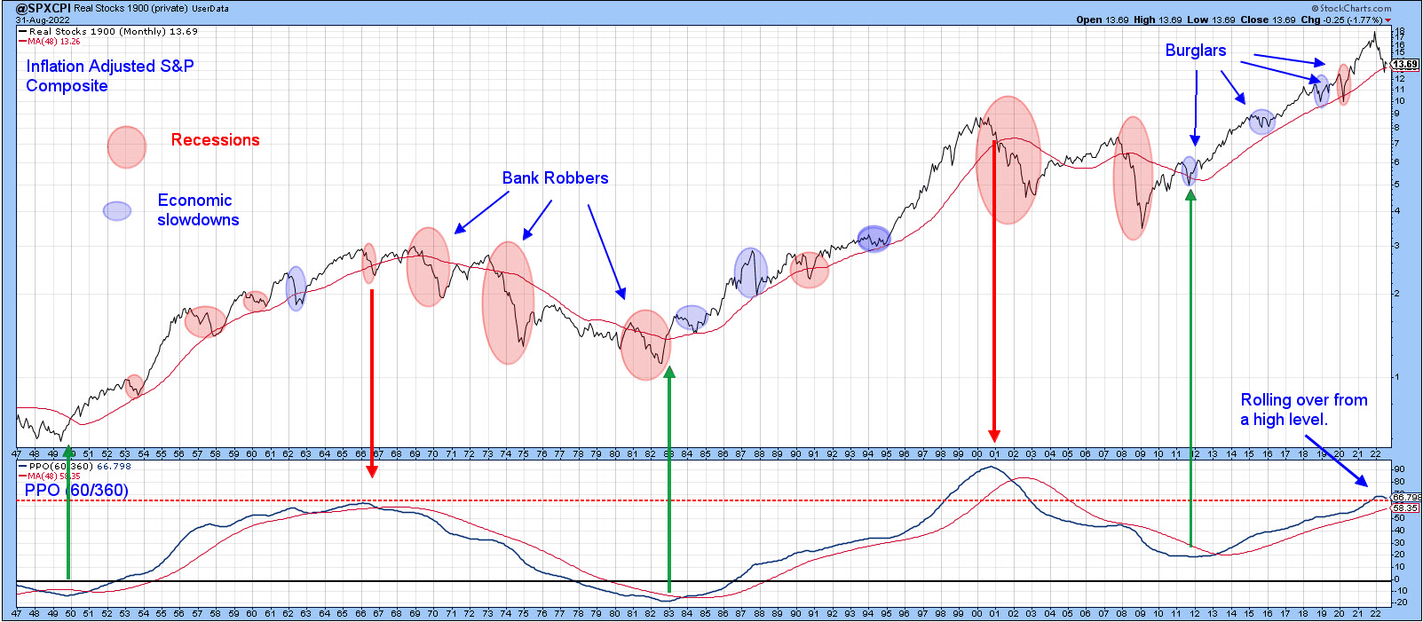 Chart 1 Chart 1
Chart 2 compares the inflation-adjusted S&P to the annualized CPI. It shows that an inflation rate north of 5.5% enhances the risk of a of a bank robber developing. Indeed, every bank robber since the 1950s has been caused by inflation, the exception being the 2000-2002 bubble-bursting bear market. I should also note that the relatively brief 1990 recession had burglar characteristics. At that time, though, the PPO in Chart 1 was positive and only half-way up its secular trajectory. It was not overextended as it is today. You can read more about the secular trend here.
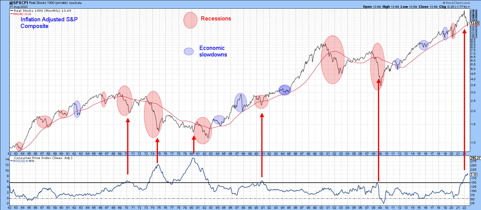 Chart 2 Chart 2
Examining Recent Price Action
One of the characteristics of a primary bear market is false upside breakouts, as such trends are noticeably deceptive. Chart 3, featuring the S&P and the NYSE A/D line, shows that the Index failed at its 200-day MA and 2022 down trendline and is now struggling to remain above its June/August up trendline. More serious is the position of the NYSE A/D Line, as it experienced a false break above its 200-day MA and its bear market trendline. False breaks are typically followed by above-average moves in the opposite direction to the break, and that certainly appears to be happening at present. The A/D Line could save itself by rallying above the dashed horizontal trendline, but, as it stands right now, a test of the June low appears more likely.
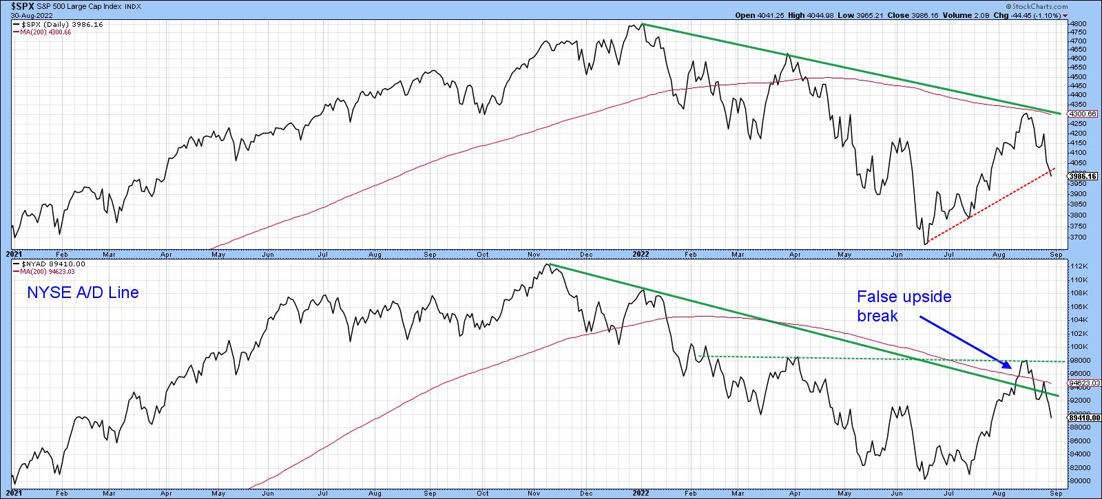 Chart 3 Chart 3
That's also the impression we get from the NASDAQ in Chart 4, which managed to pull itself back above the extended head-and-shoulders neckline but failed to hold that position. The break was confirmed with a drop below the dashed up trendline. It looks very similar to the 1946 top that I referenced a few weeks ago.
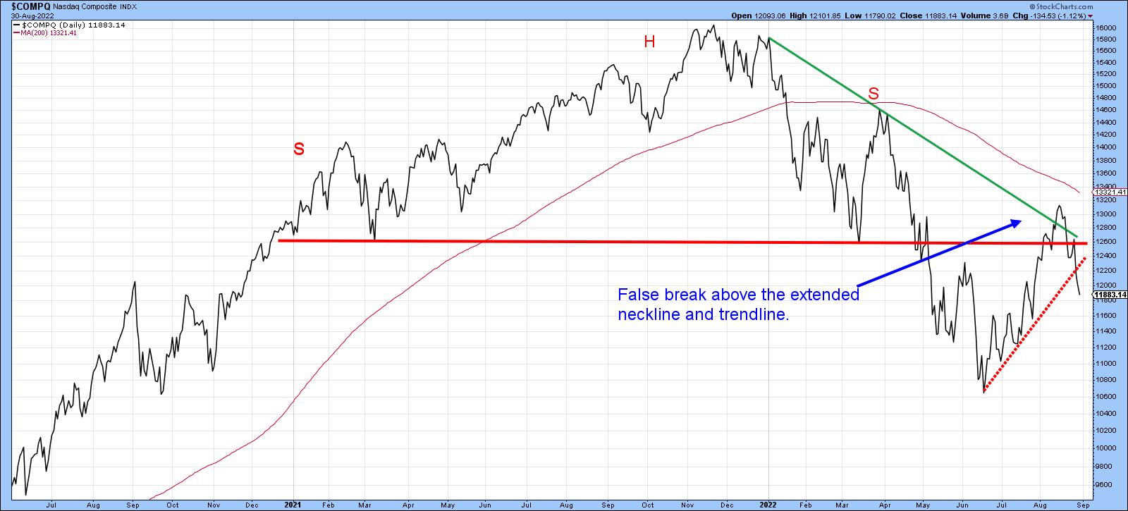 Chart 4 Chart 4
Market Has Retraced 50% of the Advance, But is Still Overbought
Our final two charts demonstrate that the market remains short-/intermediate-term overbought despite a 50% retracement. Chart 5, for instance, shows that my Dow Diffusion indicator, monitoring DJIA components in a positive trend, has just triggered a sell signal from an overbought reading. You can also see a false breakout by the NYSE itself above the 200-day MA.
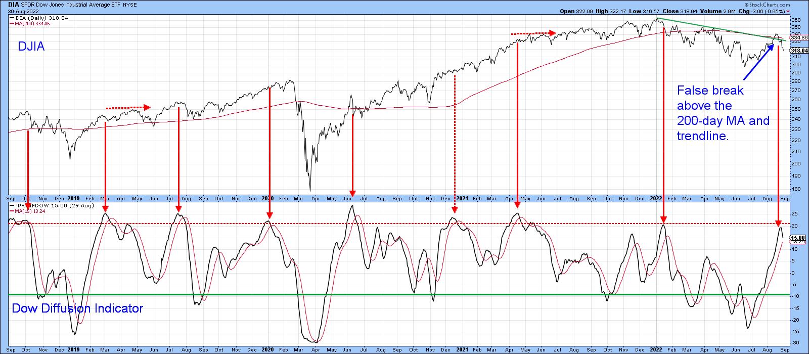 Chart 5 Chart 5
One of my favorite short-term indicators is the percentage of stocks above their 20-day EMA, as featured in Chart 6. It too has triggered a sell signal and, despite the recent decline, remains slightly above the neutral zone. Once again, we see a false breakout by the NYSE Composite above the secondary bear market trendline and the completion of a small head-and-shoulder top.
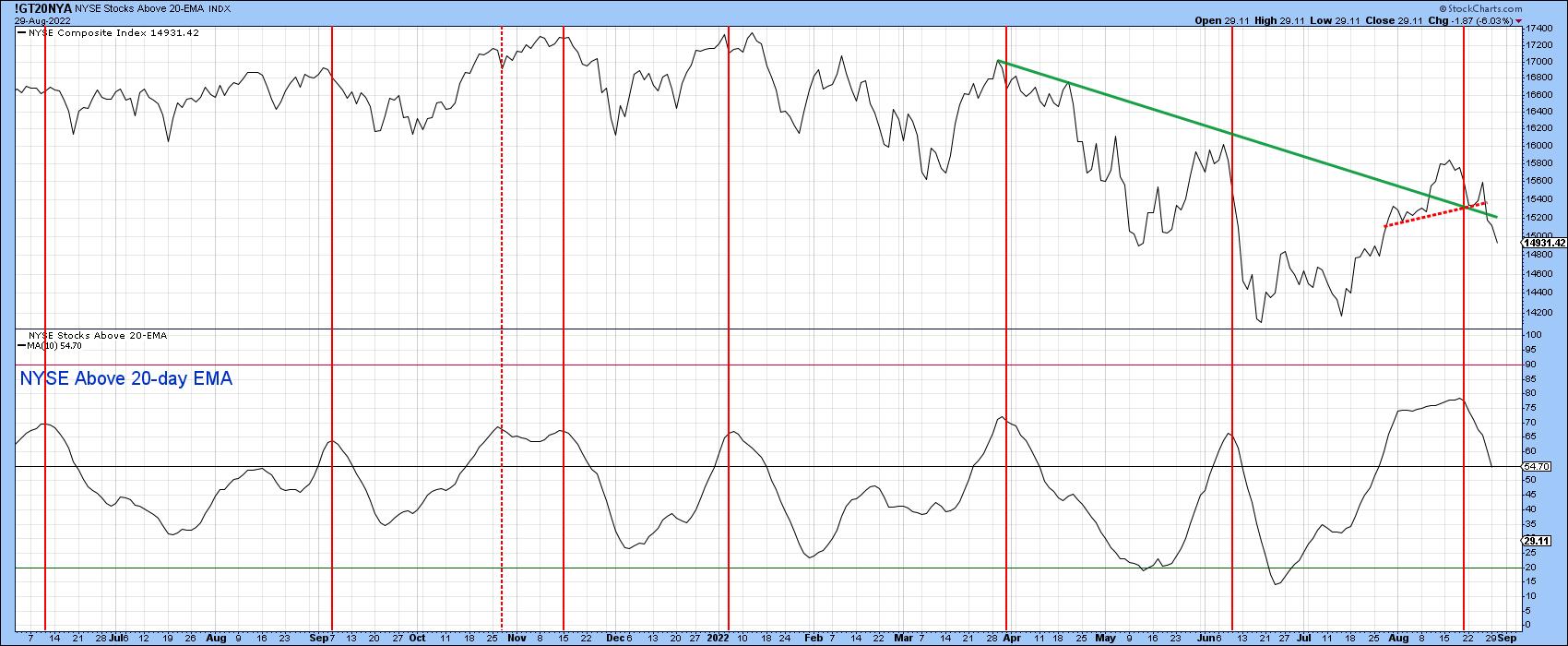 Chart 6 Chart 6
Good luck and good charting,
Martin J. Pring
The views expressed in this article are those of the author and do not necessarily reflect the position or opinion of Pring Turner Capital Group of Walnut Creek or its affiliates.
|
| READ ONLINE → |
|
|
|
| The Mindful Investor |
| As Goes NVDA, So Goes the Market |
| by David Keller |
I find semiconductors to be an important group to watch, given that they essentially provide the "backbone" to our modern information economy. Pretty much every product we use at this point has a chip involved, so if chip makers are doing well, then I can assume the economy is doing just fine.
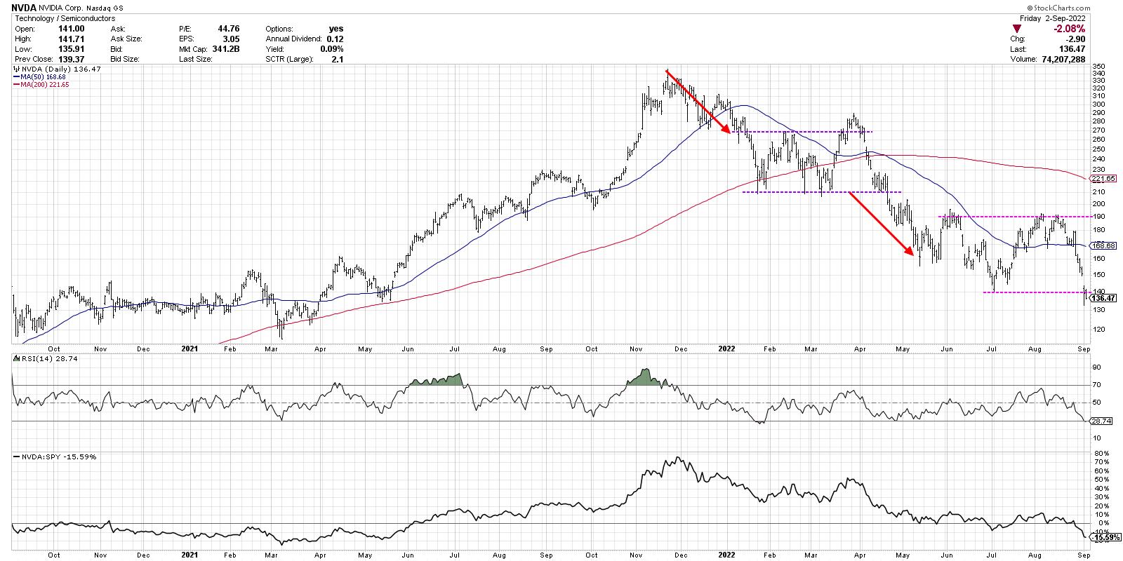
The failure of stocks like Nvidia Corp. (NVDA) to make a new high in January, while the S&P 500 did so, suggested caution and limited upside, which proved prescient. So what does it mean now that NVDA made a new low for 2022 this week?
First, let's review how 2022 has played out for this stock, and use a "measured move" technique to identify potential downside targets.

After NVDA bottomed out in January around $210, the stock spent the next three months fluctuating between 210 as support and 270-290 as resistance. This consolidation period, indicated with purple trend lines, could be called a rectangle pattern and indicates a market in equilibrium. Even though there are short-term price swings, the price was essentially rotating around a midpoint around $240. The market is basically telling you that, at this point in time, NVDA is worth about $240 a share.
In late March, the stock broke out of the pattern to the upside, but this breakout was short-lived. Just as the S&P 500 had a failed breakout above the 4600 level at this time, NVDA ended up stalling out and re-entering the consolidation area. Then in April, the price exited the pattern to the downside, confirming a new down leg in this bearish phase. Now we can use a measured move technique to anticipate a potential downside target.
What is a measured move? While there are a number of variations of this approach in the technical toolkit (even more advanced methodologies like Elliott Wave), I like to keep it simple. Basically, the trend leading into a consolidation pattern is often matched with the trend leading out of the pattern.
Let's review the chart of NVDA and consider that first breakdown in April 2022.

If you take the initial downthrust from November 2021 to January 2022, then assume a similar trajectory after the breakdown in April, that would suggest a downside objective around $160. NVDA did indeed bounce off this level of support, which led to another consolidation phase between $140 and $190 (indicated with pink trend lines).
So what can does a similar approach tell us about the current situation for this important stock?

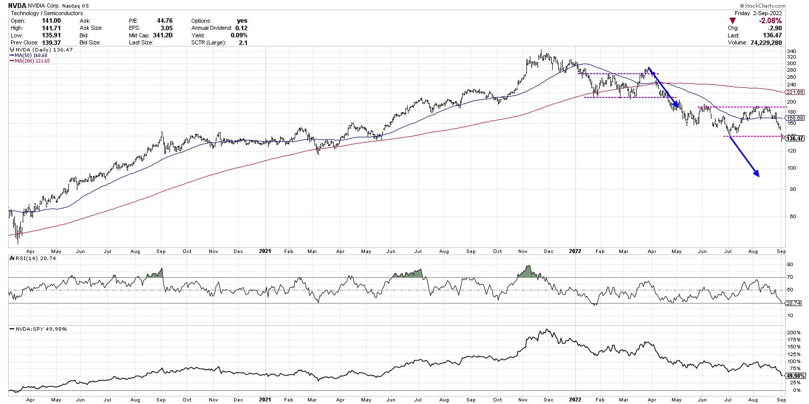
The move from the March swing high down to the upper end of the pattern is about a $100 move (290 to 190). We're using log scale for this demonstration, so a similar percent move (blue arrows) would give a downside target around 90-95.
Now here's the real question. If NVDA does reach that downside target, that would be about another 30% below current levels. What would the Nasdaq Composite do in that scenario? How about the S&P 500?
While we can run similar analysis on the major averages themselves, I have found that by some of the best tells in the market often come from analyzing specific stocks and groups, then comparing those signals to the broader indexes. In the case of Nvidia, the measured move technique suggests the bear market phase could still have plenty of room to move.
Want to digest this chart in video format? Just head over to my YouTube channel:
RR#6,
Dave
P.S. Ready to upgrade your investment process? Check out my YouTube channel!
David Keller, CMT
Chief Market Strategist
StockCharts.com
Disclaimer: This blog is for educational purposes only and should not be construed as financial advice. The ideas and strategies should never be used without first assessing your own personal and financial situation, or without consulting a financial professional.
The author does not have a position in mentioned securities at the time of publication. Any opinions expressed herein are solely those of the author, and do not in any way represent the views or opinions of any other person or entity.
|
| READ ONLINE → |
|
|
|
| Art's Charts |
| So Called Defensive ETFs are Not Immune |
| by Arthur Hill |
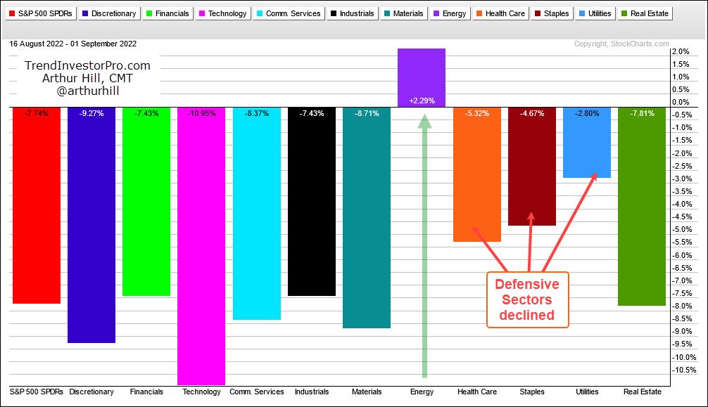
The short-term trends for the big three are down (SPY, QQQ, IWM) and we are in a bear market. Over the last two weeks, the short-term trend (down) aligned with the long-term trend (down). This is a powerful combination that can lead to rising correlation among stocks. Note that downside participation broadened over the last twelve days (16-Aug to 1-Sep) with ten of the eleven sectors losing ground. As the PerfChart below shows, XLE was the only sector showing a gain during this period.

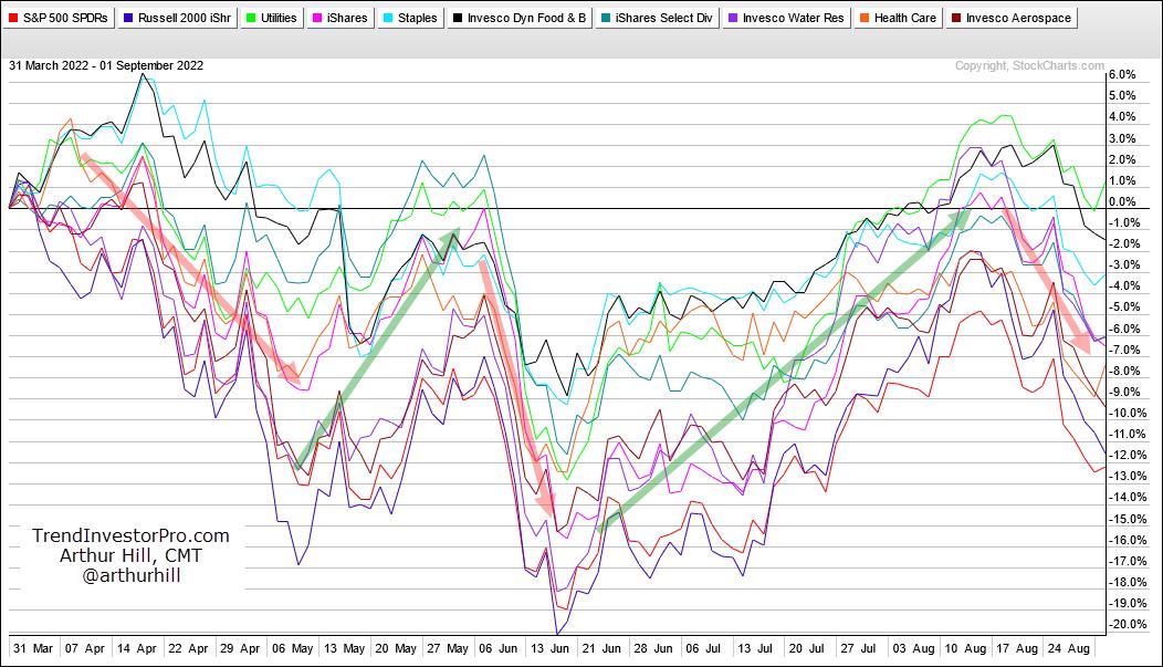
The defensive sectors held up better than SPY by declining less, but they still succumbed to broad market weakness and fell. Now let's look at the swings over the last few months. Note that SPY fell over 20% from early April to mid June, advanced some 17% from mid June to mid August and then fell around 8% from mid August to early September. These are big swings in relatively short timeframes.
The PerChart below shows how some of the so-called defensive groups performed during this timeframe. This list includes the Utilities SPDR (XLU), Infrastructure ETF (IFRA), Consumer Staples SPDR (XLP), Food & Beverage ETF (PBJ), Select Dividend ETF (DVY), Water Resources ETF (PHO) and Healthcare SPDR (XLV). I would also throw in the Aerospace & Defense ETF (PPA).

Notice how these lines pretty much move in unison (red and green arrow-lines). In particular, all rose from mid June to mid August and fell from mid August to early September. So called "defensive" groups may hold up better, but they are still correlated to the broader market and not immune to broad market weakness. Investors looking for true diversification and alternatives need to look outside of the stock market. Here at TrendInvestorPro, we become very selective during bear markets and turn our focus to the non-stock ETFs that are in uptrends or have bullish looking charts. Click here for immediate access to our commentaries, videos and strategies for ETFs.
Does the 200-day SMA actually work for SPY, QQQ, MDY and IJR? It does for one of these ETFs, but not so well for two others. In this Next Level Charting video, we put this long-term moving average do the test and show some tweaks to improve performance.
Looking for a charting edge? The TIP Indicator Edge Plugin for StockCharts ACP has eleven indicators to help you identify the trend, trail a stop, find pullbacks within uptrends and more. Click here to take your analysis process to the next level.
---------------------------------------
|
| READ ONLINE → |
|
|
|
|
|
| DecisionPoint |
| Out of 104, Only Two Industry Groups Show Rising Momentum |
| by Erin Swenlin |
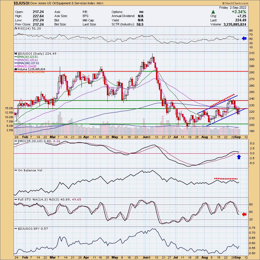
DecisionPoint Diamonds scans have failed to produce. In order to get even a few results, we have had to ease the restrictions, particularly on EMA configurations. If we don't get scan results for "Diamonds in the Rough", we dive into the Industry Summary on StockCharts.com so we can find pockets of strength. Well... there are none.
As of yesterday, EVERY industry group had declining Price Momentum Oscillators (PMOs). Today, two PMOs managed to rise a hundredth of a point. Technically that is positive momentum, but these groups are still very suspect.
The first is Oil & Equipment Services ($DJUSOI). The price chart is murky at best, but there are a few signs of life. The RSI entered positive territory above net neutral (50) today. As noted in the opening, the PMO has turned up above both the zero line and signal line, which is usually considered very bullish. While price did rebound and closed above the short-term rising trend, it stayed beneath at the 50-day EMA and February lows.

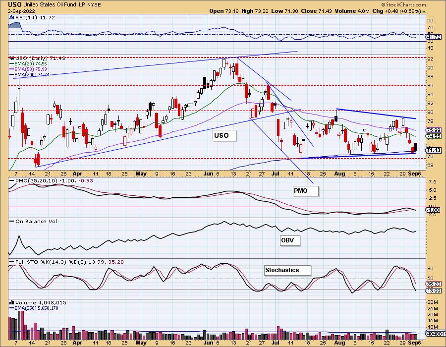
The Crude Oil chart (USO) is far from encouraging. Yes, there was a rally today, but it finished with a bearish filled black candlestick. Indicators are still very negative. Until this chart looks more healthy, I would be careful with this industry group.


The other industry group that saw rising momentum was Gold Mining ($DJUSPM). The Mining ETF ($DJUSMG) is still showing declining momentum.
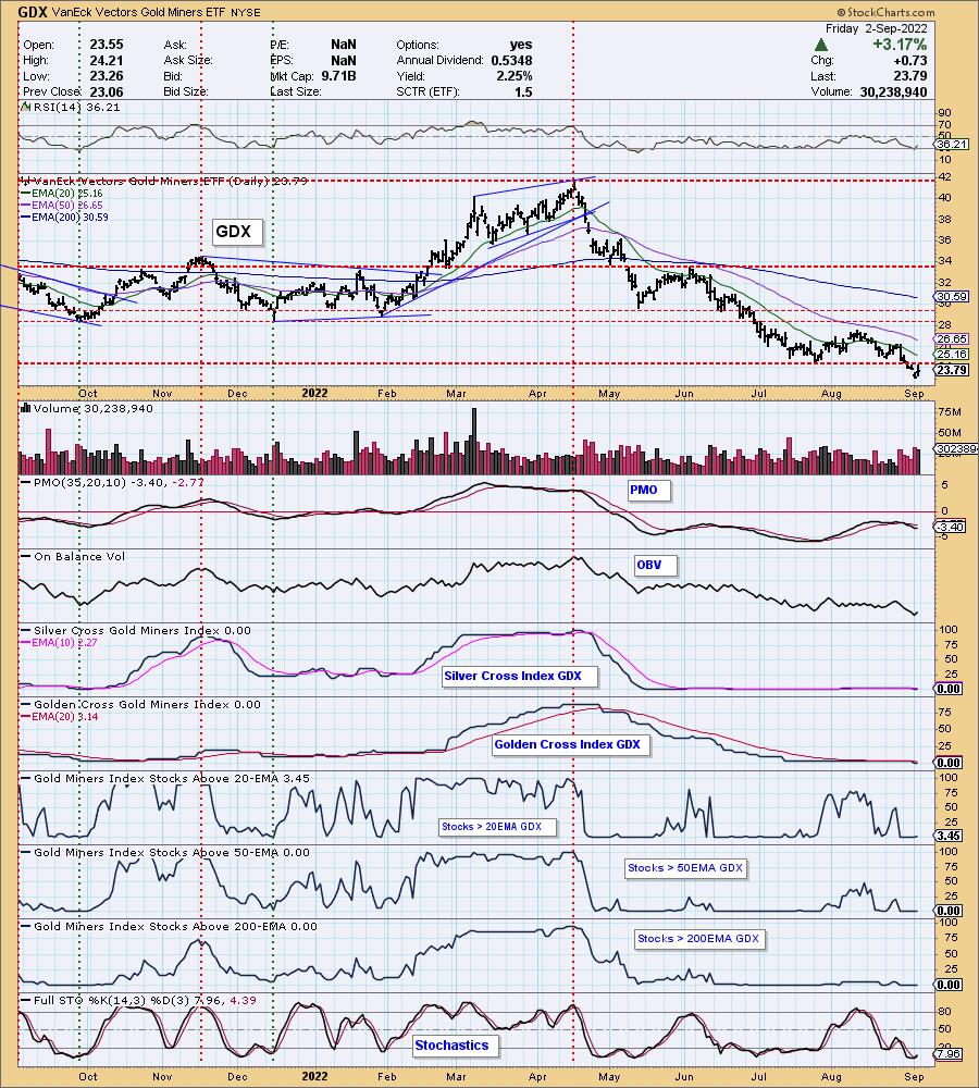
We've been writing in the DP Alert that Gold Miners are beat down and really vulnerable to more decline. Instead of using the industry group chart, we are going to use GDX. We have "under the hood" indicators available to us on that chart.
Currently, GDX is at 52-week lows and, after the recent breakdown below the July low, we've warned that this group isn't likely to rebound anytime soon. The big problem for Gold Miners is the complete lack of participation. You'll notice 0% for nearly all participation indicators with the exception of one or two stocks with price above their 20-day EMA. Gold had a good day, and that likely spurred GDX on.

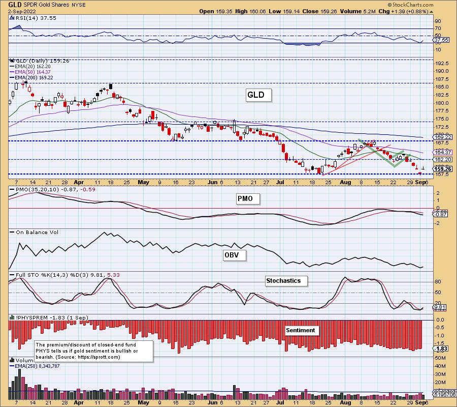
The Gold chart is showing improvement with today's rally, sort of. If Gold can continue to rally, fishing from the Gold Miners would be palatable. However, Gold Miners aren't merely subject to Gold prices, they are subject to the overall market trend as they are companies, not the metal.

Conclusion: There is nowhere to hide out. Interest rates are skyrocketing so the safety of Bonds is out the window and Gold has not been seen as a safe haven, at least not yet. The safest place is sadly cash or for brave souls, inverse ETFs and shorts.
Good Luck & Good Trading,
Erin Swenlin
Technical Analysis is a windsock, not a crystal ball. --Carl Swenlin
(c) Copyright 2022 DecisionPoint.com
Helpful DecisionPoint Links:
DecisionPoint Alert Chart List
DecisionPoint Golden Cross/Silver Cross Index Chart List
DecisionPoint Sector Chart List
DecisionPoint Chart Gallery
Trend Models
Price Momentum Oscillator (PMO)
On Balance Volume
Swenlin Trading Oscillators (STO-B and STO-V)
ITBM and ITVM
SCTR Ranking
Bear Market Rules
DecisionPoint is not a registered investment advisor. Investment and trading decisions are solely your responsibility. DecisionPoint newsletters, blogs or website materials should NOT be interpreted as a recommendation or solicitation to buy or sell any security or to take any specific action.
|
| READ ONLINE → |
|
|
|
| The Canadian Technician |
| Down 13%; Is It Over Now? |
| by Greg Schnell |
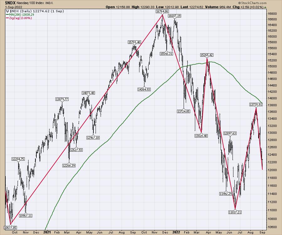
In 2021, the market didn't have a pullback of 13% before another rally started. In 2022, we are now up to two.
This tool, called the zigzag, is on StockCharts.com. Every time the market reversed positive or negative more than the amount you pick - in this case, 13% - it will draw a new trend line.

So after a swift move down of more than 1% per day for a few weeks, can the market make a hard reversal higher? That is the question!
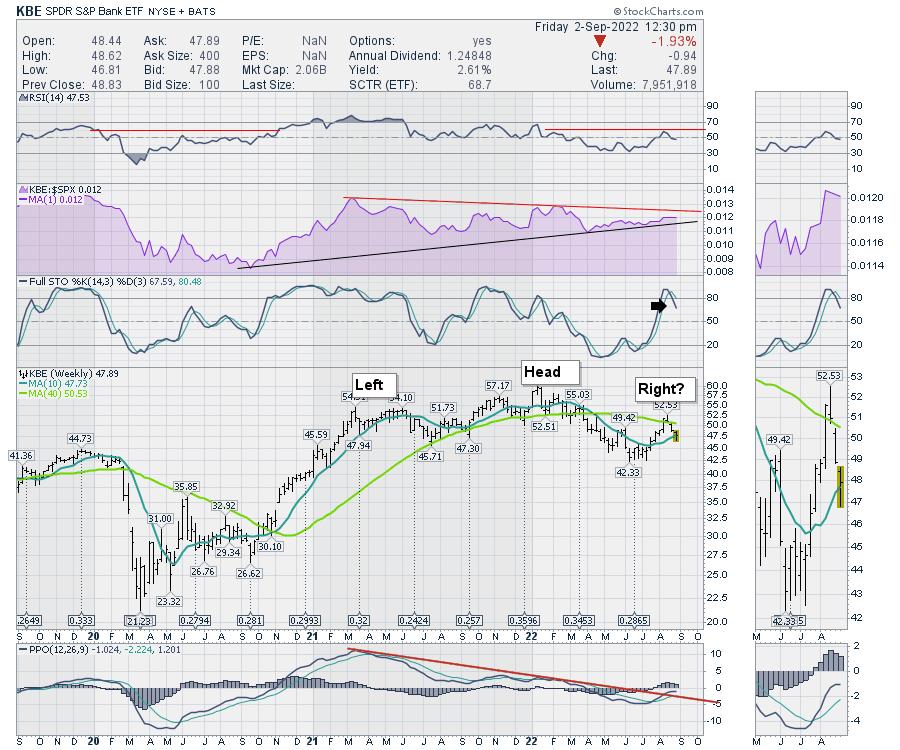
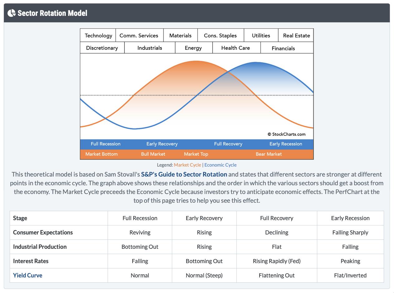
I keep watching the banks for clues based on the sector rotation model. If this chart rolls over, and the PPO rolls over below zero, that will be concerning.

The Sector Rotation model suggests that, in an early recession, financials should be one of the stronger sectors as the yield spread improves. It would appear we are still in the rapidly rising interest rate environment of the Fed that is in the bottom grid. Meaning the banks will be under pressure until this reverses.

As investors watch for signs of inflation easing, I have this question. Below are pictures of 2022 Mustangs. The black one is a fully loaded EV at $88,000.

The white one is a fully loaded gasoline engine at 58,000.

If EV cars are going to be 50% more and increasing market share every year, how can car inflation drop meaningfully? Since this picture was taken, the Ford CEO said they were going to increase the EV retail price by $8000 to cover "rising costs." Now the EV car will be $38,ooo higher or 65% higher.
A serious question - if the EV costs and EV sale prices are rising so dramatically, and car prices are a big part of the CPI calculation, how does this get anywhere near a 2% rise inflation? Secondly, If EV sales are increasing every year, and gas sales are decreasing, this is going to become an even larger accelerant year-over-year for inflation. Does the Fed call the CEOs and ask them to remove the EV car premium?
While we wait for inflation to come down, we are going to have to ask obvious questions about how this example gets to 2% inflation. Until the Fed stops raising interest rates in response to spiraling inflation, are the markets are going to continue to be under pressure? California is outlawing the sale of gasoline-powered cars; 4 days later, they announced EV charging restrictions due to soaring power demand and lack of supply. If utility bills start rising like they are in the UK, how does inflation come under control? If utility bills start spiraling to keep up with the increased EV sales, how does this level out? If EV production costs are spiraling, how does this cost spiral stop?
I think the banks are going to be a good gauge for the economy, and, until they can make the turn higher, we'll need to remain cautious. Looking at this simple car model, we might be way too early expecting inflation to flatten out.
|
| READ ONLINE → |
|
|
|
| RRG Charts |
| Inside Tech, It's Really AAPL vs. MSFT |
| by Julius de Kempenaer |

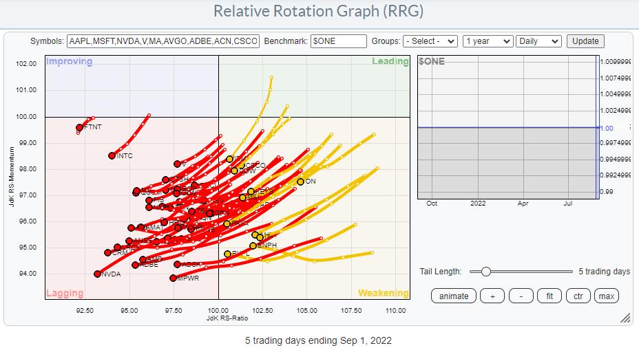
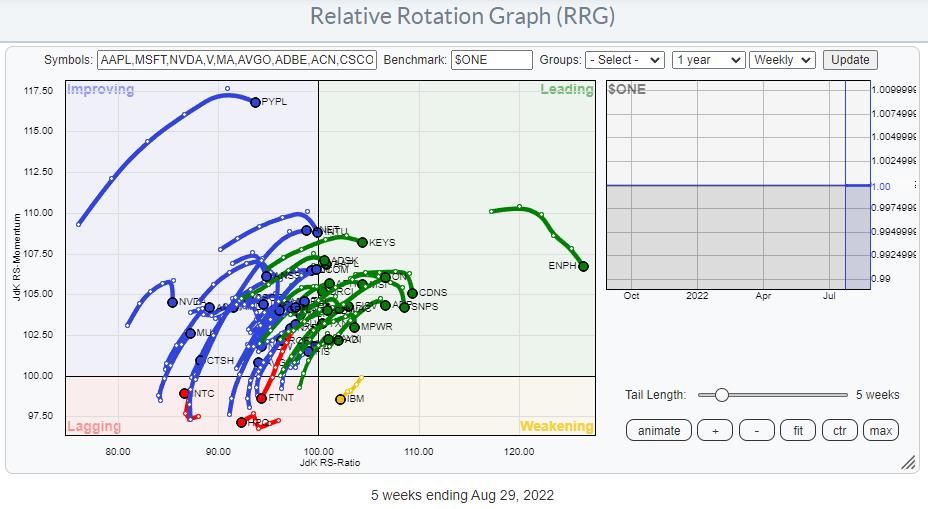
Plotting the components of the Information Technology Sector against $ONE provides us with a sobering picture. Pretty much every single stock in that index is in a downtrend, inside lagging, and/or inside weakening (and very close to entering lagging).
Plotting that same graph on a weekly timeframe shows almost all tails rolling over after an upward move.

When doing presentations, I often joke about how we don't need to worry about the ticker symbols we cannot read. The tickers that we CAN READ are the interesting ones. Apart from PYPL and ENPH, the symbols that I can read and which are triggering my attention are IBM inside the lagging quadrant and FTNT, INTC and HPQ inside the lagging quadrant.
These are not the locations where you want to be able to read those symbols. These are not small companies.
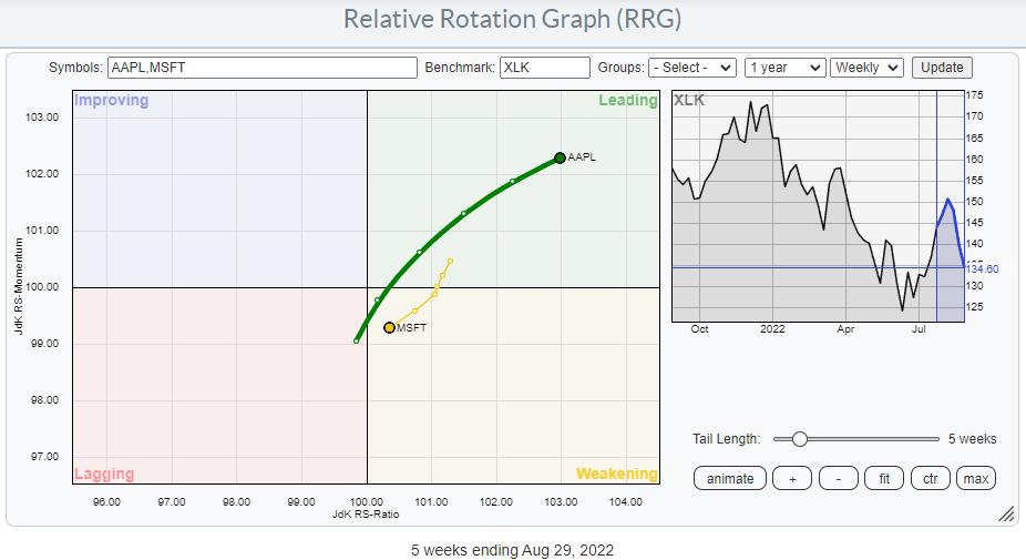
Obviously, the big names in the sector are AAPL at 25% market-cap and MSFT at 22% market cap. The two Relative Rotation Graphs below show the tails for both stocks against $ONE on weekly and daily timeframes.

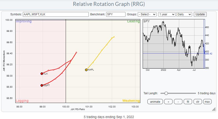
The weekly tails tell us that MSFT has already started to roll over before reaching the leading quadrant, while AAPL did enter leading, but at flat RS-Momentum. On the daily RRG, both are shooting off into the lagging quadrant, which suggests that A) The roll over of MSFT on the weekly RRG is likely to continue and B) AAPL is likely to start rolling over just inside the leading quadrant anytime soon.
With this observation in mind, I want to see the behavior of these two mega-caps from a relative perspective.

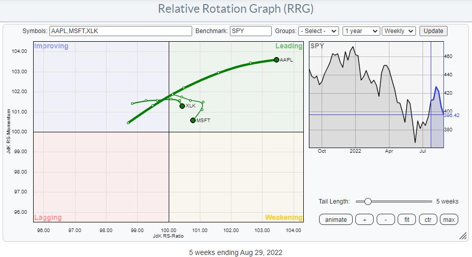
This weekly RRG above perfectly shows the opposite movements for the trails of MSFT and AAPL. AAPL is moving inside and further into the leading quadrant, while MSFT is rotating in opposite direction through the weakening quadrant, but heading towards lagging. This (sort of) balances out the relative behavior of XLK, and it means that the other names in the sector, all much less in terms of market cap than MSFT and AAPL, are dictating the rotation of the XLK tail.

This RRG shows the tails for MSFT and AAPL against SPY, and I have added the XLK tail for reference. The loss of relative momentum is clearly visible for XLK already and driven by MSFT.
What this means is that "As If and When" AAPL starts to deteriorate against SPY/XLK from a relative perspective, we will most likely see a more rapid deterioration for the sector against SPY.

Looking at the daily rotation for this setup, such a move may be around the corner.
MSFT

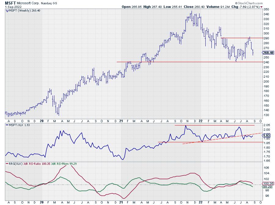
MSFT is on its way to the lower boundary of a trading range between 240-290, and a more or less similar situation is visible in the relative strength line. The RRG lines have slowly started to pick up an emerging downtrend in relative strength for MSFT vs. XLK and both are pointing lower.
AAPL

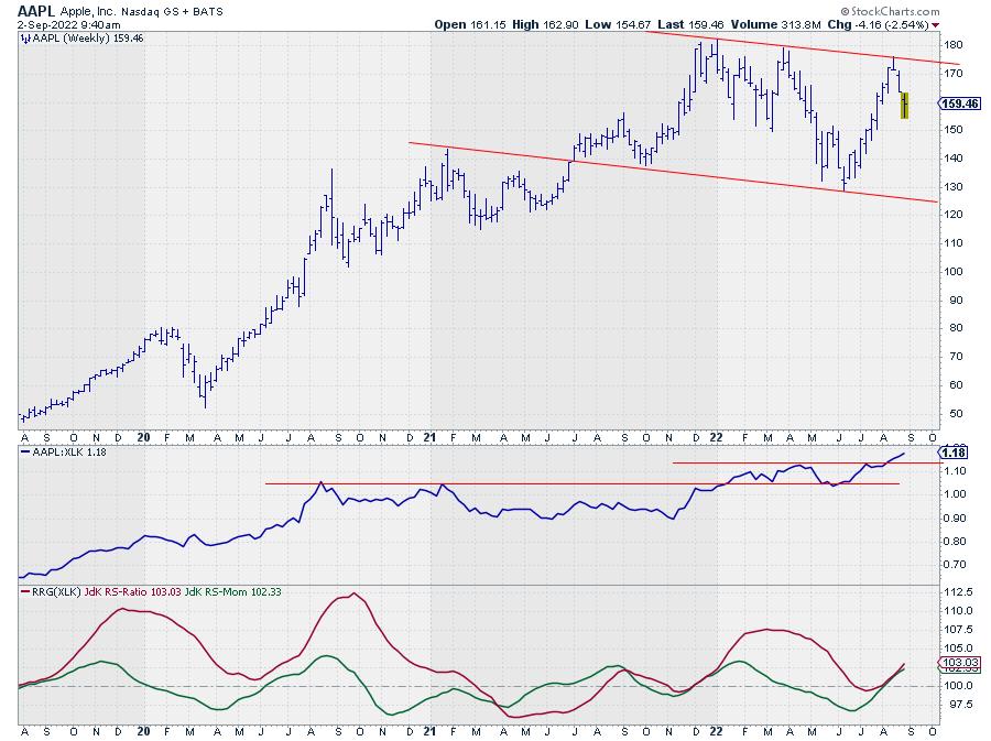
Despite the fact that AAPL is moving in a slightly down-slanting range, its relative strength against XLK is much stronger than for MSFT. This shows in the raw RS-Line, which is breaking above overhead resistance and following through. As a result, both RRG-Lines are moving above 100 and pointing higher at the same rate, which results in the strong RRG-heading that is visible on the graph.
All in all, the biggest risk for the Technology sector at the moment is a deterioration of AAPL. The first important support level to watch is near 150. Once broken, that will open up more downside and very likely drag the sector lower vs the S&P 500.
#StaySafe and Have a great weekend, --Julius
|
| READ ONLINE → |
|
|
|
| MORE ARTICLES → |
|
 Chart 1
 Chart 2
 Chart 3
 Chart 4
 Chart 5
 Chart 6


