| THIS WEEK'S ARTICLES |
| John Murphy's Market Message |
| TEST OF SUMMER LOW LOOKS LIKELY |
| by John Murphy |
STOCK INDEXES NEAR TEST OF SUMMR LOW... Hotter than expected inflation numbers this week pushed interest rates sharply higher and stock prices sharply lower. The daily bars in Chart 1 show the S&P 500 falling to the lowest level in two months and nearing a likely test of its June low. The SPX is back below all moving average lines, and its daily MACD lines in the lower box also turned negative. Although the size of the stock plunge on Tuesday may have been a surprise, the general trend lower wasn't. That's because longer-range technical indicators remain bearish.
 Chart 1 Chart 1
WEEKLY DOWNTREND INTACT...The weekly bars in Chart 2 show the summer rebound in the S&P 500 failing at its 40-week (200-day) moving average and a falling trendline drawn over it 2022 peaks (blue arrow). That failure kept its weekly downtrend intact. In addition, its moving averages lines remain in bearish alignment. Heavier trading volume on down weeks is also consistent with a market downtrend. Weekly MACD lines in the middle box which turned positive over the summer may be about to turn negative again. More importantly, monthly MACD lines remain negative.
 Chart 2 Chart 2
MONTHLY MACD LINES REMAIN BEARISH... Monthly indicators are usually the most important because they measure major long term market trends. And they remain bearish. Chart 3 shows monthly MACD bars in deep negative territory. That can be seen more clearly by the red MACD histogram bars which measure the spread between the two MACD lines. The monthly histogram bars turned negative near the beginning of the year and have fallen to the lowest level in twenty years. And show no signs of improving. That carries a negative message for the market's major trend.
 Chart 3 Chart 3
|
| READ ONLINE → |
|
|
|
| RRG Charts |
| Two Things I Don't Expect to See in a Bear Market |
| by Julius de Kempenaer |
I seriously hope that I was able to make clear in last Tuesday's Sector Spotlight that the market ($SPX) is still on shaky grounds and certainly not (back) in an uptrend. Sure, I mentioned the short-term improvement, which was undeniably there. But also that the upside was littered with resistance, and more confirmation would be needed for the longer-term trend to turn back up. That has not happened yet; as a matter of fact, the market stalled and turned at the first resistance level it met. And yes, that was sooner than I expected. ;)
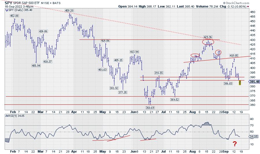
Gapping down on Tuesday with another opening gap down today (Friday) brings SPY back below its previous low (387) and back to square one. This move reinstates the downtrend that started after completing the small H&S top on 26 August. It also means that 386, 390 and the area inbetween are now expected to start serving as resistance. The daily chart of SPY shows this.
BUT... We have to keep an open mind.
The ease of movement is to the downside at the moment. After today's break, below 387, the path is cleared for a further move towards the 370 or even 360 level. However, a few things do not resonate with a bear market in full force and are keeping me awake... Well, maybe not literally, but it certainly has my attention, as I tried to express in Sector Spotlight and on The Final Bar last Wednesday.
The first one is the non-confirmation of the recent dip by the RSI. If you look at the graph above, you can see that the RSI has not (yet) dipped below its previous low, as SPY has done in the price chart. This means that it is still possible for SPY to develop a positive divergence between RSI and price. For this to materialize, we will need to see SPY turning up again within the next few daily bars. When that happens, we may see another attempt to move higher. But it will not change the fact that the upside is littered with resistance.
The second thing is an unusual or unexpected sector rotation; more specifically, the rotation for the Consumer Discretionary sector.
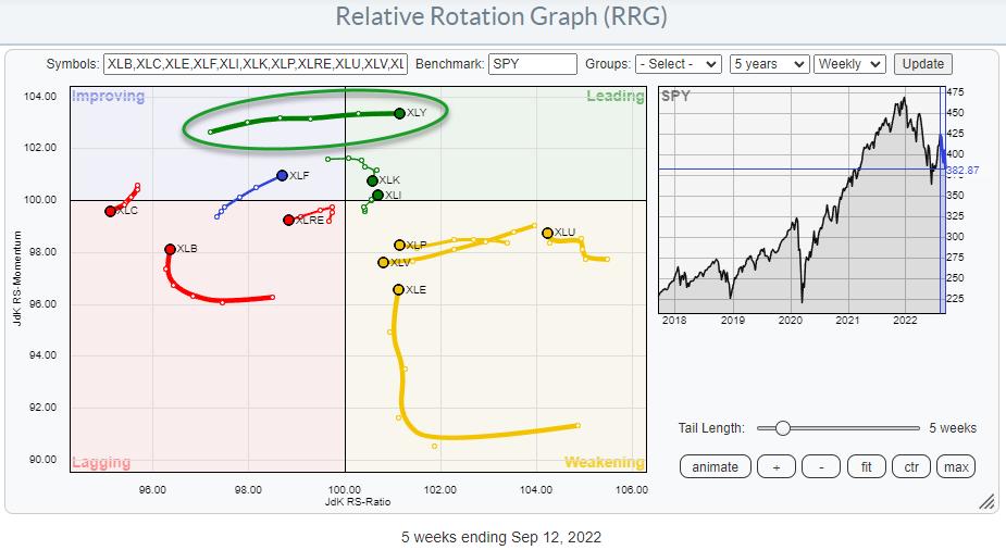
On the weekly Relative Rotation Graph, we see the XLY tail rapidly move into the leading quadrant at the highest JdK RS-Momentum reading in this universe. That shows strength! At the same time, the defensive sectors are still to the right, inside the weakening quadrant. XLU has the highest RS-Ratio reading and is turning back up towards leading, while XLP and XLV move opposite the XLY tail towards the lagging quadrant.
The worst sector, without a doubt, is Communication Services. The weekly tail has just completed a turn from improving back down into lagging, while remaining at the lowest RS-Ratio reading of the entire universe. It does not get much weaker than this.
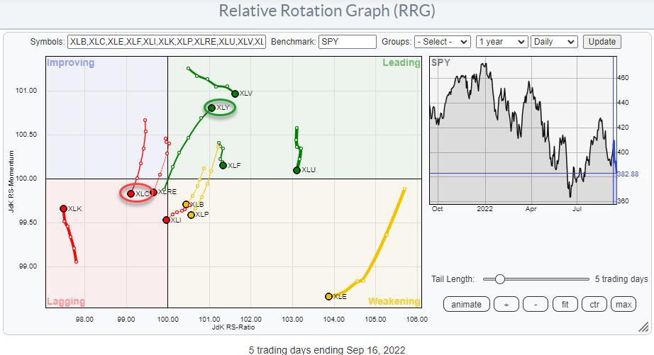
Zooming in on last week's rotation on the daily RRG shows the tail for XLY rotating into the leading quadrant at a strong RRG-Heading, which underscores the strength that was noted on the weekly RRG. The XLC tail is rotating from improving back into lagging and is also confirming the rotation that is playing out on the weekly RRG. The defensive sectors on the daily RRG are all inside, leading but losing relative momentum.
My problem is that, in a full-fledged bear market, I do not expect the Consumer Discretionary sector to show up inside the leading quadrant in both the weekly and the daily time frame...
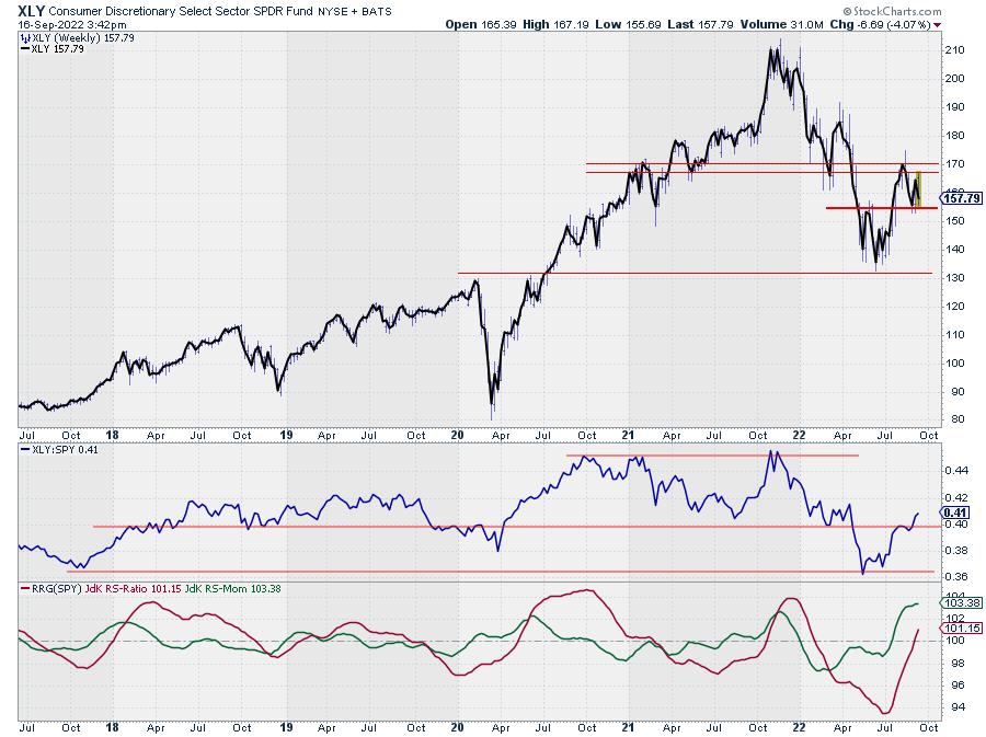
If we stick with the XLY chart for the moment, the improvement is clearly visible. Unlike SPY, XLY has not dropped below its recent low, but managed to stay above the May peak, which is now serving as support.
In the chart above, I have overlaid a thick line connecting the closing prices on top of the bar chart, from which you can see the weekly extremes. In this way, I am trying to eliminate some of the noise and get a clearer picture to determine the trend. Also, the break back above that horizontal level in relative strength has to be seen as a positive, at least for the sector. But at 12% of the S&P 500, Consumer Discretionary is the third largest sector, which can impact SPY's direction. So, at minimum, I keep an open mind to the possibility that the market is trying to find support here while respecting the long-term downtrend still in play.
In situations like this, I always have to think about a saying we have in Dutch. It would translate into something like:
The nicest flowers are growing at the edge of the ravine.
Therefore, remain very careful, as we are close to the edge of a ravine. In terms of SPY, I think 360 will qualify as the edge. But when some nice opportunities arise between here and 360, they may qualify as low-risk opportunities, provided that tight stops are in place.
#StaySafe and have a great weekend, --Julius
|
| READ ONLINE → |
|
|
|
| DecisionPoint |
| Next Week's Sector and Industry Group to Watch |
| by Erin Swenlin |
Every Friday during the DecisionPoint Diamond Mine trading room for DP Diamonds subscribers only, we do an in-depth look at all of the sectors and choose a "Sector to Watch" that could see positive results the following week. We then dive into that sector and find an "Industry Group to Watch", as well as a few symbols that have potential.
I decided to reprint a portion of today's DecisionPoint Diamonds Recap, in which I review the top "Diamond in the Rough" of the ten selected during the week, as well as the "Dud" of the week. I also review the RRGs and post the DP Sector Scoreboard. I'm only including the sections on "Sector & Industry Groups to Watch" here.
(You may not know this, but we now host "ETF Day" on Wednesdays, where I select three ETFs that should ride the tide of current market conditions, because not everyone likes to trade stocks.
The Friday hour-and-a-half Diamond Mine allows for all symbol requests to be reviewed and real-time discovery of the "Sector to Watch" and "Industry Group to Watch". I also reinforce the DecisionPoint trading strategy that I've created over the past two years. If you'd like to try out this report and the DP Alert, use Coupon Code: SAVE50 and get 50% off your first month of any DecisionPoint.com subscription.
<drum roll> And, this week's sector and industry group to watch are...
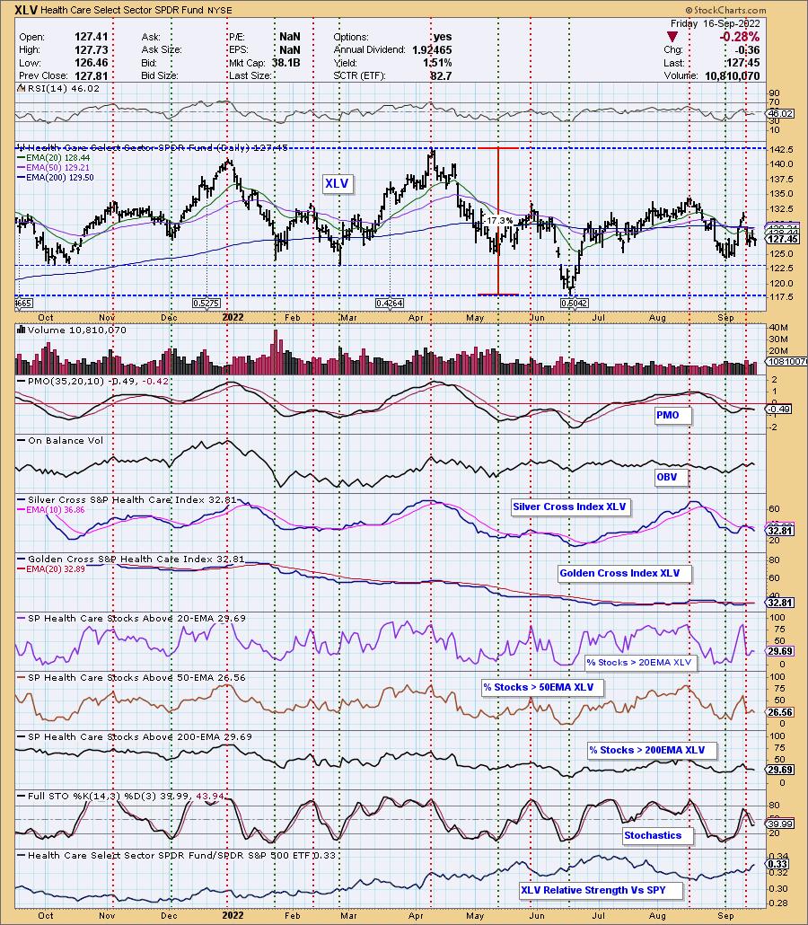
Sector to Watch: Healthcare (XLV)
While XLV hasn't had an easy time, none of the sectors have. Choosing the Sector to Watch was challenging, given that one of the sectors carry positive momentum. It came down to outperformance against the SPY and participation readings not deteriorating further today.
Not surprisingly, there are problems on this chart. The RSI is negative and has topped. The PMO topped and moved into a whipsaw SELL signal. It hasn't been able to recapture the signal line, but at least the margin is very thin. Stochastics actually twitched up. %Stocks indicators are lower than the Silver Cross Index (SCI) and Golden Cross Index (GCI), meaning this is far from an improving chart. Most of the industry groups aren't fairing well, but one does have some promise...

Save 50% off your first month of any of our newsletters by using coupon code: SAVE50
Technical Analysis is a windsock, not a crystal ball. --Carl Swenlin
(c) Copyright 2022 DecisionPoint.com
Helpful DecisionPoint Links:
DecisionPoint Alert Chart List
DecisionPoint Golden Cross/Silver Cross Index Chart List
DecisionPoint Sector Chart List
DecisionPoint Chart Gallery
Trend Models
Price Momentum Oscillator (PMO)
On Balance Volume
Swenlin Trading Oscillators (STO-B and STO-V)
ITBM and ITVM
SCTR Ranking
Bear Market Rules
DecisionPoint is not a registered investment advisor. Investment and trading decisions are solely your responsibility. DecisionPoint newsletters, blogs or website materials should NOT be interpreted as a recommendation or solicitation to buy or sell any security or to take any specific action.
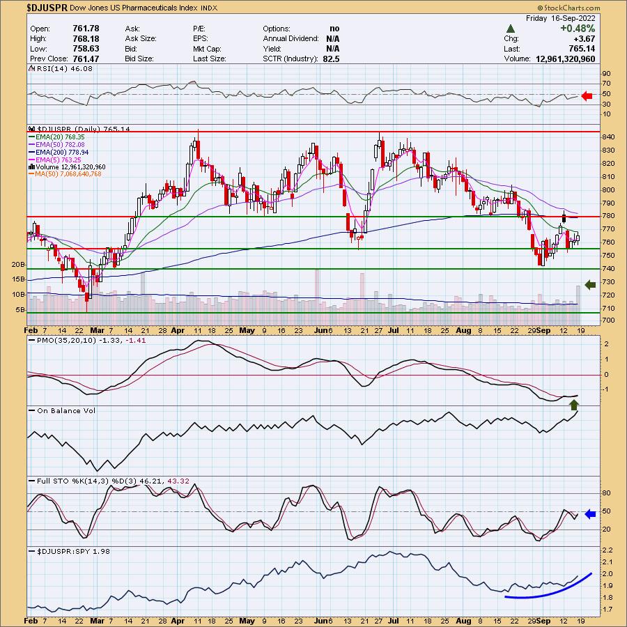
Industry Group to Watch: Pharmaceuticals ($DJUSPR)
Not a pretty chart either, but it does have some bullish characteristics. The RSI is negative, but gently rising. The PMO is on a rather new crossover BUY signal. Stochastics have turned up, volume is coming in strong, and it's increasing its outperformance of the SPY. It is in a declining trend still, but support is holding at the June low. I'm not suggesting you should buy, but there were a few symbols that I found interesting in the Diamond Mine this morning: Bristol-Meyers (BMY), Johnson & Johnson (JNJ) and Merck (MRK).
Go to StockCharts.com you can find the Industry Summary. Our sector charts are available to all subscribers.
Have a great weekend! Good Luck & Good Trading!
- Erin
erin@decisionpoint.com
|
| READ ONLINE → |
|
|
|
|
|
| The Mindful Investor |
| It's Not a Stock Market, It's a Market of Stocks |
| by David Keller |
I was taught early on that "a rising tide lifts all boats" and that the real game as an equity investor was to get the market call right. Forget about the individual stocks and instead focus your attention on the macro call.
Because most stocks just follow the market, right?
Well, sometimes yes... and sometimes no.
After our three panelists each shared five ideas during our latest episode of The Pitch, I commented to the group that it's fascinating to me that, while there are plenty of potential headwinds to the major market averages, none of seem to be having trouble finding compelling charts. In fact, some of the groups like restaurants, renewable energy equipment and automobiles basically look downright bullish.
So how do we reconcile a weaker tape this week with emerging strength in these groups? Well, we have to remember that it's not a stock market... it's a market of stocks.
I use my Market Trend Model as a systematic way to determine whether I should be leaning risk-on or risk-off. But I realized a long time ago that, regardless of the overall market trend, it is always a good time to own good charts.
The S&P 500 failed to hold a key support level this week, finally closing below 3900 for the first time since mid-July. And mega-cap leadership names, like MSFT and AMZN, are testing key support levels while other FAANG stocks, like META, have already broken down to new lows for the year.
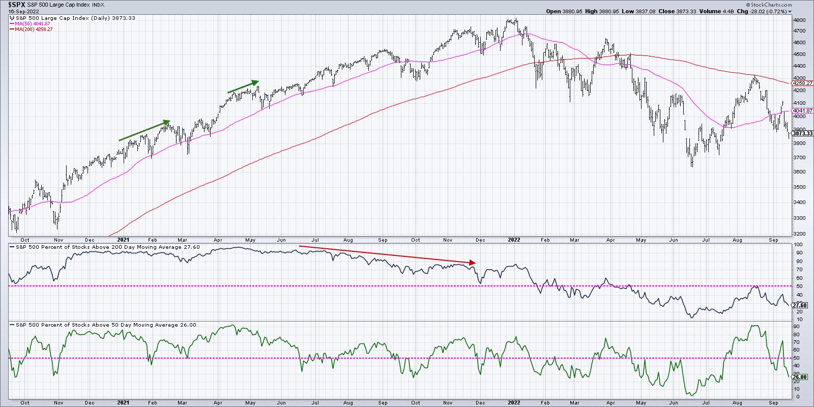
Perhaps most concerningly, only 26% of S&P 500 members remain above their 50-day moving average as of Friday's close. That's down from over 70% just one week ago! I've learned that when that indicator is below 50%, then the breadth is just not supportive of further upside for the benchmarks.
But despite all of those macro headwinds leading into next week's Fed meeting, plenty of individual stocks are demonstrating clear patterns of accumulation. When I scanned for new swing highs and lows for my Market Misbehavior Premium Members earlier this week, I came up with 83 new highs and 125 new lows. And that's after Tuesday's big down day.
Despite the questionable market conditions, three groups stand out with strong patterns and upside potential. I should note that all three of these groups were highlighted in our latest episode of The Pitch. As a matter of fact, this first group was selected by not one, not two, but, for the first time ever, all three of our panelists.
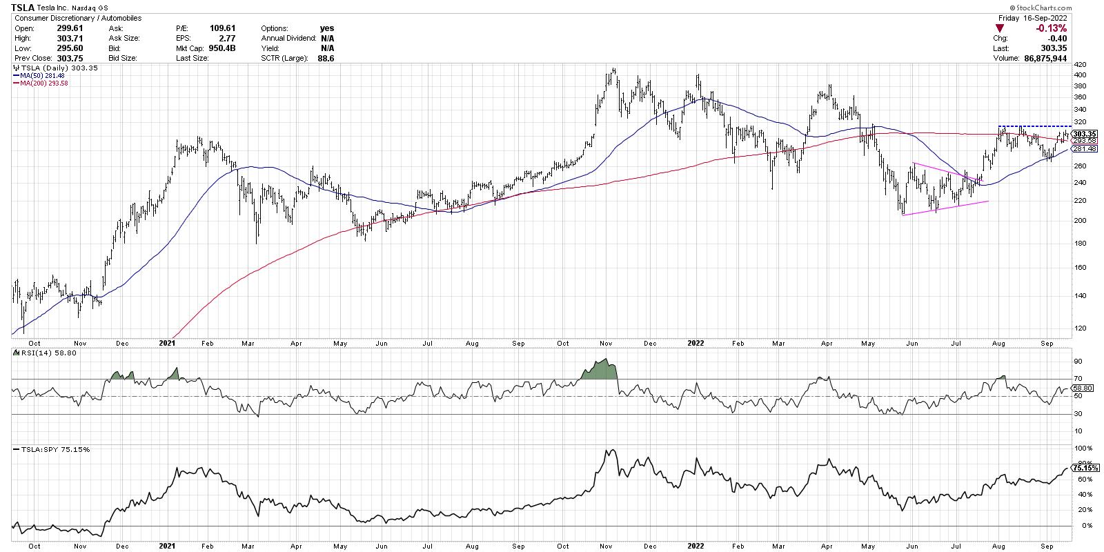
Tesla (TSLA) managed to pound out a new four-month relative high this week, handily outperforming the broader market as it remains above both the 50-day and 200-day moving averages. While a break above previous resistance around $315 would complete the bullish rotation here, it's important to focus on the relative picture, which indicates that this name has provided a fantastic opportunity to outperform in recent months.
And it's not just Tesla. Other auto makers, like RIVN and GM, have rotated from a distribution phase (lower highs and lower lows) to an accumulation phase (higher highs and higher lows).
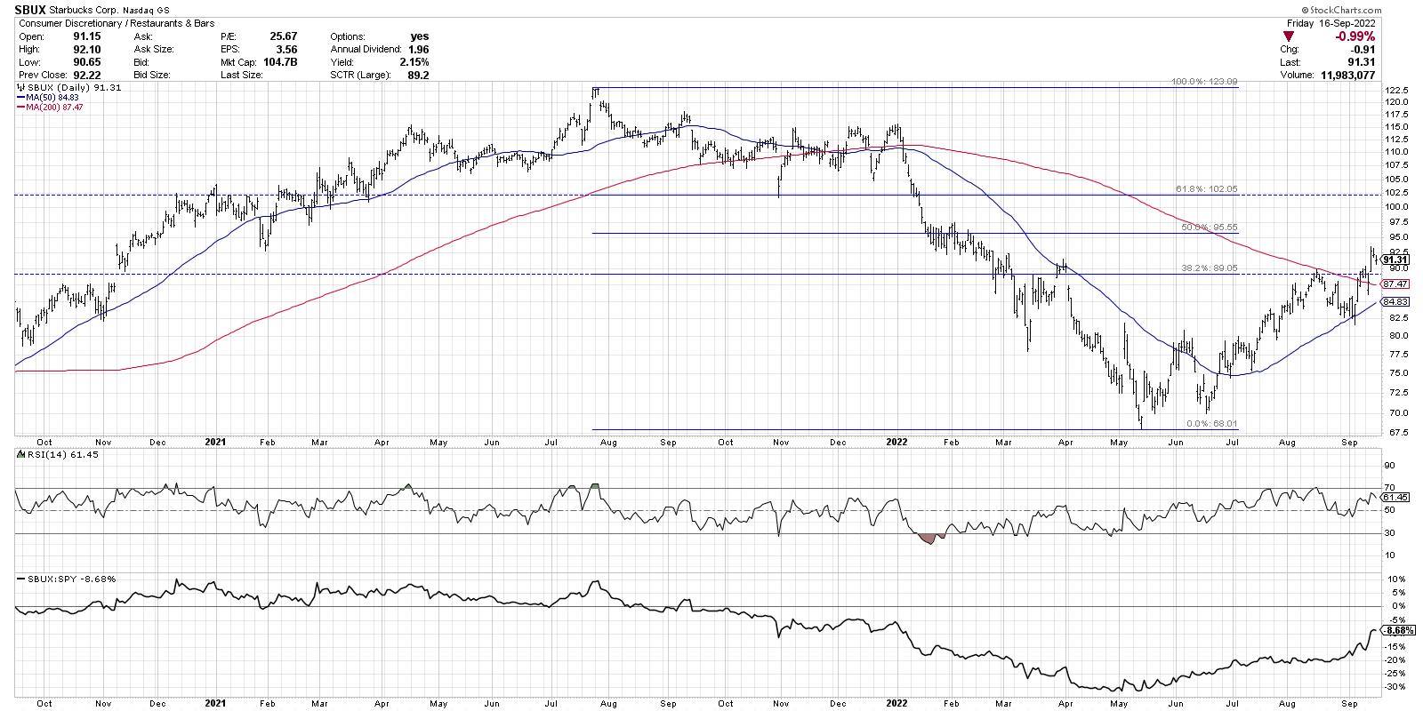
The restaurants group has also had a strong run despite the challenges facing the broad market averages. CMG and others have rotated nicely to an accumulation phase.
I chatted with Julius de Kempenaer on The Final Bar this week about the strength in Consumer Discretionary stocks, which is a little surprising based on its traditional role as offense. In fact, one of the great indicators in 2022 has been the equal-weighted Consumer Discretionary to Consumer Staples ratio, which has proven to be a much better indicator than the cap-weighted ratio using the XLY and XLP.
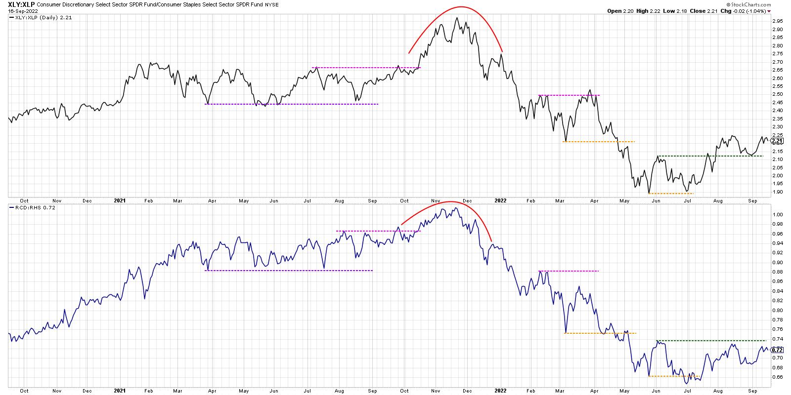
The cap-weighted ratio made a new swing high in late March, while the equal-weighted ratio did not. This was a solid indication that the March upswing was to be questioned. Recently, the cap-weighted ratio broke above its June high while the equal-weighted ratio has yet to do so. This suggests that the rally in August was not supported by a broader advance in offense over defense. (Yes, Tom Bowley, I believe in equal-weighted ETFs. Really.)
So while Consumer Discretionary as a whole has provided mixed results, charts like Starbucks (SBUX) are breaking above key resistance levels and signaling further upside potential.
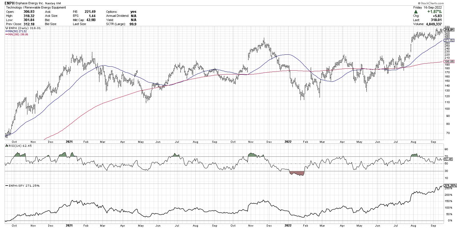
Finally, we have the renewable energy equipment, which consists of names like PLUG, FSLR and ENPH.
Enphase Energy is currently the top-ranked large-cap name, using the StockCharts SCTR rankings, and ended the week near a 52-week high. So while FAANG stocks are testing new 52-week lows, charts like ENPH almost look a FAANG chart flipped upside down.
I'm concerned about downside potential for the major market averages going into next week's Fed meeting. I've even updated downside targets for the S&P 500 and Nasdaq, given the increase likelihood of a retest of the June lows. But despite the potential weakness for equities as a whole, there are plenty of opportunities out there if you know where to look!
For more information on why the S&P 3900 level is so important, head over to my YouTube channel.
RR#6,
Dave
P.S. Ready to upgrade your investment process? Check out my YouTube channel!
David Keller, CMT
Chief Market Strategist
StockCharts.com
Disclaimer: This blog is for educational purposes only and should not be construed as financial advice. The ideas and strategies should never be used without first assessing your own personal and financial situation, or without consulting a financial professional.
The author does not have a position in mentioned securities at the time of publication. Any opinions expressed herein are solely those of the author, and do not in any way represent the views or opinions of any other person or entity.
|
| READ ONLINE → |
|
|
|
| Dancing with the Trend |
| The Deception of Average |
| by Grant Morris, Greg Morris |
 I published this the first time in November, 2017 and think it is just as appropriate now as then. I published this the first time in November, 2017 and think it is just as appropriate now as then.
The "World of Finance" is fraught with misleading information. The use of average is one that needs a discussion. Chart A is a chart showing the compounded rates of return for a variety of asset classes. If I were selling you a buy and hold strategy, or an index fund, I would love this chart. From this chart showing 85 years of data, I could say that if you had invested in small cap stocks you would have averaged 11.93% a year, and if you had invested in large cap stocks you would have averaged 9.85% a year. And I would be correct.
I think that most investors have about 20 years, maybe 25 years, in which to accumulate their retirement wealth. In their 20s and 30s, it is difficult to put much money away for many reasons such as: low incomes, children, materialism, college, etc. Therefore, with that information, what is wrong with this chart? It is for an 85-year investment and people do not have 85 years to invest. As said earlier, most have about 20 years to acquire their retirement wealth and there are many 20 years periods in this chart where the returns were horrible. The bear market that began in 1929 did not fully recover until 1954, a full 25 years later. 1966 took 16 years to recover and 1973 took 10 years.
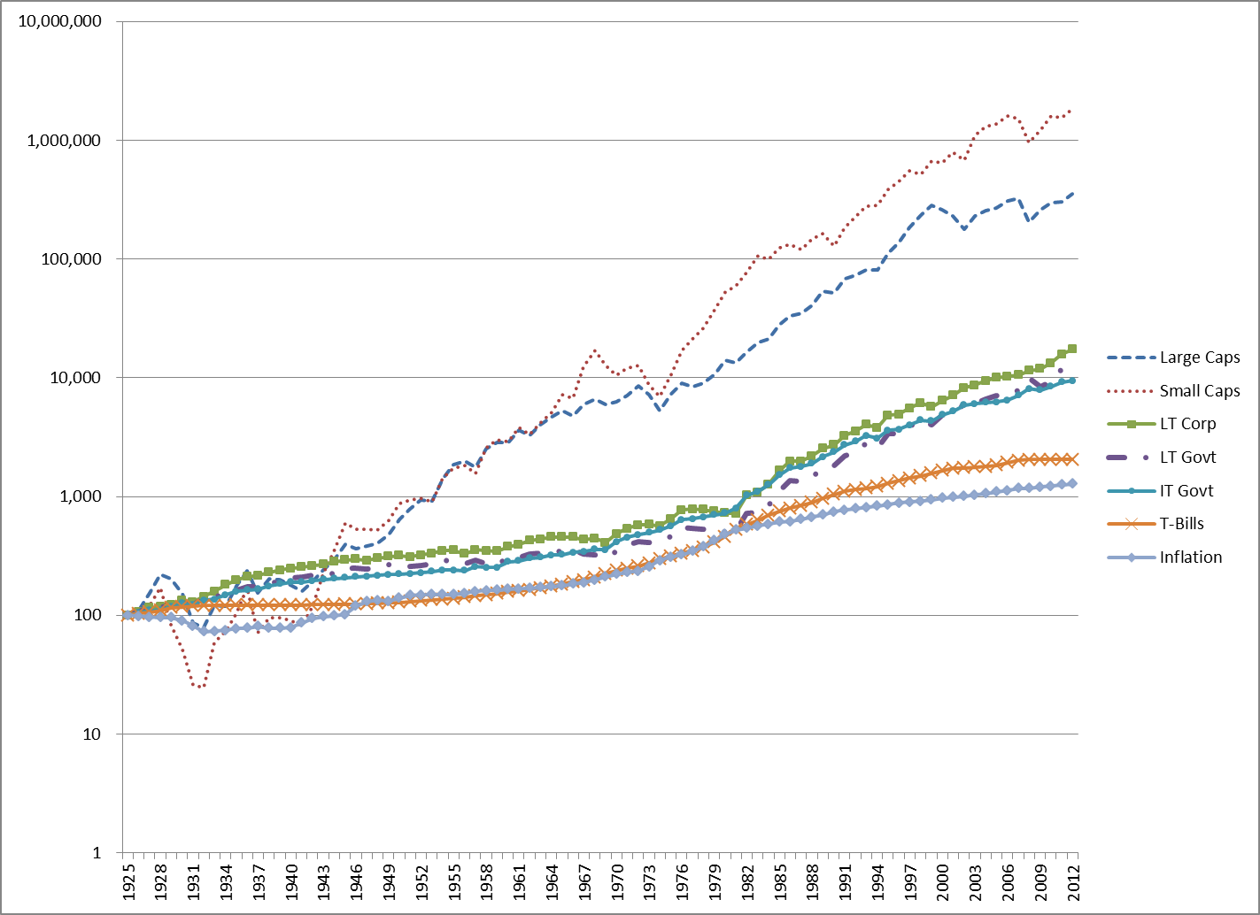 Chart A - Year Returns of Various Assets Chart A - Year Returns of Various Assets
Table A shows the performance numbers for the asset classes shown in Chart A (LT – Long Term, IT – Intermediate Term). The cumulative numbers in Table A begin at 1 on December 31, 1925.
 Table A - Long Term Performance of Asset Classes Table A - Long Term Performance of Asset Classes
Data Source: Morningstar Ibbotson SBBI Yearbook
Hint: Be careful when someone uses inappropriate averages; or more accurately, uses averages inappropriately.
Recall in Chart A that the small cap and large cap compounded returns were about 12% and 10% respectively? Chart B shows rolling 10 year returns by range since 1900. A rolling return means it shows the period from 1900 – 1909, 1901 – 1910, 1902 – 1911, etc. You can clearly see that the small stock and large stock returns depicted in Chart A fall within the middle range (8% - 12%) in Chart B, yet of all the 10 year rolling periods, only 22% of them were in that range. Often average is not very average. It reminds me of the story of the six-foot-tall Texan that drowned while wading across a stream that averaged only three feet deep.
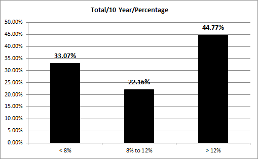 Chart B Distribution of Returns based upon Percentage Chart B Distribution of Returns based upon Percentage
Chart C shows the 20-year rolling price returns for the Dow Industrials. The range of returns in this 127-year sample (1885 – 2012) is from a low on 08/31/1949 of -3.71% to a high on 3/31/2000 of 14.06% which is a 17.77% range. To help clarify rolling returns, on 8/31/1949 (the low point on the chart), if an investor was in the Dow Industrials from 9/30/1929 until 8/31/1949, they had a return of -3.71%. Complementary, if one invested on 4/30/1980, then on 3/31/2000, they had a return of 14.06%. The mean return is 5.2% and the median return 4.8%. When median is less than mean, it simply means more returns were less average. If you recall the long-term assumptions that are often used in the first part of this article (Chart A), you can see there is a problem. The magnitude of errors in assumptions of long-term returns cannot be overstated and certainly cannot be ignored. This variability of returns can mean totally different retirement environments for investors who use these long-term assumptions for future returns. It can be the difference between living like a king, or living on government assistance. Institutional investors have the same problems if using these long-term averages.
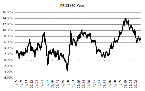 Chart C - Dow Industrial Average 20 Year Rolling Returns (1885 – 2012) Chart C - Dow Industrial Average 20 Year Rolling Returns (1885 – 2012)
This is important! One of the primary beliefs developed by Markowitz in the 1950s as the architect of Modern Portfolio Theory; was the details on the inputs for the efficient investment portfolio. In fact, his focus was hardly on the inputs at all. The inputs that are needed are expected future returns, volatility, and correlations. The industry as a whole took the easy approach to solving this by utilizing long-term averages for the inputs. In other words, one full swing through all the data that was available; and the average is the one used for the inputs into an otherwise fairly good theory. Those long-term inputs are totally inappropriate for the investing horizon of most investors; in fact, I think they are inappropriate for all human beings. While delving into this deeper is not the subject of this article, it once again brings to light the horrible misuse of average. These inputs should use averages appropriate for the investor's accumulation time frame.
Everything with Four Legs is a Pig
While this is unrelated to investments and finance, it is a story about averages which offers additional support to this topic. Doctors use growth charts (height and weight tables) for a guide on the growth of a child. What folks do not realize is that they were created by actuaries for insurance companies and not doctors. As doctors began to use them the terms overweight, underweight, obese, etc. were created based upon average. So, if your doctor says you are overweight and you need to lose weight, he is also saying you need to lose weight to be average. And from a Wall Street Journal article by Melinda Beck on July 24, 2012... "The wide variations are due in part to rising obesity rates, an increase in premature infants who survive, and a population that is growing more diverse. Yet the official growth charts from the Centers for Disease Control and Prevention still reflect the size distribution of U.S. children in the 1960s, '70s and '80s. The CDC says it doesn't plan to adjust its charts because it doesn't want the ever-more-obese population to become the new norm." And now you know.
During my last physical examination, I told my doctor about how these charts on height and weight were just large averages created by actuaries for insurance companies and that I did not mind being above average.
Try not to be Average,
Greg Morris
|
| READ ONLINE → |
|
|
|
| Martin Pring's Market Roundup |
| Bearish Weekly Dollar Candles May Help Change the Energy Inflation Dynamic |
| by Martin Pring |
It is a well-established fact that the dollar and oil prices move in opposite directions, most of the time. Perhaps a more accurate way of saying the same thing is to observe that a rising dollar acts as a headwind for energy prices, while a falling one acts a tailwind for the same.
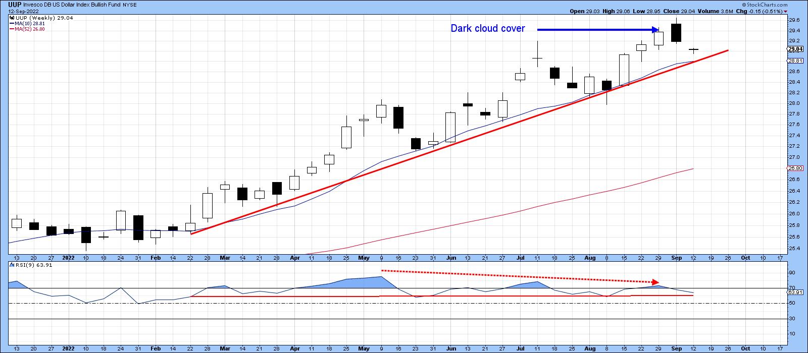
I mention this because, most weekends, I flip through a chartlist comprising weekly bars and candlesticks. Last week provided an almost textbook-perfect example of a bearish dark cloud cover for the Invesco US Dollar Index Bullish Fund (UUP). This is shown in Chart 1, where we see last week's black candle gap up at the opening, but with a close that pushed the price more than halfway below the previous week's white real body.
Dark Cloud Cover patterns are not that common, but, in my experience, tend to be quite powerful since they reflect an abrupt change in sentiment -- a form of whipsaw, if you will. These patterns usually have a negative effect of between 5 and 10 candles. Since we are talking weekly price action, that should translate into a 5-10-week time horizon, or the potential for an intermediate price move. It's always a good idea to make sure that these formations are confirmed with additional technical evidence; in this case, that would happen with a violation of the 2022 up trendline and 10-week MA, currently just under $29. Note that, since the spring, peaks in the 9-week RSI have been trending down as the price has been moving higher. A trendline violation and negative MA crossover would therefore confirm those divergences.
 Chart 1 Chart 1
Pound and Yen Sporting Bullish Weekly Hammers
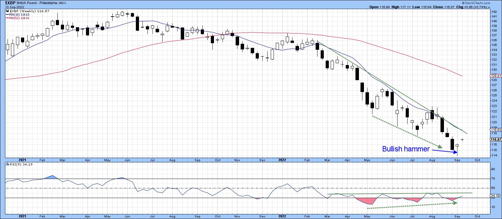
I'll return to the dollar/energy price theme later, but, first, let's consider the pound and yen. The pound is featured in Chart 2. It is sporting a bullish weekly hammer, which may have the power to push the currency back above its down trendline and the 10-week MA. Note that both are in the same vicinity and, therefore, have the effect of reinforcing themselves.
 Chart 2 Chart 2
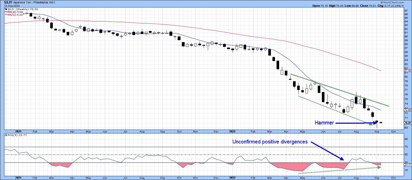
The yen is in a similar technical position, having also experienced a hammer candle. A 5-10-week respite from the recent strong downdraft is therefore likely, which suggests a reflex rally is in the cards.
 Chart 3 Chart 3
While these formations suggest that further near-term downside activity for the pound and yen is improbable and upside dollar action unlikely, there is little in the dollar's long-term technical picture to suggest the current primary uptrend is in danger of being reversed.
Oil Returns from the Brink -- or Does It?
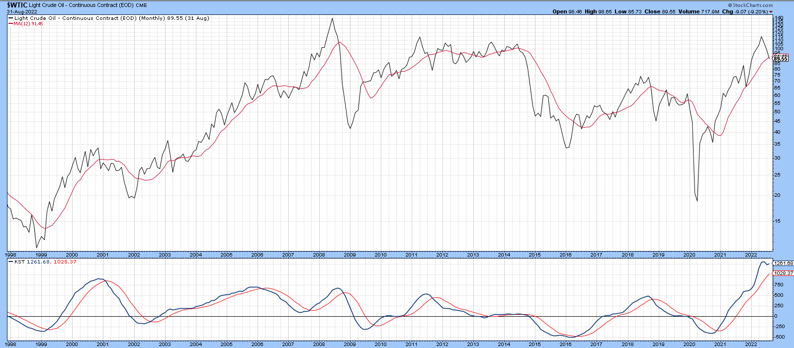
Most commodities look as though they have peaked on a primary trend basis, but, as I pointed out a few weeks ago, energy usually lags. If the dollar has topped out for a while, this potential weakness could provide a tailwind for oil prices. If not, then the bull market is probably over. Chart 4 shows that, at the end of August, the price of West Texas Crude was right at its 12-month MA and the long-term KST overstretched, but still above its MA. The trend is bullish, but at a crucial point.
 Chart 4 Chart 4
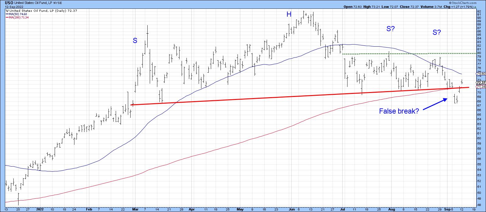
This extremely fine balance can also be appreciated from Chart 5, where you can see that the US Oil Fund (USO) recently dropped below its 200-day MA and the neckline of a head-and-shoulders top. Monday saw it cross back above these benchmarks, thereby hinting that the downside break may well turn out to be a whipsaw. Patterns that fail are usually followed by an above-average move in the opposite direction to the breakout. Consequently, the stakes are quite high, especially when the overstretched nature of the KST in Chart 4 is taken into consideration. There is little doubt, though, that a move above the right shoulder at the dashed green line in Chart 5 would represent a very bullish development, since it would confirm beyond a reasonable doubt that the downside break was a whipsaw.
 Chart 5 Chart 5
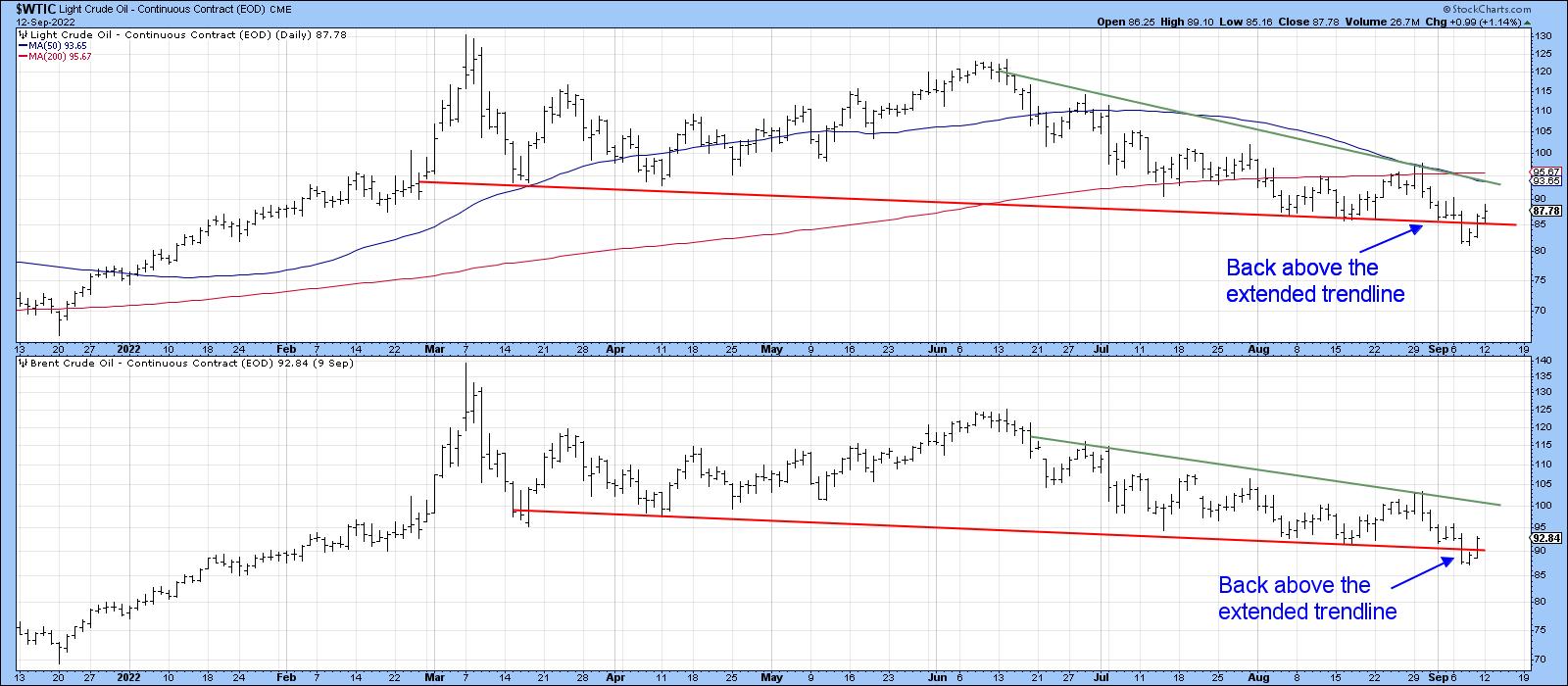
Chart 6 has a similar message, in that both West Texas and Brent crude prices also experienced what looks to be a false move to the downside.
 Chart 6 Chart 6
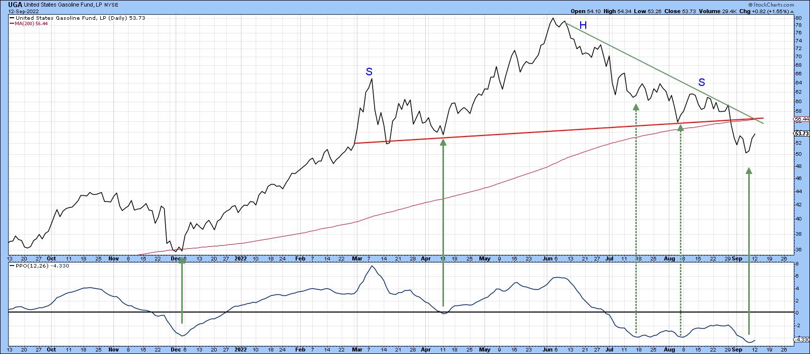
Not everything is in recovery mode, as the US Gasoline Fund has experienced a much more solid downside breakout. The two false upside reversals in the PPO are a reminder this fund may be in a bear market and a possible leading indicator (on the downside) for the energy market. It would need to clear the 200-day MA and both trendlines, say, to $58, in order to dispel such fears.
 Chart 7 Chart 7
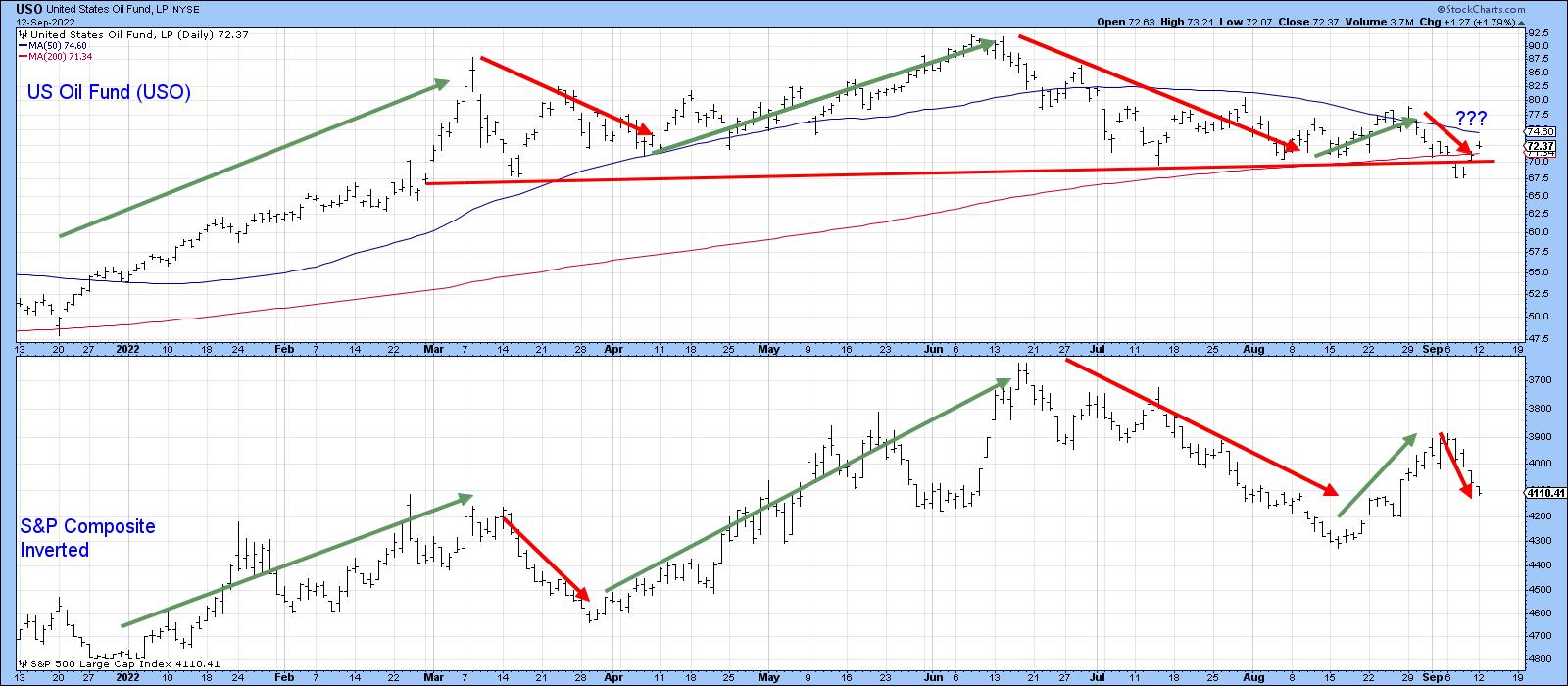
Recently, the oil price and the stock market have been moving in opposite directions, as shown by the arrows in Chart 8. It's by no means a perfect or permanent relationship, and I certainly wouldn't bet the mortgage on it. That said, it does suggest that, if oil prices move significantly higher and the relationship continues to hold, it would represent another worry that stocks have to deal with. The rationale being that energy prices suck discretionary purchasing power, thereby exacerbating any slowdown or business contraction that takes place.
 Chart 8 Chart 8
Good luck and good charting,
Martin J. Pring
The views expressed in this article are those of the author and do not necessarily reflect the position or opinion of Pring Turner Capital Group of Walnut Creek or its affiliates.
|
| READ ONLINE → |
|
|
|
| Trading Places with Tom Bowley |
| Do You Believe In Equal-Weighted ETFs? Really? |
| by Tom Bowley |
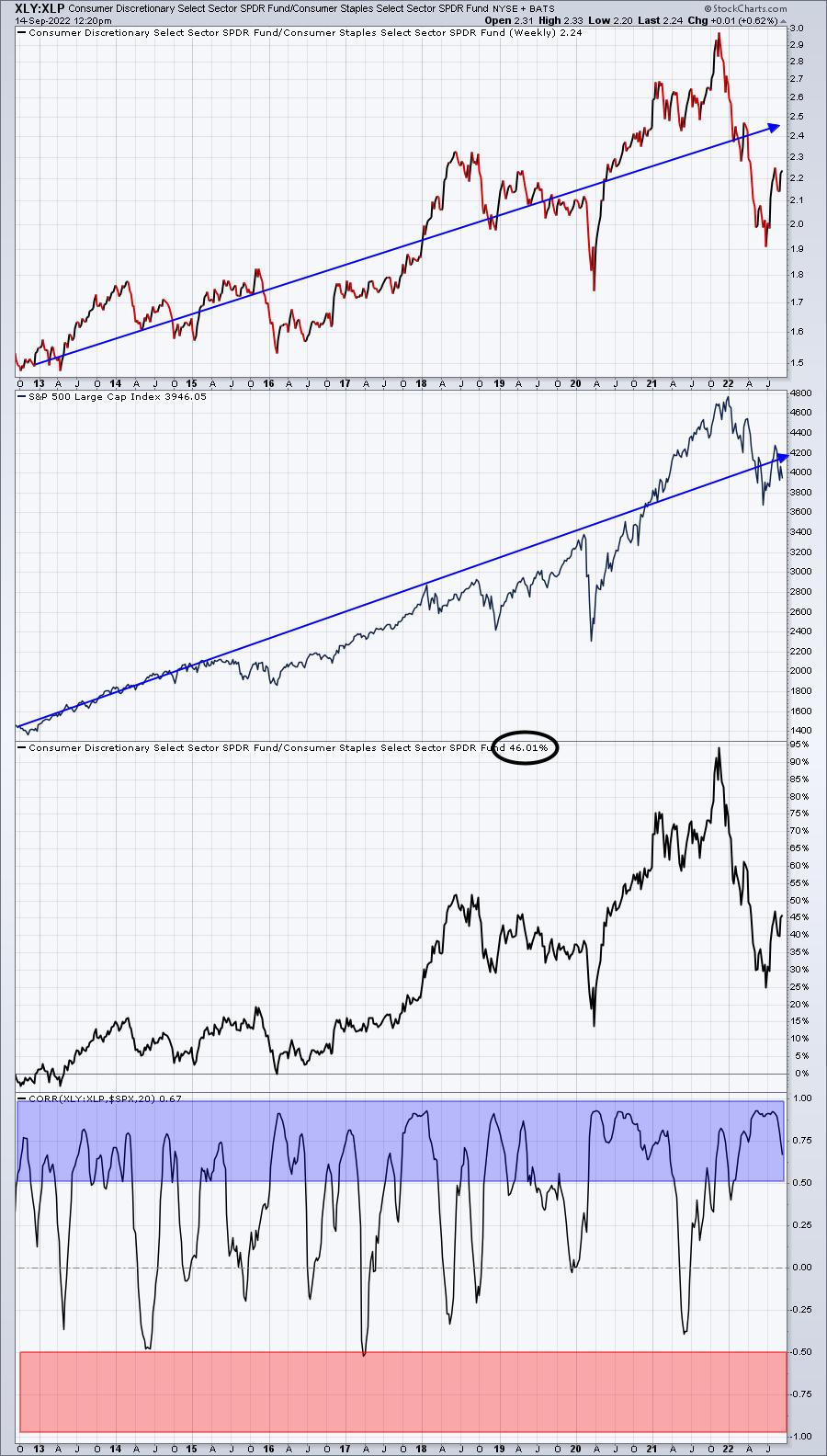
One of my favorite intermarket relationships exist between consumer discretionary (XLY) and consumer staples (XLP). It's a very quick way to see whether the stock market favors offense or defense. If the XLY:XLP ratio is rising, it's a signal to me that Wall Street believes prices are going higher. The opposite is true when the XLP is leading. If we use the correlation coefficient, we'll see just how solid this ratio can be:

Correlation spends plenty of time between +0.5 and +1.0, which is very strong positive correlation. Meanwhile, look at how often the XLY:XLP ratio shows inverse correlation in the -0.5 to -1.0 area. Essentially, zero times during the 10 years of this secular bull market. It should be fairly clear based on this visual that the XLY:XLP ratio is tightly and positively correlated with the S&P 500.
I've had many traders say that using the XLY isn't representative because Amazon.com (AMZN) and Tesla (TSLA) are so heavily weighted. Their argument is that this isn't a "true" measure. Really? So it makes more sense to equally weight companies that are "gnats" compared to these two "800-lb gorillas"?
Here are a few numbers to consider:
TSLA:
- Revenue (trailing 12 mos): $67 billion
- Quarterly Revenue growth: 41.60%
- EBITDA: $14 billion
- Quarterly Earnings growth (year over year): 97.80%
- Full-time employees: 99,290
AMZN:
- Revenue (trailing 12 mos): $486 billion
- Quarterly Revenue growth: 7.20%
- EBITDA: $52.6 billion
- Quarterly Earnings growth (year over year): N/A
- Full-time employees: 1,523,000
These two companies are EXTREMELY important to our economy. They are two of the most visible discretionary companies and weakness in either (or both) of them would be a devastating blow to consumer discretionary, the S&P 500, the NASDAQ, and to our economy.
Now let's pick two other random consumer discretionary companies from the small cap list:
Tuesday Morning Corp (TUES):
- Revenue (trailing 12 mos): $765 million
- Quarterly Revenue growth: 4.10%
- EBITDA: -$21.4 million
- Quarterly Earnings growth (year over year): N/A
- Full-time employees: 1,607
Zovio Inc. (ZVO):
- Revenue (trailing 12 mos): $230 million
- Quarterly Revenue growth: -25.70%
- EBITDA: -$38.4 million
- Quarterly Earnings growth (year over year): N/A
- Full-time employees: 1,365
So let me ask you this question. How many of you check the charts of TUES and ZVO when you're evaluating the strength of the stock market? Well, if you cling to the equal-weight theory, you are saying that the prospects and performance of TUES and ZVO are just as important as TSLA and AMZN. How crazy ridiculous is this? The last time I checked, the S&P 500 is market-cap weighted, as is the NASDAQ. What relevance does the equal-weighted version of the XLY:XLP have?
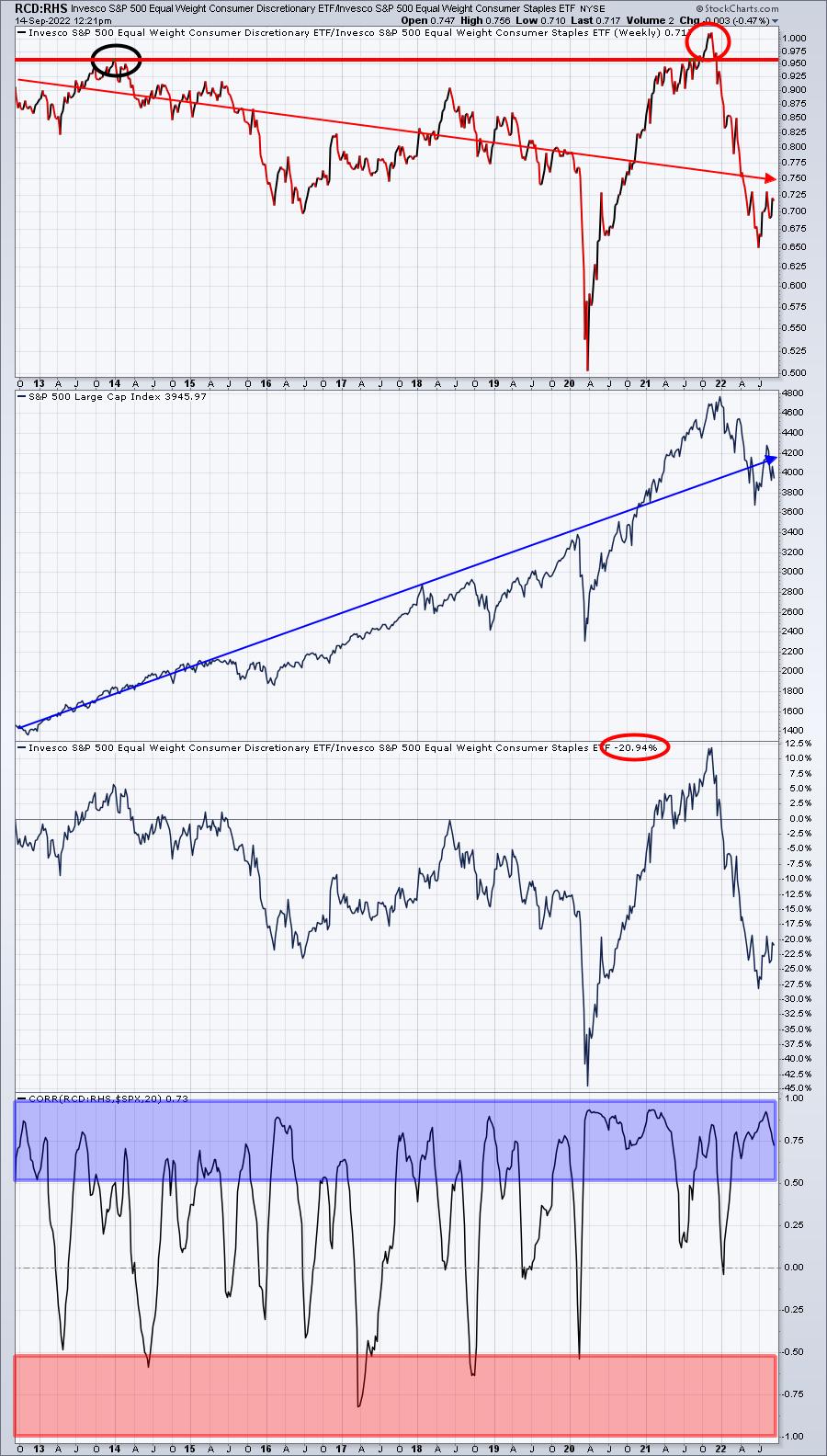
The equal-weighted version, by the way, is RCD:RHS. Let's check out this chart and see how it's performed over the past 10 years.

The overall short-term correlation here is mostly positive (though not as positive as the XLY:XLP) because we have 20-week look-back periods. But if you're waiting for the RCD:RHS ratio to break out to highs above the 2014 high, you'd have been waiting a long, long time. And guess what happened when it finally did break out? The S&P 500 fell apart.
I've had many tell me that the XLY:XLP ratio isn't a good signal to evaluate the health of the stock market, yet it continues to print higher highs and higher lows - just like the S&P 500. In the meantime, how have those RCD:RHS signals (no breakout confirmation) worked out? It had never broken out (until 2021), never confirming the 10-year secular bull market advance. If you're waiting for strength in this RCD:RHS ratio to validate the bull market, I wish you the best of luck.
Give me trading liberty (TSLA and AMZN), or give me investing death (breadth).
If you're interested in joining our FREE EB Digest newsletter (no credit card required), CLICK HERE.
Happy trading!
Tom
|
| READ ONLINE → |
|
|
|
| MORE ARTICLES → |
|
 Chart 1
 Chart 2
 Chart 3


 I published this the first time in November, 2017 and think it is just as appropriate now as then.
 Chart A - Year Returns of Various Assets
 Table A - Long Term Performance of Asset Classes
 Chart B Distribution of Returns based upon Percentage
 Chart C - Dow Industrial Average 20 Year Rolling Returns (1885 – 2012)