| THIS WEEK'S ARTICLES |
| John Murphy's Market Message |
| INTERMARKET VIEW REMAINS BEARISH |
| by John Murphy |
TREASURY YIELDS SOAR... An intermarket view across the various financial markets continues to present an overall bearish picture. And it starts with this year's surge in interest rates. Chart 1 shows the yield on 2-Year and 10-Year Treasury yields surging to the highest levels in more than a decade as the Fed embarked on an aggressive path to higher rates in order to lower inflation. In order to do that, however, it needs to slow down the economy enough to push it into a recession. That also has a bearish impact on stock prices which is one of the side-effects of an economy in recession. Stocks, which peaked earlier this year, usually peak in anticipation of a recession. Commodity prices, which usually peak later than stocks, peaked during June and continue to fall. That's usually a sign that the economy is already in a recession. Chart 1 also shows the red 2-Year Yield moving above the green 10-Year Yield earlier this year which signaled an inversion of the yield curve and another early warning of an impending recession. Another side-effect of the more aggressive Fed has been a surge in the value of the U.S. Dollar which has risen to the highest level in twenty years. While a rising dollar has helped push commodity prices lower, it's also causing problems for the global economy.
 Chart 1RISING DOLLAR HURTS FOREIGN CURRENCIES... Chart 2 shows the U.S. Dollar Index rising this week to the highest level in twenty years. That's been due mainly to the fact that the Fed has been raising interest more aggressively than foreign central bankers. A rising dollar normally has the effect of pushing U.S. commodity prices lower which may be a good thing. But it has the negative effect of pushing foreign currencies lower. One example of that is the Japanese yen in Chart 2 which has fallen to the lowest level in more than twenty years. The same is true of the British Pound and Euro which have also fallen sharply. Weaker foreign currencies can boost inflation in their respective countries at a time when foreign central bankers are raising interest to slow inflation. We saw that on Thursday when foreign bankers raised rates more aggressively to combat inflation and support their falling currencies. That may also explain why foreign stock markets have been falling harder than the U.S. which increases the threat of a global economic downturn. Chart 1RISING DOLLAR HURTS FOREIGN CURRENCIES... Chart 2 shows the U.S. Dollar Index rising this week to the highest level in twenty years. That's been due mainly to the fact that the Fed has been raising interest more aggressively than foreign central bankers. A rising dollar normally has the effect of pushing U.S. commodity prices lower which may be a good thing. But it has the negative effect of pushing foreign currencies lower. One example of that is the Japanese yen in Chart 2 which has fallen to the lowest level in more than twenty years. The same is true of the British Pound and Euro which have also fallen sharply. Weaker foreign currencies can boost inflation in their respective countries at a time when foreign central bankers are raising interest to slow inflation. We saw that on Thursday when foreign bankers raised rates more aggressively to combat inflation and support their falling currencies. That may also explain why foreign stock markets have been falling harder than the U.S. which increases the threat of a global economic downturn.
 Chart 2 Chart 2
COMMODITIES FOLLOW STOCKS LOWER.... As mentioned earlier, commodities usually peak after stocks as the economy enters a recession. The black bars in Chart 3 show the S&P 500 peaking at the start of the year before eventually falling into a bear market. The SPX is now retesting its August low. The red bars show the S&P Commodity Index peaking during June and falling this week to the lowest level since January. That also explains why commodity-related basic material and energy stocks are among the week's biggest losers. Falling commodity prices should help reduce inflationary pressures. Weaker commodity prices, however, are also consistent with a recessionary economy.
 Chart 3 Chart 3
OUTLOOK FOR STOCKS REMAINS BEARISH... All of the intermarket charts shown above carry bad news for stocks. And this week's heavy selling is a sign that stocks are likely headed lower. The weekly bars in Chart 4 show the S&P 500 failing a test of its 40-week (200-day moving) during August before heading back down to its June low. Prices are now threatening that earlier summer low and appear to be on the verge of resuming their 2022 bear market. The flat green trendlines mark Fibonacci retracement levels drawn from the 2020 low to this year's high. Those lines suggest some potential downside targets once the summer lows are broken.
 Chart 4 Chart 4
|
| READ ONLINE → |
|
|
|
| Art's Charts |
| Correlations Rise as Bear Extends its Grip |
| by Arthur Hill |
 Despite the bear market environment, a handful of stock-based ETFs were showing leadership with bullish Trend Composite signals. Representatives from dirty energy (XLE), clean energy (TAN) and utilities (XLU) were covered over the last few weeks and this article is a follow-up. These ETFs remain with bullish Trend Composite signals, but they succumbed to broad market selling pressure as correlations continue to rise and the bear extends its grip. Leading stock-based ETFs are still part of the stock market and vulnerable to the bear. Despite the bear market environment, a handful of stock-based ETFs were showing leadership with bullish Trend Composite signals. Representatives from dirty energy (XLE), clean energy (TAN) and utilities (XLU) were covered over the last few weeks and this article is a follow-up. These ETFs remain with bullish Trend Composite signals, but they succumbed to broad market selling pressure as correlations continue to rise and the bear extends its grip. Leading stock-based ETFs are still part of the stock market and vulnerable to the bear.
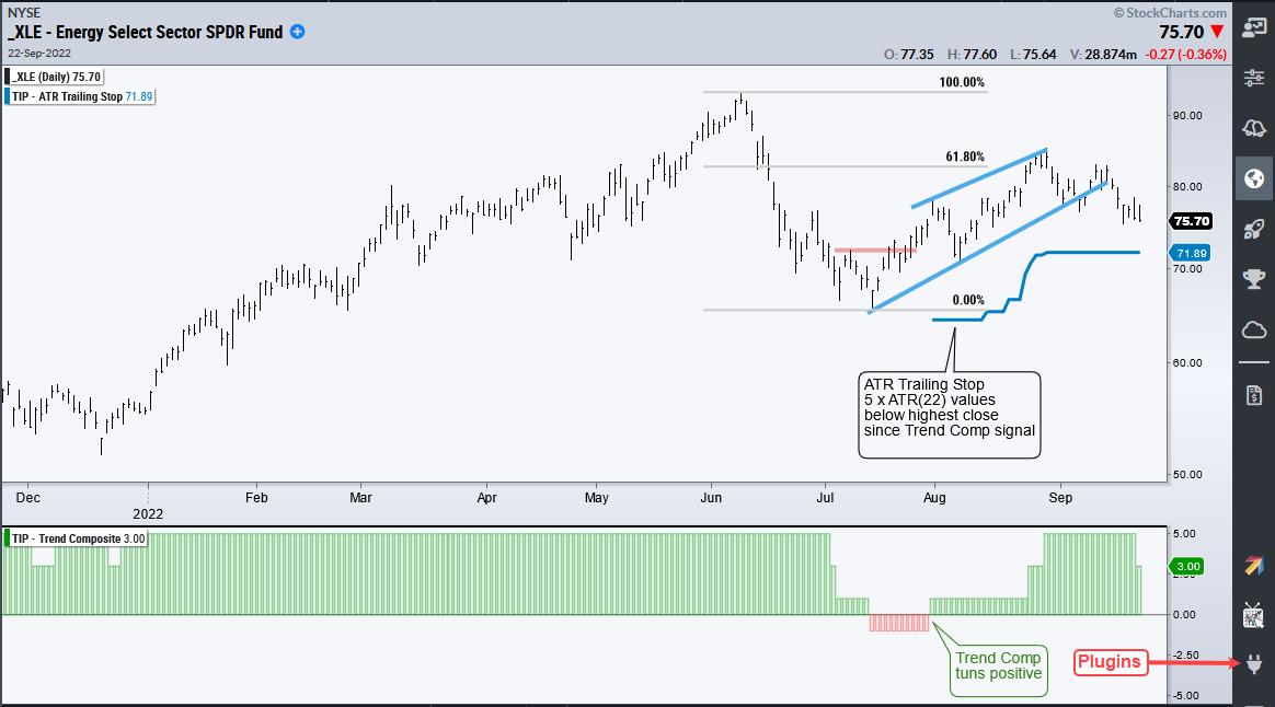
The first chart shows the Energy SPDR (XLE), which was featured on September 9th. The Trend Composite turned bullish on July 29th and the ETF extended higher after this signal, even holding up as SPY reversed in the second half of August. XLE could not escape the gravitational pull of the bear market over the last eight days and fell sharply. Even though the Trend Composite is still bullish and XLE remains above the ATR Trailing Stop, it looks like a lower high formed from June to September (~61.8% retracement) and the ETF broke wedge support to signal a continuation of the June-July decline.
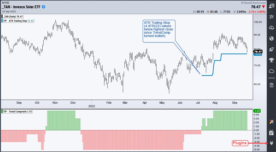
The next chart shows the Solar Energy ETF (TAN), which was featured on August 1st with a breakout. The Trend Composite turned positive just before this breakout and I set the intial ATR Trailing Stop near the June-July lows. TAN was holding up well two weeks ago, but fell sharply with the rest of the market and is nearing the ATR Trailing Stop. Whether bull or bear market, traders need to plan their trade and then trade that plan.
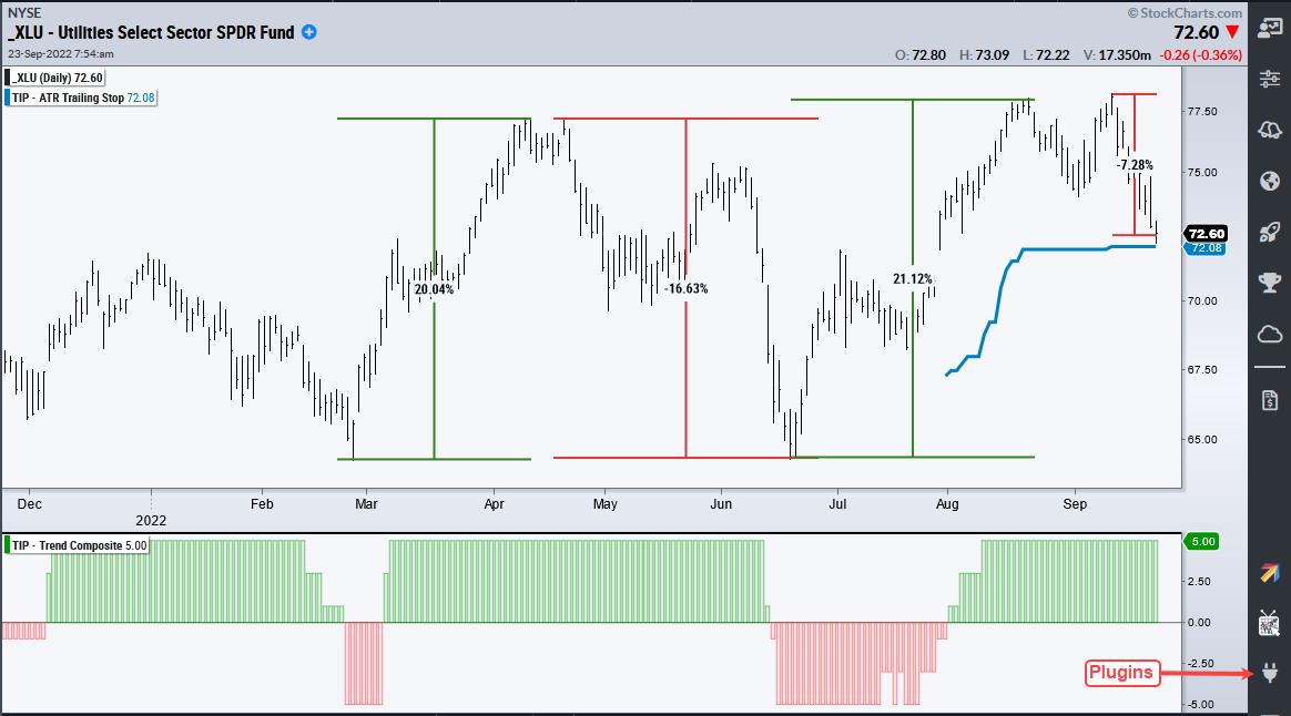
The final chart shows the Utilities SPDR (XLU) with some massive swings this year (+20%, -16%, +21%, -7%). The Trend Composite remains positive, but the swings are causing whipsaw signals. XLU is currently testing its ATR Trailing Stop (blue line), which was initially set to align with the July low. Note that my article on September 2nd showed that so-called defensive sectors are not immune to the bear. Typically, they just decline less.
Richard Russell of Dow Theory Letters (RIP) used do say that the winner in a bear market is the one who loses the least. TAN, XLE and XLU are holding up better than SPY year-to-date and over the last two months, but they are not immune to the bear as correlations rise. A bear market environment increases risk for all stock-related ETFs and the chance of picking winners is greatly reduced.
TrendInvestoPro remains very selective when it comes to stock-based ETFs because the Composite Breadth Model has been bearish since April 11th and the vast majority of ETFs are in downtrends. Our fucus is on non-stock ETFs, but even the pickings here are slim. Click here for immediate access to our reports, weekly video and ETF strategy.
StochClose, the Trend Composite, ATR Trailing Stop and eight other indicators are part of the TIP Indicator Edge Plugin for StockCharts ACP. Click here to learn more and take your analysis process to the next level.
---------------------------------------
|
| READ ONLINE → |
|
|
|
| The Mindful Investor |
| Exceptionally Bearish Breadth |
| by David Keller |
I have very fond memories of time spent in the Fidelity Chart Room, from discussing the merits of contrary opinion with teams of financial advisors to teaching student investment clubs about the value of technical analysis. But one of my favorite "behind the scenes" moments came in 2009.
You see, much of the Fidelity Chart Room consists of wall-sized paper charts telling the history of the financial markets through the language of technical analysis. (Yes, I have such positive memories of time spent with paper charts that I basically turned my home office into a miniature Chart Room!) Back in 2009, the S&P 500 had broken back below 1,000 as investors grappled with the realities of the financial crisis. Stocks were breaking support and the charts went from bad to worse seemingly every day. The downturn was so severe, in fact, that some of the paper charts in the room had to be reprinted because the price had gone below the lower end of the printed price scale.
That's right, the market literally went off the bottom edge of the paper. Our Chart Room team had to reprint entire walls of the room to adjust the scales to accommodate the most recent bearish price action. Talk about a fantastic piece of anecdotal evidence, when the Chart Room has to be rescaled due to bearish price action.
Soon after, the 2009 low was in place and the market began to rally. But I never forgot the lesson that extreme price movements to the downside, despite how painful they can be during the moment, have always returned back to new highs. Sometimes it has taken longer than other times, but, 100% of the time the market has indeed recovered.
ChartCon 2022 is happening in less than two weeks! This week, I spoke with Marc Chaikin about his expectations between now and year-end 2022 for equities. I also chatted with Joe Rabil, Julius de Kempenaer and Bruce Fraser about their "Sector Deep Dive" presentations. We have so many ideas and perspectives to share with you, and you don't want to miss this rare opportunity to learn from some of the top names in technical analysis! Sign up today.
So when I see the AAII Survey get incredibly bearish, with over 60% of respondents saying they are bearish on the US stock market, I have to acknowledge two things; 1) the market is most likely going lower for now, and 2) the market is eventually going to make new all-time highs again.
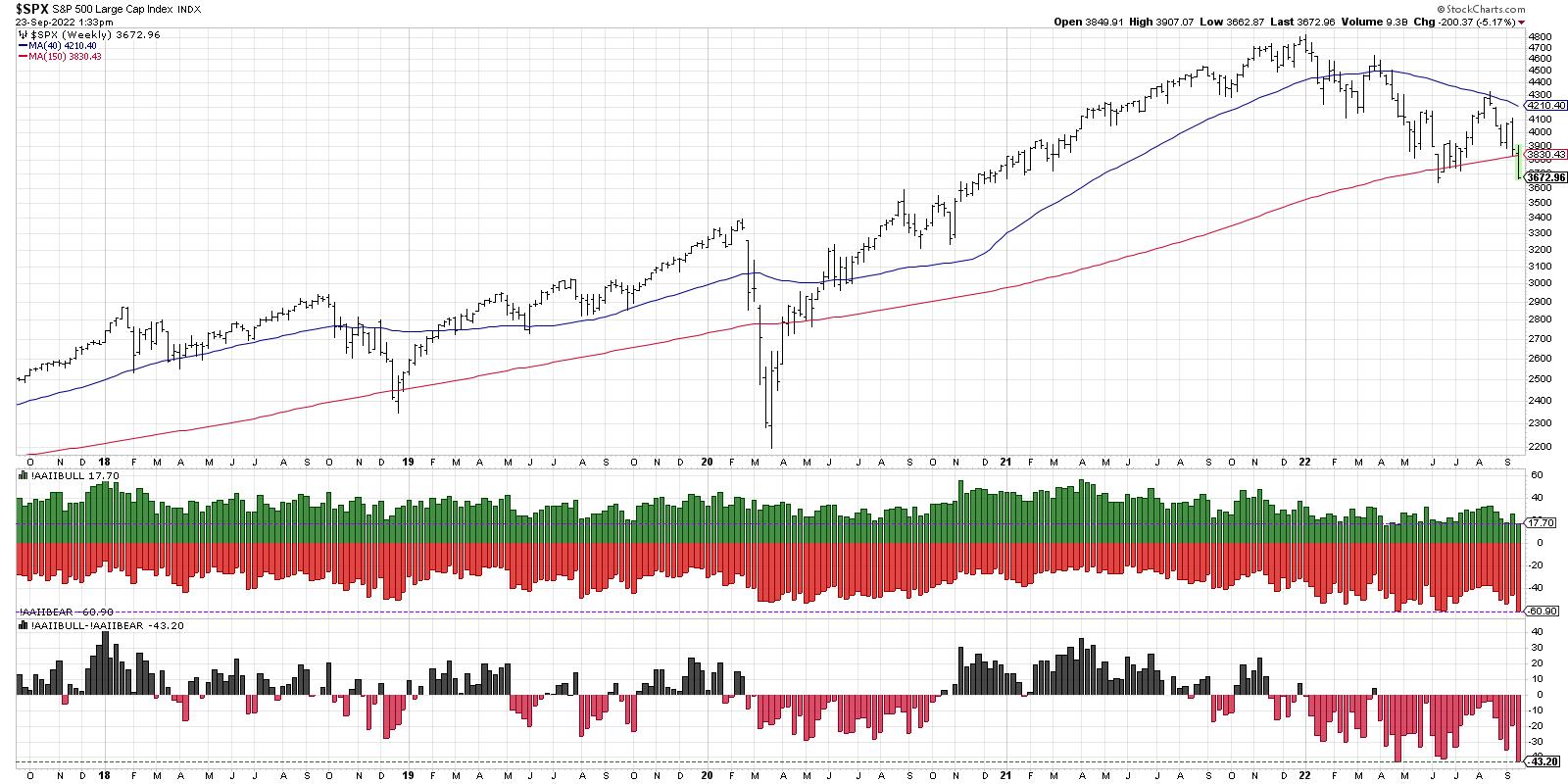
The AAII bearish reading has reached 60% two times already in 2022, in April and June. While the bearish reading in June lined up well with the June market low, it's worth noting that the April 60% reading occurred in the midst of a downturn. So just because the indicator hits 60% does not guarantee an imminent bottom.
We can also look at the spread between bulls and bears (bottom panel), which shows bears outnumbering bulls by about 43%. While this is the lowest reading for the last five years, we have to remember that indicators like this can and do get much lower.
Let's bring in more data and see what we can learn.
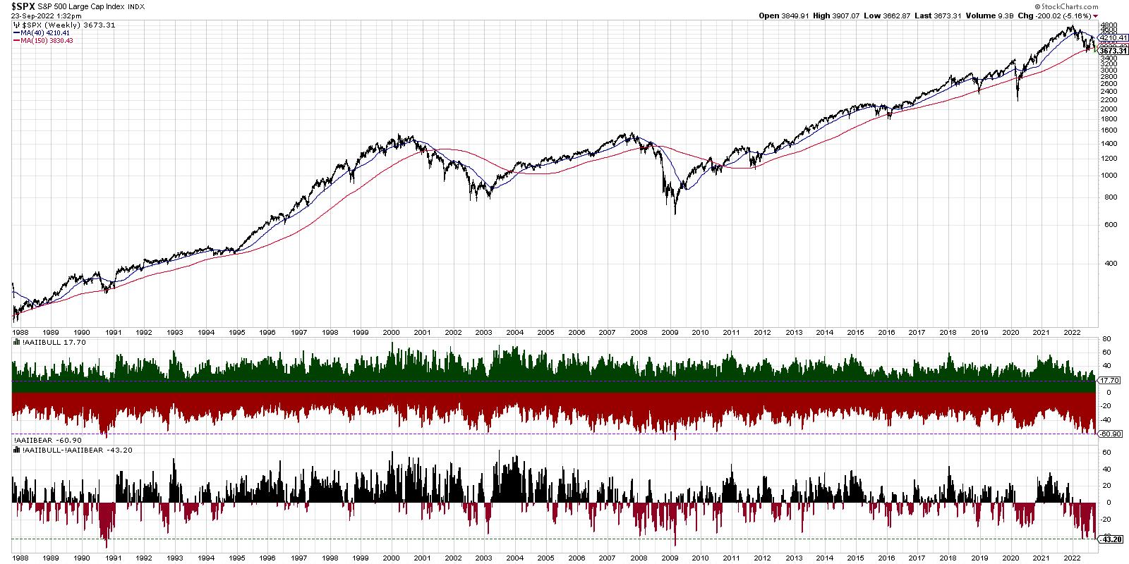
How often have we seen over 60% bears in the AAII survey, along with a spread of over 40% between bears and bulls? Going all the way back to the 1987 market crash, this has only happened two other times: in 2009 and 1990.
In 2008-2009, you'll see that the AAII bearish reading first reached 60% in early 2008. The indicator showed consistent readings around that level for another year before the ultimate bottom in 2009.
In 1990, it was less than four months between the first 60% bearish reading and the ultimate bottom in prices. Note that, in 1990, the S&P 500 stopped right at the 150-week moving average before moving higher. In 2008, the bounce off the 150-week moving average was the first step of multiple painful steps lower.
In both 2009 and 1990, the spread between bears over bulls eventually reached over 50% at the market bottom. So, based on that simple analysis, we may not be at the market bottom just yet.
So the good news is we've seen AAII readings lean even more bearish than current levels. The bad news is the most recent example of this pattern, 2008-2009, saw the market move materially lower after the initial bearish signs were registered.
My conclusion: this downturn may be just the beginning.
RR#6,
Dave
P.S. Ready to upgrade your investment process? Check out my YouTube channel!
David Keller, CMT
Chief Market Strategist
StockCharts.com
Disclaimer: This blog is for educational purposes only and should not be construed as financial advice. The ideas and strategies should never be used without first assessing your own personal and financial situation, or without consulting a financial professional.
The author does not have a position in mentioned securities at the time of publication. Any opinions expressed herein are solely those of the author, and do not in any way represent the views or opinions of any other person or entity.
|
| READ ONLINE → |
|
|
|
|
|
| RRG Charts |
| Stocks Sinking Faster Than Dollar Can Rise -- Time to Broaden Your Horizon |
| by Julius de Kempenaer |

When markets across the world and all asset classes are dropping, it's time to put things into (international) perspective and see if any alternatives to US stocks are available.
I always keep an eye on this Relative Rotation Graph, which holds a group of international stock market indexes and plots them against the Dow Jones World Index.
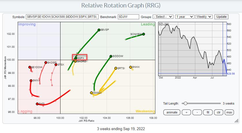
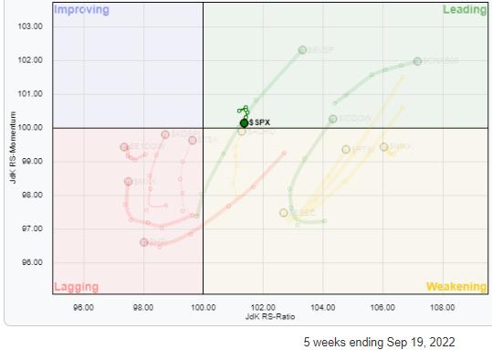 The S&P ($SPX) is slightly hidden behind the tails of the Brazilian Bovespa and the Australian All Ordinaries indexes. The small chart highlights the rotation for $SPX over the last five weeks. It reveals that, in this universe, the $SPX tail is the only one on a negative RRG-Heading. With the US making up almost half of the benchmark, many other markets in the universe must rotate in opposite directions. This is exactly what we see happening on this RRG. The S&P ($SPX) is slightly hidden behind the tails of the Brazilian Bovespa and the Australian All Ordinaries indexes. The small chart highlights the rotation for $SPX over the last five weeks. It reveals that, in this universe, the $SPX tail is the only one on a negative RRG-Heading. With the US making up almost half of the benchmark, many other markets in the universe must rotate in opposite directions. This is exactly what we see happening on this RRG.
Looking at the graph above, there are three markets that stand out in a positive way. They are the three tails inside the leading quadrant: Brazil ($BVSP), Indonesia ($IDDOW) and India ($CNX500). With US stocks sinking hard now, these rotations are becoming more and more pronounced.
Brazil
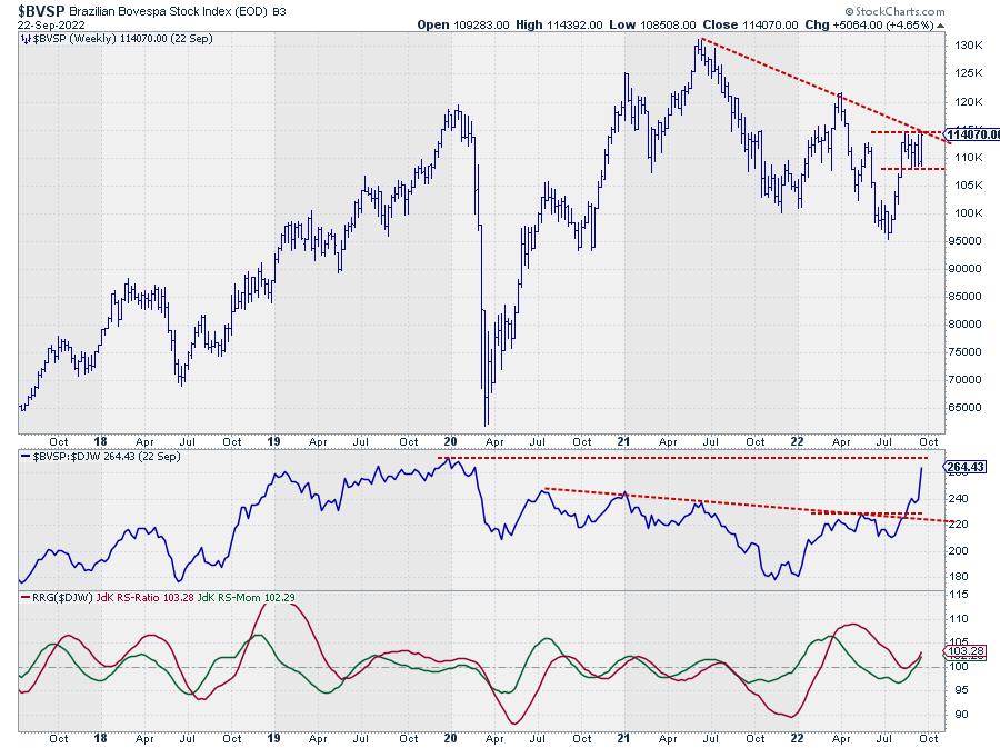
The $BVSP Index is nowhere near its most recent summer lows (95000). Instead, this market is pushing against a double resistance level offered by the falling trendline, coming off its 2021 high, and the level of the most recent high (August) in the area around 11500.
After two years of relative weakness, the relative strength for $BVSP vs. the DJ World index and, therefore, the S&P 500, is now shooting higher,
India
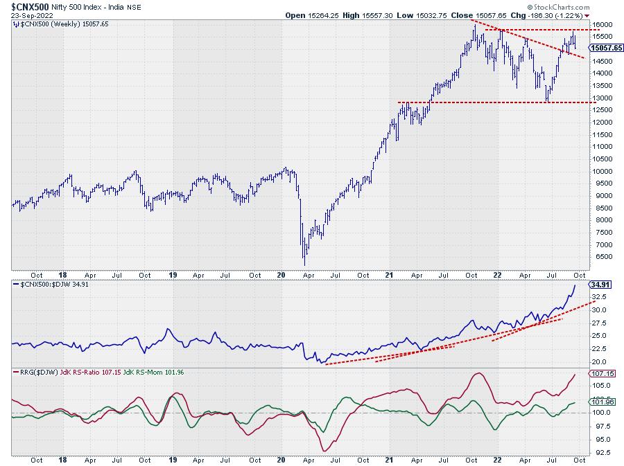
The second tail inside the leading quadrant is for the Indian $CNX500 index. Instead of challenging its summer lows, this market is also pushing against overhead resistance, sending relative strength rapidly higher.
Looking at the RRG-Lines, the $CNX500 index is already in a relative uptrend vs. the DJ World index since August 2020, when both RRG-Lines moved above the 100-level. Since then, the JdK RS-Momentum line has dipped a few times below 100, causing a few rotations completed at the right-hand side of the RRG without pushing the tail into the lagging quadrant. Underscoring the strong relative trend, the recent acceleration of relative strength is giving Indian stocks another positive push against the rest of the world, and certainly against the S&P 500.
On the price chart, $CNX500 has managed to take out the falling resistance line and is now challenging overhead resistance coming from the 2021-2022 peaks. Breaking above 16000 would push this market to new all-time highs and unlock more upside potential.
Indonesia
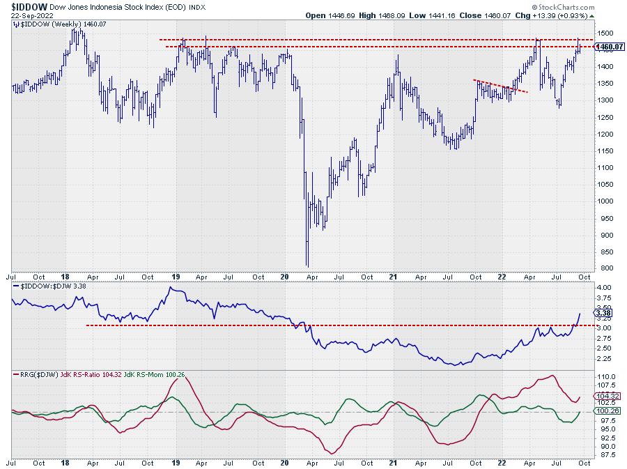
The big chart above shows the $IDDOW pushing against an almost five-year-old overhead resistance barrier. Since the end of 2021, this market has started to outperform the world index and, very recently, managed to break above the most recent peaks in relative strength, giving the relative trend another boost. This recent push in relative strength is causing the RRG-lines to curl back up again, and it is bringing the green JdK RS-Momentum line above 100, pushing the tail back into the leading quadrant.
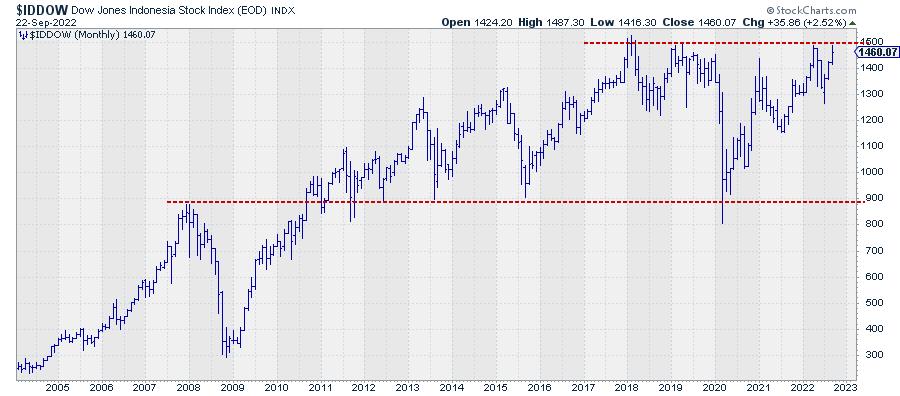
The smaller chart is the monthly chart of $IDDOW and shows how important that overhead resistance level is. Once that breaks a lot of upside potential will be unlocked.
The US Dollar
For a long time, the strength of the US dollar made it less interesting for US-based investors to look at foreign stocks. Investing in foreign stocks by default means exposure to foreign currency. And when the US dollar is getting stronger and stronger against pretty much all currencies around the world, that creates a drag on any exposure to foreign stocks.
This can be seen very well when you chart the various ETFs that offer exposure to these foreign markets. For the three markets charted above, these are EWZ for Brazil, INDA for India and EIDO for Indonesia. These ETFs are quoted in USD, so they do not represent the actual buying and selling in those specific markets, as these indexes will be multiplied by the USD exchange rate for the local currency.
That is why I never look at the charts of these ETFs to analyze trends or mark support and resistance levels. For that, I use the actual index chart. But these ETFs are great instruments to create exposure to foreign markets when needed.
The recent relative strength in these indexes is so strong that they are now countering the drag coming from the strength of the US dollar and sending their relative strength lines for the ETFs vs. SPY upward.
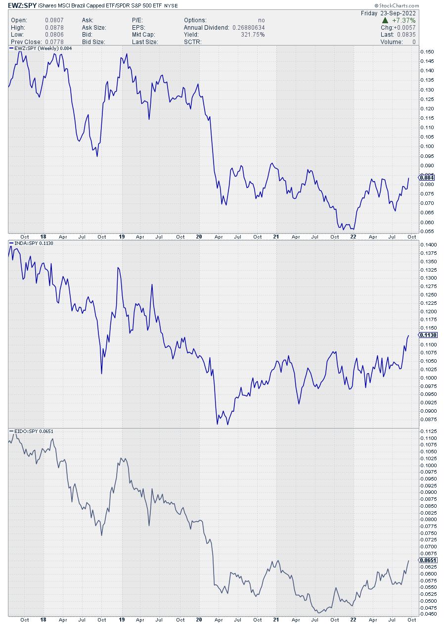
All of a sudden, a few of these foreign stock markets are becoming interesting alternatives for US investors, as long as the current slump remains in play.
#StaySafe and have a great weekend, hope to see you again next Tuesday for a new episode of Sector Spotlight.
--Julius
|
| READ ONLINE → |
|
|
|
| Martin Pring's Market Roundup |
| This Chart Says the June Lows Will Not Hold |
| by Martin Pring |
The relationship between the stock market and money market interest rates is as old as the hills. The "hills," in this case, go back to 1900 and before.
The concept rests on the idea that, at the beginning of the cycle, when the economy is falling like a stone, the Fed injects liquidity into the system to get things moving again. As soon as the stock market senses this liquidity injection will have a positive effect on business activity, it does not wait, but immediately rallies in anticipation the next recovery. That event takes place at the start of the brown shading in Figure 1, which has been flagged by the letter "S" representing a bottom in stocks. The letter "B" stands for a low in bond prices, or, more accurately, its reciprocal, a high for interest rates.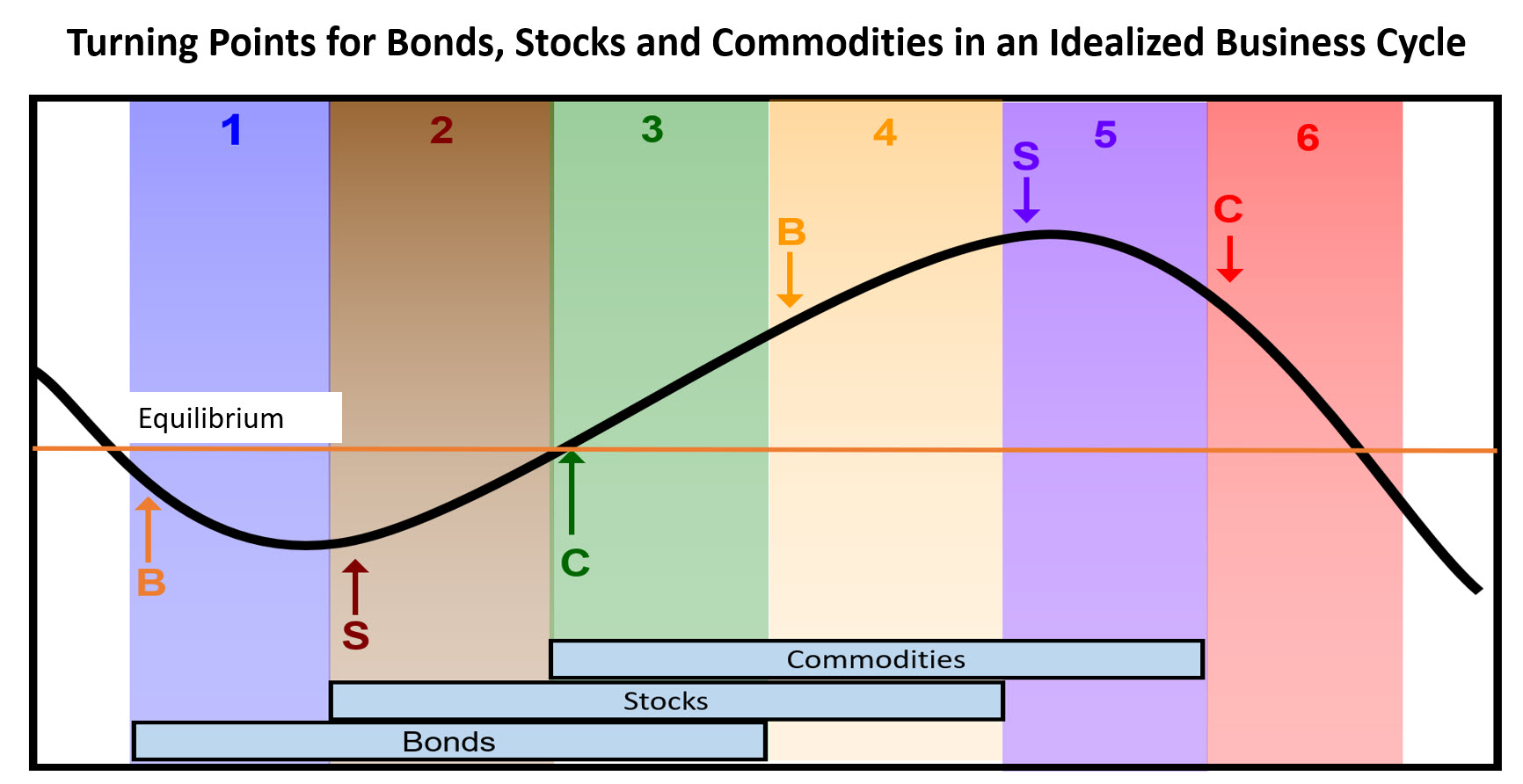 Figure 1; Source: Martin Pring's Intermarket Review Figure 1; Source: Martin Pring's Intermarket Review
Chart 1 brings us into the real world with a comparison between the inflation-adjusted S&P Composite and the yield on 3-month commercial paper. The vertical lines intersect with the recession-associated lows in the stock market, and the small red-dashed arrows tell us that, in virtually every situation, peaks in the yield lead those of the stock market. When it does not, the yield peaks and the stock market bottoms coincidentally. Given that the Fed is expected to raise rates on at least two more occasions before the current rate hike cycle ends, it seems almost inescapable that money market rates are headed much higher.
Bearing in mind the leading role played by rates, it seems a small leap to conclude that the June low was not the bottom of the 2022-?? bear market. Also, using industrial commodities as our base, all three markets are below their 12-month moving averages, which puts us currently in that pink shaded area in Figure 1. That means that there is a likelihood further stock market losses lie ahead.
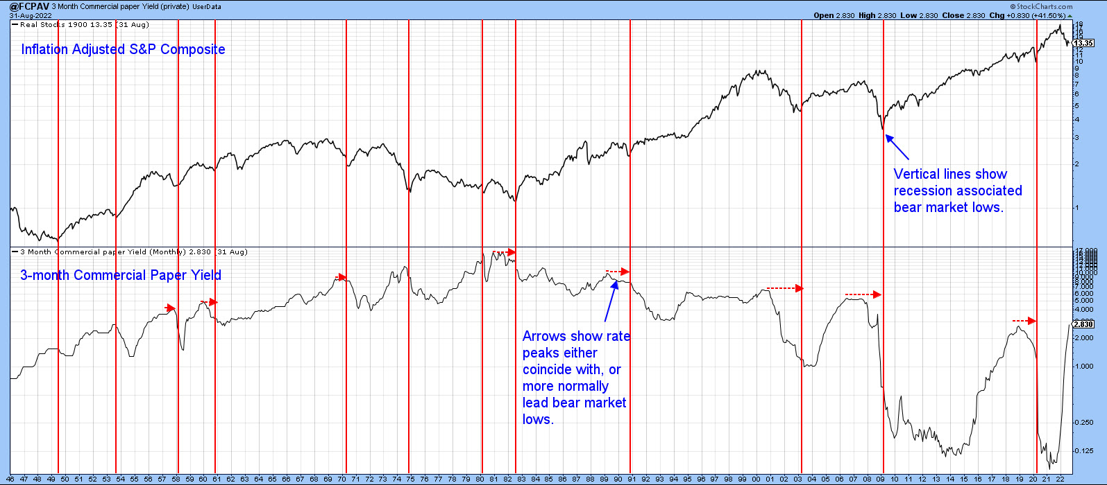 Chart 1 Chart 1
Recent Chart Action
Chart 2 shows weekly bar action for the S&P Composite, where we can see the formation of a bullish two-bar reversal earlier in the month. This should have had a favorable effect on prices, which indeed it did at last Monday's opening. However, by the end of the week, the Index had abruptly dropped below the previous week's lows, thereby forming a bearish outside bar. In doing so, it had the effect of cancelling the positive effects of the two-bar reversal. These one- and two-bar price patterns are only expected to have an effect on prices for 5-10 bars. However, it's important to remember that the outside bar in Chart 2 reflects weekly data and, as such, is expected to have a negative influence on prices for between 5-10 weeks, enough to do some serious damage, unless it too is quickly cancelled.
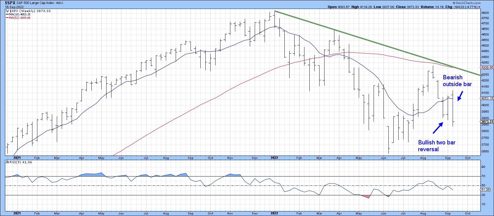 Chart 2 Chart 2
Chart 3 looks at the NASDAQ over the same period, but in the form of weekly candlesticks. Here, we can see that the Index has been tracing out a bearish consolidation engulfing formation over the course of the last two weeks. Although I am not showing it, the S&P did the same thing, which of course reinforces these signals. It should also be noted that, since the beginning of this year, the real bodies experienced consistent support or resistance at the blue 10-week MA. Consequently, last week's attempt to surpass the average at Monday's opening takes on some added negative significance.
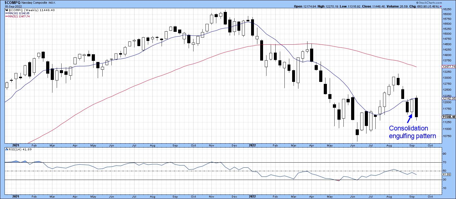 Chart 3 Chart 3
Charts 4 and 5 use daily data and their message is also bearish, as three of the four averages have now broken down from consolidation head-and-shoulder formations.
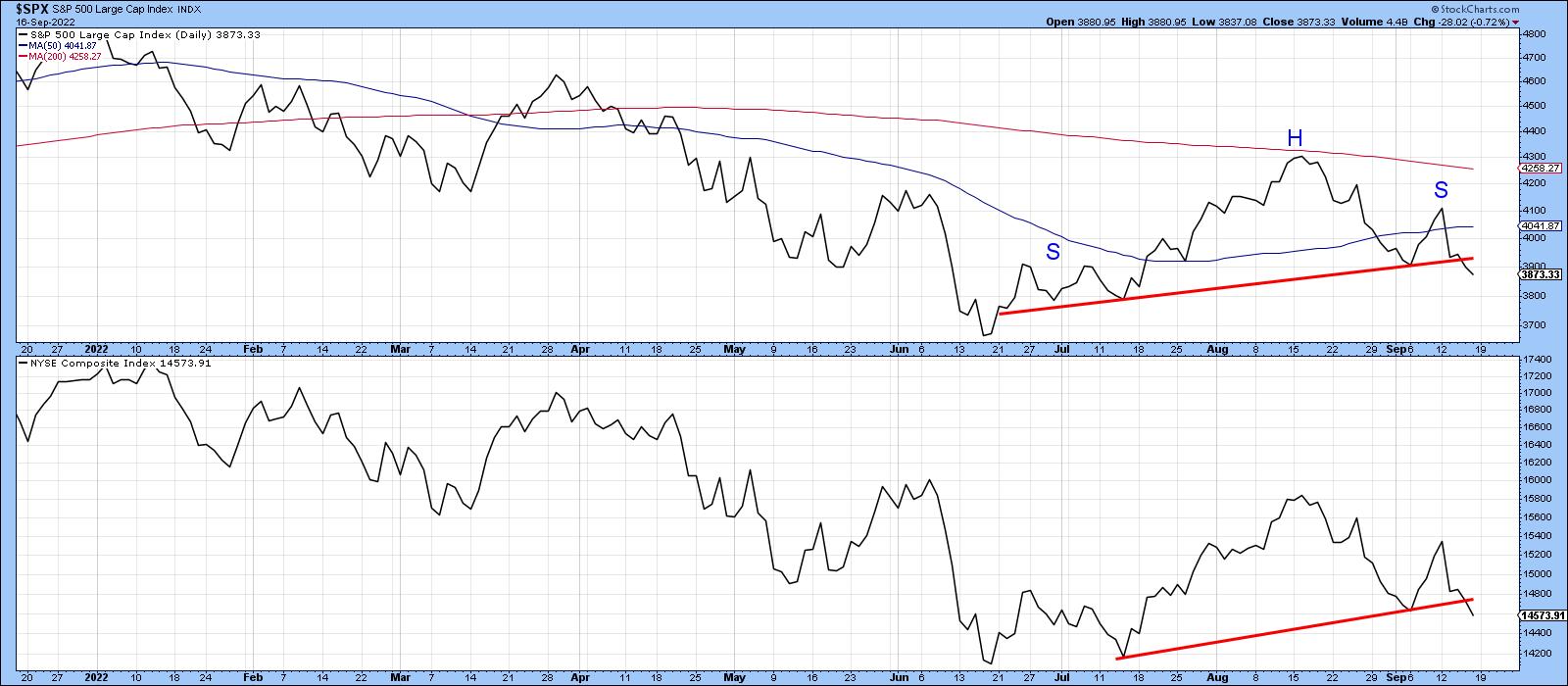 Chart 4 Chart 4
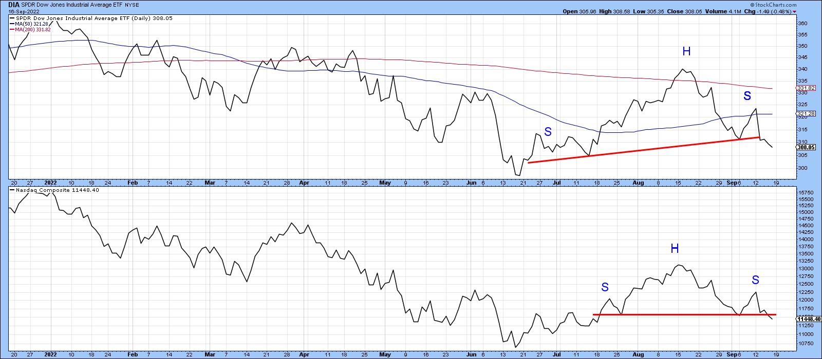 Chart 5 Chart 5
The Long-Term Picture Again
Finally, we end up with a long-term chart featuring the NYSE, S&P and NASDAQ. All three crossed below their 12-month moving averages some time ago, but are now resting on mega up trendlines. What worries me is that the weak short-term technical position demonstrated by the four previous charts could easily tip over into the longer-term structure. Similar breaks occurred during the 2007-09 bear market. Of course, we will not know for sure until the end of the month because it's a monthly chart, so there is time to avoid a decisive penetration of these lines. If one does take place, though, it will increase the risk of a more serious long-term decline or multi-year trading range.
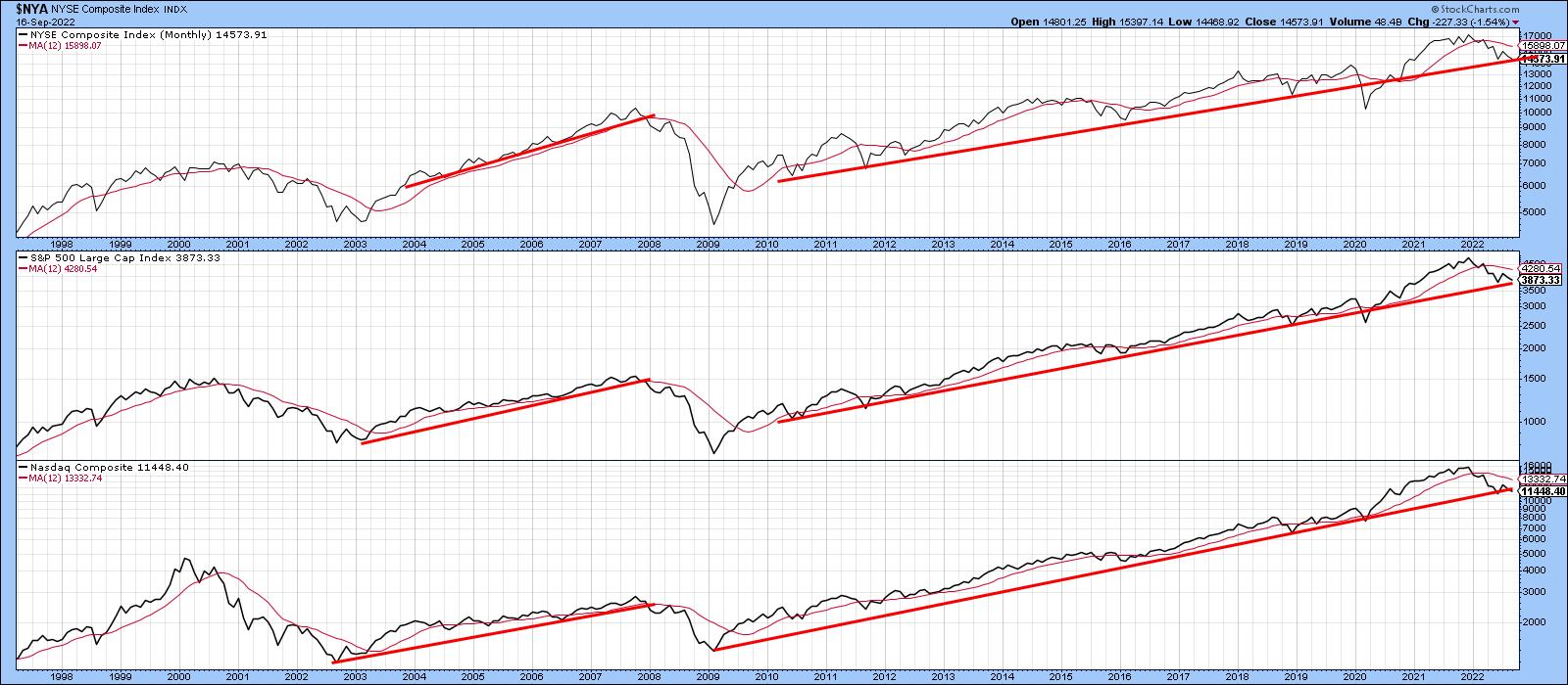 Chart 6 Chart 6
Good luck and good charting,
Martin J. Pring
The views expressed in this article are those of the author and do not necessarily reflect the position or opinion of Pring Turner Capital Group of Walnut Creek or its affiliates.
|
| READ ONLINE → |
|
|
|
| The Traders Journal |
| Five Decades Of Personal Stock Market Passages, Tools, Lessons And Stories: Part II |
| by Gatis Roze |
 To start, I want to make two points. Investing successfully requires that you remain engaged and motivated. Just because you choose to ignore the markets, the markets won't reciprocate and ignore you. Zig Ziglar said, "People often say that motivation doesn't last. Well, neither does bathing — that's why we recommend it daily." One of my goals is to keep you engaged and motivated. To start, I want to make two points. Investing successfully requires that you remain engaged and motivated. Just because you choose to ignore the markets, the markets won't reciprocate and ignore you. Zig Ziglar said, "People often say that motivation doesn't last. Well, neither does bathing — that's why we recommend it daily." One of my goals is to keep you engaged and motivated.
My second point follows the first. Investing is all about change. My observation is that often there isn't an immense difference between an average investor and a great investor.
I've met many passionate but average investors who are only excited about their vision of themselves as being stock market gurus. A few winning trades can do that. Instead, they need to be both passionate and disciplined about learning to be a competent and consistent investor. In other words, embrace both change and personal growth.
Reality is this. The education of an investor is never done. Dare I say it: we must suffer for our craft. Perhaps think of yourself as a machine learning algorithm. Every investment experience — be it optimal, sub-optimal or negative — should result in an adjustment to the investor's personal algorithm.
So these two points about ongoing motivation and continuing your education together lead directly to my first life passage and address my two objectives — staying motivated and growing as a person. Coincidentally, this blog's title — "The Traders Journal" — has reflected this ever since I began to write these in 2012 .
Passage #1 - Keeping a Journal
I started keeping a journal when I was 13 years old. My track and field coach was John Hudson who eventually became Canada's National Coach. He encouraged me to keep a training journal. He assured me that the result would be something he labelled as "crystallized wisdom". Gosh — who wouldn't want that?! It sounded as if Lord of the Rings would speak to me. It did in fact change my life, both in athletics and investing.
The foundations for my best races were well documented in my journal. I could thereby focus on replicating and improving my preparation for competitions. Similarly, disappointing results were usually explained in the training journal leading up to race. These days digital and hand written journals are common place in sports — be it F1 racing or the NFL, NHL, NBA and MLB. My trading journal today is much more detailed and structured, and I've written various blogs describing my journal. I encourage you to keep a trading journal. You will not be disappointed in the value it yields.
Passage #2 - What vs. Why
When I made the personal commitment to become a full-time investor, I had the sheer good fortune (more like divine intervention) of running a small ad looking for part-time help and having Paul Ferwerda call me. In 1970, Paul was the founder and first president of the Technical Securities Analysts Association (TSAA) in San Francisco. Sorry, New York. The TSAA came first — before the Market Technicians Association (MTA). Paul had retired from Bank of America and turned out to be the ideal mentor for me. He taught me that the market only rewards investors who act upon "WHAT" is happening in the present moment.
Paul said educated investors can waste precious time and energy focusing on "WHY". The assumption being that you'll be rewarded for knowing why. "WHY" may be more intellectually satisfying, but unfortunately it is often late to school, allowing only "WHAT" to score the higher grades.
Paul also taught me that the market is a complex auction arena fueled by millions of investors voting with their money based upon their unique information, beliefs and emotions. Eventually with an equity, you might learn exactly "WHY" a price move happened. The most importance for profitability, however, is "WHAT" is happening now. Are the buyers or sellers winning this war? The chart tells you this. The charts do not lie. Trade the "WHAT" — today. You'll learn the "WHY" tomorrow.
A key corollary Paul taught me was that by trusting the charts, I was liberated to deploy powerful technical tools and focus on putting the winds of probability at my back. But more on that later. For now, trust your charts. Here's a blog I wrote on the topic.
Passage #3 - The 5 Stages of Investor Growth
The stock market requires humility. Regardless of your IQ or the letters after your name, the stock market doesn't care how smart or educated you are. Yes, you may have a streak of winning trades that all ended with the raising of champagne glasses and a salute to your wisdom. Reality is that the University of Wall Street requires you to pay tuition. The well documented "5 Levels of Investor Growth" is described in detail in our book, Tensile Trading. It's widely accepted and was not our creation. It's similar to a college freshman having to complete their sophomore, junior and senior year before graduating. That's how it is. You don't start first year and then pole vault over your sophomore and junior years to land as a senior in your second year.
Investors similarly start as "novices" with a mixed bag of tools and ideas. There is no jumping levels from "advanced beginner" to "proficient." You might, however, accelerate through the "competent' stage. Nonetheless, you must spend some time in each stage. It's akin to a law of nature! God will be laughing if you believe you've become a Level 4 "proficient" investor in under a year.
Be humble. Accept paying tuition. We all did. Understand that if you make a disciplined and organized effort, you will progress from
- Novice
- Advanced Beginner
- Competent Investor
- Proficient
- Expert
The market will reward you as you grow. Read more.
TOOLS
The investor will always be paramount. The tools are secondary. This is why Stage 3: The Investor Self is the most important chapter in our book, Tensile Trading: The 10 Essential Stages of Stock Market Mastery. Novice investors don't believe it. Expert investors know this to be true.
Let me paraphrase from a favorite movie of mine — Bottle Shock. Claude Debussy used a standard piano. Monet used off-the-shelf paint. Rodin's bronze was not a unique metal. But look what they all achieved. It wasn't about the medium — it was about the artist. Investors must embrace the belief that their financial masterpiece can be created with straight-forward off-the-shelf tools. It's about the investor — it's not about the tools. It's always been that way.
Having said that, today we investors have far too many tools from which to choose. It's analogous to standing in front of a fire hose trying to get a drink of water. It's overwhelming. Herein, too, lies a conundrum. It's counter-intuitive but I've learned over many decades of investing that "simplification tames complexity in the stock market."
We investors need tools. We need a few tools and we need the right tools. Unlike our capitalistic mantra of "more", investors should strive for the art of reduction with a mantra such as "more with less". Build your investment methodology with a minimalist mindset as if you'd grown up in a Soviet orphanage. Instead of embracing the belief that adding one more indicator or one more fundamental factor will magically reveal to you the Holy Grail, try to understand that additional complexity is like pouring quickset concrete into the only water well in the desert.
As an example, I'll share my arsenal of tools that reflects my philosophy of simplification. One that is clearly evident in our Stock Market Mastery ChartPack and our book. When I look at an equity chart, I want to know five things. I use ten indicators to give me the insights I need.
Q1: WHAT'S THE PRICE ACTION RELATIVE TO THE MARKET?
Tools:
- Price Relative (Relative Strength)

Q2: WHAT'S THE TREND?
Tools:
- Draw Trendlines
- Moving Averages
- Average Directional Index (ADX)
Q3: WHAT'S VOLUME TELLING ME?
Tools:
- Chaikin Money Flow
- On-Balance Volume (especially powerful with one-minute data)
Q4: WHAT'S MOMENTUM?
Tools:
- Relative Strength Index (RSI)
- MACD
- Stochastics
Q5: WHAT'S THE PRESENT RISK-TO-REWARD?
Tools:
There you have it. Not much gets by me with this simple toolkit. Read more.
FIVE LESSONS
- It's okay to be wrong. It's unforgivable to stay wrong. — Marty Zwieg
- Monitor and manage your precious time. Routines make this possible. Think ChartPack.
- Be aware when you begin to distort market information to fit your own beliefs and expectations. Neutralize these tendencies. You are Switzerland!
- Don't let a string of winning trades result in an inflated opinion of yourself. Stay true to your methodology and disciplines. Warren Buffett often says, "We don't have to be smarter than the rest. We have to be more disciplined than the rest."
- For 17 years, Matt Krantz wrote an investment column for USA Today. When he left, he disclosed his "top investing lesson" as follows: "If you want to make money investing, forget the minutiae, stop obsessing, don't procrastinate, just get started."
In addition to the passages, tools and lessons herein, I had promised to include a story in this series of blogs. So here's my story. Over the years, I've had the opportunity to attend hundreds of formal and informal investment oriented gatherings. A little trick that Dr. Hank Pruden taught me (who no doubt attended thousands of these kinds of events) was to quickly ascertain the investment seriousness of whomever I struck up a conversation with. He suggested that I tactfully steer the conversation around to books and then respectfully ask if the person had read Reminiscences of a Stock Operator by Edwin Lefevre. Dr. Pruden's observation was that this gauged the seriousness of the individual with whom you were speaking.

p.s. I'm really looking forward to exchanging ideas and thoughts with you October 7th and 8th at ChartCon 2022. I hope you join all of us at this very special event! CLICK HERE for more information and to register.
Trade well; trade with discipline!
Gatis Roze, MBA, CMT
StockMarketMastery.com
|
| READ ONLINE → |
|
|
|
| The Canadian Technician |
| Which Way is Up? |
| by Greg Schnell |
Wow, the selling continues.
As the market absorbs the daily news of inflation, the market is a hard place to find ballast right now. I was on a presentation platform this week, and the person following my presentation was making 5 digits per month shorting stocks. The presentation went on to say that this will continue for a long time.
As the market tests the June lows, we'll need to watch for the selling to expand. I see critical shortages in energy and copper ahead, but that is further out than the front of our shoes, so it is not soil we are walking on now. For now, energy has a couple of big things going on, such as:
1) A double top in Natural Gas for now.

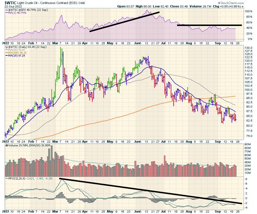
2) A double top in oil that occurred a while ago; with Friday's price action, we are getting close to unchanged on the year.

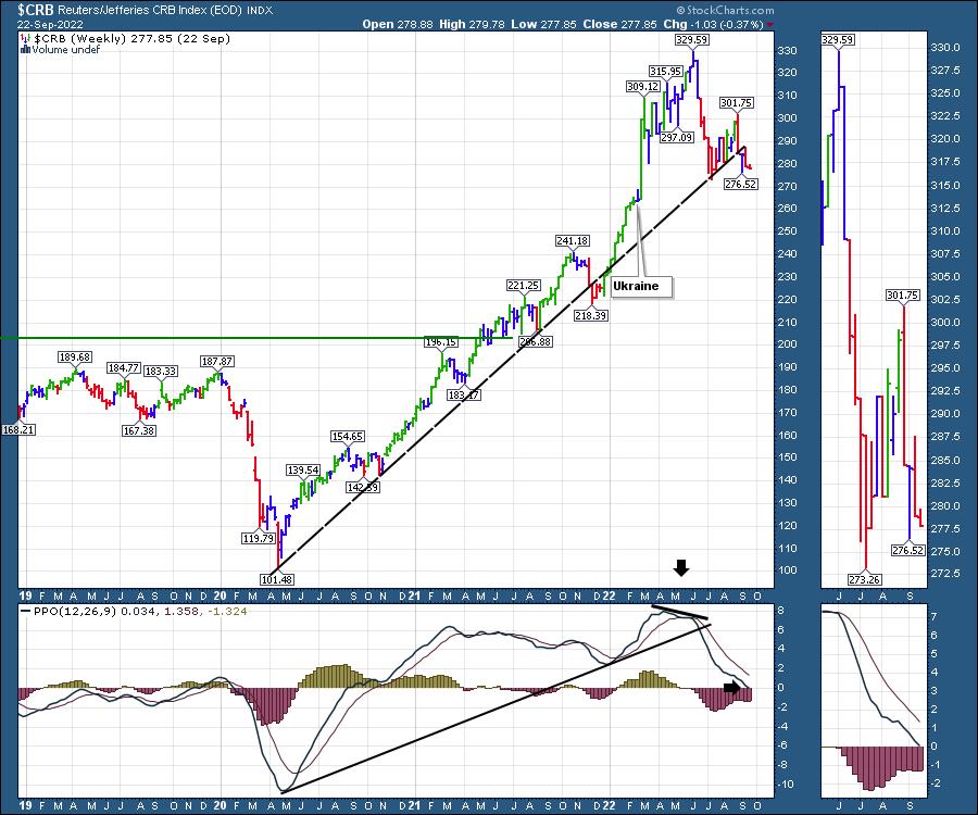
Oil and Natural gas make up a significant part of the $CRB index, and it is cracking. The two-year uptrend is cracking in particular, but other commodities are also getting wiped by the high USD and some government influenced buying/selling.

There is a lot of price action focused around the SPR supplying product into the market. As the drain of the Strategic Petroleum Reserve continues, we do not appear to be running on empty at any time soon. Chart below from the EIA. We appear to have used up about 1/3 of the maximum inventory back in 2010, and still have 2/3 in the system. However, the recent drop in inventories looks out of scale for the chart. Will that stop anytime soon or continue?

When will production catch up with demand, so that SPR withdrawals are not necessary? That still looks to be a distance away, and, as oil prices come down, that stops capital being allocated. Oil is the hardest trade on the planet as it is a political football in every region. Trying to get the direction right is difficult. When will the Saudis cut production? Will the Russian barrels coming off the market be the force that changes the charts? Neither one of these has been a reason for the markets to rally yet.
The charts outline some serious pressure on the commodities. As for the question in the title, "Which Way Is Up?", well, it's not 'up' towards commodities right now.
|
| READ ONLINE → |
|
|
|
| DecisionPoint |
| How Interest Rates are Squeezing Home Buyers |
| by Carl Swenlin |
I knew well ahead of the 2006-2007 real estate crash that problems were coming, but I didn't really understand the cause. I thought that the price of houses was going to deter buyers, but buyers didn't care about the price of a home, they only cared about "how much a month?" And that, of course, is a function of interest rates -- as rates go down, a fixed monthly payment can buy a more expensive house (and vice versa). It's the 'vice versa' with which we are currently concerned.
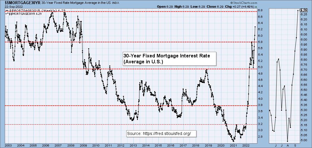
Since January 2021, the 30-Year Fixed Mortgage Rate has gone from 2.65% to 6.29% today. Looking at this chart, one has to wonder if the term 'criminal ineptitude' is an appropriate appellation for the Fed. It would seem that the Fed thinks their mission is to prevent anyone from ever feeling any pain. Unfortunately, the Fed's actions simply delay the pain and, in doing so, potentially make it worse.

For most people, the price of the home is irrelevant. They only care about the monthly payment they can afford. The following table assumes a monthly payment of $2015 (principal and interest) and a mortgage amount in 2021 of $500,000. Note that, at the current rate of 6.29%, the the fixed payment can only cover a loan of $325,900 -- 34.8% smaller than in 2021.

There are some people who can afford a higher payment, but they are still going to feel the pinch as rates go higher. This table shows that the current payment is over 50% higher than at the 2021 starting rate. Surely, many of these people are going to postpone their purchase.

Conclusion: Real estate is in a bubble thanks to interest rates being kept unrealistically low for years. Rising rates will put the squeeze on home buyers and, in many cases, they will have to forego their purchase. The result will be that the reduced demand will cause prices to drop. Real estate cheerleaders say that prices won't suffer because "people have to live somewhere." This is true, but they are already living somewhere, aren't they?

Technical Analysis is a windsock, not a crystal ball. --Carl Swenlin
(c) Copyright 2022 DecisionPoint.com
Helpful DecisionPoint Links:
DecisionPoint Alert Chart List
DecisionPoint Golden Cross/Silver Cross Index Chart List
DecisionPoint Sector Chart List
DecisionPoint Chart Gallery
Trend Models
Price Momentum Oscillator (PMO)
On Balance Volume
Swenlin Trading Oscillators (STO-B and STO-V)
ITBM and ITVM
SCTR Ranking
Bear Market Rules
DecisionPoint is not a registered investment advisor. Investment and trading decisions are solely your responsibility. DecisionPoint newsletters, blogs or website materials should NOT be interpreted as a recommendation or solicitation to buy or sell any security or to take any specific action.
|
| READ ONLINE → |
|
|
|
| The MEM Edge |
| Will The Markets Stage A Countertrend Bounce Next Week? |
| by Mary Ellen McGonagle |
It was another tough period for the markets, with the S&P 500 posting its 2nd consecutive week of a 4.7% decline. Both weeks posted above-average volume as investors fled stocks amid signs that the Fed will continue to quickly raise rates, despite the real possibility of leading the U.S. into a recession.
Events globally are adding to anxiousness, with economic activity declining in Europe while a surging dollar is hitting already-weakened emerging economies. Russia's implication that they may use nuclear weapons against Ukraine has also rattled nerves.
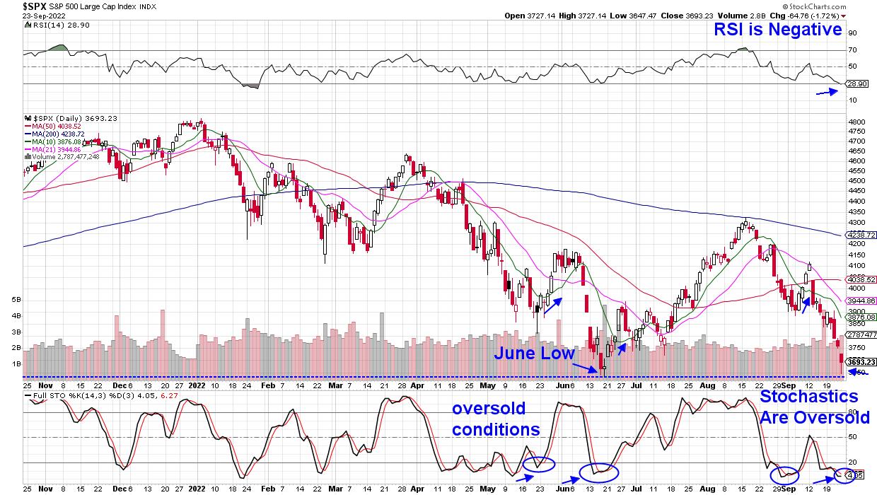
At this time, U.S. stocks are in a severe short-term downtrend that has put the markets into an oversold position similar to mid-May and mid-June. Both of those times, the S&P 500 staged a rally back up to key moving averages as buyers came in on the dip.
DAILY CHART OF S&P 500 INDEX

Things are different this time, however, as last week's selloff puts the S&P 500 perilously close to breaking below its June lows. This 3636 level is widely viewed as the next area of possible support, and a break below that would likely spark further heavy selling, as it would signal that buyers have gone away. However, if the markets are able to find support at the June low, we could experience a sharp rally.
As for what could possibly drive the markets to find support at current levels and trade higher, next week, there will be no less than 15 appearances by Federal Reserve officials, including 2 separate occasions with Fed Chair Powell. Any hint of that the central bank may consider taking their foot off the pedal, with a lower percent hike at their next meeting, would certainly help.
Also up next week are 2nd-quarter GDP numbers, as well as key inflation data, with the August PCE Price Index due. Lower-than-anticipated numbers for either of these data points could also help bring back investors' hope.
In the daily chart of the S&P 500 above, I've circled recent periods when the stochastics were oversold, which preceded a rally. Longer-term, however, the markets are in a confirmed downtrend, and any possible rallies should be viewed as short-term in nature.
While the current market conditions may be painful, the good news is that, when the markets stage a longer-term bullish uptrend, it will provide investors a tremendous opportunity. The beginning stages of a new bull period are historically the most profitable.
For those who would like to be alerted to when this possibility is setting up, take a trial of my MEM Edge Report for 4-weeks for a nominal fee. You'll gain immediate access to my recent reports that will provide insights into sector rotation that taking shape.
On this week's edition of The MEM Edge, now available to watch on demand at StockChartsTV.com and the StockCharts YouTube channel, I review areas that are withstanding the downtrend in the markets, as well as what's driving price action elsewhere. I also share why the poorest performers this week may have further downside.
Warmly,
Mary Ellen McGonagle, MEM Investment Research
|
| READ ONLINE → |
|
|
|
| Top Advisors Corner |
| Let Your Risk Tolerance Determine If You Buy the Dip |
| by John Hopkins |
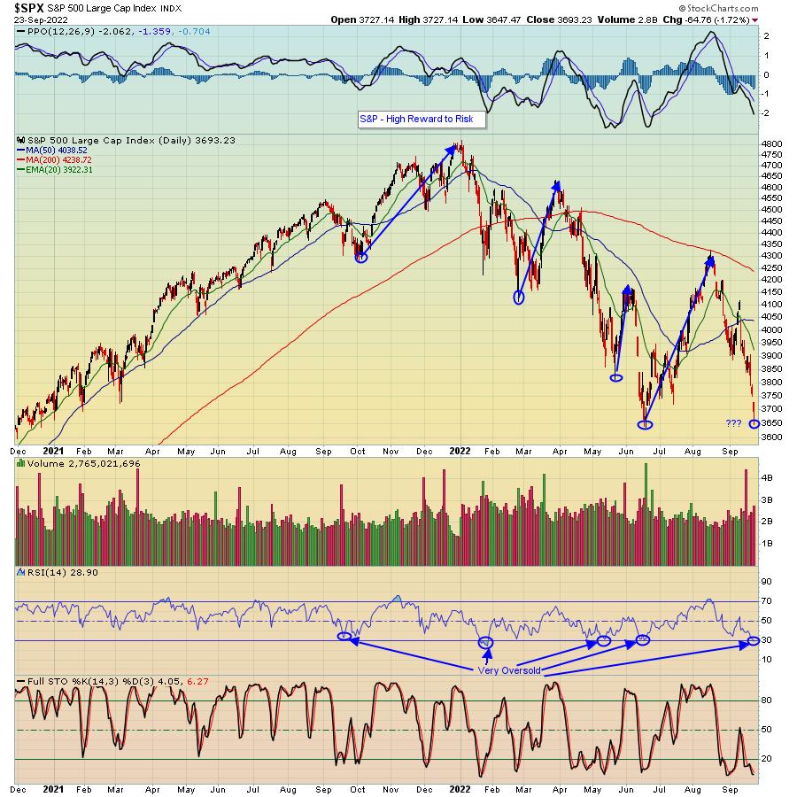
At its low on Friday, the Dow Jones closed below its June 17 low of 29,653. The S&P got within 11 points of its June low of 3636. The NASDAQ held above its June 17 low but still saw deep losses. All adding up to what? Buying opportunities, especially for those of you who think longer-term. And for those of you who have little tolerance for risk? Well, you should do fine as long as you stay disciplined.
For example, as you can see in the chart below, the S&P touched 3636 on June 17. At today's low, the S&P got to within 11 points of that June low. On the flip side, the most recent high of 4325 on August 16 is now 18.5% above today's low. Do I expect the S&P to get back to that 4325 level anytime soon? No. But I do like the outsized upside to downside reward to risk at current levels.

Note also in the above chart the RSI of 28.90 and stochastics close to zero, both flashing extreme oversold levels. In fact, look how the S&P bounced every time the RSI got down to or below the 30 level over the past year.
This is where discipline comes in. If we know the June 17 low of 3636 represents KEY price support, then we should be able to keep any losses to a minimum; i.e., a move below that level means it's time to exit long positions for those with less risk tolerance. For those who care more about the long-term, you could be looking at some great opportunities -- i.e., stocks that could make sizable moves -- once the market settles down.
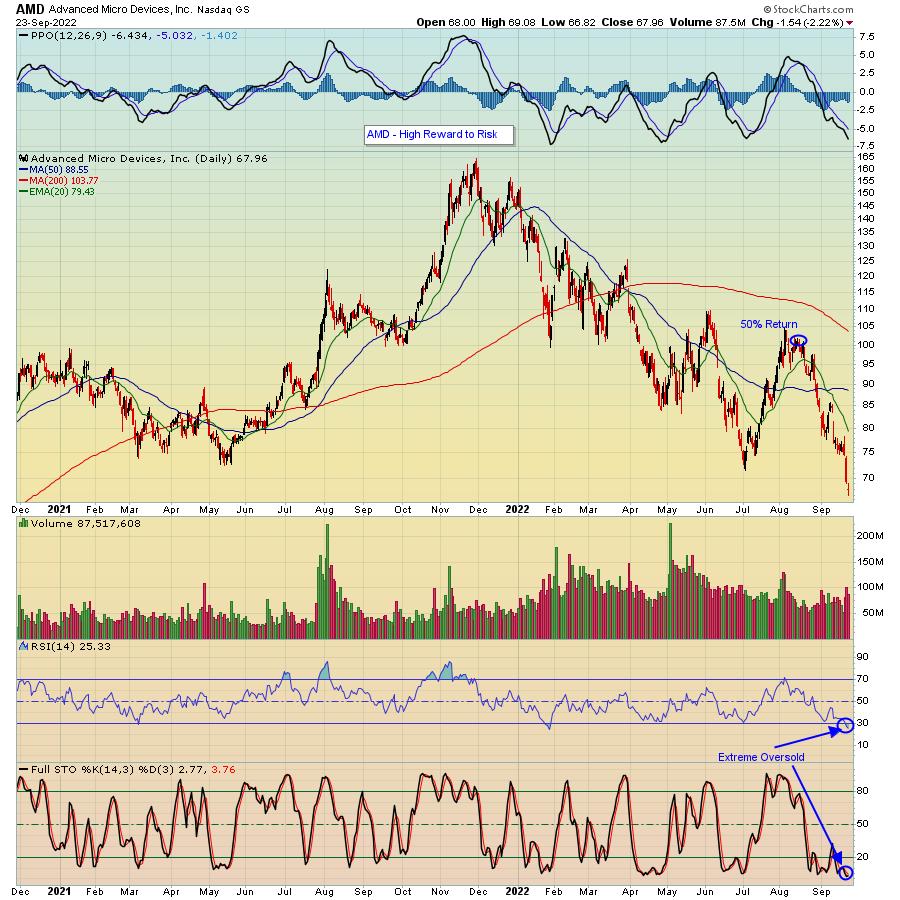
For example, look at the chart below on Advanced Micro Devices (AMD), a company that has continued to reiterate its financial strength and has fallen 60% since its November 2021 high. Do I think AMD is going to move back to that all time high any time soon? Of course not. But do I think that, over time, AMD could increase by 50%? I do. What if it takes a year to get there? So what? How many investments can you make that might produce a 50% return in a year?

This really is one of those rare times where you can have your cake and eat it too. There's not much downside risk at today's level on the S&P if you're a short-term trader and keep a tight stop at that June 17 low on the S&P of 3636. If you're a longer-term thinker, you're getting a heavily discounted market. And if you're looking to reduce risk even further, consider taking a partial position at today's levels and adding on any further pullbacks, because,as we've seen time and time again, over time, the stock market produces tremendous gains.
In the meantime, if you would like to get access to timely and highly informative market insights from our Chief Market Strategist Tom Bowley, just click here and you will receive our EarningsBeats Digest every M, W and F FREE OF CHARGE! It's a MUST-read!
At your service,
John Hopkins
EarningsBeats.com
|
| READ ONLINE → |
|
|
|
| MORE ARTICLES → |
|
 Chart 1RISING DOLLAR HURTS FOREIGN CURRENCIES... Chart 2 shows the U.S. Dollar Index rising this week to the highest level in twenty years. That's been due mainly to the fact that the Fed has been raising interest more aggressively than foreign central bankers. A rising dollar normally has the effect of pushing U.S. commodity prices lower which may be a good thing. But it has the negative effect of pushing foreign currencies lower. One example of that is the Japanese yen in Chart 2 which has fallen to the lowest level in more than twenty years. The same is true of the British Pound and Euro which have also fallen sharply. Weaker foreign currencies can boost inflation in their respective countries at a time when foreign central bankers are raising interest to slow inflation. We saw that on Thursday when foreign bankers raised rates more aggressively to combat inflation and support their falling currencies. That may also explain why foreign stock markets have been falling harder than the U.S. which increases the threat of a global economic downturn.
 Chart 2
 Chart 3
 Chart 4

 Despite the bear market environment, a handful of stock-based ETFs were showing leadership with bullish Trend Composite signals. Representatives from dirty energy (XLE), clean energy (TAN) and utilities (XLU) were covered over the last few weeks and this article is a follow-up. These ETFs remain with bullish Trend Composite signals, but they succumbed to broad market selling pressure as correlations continue to rise and the bear extends its grip. Leading stock-based ETFs are still part of the stock market and vulnerable to the bear.


 The S&P ($SPX) is slightly hidden behind the tails of the Brazilian Bovespa and the Australian All Ordinaries indexes. The small chart highlights the rotation for $SPX over the last five weeks. It reveals that, in this universe, the $SPX tail is the only one on a negative RRG-Heading. With the US making up almost half of the benchmark, many other markets in the universe must rotate in opposite directions. This is exactly what we see happening on this RRG.


 To start, I want to make two points. Investing successfully requires that you remain engaged and motivated. Just because you choose to ignore the markets, the markets won't reciprocate and ignore you. Zig Ziglar said, "People often say that motivation doesn't last. Well, neither does bathing — that's why we recommend it daily." One of my goals is to keep you engaged and motivated.