| THIS WEEK'S ARTICLES |
| John Murphy's Market Message |
| SECTOR ROTATION MODEL REMAINS BEARISH |
| by John Murphy |
SECTOR ROTATION MODEL .. One of the more useful ways to help determine the state of the stock market and the economy is to compare how various market sectors are performing. Certain market sectors do better at market tops, while others do better at market bottoms. Chart 1 shows the Stockcharts Sector Rotation Model through up and down market cycles. It also plots the relationship between stocks and the economy. The red line tracks the stock market, while the blue line tracks the economic cycle. The first lesson is that the stock market usually changes direction before the economy. While the boxes on top of the chart show how the various sectors perform at turning points for both.
STOCKS LEAD ECONOMY LOWER...The stock market peaked at the start of the year with the S&P 500 falling into a bear market with losses exceeding -20%. Historically, peaks in stocks usually lead peaks in the economy by six to nine months. That suggests that the economy is in recession or heading into one. That's where sector rotations come into play.
ENERGY LEADERSHIP IS A BAD SIGN...The sector boxes along the top of Chart 1 show materials and energy leading the market as it forms a major peak. Their strength is based on strong commodity and energy prices which signal inflationary pressure (which prompts the Fed to start raising interest rates). The sign that stocks have peaked is money flowing into defensive market sectors like consumer staples, health care, and utilities.
TECHNOLOGY AND CYCLICALS LEAD AT MARKET BOTTOMS... Looking to the boxes on the left of the chart, Technology, and Consumer Discretionary stocks start to show market leadership at stock market bottoms with Communication Services and Industrials following them higher. It also shows stocks bottoming before the economy. Let's compare the sector rotation model in Chart 1 to this year's sector performance.
 Chart 1 Chart 1
SECTOR ROTATION FITS BEARISH OUTLOOK... The table in Chart 2 shows the relative performance of the eleven market sectors since the start of the year. Energy remains the strongest sector with Utilities, Consumer Staples, and Health Care following right behind. That sector rotation fits exactly with the Model shown in Chart 1 for a market top. In addition, the weakest sectors for the year are Communication Services, Consumer Discretionary, and Technology. The fact that those three remain the year's weakest sectors (combined with continuing leadership in energy and defensive sectors) carries a negative message for the stock market and the economy. Let's take a more short-term view of recent sector performance to see if any major changes have occurred.
 Chart 2 Chart 2
WEEKLY SECTOR RANKING REMAINS BEARISH... The table in Chart 3 ranks stock sector performance for the last week. And it's not very encouraging. Energy remains the market's strongest sector which suggests that the inflationary impact of higher energy prices remains a problem for stocks and the economy (and encourages a more hawkish Fed). The fact that Materials have moved into second place also hint at higher commodity prices which is potentially inflationary. Aluminum, copper, and commodity chemicals led that sector higher this week. Even more concerning is the fact that Technology, Communication Services, and Consumer Discretionary stocks remain the market's weakest sectors. The Sector Rotation Model in Chart 1 shows those three sectors leading stocks higher at market bottoms. There's no sign of that happening. Energy leadership and technology weakness is usually a bearish sign for stocks. So is relative weakness in economically-sensitive consumer cyclicals. All of which suggests that stocks remain in an ongoing bear market. The fact that stocks show no signs of a major bottom also argues for a weaker economy and a likely recession.  Chart 3 Chart 3
|
| READ ONLINE → |
|
|
|
| The Traders Journal |
| The Pearls Of Wisdom I Took Away From ChartCon 2022: Part 1 |
| by Gatis Roze |
 I'm going to share with you some of the gems and pearls of wisdom that I personally took away from the recent ChartCon 2022 Investor Conference. You may recall some of these nuggets. Others you won't because they occurred in belly-to-belly discussions behind the scenes. I'm going to share with you some of the gems and pearls of wisdom that I personally took away from the recent ChartCon 2022 Investor Conference. You may recall some of these nuggets. Others you won't because they occurred in belly-to-belly discussions behind the scenes.
Therein lies perhaps Nugget #1. Hopefully, with Covid behind us, we'll all venture out more. And with this venturing out and more belly-to-belly moments, come insights of a much more personal nature. We stock market folks need that. Yes, this year's ChartCon was brimming with exceptional market wizards, but their presentations being streamed to a broad audience of investors is — by its very nature — a view from 10,000 feet.
I feel truly fortunate that after the cameras went dark, I could approach presenters and mine their content over coffee or dinner — thereby discovering those investment gems that are so rare to unearth after all my years in the markets. Perhaps this is Nugget #2. I first formulated the 10 Stages of Stock Market Mastery as a result of attending countless investment presentations. As an attendee, the most crucial and valuable task is to quickly surmise what the speaker's focus is and to compartmentalize his or her presentation correctly. In other words, if the talk is engaged in Stage 1 — Money Management, then you must accept that it's NOT about Stage 4 — Market Analysis. Otherwise, there's a bug in your caviar!
This was extremely important at ChartCon 2022 because the breadth of topics covered all 10 stages of Stock Market Mastery. As an attendee, to profit most from the topic at hand, you had to quickly deduce which Stage or Stages the material being discussed might belong. Our book is based precisely on these ten stages.
Nugget #3. A chat with Jon Markman reinforced a rule that I've held dear ever since Bruce Fraser (blogger of "Wyckoff Power Charting") recommended I read Wyckoff's book Reminiscences of a Stock Operator. Soon afterwards, Dr. Hank Pruden also suggested that I read it. The rule is this: Don't read any investment book unless it's recommended by two or more people you truly respect. Note as well, the caveat here is that I said "read" and not "buy." I'll admit that my own library consists of every significant investment book you can name. But on those same shelves, there are hundreds of dark and quirky books that are full of stock market twaddle!
At the same time, sitting next to the twaddle is Jon's annotated edition of the Reminiscences book which I've read at least six times. But who's counting? It's not that I'm a slow learner. It's that rereading a seminal investment book builds muscle memory and breeds better investment habits. Hopefully, most of you feel that way about our book — Tensile Trading.
Nugget #4. Our investment arena is blessed with so many colorful and quotable characters. ChartCon was an elite example. What I found interesting is that most of us maintain an archive of our favorite quotes. I believe many have stood the test of time because they are based on a market truism which at first blush might not be apparent to a novice investor. Over coffee breaks, my favorite question to ask other presenters was to query them about their personal favorite stock market quote. I could write an entire blog on their answers alone. Nevertheless, I recall a discussion that yielded this quote. Abraham Lincoln said "A man is just about as happy as he makes up his mind to be." To paraphrase, "An investor is just about as profitable as he makes up his mind to be." In other words, it's up to you to decide how much effort and discipline you are willing to allocate in becoming a consistent and successful investor. You make your mind up, put in the effort, and it will happen. Tomorrow's profits will be as certain as seasonal sunshine.
Nugget #5. Were the speakers and moderators confident? Yes, but they were grounded in humility. The commonality being perhaps that we've all been molded by the markets and the markets don't honor egos. We are all somewhat like farmers who must respect and obey the seasons. Our bountiful harvest is determined by the markets. We recognize that markets are bigger than us and it demands of us that we play our role. The markets ensure that as investors we stay grounded and not exaggerate our own place in this ecosystem. I suspect that this helps explain in part why all the presenters were so likable. Wisdom dressed in humility was fashionable at ChartCon.
Nugget #6. My observation about two common traits amongst all the speakers is focus and persistence. Each decided to direct their efforts at a particular segment of the market. Then they deployed immense persistence to succeed on their own terms. Persistence is a mindset where you are persisting to learn and be better today than what you were yesterday. Focus demands you ween yourself from the human tendency to charge at the markets as if its a smorgasbord (which it is). Focus is what produces competence and builds intuition. Deciding and knowing what is outside your investing wheelhouse is part of focusing. For myself, I no longer short equities, trade options, futures or derivatives, and never use leverage. My focus is long equities and ETFs, and I've done very nicely, thank you!
Jay Sherry said, "When you learn a little, you feel you know a lot. But when you learn a lot, you realize you know very little." This quote pretty much describes the group of speakers. For example, the oldest of the group — its not polite to say who — was always the first person on set each morning, always eager to learn. He's the LeBron James of investing, yet he's first to show up at practice! I can only pray I'll have his focus, energy and persistence when I'm his age.
There are many more nuggets and gems I want to share with you, but I think I'll stop here for now. Back at you in two weeks!
Trade well; trade with discipline!
Gatis Roze, MBA, CMT
StockMarketMastery.com
|
| READ ONLINE → |
|
|
|
| ChartWatchers |
| Unpacking the Jobs Report: Is the Labor Market Softening? |
| by Jayanthi Gopalakrishnan |
 Photo by Eric Prouzet on Unsplash Photo by Eric Prouzet on Unsplash
The Bureau of Labor Statistics released its October jobs report today. The number of jobs added was higher than the consensus forecasts.
Key Points of October Jobs Report
- Non-farm payrolls rose by 261,000 in October, higher than the 200,000 economists expected.
- Average hourly earnings were up 0.4%, which is a 4.7% year-over-year increase.
- The unemployment rate came in at 3.7%, slightly higher than the 3.5% from last month.
- Labor force participation, that is, the number of people working or looking for work, was 62.2%—a minuscule one-tenth of a point decline from September.
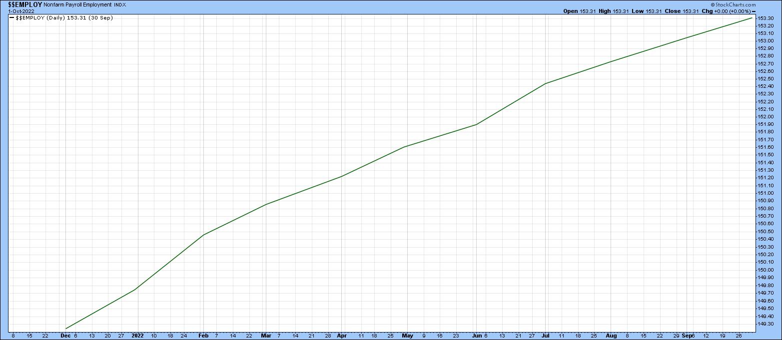
Overall, the numbers suggest the labor market is still hot, but may be softening ever-so-slightly. Under normal circumstances, a slowdown in job growth doesn't paint a positive picture. But because we're in a rising interest rate environment after a decade-long period of low-interest rates, the market liked what it heard.

CHART 1: THE LABOR MARKET IS STILL GOING STRONG. A flattening of the non-farm payroll employment index ($$EMPLOY) could mean a softening of the labor market. Chart source: StockCharts.com. For illustrative purposes.Now, on to the Deets
On Wednesday, when Fed Chairman Jerome Powell took to the podium, he mentioned that the tight labor market is putting pressure on inflation. Although the jobs market is still tight, today's data suggests that conditions might be loosening. It's very slight, but the market acted like it'll take anything it gets.
Unemployment rose slightly, as did labor force participation. More important is the September data revision. Instead of the 263,000 jobs reported, the number was revised higher to 315,000. Relative to the revised September increase, October's increase of 261,000 jobs gave the impression, that relative to the September report, the job market is much cooler.
Could today's jobs data be an indication that the Fed may start slowing down the pace of interest rate hikes? The markets seemed to think so. Equity futures rose before the open, while the Dow Jones Industrial Average ($INDU), S&P 500 Index ($SPX), and Nasdaq Composite ($COMPQ) rose after the open, as did Bitcoin ($BTCUSD). The December 2022 U.S. Dollar Index ($USD) initially fell on the news.
Initial reactions don't necessarily paint an accurate picture of overall investor bias. The $SPX, $INDU, and $COMPQ gave up a large portion of their earlier gains, although they had recovered by Friday's close. Price action for $BTCUSD was similar to the broader equity indexes. The leading sector today was Materials, followed by Financials, and then Technology. The 10-Year U.S. Treasury Yield Index ($TNX) was relatively flat during the trading day. Overall, a good end to the trading week.
What Does This Mean for the U.S. Economy?
One month's data doesn't necessarily mean there's enough of a softening for a Fed pivot. The labor market remains tight. Employers continue to have a tough time filling positions and have to offer higher wages to attract employees.
The greatest job growth was in the healthcare industry, followed by professional and technical services. The manufacturing industry also saw robust job growth, especially in durable goods. Job growth in leisure and hospitality drew particular interest, given that the industry took a real beating during the COVID-19 pandemic. It's still not at pre-pandemic levels, but it's nice to see some growth here. Hotels added the most number of jobs in the hospitality sector. Maybe people are staying in hotels either for business or their weekend getaways.
The Fed pays close attention to the jobs report because it weighs heavily on its interest rate decisions. There probably needs to be more loosening in the job market before the Fed reduces its interest rate hike pace. A softening job market may not be great for those looking for work, but that's what needs to happen for the pace of interest rate hikes to slow down.
Next week could prove to be an exciting one for the markets. We have the midterm elections on Tuesday and the CPI report for October on Thursday. Stay tuned for our market insights and analysis on these important market-moving events.
Don't miss out on our educational content in our ChartWatchers blog, Become a seasoned StockCharts user by signing up for a one-month free trial.
Disclaimer: This blog is for educational purposes only and should not be construed as financial advice. The ideas and strategies should never be used without first assessing your own personal and financial situation, or without consulting a financial professional.
|
| READ ONLINE → |
|
|
|
| Martin Pring's Market Roundup |
| Signs the Bear Market Rally May Be Over |
| by Martin Pring |
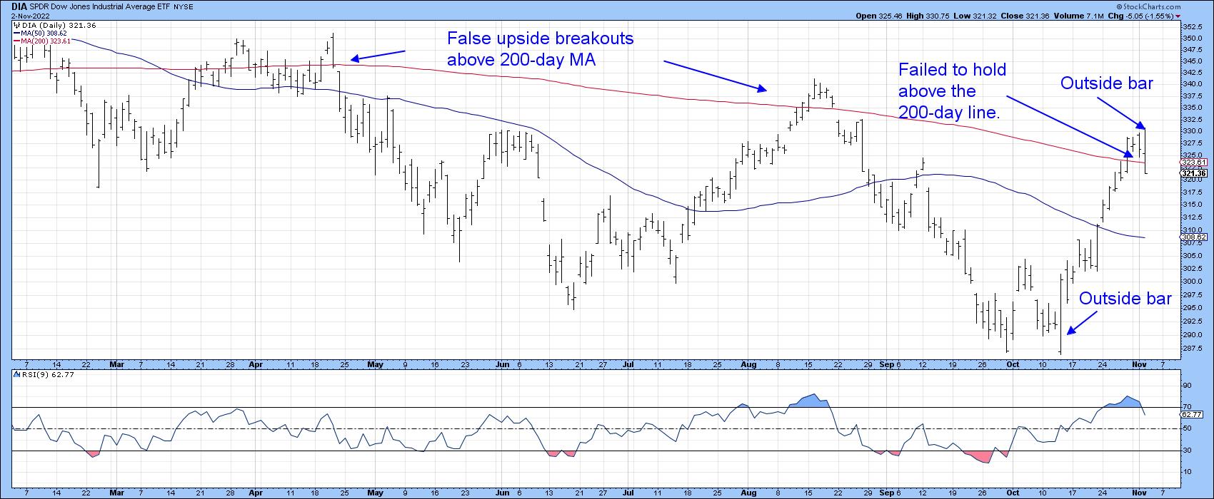
Last time I reviewed the stock market, many of the Indexes had just experienced a bullish outside bar (see chart for the DIA). Since several of the oscillators had reached oversold readings, the idea of a rally seemed appropriate. By the same token, its important to remember that there is a consistent relationship between the peak in the short-term interest rate cycle and bear market lows. They either coincide or, more likely, rates peak ahead of bear market bottoms. Since rates look like they are going higher, even after today's hike, it seems likely that stocks have yet to see their lows.
My expectation was that the improving technical position would be result in a counter-cyclical advance. In simple terms, a bear market rally! That's still how I see it. It's possible that we have not witnessed its high point; after all, the year-end period, combined with a seasonally strong post-mid-term election season, could bring us a nice Christmas present. However, a review of several internal oscillators and other indicators suggests that this part of the rally is probably over.
Chart 1 plots the Dow ETF (DIA) and shows the bullish October outside bar I referred to earlier. We also see an outside bar for the November 2 price action. This time though, it's a bearish one. You can also see how the two previous declines since March started with a false break above the 200-day MA. Tuesday's action reflects a similar event. Finally, the 9-day RSI looks like it has peaked from an overbought condition.
 Chart 1 Chart 1
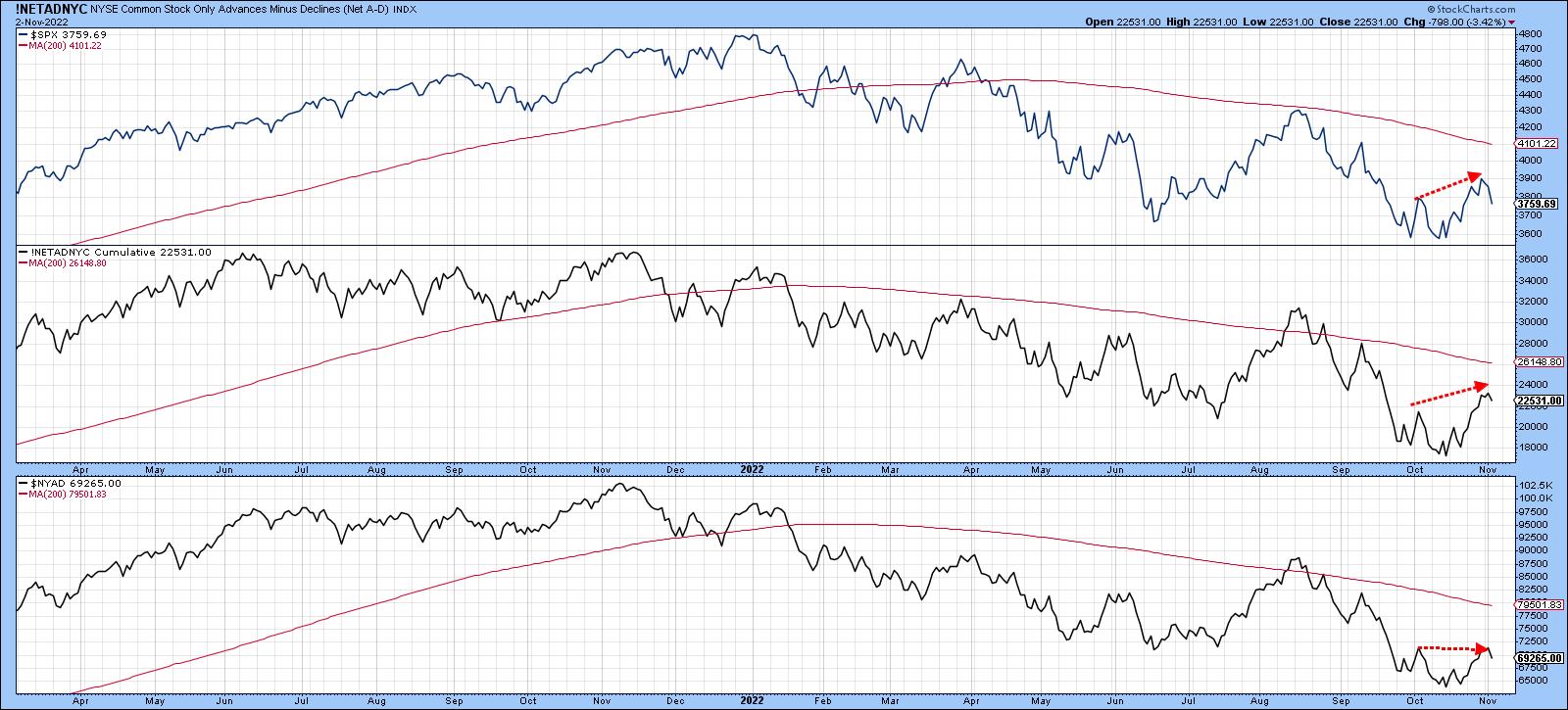
Charts 2 and 3 feature advance/decline lines for the NYSE and the globe. All three series in Chart 2 are trading below their declining 200-day MAs. The Common Stock variety is moving in more or less in the same direction as the S&P and is not telling us anything special. However, the more broadly-based series in the bottom window failed to take out its early October high, suggesting some subtle weakness.
 Chart 2 Chart 2
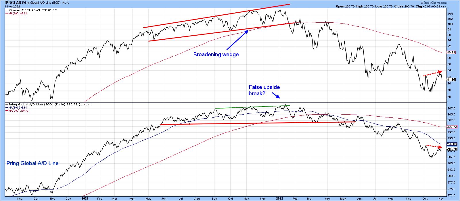
Chart 3 tells us that the Global A/D Line actually touched a slightly lower peak in November, unlike the World ETF (ACWI), which made a higher one. This represents another unwanted discrepancy.
 Chart 3 Chart 3
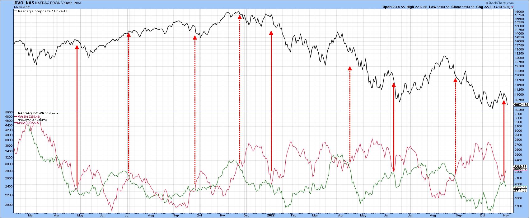
The relationship between the 20-day MA of up and down volume can sometimes be revealing. The dashed arrows in Chart 4 indicate that, when the red down volume for the NASDAQ crosses above the green up volume series, the Index usually declines. The solid lines indicate when the down volume falls to its green up volume counterpart but fails to cross it, which was the case earlier in the week. For the most part, these signals are also followed by a price drop.
 Chart 4 Chart 4
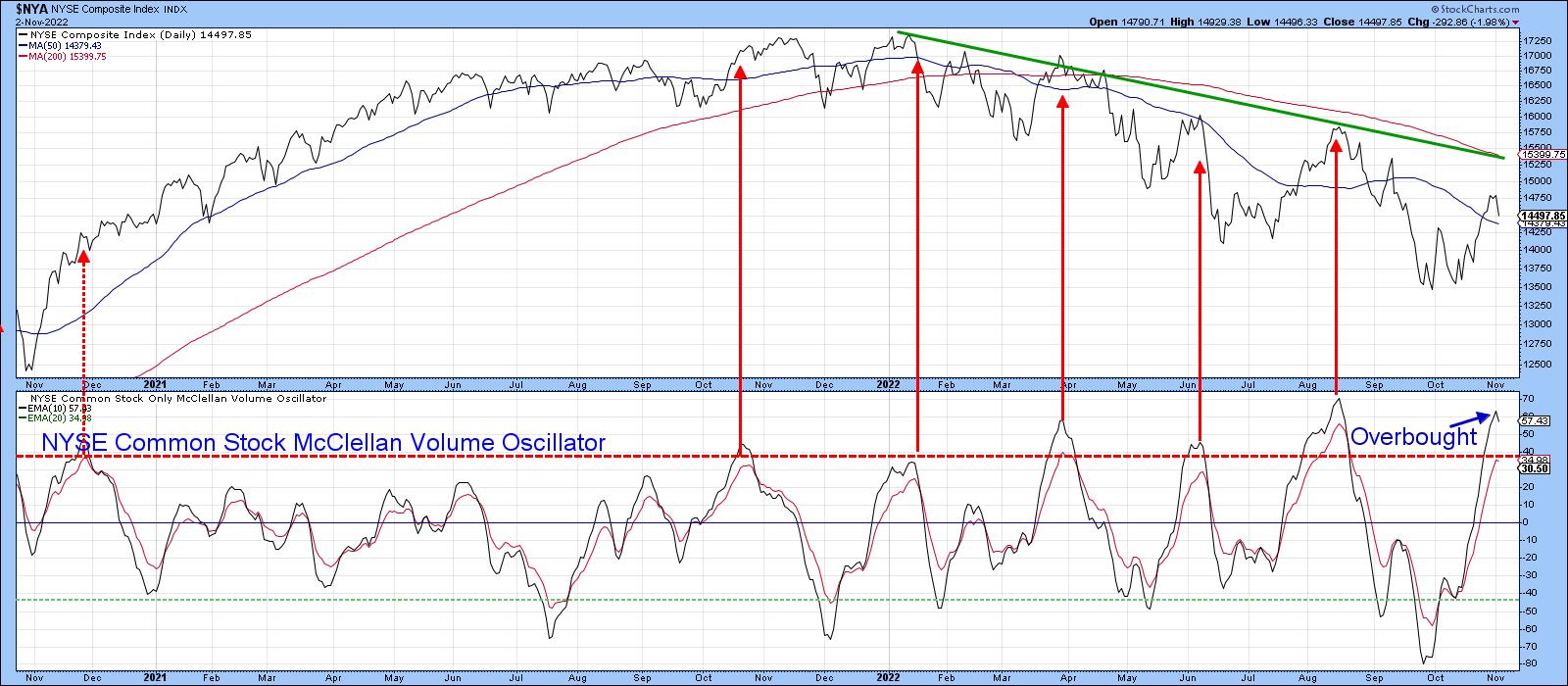
One of my favorite indicators of internal strength or weakness is the NYSE Common Stock McClellan Volume Oscillator. My preference is to calculate a 10-day EMA and compare it to a 20-day smoothing. Sell signals are triggered when it peaks from an overbought reading. The first one on the extreme left has been flagged by the dashed arrow; it does not work because it was a contra trend signal. Generally speaking, these are deceptive and subject to false signs of strength or weakness.
The primary trend changed direction this year. Since that point, the market has been very sensitive to downside reversals from an overbought condition Now it's true that this oscillator is still rising and has not yet triggered a sell signal. However, in order to avoid one, it will be necessary for the market to keep rising, which Chart 1 argues against. If my assumption about the rally peaking is incorrect, we have a great testing point at the 2022 down trendline and 200-day MA for the NYSE Composite. That's because these two indicators reinforce each other as resistance levels. If they should be surpassed, the game would change somewhat.
 Chart 5 Chart 5
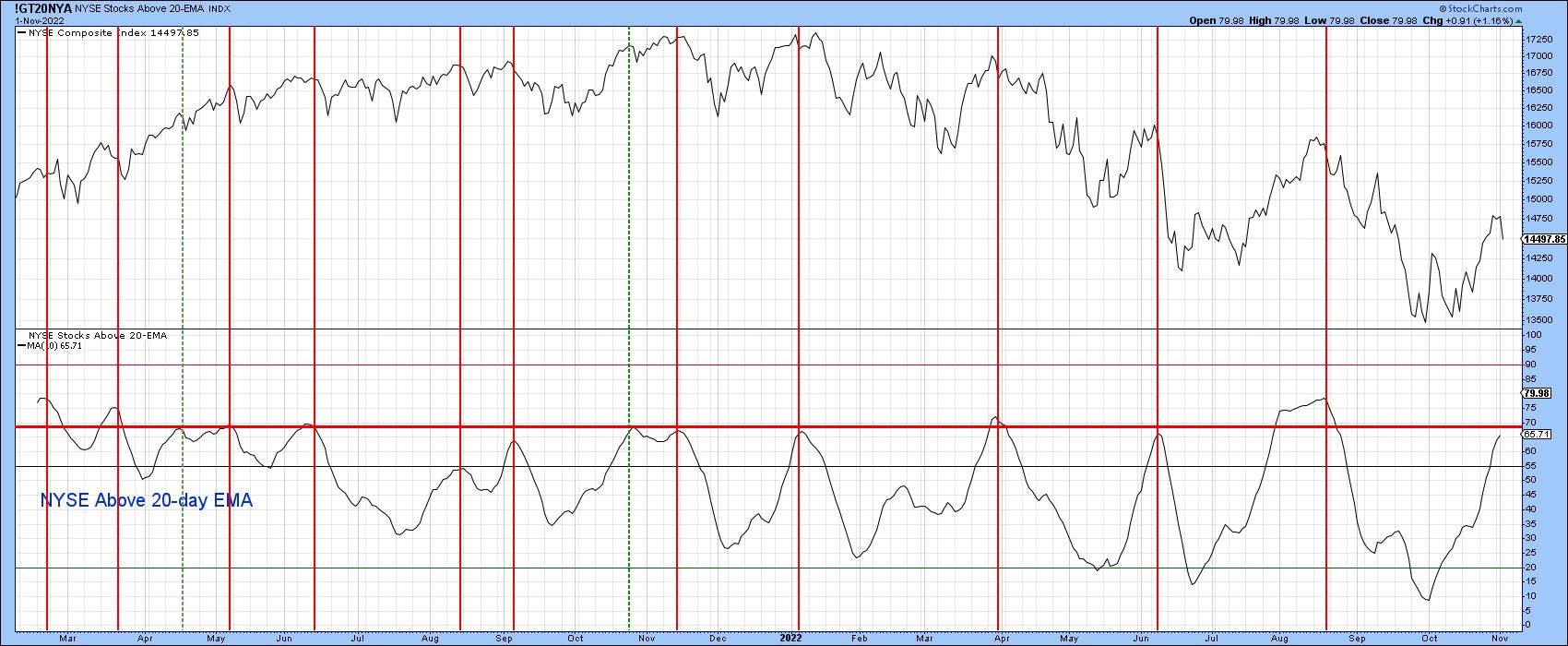
Another indicator that looks to be overextended is calculated from the number of NYSE stocks above their 20-day EMA. The indicator, plotted in Chart 6, is a 10-day MA as a way of smoothing the j raw data. The vertical lines show when this series peaks from a position at or above the red horizontal line. As with the volume oscillator earlier, it's still rising, so we cannot call it bearish at this point. Incidentally, if you want to follow it going forward, simply click on the chart. It's also possible to then save it to one of your chart lists.
 Chart 6 Chart 6
Keep Watching Tesla
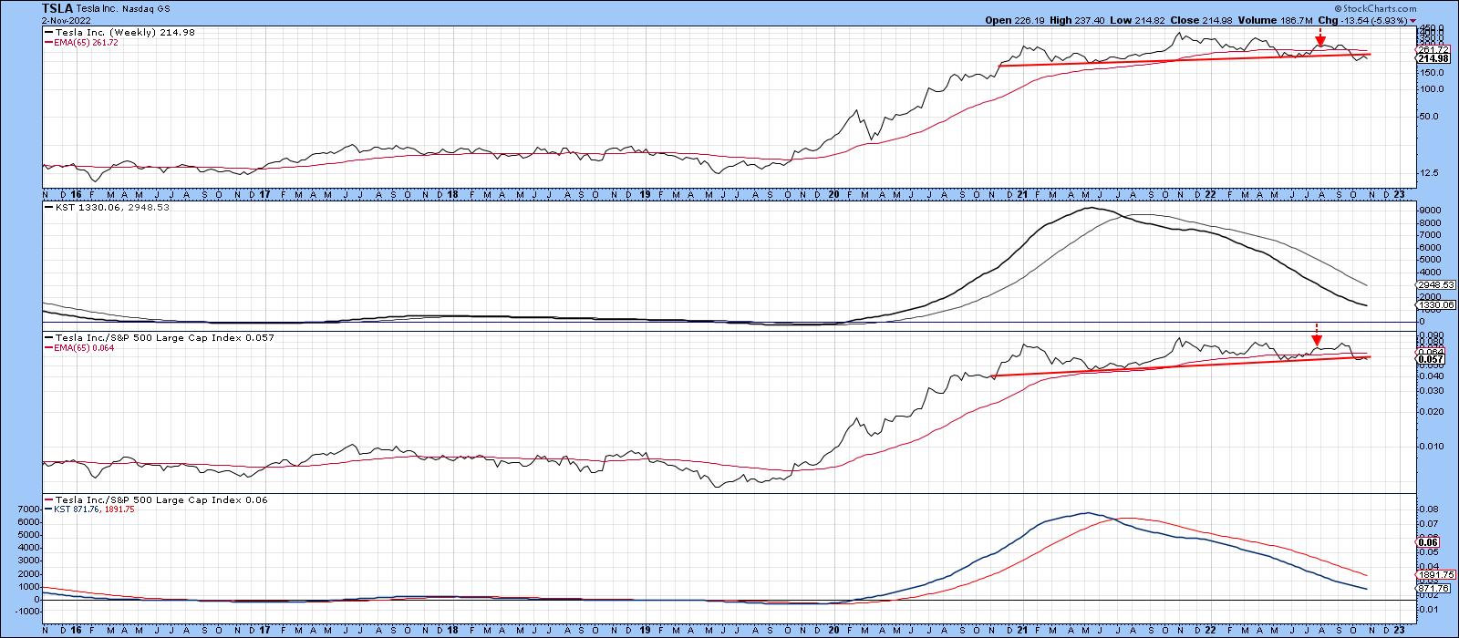
In a recent article, I suggested monitoring the progress of Tesla for a couple of reasons, first and foremost because it had begun to look toppy on both an absolute and relative basis. Moreover, as you can see from Chart 7, both long-term KSTs were in a bearish mode. The two arrows mark the point when the article was published. Prices have fallen a little since then, but that has been sufficient to result in a drop below the 65-week EMA and 2-year head and shoulders neckline.
The second reason why it makes sense to follow the stock is because it represents an icon for the post-2009 green and technology bubbles, just as Elon Musk himself has been for celebrity. Rising rates cause bubbles to burst and this may be no exception. Just sayin'!
 Chart 7 Chart 7
Good luck and good charting,
Martin J. Pring
The views expressed in this article are those of the author and do not necessarily reflect the position or opinion of Pring Turner Capital Group of Walnut Creek or its affiliates.
|
| READ ONLINE → |
|
|
|
| Top Advisors Corner |
| Market is Stuck -- Which is Extremely Bullish |
| by John Hopkins |
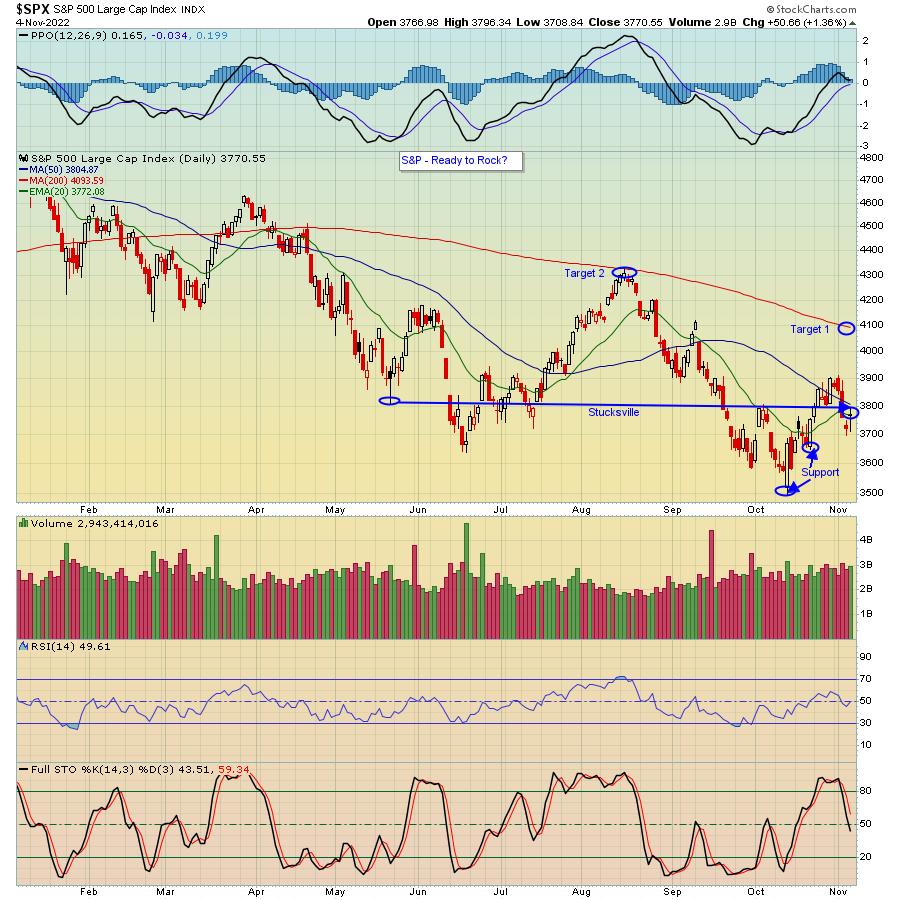
Now that the Fed has thrown everything at the market including the kitchen sink, namely by raising the Fed Funds rate by another .75 and signalling they will continue to raise rates as much as necessary down the road, traders are wondering what might come next. All you have to do is take a look at the chart below, which shows the S&P is at the same level it was back in May, to see that the worst of the selling is likely over and that the market could be getting ready for a strong rally into year-end.

Just think about it. All the Fed has done is continue to raise rates, and it has vowed to continue raising rates as long as necessary. In other words, a very hawkish stance. Yet the S&P is well above the October 13 low of 3491, likely because those who have considered stepping to the sidelines already have. Could we go lower here? Of course. But it's going to have to happen during the most bullish time of the year and after many companies have already come to the earnings confessional -- i.e. traders have already absorbed an awful lot of bad news, including the increasingly hawkish Fed.
So where do we go from here? If we do get the rally I believe will come, then, as you can see above, the first key target would be the 200-day moving average on the S&P, just below 4100. That would represent an increase of almost 9% based on Friday's close. Should the bulls manage to clear that level, then 4325, the August 16 high, would be next. If you tend to be more conservative, you might want to wait to see if we get a pullback to right around 3650, which should provide price support. After that is the biggie, 3491, and if that were to go, all bets would be off.
In the meantime, our Chief Market Strategist Tom Bowley is going to be conducting a timely, highly educational webinar this Saturday, November 5 at 10:00am ET, titled "Understanding Market Manipulation for More Profitable Trades." It's a FREE event that's filling up fast and you can learn more and register by clicking here.
At your service,
John Hopkins
EarningsBeats.com
|
| READ ONLINE → |
|
|
|
| The MEM Edge |
| Not All Boats are Sinking with Market's Tide - These Outperforming Areas are Poised for Further Upside |
| by Mary Ellen McGonagle |
It was a tough week for investors after Fed Chair Powell put a halt to a 2-week rally, which had been fueled by sharp gains in companies reporting 3rd quarter results ahead of lowered estimates. Going into this week, the S&P 500 had bullishly broken back above its 50-day moving average in a move that capped an 8% gain for this broad-based index.
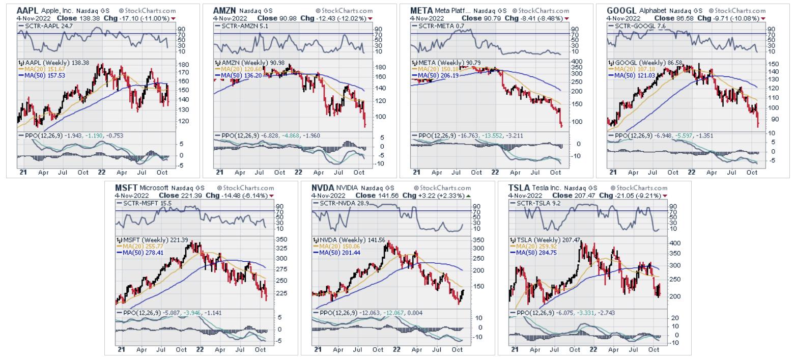
Last week's negative response to Powell's hawkish comments hit mega-cap tech names the hardest, with Apple, Alphabet and Amazon down double digits for the week. The Technology sector was the worst-performing, as the proposal of a more prolonged rate hike cycle with a higher peak rate pushed these growth stocks lower. The declines here and elsewhere sent the S&P 500 back below its key 50-day moving average.
Despite the damage to the areas most susceptible to a rising interest rate environment, there are several sectors of the market that are not only holding in, but exhibiting bullish characteristics and have underlying stocks breaking out of sound bases to new highs.
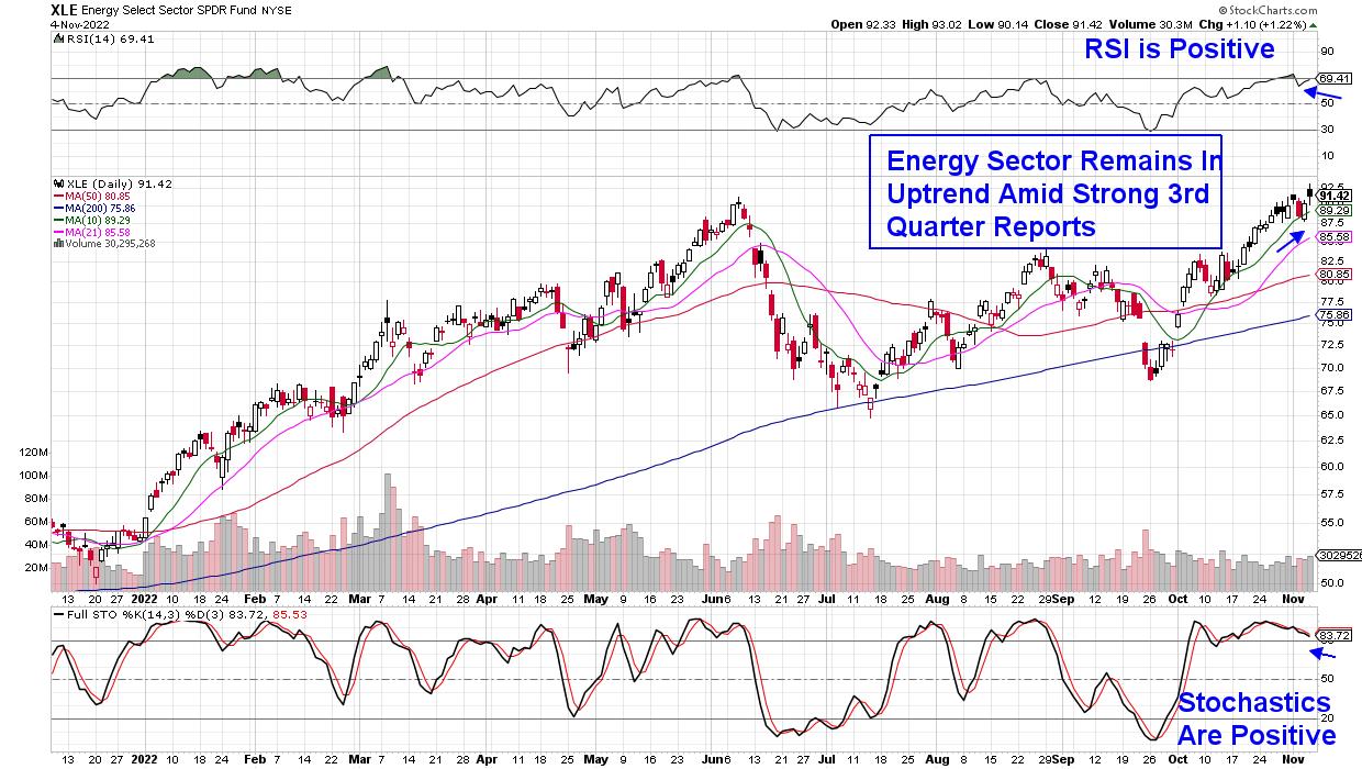
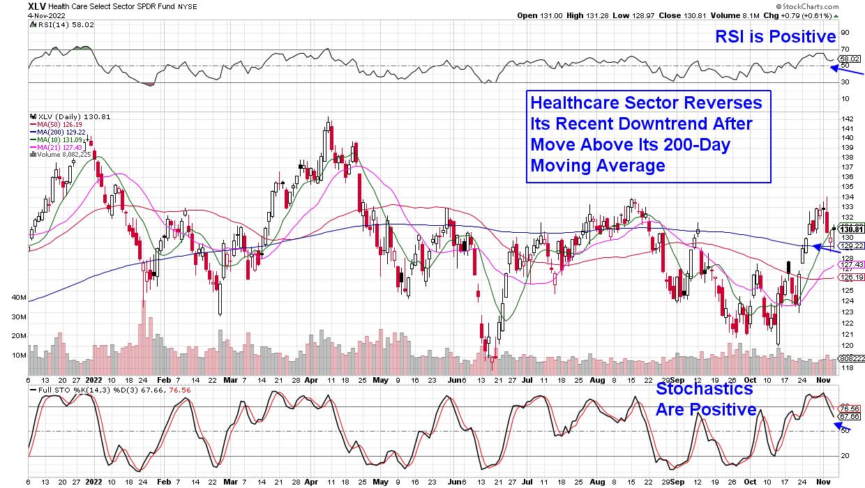
The Energy, Healthcare and Industrial sectors are all trading above key moving averages with healthy-looking charts. Energy is the strongest, with many companies reporting robust 3rd quarter results on the heels of elevated oil prices. Healthcare remains uplifted due to new drug approvals and a demand for products that's resilient to any economic slowdown. Industrials, meanwhile, have their own pockets of strength, as spending on infrastructure and other projects is boosting shares of companies such as bellwether name Caterpillar (CAT), which has been rallying on a positive global demand outlook.
As for ways to trade stocks in these relatively strong areas of the market, investors will need to keep a relatively short-term time horizon until the S&P regains its 50-day moving average.
Of the 3 sectors highlighted above, I'm most interested in Energy and Healthcare stocks, as these are two areas that can 1) trade higher in a rising rate environment (Energy) and 2) have performed well in recessionary periods such as 2008 (Healthcare). You'll want to search for stocks that are trading above key moving averages (21-, 50- and 200-day simple moving averages) and have already reported earnings.
DAILY CHART OF ENERGY SECTOR (XLE)

Within Energy, Oil & Gas Transport stocks have the most potential, as Europe's Oil embargo against Russia is set to take place beginning in December.

Amid Healthcare, many Biotech stocks are setting up for continued outperformance after several well-known companies in this area reported strong 3rd results while guiding growth prospects higher.
For those who would like immediate access to my culled list of select stocks in Healthcare and Energy that are poised to trade higher, use this link here to access a 4-week trial of my twice weekly MEM Edge Report. You'll also receive insights into support and resistance areas for the markets, as well as be alerted to shifts in sentiment.
Next week is setting up to be another volatile period ,with the elections on Tuesday and Consumer Price Index data due to be released on Friday. In addition, there'll be over 8 appearances by Federal Reserve officials, with their comments being dissected for hints of future rate hike policy.
Be sure and use this link here to trial my twice-weekly MEM Edge Report for a nominal fee. Based on historical precedence, we expect strength to continue in the areas highlighted above, with newer areas such as select retailers in the beginning stages of turning higher ahead of the release of their earnings later this month.
In this episode of StockCharts TV's The MEM Edge, I review earnings winners that pulled back and the best way to trade them. I also highlight pockets of strength that continue to emerge despite a down market, as well as the primary drivers of market price action.
Warmly,
Mary Ellen McGonagle, MEM Investment Research
|
| READ ONLINE → |
|
|
|
| The Canadian Technician |
| The Nasdaq: A Tough Market to Gauge |
| by Greg Schnell |
In what could only be described as a weird week, it was difficult to keep a pulse on what was going on.
Tech name after tech name continued to be decimated. The Nasdaq made a lower closing low on Thursday, only to end up bouncing up 1.5 % Friday afternoon. For an index that was down sharply -- 5.97% for the Nasdaq 100 on the week -- the market was very mixed. All kinds of different ways to look at it.
Across Canada and US markets combined, there were 1016 stocks down more than 5%, even as 718 stocks were up more than 5%. Considering a plummeting index, there were only marginally more down than up, with just a ~300-stock difference; usually, it's 1000 or more separating the ups from the downs on weeks with big moves in the indexes.
Global Indexes
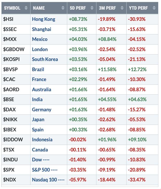
Canada closed flat on the week, Mexico closed up 4%, and the US was the worst of the week. Some North America we have going here; it was all over the performance spectrum! Shanghai, which has been terrible, and Hong Kong, which has been worse, performed well. And, considering all the problems in Europe, they didn't crush the stock exchanges like the Fed did in the USA.

Commodities
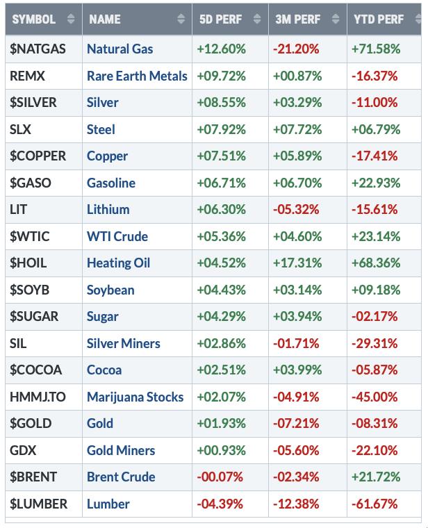
When I look at commodities, I can see investors were bored with them Monday through Thursday. While tech got ransacked this week, commodities were bid up, mostly on Friday, like we were having an economic revolution this week. Crude oil moved 5% on Friday, metals soared with Copper, and Steel jumped up on the back of a China reopening.

USA sectors
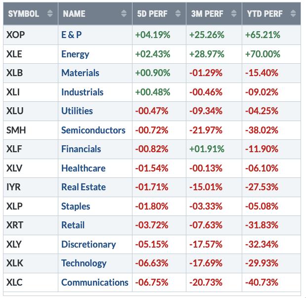
Check out the US indexes for the week. SLX closed up 7.9% on the week, but materials were flat. Crude oil and Natural Gas were up big (above) but the energy stocks lagged the commodities. The three largest growth sectors (XLY, XLC, XLK) were crushed. Steel stocks have been soaring, but technology has been plummeting.

So, for me, it was a very hard week to analyze. If the next great recession is on it's way, it wasn't in the job numbers. If the next global growth party is starting, it looks like it'll kick off in Europe and Asia. If the next commodity run is starting in energy, the energy stocks aren't the best way to play it.
Large Cap Tech:
The Fed really beat up the markets hard Wednesday and Thursday, so perhaps that was the reason for the big mixed message. Tech stocks were trainwrecks, with company ticker after ticker crashing lower. Amazon, Microsoft, Meta and Alphabet all made new 2022 lows this week. I realize the indexes are cap-weighted, but the markets were very mixed in their story telling.

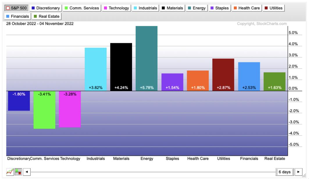
Perhaps the best way to show it is the performance by sector, with the zero line being the $SPX.

That is just a wow.
Where do we go next, and where should we be invested? If institutions have to be invested, they are definitely rotating away from the nifty 7 into anything else.
On this week's Market Buzz, I covered off industrials, which have been steadily rising for each of the last three weeks. Click here to see the video.

It is a wild trading environment out there. Keep protecting capital! If you are interested in how we examine the markets, there is more information and a $7 subscription available at OspreyStrategic.
|
| READ ONLINE → |
|
|
|
| Trading Places with Tom Bowley |
| The VIX Is Screaming to GET IN NOW! And Don't Miss Our FREE Saturday Event! |
| by Tom Bowley |
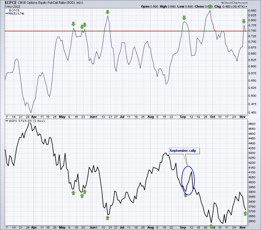
My two favorite sentiment indicators are (1) the 5-day moving average of the equity-only put-call ratio ($CPCE) and (2) the Volatility Index. On September 6th, I wrote about the elevated CPCE likely providing a short-term market bottom, and it did; the S&P 500 jumped 5% in a week. That same CPCE chart is elevated once again, potentially signaling another short-term market rally. don't use the CPCE 5-day moving average as a long-term bottom signal, as sentiment can reverse quickly. But check out the timing here:

This isn't my opinion, it's reality. When we swing too far to the downside and options traders become too pessimistic, we bounce. That's been the history of the stock market.
Well, now the Volatility Index ($VIX) is joining the party. The VIX represents the "expected" volatility over the next month. From the Chicago Board Options Exchange (CBOE), here's how they describe the calculation of the VIX:
"CBOE calculates the VIX Index using standard SPX options and weekly SPX options that are listed for trading on CBOE options. Standard SPX options expire on the 3rd Friday of each month and weekly SPX options expire on all other Fridays. Only SPX options with Friday expirations are used to calculate the VIX Index. Only SPX options with more than 23 days and less than 37 days to the Friday SPX expiration are used to calculate the VIX Index. These SPX options are then weighted to yield a constant maturity 30-day measure of the expected volatility of the S&P 500 Index."
In other words, the CBOE looks ahead at the pricing of SPX options with roughly 30-day maturities to determine the "expected" volatility. As the S&P 500 sells off, expected volatility increases as premiums rise on the options that meet that 23 to 37 day criteria.
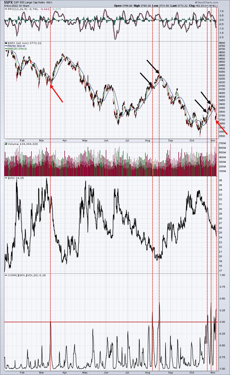
This is why there is usually an inverse relationship between the S&P 500 and the VIX. As prices drop, moves in the S&P 500 escalate, causing future options to become more expensive, thus increasing the VIX. The opposite typically holds true as well. Historically, the S&P 500 rises in a much more boring fashion, so as it moves up, the price of options is less expensive, resulting in a declining VIX. Again, it's that inverse correlation that we expect.
Occasionally, however, we see the S&P 500 and VIX move together, but it doesn't last long. It does provide interesting signals, though:

We've seen essentially three signals prior to the one that triggered yesterday. The March reversing signal worked beautifully. The August and October signals worked, but the first signal each of those two months saw a bit more upside before a 2nd signal corroborated the 1st. Selling kicked in after that 2nd signal. Now, the S&P 500 is turning lower, BUT SO IS THE VIX. That's resulted in another positive correlation reading. We should expect to see the S&P 500 turn back higher.
Will we see another big rally ahead? There's certainly no guarantee, but both of my favorite sentiment indicators are pointing to that.
There's ONE LAST CHANCE for you to join me at tomorrow's FREE virtual live event, "Understanding Market Manipulation". The event begins at 10am ET, but you MUST register with your name and email address. CLICK HERE for more information and to register. And I'll see you tomorrow morning!
Happy trading!
Tom
|
| READ ONLINE → |
|
|
|
| RRG Charts |
| Strong Rotation to Value Stocks |
| by Julius de Kempenaer |

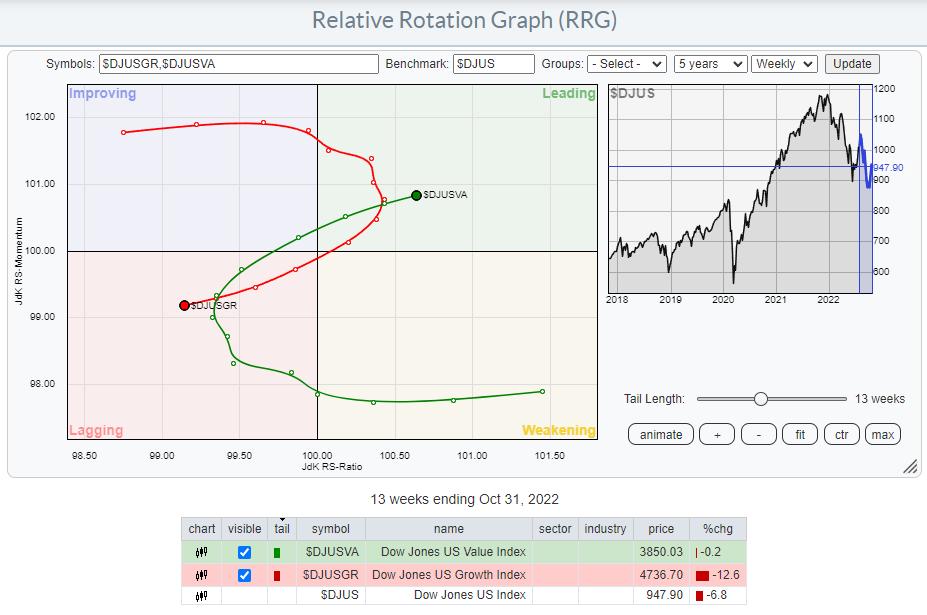
Over the last 13 weeks, a notable shift from growth to value stocks has taken place. After a rotation from leading, through weakening, into lagging between April and mid-October, the tail for value stocks has re-entered the leading quadrant at a strong RRG-Heading.
Generally, value stocks are seen as more defensive in nature than their growth counterparts. Looking back in history, it is not absolutely necessary for growth stocks to lead for the S&P 500 to rise, but it certainly helps.
In this week's episode of Sector Spotlight, I am addressing the long-term trends in asset classes and sectors. Without giving away all observations, I think that the most important takeaway from that exercise is that the trends (long-term) as they are visible and unfolding on these monthly graphs, are predominantly moving down.
Adding the observation that value stocks are taking over from growth again at the moment makes it hard for me to become overly bullish on the market as a whole at this stage. The near-term trend in the S&P is certainly pointing higher, and I think there is still some upside left. However, we will inevitably hit some pretty strong overhead resistance levels in both individual sectors and the index itself. The behavior of the market around these levels will be crucial for the longer-term outlook.
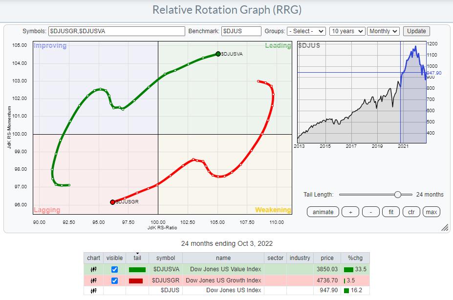
I also used monthly Relative Rotation Graphs in Sector Spotlight to visualize these long-term trends. The monthly time frame is a new feature on RRG and was recently added together with the intraday time frames.

The RRG above shows 24 months of rotation between growth- and value stocks. After the mild hiccup in favor of growth from Oct-21 to Feb-22, the growth tail continues to move lower at a negative RRG-Heading, while Value is moving in the opposite direction.
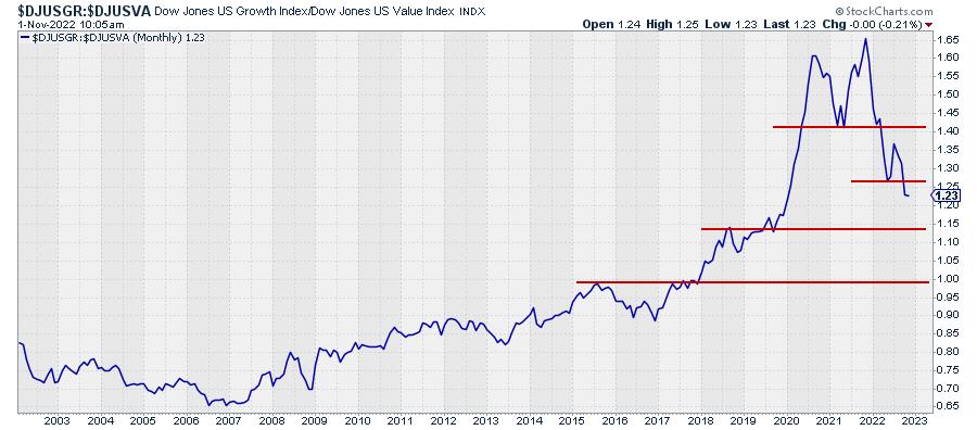
An interesting picture emerges when I bring this relationship to a standard graph.

Here is the monthly version of that relationship. The rhythm of lower highs and lower lows that emerged out of the 2021 peak is visible and confirmed by the break below the May low.

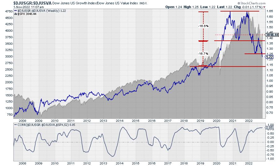
The weekly version offers more detail and shows an almost perfect double-top formation, with the two peaks aligning at 1.657 and 1.658 (WOW!!). The break of the low in between these two peaks is a little less clear, with one pull-back attempt reaching back to 1.4, but the subsequent move lower, now confirmed by the break of the previous low, that double top formation is now judged as valid. Based on the height of the formation, roughly 16.6%, we can now project the target for the current move to reach the area around 1.15 (minimum). Or in other words, back to the levels seen in 2018 and 2019 before this ratio accelerated higher.
The $SPX chart is plotted in the background as a reference. Be careful. The correlation between this ratio and the S&P 500 is generally high, currently 0.85 for a 52-week period, but it can definitely also go through periods of low or negative correlation.
Together with the continuing inversion of the yield curve, this is another long-term chart that I keep watching closely to monitor overall market conditions.
#StaySafe, --Julius
|
| READ ONLINE → |
|
|
|
| MORE ARTICLES → |
|
 Chart 1
 Chart 2
 Chart 3
 I'm going to share with you some of the gems and pearls of wisdom that I personally took away from the recent ChartCon 2022 Investor Conference. You may recall some of these nuggets. Others you won't because they occurred in belly-to-belly discussions behind the scenes.
