| THIS WEEK'S ARTICLES |
| Martin Pring's Market Roundup |
| Three Indicators that Call Bear Market Bottoms Were AWOL at the October Lows |
| by Martin Pring |
To many, October represents the low for the 2022 bear market and what we are seeing today is the first leg of a new bull trend. After all, interest rates have probably peaked, inflation is dying, supply chain problems are over and so is the pandemic.
Looking Closely at the 10-Year - One-Year Spread
One of the problems with that scenario is that it ignores a historical relationship between the stock market and the yield curve, which has only recently begun to invert. Note that the 10-year/one-year spread was used in chart 1 due to its longer history than the more popular 10-2 relationship.
The vertical lines approximate the initial inversion point when the one-year starts to trade at a higher yield than its 10-year counterpart. That means a tight monetary policy as the Fed ratchets up interest rates. The normal state of affairs is for investors to demand a higher yield on long-dated maturities because of the uncertainties involved with the longer time period. The red-dashed arrows suggest that inflation-adjusted stocks usually end up much lower than when the curve initially inverted. In 1989 and 2006, stock prices temporarily rose immediately following the inversion, but both situations eventually saw lower prices. The curve is currently at its most inverted since 1980 as it reflects the seriousness of the 2022 tightening process.
 CHART 1: THE 10-YEAR - ONE-YEAR SPREAD. The curve is at its most inverted since 1980 which may be reflective of the Fed's 2022 tightening policy. Chart source: StockCharts.com. For illustrative purposes only. CHART 1: THE 10-YEAR - ONE-YEAR SPREAD. The curve is at its most inverted since 1980 which may be reflective of the Fed's 2022 tightening policy. Chart source: StockCharts.com. For illustrative purposes only.
The inversion is one reason to be skeptical concerning the October low. Others come from missing pieces of the bear market puzzle that are usually present at such turning points. It doesn't mean October won't turn out to be the low, but merely that the probabilities would be greater had these indicators performed in an expected way.
Chart 2 compares the monthly Cboe Volatility Index ($VIX) to the S&P 500 Index ($SPX). The vertical lines flag the major lows since 1998. Each one, except the late 2019 bottom, saw a $VIX reading at or above the green horizontal "line of fear." The reading at the 2022 low was elevated, but nowhere near where the level you would expect given the magnitude of the 2022 sell-off. Few signs of capitulation here.
 CHART 2: $VIX VS. $SPX. In 2022 $VIX failed to signal fear. Chart source: StockCharts.com. For illustrative purposes only. CHART 2: $VIX VS. $SPX. In 2022 $VIX failed to signal fear. Chart source: StockCharts.com. For illustrative purposes only.
Our second indicator monitors confidence in the bond market, which is also related to expectations for the economy. Credit spreads can take many different forms, but a spread-type arrangement with a relatively long history that can also be plotted on the StockCharts platform is a ratio between the Fidelity Capital and Income and Vanguard Long-term Treasury mutual fund (FAGIX/VUSTX). The former is heavily weighted in favor of high-yield bonds. The latter is exposed to risk-free treasuries. A rising ratio reflects growing confidence among bond market participants, as they bid up the higher-yielding and riskier corporate paper in favor of the more conservative treasuries. Conversely, a falling ratio suggests bond investors are betting on a weakening economy and a greater potential for defaults.
Most of the time the ratio moves in the same direction as the $SPX. The red dashed arrows in chart 3 point out that this is not always the case. There's also an unprecedented divergence in 2022, as stocks fall but the confidence relationship rises. That means that if the October bottom is the final low for the 2022 decline, it would be the first time that a major decline had taken place as confidence was improving. The long-term KST for the ratio is still rising but is at an overbought level, suggesting a downside reversal may not be that far off and, with it, a loss of confidence, which would imply a softer stock market.
 CHART 3: DIVERGENCE BETWEEN STOCKS AND CONFIDENCE IN BOND MARKETS. If the October market low is the final low of the 2022 decline, it would be the first time confidence was rising when stocks were declining. Chart source: StockCharts.com. For illustrative purposes only. CHART 3: DIVERGENCE BETWEEN STOCKS AND CONFIDENCE IN BOND MARKETS. If the October market low is the final low of the 2022 decline, it would be the first time confidence was rising when stocks were declining. Chart source: StockCharts.com. For illustrative purposes only.
Finally, chart 4 compares the $SPX to a ratio between it and the CME CBOT 30-year U.S. Treasury Bond Price ($USB). It usually sells off during a bear market, mostly because, generally, the more volatile stocks are busy discounting a forthcoming economic slowdown or recession. The arrows show that the ratio bottoms consistently with the equity market. In 2022, though, stocks sold off, but the stock/bond relationship showed no sign of its normal weakness. Both fell, but bonds fell faster. That now leaves this relationship overstretched on the upside, as evidenced by the long-term KST in the bottom window. It also makes me wonder if bonds are now about to outperform stocks.
 CHART 4: $SPX VS. 30-YEAR U.S. TREASURY BOND. In 2022 the stock/bond relationship showed no sign of its normal weakness. Bonds fell faster than stocks. Does that mean bonds could outperform stocks? Chart source: StockCharts.com. For illustrative purposes only. CHART 4: $SPX VS. 30-YEAR U.S. TREASURY BOND. In 2022 the stock/bond relationship showed no sign of its normal weakness. Bonds fell faster than stocks. Does that mean bonds could outperform stocks? Chart source: StockCharts.com. For illustrative purposes only.
Good luck and good charting,
Martin J. Pring
The views expressed in this article are those of the author and do not necessarily reflect the position or opinion of Pring Turner Capital Group of Walnut Creek or its affiliates.
|
| READ ONLINE → |
|
|
|
| The Mindful Investor |
| Three Trendlines I'm Watching Next Week |
| by David Keller |
In early October, market trends appeared to make sense -- at least, as much as could be expected in 2022. The S&P 500 had just made a new 52-week low, the US Dollar had just achieved a new 52-week high, and the Ten Year Treasury Yield had just reached its highest level since 2008.
And then everything changed.
Over the last six weeks, equities have rallied, with the S&P 500 testing its 200-day moving average from below. The US Dollar has rotated lower, closing below its own 200-day moving average this week for the first time since June 2021. Interest rates have moved significantly lower, with the Ten Year now 75 bps lower than its October peak of around 4.25%.
This mean reversion move has left many investors scrambling to determine how to play the remainder of 2022. Will stocks follow their traditional path of strength in December, known as the strongest month for equities? Or will the S&P 500 and Nasdaq buck that trend and show weakness, indicating that the November rally was overly excessive?
Today, I'll present three trendlines I'm watching to answer those questions in the coming weeks. First, let's review the S&P 500 index and its fairly orderly decline in 2022.
1. S&P 500 Index
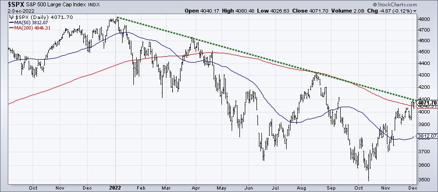
If you connect the major peaks in 2022 -- the ones in January, March and August -- you'll see that it lines up almost perfectly with this week's high. This key trendline currently lies right around 4100, which represents the final clear level of resistance around current levels. If and when the S&P 500 breaks above this trendline, a move to the August high around 4300 would be the next logical step. This 4300 level, coincidentally, represents a 61.8% retracement of the January to October selloff.
Next, we have the US Dollar.
2. US Dollar Index
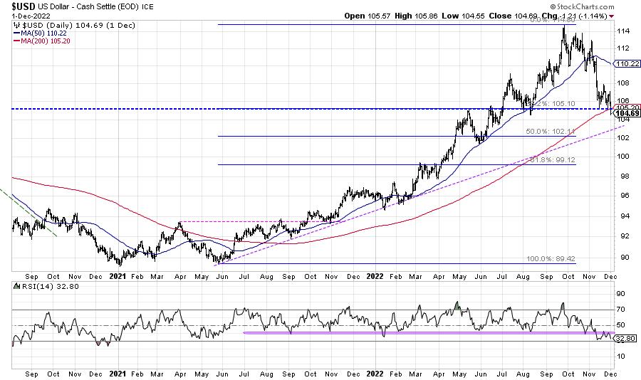
The US Dollar index has dropped from a peak just above 114 to end this week around 104. Here, we have a horizontal trendline (blue dashed line) which is a 38.2% retracement of the 2021-2022 uptrend. This trendline also lines up with the swing lows in August and November, as well as the 200-day moving average.
One of the major themes of 2022 has been the strength in the US Dollar, which we have often called the "wrecking ball for risk assets". The recent weakness in $USD has allowed stocks, bonds, and commodities to all move higher over the last six weeks.
If you're bullish on stocks here, I'd be cheering for the US Dollar to move even lower. A trendline from the 2021 and 2022 lows may be a good downside objective, currently around 103.
Finally, we can look at India.
3. iShares MSCI India ETF
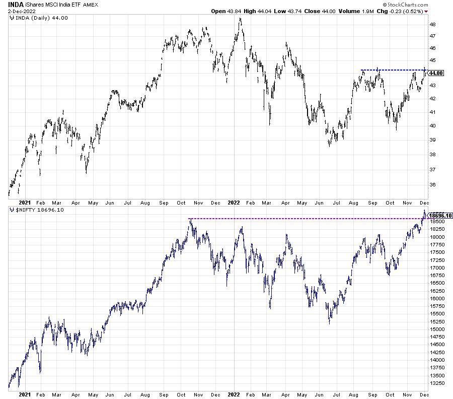
When I traveled to Mumbai last month, I spent a good deal of time reviewing charts in local currency, including the NIFTY 50 and the Sensex. These indexes broke to new 52-week highs this week, as the Indian market has shown renewed strength. But the US-listed ETF to play India, INDA, is about 10% below its own 52-week high. What's the reason for such a difference in the two charts? That's the impact of the US Dollar.
The strength in $USD through most of 2022 has meant that, for American investors, going outside the US stock market has been unfavorable as any strength in the local market would be deteriorated by the currency differential. The recent drop in the Dollar has completely flipped that narrative. While INDA is still well off its January high, the price is testing resistance just above $44 which, if broken, would complete a head-and-shoulders continuation pattern.
I'll be watching these trendlines for INDA (blue) and $NIFTY (purple) to see if these resistance levels can be broken and held.
Trendlines can provide an effective way to define trends, to follow their progress, and then identify when the trends have shifted. Those are three of the many trendlines I'll be following next week, to determine whether December continues the risk-on phase the markets have experienced since October.
Want to see a deeper dive into today's first chart on the S&P 500? Just head over to my YouTube channel.
RR#6,
Dave
P.S. Ready to upgrade your investment process? Check out my YouTube channel!
David Keller, CMT
Chief Market Strategist
StockCharts.com
Disclaimer: This blog is for educational purposes only and should not be construed as financial advice. The ideas and strategies should never be used without first assessing your own personal and financial situation, or without consulting a financial professional.
The author does not have a position in mentioned securities at the time of publication. Any opinions expressed herein are solely those of the author, and do not in any way represent the views or opinions of any other person or entity.
|
| READ ONLINE → |
|
|
|
| LIMITED TIME ONLY! |
 |
|
| Wyckoff Power Charting |
| Will the QQQ Swing into Gear? |
| by Bruce Fraser |
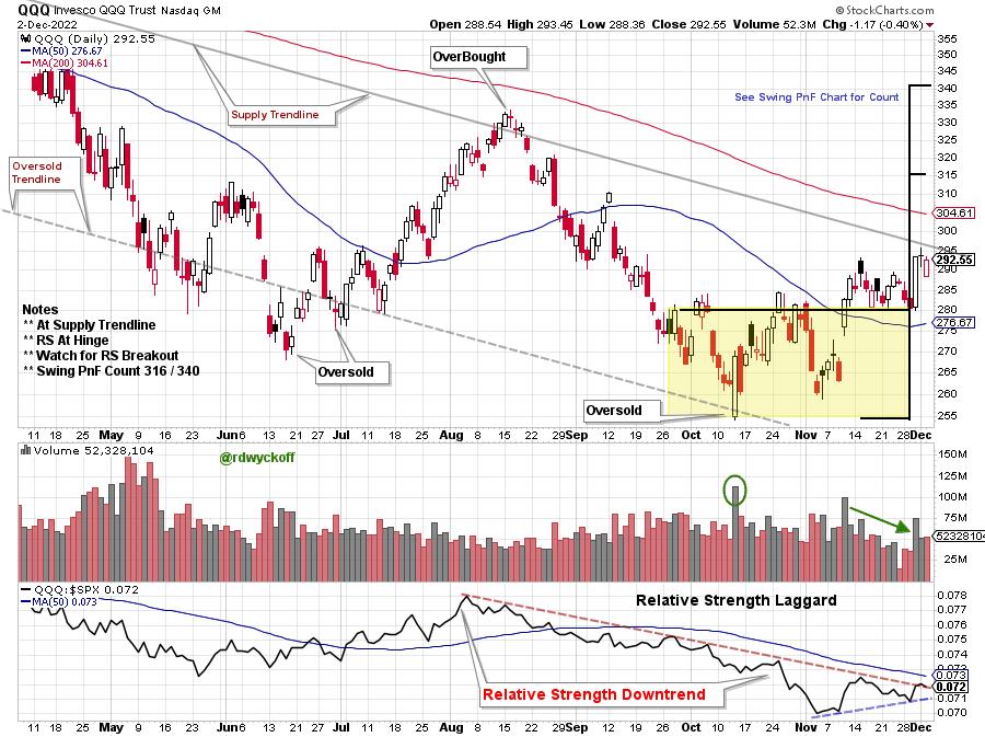
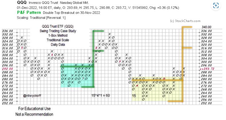
 Mega-Cap Growth stocks have led the stock market weakness on the way down in 2022. They have also lagged during the 4th quarter rally. This weakness has been a drag on major stock indexes such as the S&P 500 and the NASDAQ Composite. With the recent rally phase well underway could the Mega-Cap Growth stocks be preparing to play catchup with a bout of outperformance? The Mega-Cap Stocks have immense capitalization weighting in the major stock indexes. If they shake off their underperforming ways, even temporarily, it could put stock indexes into hyperdrive. We turn to a Swing Trading PnF case study of the QQQ ETF to determine if a ‘Cause' has formed for a rally and the upward potential of that advance. Mega-Cap Growth stocks have led the stock market weakness on the way down in 2022. They have also lagged during the 4th quarter rally. This weakness has been a drag on major stock indexes such as the S&P 500 and the NASDAQ Composite. With the recent rally phase well underway could the Mega-Cap Growth stocks be preparing to play catchup with a bout of outperformance? The Mega-Cap Stocks have immense capitalization weighting in the major stock indexes. If they shake off their underperforming ways, even temporarily, it could put stock indexes into hyperdrive. We turn to a Swing Trading PnF case study of the QQQ ETF to determine if a ‘Cause' has formed for a rally and the upward potential of that advance.

Chart Notes:
- A potential Swing Trading Accumulation Structure back to September for QQQ.
- QQQ Mega-Cap stocks have been a performance drag on major stock indexes during 2022.
- Relative Strength downtrend for the current quarter and the year illustrates the weakness.
- Relative Strength downtrend since August is attempting to reverse upward.
- QQQ is now in a Backup position with low volatility and diminished volume.
- The Overhead Supply trendline is immediately above and is important resistance.

Point & Figure Chart Notes:
- Swing PnF count (yellow shading) has price objectives near the August highs.
- A rise to this level would exceed the overhead Supply Line and the 200 d.m.a.
Better participation from these all-important mega-cap stocks would be a boost to the stock indexes, at least temporarily. A Swing PnF accumulation count appears nearly complete. This is a very important juncture on the charts, and we should monitor developments closely.
All the Best,
Bruce
@rdwyckoff
Announcement:
Best of Wyckoff Workshop. December 15, 2022, 9am to 12:30pm ET
This complimentary event is generously sponsored by the International Federation of Technical Analysts
To learn more and to register (click here)
Presenters and Topics:
- Alessio Rutigiano, Navigating the Crypto Market
- Fantz Herr, Improve Your Trading Results with Post-Trade Analysis
- John ‘Johniscan' Colucci, Scanning for Wyckoff Setups
- William Reardon & Roman Bogomazov, Live Trading Session (Wyckoff Tape Reading)
- Roman Bogomazov & Bruce Fraser, Wyckoff Market Discussion. A Wyckoff review of current markets
To learn more and to register (click here)
|
| READ ONLINE → |
|
|
|
| The Canadian Technician |
| Tesla Changes the Reality Distortion Field |
| by Greg Schnell |
As I got up this morning, I noticed a 10-minute YouTube summary of the Tesla Semi Truck unveiling. I found it extremely interesting.
Tesla Semi Truck unveiling
Tesla's stock (TSLA) is one of the most-watched charts in the market. It's been under pressure of late. Elon Musk's ability to communicate a future vision is outstanding, with so many believers following his perspective. I used to be a fuel and lubes rep, calling on large commercial road transport trucks for Western Canada. I have a little knowledge of what is required for truck fleets, but it's a little dated. I was very impressed with the reveal and some of the concepts presented in the video.
One example of remarkable engineering was hill climbing. A truck powering up a six-degree slope at speed and being able to accelerate was an engineering marvel. I drive through mountains all the time, and mountains are a challenge for trucks. In my former career, we did fuel tests with experienced drivers, and some were so detailed, they would literally know what spot on the road they would need to shift down each gear. To have a truck do all the drivetrain management at speed is truly amazing engineering.
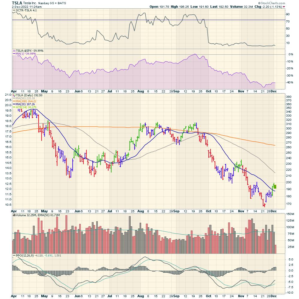
Looking at the chart of TSLA (see chart 1), it would appear to be no big deal. As this becomes more available, it could be a significant factor for TSLA's stock price. I wouldn't use the chart to recognize what's happening behind the scenes, but it might help build a base for the next price climb on the chart.

CHART 1: TESLA INC. (TSLA) STILL UNDER PRESSURE? The unveiling of TSLA's semi-truck did little to pump up the stock price. It's still worth watching just in case the semi-truck is a big hit. Chart source: StockCharts.com. For illustrative purposes only.
TSLA's stock price may not have moved much, but solar stocks were moving this morning. The Tesla truck has a 1 MW charge. Solar farms are 15 acres/megawatt. A quarter section of land hosts a 15 MW solar array. Extrapolating a 1/4 section of land for 15 trucks isn't going to be the long-term solution. However, if demand for the semis increases, managing the demand is going to be a big deal.
Solar Stocks
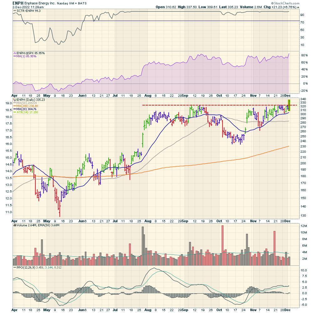
One stock in the solar space worth looking at is Enphase Energy (ENPH). Price is breaking out above resistance (see chart 2). Beautiful!

CHART 2: ENPH BREAKING ABOVE RESISTANCE. This stock could be one to add to your ChartLists. Chart source: StockCharts.com. For illustrative purposes only.
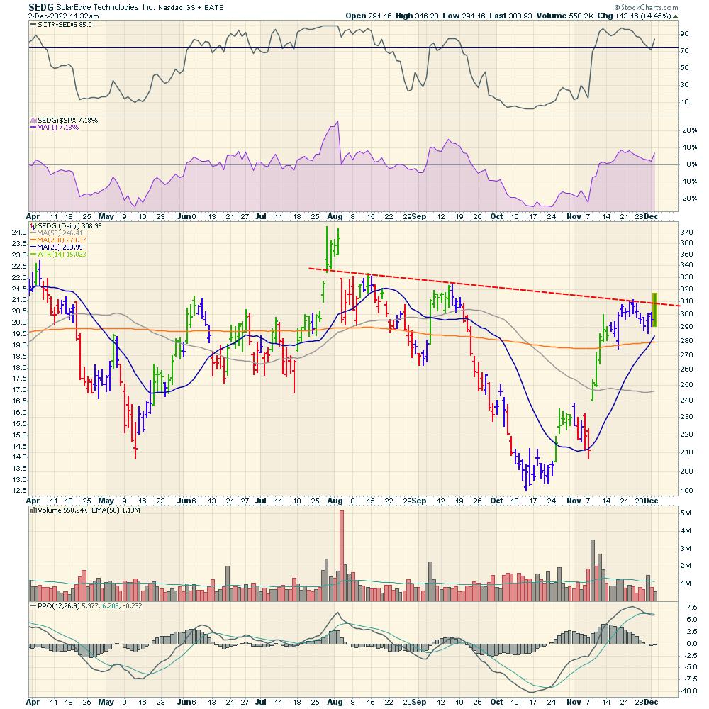
SolarEdge Techologies (SEDG) is also breaking out of a trend of lower highs (see chart 3).

CHART 3: SEDG BREAKING ABOVE ITS TREND LINE. If the stock price continues rising on above-average volume, you may want to keep this stock on your radar. Chart source: StockCharts.com. For illustrative purposes only.
A lot of changes may come in the renewable energy space, as many companies are gearing up to expand their manufacturing factories in the United States. This may be a great time to focus on the changes that are coming at us.
At Osprey Strategic, we continue to publish an entire chartlist of charts that are involved in the energy crisis outside of fossil fuels. This chartlist will continue to be a theme well into the future. If you would like to learn more, head over to Osprey Strategic and check out our $7 membership offering.
|
| READ ONLINE → |
|
|
|
| The MEM Edge |
| These Stocks Have Been the Stars of 3rd Quarter Earnings Season -- And Many Are Poised to Trade Much Higher |
| by Mary Ellen McGonagle |
Most stocks in the S&P 500 have reported 3rd quarter results and, while a lower-than-average number reported above estimates, many that had positive results have gone on to trade higher in moves that still have further upside during the current bear market rally.
The biggest winners among these companies reporting positive earnings were stocks that immediately posted a gap up in price on high volume, which then led to a base breakout. This is one of the most powerful chart patterns and often will lead to further gains that are much higher than the markets.
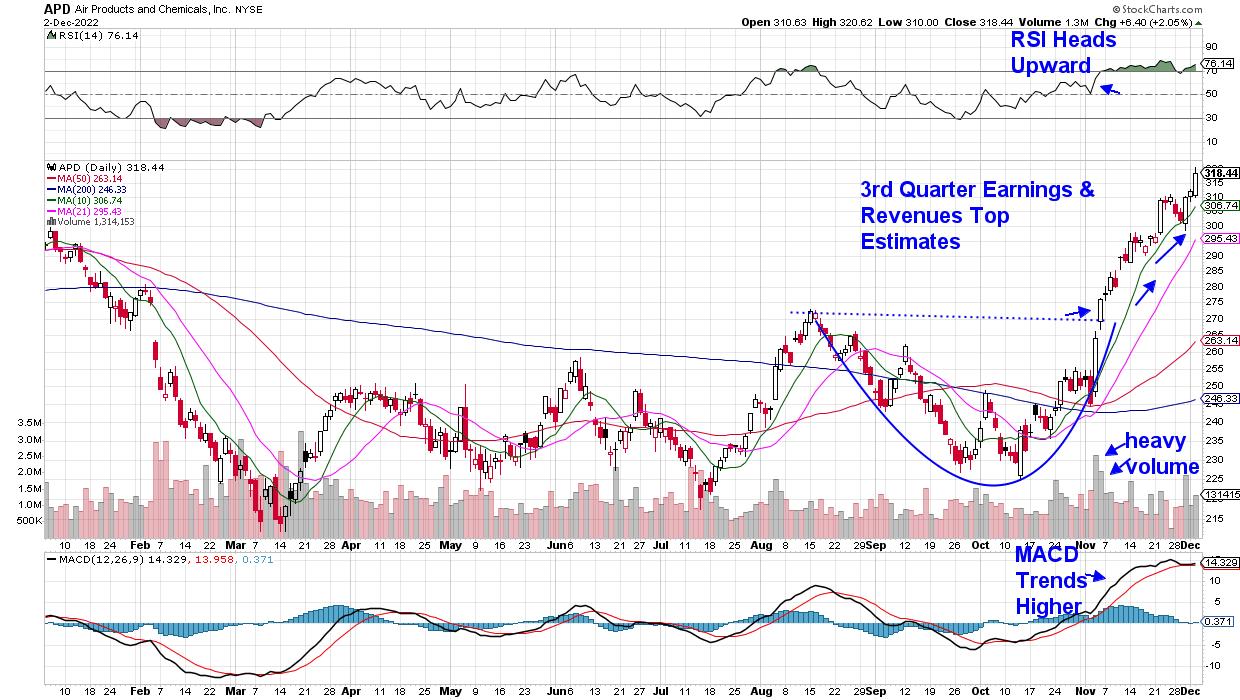
DAILY CHART OF AIR PRODUCTS AND CHEMICALS, INC.

To begin, the higher-than-average volume during the gap up in price indicates strong demand for the stock that, in most cases, will take more than one day to fulfill. One reason for the strong demand is strong earnings, which has been proven to be the primary driver of stocks that go on to far outpace the markets.
Over the days following the better-than-expected earnings report, Wall Street analysts will often begin to raise their price target for the stock -- which was the case for Air Products & Chemical (APD) -- and this will provide a secondary boost. The latest price target upgrade for APD is $390, which is 18% above the current price.
Of course, these stocks won't go on to trade higher forever. Your first signal that the uptrend is over will be a move of the RSI into negative territory (below 50) on the daily chart. Price action within the broader markets will impact these leading stocks as well.
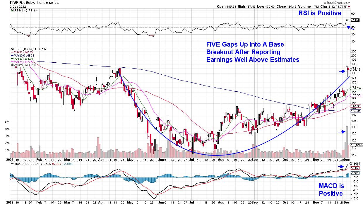
DAILY CHART OF FIVE BELOW, INC. (FIVE)

Above is a chart for Five Below (FIVE), which gapped up into a base breakout last Thursday after reporting earnings that were 93% above estimates. In addition, management raised their guidance going into year-end due to robust holiday sales. In turn, Wall Street raised their price target to $200, which is about 10% above its current price.
Five Below's supersized rally pushed the stock out of a 5-month base, which is constructive, as the longer your base breakout, the longer your possible advance out of that base.
Strong earnings are not the only reason that stocks gap up into base breakouts, as one of the Biotechnology stocks from my MEM Edge Report has just entered an uptrend out of a base due to positive clinical trial news for one of their drugs. In addition, the company is estimated to grow earnings by 207% next year. To receive immediate access to this stock that is just beginning to trend higher, use this link here for a 4-week trial at a nominal fee. You'll also have access to my other top picks.
In addition, my bi-weekly MEM Edge Report provides insights into what to expect for the markets going into year end as well as which areas of the market you should overweighting. Take advantage of this offer now!
Warmly,
Mary Ellen McGonagle, MEM Investment Research
|
| READ ONLINE → |
|
|
|
| ChartWatchers |
| Stock Market Indexes and Fibonacci Retracements: Will the Nasdaq Push Through This Key Level? |
| by Jayanthi Gopalakrishnan |

Smaller rate hikes were music to investors' ears. After two down days that looked like it could have stretched to three, the markets pulled a quick reversal and came roaring back after Fed Chairman Powell's speech at the Brookings Institution.
If you were following the markets on Wednesday, you'd know that, during the first half of the trading day, the S&P 500 Index ($SPX), Dow Jones Industrial Average ($INDU), and the Nasdaq Composite ($COMPQ) were trading lower. But after Chairman Powell mentioned that the pace of interest rate increases could moderate starting in December, investors felt more at ease.
Investors took the "Don't Fight the Fed" adage seriously, and the stock markets spiked on the news. Yesterday, the three broader indexes closed at their highs—$SPX at 4080.11, $INDU at 34,589.77, and $COMPQ at 11,468. Treasury yields, the U.S. dollar, and the CBOE Volatility Index ($VIX) moved lower (more on the $VIX later). The fall in the U.S. dollar gave a boost to precious metals, with gold and silver moving to the upside.
Fibonacci Levels and Moving Averages
If you remember, last week we mentioned that the 200-day simple moving average (SMA) would act as a strong resistance level for the $SPX. Now that the index has crossed above that level, we'll have to see if there's enough of a follow-through to take it up to the 4200 level—a key Fibonacci retracement level—or if this is a reactionary move.
The core personal consumption expenditure (PCE) index, an inflation gauge the Fed favors, came in softer than expected. This could help extend yesterday's stock market rally. If the rally continues, one thing to watch for is the slope of the 200-day SMA. It's still sloping downward and if starts flattening out, that could be a positive indication for a rally.
On Wednesday, all 11 S&P sectors were in positive territory, with Technology leading followed by Communication Services and Consumer Discretionary. This can be seen in the performance of $COMPQ, which got some much-needed attention. Since mid-October, out of the three U.S. broader indexes, the $COMPQ was the laggard, with Technology and Communication Services often being the lowest-performing sectors. But on Wednesday, after Powell's comments, $COMPQ popped.
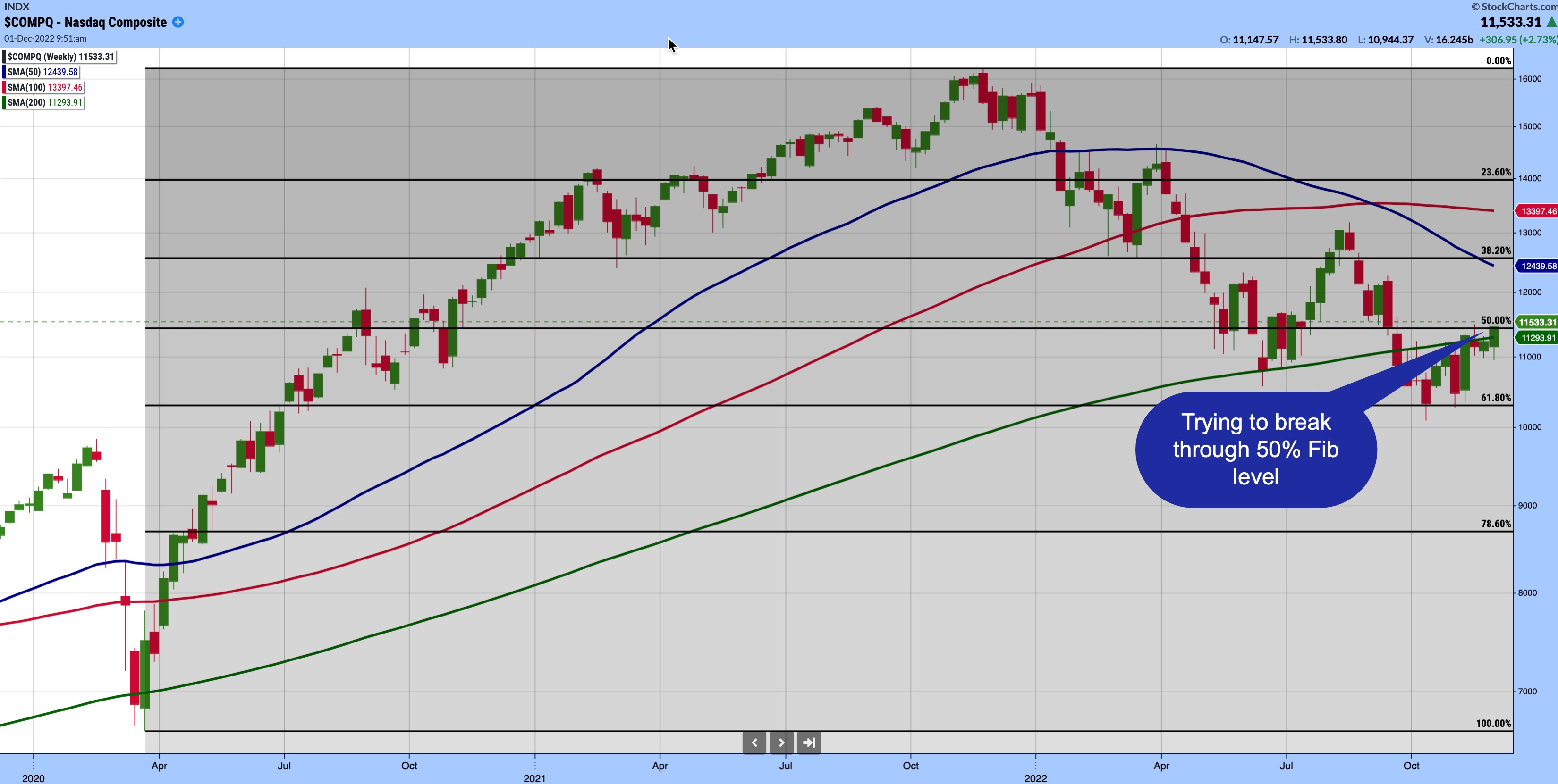
Looking at the weekly chart of $COMPQ, using the March 2020 low and November 2021 high to draw the Fibonacci levels, you can see the index is trying to push through the 50% Fibonacci retracement level (see chart 1).

CHART 1: NASDAQ FACING RESISTANCE FROM FIBONACCI RETRACEMENT LEVEL. $COMPQ is trying to catch up with the $SPX and $INDU as it tries to battle through the 50% Fib retracement level.Chart source: StockChartsACP from StockCharts.com. For illustrative purposes only.
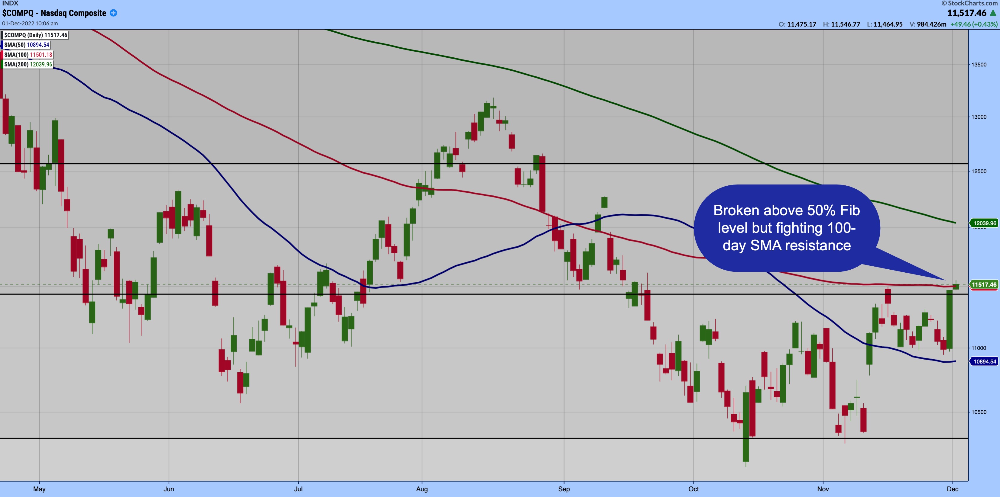
If you switch over to the daily chart, you'll see that $COMPQ has broken above its 50% retracement level, but is battling with resistance from its 100-day SMA (see chart 2).
 CHART 2: NASDAQ COMPOSITE ($COMPQ) FIGHTING RESISTANCE. After breaking out from its 50% Fibonacci retracement level, $COMPQ is now trying hard to get past its 100-day SMA, which sits a hair above the Fib level.Chart source: StockChartsACP from StockCharts.com. For illustrative purposes only.Another interesting point to note is that the 100-day SMA aligns with the November 15, 2022 high, so busting through the 100-day SMA could take some effort. If it does, we could see investors gravitate towards a risk-on investing strategy, a sign that investors are becoming more complacent. CHART 2: NASDAQ COMPOSITE ($COMPQ) FIGHTING RESISTANCE. After breaking out from its 50% Fibonacci retracement level, $COMPQ is now trying hard to get past its 100-day SMA, which sits a hair above the Fib level.Chart source: StockChartsACP from StockCharts.com. For illustrative purposes only.Another interesting point to note is that the 100-day SMA aligns with the November 15, 2022 high, so busting through the 100-day SMA could take some effort. If it does, we could see investors gravitate towards a risk-on investing strategy, a sign that investors are becoming more complacent.
Speaking of complacency, another indicator to keep on your radar is the $VIX. On Wednesday, it fell sharply to the 20 levels. The $VIX is a fear gauge that's closely watched by traders. Post-pandemic, $VIX has ranged between 20 and 35, which is higher than what was considered its norm (between 12 and 20). So, if $VIX starts to move lower than 20 and goes back to its pre-pandemic regime, it would further confirm that investors are less worried about the market.
We're not necessarily out of the woods yet, but keep an eye on key resistance levels. If $COMPQ breaks through its 100-day SMA and the other broader equity indexes also break through their resistance levels, it could be a positive sign. Remember, we are in the last trading month of the year, which, typically, is a strong month that culminates with the Santa Claus rally. According to the Stock Trader's Almanac, the Santa Claus rally tends to come to Wall Street nearly every year. Let's hope we get one this year.

Jayanthi Gopalakrishnan
Director, Site Content
StockCharts.com
Disclaimer: This blog is for educational purposes only and should not be construed as financial advice. The ideas and strategies should never be used without first assessing your own personal and financial situation, or without consulting a financial professional.
|
| READ ONLINE → |
|
|
|
| DecisionPoint |
| New Bull Market for the Dow Industrials? |
| by Carl Swenlin |
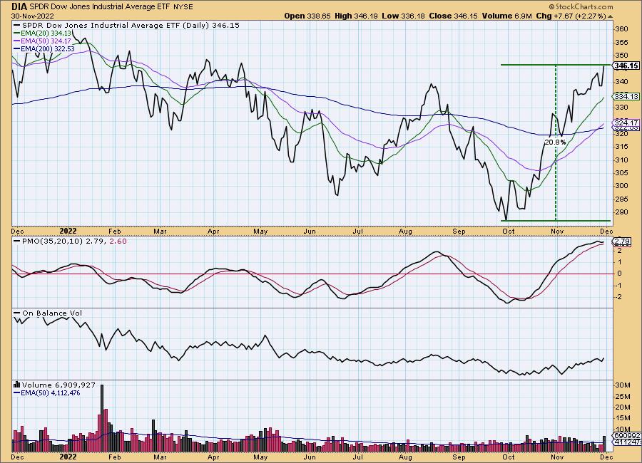
As of today, the Dow Jones Industrial Average has advanced to just over +20% from its October low, which by some standards means it has entered a new bull market. Does that mean that the worst is over and that the rest of the market will follow suit? Maybe.

A widely accepted rule is that, when a market index moves +20% from a bear market low, a new bull market has begun. And that is certainly the case for the Dow. Let us see if the other major indexes follow suit. The S&P 500/400/600 and NYSE Composite Indexes are up about +17%, and they could easily make the extra three percent. The Nasdaq 100 is only up +13%.
I personally think we are in a secular bear market, but secular bears can be interrupted by cyclical bull markets. Fundamentally, I think things are too screwed up for the secular bear to be over, but we shall see.
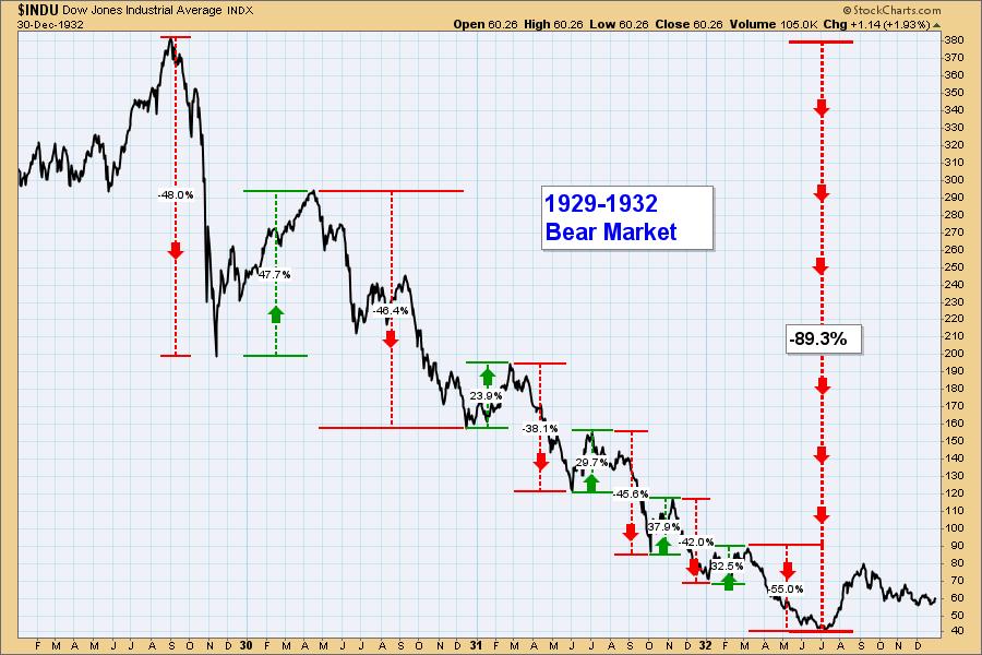
What prompted me to write this article is the following chart that you may have seen before. It shows that the secular 1929-1932 Bear Market consisted of six cyclical bear and five cyclical bull markets. I'm not saying that we are going to repeat this scenario, just demonstrating what can happen.

Conclusion: When we analyze the current bear market, we can see that it was lead by the big technology stocks, and the Dow isn't burdened by as many of them, or their cap-weighting, as the broader indexes are. For this reason the Dow barely reached the -20% decline to qualify for a bear market, and it is now recovering faster as well. But it may be a mistake to expect the broader market indexes to match this progress.
Watch the latest episode of DecisionPoint on StockCharts TV's YouTube channel here!

Technical Analysis is a windsock, not a crystal ball. --Carl Swenlin
(c) Copyright 2022 DecisionPoint.com
Helpful DecisionPoint Links:
DecisionPoint Alert Chart List
DecisionPoint Golden Cross/Silver Cross Index Chart List
DecisionPoint Sector Chart List
DecisionPoint Chart Gallery
Trend Models
Price Momentum Oscillator (PMO)
On Balance Volume
Swenlin Trading Oscillators (STO-B and STO-V)
ITBM and ITVM
SCTR Ranking
Bear Market Rules
DecisionPoint is not a registered investment advisor. Investment and trading decisions are solely your responsibility. DecisionPoint newsletters, blogs or website materials should NOT be interpreted as a recommendation or solicitation to buy or sell any security or to take any specific action.
|
| READ ONLINE → |
|
|
|
| RRG Charts |
| SPY Remains Under Pressure, But These Sectors are Improving |
| by Julius de Kempenaer |

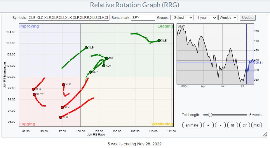
Relative Strength is Losing Its Concentration
Recent sector rotation shows a relative strength loss for two of the three defensive sectors. This is a move away from the trend we have seen for many months, where the defensive sectors were leading the market, sometimes even when the S&P 500 was moving up. So the first takeaway from this observation is that the dominance of defensive sectors seems to be fading away, at least for now.
The most eye-catching deviation is the almost straight line on the tail for XLU pushing the sector deeper into the lagging quadrant.
On the opposite side, the cyclical sectors also show a diverse image. Materials and Financials are at strong rotations and inside the leading quadrant, while Real Estate and, more importantly, Consumer Discretionary are inside the lagging quadrant.
And also, in the group of sensitive sectors, we find 2-2 opposing rotations. Energy and Industrials are inside, leading and pushing further into it as they advance on both scales. Communication Services remains weak and continues to lose on both scales. Technology has curled upward and is picking up some relative momentum but no relative strength yet.
All in all, it looks as if the dominance of the defensive group is fading, but on the other hand, none of the other groups is picking up that role. This means that relative strength in the market is currently scattered across all sectors, making it hard to use any concentration of leadership as a guide for the direction of the S&P 500.
S&P 500 Remains Under Pressure
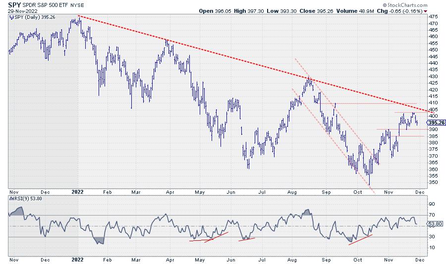
With that in mind, I still see an overhead supply for SPY.

First, the major falling resistance has been running over the highs since the start of the year. Secondly, the resistance zone between 410-415 came into play a few times as support and resistance. And then there seems to be a small double-top building around 403 where the two most recent peaks were formed.

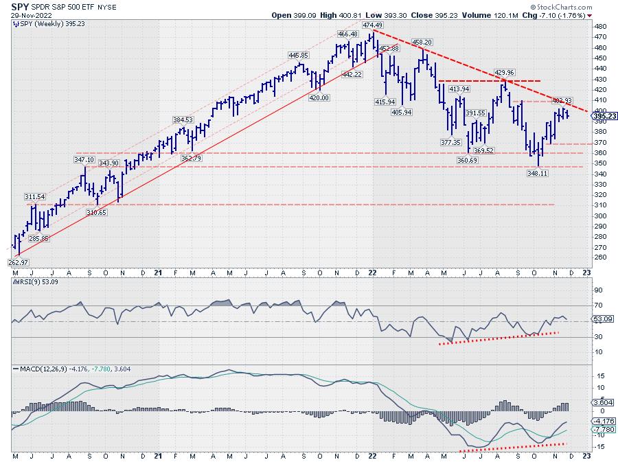
All of that is happening while the bigger trend is still down, with a clear series of lower highs and lower lows visible on the weekly chart.
Some Individual Sectors Are Improving
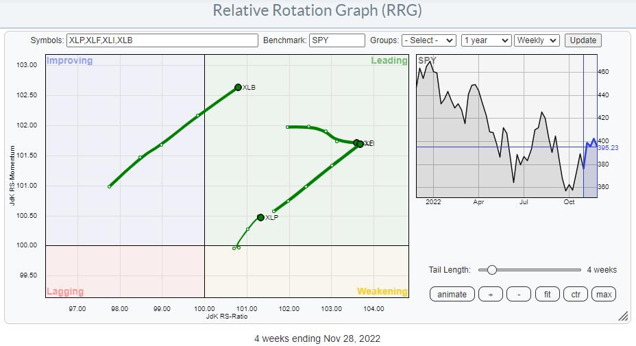
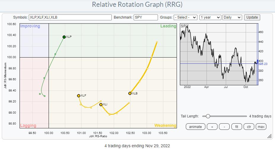
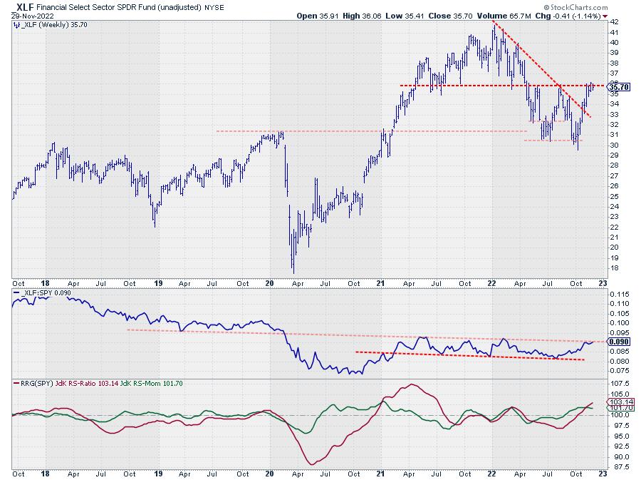
Now, with that bigger framework in place, we can check out a few sectors that are in the process of setting up for a positive turnaround. The sectors that I am particularly watching are Materials (XLB), Financials (XLF), Industrials (XLI), and Consumer Staples (XLP).

Above are these four sectors plotted on a weekly Relative Rotation Graph. Except for XLF, they are all at a strong RRG-Heading between 0-90 degrees. XLF is moving due East and continues to gain in terms of relative strength at a steady pace (relative momentum).

Switching to the daily version of this chart shows a strong rotation for XLP moving back into the leading quadrant after a corrective rotation through weakening and briefly lagging.
XLB, XLI, and XLF are all inside the weakening quadrant well above the 100-level on the RS-Ratio scale. XLF and XLI have already started turning back up, while XLB seems to need a bit more corrective relative rotation.
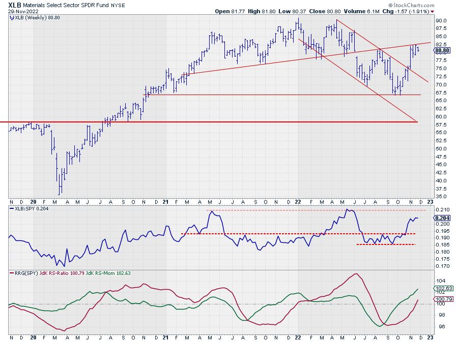
Materials

XLB is pushing against that slightly up-sloping resistance for a few weeks already but has not been able to create a decisive breakthrough. In terms of relative strength, this sector already broke horizontal resistance a few weeks ago, while the next (relative) resistance is still a bit higher. This creates room for a corrective relative move in XLB when the price fails to break higher. This is likely the sector facing the most resistance of these four.
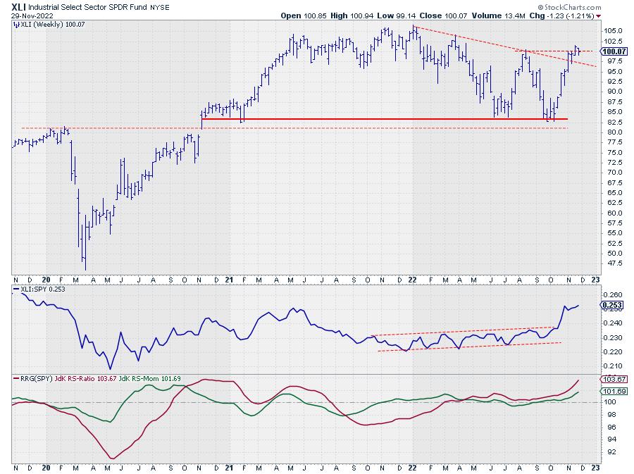
Industrials

Industrials have already broken the down-sloping resistance and is now pushing against resistance in the area around the previous peak at 100.50. Yesterday's high was at 101.30, but no real follow-through yet.
Relative strength continues to pick up momentum, resulting in one of the stronger rotations on the RRG. I am looking for a decisive break above 101.50 on this week's close. That will very likely attract more buying interest to push the sector further up toward the 105 area, where it will face the real test.
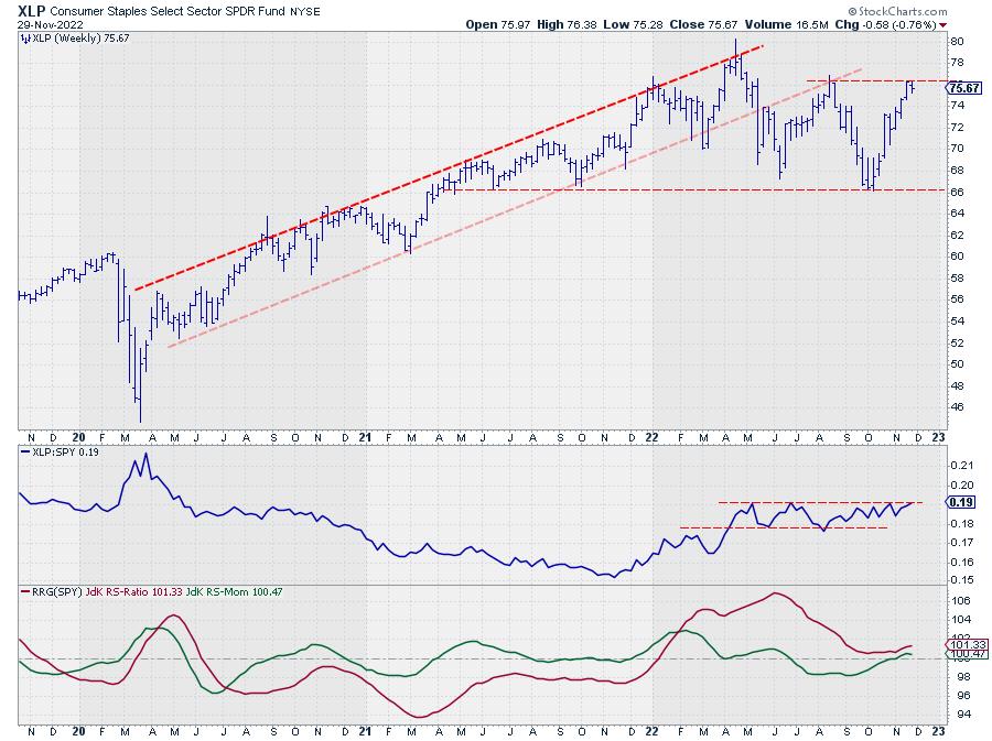
Consumer Staples

XLP found support near 66 and rallied strongly towards the 76 area, which is now running into resistance coming off the previous peak (mid-August). Relative Strength has also followed the price rally up to its resistance level.
We need a break above 76 by the end of the week to trigger new upside potential toward the peak that was set near 80 earlier this year. A decent tradable opportunity, when triggered with good downside protection once old resistance can start to act as support and a real good entry for an expected rally if and when XLP can take out its all-time high.
Financials

The setup for XLF is quite similar to the other three sectors I discussed above. However;
The upside potential from the breakout to the previous high seems to be the biggest which makes it, IMHO, the most interesting opportunity to watch once it triggers.
Last week's high was at 36.16, while the peaks of May and August came in at 35.74 and 35.97. I'd say a close at or above 36.50 this week will be the trigger for a further rally toward the levels we saw at the start of the year, ie, ~41. That equals a solid 10% upside potential while the downside is well protected around 36.
#StaySafe, --Julius
|
| READ ONLINE → |
|
|
|
| Top Advisors Corner |
| The Gold Price Move ETF Traders Weren't Betting On |
| by Tom McClellan |

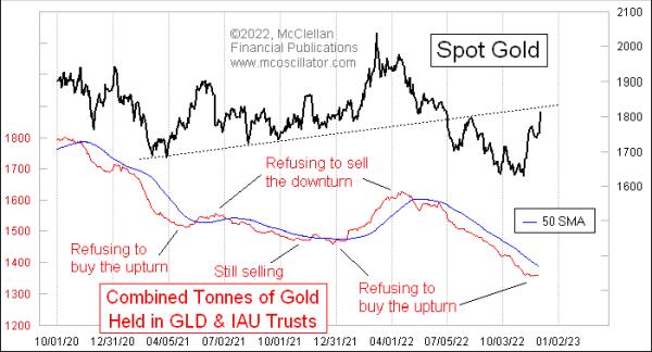
Gold prices have moved up by almost $200 off the October lows. Generally, that would bring a response from investors to start buying into SPDR Gold Shares (GLD) and iShares Gold Trust (IAU), the big gold bullion exchange-traded funds (ETFs). But they're not doing that (yet), which is really interesting.
The normal behavior by investors is to buy into these ETFs when gold is rising, then sell out of them when gold prices fall. Extremes of either buying or selling can be useful indications of a sentiment extreme, worthy of a top or bottom for prices. That's how things normally work.
What is happening now is not normal. Gold futures have been rising, with a greater than 2% jump on December 1, 2022 thanks to a little bit of U.S. dollar weakness. But up through November 30 (the most recent data available), there has not been any response by investors trying to reposition themselves into these ETFs.
Both GLD and IAU hold gold bullion to back their shares. If the shares trade at a price significantly different from the net asset value (NAV), then these funds will issue or redeem shares as needed to get the trading price back close to the NAV. When the funds do that, the total asset levels will change.
The sponsors report these data after the close each day at the following links:
Given the big jump in gold prices since October, we should expect that public sentiment toward gold should be turning more bullish, but it isn't. Investors are still avoiding these ETFs, which means that their bearishness is more firmly rooted. That is actually bullish for gold prices, because, to get a top for gold prices, we would expect to see investors clamoring to get into gold. They are not at that point yet, which conveys the message that gold is going to have to trend higher for a lot longer to get the sentiment to change.
|
| READ ONLINE → |
|
|
|
| MORE ARTICLES → |
|
 CHART 1: THE 10-YEAR - ONE-YEAR SPREAD. The curve is at its most inverted since 1980 which may be reflective of the Fed's 2022 tightening policy. Chart source: StockCharts.com. For illustrative purposes only.
 CHART 2: $VIX VS. $SPX. In 2022 $VIX failed to signal fear. Chart source: StockCharts.com. For illustrative purposes only.
  CHART 3: DIVERGENCE BETWEEN STOCKS AND CONFIDENCE IN BOND MARKETS. If the October market low is the final low of the 2022 decline, it would be the first time confidence was rising when stocks were declining. Chart source: StockCharts.com. For illustrative purposes only.
 CHART 4: $SPX VS. 30-YEAR U.S. TREASURY BOND. In 2022 the stock/bond relationship showed no sign of its normal weakness. Bonds fell faster than stocks. Does that mean bonds could outperform stocks? Chart source: StockCharts.com. For illustrative purposes only.


 Mega-Cap Growth stocks have led the stock market weakness on the way down in 2022. They have also lagged during the 4th quarter rally. This weakness has been a drag on major stock indexes such as the S&P 500 and the NASDAQ Composite. With the recent rally phase well underway could the Mega-Cap Growth stocks be preparing to play catchup with a bout of outperformance? The Mega-Cap Stocks have immense capitalization weighting in the major stock indexes. If they shake off their underperforming ways, even temporarily, it could put stock indexes into hyperdrive. We turn to a Swing Trading PnF case study of the QQQ ETF to determine if a ‘Cause' has formed for a rally and the upward potential of that advance.