| THIS WEEK'S ARTICLES |
| John Murphy's Market Message |
| S&P 500 NEARS TEST OF DECEMBER HIGH AFTER CLEARING 200-DAY LINE |
| by John Murphy |
NEXT TEST IS DECEMBER HIGH... The technical condition of the stock market continues to improve. Chart 1 shows the S&P 500 clearing its 200-day moving average. Although not shown here, it also cleared a falling trendline extending back a year. Both are positive signs. The next test will be the ability of the SPX to clear its December high. In addition, its blue 50-day moving average line is very close to testing its red 200-day line and may be nearing a "golden cross" which occurs when the shorter line crosses above the longer. That would be another positive sign. Market breadth indicators also appear supportive. Two-thirds (66%) of SPX stocks are trading above their 200-day average; while the NYSE common stock only advance-decline line has risen to the highest level in five months.
 Chart 1 Chart 1
BULLISH PERCENT INDEX TESTS RESISTANCE... Chart 2 shows the NYSE Bullish Percent Index right up against its August peak at 60%. That index measures the percent of stocks on point & figure uptrends. A decisive close above that previous peak would be a positive sign for stocks. Another sign of positive breadth is the fact that most sector indexes have exeeded 200-day moving average lines. Some have also experienced "golden crosses".
 Chart 2 Chart 2
POSITIVE SECTOR BREADTH... Eight sector SPDRs are trading over their 200-day lines. Chart 3 shows the Technology SPDR (XLK) clearing that major resistance line this week. That puts the XLK in position to challenge its December peak. Because of its large size, the XLK carries a lot of weight in the S&P 500. An upside breakout would be good for both.
GOLDEN CROSSES... Four market sectors have already experienced "golden crosses" with their 50-day lines exceeding 200-day lines. They include financials, industrials, energy, and materials. The circle in Chart 4 shows the shorter average crossing above the longer a month ago for financials. The XLF has also traded above its December high.
 Chart 3 Chart 3
 Chart 4 Chart 4
WEEKLY SECTOR RANKING... Chart 5 ranks the eleven market sectors for the past week with nine in the green and two in the red. It's encouraging to see economically-sensitive consumer discretionary stocks in the lead along with technology, communications services, and financials. The weakest sectors are utilities, healthcare, and consumer staples which are defensive in nature. All of which suggest that investor confidence appears to be improving.
FED REMAINS BIGGEST HURDLE... While market sentiment is showing signs of improvement, the biggest hurdle for stocks remains the Fed. There appears to be a disconnect between improving market action and an aggressive Fed that appears determined to keep hiking rates until inflation is finally brought under control. In addition, inverted yield curves continue to predict the likelihood of an economic recession which would be negative for stocks. At such times, technicians need to rely more than ever on market charts to help determine likely market direction. The next big test will come after next week's Fed meeting. And how stocks react to what the Fed does and says about its future intentions.
 Chart 5 Chart 5
|
| READ ONLINE → |
|
|
|
| Martin Pring's Market Roundup |
| Fourteen-Year Trend Favoring Relative Action of U.S. Equities May Be Over |
| by Martin Pring |
From the financial crisis in 2008 until October of last year, the U.S. stock market handsomely outperformed the Dow Jones Global Index ($DJW). However, recent price action suggests that this relationship may be about to change.
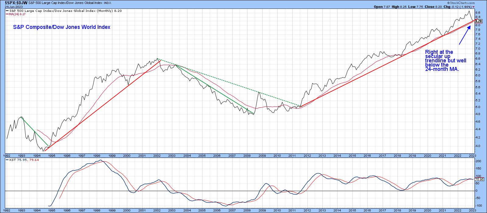
Stated more accurately, U.S. relative performance may have peaked last October, just as the S&P 500 index ($SPX) was recording its October low. Since that time, the ratio between the $SPX and $DJW has been falling like a stone. However, it has now reached mega-support in the area of its secular up trendline, as shown in Chart 1.
The chart also demonstrates how the ratio has historically lent itself to trendline construction. Each violation was followed by a worthwhile and long-term trend reversal. Note that the long-term KST is threatening to cross below its 9-month MA. If that 2008-2023 up trendline is ruptured, a KST sell signal would be an odds-on possibility, thereby further supporting the idea of a huge trend change in this relationship.
 CHART 1: HAS THE RELATIVE PERFORMANCE OF U.S. STOCKS PEAKED? When you look at the ratio between the S&P 500 index and the Dow Jones World Index, it has reached the support level of a secular uptrend. Chart source: StockCharts.com. For illustrative purposes only. CHART 1: HAS THE RELATIVE PERFORMANCE OF U.S. STOCKS PEAKED? When you look at the ratio between the S&P 500 index and the Dow Jones World Index, it has reached the support level of a secular uptrend. Chart source: StockCharts.com. For illustrative purposes only.
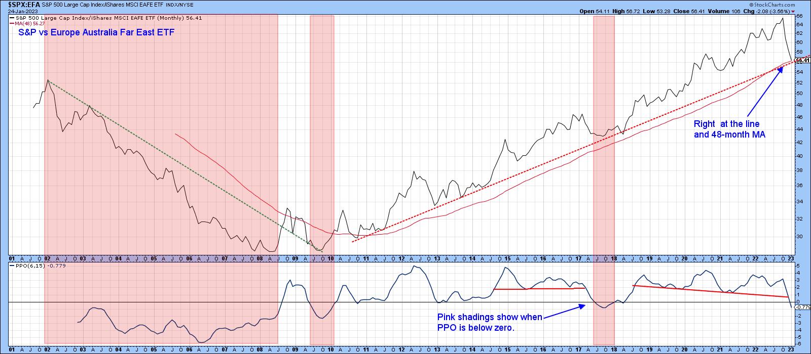
Chart 2 compares the $SPX to the rest of the world, which is represented by the MSCI EAFE ETF (EFA). The direction of the trend is similar but more pronounced than the comparison of the U.S. to a world index constructed with healthy U.S. weighting. In this instance, it's possible to draw a slightly different trendline, but it too is once again positioned right at the line. It is also evident that the 48-month moving average (MA), another dynamic level of support, is intersecting with the ratio and up trendline. So far, during this secular advance, the MA hasn't been decisively penetrated. If it was, it would represent a major technical event.
The pink shadings reflect periods when the percentage price oscillator (PPO), using the six and 15 parameters, was below zero. That has only happened twice since 2010, so this month's bearish crossover represents a third.
 CHART 2: S&P 500 INDEX VS. MSCI EUROPE AUSTRALIA FAR EAST (EAFE). Relative performance is right at an uptrend and the 48-month moving average. The PPO is also below zero. Chart source: StockCharts.com. For illustrative purposes only. CHART 2: S&P 500 INDEX VS. MSCI EUROPE AUSTRALIA FAR EAST (EAFE). Relative performance is right at an uptrend and the 48-month moving average. The PPO is also below zero. Chart source: StockCharts.com. For illustrative purposes only.
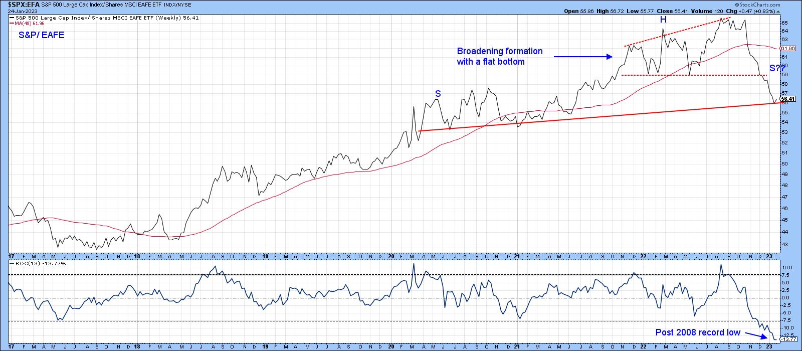
Finally, Chart 3 indicates that the 13-week rate of change (ROC) is at a post-2017 record low. This reading actually outstrips anything seen during the 2003–2008 part of the previous secular bear market. That's a big deal because it signals a characteristic change from a bull to a bear market. Alternatively, it could indicate a shift from a bull market to a multi-year trading range. Either way, it represents a piece of valuable evidence that the primary trend favoring the U.S. is over for a while.
An extreme oversold, on the one hand, can be interpreted as a bearish long-term factor. However, an oversold condition is still an oversold condition. That means things are currently overstretched on the downside. Since this ratio and $SPX vs. $DJW are both at key trendlines, and the former is intersecting with its 48-month MA, this is as good a place as any for anticipating some form of relief rally. Chart 3 also hints at the possibility that the $SPX/EFA weekly ratio may be in the process of forming a head-and-shoulders top. That's not a prediction, but a statement of a possible scenario.
 CHART 3: IS THE MARKET BECOMING MORE BEARISH? A broadening formation plus a possible head and shoulders top formation suggests that there may not be enough strength to carry the market higher. Chart source: StockCharts.com. For illustrative purposes only. CHART 3: IS THE MARKET BECOMING MORE BEARISH? A broadening formation plus a possible head and shoulders top formation suggests that there may not be enough strength to carry the market higher. Chart source: StockCharts.com. For illustrative purposes only.
The chart also shows that, between late 2021 and 2022, the ratio traced out a broadening formation with a flat bottom, otherwise known as a bearish right-angled broadening formation. These patterns normally pack a huge punch relative to their size, as they reflect a situation that's gradually becoming progressively more volatile and, therefore, unstable. As the pattern broadens by registering consecutively higher highs, bearish traders reach the give-up phase. With individual securities, it forces them to cover short positions.
Consequently, at the final peak, sentiment is very bullish, with bearish bets few and far between. In other words, we have a very weak technical structure. Prices then fall as a consequence. However, instead of finding support at the horizontal trendline, they immediately drop through it. These patterns are really head-and-shoulder tops, but the situation is so weak that prices don't have the strength to form the right shoulder. Bearing that in mind, any rally that takes place from current levels will find it tough sledding to surpass the trendline forming the lower part of the broadening formation.
Europe Comeback
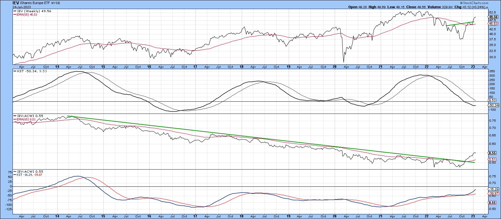
Chart 4 features one broad area that should be a beneficiary of any move away from the U.S., namely the iShares Europe 350 ETF (IEV). It uses the Nirvana ChartStyle. It's evident that IEV has violated a multi-year trendline for relative strength, a move that's also supported by the relative long-term KST. Relative strength, in this case, is measured against the iShares MSCI World ETF (ACWI). The price itself has broken out from its 2022 base and crossed above its 65-week exponential MA. It's seen a sharp run-up since the October low. So, a digestion of recent gains that allows the absolute KST in the second window to catch up, is a possibility.
 CHART 4: EUROPEAN STOCKS COULD BE SHOWING SOME STRENGTH. If you have been focused on U.S. stocks in the last decade, it may be time to look at global stocks. European stocks may be showing bullish characteristics. Chart source: StockCharts.com. For illustrative purposes only. CHART 4: EUROPEAN STOCKS COULD BE SHOWING SOME STRENGTH. If you have been focused on U.S. stocks in the last decade, it may be time to look at global stocks. European stocks may be showing bullish characteristics. Chart source: StockCharts.com. For illustrative purposes only.
Good luck and good charting,
Martin J. Pring
The views expressed in this article are those of the author and do not necessarily reflect the position or opinion of Pring Turner Capital Group of Walnut Creek or its affiliates
|
| READ ONLINE → |
|
|
|
| The Mindful Investor |
| The S&P 500 Leaves the 200-Day Behind |
| by David Keller |
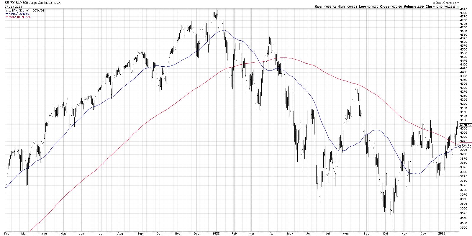
How much weight should we put on the fact that the S&P 500 index powered above its 200-day moving average this week? If history is any indication, then this is actually a fairly momentous occasion. Unless it's a repeat of March 2022, in which case we're obviously poised for a push to new lows any minute now.
To be clear, any signal considered bullish or bearish is based on the average reaction back through the history of the financial markets. So, instead of a signal always being 100% bullish or 100% bearish, I tend to think in terms of tendencies. In short, we should ask ourselves, "What tends to happen after this signal has occurred?"
Today, we'll dig into a brief history of the S&P 500 and its 200-day moving average.
The 200-Day as a Market Barometer
One of my mentors used to say, "Nothing good happens below the 200-day moving average." To rephrase, it pays to be patient for a move above the 200-day moving average, because, until then, it's at best a bear market rally.

Way back in 2021 (actually not that long ago!), the SPX stayed well above its 200-day moving average. In fact, it often tested the 50-day moving average, and pretty much every one of those tests ended up being a decent buying opportunity.
In January 2022, when the S&P 500 broke below its 50-day and 200-day moving averages, it certainly suggested that something was different. This is the sort of "change of character" that I hope to identify in my daily and weekly market analysis routines. Attempts to break out above the 200-day in August and November 2022 failed to see any upside follow through. So, when I see the price break above this moving average earlier this month, then the subsequent followthrough with higher swing highs over the last five trading days, I have to consider that a bullish tell.
Going into next week, I'd love to see a confirmed break above the 4100 level, which, I believe, would open the way to a retest of the August 2022 high around 4300. But let's continue our analysis of market history and consider some alternative approaches to the 200-day moving average.
The Moving Average Crossover Technique
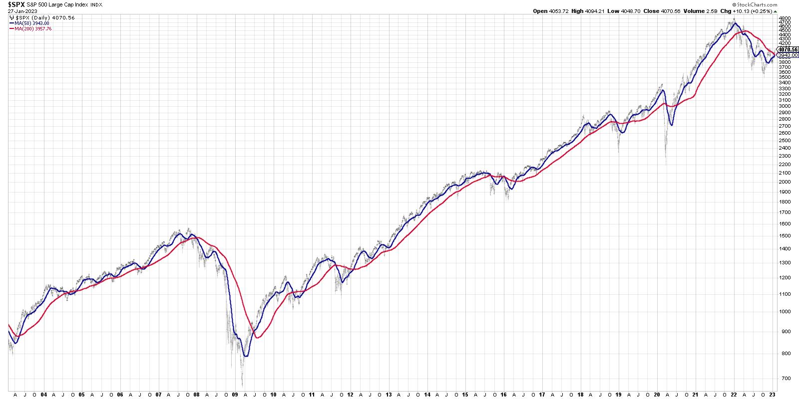
While there is often plenty of noise produced when we achieve a "golden cross" or "death cross" on the major averages, I have found them to not be the most effective ways to determine uptrends and downtrends. However, while the timing may not be perfect on these signals, I would admit that the occurrence of a golden cross next week (which seems highly likely if we rally further around the Fed meeting) would confirm even more strength in equities off the October low.

You'll notice on this chart that, when the 50-day moving average (blue) crosses above the 200-day (red), it's often way after the bottom. And that makes sense for a trend-following indicator! The most recent buy signals were in July 2020 (well after the March low) and April 2019 (after a big rally off the December 2018 low).
So while waiting for the golden cross may not feel like the best timing signal ever created, the fact remains that, in a secular bull market phase (which we are arguably still in), these signals often lead to much stronger gains.
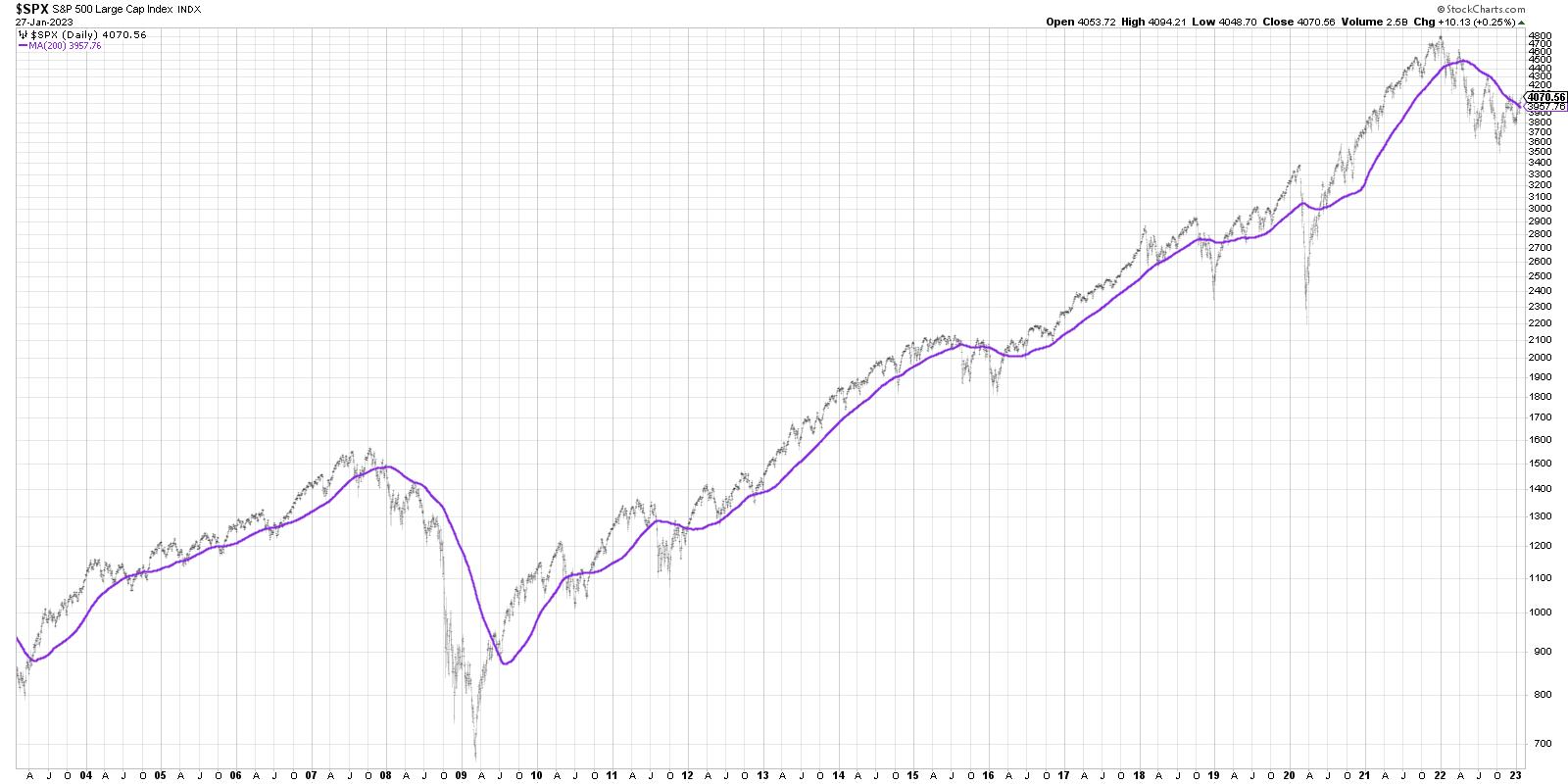
We could also strip out the 50-day moving average and just look at the slope of the 200-day moving average. On The Final Bar this week, my guest Willie Delwiche did a great job explaining why the slope of the 200-day can be an important data point.

You can easily see the relationship between the slope of the 200-day moving average (in purple on this chart) and the trend of highs and lows in the raw price data (in light gray). So when the 200-day has been sloping lower and then turns higher, this could be a better indication of an upside follow-through than some of the other techniques we've discussed.
Putting It All Together With Other Indicators
You have to remember, however, that moving averages don't just happen in a vacuum. There are other indicators we can use to confirm or deny the signals we're finding in a simple analysis of the moving average patterns.
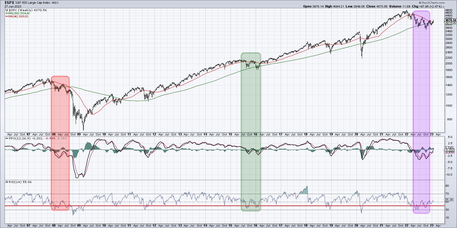
Let's add the PPO and RSI on the weekly S&P 500 chart and see how the current configuration relates to other market declines. Now that we're using a weekly chart, I'm showing the 40-week moving average (similar to the 200-day moving average and shown in red) as well as the 150-week moving average in green.

If you look at 2022-2023 and compare it to 2015-2016 and 2007-2008, you'll notice that these factors are all the same for the S&P 500 index:
- A new all-time high, followed by a lower high and a failure to hold the 40-week moving average, which then turns lower
- A retest of the 40-week moving average from below, then a break below the 150-week moving average
- The PPO gives a buy signal, followed soon after by another sell signal
- The RSI shows a bullish momentum divergence
But then the patterns start to diverge a bit. In 2008, the S&P failed to get back above the 40-week moving average. There was no additional buy signal from the PPO, and the RSI plunged into the oversold territory as the SPX accelerated lower for the next six months.
In 2016, however, the S&P briefly dipped below the 150-week moving average before powering back above this long-term barometer. The index then moved above its 40-week moving average, the RSI pushed above 50, and the PPO generated a new buy signal.
Now look at the current configuration, and you'll notice that it matches much more closely to 2016 than 2008. The conclusion? This may be just the beginning of a bullish recovery as positive momentum builds for stocks.
Want to digest this article in video format? You can find it over at my YouTube channel.
RR#6,
Dave
P.S. Ready to upgrade your investment process? Check out my YouTube channel!
David Keller, CMT
Chief Market Strategist
StockCharts.com
Disclaimer: This blog is for educational purposes only and should not be construed as financial advice. The ideas and strategies should never be used without first assessing your own personal and financial situation, or without consulting a financial professional.
The author does not have a position in mentioned securities at the time of publication. Any opinions expressed herein are solely those of the author and do not in any way represent the views or opinions of any other person or entity.
|
| READ ONLINE → |
|
|
|
|
|
| ChartWatchers |
| Stay Ahead of GDP: 3 Charts to Become a Smarter Trader |
| by Jayanthi Gopalakrishnan |

When concerns of a recession are front and center, investors tend to pay more attention to the Gross Domestic Product (GDP) report. The Q4 2022 GDP report showed the U.S. economy grew by 2.9% in the quarter, and Wall Street wasn't disappointed. The day the report was released, the market closed higher, with the Dow Jones Industrial Average ($DJIA) up 0.61%, the S&P 500 index ($SPX) up 1.1%, and the Nasdaq Composite ($COMPQ) up 1.76%. Consumer Discretionary, Technology, and Energy were the top-performing S&P sectors.
Add to the GDP report strong earnings from Tesla, Inc. (TSLA) and a mega announcement from Chevron Corp. (CVX)—raising dividends and a $75 billion buyback round—and you get a strong day in the stock markets.
Why is the GDP Report Important?
If a country's GDP is growing faster than expected, it could be a positive indication of economic strength. It means that consumer spending, business investment, and exports, among other factors, are going strong. But the GDP is just one indicator, and one indicator doesn't necessarily tell the whole story. It's a good idea to look at other indicators, such as the unemployment rate, inflation, and consumer sentiment, before making a conclusion.
Inflation appears to be cooling, but the labor market continues to be strong. The Fed has stated in many of its previous meetings that it'll be closely watching the labor market. So that'll be a sticky point as we get close to the next Fed meeting. Consumer spending is also strong, according to the GDP report. But that could have been because of increased auto sales and spending on services such as health care, personal care, and utilities. Retail sales released earlier in January indicated that holiday sales were lower.

There's a chance we could see retail sales slowing in Q1 2023 as some households run out of savings that were accumulated during the pandemic. This is something to keep an eye on going forward, as a slowdown in retail sales could mean increases in inventories. And this is something that could decrease economic activity.
Overall, the recent GDP report indicates the U.S. economy is strong, although some economists feel we'll probably see some downside in 2023, though not a recession. But the one drawback of the GDP report is that it's lagging. It comes out after the fact. Wouldn't it be great if you had known this ahead of time so you could position your trades to take advantage of the rally? While there's no way to know with 100% accuracy, there are ways to identify probable events.
3 Ways To Stay Ahead of the Curve
Instead of waiting for three months to get next quarter's GDP report, you can gauge the potential strength or weakness of the overall U.S. economy. Steven Sears, in his book The Indomitable Investor, suggested looking at these charts:
- Copper prices
- High-yield corporate bonds
- Small-cap stocks
Copper: An Economic Indicator
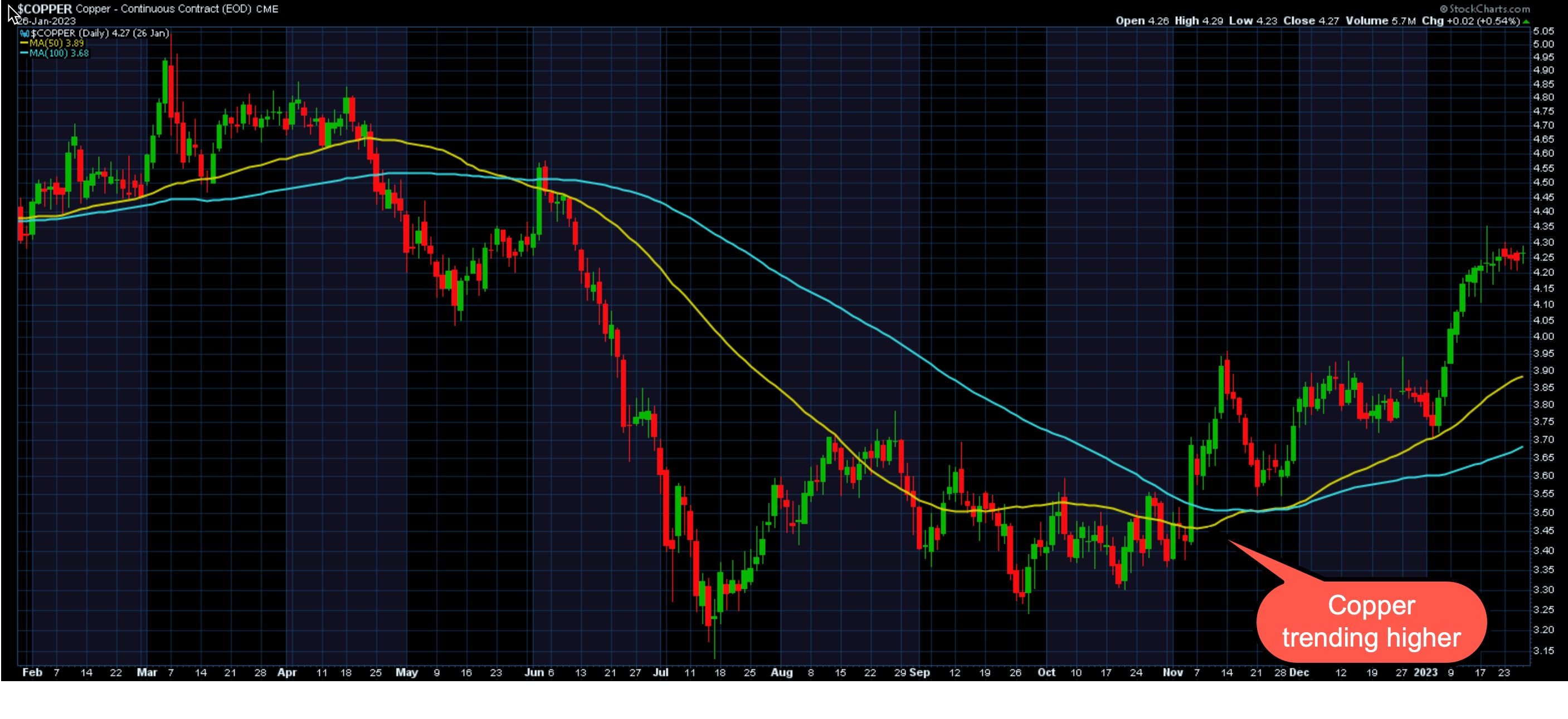
You may not hear much about copper, but it's used in the manufacture of several goods and in construction. Given that manufacturing and construction make up a big chunk of economic activity, the red metal is more important than you may have thought. If you look at the chart of copper futures ($COPPER) you'll see that, in October 2022, the price of copper was trading sideways, but, in November, its price rose and trended quite a bit higher. This would have been an indication of a strengthening economy.
 CHART 1: COPPER CONTINUOUS FUTURES CONTRACTS. Copper prices have been rising since November 2022. Chart source: StockCharts.com. For illustrative purposes only. CHART 1: COPPER CONTINUOUS FUTURES CONTRACTS. Copper prices have been rising since November 2022. Chart source: StockCharts.com. For illustrative purposes only.
High-Yield Bonds: Risk On Indicator
The higher the risk, the higher the yield. That's the premise behind high-yield bonds. In short, companies that are leveraged, smaller, or just starting to grow may not have the solid balance sheets that more established companies are likely to have. If the economy slows down, investors are likely to sell the high-yield bonds and pick up the safer U.S. Treasury bonds.
Why the flight to safety? It's because when the economy is sluggish, the companies that issue the high-yield bonds tend to find it difficult to service their debts. When the economy is expanding, the opposite happens—they tend to perform better.
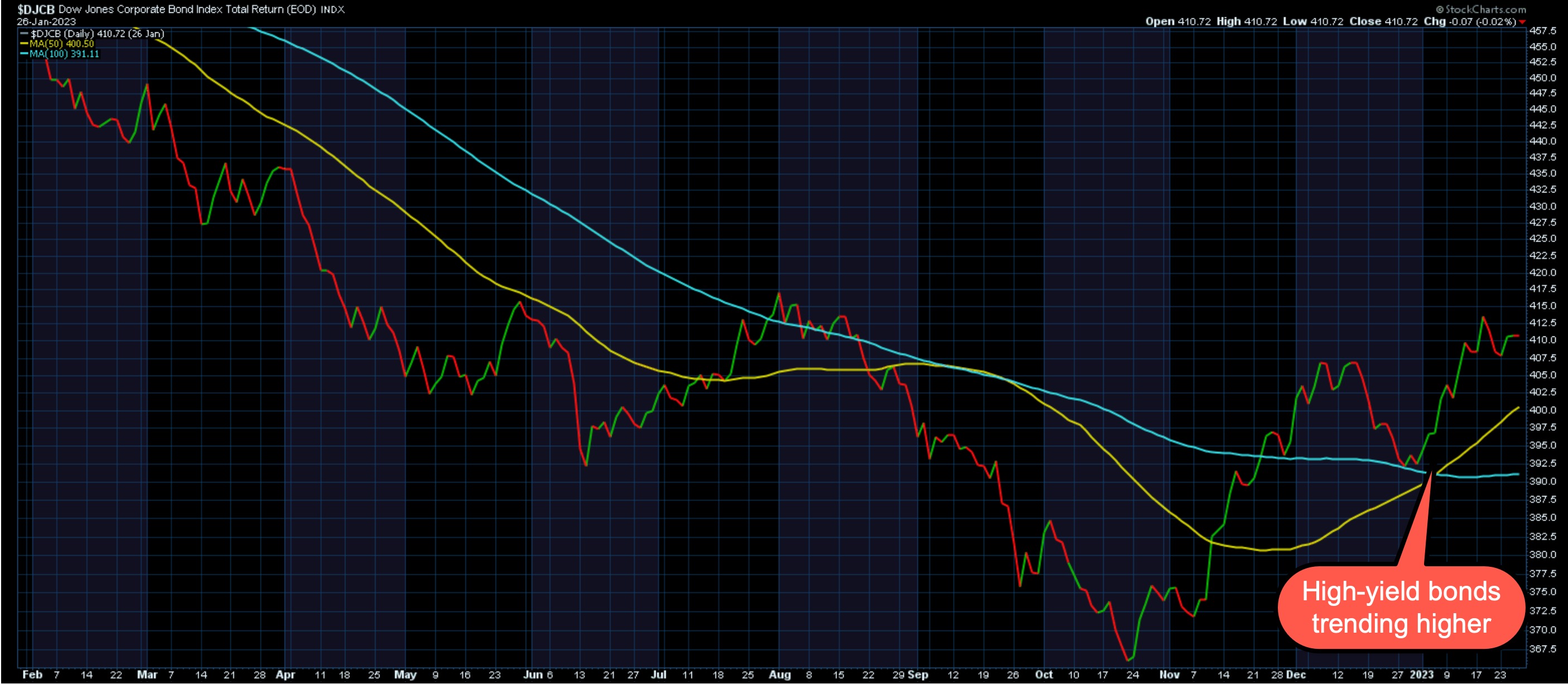
The chart below of the Dow Jones Corporate Bond Index ($DJCB) shows that, since the end of October 2022, the index trended higher. Similar to copper prices, high-yield corporate bond activity was also indicating economic expansion. You'll see similar action in charts of high-yield bond exchange-traded funds (ETFs) such as iShares iBoxx $ High Yield Corporate Bond ETF (HYG) and SPDR Barclays High Yield Bond ETF (JNK).
 CHART 2: HIGH-YIELD BONDS TRENDING HIGHER. The Dow Jones Corporate Bond Index ($DJCB) has been trending higher since end of October 2022.Chart source: StockCharts.com. For illustrative purposes only. CHART 2: HIGH-YIELD BONDS TRENDING HIGHER. The Dow Jones Corporate Bond Index ($DJCB) has been trending higher since end of October 2022.Chart source: StockCharts.com. For illustrative purposes only.
Small-Cap Stocks: They're Sensitive
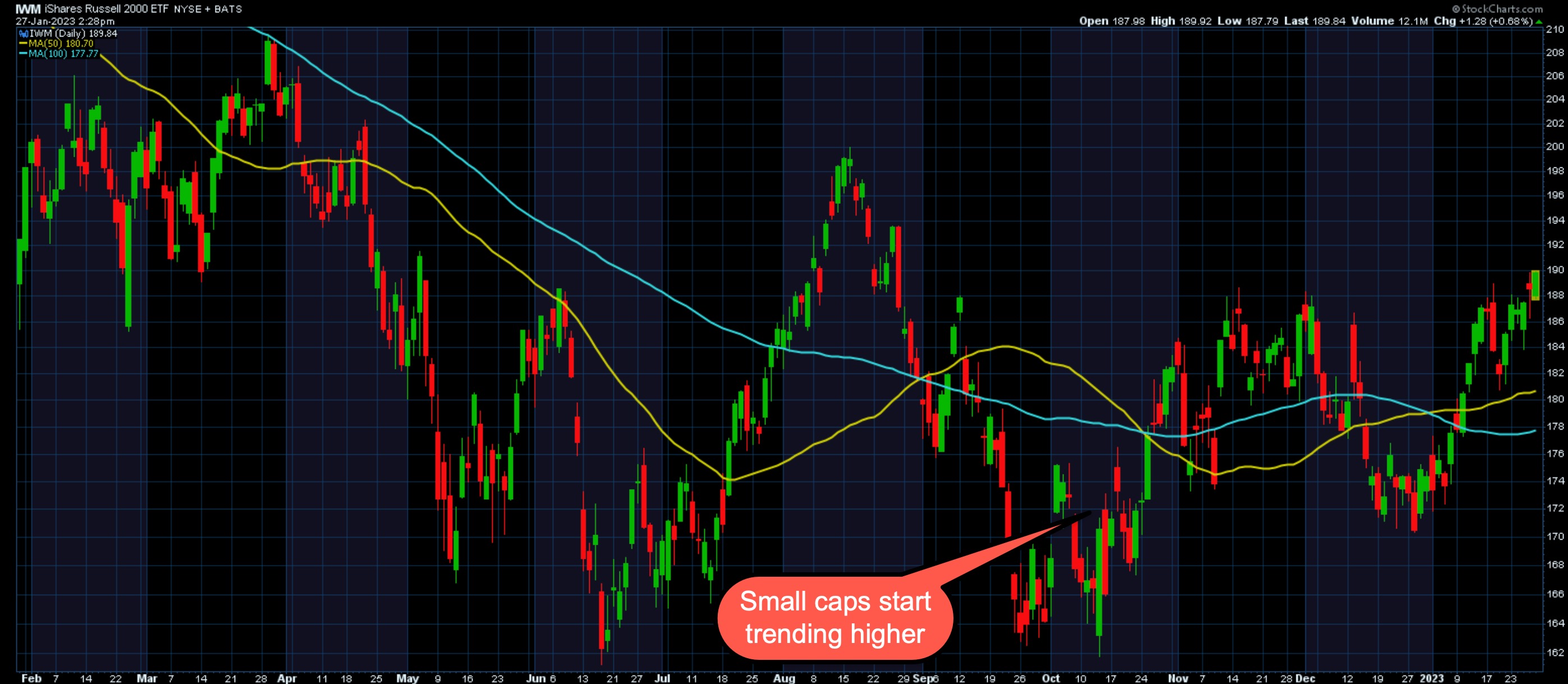
Pull up a chart of the iShares Russell 2000 ETF (IWM) and you'll see similar price action (see chart 3). Since mid-October, small-cap stocks (the Russell 2000 index is made up of 2000 small companies) have been moving higher.
 CHART 3: SMALL-CAP STOCKS TRENDING HIGHER. When the economy is expanding, small-cap stocks trend higher.Chart source: StockCharts.com. For illustrative purposes only. CHART 3: SMALL-CAP STOCKS TRENDING HIGHER. When the economy is expanding, small-cap stocks trend higher.Chart source: StockCharts.com. For illustrative purposes only.
Three's Company
If all three of these indicators are showing strength, you can expect the GDP number to be strong. There are times when the GDP number may not impact the markets, but, when inflation is a problem and the Fed is trying to curb it by raising interest rates, the GDP number tends to impact the markets.
This scenario is likely to play out in 2023, so it would be worth your while to set up a GDP Tracker ChartList. Want a live link to the charts used in this article? They're all right here.
Jayanthi Gopalakrishnan
Director, Site Content
StockCharts.com
Disclaimer: This blog is for educational purposes only and should not be construed as financial advice. The ideas and strategies should never be used without first assessing your own personal and financial situation, or without consulting a financial professional.
|
| READ ONLINE → |
|
|
|
| Art's Charts |
| Can QQQ Prove the Bears Wrong? |
| by Arthur Hill |
Last week I featured the S&P 500 SPDR (SPY) with a clear resistance level to beat. Even though the 2022 decline could be a correction after a big advance, the ETF is short of a breakout and trend reversal. The Nasdaq 100 ETF (QQQ) also has a clear level to beat and is challenging resistance.
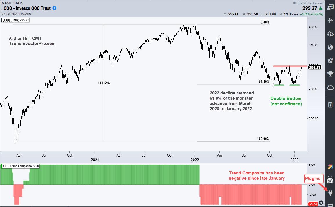
The chart below shows QQQ surging some 140% and then retracing around 61.8% of this advance. This is basically two big steps forward and one step backward. This step backward, however, has yet to reverse and the long-term trend remains down.

QQQ found support twice in the 258 area in early November and late December (green lines). These two equal lows form a potential double bottom and a break above the intermittent high would confirm the pattern. QQQ is challenging the December high as I write and a breakout at 300 would confirm the double bottom.
The indicator window shows the Trend Composite turning negative in late January and remaining negative, which means the downtrend is in force. In addition to a confirmed double bottom, I would like to see the Trend Composite turn positive before turning bullish on QQQ. The Trend Composite aggregates signals in five trend-following indicators and it is at -5 right now, which means all five have bearish signals.
TrendInvestorPro uses the Trend Composite as part of a trend-momentum strategy for trading a basket of ETFs, the All Weather List. This strategy is explained in a ten part series that includes backtest results and a signal table. Click here for immediate access.
The Trend Composite, Momentum Composite, ATR Trailing Stop and eight other indicators are part of the TrendInvestorPro Indicator Edge Plugin for StockCharts ACP. Click here to learn more and take your analysis process to the next level.
---------------------------------------
|
| READ ONLINE → |
|
|
|
| DecisionPoint |
| Can You Name These Charts? Different Types of Investments, Same Psychology. |
| by Carl Swenlin |
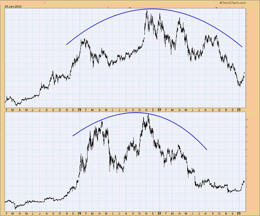
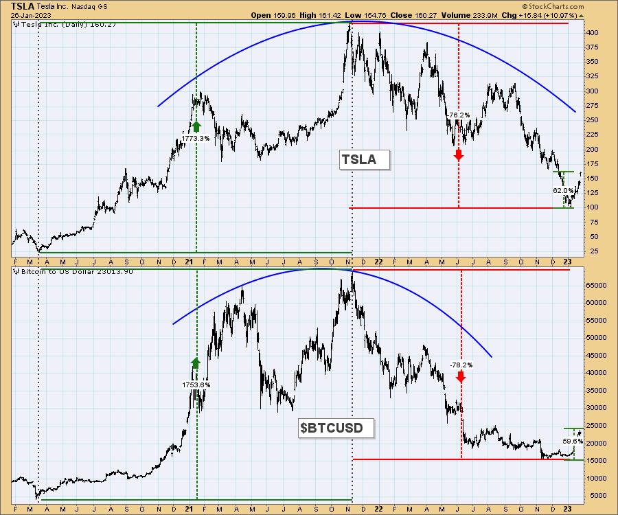
Last month in our DecisionPoint Trading Room, I gave our viewers a pop quiz. I presented two similar charts without names or price scales and challenged them to identify them by the shape of the price indexes alone. The point I was trying to make was that, while they were different, they were driven by similar waves of psychology. They began at a 2020 low, moved to a 2021 high, formed great rounded tops, then crashed in 2022.
The point I was making was that the psychology behind each was virtually identical -- buyers in a buying panic driving prices to irrational levels, then selling when the fantasy faded. Let's see who they are and how similar their journeys were.

Watch the latest episode of DecisionPoint on StockCharts TV's YouTube channel here!

The top chart panel is Tesla (TSLA), an electric car company, and the bottom panel is Bitcoin ($BTCUSD), a cryptocurrency. They are essentially different investment products, but they have moved with amazing similarity. Frankly, I didn't know how amazing until I started writing this article and began refining the annotations. Both launched from a March 2020 bottom, advanced about +1750% into a November 2021 top, then crashed about -75% into 2022 bottoms. They are now both rallying off those bottoms and, amazingly, they have both rallied about +60%.

We have to wonder what would drive such an amazing advance. In my opinion, it comes from magical, Tulip Bulb, bubble thinking. For Tesla, the underlying belief seemed to be that everyone was going to own an electric vehicle, and it was going to be a Tesla.
For Bitcoin, the belief was that the sky was the limit for an "asset" that has no intrinsic value. It was grand for a while, but there was never anything there except fantasy, and the truth that a Bitcoin has no claim on anything finally won out. It is only worth what someone is willing to pay for it. As an aside, there was also belief that a crypto investment was an investment in Blockchain technology. While the investments were maintained within a Blockchain system, there was never any direct ownership of that technology.
Conclusion: These are unrelated investment products, yet they moved with astounding similarity. I will assert that there is no fundamental basis for this, other than the human tendency to lose track of reality from time to time, and to follow emotions to unreasonable lengths.
Technical Analysis is a windsock, not a crystal ball. -- Carl Swenlin
(c) Copyright 2023 DecisionPoint.com
Helpful DecisionPoint Links:
DecisionPoint Alert Chart List
DecisionPoint Golden Cross/Silver Cross Index Chart List
DecisionPoint Sector Chart List
DecisionPoint Chart Gallery
Trend Models
Price Momentum Oscillator (PMO)
On Balance Volume
Swenlin Trading Oscillators (STO-B and STO-V)
ITBM and ITVM
SCTR Ranking
Bear Market Rules
DecisionPoint is not a registered investment advisor. Investment and trading decisions are solely your responsibility. DecisionPoint newsletters, blogs or website materials should NOT be interpreted as a recommendation or solicitation to buy or sell any security or to take any specific action.
|
| READ ONLINE → |
|
|
|
| The Canadian Technician |
| Always Be Learning: Exiting Too Soon on a Losing Position |
| by Greg Schnell |
It has been a successful month on many fronts as we started buying aggressively on January 9th. But I made some strategic errors that were really costly. There is always another train at the station, so learning to not make these mistakes again is the only value in a losing trade. I think it is good to share, as the market always keeps us humble. Learning from my mistakes is a constantly evolving process. This week was only one week in a lifetime, but it's hard to adjust in real time.
My analysis of the big run starting in early January was very accurate, and once I had positions on, I just needed to wait. Here are two examples of stopping myself out literally on the lows of the day.
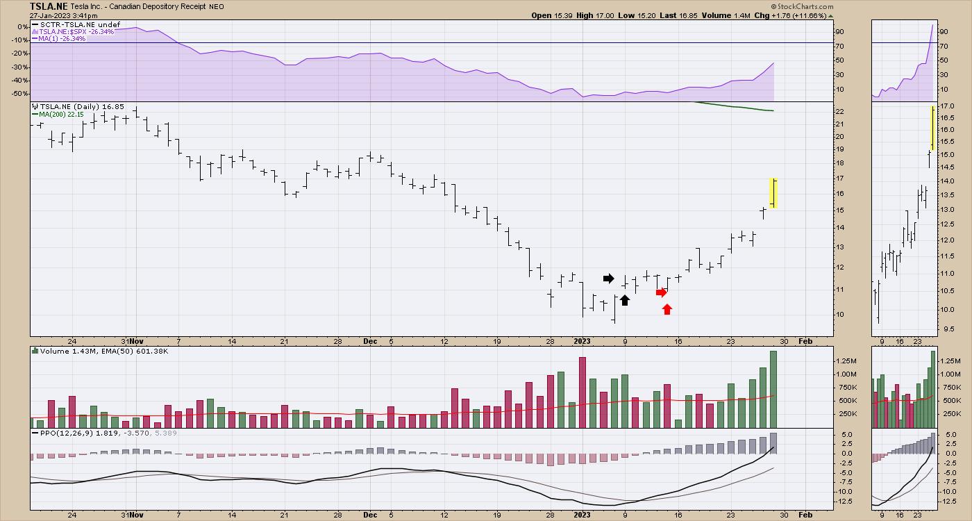
Tesla
The first is Tesla. This is a Canadian ADR to trade Tesla in Canadian dollars. Chart shape is almost the same as the US chart.
Day 1: I bought Tesla at the black arrows. It closed below my entry, a small loss.
Day 2: I was in a loss position most of the day, as the other stocks I bought on Monday trades started to work.
Day 3: Tesla pushed higher and made a doji.
Day 4: Thursday opened higher, tested lower, but closed near the open.
On Friday, Tesla announced price cuts, the stock dropped 4% on the open, and I was back in a loss position again, while other stocks were screaming higher. They announced they were cutting prices on their cars. My impatience wore thin. I sold Tesla within 2 cents of the low on the day and the stock rocketed higher.
A tough trade, as the stock is now up 50% from my entry. I can only blame myself, but it was a difficult trade to watch for the last two weeks.

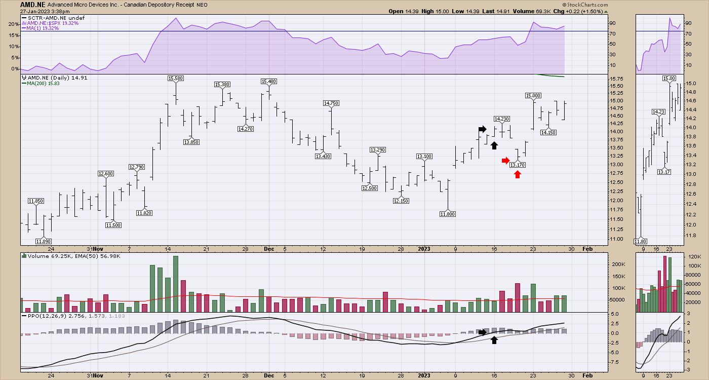
AMD - Advanced Micro Devices
The second trade I took after I sold Tesla was AMD.
Day 1, I bought it on the following Monday, as the stock made a new high, and the stock closed flat on my entry.
Day 2 was an outside bar, and price closed back in the middle of the range.
Day 3, the stock tested higher, closed lower on the lows of the day.
Day 4, the stock gapped down to start the day; I was down 6%, I sold at the red arrows at the low of the day.

Meanwhile, other trades I had were racing higher. Tough looking in the rear view mirror, but trading yesterday's chart is always more informative when you know the outcome.
Lessons Learned:
TSLA: I had no reason to exit, other than I was tired of watching the stock sit in the red as other trades were racing higher. How much time is enough? Good question. One week? As the market went higher, I expected a big name stock to move. Patience.
AMD: The stock hit my stop loss, even as all my indicators were telling me to be long this market. NVDA was shooting higher, and I was losing money in AMD. I sold on the 4-day low. When you use stops, you are going to get kicked out of good trades. That's just a fact. It stung that it was the second trade to go negative early in the rally. I would like to think it was discipline, but I need to be more forgiving, as an uptrend is starting as the volatility is still high.
One positive is that the strength indexes we use at ospreystrategic.org helped me be long the market in a timely fashion. Unfortunately, my management of the trades could have been better in both cases if I had another day of patience. I don't use hard stops, as I have been whipsawed like the folks that had the wild swings on the NYSE recently.
There is always another train, and I am moving on. But the sting of missing the big swing, ouch.
Hopefully, this lesson can help a few others, but there are two more for my notebook. I have had more lessons since those trades as well. The market will always keep us humble at some point.
|
| READ ONLINE → |
|
|
|
| RRG Charts |
| Will This Be THE Break? |
| by Julius de Kempenaer |

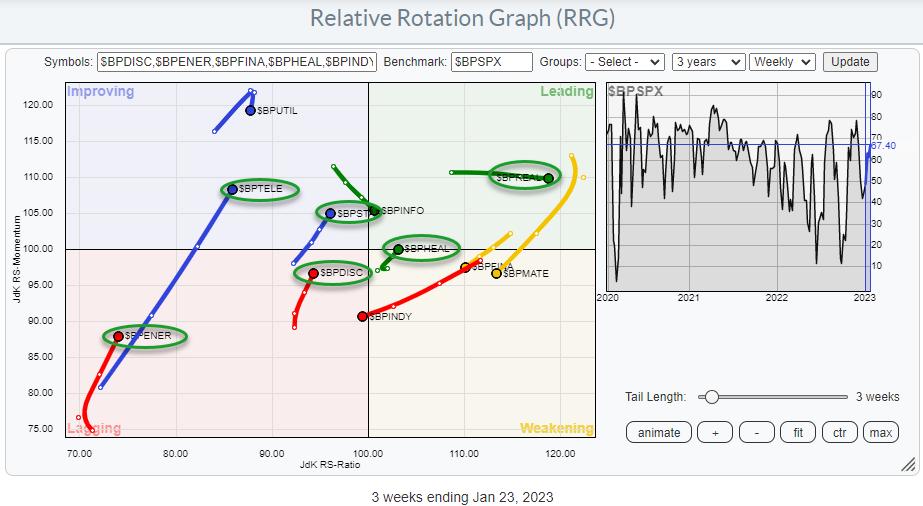
In this week's episode of Sector Spotlight, I looked at market breadth using two different variations of Relative Rotation Graphs. Following that show, I received an email from a user reminding me of another set of market breadth indices that we keep for sectors: the BullishPercent indices.
You can find all tickers for which we calculate these numbers here. These indices count the number of stocks in an index that is on a P&F buy signal, converting them to a percentage for comparison.
Be Careful With Range Bound Metrics
As a side note, these data sets have the same "problem" as the percentage of stocks above their n-day EMA. When they stay at an elevated or depressed value for a more extended period, the momentum will falter and go to zero, and, eventually, so will the "trend." Something that remains at 90 or 100 for an extended period will be a flat line that will not be picked up as a "trend."
So whenever you use these types of data sets on RRGs, please keep that in mind. They are, however, very good at picking up the start of a move, as they will very rapidly move up or down from these extreme levels, backed by solid momentum up or down. With that in mind, these type of universes, plotted on a Relative Rotation Graph, can help you pick up moves in their early stages.
The RRG at the top of the article shows the RRG using the BullishPercent values for the 11 S&P sectors, while using the same metric for the entire S&P 500 as the benchmark.
Aligning BullishPercent Tails and Price Based Tails
On this RRG, there are six sectors showing a tail that is at a positive RRG-Heading. They are highlighted in the green ovals.

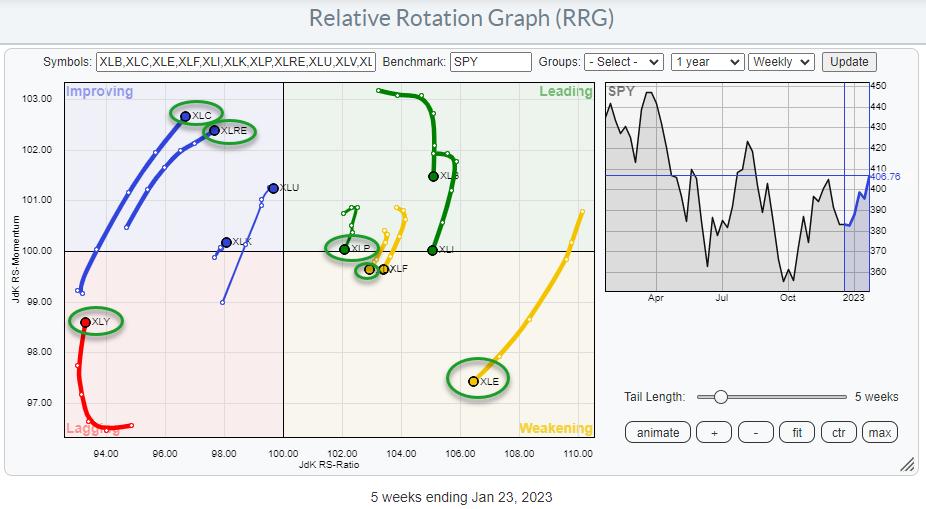
The RRG above shows the rotation for the sectors (price based). I have circled the same sectors that have a positive RRG-Heading in the first RRG.
XLC and $BPTELE are both inside the improving quadrant and showing long (powerful) tails; breadth seems to be supporting a further (relative) improvement for Communication Services.
XLRE is inside improving, but $BPCLRE is deep inside the leading quadrant, moving further right at stable relative momentum. That is definitely supportive for further improvement in the Reall Estate sector.
XLY and $BPDIC are both inside the lagging quadrant, but they are also moving at a positive RRG-Heading. Despite the fact that XLY is deep inside lagging and at the lowest RS-Ratio reading in the universe, this combination of both tails moving at a strong heading could be an early indication of more improvement ahead.
XLP is inside the leading quadrant, but has recently rolled over and is now on the verge of crossing into weakening. Its BullishPercent equivalent $BPSTAP is inside improving, but at a positive heading, indicating that, under the hood, participation in this sector is improving.
XLV has just crossed into weakening, while $BPHEAL already completed a turn back up towards and into leading after a rotation through weakening. This will be an interesting combination and setup to see if $BPHEAL indeed leads the turn for XLV.
Finally, there is XLE inside weakening at a long tail, which indicates a rapid decline of relative momentum. The high RS-Ratio reading for XLE indicates that the sector is still in a relative uptrend, but currently going through a correction. $BPENER, deep inside lagging but turning back up, could be the first sign for a starting improvement that could help the XLE tail turn back up while inside weakening.
I found it interesting to see that all sectors that have their BP tails in a positive heading have price tails that are either on the left hand side of the RRG on a positive heading, or on the right hand side of the graph going through a loss of relative momentum, but with plenty of room to complete that rotation on the right hand side of the graph.
How Does This Impact the S&P 500 Index?
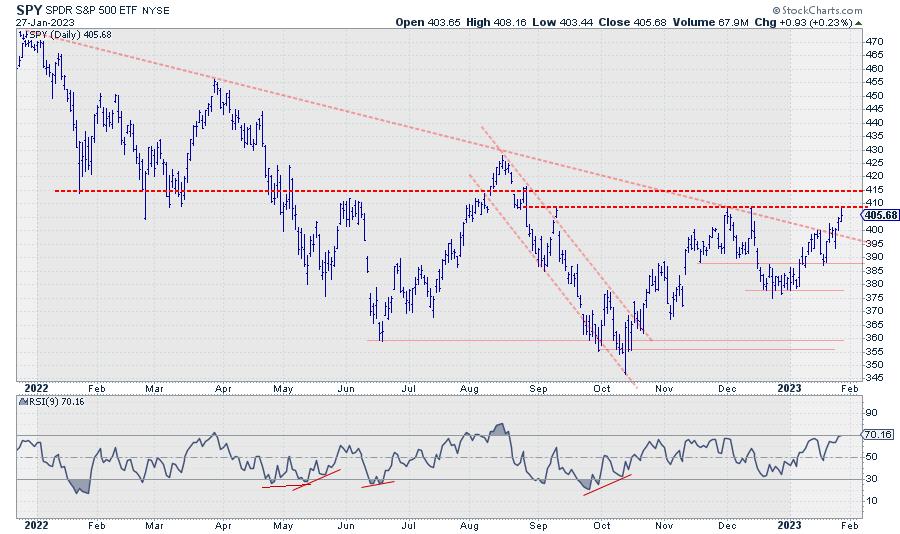
As I explained in Sector Spotlight, not all sector breadth metrics are signalling strength. Howver, the ones that do have managed to push the S&P 500 index above its falling trendline that kept the market under pressure since early 2022. This is certainly a positive piece of the puzzle.
The big question is, and will be in coming days, "will it be enough?"

We all know that breaks of diagonal trendlines are nice to know, but not always that reliable. The real proof will be the horizontal overhead resistance levels offered by old peaks; first and foremost, the area between 410-415. Once broken, the next level around 430 can then be seen as the next target.
It looks like we'll be in for a very interesting week, maybe two or three, to come!
#StayAlert and have a great weekend. --Julius
|
| READ ONLINE → |
|
|
|
| Top Advisors Corner |
| Gold's Price Oscillator |
| by Tom McClellan |

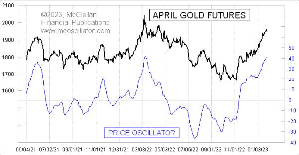
The McClellan Price Oscillator for gold futures prices has reached a pretty high level, equivalent to what it did at the price top in March 2022, and has just now turned down. This is a bearish signal and could set off a pretty big pullback.
The McClellan Price Oscillator is a cousin of the more famous McClellan A-D Oscillator. My parents created both of these back in 1969. That research grew out of their desire to get a better signal than could be gotten from looking just at moving averages alone. Together, they wondered about finding the difference between two moving averages, and this was well ahead of when Gerald Appel did the same thing with his Moving Average Convergence-Divergence (MACD) indicator.
A McClellan Price Oscillator employs prices for any stock, index, commodity, or futures price series. One calculates two exponential moving averages (EMAs), known as the 10% Trend and 5% Trend. Those percentage numbers refer to the "smoothing constant" used in the calculation of each EMA. The smoothing constant governs how much weight is given to the most recent data, so, for calculating a 10% Trend, you would multiply today's closing price by 10%, and then add that to 90% of yesterday's 10% Trend value. A larger smoothing constant means a faster response to price movements.
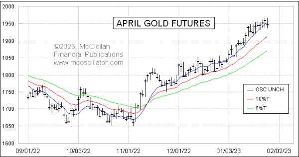
The chart below shows the 10% Trend (red) and 5% Trend (green) for the April gold futures contract. The fact that they have become spread far apart is another way of saying that the Price Oscillator has risen to a high value, because the Price Oscillator represents the distance between those two EMAs.

This chart also shows an additional line, the blue Price Oscillator Unchanged line. It represents the theoretical closing price at which a close on the next day would mean that the Price Oscillator stays at exactly the same value as the day before. It is calculated simply as the 10% Trend plus the value of the Price Oscillator. In other words, the blue line is the same distance away from the red line as the distance that the green line is separated from the red line. I like to use the Price Oscillator Unchanged level as a trigger level, especially when we see a very extended Price Oscillator value. But it does not work every time that a drop below that blue line ends up being a good sell signal. It matters more with an overbought condition.
Because the 10% Trend and 5% Trend are tied to price levels, the amplitudes of the Price Oscillator are also going to be sensitive to price levels. Saying it another way, the higher the price goes, the bigger the swings we will see on the Price Oscillator. That does not matter much for short term analyses, but, when one wants to do a long-term comparison, it can matter a lot.
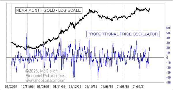
One way to compensate for that is what we call the Proportional Price Oscillator, or PPO. It is shown in this next chart:

It is calculated by taking the value of the Price Oscillator, and dividing it by the closing price, which factors out the change in price levels over time. For this chart, I go one additional step, multiplying the PPO by 1000 just to make the Y-axis values more meaningful.
What we can see from this long-term chart is that the current value of the PPO is not the highest ever, but it is still up pretty high, which merits a significant pullback in gold prices just to unstretch the rubber band and set up for the next potential up move. Such pullbacks usually continue until the Price Oscillator (and thus the PPO) gets down close to zero, or even below it.
|
| READ ONLINE → |
|
|
|
| MORE ARTICLES → |
|
 Chart 1
 Chart 2
 Chart 3
 Chart 4
 Chart 5
