In this week's episode of Sector Spotlight, I looked at market breadth using two different variations of Relative Rotation Graphs. Following that show, I received an email from a user reminding me of another set of market breadth indices that we keep for sectors: the BullishPercent indices.
You can find all tickers for which we calculate these numbers here. These indices count the number of stocks in an index that is on a Point & Figure (P&F) buy signal, and convert them to a percentage for comparison.
Be Careful With Range Bound Metrics
As a side note, these data sets have the same "problem" as the percentage of stocks above their n-day exponential moving average (EMA). When they stay at an elevated or depressed value for a more extended period, the momentum will falter and go to zero, and, eventually, so will the "trend." Something that remains at 90 or 100 for an extended period will be a flat line that will not be picked up as a "trend."
So whenever you use these types of data sets on RRGs, please keep that in mind. They are, however, very good at picking up the start of a move, as they will very rapidly move up or down from these extreme levels, backed by solid momentum up or down. With that in mind, these types of universes, plotted on a Relative Rotation Graph, can help you pick up moves in their early stages.
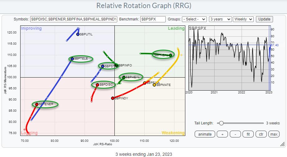
The RRG at the top of the article shows the RRG using the BullishPercent values for the 11 S&P sectors while using the same metric for the entire S&P 500 as the benchmark.
Aligning BullishPercent Tails and Price-Based Tails
On this RRG, there are six sectors showing a tail that is at a positive RRG-Heading. They are highlighted in green ovals.
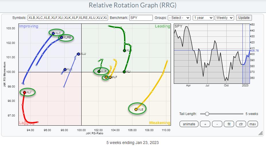
The RRG above shows the rotation for the sectors (price based). I have circled the same sectors that have a positive RRG-Heading in the first RRG.
XLC and $BPTELE are both inside the improving quadrant and showing long (powerful) tails; breadth seems to be supporting a further (relative) improvement for Communication Services.
XLRE is "inside" improving, but $BPCLRE is deep inside the leading quadrant, moving further right at stable relative momentum. That is definitely supportive of further improvement in the Real Estate sector.
XLY and $BPDIC are both inside the lagging quadrant, but they are also moving at a positive RRG-Heading. Despite the fact that XLY is deep inside lagging and at the lowest RS-Ratio reading in the universe, this combination of both tails moving at a strong heading could be an early indication of more improvement ahead.
XLP is inside the leading quadrant, but has recently rolled over and is now on the verge of crossing into weakening. Its BullishPercent equivalent $BPSTAP is inside improving, but at a positive heading, indicating that, under the hood, participation in this sector is improving.
XLV has just crossed into weakening, while $BPHEAL already completed a turn back up towards and into leading after a rotation through weakening. This will be an interesting combination and setup to see if $BPHEAL indeed leads the turn for XLV.
Finally, there is XLE inside weakening at a long tail, which indicates a rapid decline of relative momentum. The high RS-Ratio reading for XLE indicates that the sector is still in a relative uptrend, but currently going through a correction. $BPENER, deep inside lagging but turning back up, could be the first sign for a starting improvement that could help the XLE tail turn back up while inside weakening.
I found it interesting to see that all sectors that have their BP tails in a positive heading have price tails that are either on the left-hand side of the RRG on a positive heading, or on the right-hand side of the graph going through a loss of relative momentum, but with plenty of room to complete that rotation on the right-hand side of the graph.
How Does This Impact the S&P 500 Index?
As I explained in Sector Spotlight, not all sector breadth metrics are signaling strength. However, the ones that are signaling strength have managed to push the S&P 500 index above its falling trendline which kept the market under pressure since early 2022. This is certainly a positive piece of the puzzle.
The big question is, and will be in coming days, "will it be enough?"
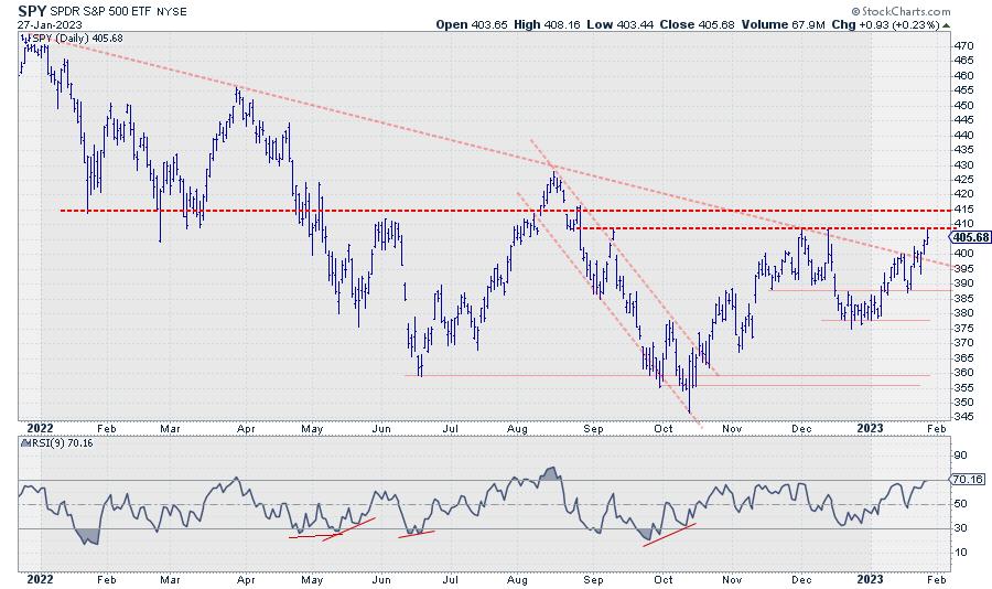
We all know that breaks of diagonal trendlines are nice to know but are only sometimes reliable. The real proof will be the horizontal overhead resistance levels offered by old peaks; first and foremost, the area between 410-415. Once broken, the next level around 430 can be seen as the next target.
It looks like we'll be in for a very interesting week, maybe two or three, to come!
#StayAlert and have a great weekend. --Julius
Julius de Kempenaer
Senior Technical Analyst, StockCharts.com
Creator, Relative Rotation Graphs
Founder, RRG Research
Host of: Sector Spotlight
Please find my handles for social media channels under the Bio below.
Feedback, comments or questions are welcome at Juliusdk@stockcharts.com. I cannot promise to respond to each and every message, but I will certainly read them and, where reasonably possible, use the feedback and comments or answer questions.
To discuss RRG with me on S.C.A.N., tag me using the handle Julius_RRG.
RRG, Relative Rotation Graphs, JdK RS-Ratio, and JdK RS-Momentum are registered trademarks of RRG Research.


