| THIS WEEK'S ARTICLES |
| John Murphy's Market Message |
| MARKET BREADTH IMPROVES |
| by John Murphy |
NYSE ADVANCE-DECLINE BREAKS OUT... Stocks gained more ground this week to continue their uptrend. What's helping keep the rally going is the fact that more individual stocks are joining the uptrend. Chart 1 shows the NYSE Advance-Decline line rising above several previous peaks to the reach the highest level in more than a year. Although that's a late signal, it's still a bullish sign. The NYSE Common Stock Only AD line has also broken out to the upside. All the major stock indexes hit new highs for the year -- except one. But it's getting close.
 Chart 1 Chart 1
SMALL CAPS NEAR UPSIDE BREAKOUT... Chart 2 shows the Russell 2000 iShares (IWM) still in the process of testing its February high. A decisive close above that previous would confirm that smaller stocks are finally joining the market uptrend. The direction of small caps plays a pivotal role in market breadth. With advance-decline lines already in uptrends, an upside breakout in small caps appears more likely.
 Chart 2 Chart 2
MATERIALS AND ENERGY ARE LOOKING STRONGER...Another encouraging sign for stocks is that most sectors are also gaining ground. All eleven S&P sectors rose during July with materials and energy showing new upside leadership. Chart 3 shows the Materials SDPR (XLB) trading above its 2023 peak to reach the highest level in more than a year. Stocks tied to copper were this week's strongest commodity group. Energy stocks are also looking stronger.
Chart 4 shows the Energy SPDR (XLE) testing its previous peak formed during April and nearing a potential upside breakout. Oil Service stocks are leading the XLE highaer. Both sectors are being supported by higher commodity prices.
 Chart 3 Chart 3
 Chart 4COMMODITY BUYING...Commodity prices also had a strong July and may be bottoming. Chart 5 shows the Invesco DB Commodity Index rising above its red 200-day moving average and in the process of testing its April high. Rising energy prices are part of that rally. A weaker dollar during July may also be attracting new money into commodity markets. Chart 4COMMODITY BUYING...Commodity prices also had a strong July and may be bottoming. Chart 5 shows the Invesco DB Commodity Index rising above its red 200-day moving average and in the process of testing its April high. Rising energy prices are part of that rally. A weaker dollar during July may also be attracting new money into commodity markets.
 Chart 5 Chart 5
|
| READ ONLINE → |
|
|
|
| Art's Charts |
| Cisco Takes the Lead with a Classic Bullish Continuation Pattern |
| by Arthur Hill |
 Cisco (CSCO) is showing leadership qualities again as it breaks out of a classic bullish continuation pattern and hits a new high. Cisco (CSCO) is showing leadership qualities again as it breaks out of a classic bullish continuation pattern and hits a new high.
The chart below shows CSCO forming a cup-with-handle pattern, which was popularized by William O'Neil of IBD. This is a bullish continuation pattern, which means the prior move was up. Indeed, CSCO advanced from the upper 30s in October to the lower 50s in early April (+35%).
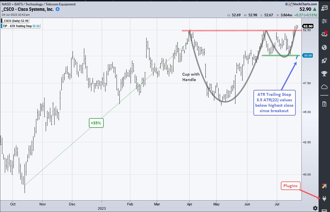
The stock hit resistance in the 52.5 area from April to July (red line). Between these resistance points, the stock dipped into April-May and formed the cup portion of the pattern. The handle formed from mid June to mid July and the stock broke rim resistance with a surge the last few days.
Overall, the cup-with-handle pattern represents a consolidation or rest within a bigger uptrend. The breakout signals an end to this consolidation and a resumption of the bigger uptrend. The lows in mid-June and mid-July mark the first support level (green line).
The short blue line on the right shows the ATR Trailing Stop for reference. 3.5 is the ATR multiplier and this value affects the distance from price. I chose this value so the stop would start just below the mid-June and mid-July lows (support). The stop will rise if prices continue to rise.
TrendInvestorPro is currently running two quantified strategies. First, we have a momentum-rotation strategy trading S&P 500 and Nasdaq 100 stocks. Second, we have a short-term mean-reversion strategy trading Russell 1000 stocks. These strategies are outlined with detailed reports and performance metrics. Click here for immediate access.
The ATR Trailing Stop, Trend Composite, Momentum Composite and eight other indicators are part of the TrendInvestorPro Indicator Edge Plugin for StockCharts ACP. Click here to take your analysis process to the next level.
---------------------------------------
|
| READ ONLINE → |
|
|
|
| Martin Pring's Market Roundup |
| The Banking Crisis is Over... Or Is It? |
| by Martin Pring |
Last April, I wrote about the SVB (SVIB) banking crisis, using the KBW Regional Banking Index ($KRX) as a proxy, and suggested the price action in the right hand part of Chart 1 had the potential to be a double bottom formation. Double bottoms are characterized by heavy activity on the initial low, followed by a significant shrinkage of activity during the formation of the second one. In this instance, the extremely low level in the Price Volume Oscillator (PVO) during April was classic. "As with all things technical," I stated, "this is merely a suspicion until confirmed by some kind of trend confirmation. Ideally, that would be a break above the horizontal blue line, but an upside penetration of that smaller green down trendline would certainly help to stem any fears on my part of serious new lows being registered, and more likely lead to a spirited rally."
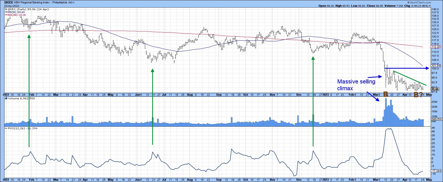 Chart 1 Chart 1
Chart 2 shows that it took some time until the green down trendline was successfully assaulted, as investors worried about another shoe dropping. In the meantime, a better indication of the completion of a bottom developed as the Index completed and broke out from a much larger pattern in the form of an inverse head-and-shoulders. Resistance is again apparent at that blue line, which suggests at least a temporary pause, but what are the possibilities of even higher ultimate prices?
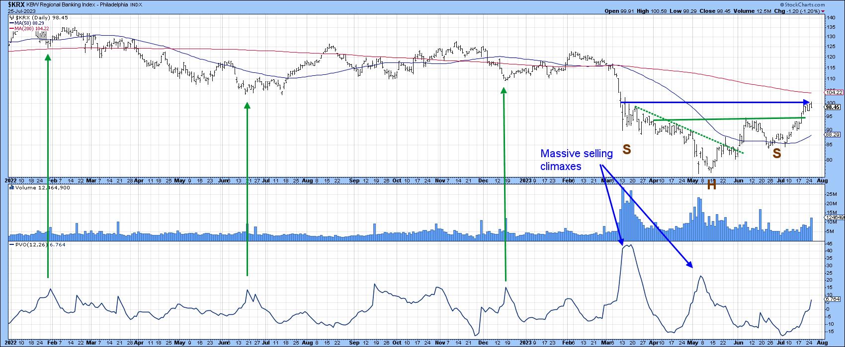 Chart 2 Chart 2
For this, we cast a wider net by taking a look at the longer-term picture for the SPDR Financial ETF itself, the XLF. One of my favorite long-term indicators for virtually any market is a monthly PPO calculated with the 6- and 15-month parameters. In that respect, the green shading in Chart 3 approximates periods where the PPO trades above its equilibrium level for an extended period. The small red arrows indicate that there have only been three false signals since the turn of the century. The latest plot indicates a very close call, as the oscillator is straddling zero. We will not know the final score until next Monday because the chart is based on monthly closes. However, with the price already trading above its 12-month MA, the odds are pretty high.
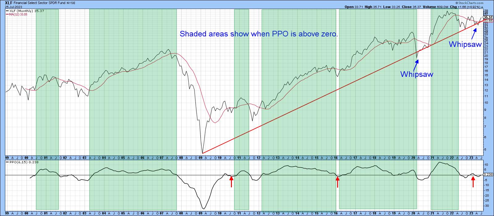 Chart 3 Chart 3
One reason for optimism comes from Chart 4, which compares the price of the XLF to its Coppock Curve. Normally, we use the Coppock to trigger buy signals when it drops below zero and turns up. In this case, though, the arrows flag positive 6-month MA crossovers. You can see that another signal was recently triggered, and it's likely to be a significant one. That's because it follows on the heels a possible false downside break of the secular up trendline. The power from the Coppock and should be enough push the price above its 2021-23 down trendline, thereby confirming the whipsaw break. I am not concluding that it will be as formidable a rally as that following the 2020 whipsaw; however, since false downside breaks are typically followed by above-average rallies, the XLF is likely to move significantly higher.
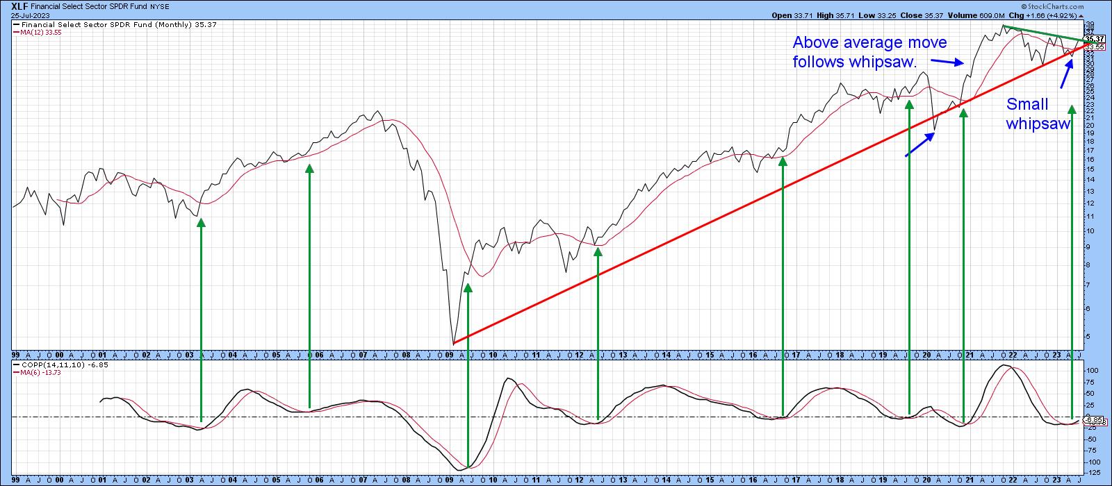 Chart 4 Chart 4
Chart 5 compares the financial ETF to its Special K indicator (SPK), which you can read about here. The SPK is still confined to a downtrend, since it is trading under its signal line and the green bear market trendline. The price itself is right at resistance in the form of the 2022-23 down trendline, so it would not take a lot of effort to go through. A rising daily KST in the bottom window says it's quite doable.
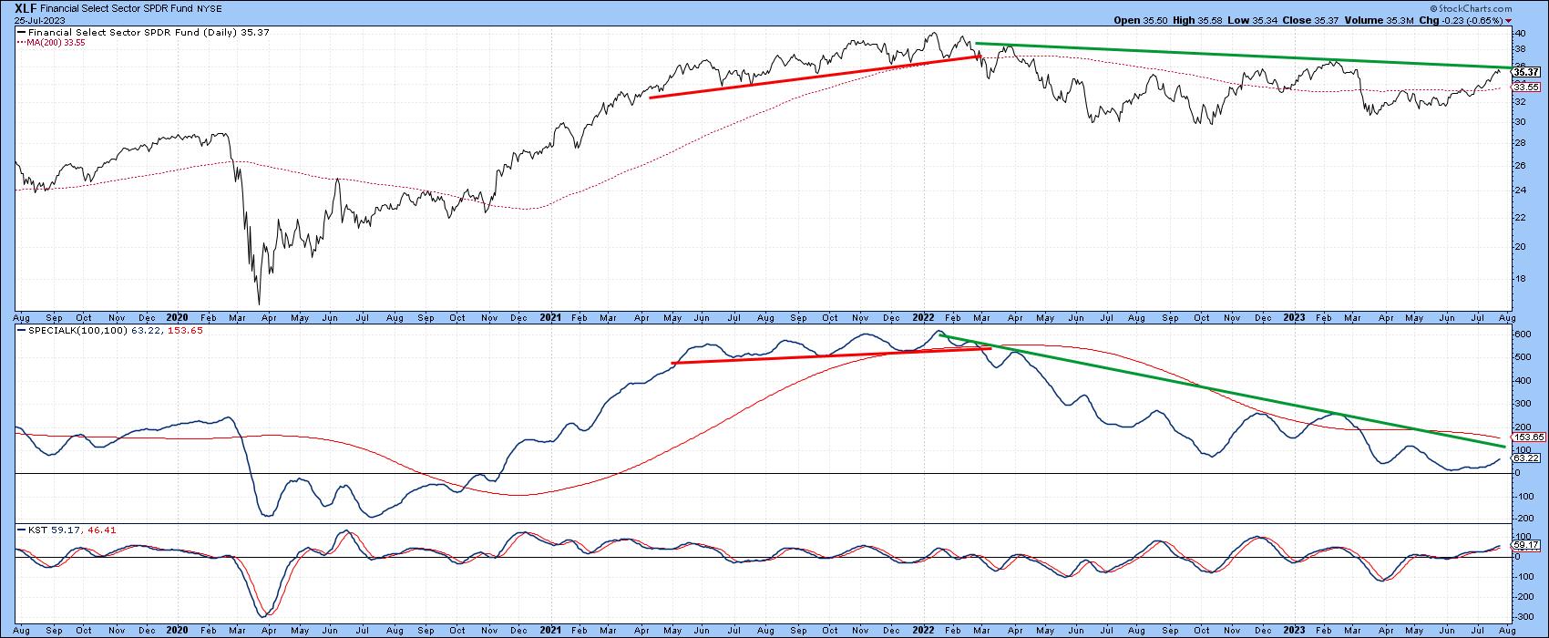 Chart 5 Chart 5
One thing I would like to see is the XLF out-perform the S&P. That's not because I have a particular affection for this sector, but the market usually rallies when financials are experiencing superior relative performance. Chart 6 demonstrates this principle. In this instance, the arrows indicate periods when the long-term KST for relative financial action is in a rising trend. The bad news is that the KST is currently in a declining mode. The good news is that it is around zero and does not require much strength to trigger an upside reversal. A declining relative KST does not mean the market will sell off, but it does take a positive technical relationship temporarily off the table.
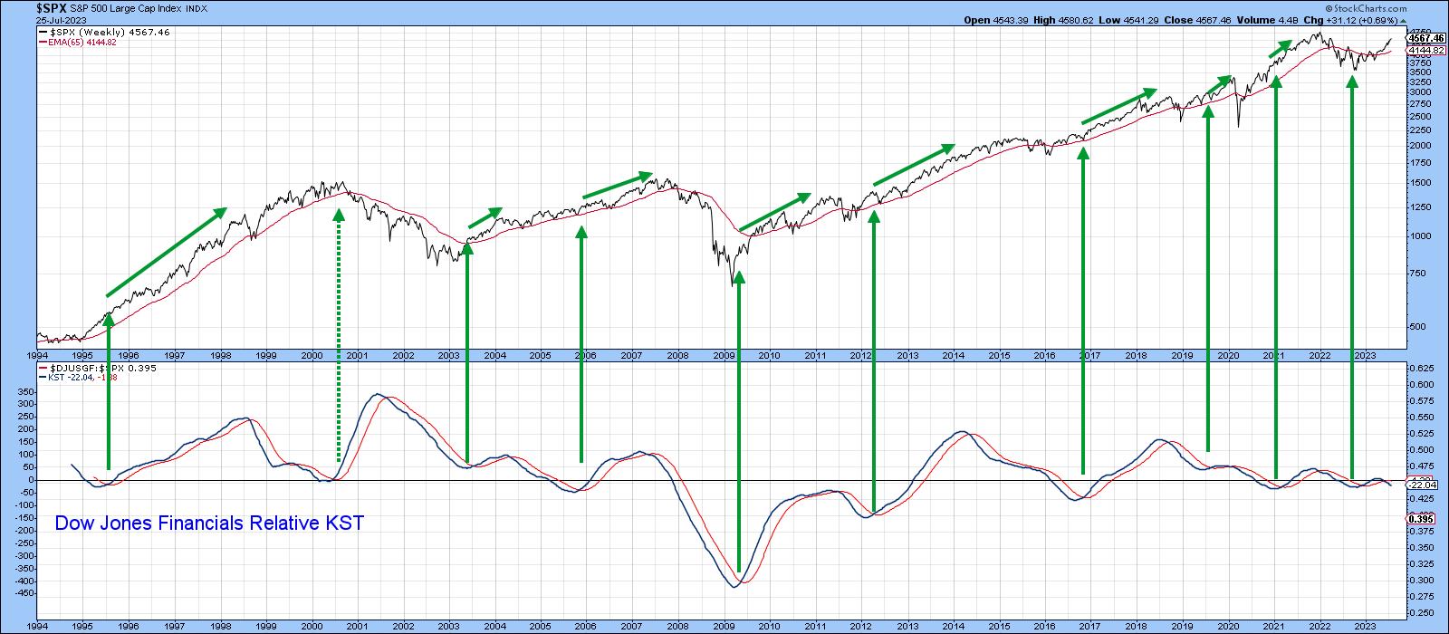 Chart 6 Chart 6
Conclusion
The financial sector has recovered nicely from its spring malaise, but has reached a critical technical juncture. Some long-term indicators have already gone bullish, which suggests the banking crisis is over. However, a strong July close for the financial sector would go a long way to confirm that possibility.
Good luck and good charting,
Martin J. Pring
|
| READ ONLINE → |
|
|
|
| ChartWatchers |
| Earnings Momentum May Push the Stock Market to New Highs |
| by Jayanthi Gopalakrishnan |

"Bearish engulfing pattern," "outside day," "key reversal"—all of these are terms you may have heard after the stock market's performance on Thursday. But one day's price action doesn't necessarily make a trend. Encouraging fundamental data reversed investor pessimism and changed the overall picture relatively quickly.
A couple of key data points that were released are:
- The initial estimate suggests the US economy grew at a 2.4% annual rate in Q2. Compare that to the 1% Q1 growth. The US economy is still growing, and at a rate that's better than what economists expected.
- The Fed's favorite inflation indicator, personal consumption expenditures price index (PCE), came in slightly cooler than expected. Core PCE gained 0.2% month-over-month, which is in line with the Dow Jones estimate of a 0.2% increase. Year-over-year core PCE came in lower than estimates—up 4.1% vs. an estimate of 4.2%. That's the lowest rate since September 2021.
A few days earlier, the Fed raised interest rates another 25 basis points. Given that future interest rate decisions will be data-dependent, this piece of data is an encouraging sign that supports the possibility that an end to the tightening is near.

The GDP and inflation data helped the equity market regain its strength. After the previous day's performance, this was welcome news that restored the negative investor conference. Strong earnings from Intel Corp (stock symbol: INTC) helped the Tech sector make up some of the losses from the day before. Mega tech stocks such as Tesla (stock symbol: TSLA), Advanced Micro Devices (stock symbol: AMD), Amazon (stock symbol: AMZN), META Platforms (stock symbol: META), Apple (stock symbol: AAPL), Alphabet (stock symbol: GOOGL), and NVIDIA (stock symbol: NVDA) rose and were among the most actively traded during the trading day.
Other industries showed strength as well. If you scroll through the Market Summary tool and view the US Industry Indexes, airlines, biotechs, gold, oil services, retailers, and transports were all up greater than one percentage point.
If you were disappointed that the Dow Jones Industrial Average ($INDU) didn't make it to a 14-day winning streak, there's still a shining light. The index has seen three weeks of gains. The weekly chart below shows the uptrend is still in play.
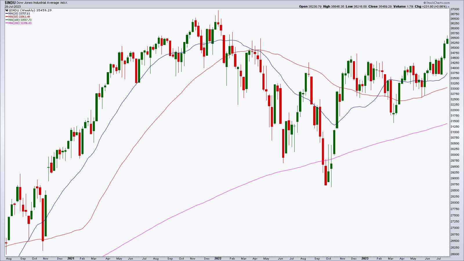
CHART 1: DOW JONES INDUSTRIAL AVERAGE ($INDU) REGISTERS THIRD STRAIGHT WEEK OF GAINS. Despite a hiccup on Thursday, the weekly chart is still trending higher and doesn't have too much in the way of resistance on the path to reaching its high. Chart source: StockCharts.com (click chart for live version). For educational purposes.
Even small-cap stocks enjoyed advances. The daily chart of the S&P 600 Small Cap Index ($SML) below shows that small caps are rallying, and the market breadth as indicated by the percentage of small-cap stocks above their 50-day moving average, the Advance-Decline Percent, and the Volume Advance-Decline Percent are showing positive breadth.
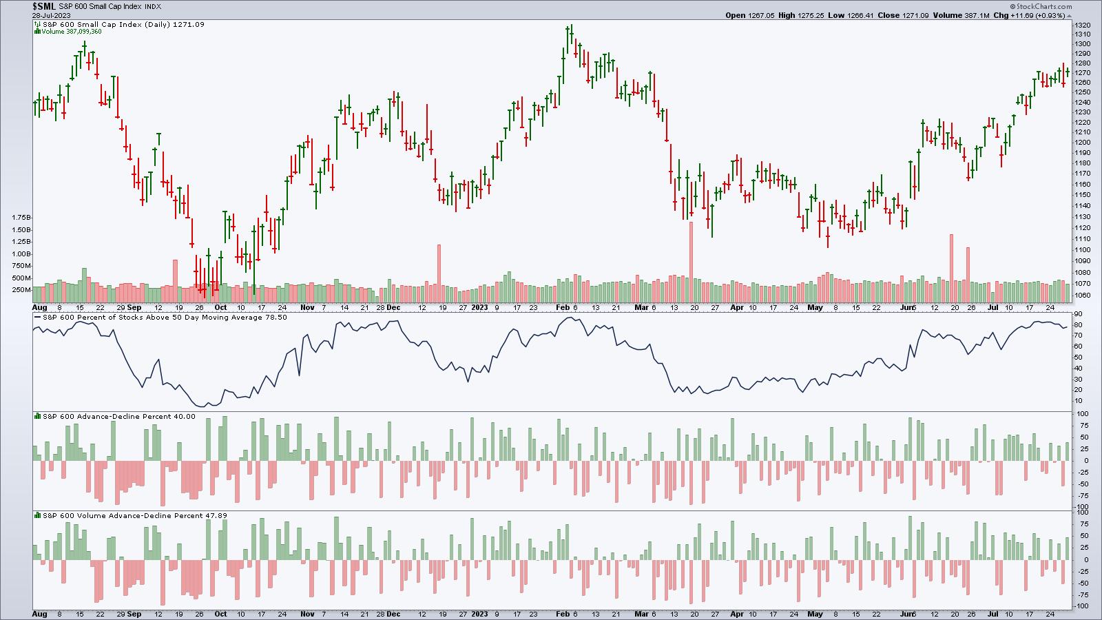
CHART 2: SMALL-CAP STOCKS DON'T WANT TO BE LEFT BEHIND. A rally and relatively strong market breadth suggest there may be some good finds in the small-cap space. Chart source: StockCharts.com (click on chart for live version). For educational purposes.
When the stock market is overextended, it's natural for investors to get jittery. So it's a good idea to watch the CBOE Volatility Index ($VIX). On Thursday, when the stock market saw a significant drop, the VIX saw a pretty wide range—from 12.74 to 15.02, closing at 14.41. This erratic VIX movement heightened fear among investors, and many thought the week would end on a negative note. But that changed, and by Friday's close, VIX closed at 13.33.
 StockCharts Tip. The Market Overview panel on Your Dashboard summarizes stock market activity in real time during the trading day. Click on the four tabs across the top—Equities, Bonds, Commodities, Crypto—to stay on top of the market action. StockCharts Tip. The Market Overview panel on Your Dashboard summarizes stock market activity in real time during the trading day. Click on the four tabs across the top—Equities, Bonds, Commodities, Crypto—to stay on top of the market action.
The Bottom Line
This week ended on a positive note. Earnings continue next week with bellwether companies AMZN and AAPL reporting. We'll also get a look at jobs data, which could give us a look at one of the important areas the Fed looks at when making interest rate decisions. It remains to be seen if earnings momentum and economic data can push the stock market to new highs.
End of Week Wrap Up
US equity indexes up; volatility down
- $SPX up 0.99% at 4582.23, $INDU up 0.5% at 35,459.29; $COMPQ up 1.9% at 14,316.66
- $VIX down 7.43% at 13.34
- Best performing sector for the week: Communication Services
- Worst performing sector for the week: Utilities
- Top 5 Large Cap SCTR stocks: Super Micro Computer (SMCI), Pohang Iron & Steel (PKX), Palantir Technologies (PLTR), NVIDIA Corp. (NVDA), DraftKings Inc. (DKNG)
On the Radar Next Week
- More earnings. Some companies reporting next week: Amazon (AMZN), Apple (AAPL), Merck (MRK), Toyota Motor Corp (TM), Pfizer (PFE), Caterpillar (CAT), and more.
- July PMI
- July ISM Manufacturing
- July ISM Services
- July Non Farm Payrolls
Disclaimer: This blog is for educational purposes only and should not be construed as financial advice. The ideas and strategies should never be used without first assessing your own personal and financial situation, or without consulting a financial professional.
|
| READ ONLINE → |
|
|
|
|
|
| DecisionPoint |
| Is Gold Headed for New All-Time Highs? |
| by Carl Swenlin |
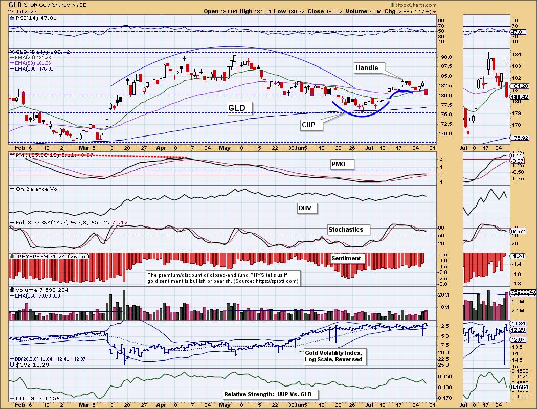
On Wednesday, the SPDR Gold Shares ETF (GLD) 20-day EMA crossed up through the 50-day EMA, generating an IT Trend Model BUY Signal. This means that GLD is bullish in the intermediate-term. GLD was already in a long-term bull market when, in January, the 50-day EMA crossed up through the 200-day EMA. Signal status is as follows:
IT Trend Model: BUY as of 7/26/2023
LT Trend Model: BUY as of 1/5/2023
As of today, GLD declined back below the 20-day and 50-day EMAs, which will result in the new BUY Signal being reversed (probably tomorrow) unless price gets back above them quickly. As I said yesterday, Gold's upward progress is usually tedious at best.
Also on the chart, I have noted a bearish rounded top formation between March and June, but Gold is in a long-term bull market and that formation failed to execute. Currently, we have a bullish cup with handle formation in progress.

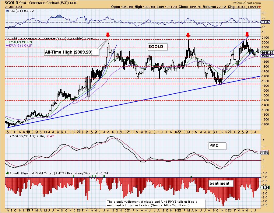
On the weekly chart, we can see that Gold has been turned back by resistance three separate times, but I think the third time may be the charm. The first two attempts were parabolic moves, which are usually doomed to failure. The third advance from the 2022 low has been more deliberate, advancing within a rising trend channel. While it too was turned back, I think there is a good chance of a successful break through this time.

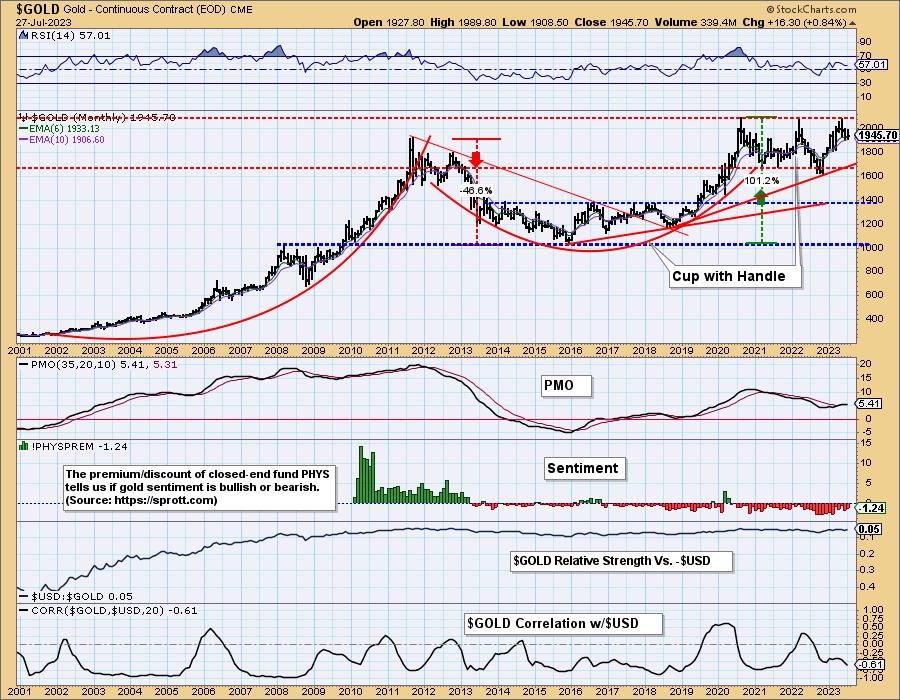
Finally, the monthly chart shows that Gold has been in a trading range for 13 years. That is a bullish continuation pattern. There is also a bullish cup with handle, implying that a long-term breakout is likely.

Conclusion: Gold has been doing a lot of long-term work by consolidating the huge advance from the 2001 lows. We think that the most recent attempt to break to new, all-time highs will ultimately be successful, but we may find ourselves grinding our teeth through the process.
Learn more about DecisionPoint.com:
Watch the latest episode of DecisionPoint on StockCharts TV's YouTube channel here!

Technical Analysis is a windsock, not a crystal ball. --Carl Swenlin
(c) Copyright 2023 DecisionPoint.com
Helpful DecisionPoint Links:
DecisionPoint Alert Chart List
DecisionPoint Golden Cross/Silver Cross Index Chart List
DecisionPoint Sector Chart List
DecisionPoint Chart Gallery
Trend Models
Price Momentum Oscillator (PMO)
On Balance Volume
Swenlin Trading Oscillators (STO-B and STO-V)
ITBM and ITVM
SCTR Ranking
Bear Market Rules
DecisionPoint is not a registered investment advisor. Investment and trading decisions are solely your responsibility. DecisionPoint newsletters, blogs or website materials should NOT be interpreted as a recommendation or solicitation to buy or sell any security or to take any specific action.
|
| READ ONLINE → |
|
|
|
| RRG Charts |
| Surging Trucks Are Driving The Industrials Sector Higher |
| by Julius de Kempenaer |

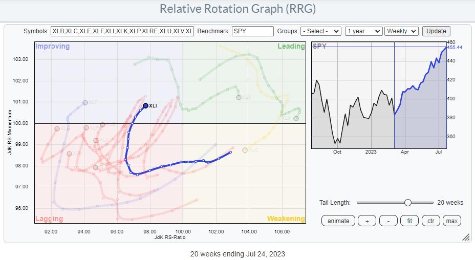
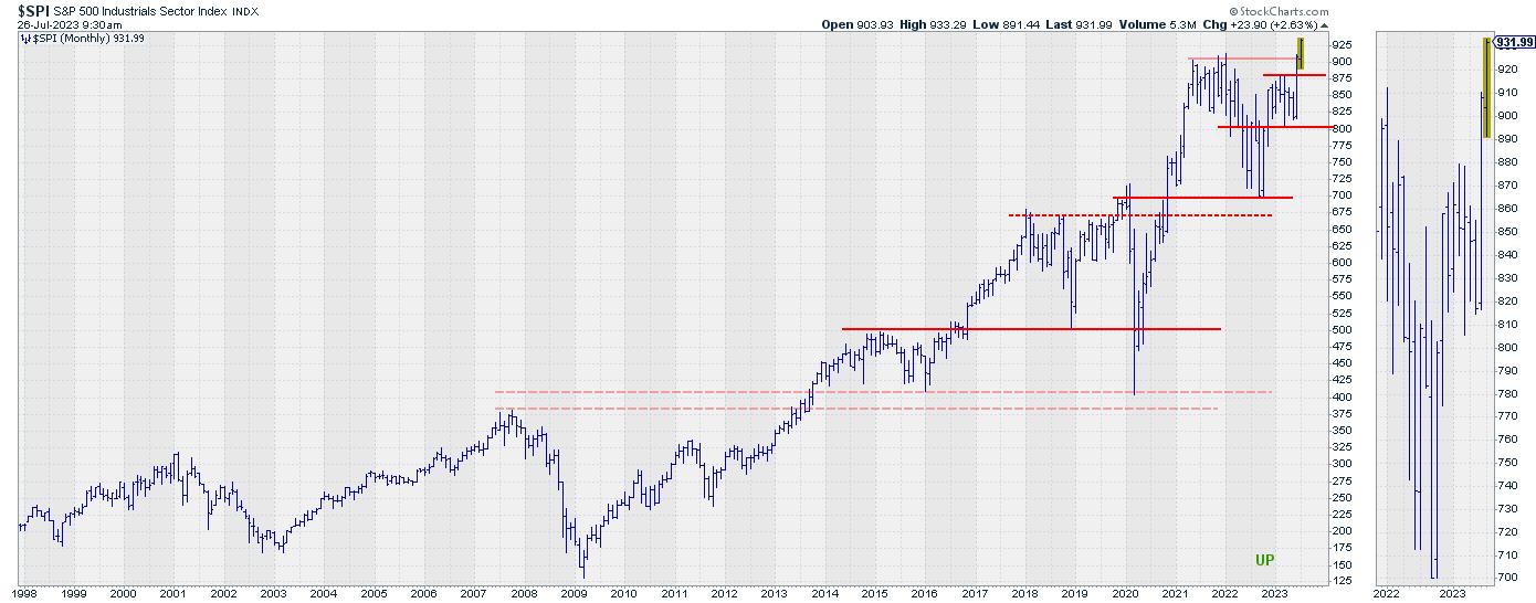
On the Relative Rotation Graph for sectors above, I have highlighted the trail of the Industrials sector over the last 20 weeks. The trajectory coming out of the lagging quadrant into improving and now turning into an RRG Heading between 0-90 degrees suggests that further improvement is ahead of us.
Industrials Breaking to New All-Time-Highs

In this episode of Sector Spotlight at the start of July, I pointed out that the Industrials sector was one of two (the other being Information Technology) breaking to new all-time highs, as seen on the monthly chart above. This in itself is, of course, already a sign of strength.
The rotation on the RRG is now starting to add the relative strength component to that strength as well.
Break Down into Industries

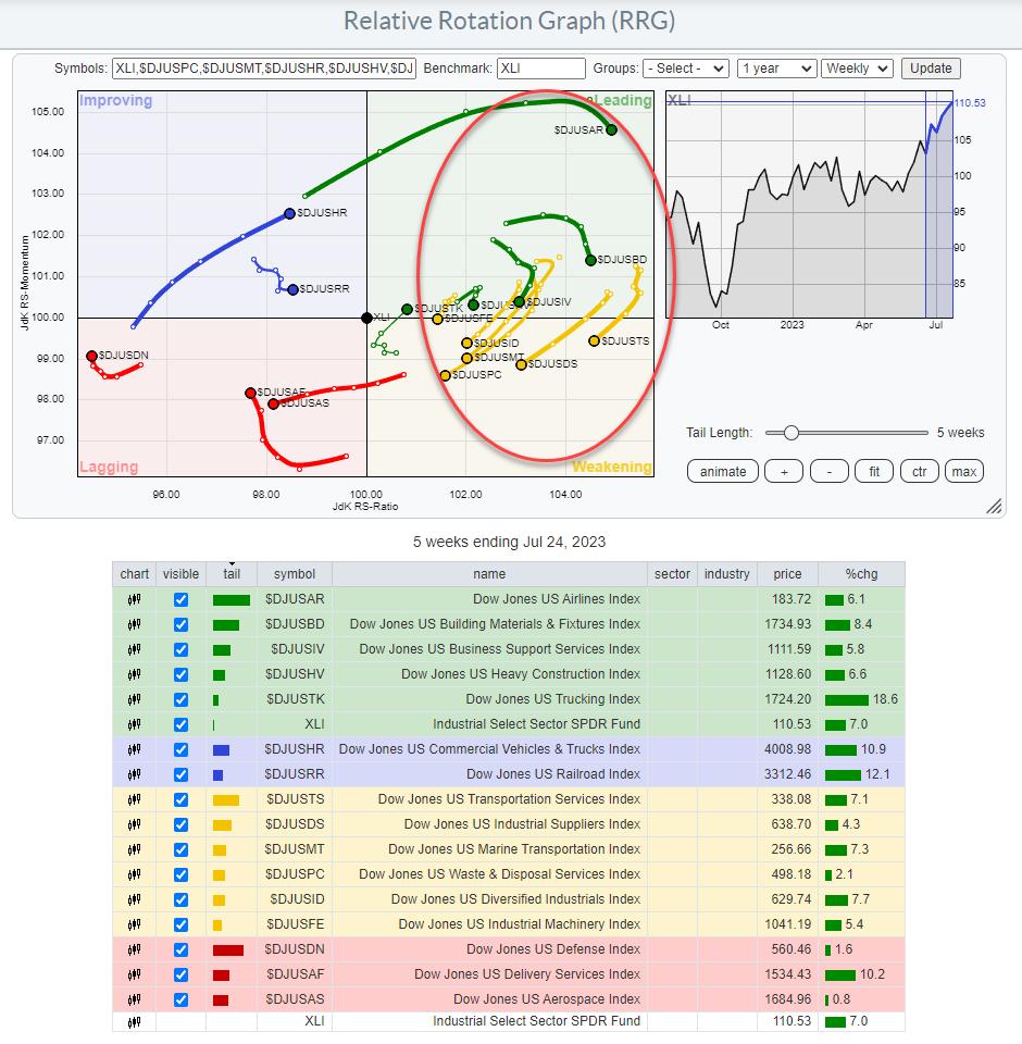
When we step from sectors into the industries that make up the Industrials sector, we see a lot of industries that have recently rolled over inside the leading quadrant and have then rolled over into weakening. Out of the remaining industries, three are inside lagging; Defense, Delivery Services, and Aerospace. Despite the small pickup of relative momentum for Defence and Delivery, they remain in a relative downtrend vs. XLI.
The railroad industry is on a short tail inside the improving quadrant, while losing some relative momentum which indicates that this industry is at a stable, yet relative, downtrend vs. XLI.
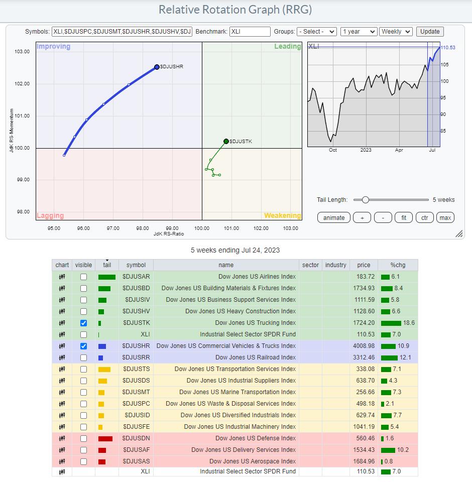
Out of these industries, which together make up the Indsutrials sector, there are currently two that stand out positively.

Commercial Vehicles & Trucks
$DJUSHR is inside the improving quadrant and heading towards leading at a long tail, indicating that there is strength behind this move.

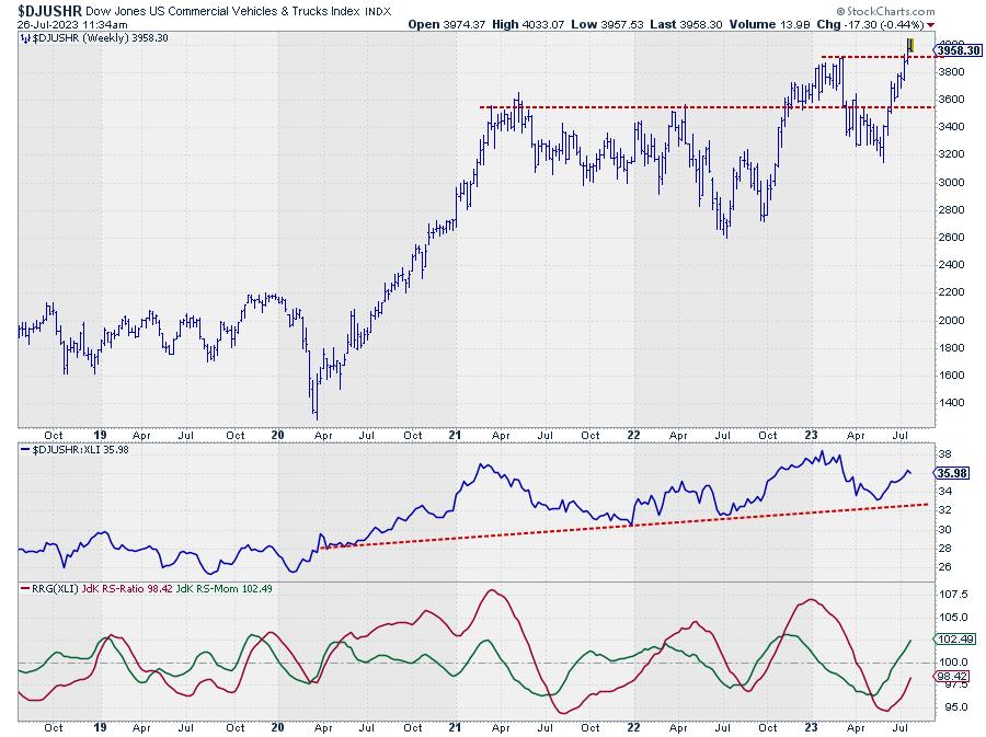
On the price chart, this index broke to new highs last week and is holding up well so far. The raw RS-Line is sloping up slightly and has just put in a new higher low, which is pulling both RRG Lines higher.
This combination suggests a further leading role for this industry in the weeks ahead.
Trucking
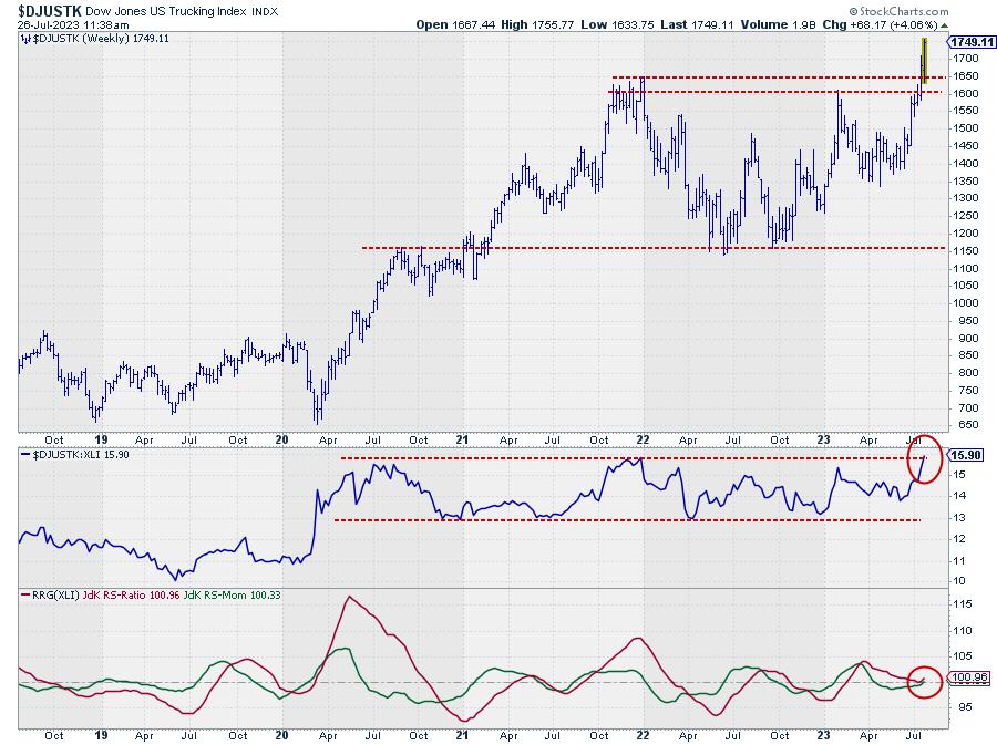
$DJUSTK has recently completed a rotation through weakening and then back into leading. It thus is completing a rotation completely on the right-hand side of the RRG, which we know is a strong sign.

The upward break in this index is more vicious than we saw in the previous chart. Also, the raw RS-Line is about to break upward from an almost three-year sideways range.
With the RS-Ratio line bottoming out above 100 and the RS-Momentum line moving back above 100, the rotation is completed without moving into the lagging quadrant (left-hand side of the RRG), which in itself is already a sign of strength.
New Industries Taking the Lead
After the big moves by airlines and construction stocks pulled the Industrials sector up and above its previous highs, it looks as if Trucking and Commercial Vehicles & Trucks are now taking over as the leading industries within the sector.
These are the stocks in these industries inside the S&P 500:
- Commercial Vehicles % Trucks : CAT,CMI,DE,PCAR,WAB
- Trucking : CHRW,JBHT,ODFL
#StayAlert, --Julius
|
| READ ONLINE → |
|
|
|
| The Canadian Technician |
| Investors Continue To Believe |
| by Greg Schnell |
The market has continued higher. Period. Despite all the warnings, markets continue to push higher.
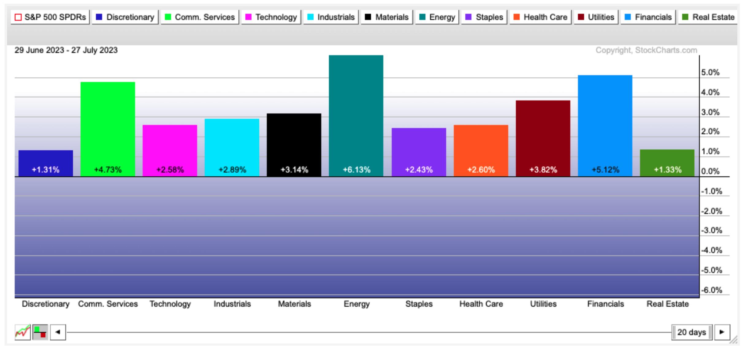
Below is the view over the last month. You can see the dates of each chart in the top left corner and the number of trading days in the lower right corner.

Every sector was a winner for this month of July. Real estate has been one of the top sectors for two of the four weeks, but it has been as weak as discretionary overall. Commodities had a rough first 1/2, but energy is starting with a strong month of July. Energy has a lot of catching up to do to reach the extremes of the semiconductor industry performance.
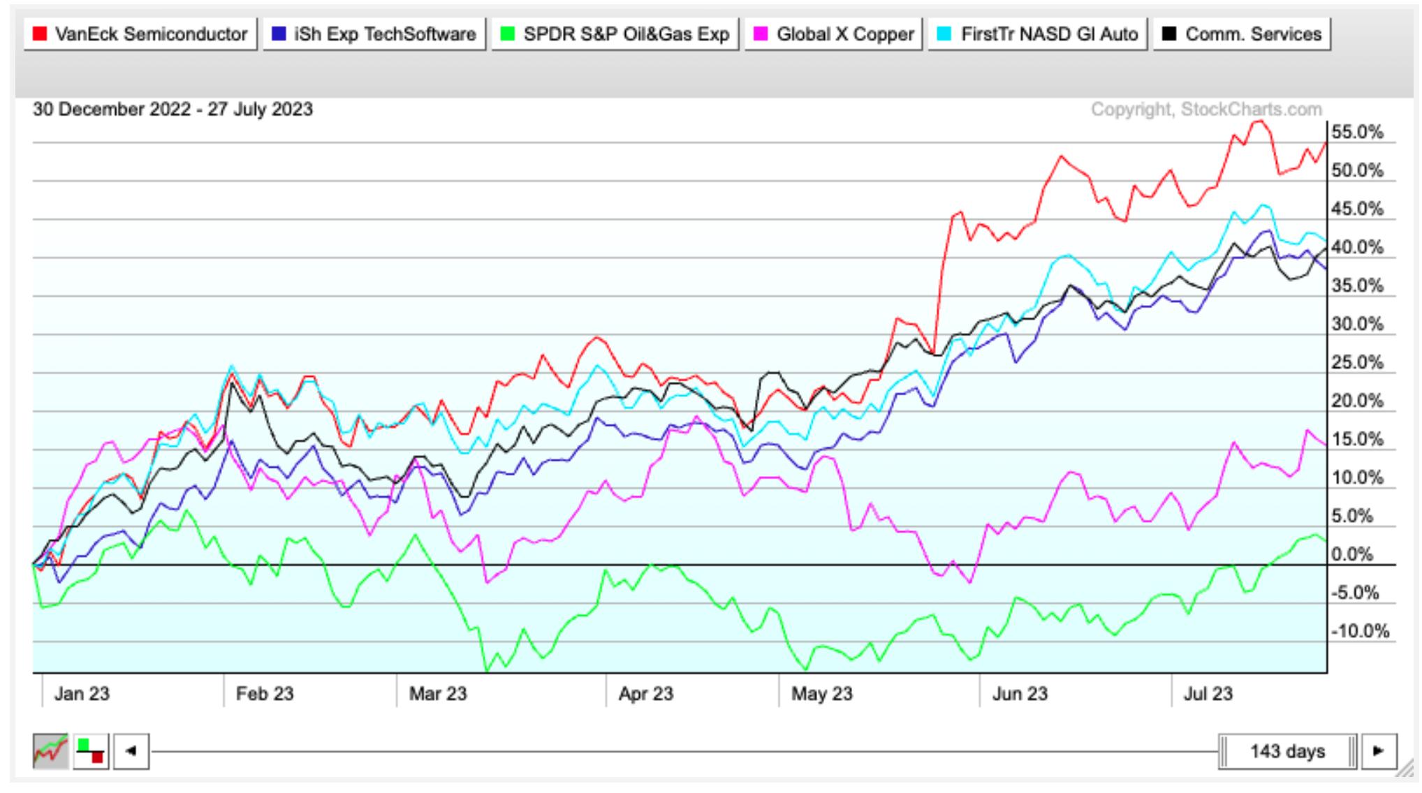
In first half of 2022, energy stayed strong while tech fell away from the leadership position. 2023 has seen an abrupt reversal of that. The chart below is year to date for 2023.

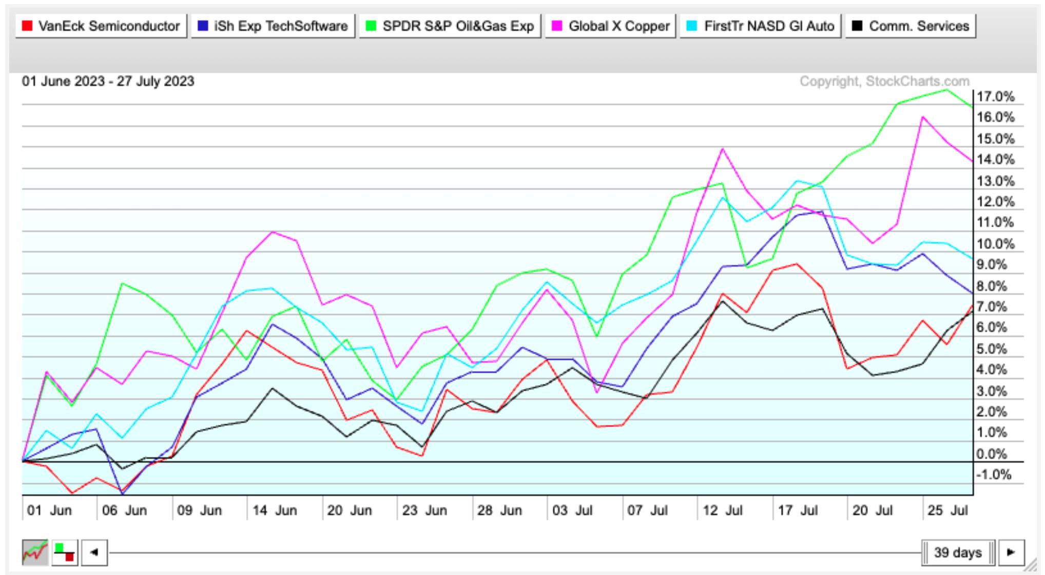
However, since June 1st, some of the main commodity ETFs have been stronger than the tech universe. The exploration and production ETF is currently doubling the performance of the IGV software ETF, SMH the semiconductor ETF, or XLC the communications ETF.

As oil touches $80, is there more in the tank? I would suspect so, as the global energy trade has gone from worst to first again. But the relentless discussion around AI continues to add strength to the tech sector, including semiconductors, electrical components and software. It is not a matter of being right or wrong, but the continual shift of what is the strongest lately makes it hard for everyone to always be in the best areas of the market.
|
| READ ONLINE → |
|
|
|
| ChartWatchers |
| Will the Fed End Its Tightening Cycle in September? |
| by Jayanthi Gopalakrishnan, Karl Montevirgen |

The Fed raised interest rates by 25 basis points—no surprise there. The stock market has priced in a 25-basis point rate hike, which will bring interest rates to the 5.25% to 5.5% range. That's the highest the Fed funds rate has been in 22 years. Should we expect more rate hikes this year?
If you remember, in the last meeting, the Fed left rates steady, but indicated that we could expect two more 25-basis point increases in 2023. When Fed Chairman Jerome Powell takes the podium, investors will be listening for hints of whether there'll be one more rate hike or if this will be it.
Alas, Chairman Powell's language was similar to what he said in the last meeting. Even though inflation is cooling, it's still above the 2% target. The US economy is growing at a modest pace, and the labor market remains very tight. For inflation to move lower, it could require below-trend growth and a softening of the labor market.
Powell mentioned that the Fed will take a data-dependent approach and continue to make decisions meeting by meeting. It'll take time to see the full effects of the Fed's monetary policy decisions, especially when it comes to inflation. When asked about when the Fed will stop raising rates, Powell responded by saying that they'll stop raising rates when they're comfortable with it.
Powell also doesn't foresee a recession in the near future, but this view is far from being assured. There are still many uncertainties. He also doesn't believe that many job losses are necessary for prices to fall to the Fed's 2% target.
Is Inflation Cooling?
We have started to see signs of inflation cooling—CPI up 3% year-over-year and core CPI up 4.8% year-over-year—which is encouraging. But one month's data doesn't set a trend. Remember, energy prices fell over 16% on an annual basis. Compare that to the 5.7% rise in food prices over the last 12 months.
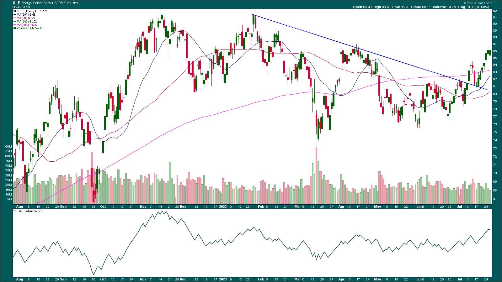
Energy makes up a significant portion of household expenses and, with energy prices coming off their lows (see chart of Energy Select Sector SPDR ETF, XLE, below), it remains to be seen if the cooling inflation was a one-off.

CHART 1: ENERGY SELECT SECTOR SPDR ETF (XLE) CONTINUES TO RISE. Keep an eye on XLE since its price action could impact inflation data in the next few months.Chart source: StockCharts.com (click on chart for live version). For educational purposes.XLE has broken above a downward-sloping trendline and is trading above its 200-day simple moving average. The On Balance Volume (OBV) indicator in the lower panel is trending higher, which means volume on up days is greater than volume on down days. As long as the uptrend is supported, it's safe to assume that energy prices will rise.

The Big-Picture View
While the general feeling is that the US will avoid a recession, there are a few areas that investors should watch—home prices, consumer confidence, and the labor market.
- Home prices in May were lower than a year ago, according to S&P CoreLogic Case Shiller Indices data, but stronger than expected.
- Consumer confidence increased to 117 in July, the highest level in two years.
- The labor market hasn't shown signs of cooling. Wage growth has been fast—hourly earnings in June rose 4.4% annually.
The core Personal Expenditures (PCE) Price index for June will be released on Friday. The Fed watches the PCE closely, and, in May, it rose 4.6%, which is still a ways away from 2%. For as long as supply and demand in the labor market are not in balance, inflation is likely to remain above the Fed's 2% target.
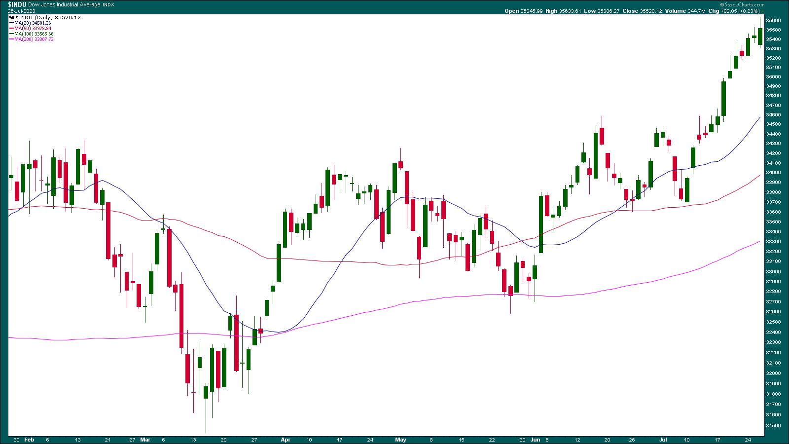
The stock and bond markets didn't react much following the Fed's rate decision. However, after Powell's presser, the Dow Jones Industrial Average ($INDU) climbed higher, pulled back, and managed to clinch its 13-day winning streak, something it hasn't done since 1987.

CHART 2: 13-DAY WINNING STREAK FOR THE DOW JONES INDUSTRIAL AVERAGE. After Powell's speech $INDU spiked briefly but pulled back. However, it managed to close higher and maintain its winning streak.Chart source: StockCharts.com (click on chart for live version). For educational purposes.
And How Are the Gold Bulls Responding?
Recently, there have been two things supporting bullish gold sentiment:
- First, the hope that the Fed's tightening cycle will finally come to an end; and
- Second, that the threat of an impending recession still hangs in the air.
JPMorgan Chase (JPM) shares this view. It predicts the Fed will lower interest rates by Q2 2024, which would result in lower real US yields and higher gold prices.
The bank sees COMEX gold ($GOLD) hovering around $2,012 an ounce by the second half of this year (currently 2% above current prices) and, should the US economy fall into a recession, around $2,175 by the end of 2024 (10% above current prices).
For SPDR Gold Trust ETF (GLD), that translates to a price target of $201 by the end of 2024.
Other hedge funds and institutions seemed to have jumped onto this golden bandwagon as well. The most recent Commitments of Traders report from the CFTC tells us that money managers made more bets that gold (futures) would go up. The gold futures market now has 115,318 more long contracts than short ones, meaning that the overall market mood has been the most bullish it's been since early March 2022.
Gold ($GOLD) and GLD has been on a four-week uptrend, but the near-term fate of gold prices depends on how closely Fed Chair Jerome Powell's guidance matches gold bull expectations. The 25-basis point rate hike didn't get much reaction from the gold market, as Powell's "data-dependent" spiel kept gold bulls and bears in a holding pattern.

CHART 3: WHAT'S A POTENTIAL PRICE TARGET FOR GLD? The upside targets for GLD are displayed in blue, and the green line represents the JPM 2024 target-equivalent. The red dashed lines represent bearish targets.
Chart source: StockChartsACP. For educational purposes.
- On the technical front, the bulls still hold the advantage. Their objective is to push gold prices above the near-term and historical resistance between $191.00 and $193.00 (see blue dotted lines). The equivalent to the JPMorgan Chase COMEX gold ($GOLD) target is represented by the green dotted line at $201.00.
- On the downside, bears' objective would be to see GLD prices decline to support near $175.00 and $168.00, as shown in the chart (see red dotted lines).
Similar to the Fed itself, gold bulls and bears will have to monitor the forthcoming inflation and labor market reports to adjust their positions accordingly. Onerous, possibly, but necessary, yes (that is, if you want to stay at the edge of the curve).
The Bottom Line
The next Fed meeting is in September. There are still two CPI and PPI (in addition to several labor market) reports ahead of the next FOMC meeting. And, as Powell reiterated, the full impact of the Fed's rate hikes has not yet been felt in the economy, as it usually takes six months to a year for a rate hike to have a full effect. Till then, it's best to take a day-to-day approach.
Disclaimer: This blog is for educational purposes only and should not be construed as financial advice. The ideas and strategies should never be used without first assessing your own personal and financial situation, or without consulting a financial professional.
|
| READ ONLINE → |
|
|
|
| MORE ARTICLES → |
|
 Chart 1
 Chart 2
 Chart 3
 Chart 4COMMODITY BUYING...Commodity prices also had a strong July and may be bottoming. Chart 5 shows the Invesco DB Commodity Index rising above its red 200-day moving average and in the process of testing its April high. Rising energy prices are part of that rally. A weaker dollar during July may also be attracting new money into commodity markets.
 Chart 5

 Cisco (CSCO) is showing leadership qualities again as it breaks out of a classic bullish continuation pattern and hits a new high.


 StockCharts Tip. The Market Overview panel on Your Dashboard summarizes stock market activity in real time during the trading day. Click on the four tabs across the top—Equities, Bonds, Commodities, Crypto—to stay on top of the market action.
