| THIS WEEK'S ARTICLES |
| John Murphy's Market Message |
| RISING ENERGY PRICES AND RISING BOND YIELDS MAY THREATEN OVERBOUGHT STOCK MARKET |
| by John Murphy |
RISING ENERGY PRICES MAY BOOST YIELDS... This week's inflation reports sent a mixed message. July's CPI came in lower while July's PPI came in higher. Bond yields, however, gained more ground. The green bars in the upper box in Chart 1 show the 10-Year Treasury Bond yield moving closer to the highest level since last October. The problem may be that July's inflation reports failed to capture that month's rebound in energy prices. Markets, however, know that energy prices are rising. The price of WTIC hit the highest level of the year. The lower box in Chart 1 shows the United States Gasoline Fund (UGA) rising to the highest level in a year. The UGA is an ETF that tracks percentage changes in gasoline futures prices. It's only a matter of time before rising energy prices boost inflation numbers. Energy stocks are also rising.
 Chart 1 Chart 1
RISING ENERGY STOCKS... Last week's message suggested that energy stocks were breaking out to the upside. That view was confirmed by this week's even higher trend. Chart 2 shows the Energy SPDR (XLE) trading well above its spring high and heading toward its early 2023 high. Last week's message also showed the Market Vectors Oil Services ETF (OIH) hitting a new multi-year high. Chart 3 below shows the S&P Oil & Gas Exploration & Production SPDR (XOP) rising to a new 2023 high. Those two groups are leading the entire energy sector higher. It was also suggested that rising energy prices carried good news for energy stocks, but potentially bad news for interest rates. Rising energy prices and higher interest rates could also cause problems for an overbought stock market.
 Chart 2 Chart 2
 Chart 3 Chart 3
WEEKLY S&P 500 CHART SHOWS OVERBOUGHT READING... Two factors that could weigh on stocks is an overbought reading and seasonal considerations. The upper box in Chart 4 shows the 9-week RSI line starting to weaken after reaching overbought territory over 70. That's a sign that the SPX could be losing upside momentum. The chart also shows the weekly SPX price bars falling back to their 10-week (50-day) moving average which is their first line of support. The Nasdaq market which is being hurt by weaker technology stocks has already slipped below its blue line. The SPX is also testing potential overhead resistance. The weekly bars in Chart 5 show the S&P 500 Unweighted Index stalling near potential overhead resistance at its early 2023 high. That reflects relative weakness in small cap stocks. That would be a logical spot for an overbought stock market to encounter some selling. Seasonal factors are also a concern.
 Chart 4 Chart 4
 Chart 5 Chart 5
AUGUST AND SEPTEMBER ARE SEASONALLY WEAK MONTHS... Chart 6 shows the monthly performance of stocks over the past ten years. And they show August and September to be two of the weakest months of the year over that time span. The Stock Traders Almanac also shows August and September to be the market's two weakest months since 1950.
 Chart 6 Chart 6
|
| READ ONLINE → |
|
|
|
|
|
| Martin Pring's Market Roundup |
| Will the Test of Last October's High for Bond Yields be Successful? |
| by Martin Pring |
The 30-year yield reached its high point last October and has been rangebound since December. Chart 1 shows that it began to break out of that trading range in late July, but has yet to succeed in taking out the October high. The 14-day RSI is currently correcting from an overbought condition. Note this momentum indicator has failed to generate an oversold condition so far in 2023. Even last December's overstretched reading was quickly followed by a sharp bounce. Both momentum characteristics are a sign of a primary bull market.
That's not to say that the early August high will not turn out to be the second top in a double top formation, but the evidence at this point falls on the side of the bulls.
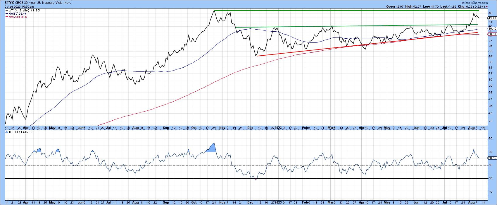 Chart 1 Chart 1
The question now is whether October high will be surpassed. To help answer, let's look at some of the indicators that move in sympathy with yields to see what they are saying.
Confidence Ratios
A major determinant of bond yields comes from market participants' estimate of future economic growth. If they believe there is a risk of economic weakness or even a recession, safe-but-low yielding treasuries are favored over riskier high-yield corporates. That connection is encapsulated in Chart 2, which compares the 10-year yield to the ratio between the Fidelity Capital and Income to that for the Vanguard Treasury Fund. A rising series reflects growing confidence. That's because traders downplay the risk of economic weakness, as they go for growth over safety.
Note how this relationship moves in sympathy with the 10-year yield itself. Recently, it touched a new bull market high, suggesting that further yield gains are likely. It's no guarantee of higher yields, but such an outcome is more likely than if the ratio was headed south.
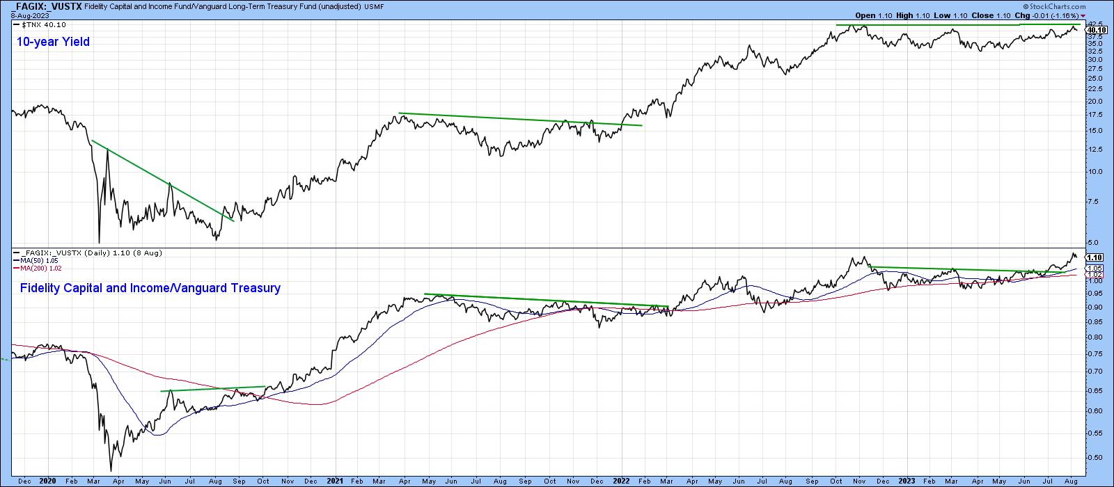 Chart 2 Chart 2
The ratio between the SPDR Financial ETF and that for the iShares REIT (XLF/IYR) offers another useful confidence relationship, the theory being that, when the more economically-sensitive and risky Financials outperform the higher-yielding REITS, it again reflects a more optimistic view of the economic outlook, which also happens to be consistent with higher rates. Chart 3 shows that the ratio broke above multi-year resistance in October of last year and is now trying to move above the 2022-23 trading range. A positive KST suggests that it will succeed. Whilst such action would not guarantee a breakout by the 10-year yield, it would certainly increase the odds.
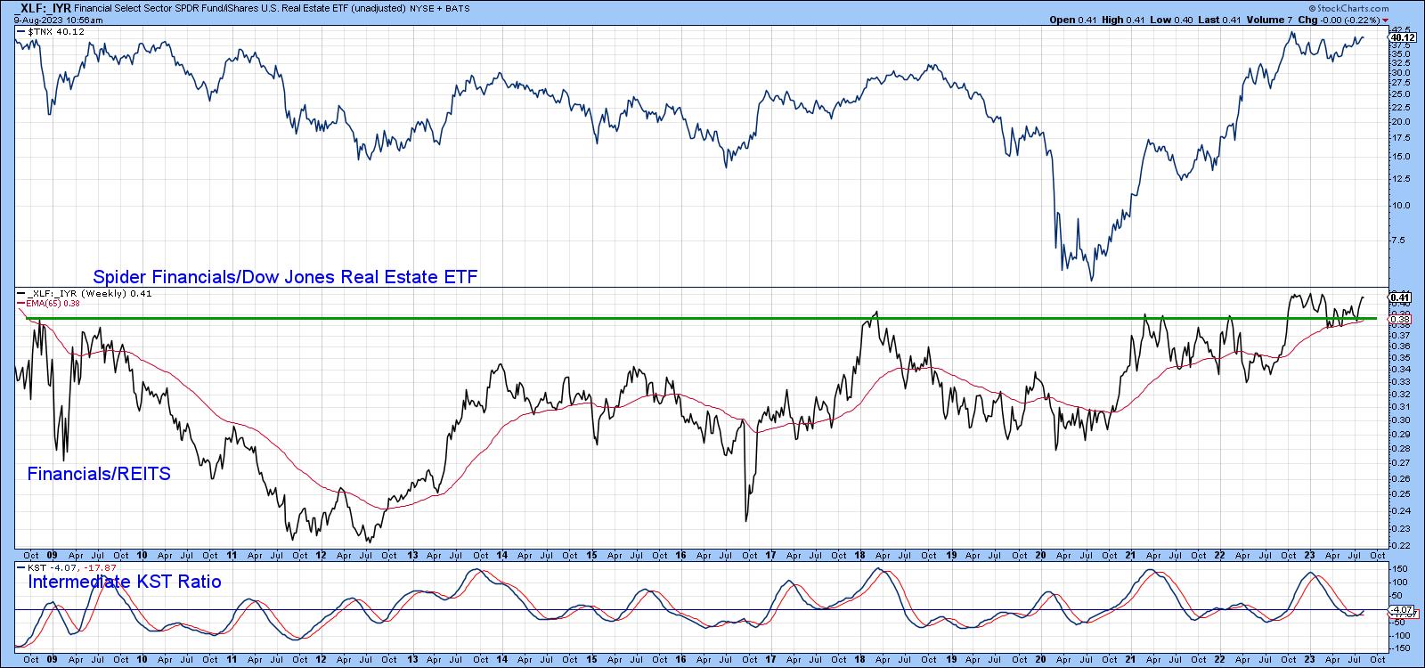 Chart 3 Chart 3
The same comment can be applied to Chart 4, featuring the Financial/Bond ratio (XLF/TLT), which is already at a new high. The very fact that the 50-day MA has started to pull away from its red 200-day counterpart is a sign that it is headed higher and could drag the yield with it.
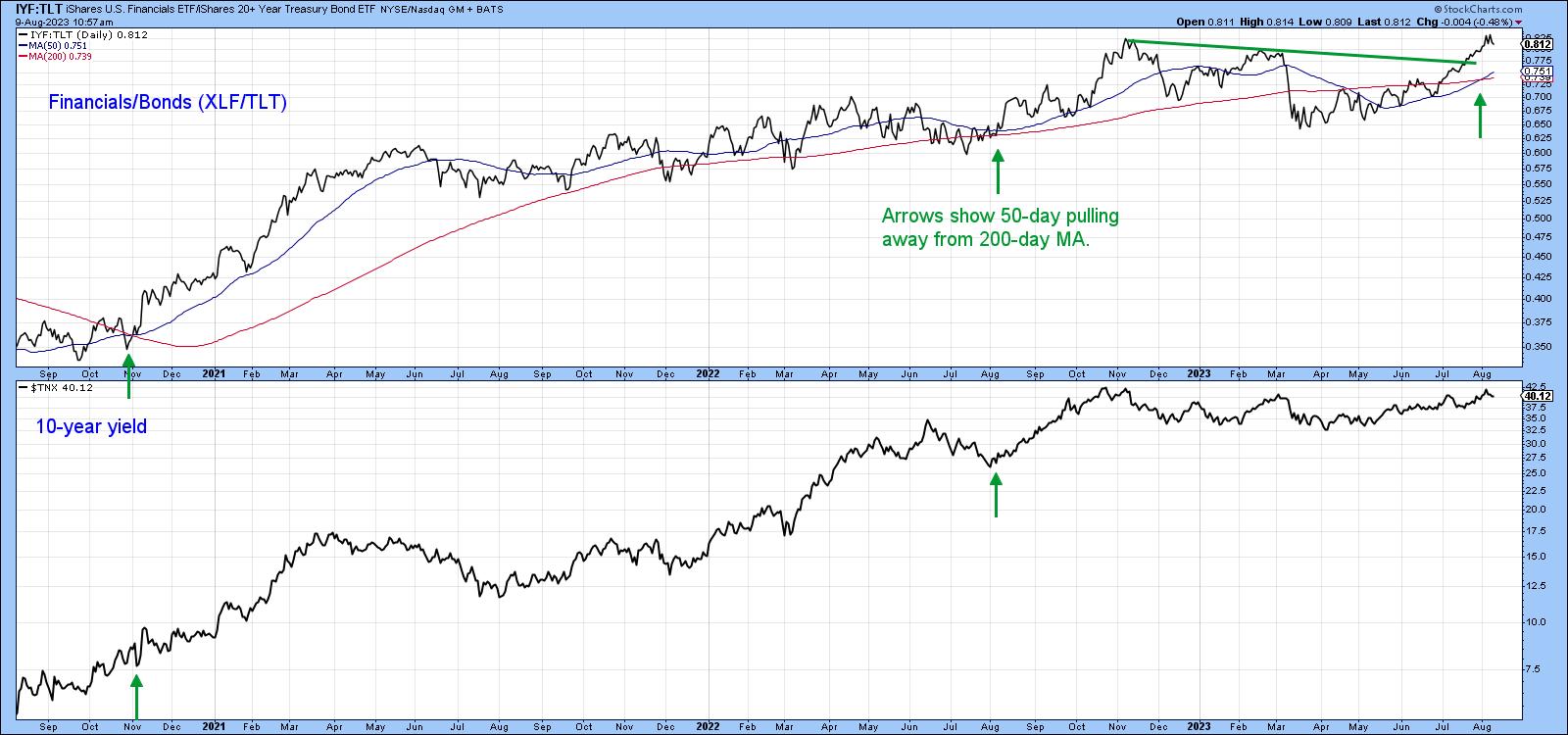 Chart 4 Chart 4
Bond Yields and Inflation
Inflation-protected bonds outperform their nominal counterparts when bond market participants are anticipating an inflationary environment, and vice versa. As a result, the ratio between them can be used to confirm or deny breakouts in the 10-year yield. Chart 5 shows this relationship recently broke out from a 9-month base, in sympathy with the yield itself. So far, it remains below last October's peak, so we cannot say it is leading rates higher. However, positive KST action suggests that the rally is ongoing.
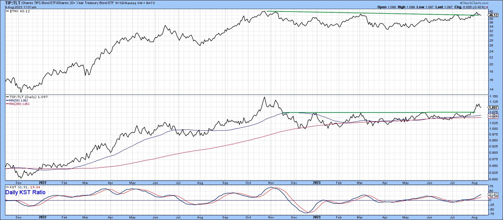 Chart 5 Chart 5
International Rates
Interest rates do not move in isolation, but are tied to the global financial system. In that respect, Chart 6 features the 10-year yield for the UK, Germany and Japan. All have reached marginal new post-October 2022 highs. The only exception is the series in the first window, i.e., that for the US. If foreign rates continue to build on their breakouts, it will be difficult for US bond yields not to follow suit.
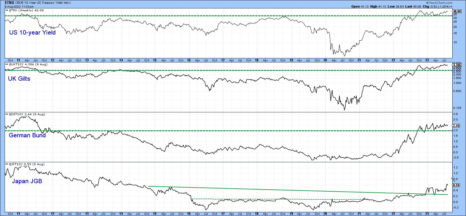 Chart 6 Chart 6
Conclusion
It seems likely that bond yields are headed higher, but there are two caveats. First, as shown in Chart 7, long-term momentum is still extremely overextended. The counteracting argument is that the recent record reading in the 12-month ROC offers a sign of a strong, young, and vibrant secular bull market. Under that environment, normal overbought readings are nowhere near as potent as when they develop during the course of a secular bear, which was the case between 1981-2020. All primary bull trends come to an end at some point, but at the very beginning of a new secular trend, it's possible to stretch the elastic a little.
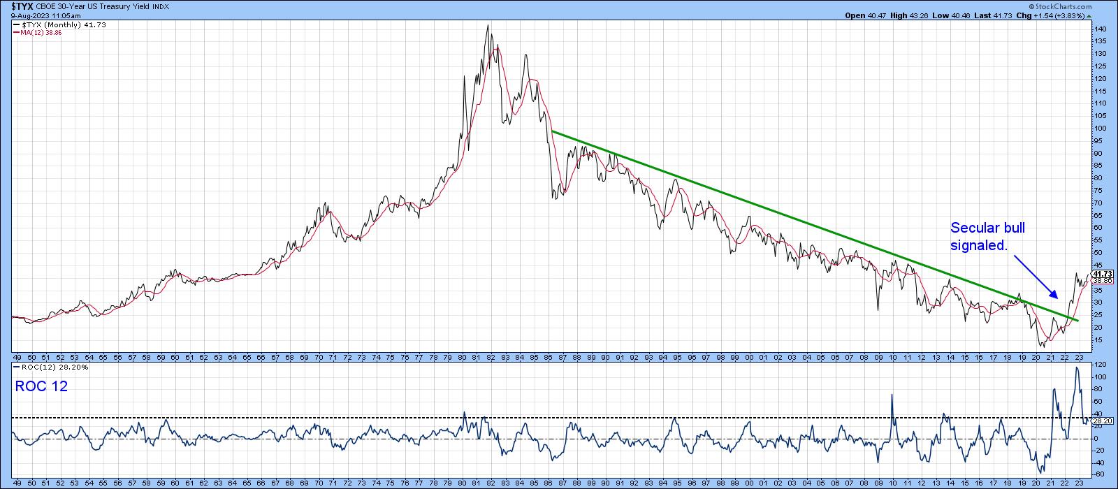 Chart 7 Chart 7
The second point is that sentiment regarding prices is currently very negative. That's bullish from a contrary aspect. Also, commitment of traders data reveals that hedgers are positioned for higher prices (lower yields). Hedgers tend to be correct at major turns. That said, there are many indicators poised to break to the upside. If they do, it will be wiser to believe them.
Good luck and good charting,
Martin J. Pring
The views expressed in this article are those of the author and do not necessarily reflect the position or opinion of Pring Turner Capital Group of Walnut Creek or its affiliates.
|
| READ ONLINE → |
|
|
|
| The Mindful Investor |
| Charting the Great Rotation of 2023 |
| by David Keller |
Every week that goes by seems to show how the mega-cap stocks that pushed the market higher in the first seven months of the year have now taken a back seat. Sectors like Financials and Energy have seen improved relative strength, while previous bellwether groups like semiconductors have begun to underperform.
When I noted bearish momentum divergences on key growth names last month, I began to think through a scenario called "The Great Rotation of 2023". The general line of thinking was that, if and when growth stocks decided to take a breather, those assets would rotate elsewhere. Would it be to cyclical sectors like Energy, or more defensive sectors like Utilities?
As the Nasdaq 100 closed below its 50-day moving average this week, following similar breaks of support from stocks like Microsoft (MSFT) and Apple (AAPL), it seems that market has answered in a clear voice that it's sectors like Energy which are now taking a new leadership role in August 2023.
Let's review the technical setup that led to this great rotation, how to visualize the leadership roles shifting between sectors, and identify some ETFs that may have further opportunities to outperform in the coming weeks and months.
The Benchmarks Break Down
Stocks like Microsoft and Apple made consistently higher highs pretty much every month in 2023. But after making new highs in mid-July, both stocks have now pushed lower and now have violated the 50-day moving average.
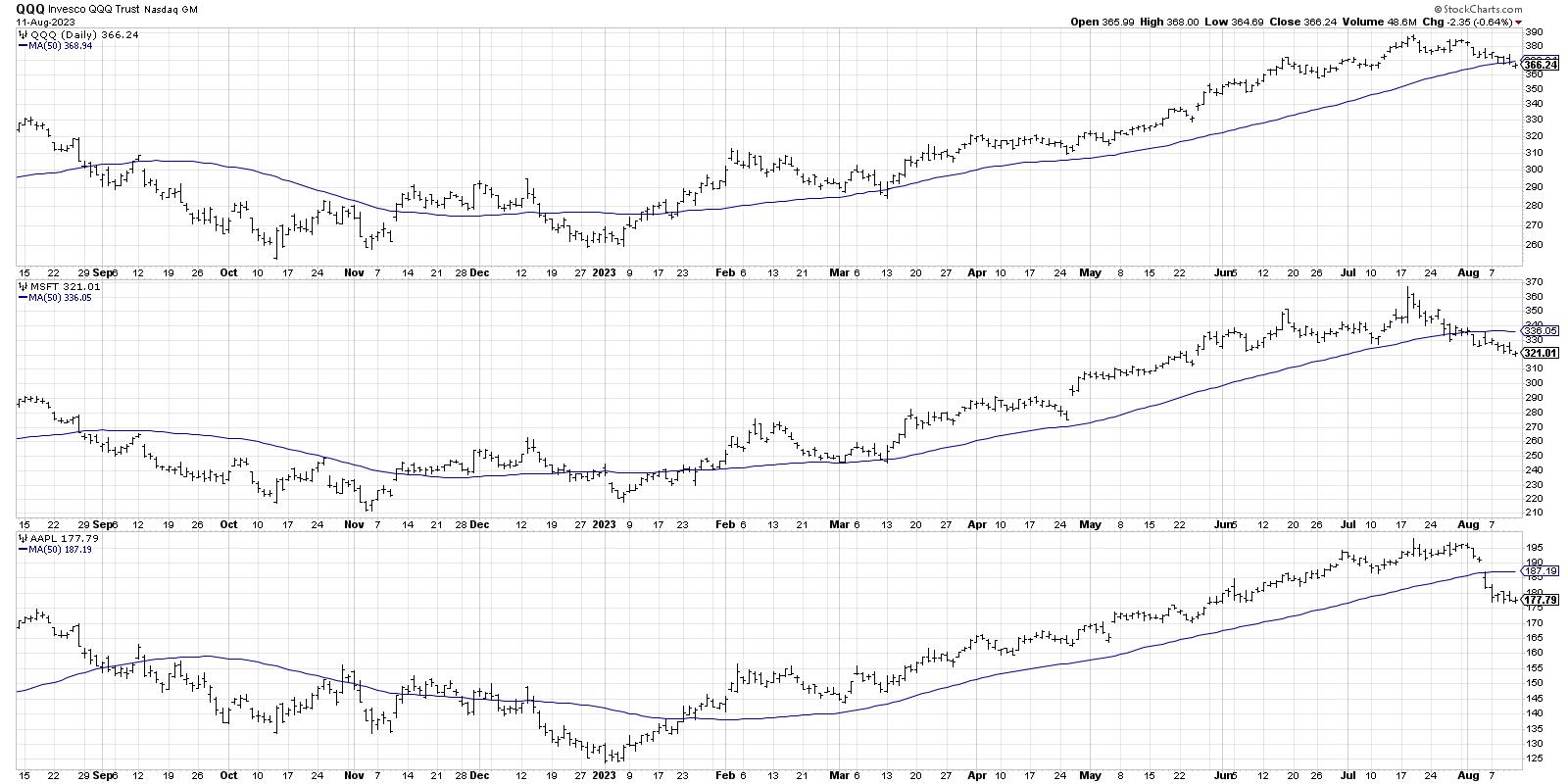
AAPL has demonstrated perhaps the clearest evidence of a stock in a distribution phase, with a gap below the 50-day moving average followed immediately by further downside movement. This suggests that no willing buyers came in to buy on price weakness, but instead that more selling pressure is in play.
The Nasdaq 100 is now about 6% off its July high, while leading names like AAPL and MSFT are down 11% and 13%, respectively. I was taught that "all large losses begin as small losses," and, given the initial downthrust in these leading names, I'm inclined to stay out of the way until some sort of support level is established.
With the top-heavy nature of our equity indexes, with even the S&P 500 weighted heavily to these mega-cap growth stocks, the S&P is also under pressure.
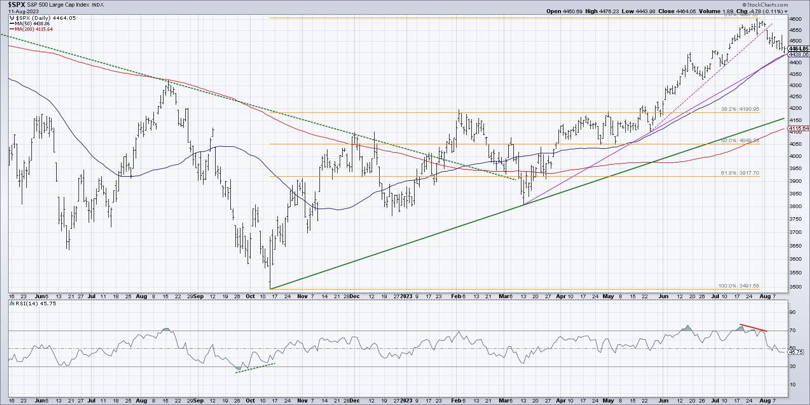
The SPX did manage to hold its 50-day moving average this week, but it's worth noting that only 55% of S&P 500 members are above their own 50-day moving average. That's down from about 90% just three weeks ago! To rephrase, about a third of the S&P 500 members have broken their 50-day moving average in the last couple weeks.
Visualizing the Rotation from Growth to Value
The weekly RRG chart provides an ideal way to visualize sector rotation, so a review of the RRG seemed to be a logical next step for me to quantify a potential rotation from growth to value.
Back in March, the RRG was very much in a growth-over-value position. Growth sectors like Technology and Communication Services were firmly in the Leading Quadrant, while value-oriented sectors like Financials and Energy were pushing into the Lagging Quadrant.
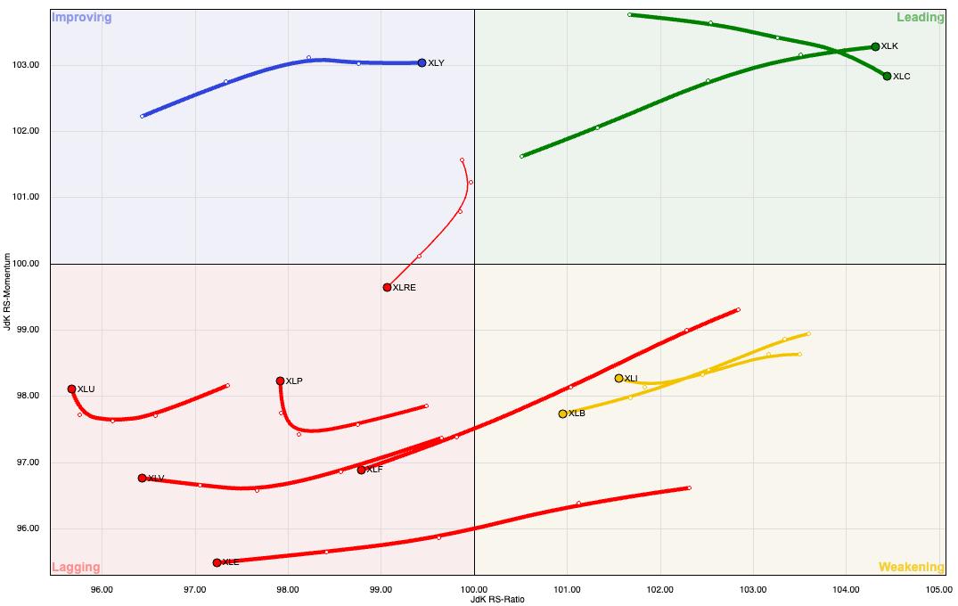
Growth sectors dominated the first six months of 2023, and even into June you could still see the strong outperformance of the FAANG sectors. But all of a sudden, forgotten sectors like Financials and Energy started to improve. Relative strength readings began to stabilize as most sectors saw improving price action.
Now in August, the drop in growth stocks has created a very different appearance to the RRG chart.
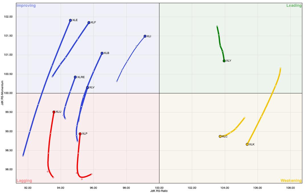
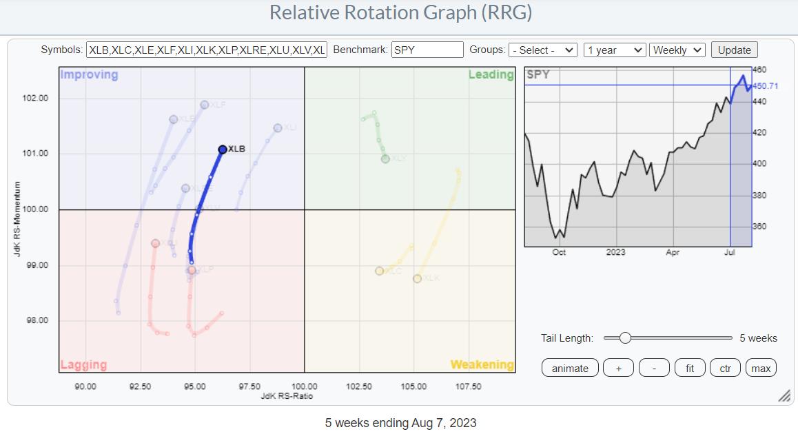
Note how the XLC and XLK are now in the Weakening Quadrant, showing a decline in relative strength momentum after the recent pullback. The Improving Quadrant includes sectors like Industrials, Financials, Energy, and Materials, all of which have seen a definitive improvement in relative strength.
The Great Rotation of 2023 appears to be less about a rotation from offense to defense, and more about a rotation from growth sectors to cyclical sectors like Energy. So which ETFs have improved to the point where they deserve a second look for investors?
Two ETFs Making New Relative Highs
I often scan for stocks and ETFs making new swing highs for my Market Misbehavior Premium Members. The S&P SPDR Oil & Gas Exploration and Production ETF (XOP) surfaced recently as an example of a previously underperforming industry group that has rotated higher.
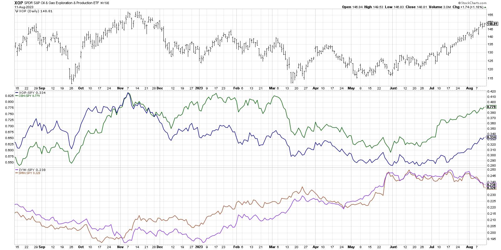
The second panel down shows the relative strength of the XOP as well as the Oil Services ETF (OIH) relative to the S&P 500. Note the downtrend in relative strength through the end of April, then the sideways relative performance in June and early July, and then a period of outperformance from mid-July through mid-August.
Now check out the bottom panel to see how two technology ETFs--IYW and SMH--have performed during this same period. Just as the RRG showed a clear rotation away from growth and into value, this chart shows the Great Rotation from sectors like Technology to new leadership including Energy.
We can speculate about when and how this Great Rotation will end, and when growth sectors will once again step into a leadership role. I'd much rather wait patiently for the charts to indicate that conditions have changed once again. For now, the charts are telling me to focus on emerging leadership in cyclical sectors until proven otherwise!
RR#6,
Dave
P.S. Ready to upgrade your investment process? Check out my free behavioral investing course!
David Keller, CMT
Chief Market Strategist
StockCharts.com
Disclaimer: This blog is for educational purposes only and should not be construed as financial advice. The ideas and strategies should never be used without first assessing your own personal and financial situation, or without consulting a financial professional.
The author does not have a position in mentioned securities at the time of publication. Any opinions expressed herein are solely those of the author and do not in any way represent the views or opinions of any other person or entity.
|
| READ ONLINE → |
|
|
|
| DecisionPoint |
| Big Tech, Big Troubles |
| by Carl Swenlin |
The seven mega-tech stocks, known to some as the Magnificent Seven, have had a magnificent advance since late last year, but now we're seeing some weakness, and it is likely that they will be under-performing for a while. Many have been affected by an emerging expectation of miracles from Artificial Intelligence (AI), but these expectations have no specific manifestation at this point in time. More like irrational exuberance, for the time being. Let's look at their charts.
APPLE (AAPL)
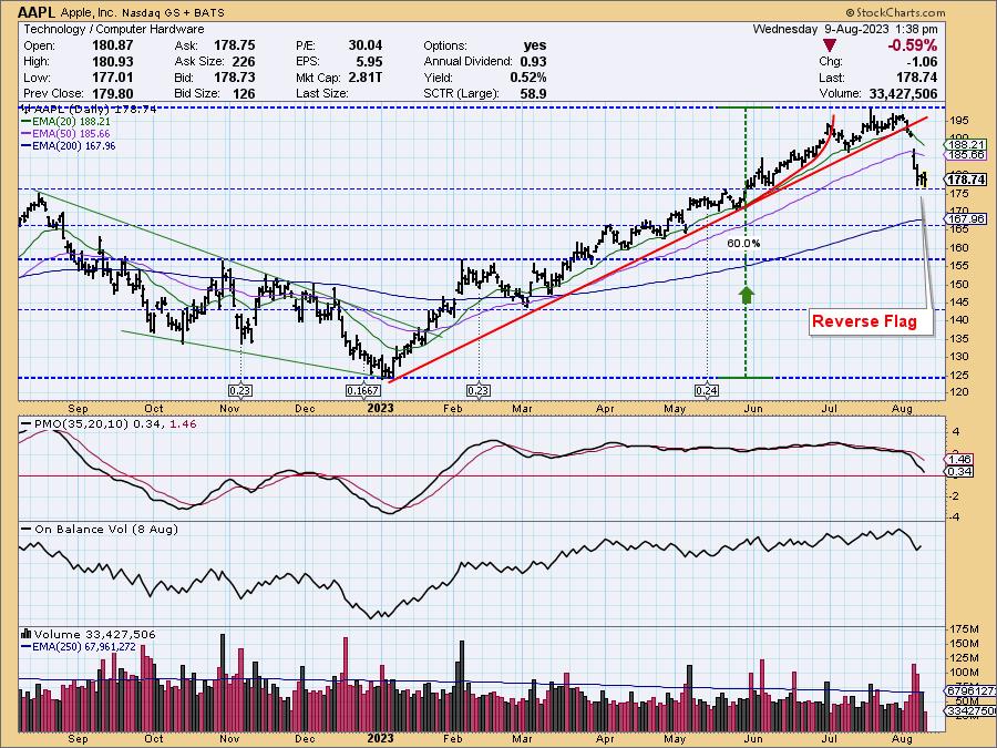
Since the price low in early-January, AAPL has maintained an orderly advance until early this month. Then it broke down through the seven-month rising trend line with a vengeance. After an -11% decline, it has paused on obvious support, forming a bearish reverse flag. Our expectation would be for a continued decline.
Amazon (AMZN)
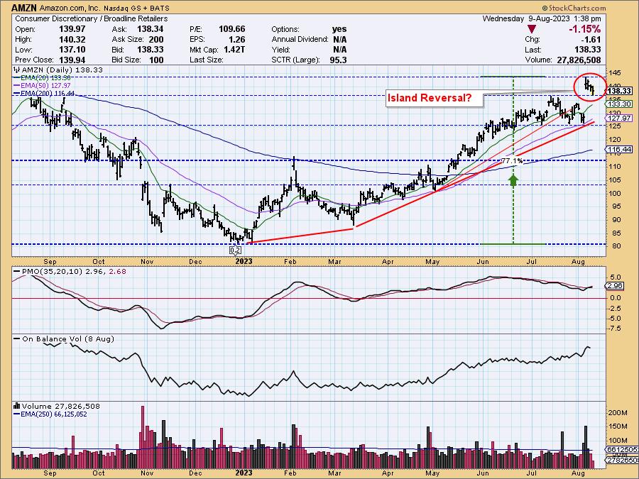
AMZN has been advancing since the December price low. In July, it began forming a bearish rounded top, but it gapped up last week on the earnings report. Since then, we have been witnessing a technical pullback. Currently, we see the recent price cluster as possibly being a setup for an island reversal, which would result in price gapping back down to horizontal support at about 125.
Alphabet, Inc. (GOOGL)
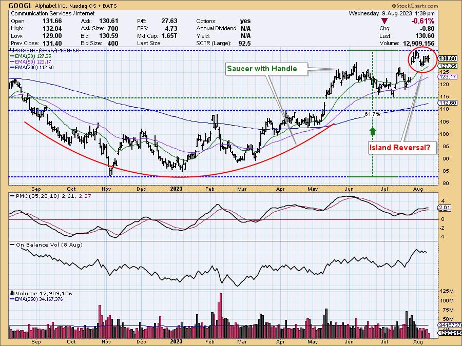
GOOGL made a low in November, before beginning a gradual advance, which resulted in the formation of a saucer. It gapped up and out of that saucer in May and began forming a handle on the saucer in June and July. In late July, it gapped up again and has since been forming its own island formation, which, of course, has the potential to reverse and gap down.
Meta Platforms, Inc. (META)
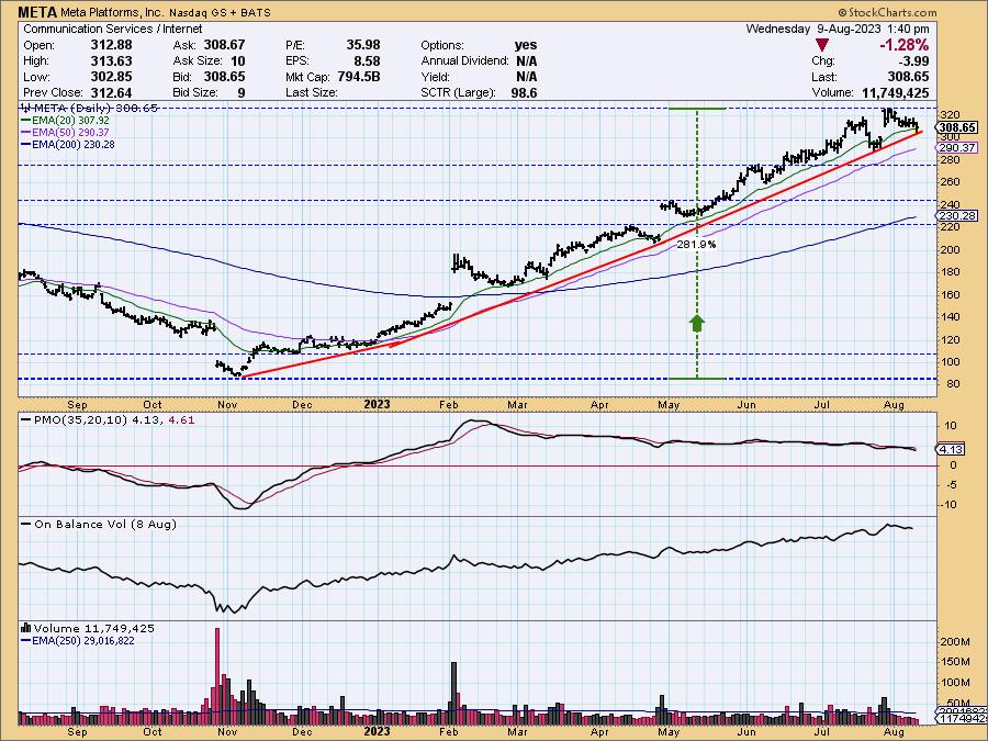
META hit a bear market bottom in November, then entered an orderly and profitable advance. At this writing, the rising trend is still intact, but with technology stocks currently in correction, we would expect that META will follow suit. The first line of support is just below 280, and the next just above 240.
Microsoft (MSFT)
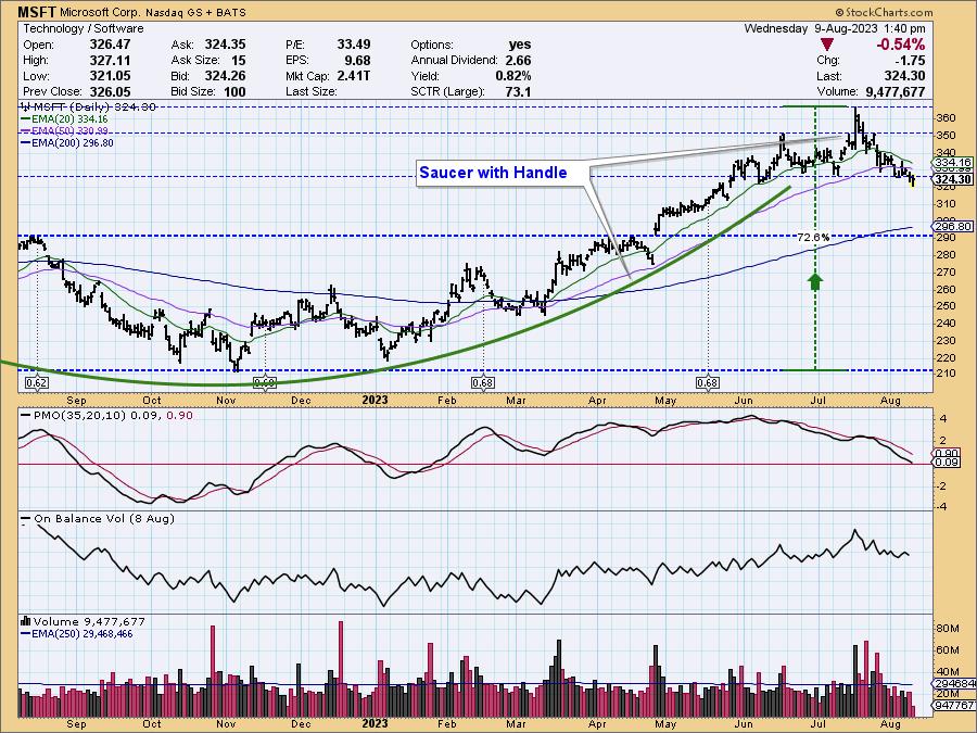
MSFT bottomed in November and has since been forming the right side of a saucer formation. In June, it began moving sideways, forming a handle on the saucer. This is a bullish formation, but there is some potential downside as the handle is formed--maybe down to 290?
Netflix (NFLX)
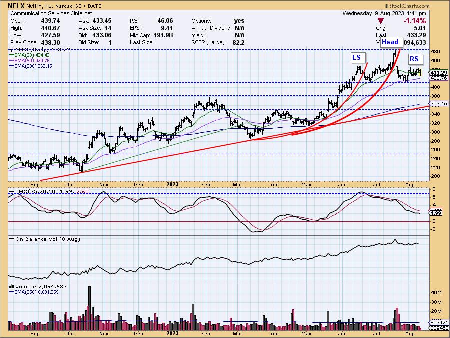
NFLX bottomed over a period of three months last summer (not shown) and has since had a somewhat choppy, but persistent, advance. The two "swoosh" marks emphasize how corrections tend to follow advances that become too vertical. The relevant feature at present is a head-and-shoulders formation with a neckline drawn across the two lows. If the formation executes (price drops below the neckline), the minimum downside projection is about 350.
Nvidia (NVDA)
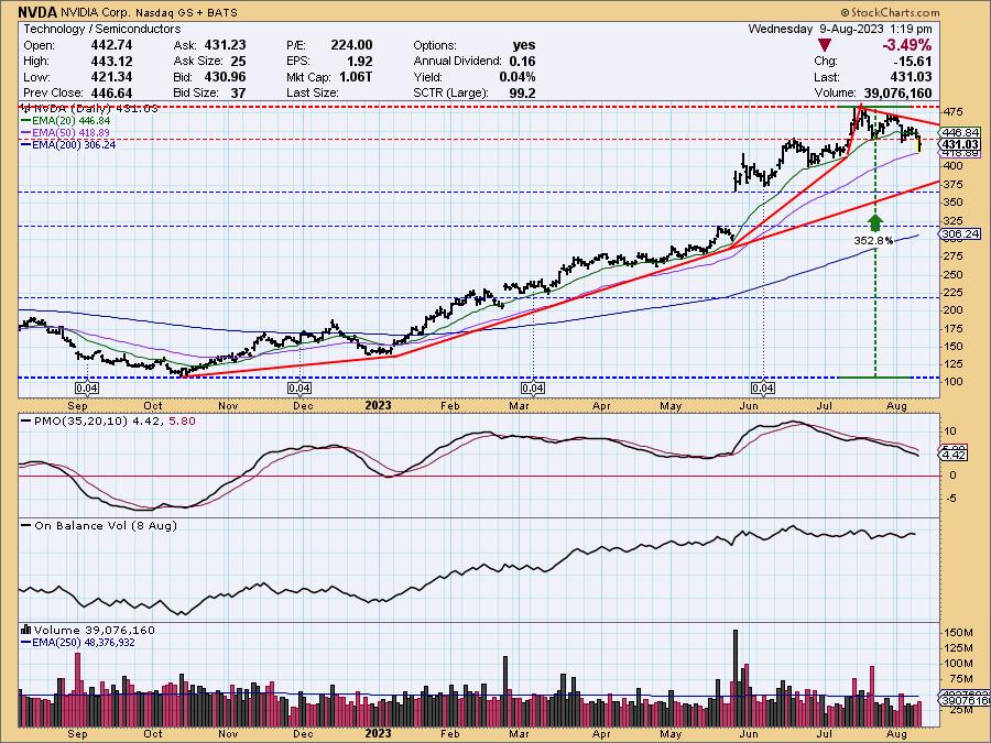
NVDA was the company that benefited most from AI fantasies with a mighty up gap in May. Since the July top, it has been giving back some of its gains, and it is currently in a declining trend. A reasonable downside projection would be down to the top of the gap around 360-ish, which would be a decline of about -25%.
CONCLUSION: The technology sector has gone into correction, and most of the big tech stocks are feeling some of the heat. Of those not yet correcting, we think it likely that they will also succumb soon.
--Carl Swenlin
Learn more about DecisionPoint.com:
Watch the latest episode of DecisionPoint on StockCharts TV's YouTube channel here!

Technical Analysis is a windsock, not a crystal ball. --Carl Swenlin
(c) Copyright 2023 DecisionPoint.com
Helpful DecisionPoint Links:
DecisionPoint Alert Chart List
DecisionPoint Golden Cross/Silver Cross Index Chart List
DecisionPoint Sector Chart List
DecisionPoint Chart Gallery
Trend Models
Price Momentum Oscillator (PMO)
On Balance Volume
Swenlin Trading Oscillators (STO-B and STO-V)
ITBM and ITVM
SCTR Ranking
Bear Market Rules
DecisionPoint is not a registered investment advisor. Investment and trading decisions are solely your responsibility. DecisionPoint newsletters, blogs or website materials should NOT be interpreted as a recommendation or solicitation to buy or sell any security or to take any specific action.
|
| READ ONLINE → |
|
|
|
|
|
| ChartWatchers |
| Introducing Cash Secured Puts: Know When To Fold Them |
| by Jayanthi Gopalakrishnan |

Bummed that you didn't ride Apple's rally? Now that the stock price has pulled back and is hovering around its 100-day simple moving average, you may have a second chance of picking it up at a lower price.
But let's say you think the stock price might fall slightly lower in the short term.
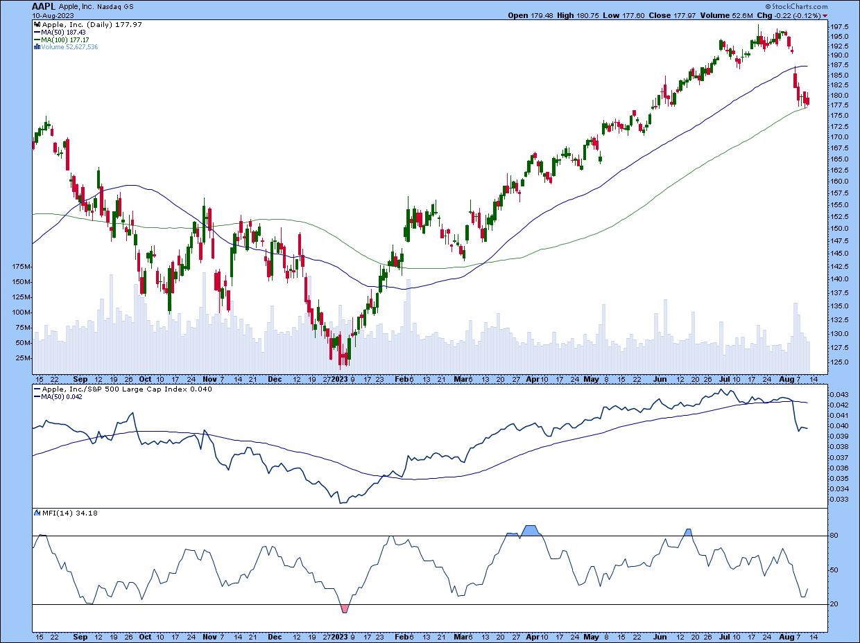
CHART 1: APPLE'S PULLBACK MAY BE A SETUP FOR A CONTINUATION OF THE PREVIOUS UPTREND. Although its relative strength against the S&P 500 has weakened and the Money Flow Index (MFI) indicated money flowing out of the stock, there's a chance the stock could bounce from its 100-day simple moving average and reverse back up.Chart source: StockCharts.com (click on chart for live version). For educational purposes.
The Cash-Secured Put
So, instead of buying the 100 shares immediately, you could sell a put option on Apple (ticker symbol: AAPL). In options lingo, this is called selling a cash-secured put. Similar to covered calls, cash-secured puts are a good strategy that can help you get acclimated to trading options.
Say AAPL is trading for $180 per share. Maybe you think the stock will go down a little and could move back up from there. In other words, you have a short-term neutral outlook and a long-term bullish outlook for the stock.
Let's pull up the options chain for AAPL.
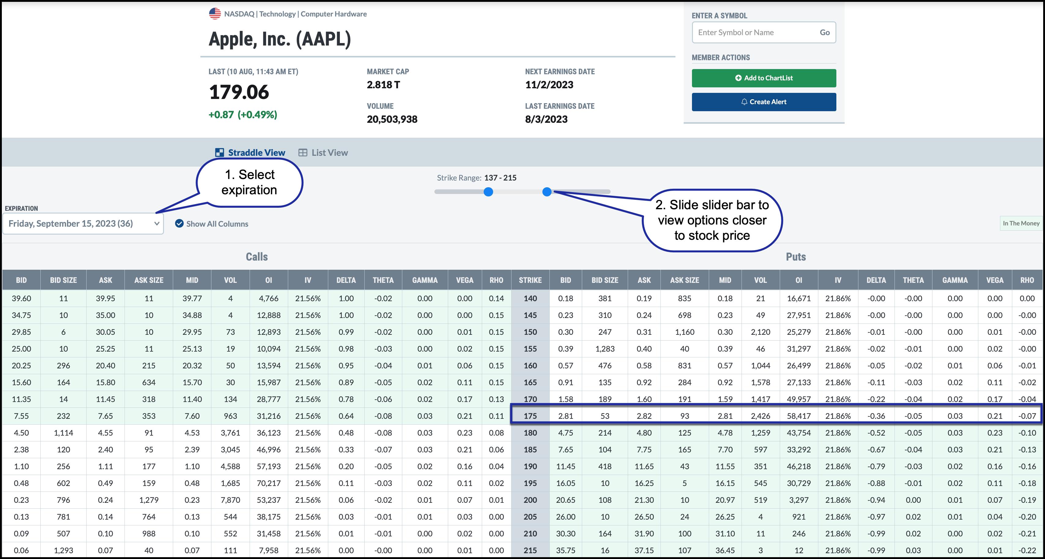
CHART 2: OPTIONS CHAIN FOR AAPL. The Sept 15 175 puts are trading at around $2.81. If you sell the puts, you could collect $281 in premium.Chart source: StockCharts.com. For educational purposes.
You want to select an expiration of around 30 to 45 days to give it some time. Remember, options have an expiration date.
From the options chain above, you see the following:
- The Sept 15 contract has 36 days to expiration (DTE), which falls within the range.
- You can slide the Strike Range slider bar to only see the relevant options in the chain.
- The 175 Sep. 15 puts are trading at a mid-price of $2.81 per contract.
How Can You Benefit from Selling Puts?
A put option gives you the right to sell the underlying security at a specific price by a specific date. If you sell a put contract, you must buy the stock when the person you sold the put to wants to exercise the contract. That means you'll need enough cash in your trading account to purchase the 100 shares of AAPL at the strike price of the options contract.
Say you sell one 175 Sept 15 put for $2.81. Remember that a put option contract controls 100 shares of AAPL. The following scenarios could play out:

- AAPL stays above $175 through expiration. The put would expire worthless, and you keep the premium, which would be $281 ($2.81 x 100).
- AAPL is at or below $175 before expiration. The put is assigned, and you'll have to buy 100 shares of AAPL at $175 per share, or $17,500, which was your objective. You collected $281 in premium, so your cash basis is reduced to $17,219.
Say your price target for AAPL is $190, and you exit the trade at that price. You would have made a profit on those shares. Of course, the opposite could happen. The stock price could fall, in which case you'd be holding on to a losing position. What you do with the stock depends on your trading objectives. Check out Master the Most Underutilized Options Income Strategy: Cash-Secured Puts to learn more about trading cash-secured puts.
Once you become familiar with trading options, you'll discover many ways to adjust your options position. For example, you could buy back the short put. You could also roll the position to another with a further expiration date. The expiration and strike price you choose would be based on your directional bias when you roll the contract.
Options = Flexibility
With options, you have tons of, er, options. Strategies such as covered calls and cash-secured puts are just the tip of the iceberg, but once you start trading them, you'll realize there are many ways to utilize them. There are several strategies you could apply which can work in tandem with assets you own or want to own.
Disclaimer: This blog is for educational purposes only and should not be construed as financial advice. The ideas and strategies should never be used without first assessing your own personal and financial situation, or without consulting a financial professional.
|
| READ ONLINE → |
|
|
|
| Don't Ignore This Chart! |
| Dow Bounces Off Support: A New High in the Cards? |
| by Jayanthi Gopalakrishnan |

If you look at the performance of the S&P 500 index ($SPX), the Nasdaq Composite ($COMPQ), and the Dow Jones Industrial Average ($INDU) over the past six months, you'll see that $COMPQ is the performance leader, while $INDU is the laggard.

CHART 1: PERFCHART OF THE THREE MAJOR INDEXES. The Nasdaq Composite is the leader while the Dow Jones Industrial Average is the laggard. Will the Dow catch up?Chart source: StockCharts.com. For educational purposes.
But while $SPX and $COMPQ are trading below their 21-day exponential moving average (EMA), $INDU could bounce off this level. Is it going to be a sprint or a jog to new highs for these three indexes?
Technical Perspective of DIA
If you want a piece of the action in $INDU, it's worth looking at the chart of the SPDR Dow Jones Industrial Average ETF (DIA). The daily chart of DIA below shows that, although DIA dipped below its 21-day EMA on August 8, it recovered and closed just above $353.
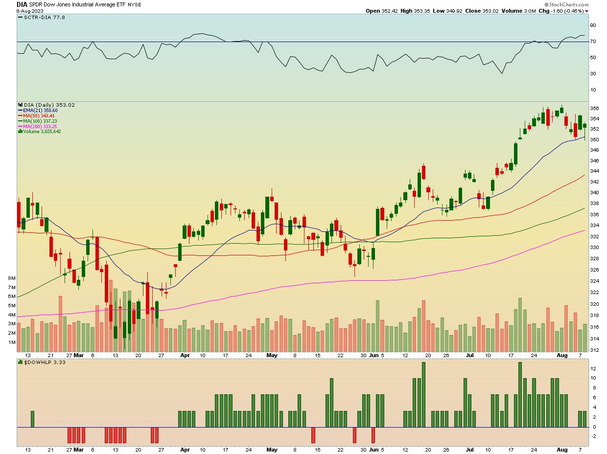
CHART 2: DAILY CHART OF SPDR DOW JONES INDUSTRIAL AVERAGE ETF. DIA bounced off its 21-day exponential moving average, has a SCTR score > 70, and has strong market internals. Could DIA see new highs soon?Chart source: StockCharts.com (click chart for live version). For educational purposes.
The StockCharts Technical Rank (SCTR) score in the upper panel has crossed above 70, which is a positive sign. The Dow New Highs-New Lows Percent ($DOWHLP) in the lower panel is above zero, although lower than during DIA's upward move. But during a pullback, it's not unusual for the new highs to decline. Its positive value is encouraging.
Benefits of Trading Index ETFs
Trading an index ETF such as DIA gives you exposure to all the stocks in the index without buying individual stocks. It reduces some of the stock-specific risks that could occur with individual stocks.
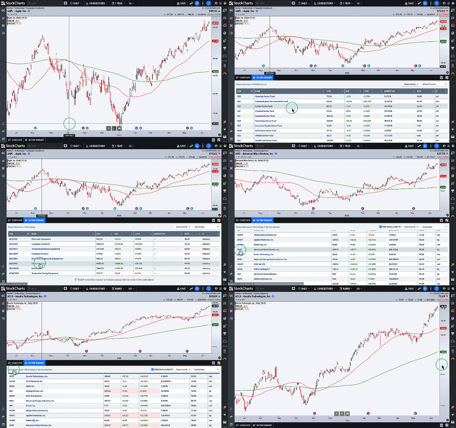
 StockCharts Tip: To find out more about DIA, scroll down to the Summary Pages in the Member Tools Section of Your Dashboard and click on Symbol Summary. Type DIA in the symbol box to view fundamental and technical details. Click on the URL in the Profile section to see the top holdings in DIA. StockCharts Tip: To find out more about DIA, scroll down to the Summary Pages in the Member Tools Section of Your Dashboard and click on Symbol Summary. Type DIA in the symbol box to view fundamental and technical details. Click on the URL in the Profile section to see the top holdings in DIA.
Investing in DIA gives you some exposure to stocks like United Health (ticker symbol: UNH), Goldman Sachs (ticker symbol: GS), Microsoft (ticker symbol: MSFT), and Home Depot (HD) along with several big-name industrial stocks.
If DIA bounces off the 21-day EMA and moves higher, it could see new highs. It's very close to its 358.47 high, reached on the week of January 3, 2022.
If you switch to StockChartsACP, you can add the Distance From Highs indicator to see how far DIA is from its 52-week high (see the lower panel in chart below). The weekly chart shows that DIA is very close to its 52-week high.
Technically speaking, DIA looks like a strong candidate for a long position. Of course, you shouldn't rule out the possibility that DIA could stall and fall further. Keep an eye on the 21-period EMA; a bounce from here with strong market internals could push this ETF to new highs. And if it happens, you don't want to miss it.

CHART 3: DIA TRADING CLOSE TO ITS 52-WEEK HIGH. The Distance From Highs indicator suggests that DIA is close to its 52-week high. Could it go higher, or will it stall and move lower? It remains to be seen, but, if the former scenario plays out, it could be a great trading opportunity.Chart source: StockChartsACP. For educational purposes.
Final Thoughts
DIA is a great way to trade the stocks that comprise the Dow Jones Industrial Average. You could also use the ETF to hedge your portfolio using options, especially if you already own shares of individual companies in the index. The same applies to any index ETF because they give you an overall view of the entire market.

Disclaimer: This blog is for educational purposes only and should not be construed as financial advice. The ideas and strategies should never be used without first assessing your own personal and financial situation, or without consulting a financial professional.
|
| READ ONLINE → |
|
|
|
| RRG Charts |
| RRG Finds Three Strong Stocks in Materials Sector |
| by Julius de Kempenaer |

Looking at the Relative Rotation Graph for US sectors, we can see the Materials sector pops up as potentially interesting. It is still inside the improving quadrant, but has just started heading towards leading.
When you are interested in overweight/underweight strategies or pair trades, an interesting sector to watch for off-sets is technology. After a strong rotation through leading, this sector has now rolled over and is inside the weakening quadrant, heading towards lagging.
Hence, primarily from a relative momentum perspective (JdK RS-Momentum), they are now at opposite rotations. For both tails, it is still possible to complete a rotation without moving to the opposite side of the RRG.
Focus on Materials
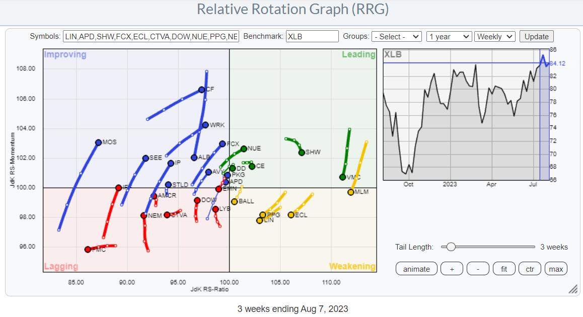
For this article, I wanted to zoom in on the Materials sector, so I ran the RRG for the members.

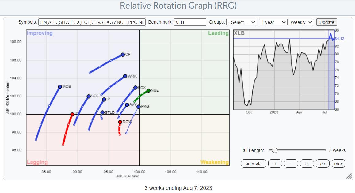
Browsing through the tails on this plot, I isolated the ones that are on a strong RRG heading, i.e. pointing in a North-Eastern direction. The RRG showing these selected tails is printed below.

Going over the individual charts for these stocks, I concentrated on the tails that are close to crossing over into the leading quadrant while still low on the RS-Momentum scale. They have enough potential on both scales to continue rising on both scales, which is what causes that stronger heading between 0-90 degrees.
Packaging Corp. - PKG

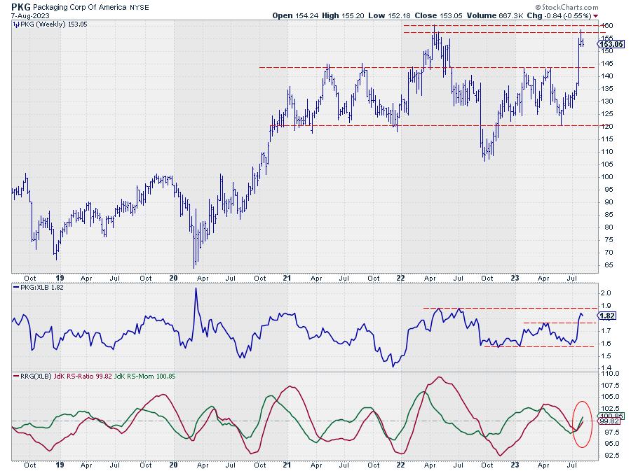
The first one is PKG. The tail is very close to the benchmark, but the heading is strong and pointing toward the leading quadrant, and a crossover seems imminent.
The price chart confirms the recent strength that has been showing up in this stock. After breaking overhead resistance near 143, the price is now hitting resistance between 155-160. The steepness of the recent move creates some risk for a correction, but 143 should now start to act as support.
Given the longer-term strength it is showing on the RRG and the break to 12-month highs makes, this a stock to watch, either for entry, when a new low will be put into place after a corrective move, or when the resistance at 160 can be broken and the stocks move to new all-time highs.
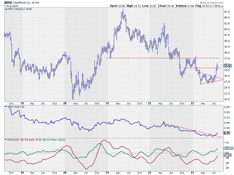
WestRock Co. - WRK

WRK has recently ended its long downtrend as it executed a reversal out of a symmetrical triangle formation.
That move ended the rhythm of lower highs and lower lows, and the initial rally following the upward break has meanwhile pushed above resistance near 33.50, which was offered by the low between the double top that formed at the end of 2022-start of 2023. With these resistance levels taken out, the upside potential for WRK now reaches up to 37.50. But more importantly, the downtrend in relative strength has now reversed as well.
The JdK RS-Momentum line is already moving above 100 and is dragging RS-Ratio higher. Given the current strength in price, it seems only a matter of time before the tail on WRK will hit the leading quadrant. Ideally, any low at or above 33.50 can be seen as a good entry-level to participate in a further move toward 37.50.
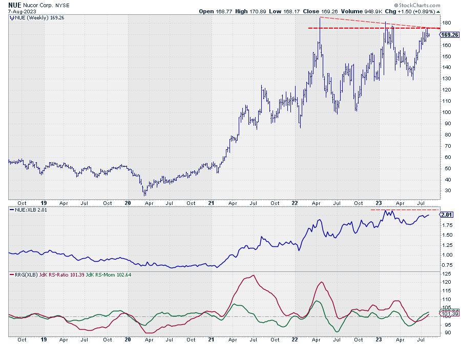
Nucor - NUE

Finally, we have Nucor. This stock is the only one out of this group that has already crossed over into the leading quadrant, ready to travel further at a strong RRG heading.
From a price perspective, all the major lows since early 2022 came in at higher levels, indicating the underlying demand for this stock. The big hurdle to be faced right now is the horizontal barrier at 175. As you can see, this is where, roughly, the horizontal overhead resistance coming from the major highs of 2022 and early 2023 is coming in. And it is also the level where the slightly falling resistance line over the extreme highs of 2022 and 2023 runs at the moment. Once Nucor can take out this double resistance level, much more upside potential will be unlocked.
Relative strength has improved, which has caused the RRG lines to continue higher above 100 in tandem. But taking out the relative high of early 2023 will be the confirmation for more outperformance.
#Stayalert, --Julius
|
| READ ONLINE → |
|
|
|
| Top Advisors Corner |
| DJIA/Gold Ratio vs. Consumer Sentiment |
| by Tom McClellan |

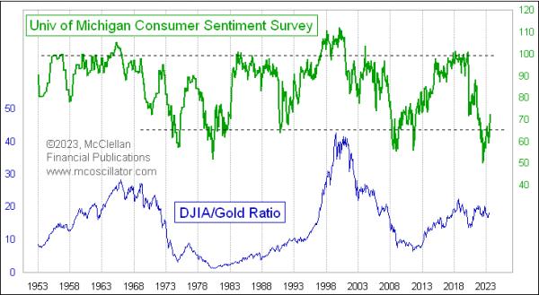
If you are a really long-term investor, then you want to buy stocks when everyone is happy, and no one likes the stock market or the economy. And when everyone is elated, that is the time to eschew stocks and turn to other assets.
This week's chart looks at the DJIA/Gold Ratio going back a few decades. And, for comparison it shows the University of Michigan's "Survey of Consumer". That sentiment survey data just hit an all-time low reading in 2022, when inflation was really high and consumers were nervous. The survey data are starting to rebound, but, thus far, the DJIA/Gold Ratio has not moved much at all.
The instances of low UMich survey readings are pretty reliably associated with great lows for the DJIA/Gold Ratio, the moments during the grand sweep of history when one would want to get out of gold and move into stocks. A sharp-eyed reader might point to the UMich survey data's low in 2008-09, after which the DJIA/Gold Ratio did not move up very much. But that was still a moment in history when one would have wanted to be a long term dip-buyer. The anomaly then was that gold prices went up in 2009-10 as fast as the stock market did, keeping the ratio flat. Another sentiment extreme came in August 2011, after a 19% decline in stock prices following the end of QE2, which put consumers into a bad mood. From that moment until a DJIA/Gold Ratio high in 2018, this ratio more than tripled, as investors decided that they did not like gold any more and the stock market ran higher.
The question now is whether this latest sentiment extreme in 2022 is going to mark another one of those great moments in history. That extreme came about because of high inflation, and the gold coin TV commercials all tell us that gold is supposed to be a great hedge against inflation. So if inflation lies ahead, and gold is going to outperform stocks, then that would make this DJIA/Gold Ratio move downward.
The problem with this thinking is that while gold prices might be helped by inflation, they are harmed by the Fed's remedies to inflation. If you have your money invested in gold right now, you are missing out on earning a 5.4% yield on 3-month T-Bills. That makes owning gold pretty expensive in terms of "opportunity cost", i.e. missing out on the opportunity to earn interest.
But high short-term rates also hurt the stock market, especially when the Fed pushes up rates to above the 2-year T-Note yield as they have done now. And the multiple officials of the FOMC who have made comments about their intentions seem to be saying that the Fed plans to keep this up for a while.
So that 2022 all-time record low reading for the UMich survey data may not turn out to be the great historical bottoming indication this time like it has been in the past, at least not for the stock market by itself. But it is reasonable to expect the DJIA/Gold Ratio to rise as it has before, thanks to gold underperforming more than from stocks outperforming.
|
| READ ONLINE → |
|
|
|
| Mish's Market Minute |
| Alibaba and China -- Can They Push Through Resistance? |
| by Mish Schneider |


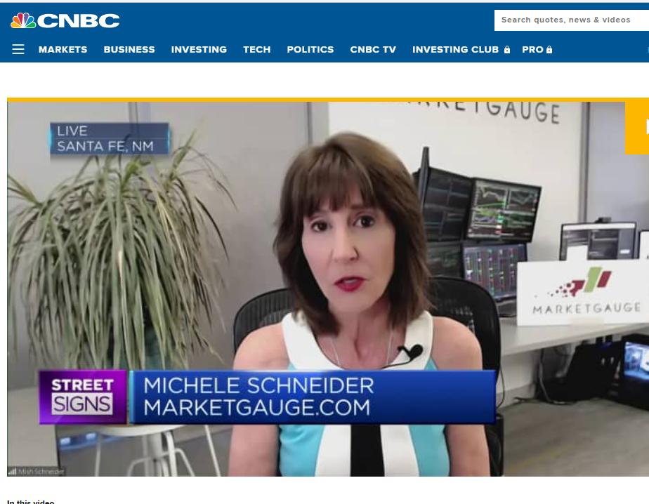
On August 10, I appeared on CNBC Asia to discuss Alibaba (BABA)'s surprise beat on earnings and China's weak economic data.
I began the segment reminding investors (and myself) that regardless of the news, opinions of analysts and the talking heads, price pays. It is with that in mind that I mention the following:
- Alibaba reported sales up 14% along with their improved margins.
- Biden banned US firms from investing in China, while China buys $5 billion chips from Nvidia (NVDA) for use in AI. These chips are designed in the US, made in Taiwan and South Korea.
- China's deflationary numbers come vastly from falling pork prices and transportation costs; this will not necessarily impact global inflation.
- The jobless rate of youth has risen to alarming numbers.
- China can print money, thereby adding liquidity if necessary and most likely will do so.
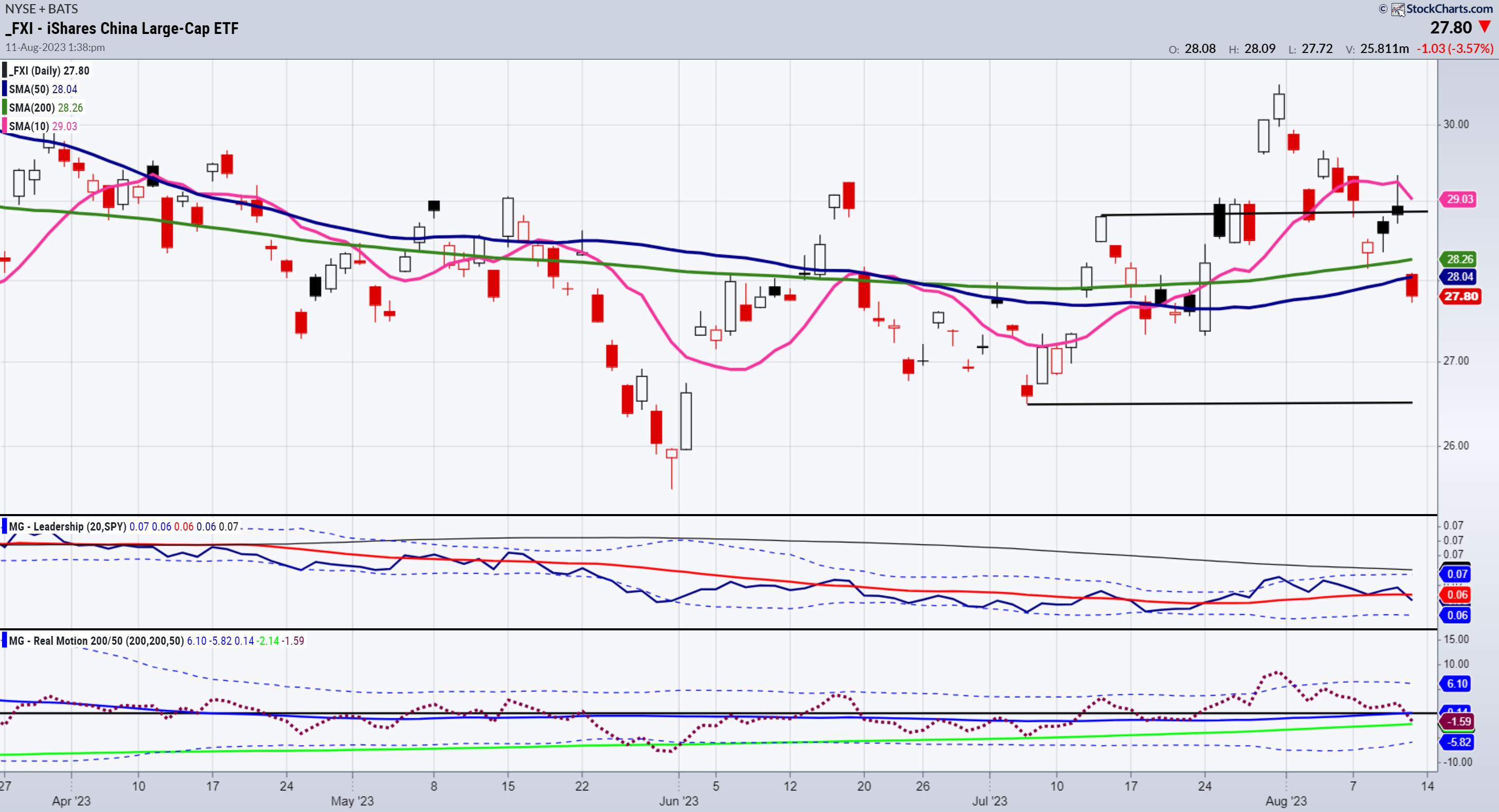
The chart of FXI, also featured on The Final Bar with Dave Keller (watch below) indicates that the price, which failed the July 6-month calendar range high on Friday, fell into support. On Thursday, the price sat on the July 6-month Calendar range high. In the clips, we say that FXI must clear $29.00.
The Real Motion indicator, even with the drop in momentum, remains in a bullish divergence, as the moving averages are stacked with the 50 over the 200-DMA. The price chart that has yet to happen. The Leadership also switched from FXI outperforming the SPY to underperforming. Nonetheless, you can now watch momentum, leadership, calendar ranges and price as a guide for a potential investment.

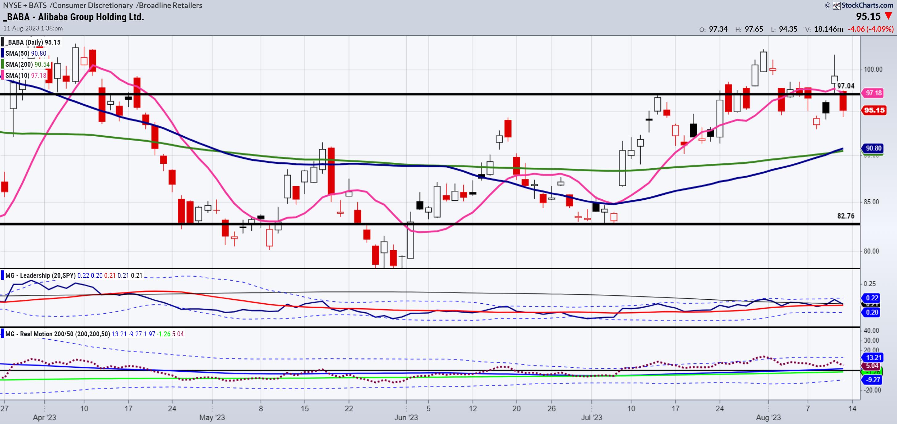
BABA did better than FXI on Friday. The phase is bullish. Price is doing a bit better than momentum. BABA is outperforming the SPY. Hence, this week we will look for a move back over the July 6-month calendar range high (97.04).
I will be off for a few days. Enjoy, and remember...
Price pays!
For more detailed trading information about our blended models, tools and trader education courses, contact Rob Quinn, our Chief Strategy Consultant, to learn more.
If you find it difficult to execute the MarketGauge strategies or would like to explore how we can do it for you, please email Ben Scheibe at Benny@MGAMLLC.com.

"I grew my money tree and so can you!" - Mish Schneider
Get your copy of Plant Your Money Tree: A Guide to Growing Your Wealth and a special bonus here.
Follow Mish on Twitter @marketminute for stock picks and more. Follow Mish on Instagram (mishschneider) for daily morning videos. To see updated media clips, click here.
Mish discusses Alibaba's stock price in this appearance on CNBC Asia.
In this guest appearance on David Keller's The Final Bar on StockCharts TV, talks higher rates and why China may deserve a second look for investors.
Mish discusses inflation, bonds, calendar ranges and places to park your money on the Benzinga Morning Prep show.
Mish covers why August is a good time for caution in this appearance on Business First AM.
Ahead of Thursday's critical US CPI update, Mish highlights the possible opportunities in the Wednesday, August 9 trading session for the S&P 500 and three key commodities on CMC Markets.
In this appearance on Fox Business' Making Money with Charles Payne, Mish and Charles cover Fed, oil and gas, and some picks for a manufacturing boom.
Mish and Nicole Petallides discuss market in correction, oil concerns, and some new picks on TD Ameritrade.
Mish runs the rule over the S&P 500 and key commodities in this video from CMC Markets.
Mish gives reasons why gold could return as a safe haven on Business First AM.
Mish talks about opportunities related to EVs in this video from Business First AM.
Mish and Jared go over oil and what might happen with small caps and regional banks in this appearance on Yahoo! Finance.
Coming Up:
August 17: Wolf Financial Spaces 1pm ET, Real Vision Daily Briefing 4pm ET
August 28: Chuck Jaffe, Money Show
September 7: Singapore Breakfast Radio, 89.3 FM
October 29-31: The Money Show
ETF Summary
- S&P 500 (SPY): 450 pivotal, 440 support at the 50-DMA.
- Russell 2000 (IWM): 191 is the 23-month holy grail, 194 July 6-month range high.
- Dow (DIA): 35,000 support.
- Nasdaq (QQQ): 362-382 range.
- Regional Banks (KRE): 48 pivotal.
- Semiconductors (SMH): 150 now the place to get back above.
- Transportation (IYT): July 6-month calendar range high at 259.30 and 254 some support.
- Biotechnology (IBB): Compression between 123-130.
- Retail (XRT): 66-67.40 short-term range (closing levels matter).
Mish Schneider
MarketGauge.com
Director of Trading Research and Education
|
| READ ONLINE → |
|
|
|
| MORE ARTICLES → |
|
 Chart 1
 Chart 2
 Chart 3
 Chart 4
 Chart 5
 Chart 6



 StockCharts Tip: To find out more about DIA, scroll down to the Summary Pages in the Member Tools Section of Your Dashboard and click on Symbol Summary. Type DIA in the symbol box to view fundamental and technical details. Click on the URL in the Profile section to see the top holdings in DIA.

