| THIS WEEK'S ARTICLES |
| John Murphy's Market Message |
| ENERGY SPDR HITS RECORD HIGH AS OIL BREAKS OUT |
| by John Murphy |
ENERGY BREAKOUTS... Several previous messages have talked about upside breakouts taking place in energy stocks. And that trend has only gotten stronger both in the stocks and the commodity. The upper box in Chart 1 shows the price of WTIC crude oil rising to the highest level since last November. The price of crude started rising three months ago which is when energy stocks started rising. In fact, they've been the market's strongest sector since June. And they achieved an upside breakout of their own. The lower box in Chart 1 shows the Energy SPDR (XLE) exceeding last year's high to end the week at a new record. As also explained in a previous message, however, energy leadership carries good and bad news. The good news is rising energy prices push energy shares higher. The bad news is that rising energy prices are potentially inflationary and can push interest rates higher. Energy leadership historically has usually also been bad for stocks.
 Chart RISIN Chart RISIN
RISING OIL BOOSTS BOND YIELDS... Chart 2 shows a relatively close relationship between the priee of crude oil (black bars) and the ten-year Treasury yield (green line) over the last year. The chart shows both declining on the left side of the chart and rising together on the right side. They both started bottoming together between April and June (see circle) and have been rising together since then. The line in the lower box shows the 60-day Correlation Coefficient between the two markets rising to 75% which reflects a positive correlation between them. That makes economic sense since rising energy prices are potentially inflationary which normally results in higher interest rates.
 Chart 2 Chart 2
ENERGY LEADERSHIP ISN'T GOOD FOR STOCKS... This is one of the hallmarks of intermarket analysis. That's because rising energy prices boost interest rates which is usually bad for stocks. That relationship can be seen in Chart 3 which compares the S&P 500 (black bars) to the XLE/SPX ratio (gray area) over the last two years. The main point of the chart is that energy leadership (rising ratio) has usually coincided with falling stock prices. While energy weakness (falling ratio) has usually coincided with higher stock prices. An upturn in the XLE/SPX ratio in early 2022 coincided with a peak in the SPX (see arrows). A peak in the ratio last November helped launch a stock market rally which is still intact. The big question now is whether the recent upturn in the XLE/SPX ratio (energy leadership) has a negative impact on stock prices. And that may depend on whether or not the ten-year bond yield exceeds the previous high reached late last year.
 Chart 3 Chart 3
|
| READ ONLINE → |
|
|
|
|
|
| The Mindful Investor |
| Which is More Likely -- SPX Over 4600 or Below 4200? |
| by David Keller |
We are now in the seasonally weakest part of the calendar year. The summer doldrums often lead to a meaningful pullback in the third quarter, and 2023 has, so far, not disappointed by following the seasonal tendencies quite well.
The month of August saw leading names like Apple (AAPL) and Microsoft (MSFT) pull back from new highs, causing many investors to rethink the "2023 is going to go up all year" thesis. So now that we've experienced an initial drop, what's next for the S&P 500?
Today we'll revisit the concept of "probabilistic analysis", where we lay out four different potential scenarios for the S&P 500. There are three things I hope you take away from this exercise.
- It's important to have a thesis as to what you think will come next for stocks. This should be based on a meaningful combination of four key pillars: fundamental, technical, macroeconomic, and behavioral. And your portfolio should be positioned to reflect what you see as the most likely outcome.
- It's also important to consider alternative scenarios. What if the market is way more bullish than you'd expect? What if some five-standard-deviation event pops up, and stocks suddenly drop 20 percent? The best way to break out of your predetermined biases is to actively consider alternative points of view.
- It's incredibly important to think about how you would adapt to one of those alternate scenarios. How would your portfolio perform in a risk-off environment in the coming months? Are you prepared for a sudden spike in risk assets, and at what point would you need to change your positions to match this new reality?
I have found that the most successful investors don't know all the answers, but they ask the best questions. So let's broaden our horizons a bit, and consider four potential future paths for the S&P 500 over the next six to eight weeks. But first, we'll review the recent pullback for the major equity averages.
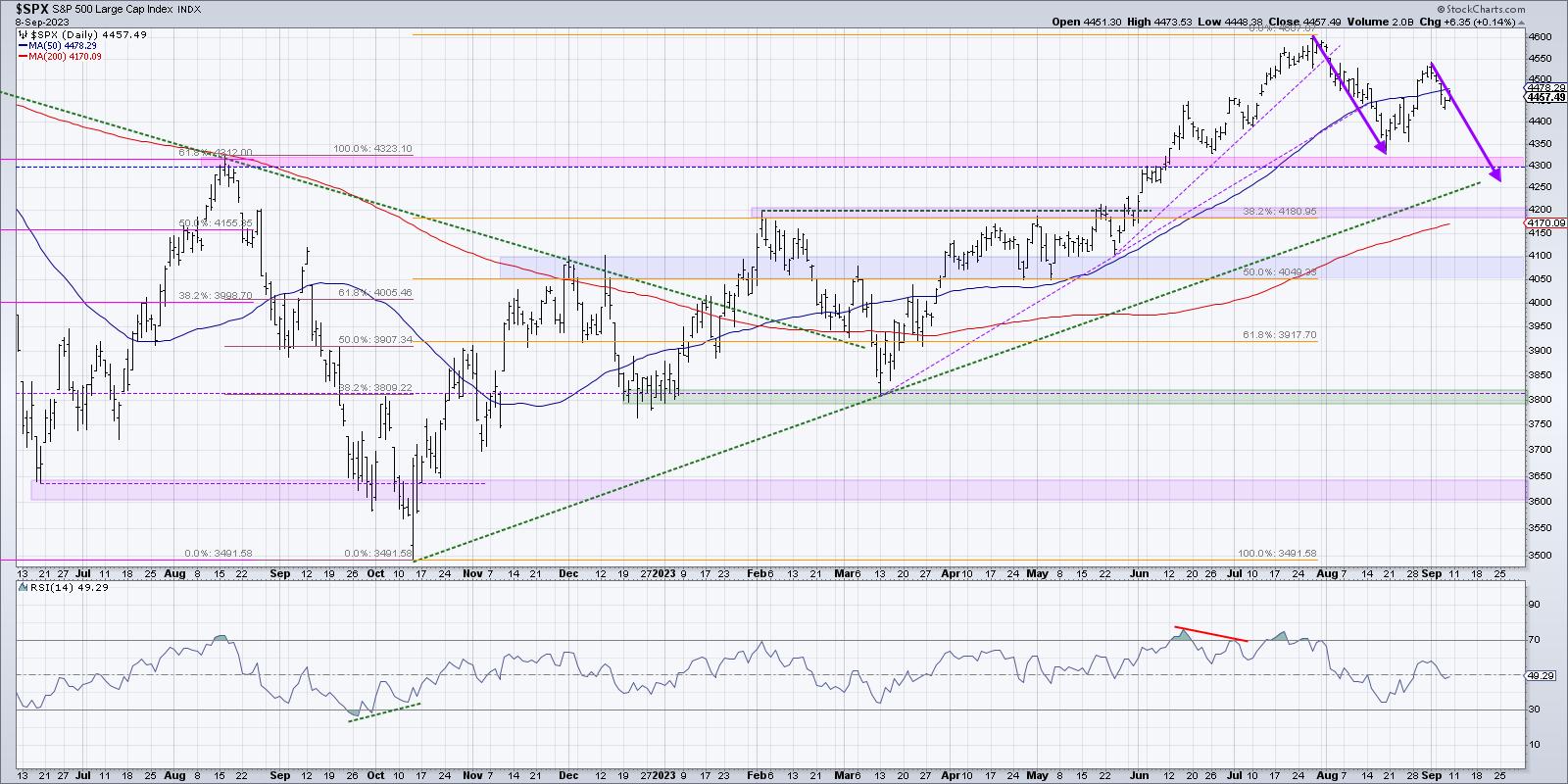
A brief seasonality check on the S&P 500 will show that August and September tend to be quite weak for the main US equity benchmark. So the drop we saw in early August actually follows the seasonal playbook quite well, as would further weakness in September.
We've been thinking about the possibility of a much deeper correction for risk assets, and it's a distinct possibility that we're now in an A-B-C pullback, which would take us to a new swing low right around options expiration in the third week of September. But at the same time that charts like LVS are displaying classic topping patterns, we can't help but notice that stocks like Alphabet (GOOGL) appear to be firmly entrenched in a protracted bullish phase.
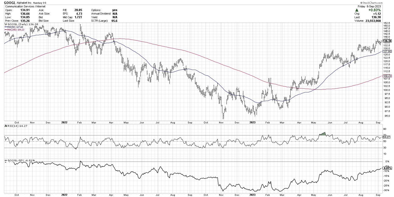
An uptrend is defined by a persistent pattern of higher highs and higher lows, and GOOGL certainly seems to be displaying that classic bullish phase quite well. How bearish do you want to be when Alphabet is just pounding higher month after month?
With our benchmarks pulling back and breadth conditions deteriorating, as well as key growth stocks like GOOGL still holding above support, let's lay out four potential scenarios for the S&P 500 over the next six-to-eight weeks. And remember the point of this exercise is threefold:
- Consider all four potential future paths for the index, think about what would cause each scenario to unfold in terms of the macro drivers, and review what signals/patterns/indicators would confirm the scenario.
- Decide which scenario you feel is most likely, and why you think that's the case. Don't forget to drop me a comment and let me know your vote!
- Think about each of the four scenarios would impact your current portfolio. How would you manage risk in each case? How and when would you take action to adapt to this new reality?
Let's start with the most optimistic scenario, involving a strong summer push for stocks.
Scenario #1: The Very Bullish Scenario
What if the pullback of the next five weeks is over, and the market goes right back to a full risk-on mode? Stocks like AAPL and MSFT would most likely return back to test new highs and interest rates would probably come down enough, as economic data continues to show at the Fed's efforts have successfully slowed down the economy.
This Very Bullish Scenario would mean a break above 4600, and when we revisit the chart in late September, we're talking about the possibility of new all-time highs for the S&P 500 and Nasdaq in October.
Scenario #2: The Mildly Bullish Scenario
Markets can correct in two ways: price and time. A price correction (see February 2023) involves the chart moving lower quickly as the market quickly sheds value. A time correction (see April-May 2023) means there's not much of a price drop, and the "correction" is more of a pause of the uptrend.
There's a possibility that the July high around 4600 still holds as resistance, and a time correction keeps the S&P 500 in the 4300-4600 range. Keep in mind that there are plenty of opportunities for sectors like Energy to thrive in a sideways market, but the major indexes don't make any headway in either direction.
Scenario #3: The Mildly Bearish Scenario
What if the A-B-C correction outlined above plays out, and the S&P 500 index pushes lower to retest the 200-day moving average? If interest rates remain elevated, and growth stocks continue to pull back, this would be a very reasonable outcome for the equity markets.
One of my mentors used to say, "Nothing good happens below the 200-day moving average." The good news is the Mildly Bearish Scenario means we drop further from current levels, but still manage to find support at this important long-term barometer.
Scenario #4: The Super Bearish Scenario
This is where things could get really nasty. What if the market goes full risk-off, interest rates push higher, economic data comes in hotter than expected, and the Fed is forced to consider further rate hikes instead of debating when to ease monetary conditions?
This Super Bearish Scenario would mean the S&P 500 breaks down through 4300 and 4200, leaving the 200-day moving average in the rearview mirror, and in late September we're debating whether the S&P 500 and Nasdaq will make a new low before year-end 2023.
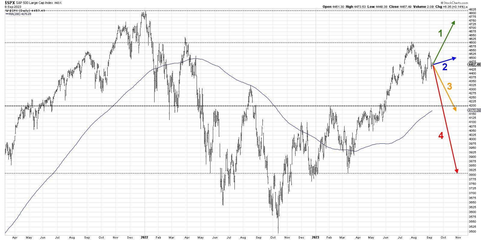
Have you decided which of these four potential scenarios is most likely based on your analysis? Head over to my YouTube channel and drop a comment with your vote and why you see that as the most likely outcome.
Also, we did a similar analysis back on the S&P 500 back in June. The "mildly bullish" scenario ending up matching the market action pretty closely. Which scenario did you vote for?
Only by expanding our thinking through probabilistic analysis can we be best prepared for whatever the future may hold!
RR#6,
Dave
P.S. Ready to upgrade your investment process? Check out my free behavioral investing course!
David Keller, CMT
Chief Market Strategist
StockCharts.com
Disclaimer: This blog is for educational purposes only and should not be construed as financial advice. The ideas and strategies should never be used without first assessing your own personal and financial situation, or without consulting a financial professional.
The author does not have a position in mentioned securities at the time of publication. Any opinions expressed herein are solely those of the author and do not in any way represent the views or opinions of any other person or entity.
|
| READ ONLINE → |
|
|
|
| Martin Pring's Market Roundup |
| Some Investment Implications for Stage 3 of the Business Cycle |
| by Martin Pring |
The business cycle has been with us for as long as reliable financial records have been available, and that's at least 200 years. It may seem to be a mysterious force, but it is nothing more than a set sequence of chronological events that just keeps repeating. The most prominent recognition of the sequence comes from the Conference Board, which publishes composite indicators reflecting sectors that lead, coincide, or lag "the" economy.
Fortunately for investors, the primary turning points for bonds, stocks, and commodities fall into this sequential approach, making it possible to construct a map which can be used for the purpose of improving the asset allocation process. In that respect, the bell curve in Figure 1 represents the growth path of the economy, and the letters B, S, and C the idealized turning points of bonds, stocks and commodities.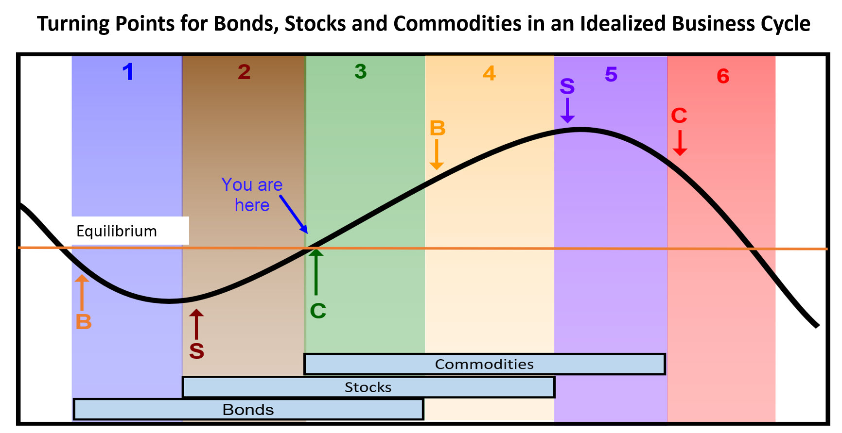 Figure 1 Figure 1
The three rectangles in the lower part of the figure tell us when each asset class is in a bull market. In the real world, these turning points are not equally spaced and occasionally fall out of sequence, which makes this approach, which you can read about here, far more an art than a science. The phases or stages of the cycle are represented by the numbers 1-6 at the top of the figure. The various stages are identified by three models or barometers which are published in my monthly Intermarket Review. July saw the commodity model join bonds and stocks in the bullish camp placing the cycle in a Stage 3.
Since the 1950s, the average annualized monthly return in this phase of the cycle has been 11% for stocks and 7% for commodities. Favored sectors have been semiconductors and financials, in the form of insurance companies and brokers. They are not the best performers in every cycle, so a policy of "trust and verify" is very much called for. In other words, trust that semiconductors are a favored Stage 3 performer, but verify that their technical position in the current cycle is also positive.
Copper Could Hold the Key
Stage 3 favors silver (9%) and crude (15%), but I am going to focus on copper (9%), which has a tendency to lead the CRB Composite. This can be appreciated from Chart 1, where the long-term KST for the red metal tends to bottom ahead of that for the CRB. The chart also shows that the copper KST looks as if it is just about to cross its MA for a primary trend momentum buy signal.
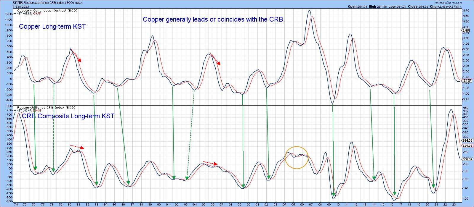 Chart 1 Chart 1
That's important because copper closely tracks major movements in the Dow Jones World Basic Industry Index. That series looks as if it may be close to experiencing a major upside breakout above a 15-year resistance trendline. The implication would be for significant new all-time highs in global basic industry or materials stocks. It's also possible that the next primary rally in copper itself might achieve a similar objective. Note how the World Index KST could be about to go bullish, just like the copper KST in the previous chart.
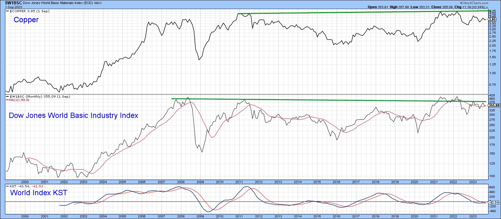 Chart 2 Chart 2
Chart 3 shows how close copper is to an important buy signal, as it is right at its 2022-23 bear trendline. The Special K is also in a similar position. Two examples of a similar setups are featured in the chart; both were followed by important moves.
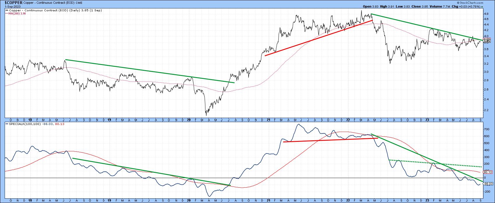 Chart 3 Chart 3
Two Beneficiaries of Higher Copper Prices
One obvious beneficiary of firming prices would be copper miners. In that respect, Chart 4 demonstrates that the Global X Copper Miners ETF (COPX) has been rangebound since 2021. It has held up much better than the price, which is a positive sign. However, it is experiencing a negative short-term KST at the moment, a factor that is likely to delay any breakout. That said, an upside breakout from the recent trading range would likely push the finely balanced long-term KST into a bullish mode.
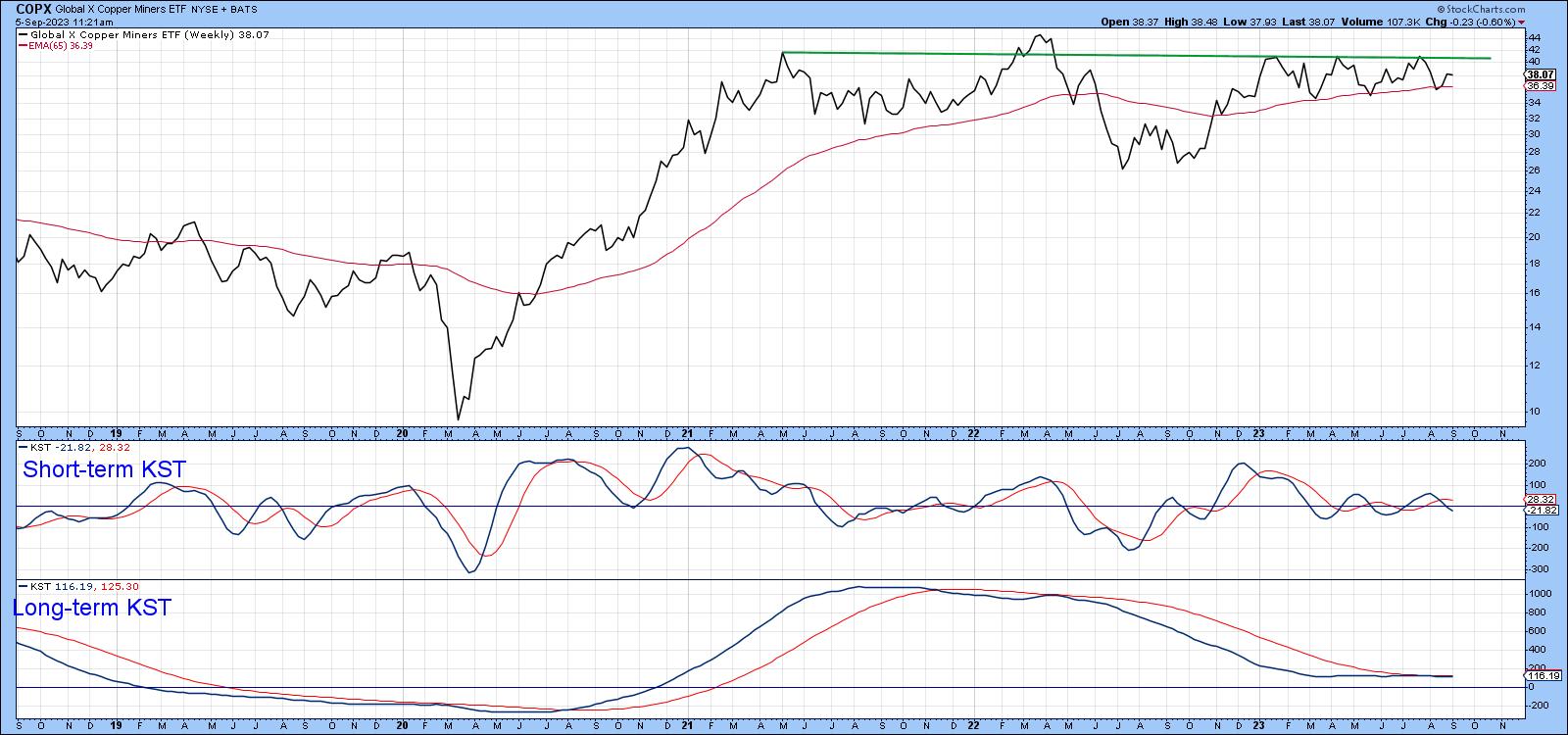 Chart 4 Chart 4
Finally, Chart 5 shows that the fortunes of emerging markets are tied in with the copper price, or more accurately with commodities in general, copper being a proxy in this case. To be sure, there are times when the two intermediate KSTs for the EEM and $COPPER diverge, but, since 2018, they have been remarkably close. Once again, we have the possibility of a bullish setup facing us, as both series are very close to important down trendlines.
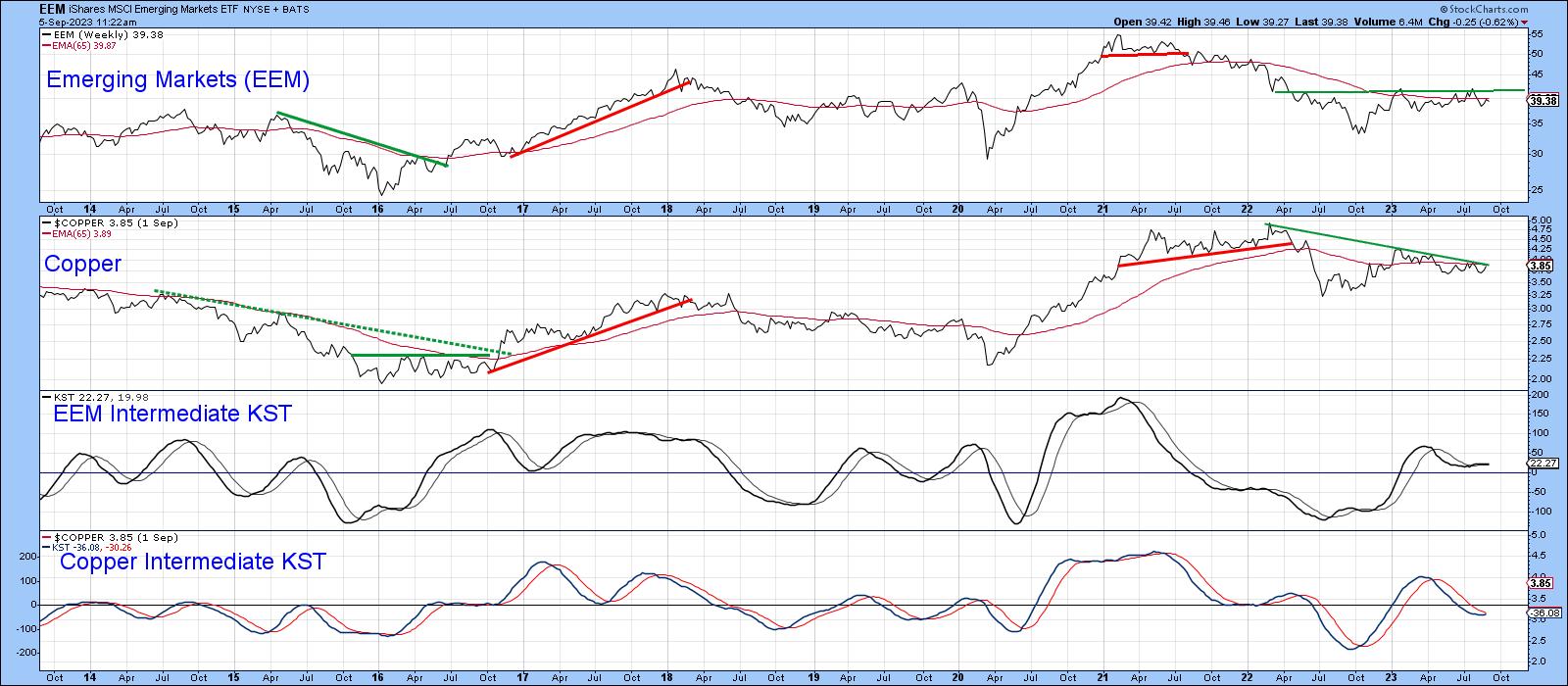 Chart 5 Chart 5
It's important to wait for the breakout, because Chart 6 shows that the current Barometer buy signal has not been preceded by the usual stimulating drop in interest rates, but by a rising trend instead. That, along with the possibility of a rising dollar, could limit any Stage 3 commodity gains.
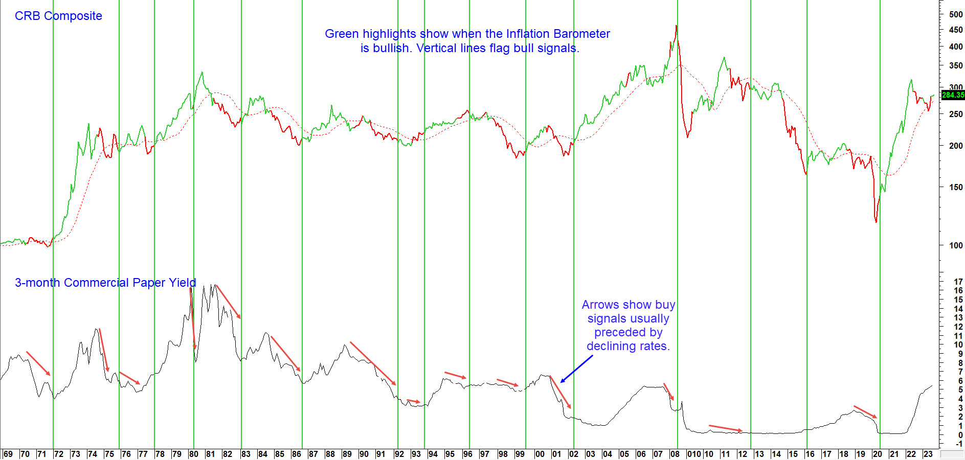 Chart 6 Chart 6
Good luck and good charting,
Martin J. Pring
The views expressed in this article are those of the author and do not necessarily reflect the position or opinion of Pring Turner Capital Group of Walnut Creek or its affiliates.
|
| READ ONLINE → |
|
|
|
| ChartWatchers |
| Stock Market Wrap-Up: Equities, Oil Close Higher While Treasury Yields Slightly Lower |
| by Jayanthi Gopalakrishnan |

"September is when leaves and stocks tend to fall; On Wall Street, it's the worst month of all."— Stock Trader's Almanac.
Why is September considered to be the worst month for stock market performance? There's no right answer, but the general belief is that, because most people's summer vacation ends and it's back to school for kids, investors are inclined to sell their positions to lock in some gains. September also marks the end of the third quarter, when mutual fund managers do their end-of-quarter restructuring.
In addition to these factors, we've seen shares of Apple, Inc. (ticker symbol: AAPL) fall sharply after China's restrictions on iPhones. NVIDIA (ticker symbol: NVDA) has also seen its share price fall. Other mega-cap stocks, such as Tesla (TSLA), Microsoft (MSFT), and Meta Platforms (META), are also trading off their highs. The broader indexes have also pulled back from late July to early August.
So far, the market is acting as it should in September. If you look at the weekly chart of the S&P 500 (see below), the trend still looks up. The S&P 500 ($SPX) has continued to trade above its 21-week exponential moving average (EMA), which could act as a support level if the index continues pulling back.
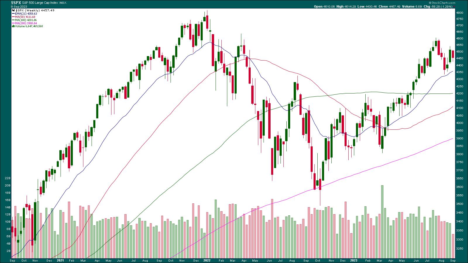
CHART 1: WEEKLY CHART OF S&P 500 INDEX. The index is still trending higher, trading above its 21-week EMA.Chart source: StockCharts.com (click on chart for live version). For educational purposes.
If you look at the daily chart of the S&P 500 below, since September 1, the index has been trending lower. The 21-day EMA is acting as a resistance level, but there needs to be a few more bars lower than the EMA to say the S&P 500 is correcting. A couple of days earlier, it seemed like the EMA was a support level.
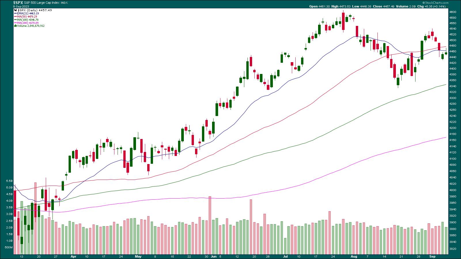
CHART 2: DAILY CHART OF S&P 500. The 21-day EMA is now acting as a resistance level. The next support level is the 100-day moving average.Chart source: StockCharts.com (click chart for live version). For educational purposes.
How the index reacts to the 21-day EMA can give an indication of whether the index is likely to fall further. If the index fails to trade above its 21-day EMA, the next support on the daily chart is the 100-day simple moving average.
Investors are still concerned about interest rates. The uptick in the ISM numbers and a drop in initial jobless claims suggest the economy is still strong. This suggests that the Fed could still raise interest rates this year. Most likely, the interest rate hike won't occur in the September meeting—the CME FedWatch Tool shows a 93% probability that interest rates will be unchanged. The probability of keeping interest rates steady in the November meeting drops to 56%. The Consumer Price Index (CPI) and Producer Price Index (PPI) for August will be released next week; it will be interesting to see if interest rate hikes have weaved into the economy.
One factor that could play into the inflation picture is the price of crude oil, which continues to increase. Crude oil is trading at around $87 per barrel. The last time oil was trading at this level was in November 2022. Besides tighter supply conditions, the rise in the US dollar could have pushed oil prices higher. The big question is if the price of crude oil will hit $100. It could, but if it moves toward the $120–$130 range, that could create demand pressure.
Final Thoughts
So, a few things to keep an eye on next week. Let's see if September plays out like it typically does. And after September comes the month that's known for its unpredictability.
End-of-Week Wrap-Up
US equity indexes up; volatility down
- $SPX up 0.14% at 4457.58, $INDU up 0.22% at 34577.28; $COMPQ up 0.09% at 13761.53
- $VIX down 3.47% at 13.90
- Best performing sector for the week: Energy
- Worst performing sector for the week: Industrials
- Top 5 Large Cap SCTR stocks: Super Micro Computer (SMCI); Celsius Holdings (CELH); Dell Technologies (DELL); Eli Lilly (LLY); XP Inc. (XP)
On the Radar Next Week
- August CPI
- August retail sales
- PPI
- September Michigan Consumer Sentiment (Prel)

Disclaimer: This blog is for educational purposes only and should not be construed as financial advice. The ideas and strategies should never be used without first assessing your own personal and financial situation, or without consulting a financial professional.
|
| READ ONLINE → |
|
|
|
|
|
| Art's Charts |
| The Key to the August Breakouts |
| by Arthur Hill |
Stocks surged in the second half of August with several ETFs breaking out of corrective patterns, such as falling flags or falling wedges. Even though September is a seasonally weak month, these breakouts are bullish until proven otherwise. Today's commentary will analyze the breakout in the Technology SPDR (XLK).
The Key to the Breakout in XLK
The chart below shows XLK in a long-term uptrend. The Trend Composite turned positive in early February and is currently at +5. This means all five inputs are on bullish signals (Bollinger Bands, CCI, StochClose, Keltner, SMA Direction). The Trend Composite is part of the TIP indicator edge plugin for StockCharts ACP. Click here to learn more.
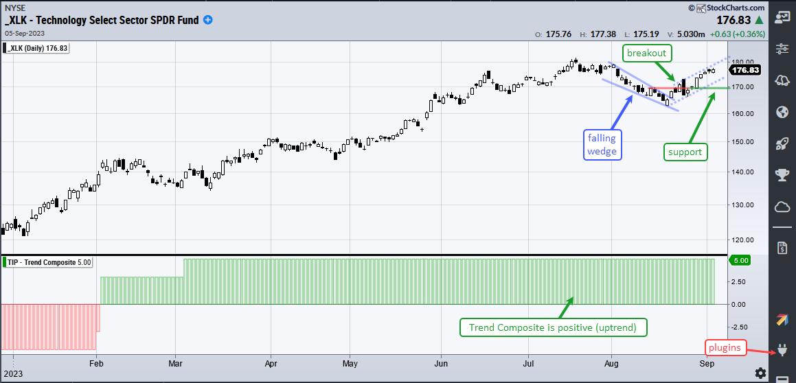
XLK hit a 52-week high in July and then corrected into mid August with a falling wedge. As discussed at TrendInvestorPro, this pattern is typical for pullbacks within bigger uptrends. XLK broke out of this wedge on August 23rd and then surged 2% on August 29th with a long white Marubozu candlestick. These candlesticks reflect a strong advance from open to close because they have no tails.
This candlestick holds the key to the August breakout and immediate uptrend. A strong advance and breakout should hold. A close below 169 would negate the August 29th surge and the August breakout. The blue dashed lines show the alternative pattern at work (a rising flag). A break below 169 would confirm the rising flag and signal a continuation of the prior decline (mid July to mid August).
Check out the Chart Trader report at TrendInvestorPro for more on these breakouts. Tuesday's report covered the breakouts in SPY and QQQ, seasonal patterns for the next three months and several trading setups. Symbols include XLV, IBB, JETS, IHI, AMD, AZN, CSX, ORLY and PAYX. Last week we covered the breakouts in gold, several tech-related ETFs and stocks. Click here for immediate access.
---------------------------------------
|
| READ ONLINE → |
|
|
|
| DecisionPoint |
| Energy Sector (XLE) Hits All-Time High, Should We Worry? |
| by Erin Swenlin |
The Energy sector (XLE) has been enjoying a rally throughout the summer. Today. it logged a new all-time high on a small breakout. While the sector looks impervious, there are a few concerns that we should point out.
The first issue would be the overbought RSI. While a stock's price can remain overbought, typically, when the RSI reaches this level, you will see at least a pause. The other issue is the "Bearish Shift" of the Silver Cross Index (SCI) as it crossed below its signal line. The rest of the indicators, including our primary Price Momentum Oscillator (PMO), are bullish. You'll notice that participation (%Stocks > 20/50/200EMAs) remains well above our bullish 50% threshold and really isn't bleeding off much. Stochastics are comfortably above 80, suggesting internal strength.
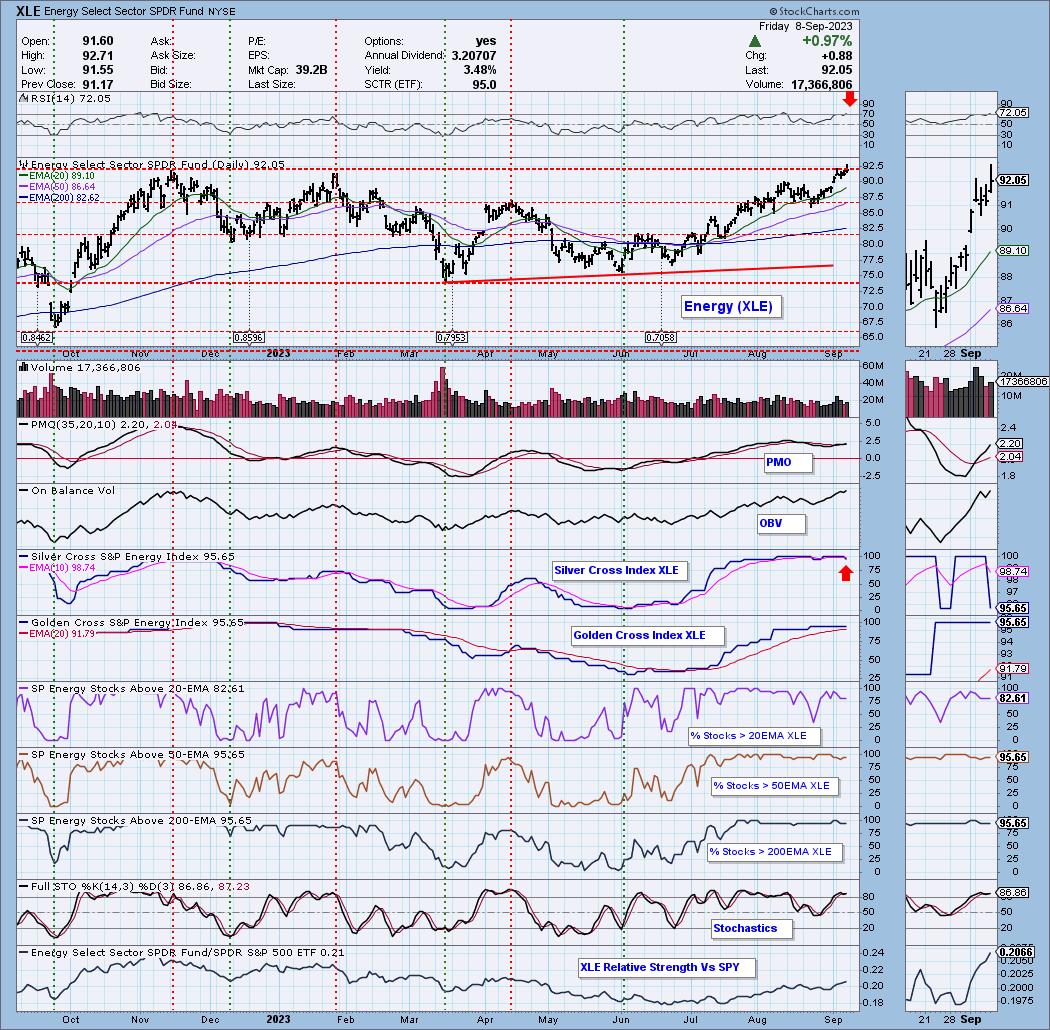
Conclusion: The Energy sector looks very strong, but we are noticing a few problems under the surface. We should remember that overbought conditions can persist in a bull market, which XLE clearly is in. If the Silver Cross Index continues to lose ground, we would tighten stops on your Energy positions.
Would you like to be notified when major indexes, sectors and select industry groups see "Bullish/Bearish Shifts" and given the bias in the intermediate and long terms? You'll find these in every DP Alert report!
Good Luck & Good Trading,
Erin Swenlin
Learn more about DecisionPoint.com:
Watch the latest episode of DecisionPoint on StockCharts TV's YouTube channel here!

Try us out for two weeks with a trial subscription!
Use coupon code: DPTRIAL2 at checkout!
Technical Analysis is a windsock, not a crystal ball. --Carl Swenlin
(c) Copyright 2023 DecisionPoint.com
Disclaimer: This blog is for educational purposes only and should not be construed as financial advice. The ideas and strategies should never be used without first assessing your own personal and financial situation, or without consulting a financial professional. Any opinions expressed herein are solely those of the author, and do not in any way represent the views or opinions of any other person or entity.
DecisionPoint is not a registered investment advisor. Investment and trading decisions are solely your responsibility. DecisionPoint newsletters, blogs or website materials should NOT be interpreted as a recommendation or solicitation to buy or sell any security or to take any specific action.
Helpful DecisionPoint Links:
DecisionPoint Alert Chart List
DecisionPoint Golden Cross/Silver Cross Index Chart List
DecisionPoint Sector Chart List
DecisionPoint Chart Gallery
Trend Models
Price Momentum Oscillator (PMO)
On Balance Volume
Swenlin Trading Oscillators (STO-B and STO-V)
ITBM and ITVM
SCTR Ranking
Bear Market Rules
|
| READ ONLINE → |
|
|
|
| ChartWatchers |
| Optimizing Your Stock Selection With the Williams True Seasonal Indicator |
| by Karl Montevirgen |

Every trader has preferred ways to find market opportunities and select tradable stocks. Among these methods, which exist in great numbers, are those that concern "seasonality" or market patterns that tend to repeat, according to the calendar.
If you're not entirely familiar with seasonality, it might not make much sense at first with regard to individual stocks. It makes sense with agricultural commodities simply because weather determines planting and harvest seasons. It also makes sense with energy commodities because, again, cold and hot weather tend to influence supply. Broad stock market seasonality might also make sense because holidays affect consumer buying behavior (think Santa Claus Rally).
However, individual stocks can and do have their seasonality patterns. What drives them? Anything from earnings season and consumer spending patterns to inventory levels, interest rates, and political events.
How Can I Detect Seasonality Patterns for Individual Stocks?
Finding seasonality-based trading opportunities on an individual stock level can be tricky. There aren't many indicators that can do this. This "gap" is what the Williams True Seasonal indicator aims to fill—basically, detecting seasonal patterns on the scale of individual securities.
What is the ‘Williams True Seasonal' Indicator?
Developed by Larry Williams in 1973, the Williams True Seasonal is a technical indicator designed to identify seasonal trends in the price of a security. As with most seasonality indicators, it measures the difference between a security's price and its average price over a specific period.
What Makes the Williams True Seasonal Different from Other Indicators?
The Williams True Seasonal differs from other seasonal indicators in its use of data. More specifically, it avoids using out-of-sample data. For example, if you wish to determine the seasonal data for 2010, only the data up to 2010 would be employed.
Other seasonal indicators might use post-2010, which is a bit "off" considering that it's using future data to calculate past seasonality. By limiting its data, the Williams True Seasonal might provide a more precise read on a stock's seasonality.
Which time frame works best for the Williams True Seasonal? It works best for weekly and daily charts. That's how Larry Williams designed it.
How to Use the Williams True Seasonal to Identify Tradable Stocks
Let's take a look at the weekly SPDR Gold Shares ETF (GLD) below.
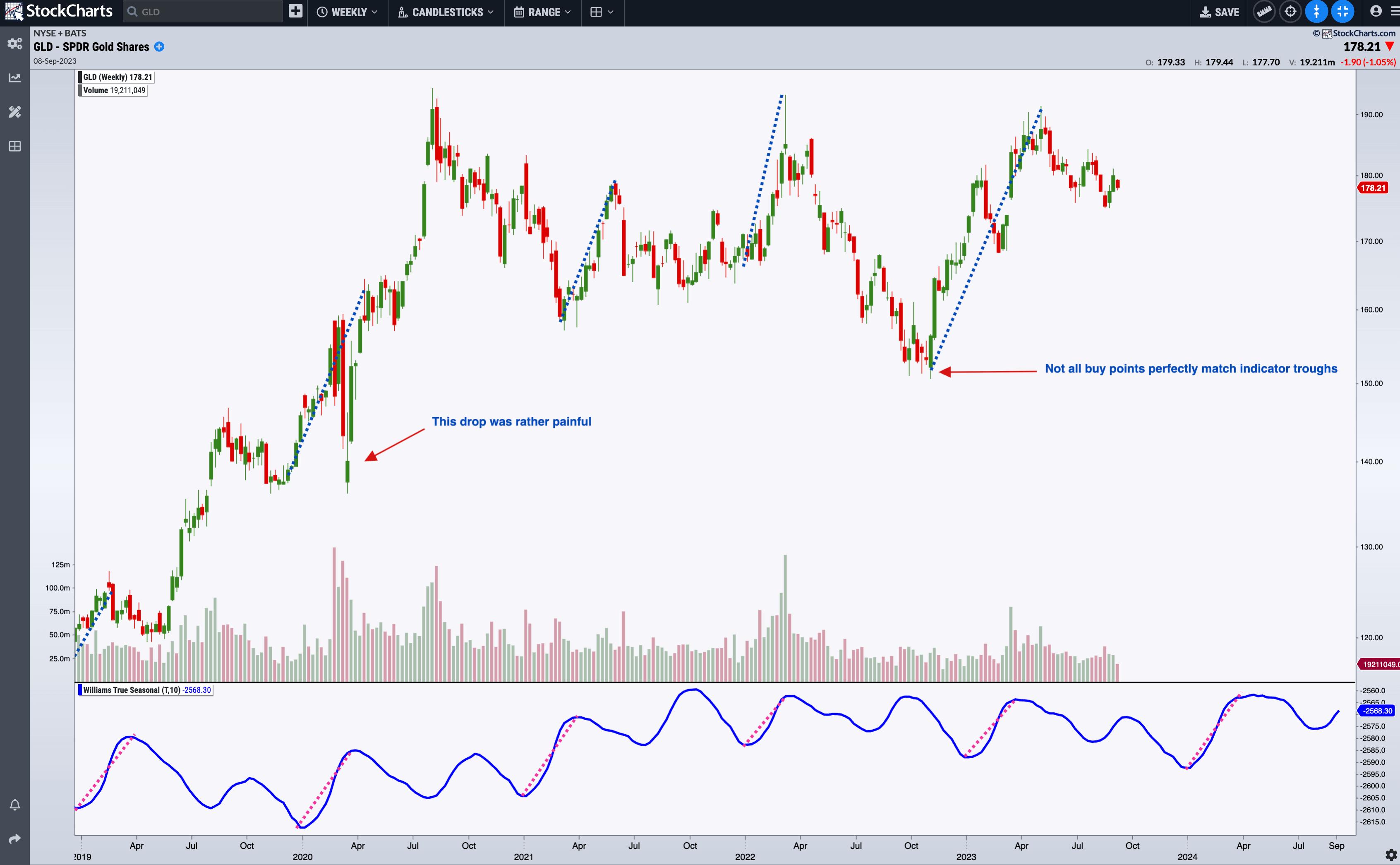
CHART 1: WEEKLY CHART OF GLD. Contrary to popular wisdom, the summer months may not be the best months to load up on gold.Chart source: StockChartsACP. For educational purposes.
 The Williams True Seasonal indicator is available in StockChartsACP as a plug-in. The Williams True Seasonal indicator is available in StockChartsACP as a plug-in.
Once you've installed it, scroll down the available indicators list (it's below the standard indicators), select Williams True Seasonal, and you'll be ready to apply this indicator to your analysis.
Looking closely at the Williams True Seasonal indicator, note the following:

- GLD tends to rise before the beginning of the year and peaks in April.
- Note how the pink dashed line highlighting this peak-to-trough in the Williams True Seasonal correlates with the blue dashed line on GLD's price chart.
- Note that the April peaks look differently depending on whether GLD is trending or not (and this can affect the way you trade GLD).
- According to this seasonal pattern, it would be wise to buy gold toward the end of the year; if the market is not trending upward, it might even be a wise decision to sell around April. Come this December, will the end of 2023 offer another compelling buy point?
- Still, you have to be flexible, as not all buy (or sell) points match perfectly with the indicator (although it comes pretty close to it), and some volatile moves, such as the one we saw in 2020, can occur.
Next, let's look at a weekly chart of IBM.

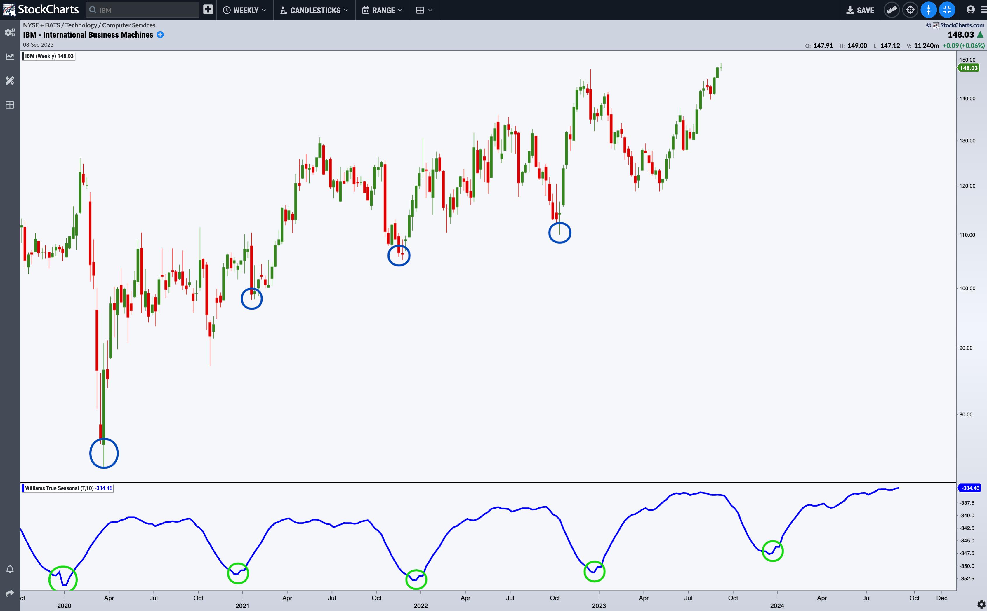
CHART 2: WEEKLY CHART OF IBM. Seasonal demand for IBM products may correspond with annual business spending toward the first of the year.Chart source: StockChartsACP. For educational purposes.
IBM makes for an ideal case because its seasonal peaks and troughs are so well-defined. IBM's buy point is toward the beginning of the year. In 2020, the big COVID Crash may have offset this seasonal trend, but it remained intact despite the uncertainties that pervaded global markets and economies. The Williams True Seasonal projects another buy point in 2024. That could mean IBM's share price might dip before resuming this seasonal trend.
Now, let's look at the Williams True Seasonal applied to daily charts.

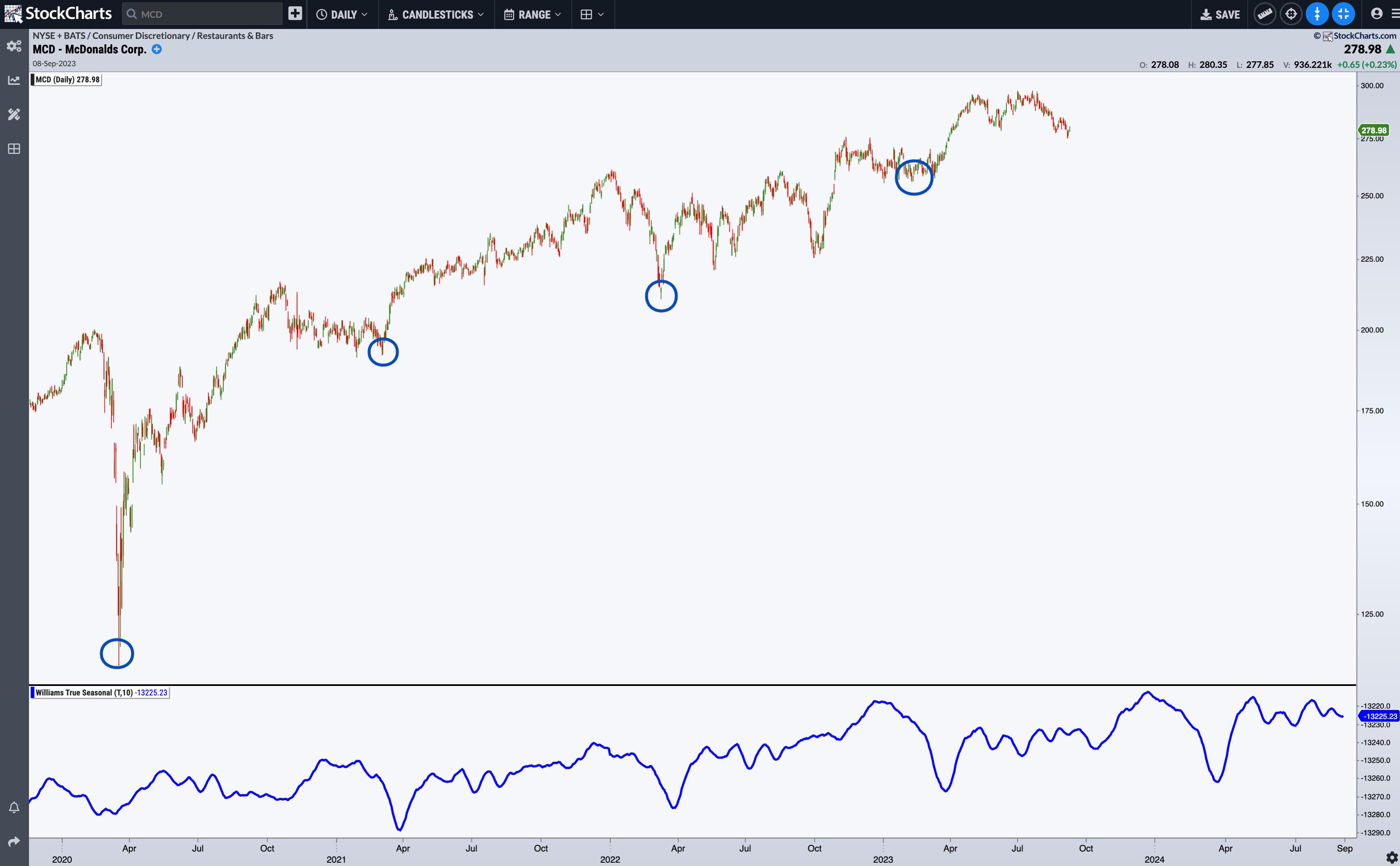
CHART 3: DAILY CHART OF MCDONALDS (MCD). Do the troughs in the Williams True Seasonal indicator signal more burger cravings and spending or investment at the end of the first quarter of the year?Chart source: StockChartsACP. For educational purposes.
Since the decline in 2020, McDonald's (MCD) began exhibiting seasonal buy points in late March. The dips in the Williams True Seasonal indicator are quite pronounced, and although the market action corresponding to these buy points varies slightly, MCD has generally been on an uptrend, and the next buy point signal may take place again in late March, should the seasonal trend continue.
The Bottom Line
The Williams True Seasonal is not so much a timing indicator as it is an early warning signal and a stock selection tool. Trading the markets with a clear view of seasonality patterns can give you a significant advantage. While the Williams True Seasonal is a potent tool, combining it with other indicators he developed, such as those for timing markets, can help sharpen your approach and trading performance.
Disclaimer: This blog is for educational purposes only and should not be construed as financial advice. The ideas and strategies should never be used without first assessing your own personal and financial situation, or without consulting a financial professional.
|
| READ ONLINE → |
|
|
|
| MORE ARTICLES → |
|
 Chart RISIN
 Chart 2
 Chart 3




 The Williams True Seasonal indicator is available in
