| THIS WEEK'S ARTICLES |
|
|
|
|
| The Mindful Investor |
| Three ETFs Suggest Further Downside |
| by David Keller |
This past week had all the potential to see a revival of the great bull market of 2023. The September inflation data, Apple's latest product announcements, and Arm's IPO all seemed had the possibility to reignite the fire of bullishness for investors.
By Friday's close, however, the S&P 500 appeared to be limping into the weekend. Growth stocks struggled and defensive sectors thrived as the market took on a very risk-off feel to wrap the week.
With this week's pullback, the S&P 500 chart appears to be forming a potential head-and-shoulders pattern.
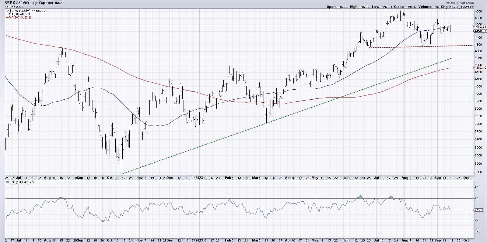
Note the peak in late July around 4600, surrounded by lower highs in June and August. If and when the SPX can break below the "neckline" formed by the interim lows in June and August, that would suggest further deterioration to at least the 200-day moving average.
Let's look at three key ETFs, all showing signs of distribution, all with further downside potential, and all with implications for further deterioration in risk assets.
Semiconductors (SMH)
Semiconductor stocks have done quite well since the October 2022 low, with the strong relative strength demonstrating consistent outperformance over the S&P 500 index. This ETF beautifully illustrates the dominance of large-cap growth stocks over other cap tiers in 2023.
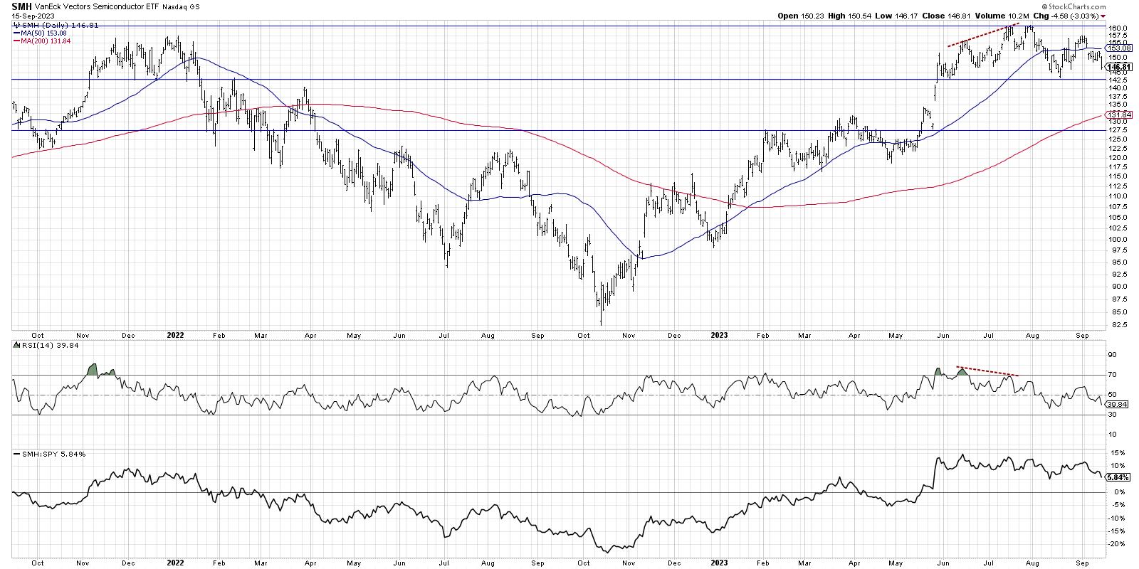
In July, we noted a bearish momentum divergence, where price moved higher while the RSI trended lower. This pattern often indicates an exhaustion point during bull phases, and suggests limited upside due to weakened positive momentum.
After testing resistance around $160 twice in July, the SMH registered a lower high in late August. If the price would push below $142, that would mean a new lower low as well. Given the weakened relative strength profile and negative momentum swing, there appears to be very real potential for further downside in this bellwether industry group.
Homebuilders (ITB)
For most of 2023, homebuilders were firing on all cylinders with consistent new highs and a steady uptrend for relative strength. Momentum characteristics, as measured by the RSI indicator, were similar to previous bullish market phases.
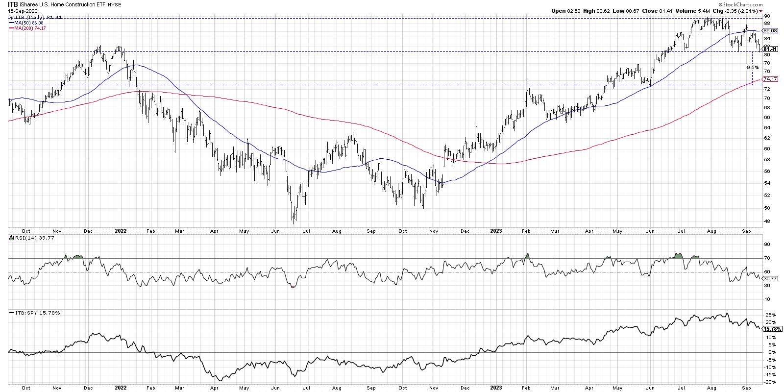
Note the high prices in July and August, where the ITB tested the same resistance level around $89 many times over a four-week period. Then, around the Labor Day holiday, we see a new lower high around $88. Similar to semiconductors, this leading group began to show signs of deterioration, as the uptrend had stalled out.
The relative strength line, which had been trending higher since November 2022, has now turned lower. This indicates that the industry group is underperforming the S&P 500, and also suggests that institutional investors are rotating their assets to other opportunities, like Energy stocks.
We can identify price support around $81 from lows in July and August. This level was reached once again this week, with Friday's drop once again pushing price down to potential support. If we see a break below $80, that would complete a breakdown pattern, with the height of the pattern indicating a minimum downside objective around $73.
Bonds (AGG)
This last chart is different than the others, in that it has been in a confirmed downtrend for some time now. The iShares Core U.S. Aggregate Bond ETF (AGG) is based off a popular bond market index and combines Treasury bonds and corporate bonds into one ETF.
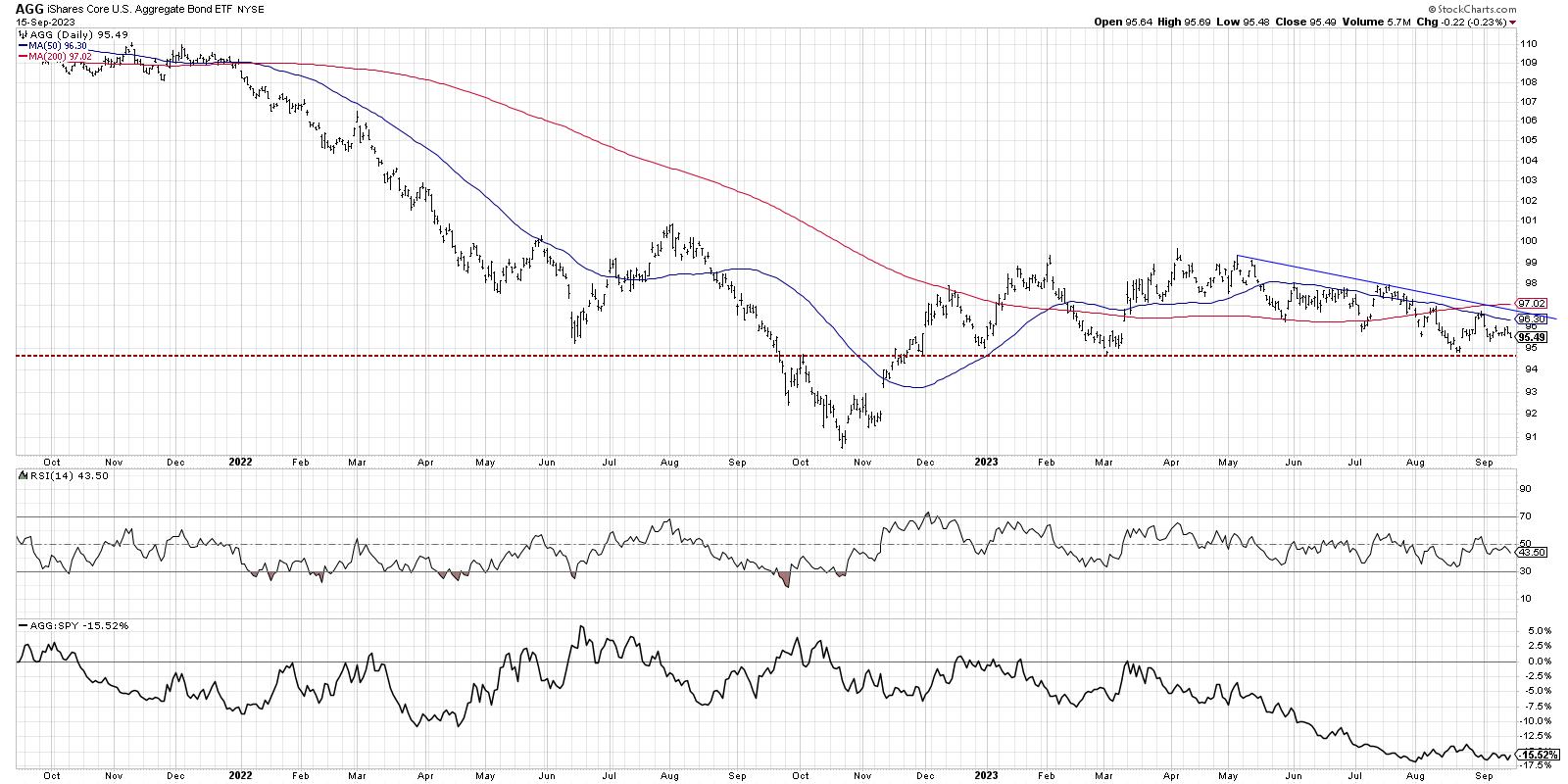
While the Nasdaq 100 and S&P 500 indexes broke above their February 2023 highs in April and May, respectively, AGG never was able to accomplish this breakout. A trendline using the highs since May show a fairly steady downtrend in bond prices, leading to a key support level around $94.50.
Note how the RSI has remained below 60 during this period as well. In bearish market phases, the entire range of a momentum indicator often moves lower. As long as the RSI remains below 60 on price bounces, it would suggest that this downtrend in bond prices is very much intact.
Why would lower bond prices suggest further downside for equities? A quick look at the Ten-Year Treasury Yield shows how higher rates are often not an ideal environment for growth stocks.
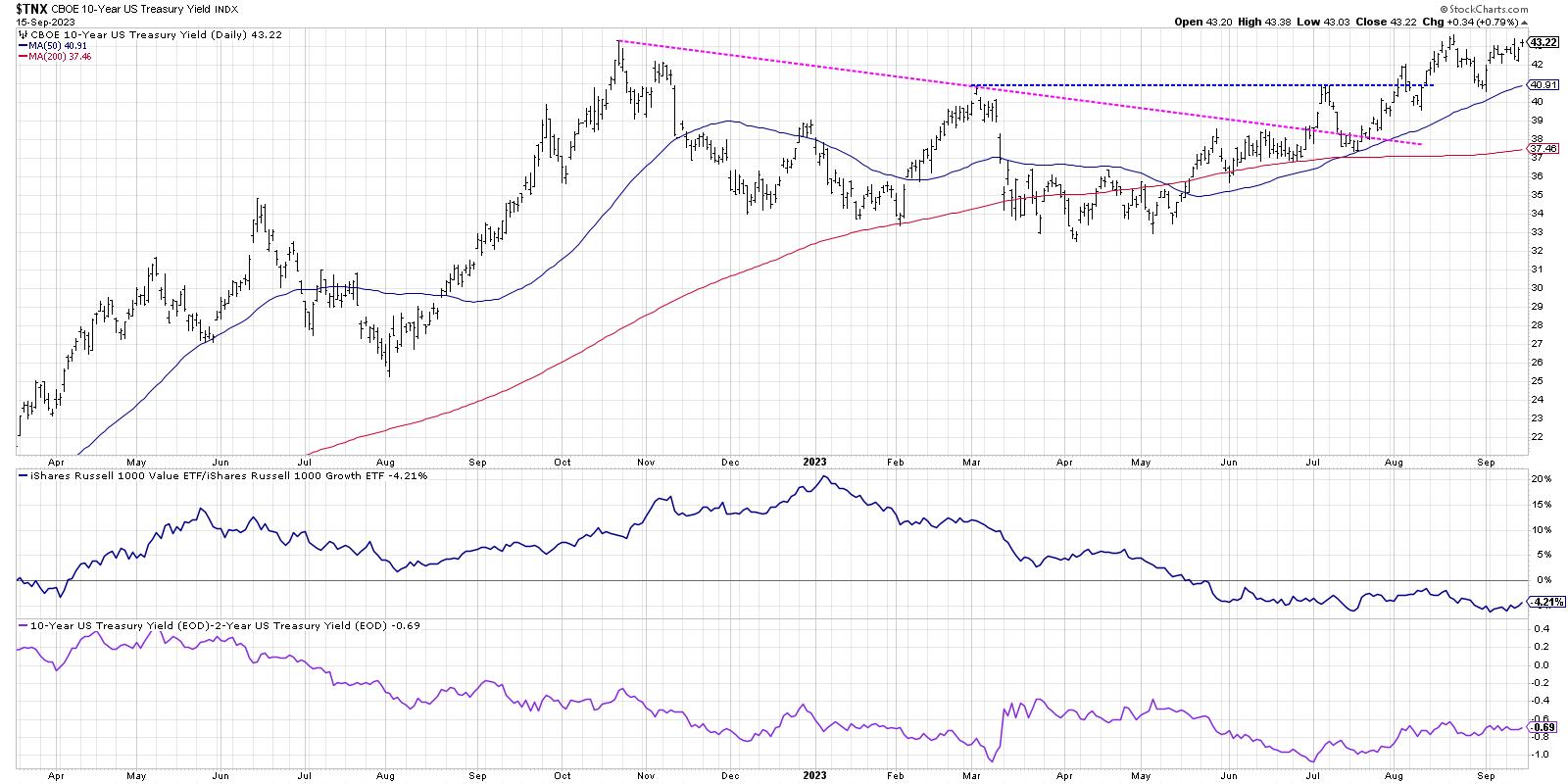
Lower bond prices mean higher bond yields. And higher interest rates are a headwind for growth stocks, as the value proposition for growth stocks is the potential for future earnings growth. If interest rates are going higher, that means that the future earnings of growth companies are worth less today.
As the panel just below the Ten-Year Yield shows, growth stocks have been holding steady with value stocks despite this rising rate environment. But if bond yields keep trending higher, this would put more and more pressure on growth stocks. which in turns means more potential downside for our growth-oriented benchmarks like the Nasdaq 100 and the S&P 500.
The S&P 500 has not yet confirmed a head-and-shoulders topping pattern. But given the weak trends in these three key ETFs, it appears that a breakdown for the S&P is much more likely than investors may expect!
RR#6,
Dave
P.S. Ready to upgrade your investment process? Check out my free behavioral investing course!
David Keller, CMT
Chief Market Strategist
StockCharts.com
Disclaimer: This blog is for educational purposes only and should not be construed as financial advice. The ideas and strategies should never be used without first assessing your own personal and financial situation, or without consulting a financial professional.
The author does not have a position in mentioned securities at the time of publication. Any opinions expressed herein are solely those of the author and do not in any way represent the views or opinions of any other person or entity.
|
| READ ONLINE → |
|
|
|
| The Traders Journal |
| Don't Even Think About Investing Without Addressing These 10 Essentials (Part 1: Essentials #1 - #5) |
| by Gatis Roze |
 We investors are frequently guilty of hearing only what we want to hear. The justification often being "that doesn't apply to me." Or my other favorite line, "Oh, I don't do that." In my previous blog — a tribute to William J. O'Neil, — I said that in the near future I'd share my specific takeaways from all his seminars I attended and his books I read. I absorbed this material from O'Neil over many decades, and in reviewing my extensive notes, I freely admit to paraphrasing his insights. We investors are frequently guilty of hearing only what we want to hear. The justification often being "that doesn't apply to me." Or my other favorite line, "Oh, I don't do that." In my previous blog — a tribute to William J. O'Neil, — I said that in the near future I'd share my specific takeaways from all his seminars I attended and his books I read. I absorbed this material from O'Neil over many decades, and in reviewing my extensive notes, I freely admit to paraphrasing his insights.
As with so many instances in life, O'Neil may have implied one lesson and I inferred something slightly different. Nevertheless, this is my collection of useful investing essentials that all of us need to remember and that all novices must adopt sooner rather than later. Not just for the betterment of our own portfolios, but for the crucial responsibility of passing the investment management baton to the next generation. Without this baton pass, your legacy dies. That may sound brutal, but it's entirely truthful.
1. SUCCESSFUL INVESTING CAN BE LEARNED
This is a fact, and I'll offer you proof. The Market Wizard, Richard Dennis, set out to prove this point by making a wager with his business partner. He won! He proved it could be done to the tune of $175 million. You should read Wikipedia's biography of Dennis. He turned $1,600 into $350 million and then famously taught his system to a small group of investing recruits who he labeled "the Turtles." In five years, his novice Turtle investors produced an aggregate profit of $175 million. The conclusion? Yes, you can learn to be a consistently profitable investor, too.
2. START EARLY — DON'T PUT OFF INVESTING
In my over 25 years teaching investors, I consistently heard the same regret over and over again, "gosh, if only I had started investing sooner." Be it Buffett, O'Neil or Bogle, they all applaud the magic of compounding and preach the gospel of starting early. You've all seen the seemingly unbelievable numbers. Young people who start investing almost certainly will be able to retire in their fifties. And even for those of you already 50, investing $15,000 annually and letting it grow at a reasonable market rate of 8% will reap a nest egg of $440,000 by the time you're 65. But my God — do the math if you start at 25 years old! I'd present you with the number, but you probably wouldn't believe me. Remember the importance of the baton pass. Teach young people to start investing early. Don't be like 64 year-old Ned, a former student of mine who said he'd just begun doing some financial planning and discovered he could retire by 65 — but only for 45 minutes. Make it happen before you end up like him! Stop waiting for inspiration as all you are doing is feeding your procrastination.
3. THE WORLD'S GREATEST HOBBY WILL REWARD YOU
I began investing as a young man and then continued through my entire career as an entrepreneur. It began as a hobby — albeit a serious hobby. At the time, my assets were managed by a professional firm. When I transitioned to making my hobby a full-time avocation, I had already been a very serious student of investing for many years. Unlike some lazier novice investors who flame out early and quickly ( for some that may be a blessing in disguise) I continued to grow and succeed by bumping, grinding and persevering. If we commit ourselves to do what needs to be done and thereby grow as investors, the market will reward us as long as we're willing to apply ourselves. The University of Wall Street will extract its tuition, but graduation pays immense dividends. It's worth it! Investing Hell is reserved for "middle earth" which is where mediocrity resides. Far too many investors are by their own design sentenced to a life of investing mediocrity. Embrace this wonderful hobby! I believe author and professor Stephen R.Covey puts it nicely. "Sow a thought, and you reap an act; sow an act, and you reap a habit; sow a character, and you reap a destiny." As an investor, growth is an obligation. The alternative is not financially attractive. Make the commitment.
4. THE METHODOLOGY OF POTHOLES
It might seem counterintuitive at first. It's not what a novice investor wants to hear, but you'll have far far more assets in your pocket over the long term if you first focus on what you should NOT do as an investor instead of trying to find the Holy Grail of stock trading methodologies. Once again, take heed of what Buffett and other Marker Wizards have advised. They will tell you that you can indeed outperform the market and actually possess mediocre investing skills — but there's the big if — if you avoid falling into the most common potholes and don't make all the usual mistakes and blunders that investors are prone to do over and over again. The reality is that the Methodology of Potholes will trump the Methodology of Investing, so to speak!
5. SIMPLE BEATS COMPLEX
Many investors have multiple university degrees, high IQs, and very successful careers. Generally, they are cerebral folks who understand complex stuff. That's why they're attracted to the stock markets and investing in the first place. Here's the conundrum — one that I was myself was guilty of initially. Increased complexity is inversely related to profits. Simplicity (within reason) produces profits and clobbers complexity in most instances. Steve Jobs had it absolutely correct when he said, "Simple can be harder than complex: You have to work hard to get your thinking clean to make it simple. But it's worth it in the end because once you get there, you can move mountains." And you have to admit, Steve Jobs moved mountains. You can as well.
Till the next blog then, when I'll present you investing essentials #6 through #10.
Trade well; trade with discipline!
Gatis Roze, MBA, CMT
StockMarketMastery.com
|
| READ ONLINE → |
|
|
|
| Martin Pring's Market Roundup |
| This Sector Looks Really Sick Long-Term |
| by Martin Pring |
The overall market has been rallying since registering its low last October. However, there is one sector which, in August, fell below its October low on a monthly closing basis. More serious is the fact that it recently violated a 23-year secular up trendline. Can you guess which sector I am referring to?
Secular Trend
The answer is utilities, or, more specifically, the Dow Jones Utility Average. Chart 1 features this index on a quarterly basis back to the 1940s. By way of emphasizing the long-term significance of such trendline penetrations, the 1966 trendline break was followed by a massive selloff and multi-decade consolidation. It was not until 1985, 20 years later, that the 1965 peak was surpassed in any meaningful way. One thing to note is the violation of the line is not quite official yet, as there are still a couple of weeks trading until the end of September, which marks the quarterly close. Even so, there are other reasons as to why a confirmed penetration is likely to materialize.
First, the quarterly Coppock Curve in the bottom window went bearish in July. The vertical red lines approximate previous such sell signals. Most, as represented by the solid ones, have been followed by weakness in the utility average.
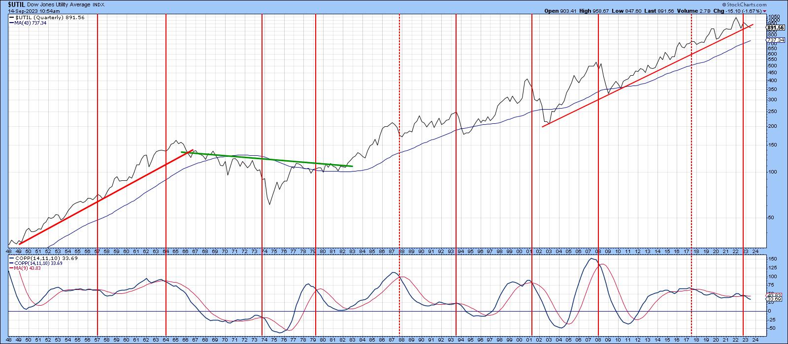 Chart 1 Chart 1
Chart 2 displays the same indicators, but this time on a monthly basis. The green arrows show when the Coppock Curve turns up from a below zero position. The indicator is currently below equilibrium, but is still constrained in its downward trajectory. It therefore remains in a bearish mode. The chart also tells us the secular up trendline has already been decisively violated. There are several ways in which the line could have been constructed, but I chose one of the more conservative possibilities. In any event, recent action has seen a violation of that red 48-month MA.
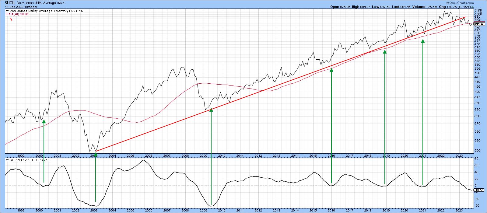 Chart 2 Chart 2
Chart 3 takes this moving average back to the 1940s, where the red and green arrows point up situations where it successfully turned back challenges from both the upside and downside. Allowing for slight whipsaws, this average has acted as a very important dynamic level of support or resistance in the 80 years covered by the chart. Bottom line: when a decisive penetration does take place, it usually signals a reliable change in the major trend.
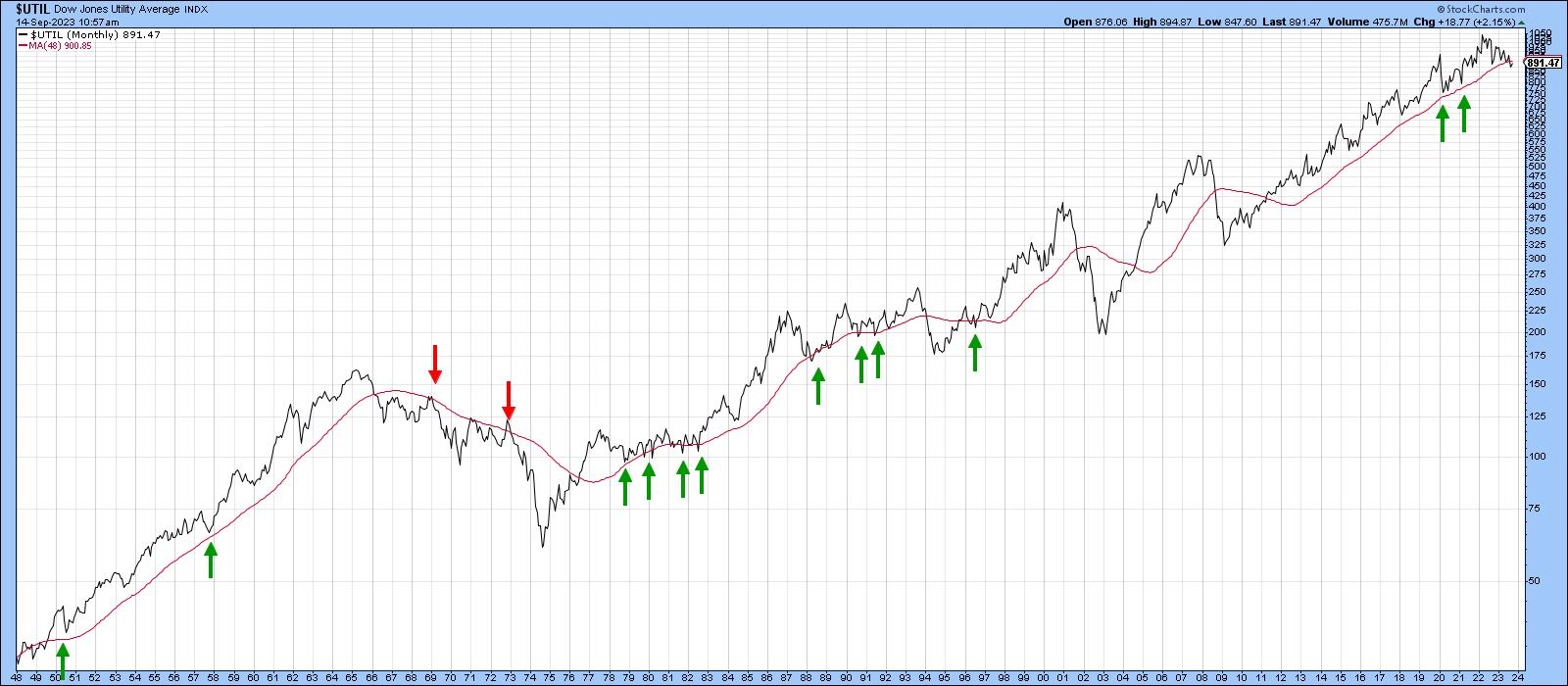 Chart 3 Chart 3
Primary Trend
Chart 4 shows a PPO using the 6- and 15-month parameters, which I find to be quite helpful for many markets. In this respect, the pink shading highlights periods when the oscillator is below zero. It was uncharacteristically late in signaling the two post 2,000 bear markets. However, to its credit, it has until recently remained in a positive mode for the last 12 years. The latest September data indicates a very marginal negative crossover, but a more decisive one is required to come to a bearish conclusion concerning this piece of technical evidence. It seems likely that this will happen, since the Index itself has just completed a massive top. This price pattern could be interpreted as a symmetrical triangle or a complex head and shoulders. It really does not matter what you call it; this formation reflects a battle between buyers and sellers, and the sellers clearly won. Also worthy of note is the fact that the series of declining peaks and troughs is still in force. There was one hopeful example of a rising trough in February, but the declining peaks remained intact throughout the whole period.
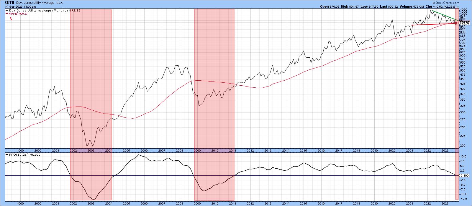 Chart 4 Chart 4
Chart 5 features this price action on a weekly basis for the SPDR Utility Fund (XLU). In the last few trading sessions, the XLU has rallied back to the extended breakdown trendline, throwing up the possibility that the top may not work. If that is the case, we would need to see a decisive Friday close that can hold above the $68 level. That's where the green trendline joining the three right shoulder peaks is residing.
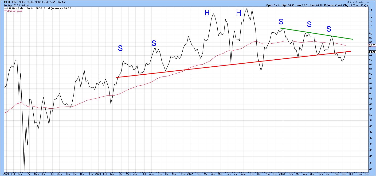 Chart 5 Chart 5
Chart 6 suggests this is a definite possibility because the percentage of XLU components above their 20-day EMA is in a positive mode. The arrows show that upward reversals in this indicator have been fairly consistent in calling a rally.
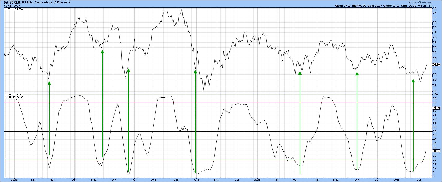 Chart 6 Chart 6
Conclusion
Whilst the short-term technical picture leaves room for hope, it seems more likely that the negative vibes being transmitted from the longer-term indicators are more likely to prevail in the end.
Good luck and good charting,
Martin J. Pring
The views expressed in this article are those of the author and do not necessarily reflect the position or opinion of Pring Turner Capital Group of Walnut Creek or its affiliates.
|
| READ ONLINE → |
|
|
|
|
|
| The MEM Edge |
| The Largest IPO In 2 Years Launched Last Week - Here's What It Means For Other Areas Of The Markets |
| by Mary Ellen McGonagle |
Shares of British chip designer Arm (ARM) surged in price after its stock market debut on Thursday - closing up 25% from its IPO price. The gains put the company's valuation at more than $64 billion, making it the biggest new offering in 2 years.
Arm's strong performance is expected to have a positive impact on the IPO pipeline, where several companies are scheduled to go public in the coming weeks — including grocery delivery service Instacart, German footwear maker Birkenstock, and marketing automation platform Klaviyo. Should these IPOs also succeed, Wall Street is expecting a wave of stock market launches in 2024 as private companies that have been sitting on the sidelines turn public. After a lull lasting for about 18 months, the U.S. IPO market has already seen a pickup, with approximately 16 companies initiating the filing process in August.
All of this is great news for the Wall Street banks that help bring these companies to market, as the fees they generate can be substantial. Underwriting fees range an average of 4% to 7% of gross IPO proceeds, which can add up quickly. In fact, Arm is expected to pay as much as $104 million in fees, which will be split among several investment banks such as Goldman Sachs and J.P. Morgan. Both companies had top spots during 2021's banner IPO year, and below are their charts, which are beginning to show signs of turning positive.
DAILY CHART OF J.P. MORGAN
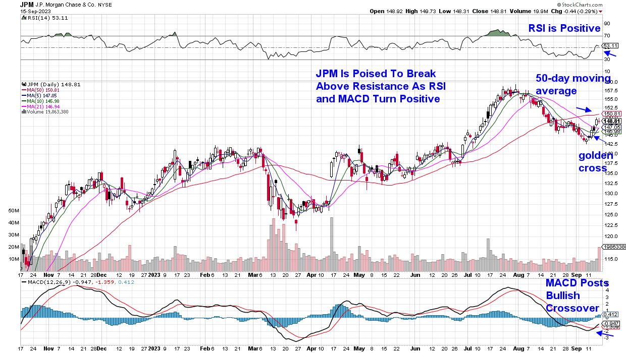
J.P. Morgan (JPM) closed above its 10- and 21-day moving averages last week on relatively high volume, which, in turn, pushed the RSI into positive territory. The MACD has posted a bullish crossover, with the black line crossing above the red. The next big hurdle will be a close above its 50-day moving average, which would confirm a new uptrend.
DAILY CHART OF GOLDMAN SACHS (GS)
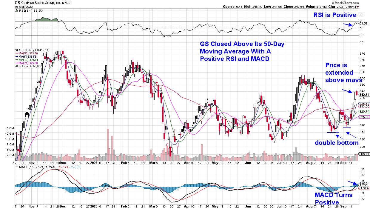
Goldman Sachs (GS) is a bit more advanced in its efforts to turn bullish. The stock closed above its key 50- and 200-day moving averages following a rally that pushed the MACD into positive territory, where it joined the already positive RSI. Last week's gain has put the stock's price well above its moving averages, so that it may enter a period of consolidation while these moving averages catch up.
While most investors in the U.S. likely haven't heard of Arm, most use the company's products every day, as the company designs and creates chips used in smartphones, laptops, and video games. The company is expected to play a big role in AI adoption, which is said to have driven most of Thursday's buying. Outside of Arm's rally, however, price action among Semiconductor stocks was quite negative last week, with the group slumping further below its key moving averages and posting a negative RSI and MACD (using ETF SOXX).
Longer-term, though, the outlook remains positive for key Semiconductor chip providers, and if you'd like to be alerted to when these names enter new uptrends and are in strong buy zones, use this link here to trial my twice weekly MEM Edge Report for a nominal fee. This report specializes on keeping subscribers on top of critical turns in the market, and those stocks that are in a position to benefit the most.
Warmly,
Mary Ellen McGonagle, MEM Investment Research
|
| READ ONLINE → |
|
|
|
| Art's Charts |
| Breadth is Not Keeping Pace with the Bounce |
| by Arthur Hill |
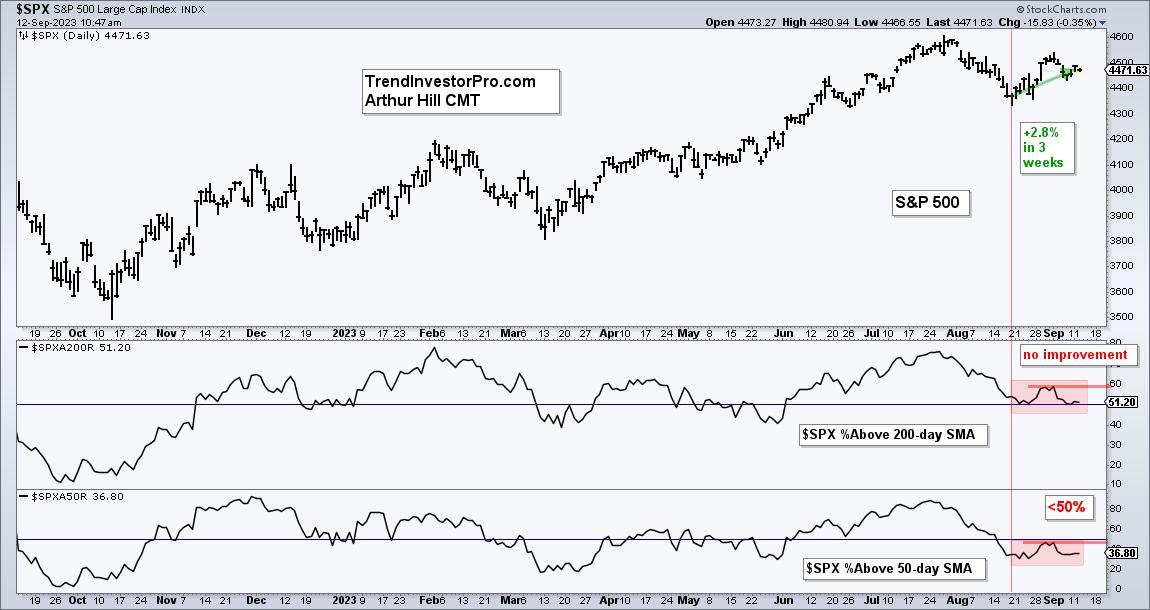
The S&P 500 SPDR bounced the last three weeks, but we did not see an improvement in breadth. Weak breadth is also reflected in performance for mid-caps and small-caps, which are lagging. Even so, SPY and QQQ are in short-term uptrends and I am watching the tech sector for clues.
Breadth is Not Keeping Pace with the Bounce - Plus MDY, IWM and XLK
These charts were part of Tuesday morning's Chart Trader report at TrendInvestorPro. The first chart shows the S&P 500 with the red vertical line marking August 18th. The index is up 2.8% since this date. The first indicator window shows SPX %Above 200-day SMA moving sideways since this date (red shading). Breadth did not improve during the bounce. The second window shows SPX %Above 50-day SMA also moving sideways and remaining below 50%.
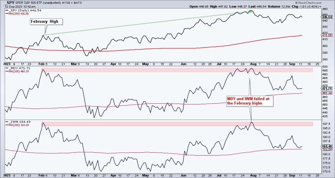
The next chart shows SPY, the S&P MidCap 400 SPDR (MDY) and the Russell 2000 ETF (IWM) since January 2023. SPY exceeded its February high and is currently around 7.5% above this high. MDY and IWM failed at the February high and are currently around 5% below this high. Small-caps and mid-caps are seriously lagging and not the place to be.
Large-cap techs are the place to be - for now. QQQ and XLK are leading the market and helping the large-cap weighted S&P 500 (SPY). The next chart shows XLK with a breakout in late August and a short-term uptrend (blue dashed lines). At this point, traders must decide what it would take to prove this bullish stance wrong.
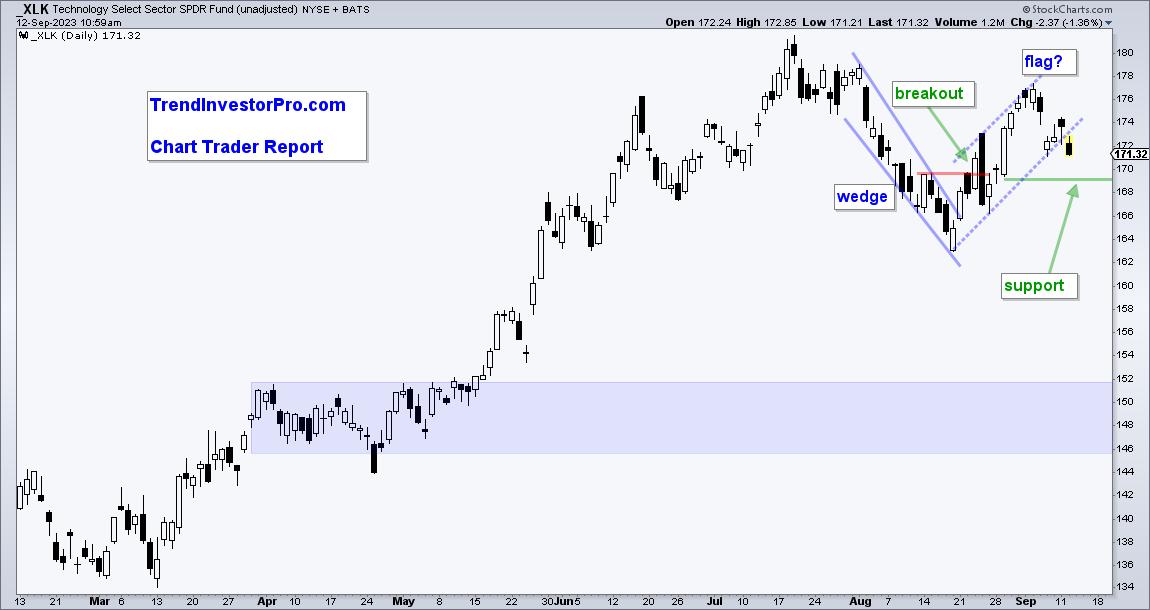
The dashed lines show a possible rising flag (bearish pattern). XLK is testing the flag line after a decline last week. There is also the big surge on August 29th with the Marubozu candlestick. I am using the low of this candlestick to mark support at 169. A close below 169 would erase this big gain and clearly break flag support. Such a move would be bearish.
Check out the Chart Trader report at TrendInvestorPro for more details. Tuesday's report updated levels for SPY and QQQ, highlighted TLT and covered yield spreads. We also provided some analysis and setups for ITB, SOXX, PPA and five stocks. Click here for immediate access.
Click here it learn about the TIP Indicator Edge Plugin for StockCharts ACP.
---------------------------------------
|
| READ ONLINE → |
|
|
|
|
|
| ChartWatchers |
| Using the Chikou Span to Identify Early Trading Signals |
| by Karl Montevirgen |

The Ichimoku Kinko Hyo (or Ichimoku for short) is like a Swiss army knife of an indicator, designed for everything from projecting support and resistance to identifying trade signals. It has five key components that should be combined to analyze current price action while setting up future trades.
What makes the Ichimoku unique among indicators is its 26-day look-forward and look-back feature. It's sort of like driving: you can't just move based on what's in front of you, you have to scan your sides to see what's happening now, as well as look behind you to see what it means for your planned maneuvers.
This article examines the 26-period look-back: the Chikou Span, or the "Lagging" Span.
Two Reasons to Look Back 26 Days
If you can see what's happening now and have a potential setup for the future, why look back? It seems a bit awkward, but there must be some rationale beyond the Chikou Span's function.
Well, there are two:
- First, to measure (more like "confirm") market sentiment.
- Second, to signal potential trend reversals, sometimes early on.
In this way, you can look at current and future setups with the confidence of seeing some form of confirmation based on past price action. Let's consider the first reason: measuring market sentiment.
Measuring Market Sentiment with the Chikou Span
Take a look at the daily chart of Apple, Inc (AAPL) below:
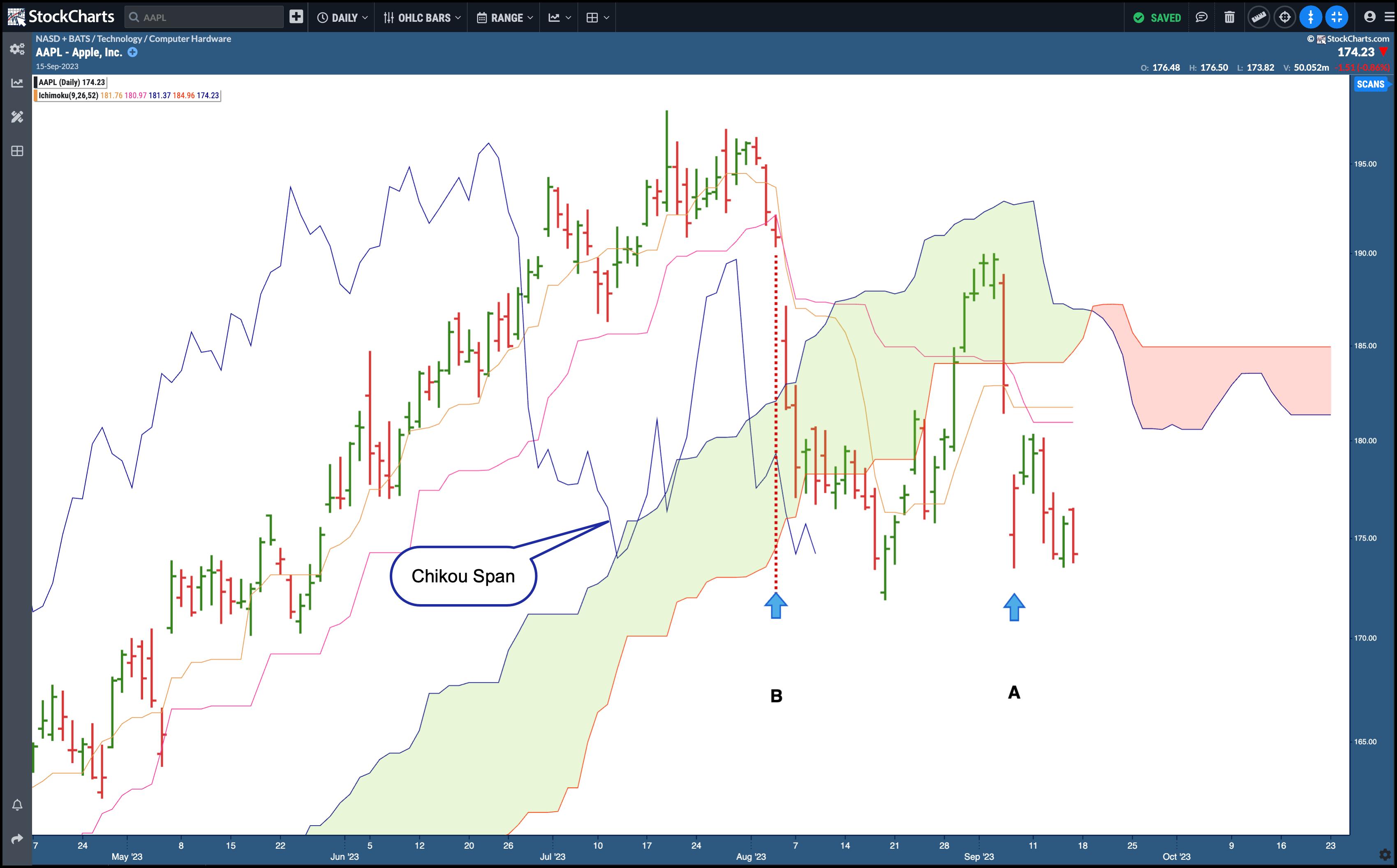
CHART 1. APPLE INC (AAPL) AND ICHIMOKU INDICATOR WITH ALL COMPONENTS BUT THE CHIKOU SPAN DULLED OUT. This chart shows that the Chikou Span is 26 days (or periods) behind current prices.Chart source: StockChartsACP. For educational purposes.
- The Chikou Span is displayed in blue.
- The arrow labeled A is the candle of focus.
- The arrow labeled B marks where the Chikou Span was 26 days prior.
Now, note that in B, the Chikou Span was well below the price 26 days prior. This indicates that sellers (or the proverbial "bears") controlled the market. And, of course, you know this because prices have fallen from where they stood 26 days ago.
So what's the value in showing and confirming what you already know? The value of the Chikou Span is in the moment of its crossover and can be used to identify trend reversals.
Using the Chikou Span to Identify Potential Trend Reversals
Let's look at the same chart, but go back several periods.
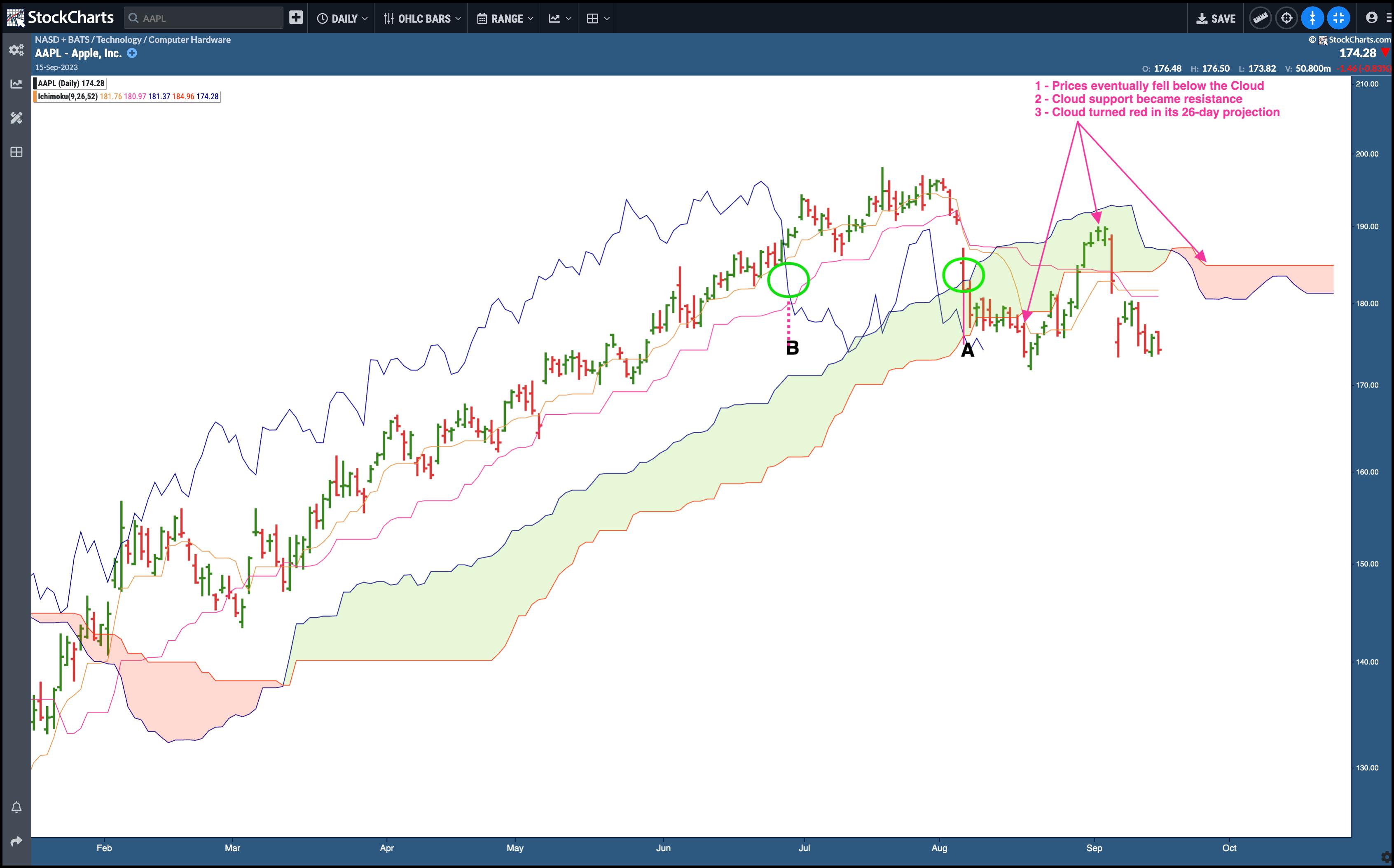
CHART 2. AAPL, CHIKOU SPAN, AND THE CLOUD (OR "KUMO"). The Chikou Span gave a bearish signal when it fell below past prices, but you have to look at other Ichimoku components to get a more accurate read on current and potential future price movements.Chart source: StockChartsACP. For educational purposes.
Note the two green circles labeled A and B. When price gapped lower at A, it coincided with the Chikou Span crossing below prices 26 days prior, as shown at B.
When the Chikou Span crossed below price and the Tenkan-sen (conversion line) and Kijun-sen (base line), it's considered a bearish indication. As you can see, prices continued to fall. However, price also falls into the Cloud (aka Kumo), generally viewed as potential support.
So there are two conflicting signals: a potential trend reversal signaled by the crossovers, but potentially bullish support in the cloud. Which one is it going to be, bullish or bearish? This is where the nuances set in, and it depends on the kind of trader you are and how you use the rest of the Ichimoku components.
- An aggressive trader might have used the negative Chikou Span crossovers as a signal to go short.
- A less aggressive trader would have waited for the Chikou Span to cross below the Cloud itself (which hasn't yet happened).
Note the outcome: Prices eventually fell through the cloud, but found support. However, upon re-entering the cloud, support became resistance, and the cloud eventually turned a bearish red. What happens next is anyone's guess. While the aggressive approach happened upon a good outcome, it wasn't the "safest" trade to take. So, it depends on your risk tolerance and approach to the markets.
So, what might have been a better trade based on a Chikou Span crossover? Let's go back to March 2023.
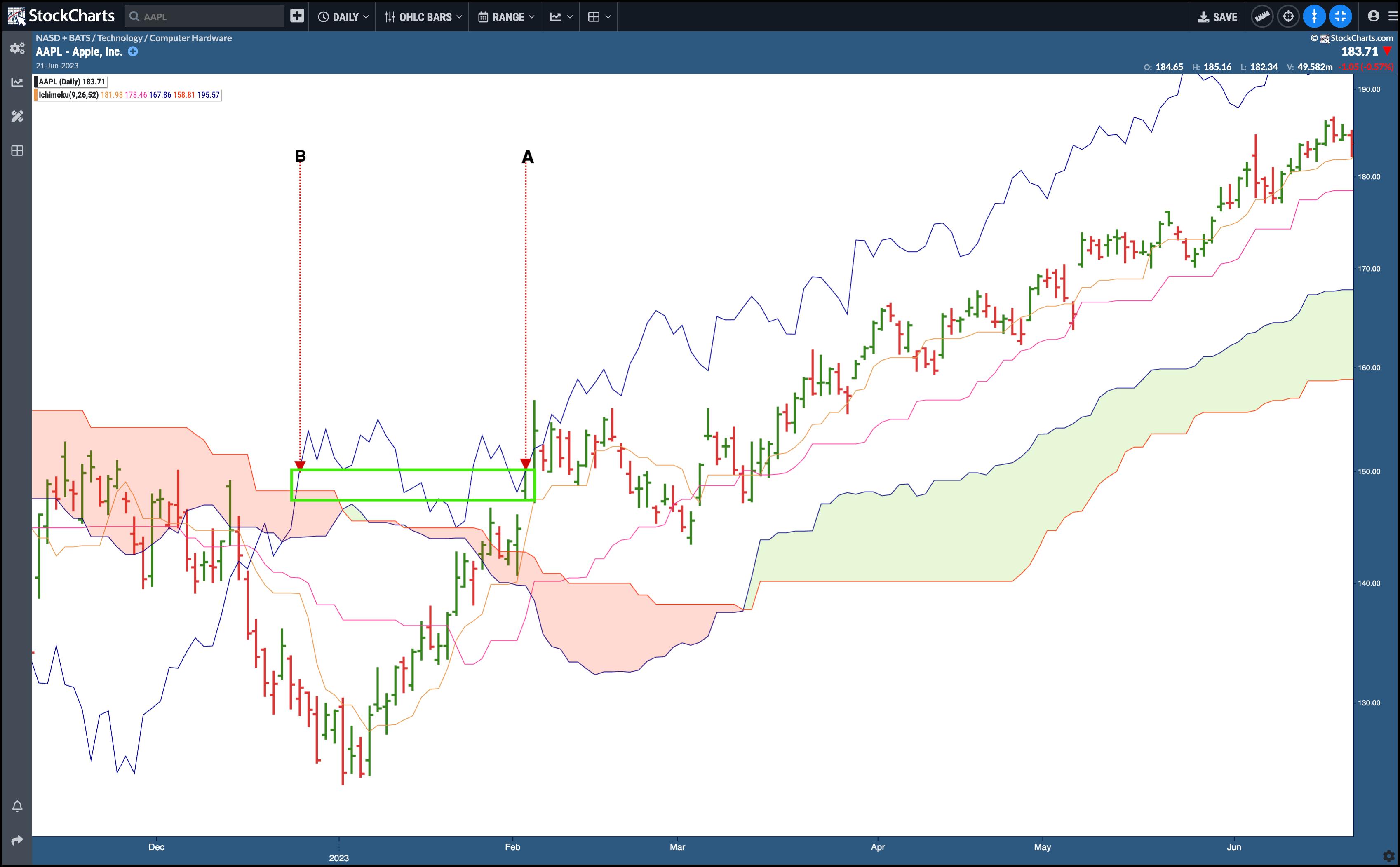
CHART 3. AAPL AND CHIKOU SPAN. The Chikou Span turned bullish before most other indicators did.Chart source: StockChartsACP. For educational purposes.
At the beginning of February 2023, the stock price (point A) was still recovering from an ugly combination of decline and consolidation. There were a few layers of resistance overhead, and there weren't many strong indications that prices were about to make a break for the upside, save for one bullish signal: the Chikou Span (point B) crossed above price, the conversion and base lines, and the cloud itself.
What followed was an uninterrupted seven-month uptrend, and the Chikou Span crossover was one of the earliest indications that prices were getting revved up to soar.
The Bottom Line
The Ichimoku Kinko Hyo can be an effective trading tool that offers a holistic market view through its five components. Among these, the Chikou Span's 26-day look-back feature is particularly unique, as it provides retroactive insights that can, ironically, be used to forecast future price action. While this "Lagging Span" operates with a 26-day delay, this doesn't diminish its anticipatory value. Instead, it underscores the importance of retrospective analysis, proving that sometimes a look back can offer the clearest view forward.

|
| READ ONLINE → |
|
|
|
| DecisionPoint |
| Bonds: Don't Forget the Long-Term Trend |
| by Carl Swenlin |
Many of the forecasts I hear regarding bonds seem to be based upon what bonds have done for most of the last 40 years, without acknowledging what has happened more recently. The chart below shows that 30-Year T-Bonds were in a rising trend from the 1982 low, but, in early 2020, they made a long-term top and began trending downward. That downtrend lasted long enough for price to violate the rising trend line, which is strong evidence that the long-term trend has now shifted downward. Technically, we should expect that this downtrend will continue for a long time, probably decades.
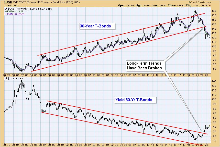
The problem with long-term charts is that we get to review huge segments of time without experiencing the tedium of the normal real-time market ebb and flow. For example, while the price trend from 1982 was primarily up, there were periods of a year or more when price moved down or sideways, so in spite of the dominant downtrend, it is likely that bonds will rally soon, and that the rally may last for quite a while. When that happens, I caution against assuming that the long-term trend is changing to up. Maybe it is, but it probably isn't.
Conclusion: It is hard for people to abandon investment techniques that have mostly worked for 40 years, but it is clear that the paradigm has shifted, and that a new approach is necessary.
Learn more about DecisionPoint.com:
Watch the latest episode of DecisionPoint on StockCharts TV's YouTube channel here!

Try us out for two weeks with a trial subscription!
Use coupon code: DPTRIAL2 at checkout!
Technical Analysis is a windsock, not a crystal ball. --Carl Swenlin
(c) Copyright 2023 DecisionPoint.com
Disclaimer: This blog is for educational purposes only and should not be construed as financial advice. The ideas and strategies should never be used without first assessing your own personal and financial situation, or without consulting a financial professional. Any opinions expressed herein are solely those of the author, and do not in any way represent the views or opinions of any other person or entity.
DecisionPoint is not a registered investment advisor. Investment and trading decisions are solely your responsibility. DecisionPoint newsletters, blogs or website materials should NOT be interpreted as a recommendation or solicitation to buy or sell any security or to take any specific action.
Helpful DecisionPoint Links:
DecisionPoint Alert Chart List
DecisionPoint Golden Cross/Silver Cross Index Chart List
DecisionPoint Sector Chart List
DecisionPoint Chart Gallery
Trend Models
Price Momentum Oscillator (PMO)
On Balance Volume
Swenlin Trading Oscillators (STO-B and STO-V)
ITBM and ITVM
SCTR Ranking
Bear Market Rules
|
| READ ONLINE → |
|
|
|
| Wyckoff Power Charting |
| Percent Scale PnF Technique. Nvidia Case Study. |
| by Bruce Fraser |
 A project that I have been working on in recent years is Horizontal PnF Counting using Percent Scaling. The method has generated promising results. Here we look at two case studies that illustrate the techniques value. Using the ‘Percentage Chart Scaling' Method in StockCharts.com Point & Figure charting platform produces a Log Scale PnF chart. The percent scale defaults to 1% but can be adjusted manually. The case study charts in this blog are 3% scale PnF Charts. It takes a 3% change in price to move to the next vertical grid column. A project that I have been working on in recent years is Horizontal PnF Counting using Percent Scaling. The method has generated promising results. Here we look at two case studies that illustrate the techniques value. Using the ‘Percentage Chart Scaling' Method in StockCharts.com Point & Figure charting platform produces a Log Scale PnF chart. The percent scale defaults to 1% but can be adjusted manually. The case study charts in this blog are 3% scale PnF Charts. It takes a 3% change in price to move to the next vertical grid column.
This method is useful for estimating the price objective potential of a dynamically growing financial instrument. The traditional rules for counting horizontal (range-bound) structures also applies to the log-scale method.
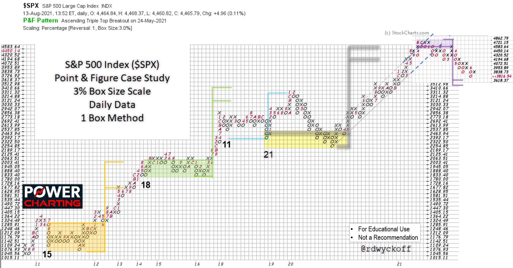
The first case study is the bull market run in the S&P 500 Index from 2010 to the Bull Market peak in 2021. Each of the Re-Accumulation pauses are counted and flagged for their price projection estimates. These Re-Accumulations can take a year or more to unfold and build a Cause for the next upward ascent. The counts are remarkably accurate and useful. Please take time to study each of them.
This charting method has been made possible by the introduction of computerization. This technique is a compounding function rather than a simple horizontal counting method used in traditional fixed scale PnF charting methodology. Therefore, each horizontal column in the range-bound structure represents a compounding event. An example of a 10 column wide range-bound price structure represents 10 periods of say 3% growth in the subsequent upward trend. Thus 10 periods of growth at 3% results in a compounded appreciation of 33.1% which would be the price target for the advance.
The benefit of this PnF method is the capability of estimating the compounded growth of a dynamically advancing investment. As is the case with traditional PnF Method the time duration of the move remains an unknown. It is best to employ log-scale for dramatically rising and volatile instruments. For smaller ‘Swing Trading' structures arithmetic scaling is most effective. Fellow Wyckoffian Alessio Rutigliano has used log scaling PnF very effectively in the analysis of the Crypto Markets. Alessio's analytical work on Crypto Markets can be seen and studied at WyckoffAnalytics.com.
 S&P 500 Index ($SPX) Point & Figure Case Study. 3% Scaling, 1-Box Reversal Method. S&P 500 Index ($SPX) Point & Figure Case Study. 3% Scaling, 1-Box Reversal Method.
This log-scale horizontal PnF study of the S&P 500 Index spans more than a decade. The bull run from 2010 to 2021 had four well defined ‘Re-Accumulation' periods. Each of these structures identified price targets that were eventually achieved. The final upward leg of the Bull Market was dramatic in its persistency and was preceded by a long and volatile trading range. The horizontal PnF count was exceeded by only one box and was the conclusion of the bull market. The log scale of this chart study was in 3% increments, which is very aggressive scaling, and illustrates what a virile bull market this decade long period was. Consider that each upward chart entry (entered as an ‘X' on the chart) was a 3% increase.
The final upward surge into the Bull Market peak was capped by an acceleration of the index into a Buying Climax. A throwover of the trend channel combined with a fulfillment of the PnF count objective sealed the fate of this aging, historic Bull Market run.

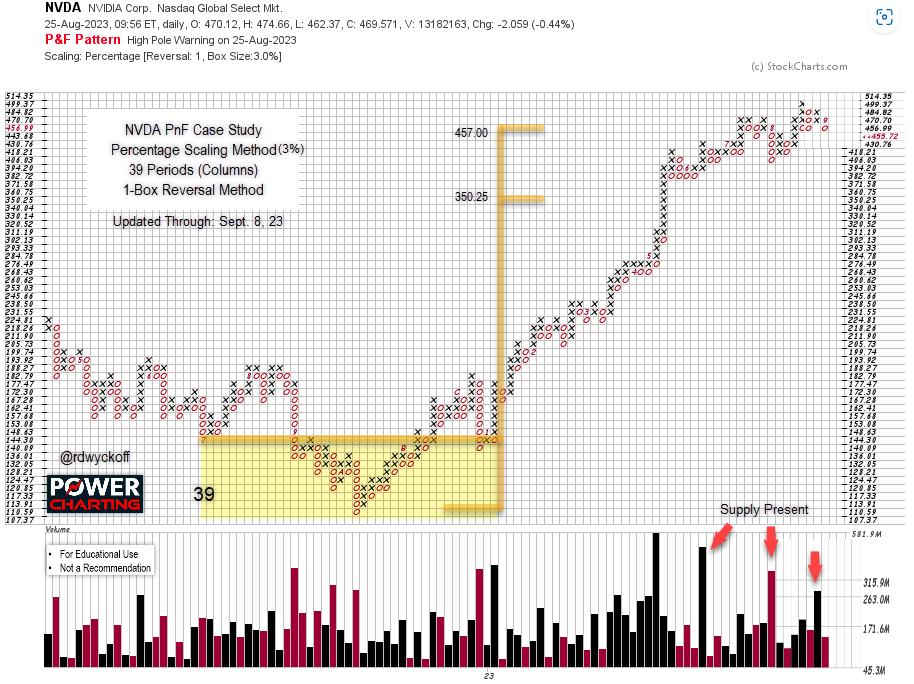
NVIDIA Corp. (NVDA) Point & Figure Case Study. 3% Scaling, 1-Box Reversal Method.
NVIDIA Corp. (NVDA) has become one of the "Magnificent 7'. The rally in 2022 and '23 was preceded by a period of Accumulation. Across the Accumulation 39 columns were counted. One-Box reversal method is used. Thus 39 periods of 3% appreciation are estimated. From the low of the count area and from the count line two price objectives are generated and flagged. The price objectives are 350.25 to 457.00. Recently NVDA surged past the higher target zone. In a final upward run (usually considered climactic) the upper objective can be exceeded. If, in short order, the stock price reverses and falls below the higher objective back into the target zone we will consider the PnF count to be active and still valid. NVDA has shortening upward thrusts in the area of the $457.00 price objective. As of Friday, September 8th NVDA was back below the upper price objective, closing the week at $455.72. Sudden weakness to a support area would be further evidence that, at best, a new range-bound price structure is beginning. Which could become a fresh new Re-Accumulation or Distribution. Only time will tell, and we will watch closely.
Notes on Log Scale PnF Method
1. Initially default to 1% Scaling. Then try 2% Scaling.
2. Count Accumulation and Re-Accumulation structures as you would with arithmetic scale charts.
3. Default to 1-box reversal charts. Avoid counting 3-box charts.
4. Primarily use log-scale method for dynamically growing financial assets. Use arithmetic scale otherwise.
5. Count very conservatively. Big counts will generate very big price objectives using log-scale.
6. Use a financial calculator or Excel to calculate compounded growth for the price objectives.
7. For Distribution and Re-Distribution default to arithmetic scale PnF charts to estimate price targets. Log scale will typically result in over-counting of downside objectives.
8. Lots of practice will help you discern when arithmetic scale or log-scale is the best method.
All the Best,
Bruce
@rdwyckoff
Disclaimer: This blog is for educational purposes only and should not be construed as financial advice. The ideas and strategies should never be used without first assessing your own personal and financial situation, or without consulting a financial professional.
Announcement:
TSAA-SF Annual Conference
In-person in San Francisco. Livestreaming for dues paying members.
The TSAA-SF will be hosting our 2023 annual conference, in partnership with AAPTA, at Golden Gate University on Sep 16, 2023.
Speakers include:
Linda Raschke - Auction Theory versus the Theory of Reflexivity
Brett Villaume - Understanding Relative Strength
Bruce Fraser - Swing Trading Technique Using the Wyckoff Method
Ali Merchant - Power of trend lines and market outlook using major indices
Bob Schott - Technical Analysis for the Buy Side
Eoin Treacy - Waiting for Godot
Damon Pavlatos - Anticipating Market Action using Market Profile, Volume Analytics Strategies along with traditional charting analysis.
Cost: TSAA-SF members in-person: $150 (breakfast and lunch included), non-members: $400. Free livestreaming for TSAA-SF members. Join the TSAA-SF now for only $75/year.
For more information on the speakers and their topics and to register (Click Here):
https://www.tsaasf.org/event-5391152
Power Charting TV:
Wyckoff Case Study: A Period of Distribution Featuring Nvidia! First of Three Parts. Special Guest: Roman Bogomazov
Description:
Master Wyckoffian Roman Bogomazov joins Bruce Fraser for an in-depth historical chart case study of Nvidia common stock. This is the first installment of a three-part Power Charting series devoted to analyzing Nvidia common stock. Each of the three episodes is evaluated using the Wyckoff Chart Reading Method in chronological order. This episode evaluates a period of Distribution. In conducting these case studies, the objective is to illustrate and develop in the viewer an appreciation of the nuance the Wyckoff Method offers in the understanding of the present position and likely future direction of a stock or index, using chart analysis, for the intention of more effectively campaigning that instrument at the best possible time.
|
| READ ONLINE → |
|
|
|
| Don't Ignore This Chart! |
| Chesapeake Energy: A Stock That Could Pump Much More |
| by Jayanthi Gopalakrishnan |

In addition to analyzing the stock market's overall performance, running scans when the market opens and after it closes is a good routine to follow. It can reveal some market activities you may not have thought about.
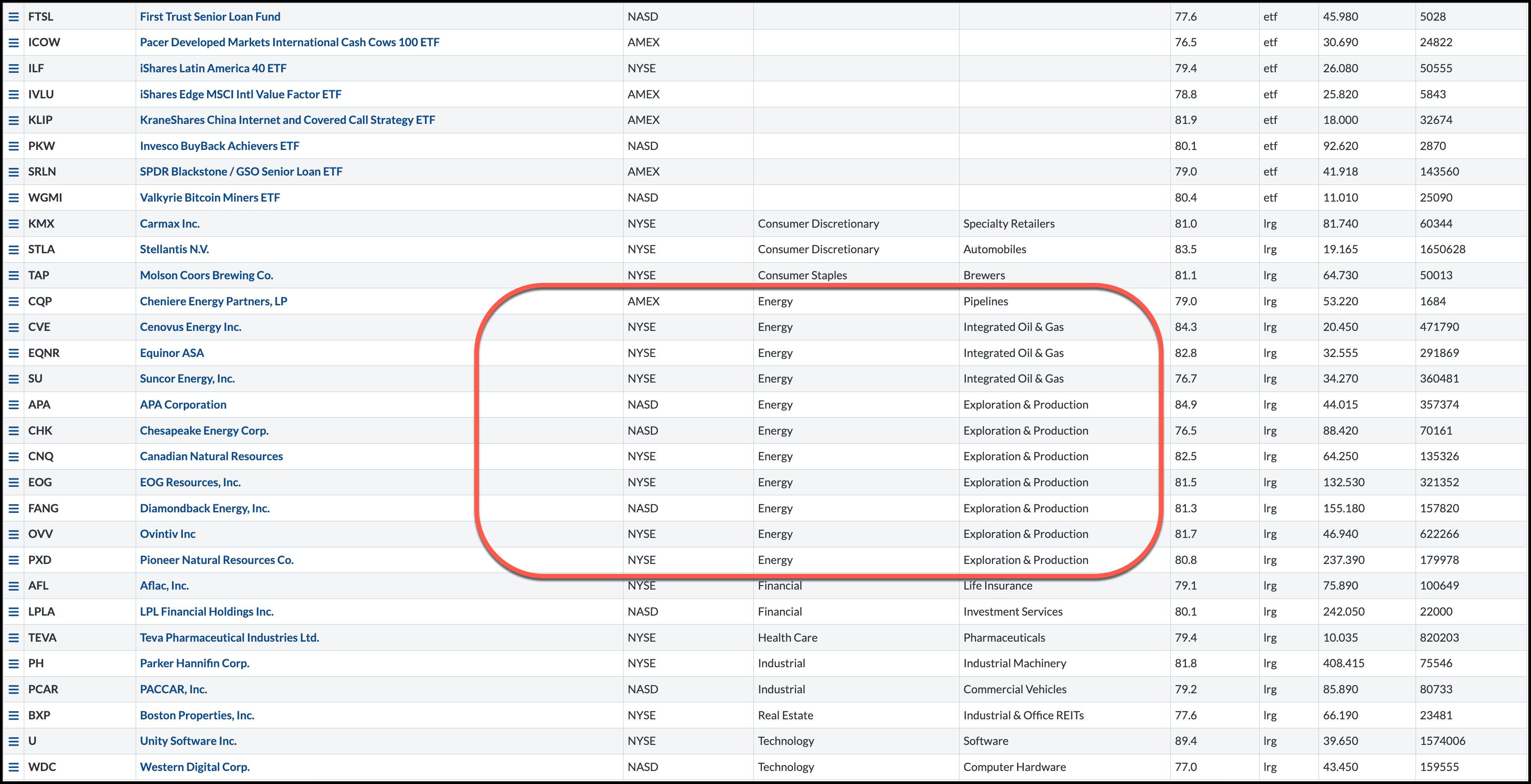
It's interesting to note how many stocks from the Energy sector made it to the StockCharts Technical Rank (SCTR) scan I run every morning. While equities are still trying to figure out which way to go, crude oil prices have risen steeply. And energy stocks are running higher along with it.

FIGURE 1: SCTR SCAN RESULTS. Many stocks that made it to the SCTR scan on September 12 were in the Energy sector. Chart source: StockCharts.com. For educational purposes.
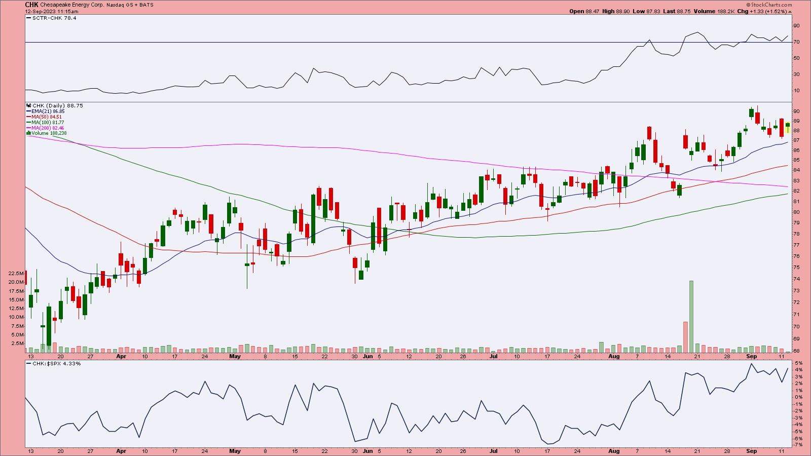
One of the stocks that showed up on the scan is Chesapeake Energy (ticker symbol: CHK). If you extend the chart to display a year of data, you'll see that the trend has been relatively slow and steady.

FIGURE 2: CHESAPEAKE ENERGY STOCK HAS BEEN TRENDING HIGHER SINCE JUNE. The stock has room for more of the upside move, although an increase in volume would be more confirming.Chart source: StockCharts.com (click chart for live version). For educational purposes.
The stock has been trending higher since June, and its SCTR score is above 70. The relative strength of CHK relative to the S&P 500 ($SPX) is climbing, although it's still relatively weak. The stock still has some room for upside movement, and the company pays out dividends to shareholders.
Note: To know how much the company will likely pay in dividends, check out the Symbol Summary page under Member Tools.
Go through the charts of the stocks that made it to the SCTR scan and identify those that meet your trading criteria. Last week, Diamondback Energy (ticker symbol: FANG) was the featured stock in this blog. It's still a scan candidate.
As long as the Energy sector continues to trend higher, it's worth adding some energy stocks to your portfolio. There are two sides to the coin. One is that crude oil prices are on their way to reaching triple digits. The other is that if crude prices go much higher, demand pressures will come into play. Consumers will feel the pinch when they fill their gas tanks. Some analysts question whether there's enough buying to push oil prices higher.
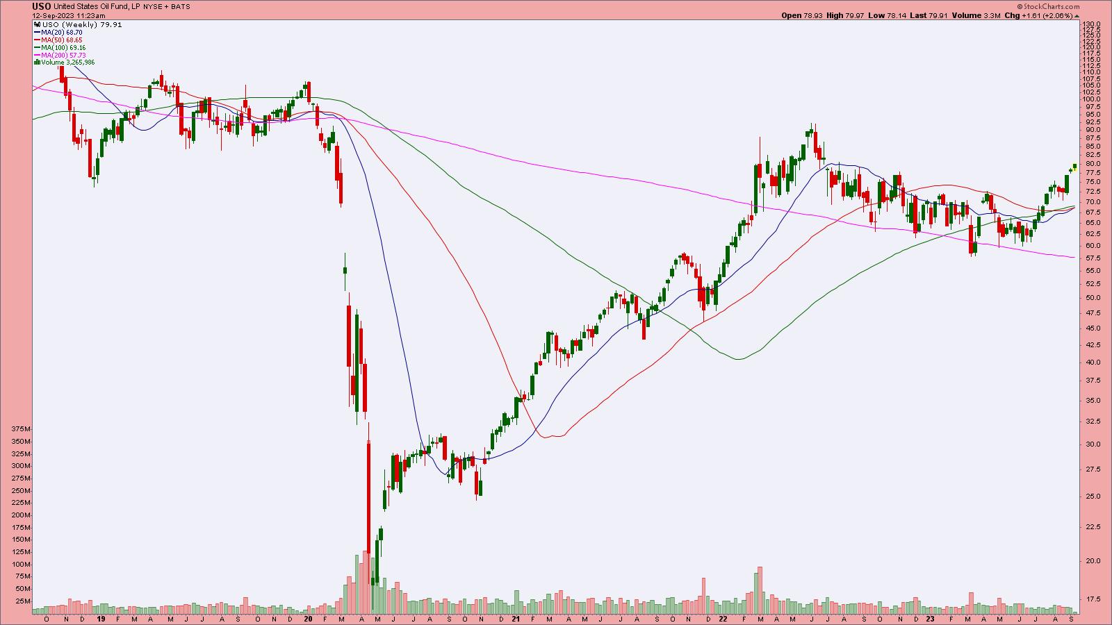
A good proxy for following crude oil prices is the United States Oil Fund (USO). The weekly chart below shows that price continues to rise. The first major resistance level would be at around the $90 level.

FIGURE 3: UNITED STATES OIL FUND (USO) IS A GOOD PROXY TO FOLLOW WTIC CRUDE OIL PRICES. After a steep fall in 2020, oil prices have recovered. How much higher will they go remains to be seen.Chart source: StockCharts.com (click on chart for live version). For educational purposes.
Trading Chesapeake Energy
Chesapeake Energy's stock has been rising steadily since June, but, except for a couple of volume spikes in August, volume has been relatively average. You could take advantage of the rise in oil prices by adding CHK or any other energy stock you have identified. For CHK, look for an increase in volume, because you want to see some momentum behind it.
Watch the crude oil market via the futures ($WTIC) or USO. This will help you keep track of the energy market, which will help you decide whether you should reduce, add, or close your positions.
SCTR Crossing Scan
[country is US] and [sma(20,volume) > 100000] and [[SCTR.us.etf x 76] or [SCTR.large x 76] or [SCTR.us.etf x 78] or [SCTR.large x 78] or [SCTR.us.etf x 80] or [SCTR.large x 80]]
Credit goes to Greg Schnell, CMT, MFTA.

Disclaimer: This blog is for educational purposes only and should not be construed as financial advice. The ideas and strategies should never be used without first assessing your own personal and financial situation, or without consulting a financial professional.
|
| READ ONLINE → |
|
|
|
| MORE ARTICLES → |
|



 We investors are frequently guilty of hearing only what we want to hear. The justification often being "that doesn't apply to me." Or my other favorite line, "Oh, I don't do that." In


 A project that I have been working on in recent years is Horizontal PnF Counting using Percent Scaling. The method has generated promising results. Here we look at two case studies that illustrate the techniques value. Using the ‘Percentage Chart Scaling' Method in StockCharts.com Point & Figure charting platform produces a Log Scale PnF chart. The percent scale defaults to 1% but can be adjusted manually. The case study charts in this blog are 3% scale PnF Charts. It takes a 3% change in price to move to the next vertical grid column.